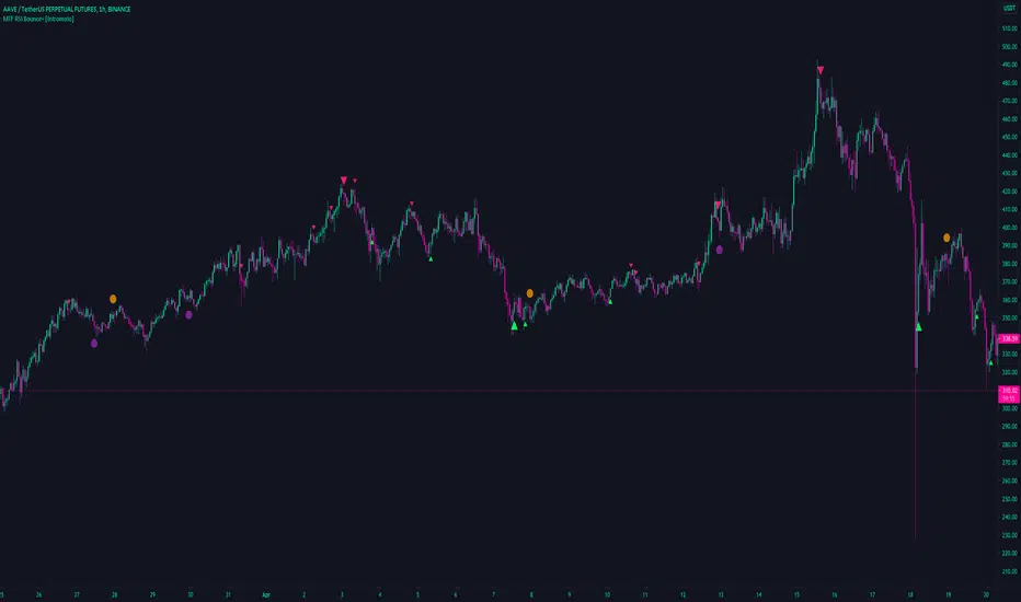
MTF RSI Bounce+ [Intromoto]This script focuses on the relative strength index of an asset and plots shapes/lines based of "bounce" and crosses of the 50 midline
Barcoloring is based on the lower time frame over/under 50 for directional bias.
Smaller plotshapes are printed when the rsi "bounces" on the lower time frame 50, i.e is higher at first, lower on second, and back above the 50 on the 3rd close of the sequence.
Larger plotshapes occur on higher time frame, "D" by default, RSI crossovers. A line, user input styling available, is plotted horizontally for reference.
Alerts added for the HTF crossover/under
Thanks
Cari dalam skrip untuk "mtf"
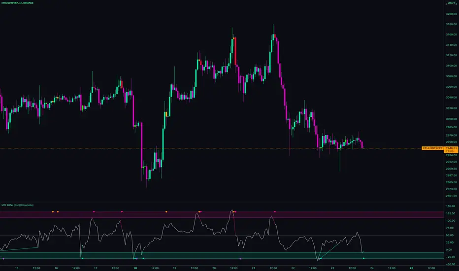
MTF BB%+ [Overlay] [Intromoto]This indicator is based around BB%, essentially showing where deviations are within price over time. This is the overlay version, better to see the precise candle signals.
Plotshapes are printed when exiting extremes of the deviations, back towards the mean.
Arrows indicate an increased likelihood of price reverting direction. Red arrow =bearish, green arrow = bullish. Dots below candles = bullish, above candles = bearish.
Dots on the top and bottom of the candles show a sub level of reversion that would be perhaps less extreme than when price reenters the norm from the normal standard deviation.
Users can also change the timeframe of the indicator for high time frame signals.
Barcolors for plotshapes included.
DM for access
Thanks
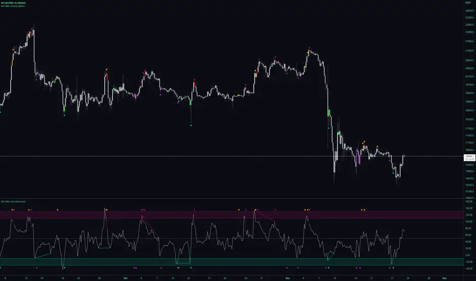
MTF BB%+ [Osc] [Intromoto]This indicator is based around BB%, essentially showing where deviations are within price over time.
Plotshapes are printed when exiting extremes of the deviations, back towards the mean.
Arrows indicate an increased likelihood of price reverting direction. Red arrow =bearish, green arrow = bullish.
Dots on the top and bottom of the oscillator show a sub level of reversion that would be perhaps less extreme than when price reenters the norm from the normal standard deviation.
Users can also change the timeframe of the indicator for high time frame signals.
Barcolors for plotshapes included.
DM for access
Thanks
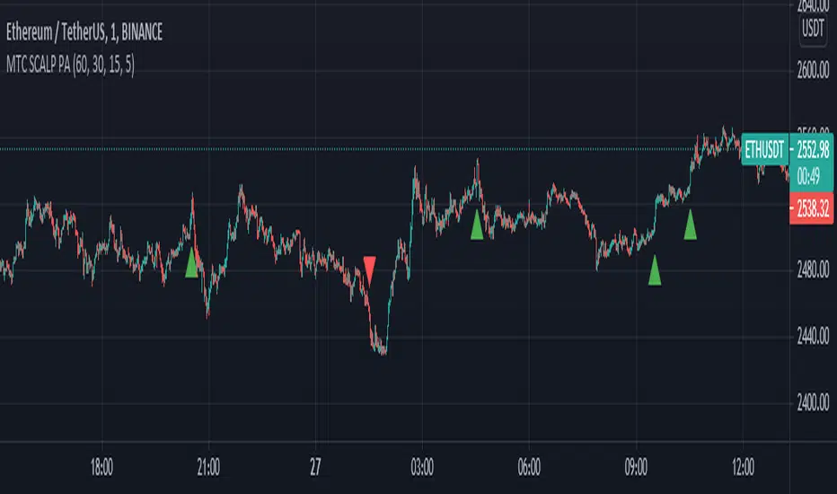
MTF SCALP Price Actionits just for personal use of my own.
if you want to use this indicator, use it at your own responsibility. but just remember its a SCALP strategy and must be used on 5M timeframe.
Long/Short Conditions :
last 1H,30M,15M and 5M candle close on same direction.
I will back test this indicator and if it worth it i will write turn it to a strategy.
PS: i'm new to pinescript coding . so, sorry for my bad coding. if you have any suggestions to improve my coding skills i will be very thankful if you share it with me.
MTF Custom MA v1.0 [sylence175]Custom moving average calculation with multi-timeframe support.
Possibility to enable/disable and display up to 8 individual MAs of different lengths and timeframes.
Possibility to use the same timeframe (global timeframe) for all MA calculations or individual ones for each single MA.
This indicator is primary focused on manual Trend Analysis.
There are no Buy/Sell signals or alerts integrated.
This is not financial advice. Use it at your own risk.
MTF Aroon [Takazudo]Multi Timeframe Aroon implementation. This study highlights the background when the strong signal is detected.
This study was intented to use as a part of buy/sell strategies.


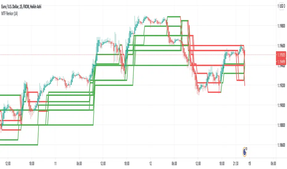
MTF RenkoThis indicator Should be opened on a 15 min chart
It will display the Renko Highs and lows of:
30 min chart
45 min chart
60 min chart
and
120 min chart
MTF ComboMiddle stochastic is the HTF stochastic of price. The color coding indicates the trend in even higher timeframe.
- The graph on top is the stochastic of ATR (with HTF and current one with RSI and macd histogram).
- The green graph at the bottom is the stochastic of the OBV (with HTF and current one with RSI and macd histogram).
- Purple histogram and area underneath the mid-stochsatic are the macd histogram and the stochastic RSI.
- The dots in the middle are determined by the combined score of all
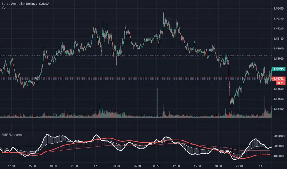
MTF RSI EMA snakesThis simple script plots 2 moving averages of RSI at 2 selected timeframes.
Setting each set of moving averages to a higher timeframe allows for monitoring of momentum at that time frame, and comparison of momentum across timeframes.
Crossovers of the respective averages of different time frames can be used as trade signals.
Having the leading average above the slower average on both timeframes can be an effective trend filter.
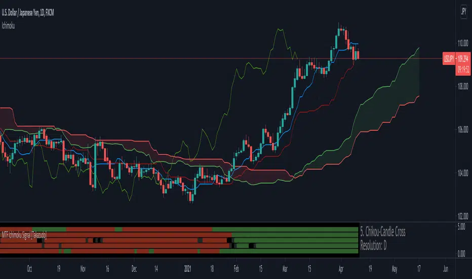
MTF Ichimoku Signal [Takazudo]A multi timeframe Ichimoku Signal indicator. This indicator shows the status of each Ichimoku Signals.
1. TK-Cross
Tenkan-Sen & Kijun-Sen cross status
2. Future Kumo
The newest Kumo color
3. Kumo & Current Relation
The relation between current price & Kumo.
4. Kumo & Chikou-Span Relation
The relation between Kumo & Chikou-Span.
5. Chikou-Span & Candle Cross
Chikou-Span & Candle cross status
Dilip Money FlowMTF Money Flow Indicator is an amazing tool used to help determine market direction on multiple time-frames based on the the traded volume .
This indicator is a superb upgrade to my original Money flow indicators.
You now how the option to adjust the displayed volume timeframe, which in turn adjusts the Money Flow Moving Averages, along with the new Breakout Candle feature.
Additionally, the background colors represent the volume flow crossovers on the primary time-frame, along with three addition time-frames that are user adjustable.
The primary volume flow crossover is shown on the top of the grid, followed by the First Additional Time Frame and then so on down to the bottom.
I generally have this set with the lowest timeframe value at the top, followed by the next one in line.
Note: Since volume amounts vary across the board. The background height is set to readjust based on the highest bars. This lookback amount is adjustable by the user and it does not affect calculations what so ever.
I find, with the standard settings, it works best on the 1 hour timeframe as shown, but again, can be used on any time frame.
For access, send me a DM on TradingView
MTF Dots [Intromoto]Similar to my other "Dots" indicator.
The plotshapes are based off of RSI at different values over specific lengths and under 6 specific resolutions.
For example: the 2nd overbought dot has its own length/period or 15, its own value for when the plot is triggered , and it's own customizable resolutions, i.e 15 minutes.
All signals will be congruent across different chart time frames because each signal has its own resolution, independant from the chart. If, however, you want the signals to change, just set the resolutions to "Same as chart" and the signals will change through chart changes.
The default time frame resolutions are 5, 15, 60, 240, D, and W.
Each dot also has it's own individual alerts.
DM for access.
Thanks.

MTF Chop IndexSimple Multi Time Frame Choppiness Index Heatmap
You can set five different timeframes, set triggering chop value above which the bar will turn green.
Colors can also be adjusted in settings

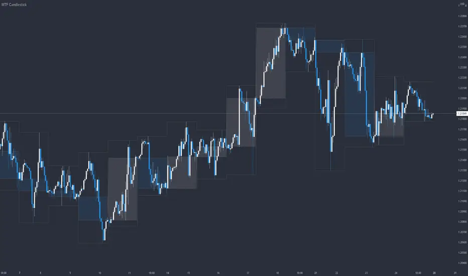
MTF CandlestickOne of the most important thing to understand in order to estimate the trend direction and its continuation is how the lower time frame candlesticks have been formed.
There are many processes by which candlesticks have been formed even if same size.
So in this script, daily candlestick is overlapped on the currently chart as default, and that can be changed.
Only real body is shown so as not to interfere with the currently chart.

Volume With Cash Flow MTF Volume Flow Indicator is an amazing tool used to help determine market direction on multiple time-frames based on the the traded volume .
This indicator is a superb upgrade to my original volume flow indicators.
You now how the option to adjust the displayed volume timeframe, which in turn adjusts the Volume Flow Moving Averages, along with the new Breakout Candle feature.
Additionally, the background colors represent the volume flow crossovers on the primary time-frame, along with three addition time-frames that are user adjustable.
The primary volume flow crossover is shown on the top of the grid, followed by the First Additional Time Frame and then so on down to the bottom.
I generally have this set with the lowest timeframe value at the top, followed by the next one in line.
Note: Since volume amounts vary across the board. The background height is set to readjust based on the highest bars. This lookback amount is adjustable by the user and it does not affect calculations what so ever.
I find, with the standard settings, it works best on the 5 munites timeframe as shown, but again, can be used on any time frame.
For access, send me a DM on TradingView
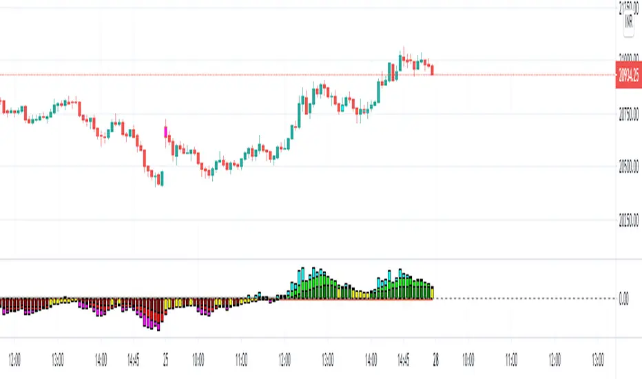
Mtf Rsi Supply/Demand ZonesThis scripts draws supply and demand zones based on the RSI indicator. For example if RSI is under 30 a supply zone is drawn on the chart and extended for as long as there isn't a new crossunder 30. Same goes for above 70. The threshold which by default is set to 30, which means 30 is added to 0 and subtracted from 100 to give us the classic 30/70 threshold on RSI , can be set in the indicator settings.
By only plotting the Demand Below Supply Above indicator you get automatic SD level that is updated every time RSI reaches either 30 or 70. If you plot the Resistance Zone / Support Zone you get an indicator that extends the zone instead of overwrite the earlier zone. Due to the zone being extended the chart can get a bit messy if there isn't a clear range going on.
There is also a "confirmation bars" setting where you can tell the script how many bars under over 30 / 70 you want before a zone is drawn.As you can see, this could be useful "Price Flow" indicator, where we would only short if a zone appears below another zone, or long if two zones in a row are going up, like stairs.
MTF EMA 3Set(Multi Time Frame Exponential Moving Averages 3 Set)Multi Time Frame Exponential Moving Averages 3 Set
One indicator displays the three types of moving averages of the top bar.
It can be used for environment recognition.
It is easy to repel when the 4 hour foot and the pivot overlap.
MTF TZ-CXThis is a Beta version of Trend Indicator using Multi Time Frame Analysis to suggest a long or a short
the main use of this indicator is quick scalping and Intra-day trading.
The Indicator shows the option to show the Trend Zone and Buy/Sell Signals which the use can on or off
Also to avoid false positives we have introduced a double check using RSI,
it is defaulted to 60/30 - the users are free to change it as per their preferences
The system will not suggest a trade when the the counter in inside the RSI limits
Stop Loss - That should be done by following ones risk appetite , Ideally the open/close of the previous candle should be the stop loss for the buy/sell
but everyone has their own Risk Management Strategies based on the capital deployed.
Disclaimer : There could be scenarios when the candle is shown as a long or short and then the candle turns into opposite direction red/green .
In such scenarios , Please refer to the just preceding candle and if this candle is moving into positive direction (forming green candle) only then buy ,
Similarly Sell/Short only if this candle is forming a red candle

MTF Stochastic with automatic divergenceThis is a stochastic indicator that show the stochastic in your current timeframe and also the stochastic from the timeframe above (if current is 15 mins - the above is 1 hour etc). When the 2 stochastics align the background colour highlights to emphasise that. The idea being that you have your current stochastic pushing down improving your change of a successful entry and the stochastic from above pushing down showing there is momentum in that direction.
In addition, the indicator will show when positive and negative divergence occurs on the current timeframe. Divergence can be a little subjective but it seems to find the important ones.
Finally, it highlights when the current stochastic crosses. I was finding once you squash it down it gets difficult to see so I made that easier.
For me I don't tend to use the divergence feature (which is ironic as i found it very hard to code) but being able to see what is happening on the timeframe above is a very effective filter saving me from bad trades.
The script is a little scruffy in places but neat enough to adapt to other indicators. Somewhere I have the same principle for MACD - one of these days I'll find it and make it available.
Hope thats useful to people and good luck.

MTF Anchored VWAPAnchored VWAP is all the rage, but it's just one indicator. That being said, it seems like people want to add more than one at a time so why eat into your indicator cap. This script will allow you to configure 5 AVWAPS at a time.
This will not plot if the time chosen is not in market hour s. Note: market hours may be outside of YOUR timeframe. i.e, the market may open at 7:30 your time, but it will not plot until you change it to 9:30.
Enjoy

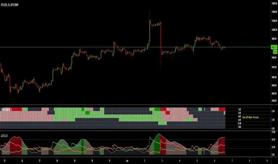
MTF ADX & DI - Monitoring PanelMonitoring panel showing the ADX (Average Directional Index) & DMI (Directional Movement Index) as color code for 6 different timeframes.
This gives a very easy overview on the current state of the market and if it is trending.
- ADX basically describes the strength of a Trend
- DMI give indication on the direction of the trend, usually shown as +DI and -DI
Meanings of the Colors:
ADX is below Low Threshold (no trend) : Black
ADX is above Low Threshold and DI is positive (weak bullish trend) : Light Green
ADX is above High Threshold and DI is positive (strong bullish trend) : Dark Green
ADX is above Low Threshold and DI is negative (weak bearish trend) : Light Red
ADX is above High Threshold and DI is negative (strong bearish trend) : Dark Red
- Low Threshold (default = 20) and High Threshold (default = 50) can be changed in the settings
- Timeframes can be changed, but the description labels are currently hardcoded - if you want to change it, just copy the script and change them
- Currently there are two additional timeframes commented in the code - if you want to use them, just copy the script and uncomment them
Have fun and as always I am open for constructive feedback.
Cheers!