Fractal Sweep Strategy# Fractal Sweep Strategy
A trend-following strategy that trades **sweeps** of fractal highs and lows, using two complementary entry models that can run in parallel.
---
## Concept
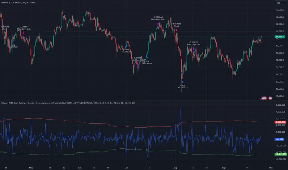
The strategy identifies **fractal points** (local highs/low over N bars) and enters when price **sweeps** them—breaking above a fractal high or below a fractal low—then closes back in the opposite direction. This often signals a rejection and potential reversal.
**Sweep High** → Short bias
**Sweep Low** → Long bias
---
## Entry Models
### 1. Attempted Candle
- **Immediate trade:** The sweep candle itself is bearish (for short) or bullish (for long).
- **Delayed trade:** If the sweep candle is not in the right direction, the strategy waits for the first **Attempted candle**:
- **Short:** Bearish candle with `high > high ` (takes out the prior candle’s high).
- **Long:** Bullish candle with `low < low ` (takes out the prior candle’s low).
- **Entry:** At the close of the Attempted candle (repainting-safe).
- **SL:** Low of the Attempted candle (short) / High of the Attempted candle (long).
- **TP:** CRV × risk (default CRV = 2).
### 2. Trigger Level
- **Setup:** Fractal high is swept by a **bullish** candle, and the **next candle is not** an Attempted candle.
- **Trigger level:** Body low of the sweep candle (`min(open, close)`), ignoring the wick.
- **Activation:** Any later candle closes **below** the trigger level.
- **Entry:** At the close of the breaking candle, or at the open of the next candle if the break is detected one bar late.
- **SL:** High of the sweep candle (Trigger Level candle).
- **TP:** CRV × risk (default CRV = 2).
### Parallel Mode
With **"Both"** selected, both models run at the same time. Pyramiding allows up to 2 short positions (one from each model) when both trigger.
---
## Risk Management
- **Stop Loss:** High/Low of the reference candle (Attempted or Trigger Level candle).
- **Take Profit:** Entry ± (CRV × risk), with separate CRV for each model.
- **Max Trades per Day:** Limits total entries across both models (default: 5).
---
## Optional Filters
### Supertrend H1 (Directional Bias)
- **Off:** No filter.
- **With Trend:** Long only in H1 uptrend, short only in H1 downtrend.
- **Counter Trend:** Long only in H1 downtrend, short only in H1 uptrend.
### Session Filter
- Restricts trades to a time window (e.g. 08:00–17:00) in the selected timezone.
---
## Fractal Settings
- **Bars in Fractal:** 3, 5, 7, or 9 (default: 5).
- **Fractals Timeframe:** Chart TF or higher (e.g. M15 for MTF fractals).
- **Max Age:** Fractals older than N bars are ignored.
---
## Visuals
- Fractal lines and markers (▲/▼).
- SL/TP lines for open trades.
- Optional debug labels (trade explanation, sweep labels, no-trade reasons).
- Optional H1 Supertrend overlay when bias is active.
---
## Repainting Safety
Entries are placed only on **confirmed bars** (`barstate.isconfirmed`), so signals are fixed once the candle closes.
---
## Credits
- **Fractal logic:** Based on MTF Fractals
- **Strategy:** Lean Strategy Blueprint
- **License:** CC BY-NC-SA 4.0
Strategi Pine Script®