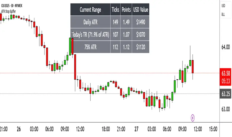
REVE MarkersREVE stands for โRange Extensions Volume Expansionsโ. It seeks to report the same as the REVE which I published before. However the code uses a different algorithm to find the โusual rangeโ or โusual volumeโ to which the current range and volume is compared. In the old REVE a function is coded which mimics a median() function..
In this code the median() function provided in pinescript is used, which makes the code of the actual algorithm nice and short in lines 21 through 27
For example line 23: โmorevol=ta.median(curvol , usual)*eventnormโ in which
โmorevol โ is the calculated level above which the volume is deemed considerable,
โcurvolโ is the current volume (see line 21); curvol the volume of the previous period.
โusualโ is the lookback period (see line 8)
โta.median(curvol , usual)โ is therfore the median volume in the lookback period
โeventnormโ is the percent which sets when โnormalโ becomes โconsiderableโ (see line 6)
In line 26 the same is done for range.
The code in lines 30 to 92, concern logic manipulations to arrive at choosing the appropriate marker, which are plotted in lines 95 through 136.
Using the shapes as provided by Pinescript offers the possibility to give a much better and more meaningful visualization of volume and range events than different colored columns and histograms in the โoldโ REVE in the below panel (see example chart).
Using the Pinescript function to find the median opens the possibility of letting the user play in the inputs with the lookback period and the norms for considerable and excessive to find a setting he or she likes most.
Using median in stead of average is necessary in volume and range analysis because these are so volatile. E.g. range or volume can be 10 times larger in the next period! If you have a few excessive volumes or ranges in the lookback period the โaverage volume or rangeโ is much higher than the โusual volume or rangeโ In statistics this is referred to as the outlier problem.
The markers are located on the bottom of the instrument pane. Those indicating volume events (with โeventโ I mean a considerable or excessive expansion or extension) are colored triangles or squares, triangles indicate direction, squares that the price stays the same. those indicating range events with โnormalโ volume are crosses, plus-cross means considerable range event and x-cross is excessive event.
The red, fuchsia and maroon triangles and squares indicate a combination of volume and range events. I call this โeffective volumeโ because more trade leads to shifting prices. The green and blue triangles and squares indicate a volume event with โnormalโ ranges. I call this โineffective volumeโ because more volume does not lead to price shits. Effective volume can be attributed to occasional traders, because these do not care much for the price effect of their orders. The ineffective volume is attributable to institutional traders, because these go to great length to hide the size of their selling or buying objective by trading many small amounts in a day. Therefore one can theorize that โsmart moneyโ is active when green and blue markers show up.
There is an option in the inputs to show markers around the candles (or bars). Those above indicate volume events, plus-cross for considerable and x-cross for excessive volume.
Those below the candles (or bars) indicate range events, triangles for direction or a plus-cross when the price stays the same. The small ones indicate considerable range events and the big ones excessive range events. This option can be used for better understanding of the colors of the bottom markers or to check which marker applies to which candle or bar.
If the instrument is without volume, the indicator will show only range markers.
Have fun and take care.
Cari dalam skrip untuk "range"
Rolling ATR Channel (Expo)Rolling ATR Channel (Expo) is a sophisticated indicator that identifies the underlying trend as well as identifies ATR based trading ranges. In a trending market, the price will be within the Upper or Lower band. If the market is in a trading range , the price will bounce between the upper and lower ATR zones, until the price breaks through and creates a new trend. The user will no longer have to guess in which state the market is in, the indicator displays it clearly.
So, the indicator displays real-time Range (ATR based) support and resistance zones as well as if the market is in a trend.
If you know the current market state, you have the ability to choose the most applicable market strategy.
Real-time
No repainting
Works on any market and in any timeframe
HOW TO USE
- Use the indicator to identify trading range support and resistance zones.
- Use the indicator to identify when the price breaks through the trading range.
- Use the indicator to identify if the market is in a trend.
INDICATOR IN ACTION
4 Hour chart
I hope you find this indicator useful , and please comment or contact me if you like the script or have any questions/suggestions for future improvements. Thanks!
I will continually work on this indicator, so please share your experience and feedback as it will enable me to make even better improvements. Thanks to everyone that has already contacted me regarding my scripts. Your feedback is valuable for future developments!
-----------------
Disclaimer
Copyright by Zeiierman.
The information contained in my scripts/indicators/ideas does not constitute financial advice or a solicitation to buy or sell any securities of any type. I will not accept liability for any loss or damage, including without limitation any loss of profit, which may arise directly or indirectly from the use of or reliance on such information.
All investments involve risk, and the past performance of a security, industry, sector, market, financial product, trading strategy, or individualโs trading does not guarantee future results or returns. Investors are fully responsible for any investment decisions they make. Such decisions should be based solely on an evaluation of their financial circumstances, investment objectives, risk tolerance, and liquidity needs.
My scripts/indicators/ideas are only for educational purposes!
-----------------
ACCESS THE INDICATOR
โข Contact me on TradingView or use the links below
888 BOT #alertsโ 888 BOT #alerts
This is an Expert Advisor 'EA' or Automated trading script for โlongsโ and โshortsโ, which uses only a Take Profit or, in the worst case, a Stop Loss to close the trade.
It's a much improved version of the previous โRepanochaโ. It doesn`t use 'Trailing Stop' or 'security ()' functions (although using a security function doesn`t mean that the script repaints) and all signals are confirmed, therefore the script doesn`t repaint in alert mode and is accurate in backtest mode.
Apart from the previous indicators, some more and other functions have been added for Stop-Loss, re-entry and leverage.
It uses 8 indicators, (many of you already know what they are, but in case there is someone new), these are the following:
1. Jurik Moving Average
It's a moving average created by Mark Jurik for professionals which eliminates the 'lag' or delay of the signal. It's better than other moving averages like EMA, DEMA, AMA or T3.
There are two ways to decrease noise using JMA. Increasing the 'LENGTH' parameter will cause JMA to move more slowly and therefore reduce noise at the expense of adding 'lag'
The 'JMA LENGTH', 'PHASE' and 'POWER' parameters offer a way to select the optimal balance between 'lag' and over boost.
Green: Bullish, Red: Bearish.
2. Range filter
Created by Donovan Wall, its function is to filter or eliminate noise and to better determine the price trend in the short term.
First, a uniform average price range 'SAMPLING PERIOD' is calculated for the filter base and multiplied by a specific quantity 'RANGE MULTIPLIER'.
The filter is then calculated by adjusting price movements that do not exceed the specified range.
Finally, the target ranges are plotted to show the prices that will trigger the filter movement.
Green: Bullish, Red: Bearish.
3. Average Directional Index (ADX Classic) and (ADX Masanakamura)
It's an indicator designed by Welles Wilder to measure the strength and direction of the market trend. The price movement is strong when the ADX has a positive slope and is above a certain minimum level 'ADX THRESHOLD' and for a given period 'ADX LENGTH'.
The green color of the bars indicates that the trend is bullish and that the ADX is above the level established by the threshold.
The red color of the bars indicates that the trend is down and that the ADX is above the threshold level.
The orange color of the bars indicates that the price is not strong and will surely lateralize.
You can choose between the classic option and the one created by a certain 'Masanakamura'. The main difference between the two is that in the first it uses RMA () and in the second SMA () in its calculation.
4. Parabolic SAR
This indicator, also created by Welles Wilder, places points that help define a trend. The Parabolic SAR can follow the price above or below, the peculiarity that it offers is that when the price touches the indicator, it jumps to the other side of the price (if the Parabolic SAR was below the price it jumps up and vice versa) to a distance predetermined by the indicator. At this time the indicator continues to follow the price, reducing the distance with each candle until it is finally touched again by the price and the process starts again. This procedure explains the name of the indicator: the Parabolic SAR follows the price generating a characteristic parabolic shape, when the price touches it, stops and turns (SAR is the acronym for 'stop and reverse'), giving rise to a new cycle. When the points are below the price, the trend is up, while the points above the price indicate a downward trend.
5. RSI with Volume
This indicator was created by LazyBear from the popular RSI.
The RSI is an oscillator-type indicator used in technical analysis and also created by Welles Wilder that shows the strength of the price by comparing individual movements up or down in successive closing prices.
LazyBear added a volume parameter that makes it more accurate to the market movement.
A good way to use RSI is by considering the 50 'RSI CENTER LINE' centerline. When the oscillator is above, the trend is bullish and when it is below, the trend is bearish.
6. Moving Average Convergence Divergence (MACD) and (MAC-Z)
It was created by Gerald Appel. Subsequently, the histogram was added to anticipate the crossing of MA. Broadly speaking, we can say that the MACD is an oscillator consisting of two moving averages that rotate around the zero line. The MACD line is the difference between a short moving average 'MACD FAST MA LENGTH' and a long moving average 'MACD SLOW MA LENGTH'. It's an indicator that allows us to have a reference on the trend of the asset on which it is operating, thus generating market entry and exit signals.
We can talk about a bull market when the MACD histogram is above the zero line, along with the signal line, while we are talking about a bear market when the MACD histogram is below the zero line.
There is the option of using the MAC-Z indicator created by LazyBear, which according to its author is more effective, by using the parameter VWAP (volume weighted average price) 'Z-VWAP LENGTH' together with a standard deviation 'STDEV LENGTH' in its calculation.
7. Volume Condition
Volume indicates the number of participants in this war between bulls and bears, the more volume the more likely the price will move in favor of the trend. A low trading volume indicates a lower number of participants and interest in the instrument in question. Low volumes may reveal weakness behind a price movement.
With this condition, those signals whose volume is less than the volume SMA for a period 'SMA VOLUME LENGTH' multiplied by a factor 'VOLUME FACTOR' are filtered. In addition, it determines the leverage used, the more volume, the more participants, the more probability that the price will move in our favor, that is, we can use more leverage. The leverage in this script is determined by how many times the volume is above the SMA line.
The maximum leverage is 8.
8. Bollinger Bands
This indicator was created by John Bollinger and consists of three bands that are drawn superimposed on the price evolution graph.
The central band is a moving average, normally a simple moving average calculated with 20 periods is used. ('BB LENGTH' Number of periods of the moving average)
The upper band is calculated by adding the value of the simple moving average X times the standard deviation of the moving average. ('BB MULTIPLIER' Number of times the standard deviation of the moving average)
The lower band is calculated by subtracting the simple moving average X times the standard deviation of the moving average.
the band between the upper and lower bands contains, statistically, almost 90% of the possible price variations, which means that any movement of the price outside the bands has special relevance.
In practical terms, Bollinger bands behave as if they were an elastic band so that, if the price touches them, it has a high probability of bouncing.
Sometimes, after the entry order is filled, the price is returned to the opposite side. If price touch the Bollinger band in the same previous conditions, another order is filled in the same direction of the position to improve the average entry price, (% MINIMUM BETTER PRICE ': Minimum price for the re-entry to be executed and that is better than the price of the previous position in a given %) in this way we give the trade a chance that the Take Profit is executed before. The downside is that the position is doubled in size. 'ACTIVATE DIVIDE TP': Divide the size of the TP in half. More probability of the trade closing but less profit.
โ STOP LOSS and RISK MANAGEMENT.
A good risk management is what can make your equity go up or be liquidated.
The % risk is the percentage of our capital that we are willing to lose by operation. This is recommended to be between 1-5%.
% Risk: (% Stop Loss x % Equity per trade x Leverage) / 100
First the strategy is calculated with Stop Loss, then the risk per operation is determined and from there, the amount per operation is calculated and not vice versa.
In this script you can use a normal Stop Loss or one according to the ATR. Also activate the option to trigger it earlier if the risk percentage is reached. '% RISK ALLOWED' wich is calculated according with: '%EQUITY ON EACH ENTRY'. Only works with Stop Loss on 'NORMAL' or 'BOTH' mode.
'STOP LOSS CONFIRMED': The Stop Loss is only activated if the closing of the previous bar is in the loss limit condition. It's useful to prevent the SL from triggering when they do a โpumpโ to sweep Stops and then return the price to the previous state.
โ ALERTS
There is an alert for each leverage, therefore a maximum of 8 alerts can be set for 'long' and 8 for 'short', plus an alert to close the trade with Take Profit or Stop Loss in market mode. You can also place Take Profit limit and Stop Loss limit orders a few seconds after filling the position entry order.
- 'MAXIMUM LEVERAGE': It is the maximum allowed multiplier of the % quantity entered on each entry for 1X according to the volume condition.
- 'ADVANCE ALERTS': There is always a time delay from when the alert is triggered until it reaches the exchange and can be between 1-15 seconds. With this parameter, you can advance the alert by the necessary seconds to activate it earlier. In this way it can be synchronized with the exchange so that the execution time of the entry order to the position coincides with the opening of the bar.
The settings are for Bitcoin at Binance Futures (BTC: USDTPERP) in 30 minutes.
For other pairs and other timeframes, the settings have to be adjusted again. And within a month, the settings will be different because we all know the market and the trend are changing.
โ 888 BOT (SPANISH)
Este es un Expert Advisor 'EA' o script de trading automatizado para โlongsโ y โshortsโ, el cual, utiliza solo un Take Profit o, en el peor de los casos, un Stop Loss para cerrar el trade.
Es una versiรณn muy mejorada del anterior โRepanochaโ. No utiliza โTrailing Stopโ, ni funciones โsecurity()โ (aunque usar una funciรณn security no significa que el script repinte) y todas las seรฑales son confirmadas, por consiguiente, el script no repinta en modo alertas y es preciso en en el modo backtest.
Aparte de los anteriores indicadores se han aรฑadido algunos mรกs y otras funciones para Stop-Loss, de re-entrada y apalancamiento.
Utiliza 8 indicadores, (muchos ya sabรฉis sobradamente lo que son, pero por si hay alguien nuevo), son los siguientes:
1. Jurik Moving Average
Es una media mรณvil creada por Mark Jurik para profesionales la cual elimina el โlagโ o retardo de la seรฑal. Es mejor que otras medias mรณviles como la EMA, DEMA, AMA o T3.
Hay dos formas de disminuir el ruido utilizando JMA. El aumento del parรกmetro 'LENGTH' harรก que JMA se mueva mรกs lentamente y, por lo tanto, reducirรก el ruido a expensas de aรฑadir โlagโ
Los parรกmetros 'JMA LENGTH', 'PHASE' y 'POWER' ofrecen una forma de seleccionar el equilibrio รณptimo entre โlagโ y sobre impulso.
Verde : Alcista, Rojo: Bajista.
2. Range filter
Creado por Donovan Wall, su funciรณn es la de filtrar o eliminar el ruido y poder determinar mejor la tendencia del precio a corto plazo.
Primero, se calcula un rango de precio promedio uniforme 'SAMPLING PERIOD' para la base del filtro y se multiplica por una cantidad especรญfica 'RANGE MULTIPLIER'.
A continuaciรณn, el filtro se calcula ajustando los movimientos de precios que no exceden el rango especificado.
Por รบltimo, los rangos objetivo se trazan para mostrar los precios que activarรกn el movimiento del filtro.
Verde : Alcista, Rojo: Bajista.
3. Average Directional Index (ADX Classic) y (ADX Masanakamura)
Es un indicador diseรฑado por Welles Wilder para medir la fuerza y direcciรณn de la tendencia del mercado. El movimiento del precio tiene fuerza cuando el ADX tiene pendiente positiva y estรก por encima de cierto nivel mรญnimo 'ADX THRESHOLD' y para un periodo dado 'ADX LENGTH'.
El color verde de las barras indica que la tendencia es alcista y que el ADX estรก por encima del nivel establecido por el threshold.
El color Rojo de las barras indica que la tendencia es bajista y que el ADX estรก por encima del nivel de threshold.
El color naranja de las barras indica que el precio no tiene fuerza y seguramente lateralizarรก.
Se puede elegir entre la opciรณn clรกsica y la creada por un tal 'Masanakamura'. La diferencia principal entre los dos es que en el primero utiliza RMA() y en el segundo SMA() en su cรกlculo.
4. Parabolic SAR
Este indicador, creado tambiรฉn por Welles Wilder, coloca puntos que ayudan a definir una tendencia. El Parabolic SAR puede seguir al precio por encima o por debajo, la particularidad que ofrece es que cuando el precio toca al indicador, este salta al otro lado del precio (si el Parabolic SAR estaba por debajo del precio salta arriba y viceversa) a una distancia predeterminada por el indicador. En este momento el indicador vuelve a seguir al precio, reduciendo la distancia con cada vela hasta que finalmente es tocado otra vez por el precio y se vuelve a iniciar el proceso. Este procedimiento explica el nombre del indicador: el Parabolic SAR va siguiendo al precio generando una caracterรญstica forma parabรณlica, cuando el precio lo toca, se para y da la vuelta (SAR son las siglas en inglรฉs de โstop and reverseโ), dando lugar a un nuevo ciclo. Cuando los puntos estรกn por debajo del precio, la tendencia es alcista, mientras que los puntos por encima del precio indica una tendencia bajista.
5. RSI with Volume
Este indicador lo creo un tal LazyBear de TV a partir del popular RSI.
El RSI es un indicador tipo oscilador utilizado en anรกlisis tรฉcnico y creado tambiรฉn por Welles Wilder que muestra la fuerza del precio mediante la comparaciรณn de los movimientos individuales al alza o a la baja de los sucesivos precios de cierre.
LazyBear le aรฑadiรณ un parรกmetro de volumen que lo hace mรกs preciso al movimiento del mercado.
Una buena forma de usar el RSI es teniendo en cuenta la lรญnea central de 50 'RSI CENTER LINE'. Cuando el oscilador estรก por encima, la tendencia es alcista y cuando estรก por debajo la tendencia es bajista.
6. Moving Average Convergence Divergence (MACD) y (MAC-Z)
Fue creado por Gerald Appel. Posteriormente se aรฑadiรณ el histograma para anticipar el cruce de medias. A grandes rasgos podemos decir que el MACD es un oscilador consistente en dos medias mรณviles que van girando en torno a la lรญnea de cero. La lรญnea del MACD no es mรกs que la diferencia entre una media mรณvil corta 'MACD FAST MA LENGTH' y una media mรณvil larga 'MACD SLOW MA LENGTH'. Es un indicador que nos permite tener una referencia sobre la tendencia del activo sobre el cual se estรก operando, generando de este modo seรฑales de entrada y salida del mercado.
Podemos hablar de mercado alcista cuando el histograma del MACD se sitรบe por encima de la lรญnea cero, junto con la lรญnea de seรฑal, mientras que hablaremos de mercado bajista cuando el histograma MACD se situarรก por debajo de la lรญnea cero.
Estรก la opciรณn de utilizar el indicador MAC-Z creado por LazyBear que segรบn su autor es mรกs eficaz, por utilizar el parรกmetro VWAP (precio medio ponderado por volumen) 'Z-VWAP LENGTH' junto con una desviaciรณn standard 'STDEV LENGTH' en su cรกlculo.
7. Volume Condition
El volumen indica el nรบmero de participantes en esta guerra entre toros y osos, cuanto mรกs volumen mรกs probabilidad de que se mueva el precio a favor de la tendencia. Un volumen bajo de negociaciรณn indica un menor nรบmero de participantes e interรฉs por el instrumento en cuestiรณn. Los bajos volรบmenes pueden revelar debilidad detrรกs de un movimiento de precios.
Con esta condiciรณn se filtran aquellas seรฑales cuyo volumen es inferior a la SMA de volumen para un periodo 'SMA VOLUME LENGTH' multiplicado por un factor 'VOLUME FACTOR'. Ademรกs, determina el apalancamiento utilizado, a mรกs volumen, mรกs participantes, mรกs probabilidad de que se mueva el precio a nuestro favor, es decir, podemos utilizar mรกs apalancamiento. El apalancamiento en este script lo determina las veces que estรก el volumen por encima de la lรญnea de la SMA.
El apalancamiento mรกximo es de 8.
8. Bollinger Bands
Este indicador fue creado por John Bollinger y consiste en tres bandas que se dibujan superpuestas al grรกfico de evoluciรณn del precio.
La banda central es una media mรณvil, normalmente se emplea una media mรณvil simple calculada con 20 perรญodos. ('BB LENGTH' Nรบmero de periodos de la media mรณvil)
La banda superior se calcula sumando al valor de la media mรณvil simple X veces la desviaciรณn tรญpica de la media mรณvil. ('BB MULTIPLIER' Nรบmero de veces la desviaciรณn tรญpica de la media mรณvil)
La banda inferior de calcula restando a la media mรณvil simple X veces la desviaciรณn tรญpica de la media mรณvil.
la franja comprendida entre las bandas superior e inferior contiene, estadรญsticamente, casi un 90% de las posibles variaciones del precio, lo que significa que cualquier movimiento del precio fuera de las bandas tiene especial relevancia.
En tรฉrminos prรกcticos, las bandas de Bollinguer se comporta como si de una banda elรกstica se tratara de manera que, si el precio las toca, รฉste tiene mucha probabilidad de rebotar.
En ocasiones, despuรฉs de rellenarse la orden de entrada, el precio se devuelve hacia el lado contrario. Si toca la banda de Bollinger se rellena otra orden en la misma direcciรณn de la posiciรณn para mejorar el precio medio de entrada, (% MINIMUM BETTER PRICE': Precio mรญnimo para que se ejecute la re-entrada y que sea mejor que el precio de la posiciรณn anterior en un % dado) de esta manera damos una oportunidad al trade de que el Take Profit se ejecute antes. La desventaja es que se dobla el tamaรฑo de la posiciรณn. 'ACTIVATE DIVIDE TP': Divide el tamaรฑo del TP a la mitad. Mรกs probabilidad de que se cierre el trade pero menos ganancias.
โ STOP LOSS y RISK MANAGEMENT.
Una buena gestiรณn de las pรฉrdidas o gestiรณn del riesgo es lo que puede hacer que tu cuenta suba o se liquide en poco tiempo.
El % de riesgo es el porcentaje de nuestro capital que estamos dispuestos a perder por operaciรณn. Este se aconseja que debe estar comprendido entre un 1-5%.
% Risk = (% Stop Loss x % Equity per trade x Leverage) / 100
Primero se calcula la estrategia con Stop Loss, despuรฉs se determina el riesgo por operaciรณn y a partir de ahรญ se calcula el monto por operaciรณn y no al revรฉs.
En este script puedes usar un Stop Loss normal o uno segรบn el ATR. Tambiรฉn activar la opciรณn de que salte antes si se alcanza el porcentaje de riesgo. '% RISK ALLOWED' que se calcula segรบn el porcentaje de tu capital para 1X '% EQUITY ON EACH ENTRY'.
'STOP LOSS CONFIRMED': Solamente se activa el Stop Loss si el cierre de la barra anterior se encuentra en la condiciรณn de lรญmite de pรฉrdidas. Es รบtil para evitar que se dispare el SL cuando hacen un โpumpโ para barrer Stops y luego se devuelve el precio a la normalidad.
โ ALERTAS
Hay una alerta por cada apalancamiento por consiguiente como mรกximo se pueden poner 8 alertas para 'long' y 8 para 'short', mรกs una alerta para cerrar el trade con Take Profit o Stop Loss en modo market. Tambien puedes colocar las ordenes Take Profit limit y Stop Loss limit unos segundos despues de rellenar la orden de entrada de la posiciรณn.
- 'MAXIMUM LEVERAGE': Es el mรกximo multiplicador permitido de la cantidad introducida para 1X segรบn la condiciรณn de volumen.
- 'ADVANCE ALERTS': Siempre existe un retardo de tiempo desde que se activa la alerta hasta que llega al exchange y que puede ser de entre 1-15 segundos. Con este pรกrametro se puede adelantar la alerta los segundos necesarios para que se active antes. De este modo se puede sincronizar con el exchange para que el tiempo de ejecuciรณn de la orden de entrada a la posiciรณn coincida con la de apertura de la barra.
Los settings son para Bitcoin en Binance Futures (BTC:USDTPERP) en 30 minutos.
Para otro pares y otras temporalidades se tienen que ajustar las opciones de nuevo. Ademรกs para dentro de un mes, los ajustes serรกn otros distintos ya que el mercado y la tendencia es cambiante.
Opening RangeThe Opening Range indicator highlights the high, low, and midpoint of the first hour (1H) of each trading day and the first four hours (4H) of each trading week. These ranges are displayed as rectangles, providing key support, resistance, and breakout levels.
Features
1H Daily Range: Shows the opening range for the first hour of each trading day.
4H Weekly Range: Shows the opening range for the first four hours of each trading week.
Middle Line: Displays a dotted line at the midpoint of each range for additional reference.
Labels: Marks each range with "OR.1H" or "OR.4H" for easy identification.
Customizable: Adjust colors, toggle visibility, and set the number of ranges to display.
How to Use
Use the high and low of the range as potential support and resistance levels.
Watch for breakouts above or below the range for trading opportunities.
Use the midpoint line as a reference for mean reversion or trend analysis.
Weighted Moving Range with Trend Signals (WMR-TS)Weighted Moving Range with Trend Signals (WMR-TS)
Technical analysis involves analyzing statistical trends from trading activity , such as price movement and volume, to make trading decisions. Technical indicators are mathematical calculations based on the price, volume, or open interest of a security or contract. They are used by traders to analyze price movements and predict future market behavior. The WMR-TS indicator combines weighted moving averages and range calculations to identify key trading levels and generate buy/sell signals. It dynamically adjusts to market conditions, offering traders insights into potential support, resistance, and trend reversal points. Key levels are color-coded for quick interpretation. It utilizes weighted moving averages (WMA) and range calculations to determine these levels, making it a robust tool for both trending and ranging markets.
SUMMARY
Parameters :
WMA Length : Determines the length for the primary weighted moving average.
Highest High Length : Sets the period for calculating the highest high.
Lowest Low Length : Sets the period for calculating the lowest low.
Range Corrector : Adjusts the range calculation slightly for fine-tuning.
Top Level : Multiplier for determining the top level from the calculated range.
Bottom Level : Multiplier for determining the bottom level from the calculated range.
Levels Visibility : Sets how many recent bars will display the levels.
Trading Zones :
Short Area : Highlighted zone indicating potential shorting opportunities.
Long Area : Highlighted zone indicating potential buying opportunities.
The Levels :
Wave (Yellow): Midpoint of the calculated range, adjusted by WMA.
Top Level (Red): Calculated upper boundary of the trading range.
Sell Level (Pink): Intermediate sell level.
Resistance Level (Magenta): Immediate resistance level.
Support Level (Cyan): Immediate support level.
Buy Level (Light Green): Intermediate buy level.
Bottom Level (Dark Green): Calculated lower boundary of the trading range.
Interpreting the Signals :
Hammer Signal : Red circles above bars indicate potential sell signals.
Rocket Signal : Green circles below bars indicate potential buy signals.
KEY CONCEPTS
Highest High and Lowest Low :
These values represent the highest high ( HH ) and lowest low ( LL ) over a specified number of periods.
Support Level :
This is the lower boundary of the trading range. It is a price level where demand is strong enough to prevent the price from falling further. As the price approaches the support level, it is likely to bounce back up.
Resistance Level :
This is the upper boundary of the trading range. It is a price level where supply is strong enough to prevent the price from rising further. As the price approaches the resistance level, it is likely to pull back down.
THE USE OF MULTIPLIERS :
The script uses several multipliers to adjust and fine-tune the calculated support and resistance levels, as well as to control the range and sensitivity of these levels. Here is a detailed explanation of these multipliers and their purpose:
Range Corrector : This multiplier adjusts the calculated high ( H ) and low ( L ) levels, adding flexibility to how these levels are positioned relative to the highest high and lowest low. It ranges from -1 to 1 , with a default value of 0 . The use of positive values increase the range, making the calculated levels further apart. Thus, using negative values decrease the range, bringing the calculated levels closer together.
Top Level : This multiplier adjusts the distance of the top level from the calculated high H ) level. It fluctuates from 0 to 2 , with a default value of 0.382 . Higher values will push the top level further above the high level, while lower values will bring it closer.
Bottom Level : This multiplier adjusts the distance of the bottom support level from the calculated low support level. Ranging from 0 to 2, with a default value of 0.214, the higher values will push the bottom level further below the low level, while lower values will bring it closer.
The script plots the support and resistance levels on the chart, allowing traders to visualize the trading range. Color-coded zones are used to indicate areas where buying or selling opportunities may arise based on the current price relative to the trading range. A trading range refers to the area between a price's support and resistance levels over a specific period of time. Within this range, the price of the security fluctuates up and down but does not break out above the resistance or below the support. Support and resistance levels to make trading decisions. Buying near the support level and selling near the resistance level is a common strategy. When the price moves above the resistance level, it is called a breakout . A breakout often indicates that the price may start a new upward trend . Conversely, when the price moves below the support level, it is called a breakdown . A breakdown often indicates that the price may start a new downward trend . By understanding and utilizing trading ranges, traders can make more informed decisions, optimize their trading strategies, and manage risk more effectively.
Understanding Moving Averages
A moving average (MA) is a widely used technical indicator that helps smooth out price data by creating a constantly updated average price. The main purpose of using a moving average is to identify the direction of the trend and to reduce the "noise" of random price fluctuations. The Weighted Moving Average ( WMA ) assigns different weights to each period, with more recent periods typically given more weight. A 10-day WMA might give the most recent day a weight of 10, the second most recent day a weight of 9, and so on. It is useful for traders who want to emphasize recent price data more than older data. When the price is above the moving average, it suggests an Bullish trend . A Bearish Trend is expected to take place when the price is below the moving average. Understanding the price reactions around these levels can be used to make trading decisions.
APPLYING CONCEPTS
Support and Resistance Calculations in the Script :
The script calculates dynamic support and resistance levels using weighted moving averages ( WMA s) and the highest high and lowest low over specified periods. Buy ( Rocket ) and sell ( Hammer ) signals are generated based on the crossing of the price with calculated top and bottom levels.These signals help traders identify potential entry and exit points within the trading range .
Weighted Moving Average (WMA) Application in the Script
This script calculates a special trendWMA using the close price that helps in creating a more dynamic moving average that considers both high and low price actions. This modified WMA is used in conjunction with highest high and lowest low values over specified periods to calculate dynamic support and resistance levels.
Explanation of the Levels in the Script
By understanding these levels, traders can make more informed decisions about where to enter and exit trades, manage risk, and anticipate potential market movements. The script incorporates several key levels levels that traders can use to better anticipate price movements and make more informed trading decisions. Leveraging the principles of Fibonacci retracement ratios ( 23.6%, 38.2%, 50%, 61.8%, and 100% ) to identify key support and resistance zones can also serve for gauging the overall market sentiment.
Top Level and Sell Leve l: Used to identify potential resistance zones where the price may reverse or pause.
Support Level and Buy Level : Used to identify potential support zones where the price may bounce.
Upper and Lower Pivot Values : Serve as intermediate levels for possible price retracements or extensions within the trading range.
Wave Level : Indicates the central trend direction, which can be useful for gauging the overall market sentiment.
Alerts are a crucial part of the script as they notify traders of potential buy and sell signals based on predefined conditions. There are two main alerts: one for a " Hammer " signal (sell condition) and one for a " Rocket " signal (buy condition).
Adjust the input parameters to fit your trading style and the specific asset being analyzed. Shorter lengths may be more responsive to price changes but can produce more false signals , while longer lengths provide smoother signals but may lag . Always backtest the indicator on historical data to understand its behavior and performance. Also remember that different markets may require different parameter settings for optimal performance.
Keep in mind that by nature like all moving averages, WMAs lag behind price action. This means that signals may be delayed. The indicator performs differently in various market conditions. Always consider the overall market context when interpreting signals.
Adjusting parameters like the range corrector and visibility can help tailor the indicator to specific market conditions or trading strategies, improving its effectiveness. The script uses the calculated levels to plot lines and fill zones on the chart, helping traders visualize potential support, resistance, and trend reversal points. The use of multipliers allows for dynamic adjustment of these levels, making the indicator flexible and adaptable to different market conditions.
I think traders can make more informed decisions about where to enter and exit trades, manage risk, and anticipate potential market movements following this code. Stay safe and always remember that market is always changing. Use this tool if you want, please stay informed and plan safe trades,
D.
Donchian Trend Ranges [AlgoAlpha]๐๐ Donchian Trend Ranges ๐๐
Elevate your trading game with the Donchian Trend Ranges indicator from AlgoAlpha! ๐๐ This advanced tool helps you visualize market trends and potential reversal points using Donchian channels, volatility measures, and average true range (ATR).
Key Features
โ๏ธ Customizable Parameters: Adjust the lookback period and range multiplier to fit your trading style.
๐จ Color-Coded Trends: Easily distinguish between uptrends and downtrends with customizable colors.
๐ Dynamic Channels: Visualize multiple dynamic channels based on Donchian ranges and volatility.
โ๏ธ Trend Clouds: See market strength and weakness with upper and lower trend clouds.
๐ Signal Alerts: Get notified of potential trend shifts and take profit points.
How to Use
๐ Add the Indicator: Add the indicator to favorites. Customize settings such as the lookback period and range multiplier to match your trading needs.
๐ Analyze Trends: The indicator calculates the highest and lowest prices over a specified period to create dynamic channels. It then uses standard deviation and ATR to adjust these channels for market volatility, plotting upper and lower ranges. Green bars indicate an up trend and red bars for a down trend.
๐ Set Alerts: Enable notifications for bullish and bearish trend shifts, as well as weak and strong take profit points, ensuring you never miss an opportunity.
How it Works
The Donchian Trend Ranges indicator calculates the highest and lowest prices over a specified period to create a basis line. It creates a range around the basis based on standard deviations and the clouds' width is determined by a 14 period ATR. The basis line and bar colors changes based on whether the closing price is above or below it, indicating trends. Clouds around these lines represent market reversal zones that can be used as entry levels when used in confluence with momentum indicators, visual signals ("X" and "โ") marking strong and weak take profit points are also printed when the prices revert from the clouds towards the basis. Integrated alerts notify you of significant events like trend shifts and take profit signals, keeping you informed without constant monitoring.
Unleash the power of the Donchian Trend Ranges in your trading strategy! ๐๐โจ
KNN ATR Dual Range Predictions [SS]Excited to release this indicator!
I wanted to do a machine learning, ATR based indicator for a while, but I first had to learn about machine learning algos haha.
Now that I have created a KNN based regression methodology (shared in a previous indicator), I can finally do it!
So this is a Nearest Known Neighbor or KNN regression based indicator that uses ATR (average ranges) to predict future ranges.
It operates by calculating the move from High to Open and Open to Low and performing KNN regression to look for other, similar instances of similar movements and what followed those movements.
It provides for 2 methods of KNN regression, the traditional Cluster method (where it identifies a number of clusters within a tolerance range and averages them out), or the method of last instance (where it finds the most recent identical instance and plots the result from that).
You can toggle the parameters as you wish, including the:
a) Type of Regression
b) Number of Clusters
c) Tolerance for Clusters
Others functions:
The indicator provides for the ability to view 2 different timeframe targets. The default calculation is the current timeframe you are on. So if you are on the 1 minute, 5 minute or 1 hour, it will automatically default the primary range to this timeframe. This cannot be changed.
But it permits for a second prediction to be calculated for a timeframe you can specify. The example in the chart above is the 1 hour overlaid on the 5 minute chart.
You can see how the model is performing in the statistics table. The statistics table can be removed as well if you don't want it overlaid on your chart.
You can also toggle off and on the various ranges. IF you only want to visualize 1 hour levels on a 5 minute chart, you can toggle off the bands and just view the higher tf data. Inversely, if you only want the current timeframe data and not the higher tf data, you can toggle the higher tf data off as well.
General Use Tips:
Some general use tips include:
๐ฏThe default settings are appropriate for most common tickers. Because this is performing an autoregression on itself, the parameters tend to be more tight vs. performing dual correlation between two separate tickers which are sizably different in scale (which would require a higher tolerance).
Here is an example of YM1!, which is a sizably larger ticker, however it is performing well with the current settings.
๐ฏ If you get not great results from your ranges or an error in the correlation table, something like this:
It means the parameters are too tight for what you want to do and it is having trouble identifying other, similar cases (in this case, the lookback length was significantly shortened). The first step is to:
a) Expand your lookback range (up to 500 is usually sufficient). This should resolve most issues in most cases. If not:
b) If you are using the Cluster method, try broadening your cluster tolerance by 0.5 increments.
Between those two implementations, you should get a functional model. And it actually honestly hasn't happened to me in general use, I had to force that example by significantly shortening the lookback period.
Concluding Remarks
And that's pretty much the indicator.
I hope you enjoy it! I was really excited to be finally able to do it, like I said I attempted to do this for a while but needed to research the whole KNN process and how its performed.
Enjoy and leave your comments and questions below!
The HoneyChai RSI by CoffeeShopCryptoHere is a fun new way to view the RSI. A new TradingView Indicator for you RSI enthusiasts. This is the Honey Chai RSI Indicator.
This indicator combines the RSI oscillator with additional features to enhance its functionality and visual study.
The purpose of this indicator is to provide a more comprehensive view of the RSI and aid in identifying trends, potential entry / exit points, and ranging conditions.
How it's Built.
The RSI:
The RSI is represented by its common line which you can turn on and off, as usual.
Japanese candlesticks:
In this indicator, are also Japanese candlesticks giving you their representation of the RSI. This provides a clearer visualization of the RSI movements across its Open, High, Low, and Close, unlike the OHLC of the Heiken Ashi candles in the Heiken Ashi Algo.
In addition to the RSI line and Japanese candles, there are two moving averages applied to the RSI value. For the purpose of keeping with my CoffeeShop theme, the High average line is the Honey Line and the Low average line is the Chai Line. The user can choose between Exponential Moving Average or Simple Moving average. These moving averages are calculated based on the high vs low values of the past RSI readings, with the high average acting as the leading line.
When the Honey line is above the Chai Line, it indicates an uptrend, whereas when the Honey Line is below the Chai Line, it suggests a downtrend.
If the price is moving up but the Honey line is still below the Chai line, you're technically still in a downtrend and you should trade this like a pullback.
Identifying Trends.
To identify short entries, you need to wait for the Japanese candles to open and close below the Honey line while the Honey line is below the Chai Line. Conversely, you wait for the Japanese candles to open and close above the Honey line while the Honey line is above the Chai Line. This confirmation helps in identifying potential reversal points.
Range Bound Market.
The indicator also incorporates a visual representation of a ranging area. The 60 and 40 levels of the RSI are visually differentiated to indicate this range. When the Japanese candles are opening and closing within this range and the RSI remains contained within these levels, it suggests that the price is likely in a ranging phase, and traders should wait for a breakout from this range before taking action.
In summary, this custom indicator provides a comprehensive view of the RSI oscillator by incorporating Japanese candlestick visuals, moving averages, and a visual representation of the ranging area. By analyzing these elements, traders can gain insights into trends, potential entry points, and ranging conditions in the market.
---------HOW TO TRADE-----------
LONGS AND SHORTS
An example on how to use this in a long trade is to wait for your moving averages to be high (yellow) over low (orange). For the purpose of the description in this indicator you're looking for the honey to be over the chai.
Even if the RSI and Japanese candles in the oscillator are falling, however the honey is above the Chai, you are still in an uptrend.
The positioning of the moving averages will always determine the direction of the overall price trend so in this position you're looking for long entries.
take a long position as an entry when the open and the close of the Japanese candle in the oscillator is above your honey line.
when you notice a bearish candle closing below the honey line in an uptrend position you can exit your trade.
Confluence for short trades would be just the opposite and using the moving averages in an upside down pattern. In other words the honey needs to be below the chai and your Japanese candle needs to be closing bearish however they open and the close of that candle needs to be below both of your moving averages. exit when you get a bullish candle closing in between the averages.
TRADING RANGES
Wait for your moving average to enter into the range bound 60/40 area as well as your Japanese candles to Wick above and below this area but not close above and below the area.
At this point you can mark off the high and the low of the range as it pertains to your price chart and start using your range trading strategy.
Key Intraday Range Analysis - K.I.R.A. The KIRA Indicator is a unique tool designed to provide traders with actionable insights by identifying and analyzing key intraday price ranges. Built upon a specialized methodology, it uses Fibonacci-derived levels anchored to significant opening ranges to generate trading levels for the day. Unlike other indicators that focus on broader trend analysis, KIRAโs approach provides precision, simplicity, and adaptability for intraday traders.
How It Works
KIRA takes the first 30-second range of the European market open and calculates Fibonacci projections derived solely from the golden ratio. These projections form potential areas of interest, such as support and resistance levels, that guide traders in their decision-making process.
By visualizing these levels directly on the chart, KIRA simplifies intraday trading, helping traders identify key reaction zones with high clarity.
Key Features:
-Clean and Readable Output: Generates easily identifiable levels directly on a clear chart to reduce visual clutter.
-Dynamic and Adaptive: Works across various assets, including indices, forex, and commodities, while maintaining reliability on lower timeframes.
How to Use
1. Set Up: Ensure your chart timeframe is aligned with intraday trading, ideally 1-minute or 5-minute intervals.
2. Monitor Levels: Observe how price reacts to the projected levels generated from the opening range.
3. Strategize: Use these levels as potential entries, exits, or areas to tighten risk management, depending on price action.
Unlike conventional indicators that reuse public domain methodologies or classic technical analysis tools, KIRA is based on a nuanced approach to anchoring Fibonacci projections. Its uniqueness lies in its precise application of golden ratio derivatives, specifically tailored to intraday price movements.
The chart accompanying this script provides a clean visualization of the KIRA levels applied to a 1-minute chart of . All outputs are directly from the KIRA script to ensure clarity and ease of use.
RTH/ETH Session RangesSimple script that adds a table to the bottom left of the chart - shows the high and low of the Full Session with range, and shows the high and low of the RTH/USA session with same calculations.
This simple script enhances your charting experience by adding a comprehensive table to the bottom left corner of your trading chart. The table is designed to provide key market data at a glance, specifically focusing on the high and low metrics for different trading sessions. Here's a breakdown of what the script offers:
Features of the Script
Full Session Data:
High: The highest price point reached during the entire trading session.
Low: The lowest price point reached during the entire trading session.
Range: The difference between the high and low prices, providing insight into the session's volatility.
RTH/USA Session Data (Regular Trading Hours):
High: The highest price point reached during the RTH, typically reflecting the most active part of the trading day.
Low: The lowest price point reached during the RTH.
Range: The difference between the high and low prices during the RTH, indicating the session's intraday volatility.
How to Use the Script for Trading
Identify Key Levels:
Use the high and low points to identify significant support and resistance levels. These levels can guide your entry and exit points, helping you make informed trading decisions.
Gauge Market Volatility:
The range values for both the Full Session and RTH provide a quick snapshot of market volatility. Higher ranges suggest more significant price movements, which can inform your risk management strategies and position sizing.
Compare Sessions:
By comparing the Full Session data with the RTH data, you can identify differences in price behavior between the broader market hours and the more active trading periods. This comparison can help in understanding market dynamics and planning trades accordingly.
Unique Aspects of the Script
Ease of Access: The table's placement in the bottom left corner ensures that it is always visible without obstructing the main chart view, allowing for quick reference without disrupting your analysis.
Comprehensive Insights: By covering both the Full Session and RTH, the script provides a holistic view of the market, catering to traders who focus on different timeframes.
Customization Potential: Although simple, the script can be customized further to include additional metrics or visual tweaks to better suit individual trading strategies.
Practical Example
Imagine you're trading a particular stock and want to decide on a potential breakout strategy. By using this script, you can quickly identify the high of the Full Session as a potential breakout point. If the price approaches this level during the RTH, you can prepare to enter a trade with the confidence that this level has previously acted as a significant resistance. Conversely, knowing the low of the RTH can help you set stop-loss orders to manage risk effectively.
TrendCylinder (Expo)โ Overview
The TrendCylinder is a dynamic trading indicator designed to capture trends and volatility in an asset's price. It provides a visualization of the current trend direction and upper and lower bands that adapt to volatility changes. By using this indicator, traders can identify potential breakouts or support and resistance levels. While also gauging the volatility to generate trading ranges. The indicator is a comprehensive tool for traders navigating various market conditions by providing a sophisticated blend of trend-following and volatility-based metrics.
โ How It Works
Trend Line: The trend line is constructed using the closing prices with the influence of volatility metrics. The trend line reacts to sudden price changes based on the trend factor and step settings.
Upper & Lower Bands: These bands are not static; they are dynamically adjusted with the calculated standard deviation and Average True Range (ATR) metrics to offer a more flexible, real-world representation of potential price movements, offering an idea of the market's likely trading range.
โ How to Use
Identifying Trends
The trend line can be used to identify the current market trend. If the price is above the trend line, it indicates a bullish trend. Conversely, if the price is below the trend line, it indicates a bearish trend.
Dynamic Support and Resistance
The upper and lower bands (including the trend line) dynamically change with market volatility, acting as moving targets of support and resistance. This helps set up stop-loss or take-profit levels with a higher degree of accuracy.
Breakout vs. Reversion Strategies
Price movements beyond the bands could signify strong trends, making it ideal for breakout strategies.
Fakeouts
If the price touches one of the bands and reverses direction, it could be a fakeout. Traders may choose to trade against the breakout in such scenarios.
โ Settings
Volatility Period: Defines the look-back period for calculating volatility. Higher values adapt the bands more slowly, whereas lower values adapt them more quickly.
Trend Factor: Adjusts the sensitivity of the trend line. Higher values produce a smoother line, while lower values make it more reactive to price changes.
Trend Step: Controls the pace at which the trend line adjusts to sudden price movements. Higher values lead to a slower adjustment and a smoother line, while lower values result in quicker adjustments.
-----------------
Disclaimer
The information contained in my Scripts/Indicators/Ideas/Algos/Systems does not constitute financial advice or a solicitation to buy or sell any securities of any type. I will not accept liability for any loss or damage, including without limitation any loss of profit, which may arise directly or indirectly from the use of or reliance on such information.
All investments involve risk, and the past performance of a security, industry, sector, market, financial product, trading strategy, backtest, or individual's trading does not guarantee future results or returns. Investors are fully responsible for any investment decisions they make. Such decisions should be based solely on an evaluation of their financial circumstances, investment objectives, risk tolerance, and liquidity needs.
My Scripts/Indicators/Ideas/Algos/Systems are only for educational purposes!
Liquidation Ranges + Volume/OI Dots [Kioseff Trading]Hello!
Introducing a multi-faceted indicator "Liquidation Ranges + Volume Dots" - this indicator replicates the volume dot tools found on various charting platforms and populates a liquidation range on crypto assets!
Features
Volume/OI dots populated according to user settings
Size of volume/OI dots corresponds to degree of abnormality
Naked level volume dots
Fixed range capabilities for volume/OI dots
Visible time range capabilities for volume/OI dots
Lower timeframe data used to discover iceberg orders (estimated using 1-minute data)
S/R lines drawn at high volume/OI areas
Liquidation ranges for crypto assets (10x - 100x)
Liquidation ranges are calculated using a popular crypto exchange's method
# of violations of liquidation ranges are recorded and presented in table
Pertinent high volume/OI price areas are recorded and presented in table
Personalized coloring for volume/OI dots
Net shorts / net long for the price range recorded
Lines shows reflecting net short & net long increases/decreases
Configurable volume/OI heatmap (displayed between liquidation ranges)
And some more (:
Liquidation Range
The liquidation range component of the indicator uses a popular crypto exchange's calculation (for liquidation ranges) to populate the chart for where 10x - 100x leverage orders are stopped out.
The image above depicts features corresponding to net shorts and net longs.
The image above shows features corresponding to liquidation zones for the underlying coin.
The image above shows the option to display volume/oi delta at the time the corresponding grid was traded at.
The image above shows an instance of using the "fixed range" feature for the script.
*The average price of the range is calculated to project liquidation zones.
*Heatmap is calculated using OI (or volume) delta.
Huge thank you to Pine Wizard @DonovanWall for his range filter code!
Price ranges are automatically detected using his calculation (:
Volume / OI Dots
Similar to other charting platforms, the volume/OI dots component of the indicator distinguishes "abnormal" changes in volume/OI; the detected price area is subsequently identified on the chart.
The detection method uses percent rank and calculates on the last bar of the chart. The "agelessness" of detection is contingent on user settings.
The image above shows volume dots in action; the size of each volume dot corresponds to the amount of volume at the price area.
Smaller dots = lower volume
Larger dots = higher volume
The image above exemplifies the highest aggression setting for volume/OI dot detection.
The table oriented top-right shows the highest volume areas (discovered on the 1-minute chart) for the calculated period.
The open interest change and corresponding price level are also shown. Results are listed in descending order but can also be listed in order of occurrence (most relevant).
Additionally, you can use the visible time range feature to detect volume dots.
The feature shows and explains how the visible range feature works. You select how many levels you want to detect and the script will detect the selected number of levels.
For instance, if I select to show 20 levels, the script will find the 20 highest volume/OI change price areas and distinguish them.
The image above shows a narrower price range.
The image above shows the same price range; however, the script is detecting the highest OI change price areas instead of volume.
* You can also set a fixed range with this feature
* Naked levels can be used
Additionally, you can select for the script to show only the highest volume/ OI change price area for each bar. When active, the script will successively identify the highest volume / OI change price area for the most recent bars.
Naked Levels
The image above shows and explains how naked levels can be detected when using the script.
And that's pretty much it!
Of course, there're a few more features you can check out when you use the script that haven't been explained here (:
Thank you again to @DonovanWall
Thank you to @Trendoscope for his binary insertion sort library (:
Thank you to @PineCoders for their time library
Thank you for checking this out!
Highs/Lows difference [OrganicPunch]Highs/Lows difference indicator
To visually evaluate the difference between highs and lows of a price range.
This handsome indicator shows:
difference between highs of 2 candles by displaying it in green histogram
difference between lows of 2 candles by displaying it in red histogram
difference between both highs and lows by displaying a circle at the level of the difference
To read the numerical value, point at the circle of the relevant bar you are interested in, and see the scale.
Indicator is useful in creating strategies where you want to filter out consolidations/ranges (or to locate them), e.g. "Open trade when H/L difference is larger than 200", or "Look for candles with H/L difference lesser than 50".
The exact value of needed H/L difference can be found using this indicator.
$0 Monthly Weekly & Daily OHLC Viewer
Visualizer of current or previous month(s), week(s) & days ranges
Purpose: View last Monthly, Weekly, Daily, and/or a custom time interval OHLC, i.e. previously closed/confirmed or the ongoing higher time interval ranges
Main configurations available:
- 2 main reporting modes: View the current/ongoing M/W/D candles' OHLC (live, repaints) or report OHLC of last closed ones, i.e. previous Montly, Weekly and/or Daily
- View only latest Monthly, Weekly and/or Daily OHLC (lines) or all past ones (~channel)
- Set your own time interval for its price range(s) to be reported, e.g. last quarter '3M', 12H '720', or hide it
- View one specific day of the week OHLC reported all over the week
Graphic/visual configuration:
- Show the High & Low levels or not
- Show the Open & close levels or not
- Display a background color between top & down or lines only
- Change the background color depending if is/was rising or falling price
- Highlight the top & down breaches of higher timeframe resolution candles: Daily breaching last Weekly range, and/or the Weekly the Monthly one
- Colors & styling can be edited from the indicator's styling configuration panel
Depending on its expected usage, those configurations enable to:
- Consider previously closed candles OLHC as reference top & down ranges (support & resistance, breaches)
- Review chart's current candles evolution within their higher time interval / candle (M/W/D)
- Consider specific week days' range as a reference for the week trend
- Have a general overview of the market evolution trends
Default config is to view current candles evolving within their higher time interval / candle, while reporting last previously closed M+W is a preferred usage. Play with the config settings to find your setup.
View ongoing M+W+D OHLC with dynamic background color:
View previously closed M+W+D OHLC:
View closed H&L for M+W+D, latest only:
View Mondays' OHLC:
Feedback & support welcome.
FxCanli RangeFxCanli Range is an indicator based on ICT Internal Range and External Range concept.
What is ICT Internal Range Liquidity?
The Fair Value Gap is marked as the ICT internal range liquidity.
ICT Fair Value Gap is marked as the liquidity because it is a formation of three candles leaving an area between high and low of 1st and 3rd candle where price do not overlap.
FxCanli Range Indicator draws all Internal Ranges above explaining the ICT internal range liquidity.
What is Imbalance (FVG)?
Fair Value Gaps are price jumps caused by imbalanced buying and selling pressures.
A bullish Fair Value Gap is created when there is a gap between the high of the first candle and the low of the third candle.
A bearish Fair Value Gap is created when there is a gap between the low of the first candle and the high of the third candle.
What is ICT External Range Liquidity?
The swing high and swing low of an ICT dealing range are termed as external range.
The high of an ICT dealing range is termed as โbuy side liquidityโ assuming the buy stops rest above the high of dealing range.
While the low of an ICT dealing range is known as โsell side liquidityโ assuming the sell stops resting below the low of dealing range.
FxCanli Range Indicator draws all External Ranges above explaining the ICT external range liquidity
๐ถ USAGE & EXAMPLES
As ICT said us, Price moves 2 side, Internal Liquidity or External Liquidity
External Range Liquidity to Internal Range Liquidity
When price reached to External Range, it will sweep the External Range Liquidity
at that time, we have to wait price to reverse and start to move to Internal range liquidity (FVG)
our strategy has to be like this; we have to open 2 time less lower time frame
if we are at 1 hour chart, we have to open 1Hour - 15 min - 5 min chart
and wait for Trend Reversal pattern at there
Internal Range Liquidity to External Range Liquidity
When price reached to Internal Range(FVG), it will fill the imbalance
at that time, we have to wait price to reverse and start to move to External Range Liquidity.
Again we have to decrease our time frame 2 times.
if we are at 1 hour chart, we have to open 1Hour -> 15 min -> 5 min chart
and wait for Trend Reversal pattern at there
๐ถ SETTINGS
With the settings;
โช๏ธ Fractal Properties;
it will show fractals or not, you will decide the period of fractals, Style, Color and also Size of the fractal
โช๏ธ Trend Line Properties;
it will show trend or not, you will decide the color of the trend, line style, and line width.
โช๏ธ External Range Properties;
it will show external range or not, Color of the level, line style, line witdh, show text of the external range, what will it write at the text, place/size/color of the text, show time frame, show price,
โช๏ธ Internal Range Properties;
it will show internal range or not, Color of the level, line style, line witdh, show text of the external range, what will it write at the text, place/size/color of the text, show time frame, show price,
โช๏ธ Alert Conditions
you will set alerts at this part
Alert or not, liquidity(External Range) alerts, FVG(Internal Range) alerts, FVG filled alert
Part 1
Part 2
Wish you great trades...
Judas Swing ICT 01 [TradingFinder] New York Midnight Opening M15๐ต Introduction
The Judas Swing (ICT Judas Swing) is a trading strategy developed by Michael Huddleston, also known as Inner Circle Trader (ICT). This strategy allows traders to identify fake market moves designed by smart money to deceive retail traders.
By concentrating on market structure, price action patterns, and liquidity flows, traders can align their trades with institutional movements and avoid common pitfalls. It is particularly useful in FOREX and stock markets, helping traders identify optimal entry and exit points while minimizing risks from false breakouts.
In today's volatile markets, understanding how smart money manipulates price action across sessions such as Asia, London, and New York is essential for success. The ICT Judas Swing strategy helps traders avoid common pitfalls by focusing on key movements during the opening time and range of each session, identifying breakouts and false breakouts.
By utilizing various time frames and improving risk management, this strategy enables traders to make more informed decisions and take advantage of significant market movements.
In the Judas Swing strategy, for a bullish setup, the price first touches the high of the 15-minute range of New York midnight and then the low. After that, the price returns upward, breaks the high, and if thereโs a candlestick confirmation during the pullback, a buy signal is generated.
bearish setup, the price first touches the low of the range, then the high. With the price returning downward and breaking the low, if thereโs a candlestick confirmation during the pullback to the low, a sell signal is generated.
๐ต How to Use
To effectively implement the Judas Swing strategy (ICT Judas Swing) in trading, traders must first identify the price range of the 15-minute window following New York midnight. This range, consisting of highs and lows, sets the stage for the upcoming movements in the London and New York sessions.
๐ฃ Bullish Setup
For a bullish setup, the price first moves to touch the high of the range, then the low, before returning upward to break the high. Following this, a pullback occurs, and if a valid candlestick confirmation (such as a reversal pattern) is observed, a buy signal is generated. This confirmation could indicate the presence of smart money supporting the bullish movement.
๐ฃ Bearish Setup
For a bearish setup, the process is the reverse. The price first touches the low of the range, then the high. Afterward, the price moves downward again and breaks the low. A pullback follows to the broken low, and if a bearish candlestick confirmation is seen, a sell signal is generated. This confirmation signals the continuation of the downward price movement.
Using the Judas Swing strategy enables traders to avoid fake breakouts and focus on strong market confirmations. The strategy is versatile, applying to FOREX, stocks, and other financial instruments, offering optimal trading opportunities through market structure analysis and time frame synchronization.
To execute this strategy successfully, traders must combine it with effective risk management techniques such as setting appropriate stop losses and employing optimal risk-to-reward ratios. While the Judas Swing is a powerful tool for predicting price movements, traders should remember that no strategy is entirely risk-free. Proper capital management remains a critical element of long-term success.
By mastering the ICT Judas Swing strategy, traders can better identify entry and exit points and avoid common traps from fake market movements, ultimately improving their trading performance.
๐ต Setting
Opening Range : High and Low identification time range.
Extend : The time span of the dashed line.
Permit : Signal emission time range.
๐ต Conclusion
The Judas Swing strategy (ICT Judas Swing) is a powerful tool in technical analysis that helps traders identify fake moves and align their trades with institutional actions, reducing risk and enhancing their ability to capitalize on market opportunities.
By leveraging key levels such as range highs and lows, fake breakouts, and candlestick confirmations, traders can enter trades with more precision. This strategy is applicable in forex, stocks, and other financial markets and, with proper risk management, can lead to consistent trading success.
Expected Move BandsExpected Moves
The Expected Move of a security shows the amount that a stock is expected to rise or fall from its current market price based on its level of volatility or implied volatility. The expected move of a stock is usually measured with standard deviations.
An Expected Move Range of 1 SD shows that price will be near the 1 SD range 68% of the time given enough samples.
Expected Move Bands
This indicator gets the Expected Move for 1-4 Standard Deviation Ranges using Historical Volatility. Then it displays it on price as bands.
The Expected Move indicator also allows you to see MTF Expected Moves if you want to.
This indicator calculates the expected price movements by analyzing the historical volatility of an asset. Volatility is the measure of fluctuation.
This script uses log returns for the historical volatility calculation which can be modelled as a normal distribution most of the time meaning it is symmetrical and stationary unlike other scripts that use bands to find "reversals". They are fundamentally incorrect.
What these ranges tell you is basically the odds of the price movement being between these levels.
If you take enough samples, 95.5% of the them will be near the 2nd Standard Deviation. And so on. (The 3rd Standard deviation is 99.7%)
For higher timeframes you might need a smaller sample size.
Features
MTF Option
Parameter customization
Volumetric Toolkit [LuxAlgo]The Volumetric Toolkit is a complete and comprehensive set of tools that display price action-related analysis methods from volume data.
A total of 4 features are included within the toolkit. Symbols that do not include volume data will not be supported by the script.
๐ถ USAGE
The volumetric toolkit puts a heavy focus on price action, returning support/resistance levels, ranges, volume divergences...etc.
The main premise between each feature is that volume has a direct relationship with market participants level of interest over a specific symbol, and that this interest is not constant over time.
Each individual feature is detailed below.
๐น Ranges Of Interest
The Ranges Of Interest construct a range from a surge of high liquidity in the market. This range is constructed from the price high and price low of the candle with the associated significant liquidity.
The returned extremities can be used as support and resistance, with breakouts often being accompanied by significant liquidity as well, suggesting potential trend continuations.
The length setting associated with this feature determines how sensitive the range detection algorithm is to volume, with higher values requiring more significant volume in order to display a new range.
๐น Impulses
Impulses highlight times when volume makes a new higher high while the price makes a new higher high or lower low, suggesting increased market participation.
When this occurs when the price makes a new higher high the impulse is considered bullish (green), if the price makes a new lower low the impulse is bearish (red).
Impulses occurring within an established trend opposite to it (e.g a bearish impulse on an uptrend) might be indicative of reversals.
The length setting works similarly to the previously described ranges of interest, with higher values requiring longer-term volume higher high and price higher high/lower low, highlighting more significant impulse and potentially longer-term reversals.
๐น Levels Of Interest
Levels of interest display price levels of significant trading activity, contrary to the range of interest only the closing price is taken into account, also volume peaks are used to detect significant trading activity.
Note that this feature is subject to backpainting, that is lines are set retrospectively.
Users can determine the amount of most recent levels to display on the chart. These can be used as classical support/resistances.
๐น Volume Divergence
We define volume divergence as a decreased market participation while a trend is still developing.
More precisely volume divergences are highlighted if volume makes a lower high while price is making a new higher high/lower low.
This can be indicative of a lack of further participation in the current trend, indicating a potential reversal.
Using higher length values will return longer-term divergences.
Note that this feature is subject to backpainting, that is lines are set retrospectively.
๐ถ SETTINGS
๐น Ranges Of Interest
Show Ranges Of Interest: Display Ranges Of Interest.
Length: Ranges Of Interest sensitivity to volume.
๐น Impulses
Show Impulses: Display Ranges Of Interest.
Length: Impulses sensitivity to volume.
๐น Levels Of Interest
Show: Determine if Levels Of Interest are displayed, and how many from the most recent.
Length: Level detection sensitivity to volume.
๐น Volume Divergences
Show Divergences: Determine if Volume Divergences are displayed.
Length: Period for the detection of price tops/bottoms and volume peaks.
Normalized True Range - Grouped by WeekdaysThis indicator helps traders analyze daily volatility patterns across different days of the week by calculating normalized price ranges.
Unlike traditional volatility measures, it uses a normalized approach by dividing the daily range (high-low) by the midpoint price and multiplying by 100, providing a percentage-based measure that's comparable across different price levels. This normalization makes it particularly useful for comparing volatility patterns across different assets or time periods.
The indicator also includes a statistical overlay that highlights extreme volatility events. By calculating the 5th and 95th percentiles of the normalized ranges within your specified date range, it creates upper and lower bounds that help identify outlier days where volatility was exceptionally high or low.
These bounds appear as horizontal lines on the chart, making it easy to spot when current volatility breaks out of its historical norms.
The data is presented in both visual and tabular formats, with a comprehensive table showing the maximum, minimum, average, and 25th percentile ranges for each day of the week. This dual presentation allows traders to both quickly spot patterns visually and access detailed statistics for deeper analysis.
The user can customize the analysis period through simple date range inputs, making it flexible for different analytical timeframes.
Fibonacci Period Range [UkutaLabs]โ OVERVIEW
The Fibonacci Period Range Indicator is a powerful trading tool that draws levels of support and resistance that are based on key Fibonacci levels. The script will identify the high and low of a range that is specified by the user, then draw several levels of support and resistance based on Fibonacci levels.
The script will also draw extension levels outside of the specified range that are also based on Fibonacci levels. These extension levels can be turned off in the indicator settings.
Each level is also labelled to help traders understand what each line represents. These labels can be turned off in the indicator settings.
The purpose of this script is to simplify the trading experience of users by giving them the ability to customize the time period that is identified, then draw levels of support and resistance that are based on the price action during this time.
โ USAGE
In the indicator settings, the user has access to a setting called Session Range. This gives users control over the range that will be used.
The script will then identify the high and low of the range that was specified and draw several levels of support and resistance based on Fibonacci levels between this range. The user can also choose to have extension levels that display more levels outside of the range.
These lines will extend until the end of the current trading day at 5:00 pm EST.
โ SETTINGS
Configuration
โข Display Mode: Determines the number of days that will be displayed by the script.
โข Show Labels: Determines whether or not identifying labels will be displayed on each line.
โข Font Size: Determines the text size of labels.
โข Label Position: Determines the justification of labels.
โข Extension Levels: Determines whether or not extension levels will be drawn outside of the high and low of the specified range.
Session
โข Session Range: Determines the time period that will be used for calculations.
โข Timezone Offset (+/-): Determines how many hours the session should be offset by.
Twin Range Filter VisualizedVisulaized version of @colinmck's Twin Range Filter version on TradingView.
On @colinmck's Twin Range Filter version, you can only see Long and Short signals on the chart.
But in this version of TRF, users can visually see the BUY and SELL signals on the chart with an added line of TRF.
TRF is an average of two smoothed Exponential Moving Averages, fast one has 27 bars of length and the slow one has 55 bars.
The purpose is to obtain two ranges that price fluctuates between (upper and lower range) and have LONG AND SHORT SIGNALS when close price crosses above the upper range and conversely crosses below lower range.
I personally combine the upper and lower ranges on one line to see the long and short signals with my own eyes so,
-BUY when price is higher or equal to the upper range level and the indicator line turns to draw the lower range to follow the price just under the bars as a trailing stop loss indicator like SuperTrend.
-SELL when price is lower or equal to the lower range levelline under the bars and then the indicator line turns to draw the upper range to follow the price just over the bars in that same trailing stop loss logic.
There are also two coefficients that adjusts the trailing line distance levels from the price multiplying the effect of the faster and slower moving averages.
The default values of the multipliers:
Fast range multiplier of Fast Moving Average(27): 1.6
Slow range multiplier of fSlow Moving Average(55): 2
Remember that if you enlarge these multipliers you will enlarge the ranges and have less but lagging signals. Conversely, decreasing the multipliers will have small ranges (line will get closer to the price and more signals will occur)
ICT Friday's Asian RangeยฐThis concept was engineered and taught by the Inner Circle Trader .
The goal of this script is to outline a potential draw on liquidity for the next trading week. It gives a parameter for ICT PD Arrays to be located above and below the marketplace and should be used in conjunction with the higher Timeframe Arrays as defined by ICT.
If there is a higher Timeframe array with a standard deviation confluence of the Friday Asian Range it is considered high probability for price to reach up/down to that level, and present a potential retracement or reversal.
The Asian Range is defined as the window of Time between 7PM to Midnight New York Time. In this case we will be only using the Friday's Asian Range which will take place on Thursday between these Times.
We have two ranges: a Body range made of the highest and lowest candle bodies, and a Wick range made by the highest and lowest candle wicks.
ICT teaches that we only want to apply this concept to the 5minute and 15minute chart.
THIS SCRIPT WILL NOT WORK ON ANY OTHER TIMEFRAME OUT OF THE BOX
Framework:
Visualization:
Example:
Consolidation Range Tracker[Trendoscope]๐ฒ Introducing Consolidation Range Tracker: Visualising Price Consolidation after Impulsive Moves
ConsolidationRangeTracker is an innovative indicator designed to assist traders in identifying and tracking price consolidation zones following impulsive market moves. This indicator is built on Auto Motive Wave indicator and Interactive Motive Wave indicator. This is also an attempt to plot Wyckoff Distribution pattern. But, instead of implying the price movement after consolidation, we are just leaving it to the interpretation of the users.
๐ฒ Process
Find impulse wave using the methods defined in Auto Motive Wave indicator and Interactive Motive Wave indicator
Define the range of consolidation based on predefined ratio (available as input settings)
Track the price movement within range along with number of bars and cumulative volume.
When price breaks out of the range, check if price ranged long enough to consider it as consolidation.
Retain the drawings and visualisation if the consolidation is confirmed before the breakout. Or else, remove them from the chart to keep it clean.
Overall output can be visualised as
Note : Patterns will not be there on the chart every time. It is normal for indicator not to show any drawings or patterns on the chart.
๐ฒ Stages of the Indicator
๐ฏ When an Impulse is formed
When an impulse wave is detected, wave is drawn on the chart along with details such as number of bars and volume spawning the impulse wave and the calculated range based on the input value. An alert of new impulse is also triggered if configured for alerts.
๐ฏ When an Impulse is updated
When price extends further without consolidating, the impulse wave is also updated to consider the latest values. This repaint is expected and as designed. We will also trigger an alert related to update of an impulse wave.
๐ฏ Update of range as and when it happens
Range is not bound and it keeps moving based on the highest and lowest price. Value of range is constant and it is calculated based on certain ratio of impulse as configured in settings. But, this range can move up and down based on which direction the price moves.
For example, this is the initial range when the impulse wave is formed.
But, after certain bars, we can see that the range shift slightly up because, price has more upward movement than downward.
No alerts are triggered during this phase.
๐ฏ Confirmed consolidation
Consolidation range is confirmed after price range through certain bars with respect to number of bars involved in the impulse wave. The default setting of 1 for range bar ratio means that range is confirmed when price ranges for same number of bars as that of impulse.
An alert is triggered when consolidation range is confirmed.
๐ฏ Breakout
Breakout happen if the price exceeds the range bracket. Breakout may happen either before or after confirmation of consolidation. In either case, an alert is triggered.
Patterns are removed from the chart if the consolidation is not confirmed. In other words, the price did not stay in range for long time.
๐ฒ Settings
Simple settings to define the zigzag base and few pattern related configuration.
๐ฒ Alerts
Alerts are configured using alert function and are triggered in following scenarios.
A new impulse created
An impulse wave is updated
Consolidation range confirmed
Breakout with/without confirmed consolidation.
๐ฒ Use Cases
Indicator can be used for identifying few types of patterns on the chart. But, they may involve user's discretion. Major patterns that can be identified are:
๐ฏ Flag Formation Consolidation after an impulse can be termed as flag and is a sign of trend continuation after consolidation.
๐ฏ Wyckoff Distribution Long consolidation with high volume after an impulse can be a sign of wyckoff distribution formation. This pattern is trend reversal pattern.