Candle Range Theory (CRT) +Candle Range Theory (CRT)+
Summary
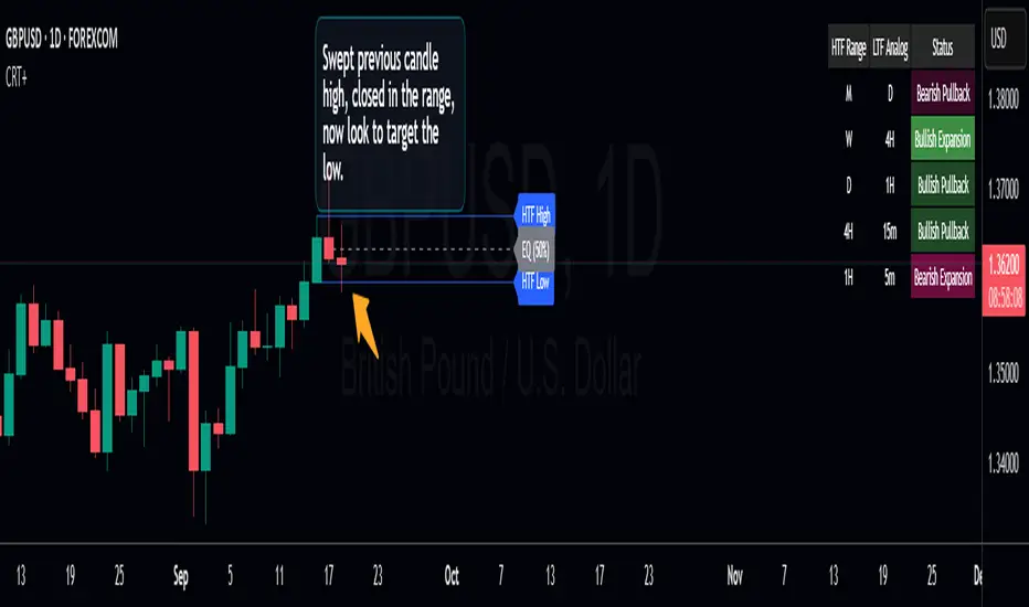
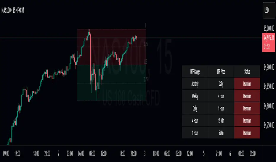
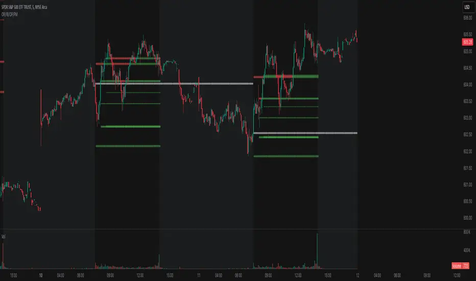
Purpose: Projects a Higher Timeframe (HTF) candle’s range onto your current chart and adds a compact multi-timeframe confluence table to judge premium/discount, trend vs pullback, and alignment.
What it draws:
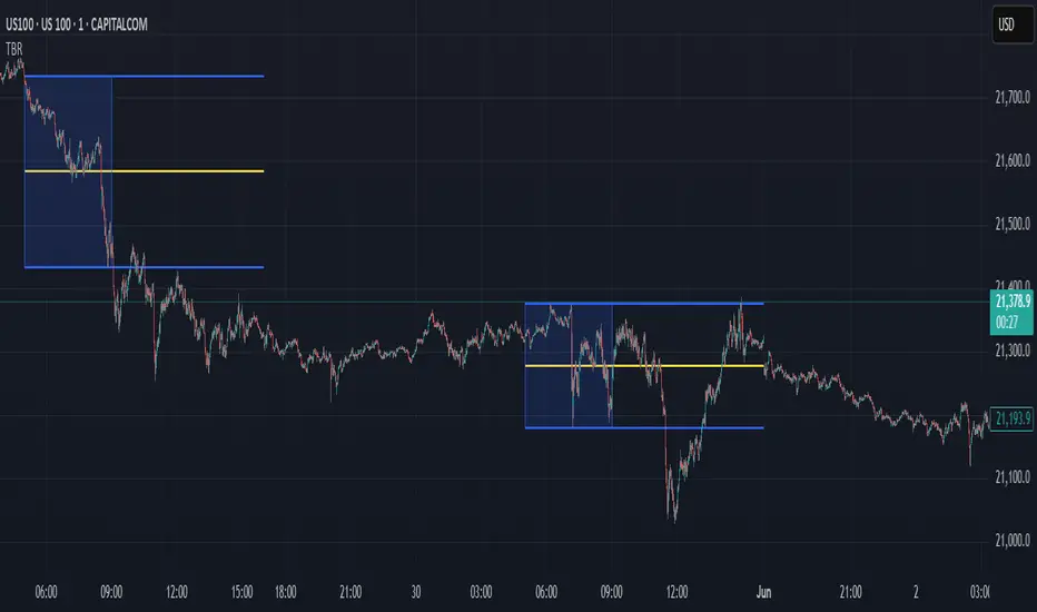
HTF Range: Active HTF High, Low, and the 50% Equilibrium (EQ) line. Range updates while the HTF bar is building and resets when a new HTF bar starts.
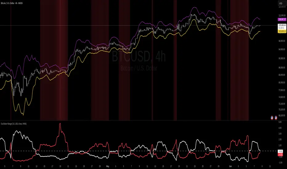
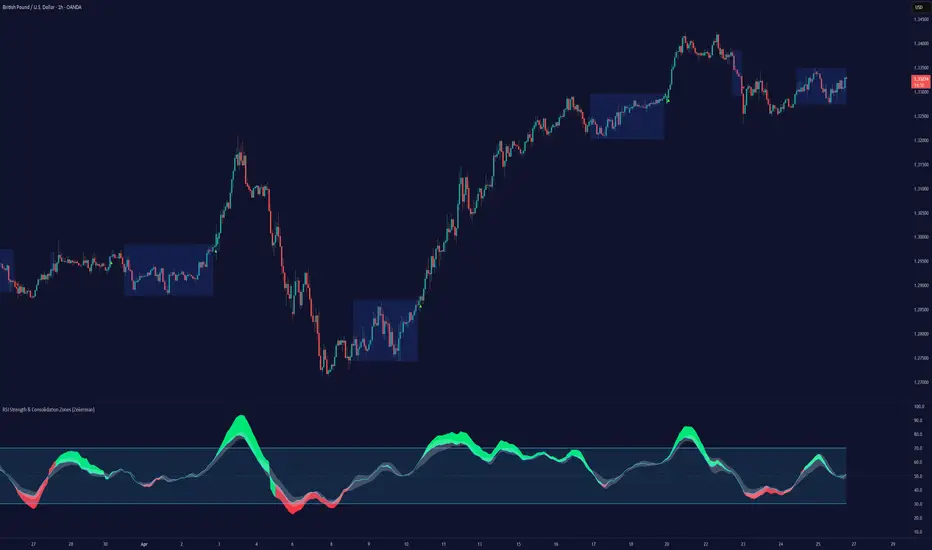
Confluence Table (optional): Up to 5 rows, each pairing a configurable HTF and LTF. Background tint shows premium/discount relative to that row’s HTF EQ. The row label reports directional state (bullish/bearish and pullback/continuation) using simple bar-close momentum checks and a configurable lookback.
How the Confluence Table works
Rows: Up to five independent HTF/LTF pairs (each row can be toggled on/off and configured).
Location: Price vs that row’s HTF EQ
Above EQ = Premium (maroon tint by default)
Below EQ = Discount (green tint by default)
Direction/State: A bar-close momentum read combined with HTF location to label:
Bullish continuation / Bearish continuation
Bullish pullback (upward momentum in discount) / Bearish pullback (downward momentum in premium)
Lookback control:
Uniform Lookback ON: HTF and LTF both use a 1-bar lookback (more responsive).
Uniform Lookback OFF: HTF uses a slightly longer lookback on higher frames for stability; LTF remains 1-bar for responsiveness.
Disclaimer:
This script is for educational and informational purposes only and does not constitute financial advice, investment advice, or trading recommendations. Trading involves substantial risk; you can lose some or all of your capital. Past performance or examples are not indicative of future results. The author provides no warranties regarding accuracy, completeness, or fitness for any purpose and disclaims liability for any losses arising from the use of this tool. Always use your own judgment, confirm on bar close, and consider multiple factors (e.g., volatility, liquidity, news) before taking any action. You are solely responsible for your trading decisions.
Penunjuk Pine Script®