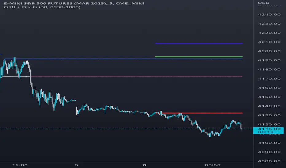
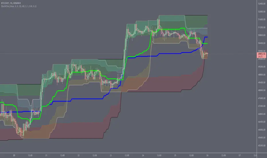
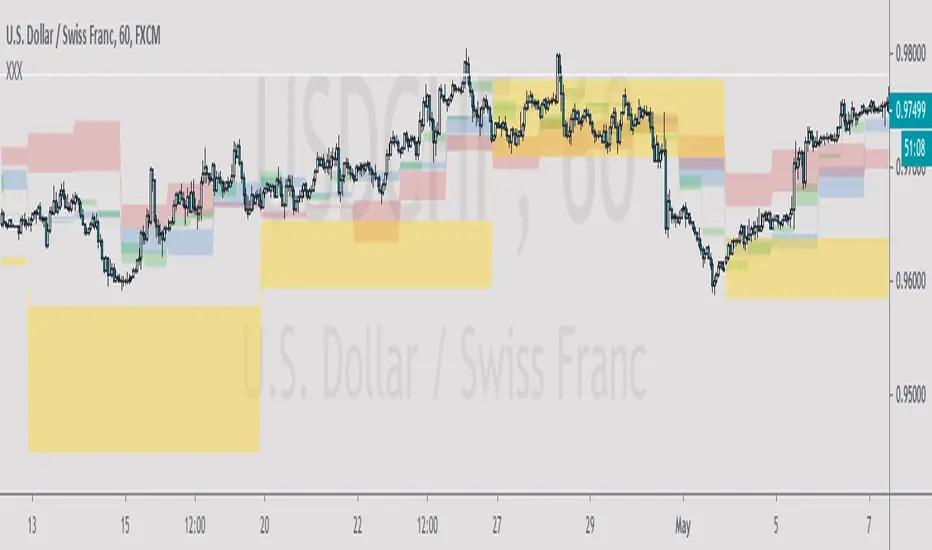
Worldwide Sessions and Open Range BreakoutThis script shows when the various normal market hours for each of the major worldwide markets (Asia, New York, and London). It also draws a line on the opening range for each of these market sessions. The opening range defaults to the first 15 minutes of the session, but this can be customized.
This script does automatically handle the session times regardless of your time zone or what time frame you are on. No need to set anything! This probably can't handle non-normal trading days, such as partial days.
This script is made for futures, but would likely work for other markets, like Forex.
Cari dalam skrip untuk "range"
9:15 Range with 0.09% BufferThis strategy is based on the first 9:15 AM candle for Nifty, which is considered a key reference point (also called the "GAN level entry"). It defines a range around the high and low of the 9:15 candle with a 0.09% buffer on both sides.
The upper buffer level acts as a potential resistance.
The lower buffer level acts as a potential support.
When the price crosses above the upper buffer, it signals a possible entry for a Call option (CE) or a long position.
When the price crosses below the lower buffer, it signals a possible entry for a Put option (PE) or a short position.
This approach helps traders identify early breakout opportunities based on the opening candle range, aiming to capture momentum moves in either direction during the trading session.
Not-So-Average True Range (nsATR)Not-So-Average True Range (nsATR)
*By Sherlock_MacGyver*
---
Long Story Short
The nsATR is a complete overhaul of traditional ATR analysis. It was designed to solve the fundamental issues with standard ATR, such as lag, lack of contextual awareness, and equal treatment of all volatility events.
Key innovations include:
* A smarter ATR that reacts dynamically when price movement exceeds normal expectations.
* Envelope zones that distinguish between moderate and extreme volatility conditions.
* A long-term ATR baseline that adds historical context to current readings.
* A compression detection system that flags when the market is coiled and ready to break out.
This indicator is designed for traders who want to see volatility the way it actually behaves — contextually, asymmetrically, and with predictive power.
---
What Is This Thing?
Standard ATR (Average True Range) has limitations:
* It smooths too slowly (using Wilder's RMA), which delays detection of meaningful moves.
* It lacks context — no way to know if current volatility is high or low relative to history.
* It treats all volatility equally, regardless of scale or significance.
nsATR** was built from scratch to overcome these weaknesses by applying:
* Amplification of large True Range spikes.
* Visual envelope zones for detecting volatility regimes.
* A long-term context line to anchor current readings.
* Multi-factor compression analysis to anticipate breakouts.
---
Core Features
1. Breach Detection with Amplification
When True Range exceeds a user-defined threshold (e.g., ATR × 1.2), it is amplified using a power function to reflect nonlinear volatility. This amplified value is then smoothed and cascades into future ATR values, affecting the indicator beyond a single bar.
2. Direction Tagging
Volatility spikes are tagged as upward or downward based on basic price momentum (close vs previous close). This provides visual context for how volatility is behaving in real-time.
3. Envelope Zones
Two adaptive envelopes highlight the current volatility regime:
* Stage 1: Moderate volatility (default: ATR × 1.5)
* Stage 2: Extreme volatility (default: ATR × 2.0)
Breaching these zones signals meaningful expansion in volatility.
4. Long-Term Context Baseline
A 200-period simple moving average of the classic ATR establishes whether current readings are above or below long-term volatility expectations.
5. Multi-Signal Compression Detection
Flags potential breakout conditions when:
* ATR is below its long-term baseline
* Price Bollinger Bands are compressed
* RSI Bollinger Bands are also compressed
All three signals must align to plot a "Volatility Confluence Dot" — an early warning of potential expansion.
---
Chart Outputs
In the Indicator Pane:
* Breach Amplified ATR (Orange line)
* Classic ATR baseline (White line)
* Long-Term context baseline (Cyan line)
* Stage 1 and Stage 2 Envelopes (Purple and Yellow lines)
On the Price Chart:
* Triangles for breach direction (green/red)
* Diamonds for compression zones
* Optional background coloring for visual clarity
---
Alerts
Built-in alert conditions:
1. ATR breach detected
2. Stage 1 envelope breached
3. Stage 2 envelope breached
4. Compression zone detected
---
Customization
All components are modular. Traders can adjust:
* Display toggles for each visual layer
* Colors and line widths
* Breach threshold and amplification power
* Envelope sensitivity
* Compression sensitivity and lookback windows
Some options are disabled by default to reduce clutter but can be turned on for more aggressive signal detection.
---
Real-Time Behavior (Non-Repainting Clarification)
The indicator updates in real time on the current bar as new data comes in. This is expected behavior for live trading tools. Once a bar closes, values do not change. In other words, the indicator *does not repaint history* — but the current bar can update dynamically until it closes.
---
Use Cases
* Day traders: Use compression zones to anticipate volatility surges.
* Swing traders: Use envelope breaches for regime awareness.
* System developers: Replace standard ATR in your logic for better responsiveness.
* Risk managers: Use directional volatility signals to better model exposure.
---
About the Developer
Sherlock_MacGyver develops original trading systems that question default assumptions and solve real trader problems.
Opening Range 15 minThis indicator highlights the Opening Range (OR) for the first 15 minutes (9:30–9:45 AM EST). It visually plots high/low lines and a shaded box to define this range, helping traders identify key intraday levels for potential breakout or rejection scenarios. The script also provides optional overlays for the Previous Day’s High/Low and the Extended Hours High/Low, offering a complete context for day trading setups.
Main Features:
Opening Range Detection – Automatically calculates and draws the high/low of the 9:30–9:45 AM session.
Visual Enhancements – Includes customizable lines, shaded boxes, and labels to mark the OR high (ORH) and low (ORL) levels.
Previous Day High/Low (Optional) – Plots and labels the previous day's high and low for reference during current day trading.
Extended Hours High/Low (Optional, when ETH enabled) – Displays overnight session levels for added insight into early volatility (4:00 AM to 9:30 AM EST).
User Customization – Easily adjust colors, label styles, and visibility for all plotted levels and regions.
Candle Range Trading (CRT) with Alerts
📌 Description:
The Candle Range Trading (CRT) indicator identifies potential reversal or continuation setups based on specific two-candle price action patterns.
It analyzes pairs of candles to detect Bullish or Bearish CRT patterns and provides visual signals (triangles) and alert notifications to support scalp or swing trading strategies.
🔍 How It Works:
🔻 Bearish CRT Pattern:
Candle 1 is bullish
Candle 2 is bearish
Candle 2's high > Candle 1's high
Candle 2 closes within Candle 1’s range
🔺 Red triangle above candle
🔺 Bullish CRT Pattern:
Candle 1 is bearish
Candle 2 is bullish
Candle 2's low < Candle 1's low
Candle 2 closes within Candle 1’s range
🔻 Green triangle below candle
📈 Visual Features:
🔺 Red triangle = Bearish CRT
🔻 Green triangle = Bullish CRT
📏 Optional box showing CRT High and CRT Low
🔔 Built-in Alerts:
Bullish CRT Alert: "Bullish CRT Pattern Detected"
Bearish CRT Alert: "Bearish CRT Pattern Detected"
Set alerts to get notified instantly when a pattern is detected.
⚠️ Note:
Use in conjunction with trend filters, support/resistance, or volume for best results.
Ideal for scalping or short-term trades.
Avoid trading in choppy or low-volume markets.
⚠️ Disclaimer:
This script was generated with the assistance of ChatGPT by OpenAI and is intended for educational and informational purposes only.
All strategies, alerts, and signals derived from this indicator should be thoroughly backtested and validated before using in live trading.
Trading involves substantial risk, and past performance is not indicative of future results. The author and ChatGPT bear no responsibility for any trading losses or financial decisions made using this script.
Users are solely responsible for the risks associated with their trading actions. Always apply proper risk management and perform your own due diligence before making any financial decisions.
Opening Range Breakout Detector📈 Opening Range Breakout Detector (TF-Independent)
Tracks breakouts with precision. No matter the chart, no matter the timeframe.
This indicator monitors whether price breaks above or below the Opening Range across multiple key durations — 1m, 5m, 10m, 15m, 30m, 45m, and 60m — using 1-minute data under the hood, while you can work on higher timeframe charts (daily, etc.).
Highlights:
✅ Status table shows which ORs broke UP or DOWN
⏱ Control which timeframes to track
🖼 Customizable table position, size and colors
Crafted by @FunkyQuokka
Custom Opening Range - CommoditiesThe Custom Opening Range Indicator for Commodities is designed for instruments that trade nearly 24 hours, such as crude oil or natural gas. It allows traders to define the Opening Range based on Indian Standard Time (IST)—typically starting at 3:30 AM IST, which aligns with the global commodities market open. Users can customize both the start time and duration of the range (e.g., 5, 15, or 30 minutes). The indicator dynamically plots the high and low of this range and shades the area between them, providing a clear visual reference for breakout or reversal setups during the rest of the trading session.
Highest/Lowest Range in TimeframeThis script helps traders visually identify the highest high and lowest low within a customizable range of recent bars.
🔍 Key Features
Scans the last 100 to 1000 bars (user-defined)
Automatically detects:
The highest wick (high) and lowest wick (low)
Draws dotted green horizontal lines at both levels
Shows a label indicating the percentage range between high and low
Displays real-time high and low price labels directly on the chart
⚙️ Use Cases
Quickly spot price extremes over your desired time window
Visually measure market range and volatility
Identify breakout potential or reversal zones
✅ How to Use
Add the script to your chart.
Set the “Bars to Scan” input to your desired lookback period (between 100–1000).
Use the displayed lines and labels to identify key high/low price levels and range metrics.
Average Body RangeThe Average Body Range (ABR) indicator calculates the average size of a candle's real body over a specified period. Unlike the traditional Average Daily Range (ADR), which measures the full range from high to low, the ABR focuses solely on the absolute difference between the open and close of each bar. This provides insight into market momentum and trading activity by reflecting how much price is actually moving from open to close , not just in total.
This indicator is especially useful for identifying:
Periods of strong directional movement (larger body sizes)
Low-volatility or indecisive markets (smaller body sizes)
Changes in trend conviction or momentum
Customization:
Length: Number of bars used to compute the average (default: 14)
Use ABR to enhance your understanding of price behavior and better time entries or exits based on market strength.
7-Day Narrow Range (NR7)NR7
NR7 stands for "Narrow Range 7." It identifies a day (or bar) with the narrowest trading range of the past seven days.
Traders often watch for NR7 patterns as they can indicate a period of consolidation before a potential breakout. A narrow range suggests that volatility is low, and a breakout could lead to a significant price move.
NR7 signals are often used in conjunction with other technical indicators and analysis techniques.
Remember that NR7 is just one tool, and no indicator is perfect. Always use sound risk management.
Volume Range Map [BigBeluga]This volume-based tool identifies the highest and lowest price extremes within a lookback period and constructs two dynamic range zones. Each zone is filled with horizontal volume profiles that visualize the distribution of traded volume across price bins, helping traders pinpoint key areas of accumulation and distribution.
🔵Key Features:
Dynamic High/Low Zones:
➣ Automatically detects the highest and lowest price levels within a custom lookback window.
➣ Draws two shaded zones: one near the high and one near the low, representing potential supply and demand areas.
Volume Profiles per Zone:
➣ Each zone is filled with a volume profile histogram divided into bins.
➣ The length of each horizontal bar represents the relative volume traded at that price level.
➣ Bins collectively account for 100% of the zone’s volume.
POC Highlighting:
➣ The price bin with the highest volume is marked as the Point of Control (POC), along with a label showing its share of total volume in percentage.
➣ A dashed line is drawn at the middle level of the zone.
Customizable Display:
➣ Traders can adjust the number of bins, zone width, and toggle midline visibility to match their strategy needs.
➣ Colors of upper and lower volume zones are fully customizable.
🔵Usage:
Supply/Demand Analysis: Use upper/lower volume zones to find key reversal or continuation areas where market participants were most active.
Volume Confirmation: Confirm breakout or rejection trades by watching how price reacts to high-volume areas inside each zone.
POC Strategy: Treat POC levels as magnet zones — price tends to revisit them due to high liquidity.
Trade Planning: Use volume-weighted levels instead of raw price action to plan entries, stop-losses, and targets.
Volume Range Map offers a clean and powerful way to analyze volume distribution at price extremes. By combining precise volume histograms, POC highlights, and adaptive zone drawing, it brings market structure into sharper focus for range and breakout traders alike.
Previous Candle Range Split into ThirdsThis script plots two horizontal lines over the previous candle to divide its total range (high to low) into three equal parts. The first line marks 33% of the range from the low, and the second marks 66%. This helps users visually identify whether the previous candle closed in the lower, middle, or upper third of its range, providing context on potential buyer or seller dominance during that session.
Users can customize the color, width, and style (solid, dotted, dashed) of each line, as well as toggle their visibility from the script's input settings.
This indicator is designed as a discretionary analysis tool and does not generate buy or sell signals.
Nifty Range % and Points by Time BlocksPine Script that gives you day-wise intraday range percentage for these 3 time blocks (9:16–10:45, 10:45–1:15, 1:15–3:15), we can:
Detect time blocks during the day
Track High/Low for each block
Calculate range % for each block:
\text{Range %} = \frac{(High - Low)}{\text{Previous Day Close}} \times 100
Plot / Label it on the chart at the end of each block
OG ATR RangeDescription:
The OG ATR Tool is a clean, visualized version of the Average True Range indicator for identifying volatility, stop-loss levels, and realistic price movement expectations.
How it works:
Calculates the average range (in points/pips) of recent candles.
Overlays ATR bands to help define breakout potential or squeeze zones.
Can be used to size trades or set dynamic stop-loss and target levels.
Best for:
Intraday traders who want to avoid unrealistic targets.
Volatility-based setups and breakout strategies.
Creating position sizing rules based on instrument volatility.
Pro Tip: Combine with your trend indicators to set sniper entries and exits that respect volatility.
PumpC Opening Range Breakout (ORB) Stretch RangePumpC ORB Stretch
The PumpC ORB Stretch is a volatility-based indicator that helps traders identify potential breakout zones by analyzing how price typically behaves around the open. This tool is inspired by concepts introduced by Toby Crabel in his well-known book “Day Trading with Short-Term Price Patterns and Opening Range Breakout.”
Rather than predicting market direction, this indicator highlights areas where price is likely to expand based on recent volatility. It is designed for traders who prefer dynamic, data-driven breakout levels over static support and resistance zones.
What Is the "Stretch"?
In Toby Crabel’s framework, the Stretch is the average of the smaller of two price moves:
The distance from the open to the high of the bar
The distance from the open to the low of the bar
This smaller value captures the “quiet side” of the candle and reflects recent price compression. Averaged over multiple periods (commonly 10 daily bars), it creates a baseline to assess how far price may move away from the open under typical market conditions.
How the Indicator Works
The PumpC ORB Stretch follows this process:
Uses a higher timeframe (such as daily) to calculate the open, high, and low.
For each bar, measures the smaller of the two distances: open to high or open to low.
Applies a moving average to the result over a user-defined number of bars (default is 10).
Multiplies the average stretch by customizable levels (e.g., 0.382, 1.0, 2.0).
Plots breakout levels above and below the open of the selected timeframe.
The result is a set of adaptive levels that expand or contract with market volatility.
Customization Options
Stretch Timeframe: Choose the timeframe used for stretch calculation (default: Daily).
Stretch Length: Set the number of bars to include in the moving average.
Breakout Levels: Enable or disable individual levels and define multipliers.
Color Settings: Customize colors for each range level for easy visual distinction.
Plot Style: Circular markers are used to reduce chart clutter and improve readability.
How to Use It
Use plotted levels to anticipate possible breakouts from the open.
Adjust stretch length to reflect short-term or longer-term volatility trends.
Combine this tool with momentum indicators, volume, or price action for confirmation.
Use levels to help guide stop placement or profit targets in breakout strategies.
Important Notes
This script is based on an interpretation of Crabel’s concepts and is not affiliated with Crabel Capital or the original author.
The indicator does not predict direction; it is a tool for context and structure.
It is recommended that users test and validate this tool in a simulated environment before applying it to live trading.
This indicator is intended for educational purposes only.
Licensing and Attribution
This script is built entirely in Pine Script v5 and follows TradingView’s open-source standards. It does not include any third-party or proprietary code. If you modify or share it, please credit the original idea and follow all TradingView script publishing rules.
Dynamic Candle Range Point IndicatorThe "Dynamic Candle Range Point Indicator" (DCRPI) does two important jobs at once. For each candle on your chart, it shows you exactly how many points the price moved in two different ways:
1. At the top of each candle, you'll see how many points the price moved from open to close (the body range)
2. At the bottom, you'll see the total movement from the highest to lowest point (the full range)
The really smart part is how it colors the borders of candles based on how much the price moved. This gives you a quick visual way to spot significant price movements:
- Small movements keep the standard green/red colors
- Medium movements (25-30 points) show as yellow
- Larger movements get more unique colors (orange, purple, blue, etc.)
This makes it easy to instantly identify which candles had the most significant price movement without having to read all the numbers. You can quickly spot the most volatile candles across your chart by their distinctive border colors.
The indicator is lightweight and should run smoothly on most charts without causing performance issues.
Opening RangeShows the opening range for morning and afternoon session. 9:30-10:00 and 1:30-2:00 EST.
It also has the option to add 0.5 and 1 standard deviations in both directions or range extensions.
Note: If you are having weird scaling issues when using this script, especially with the extensions, go to the settings in the bottom right of the chart. It is where the time and price axis meet which is bottom right by default. And then make sure "Scale price chart only" is enabled.
ICT Balanced Price Range - Double FVG with VolumeThis is an FVG indicator combined with volume to identify moments when a sudden volume spike creates a price gap.
Additionally, I've added the ICT Balanced Price Range, which occurs when two opposing FVGs form a connected gap. This gap has a high probability of reversal and is one of the key signs of liquidity sweeps.
Unlike other FVG indicators that filter FVGs based on ATR, average price, or range, I believe such methods lead to overfitting and may not work across multiple pairs with a single setting. Instead, I only filter FVGs when there are consecutive overlapping FVGs.
The indicator includes full functionality:
Candle color customization
FVG line color customization
FVG fill color customization
BPR color customization
Adjustable average volume and volume threshold
Highlighting candles with abnormal volume
Enjoy and make sure to backtest thoroughly before using!
ZenAlgo - SessionsZenAlgo - Sessions is a robust TradingView indicator designed to analyze and visualize global trading sessions (Asian, European, and US). By combining session-specific price levels, volume and delta tracking, and historical performance metrics, it delivers actionable insights for session-based trading strategies, simplifying decision-making in dynamic markets.
Features
Session Highlighting: Distinguishes trading sessions with customizable colors for easy identification.
Session Levels: Dynamically calculates and projects five key levels (0%, 25%, 50%, 75%, 100%) to identify support and resistance zones.
Volume and Delta Tracking: Tracks session-specific total volume, inflows, outflows, and delta to assess market sentiment.
Interactive Performance Table: Summarizes recent session metrics, including win/loss percentages, volume, and delta, enabling trend analysis.
Historical Analysis: Retains session performance data for up to 100 sessions, providing insights into long-term trends.
Dynamic Range Projection: Extends session levels into subsequent sessions, maintaining market context.
Customizable Time Zones: Adapts session tracking to any trading environment.
Added Value: Why Is This Indicator Original/Why Shall You Pay for This Indicator?
1. Synergy Between Indicators
Session Levels: Highlight key market zones that guide entry/exit points.
Volume and Delta Metrics: Clarify price action at these levels by identifying buyer/seller dominance.
Performance Metrics: Aggregate historical session data, helping traders identify recurring patterns, sentiment shifts, and session-specific tendencies.
Together, these features amplify one another, creating actionable insights that exceed the value of standalone tools.
2. Comparison to Freely Available Indicators
Traditional indicators like Bollinger Bands, RSI, or Moving Averages operate on broad price action trends. ZenAlgo - Sessions focuses on session-specific patterns, volume dynamics, and real-time updates, delivering more context-specific insights.
By consolidating multiple functionalities into one tool, it eliminates the need for multiple separate indicators, streamlining analysis.
3. Why Pay for This Indicator?
Comprehensive Insights: Delivers session-specific metrics unavailable in standalone tools.
Real-Time Updates: Ensures metrics and levels reflect the latest market movements.
Seamless Integration: Combines price action, volume, and historical performance into a single, intuitive interface.
How It Works
1. Session Detection
Defines sessions for Asia, Europe, and the US based on fixed opening and closing times. Time zones ensure compatibility with global markets, excluding weekends and holidays for relevance.
2. Price Levels
Calculates five levels (0%, 25%, 50%, 75%, 100%) based on session high and low, projecting these into subsequent sessions for continued analysis.
3. Volume and Delta Metrics
Tracks session volume, separating inflows and outflows based on price movements.
Calculates delta to gauge net buying/selling activity.
4. Performance Metrics
Tracks win/loss rates and percentage changes across sessions.
Stores session metrics (volume, delta, win/loss) for up to 100 sessions.
5. Dynamic Visualization
Continuously updates session levels and metrics in real time for actionable insights.
Usage Examples
Support/Resistance Levels: Use session levels, especially the 50% midline, as potential pivot points for trades.
Breakout Analysis: Monitor price action beyond session highs or lows to confirm breakouts.
Volume Trends: Compare session volumes to identify high-activity periods.
Delta Shifts: Assess delta changes to determine market sentiment at key levels.
Session Comparison: Identify which session drives significant activity using the performance table.
Multi-Session Strategies: Plan trades based on extended session levels to anticipate reactions at previously tested zones.
Settings
Asia Session Color: Adjust the highlight color for the Asian session.
Europe Session Color: Customize the color for the European session.
US Session Color: Define the color for the US session.
Time Zone: Set the time zone for session tracking.
Line Transparency: Adjust session line opacity.
Number of Sessions for Total Count: Define how many sessions to analyze in the performance table.
Important Notes
This indicator is a technical analysis tool and does not guarantee trading success. Use it alongside other indicators and fundamental analysis for a comprehensive trading strategy.
Combine with Other Tools: Use complementary indicators such as RSI, Bollinger Bands, or ATR to filter out unreliable signals and improve accuracy.
Known Weaknesses and Mitigation Strategies
1. Extreme Volatility
Issue: During sudden, significant price movements (e.g., news-driven events), session levels and delta metrics may become less reliable as the market temporarily disregards historical patterns.
Mitigation: Combine ZenAlgo - Sessions with volatility indicators like ATR (Average True Range) or a news alert system to adjust expectations during these periods.
2. Low Liquidity Periods
Issue: During holidays or outside peak trading hours, session metrics may misrepresent actual market activity due to reduced participant involvement.
Mitigation: Focus on sessions with higher activity (e.g., overlapping US and European sessions) to ensure more accurate insights.
3. Non-Standard Trading Hours
Issue: Market-specific differences, such as extended hours or daylight saving adjustments, can misalign session boundaries.
Mitigation: Verify session times align with your market and adjust settings accordingly.
4. Historical Data Dependencies
Issue: Historical metrics rely on consistent session patterns; deviations (e.g., extended or shortened sessions) can impact trend accuracy.
Mitigation: Regularly review and interpret historical data alongside real-time metrics to ensure alignment.
Central Pivot Range (CPR)Central Pivot Range (CPR) Indicator
The Central Pivot Range (CPR) indicator is designed to help traders identify key levels of support and resistance based on pivot points calculated from the previous day's price action. The CPR levels act as critical areas of price convergence and potential reversal, which can help in anticipating future price movements. This version of the CPR indicator includes customizable features to enhance your trading strategy.
Key Features:
Custom Timeframe Support: The indicator allows you to select a custom timeframe for calculating the CPR levels. By default, it uses the daily timeframe ('D'), but you can adjust it to any other timeframe of your choosing. The indicator calculates the CPR and support/resistance levels based on the data from the selected timeframe.
Central Pivot (CP), Below Central Pivot (BC), and Top Central Pivot (TC):
Pivot (CP): The central pivot point is calculated as the average of the high, low, and close prices of the selected timeframe.
Below Central Pivot (BC): This is the midpoint between the high and low prices of the selected timeframe.
Top Central Pivot (TC): This is calculated based on the central pivot and below central pivot, providing a range between support and resistance levels.
Support and Resistance Levels (S1, S2, S3, R1, R2, R3):
Support Levels (S1, S2, S3): These are calculated based on the central pivot, providing potential areas where price may find support and reverse.
Resistance Levels (R1, R2, R3): These are calculated similarly but indicate potential resistance zones where price may face challenges to move higher.
Dynamic Plotting Based on User Input:
The indicator allows you to choose which levels to display on the chart, including the Central Pivot (CP), Support Levels (S1, S2, S3), and Resistance Levels (R1, R2, R3), all of which can be toggled on or off via checkboxes.
CP is displayed in white, BC and TC in blue, Support levels (S1, S2, S3) in green, and Resistance levels (R1, R2, R3) in red.
Daywise Calculations:
The CPR and levels are based on the previous day’s price action, providing historical support and resistance levels that can be useful for intraday analysis.
The request.security function is used to fetch the pivot data from the custom timeframe, ensuring the levels are calculated based on the last completed period (previous day) without repainting.
Customization Options:
CPR Plot: Toggle the visibility of the central pivot range (CPR) lines.
Support Levels (S1, S2, S3): Choose to show or hide the support levels.
Resistance Levels (R1, R2, R3): Choose to show or hide the resistance levels.
Custom Timeframe: Set a custom timeframe for calculating the CPR, allowing for more flexible and tailored analysis.
Dawud Range RoverThe Dawud Range Rover (No Repaint) is an advanced indicator that normalizes smoothed price data into a 0 to 100 range, providing traders with a clear visualization of overbought and oversold levels. This indicator uses adjustable smoothing techniques (EMA, RMA, SMA, TMA) and strength parameters to balance responsiveness and accuracy. It highlights market conditions through non-repainting normalized values, a signal line, and visual cues such as background shading and horizontal thresholds. With robust customization options for rolling lengths, smoothing methods, and levels, it helps traders identify actionable market trends and improve decision-making.
True Range Trend StrengthThis script is designed to analyze trend strength using True Range calculations alongside Donchian Channels and smoothed moving averages. It provides a dynamic way to interpret market momentum, trend reversals, and anticipate potential entry points for trades.
Key Functionalities:
Trend Strength Oscillator:
Calculates trend strength based on the difference between long and short momentum derived from ATR (Average True Range) adjusted stop levels.
Smooths the trend strength using a simple moving average for better readability.
Donchian Channels on Trend Strength Oscillator:
Plots upper and lower Donchian Channels on the smoothed trend strength oscillator.
Traders can use these levels to anticipate breakout points and determine the strength of a trend.
Zero-Cross Shading:
Highlights bullish and bearish zones with shaded backgrounds:
Green for bullish zones where smoothed trend strength is above zero.
Red for bearish zones where smoothed trend strength is below zero.
Moving Averages for Oscillator:
Overlays fast and slow moving averages on the oscillator to provide crossover signals:
Fast MA Cross Above Slow MA: Indicates bullish momentum.
Fast MA Cross Below Slow MA: Indicates bearish momentum.
Alerts:
Alerts are available for MA crossovers, allowing traders to receive timely notifications about potential trend reversals or continuation signals.
Anticipating Entries with Donchian Channels:
The integration of Donchian Channels offers an edge in anticipating excellent trade entries.
Traders can use the oscillator's position relative to the channels to gauge oversold/overbought conditions or potential breakouts.
Use Case:
This script is particularly useful for traders looking to:
Identify the strength and direction of market trends.
Time entries and exits based on dynamic Donchian Channel levels and trend strength analysis.
Incorporate moving averages and visual cues for better decision-making.
Price RangePrice Range
This indicator displays low, middle, and high price zones based on the lowest and highest prices over a specified period, using color-coding. This helps users visually identify the current price's position within these zones.
The effectiveness of chart patterns varies depending on where they appear within these price zones. For example, a double bottom pattern, which signals a potential market bottom, is a strong buy signal if it forms in the low zone, but it has less reliability if it forms in the middle or high zones.
Similarly, price action signals vary in significance based on their location. If a long upper wick pin bar appears in the high zone, it is often interpreted as a sign of reversal.
By combining this Price Range indicator with indicators that display chart patterns or price action signals, traders can make more informed trading decisions.
By default, the middle zone is set to cover 50% of the range, but this can be adjusted.
このインジケーターは、指定した期間の最安値と最高値をもとに、安値圏、中段圏、高値圏を色分けして表示します。これにより、ユーザーは現在の価格がどの位置にあるのかを視覚的に判断できます。
また、チャートパターンの効果は、出現する価格帯によって異なります。たとえば、ダブルボトムは相場の底を示すパターンで、安値圏で形成されると強い買いシグナルとなりますが、中段圏や高値圏で出現しても信頼性は低くなります。
プライスアクションも、どの価格帯に現れるかによって解釈が異なります。高値圏で上ヒゲの長いピンバーが現れると、反転の兆しとして判断されることが多いです。
このPrice Rangeインジケーターを、チャートパターンやプライスアクションを表示するインジケーターと組み合わせることで、より適切なトレード判断が可能になります。
デフォルトでは中段圏の割合が50%になるように設定されていますが、変更することが可能です。