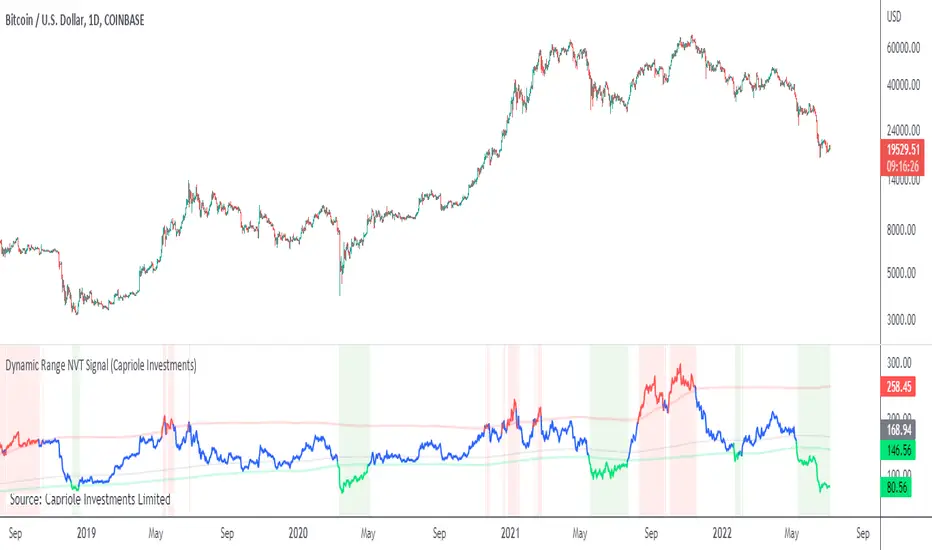
Open Interest Profile [Fixed Range] - By LeviathanThis script generates an aggregated Open Interest profile for any user-selected range and provides several other features and tools, such as OI Delta Profile, Positive Delta Levels, OI Heatmap, Range Levels, OIWAP, POC and much more.
The indicator will help you find levels of interest based on where other market participants are opening and closing their positions. This provides a deeper insight into market activity and serves as a foundation for various different trading strategies (trapped traders, supply and demand, support and resistance, liquidity gaps, imbalances,liquidation levels, etc). Additionally, this indicator can be used in conjunction with other tools such as Volume Profile.
Open Interest (OI) is a key metric in derivatives markets that refers to the total number of unsettled or open contracts. A contract is a mutual agreement between two parties to buy or sell an underlying asset at a predetermined price. Each contract consists of a long side and a short side, with one party consenting to buy (long) and the other agreeing to sell (short). The party holding the long position will profit from an increase in the asset's price, while the one holding the short position will profit from the price decline. Every long position opened requires a corresponding short position by another market participant, and vice versa. Although there might be an imbalance in the number of accounts or traders holding long and short contracts, the net value of positions held on each side remains balanced at a 1:1 ratio. For instance, an Open Interest of 100 BTC implies that there are currently 100 BTC worth of longs and 100 BTC worth of shorts open in the market. There might be more traders on one side holding smaller positions, and fewer on the other side with larger positions, but the net value of positions on both sides is equivalent - 100 BTC in longs and 100 BTC in shorts (1:1). Consider a scenario where a trader decides to open a long position for 1 BTC at a price of $30k. For this long order to be executed, a counterparty must take the opposite side of the contract by placing a short order for 1 BTC at the same price of $30k. When both long and short orders are matched and executed, the Open Interest increases by 1 BTC, indicating the introduction of this new contract to the market.
The meaning of fluctuations in Open Interest:
- OI Increase - signifies new positions entering the market (both longs and shorts).
- OI Decrease - indicates positions exiting the market (both longs and shorts).
- OI Flat - represents no change in open positions due to low activity or a large number of contract transfers (contracts changing hands instead of being closed).
Typically, we monitor Open Interest in the form of its running value, either on a chart or through OI Delta histograms that depict the net change in OI for each price bar. This indicator enhances Open Interest analysis by illustrating the distribution of changes in OI on the price axis rather than the time axis (akin to Volume Profiles). While Volume Profile displays the volume that occurred at a given price level, the Open Interest Profile offers insight into where traders were opening and closing their positions.
How to use the indicator?
1. Add the script to your chart
2. A prompt will appear, asking you to select the “Start Time” (start of the range) and the “End Time” (end of the range) by clicking anywhere on your chart.
3. Within a few seconds, a profile will be generated. If you wish to alter the selected range, you can drag the "Start Time" and "End Time" markers accordingly.
4. Enjoy the script and feel free to explore all the settings.
To learn more about each input in indicator settings, please read the provided tooltips. These can be accessed by hovering over or clicking on the ( i ) symbol next to the input.
Cari dalam skrip untuk "range"
Supply and Demand Visible Range [LuxAlgo]The Supply and Demand Visible Range indicator displays areas & levels on the user's chart for the visible range using a novel volume-based method. The script also makes use of intra-bar data to create precise Supply & Demand zones.
🔶 SETTINGS
Threshold %: Percentage of the total visible range volume used as a threshold to set supply/demand areas. Higher values return wider areas.
Resolution: Determines the number of bins used to find each area. Higher values will return more precise results.
Intra-bar TF: Timeframe used to obtain intra-bar data.
🔶 USAGE
The supply/demand areas and levels displayed by the script are aimed at providing potential supports/resistances for users. The script's behavior makes it recalculate each time the visible chart interval/range changes, as such this script is more suited as a descriptive tool.
Price reaching a supply (upper) area that might have been tested a few times might be indicative of a potential reversal down, while price reaching a demand (lower) area that might have been tested a few times could be indicative of a potential reversal up.
The width of each area can also indicate which areas are more liquid, with thinner areas indicating more significant liquidity.
The user can control the width of each area using the Threshold % setting, with a higher setting returning wider areas. The precision setting can also return wider supply/demand areas if very low values are used and has the benefit of improving the script execution time at the cost of precision.
The Supply and Demand Zones indicator returns various levels. The solid-colored levels display the average of each area, while dashed colored lines display the weighted averages of each area. These weighted averages can highlight more liquid price levels within the supply/demand areas.
Central solid/dashed lines display the average between the areas' averages and weighted averages.
🔶 DETAILS
Each supply/demand area is constructed from volume data. The calculation is done as follows:
The accumulated volume within the chart visible range is calculated.
The chart visible range is divided into N bins of equal width (where N is the resolution setting)
Calculation start from the highest visible range price value for the supply area, and lowest value for the demand area.
The volume within each bin after the starting calculation level is accumulated, once this accumulated volume is equal or exceed the threshold value ( p % of the total visible range volume) the area is set.
Each bin volume accumulation within an area is displayed on the left, this can help indicate how fast volume accumulates within an area.
🔶 LIMITATIONS
The script execution time is dependent on all of the script's settings, using more demanding settings might return errors so make sure to be aware of the potential scenarios that might make the script exceed the allowed execution time:
Having a chart's visible range including a high number of bars.
Using a high number of bins (high resolution value) will increase computation time, this can be worsened by using a high threshold %.
Using very low intra-bar timeframe can drastically increase computation time but can also simply throw an error if the chart timeframe is high.
Users facing issues can lower the resolution value or use the chart timeframe for intra-bar data.
Grid Range Volatility BasedThis TradingView Pine script implements a grid range volatility based indicator that displays dynamic horizontal lines on the chart. The lines are calculated based on the average true range (ATR) of the security being plotted, and the range can be adjusted using an input parameter. The distance between the top and bottom lines is displayed as a percentage in a dynamic label that updates with each new bar.
The script allows the user to choose whether to use red or black lines, and also provides options to set the number of days for range calculations, and the calculation type (either ATR(1) or ATR(x)). The script is designed to work with stocks, forex, and other securities that have price data.
To use this script, simply attach it to a chart and adjust the input parameters to suit your analysis needs. The dynamic lines and percentage label will be displayed on the chart, providing a visual representation of the range volatility of the security being plotted. The values of the highest and lowest lines can also be displayed as labels on the price axis, providing additional context for the range volatility.
Average True Range PercentWhen writing the Quickfingers Luc base scanner (Marvin) script, I wanted a measure of volatility that would be comparable between charts. The traditional Average True Range (ATR) indicator calculates a discrete number providing the average true range of that chart for a specified number of periods. The ATR is not comparable across different price charts.
Average True Range Percent (ATRP) measures the true range for the period, converts it to a percentage using the average of the period's range ((high + low) / 2) and then smooths the percentage. The ATRP provides a measure of volatility that is comparable between charts showing their relative volatility.
Enjoy.
CPR - Central Pivot Range (by Alex L.)CPR or Central Pivot Range is a tool for identifying a trend, its volatility and its future targets for the price levels (in up or down directions).
What this indicator offers:
- Main purpose of this indicator is to display levels of support/resistance in a given trend as potentially good levels of entering into position or existing from a position. Entry levels are RED, resistance levels are in GREEN.
- You have the ability to view daily, weekly, monthly pivot levels, depending on what kind of trader you are.
- Unique to this indicator - you have the ability to view YEARLY pivot levels.
- Unique to this indicator - you have the "Pivots History" option to either show all history or just the recent piriod to make your chart clean of "noise".
- Unique to this indicator - you can view "future" pivot levels based on current price.
- You have the ability to view "future pivots" which can be useful as entry or exit levels for the current trend.
- You have the ability to view one, two, three or four pivor levels concurrently depending on how much information you want on your chart.
- You have the option to use "Compact View" to further reduce "noise" and make your chart event more clean.
- Open source.
Some guidelines:
- When current Central Pivot Range is higher than previous Central Pivot Range then the stock is in an uptrend and vice versa.
- Wide Central Pivot Range usually means the stock is in a "sideways trend" and volatility is low.
- Tight Central Pivot Range usually means the stock has a very low volatility and is about to explode (up or down). Switching to a higher timeframe can often give hints to what direction the stock is likely to go.
Default settings:
- Pivot Levels : "Two Pivot Levels"
- Filter/Hide Pivots: "Hide Pivot+BC+TC"
- Pivots History: "Few Months Back"
'V' Show Monthly Pivots
'V' Show Future Pivots
Calculations of pivot levels formula is according to book "Secrets of a Pivot Boss" by Franklin O. Ochoa.
Quote from the book: "The way to make money is to make it. The way to make big money is to be right at exactly the right time."
Open source.
Enjoy!
Simple RangeThe daily price range is a good proxy to judge an instrument’s volatility. I have combined multiple concepts in this indicator to display information regarding the daily price range & its volatility.
A trading period's range is simply the difference between its high and the low. This script shows the daily high-to-low range of the price as a column chart. It has 3 main components:
1. Narrow-range days (NR7) & Wide-range Days (WR20) - as plot columns
Original concept from Thomas Bulkowski
Modified from "NR4 & NR7 Indicator" script by theapextrader7
Modified from "WR - BC Identifier" script by wrpteam2020
Narrow range days mark price contractions that often precede price expansions. This script uses NR7 (narrow range 7) as a narrow-range day. This value can be changed by the user if, instead of an NR7, he or she wishes to use NR4 or NR21, or any other interval of his or her choice. NR7 is an indecisive trading day in which the range is narrower than any of the previous six days (a total of 7 days). This is a popular concept given by Thomas Bulkowski. A breakout is said to occur when price closes above the top or below the bottom of the NR7. Upside breakout of an NR 7 candle with high volumes indicates bullishness.
Similarly, highs & lows of wide-range bars (on big volumes) are also significant reference levels for price. Wide-range candle are identified by size of the body candle (open - close). The script compares the size of previous 20 candles to identify WR20 candles. This value can also be changed by the user.
The script shows NR7 & WR20 as orange & blue bars, respectively.
The user can also turn on the option to identify a big high-to-low range candle greater than a pre-defined threshold (default is 5%). These show up as green or red bars.
2. TTM Squeeze - as background
Original concept from John Carter's book "Mastering the Trade"
Based on "Squeeze Momentum Indicator" script by LazyBear
John Carter’s TTM Squeeze indicator looks at the relationship between Bollinger Bands and Keltner's Channels to help identify period of volatility contractions. Bollinger Bands being completely enclosed within the Keltner Channels is indicative of a very low volatility. This is a state of volatility contraction known as squeeze. Using different ATR lengths (1.0, 1.5 and 2.0) for Keltner Channels, we can differentiate between levels of squeeze (High, Mid & Low compression, respectively). Greater the compression, higher the potential for explosive moves.
In the script, the High, Mid & Low compression squeezes are depicted via the background color being red, orange, or yellow, respectively.
3. Average Daily Range - as table
Original idea by alpine_trader
Modified from "ADR% - Average Daily Range % by MikeC" script by TheScrutiniser
Average Day Range (ADR) tells how much the price moves between the high and low on a given day. This is the day Range, which is then averaged to create ADR. The script uses an average of the last 20 days to calculate the ADR. Unlike ATR (Average True Range), this excludes Gaps.
The script displays the ADR as a % value in a table.
If you want to find stocks that move a lot on an average on most days, then look for stocks that have ADR% of 5% or more.
If you prefer lower volatility stocks, focus on stocks with lower ADR% values, such as 2% or less.
How it comes together
For a bullish "momentum burst", or a velocity trade:
Select stocks with Average Day Range % (ADR) greater than 5
Identify significant reference price levels via highs & lows of WR20 bars (on big volumes)
Wait for a decent mid-to-high compression squeeze
Look for clusters of NR7 candles in the consolidation
Any breakout from this consolidation should be accompanied by more than average (preferably pocket pivot) volumes
GKD-C Williams % Range Regular [Loxx]Giga Kaleidoscope Williams Precent Range is a Confirmation module included in Loxx's "Giga Kaleidoscope Modularized Trading System".
█ Giga Kaleidoscope Modularized Trading System
What is Loxx's "Giga Kaleidoscope Modularized Trading System"?
The Giga Kaleidoscope Modularized Trading System is a trading system built on the philosophy of the NNFX (No Nonsense Forex) algorithmic trading.
What is an NNFX algorithmic trading strategy?
The NNFX algorithm is built on the principles of trend, momentum, and volatility. There are six core components in the NNFX trading algorithm:
1. Volatility - price volatility; e.g., Average True Range, True Range Double, Close-to-Close, etc.
2. Baseline - a moving average to identify price trend
3. Confirmation 1 - a technical indicator used to identify trends.
4. Confirmation 2 - a technical indicator used to identify trends.
5. Continuation - a technical indicator used to identify trends.
6. Volatility/Volume - a technical indicator used to identify volatility/volume breakouts/breakdown.
7. Exit - a technical indicator used to determine when a trend is exhausted.
How does Loxx's GKD (Giga Kaleidoscope Modularized Trading System) implement the NNFX algorithm outlined above?
Loxx's GKD v1.0 system has five types of modules (indicators/strategies). These modules are:
1. GKD-BT - Backtesting module (Volatility, Number 1 in the NNFX algorithm)
2. GKD-B - Baseline module (Baseline and Volatility/Volume, Numbers 1 and 2 in the NNFX algorithm)
3. GKD-C - Confirmation 1/2 and Continuation module (Confirmation 1/2 and Continuation, Numbers 3, 4, and 5 in the NNFX algorithm)
4. GKD-V - Volatility/Volume module (Confirmation 1/2, Number 6 in the NNFX algorithm)
5. GKD-E - Exit module (Exit, Number 7 in the NNFX algorithm)
(additional module types will added in future releases)
Each module interacts with every module by passing data between modules. Data is passed between each module as described below:
GKD-B => GKD-V => GKD-C(1) => GKD-C(2) => GKD-C(Continuation) => GKD-E => GKD-BT
That is, the Baseline indicator passes its data to Volatility/Volume. The Volatility/Volume indicator passes its values to the Confirmation 1 indicator. The Confirmation 1 indicator passes its values to the Confirmation 2 indicator. The Confirmation 2 indicator passes its values to the Continuation indicator. The Continuation indicator passes its values to the Exit indicator, and finally, the Exit indicator passes its values to the Backtest strategy.
This chaining of indicators requires that each module conform to Loxx's GKD protocol, therefore allowing for the testing of every possible combination of technical indicators that make up the six components of the NNFX algorithm.
What does the application of the GKD trading system look like?
Example trading system:
Backtest: Strategy with 1-3 take profits, trailing stop loss, multiple types of PnL volatility, and 2 backtesting styles
Baseline: Hull Moving Average as shown on the chart above
Volatility/Volume: Average Directional Index (ADX) as shown on the chart above
Confirmation 1: Williams Precent Range as shown on the chart above
Confirmation 2: Williams Percent Range
Continuation: Fisher Transform
Exit: Rex Oscillator
Each GKD indicator is denoted with a module identifier of either: GKD-BT, GKD-B, GKD-C, GKD-V, or GKD-E. This allows traders to understand to which module each indicator belongs and where each indicator fits into the GKD protocol chain.
Giga Kaleidoscope Modularized Trading System Signals (based on the NNFX algorithm)
Standard Entry
1. GKD-C Confirmation 1 Signal
2. GKD-B Baseline agrees
3. Price is within a range of 0.2x Volatility and 1.0x Volatility of the Goldie Locks Mean
4. GKD-C Confirmation 2 agrees
5. GKD-V Volatility/Volume agrees
Baseline Entry
1. GKD-B Baseline signal
2. GKD-C Confirmation 1 agrees
3. Price is within a range of 0.2x Volatility and 1.0x Volatility of the Goldie Locks Mean
4. GKD-C Confirmation 2 agrees
5. GKD-V Volatility/Volume agrees
6. GKD-C Confirmation 1 signal was less than 7 candles prior
Continuation Entry
1. Standard Entry, Baseline Entry, or Pullback; entry triggered previously
2. GKD-B Baseline hasn't crossed since entry signal trigger
3. GKD-C Confirmation Continuation Indicator signals
4. GKD-C Confirmation 1 agrees
5. GKD-B Baseline agrees
6. GKD-C Confirmation 2 agrees
1-Candle Rule Standard Entry
1. GKD-C Confirmation 1 signal
2. GKD-B Baseline agrees
3. Price is within a range of 0.2x Volatility and 1.0x Volatility of the Goldie Locks Mean
Next Candle:
1. Price retraced (Long: close < close or Short: close > close )
2. GKD-B Baseline agrees
3. GKD-C Confirmation 1 agrees
4. GKD-C Confirmation 2 agrees
5. GKD-V Volatility/Volume agrees
1-Candle Rule Baseline Entry
1. GKD-B Baseline signal
2. GKD-C Confirmation 1 agrees
3. Price is within a range of 0.2x Volatility and 1.0x Volatility of the Goldie Locks Mean
4. GKD-C Confirmation 1 signal was less than 7 candles prior
Next Candle:
1. Price retraced (Long: close < close or Short: close > close )
2. GKD-B Baseline agrees
3. GKD-C Confirmation 1 agrees
4. GKD-C Confirmation 2 agrees
5. GKD-V Volatility/Volume Agrees
PullBack Entry
1. GKD-B Baseline signal
2. GKD-C Confirmation 1 agrees
3. Price is beyond 1.0x Volatility of Baseline
Next Candle:
1. Price is within a range of 0.2x Volatility and 1.0x Volatility of the Goldie Locks Mean
3. GKD-C Confirmation 1 agrees
4. GKD-C Confirmation 2 agrees
5. GKD-V Volatility/Volume Agrees
█ Williams Precent Range
What is Williams Precent Range?
Williams %R, also known as the Williams Percent Range, is a type of momentum indicator that moves between 0 and -100 and measures overbought and oversold levels. The Williams %R may be used to find entry and exit points in the market. The indicator is very similar to the Stochastic oscillator and is used in the same way. It was developed by Larry Williams and it compares a stock’s closing price to the high-low range over a specific period, typically 14 days or periods.
Requirements
Inputs
Confirmation 1 and Solo Confirmation: GKD-V Volatility / Volume indicator
Confirmation 2: GKD-C Confirmation indicator
Outputs
Confirmation 2 and Solo Confirmation: GKD-E Exit indicator
Confirmation 1: GKD-C Confirmation indicator
Continuation: GKD-E Exit indicator
Additional features will be added in future releases.
This indicator is only available to ALGX Trading VIP group members . You can see the Author's Instructions below to get more information on how to get access.
Volume Profile Visible Range For All AccountsVolume Profile Visible Range For All Accounts is displaying volume from price perspective. It’s done by summing volume by the “estimated” transaction price. This version is estimating it based on public volume data so it can be used with any account.
Volume Profile is a powerful tool commonly used by PRO users, to disseminate its use also by users who operate on basic volume data, we have prepared a set of scripts:
Volume Profile For All Accounts – Analyze last 50-20000 bars.
Volume Profile From Date For All Accounts – Analyze all bars since start date.
Volume Profile Range For All Accounts – Analyze bars in a range between start and end date.
Volume Profile Visible Range For All Accounts – Analyze bars in the range visible on the screen.
If after reading script description something is not clear, do not hesitate to ask. We are helping all users.
Script Settings:
| SCANNER VISUALIZATION |
Rows – Number of rows
Width – Width of the visualization.
Position – Position of the visualization:
S_DU – At START of the area (left edge of the screen), DOWN first
S_UD – At START of the area (left edge of the screen), UP first
BE_DU – At BEFORE END of the area, DOWN first
BE_UD – At BEFORE END of the area, UP first
E_DU – At END of the area, DOWN first
E_UD – At END of the area, UP first
Color Up – Color of volume classified as move Up, or Both if separation is off.
Color Down - Color of volume classified as move Down
Color Border – Border color.
Up/Down separate – Draw separate volume classified as Up and Down
Show values – Showing volume values of the bars.
Troubleshooting:
In case of any problems, send error details to the author of the script.
Opening Range, Initial Balance, Opening PriceThis script draws Opening Range, Initial Balance and Opening Price with options to show mid levels.
By default, lines changes color depending on whether closing price is above or below the lines. Red if price is below, green if price is above.
Colors and line styles are all configurable.
Options to change label positions.
Some definitions:
Opening Range - The opening range is high and low for a given period after the market opens. This period is generally the first 30 or 60 minutes of trading
Initial Balance - WRT to TPO profile chart, the Initial Balance is the price range resulting from the market’s trade during the first two 30 minute periods of the regular trading hours session.
Why is this useful?
The first hour of the trading day is the most active and dynamic period. The price range defined by this period of trading creates some key support / resistance levels for the rest of the day. Example below:
Time Range Bar PatternThis will show candle pattern in separate window to maintain candle pattern and candle's shape consistently (as in big trading range, candle is much smaller and in small trading range, candle is much bigger)
There are 4 parameters:
- Bull color and bear color - clear enough
- Candle Time Range - you can input time range you desire (remember you need to set the value based on chart time as well, for example if M5, then the time range need to be in M5 time range)
- First Candle Time Range - need your help to input the first candle time range for easier calculation and visual (remember you need to set the value based on chart time as well, for example if M5, then the time range of first candle should be in 5 minutes period)
(Quartile Vol.; Vol. Aggregation; Range US Bars; Gaps) [Kioseff]Hello!
This indicator is a multifaceted tool that's, hopefully, useful for price action and volume analysis.
(This script makes use of the newly introduced "text_font" parameter)
With this script you'll have access to:
Range US Chart
Volume Aggregation Chart
Gaps Chart
Volume by Quartile
Consequently, you'll have access to:
First Quartile Volume Threshold
Second Quartile Volume Threshold
Third Quartile Volume Threshold
90th Percentile Volume Threshold
Fourth Quartile Volume Threshold
Q2 - Q1 Dispersion
Q3 - Q2 Dispersion
Q4 - Q3 Dispersion
Quartile Deviation
Interquartile Range
Avg. "n" bar return following "high" volume
Avg. "n" bar positive return following "high" volume
Avg. "n" bar negative following "high" volume
# of Positive Returns Following a Gap
# of Negative Returns Following a Gap
# of Gaps
# of Up Gaps
# of Down Gaps
Average # of bars to fill Up Gaps
Average # of bars to dill Down Gaps
Average Gap Up % increase
Average Gap Down % decrease
Cumulative % increase of all Up Gaps
Cumulative % decrease of all Down Gaps
Sort gaps by distance from price
Hide gaps that price substantially deviates from (gaps will reappear when price trades near the gap)
Segment Range US bars by date
Manually configure Range US price thresholds
Identify "congestion" areas with Range US bars
Range US Levels that must be exceeded for a new Range US bar to produce
Manually configure cumulative volume threshold for Volume Aggregation bars
Segment Volume Aggregation bars by date
Largest Volume Aggregation bar increases
Largest Volume Aggregation bar decreases
Calculate log returns after "high" volume sessions
Quartile Volume
The Quartile Volume portion of the script segments price/volume intervals by quartile.
The image above shows features of the indicator.
For statistics, the following metrics are recorded:
First Quartile
Second Quartile
Third Quartile
90th Percentile
Fourth Quartile
Q2 - Q1 Dispersion
Q3 - Q2 Dispersion
Q4 - Q3 Dispersion
Quartile Deviation
Interquartile Range
Color-coordinated price bars (by volume quartiles)
The percent rank for the volume of the current bar
Avg. "n" bar return following "high" volume
Avg. "n" bar positive return following "high" volume
Avg. "n" bar negative following "high" volume
The script colors bars via gradient.
By default, bars are colored lime when volume for the interval is "high" (exceeds upper quartile thresholds). The greener the bar, the higher the volume for the interval.
Bars are colored red when volume for the interval is "low" (fails to exceed lower quartile thresholds). The redder the bar, the lower the volume for the interval.
Naturally, brownish-colored bars reflect a volume interval that concluded near the median.
The image above exemplifies the process. This feature might be useful to categorize / objectively define high-volume clusters, low-volume clusters, high-volume price moves, low-volume price moves, etc.
For greater precision, you can select to color bars by volume quartile they belong to.
The image above shows color-coordinated price bars. More details shown in the image.
Additionally, you can select to plot the quartile/percentile that a price bar belongs to on the chart.
The image above shows price bars numbered by the volume quartile they belong to.
The script will distinguish successive 90th percentile violations, superimpose a linear regression channel atop the data sequence, and record pertinent statistics.
The image above shows the process.
Lastly, the user can plot an anchored VWAP using a built-in time function.
The image above shows the anchored VWAP.
Range US Chart
A Range US chart operates irrespective of time and volume - simply - bars produce after a user-defined price move is achieved/exceeded in either direction. A range us chart produces “trend candles” and “reversal candles”. A reversal candle always moves against the most immediate bar; a trend candle always moves in favor of the most immediate bar. The user defines the dollar amount price must travel up/down for a trend candle to fulfill, and for a reversal candle to fulfill.
Note: if a “down reversal” candle (red) Is produced, it’s impossible for the next candle to also be a down reversal candle - for the downside move to continue the criteria for a down trend candle must be fulfilled. Similarly, if an “up reversal” candle (green) Is produced, it’s impossible for the next candle to also be an up reversal candle - for the upside move to continue, the criteria for an uptrend trend candle must be fulfilled. Consequently, Range US bars frequently trade at the same level for extended periods. This is intentional, as this chart type is theorized to “filter noise” (whether Range US charts fulfill this theory is to your discretion).
Lastly, if an up trend candle (green) is produced, the next candle cannot be up a reversal up candle - only a trend up candle or reversal down candle can produce - vice versa for a trend down candle (the subsequent candle cannot be a reversal down candle). In this sense, an uptrend continues on successive trend up candles; a down trend continues on successive trend down candles.
The image above exemplifies Range US chart functionality.
The lower-right stats table shows the requisite price move for a "Trend" candle to produce and for a "Reversal" candle to produce.
The default settings for this chart time automatically calculate the required "Trend" candle price move and the required "Reversal" candle price move. However, both settings are configurable.
The image above shows manually configured parameters for a trend bar and reversal bar to produce. This feature allows the user to replicate the Range US chart hosted on extrinsic charting platforms.
However, please consider that this script does not use tick data; 1-minute OHLC data is used for calculations.
Consequently, configuring the trend bar and reversal bar requirement too low may return inaccurate data. For instance, if you set trend candles to form after a $1 price move then trend candles will form if price moves up $1 from a green Range US bar or down $1 from a red Range US bar. This is sufficient for lower priced assets; however, if you were trading, for instance, Bitcoin - a $1 price move can happen numerous times in one minute. This script can’t plot bars and record data until a 1-minute bar closes and a new 1-minute bar opens. Further, if Bitcoin moves up $1 twenty times and down $1 twenty times in a 1-minute bar - your Range US chart will record such variations as one price move. This data is inaccurate and likely useless.
To counter this quandary, a warning message will appear if you configure trend bar price moves or reversal bar price moves too low.
The image above shows the concealable warning message.
The image above is a flow diagram (made with shaky hands) illustrating the Range US bar formation process.
A google search will return additional information on the Range US chart type.
Volume Aggregation Bars
TradingView user and member of the TradingView Discord server @ferreirajames informed me of the Volume Aggregation chart type. The user commented in the "Suggestions" channel for the TradingView Discord server asking for the Volume Aggregation chart type. As an interim fix, I tried my hand at recreating the process, which is available in this script.
Similar to the Range US chart type, Volume Aggregation bars aren’t bound to a time-axis; the bars form after a user-defined, cumulative amount of volume is achieved or exceeded. Consequently, once the cumulative amount of volume is achieved or exceeded - a bar is produced at the corresponding price level.
Underlying theory: The chat type is conducive to identifying price levels where traders are “trapped”. Whether the process adequately distinguishes this circumstance is to your discretion.
The image above exemplifies the Volume Aggregation chart type.
Regardless of the current price, Volume Aggregation bars for after a requisite amount of volume is achieved/exceeded. Tick data isn't used; therefore, remainder values are carry over.
By default, the script automatically calculates a proportional cumulative volume total to dictate the formation of Volume Aggregation bars. However, the cumulative threshold is configurable.
The image above shows Volume Aggregation bars forming subsequent a user-defined cumulative volume total being exceeded.
Note: This chart type uses OHLC data from the timeframe of your chart. Therefore, for instance, setting the volume threshold too low will produce inaccurate, useless data.
A warning message will appear for such occurrence.
Gaps
The indicator incorporates a "Gaps" chart type.
The image above shows accompanying features.
A list of all unfilled gaps is accessible - gaps for this list are sorted by distance from current price.
Partially filled gaps are displayed in the corresponding gap box - the percentage amount the gap was filled is also displayed.
Gap statistics show:
# of Gaps
# of Up Gaps
# of Down Gaps
Average # of bars to fill Up Gaps
Average # of bars to dill Down Gaps
Average Gap Up % increase
Average Gap Down % decrease
Cumulative % increase of all Up Gaps
Cumulative % decrease of all Down Gaps
Naturally, there may be gaps formed thousands of bars ago that aren't close to price. Showing these gaps on the chart will "scrunch" the y-axis and make prices indistinguishable.
I've added a setting that allows the user to hide gaps that are "n" % away from the current price. The gap, if unfilled, will reappear when price trades within the user-defined percentage.
The image above shows an example. There's an unfilled down gap that's "hidden" because the current price is a further % away from price than what I've specified in the settings (1%). When prices trade back within 1% of the gap - it will reappear.
The image above shows the process in action. Prices moved back within 1% (can be any %) of the gap; therefore, it reappeared on the chart.
You can also set the % distance a gap must achieve for it to be considered a gap, recorded and plotted. Additionally, you can select to "visualize" gaps. Similar to the Range US chart and the Volume Aggregation chart, this setting will bars reflecting the most recent sequence of gaps - date and percentage distance of the gap are superimposed atop the bar.
Let me know if there's anything else you'd like included!
Note: The initial compilation time for this script is.... high. However, once the script's compiled, calculation load times are quick and you can sift through assets and timeframes relatively quick.
There's also a setting to "Improve Load Times" in the user-inputs table. This setting only improves the load times for post-compilation calculations and plots. The initial compilation load time is unchanged. Simply, once the indicator has "first loaded", all subsequent loads are quick.
Thank you! (:
Mini Coil With Real RangeA mini coil is a low risk setup that can be used within a longer term pattern. The coiling action represents a tightening of volatility and is most effective when price is no more than 10-15% above a prior base.
The mini coil was created by Matt Caruso, @CarusoInsights, a professional investor and top performer in the 2020 US Investing Championship, finishing with a 346% return.
Mini Coil Setup
▪ Given an initial bar, at a minimum, two bars follow that don't exceed the high or low of the initial bar.
▪ The entry is when there is a break above the high of the initial bar.
▪ A common stop is the low of the last bar before the breakout.
Unique Features
▪ Real Range
When the initial bar open is a gap up greater than the previous bar close, when using the real range, the start of the mini coil is the close of the bar prior to the gap up. See the examples below for more information.
▪ Thresholds
During the formation of a mini coil, price may deviate slightly above or below the high or low of the initial bar. It can be helpful to set a threshold which allows for small percentage moves, above or below, yet still consider the price to be within the high/low range of the initial bar.
▪ Breakout Price
To help track the potential breakout price, there is an option to show the high of the initial bar.
Mini Coil Examples
DDOG - Real Range
AAPL - Historical Mini Coils
AMD - Real Range and Threshold %
Indicator Daily-Weekly-Range-In-PriceSpecification: Indicator Daily-Weekly-Range-In-Price helps traders to easily identify the price movement of a range that goes from highs to lows in a specific timeframe. Range price can be chosen between daily or weekly. It can be integrated with strategies giving us more information abot price movement.
Name:Daily-Weekly-Range-In-Price
Category: Mean Reversion. Range Trading
Timeframe: From weekly below, depending on the specific technique.
Technical Analysis: The indicator uses price action from daily to weekly using highs/lows to detect the range movement.
Suggested usage: Every Market especially for Swing Trading Operativity.
Daily-Weekly-Range-In-Price Indicator can identify automatically the range between highs and lows from weekly to minor timeframes with labels on the charts and an histogram helping shown on the chart to easily identify the volatility range juat at one glance.
Highly Dinamic Inputs Settings: Timeframe can be changed from the input options, labes indicating the range in price will change automatically.
Visible Range VWAP with DeviationsImplementing Pine's new Visible range function I have built with the help of @RumpyPumpyDumpy a Visible range Vwap with Standard deviations in the same style and color way originally created by Zach Hurwitz, This is created in the styling and under the teaching of his education over the last few years. Zach uses intraday, and long term strategy based around 4 trade types that are taken in and around Vwap and its deviation bands. Whether that is intraday vwap , Longer term time based vwaps, Event based vwaps such as earnings , Gaps, Highest Volume based, and now "Visible range" based vwaps. The new visible range function is a huge help and time saver when wanting to quickly see a longer dated vwap or a vwap from a specific spot on your chart. All you have to do is scroll to that position on the chart and the Vwap and bands automatically launches from the furthest most left candle on your chart using the source input user chooses, HLC3, High, Low, etc.
This is a fully functional Volume weighted average price and launches on the furthest most left bar on your chart. It comes set to calculate the average price based off the launch candles HLC3 value, or User can choose to change the source input to High or Low for custom anchored visible range high/low vwap showing overhead resistance or support from underneath.
The deviations can be used as support and resistance intraday or longer time frames. Myself and others in our community have 4 trade type set ups that we take in and around Vwaps deviations. It offers us consistent, and manageable risk points at measured distances away from average price, and specific targets to aim for intraday and in longer time framed swing trades.
Vwap and its deviations are a institutional benchmark and a tool that higher time frame and institutional traders around the world use as a guide. With the use of visible range and multiple launch points on the candle we can quickly get an idea of where participants may be buying and selling, or trapped or supportive of price.
Standard deviation bands and the color-coding reflects the market’s current position and slope. This can now be applied to the visible range of your entire chart, and you can quickly understand whether the market is trending positive, negative, or flat and counter trend.
I have included our traditional color way of Zach's original vwap indicators that were originally released on TOS and now also available on TradingView. This shows a yellow positive sloped vwap , or magenta negative sloped vwap . User also has choice of slope signal which shows positive, negative, neutral, or single color choice.
There is also positive and negative cloud coloring behind price to show when price is above or below visible range vwap . This helps immediately understand whether price is moving in your favor or against. In addition there is the choice of brightly highlighting what we refer to as the "Fast lane", which is a trending market either positive or negative in plus one or negative one deviation. You can use them independently, or choose not to color them at all. There is also Positive and negative coloring options for the Deviation plots themselves, which in positive trend will color the upper deviations green or in negative trend color them red.
User also has the choice to add "Tolerance bands", which are sub deviation levels usually used in 0.25-0.50 increments. These show a zone above and below each deviation of which price may test above or below. We do not think as vwap as a hard "Line in the sand" rather a zone where we look for participation from those that are currently in that average price, this means price sometimes may move slightly under the vwap or deviation level as price seeks liquidity and the Tolerance bands can add some insight in an event like this.
As always-
*** ALL USERS ASSUME ALL RESPONSIBILTIY WHILE USING THIS TOOL. THIS IS NOT, NOR SHOULD NOT BE MISCONSTRUED AS FINANCIAL ADVICE. USER ASSUMES ALL RISKS ASSOCIATED WITH THE USE OF THIS TOOL WHILE TRADING,AND FOR ANY AND ALL LOSS THAT MAY OCCUR WHILE USING SAID TOOL. TRADING IS RISKY AND USER COULD STAND TO LOSE ALL CAPITAL INVESTED.
Hope you enjoy.
Thanks
-JMF
CPR with Developing Pivot RangeThis Developing Pivot Range(DPR) made by Saravanan_Ragavan based on Pivot Boss Developing Pivot Range Concept. This indicator will show how the CPR is developing during the day. Also it shows how trend developing. range fills with green and widening in up trend, wise versa range fills with red and widening in down trend.
Pivot Boss described as following about this indicator:
The Developing Pivot Range (DPR) indicator dynamically calculates the central pivot range in real time as new data enters the market bar by bar. Essentially, this indicator allows you to see the “meat of the market” as the day’s trading activity is taking place. More importantly, however, the closing values for the indicator tell you where the central pivot range will be located for the following session, which paves the way for analyzing extremely important two-day pivot range relationships and key width characteristics. Having this information in advance allows us to prepare properly for the
upcoming session.
Note: Today Session end DPR become Tomorrow's CPR.
Hope this Helps you!
Fr3d0's Volume Profile Visible RangeLow level implementation
At the core of VPVR there’s a concept called “bucketization”.
Question : what is bucketization?
Answer : bucketization consists of identifying metrics with high predictive power and combine them appropriately.
I think this is a problem of bucketization because what the VPVR does is to take a price range, divide it into buckets and fill them up with the volume that was produced in each bucket’s range over the given period.
The more we divide our price range the finer the resolution, but also the less significant each bucket will become.
The steps are :
1. Get the price range with min and max over the give period;
2. Divide the range into buckets;
3. Loop over each candle of the given period and proportionally assign volume to one or more bucket.
Question : how to assign volume to buckets?
Answer : we need to calculate the right amount to add to each bucket for each candle. If 20% of a candle lies on a bucket then that bucket needs to have 20% of the volume of that candle, the rest 80% belongs to other buckets.
To get the percentage of a candle on a given bucket we have to find the price range of the candle contained within the bucket, then divide that amount by the entire length of the candle.
How to bucketize
Question : what are the formulas of A, B, C and Target respectively?
Answer :
- A = Max(candle_high, bucket_top) - Min(candle_low, bucket_bottom);
- B = Max(candle_high, bucket_top) - Min(candle_high, bucket_top);
- C = Max(candle_low, bucket_bottom) - Min(candle_low, bucket_bottom);
- Target = A - B - C.
Now that we now how to calculate the price range belonging to each bucket we need to calculate a percentage of volume to fill the bucket with.
The formula is trivially simple :
Volume * Target / (candle_high - candle_low).
Question : can we distinguish between buy volume and sell volume? If so, how?
Answer : yes we can and the following paragraph will teach you how.
Put it simply we can use the difference between the extremes of a candle (low and high) and its close price to get the buy and sell volumes.
The formulas for that are :
- Buy volume = Volume * (close - low) / (high - low);
- Sell volume = Volume * (high - close) / (high - low).
I know this is rather simplicistic but it makes sense.
Closing thoughts
This script is a working progress and I’m going to give more details if necessary, just let me know in the comments down below.
Exhaustion ZonesOur Indicator “Exhaustion Zones” offers an insight into the expected Volatility of any given Instrument applied to. Understanding Volatility is essential for using this Indicator. If you are familiar with the concept, then you will most likely find this indicator useful in your trading. If you are unfamiliar with the concept and are interested in this topic, then continue reading a “Brief Concept of Volatility” at the end of the description, where we will provide some informational Links.
This description will provide a High Level description of how our Indicator identifies and visualizes Exhaustion Zones, followed by how to use the Indicator in your trading. At the end we would like to introduce our team and experience.
High Level Description of “Exhaustion Zones”:
Our indicator is predicting the expected market volatility for a predefined period based on recent historical Volatility, which will be referred to as “Period Volatility” from now on. Currently there are two Predefined Periods…
...a daily period, which starts from 21 UTC for the next 24 hours.
...a weekly period, which starts from Sunday 21 UTC for the next 7 days.
Our indicator calculates an expected volatility for the respective period and informes you, the trader, how large the price range could be. The indicator calculates “Exhaustion Zones” using the Period Volatility, which is a multiple (1x, 2x and 3x) of the Period Volatility, based on the Period High/Low. Basically, adding the multiple of the Period Volatility to the Period Low would equate to the “Upper Exhaustion Zones”, and subtracting the multiple of the Period Volatility from the Period High would equate to the “Lower Exhaustion Zones”.
Visualisation:
Our indicator needs to display 2 states …
…price range is SMALLER than predicted Period Volatility. An example would be, a daily period has just begun, and the Daily range is small, hence the Daily range is smaller than the predicted Period Volatility. This state will be referred to as “Moving Exhaustion Zones”
...price range is GREATER than predicted Period Volatility. An example would be, a market has experienced a shock leading to a huge price change and exceeding the Period Volatility. This state will be referred to as “Locked Exhaustion Zones”
What do the Boxes mean:
Our Indicator displays 2 different Periods - Daily and Weekly. The Daily period is displayed with a red accent color, whereas a weekly Period has a yellow accent.
The Boxes themself display the “Exhaustion Zones”. Each period displays upto 4 Exhaustion Zones - 2 Upper Exhaustion Zones, 2 Lower Exhaustion Zones, each having a “Zone 0” and “Zone 1”.
Moving Exhaustion Zones
Moving Exhaustion Zones displays 4 Exhaustion Zones. These Zones are based on the Period High/Low and are NOT locked, and can still be redrawn. As prices make new Period Highes and Lows, exhaustion Zones will be adjusted. This state is visualized by the Open Lock on the right side of the current Exhaustion Zone.
Locked Exhaustion Zones
Locked Exhaustion Zones display 2 Exhaustion Zones and a dashed Line. Price has made its move and has exceeded predicted Period Volatility. Exhaustion Zones are locked and will NOT be repainted from now on. This state is visualized by the closed Lock on the right side of the current Exhaustion Zone.
How to use it:
The Exhaustion Zones indicator is a mean reverting Indicator. That being said, when Price approaches/enters a Zone, the assumption is that Price will either slow down, or reverse.
The Exhaustion Zone is displayed as 2 Sub-Zones: Zone 0 and Zone 1. As Price continues through the Zones without a reversal, the potential for a reversal increases.
We recommend using this Indicator with a reversal Trading Strategy familiar to you.
Furthermore, this Indicator is well suited as a Target. You can use the Exhaustion Zones to define your Target or where you would like to remove partial Profits.
Important
Please note, that the indicator itself just presents price areas where there is a potential for a price reversal, and that these Zones should not be traded blindly
Time frame:
This indicator is programmed to be used on all Timeframes lower than Weekly Timeframes.
Instruments:
This indicator aims to visualize areas of where Market price has the potential to reverse, hence making this a mean reverting Indicator.
Taking this statement to account, it is recommended to apply this Indicator to Instruments with a mean reverting character.
Examples of mean reverting markets could be for example …
...all FOREX instruments, as FOREX is considered a mean reverting Market.
...an instrument that is in a consolidation, or which you are expecting to enter a period of consolidation.
Indicator settings and configuration:
The Indicator has no functional parameters, to reduce User error, and only has visual parameters. The color of the Zones can be tailored to your liking.
Furthermore you have decided what you would like to display on your chart:
… Display Weekly Zones
...Display Daily Zones
...Show History
...Show Zone States.
Brief concept of Volatility:
Volatility is a concept that has been around for a very long time. Following links are helpful to get a grasp of the concept:
en.wikipedia.org(finance)
www.investopedia.com
Our Team:
We are a team of 3 Traders with a co mbined experience of 40 years. We are using our experiences from the market to create Indicators to Visualize the most relevant Patterns to us in our trading today. Our goal is to reconstruct these patterns to match our understanding of the market and to simplify the process of creating reproducible trading Strategies.
Multi Range VWAP PivotsMulti Range VWAP Pivots turned out to be one of my most accurate pivot indicators to date!
Multi Range VWAP Pivots works by recognizing the high and low of the timeframe selected (D, W, M, 6M, and 12M) and plotting range high to VWAP averages and range low to VWAP averages.
After further examination of each completed range, I came to the conclusion that due to the nature of averages, high and low respectively would need to be completed within the current range, for the averages to actually display pivots correctly. This means that if all averages appear to be "pivoting" correctly after or during a break lower of higher, then we can only assume the most recent break higher or lower could be exhaustion and price will be reverted to the mean (VWAP). OR, this could be the most accurate hindsight indicator on the planet.
*DISCLAIMER*: This indicator repaints. DO NOT backtest or set alerts with this indicator.
Open Range Breakout with TSLThis ORB with TSL Indicator Session Time is Indian NSE and BSE Equity Market
This indicator Provide you 2 type Setup
Opening Range Plot Only for Observation
1st Range Breakout = Long
2nd Range Breakout = Short
How to work This Indicator?
When Market is Open This Indicator automatically Plot Opening Range High and Low,
if Market bullish & Candle Close above Opening Range high When This Indicator automatically Plot 1st Range High and Low if You Want to 1st Range High Plot Crossingup any Candle You can Also Add Alerts
if Market Bearish & Candle Close Below Opening Range Low When This Indicator automatically Plot 2nd Range High and Low if You Want to 2nd Range Low Plot CrossingDown any Candle You can Also Add Alerts
If you Have any Suggestion please mention here
Thank you so much
This Also Automatically start trailing SL on basis of ATR
Rosebud Trend [DepthHouse]Rosebud Trend Indicator uses complex range calculations to easily detect trend changes, critical support and resistance levels, and even aid in spotting reversals. The Critical Support & Resistance Zones are plotted via the red and green cloud. This cloud not only visually displays the expected trend direction but often acts as major support and resistance zones. The outer band measures the expected range in which the assets trades within over longer periods of time.
Users can switch the ‘Trend Sensitivity’ between ‘Low’ and ‘High’ to increase or decrease the rate at which the cloud changes.
By altering the S/R Band Thickness users can furthermore increase or decrease the rate at which a trend changes by altering the thickness of the cloud. I prefer to keep these settings at 0.55 , 0.382, or 0.236.
The bar colors are generated by a combination of Rosebuds primary function and our ATR AUTO Oscillator base functions. Users have 3 bar color options to select from: Simple, Complex, and Off .
Simple: Bars colors alternate between shades of red and green based on the trend direction and the ATR Auto strength. Stronger the shade, the stronger the trend.
Complex: This adds a few extra variables to the script which generates a more complex bar color display. Using this option, Rosebud will generate light red bars in a bull trend if downward movement is strong and vice versa in a bear trend. It also will generate a purple bar if the candle successfully closes above or below the Top & Bottom Range Bands; We call this a range break , and it could be an early sign of strong upward or downward movement.
Off: In case you like to keep things even simpler, this option hides all overlay bar colors.
Sample of Complex Bar Colors:
Bull, Bear signals along with Up and Down arrows are too based on a combination of our trend direction and ATR Auto Oscillator calculations.
Users have the option to adjust both bar color, and shape generation settings via:
Smoothed Signal Option: Turns advance smoothing on or off. On will reduce signal noise, while Off could land you that perfect bottom signal with a lower success rate.
Candlestick Length: Default factor for bar color and shape generation, higher the number the fewer signals that will generate.
Candlestick Smoothing: Default smoothing for the Candlestick Length
Signal Lookback: Adjust the factor at which Bull, Bear, Up, and Down. Lower this to 2 for more signals.
Cross Thresholds: The lower this number the easier it is for ‘Bull’, ‘Bear’, and over extended signals to generate; see image below:
*Users also have the option to hide all signal visuals via the 'Shapes' On/Off option.
Users have multiple built in Alerts to choose from:
Bullish Trend Change: When the critical cloud switches to Bullish
Bearish Trend Change: When the critical cloud switches to Bearish
Upper Range Break: When the price action closes above the Range Top
Lower Range Break: When the price action closes below the Range Bottom
Light Bullish Cross: Early bullish signal; also displayed by up arrows by default
Light Bearish Cross: Early bear signal: also displayed by down arrows by default
Verified Bullish Cross: Occurs when a Bull signal is generated.
Verified Bearish Cross: Occurs when a Bear signal is generated.
*Past performance is no guarantee of future results*
Pivot Range - Fisher's Methodology(1D & 3D & W & M)Pivot Range - Fisher's Methodology(1D & 3D & W & M)
Version 2.00
Created by TWA_TradeWithAmir(TWA_PriceActionTips)
Updated 10/29/2020
Based On Mark B. Fisher's ACD Methodology
* 1D Pivot Range, 3D Pivot Range, Weekly Pivot Range & Monthly Pivot Range
Weekly Open Percent RangeA simple take on finding percentage gain/drop range in a week for ranging or trending market instrument.
This script is hard coded to plot 0 to 3%, -3% range for the week base on instrument weekly open price.
Best to use with measured volatility indicator to gauge the movement of price. Anytime the price goes above the range level then it is likely to be trending. Highly volatile instruments will not find this indicator useful. It is best for heavy instruments like Forex or Indices where range % in a week in a non-volatile move is really quite small that these act as resistances and support.
Range Levels:
3%
2.5%
2%
1.5%
1%
0.75%
0.5%
0.25%
0%
-.25%
-.5%
-.75%
-1%
-1.5%
-2%
-2.5%
-3%
The next step for this indicator is to consider volatility range of instrument and to include this in the percentage zone levels instead of hard coding these.
ASFX EMAs, ADR, Asian Range, and Pivot PointsThis indicator combines the essential indicators that ASFX traders use, including the EMAs (8, 21, 50, 200, 800), the Average Daily Range, the Asian Range, and the Pivot Points.
The EMAs should be used as dynamic supports and resistances. We could use it to find entries like when there is a bullish engulfing coming off the 21 EMA.
The Average Daily Range tells us the how many pips the pair moves on average. We could use it to measure risk/reward ratios or see it as another resistance.
The Asian Range is displayed as two lines indicating the Asian Session's High and Low. This could help us to determine whether the pair is ready for a breakout. We might avoid setups that are still in the Asian Range as the pair might still be indecisive.
The Pivot Points are also another form of support and resistance which are calculated using the previous day's data. The Pivot Points displayed in this indicator only include the Pivot, R1, R2, R3, S1, S2, S3. (R4, R5, S4, S5 are not included)
All of these indicators should give us a read of the trend. If the EMAs are beautifully fanned out with the 8 EMA on the top and the 800 EMA on the bottom and the price is above the Asian Range and the Pivot, we might keep an eye for a long entry.