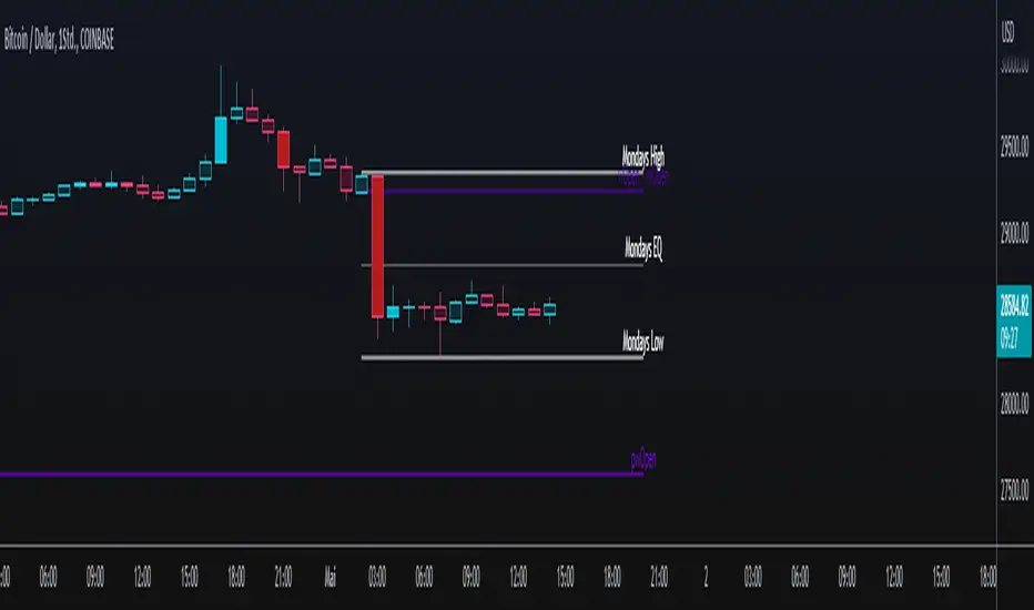
♒RBCI - Range Bound Channel Index by Cryptorhythms♒ RBCI - Range Bound Channel Index by Cryptorhythms
Intro
This is my best approximation of the RBCI. Its not perfect, but it does the job well enough.
A good way to use it is to enter when the singal line (light blue) RE ENTERS the channel from below. I circled these points on the indicator in green.
Description
Information to create was gathered mostly here: www.finware.com
RBCI (Range Bound Channel Index) – is calculated by means of the channel (bandwidth) filter (CF). Channel filter simultaneously fulfills two functions:
Removes low frequent trend formed by low frequent components of the spectrum with periods, more T2= 1/fc2;
Removes high frequency noise formed by the high frequent components of the spectrum with periods, less T1= 1/fc1.
👍 Enjoying this indicator or find it useful? Please give me a like and follow! I post crypto analysis, price action strategies and free indicators regularly.
💬 Questions? Comments? Want to get access to an entire suite of proven trading indicators? Come visit us on telegram and chat, or just soak up some knowledge. We make timely posts about the market, news, and strategy everyday. Our community isn't open only to subscribers - everyone is welcome to join.
For Trialers & Chat: t.me
Cari dalam skrip untuk "range"
Dotenslayer : An open range breakouts method indicator for botThis script shows the long and short points of certain Japanese bots like 'DotenKun' which use open range breakouts method.
Searching recent 18 bars as default and shows the range calculated with a factor (default k = 1.6). You can edit this condition by yourself.
When filled the long or short conditions, also shows the indicator on the price chart to help your trading on BTC.
Also, this script can make alarm events related to those conditions.
This script only works for BTCUSD, XBTUSD, BTCJPY, FXBTCJPY with 1H time span.
Disclaimer :
I don't own the source code of the certain bots and I didn't directly reference the source code of it.
So which means, I don't guarantee this script works as same as the bots works.
Also, I didn't mean to disturb their trading bot businesses.
Your donations are welcome! :
BTC : 327MqYGfHJFC7LRijGwQZXdTAyFwvYCzyv
ETH : 0x5E270c3667E65ba6158D292a98c5b54F81AfCAf1
Range Trend Channels with Flip Signals 0.1.0Range Trend Channels with Flip Signals 0.1.0
Purpose:
- Detects "range trend" patterns on the chart using
4-bar structures.
- Draws main channel lines, parallel lines, and "third lines"
on valid hard closes above/below.
- Generates BUY/SELL signals based on candle interaction
with the third lines.
Features:
• Configurable number of recent patterns to keep.
• Adjustable hard-close buffer in ticks.
• Adjustable line width and style.
• Separate colors for bullish (green) and bearish (black) ranges.
• Extra third line colors for each type.
• Option to enable/disable hard-close detection per side.
• Signal system with:
– Strict next-bar or window-based mode
– Candle color filtering
– Minimum body size requirement
– Optional momentum filter
• Alerts for BUY/SELL signals.
Usage Tips:
- Use on your preferred timeframe for spotting
structure-based continuation/reversal points.
- "Hard-close buffer" helps prevent false triggers
from small overlaps.
- In strict mode, signals fire on the very next bar
after the third line is created.
- In window mode, signals can trigger within a
specified number of bars after third line creation.
Multi Ranges Volume Distribution [LuxAlgo]The Multi Ranges Volume Distribution tool allows traders to see the volume distribution by price for three different timeframes simultaneously. Each distribution can report the total amount of accumulated volume or the accumulated buy/sell volume separately.
Levels are displayed at the top and bottom of each timeframe's range, as well as the POC or level with the most volume.
🔶 USAGE
By default, the tool displays daily, weekly, and monthly volume distributions, highlighting the accumulated volume within each row.
Each distribution shows the volume at each price, as well as three lines: the top and bottom prices, and the price at which the most volume was traded.
The reported accumulated volume can be useful for highlighting which price areas are of the most interest to traders, with the specific timeframe specifying whether this interest is long-term or short-term.
🔹 Timeframes & Rows
Traders can adjust the timeframe and the number of rows for each volume distribution.
This is useful for multi-timeframe analysis of volume at the same price levels, or for obtaining detailed data within the same timeframe.
The chart above shows three volume distributions with the same monthly timeframe but a different number of rows; each is more detailed than the previous one.
🔹 Total vs Buy & Sell Volume
Traders can choose to display either the total volume or the buy and sell volumes.
As we can see on the above chart, the background of each row uses a gradient that is a function of the delta between the buy and sell volumes.
This is useful to determine which areas attract buyers and sellers.
🔶 SETTINGS
Volume Display: Select between total volume and buy and sell volume.
Distance between each box: Adjust the spacing of the volume distributions.
Period A: Select a timeframe and the number of rows.
Period B: Select a timeframe and the number of rows.
Period C: Select a timeframe and the number of rows.
Standard Deviation Range with Box (NY Session Timeframe)
---
Standard Deviation Range with Box (NY Session Timeframe)
This TradingView script is designed to help traders visualize a **price range** along with **standard deviations** during the **New York session (GMT-5)**. It provides key insights into market movements and standard deviation levels, all while offering graphical representations for easy analysis.
#### **Key Features**:
*⏰ Customizable Time Range**:
- Define a **start** and **end time** for the price range during the New York session (default: 09:40 to 09:50 GMT-5).
- The script automatically converts the specified time into New York timezone timestamps.
**📦 Price Range Box**:
- Draws a **dynamic box** to capture the **highest** and **lowest** prices during the defined timeframe.
- The box automatically updates as the highest and lowest prices change during the session.
**📏 Standard Deviations**:
- Calculates **standard deviation levels** (e.g., -1.5, 2, 2.5, -2, -1) based on the session's high-low range.
- Plots **horizontal lines** to represent these standard deviations, allowing for quick visual analysis of price volatility.
**🎨 Graphical Customization**:
- Customize the **box color**, **background color**, and **line styles** to match your chart’s aesthetics.
- The standard deviation lines are also customizable in terms of color and style for optimal visual clarity.
**💬 Watermark and Information Overlay**:
- Displays a **quote watermark** on the chart. The default quote is: "Patience is the price of the best opportunities."
- Provides real-time **symbol information** (ticker, timeframe, date) for context while analyzing the chart.
**🔄 Dynamic Updates**:
- Continuously updates the **highest** and **lowest** prices during the selected session.
- The box and deviation lines are automatically redrawn with each new bar during the session.
**Use Case**:
Ideal for traders who want to analyze **price movements** and **volatility** within a specific New York session window. It offers a clear view of the market’s historical range and current volatility, helping traders make data-driven decisions.
#### **How It Works**:
**Set the Time Range** ⏱️: Choose your start and end time for the New York session price range.
**Observe the Box** 📦: View the box showing the high/low price range for the session.
. **Check Standard Deviations** 📉: Monitor how the price relates to various standard deviation levels (plotted as horizontal lines).
**Watch Watermark & Info** 🧑💻: View your selected symbol’s **ticker**, **timeframe**, and **date** on the chart.
Adaptive Range Scalper - KetBotAIThe Adaptive Scalper is designed to dynamically adjust entry, take-profit (TP), and stop-loss (SL) levels based on the latest market price. It combines multiple tools to provide traders with actionable insights, suitable for a range of trading styles and timeframes.
How the Indicator Works
Dynamic Levels:
- Yellow Dotted Line: Represents the entry level, following the latest price dynamically.
- Green Line: The Take Profit (TP) level, calculated as a multiple of the current price, adapts in real-time.
- Red Line: The Stop Loss (SL) level, placed below the price and also dynamically adjusts.
Bollinger Bands:
Provides context for market volatility and potential overbought/oversold zones.
Narrowing bands signal consolidation, while expanding bands indicate increased volatility.
Buy and Sell Signals:
Buy Signal: Triggered when the price crosses above the lower Bollinger Band.
Sell Signal: Triggered when the price crosses below the upper Bollinger Band.
These signals help traders time entries and exits based on momentum shifts.
Risk/Reward Analysis:
Visual shading shows the favorable risk/reward zone between the stop loss and take profit levels.
Timeframe Suggestions
Short-Term Traders (Scalping):
Use on 5-minute to 15-minute charts.
Focus on high-volatility periods for quick entries and exits.
Intraday Traders:
Ideal for 30-minute to 1-hour charts.
Provides more stable signals and less noise.
Swing Traders:
Best suited for 4-hour or daily charts.
Captures broader trends with fewer signals, allowing for larger moves.
Tool Combination
Volume Profile:
Combine with volume-based tools to confirm key support/resistance zones around TP and SL levels.
Trend Indicators:
Use with Moving Averages (e.g., 20-period or 50-period) to identify the broader trend direction.
Example: Only take buy signals in an uptrend and sell signals in a downtrend.
Momentum Oscillators:
Pair with tools like RSI or MACD to avoid entering overbought/oversold conditions.
Support/Resistance Lines:
Manually mark significant levels to confirm alignment with the indicator’s TP and SL zones.
Useful Advice for Traders
Risk Management:
- Always assess the risk/reward ratio; aim for at least 1:2 (risking 1 to gain 2).
- Adjust the multiplier to match your trading style (e.g., higher multiplier for swing trades, lower for scalping).
Avoid Overtrading:
Use the indicator in conjunction with clear rules to avoid false signals during low-volatility periods.
Monitor market volatility:
Pay attention to narrowing Bollinger Bands, which signal consolidations. Avoid trading until a breakout occurs.
Test on Demo Accounts:
Practice using the indicator on a demo account to understand its behavior across different assets and timeframes.
Focus on High-Liquidity Markets:
For the best results, trade highly liquid instruments like major currency pairs, gold, or stock indices.
Summary
The Adaptive Range Indicator dynamically adjusts to market conditions, offering clear entry and exit levels. By combining it with Bollinger Bands and other tools, traders can better navigate market trends and avoid noise. It’s versatile across multiple timeframes and assets, making it a valuable addition to any trader’s toolkit.
Katalyst's Opening Range BreakoutKatalyst's Opening Range Breakout + No Trade Zone
📜 Overview:
This indicator allows traders to visualize the high and low of the opening range for a user-selected timeframe (e.g., 30s, 1m, 5m, 15m). It features fully customizable lines, labels, and an optional **No Trade Zone** fill to help you identify breakout levels with ease.
---
🎯 Key Features:
1. **Customizable Opening Range**:
- Select your preferred opening range duration: **30 seconds, 1 minute, 2 minutes, 5 minutes, 10 minutes, or 15 minutes**.
- The indicator calculates and plots the **high** and **low** of the selected opening range.
2. **Dynamic Line Styling**:
- Choose the **line color**, **transparency**, and **style**: **Solid, Dashed, or Dotted**.
- Lines extend to the right of the chart for clarity.
3. **No Trade Zone** *(Optional / Disabled by default)*:
- When enabled, fills the area between the high and low lines with a customizable **color and transparency**.
- Helps visually identify consolidation areas where trading might be avoided.
4. **Labels for Precision**:
- Clearly displays the **Opening Range High** and **Low** values.
- Labels are color-coded and positioned dynamically for easy interpretation.
5. **Clean and Efficient Updates**:
- The indicator deletes old lines, labels, and fills before creating new ones, ensuring a clutter-free chart.
---
⚙️ How to Use:
1. **Select Your Timeframe**:
- From the settings, choose your desired opening range duration: 30s, 1m, 2m, 5m, 10m, or 15m.
2. **Customize the Visuals**:
- Adjust line color, style, and transparency.
- Enable the **No Trade Zone** for a transparent background fill between the high and low lines.
3. **Interpret the Breakout**:
- Watch for price movements above or below the **opening range** to identify potential breakout opportunities.
---
🛠 Settings:
Opening Range Duration: Select the timeframe for the opening range (30s, 1m, 2m, 5m, 10m, 15m).
Line Color: Set the color of the range lines.
Line Transparency: Adjust the transparency of the lines (0 = solid, 100 = invisible).
Line Style: Choose line style: Solid, Dashed, or Dotted.
Label Colors: Customize the label colors for the high and low values.
Enable No Trade Zone: Fill the area between high and low lines with a transparent color.
No Trade Zone Color: Set the fill color for the no trade zone.
No Trade Zone Transparency: Adjust the transparency of the no trade zone fill.
---
📈 Ideal For
Day traders and scalpers looking to trade **breakouts**.
Traders who want to identify areas of consolidation visually.
Anyone who relies on the **opening range** for their trading strategy.
---
🔍 Example Usage:
Set the opening range to **5 minutes** and enable the **No Trade Zone** with a light red fill.
Watch for price to break above or below the high/low lines to signal potential trade opportunities.
---
✨ Why Use This Indicator?
This script simplifies your breakout strategy by providing a clear, visually appealing representation of the opening range. The flexible customization options and the optional **No Trade Zone** make it a powerful tool for identifying high-probability trades.
---
Let me know if you need any additional tweaks or clarifications for this description. It's all set to help traders understand and use your powerful script! 🚀📈
Monday range by MatboomThe "Monday Range" Pine Script indicator calculates and displays the lowest and highest prices during a specified trading session, focusing on Mondays. Users can configure the trading session parameters, such as start and end times and time zone. The indicator visually highlights the session range on the chart by plotting the session low and high prices and applying a background color within the session period. The customizable days of the week checkboxes allow users to choose which days the indicator should consider for analysis.
Session Configuration:
session = input.session("0000-0000", title="Trading Session")
timeZone = input.string("UTC", title="Time Zone")
monSession = input.bool(true, title="Mon ", group="Trading Session", inline="d1")
tueSession = input.bool(true, title="Tue ", group="Trading Session", inline="d1")
Users can configure the trading session start and end times and the time zone.
Checkboxes for Monday (monSession) and Tuesday (tueSession) sessions are provided.
SessionLow and SessionHigh Functions:
SessionLow(sessionTime, sessionTimeZone=syminfo.timezone) => ...
SessionHigh(sessionTime, sessionTimeZone=syminfo.timezone) => ...
Custom functions to calculate the lowest (SessionLow) and highest (SessionHigh) prices during a specified trading session.
InSession Function:
InSession(sessionTimes, sessionTimeZone=syminfo.timezone) => ...
Determines if the current bar is inside the specified trading session.
Days of Week String and Session String:
sessionDays = ""
if monSession
sessionDays += "2"
if tueSession
sessionDays += "3"
tradingSession = session + ":" + sessionDays
Constructs a string representing the selected days of the week for the session.
Fetch Session Low and High:
sessLow = SessionLow(tradingSession, timeZone)
sessHigh = SessionHigh(tradingSession, timeZone)
Calls the custom functions to obtain the session low and high prices.
Plot Session Low and High and Background Color for Session
plot(sessLow, color=color.red, title="Session Low")
plot(sessHigh, color=color.red, title="Session Low")
bgcolor(InSession(tradingSession, timeZone) ? color.new(color.aqua, 90) : na)
Apeiron Jail RangeThe Apeiron Jail Range is an experimental use of proprietary standard deviation calculations.
It calculates price standard deviations based of previous data & a MA, which it applies and anchors to an automatically (can also be done manually) selected TF open. Finally, the standard deviation bands are plotted and create a "Jail" range with up to 12 levels (6 above and 6 below) that can potentially work as support and resistance during the TF period anchor time.
The indicator is meant to help traders identify potential support and resistance levels which can then be used in confluence with other indicators and strategies. It can also be potentially used for testing automation strategies such as grid trading.
The anchor time and the lenght of the MA used for the calculation can be manually or automatically selected.
The example shown uses the same indicator twice to show all levels from 0.5 - 1 - 1.5 ... 5.5 - 6
Days in rangeThis script is a little widget that I made to do some homework on the VIX.
As you can see in the chart I was analyzing the 2008 market crash and the stats that followed it after until the market started to recover.
You can see that theory in my "Ideas" tab.
This is an interactive set of lines that you can use to count the the bars inside and outside of your chosen range, and the percentage outside that range.
You should initially enter the price range of your product in the menu and set some arbitrary dates that you can easily see on your chart.
Drag and drop the lines around to suit what price and the dates you are analyzing.
The table will display the bar count inside and outside of the range, the total bars, and the percentage outside that range.
I personally used this as a tool to study the overall average of the product, compared with the behavior during major market events.
It is currently my opinion that post 2020 analysis needs to take into account the behavior of any given product prior to 2020 when the
VIX was in its comfort zone. Not to say that a price valuation hasn't been set, but that the movement to that price was outside of "Normal Market Conditions,"
and the time factor to return to that value might be skewed. Other factors would need to be considered at that point pertaining to your specific product or corelating indicator.
I could see this tool being useful to Forex and commodities traders. But that isn't my field so that that for what it is. I do think it would perform best on something that is more
pegged to a price range. I personally would use it on product's, like the VIX, that I use as an indicator product. That is what it was designed for.
But I suppose it could be used for Mean price and time related analysis, maybe with a Vwap, SMA or other breakout style indicators.
Volume analysis might be pretty sporty. Possibly time patterns... the possibilities could be endless. Or... limited.
I am publishing this for my trade group so that it can be tinkered with to find other helpful ways to use it.
If anyone finds something interesting with other indicators, please drop a comment below and I could consider creating a script to integrate with this tool.
Body / Range %Body / Range is a volatility indicator that shows how many percentages the body candle occupies the range.
The ratio tells us about the health and confidence of the current candlestick.
Since overall candle Range is always bigger than the body range, Body/Range indicator will always fluctuate inside a range of 0 and 100%.
I didn't use True Range because it considers gaps and the ratio won't be considering individual candles. Therefore, I used high - low and identified it as Range.
In this function, the wicks play obviously role in determining the ratio too without its variable separately in the formula. I wouldn't use wicks here because Range = body + total wicks anyway. It already covers the variable. If I made the ratio with Body / Total Wicks, we wouldn't have stable 0 - 100% range of the indicator by the way. So it's fully justified dividing Body by Range to get some summarized Candle Metrics.
Logically we assume that if wicks are relatively bigger than body then the ratio will be relatively smaller and vice versa.
Change TF of the indicator is possible. For example, 3 months per bar would look like this:
Michigandolf's 30min Opening Range (w/Extensions)See previous version for explanation of the 30min Opening Range:
This new version is for users that prefer to see the Opening Range Extensions.
The extensions are based on the distance from the Opening Range High to the Mid Point (or Low to the Mid Point).
Previous Days RangesPrevious Days Ranges
Simply plots out market ranges of previous days price action, of which are the following:
Previous Day High
Previous Day Low
Previous Day Extended High
Previous Day Extended Low
Supports adjustments of timeframes, for different time zones, and style.
Operietur ⸗ Time Range BreakoutOur T.R.B ( Time Range Breakout ) indicator is very similar to the O.R.B ( Open Range Breakout ) indicator. This script plots the high/Low within a custom time-range which then extends that plot to end-of-day. A Fibonacci extension is then drawn from that range. The default settings of this indicator set the similarities to the ORB. This script only displays the last trading day.
Due to Tradingview's singular refresh rate for the larger timeframes("resolutions"); this indicator works on timeframes LESS than 60min. Additionally, the smaller the timeframe the more accurate the price range will be.
The movements within the specified period of time define the projected Fibonacci prices associated with the allotted time's price range.
• Custom Time Range
• Fibonacci Extensions
• Up to 5 PTs
• Customizable Multiplier
Additional script features allow for fully adjustable settings and configurations:
• Adjustable; PT Colors
• Adjustable; Range Color
• Adjustable; Toggles
Cuban's Range Reversal OverlayBeen a minute since a public script!
This one looks at the range and recommends potential reversal depending on degree of overextension.
Originally intended for low timeframe short time horizon reversals but works well on higher timeframes as well.
Oscillator included in the image so you can see under the skirt and check what's happening.
ATR Timeframe RangeThis indicator shows the ATR range on the daily or any other timeframe on your current chart. All settings are fully customize-able.
[C] Dynamic Range Channel based on ATR on Multi Time FramePlots the dynamic range from the calculated Average True Range of the security. The calculated price that it could return to from high to low and vice versa. Has been tested on multiple time frames on NSE equity stocks.
Range OscillatorRange Oscillator is a centered oscillator that can be classified as both trend and momentum indicator and also as either bound limited or non-limited one.
The main part is a measure of difference between specified source (Price, if source is set to close) and average of highest and lowest price in a given period(Range), plotted as histogrsam.
Thus when level of price is above this average, oscillator shows bullish trend and if the price trades below it, oscillator will show bearish trend.
Height of histogram shows momentum, as price diverges from base bars of histogram will grow longer and this also indicates a rising momentum. And a narrowing histogram shows that trend and momentum are fading.
Indicator can be modified in various ways as there are plenty of options available...
The first option you will see is the mode option. Oscillator can be set to basic, percent and index modes.
Basic mode is simply the distance of source from base. Percent mode calculates the percent of this distance. And Index mode limits the oscillator to percent of range, where 50 is the center.
Look-back period is the number of bars that will be checked to canculate range. (20-60 is suggested)
Then there is smoothing option which is enabled as default and you have 4 types of moving averages (SMA, EMA, WMA, RMA) to choose as smoothing method of signal or turn it off.
Another double moving average is provided if you would like to add more filtering layers to signals. Histogram will be changing colors based on moving average crosses if they are enabled. Second MA can be used as source of first MA to simulate K and D.
Next option is to whether have wicks included in range calculation or not.
And levels and source can be modified at the end.
Overbought/Oversold...
Oversold and overbought levels can be seen in all modes. In non-index modes the levels are not fixed, but canculated in percent and plotted around center level dynamically.
Remeber that these areas are not there to signal reversal but trend strength.
Default threshold is set to 70 for overbought and 30 for oversold, and can be changed according to security or self preferences.
Readings above overbought level would indicate that the underlying security was trading near the top of high-low range for the specified period of bars back. Readings below oversold occur when a security is trading at the low end of its high-low range.
Signals...
Center Cross
As explained, Center Cross (The most basid signal generated by indicator) could be a result of possible change in trend.
Bull/Bear Divergences
Divergences form when a new high or low in price is not confirmed by the oscillator. A bullish divergence forms when price records a lower low, but the Range Oscillator forms a higher low. This shows less downside momentum that could forecast a bullish reversal. A bearish divergence forms when price records a higher high, but the Range Oscillator forms a lower high. This shows less upside momentum, and indicates a possible bearish reversal. Once a divergence happens, other confirmation such as Center Line cross or a trend break-out on the chart, should be considered to signal an actual reversal.
Twin Peaks
Since the similarity of Range Oscillator and Awsome Oscillator, Twin Peaks can also be considered as signals in non-Index modes.
Twin Peaks is a method which considers the differences between two peaks on the same side of the Center Line.
A Bullish Twin Peaks setup occurs when there are two peaks below the Center Line. The second peak is higher than the first peak and followed by a light bar. The trough between the two peaks, is recommended to remain below the Center Line the entire time.
A Bearish Twin Peaks setup occurs when there are two peaks above the Center Line. The second peak is lower than the first peak and followed by a dark bar.
Momentum Failure
The situation happens when signal bars can't cross into overbought/oversold areas, which can lead to a strong trend reversal.
Saucer
A Saucer Setup looks for fast momentum changes in three consecutive bars on non-Index modes specially. Bars must be on the same side of the Center Line.
A Bullish Saucer setup occurs when the Oscillator is above the Center Line. It entails two consecutive dark bars (with the second bar being lower than the first bar) being followed by a light Bar.
A Bearish Saucer setup occurs when the Oscillator is below the Center Line. It entails two consecutive light bars (with the second bar being higher than the first bar) being followed by a dark bar.
Break-outs
Break-outs of lines generated from connecting peaks on non-Index modes can be considered as signal. Break-outs often provide faster signals that Center Line cross.
Example chart with Basic mode:
GBPUSD, 1D
Attention: Like most of other indicators, the point that it is based on historical data of price will often result in false signals.
It is very important to use the Range Oscillator with causion, And in conjunction with other technical analysis.
5 Sessions RangeThis script averages the range of the previous 5 sessions and displays it on the chart
The sessions are adjustable
True Rolling Pivot Range IndicatorHere is the actual 3 day rolling pivot range indicator as detailed in Mark Fisher's book The Logical Trader.
ATR True Range - Multi Timeframe - BonavestTo add this indicator to your charts:
Click the 'Add to Favorite Scripts' button down below this description.
This simple indicator is merely for displaying mulitple ATR ranges at a glance on one chart.
SETTINGS
Each ATR is completely configurable:
Length - to base the ATR on
Timeframe - 'Chart' uses the current chart resolution; other timeframes are available on pull downs
Multiplier - Each ATR can use a multiplier to be able to show multiples or fractions of the full ATR. (i.e. 85=85%, 150=150%)
Dark Theme - Default colors for black or dark backgrounds
I use this indicator for:
Determining price ranges
Setting stop losses and take profit levels
CD_Average Daily Range Zones- highs and lows of the dayUses daily average ranges of 5 and 10 (most used) as buy (support) and highs (resistance) areas - half ranges used in calculations for a more accurate "forecast" of the H and L . Uses open but not close, so it does not repaint - experimental
ATR - Average True Range + Dynamic Trend w/ Signals | by Octopu$↕ ATR - Average True Range + Dynamic Trend w/ Signals | by Octopu$
What is ATR?
ATR stands for Average True Range
A Technical Analysis Indicator that measures market volatility by decomposing the range of a Security Price in a specific period.
The ATR can be used as a High Low Spectrum,
As well as a variation of a Moving Average, considering the ranges on a timeframe, generally this being 14 days.
Shorter periods can be used (will generate more signals) or longer periods for steadier trends (for fewer signals)
A ticker on a high volatility has a high ATR.
A ticker on a low volatility has a low ATR.
It is an useful resource for a trading system:
Can be used to enter or exit trades and/or also measure the daily spectrum of a stock.
Does not necessarily points price direction, but takes into account gaps and strong legs.
Can also be used as trading positions confirmation,
Rather be it for stop losses or take profits,
As well as setting trailing stops or limit orders.
This tool offers a great Risk to Reward Ratio, considering the fact you will be aware of the possible moves that an asset can perform.
This indicator should not be used as a standalone tool.
(The combination of factors relies on your own knowledge about Confluence Factors along with your Due Diligence)
This indicator is not an advice to buy or sell securities.
www.tradingview.com
SPY
ANY Ticker. ANY Timeframe.
(Used SPY 5m as Example only)
Features:
• ATR ( Average True Range )
• Range UP and DOWN
• Movement from Price Line
• Dynamic ATR
• Cross/Test Signals
• Live and Last Close
Options:
• Specific Factors Setup
• Length Customization
• Toggle On/Off
• Color PIcker
• Styling Options
Notes:
v1.0
Indicator release.
Changes and updates can come in the future for additional functionalities or per requests. Follow and Stay Tuned!
Did you like it? Please Support and Shoot me a message! I'd appreciate if you dropped by to say thanks! Thank you.
- Octopu$
🐙