Session Makers v1
Session Makers v1 - Professional Trading Session Visualizer
This advanced indicator highlights key trading sessions and market structure levels, helping traders identify optimal trading times and important price levels.
Key Features:
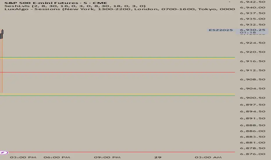
Session Time Markers
- Vertical dotted lines at major market opens (London/New York)
- Appears 30 minutes before each session for early preparation
Interactive Session Boxes
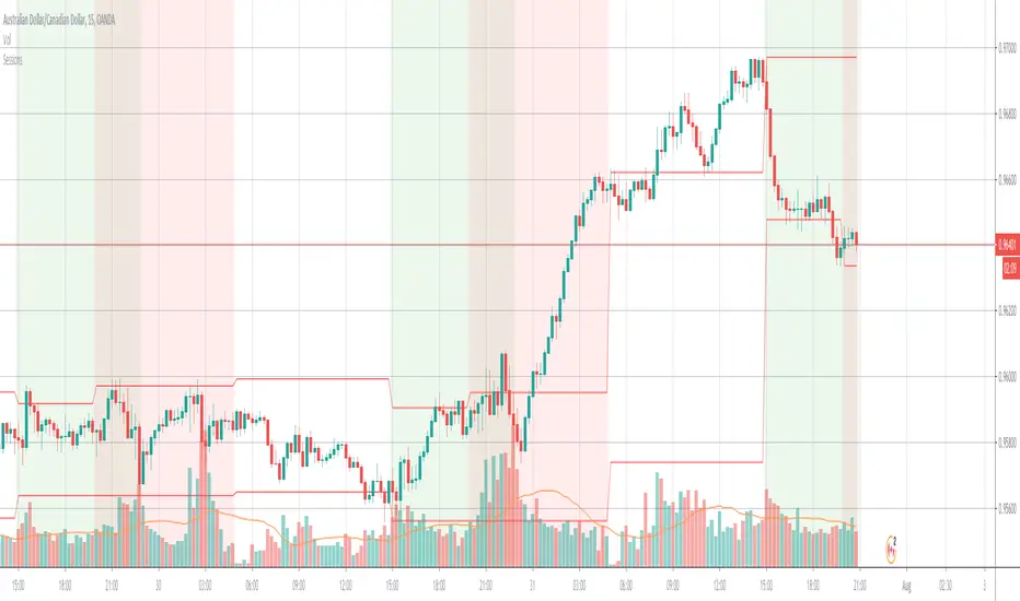
- Asia Session (22:00-06:00 GMT) - Blue shaded area
- London AM (08:00-09:00 GMT) - Gray shaded area
- London/New York Overlap (14:00-15:00 GMT) - Gray shaded area
Key Reference Levels
- Yesterday's high/low (with touch alerts)
- Previous week's high/low (with touch alerts)
- Asia session high/low/mid lines
Smart Visual Design
- Clean, non-cluttered visuals that adapt to your chart
- Customizable colors and transparency for all elements
- Optimized for all timeframes (M1-H4)
only use in timeframes <= 15 min
Cari dalam skrip untuk "session"

Session VWAP Cumulative BiasThe Session VWAP Cumulative Bias indicator is designed to differentiate between "choppy" price action and true "institutional" trend days. Unlike standard VWAP indicators that only show where price is now, this tool tracks the cumulative sentiment of the entire session.
Core Functions:
Cumulative Z-Score Logic: It calculates the distance between price and VWAP (in Standard Deviations) and sums it up over the course of the day. This reveals the "weight" of the market bias—the longer price stays pinned away from the VWAP, the more extreme the histogram becomes.
Scale Protection: It includes a "Capping" mechanism that prevents morning gaps or low-volume outliers from distorting the scale, ensuring the histogram remains readable from open to close.
Momentum vs. Regime Toggles: Users can switch between VWAP Slope (measuring the speed of the average's movement) and Cumulative Bias (measuring total session dominance).
Visual price Overlay: It automatically colors the price candles and plots a session-anchored VWAP line on the main chart, providing a clear visual of when price is "fair" versus "overextended."
How to read it:
Trend Confirmation: A steadily growing "mountain" in the histogram confirms an institutional trend day where dips are being bought (or rips sold).
Mean Reversion: When price hits a new high but the Cumulative Histogram begins to round off or diverge, it signals that the "elastic band" is stretched and price is likely to return to the orange VWAP line.
Regime Shifts: A cross of the zero-line on the histogram indicates a total shift in session control from buyers to sellers (or vice versa).

Auto Session Fib (Daily / Weekly)Session-Anchored Fibonacci (RTH Only)
Automatically tracks the Regular Trading Hours session (09:30–16:00).
Fibonacci levels are built only from session high and low, not overnight noise.
Levels dynamically update throughout the session and anchor precisely at 09:30.
Session levels plotted:
High / Low
50% retracement
61.8%, 78.6%, 88.6% (bullish and bearish interpretations)
These levels are intended for intraday execution, not bias.
2️⃣ Previous Week Fibonacci (Market Context)
Displays previous week High, Low, and Fibonacci retracements.
Lines are confined strictly to the prior week (no overlap into the current week).
Levels are shown in a faint gray to distinguish context from execution.
Each key fib level includes descriptive labels, not just numbers:
61.8% → Golden Zone anchor
78.6% → Deep pullback / last defense
88.6% → Trend failure / trap zone
These are decision-framing levels, designed to help identify where trends either hold or fail.
3️⃣ Previous Day Extension Zones (Expansion Targets)
Calculates previous day range and projects:
+1.618 / +1.786
−1.618 / −1.786
Draws filled zones (no borders) between:
1.618 ↔ 1.786
−1.618 ↔ −1.786
Boxes extend only across the current RTH session.
These zones represent expansion / exhaustion areas, not reversal signals by themselves.
4️⃣ RSI Turn Signals (Clean, Non-Repainting)
Uses a standard RSI, with:
Adjustable length
Adjustable overbought / oversold levels
Optional independent RSI timeframe (can differ from chart TF)
Signals trigger only on a turn, not while RSI remains extreme:
Buy: RSI crosses up through oversold
Sell: RSI crosses down through overbought
This indicator is built to answer three questions:
Where am I relative to important structure?
Is price extended or mean-reverting?
Is there a confirmed momentum turn?

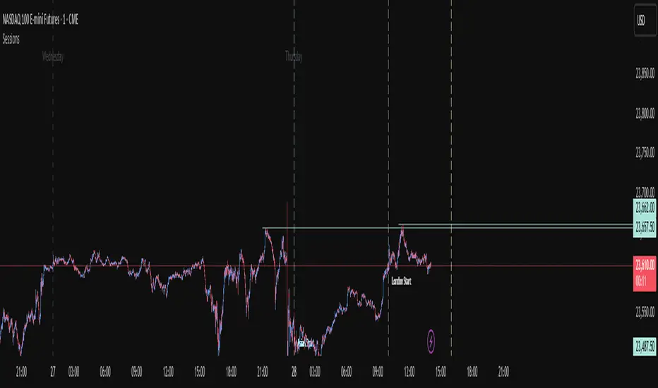
Sessions (NY • London • Asia)This tool highlights the London, New York, and Asia sessions on your chart. You can change the session times to whatever you want, making it easy to see which session the market is in.

Sessions - [CLEAN SESSION LEVELS UPDATED 2.0 ]s indicator automatically plots high and low levels for all major trading sessions — Asia, London, and New York — helping traders identify key liquidity zones and structure points throughout the day. Designed for precision and clarity, it adapts seamlessly across timeframes and pairs, making it ideal for session-based strategies, sweep setups, and intraday market structure analysis.

Session Opens by TradeSeekersIt doesn't get much simpler than this indicator for futures traders wanting to track four key session open prices.
Sessions
1. ETH open - extended hours starts
2. Midnight open - new calendar day starts
3. CME open - Chicago exchange opens, data releases
4. RTH open - regular trading hours, volume cometh
Usage
All four of these prices / areas are important for futures traders to pay attention to.
RTH opens far below ETH sometimes will retrace, CME and RTH together can act as a powerful range.
Midnight open sometimes has little importance for the day, but then again it's provided beautiful bounces. Again each level I find to be impactful nearly every session, so I like to keep them close by in an understated manner.
Timezone
If you're not EST, adjust the timezone string accordingly (refer to TradingView docs for string formats).
Proximity Detection
Also, I added proximity detection that aims to keep level collisions from occurring. If a particular session open isn't shown it may be due to being exactly the same price as another open or it's too close to another open.
The proximity sensitivity can be adjusted in settings. The on chart appearance doesn't impact the alerting capability.
Aesthetics
I don't like boring charts so I added a fun "glow" effect, I went with a palette that reminded me of clear sky colors at those times of day (if you're EST).
Alerting
Alerting can be done with just a single alert, first open the indicator config and uncheck any session opens you don't want to be alerted on (why!?), and then use the standard alert menus in TradingView to set the alert on "Any alert() function call".
Why does this beautiful indicator exist?
While there are a handful of indicators that plot open prices with some overlap to this one, I didn't see any that alerted automatically without much fuss.

Sessions+Days Marker (SigmaSita)An indicator that marks the sessions and days. You can adjust session start times. Sessions are Asian, London and New York.
Session Shading (Asia, London, NY)This indicator highlights the three major trading sessions — Asia, London, and New York — on your chart in any time zone. Each session is shaded a different color, with optional labels marking when each begins. It’s designed to help traders quickly see when global market centers are active, identify overlaps between sessions, and align entries or exits with periods of higher liquidity and volatility.

Session Shading (Asia, London, NY) — ESTThis indicator highlights the three major trading sessions — Asia, London, and New York — on your chart in Eastern Time. Each session is shaded a different color, with optional labels marking when each begins. It’s designed to help traders quickly see when global market centers are active, identify overlaps between sessions, and align entries or exits with periods of higher liquidity and volatility.
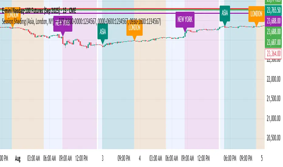
Session Shading (Asia, London, NY) — PSTThis indicator highlights the three major trading sessions — Asia, London, and New York — on your chart in Pacific Time. Each session is shaded a different color, with optional labels marking when each begins. It’s designed to help traders quickly see when global market centers are active, identify overlaps between sessions, and align entries or exits with periods of higher liquidity and volatility.

Session Stats + (dc_77)The "Session Stats + (dc_77)" indicator is a Pine Script tool designed to analyze trading sessions by plotting key price levels and statistical metrics. It displays a session's open price, manipulation levels (mean and median price movements), and distribution levels based on historical session data, with customizable time zones and session times. Users can toggle projections for 1-hour, 4-hour, daily, weekly, and monthly timeframes, showing average manipulation and distribution distances from the session open. Visual elements like shaded areas, labeled lines, and a vertical anchor line enhance readability, with options to filter data by day of the week. Alert conditions are included to notify users when the price crosses significant levels, such as the session open or manipulation/distribution thresholds.

Session Highs and Lows IndicatorThis indicator marks the high and low levels for key trading sessions, allowing traders to identify significant price zones across different markets. The default session times are defined in UTC and will automatically adjust to your local timezone:
- **London Session (07:00-09:00 UTC)**: Tracks intraday liquidity zones for potential highs/lows.
- **New York Session (12:00-14:00 UTC)**: Highlights volatility during market overlaps with Europe.
- **Asia Session (23:00-01:00 UTC)**: Confirms trend continuation and retracement opportunities.
- **New York Close Session (19:00-21:00 UTC)**: Focuses on reversals and breakout tests during global transitions.
The script dynamically updates session highs and lows with clear labels and dashed horizontal lines for better visualization. **Time ranges can be adjusted to suit your trading preferences.** This makes the indicator flexible and effective for liquidity hunting, trend trading, and breakout strategies.

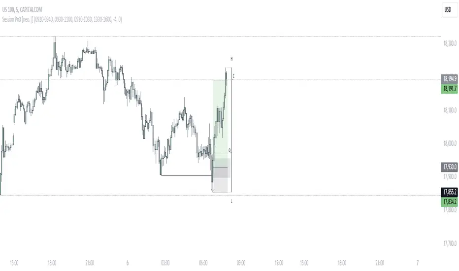
Session OHLC [neo.|]OHLC/OLHC and Po3 (Power of Three by ICT) are both concepts describing a potential way to describe candle formations. While OHLC stands for Open High Low Close, what it usually refers to is the bearish scenario of how a candle first opens, manipulates until the high then creates the low before closing, and vice versa for OLHC. Po3 goes hand in hand with this concept as a way to sequentialize this candle formation into three separate cycles seen on a lower timeframe known as "Accumulation", "Manipulation", and "Distribution". Where the accumulation in the OHLC scenario would be the range created before the high, the manipulation being the high, and the distribution being the run downwards to the low.
What Session OHLC allows you to do, is to view these Po3 scenarios not through a higher timeframe candle perspective, but instead through a fully customizable session perspective. For example, you might want to see a specific period of time as a candle to simplify the process of identifying an AMD cycle, and all you would need to do is to enter that period of time in the indicator settings, and when you are at that period of time, you will see it being represented as a bar candle, with the session open, high, low, and close being annotated as O, H, L, and C.
This is especially useful for when you want to track the manipulation before a session open, or track a specific time where there is more volume in the market, allowing you to enter trades prior to when a distribution phase will begin.
Currently, you are able to select up to 4 different sessions that will appear on your chart while the session is active, however it is a good idea for the session times you choose not to overlap as the drawings will overlap as well. If you would like to monitor two times that happen to overlap, it is a good idea to add another instance of the indicator to your chart, and adjust the bar offset on one of them in the settings.
Session Highest/LowestFor trader who trade session breaks.
Black background is Asian session, and green is London session, and dark green is NY session which overlap the London session.
Red line is for resistant, and green line for support, which previous session's highest/lowest.
It also can use to show group in 8 tabs to review breaks.
Session barsthis script marks off the extended hours trading for NY session. Shades the off hours and overnight data. Highlights the regular trading session for NY session. It can be adjusted for any particular market.
I use it specifically to show the missing data on the SPY as compared with the continuous data on the SPX500.

Sessions + PDH / PDLTracks the high and low of the NY AM session (8:30–12:00 NY time) and the NY PM session (12:00–16:00 NY time) from the previous day.
Draws thin black lines for each high and low, starting at 8:30 AM the next day.
Adds labels on the right side of the lines (AM High, AM Low, PM High, PM Low) for easy identification.
Works on any timeframe chart.
Purpose: Helps you see key previous day session levels at the same starting time (8:30 AM) for intraday reference.

Session Boxes 03:33-07:30 + 14:00ession Boxes & Pre-Market Structure (14:00–07:30) Indicator
This indicator plots key session structures and highlights a unique pre-market range window using colored boxes on the 15-minute chart. Designed for intraday traders, it visually marks important institutional activity times and a strategic price zone that often sets the tone for the following trading day.
📍 Key Features:
✅ 03:00 AM Box
Draws a purple box around the 03:00 candle (EST) until 16:00 (market close).
Useful for identifying London/early European session impact.
✅ 07:30 AM Box
Draws an orange box around the 07:30 candle (EST) until 16:00.
Marks the key pre-market data release period (e.g., CPI/NFP days).
✅ 🔴 14:00 to Next Day 07:30 Range Box
Draws a red box with 50% opacity starting from the 14:00 (2 PM) candle and ending at the 07:30 AM candle the next day.
This range often represents institutional positioning and pre-market accumulation/distribution zones.
Ideal for identifying breakout or rejection zones for the next session.
⚠️ Important Notes:
Works only on the 15-minute timeframe.
Auto-adjusts to the New York timezone (EST/EDT).
A visual label reminds you to switch to the correct timeframe if you’re on the wrong chart.

Session Open Vertical LinesThis script automatically draws vertical lines on your chart at the exact opening times of three market sessions (in your chart’s timezone):
Asian session → red line
London session → yellow line
US session → blue line

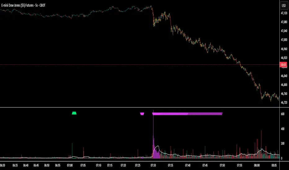
Session Volume Spike Detector (MTF Arrows)Overview
The Session Volume Spike Detector is a precision multi-timeframe (MTF) tool that identifies sudden surges in buy or sell volume during key market windows. It highlights high-impact institutional participation by comparing current volume against its historical baseline and short-term highs, then plots directional markers on your chart.
This version adds MTF awareness, showing spikes from 1-minute, 5-minute, and 10-minute frames on a single chart. It’s ideal for traders monitoring microstructure shifts across multiple time compressions while staying on a fast chart (like 1-second or 1-minute).
Key Features
Dual Session Windows (DST-aware)
Automatically tracks Morning (05:30–08:30 MT) and Midday (11:00–13:30 MT) activity, adjusted for daylight savings.
Directional Spike Detection
Flags Buy spikes (green triangles) and Sell spikes (magenta triangles) using dynamic volume gates, Z-Score normalization, and recent-bar jump filters.
Multi-Timeframe Projection
Displays higher-timeframe (1m / 5m / 10m) spikes directly on your active chart for continuous visual context — even on sub-minute intervals.
Adaptive Volume Logic
Each spike is validated against:
Volume ≥ SMA × multiplier
Volume ≥ recent-high × jump factor
Optional Z-Score threshold for statistical significance
Session-Only Filtering
Ensures spikes are only plotted within specified trading sessions — ideal for futures or intraday equity traders.
Configurable Alerts
Built-in alert conditions for:
Any timeframe (MTF aggregate)
Individual 1m, 5m, or 10m windows
Alerts trigger only when a new qualifying spike appears at the close of its bar.
Use Cases
Detect algorithmic or institutional activity bursts inside your trading window.
Track confluence of volume surges across multiple timeframes.
Combine with FVGs, bank levels, or range breakouts to identify probable continuation or reversal zones.
Build custom automation or alert workflows around statistically unusual participation spikes.
Recommended Settings
Use on 1-minute chart for full MTF display.
Adjust the SMA length (default 20) and Z-Score threshold (default 3.0) to suit market volatility.
For scalping or high-frequency environments, disable the 10m layer to reduce visual clutter.
Credits
Developed by Jason Hyde
© 2025 — All rights reserved.
Designed for clarity, precision, and MTF-synchronized institutional volume detection.
Sessions — Asia / London / New York (shaded + start/end arrows)Asian Session London Session Newyork Session
- adjust time its in utc otherwise you will be trading random times

Intraday Sessions Ranges with Time SegmentationSession Ranges indicator overlays customizable range boxes on major trading sessions (e.g. London, Premarket, NY AM and NY PM) using New York time.
Toggle visibility, add evenly spaced vertical segment lines, and highlight key time zones. Perfect for traders marking price action and levels across multiple historical days.

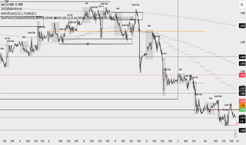
Session Precision Combinations[RICHECAPITAL]The Precise Sessions Indicator provides exact segmentation of data streams into defined sessions for granular performance analysis. By isolating activity within configurable time windows, it enables users to track metrics, monitor engagement, and detect temporal trends with exceptional accuracy. Whether used for user behavior tracking, server performance monitoring, or event-driven analytics, it ensures that insights are tied precisely to relevant time segments — eliminating noise and improving interpretability.
Session LevelsMarks the highs and lows of the previous day New York session and the following Asian and London sessions.