Normalised ATR - Configurable Session Volatility AnalysisThis indicator analyzes price volatility across different trading sessions throughout the day. Here are its key features:
1. **Configurable Time Periods**
- Users can set specific date ranges for analysis
- Supports up to 12 customizable trading sessions
- Adjustable session durations (1-8 hours each)
2. **Volatility Measurements**
- Offers two calculation methods:
* Normalized Range: (High-Low)/Midpoint Price × 100 (as percentage)
* Absolute Range: Simple High-Low difference
- Tracks key statistics for each session:
* Maximum range
* Minimum range
* Average range
* 25% quartile range
3. **Statistical Analysis**
- Calculates 5th and 95th percentiles across all sessions
- Provides visual reference lines for these percentiles
- Shows detailed statistics in a color-coded table
4. **Visual Display**
- Clear tabular display of session statistics
- Color-coded for easy reading
- Plot of daily ranges with percentile bounds
- Session times displayed in UTC
This tool is particularly useful for:
- Understanding market volatility patterns across different trading sessions
- Identifying optimal trading hours
- Planning trading strategies based on historical volatility patterns
- Comparing volatility across different market periods
Cari dalam skrip untuk "session"

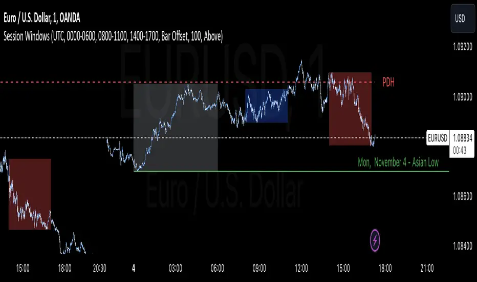
Daily Structure Cycles - Session - PDH/PDLDescription:
The Session Windows indicator visualizes predefined trading sessions on the chart, highlighting key price ranges with customizable background colors and labels. Designed to track session-specific high and low levels, this tool provides visual guidance for analyzing market behavior across different trading windows. It includes three customizable sessions—Asian, Window 1, and Window 2—that can be toggled on or off.
How It Works:
Each session is marked with a colored box, representing the high and low range for that session. Border colors and box transparency can be customized, allowing for easy visual differentiation.
The indicator also displays the high and low levels of the previous day, marked as PDH (Previous Day High) and PDL (Previous Day Low). When the current price crosses these levels, the line style changes, signaling potential support or resistance levels.
Labels for each session high and low are positioned based on the user-defined offset and alignment options, providing easy-to-read markers at the end of each session.
Usage: This indicator helps traders observe price behavior within distinct trading sessions and how the current price interacts with previous day’s highs and lows, which may offer insight into support/resistance zones. Traders can use this tool to spot breakout or reversal points as price moves through session highs/lows or crosses the previous day’s levels.
Customization Options:
Session Settings: Choose session times for Asian, Window 1, and Window 2.
Color Settings: Set different colors for session background and border lines.
Label Positioning: Adjust label offset and vertical position for high/low markers.
PDH/PDL Levels: Toggle lines for previous day’s high and low, with color and line style options.
Limitations: This indicator is designed for visualization purposes and is best used alongside other tools for confirmation, as it does not provide standalone buy or sell signals.
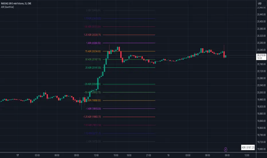
Average Session Range [QuantVue]The Average Session Range or ASR is a tool designed to find the average range of a user defined session over a user defined lookback period.
Not only is this indicator is useful for understanding volatility and price movement tendencies within sessions, but it also plots dynamic support and resistance levels based on the ASR.
The average session range is calculated over a specific period (default 14 sessions) by averaging the range (high - low) for each session.
Knowing what the ASR is allows the user to determine if current price action is normal or abnormal.
When a new session begins, potential support and resistance levels are calculated by breaking the ASR into quartiles which are then added and subtracted from the sessions opening price.
The indicator also shows an ASR label so traders can know what the ASR is in terms of dollars.
Session Time Configuration:
The indicator allows users to define the session time, with default timing set from 13:00 to 22:00.
ASR Calculation:
The ASR is calculated over a specified period (default 14 sessions) by averaging the range (high - low) of each session.
Various levels based on the ASR are computed: 0.25 ASR, 0.5 ASR, 0.75 ASR, 1 ASR, 1.25 ASR, 1.5 ASR, 1.75 ASR, and 2 ASR.
Visual Representation:
The indicator plots lines on the chart representing different ASR levels.
Customize the visibility, color, width, and style (Solid, Dashed, Dotted) of these lines for better visualization.
Labels for these lines can also be displayed, with customizable positions and text properties.
Give this indicator a BOOST and COMMENT your thoughts!
We hope you enjoy.
Cheers!
Ultimate ICT Key LevelsUltimate ICT Key Levels is a comprehensive institutional trading suite designed to bridge the gap between Higher Timeframe Structure and Intraday Liquidity.
Unlike standard indicators that clutter your chart with static lines, this tool features a dynamic Mitigation Engine. It actively tracks key institutional reference points and automatically "retires" them the moment price sweeps the liquidity, keeping your chart clean and your focus sharp.
This is the only tool you need to track Daily/Weekly/Monthly structure alongside Asia, London, and New York session liquidity in real-time.
Key Features
1. The Session Liquidity Master Automatically identifies and draws the Highs and Lows for the three major institutional sessions: Asia, London, and New York.
Dynamic Mitigation: Choose whether lines extend infinitely or stop immediately when price touches them. This allows you to differentiate between "fresh" liquidity and "swept" levels.
Historical Lookback: Review session logic from previous days (customizable up to 5+ days) to find unmitigated targets from earlier in the week.
Visual Customization: Fully adjustable Session Boxes, Line Styles, and Colors.
2. Smart Proximity Dashboard A sophisticated, multi-column dashboard that tells you exactly where the nearest targets are without needing to scan the whole chart.
Split-View Design: Monitors Daily Structure (left) and Session Liquidity (right) side-by-side.
Auto-Sorting: Automatically calculates and displays the Top 3 closest levels to the current price.
Smart Filtering: As soon as a level is mitigated on the chart, it is removed from the dashboard instantly.
3. Higher Timeframe Structure (HTF) Never lose track of the bigger picture.
Daily, Weekly, & Monthly: Automatically plots Highs, Lows, Midpoints, and Opens.
Decoupled Logic: You can view Opening Prices (e.g., Weekly Open) independently without needing to enable the Highs/Lows.
4. Key Opening Prices Plots the essential time-based pivots used by institutional algorithms:
True Day Open (00:00 EST)
Daily Open
NY 09:30 Open
Robust 5:00 PM EST Reset: Custom logic ensures precise calculations regardless of your broker's server time.
How to Use
For Bias: Use the Daily/Weekly/Monthly levels to determine higher timeframe expansion or retraction.
For Targets: Use the Session Highs/Lows (Asia/London) as distinct liquidity targets. If the lines are extending, the liquidity is still there.
For Execution: Watch the Dashboard to see how many ticks away you are from a key level. Confluence between a Session Low and a Daily Level is a high-probability reversal or breakout zone.
Settings & Customization
Dashboard Modes: Switch between "Both," "Daily Only," or "Session Only" to fit your screen space.
Line Styles: Custom control over line width, style (Solid/Dash/Dot), and labels for every single level.
Lookback Period: Control how much historical data is displayed to manage chart cleanliness.
Disclaimer: This tool is for educational and informational purposes only and does not constitute financial advice. Always manage your risk.

Sesion Operativa - Codigo InstitucionalThis indicator is designed for institutional and precision traders who need to visualize market liquidity and key session operating ranges without visual clutter.
Unlike standard session indicators, this tool focuses on clarity and the projection of key levels (Highs and Lows) to identify potential future reaction zones.
Key Features:
4 Customizable Sessions: Pre-configured with key institutional times (Pre-NY, NY Open, London, and Asia). Each session is fully adjustable in time, color, and style.
Minimalist Labeling: Displays the session name and operating range (in pips/points) in a clean, direct format (e.g., NY - 45), removing decimals and unnecessary text to keep the chart clean.
Range Projections: Option to project the Highs and Lows of each session forward (N candles) to use them as dynamic support or resistance levels.
Opening Highlight (NYSE): Special feature to highlight candle colors during specific high-volatility times (default 09:30 - 09:35 UTC-5), perfect for identifying manipulation or liquidity injections at the stock market open.
Adjustable Time Zone: Default setting is UTC-5 (New York), but fully adaptable to any user time zone.

5 Layer Script P5 ICT Identifier Package (Sessions + Narrative)This script is a session-based market narrative framework designed to help traders understand where price is likely seeking liquidity and alignment, rather than focusing on isolated entries.
This script mainly identifies and labels the Asia, London, and New York trading sessions, providing structure for how price behavior evolves throughout the day. It is intended to be used as a context and timing tool.
How it works
-Automatically maps Asia, London, and New York sessions
-Highlights session ranges and transitions
-Helps visualize accumulation, expansion, and distribution phases
-No repainting once a session is completed
How to use it
-Use Asia to observe range formation and liquidity build-up
-Use London for expansion, manipulation, or early continuation
-Use New York for confirmation, continuation, or reversal (IMPORTANT)
-Align session behavior with:
Higher-timeframe bias
Midpoint equilibrium levels
Fair Value Gaps
Signal or Potential Reversal confirmations
Best practices
-Avoid treating sessions as directional signals
-Focus on session objectives, not candle patterns
-Most effective on futures, indices, and liquid FX pairs
-Works best when combined with higher-timeframe structure
This package is intentionally narrative-driven and non-mechanical, allowing traders to frame intraday price action within a repeatable session logic rather than reactive decision-making.
ADDITIONAL: If youve made it this far i will tell you a cheat code to this specific script. Once you alligned your standard time for the sessions you will notice that if you set the sessions to close properly i recommend asking Chatgpt or any other AI tool, you will notice that the sessions end a few hours earlier for NY. You should see a label pop up for the NY just like the Asia and London session. That signal will tell you the next potential move only if you utilize the ICT killzones cheatsheet, easy to find on google images and I will attach it here if possible. its definetly mixed up but thats just market structure, only one you should pay attention to take a trade is the end of the NY session if adjusted properly. over 90% success rate following this strategy. I will add the link for the full cheat sheet below
www.scribd.com

NOVA - SessionsKey Features:
Three Major Sessions:
Asia (Tokyo):** Draws the overnight consolidation range (High/Low/Mid).
London:** Draws the breakout session range.
New York:** Draws the reversal/continuation session range (aligned with the Stock Market Open).
Smart Timezone Logic:
All sessions are calculated using their **local** exchange times (e.g., Tokyo time for Asia, NY time for NYSE) but display correctly on your chart in Amsterdam time. You never have to adjust for Daylight Savings.
Support & Resistance:
The Highs, Lows, and Midpoints extend to the right, allowing you to see how previous sessions act as support or resistance later in the day.
Daily Open:
Marks the exact opening price at Midnight to help you determine if price is "premium" (expensive) or "discount" (cheap) for the day.
Midnight VWAP:
A volume-weighted average price that resets every night, acting as a dynamic "fair value" line for the day.
Clean Visuals:
Completely customizable. You can toggle background boxes, lines, and text labels to keep your chart clean.
In short:
It automates the "boring work" of marking up your chart every morning so you can focus purely on price action.

Killzones & DoL's by @mohtradesThe KillZones & DoLs indicator is a comprehensive tool designed for ICT and institutional traders. It provides a clean, customizable way to visualize key time-based levels, killzone sessions, and daily/weekly/monthly statistics directly on your chart.
Key Features
1. Killzones & Sessions
Visualize the three major trading sessions with customizable boxes and time ranges:
Asia Range: Default 20:00 - 00:00 (NY Time)
London Killzone: Default 02:00 - 05:00 (NY Time)
New York Killzone: Default 09:30 - 16:00 (NY Time)
Killzone Tools:
Boxes: Draw highlighted boxes for each session.
Pivots: Automatically mark the High and Low of each session.
Midpoints: Optionally show the 50% equilibrium level of the session range.
Extensions: Extend pivot lines until they are mitigated (price touches them) or keep them for a set duration.
Alerts: Get notified when a session High or Low is broken.
2. Highs & Lows (HTF Levels)
Track significant liquidity levels from higher timeframes without switching charts:
Previous Day High/Low (PDH/PDL)
Previous Week High/Low (PWH/PWL)
Previous Month High/Low (PMH/PML)
Current High/Low of Day (HOD/LOD): Tracks the developing high and low of the current day.
Current High/Low of Week (HOW/LOW): Tracks the developing high and low of the current week.
3. Opening Price Lines
Mark key opening prices to use as support/resistance or bias confirmation:
True Day Open (00:00 NY)
Week Open
Month Open
Custom Open Lines: Configure up to 8 custom time-based open price lines (e.g., 06:00, 10:00, 14:00).
4. Separators & Statistics
Period Separators: Vertical lines marking the start of new Days, Weeks, or Months.
Range Table: Display the range (in pips/points) of recent sessions and their average to gauge volatility.
Customization
Timezone: Fully adjustable to your preferred timezone (default America/New_York).
Styling: Customize colors, line styles, widths, and label sizes for all elements.
Drawing Limits: Optimize chart cleanliness by limiting historical drawings to the last N days.
How to Use
Add the indicator to your chart.
Open Settings to enable/disable specific Killzones (Asia, London, NY).
Enable "Show PDH/PDL" or "Show HOW/LOW" to track liquidity.
Set your convenient timezone (typically NY for ICT concepts).
Use alerts to catch liquidity runs on session pivots.

Lightning Session LevelsLightning Session Levels (LSL) draws clean, non-repainting levels for the major market sessions and a compact HUD in the top-right corner. It’s built to be lightweight, readable, and “set-and-forget” for intraday traders.
What it shows
Session High/Low and Open/Close levels for:
ASIA (00:00–08:00 UTC)
EUROPE (07:00–16:00 UTC)
US (13:30–20:00 UTC)
OVERNIGHT (20:00–24:00 UTC)
HUD panel:
Current active session
Countdown to the next US session (auto-calculated from UTC)
How it works (non-repainting)
Levels are anchored at session close. Each line is created once on the confirmed closing bar of the session (x2 = session end).
Optional Extend Right keeps the level projecting forward without changing the anchor (no “drifting”).
All drawings are pinned to the right price scale for stable reading.
Inputs
Show HUD — toggle the top-right panel.
Show Levels — master switch for drawing levels.
Draw High/Low — H/L session levels.
Draw Open/Close — O/C session levels.
Extend Right — extend all session lines to the future.
Keep N past sessions per market — FIFO limit per session group (default 12).
ASIA / EUROPE / US / OVERNIGHT — enable/disable specific sessions.
Style & palette
Consistent “Lightning” colors:
ASIA = Cyan, EUROPE = Violet, US = Amber, OVERNIGHT = Teal
Labels are always size: Normal for readability.
HUD uses a dark, subtle two-tone background to stay out of the way.
Recommended use
Timeframes: intraday (1m → 4h).
On 1D and higher, TradingView’s session-window time() filters won’t match intraday windows, so levels won’t plot (by design).
Markets: crypto, indices, FX, equities — any symbol where intraday session context helps.
Notes & limitations
Fixed UTC windows. The US window is set to 13:30–20:00 UTC. Daylight-saving shifts (DST) are not auto-adjusted; if you need region-specific DST behavior, treat this as a consistent UTC model.
The HUD timer counts down to the next US open from the current UTC clock.
Draw limits are capped (500 lines, 500 labels) for performance and stability.
Quick start
Add Lightning Session Levels to your chart.
Toggle Draw High/Low and/or Draw Open/Close.
Turn on Extend Right if you want the levels to project forward.
Enable only the sessions you care about (e.g., just EUROPE and US).
Use Keep N past sessions to control clutter (e.g., 6–12).
Disclaimer
This tool is for educational/informational purposes only and is not financial advice. Past session behavior does not guarantee future results. Always manage risk.

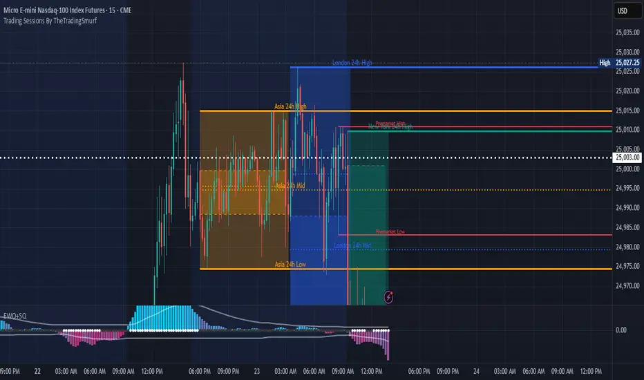
Trading Sessions By TheTradingSmurf━━━━━━━━━━━━━━━━━━━━━━━━━━━━━━━━━━━━━━
📊 Trading Sessions By TheTradingSmurf
━━━━━━━━━━━━━━━━━━━━━━━━━━━━━━━━━━━━━━
Highlights the 3 major trading sessions:
• Asia (00–09 GMT)
• London (08–17 GMT)
• New York (13–22 GMT)
━━━━━━━━━━ FEATURES ━━━━━━━━━━
✓ Shows only the last 2 sessions (48h lookback)
✓ Session High / Low / Mid lines
✓ Labels at line end with 24h / 48h tag
✓ Font colors match session colors by default
✓ Configurable line widths & extensions
✓ Optional info block (Range / Avg / High / Low / Mid)
✓ Toggle Open/Close lines, averages, and ranges
━━━━━━━━━━ DEFAULTS ━━━━━━━━━━
• Minimal view → only H/L/M lines
• Asia = Orange
• London = Blue
• New York = Green
━━━━━━━━━━━━━━━━━━━━━━━━━━━━━━━━━━━━━━
Ideal for liquidity mapping, overlap awareness,
and market structure analysis.
━━━━━━━━━━━━━━━━━━━━━━━━━━━━━━━━━━━━━━
Lumiere’s Indicator BundleThe Lumiere’s Indicator Bundle combines three of Lumiere’s most used tools into one script:
🔹 BOS Mark-out – Marks Breaks of Structure with clear bullish/bearish levels and optional alerts.
🔹 Liquidity Mark-ou t – Draws significant swing highs/lows and automatically removes them once swept.
🔹 Trading Session High/Low – Tracks Asia, London, and New York session ranges with customizable timezone.
Why this bundle?
I made this bundle so everyone can run all my indicators at once without having to pick and choose between them or worry about chart space limits.
Instead of loading 3 separate indicators, this package gives you everything in one place. You can toggle each module (BOS, Liquidity, Sessions) on or off from the settings. All inputs are kept clean and organized in their own sections for easy adjustments.
What to expect
BOS lines always plotted on top for maximum clarity.
Liquidity highs/lows update in real time and get removed when taken out.
Session ranges show the active session’s high/low and can mark sweeps after the session closes.
Default timezone is New York (UTC-4), but you can switch to any TradingView-supported timezone.
BOS alerts are included, so you’ll never miss a structural break.

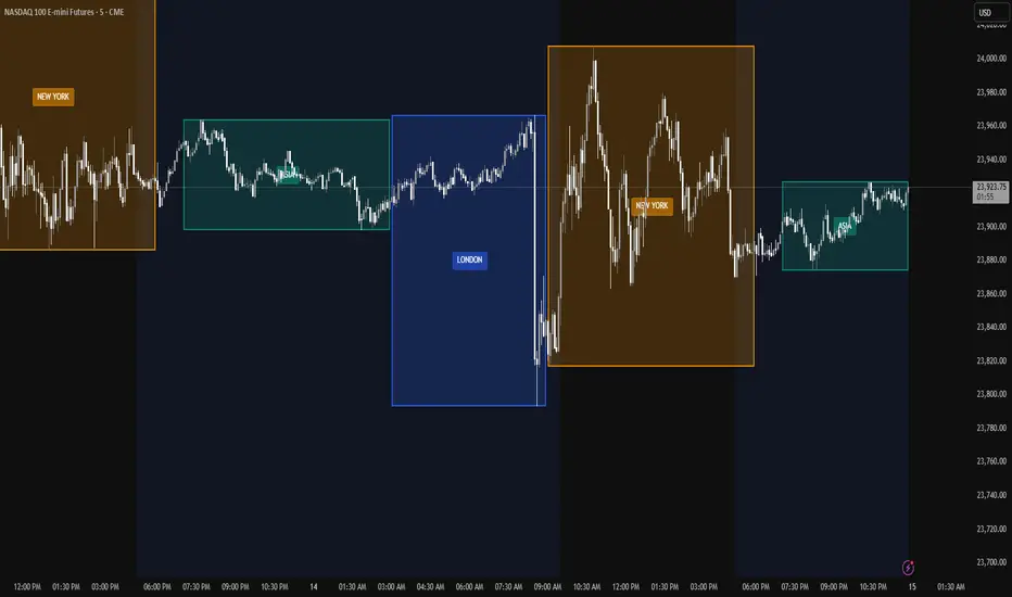
Trading Session Zones - Asia, London, NY - AMD
What it does:
This Pine Script indicator automatically identifies and highlights the high/low price ranges for the three major global trading sessions: Asia, London, and New York. It draws filled colored boxes around each session's price action, making it easy to spot key support/resistance levels and session boundaries
Key Features:
Three distinct colored zones: Teal for Asia, Blue for London, Orange for New York
Filled boxes with transparency: Clear visibility without obscuring price action (80% transparency)
Session labels:Each box displays the session name in the center
Clean transitions: London session automatically ends when New York begins (no overlap)
Real-time updates:Boxes expand as sessions progress, tracking new highs and lows
Technical Details:
Uses user-defined types for efficient session tracking
Automatically handles session transitions
Works on any timeframe and any instrument
Optimized for performance with proper object limits
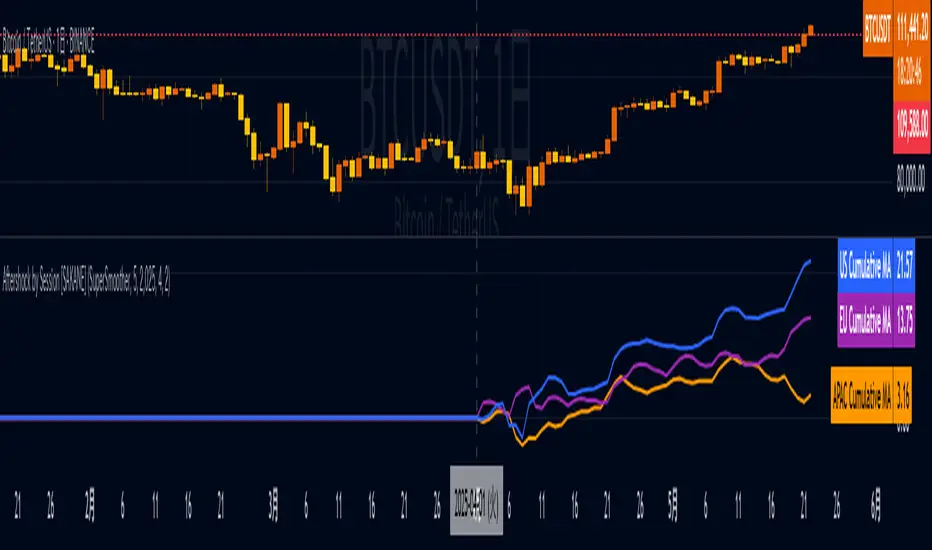
Aftershock by Session [SAKANE]■ Background & Motivation
In 24/7 markets like crypto, not all participants react simultaneously to major events.
Instead, reactions unfold across different regional trading sessions — Asia (APAC), Europe (EU), and the United States (US) — each with its own tempo and sentiment.
This indicator is designed to visualize which session drives the market after a key event — capturing the "aftershock" effect that ripples through time zones.
■ Key Features
Tracks price return (open → close) for each session: APAC / EU / US
Cumulative session returns are calculated and visualized
Smoothing options: SMA, EMA, or Ehlers SuperSmoother
Optimized for daily charts to highlight structural momentum shifts
Toggle visibility of each session independently
■ Why “Aftershock”?
Take April 2, 2025 — the day of the “Trump Tariff Opening.”
That policy announcement triggered a market-wide response. But:
Which session reacted first?
Which session truly moved the market?
This indicator is named “Aftershock” because it helps you see the ripple effect of such events — when and where momentum followed.
■ How to Use
Search for “Aftershock by Session ” on TradingView
Add it to your chart (use Daily timeframe)
Customize sessions and smoothing options via settings
You can also bookmark it for quick access.
■ Insights & Use Cases
Detect which session initiated or led market moves after news events
Understand geo-temporal dynamics — did the move start in Asia, Europe, or the US?
For example, on April 2, 2025, the day Trump’s tariff pivot was announced:
You can instantly see which session took the lead —
the APAC session hesitated, while the US session drove the trend.
This insight becomes visually obvious with the cumulative lines.
■ Unique Value
Unlike typical indicators based on raw price action,
Aftershock analyzes market movement through a session-based structural lens.
It captures where capital actually moved — and when.
A tool not just for technical analysis, but for event-driven, macro-aware market reading.
■ Final Thoughts
To truly understand market mechanics, we must look beyond candles and trends.
Aftershock by Session breaks down the 24-hour cycle into meaningful regional flows,
allowing you to track the true drivers behind price momentum.
Whether you're trading, researching, or tracking macro catalysts,
this tool helps answer the key question:
“Who moved the market — and when?”
Market Sessions & LevelsOverview
This Pine Script indicator identifies key trading levels and market sessions, making it easier for traders to analyze price movements. It highlights the previous day's high and low, tracks premarket price action, and marks the first 5-minute high and low after the market opens.
Features
✅ Identifies Market Sessions:
Pre-Market Session (4:30 AM - 9:30 AM EST)
Regular Market Session (9:30 AM - 4:00 PM EST)
✅ Tracks Key Levels:
Previous Day’s High & Low
Premarket High & Low
First 5-Minute High & Low after market open
✅ Visual Cues for Easy Analysis:
Plots horizontal lines for each level with distinct colors
Displays labels for key price levels on the chart
How It Helps Traders
📊 Pre-Market Preparation: Helps traders spot key resistance/support levels before the market opens.
🚀 Momentum Trading: The first 5-minute high/low can act as breakout or reversal zones.
📉 Historical Price Context: Uses the previous day's high/low to gauge market sentiment.
Customization
The script can be easily modified to adjust session timings, colors, or additional levels based on your trading strategy.
💡 How to Use:
Apply the script to a 1-minute or 5-minute chart for the most accurate premarket and first 5-minute tracking.
Look for price reactions at the plotted levels to determine potential trade setups.
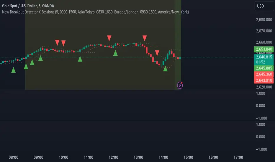
MJForex Breakout Detector X SessionsThis Pine Script code is a Breakout Detector with Trading Session highlights for use on a financial chart. Here's a detailed breakdown of its functionality:
1. Breakout Detection
The main purpose of this script is to detect breakouts based on specific price levels (like highs and lows) within a given lookback period. It identifies different types of breakouts in real time, specifically:
Higher High (HH): The highest price in the lookback period is exceeded, suggesting bullish momentum.
Higher Low (HL): A low that is higher than the previous low, which might indicate a potential upward trend continuation.
Lower High (LH): The price makes a lower high than the previous high, indicating a possible downward reversal.
Lower Low (LL): A low that is lower than the previous low, indicating bearish momentum.
Breakout Logic:
A buy signal is generated when there is a breakout above a Higher High or a Higher Low, signaling a potential bullish trend.
A sell signal is generated when there is a breakout below a Lower High or a Lower Low, signaling a potential bearish trend.
These signals are plotted on the chart using shapes (green triangles for buy signals and red triangles for sell signals).
2. Candle Body vs. Wick Consideration
The indicator allows you to choose whether the breakout is detected based on the candle body (the open and close prices) or the wick (the high and low prices).
This is controlled by a user input (use_body), so you can switch between these modes depending on your preference.
3. Trading Session Highlights
The script also visually highlights different trading sessions on the chart. Three sessions can be configured:
First Session (e.g., Asia/Tokyo)
Second Session (e.g., Europe/London)
Third Session (e.g., America/New York)
Each session is colored differently on the chart's background (blue, yellow, and green), helping you easily visualize which trading session is currently active.
4. Real-Time Alerts
The script generates real-time alerts when a breakout occurs.
Alerts are sent based on the current price action without waiting for the candle to close, which helps traders respond quickly to potential breakout signals and be aware of the particular zone or area.
Alerts:
A Buy alert is triggered when there's a Higher High (HH) or Higher Low (HL) breakout.
A Sell alert is triggered when there's a Lower High (LH) or Lower Low (LL) breakout.
These alerts can be used to notify traders when certain breakout conditions are met, allowing them to take action immediately.
5. Customizability
The script allows for several customizable inputs:
Lookback Period: The number of bars used to calculate the highest high and lowest low (default is 5).
Breakout Detection Toggle: You can choose whether to show the breakout signals on the chart.
Session Visibility: You can turn on/off the visual highlights for the trading sessions.
Body/Wick Toggle: You can select whether to consider the candle body or the wick when detecting breakouts.
In Summary:
Breakout Detection: Detects and highlights Higher High, Higher Low, Lower High, and Lower Low breakouts on the chart, generating buy/sell signals.
Candle Body/Wick Option: You can choose to detect breakouts based on the body or wick of the candle.
Real-Time Alerts: Sends alerts as soon as a breakout occurs, without waiting for the candle to close.
Trading Session Highlights: Highlights different global trading sessions for easy visual reference on the chart.
This indicator is particularly useful for traders who want to identify key breakouts and visually track trading sessions across different markets.
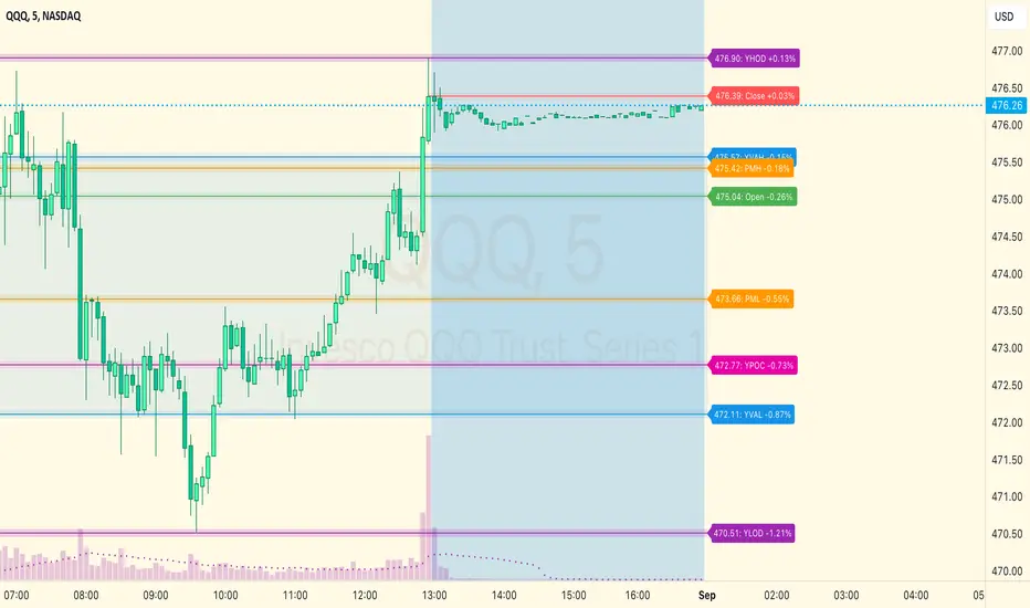
MM Day Trader LevelsAs an intraday trader, there are certain key levels that I care about for short-term price action on every single chart. When I first began day trading, each morning I would painstakingly mark those key levels off on the charts I planned to trade each day. Depending on the number of charts I was watching, this would take up quite a bit of my time that I felt would have been much better spent doing other things. It also meant that those levels would often be left behind, and on later days I might be trading a symbol and get confused when a line appeared and I'd be paying attention to it only to later discover that it wasn't from prior day, but from some other day in the past when I had marked it off.
I looked all over TradingView to find indicators that did this automatically for me, and I found a lot of them. One by one I tried them, and inevitably I would always find that something was wrong with them. Often they didn't have all of the levels I wanted (so I would have to combine multiple indicators), but more often I found that the levels would be incorrect, or they would be buggy and not appear consistently, or they would not appear at the right time, or they would not work on futures! The list of problems went on and on. And the biggest issue I found was that nobody knew how to get session volume profile in an indicator.
So, over the course of a few years I figured out how to solve all of those problems and now I'm thrilled to present this free indicator for everyone like me who trades intraday and wants a clean consistent way to see the prior day levels that they care about automatically on every single chart (even futures). The levels the indicator provides are:
Yesterday High & Low
Value Area High & Low & Point of Control
Today's Open
Yesterday's Close (aka "Settlement" on futures)
Premarket High & Low (non-futures only)
Overnight High & Low (futures only)
These levels are extremely important, and I expect price to be reactive to them, so each level has a shaded background behind it so that the levels stand out against other lines you may have on your chart. I try to keep configuration as simple as possible, but there are configuration options that allow you to:
Hide any of the levels
Change the color for the levels
Shade the value area (or not)
Change the label text, size, type (basic label or plain text) and location (how far to the right of last candle to place the label
Adjust session volume profile value area volume & number of rows
The biggest advantage to this indicator over others on TradingView is how it handles session volume profile. When it comes to futures, TradingView does differentiate between regular trading hours and "electronic" trading hours on the charts, but their timeframes for those sessions are unusual, and they do not provide any programmatic way to differentiate between them. So, I created a whole new library for dealing with futures sessions that is fully integrated into both my Session Volume Profile library and this indicator, allowing me to bring you the best and only custom indicator available on TradingView that provides you with true regular session volume profile information across every type of symbol, including futures.
I'm incredibly proud of everything I've been able to provide with this indicator, and even more thrilled to say that I'm proud of how the indicator has been implemented. Once again releasing this indicator and all associated code for free and open source. I encourage you to take a look at the source code to see how it all works, take advantage of the free underlying libraries I created to make all of this possible: Session Library and Session Volume Profile Library.
JP7FX Signals ProJP7FX Signals Pro
Smart session signals based on structure, liquidity shifts and volatility filters.
Designed for use on the 1 minute timeframe.
What this tool does
This indicator builds signals around three things traders track every day.
• session ranges for Asia, Frankfurt, London and New York
• Fair Value Gap behaviour
• Supertrend shifts with volatility confirmation
The script draws each session range on your chart. It tracks when price breaks a session high or low, then checks if the market is above or below the daily open. These conditions help filter trades by direction during different sessions.
It also detects bullish and bearish Fair Value Gaps. The script tracks when an FVG forms, when price enters the imbalance and when it gets mitigated. These checks create part of the signal logic.
Supertrend is used as an extra filter. A crossover above or below the Supertrend gives a directional bias. When combined with session behaviour and FVG conditions, the script can mark possible long or short signals during London or New York.
How the signals form
A signal only prints when the script has all conditions in place.
This includes:
• a session range break in the correct direction
• a price position relative to the daily open
• confirmation from Supertrend
• FVG creation or mitigation on the right side of price
• liquidity taken in previous sessions
These rules reduce noise and avoid signals that appear in weak conditions.
What the indicator is for
• understanding how sessions behave on the 1 minute chart
• tracking liquidity behaviour
• seeing when a clean break and trend shift takes place
• getting notified when the market forms the conditions you set
This is not a buy or sell system on its own
Signals do not replace analysis. You still need market structure, higher timeframe direction, orderblocks or your own trade model.
A signal is only a prompt to look at the chart, not a confirmation to enter a trade.
Price can shift quickly around sessions, so check the context before acting on any alert.
Important notes
• designed for the 1 minute timeframe
• signals do not guarantee trend continuation
• conditions can form in strong or weak market phases
• use your own risk rules and validation before entering trades
JP7FX Signals Pro helps you track session behaviour and FVG interaction more efficiently, but trading decisions still need your full chart process.

Candle box - All SessionsCandle Box – All Sessions + Weekday Filter
This indicator automatically draws boxes on your chart, highlighting custom sessions based on user-defined start and end times.
For each selected session, it visually marks the high and low of the opening candle from your chosen timeframe, making it easy to analyze volatility, breakouts, and ranges.
Key Features:
Full Time Customization: Choose the start and end hour/minute for your session boxes.
Reference Candle Timeframe: Select which timeframe’s high/low to use (e.g., 5min, 15min, etc).
Weekday Selection: Display boxes only on the days of the week you want—any combination of weekdays and weekends.
Session History: All previous session boxes remain visible on the chart, allowing easy review of price behavior across multiple days.
Visual Customization: Adjust border color, background color, and border width for each box.
Typical Uses:
Highlight volatility during key market sessions (e.g., NY Open, London, Close, etc.).
Mark opening ranges for daily or any custom time window.
Identify breakout and consolidation patterns across sessions.
How to Use:
Add the indicator to your chart.
Configure your preferred start/end time, reference candle timeframe, visual style, and select the days of the week.
The indicator will automatically draw all session boxes for both current and past days, making market structure and session dynamics instantly clear.
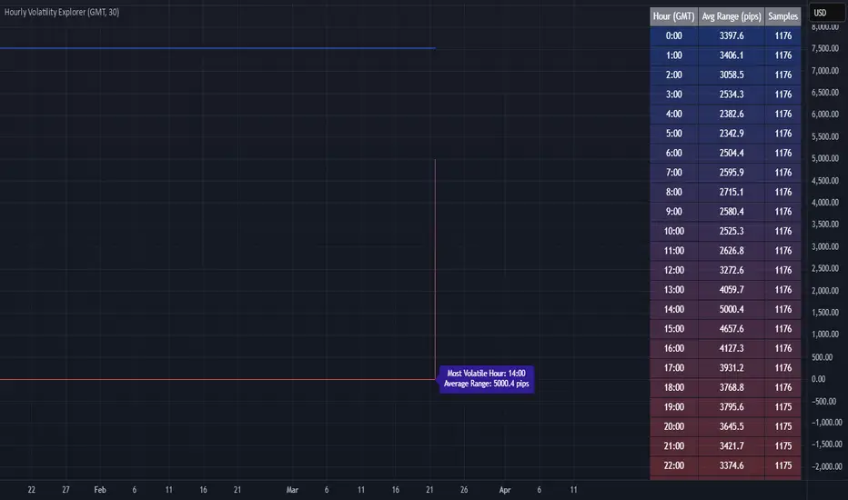
Hourly Volatility Explorer📊 Hourly Volatility Explorer: Master The Market's Pulse
Unlock the hidden rhythms of price action with this sophisticated volatility analysis tool. The Hourly Volatility Explorer reveals the most potent trading hours across multiple time zones, giving you a strategic edge in timing your trades.
🌟 Key Features:
⏰ Multi-Timezone Analysis
• GMT (UTC+0)
• EST (UTC-5) - New York
• BST (UTC+1) - London
• JST (UTC+9) - Tokyo
• AEST (UTC+10) - Sydney
Perfect for tracking major market sessions and their overlaps!
📈 Dynamic Visualization
• Color-gradient hourly bars for instant pattern recognition
• Real-time volatility comparison
• Interactive data table with comprehensive statistics
• Automatic highlighting of peak volatility periods
🎯 Strategic Applications:
Day Trading:
• Identify optimal trading windows
• Avoid low-liquidity periods
• Capitalize on session overlaps
• Fine-tune entry/exit timing
Risk Management:
• Set appropriate stop losses based on hourly volatility
• Adjust position sizes for different market hours
• Optimize risk-reward ratios
• Plan around high-impact hours
Global Market Analysis:
• Track volatility across all major sessions
• Spot institutional trading patterns
• Identify quiet vs. active periods
• Monitor 24/7 market dynamics
💡 Perfect For:
• Forex traders navigating global sessions
• Crypto traders in 24/7 markets
• Day traders optimizing execution times
• Algorithmic traders fine-tuning strategies
• Risk managers calibrating exposure
📊 Advanced Features:
• Rolling 3-month analysis for reliable patterns
• Precise pip movement calculations
• Sample size tracking for statistical validity
• Real-time current hour comparison
• Color-coded visual system for instant insights
⚡ Pro Trading Tips:
• Use during major session overlaps for maximum opportunity
• Compare patterns across different instruments
• Combine with volume analysis for deeper insights
• Track seasonal variations in hourly patterns
• Build trading schedules around peak hours
🎓 Educational Value:
• Understand market microstructure
• Learn global market dynamics
• Master timezone relationships
• Develop timing intuition
🛠️ Customization:
• Adjustable lookback period
• Flexible pip multiplier
• Multiple timezone options
• Visual preference settings
Whether you're scalping the 1-minute chart or managing longer-term positions, the Hourly Volatility Explorer provides the precise timing intelligence needed for today's global markets.
Transform your trading schedule from guesswork to science. Know exactly when markets move, why they move, and how to position yourself for maximum opportunity.
#TechnicalAnalysis #Trading #Volatility #MarketTiming #DayTrading #Forex #Crypto #TradingView #PineScript #MarketAnalysis #TradingStrategy #RiskManagement #GlobalMarkets #FinancialMarkets #TradingTools #MarketStructure #PriceAction #Scalping #SwingTrading #AlgoTrading
Asian Session ShadingDescription
The "Asian Session Shading" indicator is designed to highlight the trading hours of the Asian market session on TradingView charts. This script shades the background of the chart in a pale blue color to visually distinguish the time period of the Asian trading session. By using this indicator, traders can easily identify when the Asian session is active, helping them to analyze and make informed trading decisions based on time-specific market behavior.
Features
Customizable Timing: The session start and end times can be adjusted to fit different Asian market hours.
Visual Clarity: The pale blue shading helps to visually separate the Asian session from other trading sessions.
Easy to Use: Simple implementation with clear visual cues on the chart.
Best Use Cases
Market Analysis: Traders can use this indicator to analyze market movements and trends specific to the Asian trading session.
Trading Strategies: This tool can assist in developing and implementing trading strategies that take into account the unique characteristics of the Asian market.
Time Management: Helps traders to manage their trading schedule by clearly marking the start and end of the Asian session.
How to Use
Apply to Chart: Save and apply the indicator to your chart to see the shaded Asian session.
This indicator is particularly useful for forex traders, stock traders, and anyone looking to incorporate the Asian market's influence into their trading strategy.
ICT Kill Zones [dR-Algo]ICT Kill Zones Indicator by dR-Algo
Introducing the dR-Algo's ICT Kill Zones Indicator – a tool meticulously crafted to blend with the elegance of the ICT Concept of Kill Zones. Built for traders who seek clarity and focus, this unique indicator is tailored to highlight the essential time frames while ensuring minimal distraction from the core price action.
Key Features:
Three Kill Zones:
London Kill Zone: Kickstart your trading day with the London Kill Zone, highlighting the critical period between 03:00 to 04:00 (UTC-4). The London session, known for its volatility due to the overlapping of the Asian session, is captured precisely for your benefit.
NY AM Session: As the European markets gear towards close and the US markets come alive, our indicator emphasizes the activity from 10:00 to 11:00 (UTC-4). It’s a window where significant market moves often originate.
NY PM Session: Capture the late-day trading action between 14:00 to 15:00 (UTC-4). As markets prepare to close, this time frame can offer last-minute opportunities.
Subtle Yet Effective Visualization: Unlike many other indicators that bombard traders with an array of colors, our ICT Kill Zones Indicator is intentionally designed to be subtle. It provides just the right amount of visual emphasis without overwhelming the chart. The primary goal is to let traders focus on what truly matters: the price action.
User-Friendly Customization: The indicator's settings can be easily tailored to align with individual trading styles, allowing traders to adjust and tweak as per their preference.
Seamless Integration with Trading View: Smoothly integrates with your TradingView charts ensuring optimal performance and real-time responsiveness.
Why Choose Our ICT Kill Zones Indicator?
The market is flooded with indicators, each promising to be the 'next big thing.' What sets dR-Algo's ICT Kill Zones Indicator apart is its dedication to simplicity and effectiveness. It's not just about adding an indicator to your chart; it's about adding value to your trading experience. By seamlessly merging vital time frames without overshadowing the price action, we ensure traders get the best of both worlds.
Join the trading revolution with dR-Algo and embrace a focused approach to the markets.

[astropark] Kill ZonesDear Followers,
today I'm glad to present you an indicator which highlights for you the most important market Kill Zones .
This indicator will color background of the time sessions when Asia, London and New York sessions are going to be most active .
This way you can understand easier what istitutions and big hedge funds made during the session.
You can change colors and transparency in the indicator options, default colors are yellow for Asia, blue for London and red for New York sessions.
You can enable the indicator to show background also during the weekend (disabled by default).
This indicator works on all markets, I suggest not to use it above 1h timeframe, 5m-15m is great.
This is a premium indicator , so send me a private message in order to get access to this script.

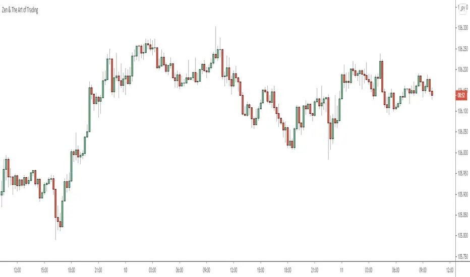
ATR (Average True Range) By TimeWhat is ATR By Time?
This premium indicator was inspired by my RVOL By Time indicator . It works on Stocks, Forex, Crypto and most Futures markets. Instead of calculating the ATR by recent price data, it calculates an ATR value for each candle based on that candle’s time of day.
For example, if you set the Lookback setting on this indicator to 14, then instead of calculating the ATR based on the past 14 candles, it will calculate an ATR value based on the past 14 trading sessions for each candle.
This is extremely useful for day traders in particular as it allows you to gauge the average range of candles during certain times of day instead of only by the most recent price action.
It also draws a regular ATR (optional) – so this is essentially an enhanced ATR script that gives you multiple readings on price volatility.
If you are interested, you can purchase access to the script or register for a free trial on my website: ATR By Time Feature Page .
Why Does It Cost Money?
The reason why this is a premium script that requires payment to access is because it took a lot of time, research and development in order to create. The other advantage of charging for it is that it retains exclusivity to only a select few dedicated traders.
By paying the yearly fee you get access to ALL of my premium indicators including lifetime updates and technical support.
If you don’t want to pay for this script then I completely understand and I have plenty of other free indicators and scripts that you might be interested in!
Free Trial
I am a trader myself and so I know how skeptical you might be that this indicator is worth your time and money. That is why I am offering a free trial of this indicator.
All you need to do to initiate your trial is Join My Mailing List/ on my website: zenandtheartoftrading.com
How It Works
This script uses a complex formula to calculate ATR values across distant historical bars.
Depending on the timeframe you select it will skip through historical bars to find previous bars from the same time of day. It collects these values then applies the traditional ATR formula to them.
The ATR value is determined by the maximum result of the following three calculations:
- Current high minus the current low
- The absolute value of the current high minus the previous close
- The absolute value of the current low minus the previous close
- Whichever of these three calculations comes out highest, that is your ATR for the given candle.
Once this value is calculated for historical bars the ATR indicator’s reading is typically determined by a 14-period moving average of these individual ATR values. So the ATR reading you see on your screen is an average of the past 14 ATR values.
This means that as markets expand and contract this volatility reading will adapt to the change in candle price ranges.
The difference with the ATR By Time indicator’s calculation formula is that rather than referencing recent bars it references bars based on their time of day.
For example, if you are on the 1-Hour chart and you check the ATR By Time value at 9:00AM with a Lookback period of 14, then the value you see will be the result of the ATR calculation of every 9:00AM 1-Hour candle over the past 14 trading sessions.
You can also choose to enable the ATR moving average in the settings menu if you wish. This will give you a smoothed ATR reading by averaging the current session’s ATR value with previous sessions.
This versatility gives you a sophisticated reading on price volatility which is particularly helpful for day trade setups based around market opens or market closes when volatility tends to spike.
The regular ATR indicator will not account for this on the lower timeframes, but this indicator will!
Examples
Stocks - Heatmap Scheme with regular ATR
Stocks - Price Scheme - No ATR
Stocks - Traffic Scheme - Session Average Line RMA
Stocks - Trigger Scheme - 10 sessions
Forex - RMA
Forex - No RMA
Forex - Normal ATR Stop
Forex - Session ATR Stop