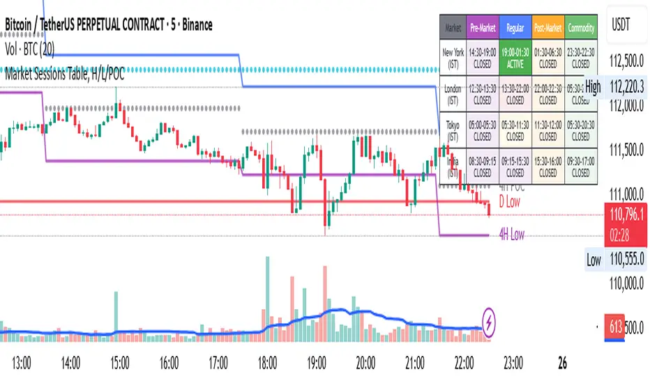
Market Sessions Table, H/L/POCHello Everyone,
This is my first effort and first script for the community. This indicator has two major parts
Table with Pre-Market Session Time, Regular Market Session Time and Commodity Market Session
High, Low and POC (Middle) of 4 Hour, Previous 1 Day and Last Week
This will mark the following:
High, Low and POC of 4 Hours Candle with Lines
High, Low and POC of previous day Candle with Lines
High, Low and POC of previous week Candle with Lines
User has option to either disable any or all the Lines.
User has option to change the color, size and line type (flat or dotted) on lines.
User also has an option to see the High, Low and POC in a separate table as well.
Table with Pre-Market Session Time, Regular Market Session Time and Commodity Market Session
As the name suggest this is a table which shows the Pre-Market Session Time, Regular Market Session Time and Commodity Market Session of US, UK, Tokyo and Indian Exchanges.
User has an ability to enable or disable any Exchange or session.
User can also enable or disable highlighting a particular market session in the chart background.
Additionally user can choose to display the different market session is there own local time zone. Since I am from India I choose to display the open and close of market session as per India standard time.
Guys please suggest any improvement or anything additional you wanted on the same indicator.
Cari dalam skrip untuk "session"
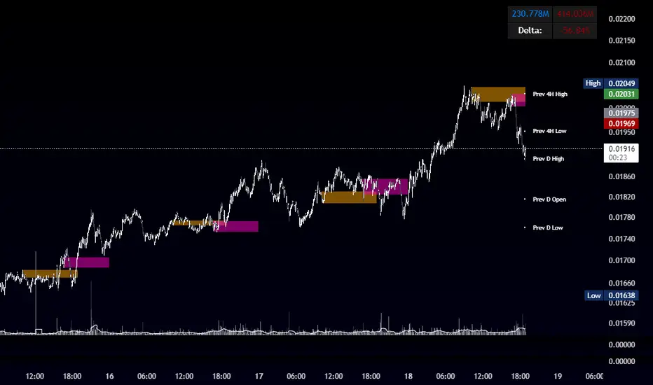
OBR 15min Session Opening Range Breakout + Volume Trend DeltaQuick Overview
This Pine Script plots the opening range for London and New York sessions, highlights breakout levels, draws previous session pivots, and offers a live volume delta table for trend confirmation.
Session Opening Range
- Captures the high/low of the first 15 minutes (configurable) for both London & NY sessions.
- Fills the range area with adjustable semi‑transparent colors.
- Optional alerts fire on breakout above the high or below the low.
Previous Session Levels
- Automatically draws previous day’s High, Low, Open and previous 4‑hour High/Low.
- Helps identify key S/R zones as price approaches ORB breakouts.
Volume Trend Delta
- Uses a CMO‑weighted moving average and ATR bands to detect trend state.
- Accumulates bullish vs. bearish volume during each trend.
- Displays Bull Vol, Bear Vol, and Delta % in a movable table for quick strength checks.
How to Use
1. Let the opening range complete (first 15 min).
2. Look for price closing above/below the ORB—enter long on an upside break, short on a downside break.
3. Check the Volume Delta table: positive delta confirms buying strength; negative delta confirms selling pressure.
4. Use previous day/4h levels as additional support/resistance filters.
Settings & Customization
- ORB Duration & Session Times (London/NY), fill colors, and toggles.
- Enable/disable Previous Day & 4H levels.
- Trend Period, Momentum Window, and Delta table position/size.
- Pre‑built alert conditions for all ORB breakouts.
Developer Notes
- Fully commented for easy adjustments.
- Modular sections: ORB, previous levels, trend delta, and alerts.
- No external libraries—pure Pine Script v6.
Tip
Combine ORB breakouts with Volume Delta and prior session pivots to filter false signals and trade stronger, more reliable moves.
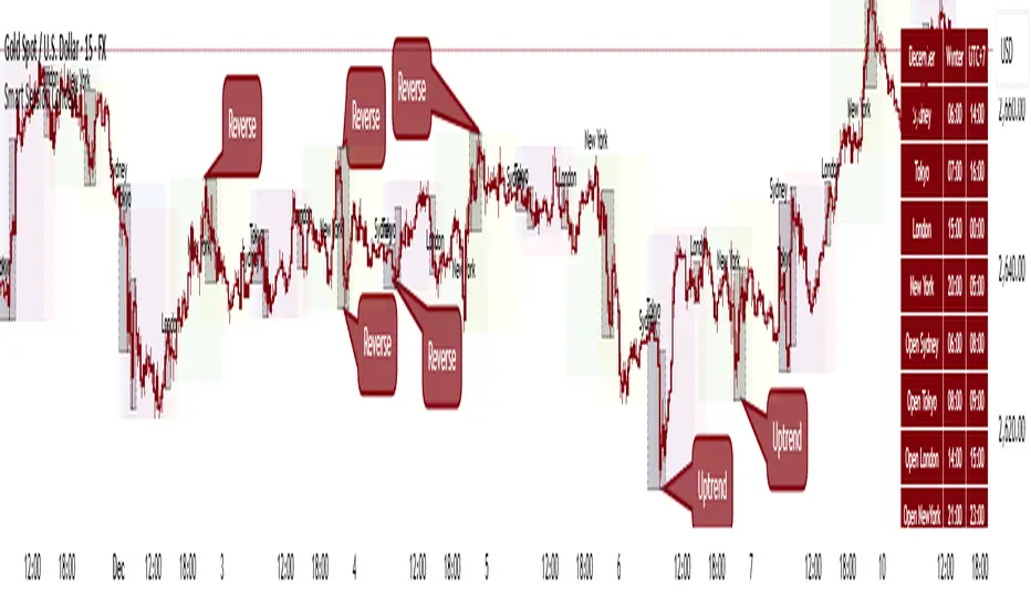
Smart Session ConceptSmart Session Concept — Intelligent Trading Session Overlay
Smart Session Concept is designed to detect major reversal points and key price pivots formed on higher timeframes, particularly during high-volume periods of the day — often marking the footprints of institutional orders and whales.
🔍 Key Features:
Displays standard sessions (Asian, London, New York) and allows adding custom time sessions.
Offers two visualization modes:
Time session table
Visual session boxes plotted on the chart
Auto-sync with seasonal time changes (Summer/Winter), supports Daylight Saving Time (DST)
Full flexibility:
Toggle table, boxes, and labels on/off
Customize colors for all session elements
Choose which months are considered summer/winter
💡 Suggested Use Case:
Use Smart Session Sync to pinpoint critical price structures such as:
Peaks and troughs of trending waves
Highs/lows in Wyckoff trading ranges
Liquidity sweeps or untouched liquidity zones
----------------------
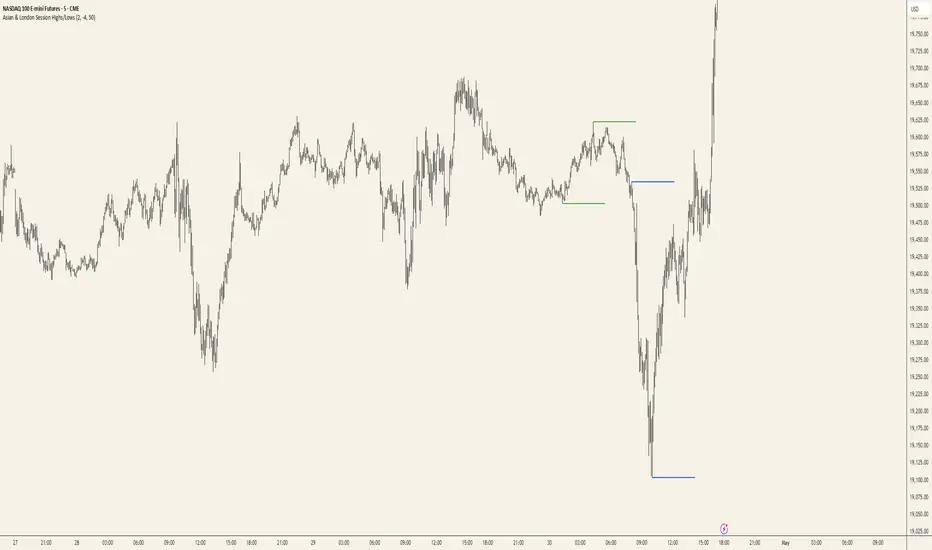
Asian & London Session Highs/LowsAsian & London Session Highs/Lows with Extendable Lines
This TradingView script automatically marks the highs and lows of the Asian and London trading sessions for the most recent day, allowing traders to identify key levels during these active periods. The lines representing the high and low of each session are drawn at the exact price point where the high/low occurred, and they extend to the right for a customizable number of bars, helping to visualize how the price reacts to these key levels after the session ends.
Key Features:
Session High/Low Tracking: Automatically tracks the highest and lowest points for the Asian and London sessions.
Extendable Lines: Lines start at the exact bar where the high/low occurred and can be extended to the right for a specified number of bars.
Timezone Adjustment: Allows you to input a timezone offset to adjust session times based on your local time or desired market time zone.
Customizable Colors & Line Thickness: Adjust the color and thickness of the session high and low lines to suit your visual preferences.
Clear & Precise Levels: Helps identify important support and resistance levels, making it easier to spot market reactions around session highs and lows.
This indicator is perfect for day traders and those looking to trade during specific market hours, offering clear visual markers of session boundaries and critical price levels.
Trading SessionsTrading Sessions Indicator
Overview
Trading Sessions is a visually displays major trading sessions worldwide. It overlays the trading hours of four major markets - Sydney, Tokyo, London, and New York - on your chart.
Key Features
Simultaneous display of 4 trading sessions
Visual session dividers
Customizable session boxes
Session status display in top-right corner
Session Settings
Configuration Options per Session
Toggle visibility
Timezone configuration
Trading hours setting (Default: 08:00-17:00)
Background color setting (95% transparency)
Default Session Configuration
Sydney Session (Yellow)
Tokyo Session (Red)
London Session (Blue)
New York Session (Lime)
Session Divider Settings
Toggle divider visibility
Divider line position (top/bottom)
Session emoji position (top/bottom)
Customizable emoji per session
Sydney: 🦘
Tokyo: 🗼
London: 🚇
New York: 🗽
Overlay Settings
Force Overlay
When enabled: Forces session backgrounds behind candles
When disabled: Standard overlay display
Box Overlay
When enabled: Displays price range boxes during sessions
Shows session name at box top
Individual color settings per session
Display Features
1. Background Color Distinction
Each session shown in configured color
Visibility adjusted through transparency
2. Session Divider Display
Vertical line (|): Session start/end
Upper line (¯)/lower line (_): During session
Emoji: Session start
3. Status Display
Session status shown in top-right
Active sessions highlighted in corresponding colors
Inactive sessions shown in gray
Limitations
Timezones must conform to IANA Time Zone Database format

OHLC, Sessions & Key Levels [Orderflowing]Multi-Timeframe (+) OHLC, Sessions & Key Levels | Custom-Timeframe OHLC | Sessions Analysis | Market Key Levels
Built using Pine Script V5.
Introduction
The OHLC, Sessions & Key Levels Indicator is a tool designed for traders who want to integrate Multi-Timeframe (MTF) OHLC Data, Sessions Analysis, and Key Market Levels into their trading system.
This Indicator can help traders by automatically marking the OHLC, Sessions & Key Levels directly on the price chart, saving time furthermore potentially allowing for better judgement in their trading and risk management process.
Innovation and Inspiration
The Indicator draws from multiple concepts;
The OHLC levels across different timeframes, session-based analysis, and plotting potentially important and pivotal market levels.
Concept Inspiration from ICT-Traders / Market Maker Model Traders.
Use of Open-Source Code
Specific parts of this Indicator's code have been inspired by & further developed from publicly available code originally developed for the MetaTrader platform.
All such integrations have been wired to work within the TradingView environment, specifically using Pine Script Version 5.
Elements have been made to benefit the overall functionality, the code logic, to make sure it offers unique value to TradingView's users.
Core Features
OHLC MTF Analysis
Foundation
This component allows traders to track the Open, High, Low, and Close levels across different timeframes, ranging from intraday periods to yearly data.
Customization
Traders can adjust the bar offset, width, and colors of the OHLC bars, as well as display options. Option to highlight the Open/Close with labels and the High/Low with marks.
Application
The OHLC MTF component gives traders a clear view of important price levels, which can serve as support, resistance, or potential entry/exit points.
Main Trading Sessions & Custom Sessions
Starting Point
The Sessions component relies on the user-inputted key market sessions, defaults include New York, London, Asia, and optionally Sydney. Session Defaults to UTC.
Please Note: Adjust Time Zone in TradingView's Desktop App or Web Interface to use the sessions in correct local time.
Customization
Traders can adjust session names, session times, time zone, visibility, session colors, and session-specific high and low markers.
This allows us to visualize price movements during these selected periods.
Application
By highlighting different trading sessions, traders can potentially better time their trades, understanding when significant price movements usually occur. This can potentially be used to try and find patterns in a time-based method.
Key Levels
Customization
Traders can choose which key levels to display and adjust the visual style of these levels, including line width, style, and color.
Application
The Key Levels feature can help traders identify support and resistance levels that can serve as potential entry or exit points. Can be useful in market structure analysis by marking significant price levels based on different timeframes.
Designed for multi-timeframe analysis, allowing traders to track OHLC levels, session ranges, and key market levels.
It’s highly customizable, making it suitable across trading styles and charting setups, whether scalping, day trading, swing trading or longer term investing.
Multi-Timeframe (MTF) OHLC
Can be plotted as a Candlestick or Bar-Chart or Both
These can help traders keep an eye on price levels across multiple timeframes while allowing the actual chart to be on another timeframe than the displayed OHLC.
Example - OHLC on the Weekly Candle/Bar - Chart 4 Hourly Candles
While being on lower timeframes, the trader can keep an eye on how the OHLC candle is developing. ICT-Traders find the Daily (Default Setting) OHLC useful in analysis.
It can be customized to any timeframe the trader wishes to use.
Inspired by ICT-Traders / Market Maker Model Traders and Top-Down Analysis Style.
Combined with Session Analysis to view into the price behavior during specific trading sessions, could potentially be very useful for finding trading setups.
OHLC Levels
Creates lines based on user input - Can potentially be important reference points for trade setups / invalidation / confirmation, levels could be used as the HTF Origin.
Conclusion
The OHLC MTF, Sessions & Key Levels Indicator is a tool that combines multiple market analysis concepts into a single unique script. It offers another view of the market's behavior by combining OHLC data from a different timeframe, main trading sessions, and key levels.
Why Invite-Only?
The OHLC, Sessions & Key Levels Indicator is offered as invite-only because you receive a quality and customizable tool that combines multiple functions into one convenient script.
This Indicator stands out by being a complete and optimized trading tool based on three desirable components.
—
Multi-Timeframe OHLC Analysis, Sessions Tracking & Key Levels
—
Into One Customizable Indicator.
Disclaimer
While the Indicator offers a view of the OHLC price action on multiple timeframes, key levels & trading sessions, traders should not solely rely on it for trading decisions. As with all trading tools, it should be used as part of a complete trading strategy.

CM Opening Range-Asia and Europe SessionCM Opening Range Asia AndEurope Sessions
Requested by rayhug1 to use Asia Range of 5pm Est to 2am Est...uses 540 minutes (5pm to 2am Est — 9 Hours) to calculate the Range...then breakouts trigger after 2am
-Ability to change Start and End Times to use any entire session.
---Defaults to 540 minutes (9 hours) but Opening Range Calculation can be changed to 1 hour, 2 hour etc. in Inputs tab
***Known Bug…Currently will NOT Plot accurately the U.S. Session from 0800 to 0759. Will Update Indicator when Fixed.
-Ability to Change the Start and End Times to Accommodate any session.
—Default is 1700 to 1659 (Asian Range)
—Europe Session 0200 to 0159
***All times are based on New York Time or Eastern Standard time … GMT-5
***Times will change based on Daylight Savings Time.

IU Time SessionsDISCRIPTION
IU Time Sessions is a multi–market session indicator designed to visually highlight major global trading sessions directly on your chart.
It helps traders easily identify when Tokyo, London, New York, and Sydney sessions are active based on their selected time zone.
The indicator automatically adjusts session timings according to the chosen time zone, making it extremely useful for traders across different countries.
Each session is displayed with a customizable background color, allowing you to instantly recognize market behavior, volatility changes, and session overlaps.
In addition, session start alerts can be enabled so traders never miss the opening of important market hours.
USER INPUTS :
• Select Your Time Zone
Allows users to choose their local or preferred market time zone for accurate session calculation.
• Background Color Transparency
Adjust the transparency level of session background colors for better chart visibility.
• Enable / Disable Individual Sessions
Users can turn ON or OFF:
* Tokyo Session
* London Session
* New York Session
* Sydney Session
• Session Time Settings
Each session has customizable start and end times.
• Session Colors
Each trading session has its own selectable background color.
• Session Alerts
Optional alerts for:
* Tokyo session start
* London session start
* New York session start
* Sydney session start
WHY IT IS UNIQUE:
• Fully time-zone adaptive (works globally)
• Supports all major forex and crypto trading sessions
• Clean background visualization without clutter
• Custom session timing flexibility
• Individual session enable/disable control
• Session start alerts without repainting
• Works on all timeframes
• Lightweight and optimized Pine Script v6 code
Unlike basic session indicators, this tool focuses on clarity, flexibility, and accurate time-zone conversion — making it suitable for both beginners and professional traders.
HOW USER CAN BENIFIT FROM IT :
• Easily identify high-liquidity market hours
• Understand session-based price behavior
• Spot session overlaps for increased volatility
• Improve timing for entries and exits
• Avoid low-volume trading periods
• Use alerts to stay disciplined and prepared
• Suitable for forex, crypto, indices, and commodities
This indicator helps traders align their strategies with institutional trading hours and make better-timed trading decisions.

Thiru Time CyclesThiru Time Cycles - Advanced Time-Based Market Analysis System
WHAT IT DOES:
Automatically identifies and visualizes trading sessions, time cycles, and market structure elements. Helps traders identify optimal entry times, track session ranges, and monitor market structure through ICT/SMC methodologies.
KEY FEATURES:
1. SESSION KILLZONES
- Asia, London, NY AM, NY PM, Lunch, Power Hour sessions
- Customizable colors, transparency, and visual styles (Filled, Outline, TopLine, SideBars)
- Real-time high/low tracking within each session
2. 90-MINUTE TIME CYCLES
- Divides major sessions into three 90-minute cycles (A/M/D phases)
- London: LO A, LO M, LO D
- NY AM: AM A, AM M, AM D
- NY PM: PM A, PM M, PM D
3. 30-MINUTE SUB-CYCLES
- Granular 30-minute breakdowns (A1-A3, M1-M3, D1-D3)
- Precise entry timing within larger cycles
4. TOI (TIME OF INTEREST) TRACKER
- London: 2:45-3:15 AM, 3:45-4:15 AM
- NY AM: 9:45-10:15 AM, 10:45-11:15 AM
- NY PM: 1:45-2:15 PM, 2:45-3:15 PM
5. TRADE SETUP TIME WINDOWS
- London: 2:30-4:00 AM
- NY AM: 9:30-10:30 AM
- NY PM: 1:30-2:30 PM
6. TOI VERTICAL LINES
- 90-minute and 30-minute cycle boundary markers
- Customizable opacity, style, and height
7. PIVOT ANALYSIS
- High/Low pivot identification per session
- Pivot midpoints
- Customizable labels with price display
- Extension options (until mitigated/past mitigation)
8. SESSION RANGE TABLE
- Real-time range display
- Average range calculation
- Color-coded active sessions
9. OPENING PRICE LINES
- Daily Chart Open, hourly opens
- Customizable session opens
10. DAY/WEEK/MONTH FILTERS
- Filter by day of week
- Current week/last 4 weeks options
- D/W/M high/low tracking
HOW TO USE:
BASIC SETUP:
1. Add indicator to chart
2. Set timezone (default: America/New_York)
3. Enable desired sessions in Killzones section
4. Customize colors and styles
FOR SESSION TRADING:
- Enable session killzones you trade
- Monitor session boxes for high/low ranges
- Use range table for current/average ranges
FOR TIME CYCLE ANALYSIS:
- Enable 90-min or 30-min cycles
- Watch price action at cycle boundaries
- Use vertical lines for cycle transitions
FOR PIVOT TRADING:
- Enable "Show Pivots" in Killzone Pivots
- Use pivots as support/resistance
- Set alerts for pivot breaks
FOR TOI TRADING:
- Enable TOI Tracker
- Monitor specific time windows
- Use for precise entry timing
UNIQUE FEATURES:
✓ Custom visual system (Filled/Outline/TopLine/SideBars box styles)
✓ Proprietary color processing functions
✓ Dual cycle system (90-min + 30-min simultaneous tracking)
✓ Integrated TOI system with vertical line visualization
✓ Smart label positioning with collision detection
✓ Comprehensive range analysis with averaging
✓ Flexible session management with custom time windows
TECHNICAL:
- Pine Script v6
- 500 max labels/lines/boxes
- Full DST-aware timezone support
- Multi-timeframe compatible
- Customizable timeframe limits
BEST PRACTICES:
- Start with session killzones, add cycles gradually
- Set appropriate timeframe limits to avoid clutter
- Use consistent colors for clarity
- Enable only sessions you actively trade
- Monitor range table for session volatility
- Set pivot break alerts for your trading sessions
Compatible with all instruments (forex, stocks, futures, crypto). Works on all timeframes, optimized for intraday trading.
For support: @thirudinesh on TradingView
© 2025 thirudinesh - Advanced Time Cycle Analysis System
Proprietary Algorithm - All Rights Reserved

Trading Sessions ConstructorHello friends,
This tool is designed for traders who want a clean, flexible way to visualize trading sessions directly on the chart. It lets you highlight key market sessions (London, New York, Tokyo, Sydney, custom specifications, etc.), add rich visual structure around them, and optionally track basic statistics - all in a highly customizable and timezone-aware format.
🛠️ How It Works
The indicator lets you define up to 8 separate sessions , each with its own name, timezone, and active days of the week. Sessions can share one common timezone or use individual timezones, depending on how you prefer to track global markets.
For each session, the script builds a visual "frame" around price action:
it can draw a box around the full range, plot high/mid/low lines, show a title label above price, and optionally display a box stats label with session metrics (such as volume or pips range).
A progress indicator at the bottom of the chart helps you see how much of the current session has already passed, while an optional summary table aggregates statistics across all visible sessions for quick comparison.
🔥 Key Features
Up to 8 configurable sessions with their own names, timezones, and weekdays
Option to use one common timezone for all sessions or separate timezones per session
Custom session titles with flexible label positioning and size
Customizable vertical start-line
Customizable session box
Per-session box stats label with selectable metrics
Independent high, mid, and low lines with full style and width control
Optional background shading to highlight active trading hours
Bottom progress indicator (◼) showing how much of the session has elapsed
Optional statistics table summarizing all visible sessions
📸 Visual Examples
1. Background + High/Mid/Low lines + Session names above high
2. Background + Boxes + Session names above high
3. Background + Vertical start-line + Session names at the bottom
4. Background + Vertical start-line + Session names at the top + Bottom progress indicator
5. Background + Session names at the bottom + Bottom progress indicator 👋 Good luck and happy trading!
Skrip berbayar

ICT Sessions Ranges [SwissAlgo]ICT Session Ranges - ICT Liquidity Zones & Market Structure
OVERVIEW
This indicator identifies and visualizes key intraday trading sessions and liquidity zones based on Inner Circle Trader (ICT) methodology (AM, NY Lunch Raid, PM Session, London Raid). It tracks 'higher high' and 'lower low' price levels during specific time periods that may represent areas where market participants have placed orders (liquidity).
PURPOSE
The indicator helps traders observe:
Session-based price ranges during different market hours
Opening range gaps between market close and next day's open
Potential areas where liquidity may be concentrated and trigger price action
SESSIONS TRACKED
1. London Session (02:00-05:00 ET): Tracks price range during early London trading hours
2. AM Session (09:30-12:00 ET): Tracks price range during the morning New York session
3. NY Lunch Session (12:00-13:30 ET): Tracks price range during typical low-volume lunch period
4. PM Session (13:30-16:00 ET): Tracks price range during the afternoon New York session
CALCULATIONS
Session High/Low: The highest high and lowest low recorded during each active session period
Opening Range Gap: Calculated as the difference between the previous day's 16:00 close and the current day's 09:30 open
Gap Mitigation: A gap is considered mitigated when the price reaches 50% of the gap range
All times are based on America/New_York timezone (ET)
BACKGROUND INDICATORS
NY Trading Hours (09:30-16:00 ET): Optional gray background overlay
Asian Session (20:00-23:59 ET): Optional purple background overlay
VISUAL ELEMENTS
Horizontal lines mark session highs and lows
Subtle background boxes highlight each session range
Labels identify each session type
Orange shaded boxes indicate unmitigated opening range gaps
Dotted line at 50% gap level shows mitigation threshold
FEATURES
Toggle visibility for each session independently
Customizable colors for each session type
Automatic removal of mitigated gaps
All drawing objects use transparent backgrounds for chart clarity
ICT CONCEPTS
This tool relates to concepts discussed by Inner Circle Trader regarding liquidity pools, session-based analysis, and gap theory. The indicator assumes that session highs and lows may represent areas where liquidity is concentrated, and that opening range gaps may attract price until mitigated.
USAGE NOTES
Best used on intraday timeframes (1-15 minute charts)
All sessions are calculated based on actual price movement during specified time periods
Historical session data is preserved as new sessions develop
Gap detection only triggers at 09:30 ET market open
DISCLAIMER
This indicator is for educational and informational purposes only. It displays historical price levels and time-based calculations. Past performance of price levels is not indicative of future results. The identification of "liquidity zones" is a theoretical concept and does not guarantee that orders exist at these levels or that prices will react to them. Trading involves substantial risk of loss. Users should conduct their own analysis and risk assessment before making any trading decisions.
TIME ZONE
Set your timezone to: America/New_York (UTC-5)

Enterprise Digital Clock Pro# Enterprise Digital Clock Pro - User Documentation
## Overview
Enterprise Digital Clock Pro is a professional-grade trading indicator designed to provide real-time global market session monitoring directly on your chart. This comprehensive tool helps traders stay synchronized with international market hours, track multiple trading sessions simultaneously, and receive timely alerts for market transitions.
## Purpose & Benefits
### Why Use This Indicator?
- **Global Market Awareness**: Monitor up to 8 major financial markets simultaneously
- **Real-Time Updates**: Live clock with second-by-second precision
- **Session Management**: Know exactly when markets open, close, or enter pre/post-market sessions
- **Time Zone Flexibility**: Automatically handles time zone conversions
- **Professional Visualization**: Enterprise-grade display with multiple theme options
- **Trading Efficiency**: Never miss important market openings or closings with alert notifications
### Who Should Use This Indicator?
- International traders managing positions across multiple markets
- Day traders focusing on specific session overlaps
- Institutional traders requiring professional market monitoring
- Anyone trading across different time zones
- Traders seeking better timing for entry and exit points
## Features
### Core Functionality
1. **Real-Time Digital Clock**: Displays current time in your selected timezone with live updates
2. **Multi-Market Dashboard**: Track 8 major global markets simultaneously
3. **Market Status Indicators**: Visual indicators showing:
- LIVE (Market Open)
- CLOSED (Market Closed)
- PRE (Pre-Market)
- POST (After-Hours)
- WKND (Weekend)
4. **Time Until Change**: Shows remaining time until market opens or closes
5. **Alert System**: 5-minute warnings before market transitions
6. **Professional Themes**: Multiple pre-configured color schemes
## Configuration Guide
### 🎨 Theme Settings
#### Theme Preset
Choose from professionally designed themes:
- **Dark Professional**: Modern dark theme with high contrast (Default)
- **Light Corporate**: Clean, bright theme for well-lit environments
- **Bloomberg Terminal**: Classic financial terminal appearance
- **Trading Floor**: Professional trading desk aesthetic
- **Custom**: Create your own color scheme
### ⏰ Clock Settings
#### Local Timezone
Select your preferred timezone from extensive global options. The indicator supports all major financial centers including:
- Americas (New York, Chicago, Los Angeles, Toronto, São Paulo, etc.)
- Europe (London, Frankfurt, Paris, Madrid, Bucharest, etc.)
- Asia-Pacific (Tokyo, Shanghai, Hong Kong, Singapore, Sydney, etc.)
**Default**: Europe/Bucharest
#### Dashboard Position
Choose where the clock appears on your chart:
- Top Right (Default)
- Top Left
- Bottom Right
- Bottom Left
- Top Center
- Bottom Center
#### Clock Text Size
Adjust the main clock display size:
- Small
- Normal
- Large (Default)
#### Market Text Size
Control the size of market information text:
- Small
- Normal (Default)
- Large
### ✨ Visual Enhancements
#### Enable Gradient Effects
Adds subtle gradient transitions to enhance visual appeal
- **Default**: Enabled
#### Enable Shadow Effects
Creates depth with shadow effects for better readability
- **Default**: Enabled
#### Enable Animated Status Indicators
Provides dynamic visual feedback for market status changes
- **Default**: Enabled
#### Corner Radius
Adjust the roundness of dashboard corners (0-5)
- **Default**: 2
#### Border Style
Select the dashboard border appearance:
- None
- Subtle (Default)
- Professional
- Bold
### 🎨 Custom Colors
*Only active when "Custom" theme is selected*
- **Header Background**: Background color for the clock header
- **Header Text**: Text color for the clock display
- **Body Background**: Background color for market information
- **Body Text**: Text color for market listings
- **Accent Color**: Highlight color for important elements
- **Market Open**: Color indicating open markets
- **Market Closed**: Color indicating closed markets
- **Warning/Pre-Market**: Color for warnings and pre-market sessions
### 🌏 Market Display
Toggle visibility for each market:
- **Show Tokyo Market** (Default: On)
- **Show Shanghai Market** (Default: On)
- **Show Hong Kong Market** (Default: On)
- **Show Sydney Market** (Default: On)
- **Show London Market** (Default: On)
- **Show Frankfurt Market** (Default: On)
- **Show Bucharest Market** (Default: On)
- **Show NY Market** (Default: On)
- **Show Time Until Open/Close** (Default: On)
### Market Session Settings
Configure trading hours for each market in 24-hour format (HHMM-HHMM):
#### 🇯🇵 Tokyo Session
- **Trading Hours**: Set Tokyo Stock Exchange hours
- **Default (Winter)**: 0200-0800 (Bucharest time)
#### 🇨🇳 Shanghai Session
- **Trading Hours**: Set Shanghai Stock Exchange hours
- **Default (Winter)**: 0330-0900 (Bucharest time)
#### 🇭🇰 Hong Kong Session
- **Trading Hours**: Set Hong Kong Stock Exchange hours
- **Default (Winter)**: 0330-1000 (Bucharest time)
#### 🇦🇺 Sydney Session
- **Trading Hours**: Set Australian Securities Exchange hours
- **Default (Winter)**: 0100-0700 (Bucharest time)
#### 🇩🇪 Frankfurt Session
- **Trading Hours**: Set Frankfurt Stock Exchange hours
- **Default**: 0900-1830 (Bucharest time)
#### 🇷🇴 Bucharest Session
- **Trading Hours**: Set Bucharest Stock Exchange hours
- **Default**: 0930-1600 (Bucharest time)
#### 🇬🇧 London Session
- **Trading Hours**: Set London Stock Exchange hours
- **Default**: 1000-1830 (Bucharest time)
#### 🇺🇸 New York Session
- **Trading Hours**: Set NYSE/NASDAQ hours
- **Default**: 1630-2300 (Bucharest time)
## Usage Instructions
### Initial Setup
1. Add the indicator to your chart
2. Select your local timezone in Clock Settings
3. Choose your preferred theme or customize colors
4. Select which markets you want to monitor
5. Adjust display position and text sizes to your preference
6. Configure session times if different from defaults
### Reading the Display
The dashboard shows:
- **Top Row**: Current time in your selected timezone
- **Date Row**: Current date and timezone information
- **Market Rows**: Each selected market displays:
- Country flag
- Market name
- Status indicator (LIVE/CLOSED/PRE/POST/WKND)
- Current local time in that market
- Time until next status change (optional)
- **Footer**: Summary of active markets
### Status Indicators Explained
- **● LIVE**: Market is currently open for trading
- **○ CLOSED**: Market is closed
- **◐ PRE**: Pre-market session (1 hour before open)
- **◑ POST**: After-hours session (1 hour after close)
- **◉ WKND**: Weekend (market closed)
### Alert System
The indicator automatically generates alerts:
- 5-minute warning before market opening
- 5-minute warning before market closing
- Alerts appear once per bar to avoid spam
## Best Practices
### For Day Traders
- Focus on markets relevant to your trading pairs
- Use the "Time Until Change" feature to prepare for volatility
- Set alerts for session overlaps (highest liquidity periods)
### For Swing Traders
- Monitor major market opens for gap opportunities
- Track after-hours activity in relevant markets
- Use weekend status to plan Monday strategies
### For International Traders
- Keep all markets visible for complete global overview
- Adjust session times for daylight saving changes
- Use Custom theme to match your trading platform
## Troubleshooting
### Common Issues & Solutions
**Clock not updating:**
- Ensure your chart is on a live/real-time data feed
- Refresh your chart or switch timeframes
**Incorrect market status:**
- Verify session times are correctly configured
- Check if daylight saving time affects your settings
- Ensure weekend detection is working properly
**Display issues:**
- Try different position settings if overlapping with price action
- Adjust text sizes for better visibility
- Switch themes for better contrast
**Time zone confusion:**
- All session times should be entered in your local timezone
- The indicator automatically handles conversions
- Verify your selected timezone matches your actual location
## Tips for Optimal Use
1. **Session Overlap Trading**: The most volatile and liquid periods occur when major sessions overlap
2. **Pre-Market Preparation**: Use PRE status to prepare for market opens
3. **Weekend Planning**: Review weekly performance when all markets show WKND
4. **Mobile Trading**: Choose larger text sizes for mobile device visibility
5. **Multi-Monitor Setup**: Position dashboard on secondary monitors using corner options
## Performance Notes
- The indicator updates in real-time without requiring chart refreshes
- Minimal resource usage ensures smooth chart performance
- Compatible with all timeframes and chart types
- Works seamlessly with other indicators
## Conclusion
Enterprise Digital Clock Pro transforms your trading chart into a professional command center for global market monitoring. Whether you're trading forex during London-New York overlap, catching the Asian session, or monitoring international equities, this indicator ensures you're always synchronized with global markets.
Stay informed, trade professionally, and never miss important market transitions with Enterprise Digital Clock Pro.

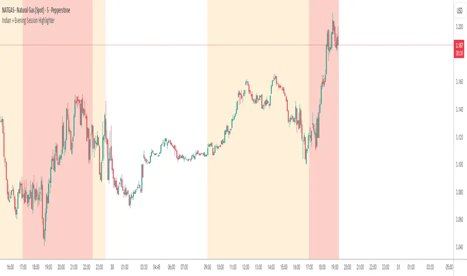
Indian + Evening Session HighlighterThis indicator visually highlights two key trading windows for Indian instruments according to IST:
Indian Session: 9:00 AM to 11:30 PM IST is shaded light orange on the chart, representing the main domestic trading hours for stocks, indices, commodities, or derivatives.
Evening Session: 5:00 PM to 10:30 PM IST is shaded light red, marking the commonly followed evening window, which often captures the impact of US and European market movements.
The indicator automatically overlays these session backgrounds on your chart, helping you quickly identify when price action occurs during India’s core and evening trade windows. This allows traders to focus on strategies specific to these time intervals, identify session-based volatility, and avoid trading during less active periods. If the evening session overlaps with the Indian session, the colors are layered for visual clarity.
It is ideal for intraday traders, option strategists, and anyone monitoring Indian market rhythms or US-linked volatility impacts on Indian assets. No inputs are required; simply apply the script and view distinct session highlights for improved timing and decision making.
ICT Killzones & MacrosICT Killzones & Macros (v1.1.5) — configurable ICT session windows + refined “macro” windows with live High/Low levels, optional extensions, next-window previews, and lightweight opening-price lines. Built to be clock-robust, timezone-aware, and performant on intraday charts.
Tip: All times are interpreted in your chosen IANA timezone (default: America/New_York) and auto-handle DST. You can rename, recolor, enable/disable, and retime every window.
What it plots
- Killzones (5) : Asia (19:00–02:00), London (02:00–05:00), NY AM (07:00–09:30), London Close (10:00–12:00), NY PM (13:30–16:00) — full-height boxes with optional header.
- Macros (8) (defaults tailored for common ICT “refined” windows): Asia-1 (18:00–21:00), Asia-2 (21:00–00:00), London-1 (01:00–04:00), AM-1 (09:45–10:15), AM-2 (10:45–11:15), Lunch (12:00–13:00), PM-1 (13:30–14:30), Power Hour (15:10–16:00).
- Live High/Low lines for the current Macro/Killzone window.
- Optional HL extension to the right until price crosses or the trading day rolls (style selectable).
- “Next” previews : earliest upcoming Macro and Killzone header; optional next-window background band.
- Opening Prices (3 lightweight time lines) : defaults 00:00, 08:30, 09:30 with right-edge labels, scoped to a session you choose (auto-cleans at session end).
- Key inputs & styling
- General : Timezone (IANA), “Sessions to show” (per window) to keep only the last N completed windows.
- Header : height (ticks), gap (ticks), fill opacity, border width/style, text size/color, toggle “Next Macro/Killzone” headers.
- Boxes : global fill opacity, global border width/style (used by both Macros & Killzones).
- High/Low : show HL, HL line style, extend on/off + extension style, optional extension labels.
- Opening Prices : enable Time 1/2/3, set HH:MM for each, session window, per-line colors, style (dotted/dashed/solid), width.
- Per-window controls : each Macro/Killzone has Enable, Session (HHMM-HHMM), Label, Fill color.
How to use (quick start)
- Set Timezone to your preference (default America/New_York).
- Toggle on the Macros and Killzones you trade. Adjust session times if needed.
- (Optional) Turn on Extend High/Low to project levels until crossed/day-roll.
- (Optional) Enable Next… headers to see the next upcoming window at a glance.
- (Optional) Configure Opening Prices (00:00 / 08:30 / 09:30 by default) and the session over which they appear.
Behavior & notes
- Time windows are computed by clock, not by guessing bar timestamps, making them robust across brokers and timeframes.
- With HL extension on, the current window’s levels extend until crossed or the end of the trading day (in your timezone). With it off, completed windows keep static HL markers (limited by “Sessions to show”).
- “Sessions to show” applies per Macro/Killzone to automatically prune older windows and keep charts snappy.
- Opening-price lines exist only within the chosen “Opening Prices Session” and are removed when it ends (keeps charts clean).
Defaults (color cues)
Killzones: Asia (blue), London (purple), NY AM (green), London Close (yellow), NY PM (orange).
Macros: neutral greys with Lunch and PM accents out of the box (all customizable).
Performance tips
- Reduce “Sessions to show” if you scroll far back in history.
- Disable “Next…” previews and/or extension labels on very slow machines.
- Narrow the “Opening Prices Session” window to exactly when you need those lines.
Changelog highlights
- v1.1.5 : Internal refinements and stability.
- v1.1.3 : Live High/Low lines for current windows + optional extension.
- v1.1.2 : Added “next Killzone” preview (to match “next Macro”).
- v1.1.0 : Defaults updated (5 KZ, 8 Macros). Removed “snap-to-killzone” behavior.
- v1.0.0 : Independent Macro vs. Killzone rendering; cleaner header logic.
- Known limitations
If your chart warns about drawings, trim “Sessions to show”.
If your broker session times differ from NY hours, adjust the sessions or change the indicator timezone.
Credits & intent
Inspired by ICT timing concepts; provided for education/mark-up, not financial advice.
Built to be flexible so you can mirror your personal playbook and journaling workflow.

SMC Concepts (Sessions, Lookback Gaps) | קונספטים SMCThe indicator marks the Asian session and the London session in order to see liquidity taking - in addition, it gently marks gaps throughout the entire chart - the indicator marks gaps of a 24/12/6/3 hour back time - from the New York session. The marking of these gaps will be throughout the entire chart until the New York session. Options for selecting a specific time precisely.האינדיקטור מסמן את סשן אסיה ואת סשן לונדון על מנת לראות לקיחת נזילות -בנוסף מסמן בעדינות גאפים לאורך כל הגרף -האינדיקטור מסמן גאפים של זמן לאחור של 24/12/6/3 שעות- מזמן סשן נויורק סימון הגאפים האלו יהיה לאורך כל הגרף עד לסשן נויורק . אפשרויות לבחירת זמן מסוים בדווקה .

ORB & Sessions [Capitalize Labs]ORB & Sessions Indicator
The ORB & Sessions Indicator provides a structured way to analyze intraday price action by combining two well-established concepts: global trading sessions and Opening Range Breakouts (ORB). It is designed to help traders identify where liquidity forms, when volatility expands, and how price behaves around key session and range levels.
Market Sessions Framework
Displays New York, London, and Asian sessions directly on the chart.
Each session can be shown as a highlighted background zone, or with extended highs and lows for liquidity tracking.
Session highs and lows remain projected forward after the session ends, allowing traders to monitor sweeps, retests, and reactions throughout the day.
Session times are fully customizable and can be aligned with the trader’s own timezone or broker feed.
This structure helps traders place price action into context, whether during quiet Asian trading, London-driven volatility, or New York reversals.
Opening Range Breakouts (ORB)
Supports three independent ORBs, each with configurable session times.
During the defined ORB window, the indicator captures the high and low of the range and plots a live updating box.
Once the ORB closes, the range locks and projects breakout targets (T1 and T2) based on user-defined risk-to-reward multiples.
Alerts are included for breakouts of highs, lows, or target levels.
Traders can use a single ORB or multiple—for example, tracking an Asian ORB into London, or London into New York.
Visualization and Clarity
Color-coded boxes and levels for sessions and ORBs.
Labels such as “Range High” and “Range Low” ensure clarity without clutter.
Flexible display settings allow highlighting full zones, just lines, or minimal markers depending on preference.
Practical Applications
This indicator is useful for:
Liquidity and volatility analysis: Observe where session highs and lows form and how they influence later trading.
Breakout and reversal strategies: Use ORB ranges to define risk and plan target projections.
Time-based research: Explore how different session overlaps or ORBs affect markets like indices, FX, and commodities.
Risk planning: Built-in R-multiple targets provide a consistent framework for evaluating setups.
Why It’s Different
Instead of showing sessions and ORBs separately, this indicator integrates them into one framework. Traders can:
See when and where sessions open and establish range levels.
Define precise ORBs with customizable timing.
Track breakout levels and targets in real time with alerts.
The result is a clear, time-structured view of the trading day, helping traders align setups with session dynamics and opening range behavior.
This indicator does not generate buy or sell signals. It is an analytical and visualization tool, providing structure for traders to better interpret intraday price action.

Simple Sessions & LevelsWhat this indicator does:
This script marks out two essential types of price levels for intraday and swing traders:
The high and low of a customizable 15-minute opening range after the market/session open.
The previous day’s high, midpoint (“halfback”), and low.
How it works:
The script lets you set the session start time (hour and minute) to match your market.
It then calculates the high and low of the first 15 minutes after the session opens and plots those as solid lines.
It also plots the prior day’s high, halfback (midpoint), and low on your chart for easy reference.
Each line and each label can be toggled on or off independently in the settings for maximum customization.
Colors for each level are also fully customizable.
How to use it:
Add the script to your chart.
Set the session start hour and minute to match the open of the market or instrument you trade.
Choose which levels and labels you want displayed by using the toggles in the settings.
The indicator will automatically draw the session range and prior day levels for you.
Use these lines as reference for key support, resistance, and potential trade entry/exit points.
What makes it unique and useful:
This tool combines a flexible session opening range with classic daily reference levels in one package. You have complete control over which levels and labels are shown, making it adaptable for any trading style. It’s especially useful for day traders who want to quickly identify volatility windows and the most important price levels from the previous session.

TradeJorno - Time + Price Levels
Tired of manually drawing and updating important ICT or SMC time and price levels on your charts every day?
Here’s an indicator to draw important TIME and PRICE levels automatically.
Here’s what you can highlight in realtime on your charts:
1. Previous major highs and lows
⁃ Previous daily and weekly highs and low
- Weekly dividing lines
2. Session highs/lows
⁃ Plot the high and low of Asia and London sessions.
⁃ Customise the timeframe and appearance on the chart.
- Previous session settlement price.
3. Various price levels
⁃ Pre-market opening prices : midnight, 7:30 and 8:30
⁃ Regular market opening prices: 9:30, 10:00, 14:00
- end of session settlement prices
4. Market opening range high and low
⁃ Lines extending throughout the current session
⁃ Customise the timeframe and appearance on the chart.
5. ICT Macro times
- Draw customisable vertical lines and labels to indicate the start of each ICT macro
period.
Let us know in the comments below if there’s anything else we need to add!
Zen FDAX Session📝 Description
OVERVIEW
The Zen FDAX Session indicator highlights periods outside the regular trading hours of the FDAX (DAX Futures) on the Xetra exchange. It shades the chart background during non-trading hours, aiding traders in distinguishing active market periods from inactive ones.
FUNCTIONALITY
Customizable Trading Hours: Users can define the session's start and end times in UTC, allowing flexibility to match personal trading schedules or account for daylight saving changes.
Visual Clarity: The indicator applies a subtle background color to non-trading hours, ensuring clear demarcation without obscuring price data.
Time Zone Awareness: Designed with UTC inputs to maintain consistency across different user time zones.
USAGE
Add the Indicator: Apply the "Zen FDAX Session" indicator to your chart.
Set Trading Hours: Input your desired session start and end times in UTC.
Interpret the Shading: Areas with shaded backgrounds represent times outside your defined trading session.
Note: This indicator does not generate buy/sell signals but serves as a visual aid to identify trading sessions.

Previous Day, Week, Monday Liq + Asian, London & Ny session LiqGM Gs,
This indicator helps traders identify key liquidity levels from different market sessions (Asian, London, NY), as well as weekly and daily highs/lows. It automatically plots these levels on the chart, making it easier to spot potential support/resistance zones where price might react.
Key Features:
1. Multi-Timeframe Liquidity Zones
Previous Day High/Low – Tracks the prior day’s range.
Monday High/Low – Useful for weekly opening liquidity.
Previous Week High/Low – Helps identify broader weekly levels.
2. Customizable Session Times
Asian, London, and NY Session Highs/Lows – Automatically detects and plots key levels from each trading session.
Adjustable Time Zones – Supports multiple GMT offsets (GMT-8 to GMT+3), making it adaptable for traders worldwide.
3. Visual Customization
Color & Style Options – Each level type (e.g., London High, NY Low) can be customized in color, line style (solid, dashed, dotted), and width.
Faded Opacity for Swept Levels – When a level is swept (price breaks but closes beyond it), it becomes semi-transparent, helping traders distinguish active vs. invalidated levels.
4. Clean & Informative Labels
Each level has a clear label (e.g., "Asia High," "PW Low") for easy identification.
Adjustable label offsets prevent clutter on the chart.
Pros & Benefits for Traders:
✅ Helps Identify Key Liquidity Zones – Institutional traders often target session highs/lows for liquidity grabs. This indicator makes these levels visible at a glance.
✅ Adaptable to Different Trading Styles
Day Traders – Can use Asian/London/NY session levels for intraday setups.
Swing Traders – Can focus on weekly and Monday levels for broader trends.
✅ No Repainting – Levels are fixed once formed and do not change retroactively.
✅ Customizable for Personal Preference – Traders can adjust colors, line styles, and visibility to match their trading setup.
✅ Useful for Multiple Markets – Works well on Forex (major pairs), indices, and even crypto (due to 24/7 market structure similarities).
Suggested Use Cases:
Breakout Trading – Watch for price reactions at session highs/lows.
Mean Reversion – Fade moves into weekly or daily extremes.
Institutional Liquidity Analysis – Identify potential stop hunts or accumulation zones.
Conclusion:
This indicator is a powerful tool for traders who rely on session-based liquidity, institutional order flow, and key support/resistance levels. By automating the detection of these zones, it saves time and helps traders make more informed decisions.

Trading Sessions Highs/Lows | InvrsROBINHOODTrading Sessions Highs/Lows | InvrsROBINHOOD
🚀 A powerful indicator for tracking key trading sessions and the highs and lows of each session!
📌 Description
The Trading Sessions Highs/Lows indicator visually marks the most critical trading sessions—Asia, London, and New York—using small colored dots at the bottom of the candle. It also tracks and plots the highs and lows of each session, along with the Daily Open and Weekly Open levels.
This tool is designed to help traders identify session-based liquidity zones, price reactions, and potential trade setups with minimal chart clutter.
Key Features:
✅ Session markers (Asia, London, NY AM, NY Lunch, NY PM) plotted as small dots
✅ Plots session highs and lows for market structure insights
✅ Daily Open line for intraday reference
✅ Weekly Open line for higher timeframe bias
✅ Alerts for session high/low breaks to capture momentum shifts
✅ User-defined UTC offset for global traders
✅ Customizable session colors for personal preference
📖 How to Use the Indicator
1️⃣ Understanding the Sessions
Asia Session (Yellow Dot) → Marks liquidity buildup & pre-London moves
London Session (Blue Dot) → Strong volatility, breakout opportunities
New York AM Session (Green Dot) → Major trends & institutional participation
New York Lunch (Red Dot) → Low volume, ranging market
New York PM Session (Dark Green Dot) → End-of-day movements & reversals
2️⃣ Session Highs & Lows for Market Structure
Session Highs can act as resistance or breakout points.
Session Lows can act as support or stop-hunt zones.
Break of a session high/low with volume may indicate continuation or reversal.
3️⃣ Using the Daily & Weekly Open
The Daily Open (Black Line) helps gauge the intraday trend.
Above Daily Open → Bearish Bias
Below Daily Open → Bullish Bias
The Weekly Open (Red Line) sets the higher timeframe directional bias.
4️⃣ Alerts for Breakouts
The indicator will trigger alerts when price breaks session highs or lows.
Useful for setting stop-losses, breakout trades, and risk management.
💡 Why This Indicator is Important for Beginners
1️⃣ Avoids Overtrading:
Many beginners trade in low-volume periods (NY Lunch, Asia session) and get stuck in choppy price action.
This indicator highlights when volatility is high so traders focus on better opportunities.
2️⃣ Session-Based Liquidity Traps:
Market makers often run stops at session highs/lows before reversing.
Watching session breaks prevents traders from falling into liquidity grabs.
3️⃣ Reduces Emotional Trading:
If price is above the Daily Open, a beginner shouldn’t look for shorts.
If price is below a key session low, it may signal a fake breakout.
4️⃣ Aligns with Institutional Trading:
Smart money traders use session highs/lows to set stop hunts & reversals.
Beginners can use this indicator to spot these zones before entering trades.
🛡️ How to Mitigate Risk with This Indicator
✅ Wait for Confirmations – Don’t trade blindly at session highs/lows. Look for wicks, rejections, or break/retests.
✅ Use Stop-Loss Above/Below Session Levels – If you’re going long, set SL below a session low. If short, set SL above a session high.
✅ Watch Volume & News Events – Breakouts without strong volume or news may be fake moves.
✅ Combine with Other Strategies – Use price action, trendlines, or EMAs with this indicator for higher probability trades.
✅ Use the Weekly Open for Trend Bias – If price stays below the Weekly Open, avoid bullish setups unless key support holds.
🎯 Who is This Indicator For?
📌 Beginners who need clear session-based trading levels.
📌 Day traders & scalpers looking to refine their intraday setups.
📌 Smart money traders using liquidity concepts.
📌 Swing traders tracking higher timeframe momentum shifts.
🚀 Final Thoughts
This indicator is an essential tool for traders who want to understand market structure, liquidity, and volatility cycles. Whether you’re trading forex, stocks, or crypto, it helps you stay on the right side of the market and avoid unnecessary risks.
🔹 Set it up, customize your colors, define your UTC offset, and start trading smarter today! 🏆📈

C|M Capital (Market Structure Pro)CM Capital (Market Structure Pro)
Overview:
The CM Capital (Market Structure Pro) Indicator is a groundbreaking tool for traders seeking a comprehensive market analysis. This closed-source script merges multiple facets of market dynamics into a single, user-friendly interface, designed to enhance decision-making by providing a multi-dimensional view of market behavior. By combining advanced market structure detection, liquidity event identification, Fair Value Gap analysis, and session-specific insights, this indicator offers traders a strategic advantage in navigating the complexities of financial markets.
Key Functionalities:
Market Structure Insights:
Break of Structure (BOS) and Market Structure Shifts (MSS):
Methodology: Our approach uses fractal analysis coupled with custom algorithms to dissect price movements, identifying pivotal moments where market structure breaks or shifts. The script evaluates candle patterns, volume data, and price momentum to flag these events.
Customization: Users can choose between candle close or wick confirmations and select from various line styles for visualization, tailoring the sensitivity to match their trading strategy, whether it's scalping or swing trading.
Utility: These markers act as early signals for trend changes, allowing traders to prepare for potential reversals or continuations, especially useful in volatile markets where timely decisions are crucial.
Structure Strength:
Highs and Lows Definition: The 'Structure Strength' setting in this indicator directly influences the identification of structure highs and lows. It's not just about detecting market structure; it's about defining what constitutes a significant high or low based on your trading horizon.
Swing vs. Internal Structure:
Lower Strength: Opting for a lower strength setting will highlight more extreme, swing-type structures. This means the indicator will mark out only the most pronounced highs and lows, which are ideal for traders focusing on broader market swings or longer-term trends.
Higher Strength: Conversely, increasing the strength level plots more internal structure levels. This setting is perfect for traders who want to dive into the market's micro-movements, offering insights into potential support and resistance within ongoing trends, essentially capturing more reactive and detailed price action.
Strategic Application: This adjustable parameter allows traders to zoom in or out on the market structure, aligning with their trading style or the specific market conditions they're navigating. Whether you're looking to catch significant market turns or to finesse entries and exits within a trend, the structure strength setting provides the granularity needed for nuanced market analysis.
Liquidity Sweeps:
Detection: Beyond traditional price action analysis, our indicator incorporates a unique method to spot liquidity sweeps. By analyzing price movements against historical support/resistance zones, it highlights instances where significant orders might have been absorbed, suggesting areas of potential price reversal or continuation.
Visualization: Liquidity sweeps are visually marked with customizable colors and an 'X' label, making them instantly recognizable. This feature is particularly beneficial for traders looking to enter or exit trades based on market inefficiencies or anticipated institutional activity.
Application: Traders can use these signals to anticipate where the market might react strongly, either as support for entries or as a caution for exits, enhancing trade precision.
Fair Value Gaps (FVGs):
Identification: Our proprietary FVG detection algorithm looks for price discrepancies over recent bars, signaling where the market could aim to rebalance. This is not merely about spotting gaps but understanding their context within the market's flow.
Enhanced Visualization: Users can extend FVGs across the chart, providing a clearer view of potential mean reversion points or continuation levels, aiding in setting targets or stop-losses.
Strategic Use: FVGs serve as dynamic levels where traders might expect price action to revisit, offering opportunities for mean reversion trades or confirming trend strength.
Session Visualization:
Session Markers: By delineating Asia, London, and New York session times, the indicator helps traders recognize session-specific volatility, trends, and liquidity conditions. Each session can be customized for color and duration, aligning with various trading strategies.
Timeframe Correlation: Integrating session analysis with structural and liquidity insights allows for a strategy where trades are timed not just by price action but by when in the global market cycle they occur, potentially increasing the effectiveness of entry and exit points.
Watermark Display:
Personalization: Add a personal touch or brand identity to your charts with customizable text and color options for the watermark, enhancing both the aesthetic and functional aspects of your trading setup.
Originality:
This script's originality lies in its holistic approach to market analysis. The integration of these diverse yet synergistic components provides a unique toolset:
Confluence of Signals: Each element enhances the others, creating a confluence where structural changes, liquidity events, and time-based market conditions are analyzed in concert, offering a more complete trading signal than isolated indicators.
Customization for Diverse Trading Styles: From high-frequency scalping to long-term trend following, the script's flexibility caters to a broad spectrum of trading strategies by allowing adjustments in sensitivity, visualization, and application.
How to Use:
Setup: Add the script to your chart and explore the settings in the input panel. Customize the visual and functional aspects to align with your trading style.
Strategy Application:
Use BOS/MSS for trend confirmation, liquidity sweeps for entry/exit precision, FVGs for mean reversion opportunities, and session markers to time your trades optimally.
Consider combining signals for stronger trade validation; for instance, a BOS during the London session might be more significant if it coincides with a liquidity sweep and an FVG from the Asian session.

GG - LevelsThe GG Levels indicator is a tool designed for day trading U.S. equity futures. It highlights key levels intraday, overnight, intermediate-swing levels that are relevant for intraday futures trading.
Terminology
RTH (Regular Trading Hours): Represents the New York session from 09:30 to 17:00 EST.
ON Session (Overnight Session): Represents the trading activity from 17:00 to 09:29 EST.
IB (Initial Balance): The first hour of the New York session, from 09:30 to 10:30 EST.
Open: The opening price of the RTH session.
YH (Yesterday's High): The highest price during the RTH session of the previous day.
YL (Yesterday's Low): The lowest price during the RTH session of the previous day.
YC (Yesterday's Close): The daily bar close which for futures gets updated to settlement.
IBH (Initial Balance High): The highest price during the IB session.
IBL (Initial Balance Low): The lowest price during the IB session.
ONH (Overnight High): The highest price during the ON session.
ONL (Overnight Low): The lowest price during the ON session.
VWAP (Volume-Weighted Average Price): The volume-weighted average price that resets each day.
Why is RTH Important?
Tracking the RTH session is important because often times the overnight session can be filled with "lies". It is thought that because the overnight session is lower volume price can be pushed or "manipulated" to extremes that would not happen during higher volume times.
Why is the ON Session Important Then?
Just because the ON session can be thought as a "lie" doesn't mean it is relevant to know. For example, if price is stuck inside the ON range then you can think of the market as rotational or range-bound. If price is above the ON range then it can be thought of as bullish. If price is below the ON range then it can be thought as bearish.
What is IB?
IB or initial balance is the first hour of the New York Session. Typically the market sets the tone for the day in the first hour. This tone is similarly a map like the ON session. If we are above the IBH then it is bullish and likely a trend day to the upside. If we are below the IBL then it is bearish and likely a trend day to the downside. If we are in IB then we want to avoid conducting business in the middle of IBH and IBL to avoid getting chopped up in a range bound market.
These levels are not a holy grail
You should use this indicator as guide or map for context about the instrument you are trading. You need to combine your own technical analysis with this indicator. You want as much context confirming your trade thesis in order to enter a trade. Simply buying or selling because we are above or below a level is not recommended in any circumstance. If it were that easy I would not publish this indicator.
Adjustments
In the indicator settings you can adjust the RTH, ON, and IB session-time settings. All of the times entered must be in EST (Eastern Standard Time). You may want to do this to apply the levels to a foreign market.
Examples
