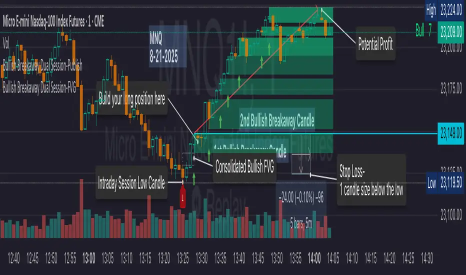
Bullish Breakaway Dual Session-Publish-Consolidated FVG
Inspired by the FVG Concept:
This indicator is built on the Fair Value Gap (FVG) concept, with a focus on Consolidated FVG. Unlike traditional FVGs, this version only works within a defined session (e.g., ETH 18:00–17:00 or RTH 09:30–16:00).
Bullish consolidated FVG & Bullish breakaway candle
Begins when a new intraday low is printed. After that, the indicator searches for the 1st bullish breakaway candle, which must have its low above the high of the intraday low candle. Any candles in between are part of the consolidated FVG zone. Once the 1st breakaway forms, the indicator will shades the candle’s range (high to low). Then it will use this candle as an anchor to search for the 2nd, 3rd, etc. breakaways until the session ends.
Session Reset: Occurs at session close.
Repaint Behavior:
If a new intraday (or intra-session) low forms, earlier breakaway patterns are wiped, and the system restarts from the new low.
Counter:
A session-based counter at the top of the chart displays how many bullish consolidated FVGs have formed.
Settings
• Session Setup:
Choose ETH, RTH, or custom session. The indicator is designed for CME futures in New York timezone, but can be adjusted for other markets.
If nothing appears on your chart, check if you loaded it during an inactive session (e.g., weekend/Friday night).
• Max Zones to Show:
Default = 3 (recommended). You can increase, but 3 zones are usually most useful.
• Timeframe:
Best on 1m, 5m, or 15m. (If session range is big, try higher time frame)
Usage
1. Avoid Trading in Wrong Direction
• No bullish breakaway = No long trade.
• Prevents the temptation to countertrade in strong downtrends.
2. Catch the Trend Reversal
• When a bullish breakaway appears after an intraday low, it signals a potential reversal.
• You will need adjust position sizing, watch out liquidity hunt, and place stop loss.
• Best entries of your preferred choices: (this is your own trading edge)
Retest
Breakout
Engulf
MA cross over
Whatever your favorite approach
• Reversal signal is the strongest when price stays within/above the breakaway candle’s
range. Weak if it breaks below.
3. Higher Timeframe Confirmation
• 1m can give false reversals if new lows keep forming.
• 5m often provides cleaner signals and avoids premature reversals.
Failed Trade Example:
This indicator will repaint if a new intraday session low is updated. So it is possible to have a failed trade. Here is an example from the same session in 1m chart. However, if you enter the trade later at another bullish breakaway candle signal. The loss can be mitigated by the profit.
Therefore you should use smaller position size for your 1st trade. You should also considering using 5m chart to avoid 1m bull trap. In this example, if you use 5m chart, you can totally avoid this failed trade.
If you enter the trade, you will see the intraday low is stop loss hunted. You can also see the 1st bullish breakaway candle is super weak. There are a lot of candles below the breakaway candle low, so it is very possible to fail.
In the next chart, you can see the failed traded get stop loss hunted. However you can enter another trade with huge profit to win back the loss from the 1st trade if you follow the rule.
Summary
This indicator offers 3 main advantages:
1. Prevents wrong-direction trades.
2. Confirms trend entry after reversal signals.
3. Filters false positives using higher timeframes.
How to sharp your edge:
1. ⏳Extreme patience⏳: Do not guess the bottom during a downtrend before a confirmed bullish breakaway candle. If you get caught, have the courage to cut loss. This is literally the most important usage of this indicator. Again, this is the most important rule of this indicator and actually the hardest rule to follow.
2. 🛎Better Entry🛎: After a confirmed bullish breakaway, you will always have a good opportunity to enter the trade using established trading technique. Your edge will come from the position size, draw down, stop loss placement, risk/reward ratio.
3. ✂Cut loss fast✂: If you enter a trade according to the rule, but you are still not making profit for a period of time, and the price is below the low of the breakaway candle. It is very likely you may hit stop loss soon (intraday session low). It won't be a bad idea to cut loss before stop loss hit.
4. 🔂Reentry with confidence after stop loss🔂: a stop loss will not invalidate the indicator. If you see a second chance to reenter, you should still follow the trade guide and rule.
5. 🕔Time frame matter🕔: try 1m, 3m, 5m, 10m, 15m time frame. Over time, you should know what time frame work best for you and the market. Higher time frame will reduce the noise of false positive trade, but it comes with a higher stop loss placement and less max profit, however it may come with a lower draw down. Time frame will matter depending on the range of the session. If the session range is small (<0.5%), lower time frame is good. If session range is big (>1%), 5m time frame is better. Remember to wait for candle to close, if you use higher time frame.
Last Mention:
The indicator is only used for bullish side trading.
Cari dalam skrip untuk "session"
ADR/ATR Session No Probability Table by LKHere you go—clear, English docs you can drop into your script’s description or share with teammates.
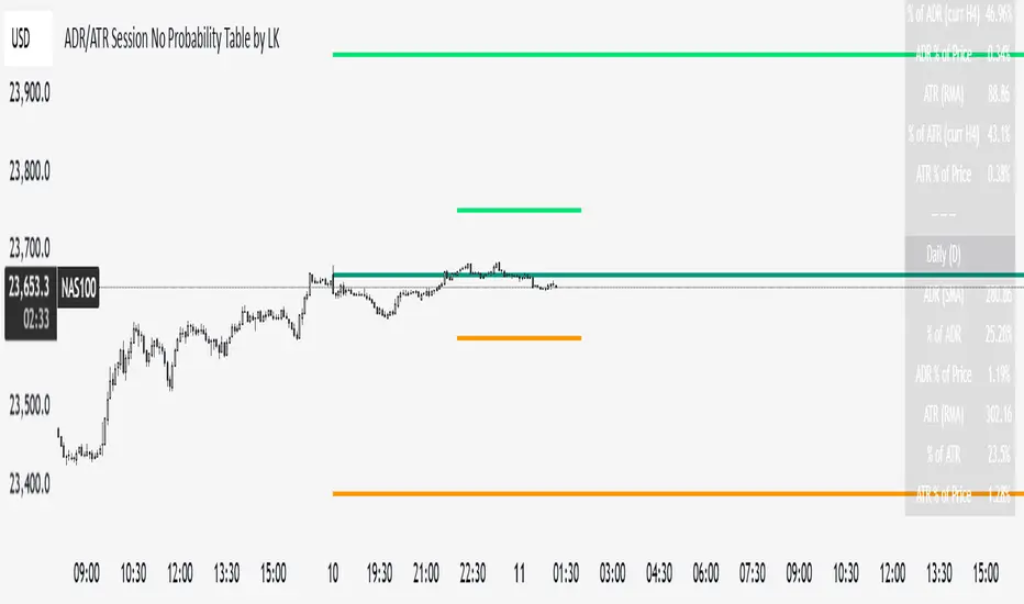
ADR/ATR Session by LK — Overview
This indicator summarizes Average Daily Range (ADR) and Average True Range (ATR) for two horizons:
• Session H4 (e.g., 06:00–13:00 on a 4‑hour chart)
• Daily (D)
It shows:
• Current ADR/ATR values (using your chosen smoothing method)
• How much of ADR/ATR today/this bar has already been consumed (% of ADR/ATR)
• ADR/ATR as a percent of price
• Optional probability blocks: likelihood that %ADR will exceed user‑defined thresholds over a lookback window
• Optional on‑chart lines for the current H4 and Daily candles: Open, ADR High, ADR Low
⸻
What the metrics mean
• ADR (H4 / D): Moving average of the bar range (high - low).
• ATR (H4 / D): Moving average of True Range (max(hi-lo, |hi-close |, |lo-close |)).
• % of ADR (curr H4): (H4 range of the current H4 bar) / ADR(H4) × 100. Updates live even if the current time is outside the session.
• % of ADR (Daily): (today’s intra‑day range) / ADR(D) × 100.
• % of ATR (curr H4 / Daily): TR / ATR × 100 for that horizon.
• ADR % of Price / ATR % of Price: ADR or ATR divided by current price × 100 (a quick “volatility vs. price” gauge).
Session logic (H4): ADR/ATR(H4) only update on bars that fall inside the configured session window; outside the window the values hold steady (no recalculation “bleed”).
Daily range tracking: The indicator tracks today’s high/low in real‑time and resets at the day change.
⸻
Inputs (quick reference)
Core
• Length (ADR/ATR): smoothing length for ADR/ATR (default 21).
• Wait for Higher TF Bar Close: if true, updates ADR/ATR only after the higher‑TF bar closes when using request.security.
Timeframes
• Session Timeframe (H4): default 240.
• Daily Timeframe: default D.
Session time
• Session Timezone: “Chart” (default) or a fixed timezone.
• Session Start Hour, End Hour (minutes are fixed to 0 in this version).
Smoothing methods
• H4 ADR Method / H4 ATR Method: SMA/EMA/RMA/WMA.
• Daily ADR Method / Daily ATR Method: SMA/EMA/RMA/WMA.
Table appearance
• Table BG, Table Text, Table Font Size.
Lines (optional)
• Show current H4 segments, Show current Daily segments
• Line colors for Open / ADR High / ADR Low
• Line width
Probability
• H4 Probability Lookback (bars): number of H4 bars to examine (e.g., 300).
• Daily Probability Lookback (days): number of D bars (e.g., 180).
• ADR thresholds (%): CSV list of thresholds (e.g., 25,50,55,60,65,70,75,80,85,90,95,100,125,150).
The table will show the % of lookback bars where %ADR ≥ threshold.
Tip: If you want probabilities only for session H4 bars (not every H4 bar), ask and I can add a toggle to filter by inSess.
⸻
How to read the table
H4 block
• ADR (method) / ATR (method): the session‑aware averages.
• % of ADR (curr H4): live progress of this H4 bar toward the session ADR.
• ADR % of Price: ADR(H4) relative to price.
• % of ATR (curr H4) and ATR % of Price: same idea for ATR.
H4 Probability (lookback N bars)
• Rows like “≥ 80% ADR” show the fraction (in %) of the last N H4 bars that reached at least 80% of ADR(H4).
Daily block
• Mirrors the H4 block, but for Daily.
Daily Probability (lookback M days)
• Rows like “≥ 100% ADR” show the fraction of the last M daily bars whose daily range reached at least 100% of ADR(D).
⸻
Practical usage
• Use % of ADR (curr H4 / Daily) to judge exhaustion or room left in the day/session.
E.g., if Daily %ADR is already 95%, be cautious with momentum continuation trades.
• The probability tables give a quick historical context:
If “≥ 125% ADR” is ~18%, the market rarely stretches that far; your trade sizing/targets can reflect that.
• ADR/ATR % of Price helps normalize volatility between instruments.
⸻
Troubleshooting
• If probability rows are blank: ensure lookback windows are large enough (and that the chart has enough history).
• If ADR/ATR show … (NA): usually you don’t have enough bars for the chosen length/TF yet.
• If line segments are missing: verify you’re on a chart with visible current H4/D bars and the toggles are enabled.
⸻
Notes & customization ideas
• Add a toggle to count only session bars in H4 probability.
• Add separate thresholds for H4 vs Daily.
• Let users pick minutes for session start/end if needed.
• Add alerts when %ADR crosses specified thresholds.
If you want me to bundle any of the “ideas” above into the code, say the word and I’ll ship a clean patch.
ADR/ATR Session by LK## **Features**
1. **Custom ADR & ATR Calculation**
* Calculates **Average Daily Range (ADR)** and **Average True Range (ATR)** separately for:
* **Session timeframe** (default H4 / 06:00–13:00)
* **Daily timeframe**
* Independent smoothing method selection (**SMA, EMA, RMA, WMA**) for H4 ADR, H4 ATR, Daily ADR, and Daily ATR.
2. **Percentage Metrics**
* % of ADR / ATR covered by the **current H4 bar**.
* ADR / ATR expressed as a percentage of the **current price**.
* % of ADR already reached for the **current day**.
* % of Daily ATR vs current day’s True Range.
3. **Dynamic Chart Lines**
* Draws **3 lines for H4**: Session Open, ADR High, ADR Low.
* Draws **3 lines for Daily**: Daily Open, ADR High, ADR Low.
* Lines **extend to the right** so they stay visible across the chart.
* Colors and widths are fully customizable.
4. **Real-Time Data Table**
* Compact table displaying all ADR/ATR values and percentages.
* Adjustable table font size (**tiny, small, normal, large, huge**).
* Transparent background option for minimal chart obstruction.
5. **Flexible Session Settings**
* Select session start and end time in hours/minutes.
* Choose session timezone (chart timezone or major financial centers).
* Toggle H4 lines, Daily lines separately.
6. **Lookahead Control**
* Option to wait for higher-timeframe candle close before updating values (more accurate, less repainting).
---
## **How to Use**
### **1. Adding the Indicator**
* Copy and paste the Pine Script into TradingView’s Pine Editor.
* Click **“Add to chart”**.
* Make sure your chart supports the higher timeframes you choose (e.g., H4 and Daily).
### **2. Setting Your Session**
* **Session Start Hour** & **End Hour** → Defines the intraday session to measure ADR/ATR (default: 06:00–13:00).
* **Session Timezone** → Pick “Chart” or a major financial center (e.g., New York, London, Tokyo).
### **3. Choosing Smoothing Methods**
* For each ADR/ATR (H4 and Daily), choose:
* SMA (Simple)
* EMA (Exponential)
* RMA (Wilder’s smoothing)
* WMA (Weighted)
### **4. Adjusting Chart Display**
* **Show H4 Lines** → Displays session open and ADR High/Low for the current H4 session.
* **Show Daily Lines** → Displays daily open and ADR High/Low.
* Customize line colors and widths.
### **5. Reading the Table**
* **H4 Section**
* ADR / ATR values for the selected session.
* % of ADR/ATR covered by the **current H4 bar**.
* ADR/ATR as % of the current price.
* **Daily Section**
* ADR / ATR for the daily timeframe.
* % of ADR already covered by today’s range.
* ADR/ATR as % of price.
### **6. Pro Tips**
* Use **H4 ADR %** to gauge intraday exhaustion — if current range is near 100%, market may slow or reverse.
* Use **Daily ADR %** for swing trade context — if a day has moved beyond its ADR, expect lower continuation probability.
* Combine with support/resistance to identify high-probability reversal zones.

[Smith] VWAP Deviation + VWAP Deviation +
Short Description:
Advanced VWAP indicator with deviation bands, smart signal filtering, and session-based performance tracking. Features log-space scaling, RSI confirmation, volume filters, and market regime detection.
Full Description:
The VWAP Deviation + is a comprehensive trading indicator that combines Volume Weighted Average Price (VWAP) analysis with advanced signal filtering to identify high-probability trade opportunities. This indicator goes beyond basic VWAP by incorporating multiple confirmation layers and intelligent market analysis.
🎯 Key Features
Core VWAP Analysis:
- Custom volume-weighted mean calculation with deviation bands (2σ and 3σ)
- Optional log-space scaling for proportional price movements
- Real-time VWAP line with customizable visibility
Smart Signal Detection:
- RSI confirmation for all trade signals
- Volume filter requiring above-average trading activity
- Market regime detection (trending vs ranging markets)
- Optional RSI divergence analysis
Advanced Filtering:
- Multi-condition signal validation
- Session-based performance tracking (Asian, London, NY)
- Real-time win rate calculation
- Strong vs regular signal classification
Visual Features:
- Clean, professional interface with customizable colors
- Optional signal shapes and annotations
- Performance statistics table
- Filled deviation bands for easy visualization
📊 How It Works
The indicator identifies trade opportunities when:
1. Price touches VWAP deviation bands (2σ or 3σ)
2. RSI confirms oversold/overbought conditions
3. Volume exceeds the specified threshold
4. Market regime conditions are favorable
Signal Types:
- LONG : Price at lower bands + RSI oversold + volume confirmation
- SHORT : Price at upper bands + RSI overbought + volume confirmation
- STRONG : Same conditions but at 3σ bands for higher conviction trades
⚙️ Customization Options
Core Settings:
- VWAP length and source selection
- Adjustable deviation multipliers
- Log-space scaling toggle
Signal Filters:
- RSI length and threshold levels
- Volume filter with customizable multiplier
- Market type filtering options
Advanced Features:
- Session statistics tracking
- RSI divergence detection
- Market regime analysis
Visual Controls:
- Show/hide individual components
- Custom color schemes
- Signal display toggles
🔔 Alert System
Built-in alerts for:
- Long and short trade opportunities
- Strong signal confirmations
- RSI divergence signals
💡 Best Practices
- Use higher timeframes (15m+) for more reliable signals
- Combine with additional confirmation indicators
- Pay attention to session statistics for timing optimization
- Monitor market regime indicators for context
This indicator is suitable for day traders, swing traders, and anyone looking to improve their VWAP-based trading strategies with advanced filtering and market analysis.

Market Session Boxes with Volume Delta [algo_aakash]This script highlights four key forex trading sessions — Tokyo, London, New York, and Sydney — by drawing color-coded boxes directly on the chart. For each session, it shows:
High and low of the session
Total volume traded
Volume delta (bullish vs bearish pressure)
Optional extension of session highs/lows into future candles
Cleanly labeled time range and stats
Users can:
Select which sessions to display
Customize session times (in UTC+0)
Choose colors per session
Toggle session labels and extension lines
Use Case: Designed to help intraday and short-term traders visualize market rhythm, liquidity zones, and session-based volatility. The volume delta metric adds an extra layer of sentiment analysis.
This tool works best on intraday timeframes like 15m, 30m, or 1H.
Disclaimer:
This indicator is for educational and visual analysis purposes. It does not constitute trading advice or guarantee results. Always conduct your own analysis before making trading decisions.

ALN Sessions - for NQ2/24/25 - v1
This script does not calculate any stats.
It uses the sessions and stats from NQStats/ALNSessions
Option to draw boxes around the session times.
Options to adjust the table text/background colors/position.
The logic will determine how the Asia and London sessions interact.
Once the New York session starts (8am), it will then display the appropriate stats.
Script quirk...fyi. The script removes the stats table at 6PM.
That's just how it works. I used grok to assist with the code, and it got funky. It works, so I left it that way.
The appropriate stats table will then be displayed when the next New York session begins.
---
There is another table I used just for troubleshooting to show the values of the Asia/London session highs/lows. This can just be ignored.
3/3/25 - republished.

Opening Range with Breakouts & Targets [LuxAlgo]Opening Range with Breakouts & Targets is based on the long-standing Opening Range Breakout strategy popularized by traders such as Toby Crabel and Mark Fisher.
This indicator measures and displays the price range created from the first period within a new trading session, along with price breakouts from that range and targets associated with the range width.
🔶 USAGE
The Opening Range (OR) can be a powerful tool for making a clear distinction between ranging and trending trading days. Using a rigid structure for drawing a range, provides a consistent basis to make judgments and comparisons that will better assist the user in determining a hypothesis for the day's price action.
NOTE: During a suspected "Range Day", the Opening Range can be used for reversion strategies, typically targeting the opposite extreme of the range or the mean of the range. However, more commonly the Opening Range is used for breakouts on suspected "Trend Days", targeting further upward or downward market movement.
The common Opening Range Breakout Strategy (ORB) outlines a structure to enter and exit positions based on rigid points determined by the Opening Range. This methodology can be adjusted based on markets or trading styles.
Determine Opening Range High & Low: These are the high and low price within a chosen period of time after the market opens. This can be customized to the user's trading style and preference. Common Ranges are from 5-60 mins.
Watch for a Breakout with Volume: A Breakout occurs when price crosses the OR High (ORH) or OR Low (ORL), an increase in volume is typically desired when witnessing these breakouts to confirm a stronger movement.
Manage Risk: Based on user preference and the appropriately determined amount of risk, multiple ways can be determined to manage risk by using Opening Range.
For Example: A stop-loss could be set at OR Mean (ORM) or the opposite side of the range, while a profit target could optionally be set at the first price target generated by the script.
Alternatively, a user might want to use a Moving Average (MA) as an adaptive stop-loss and use price targets to scale out. These are just 2 examples of the possible options, both capable with this tool.
🔹 Signals
Signals will fire based on the break of the opening range, this is indicated by arrows above and below the range boundaries.
Optionally, a bias can be added to these signals to aid in mitigating false signals by using a directional filter based on the current day's OR relative to the previous day's OR.
Regardless of the signal bias being enabled, the Opening Range Zone will always be colored directionally according to this.
If the current day's OR is above the previous day's OR, the Zone will be Green.
If the current day's OR is below the previous day's OR, the Zone will be Red.
By enabling the signal bias, signals in the opposite direction of the daily bias will fire on the cross of the first target in that direction.
🔹 Targets
In this indicator, targets are not limited and will generate infinitely based on a % width of the Opening Range.
Additionally, there are 2 display methods for these targets.
Extended: Extends the targets to the current bar and displays all targets that have been crossed so far within the session.
Adaptive: Extends only the 2 closest targets surrounding price, allowing for a display consisting of fewer lines at one time.
🔶 DETAILS
🔹 Historical Display
This indicator can be utilized in multiple ways, for use in real-time, and for historical analysis to form methods. Because of this, the indicator has an option to display only the current day's data or the entire historical data. This can also help clean up the chart when it is in use.
🔹 Time Period
The specific time period to create the opening range is entirely up to each user's preference, by default it is set to 30 mins; however, this time period can be edited with full control if desired.
Simply toggle on the "Custom Range" and input a range of time to create the range.
🔹 Session Moving Average
The Session Moving Average is a common Moving Average, which resets at the beginning of a new session. This allows for an unbiased MA that was created entirely from the current session's price action.
Note: The start of the session is determined by the start of the Opening Range if using a custom range of time.
🔶 SETTINGS
Show Historical Data: Choose to display only the current session's data or the full history of data.
Opening Range Time Period: Select the time period to form the opening range from. This operates on Session Start, so it will change with the chart.
Custom Range: Opt for a custom Range by enabling this and inputting your range times as well as your needed timezone.
Breakout Signal Bias: Select if the Breakout Signals will use a Daily Directional Bias for firing.
Target % of Range: Sets the % of the Range width that will be used as an increment for the Targets to display in.
Target Cross Source: Choose to use the Close price or High/Low price as the crossing level for Target displays. When this source crosses a target it will generate more targets.
Target Display: Choose which style of display to use for targets.
Session Moving Average: Optionally enable a Moving average of your choice that resets at the beginning of each session (start of opening range).

Ayiah-SessionsDisplays the True Session Times for Forex, Indices & Crypto.
It helps visualize the sessions chart so you can see when and where volume comes into the market and out of the market.
The Asia-Session is displayed by a range high and low box instead of a vertical lines like the other sessions as it can be used as the main liquidity standpoint for LTF-Trading.
Frankfurt/London/New York Session all get highlighted by vertical lines, with that u can know when volume can come into the market and out of the market.
When looking at the crypto market please make sure to change it in the indicator aswell as otherwise it wont lign up properly.
All Sessions can be customized by color and time span on the "inputs" section.
The last thing there is that it colors the 09:30 and 15:30 candle as often manipulation and fake pushes are created at those times.
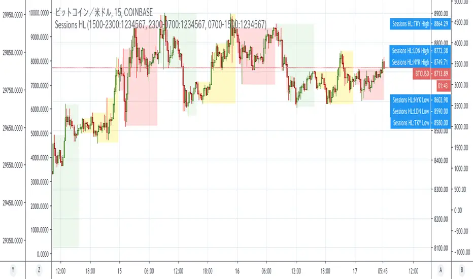
Session_for_crypto_High/Low*This script is an improved version of "Sessions_for_crypto" I made in the past.
・ Purpose of Sessions_for_crypto (old)
CoinCollege's article found that between September 1, 2019 and January 15, 2020, Bitcoin price movements tended to be the most driven by US time.
Japan time was the least active. This is similar to Forex.
Reference: Consideration on the time zone and day of the week when the Bitcoin market is easy to move (September 2019-January 2020)
Original title: ビットコイン相場が動き易い時間帯と曜日についての考察(2019年9月〜2020年1月)
・What makes this "High/Low" script different
The older indicator simply filled in the time zone.
However, this indicator grasps and describes the highest and lowest price of each time zone.
For this reason, it is easy to visually understand in which time zone the price movement was intense and trends.
Recommended period: less than 4h
・Options
Sessions can be changed manually.
The default values are as follows (UTC):
NY 1500-2300:1234567
Tokyo 2300-0700:1234567
London 0700-1500:1234567
========================================================================
コインカレッジさんの記事で「米国時間が一番Bitcoin動くよね」という調査結果が出ていたので、時間帯を色分けしてくれるインジSession_for_cryptoを以前に作りました。
なのですが、チャート全体に色がついて見づらいし、どのタイムゾーンでどういうトレンドが出ているかパっと見で分かりにくいと感じていました。
このインジケーターではその辺を解消するために、各タイムゾーンの最安値と最高値の範囲だけを塗りつぶす事で、なんとなく「お、今日は東京時間が結構動いているじゃん」とわかるようになればいいなーという感じで作っています。
時間帯はコインカレッジさんの記事準拠ですが、マニュアルで変更できるようにしてあるので好きな時間帯を設定して下さい。
Trade Session Tracker [theUltimator5]Trade Session Tracker is a unique indicator designed to isolate each discrete trading session on the US stock exchanges and display a cumulative running price for each session so you can visualize how each session performs over long periods of time.
This indicator allows you to unlock a potentially unique and powerful trading strategy that exploits returns during lower liquidity periods through trend analysis. Certain stocks tend to move in the same direction during specific windows in the day, and now you can find them yourself.
This indicator only works properly on the daily timeframe. Other timeframes are not supported.
The sessions that this indicator supports are:
Intraday (Market open to market close)
After Hours (Market close until 20:00 eastern)
Overnight (20:00 eastern through 04:00 eastern the next day)
Pre-market (04:00 eastern through market open)
Close-to-open (market close to the following market open)
There are two plot modes:
Cumulative — chained returns since chart start (synthetic continuous price line)
Daily Change — single-session return (refreshes each new trading day)
!IMPORTANT!
This indicator only supports symbols that trade on the overnight markets through the BOATS ATS. This includes hundreds of ticker symbols, but the majority of smaller cap stocks or non-equity symbols are not supported.
Some symbols offer dividends, and the "ADJ" button at the bottom right corner of the chart must be disabled for the data to display properly, or else you will get extremely skewed results. Notorious symbols for this are SPY and AAPL.
How it works:
Standard chart data only calculates sessions through open, close, and previous close and cannot isolate out pre-market and after hours price action.
With the addition of overnight data, we now have a separate set of open and close values which can be pulled.
To calculate after hours price action, we use the opening price of the overnight venue divided by the close price earlier that day.
To calculate the pre-market price action, we divide the open price by the previous overnight close price.
Overnight price is simply calculated by overnight close divided by overnight open.
There is a table that can be toggled off and repositioned that shows the current settings.
Here is an example of close-to-open and intraday
Here is an example of overnight returns

ICT Sessions & Levels Pro |MC|💎 ICT Sessions & Levels Pro™ |MC| 💎
🔸 This Indicator is a comprehensive intraday market structure and session analysis tool inspired by ICT concepts.
It automatically plots key Daily and Weekly reference levels such as:
🔹 PDH/PDL, PD.EQ, PD Quarter Levels (25% / 75%),
🔹 Day Open (D.O),
🔹 Week Open (W.O),
🔹 Midnight True Open (M.O),
🔹 Previous Week High/Low and EQ (PWH/PWL, PW.EQ),
all based on true higher-timeframe data.
🔸 In addition, the script highlights major trading sessions (Asia, London, New York AM, Lunch, and New York PM) with configurable ranges, boxes, lines, and extended levels, including optional alerts when session highs or lows are breached.
🔸 Designed for intraday traders, this indicator helps visualize liquidity, equilibrium, and session context with clean labeling, customizable styles, and controlled historical depth — keeping the chart informative without clutter.
🔹 Warning: Do not trade based on this indicator alone. Always use it in combination with other
analysis and risk management techniques.
⚠️ Disclaimer ⚠️
This indicator is for educational and analytical purposes only.
It does not provide financial advice or trading signals.
Always apply proper risk management.
Happy Trading!

USDJPY Pro: 1H Trend + Prob + Sessions + Timer + Swings
📊 USDJPY – Table Explanation (Balanced & Clean)
USDJPY is a well-balanced pair with smooth trends.
The table helps you enter calmly and precisely.
🔹 Market Trend (1H)
Shows the main direction from the 1-Hour timeframe.
BULL → Look for BUY only
BEAR → Look for SELL only
👉 USDJPY respects trend direction very well.
🔹 Session
Displays the current trading session.
London & New York = best volatility
LOW = slow market
👉 Helps you avoid trading during dead hours.
🔹 Candle Time Left
Shows how much time remains before the candle closes.
👉 Very useful for waiting for candle confirmation on USDJPY.
🔹 Buy / Sell Probability
Shows the strength of BUY or SELL setups in %.
55%+ is usually sufficient for this pair
👉 Helps avoid weak or early entries.
🔹 RSI / Volume
Confirms momentum and activity.
Strong volume = better follow-through
✅ Result:
A clean table designed for disciplined, trend-based trading.

Jam Algo Super Trend V2Jam Algo Super Trend
Jam Algo Super Trend is a precision-built trading indicator designed for Bitcoin and high-volatility markets, optimized for New York session trading and scalping workflows.
This indicator combines RSI momentum, a custom SuperTrend structure, and an optional EMA trend filter to identify high-probability impulse moves, focusing on profit accumulation rather than win rate obsession.
🔹 Key Features
RSI-based momentum detection with configurable thresholds
Custom SuperTrend logic for dynamic trend structure
Optional EMA filter for directional bias
Real New York Session filter (time + weekdays)
Visual BUY / SELL signals on chart
Automatic TP & SL boxes (ATR or Percentage based)
Built-in NY session statistics dashboard
Designed for scalping and intraday trading
🔹 Trading Philosophy
Jam Algo Super Trend is not a prediction tool.
It is a reaction-based system built to exploit short-term inefficiencies, making it especially suitable for:
BTC scalping (1m–5m)
Prop firm challenges
Traders focused on consistent profit accumulation
Win rate is intentionally secondary.
The system is engineered to favor repeatable trades, controlled risk, and session discipline.
🔹 Recommended Use
Asset: Bitcoin (BTC)
Session: New York
Timeframes: 1m, 3m, 5m, 1H
Risk: ≤ 0.5% per trade
⚠️ Disclaimer
This indicator is a decision-support tool, not financial advice.
Proper risk management and discipline are essential.
Created by Juan Montoya
Jam Algo © 2026

CamTrades Premium IndicatorCamTrades Premium Indicator – Institutional Market Structure & Session Mapping System
The CamTrades Premium Indicator is a precision market-structure and session-mapping system built to help traders identify where liquidity lives, where institutions engage, and where price is most likely to react.
This is not a buy/sell signal tool.
It is a context and execution framework for discretionary traders who want clarity, structure, and higher-probability trading environments.
Instead of cluttering your chart with lagging indicators and random signals, CamTrades Premium focuses on the levels that actually move markets.
The CamTrades Philosophy
Markets don’t move randomly.
Price moves when liquidity is targeted and capital is committed.
CamTrades Premium visualizes:
• Where sessions establish their range
• Where liquidity pools form
• Where price is most likely to react
• Where structure shifts matter
If price isn’t at a meaningful level — you don’t trade.
Core Features
Session Structure Mapping
• Asia, London, & New York 15-Minute Opening Ranges (High, Low, Midpoint)
• Asia & London Session High/Low rays projected forward
• Previous NY (RTH) High & Low (PDH / PDL)
• True Day Open (TDO) reference level
These levels define intraday liquidity pools where reactions are statistically more likely to occur.
Auto Fibonacci Framework
• Sydney → Asia 1H Auto Fibonacci
• Clean right-side price labels
• Designed for precision targeting, not clutter
This Fibonacci system provides objective structure-based projections, not random extensions.
Clean, Modular Design
Every module is:
• Fully toggleable
• Fully customizable
• Designed for clarity
Your chart stays readable, professional, and distraction-free.
Who This Is For
• ICT / Smart Money traders
• Futures, Forex, Crypto, and Index traders
• Traders who value precision over frequency
• Traders tired of signal spam
• Traders who want context, not noise
What Makes CamTrades Premium Different
No guessing
No signal chasing
No clutter
No emotional entries
Just clean structure, institutional context, and execution clarity.
CamTrades Premium doesn’t tell you what to trade.
It shows you when trading actually makes sense.
How To Use It (Best Practices)
1️⃣ Wait for price to reach a key Session or Daily Level
2️⃣ Look for structure shifts or displacement
3️⃣ Use Fibonacci & opposing liquidity as targets
4️⃣ Trade during high-volume windows (London & NY)
The tool provides the map.
You provide the execution.
Purpose & Disclaimer
This indicator provides market context and reference levels only.
It does not generate trade entries, exits, or signals.
All trading decisions, risk management, and outcomes are the sole responsibility of the user.
Use at your own discretion.

1st 4H Candle [ApexFX]Overview
This indicator identifies the very first 4-hour candle of the trading day and plots its high and low as horizontal lines. These levels are designed to act as key support and resistance for the rest of the 24-hour session.
The lines are calculated using 4-hour data but display on any timeframe, allowing you to see these key daily levels while trading on lower timeframes like the 15-minute or 5-minute chart. The lines extend for the first six 4-hour candles (24 hours) before stopping.
Features
Flexible Timezone: A simple dropdown menu to select your local timezone (e.g., "America/New_York", "Europe/London", "UTC") to ensure the candle is always correctly identified.
Asset Presets: Instantly set the correct start time for major asset classes:
Forex (23:00)
Indices (00:00)
Crypto (21:00)
Fully Custom: A "Custom" option lets you define any hour and minute for the start of your session, giving you full control for other assets like Gold or Oil.
Custom Colors: Change the color of the high and low lines from the settings menu.
How to Use
Add the indicator to your chart.
Open the indicator's "Settings".
In the "Your Timezone" dropdown, select the same timezone you use for your chart (e.g., "America/New_York").
In the "Asset Type Preset" dropdown, choose the asset you are trading (e.g., "Indices").
The indicator will wait for the first 4-hour candle (e.g., the 00:00 candle for Indices) to close, and then it will automatically draw the high and low lines.

Apex FX - 1st 4H CandleApex FX - 1st 4H Candle
Overview
This indicator identifies the very first 4-hour candle of the trading day and plots its high and low as horizontal lines. These levels are designed to act as key support and resistance for the rest of the 24-hour session.
The lines are calculated using 4-hour data but display on any timeframe, allowing you to see these key daily levels while trading on lower timeframes like the 15-minute or 5-minute chart. The lines extend for the first six 4-hour candles (24 hours) before stopping.
Features
Flexible Timezone: A simple dropdown menu to select your local timezone (e.g., "America/New_York", "Europe/London", "UTC") to ensure the candle is always correctly identified.
Asset Presets: Instantly set the correct start time for major asset classes:
Forex (23:00)
Indices (00:00)
Crypto (21:00)
Fully Custom: A "Custom" option lets you define any hour and minute for the start of your session, giving you full control for other assets like Gold or Oil.
Custom Colors: Change the color of the high and low lines from the settings menu.
How to Use
Add the indicator to your chart.
Open the indicator's "Settings".
In the "Your Timezone" dropdown, select the same timezone you use for your chart (e.g., "America/New_York").
In the "Asset Type Preset" dropdown, choose the asset you are trading (e.g., "Indices").
The indicator will wait for the first 4-hour candle (e.g., the 00:00 candle for Indices) to close, and then it will automatically draw the high and low lines.

Time & Session Dividers### indicator Summary
This indicator is a powerful utility designed to help you visualize time-based market structure by drawing customizable vertical lines on your chart. It allows you to clearly mark the beginning of new timeframes (like hours, days, or weeks) and highlight specific trading sessions or time slots (like the London open or a news event).
It comes with **6 independent dividers** that you can configure to your exact needs:
* **3 Timeframe Dividers**
* **3 Custom Time Slot Dividers**
### Key Features
* **Timeframe Separators:** Set up to 3 different higher timeframes (e.g., 1H, 4H, 1D). The indicator will automatically draw a vertical line at the start of each new bar for that timeframe, helping you easily see hourly, daily, or weekly boundaries.
* **Custom Time Slots (Sessions):** Define up to 3 specific time windows (e.g., "09:30-16:00" for the New York session). The indicator will draw a line at the **start** of this session and another line at the **end**, allowing you to isolate specific periods of market activity.
* **Full Customization:** Each of the 6 dividers is fully independent and can be customized with:
* A simple toggle to turn it on or off.
* A unique color.
* A line style (Solid, Dotted, or Dashed).
* A toggle to show or hide its text label.
* **Smart Labels:** Labels for timeframe dividers display the timeframe (e.g., "4H"), while labels for time slots automatically format to show the precise start or end time (e.g., "09:30" and "16:00").
### How to Use
1. Add the "Timeframe Vertical Lines" indicator to your chart.
2. Open the indicator's **Settings** panel.
3. **To add a timeframe line (e.g., Daily):**
* Go to the "Timeframe Divider 1" group.
* Check the "Show Divider 1" box.
* Set the "Timeframe 1" to "1D".
* Adjust the color, style, and text visibility to your liking.
4. **To add a session line (e.g., London Session):**
* Go to the "Time Slot Divider 1" group.
* Check the "Show Time Slot Divider 1" box.
* Set the "Time Slot 1" to your desired session, e.g., "0800-1700".
* Adjust the color and style. The script will now draw lines at 08:00 and 17:00 (based on the chart's timezone).
5. Repeat the process using the other available divider slots to build a complete temporal map of your chart.

ICT Venom Trading Model [TradingFinder] SMC NY Session 2025SetupIntroduction
The ICT Venom Model is one of the most advanced strategies in the ICT framework, designed for intraday trading on major US indices such as US100, US30, and US500. This model is rooted in liquidity theory, time and price dynamics, and institutional order flow.
The Venom Model focuses on detecting Liquidity Sweeps, identifying Fair Value Gaps (FVG), and analyzing Market Structure Shifts (MSS). By combining these ICT core concepts, traders can filter false breakouts, capture sharp reversals, and align their entries with the real institutional liquidity flow during the New York Session.
Key Highlights of ICT Venom Model :
Intraday focus : Optimized for US indices (US100, US30, US500).
Time element : Critical window is 08:00–09:30 AM (Venom Box).
Liquidity sweep logic : Price grabs liquidity at 09:30 AM open.
Confirmation tools : MSS, CISD, FVG, and Order Blocks.
Dual setups : Works in both Bullish Venom and Bearish Venom conditions.
At its core, the ICT Venom Strategy is a framework that explains how institutional players manipulate liquidity pools by engineering false breakouts around the initial range of the market. Between 08:00 and 09:30 AM New York time, a range called the “Venom Box” is formed.
This range acts as a trap for retail traders, and once the 09:30 AM market open occurs, price usually sweeps either the high or the low of this box to collect stop-loss liquidity. After this liquidity grab, the market often reverses sharply, giving birth to a classic Bullish Venom Setup or Bearish Venom Setup
The Venom Model (ICT Venom Trading Strategy) is not just a pattern recognition tool but a precise institutional trading model based on time, liquidity, and market structure. By understanding the Initial Balance Range, watching for Liquidity Sweeps, and entering trades from FVG zones or Order Blocks, traders can anticipate market reversals with high accuracy. This strategy is widely respected among ICT followers because it offers both risk management discipline and clear entry/exit conditions. In short, the Venom Model transforms liquidity manipulation into actionable trading opportunities.
Bullish Setup :
Bearish Setup :
🔵 How to Use
The ICT Venom Model is applied by observing price behavior during the early hours of the New York session. The first step is to define the Initial Range, also called the Venom Box, which is formed between 08:00 and 09:30 AM EST. This range marks the high and low points where institutional traders often create traps for retail participants. Once the official market opens at 09:30 AM, price usually sweeps either the top or bottom of this box to collect liquidity.
After this liquidity grab, the market tends to reverse in alignment with the true directional bias. To confirm the setup, traders look for signals such as a Market Structure Shift (MSS), Change in State of Delivery (CISD), or the appearance of a Fair Value Gap (FVG). These elements validate the reversal and provide precise levels for trade execution.
🟣 Bullish Setup
In a Bullish Venom Setup, the market first sweeps the low of the Venom Box after 09:30 AM, triggering sell-side liquidity collection. This downward move is often sharp and deceptive, designed to stop out retail long positions and attract new sellers. Once liquidity is taken, the market typically shifts direction, forming an MSS or CISD that signals a reversal to the upside.
Traders then wait for price to retrace into a Fair Value Gap or a demand-side Order Block created during the reversal leg. This retracement offers the ideal entry point for long positions. Stop-loss placement should be just below the liquidity sweep low, while profit targets are set at the Venom Box high and, if momentum continues, at higher session or daily highs.
🟣 Bearish Setup
In a Bearish Venom Setup, the process is similar but reversed. After the Initial Range is defined, if price breaks above the Venom Box high following the 09:30 AM open, it signals a false breakout designed to collect buy-side liquidity. This move usually traps eager buyers and clears out stop-losses above the high.
After the liquidity sweep, confirmation comes through an MSS or CISD pointing to a reversal downward. At this stage, traders anticipate a retracement into a Fair Value Gap or a supply-side Order Block formed during the reversal. Short entries are taken within this zone, with stop-loss positioned just above the liquidity sweep high. The logical profit targets include the Venom Box low and, in stronger bearish momentum, deeper session or daily lows.
🔵 Settings
Refine Order Block : Enables finer adjustments to Order Block levels for more accurate price responses.
Mitigation Level OB : Allows users to set specific reaction points within an Order Block, including: Proximal: Closest level to the current price. 50% OB: Midpoint of the Order Block. Distal: Farthest level from the current price.
FVG Filter : The Judas Swing indicator includes a filter for Fair Value Gap (FVG), allowing different filtering based on FVG width: FVG Filter Type: Can be set to "Very Aggressive," "Aggressive," "Defensive," or "Very Defensive." Higher defensiveness narrows the FVG width, focusing on narrower gaps.
Mitigation Level FVG : Like the Order Block, you can set price reaction levels for FVG with options such as Proximal, 50% OB, and Distal.
CISD : The Bar Back Check option enables traders to specify the number of past candles checked for identifying the CISD Level, enhancing CISD Level accuracy on the chart.
🔵 Conclusion
The ICT Venom Model is more than just a reversal setup; it is a complete intraday trading framework that blends liquidity theory, time precision, and market structure analysis. By focusing on the Initial Range between 08:00 and 09:30 AM New York time and observing how price reacts at the 09:30 AM open, traders can identify liquidity sweeps that reveal institutional intentions.
Whether in a Bullish Venom Setup or a Bearish Venom Setup, the model allows for precise entries through Fair Value Gaps (FVGs) and Order Blocks, while maintaining clear risk management with well-defined stop-loss and target levels.
Ultimately, the ICT Venom Model provides traders with a structured way to filter false moves and align their trades with institutional order flow. Its strength lies in transforming liquidity manipulation into actionable opportunities, giving intraday traders an edge in timing, accuracy, and consistency. For those who master its logic, the Venom Model becomes not only a strategy for entry and exit, but also a deeper framework for understanding how liquidity truly drives price in the New York session.
Time-based LiquidityThis indicator automatically marks important time-based liquidity levels on your chart, helping you stay aware of where major price reactions may occur and the market is forced to show its hand.
Key Features:
Previous Month’s, Week’s, and Day’s Highs and Lows: Displays PMH/PML, PWH/PWL, and PDH/PDL — key reference points where liquidity often accumulates.
Intraday Session Highs and Lows: Divides the trading day into quarters (00:00–06:00, 06:00–12:00, etc. following Day’s Quarterly Theory) and tracks session highs and lows dynamically across these periods.
Current Session 90-Minute Quarters: Splits the active session into 90-minute intervals to highlight short-term liquidity structures and potential reaction zones.
Level Alerts: Tracks when each liquidity level is reached and enables customizable alerts so you don’t miss important price movements.
Use Case:
This tool provides an organized, time-based framework for identifying where liquidity is likely to concentrate across different timeframes and intraday cycles. Use these levels for forming bias, planning entries, exits, or anticipating price reactions at key points in the market structure.
Customization Options:
Enable/disable liquidity levels to display (Daily, Weekly, Monthly, Sessions, Session Quarters)
Customize the appearance of each level (color, style, line width)
Enable or disable tracking and alerts for level interactions

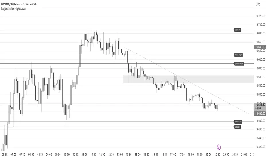
Major Session Highs/LowsThis indicator creates horizontal lines at major session high/lows (US, London, and Asian). The script updates the lines automatically, on session close.
For instance, when viewing during the US session, after the London overlap, horizontal lines will be displayed at the following levels.
The high/low of the most recent London session.
The high/low of the most recent Asian session.
The high/low of the last full US session, i.e. the session of the day prior.
When the current US session closes, the US levels automatically update.
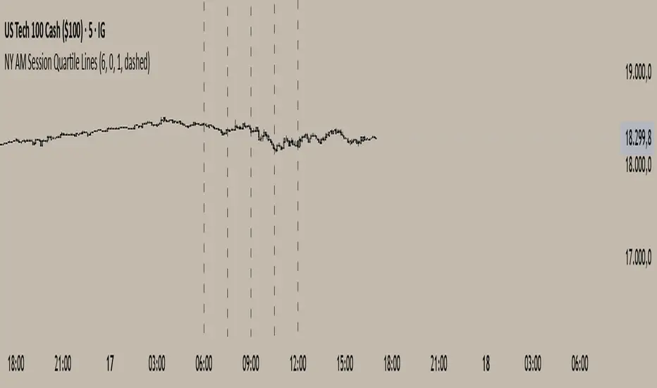
NY AM Session Quartile LinesNY AM Session Quartile Lines
This script automatically divides the New York AM session (6:00 AM to 12:00 PM NY time) into four clear quartiles.
It helps traders visualize the market structure by marking each new quartile with customizable vertical lines.
🔹 Features:
Configurable session start time (NY time).
Adjustable line color, width, and style (solid, dashed, or dotted).
Clean, lightweight design that fits any trading style.
Works across all instruments and timeframes that cover the NY session.
🔹 Perfect for:
Intraday traders who focus on New York session dynamics.
Identifying accumulation, manipulation, and distribution phases across the session.
Structuring the AM session into logical market segments for better planning and analysis.
🎯 Default Settings:
Start Hour: 6:00 AM NY
Line Style: Dashed
Line Color: Black
Line Width: 2
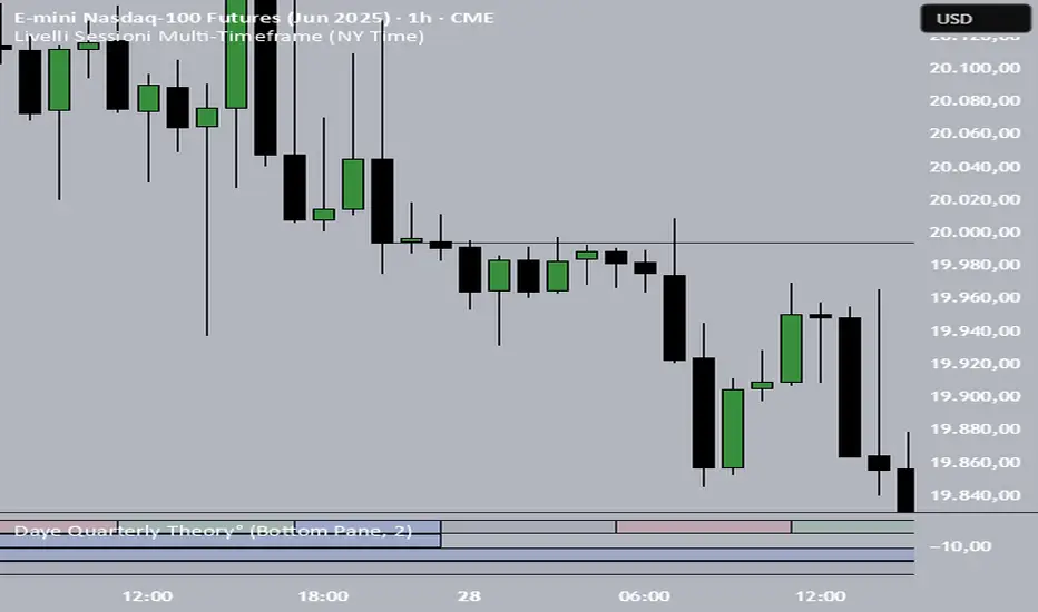
Livelli Sessioni Multi-Timeframe (NY Time)📌 This script automatically draws the highest and lowest closing prices from the previous session, based on the active timeframe:
On M15, it calculates the highest and lowest closes of each 6-hour session block (00–06, 06–12, 12–18, 18–00 — New York time).
On H1, it uses the highest and lowest closes of the entire previous day (NY time).
On H4, it uses the highest and lowest closes of the previous week (NY time).
🔁 Levels are only shown during the current session and automatically reset when the session changes.
🧭 All calculations are based on the New York time zone (EST/EDT).
🎯 Designed for traders who focus on clean and reliable reference levels based on price closes rather than wicks — ideal for intraday and swing trading.
📉 Display style: thin black lines, with optional touch markers.
Compatible with Forex, indices, crypto, and more.
🛠️ Created by @bordimichele00
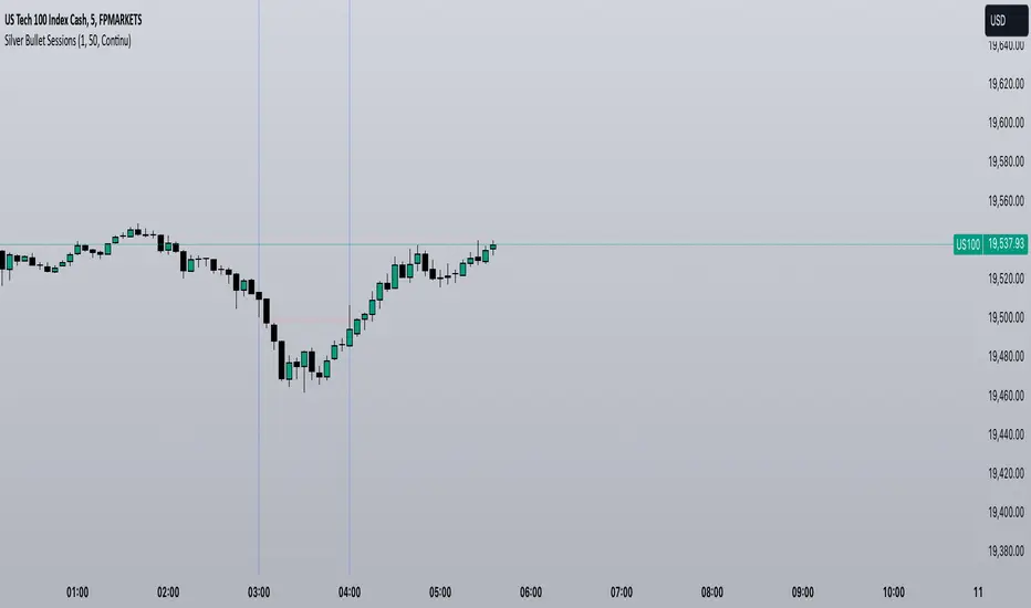
Silver Bullet SessionsThe Silver Bullet Sessions indicator is a specialized timing tool designed to highlight key market sessions throughout the trading day. By marking specific hours with vertical lines, it helps traders identify potentially significant market moments that often coincide with increased volatility and trading opportunities.
This indicator plots vertical lines at six strategic times during the trading day: 3:00 AM, 4:00 AM, 10:00 AM, 11:00 AM, 2:00 PM, and 3:00 PM. These times are carefully selected to correspond with important market events and session overlaps in the global trading cycle. The early morning hours (3-4 AM) often capture significant Asian market movements and the European market opening. The mid-morning period (10-11 AM) typically corresponds with peak European trading hours and the pre-US market dynamics. The afternoon times (2-3 PM) coincide with key US market activities and the European market close.
The indicator is implemented using Pine Script version 6, ensuring compatibility with the latest TradingView platform features. It employs a clean, efficient coding structure that minimizes resource usage while maintaining reliable performance. The vertical lines are rendered in blue for clear visibility against any chart background, and their width is optimized for easy identification without obscuring price action.
Traders can use these visual markers to:
Plan their entries and exits around these key time periods
Anticipate potential market volatility
Structure their trading sessions around these significant market hours
Identify session-based trading patterns