Smart Trend Lines [The_lurker]"Smart Trend Lines" هو مؤشر متقدم مصمم لرسم خطوط الاتجاه الديناميكية تلقائيًا على الرسم البياني، مع القدرة على اكتشاف الكسور (Breakouts) بدقة باستخدام فلاتر تحليلية مثل ADX، RSI، والحجم. يوفر المؤشر ثلاثة أنواع من خطوط الاتجاه – رئيسية (Main)، متوسطة (Mid)، وقصيرة (Short) – لتلبية احتياجات المتداولين على مختلف الأطر الزمنية، سواء كانوا يركزون على الاتجاهات طويلة الأمد أو قصيرة الأمد.
كيف يعمل :
1- رسم خطوط الاتجاه:
يستخدم المؤشر نقاط الـ Pivot Highs و Pivot Lows لتحديد خطوط الاتجاه الصاعدة والهابطة تلقائيًا.
يتم رسم ثلاثة مستويات لخطوط الاتجاه بناءً على أطوال زمنية قابلة للتخصيص:
Main Trend Lines: لتحليل الاتجاهات طويلة الأمد (افتراضي: 50 شمعة).
Mid Trend Lines: للاتجاهات متوسطة المدى (افتراضي: 21 شمعة).
Short Trend Lines: للاتجاهات قصيرة المدى (افتراضي: 9 شموع).
2- اكتشاف الكسور:
يتم اكتشاف كسر خط الاتجاه عندما يتجاوز السعر (إغلاق، أعلى، أدنى - حسب اختيار المستخدم) الخط.
يتم وضع تسمية (Label) عند نقطة الكسر تحمل معلومات مختصرة عن الشروط المتحققة (مثل الحجم، ADX، RSI).
3- فلاتر التحقق:
ADX: يتحقق من قوة الاتجاه (الحد الأدنى قابل للتعديل، افتراضي: 20).
RSI: يستخدم لتصفية الكسور في مناطق التشبع الشرائي أو البيعي (حدود عليا وسفلى قابلة للتخصيص).
Volume: يقارن الحجم الحالي بالمتوسط المتحرك للحجم للتأكد من قوة الحركة.
4- التنبيهات:
يوفر تنبيهًا موحدًا عند حدوث أي كسر (شراء أو بيع) لجميع أنواع الخطوط، مع إطلاق التنبيه فقط عند شمعة الكسر.
المميزات الرئيسية
خطوط اتجاه متعددة المستويات:
ثلاثة أطوال مختلفة (رئيسية، متوسطة، قصيرة) مع إمكانية إظهارها أو إخفائها بشكل مستقل، مما يتيح المرونة للمتداولين.
تخصيص كامل:
تعديل أطوال خطوط الاتجاه (عدد الشموع).
اختيار الألوان والأنماط (متصل، متقطع، منقط) لكل نوع من الخطوط.
تحديد حجم التسميات (Tiny, Small, Normal, Large, Huge).
اختيار نوع السعر المستخدم لفحص الكسر (Close, High, Low).
فلاتر ذكية:
استخدام ADX لتأكيد قوة الاتجاه.
فلتر RSI لتجنب الإشارات في المناطق المشبعة.
مقارنة الحجم لضمان أهمية الكسر.
تسميات تفاعلية:
تظهر التسميات عند الكسر مع رموز مختصرة (V للحجم، A لـ ADX، R لـ RSI) لتوضيح الشروط المتحققة.
حجم التسميات قابل للتخصيص لتحسين الرؤية.
تنبيهات دقيقة:
تنبيه واحد موحد لجميع الكسور (شراء أو بيع) يُطلق فقط عند شمعة الكسر، مما يقلل من الإزعاج ويزيد من الكفاءة.
عرض الخطوط السابقة:
خيار اختياري لعرض خطوط الاتجاه الرئيسية السابقة لتحليل تاريخي أعمق.
الفوائد
سهولة الاستخدام: يرسم خطوط الاتجاه تلقائيًا دون الحاجة إلى رسم يدوي.
دقة عالية: الفلاتر المتعددة (ADX، RSI، Volume) تقلل من الإشارات الخاطئة وتعزز موثوقية الكسور.
مرونة كبيرة: مناسب لجميع أنواع المتداولين (Scalpers، Swing Traders، Long-term Investors) بفضل الخطوط متعددة الأطوال.
واجهة مرئية واضحة: ألوان وأنماط قابلة للتخصيص تجعل الرسم البياني سهل القراءة.
%% نصائح الاستخدام
للمتداولين قصيري الأمد: ركز على خطوط "Short" واضبط الفلاتر لتكون أكثر حساسية (مثل تقليل عتبة ADX).
للتحليل طويل الأمد: استخدم خطوط "Main" مع إعدادات افتراضية أو أطول لالتقاط الاتجاهات الكبيرة.
قم بتفعيل التنبيهات للحصول على إشعارات فورية عند حدوث كسر مؤكد.
%% الإعدادات
Main/Mid/Short Trend Line Length: اضبط طول كل خط بناءً على استراتيجيتك.
Color & Style: اختر ألوانًا وأنماطًا تناسب تفضيلاتك البصرية.
Break Check Price: حدد نوع السعر المستخدم للكسر (افتراضي: Close).
Label Size: اختر حجم التسميات حسب احتياجاتك.
Filters: فعّل أو عطّل الفلاتر وضبط العتبات (ADX، RSI، Volume) لتتناسب مع السوق.
إخلاء المسؤولية
لا يُقصد بالمعلومات والمنشورات أن تكون، أو تشكل، أي نصيحة مالية أو استثمارية أو تجارية أو أنواع أخرى من النصائح أو التوصيات المقدمة أو المعتمدة من TradingView.
"Smart Trend Lines" is an advanced indicator for drawing dynamic trend lines, with the ability to detect breakouts (breakouts) using analytical filters such as ADX, RSI, etc. It provides three types of light lines - main (main), intermediate (intermediate), and short (short) - for the General Pipeline Network Company on various time frames, whether they are set on long-term or precious trends.
How it works:
1- Drawing lines for lines:
Uses the Pivot Highs and Pivot Lows indicator points for guide lines and automatic guide lines.
Three levels of guide lines are drawn along the air lines for customization:
Main trend lines: for analyzing long-term trends (default: 50 candles).
Intermediate trend lines: for medium-term trends (default: 21 candles).
Short trend lines: for short-term trends (default: 9 candles).
2- Fracture detection:
A fault is detected when the price (close, high, low - according to the user's choice) crosses the line.
A label is placed at the break point with brief information about the conditions met (such as volume, ADX, RSI).
3- Validation filters:
ADX: Checks the strength of the fault (simple limit, default: 20).
Relative Strength Index (RSI): Used to filter out fractures in the northern or eastern regions (customizable upper limits).
Volume: Compares the current volume to the moving average of the volume by the strength of the impact.
4- Alerts:
Provides a unified alert when any break (buy or sell) occurs for all types of lines, with the alert being triggered only when the break occurs.
Key features
Multiple trend lines for levels:
Three different lengths (main, medium, short) with the possibility of showing or hiding them independently, allowing traders.
Full translation:
Modify the length of the lines (number of candles).
Choose colors and styles (solid, dashed, dotted) for each type of line.
Select label size (small, small, normal, large, huge).
Select user type to check the breakout (close, high, low).
Smart filters:
Use ADX to confirm the strength of the error.
RSI filter abbreviated in environmental factors.
Compare volume and use of the breakout.
Interactive labels:
Scale labels on the breakout with special symbols (V for volume, A for ADX, R for RSI) to indicate the conditions met.
Customizable label size to customize the search.
Precise alerts:
A single unified alert for all breakouts (buy or sell) is triggered only on the breakout, choosing from celebration to protest for that.
View previous lines:
Option to select previous major lines to analyze their history.
Benefits
Ease of use: Draws freehand lines without the need to draw by hand.
High-precision: Optical filters (ADX, RSI, Volume) are effective from the effective impact and enhance the confidence of the breakouts.
Multiple options: Suitable for all types of traders (scalpers, swing traders, long-term investors) thanks to Malaysia Airlines 24/7.
Visual interface: Colors and patterns can be plotted for easy-to-read charting.
%% Tips for use
For short-term traders: Focus on the "short" lines and adjust the filters to be more visible (e.g. reduce the ADX bar).
For long-term analysis: Use the "main" lines with default or partial settings for key points.
Enable notifications for breakouts on instant notifications when absolutely necessary.
%%Except
Main/Intermediate/Short Trend Line Length: Adjust the length of each line to guide you.
Color and Style: Choose colors and styles to suit your visual preferences.
Verify Price Breakout: Select the type of price used for the breakout (default: Close).
Label Size: Choose the size of the labels as desired.
Filters: Enable or disable filters and adjust thresholds (ADX, RSI, Volume) to suit the market.
Disclaimer
The information and posts are not intended to be, or constitute, any financial, investment, trading or other types of preparation or execution of tasks or endorsed by TradingView.
Cari dalam skrip untuk "smart"
Smart Volume S/R Pro [The_lurker]مؤشر "Smart Volume S/R Pro " هو أداة تحليل فني متقدمة مصممة لمساعدة المتداولين في تحديد مستويات الدعم والمقاومة القوية بناءً على حجم التداول، مع إضافة ميزات تحليلية متطورة مثل تصفية الاتجاه ، مناطق الثقة ، تقييم القوة ، حساب احتمالية الاختراق ، قياس السيولة ، تحديد الأهداف السعرية ، ومستويات فيبوناتشي . وايضا تقديم تسميات (Labels) بجانب كل مستوى دعم ومقاومة، تحتوي على أرقام ومعلومات دقيقة تعكس حالة السوق. هذه التسميات ليست مجرد زينة، بل أدوات تحليلية تساعد المتداولين على اتخاذ قرارات مستنيرة بناءً على بيانات السوقيهدف هذا المؤشر إلى توفير رؤية شاملة للسوق .
الوظائف الرئيسية للمؤشر
1- تحديد مستويات الدعم والمقاومة بناءً على حجم التداول العالي
يقوم المؤشر بتحليل الأشرطة (Bars) السابقة (حتى 300 شريط افتراضيًا) لتحديد النقاط التي شهدت أعلى مستويات حجم التداول.
يرسم خطوط أفقية تمثل مستويات المقاومة (عند أعلى سعر في تلك الأشرطة) والدعم (عند أدنى سعر)، ويمكن للمستخدم اختيار عدد الخطوط المعروضة (من 1 إلى 6).
2- تصفية الاتجاه باستخدام مؤشر ADX
يستخدم المؤشر مؤشر الاتجاه المتوسط (ADX) لتقييم قوة الاتجاه في السوق.
عندما تكون قوة الاتجاه عالية (تتجاوز عتبة محددة، 25 افتراضيًا)، يقلل المؤشر عدد مستويات الدعم والمقاومة المعروضة للتركيز فقط على المستويات الأكثر أهمية.
3- مناطق الثقة الديناميكية
يضيف المؤشر مناطق حول مستويات الدعم والمقاومة بناءً على متوسط المدى الحقيقي (ATR)، مما يساعد المتداولين على تصور النطاقات التي قد يتفاعل فيها السعر مع هذه المستويات.
يمكن تعديل عرض هذه المناطق باستخدام مضاعف ATR.
4- تقييم قوة المستويات
يحسب المؤشر قوة كل مستوى بناءً على حجم التداول، عدد المرات التي تم اختبار المستوى فيها (Touch Count)، وقرب السعر الحالي من المستوى.
يتم عرض درجة القوة (من 0 إلى 100) بجانب كل مستوى إذا تم تفعيل هذه الخاصية.
5- احتمالية الاختراق
يقدّر المؤشر احتمالية اختراق كل مستوى بناءً على الزخم (ROC)، قوة المستوى، والمسافة بين السعر الحالي والمستوى.
يظهر الاحتمال كنسبة مئوية إذا تم تفعيل الخيار، مما يساعد المتداولين على توقع الحركات المحتملة.
6- تحليل السيولة التاريخية
يقيس المؤشر السيولة حول كل مستوى بناءً على حجم التداول في النطاقات القريبة منه.
يمكن عرض قيم السيولة في التسميات أو استخدامها لتعديل عرض الخطوط (الخطوط الأكثر سيولة تظهر أعرض).
7- الأهداف السعرية
عند تفعيل هذه الخاصية، يحسب المؤشر أهداف سعرية للاختراق (Breakout) والارتداد (Reversal) بناءً على الزخم وقوة المستوى وATR.
يمكن عرض هذه الأهداف كنصوص في التسميات أو كخطوط أفقية على الرسم البياني.
8- مستويات فيبوناتشي
يرسم المؤشر مستويات فيبوناتشي (0.0، 0.236، 0.382، 0.5، 0.618، 0.786، 1.0) بناءً على أعلى وأدنى سعر في فترة النظرة الخلفية.
يمكن للمستخدم اختيار أي من هذه المستويات لعرضها أو إخفائها.
9- تنبيه شامل للاختراق
يوفر المؤشر تنبيهًا واحدًا يشمل جميع المستويات، حيث يُطلق التنبيه عندما يخترق السعر أي مستوى دعم أو مقاومة مع رسالة توضح نوع الاختراق والمستوى المخترق.
كيفية عمل المؤشر
الخطوة الأولى: يحدد المؤشر الأشرطة ذات الحجم العالي خلال فترة النظرة الخلفية المحددة (Lookback Period).
الخطوة الثانية: يرسم مستويات الدعم والمقاومة بناءً على أعلى وأدنى الأسعار في تلك الأشرطة، مع مراعاة عدد الخطوط المختارة من المستخدم.
الخطوة الثالثة: يطبق مرشح الاتجاه (إذا كان مفعلاً) لتقليل عدد المستويات في حالة الاتجاه القوي.
الخطوة الرابعة: يضيف التحليلات الإضافية مثل القوة، السيولة، احتمالية الاختراق، والأهداف السعرية، ويرسم مناطق الثقة ومستويات فيبوناتشي حسب الإعدادات.
الخطوة الخامسة: يراقب السعر ويطلق تنبيهًا عند الاختراق.
الإعدادات القابلة للتخصيص
1- فترة النظرة الخلفية (Lookback Period): عدد الأشرطة التي يتم تحليلها (افتراضيًا 300).
2- عدد الخطوط (Number of Lines): من 1 إلى 6 مستويات دعم ومقاومة.
3- الألوان والأنماط: يمكن تغيير ألوان الخطوط وأنماطها (ممتلئة، متقطعة، منقطة).
4- التسميات: تفعيل/تعطيل التسميات، وحجمها، وموقعها، ولون النص.
5- مرشح الاتجاه: تفعيل/تعطيل ADX، وتعديل طوله وعتبته.
6- مناطق الثقة: تفعيل/تعطيل، وتعديل طول ATR ومضاعفه.
7- القوة واحتمالية الاختراق: تفعيل/تعطيل العرض، وتعديل طول ROC.
8- السيولة: تفعيل/تعطيل تأثير السيولة على عرض الخطوط وقيمها في التسميات.
9- الأهداف السعرية: تفعيل/تعطيل الأهداف وعرضها كخطوط.
10- فيبوناتشي: اختيار المستويات المعروضة ولون الخطوط.
فوائد المؤشر
دقة عالية: يعتمد على حجم التداول لتحديد المستويات، مما يجعله أكثر موثوقية من المستويات العشوائية.
مرونة: يوفر خيارات تخصيص واسعة تتيح للمتداولين تكييفه حسب استراتيجياتهم.
تحليل شامل: يجمع بين الدعم والمقاومة، الاتجاه، السيولة، والأهداف في أداة واحدة.
سهولة الاستخدام: التسميات والتنبيهات تجعل من السهل متابعة السوق دون تعقيد.
==================================================================================تسميات (Labels) بجانب كل مستوى دعم ومقاومة، تحتوي على أرقام ومعلومات دقيقة تعكس حالة السوق. هذه التسميات ليست مجرد زينة، بل أدوات تحليلية تساعد المتداولين على اتخاذ قرارات مستنيرة بناءً على بيانات السوق. في هذا الشرح، سنستعرض كل رقم أو قيمة تظهر في التسميات ومعناها العملي.
مكونات التسميات
التسميات تظهر بجانب كل مستوى دعم (Support) ومقاومة (Resistance) وتبدأ بحرف "S" للدعم أو "R" للمقاومة، تليها مجموعة من الأرقام والقيم التي يمكن تفعيلها أو تعطيلها حسب إعدادات المستخدم. إليك تفصيل كل عنصر:
1- عدد اللمسات (Touch Count)
الرمز: يظهر مباشرة بعد "S" أو "R" (مثال: "R: 5" أو "S: 3").
المعنى: يشير إلى عدد المرات التي اختبر فيها السعر هذا المستوى دون اختراقه.
الفائدة: كلما زاد عدد اللمسات، كلما كان المستوى أقوى وأكثر أهمية. على سبيل المثال، إذا كان "R: 5"، فهذا يعني أن السعر ارتد من هذا المستوى 5 مرات، مما يجعله مقاومة قوية محتملة.
2- قوة المستوى (Strength Rating)
الرمز: يظهر بين قوسين مربعين (مثال: " ").
المعنى: قيمة من 0 إلى 100 تعكس قوة المستوى بناءً على عوامل مثل حجم التداول، عدد اللمسات، وقرب السعر الحالي من المستوى.
الفائدة: القيم العالية (مثل 75 أو أكثر) تشير إلى مستوى قوي يصعب اختراقه، بينما القيم المنخفضة (مثل 30 أو أقل) تدل على ضعف المستوى وسهولة اختراقه. يمكن للمتداول استخدام هذا لتحديد المستويات الأكثر موثوقية.
3- احتمالية الاختراق (Breakout Probability)
الرمز: يبدأ بحرف "B" متبوعًا بنسبة مئوية (مثال: "B: 60%").
المعنى: نسبة من 0% إلى 100% تُظهر احتمالية اختراق السعر للمستوى بناءً على الزخم الحالي، قوة المستوى، والمسافة بين السعر والمستوى.
الفائدة: نسبة مرتفعة (مثل 60% أو أكثر) تعني أن السعر قد يخترق المستوى قريبًا، بينما النسب المنخفضة (مثل 20%) تشير إلى احتمال ارتداد السعر. هذا مفيد لتوقع الحركة التالية.
4- قيمة السيولة (Liquidity Value)
الرمز: يبدأ بحرف "L" متبوعًا برقم (مثال: "L: 1200").
المعنى: يمثل متوسط حجم التداول في النطاق القريب من المستوى، مما يعكس السيولة التاريخية حوله.
الفائدة: القيم العالية تدل على وجود سيولة كبيرة، مما يعني أن السعر قد يتفاعل بقوة مع هذا المستوى (إما بالارتداد أو الاختراق). القيم المنخفضة تشير إلى سيولة ضعيفة، مما قد يجعل المستوى أقل تأثيرًا.
5- الأهداف السعرية (Price Targets)
الرمز: يبدأ بـ "BT" (هدف الاختراق) و"RT" (هدف الارتداد) متبوعين بأرقام (مثال: "BT: 150.50 RT: 148.20").
المعنى:
BT (Breakout Target): السعر المحتمل الذي قد يصل إليه السعر بعد اختراق المستوى.
RT (Reversal Target): السعر المحتمل الذي قد يصل إليه السعر إذا ارتد من المستوى.
الفائدة: تساعد المتداولين في تحديد نقاط الخروج المحتملة بعد الاختراق أو الارتداد، مما يسهل وضع خطة تداول دقيقة.
أمثلة عملية
تسمية مقاومة: "R: 4 B: 25% L: 1500 BT: 155.00 RT: 152.00"
المستوى اختُبر 4 مرات، قوته 80 (قوي جدًا)، احتمالية الاختراق 25% (منخفضة، أي احتمال ارتداد أعلى)، السيولة 1500 (مرتفعة)، هدف الاختراق 155.00، هدف الارتداد 152.00.
الاستنتاج: المستوى قوي ومن المرجح أن يرتد السعر منه، لكن إذا اخترق، فقد يصل إلى 155.00.
تسمية دعم: "S: 2 B: 70% L: 800 BT: 145.00 RT: 147.50"
المستوى اختُبر مرتين، قوته 40 (متوسطة إلى ضعيفة)، احتمالية الاختراق 70% (مرتفعة)، السيولة 800 (متوسطة)، هدف الاختراق 145.00، هدف الارتداد 147.50.
الاستنتاج: المستوى ضعيف ومن المحتمل أن يخترقه السعر ليهبط إلى 145.00.
كيفية الاستفادة من التسميات
تحديد القوة والضعف: استخدم قوة المستوى (Strength) لمعرفة ما إذا كان المستوى موثوقًا للارتداد أو عرضة للاختراق.
توقع الحركة: انظر إلى احتمالية الاختراق (Breakout Probability) لتحديد ما إذا كنت ستنتظر اختراقًا أو ترتدًا.
إدارة المخاطر: استخدم الأهداف السعرية (BT وRT) لتحديد نقاط جني الأرباح أو وقف الخسارة.
تقييم السيولة: ركز على المستويات ذات السيولة العالية لأنها غالبًا تكون نقاط تحول رئيسية في السوق.
تأكيد التحليل: ادمج عدد اللمسات مع القوة والسيولة للحصول على صورة كاملة عن أهمية المستوى.
تخصيص التسميات
يمكن للمستخدم تفعيل أو تعطيل أي من هذه القيم (القوة، الاحتمالية، السيولة، الأهداف) من إعدادات المؤشر.
يمكن أيضًا تغيير حجم التسميات (صغير، عادي، كبير)، موقعها (يمين، يسار، أعلى، أسفل)، ولون النص لتناسب احتياجاتك.
التسميات في هذا المؤشر هي بمثابة لوحة تحكم صغيرة بجانب كل مستوى دعم ومقاومة، تقدم لك معلومات فورية عن قوته، احتمالية اختراقه، سيولته، وأهدافه السعرية. بفهم هذه الأرقام، يمكنك تحسين قراراتك في التداول، سواء كنت تبحث عن نقاط دخول، خروج، أو إدارة مخاطر. إذا كنت تريد أداة تجمع بين البساطة والعمق التحليلي .
تنويه:
المؤشر هو أداة مساعدة فقط ويجب استخدامه مع التحليل الفني والأساسي لتحقيق أفضل النتائج.
إخلاء المسؤولية
لا يُقصد بالمعلومات والمنشورات أن تكون، أو تشكل، أي نصيحة مالية أو استثمارية أو تجارية أو أنواع أخرى من النصائح أو التوصيات المقدمة أو المعتمدة من TradingView.
The Smart Volume S/R Pro indicator is an advanced technical analysis tool designed to help traders identify strong support and resistance levels based on trading volume, with the addition of advanced analytical features such as trend filtering, confidence zones, strength assessment, breakout probability calculation, liquidity measurement, price target identification, and Fibonacci levels. It also provides labels next to each support and resistance level, containing accurate numbers and information that reflect the market condition. These labels are not just decorations, but analytical tools that help traders make informed decisions based on market data. This indicator aims to provide a comprehensive view of the market.
Main functions of the indicator
1- Identifying support and resistance levels based on high trading volume
The indicator analyzes previous bars (up to 300 bars by default) to identify the points that witnessed the highest levels of trading volume.
It draws horizontal lines representing resistance levels (at the highest price in those bars) and support (at the lowest price), and the user can choose the number of lines displayed (from 1 to 6).
2- Filtering the trend using the ADX indicator
The indicator uses the Average Directional Index (ADX) to assess the strength of a trend in the market.
When the strength of the trend is high (exceeding a specified threshold, 25 by default), the indicator reduces the number of support and resistance levels displayed to focus only on the most important levels.
3- Dynamic Confidence Zones
The indicator adds zones around support and resistance levels based on the Average True Range (ATR), helping traders visualize the ranges in which the price may interact with these levels.
The width of these zones can be adjusted using the ATR multiplier.
4- Assessing the Strength of Levels
The indicator calculates the strength of each level based on trading volume, the number of times the level has been tested (Touch Count), and the proximity of the current price to the level.
A strength score (from 0 to 100) is displayed next to each level if this feature is enabled.
5- Breakout Probability
The indicator estimates the probability of breaking each level based on momentum (ROC), the strength of the level, and the distance between the current price and the level.
The probability is displayed as a percentage if the option is enabled, helping traders anticipate potential moves.
6- Historical Liquidity Analysis
The indicator measures liquidity around each level based on the trading volume in the ranges near it.
The liquidity values can be displayed in the labels or used to adjust the width of the lines (the most liquid lines appear wider).
7- Price Targets
When this feature is enabled, the indicator calculates price targets for breakout and reversal based on momentum, level strength and ATR.
These targets can be displayed as text in the labels or as horizontal lines on the chart.
8- Fibonacci Levels
The indicator plots Fibonacci levels (0.0, 0.236, 0.382, 0.5, 0.618, 0.786, 1.0) based on the highest and lowest price in the lookback period.
The user can choose which of these levels to display or hide.
9- Comprehensive Breakout Alert
The indicator provides a single alert that includes all levels, where the alert is triggered when the price breaks any support or resistance level with a message explaining the type of breakout and the level broken.
How the indicator works
Step 1: The indicator identifies the bars with high volume during the specified Lookback Period.
Step 2: Draws support and resistance levels based on the highest and lowest prices in those bars, taking into account the number of lines selected by the user.
Step 3: Apply the trend filter (if enabled) to reduce the number of levels in case of a strong trend.
Step 4: Adds additional analyses such as strength, liquidity, breakout probability, and price targets, and draws confidence zones and Fibonacci levels according to the settings.
Step 5: Monitors the price and triggers an alert when the breakout occurs.
Customizable Settings
1- Lookback Period: Number of bars to analyze (default 300).
2- Number of Lines: From 1 to 6 support and resistance levels.
3- Colors and Styles: Line colors and styles can be changed (filled, dashed, dotted).
4- Labels: Enable/disable labels, their size, location, and text color.
5- Trend Filter: Enable/disable ADX, and modify its length and threshold.
6- Confidence Zones: Enable/disable, and modify the ATR length and multiplier.
7- Strength and Breakout Probability: Enable/disable the display, and modify the ROC length.
8- Liquidity: Enable/disable the effect of liquidity on the display of the lines and their values in the labels.
9- Price Targets: Enable/disable the targets and display them as lines.
10- Fibonacci: Choose the displayed levels and the color of the lines.
Indicator Benefits
High Accuracy: It relies on trading volume to determine the levels, which makes it more reliable than random levels.
Flexibility: It provides extensive customization options that allow traders to adapt it to their strategies.
Comprehensive Analysis: Combines support and resistance, trend, liquidity, and targets in one tool. Ease of Use: Labels and alerts make it easy to follow the market without complexity.
Labels next to each support and resistance level contain accurate numbers and information that reflect the market situation. These labels are not just decorations, but analytical tools that help traders make informed decisions based on market data. In this explanation, we will review each number or value that appears in the labels and their practical meaning.
Label Components
Labels appear next to each support and resistance level and begin with the letter "S" for support or "R" for resistance, followed by a set of numbers and values that can be enabled or disabled according to the user's settings. Here is a breakdown of each element:
1- Touch Count
Symbol: Appears immediately after "S" or "R" (example: "R: 5" or "S: 3").
Meaning: Indicates the number of times the price has tested this level without breaking it.
Benefit: The more touches, the stronger and more important the level. For example, if it is "R: 5", it means that the price has bounced off this level 5 times, making it a potentially strong resistance.
2- Strength Rating
Symbol: Appears between square brackets (example: " ").
Meaning: A value from 0 to 100 that reflects the strength of the level based on factors such as trading volume, number of touches, and proximity of the current price to the level.
Benefit: High values (such as 75 or more) indicate a strong level that is difficult to break, while low values (such as 30 or less) indicate a weak level that is easy to break. A trader can use this to determine the most reliable levels.
3- Breakout Probability
Symbol: Starts with the letter "B" followed by a percentage (example: "B: 60%").
Meaning: A percentage from 0% to 100% that shows the probability of the price breaking the level based on the current momentum, the strength of the level, and the distance between the price and the level.
Interest: A high percentage (such as 60% or more) means that the price may soon break through the level, while low percentages (such as 20%) indicate that the price may bounce. This is useful for anticipating the next move.
4- Liquidity Value
Symbol: Starts with the letter "L" followed by a number (example: "L: 1200").
Meaning: Represents the average trading volume in the range near the level, reflecting historical liquidity around it.
Interest: High values indicate high liquidity, meaning that the price may react strongly to this level (either by bouncing or breaking through). Low values indicate low liquidity, which may make the level less influential.
5- Price Targets
Symbol: Starts with "BT" (breakout target) and "RT" (rebound target) followed by numbers (example: "BT: 150.50 RT: 148.20").
Meaning:
BT (Breakout Target): The potential price that the price may reach after breaking the level.
RT (Reversal Target): The potential price that the price may reach if it rebounds from the level.
Utility: Helps traders identify potential exit points after a breakout or rebound, making it easier to develop an accurate trading plan.
Working examples
Resistance label: "R: 4 B: 25% L: 1500 BT: 155.00 RT: 152.00"
Level tested 4 times, strength 80 (very strong), probability of breakout 25% (low, i.e. higher probability of rebound), liquidity 1500 (high), breakout target 155.00, rebound target 152.00.
Conclusion: The level is strong and the price is likely to rebound from it, but if it breaks, it may reach 155.00.
Support Label: "S: 2 B: 70% L: 800 BT: 145.00 RT: 147.50"
Level tested twice, Strength 40 (medium to weak), Breakout Probability 70% (high), Liquidity 800 (medium), Breakout Target 145.00, Rebound Target 147.50.
Conclusion: The level is weak and the price is likely to break it to drop to 145.00.
How to use labels
Determine strength and weakness: Use the level's strength to see if the level is reliable for a bounce or vulnerable to a breakout.
Predict the move: Look at the Breakout Probability to determine whether to wait for a breakout or a bounce.
Risk Management: Use price targets (BT and RT) to set take profit or stop loss points.
Liquidity Evaluation: Focus on levels with high liquidity as they are often key turning points in the market.
Analysis Confirmation: Combine the number of touches with strength and liquidity to get a complete picture of the level’s importance.
Customize Labels
The user can enable or disable any of these values (strength, probability, liquidity, targets) from the indicator settings.
The size of the labels (small, normal, large), their position (right, left, top, bottom), and the color of the text can also be changed to suit your needs.
The labels in this indicator act as a small dashboard next to each support and resistance level, providing you with instant information about its strength, probability of breakout, liquidity, and price targets. By understanding these numbers, you can improve your trading decisions, whether you are looking for entry points, exit points, or risk management. If you want a tool that combines simplicity with analytical depth.
Disclaimer:
The indicator is an auxiliary tool only and should be used in conjunction with technical and fundamental analysis for best results.
Disclaimer
The information and posts are not intended to be, or constitute, any financial, investment, trading or other types of advice or recommendations provided or endorsed by TradingView.

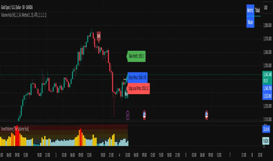
Smart Wick Concept (SWC)Smart Wick Concept (SWC)
The Smart Wick Concept (SWC) is a unique trend-following strategy designed to capture precise entry points in trending markets. This indicator identifies trade opportunities based on higher timeframe trends and wick behavior on lower timeframes, making it an effective tool for intraday and swing traders.
Key Features:
Trend Identification:
SWC uses the H1 timeframe to define the primary market trend (bullish or bearish), ensuring alignment with the overall market direction.
Precise Entry Signals:
Entry opportunities are generated on the M15 timeframe when a candle's wick interacts with the prior candle's range. This approach minimizes false signals and enhances accuracy.
Stop Loss and Take Profit Levels:
The indicator automatically calculates suggested stop loss and take profit levels based on market dynamics, providing traders with a clear risk-reward framework.
Customizable Parameters:
SWC allows traders to adjust key settings, such as the higher timeframe and minimum trend range, to align with their trading preferences and market conditions.
How It Works:
Bullish Entry:
Higher timeframe trend must be bullish.
A M15 candle must dip below the previous candle’s low and close back above it, signaling a potential buy opportunity.
Bearish Entry:
Higher timeframe trend must be bearish.
A M15 candle must exceed the previous candle’s high and close back below it, signaling a potential sell opportunity.
Risk Management:
Stop loss is placed at the low (for buys) or high (for sells) of the current M15 candle.
Take profit targets are calculated at twice the risk, ensuring a favorable risk-reward ratio.
Benefits:
Aligns trades with market momentum.
Reduces noise by filtering out weak or sideways trends.
Provides a structured approach to trading XAUUSD and other volatile instruments.
Use Cases:
The Smart Wick Concept is ideal for traders looking for a disciplined and data-driven approach to trading. While it is optimized for XAUUSD, it can also be applied to other trending markets such as major currency pairs or indices with some parameter adjustments.
Disclaimer:
This indicator is a trading tool and should not be used as a standalone strategy. Always backtest the indicator thoroughly and use proper risk management to protect your capital. Past performance does not guarantee future results.

Ultra Smart TrailIntroduction
The Ultra Smart Trail indicator is a comprehensive tool for traders seeking to identify and follow market trends efficiently. Combining dynamic trend detection with adaptive price bands, this indicator simplifies the process of understanding market direction and strength. It provides clear visual cues and customizable settings, catering to both novice and experienced traders.
Detailed Description
The Ultra Smart Trail indicator works by calculating a Trend Flow Line (TFL) using a hybrid moving average technique. This TFL dynamically adjusts to market conditions, smoothing out price fluctuations while remaining responsive to significant market shifts.
.........
Trend Flow Line (TFL)
A color-coded line indicating bullish, bearish, or neutral trends based on price movement relative to the TFL.
The TFL uses a combination of weighted moving averages (WMA) and double-weighted moving averages (DWMA) for accuracy.
.....
Dynamic Price Bands
The indicator plots upper and lower bands around the TFL, based on customizable multipliers of standard deviation. These bands adapt dynamically to volatility, helping traders spot overbought or oversold conditions.
The script calculates standard deviation-based bands with customizable multipliers, enabling precise adjustment to trading styles or instruments.
.....
Uptrend/Downtrend Highlights
The background and price bands visually differentiate trending and ranging markets, making it easier to identify high-probability trade setups.
.....
Reversal Alerts
By analyzing the relationship between price and bands, the script highlights potential reversals or continuation zones with distinct levels and fills.
.........
This indicator is a powerful addition to any trader’s toolkit, simplifying market analysis and enhancing decision-making.

Smart QQE ModSmart QQE - Chart Overlay
Smart QQE shows QQE Trend and RSI plot on chart to determine the trend direction and eliminate false signals.
QQE is obtained from original code by Glaz and rescaled to fit on chart. RSI 50 level acts as Zero which is plotted as a Bollinger on chart.
This is not a Bollinger band . its an RSI channel with levels 0-100 plotted around the mid band. The RSI Mid Band is calculated based on RSI value.
Trend:
Price above RSI Mid band is uptrend
Price below RSI Mid band is Down Trend
The Green line - Discount Zone - 0-RSI level - Oversold Zone
The Red Line - Premium Zone - 100 - RSI level - Overbought Zone
Buy / Sell signals
QQE Buy and Sell signals are plotted based on crossovers of RSI and Fast RSI crossovers.
QQE trend is colored based on the crossover.
Candle color:
candle color determines the Original QQE Trend.
Blue - QQE line above Threshold level in Buy Zone
Pink - QQE line below Threshold level in Sell Zone
Entries are to be made with proper confirmation.
HULL MA is provided as a MA Ribbon for additional confirmation. This MA can be changed to various forms Like EMA , SMA , WMA , HMA , RMA the open and close of the MA are plotted so it determines the exact Trend reversal of the price.
Credits to @Glaz QQE Threshold

Smart Money Flow Pro (Dual Mode: MCD & MCDX) MI02bSmart Money Flow Pro (MI02b) indicator shows Buyer / Seller activities by calculating series of Price & Volume data, over a certain period of time.
It analyses Institutional fund possible behavior from the pool of data derived from price volume movement every trading day.
RED bar represents percentage of stock holders are currently in profit.
Purple line is RED bar's moving average.
Green bar represents percentage of stock holders are currently in loss.
Lime Green line is Green bar's moving average.
Yellow bar represents percentage of daily traders (buy & sell at the same day).
Pink line is Yellow bar's moving average.
RED bar > 50% shows institution fund has in control, uptrend is likely easier to continue.
BLUE bar > 50% shows retailer fund is stucked inside, downtrend is likely easier to continue.
Crossing of moving average lines indicates changing of trend (reversal sign):
1) Purple line up-crossed Green line - UPTREND
2) Green line up-crossed Purple line - DOWNTREND
Smart Money Flow Pro includes 6 Long/Buy signals (🔺, ⭕️, 👍, 😊, 📈, 🔷)
Each signals comes with individual alert setting.
Disclaimer:
This script indicator is solely for the purpose of education / opinion sharing only, and should not be construed as investment advice or recommendations to buy or sell any security.
Get your trade advise from a legit broker, you are responsible on your own trade.
Thank you.
Cyatophilum Smart rebalance strategyAn indicator to backtest and create automated Smart Rebalance strategies.
The strategy tries to beat holders while keeping your portfolio repartition stable.
Configure the indicator to receive alerts for several pairs at a choosen rebalance time frame.
═════════════════════════════════════════════════════════════════════════
█ HOW IT WORKS
Here is an example:
The user chooses a certain number of pairs, up to 4 pairs for now. An initial capital, a fees % and a rebalance time frame.
The capital is split equally between each pair. (ex. for 2 pairs: 50% on each).
On each rebalance time frame (on the bar it happens), pairs balance who grew bigger than 50% will be redistributed to other pairs, making sure that after the transaction, the total capital is once again split equally through all pairs. This means selling pairs whose price went higher than the others, and buying those who dropped. In other words, selling high and buying low.
On each interval, the strategy will send orders for each pair saying whether to buy or to sell, and the quantity.
█ HOW TO USE
Creating a strategy
When adding the indicator to the chart, you must confirm the pairs you want to use, the rebalance time frame, the initial capital and commission fees.
The inital capital corresponds to the quote currency of all pairs, so each pair must have the same quote currency. (ex: USDT or BTC markets)
It will also be asked to select a "Strategy Start Date", which is the starting point of your strategy. Select the current bar if you want to start a strategy and get accurate order quantities. Otherwise, select a bar in the past for backtesting.
When setting the "Strategy Start Date" to the current day, it will look like this:
The strategy equity is equal to the intial capital, and no order has happened yet, the backtest panel shows 0%.
The first rebalance will happen at the next interval: here the 15th november.
Since this is the first rebalance, the strategy buys each pair with the same quantity in quote currency value.
After 1 rebalance, the strategy equity drops a little, since we only bought and paid fees.
Backtesting
Since the strategy is trading several pairs, the Strategy Tester cannot really be used. This is why the indicator has a backtest panel and a equity line plot that shows the progress of the strategy.
This view can be replicated by disabling the labels in the style tab.
You can also use the Data Window to track the strategy pairs balances on each bar.
Creating Alerts
The indicator is using the alert() calls: it only uses 1 alert slot to send order messages for each pair.
To set your alert messages, open the indicator settings.
You can use the placeholders {pair}, {order_direction} and {quantity} to get their values replaced by respectively the pair ticker (symbol name without the exchange prefix), the order direction "BUY" or "SELL", and the quantity amount in quote currency.
Create your alert after you set the messages in the indicator settings, and make sure "Any alert() function call" is set in the alert option.
█ LIMITATIONS
• Small quantities
An order with a too small quantity might not get executed by the exchange. To increase the quantity of the strategy orders, either increase your strategy capital, increase the rebalance time frame, or reduce the number of pairs.
• Not enough data
The strategy will give an error if one of the pair data does not go back to the strategy start date. Typically if a crypto pair is new and was added to TradingView recently, you will not be able to backtest prior to that.
• Chart and rebalance Time Frame
The strategy will give an error if one of the two conditions are not met:
- The Rebalance time frame must be greater than current chart's time frame.
- The Rebalance time frame must be a multiple of current chart's time frame.
Please read the author instructions below for access and automation.

Smart MA Zone Crossover [HMA-EMA]Smart MA Zone Crossover is a trend-following indicator designed to capture early momentum shifts using the crossover between Hull Moving Average (HMA) and Exponential Moving Average (EMA).
The indicator visually highlights trend direction using a dynamic colored zone, making it easy to identify bullish and bearish market phases at a glance.
🔸 Step 1: Moving Average Calculation
HMA (Hull Moving Average) → Faster, smoother, reacts quickly to price
EMA (Exponential Moving Average) → Stable trend reference
Both MA lengths are **fully adjustable** from the settings panel.
🔸 Step 2: Trend Detection
Bullish Trend: HMA is above EMA
Bearish Trend: HMA is below EMA
The area between the two averages is filled with color to visually represent the current trend state.
Step 3: Signal Generation (Non-Repainting)
Signals are generated **only on confirmed crossovers**:
✅ BUY Signal- HMA crosses above EMA
❌ SELL Signal-HMA crosses belowEMA
Signals do **not repaint** and appear only once per crossover.
🔸 Step 4: Visual Customization
Users can enable or disable:
* Moving average lines
* Colored MA zone fill
* Buy/Sell arrows
* Buy/Sell text labels
This allows the indicator to remain **minimal or detailed**, depending on user preference.
🔹 Key Features
✔ Non-repainting logic
✔ Clean crossover-based signals
✔ Customizable HMA & EMA lengths
✔ Optional MA zone fill
✔ Buy/Sell arrows & labels
✔ Works on all timeframes
✔ Beginner-friendly & scalper-ready
🔹 Best Use Cases
* Trend confirmation
* Momentum trading
* Scalping & intraday trading
* Swing trend filtering
For best results, combine with:
* Support & resistance
* Volume
* Higher-timeframe trend
🔹 Disclaimer
This indicator is provided for **educational purposes only**.
It is **not financial advice**. Always backtest and use proper risk management before trading live markets.

Smart 9-15 EMA Cross + RSI + FVG Zones (Instant Signal)Smart 9-15 EMA Cross + RSI + FVG Zones (Instant Signal)

Smart BUY/SELL Pop IndicatorSmart BUY/SELL Indicator
This indicator shows BUY and SELL labels directly on your TradingView chart. Green labels indicate potential upward moves, and red labels indicate potential downward moves.
How it works
It uses two moving averages: a fast (9-period) and a slow (21-period). A BUY signal appears when the fast MA crosses above the slow MA, and a SELL signal appears when it crosses below.
Why it’s useful
It gives a visual guide for entry and exit points without alert messages. Accuracy can improve by adding filters like RSI or MACD.

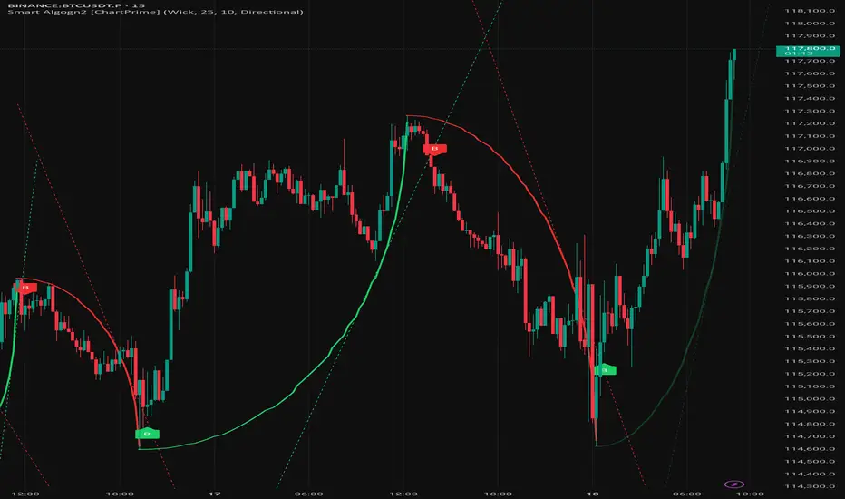
Smart Algogn2 [ChartPrime]Smart Algo gives you clear entry & exit signals using advanced price action logic. Built for traders who want consistency and speed.
> The B symbols are the entry points
> Previous swing high/low is the SL
> Keep 1:2 OR 1:1.5 Risk-Reward

Smart Algogn2 [ChartPrime]Smart Algo indicator with buy/sell signals, optimized for crypto intraday trading.
Smart Volume [Volume Hub]Smart Volume is a custom indicator designed to highlight meaningful changes in market activity by measuring how current volume compares to historical averages. Instead of looking at raw volume alone, it calculates how many standard deviations above or below the mean a bar’s volume is. This makes it possible to identify unusual activity (accumulation, distribution, breakouts, or fakeouts) that might not be visible just by looking at candle size or price action.
The script classifies each bar’s volume into zones:
🔴 Extra High: 4× or more standard deviations above average
🟠 High: 2.5× above average
🟡 Medium: 1× above average
🔵 Normal: around average
🟢 Low: below average
Each classification has its own color, which is applied directly to the volume histogram. This provides a quick “heatmap” effect so traders can instantly see when markets are entering phases of unusually high or unusually low participation.
🔑 How It Works
The script computes a moving average of volume over the last 610 bars.
It calculates the standard deviation of volume over the same lookback.
For each bar, it measures how far that bar’s volume is from the average, expressed in multiples of standard deviation.
Depending on the zone it falls into (low, normal, medium, high, or extra high), the bar is colored accordingly.
Background heatmap zones and threshold lines can optionally be displayed to help visualize where each threshold lies.
This approach goes beyond raw volume numbers by showing relative extremes. For example, a 50K-volume bar on one market might mean nothing, but if it’s 4 standard deviations higher than usual, it’s an “extra high” signal of market participation.
📌 How to Use It
Look for clusters of extra-high volume bars to spot institutional activity or breakout confirmation.
Use low-volume areas to identify possible consolidations, false breakouts, or lack of conviction.
Combine with your trend or price-action tools: e.g., if price breaks resistance on extra high volume, the move is more likely valid.
Works across all markets (stocks, forex, crypto, futures) and timeframes.
⚠️ Disclaimer
This script does not generate buy/sell signals. It is a volume analysis tool to help identify areas of high or low activity. Always combine with proper risk management and other forms of analysis.
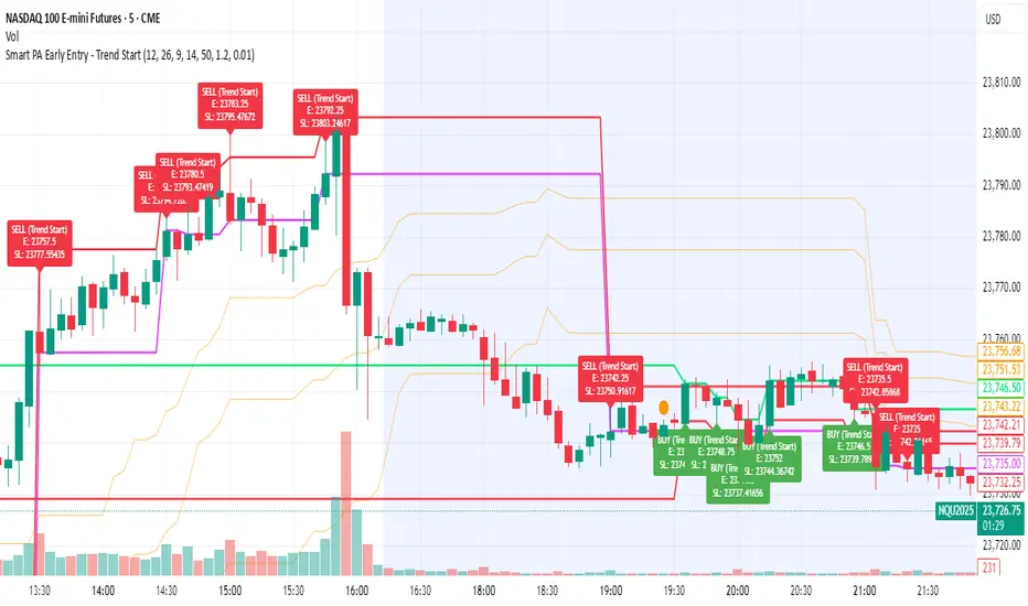
Smart PA Early Entry - Trend StartSmart PA Early Entry Indicator (MACD + FVG + Fibonacci)
This TradingView indicator helps traders spot potential trend reversals early by combining multiple technical tools:
MACD Momentum – Identifies the direction of the trend.
Volume Filter – Confirms strong market participation for reliable signals.
Fair Value Gaps (FVG) – Highlights areas where price may reverse or continue strongly.
Fibonacci Retracement Levels – Pinpoints key support/resistance zones for early entries.
ATR-based Stop Loss – Automatically calculates a dynamic stop-loss based on market volatility.
Trend Start Signals – Alerts only appear on the first candle of a potential trend change to avoid repeated signals.
Visual Labels & Plots – Shows entry price, stop-loss, FVG zones, and Fibonacci levels for easy chart reading.
Ideal for: Intraday and swing traders looking for high-probability entries near trend reversals with clear risk management.
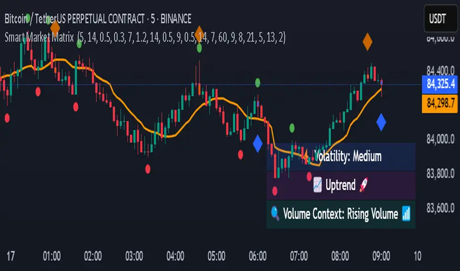
Smart Market Matrix Smart Market Matrix
This indicator is designed for intraday, scalping, providing automated detection of price pivots, liquidity traps, and breakout confirmations, along with a context dashboard featuring volatility, trend, and volume.
## Summary Description
### Menu Settings & Their Roles
- **Swing Pivot Strength**: Controls the sensitivity for detecting High/Low pivots.
- **Show Pivot Points**: Toggles the display of HH/LL markers on the chart.
- **VWMA Length for Trap Volume** & **Volume Spike Multiplier**: Identify concentrated volume spikes for liquidity traps.
- **Wick Ratio Threshold** & **Max Body Size Ratio**: Detect candles with disproportionate wicks and small bodies (doji-ish) for traps.
- **ATR Length for Trap**: Measures volatility specific to trap detection.
- **VWMA Length for Breakout Volume**, **ATR Multiplier for Breakout**, **ATR Length for Breakout**, **Min Body/Range Ratio**: Set adaptive breakout thresholds based on volatility and volume.
- **OBV Smooth Length**: Smooths OBV momentum for breakout confirmation.
- **Enable VWAP Filter for Confirmations**: Optionally validate breakouts against the VWAP.
- **Enable Higher-TF Trend Filter** & **Trend Filter Timeframe**: Align breakout signals with the 1h/4h/Daily trend.
- **ADX Length**, **EMA Fast/Slow Length for Context**: Parameters for the context dashboard (Volatility, Trend, Volume).
- **Show Intraday VWAP Line**, **VWAP Line Color/Width**: Display the intraday VWAP line with custom style.
### Signal Interpretation Map
| Signal | Description | Recommended Action |
|--------------------------------|-----------------------------------------------------------|-------------------------------------------|
| 📌 **HH / LL (pivot)** | Market structure (support/resistance) | Note key levels |
| **Bull Trap(green diamond)** | Sweep down + volume spike + wick + rejection | Go long with trend filter
| **Bear Trap(red diamond)** | Sweep up + volume spike + wick + rejection | Go short with trend filter
| 🔵⬆️ **Breakout Confirmed Up** | Close > ATR‑scaled high + volume + OBV↑ | Go long with trend filter |
| 🔵⬇️ **Breakout Confirmed Down** | Close < ATR‑scaled low + volume + OBV↓ | Go short with trend filter |
| 📊 **VWAP Line** | Intraday reference to guide price | Use as dynamic support/resistance |
| ⚡ **Volatility** | ATR ratio High/Med/Low | Adjust position size |
| 📈 **Trend Context** | ADX+EMA Strong/Moderate/Weak | Confirm trend direction |
| 🔍 **Volume Context** | Breakout / Rising / Falling / Calm | Check volume momentum |
*This summary gives you a quick overview of the key settings and how to interpret signals for efficient intraday scalping.*
### Suggested Settings
- **Intraday Scalping (5m–15m)**
- `Swing Pivot Strength = 5`
- `VWMA Length for Trap Volume = 10`, `Volume Spike Multiplier = 1.6`
- `ATR Length for Trap = 7`
- `VWMA Length for Breakout Volume = 12`, `ATR Length for Breakout = 9`, `ATR Multiplier for Breakout = 0.5`
- `Min Body/Range Ratio for Breakout = 0.5`, `OBV Smooth Length = 7`
- `Enable Higher-TF Trend Filter = true` (TF = 60)
- `Show Intraday VWAP Line = true` (Color = orange, Width = 2)
- **Swing Trading (4h–Daily)**
- `Swing Pivot Strength = 10`
- `VWMA Length for Trap Volume = 20`, `Volume Spike Multiplier = 2.0`
- `ATR Length for Trap = 14`
- `VWMA Length for Breakout Volume = 30`, `ATR Length for Breakout = 14`, `ATR Multiplier for Breakout = 0.8`
- `Min Body/Range Ratio for Breakout = 0.7`, `OBV Smooth Length = 14`
- `Enable Higher-TF Trend Filter = true` (TF = D)
- `Show Intraday VWAP Line = false`
*Adjust these values based on the symbol and market volatility for optimal performance.*
Smart Moving AveragesSmart Moving Averages analyzes the dynamic interplay between price action and multiple moving averages to identify high-probability support and resistance zones.
The script's distinguishing features include:
Bounce detection that filters out noise by requiring specific penetration thresholds (0.1-1.5%), helping traders identify genuine support tests versus false signals
Real-time MA clustering analysis that reveals zones where multiple moving averages converge, indicating potentially stronger support/resistance levels
Statistical tracking of bounce success rates for each MA, allowing traders to identify which moving averages are most reliable for the current market conditions
Power bounce detection that combines EMA spread analysis with trend confirmation, highlighting especially strong bullish setups
Visual stack status system that instantly communicates market health through an intuitive color-coded display showing how many MAs are below price
The script helps traders make more informed decisions by quantifying the historical reliability of different moving averages while providing real-time analysis of MA interactions with price. This systematic approach moves beyond simple MA crossovers to identify higher probability trading opportunities.

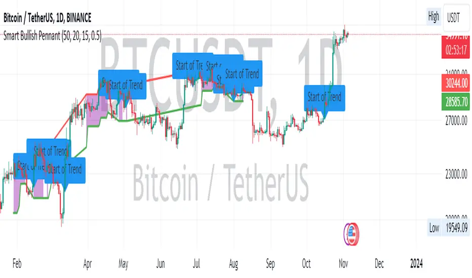
Smart Bullish Pennant PatternDescription:
This script is designed to identify and visualize the Bullish Pennant pattern, a popular continuation pattern used by traders. The script follows a structured approach to identify the underlying bullish trend, the consolidation phase, and finally, the breakout from the pennant, which could signify a potential continuation of the bullish trend.
Here's how the script operates:
Bullish Trend Identification:
The script first identifies a bullish trend based on a user-defined length and a specified Exponential Moving Average (EMA).
A bullish trend is considered to be in place if the closing price is above the trend EMA, and the EMA is rising over the specified length of bars.
Consolidation Phase Detection:
During the bullish trend, the script looks for a consolidation phase, which is identified by comparing the range of the recent bars against the range of the bullish trend.
The consolidation phase is characterized by a narrowing price range, forming the pennant.
Breakout Confirmation:
A breakout from the consolidation is considered confirmed if the closing price breaks above the consolidation high, accompanied by an increase in volume.
The script allows for a one-bar delay in confirmation to avoid false breakout signals.
Price Target Calculation:
Upon a confirmed breakout, the script calculates the price target based on the height of the preceding bullish trend, added to the breakout point.
Visual Aids:
The script plots the consolidation range during the consolidation phase.
A breakout is visually indicated with a triangle above the breakout bar.
The price target is displayed on the chart with a step line.
Alerts:
An alert is triggered upon a confirmed breakout, notifying the trader of the potential bullish continuation.
Labels:
Labels are plotted to indicate the start of the bullish trend and the breakout point.
By employing this script, traders can automate the process of identifying the Bullish Pennant pattern, aiding in timely decision making for potential trade entries and exits.
This script is protected, ensuring its proprietary nature while sharing its utility with the TradingView community.
smart candlesSmart Candles is an indicator which uses several Volume / Price / Trend based Indicators to colour the possible local top & bottom zones on the chart .
used indicators are : DPO / RSI / CMO / Helers DMI / Flower Indicator / Wave Trend
the more red the candle becomes , the more the market is considered as in a possible top
and the more green the candle becomes , the more the market is considered as a possible bottom
this script is an upgrade of this :

Smart On Balance Volume MTFSmart On Balance Volume
And constructed this indicator to have a variation of the conventional volume, the on balance volume is an indicator that is not given much value when I think that it is a formidable underlying basis of what is happening more when some etf cannot be measured with the PVI or NVI.
The Stochastico is built with the OBV signal of 3 different time frames, as it is for daily work
Has multiple settings and signals =
Color in overbought and oversold zones
visual alerts of crossovers in overbought and oversold zones
Alerts in for TDW on overbought and oversold
Signal length for% K
Signal length for% D
Smoothing length for% K and% D
A switch is added to toggle between the 3 time frames and the main one
Switch is added so you can see the original OBV
A switch is added to change the color in the bars
If you like it and find it useful please leave the comments below


SMT @joshuuuSmart Money Tool / Smart Money Technique is a concept taught by ICT (The InnerCircleTrader).
It compares correlated assets and if the correlation gets disrupted, we call it a smt divergence.
Correlated assets are for example the nasdaq, the sp500 and the dow.
A bullish scenario would be if one of those three makes a lower low and the other two make a higher low. In this case, that would form a divergence.
Another example would be the dxy (dollar-index), the eurusd and gbpusd. what's special about dxy compared to eurusd or gbpusd, is that dxy is inversely correlated to eurusd and gbpusd.
For inversely correlated assets the script has the option to inverse symbols.
Besides the option to inverse symbols, the script is also able to track smts between the two other symbols, that are not on the current chart and it's possible to filter smts only for certain time periods.
Options for those time periods are
ICT Killzones (all mentioned times are in ny time)
London Killzone : 0200-0500
forex:
NewYork Killzone : 0700-1000
indices:
NYAM Killzone : 0830-1100
NYPM Killzone : 1330-1600
ICTs Index SMT Times
AM - 0500-0930
PM - 1200-1500
To detect smts, the script compares swing highs with previous swing highs and swing lows with previous swing lows on all three symbols. To determine swing points, the user is able to input the amount of
candles to detect swing points, usually 1-3 is enough.

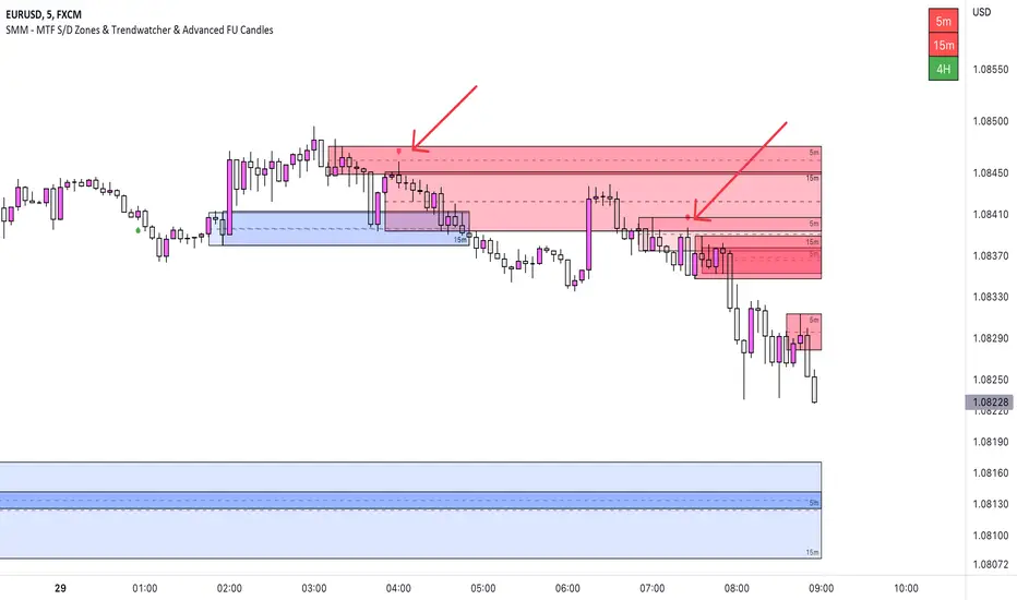
SMM - MTF S/D Zones & TrendwatcherHello Traders,
Introducing the SMM - MTF S/D Zones & Trendwatcher, a powerful tool designed to make your trading easier and eliminate guesswork. Our goal is to save you time by automatically marking up the chart with key points of interest.
Our newest tool combines multiple time frames (MTF) to provide a comprehensive view of supply and demand zones, and includes a trendwatcher that tracks the trend of the input timeframes.
The indicator is based on calculations of supply and demand zones, providing valuable insights for traders looking to make informed decisions about buying and selling. With its MTF functionality, the SMM - MTF S/D Zones & Trendwatcher is a valuable tool for any trader looking to stay on top of the market.
Features Version 1.1
-----------
-- MTF S/D Zones
Our indicator includes three adjustable supply and demand zones, which can be set to a desired higher timeframe.
Each zone includes options for:
- Extending the boxes.
- Show the 50% mitigation line.
- Let a zone disappear, change color, or do nothing.
- Option to plot/show the zones on the chart.
-- Trendwatcher
A convenient table that provides a quick overview of the trends of the set supply and demand.
You can configure the Trendwatcher the following ways:
- Option enable/disable the S/D trends to show in the table.
- Trendwatcher location on the chart.
- Trendwatcher size.