CryptoGraph Entry BuilderA complete system to generate buy & sell signals, based on multiple indicators, timeframes and assets
═════════════════════════════════════════════════════════════════════════
🟣 How it works
This indicator allows you to create buy & sell signals, based on multiple trigger conditions, placed in one easy to use TradingView indicator to produce alerts, backtest, reduce risk and increase profitability. This script is especially designed to be used with the CryptoGraph Strategizer indicator. Signals produced by this indicator, can be used as external input with the CryptoGraph Strategizer, by adding both indicators to your chart and selecting "External Input" as entry source in the inputs of the Strategizer indicator. From that point on, buy & sell signals generated by the Entry Builder, will be used for backtesting.
Each trigger or filtering condition is selectable and able to be combined using the selection boxes.
Trigger or filter conditions can be used on a different timeframes, and with different assets or coin pairs. Make sure to set higher timeframe filters, to a higher timeframe than your chart timeframe.
🟣 How to use
• Add the indicator to your chart
• Select an indicator you woud like to use for entry analysis. Combine more indicators for more entry filtering
• Configure entry conditions per indicator. It is recommended to add and configure one indicator at a time
• Analyse your buy/sell entries
• Connect to CryptoGraph Strategizer as external input source for backtesting purposes
🟣 Indicator Filters
• ATR :
Average True Range (ATR) is a tool used in technical analysis to measure volatility .
Possible options for ATR entry filtering are an ATR value greater/smaller than your input variable for trade entries, or the ATR crossing your input variable for trade entries.
This enables the possibility to only enter positions when the market has a certain degree of volatility .
• ADX :
The Average Directional Index ( ADX ) helps traders determine the strength of a trend, not its actual direction. It can be used to find out whether the
market is ranging or starting a new trend.
Possible options for ADX entry filtering are an ADX value greater/smaller than your input variable for trade entries, or the ADX crossing your input variable for trade entries.
• OBV :
The On Balance Volume indicator (OBV) is used in technical analysis to measure buying and selling pressure. It is a cumulative indicator meaning that on days where price went up, that day's volume is added to the cumulative OBV total.
Possible options for OBV entry filtering are Regular, Hidden or Regular&Hidden divergences. Divergence is when the price of an asset is moving in the opposite direction of a technical indicator, such as an oscillator, or is moving contrary to other data. Divergence warns that the current price trend may be weakening, and in some cases may lead to the price changing direction.
• Moving Average :
Moving Average (MA) is a price based, lagging (or reactive) indicator that displays the average price of a security over a set period of time. A Moving Average is a good way to gauge momentum as well as to confirm trends, and define areas of support and resistance .
Possible options for MA entry filtering are price being above/below Moving Average 1, price crossing up/down Moving Average 1, Moving Average 1 being above/below Moving Average 2 and Moving Average 1 crossing up/down Moving Average 2.
• Supertrend :
Supertrend (ST) is a trend-following indicator based on Average True Range (ATR). The calculation of its single line combines trend detection and volatility . It can be used to detect changes in trend direction and to position stops.
Possible options for ST entry filtering are Supertrend being in upward/downward direction, or Supertrend changing direction.
• RSI :
The Relative Strength Index ( RSI ) is a well versed momentum based oscillator which is used to measure the speed (velocity) as well as the change (magnitude) of directional price movements.
Possible options for RSI entry filtering are RSI being smaller/greater than your input value, or RSI crossing up/down your input value.
• Stochastic RSI :
The Stochastic RSI indicator ( Stoch RSI ) is essentially an indicator of an indicator. It is used in technical analysis to provide a stochastic calculation to the RSI indicator. This means that it is a measure of RSI relative to its own high/low range over a user defined period of time.
Possible options for Stoch RSI entry filtering are Stoch RSI crossing below or above your input value.
• VWAP Bands :
Volume Weighted Average Price ( VWAP ) is a technical analysis tool used to measure the average price weighted by volume . VWAP is typically used with intraday charts as a way to determine the general direction of intraday prices.
We use standard deviations, determined by user input, to create VWAP bands.
Possible options for VWAP long entry filtering are: price being below the lower VWAP band, price crossing back up the lower VWAP band or price crossing down the lower VWAP band.
Possible options for VWAP short entry filtering are: price being above the upper VWAP band, price crossing back down the upper VWAP band, or price crossing up the upper VWAP band.
• Bollinger Bands :
Bollinger Bands (BB) are a widely popular technical analysis instrument created by John Bollinger in the early 1980’s. Bollinger Bands consist of a band of three lines which are plotted in relation to security prices. The line in the middle is usually a Simple Moving Average ( SMA ) set to a period of 20 days (the type of trend line and period can be changed by the trader; however a 20 day moving average is by far the most popular).
Possible options for BB long entry filtering are: price being below the lower Bollinger band , price crossing back up the lower Bollinger band or price crossing down the lower Bollinger band .
Possible options for BB short entry filtering are: price being above the upper Bollinger band , price crossing back down the upper Bollinger band , or price crossing up the upper Bollinger band .
• WaveTrend :
WaveTrend (WT) is a smoothed momentum oscillator which enables it to detect true reversals in an accurate manner.
Possible options for WT entry filtering are: Green/red dots below or above a certain WaveTrend value, Regular Divergence, Hidden Divergence and Regular&Hidden Divergence.
Cari dalam skrip untuk "supertrend"

Nifty36ScannerThis code is written for traders to be able to automatically scan 36 stocks of their choice for MACD , EMA200 + SuperTrend and Half Trend . Traders can be on any chart, and if they keep this scanner/indicator on , it will start displaying stocks meeting scanning criteria on the same window without having to go to Screener section and running it again and again. It will save time for traders and give them real time signals.
Indicators for scanning stocks are:
MACD
EMA200
Supertrend
HalfTrend - originally developed by EVERGET
Combination of EMA200 crossover/under and MACD crossover/under has worked well for me for long time, so using this combination as one of the criteria to
Scan the stocks. Using Everget's Half Trend method confirms the signal given by MACD , EMA200 and Supertrend Crossover.
I have added 36 of my favourite stocks from Nifty 50 lot. Users of this script can use the same stocks or change it by going into the settings of this scanner.
The Code is divided into 3 Sections
Section 1: Accepting input from users as boolean so that they can scan on the basis of one of the criteria or any combination of the criteria.
Section 2: "Screener function" to calculate Buy/ Sell on the basis of scanning criteria selected y the user.
screener=>
= ta.supertrend(2.5,10)
Buy/Sell on the basis of Supertrend crossing Close of the candle
//using ta.macd function to calculate MACD and Signal
= ta.macd(close, 12, 26, 9)
using HalfTrend indicator to calculate Buy/Sell signals , removed all the plotting functions from the code of Half Trend
Bringing Stock Symbols in S series variables
s1=input.symbol('NSE:NIFTY1!', title='Symbol1', group="Nifty50List", inline='0')
Assigning Bull/Bear ( Buy/Sell) signals to each stocks selected
=request.security(s1, tf, screener())
Assign BUY to all the stocks showing Buy signals using
buy_label1:= c1?buy_label1+str.tostring(s1)+'\n': buy_label1
Follow the same process for SELL Signals
Section 3: Plotting labels for the BUY/SELL result on the in terms of label for any stocks meeting the criteria with deletion of any previous signals to avoid clutter on the chart with so many signals generated in each candle
Display Buy siganaling stocks in teh form of label using Label.new function with parameters as follows:
barindex
close as series
color
textcolor
style as label_up,
yloc =price
textalign=left
Delete all the previous labels
label.delete(lab_buy )
STOCKS SELECTION
We have given range f 36 stocks from NIFTY 50 that can be selected at anytime,. User can chose their own 36 stocks using setting button.
INDICATORS SELECTION
1. MACD: It i sone of the most reliable trading strategy with 39.3% Success rate with 1.187 as profit factor for NIFTY Index on Daily time frame
2. EAM200 + Super trend : Combination of EMA200 crossover and Super trend removes any false positives and considered a very reliable way of scanning for Buy/Sell signals
3. HALF TREND: Originally developed as an indicator by Everget and modified as strategy by AlgoMojo, it generates Buy/Sell signals with 40.2% success rate with 1.469 as profit faction, on 15 minutes timeframe.

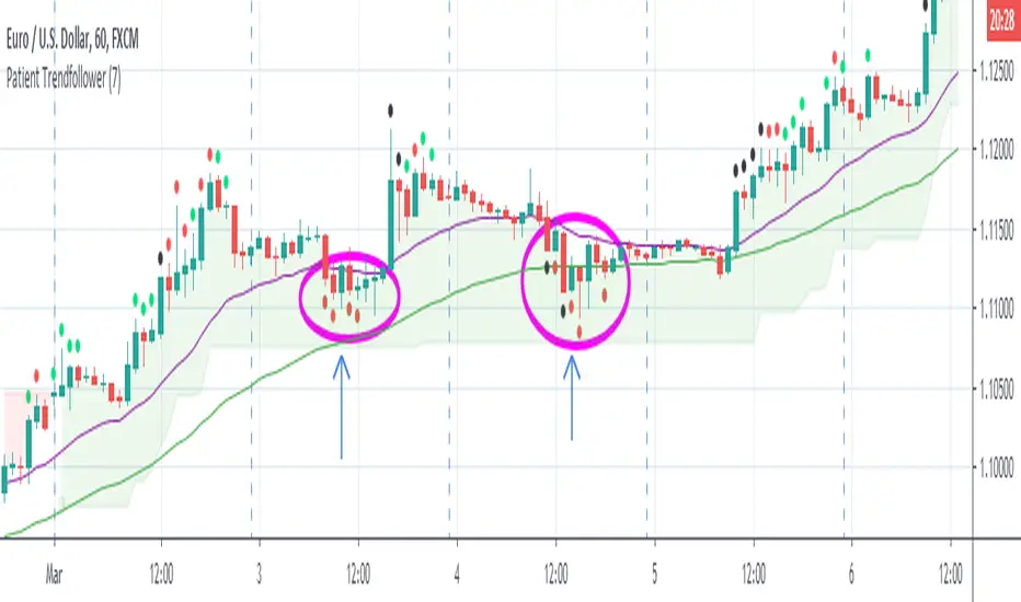
Patient Trendfollower (7)(alpha)Patient Trendfollower consists of 21 and 55 EMA, Commodity Channel Index and Supertrend indicator. It confirms a trend and gives you a signal on a pullback. Original creation worked on 1h EURUSD chart.
►Long setup:
• 21 EMA is above 55 EMA, which is above the Supertrend indicator.
• Commodity Channel Index is an oscillator, which prints into the chart if extreme levels are reached. Green is for a level above 100 or below -100, red is above 140 or below -140 and black is above 180 or below -180.
• If 21 EMA > 55EMA > Supertrend and an oversold signal appear, you can buy into the trend.
• When backtesting on 1h EURUSD, profit target 400 pips worked best with a stop-loss below Supertrend's bottom and the size of your spread.
• A picture shows two valid entries.
: This part still malfunctions and shows red dots over some green ones. It is important to disable red ones in the settings to see green ones.
Some more long signals:
Some short signals:
►Backtesting data with default settings and trading only green CCI signals with mentioned risk management strategy:
• 212 closed trades
• 58.96% profitable with average win trade 348 USD and average loss trade 263 USD when only green signals are followed.
• Profit factor 1.903, Sharpee 0.792
• 20 bars is average for all trades, short trades were 18 bars long on average.
With given data, you can see the strategy is profitable by itself. However, original risk management settings do work only on 1h charts of EURUSD and would need to be adjusted for other instruments based on average volatility.
Even though the profitability is low, you can increase your odds by a great margin, if you properly use price action (impulsive and corrective moves, patterns, bar analysis), if you trade when major exchanges are open, you may also use wave analysis such as Elliot Waves or Market Profiles to predict whether the next day might be a trending day. My backtesting program didn't consider these ideas.
Unfortunately, I won't be making backtesting strategy public with it anytime soon, because it still has some parts that do not work. I am ok with that since I understand the code and know what does malfunction and how. Then, there are parts which I am not sure how to fix yet. This is why the indicator is still considered alpha.
In the future when a strategy is published, you will also be able to set your own overbought/oversold values without entering the code itself and probably some other features. But I am not in a hurry for that. You can give me feedback on UX and try to figure out the best setups for other symbols, it might help to improve the automatic testing script when I know what I should achieve. My main point is to make this public for friends who can already be using it on EURUSD at least.
Close doesn't always have to be 400 pips, you might want to close on a logical level such as strong resistance or a trendline too.
Thanks to:
• @everget for providing Supertrend solution.
• Satik FX who hand-tested the system by hand and reported results in this article . He is my main inspiration for creating the complete indicator as one because I want to be able to show and hide it with a single click. My future scripts will also work as a whole strategy each by itself.
• The number in the script's name comes from Satik's numbering. A mentioned article was his seventh shared strategy.
Straddle and Strangle Premium (AlgoStraddle)# Straddle and Strangle Indicator
## Overview
The **Straddle and Strangle** indicator is a powerful tool designed for options traders to analyze the combined premium behavior of Straddle and Strangle strategies on Indian indices (NIFTY, BANKNIFTY, FINNIFTY, etc.). Unlike simple premium adders, this indicator visualizes the **combined price action as a true candlestick chart**, allowing for precise technical analysis on the strategy itself.
It integrates essential technical indicators—SuperTrend, VWAP, Moving Averages, and Dynamic Support/Resistance—directly onto the combined premium chart, helping traders make informed decisions based on the net value of their positions.
## Key Features
### 1. Accurate Combined Premium Chart
- **True Candlesticks**: Displays the combined Open, High, Low, and Close of the CE and PE options.
- **Spread Ticker Logic**: Uses TradingView's spread syntax (e.g., `NIFTY25DEC26000C + NIFTY25DEC26000P`) to ensure mathematically accurate High/Low calculations, avoiding the "fake wicks" common in simple addition scripts.
- **Toggle View**: Switch between a clean Candlestick chart and a simple Line chart.
### 2. Comprehensive Premium Table (5-Strike Ladder)
- Displays a real-time table on the chart overlay.
- Shows the **Selected Strike** (Center) plus **2 Strikes Above** and **2 Strikes Below**.
- For each strike, view the individual **CE Price**, **PE Price**, and **Combined Premium**.
- Helps in quickly spotting better premiums or potential adjustments without changing inputs.
### 3. Built-in Technical Analysis
Analyze the combined premium just like a regular stock:
- **SuperTrend**: Identifies the trend direction (Bullish/Bearish) of the combined premium.
- **VWAP (Volume Weighted Average Price)**: A key benchmark for intraday direction.
- **Moving Averages**: Configurable SMA, EMA, WMA, or RMA to track momentum.
- **ATR Stop Loss**: Dynamic trailing stop-loss levels based on volatility.
- **Dynamic Support & Resistance**: Automatically plots Swing Highs and Swing Lows to identify breakout or breakdown levels.
### 4. Flexible Strategy Selection
- **Fixed Straddle**: Select a single strike for both CE and PE.
- **Fixed Strangle**: Select different strikes for CE and PE.
- **Multi-Index Support**: Ready-to-use presets for NIFTY, BANKNIFTY, FINNIFTY, MIDCPNIFTY, SENSEX, and BANKEX.
- **Custom Symbol**: Option to manually input any other symbol.
## How to Use
1. **Select Chart Type**: Choose between "Fixed Straddle" or "Fixed Strangle".
2. **Set Symbol & Expiry**: Choose your index (e.g., NIFTY) and enter the Expiry Date (YYYY-MM-DD).
3. **Enter Strikes**:
* For **Straddle**: Enter the ATM strike.
* For **Strangle**: Enter the specific CE and PE strikes.
4. **Analyze**:
* Use the **Candlestick Chart** to read price action.
* Watch for **SuperTrend** flips for trend changes.
* Use **VWAP** as a dynamic support/resistance reference.
* Monitor the **Table** to compare premiums across nearby strikes.
## Alerts
The indicator includes built-in alert conditions for automation:
- **SuperTrend Change**: Bullish/Bearish flips.
- **VWAP Cross**: Price crossing above or below VWAP.
- **Support/Resistance Break**: Price breaking key swing levels.
---
*Designed for precision options analysis.*

Straddle and Strangle Premium# Straddle and Strangle Indicator
## Overview
The **BCA Fixed Straddle and Strangle** indicator is a powerful tool designed for options traders to analyze the combined premium behavior of Straddle and Strangle strategies on Indian indices (NIFTY, BANKNIFTY, FINNIFTY, etc.). Unlike simple premium adders, this indicator visualizes the **combined price action as a true candlestick chart**, allowing for precise technical analysis on the strategy itself.
It integrates essential technical indicators—SuperTrend, VWAP, Moving Averages, and Dynamic Support/Resistance—directly onto the combined premium chart, helping traders make informed decisions based on the net value of their positions.
## Key Features
### 1. Accurate Combined Premium Chart
- **True Candlesticks**: Displays the combined Open, High, Low, and Close of the CE and PE options.
- **Spread Ticker Logic**: Uses TradingView's spread syntax (e.g., `NIFTY25DEC26000C + NIFTY25DEC26000P`) to ensure mathematically accurate High/Low calculations, avoiding the "fake wicks" common in simple addition scripts.
- **Toggle View**: Switch between a clean Candlestick chart and a simple Line chart.
### 2. Comprehensive Premium Table (5-Strike Ladder)
- Displays a real-time table on the chart overlay.
- Shows the **Selected Strike** (Center) plus **2 Strikes Above** and **2 Strikes Below**.
- For each strike, view the individual **CE Price**, **PE Price**, and **Combined Premium**.
- Helps in quickly spotting better premiums or potential adjustments without changing inputs.
### 3. Built-in Technical Analysis
Analyze the combined premium just like a regular stock:
- **SuperTrend**: Identifies the trend direction (Bullish/Bearish) of the combined premium.
- **VWAP (Volume Weighted Average Price)**: A key benchmark for intraday direction.
- **Moving Averages**: Configurable SMA, EMA, WMA, or RMA to track momentum.
- **ATR Stop Loss**: Dynamic trailing stop-loss levels based on volatility.
- **Dynamic Support & Resistance**: Automatically plots Swing Highs and Swing Lows to identify breakout or breakdown levels.
### 4. Flexible Strategy Selection
- **Fixed Straddle**: Select a single strike for both CE and PE.
- **Fixed Strangle**: Select different strikes for CE and PE.
- **Multi-Index Support**: Ready-to-use presets for NIFTY, BANKNIFTY, FINNIFTY, MIDCPNIFTY, SENSEX, and BANKEX.
- **Custom Symbol**: Option to manually input any other symbol.
## How to Use
1. **Select Chart Type**: Choose between "Fixed Straddle" or "Fixed Strangle".
2. **Set Symbol & Expiry**: Choose your index (e.g., NIFTY) and enter the Expiry Date (YYYY-MM-DD).
3. **Enter Strikes**:
* For **Straddle**: Enter the ATM strike.
* For **Strangle**: Enter the specific CE and PE strikes.
4. **Analyze**:
* Use the **Candlestick Chart** to read price action.
* Watch for **SuperTrend** flips for trend changes.
* Use **VWAP** as a dynamic support/resistance reference.
* Monitor the **Table** to compare premiums across nearby strikes.
## Alerts
The indicator includes built-in alert conditions for automation:
- **SuperTrend Change**: Bullish/Bearish flips.
- **VWAP Cross**: Price crossing above or below VWAP.
- **Support/Resistance Break**: Price breaking key swing levels.
---
*Designed for precision options analysis.*

VisionAlgoPurpose: A multi-functional trading indicator that combines trend analysis, market structure, support/resistance zones, supply/demand levels, signal generation, risk management (TP/SL), and a visual dashboard for informed trading decisions.
1. Signal Generation
VisionAlgo provides buy and sell signals based on several technical filters:
SuperTrend Signals:
Calculated using a customizable ATR-based supertrend formula.
Generates bullish signals when price crosses above the supertrend and bearish signals when price crosses below.
Signals can be filtered into Normal and Strong signals depending on trend alignment with EMA/SMA filters.
Moving Average Filter:
Users can apply a moving average filter (SMA, EMA, WMA, VWMA, HMA) to validate signals.
Ensures trades align with the broader trend.
Signal Sensitivity & Mode:
Adjustable sensitivity (1–15) to control frequency of signals.
Signal Mode options: All, Normal, or Strong.
Candle Coloring:
Bars can be automatically colored bullish or bearish based on active signals for quick visual reference.
2. Trend and Market Structure Indicators
EMA Trend Confirmation:
200-period EMA serves as a long-term trend filter.
Signals above EMA reinforce bullish bias, signals below reinforce bearish bias.
Linear Regression & Trend Slopes:
Calculates slope, intercept, and deviations of price to detect potential reversal zones and trend direction.
Power MA / Trend Ribbon / Cirrus Cloud:
Optional advanced trend indicators that provide layered confirmation of market direction.
Auto Trend Lines:
Draws trend lines automatically based on swing highs/lows for visual trend guidance.
3. Support/Resistance & Supply-Demand Zones
EzAlgo SR Levels:
Dynamically detects support/resistance levels using pivot highs/lows.
Zones can be extended and colored differently based on bullish/bearish conditions.
Supply/Demand Zones (POI):
Tracks high/low swings to mark supply and demand areas.
Uses ATR-based buffers for box sizing.
Prevents overlapping zones and highlights breakout-of-structure (BOS) events.
Reversal Bands / Retest Zones:
Multi-layered bands around price to detect potential reversal and retest zones using ATR or True Range multipliers.
4. Risk Management – TP / SL System
Entry, Stop Loss, and Take Profit Levels:
Automatically calculates and plots TP1, TP2, TP3 based on ATR multiples.
Stop Loss dynamically adjusts depending on trade direction and risk multiplier.
TP/SL Breakout Labels:
Labels appear on the chart when price hits a TP or SL level for instant trade feedback.
Customizable Colors for Visualization:
Different colors for entry, SL, TP levels for clarity.
5. Dashboard Functionality
Multi-Timeframe Trend Overview:
Displays trend direction across multiple timeframes (1h, 2h, 4h, 8h, Daily).
Uses EMA to define bullish/bearish trend for each timeframe.
Current Position and Trend Summary:
Shows active position (Buy/Sell) and current trend in a compact table on the chart.
Background color dynamically changes to green/red based on bullish/bearish bias.
6. Advanced Features
Trailing Stop Loss (Optional):
Can enable dynamic trailing stops to lock profits.
Reversals & Reversal Bands:
Highlight potential market turning points using multi-period ATR bands.
Trend Line Customization:
Line color, width, style, and extendable endpoints for visual trend analysis.
Volume / Range Filters:
Incorporates filters based on price consolidation and breakout strength.
7. Code Structure Highlights
Input Section:
All major user inputs are grouped logically (Buy/Sell, Indicators, TP/SL, Dashboard, Trend Lines, etc.).
Signal Logic:
Computes bullish and bearish signals based on supertrend and moving averages.
Differentiates normal and strong signals for precision.
Position Tracking:
Keeps track of long/short positions and whether TP levels have been hit.
TP/SL Logic:
Uses ATR-based multipliers for dynamic risk management.
Plots horizontal lines and labels for each TP and SL.
Support & Resistance Logic:
Detects pivot highs/lows for SR levels.
Uses arrays to manage dynamic lines and zone fills.
Supply/Demand Zone Logic:
Avoids overlapping zones with ATR buffer.
Marks breakout-of-structure (BOS) zones when price breaks key levels.
Dashboard Logic:
Creates a visual table with current position, trend, and timeframe analysis.

Reddington Trading Bot Adaptive Signals# Reddington Trading Bot Adaptive Signals — mashup disclosure & user guide
## What it is
**Reddington Trading Bot Adaptive Signals** is a **manual trading** overlay that aggregates multiple entry logics (Supertrend, Bollinger, MACD, Counter-Trend, Scalp) behind a single, adaptive filter stack (EMA trend, ADX strength, ATR regime, volume, RSI band, sessions, candle confirmation).
When a setup passes all gates, the script **marks the bar** with a label (e.g., `ST Long ####`) and plots **Entry / SL / TP / Half-TP** reference lines for discretionary execution.
> This is an **indicator**, not an autostrategy. It does not place orders or manage positions.
---
## Mashup disclosure — what’s combined and why
This script is a **mashup** designed to reduce false positives by requiring **confluence** across trend, momentum, volatility, and liquidity:
* **Trend filter (EMAs)** — `ema_short > ema_long` for longs and vice versa for shorts.
*Why:* prevents fighting the dominant direction.
* **Supertrend direction** — uses `ta.supertrend()` to pick continuation states.
*Why:* captures impulse while controlling whipsaw.
* **Bollinger context** — upper/lower band interaction for breakout/overshoot logic.
*Why:* detects expansion and extreme deviations.
* **MACD cross (12/26/9)** — confirms momentum turns with `ta.macd`.
*Why:* times transitions into continuation.
* **RSI band** — between configurable overbought/oversold levels.
*Why:* avoids chasing exhaustion.
* **ADX strength (manual DI+/DI− → DX → RMA)** — trend quality gate.
*Why:* filters out chop when trend quality is weak.
* **ATR regime window** — ATR between low/high multiples of its baseline.
*Why:* trades when volatility is “tradable”, not too thin or too wild.
* **Volume filter** — volume ≥ SMA(volume, N).
*Why:* favors liquid conditions and cleaner ticks.
* **Session gate (Asia/EU/US)** — run only in chosen UTC windows.
*Why:* aligns with hours of depth, fewer fake breaks.
* **Candle confirmation** — simple **bar-over-bar**/**bar-under-bar** check.
*Why:* a last safety check to avoid immediate reversals.
The **strength** of the mashup is that each module covers a blind spot of the others, so a signal only prints when *trend + momentum + volatility + liquidity* line up.
---
## Non-repaint & timing notes
* The script **does not** use `request.security()`; all logic is computed on the active chart TF with standard Pine series semantics.
* Conditions can evolve **intra-bar**. For conservative usage, **confirm on bar close** before executing.
* Plotted levels (Entry/SL/TP/Half-TP) are reference guides; fills depend on your execution and venue slippage.
---
## Inputs (concise)
* **Supertrend multiplier**; **ADX threshold**; ATR low/high multiples; **RSI overbought/oversold**.
* **Sessions**: enable/disable Asia, Europe, America (UTC).
* Internal periods are **auto-scaled** from a 300-sec base via `timeframe.in_seconds()`, adapting the signal windows to your chart TF.
---
## Entry families (built-in)
* **ST (Supertrend continuation)**
Long: ST up + EMA short>long + below BB upper + ADX>th + volume/ATR/RSI ok + candle confirm + session.
Short: symmetric.
* **BB (Bollinger context)**
Long: close > BB upper + quality gates; Short: close < BB lower + quality gates.
* **MACD (momentum cross)**
Cross up/down with quality gates and candle confirm.
* **CT (Counter-trend poke)**
Long: close < BB lower with distance to middle > 1% and RSI<50; Short: mirror.
*Use sparingly; relies on strong quality gates to avoid catching knives.*
* **SC (Scalp EMA5/EMA10 cross)**
With mid-RSI, ADX>20, and all quality gates.
**Position state** is tracked internally (series vars) so that once in a trade, the script monitors **SL**, **Half-TP**, and **TP** hits and prints corresponding labels.
---
## On-chart visuals
* **Entry/SL/TP/Half-TP** lines (cross style), visible **only while a position is tracked**.
* **Bar labels** on entry (` Long/Short ####`), on SL/TP/Half events.
* A small **session/ticker/TF tag** on the last bar.
---
## How to trade it (suggested checklist)
1. **Wait for the label** (e.g., `ST Long …`) and check that all quality filters are green (they are enforced inside the code).
2. Execute **at your discretion** (market/limit); the script’s **Entry** level is the reference (close or your own limit).
3. Place **SL/TP** according to the printed levels; optionally scale at **Half-TP**.
4. Prefer **bar-close confirmation** on faster TFs to reduce intra-bar noise.
5. Respect your own risk rules (position sizing, max daily loss, news filter).
---
## Recommended timeframes & markets
* Designed for **intraday** use (e.g., **5m–15m**) where volume and sessions matter.
* Works on crypto perpetuals/spot and liquid FX/CFD symbols; threshold tuning may be required per venue.
---
## Limitations & tips
* It’s **one** layer of confirmation; don’t force trades in flat liquidity or into major news.
* CT/Scalp entries are more sensitive to noise; if you prefer higher selectivity, raise **ADX threshold** and narrow **ATR window**.
* Because conditions can change **within a bar**, **alerts** are best set to trigger **on bar close** if you add `alertcondition()` hooks (not included in this base).
---
## Disclaimer
This script is for **educational purposes only** and does **not** constitute financial advice, investment recommendation, solicitation, or an offer to buy/sell any instrument. Trading involves risk; past results do not guarantee future performance. You are solely responsible for your trading decisions and outcomes.

QuantumFlow MTF System Extended
QuantumFlow MTF System Extended
Multi-Timeframe Directional Flow & Volatility Alignment Engine — Higher-Timeframe Edition
The QuantumFlow MTF System Extended is a higher-timeframe analytical framework that expands upon the original QuantumFlow concept.
While the base version focuses on short-term structures (1M – 15M), this edition is designed for traders who need to observe medium- to long-term directional harmony across the 30M, 45M, 1H, 2H, 3H and 4H timeframes.
Its purpose is to provide a structured, non-repainting overview of how momentum and volatility align over broader market horizons — helping traders understand the prevailing directional flow rather than predicting future prices.
Concept
The system aggregates confirmed Supertrend directions from each higher timeframe, converting them into normalized bullish or bearish values.
These values are then processed through dual-layer EMA momentum filters that validate the directional strength of each component.
The resulting matrix displays a precise snapshot of how higher-timeframe market structures are synchronized — serving as a compass of directional alignment rather than a buy/sell signal generator.
A multi-ATR framework defines adaptive volatility zones, allowing each instrument to react proportionally to its intrinsic volatility profile.
This approach smooths sensitivity shifts that often occur between intraday and multi-hour structures, delivering consistent analytical behavior across asset classes.
How It Works
Confirmed Multi-Timeframe Supertrend
Each timeframe produces a close-confirmed Supertrend direction, ensuring signal stability and preventing repainting.
Adaptive Multi-ATR Model
Multiple ATR instances with distinct deviation factors define dynamic volatility thresholds that self-adjust to market conditions.
Dual EMA Momentum Validation
Two independent EMA layers filter and confirm each Supertrend direction, improving directional clarity and reliability.
Flow Totals Engine
The indicator sums all timeframe states into real-time bullish/bearish totals and percentage ratios, clearly visualized within a single panel.
Configurable Alerts (Optional)
Users may set threshold-based alerts when directional alignment reaches specified intensity levels (for example, when all timeframes are synchronized).
Full Customization
All visual elements — colors, text, background, and layout — can be adjusted to match personal preferences or chart themes.
Intended Use and Benefits
Observe how higher-timeframe trends align to reveal medium-term directional bias.
Quantify the balance of bullish vs bearish momentum across multiple timeframes.
Combine with lower-timeframe analysis (e.g. the original QuantumFlow System) to establish multi-layer confirmation between short- and mid-term flows.
Maintain awareness of trend synchronization or divergence without relying on subjective chart interpretation.
This indicator does not provide trading signals, forecasts, or financial advice.
It is an analytical tool intended to assist users in studying market structure and volatility behavior.
Chart Display
QuantumFlow Extended presents a unified dashboard that lists each analyzed timeframe, its active directional state, and the overall flow balance in numeric and percentage form.
It functions seamlessly on all instruments and can be used standalone or alongside the original short-term version.
Access
This is an invite-only indicator.
To request access or additional information, please contact the author privately via the TradingView profile.

Inflection Nexus - SPAInflection Nexus - SPA: Self-Adapting Trend Reversal System
Overview
Inflection Nexus - SPA (Shadow Portfolio Adaptation) is an adaptive trend-following indicator that automatically optimizes its parameters in real-time through a unique shadow testing methodology. Unlike traditional static indicators that use fixed ATR periods and multipliers, this system continuously evaluates multiple parameter combinations in the background and dynamically adjusts to current market conditions without manual intervention.
What Makes This Original
The core innovation is the Shadow Portfolio Adaptation (SPA) engine, which runs parallel virtual portfolios in the background to test different ATR period and multiplier combinations. The system tracks the performance of these shadow portfolios over rolling windows and automatically switches to the best-performing parameter set. This creates a self-improving indicator that adapts to changing volatility regimes, trending vs. ranging markets, and shifting market dynamics without requiring user reconfiguration.
This is not simply a combination of existing indicators. The SPA engine is a novel approach that transforms the traditional Supertrend methodology from a static tool into an adaptive system with built-in machine learning principles.
Core Components and How They Work Together
1. Adaptive Supertrend Foundation
The base trend detection uses an ATR-based Supertrend calculation with your chosen source (default: hlcc4 for smoothness). Rather than using fixed parameters, the system starts with your configured ATR Period and Multiplier as baseline values.
2. Shadow Portfolio Adaptation Engine
This is where the innovation happens. The system simultaneously tests multiple parameter variations in the background:
- Creates shadow portfolios with different ATR periods (spanning from your base period minus a range to plus a range)
- Tests different ATR multipliers for each period
- Each shadow portfolio tracks virtual trade performance over a configurable lookback window
- Calculates a confidence score based on win rate, profit factor, and trade frequency
- Automatically switches to the best-performing parameter combination
- Implements smooth transitions to prevent whipsaw from parameter changes
The adaptation happens continuously, allowing the system to shift from tight, responsive settings during low volatility to wider, more conservative settings during high volatility periods.
3. Signal Generation Logic
The system offers two complementary signal modes:
Reversal Mode (default): Identifies potential trend exhaustion points. A sell signal requires price to make a new structural high while the trend is bullish, then flip bearish. This captures the exact moment a trend runs out of momentum. The "Require New High/Low During Trend" filter ensures signals only occur at genuine extremes, not mid-range noise.
Breakout Mode (optional): Identifies trend continuation. Signals occur when price breaks to new highs/lows in the direction of the current trend, confirming momentum rather than reversing it.
4. Multi-Layer Confirmation Filters
Each signal passes through optional quality filters:
- RSI Momentum Filter : Ensures buy signals occur after RSI has been oversold (preventing buying into exhaustion) and sell signals occur after RSI has been overbought
- Volume Spike Confirmation : Requires increased volume relative to recent average, confirming conviction behind the move
- Major Level Filter : Ensures signals only occur after significant price moves (measured in ATR multiples), filtering out minor fluctuations
5. Risk Management Integration
The dashboard displays real-time metrics including:
- Current regime classification (Trending, Volatile, Ranging)
- Shadow portfolio performance tracking
- Adaptive confidence scores
- Parameter evolution log
- Market heat map showing probability zones
How to Use This Indicator
Setup:
1. Apply the indicator to your chart
2. Start with default settings for your first session
3. The SPA engine requires a warm-up period (controlled by "Learning Window") to gather sufficient data - expect optimal adaptation after 100-200 bars
4. Enable the dashboard to monitor the adaptation process and current market regime
Signal Interpretation:
- Long signals (green triangles below price): Enter long when the system detects a potential bullish reversal or breakout
- Short signals (red triangles above price): Enter short when the system detects a potential bearish reversal or breakout
- Dashboard color coding : Green regime = favorable for trend-following, Yellow = volatile (use caution), Red = choppy (consider reducing position size)
Best Practices:
- Use Reversal Mode in swing trading environments where you want to catch major turning points
- Use Breakout Mode in strong trending markets where you want confirmation entries
- Enable both modes for comprehensive coverage, but filter by the regime indicator
- The "Min Bars Between Signals" setting prevents over-trading - start at 10-12 bars for most timeframes
- Pay attention to the "Map Heat" metric - higher active cells indicate more defined market structure
Parameter Optimization:
The system is designed to self-optimize, but you can guide it:
- Sensitivity : Lower values (15-25) for intraday scalping, higher values (40-60) for swing trading
- ATR Period : Your baseline starting point - the SPA engine will explore around this value
- Multiplier : Your baseline band width - the engine tests variations of this
- Learning Window : How many bars of data the shadow portfolios evaluate (200-500 for most markets)
- Adaptation Frequency : How often the system checks for better parameters (30-50 bars balances responsiveness and stability)
Dashboard Insights:
The three-panel dashboard provides real-time intelligence:
- Panel A shows current signal state, trend direction, and overall market regime
- Panel B displays shadow portfolio statistics, confidence scores, and the adaptation log
- The regime classification helps you understand if current market conditions favor trending strategies or if you should reduce exposure
Calculation Methodology
The system operates in three phases:
Phase 1 - Base Calculation:
- Calculates ATR using your specified period and method (RMA for smoothness)
- Identifies structural highs/lows using the sensitivity parameter
- Computes initial Supertrend bands: Price ± (ATR × Multiplier)
Phase 2 - Shadow Testing:
- Creates a grid of parameter combinations (ATR periods from base-5 to base+15, multipliers from base-0.5 to base+1.0)
- For each combination, simulates trade entries and exits over the learning window
- Tracks metrics: win rate, profit factor, max drawdown, trade count
- Calculates a confidence score using weighted metrics (win rate × 0.4 + profit factor × 0.3 + normalized trade frequency × 0.3)
Phase 3 - Adaptive Selection:
- Every N bars (adaptation frequency), ranks all shadow portfolios by confidence score
- Selects the highest-scoring parameter set
- Implements parameter change with transition smoothing to prevent signal disruption
- Logs the change and updates the dashboard
This creates a continuous feedback loop where the indicator learns from recent market behavior and adjusts its sensitivity accordingly.
Ideal Market Conditions
Best Performance:
- Markets with clear swing structure (forex majors, liquid stocks, major indices)
- Timeframes from 5-minute to daily (indicator adapts across timeframes)
- Trending markets with periodic consolidations (where reversals are meaningful)
Challenging Conditions:
- Extremely low liquidity assets (insufficient price action for adaptation)
- Very low timeframes (1-minute or below) where noise dominates
- Markets in deep consolidation for extended periods (the system will reduce signal frequency appropriately)
Technical Notes
- The indicator uses lookback functions with a 5000-bar maximum, ensuring sufficient historical context
- Shadow portfolios are lightweight - they don't execute actual trades, only track hypothetical P&L
- The confidence-based selection prevents the system from chasing random variations
- The minimum bars between signals prevents over-fitting to short-term fluctuations
- All calculations are performed on closed bars to prevent repainting
Recommended Settings by Trading Style
Day Trading (5-15 min charts):
- Sensitivity: 20-30
- ATR Period: 14-20
- Multiplier: 1.2-1.5
- Min Bars Between Signals: 8-12
- Enable RSI Filter: Yes
Swing Trading (1H-4H charts):
- Sensitivity: 30-50
- ATR Period: 20-30
- Multiplier: 1.5-2.0
- Min Bars Between Signals: 10-15
- Enable Major Levels Only: Optional
Position Trading (Daily charts):
- Sensitivity: 50-80
- ATR Period: 30-40
- Multiplier: 2.0-2.5
- Min Bars Between Signals: 5-10
- Enable Breakout Mode: Consider
The SPA engine will refine these starting points automatically based on actual market performance.
Important Disclaimers
This indicator is a technical analysis tool designed to identify potential trend changes and continuation points. It should not be used as a standalone trading system. Always combine with proper risk management, position sizing, and additional confirmation methods. Past performance of the adaptation engine does not guarantee future results. The shadow portfolio system is designed to improve parameter selection, but no indicator can predict market movements with certainty.
— Dskyz, Trade with insight. Trade with anticipation.

Tunç ŞatıroğluTunç Şatıroğlu's Technical Analysis Suite
Description:
This comprehensive Pine Script indicator, inspired by the technical analysis teachings of Tunç Şatıroğlu, integrates six powerful TradingView indicators into a single, user-friendly suite for robust trend, momentum, and divergence analysis. Each component has been carefully selected and enhanced by beytun to improve functionality, performance, and visual clarity, aligning with Şatıroğlu's approach to technical analysis. The default configuration is meticulously set to match the exact settings of the individual indicators as used by Tunç Şatıroğlu in his training, ensuring authenticity and ease of use for followers of his methodology. Whether you're a beginner or an experienced trader, this suite provides a versatile toolkit for analyzing markets across multiple timeframes.
Included Indicators:
1. WaveTrend with Crosses (by LazyBear, modified): A momentum oscillator that identifies overbought/oversold conditions and trend reversals with clear buy/sell signals via crosses and bar color highlights.
2. Kaufman Adaptive Moving Average (KAMA) (by HPotter, modified): A dynamic moving average that adapts to market volatility, offering a smoother trend-following signal.
3. SuperTrend (by Alex Orekhov, modified): A trend-following indicator that plots dynamic support/resistance levels with buy/sell signals and optional wicks for enhanced accuracy.
4. Nadaraya-Watson Envelope (by LuxAlgo, modified): A non-linear envelope that highlights potential reversals with customizable repainting options for smoother outputs.
5. Divergence for Many Indicators v4 (by LonesomeTheBlue, modified): Detects regular and hidden divergences across multiple indicators (MACD, RSI, Stochastic, CCI, Momentum, OBV, VWMA, CMF, MFI, and more) for early reversal signals.
6. Ichimoku Cloud (TradingView built-in, modified): A multi-faceted indicator for trend direction, support/resistance, and momentum, with enhanced visuals for the Kumo Cloud.
Key Features:
- Authentic Default Settings : Pre-configured to mirror the exact parameters used by Tunç Şatıroğlu for each indicator, ensuring alignment with his proven technical analysis approach.
- Customizable Settings : Enable/disable individual indicators and fine-tune parameters to suit your trading style while retaining the option to revert to Şatıroğlu’s defaults.
- Enhanced User Experience : Modifications improve visual clarity, performance, and usability, with options like repainting smoothing for Nadaraya-Watson and adjustable Ichimoku projection periods.
- Multi-Timeframe Analysis : Combines trend-following, momentum, and divergence tools for a holistic view of market dynamics.
- Alert Conditions : Built-in alerts for SuperTrend direction changes, buy/sell signals, and divergence detections to keep you informed.
- Visual Clarity : Overlays (KAMA, SuperTrend, Nadaraya-Watson, Ichimoku) and pane-based indicators (WaveTrend, Divergences) are clearly distinguished, with customizable colors and styles.
Notes:
- The Nadaraya-Watson Envelope and Ichimoku Cloud may repaint in their default modes. Use the "Repainting Smoothing" option for Nadaraya-Watson or adjust Ichimoku settings to mitigate repainting if preferred.
- Published under the MIT License, with components licensed under GPL-3.0 (SuperTrend), CC BY-NC-SA 4.0 (Nadaraya-Watson), MPL 2.0 (Divergence), and TradingView's terms (Ichimoku Cloud).
Usage:
Add this indicator to your TradingView chart to leverage Tunç Şatıroğlu’s exact indicator configurations out of the box. Customize settings as needed to align with your strategy, and use the combined signals to identify trends, reversals, and divergences. Ideal for traders following Şatıroğlu’s methodologies or anyone seeking a powerful, all-in-one technical analysis tool.
Credits:
Original authors: LazyBear, HPotter, Alex Orekhov, LuxAlgo, LonesomeTheBlue, and TradingView.
Modifications and integration by beytun .
License:
Published under the MIT License, incorporating code under GPL-3.0, CC BY-NC-SA 4.0, MPL 2.0, and TradingView’s terms where applicable.

One Trade Setup for LifeIndicators are refered from @TFlab and @ChartPrime and @UAlgo
***
## Indicator Overview 🚀
**One Trade Setup for Life** is a sophisticated TradingView Pine Script indicator blending Smart Money Concepts (SMC), advanced Price Action, and Liquidity Analysis. It provides signals for structural market moves, trade setups, and custom alerts. This tool is designed for **precision execution**, giving traders a comprehensive edge in diverse market conditions.
***
## Key Logic Sections & Explanation
### Smart Money Concept Logic 💸
- **Pivot Lines**: Plots SMC levels based on swing high/low pivots, customizable for wick/body detection and colored to represent bullish or bearish market structure.
- **Market Structure Detection**: Tracks changes such as BOS (Break of Structure) and CHoCH (Change of Character), using real-time breakout logic to highlight structural shifts, confirm reversal setups, and trigger accompanying alerts.
- **Engulfing & Confirmation**: Identifies engulfing candles, confirms market structure changes, and plots colored lines—with shape plots at exact highs/lows for visual clarity.
***
### Pure Price Action 📈
- **Swing Detection**: Adjustable bars for detecting swing points, making the indicator sensitive to trend reversals and continuations based on candle closes or wicks.
- **BOS/CHoCH Lines**: Plots dashed, solid, or dotted lines (user-selected) to visualize structural changes in price, adding color-coded markers for transparency.
- **Sentiment Table**: Displays an emoji-based sentiment table at the chart bottom, updating live to quickly gauge overall price action and market mood (bull, bear, neutral emoji).
***
### Supertrend Logic 🟩🟥
- **ATR-Based Trend Filter**: Implements Supertrend bands using customizable ATR length, multiplier, and increment. Options include normalization for flexibility in ranging versus trending markets.
- **Multi-Factor Signals**: Detects buy/sell crossovers and plots median/stdev areas for additional confirmation. Users can visually track Supertrend support/resistance as trade triggers.
***
### RSI & Activity Analysis 📊
- **RSI Calculation**: Provides customizable RSI length, overbought/oversold thresholds. Candle coloring flips as RSI hits extreme levels, giving immediate visual signals for exhaustion or reversals.
- **Trading Volume Proxy**: Advanced logic computes percentile rankings and plots quintile bands, triggering signal arrows when activity surges above or below key thresholds.
***
### Liquidity Sweep & Fair Value Gap Logic 💧
- **Sweep Zones**: Detects price sweeps at key resistance/support lines generated from pivots, marking with labels and enabling sweep alerts.
- **FVG & Mitigation**: Integrates Fair Value Gap (FVG) detection. The indicator can filter FVG zones by aggressiveness, classify supply/demand FVGs, and highlight where price is likely to react for entry or exit.
***
### Support, Resistance, and Swing Levels 🟦🟥
- **Multi-Period SR Lines**: Draws dynamic lines for support/resistance from high/low pivots, adjustable for length and quantity, and visually distinct using color, label, and style options.
- **Main Swing Alerts**: Tracks swing direction, assigns colors, and fires alerts only when direction changes, ensuring traders catch priority momentum shifts.
***
### Detailed Alerts System 🚨
- **Custom Alert Inputs**: Users can toggle alerts for CHoCH, BOS, liquidity structure, high-volume, FVG events, sweep zones, false breakouts, and trigger candles—ensuring critical signals are never missed.
- **On-Chart Graphics**: Circles, arrows, and emoji labels clearly mark confirmation, swings, and reversal points directly on the chart, streamlining decision-making.
***
## Example Markdown Table: Alert Features
| Alert Type | Logic/Trigger | Emoji | Visual Output |
|------------------------|--------------------------------------|-------|---------------------------|
| CHoCH (Change of Char.)| Counter-trend BOS detection | 🔄 | Colored line & arrow |
| BOS (Break of Struct.) | Trend BOS, confirming market shift | 💥 | Line/circle at high/low |
| Liquidity Sweep | Price breaks support/resistance | 💧 | Label "Sweep" + alert |
| FVG Alert | FVG zone formation by aggression | ⚡ | Box highlight + alert |
| Supertrend Trigger | Median/std crossovers | 🟩🟥 | Colored area, Buy/Sell |
***
## Customization, Emoji & Styling 🎨
- **All key inputs are grouped and tooltipped for easy setup.**
- **Charts use emojis for sentiment** and direction, visible on tables and labels.
- **Colors are user-selected** for all markers (pivot, BOS, CHoCH, FVG, SR, swing).
- **Visuals (circles/arrows)** highlight entry, exit, and alert points for instant interpretation—making the script unique and easy to use.
***
## Publication & Use 🌐
This script is covered under the Mozilla Public License 2.0. When publishing, provide the following metadata:
- **Title**: One Trade Setup for Life
- **Description**: A fusion tool combining SMC, price action, advanced liquidity analytics, and market structure detection—with a robust alert system and richly visual trading interface.
**Enjoy clear signals, custom alerts, and visually appealing chart markers—all in one package!** 🏆

Institutional Momentum Zones (ADX+ROC+DI+MACD+Filters)Institutional Momentum Zones (ADX + ROC + DI + MACD + Filters)
This indicator is designed to help traders visually identify Bullish, Neutral, and Bearish momentum zones on Nifty, indices, or any liquid asset, using a rules-based, institutional-style approach.
It combines multiple professional-grade momentum and trend filters into a single framework:
ADX (Average Directional Index) – Measures trend strength, filters out choppy conditions.
Directional Indicators (+DI / –DI) – Confirms whether bulls or bears are in control.
ROC (Rate of Change) – Quantifies momentum speed and direction.
MACD (optional) – Adds confirmation by checking multi-timeframe momentum alignment.
EMA Filters (optional) – Ensures price is in alignment with long-term trend bias.
Supertrend (optional) – Can be enabled for additional trend confirmation.
How it works:
Bullish Zone (Green) → Strong trend (ADX > threshold) + upward momentum (ROC > 0, +DI > –DI) + optional EMA/MACD/Supertrend confirmation.
Bearish Zone (Red) → Strong trend (ADX > threshold) + downward momentum (ROC < 0, –DI > +DI) + optional EMA/MACD/Supertrend confirmation.
Neutral Zone (Yellow) → Low trend strength (ADX < threshold) or mixed momentum signals.
Features:
Automatic background coloring for zone detection.
On-chart labels marking new zone changes.
EMA50 / EMA200 and Supertrend overlay options.
Signal markers for bullish/bearish entries.
Info panel with live ADX, ROC, DI values, and MACD histogram.
Alert conditions for zone changes (Bull, Bear, Neutral).
Best used for:
Index momentum tracking (e.g., Nifty, Bank Nifty, Dow, S&P500)
Swing trading & positional trading strategies
Filtering trades to avoid entering during low-momentum chop
Tip: For Nifty positional trading, use Daily or 4H charts with EMA & MACD filters enabled for cleaner, high-confidence signals.

Mutanabby_AI __ OSC+ST+SQZMOMMutanabby_AI OSC+ST+SQZMOM: Multi-Component Trading Analysis Tool
Overview
The Mutanabby_AI OSC+ST+SQZMOM indicator combines three proven technical analysis components into a unified trading system, providing comprehensive market analysis through integrated oscillator signals, trend identification, and volatility assessment.
Core Components
Wave Trend Oscillator (OSC): Identifies overbought and oversold market conditions using exponential moving average calculations. Key threshold levels include overbought zones at 60 and 53, with oversold areas marked at -60 and -53. Crossover signals between the two oscillator lines generate entry opportunities, displayed as colored circles on the chart for easy identification.
Supertrend Indicator (ST): Determines overall market direction using Average True Range calculations with a 2.5 factor and 10-period ATR configuration. Green lines indicate confirmed uptrends while red lines signal downtrend conditions. The indicator automatically adapts to market volatility changes, providing reliable trend identification across different market environments.
Squeeze Momentum (SQZMOM): Compares Bollinger Bands with Keltner Channels to identify consolidation periods and potential breakout scenarios. Black squares indicate squeeze conditions representing low volatility periods, green triangles signal confirmed upward breakouts, and red triangles mark downward breakout confirmations.
Signal Generation Logic
Long Entry Conditions:
Green triangles from Squeeze Momentum component
Supertrend line transitioning to green
Bullish crossovers in Wave Trend Oscillator from oversold territory
Short Entry Conditions:
Red triangles from Squeeze Momentum component
Supertrend line transitioning to red
Bearish crossovers in Wave Trend Oscillator from overbought territory
Automated Risk Management
The indicator incorporates comprehensive risk management through ATR-based calculations. Stop losses are automatically positioned at 3x ATR distance from entry points, while three progressive take profit targets are established at 1x, 2x, and 3x ATR multiples respectively. All risk management levels are clearly displayed on the chart using colored lines and informative labels.
When trend direction changes, the system automatically clears previous risk levels and generates new calculations, ensuring all risk parameters remain current and relevant to existing market conditions.
Alert and Notification System
Comprehensive alert framework includes trend change notifications with complete trade setup details, squeeze release alerts for breakout opportunity identification, and trend weakness warnings for active position management. Alert messages contain specific trading pair information, timeframe specifications, and all relevant entry and exit level data.
Implementation Guidelines
Timeframe Selection: Higher timeframes including 4-hour and daily charts provide the most reliable signals for position trading strategies. One-hour charts demonstrate good performance for day trading applications, while 15-30 minute timeframes enable scalping approaches with enhanced risk management requirements.
Risk Management Integration: Limit individual trade risk to 1-2% of total capital using the automatically calculated stop loss levels for precise position sizing. Implement systematic profit-taking at each target level while adjusting stop loss positions to protect accumulated gains.
Market Volatility Adaptation: The indicator's ATR-based calculations automatically adjust to changing market volatility conditions. During high volatility periods, risk management levels appropriately widen, while low volatility conditions result in tighter risk parameters.
Optimization Techniques
Combine indicator signals with fundamental support and resistance level analysis for enhanced signal validation. Monitor volume patterns to confirm breakout strength, particularly when Squeeze Momentum signals develop. Maintain awareness of scheduled economic events that may influence market behavior independent of technical indicator signals.
The multi-component design provides internal signal confirmation through multiple alignment requirements, significantly reducing false signal occurrence while maintaining reasonable trade frequency for active trading strategies.
Technical Specifications
The Wave Trend Oscillator utilizes customizable channel length (default 10) and average length (default 21) parameters for optimal market sensitivity. Supertrend calculations employ ATR period of 10 with factor multiplier of 2.5 for balanced signal quality. Squeeze Momentum analysis uses Bollinger Band length of 20 periods with 2.0 multiplication factor, combined with Keltner Channel length of 20 periods and 1.5 multiplication factor.
Conclusion
The Mutanabby_AI OSC+ST+SQZMOM indicator provides a systematic approach to technical market analysis through the integration of proven oscillator, trend, and momentum components. Success requires thorough understanding of each element's functionality and disciplined implementation of proper risk management principles.
Practice with demo trading accounts before live implementation to develop familiarity with signal interpretation and trade management procedures. The indicator's systematic approach effectively reduces emotional decision-making while providing clear, objective guidelines for trade entry, management, and exit strategies across various market conditions.

Adiyogi Trend🟢🔴 “Adiyogi” Trend — Market Alignment Visualizer
“Adiyogi” Trend is a powerful, non-intrusive trend detection system built for traders who seek clarity, discipline, and alignment with true market flow. Inspired by the meditative stillness of Adiyogi and the need for mindful, high-probability decisions, this tool offers a clean and intuitive visual guide to trending environments — without cluttering the chart or pushing forced trades.
This is not a buy/sell signal generator. Instead, it is designed as a background confirmation engine that helps you stay on the right side of the market by identifying moments of true directional strength.
🧠 Core Logic
The “Adiyogi” Trend indicator highlights the background of your chart in green or red when multiple layers of strength and structure align — including momentum, market positioning, and relative force. Only when these internal components agree does the system activate a directional state.
It’s built on three foundational energies of trend confirmation:
Strength of movement
Structure in price action
Conviction in momentum
By combining these into one visual background, the indicator filters out indecision and helps you stay focused during real trend phases — whether you're day trading, swing trading, or holding longer-term positions.
📌 Core Concepts Behind the Tool
The indicator integrates three essential market filters—each confirming a different dimension of trend strength:
ADX (Average Directional Index) – Measures trend momentum.
You’ve chosen a very responsive setting (ADX Length = 2), which helps catch the earliest possible signs of momentum emergence.
The threshold is ADX ≥ 22, ensuring that weak or sideways markets are filtered out.
SuperTrend (10,1) – Captures short-term trend direction.
This setup follows price closely and reacts quickly to reversals, making it ideal for fast-moving assets or intraday strategies.
SuperTrend acts as the structural confirmation of directional bias.
RSI (Relative Strength Index) – Measures strength based on recent price closes.
You’ve configured RSI > 50 for bullish zones and < 50 for bearish—a neutral midpoint standard often used by professional traders.
This ensures that only trades in sync with momentum and recent strength are highlighted.
🌈 How It Visually Works
Background turns GREEN when:
ADX ≥ 22, indicating strong momentum
Price is above the 20 EMA and above SuperTrend (10,1)
RSI > 50, confirming recent strength
Background turns RED when:
ADX ≥ 22, indicating strong momentum
Price is below the 20 EMA and below SuperTrend (10,1)
RSI < 50, confirming recent weakness
The background remains neutral (transparent) when trend conditions are not clearly aligned—this is the tool's way of keeping you out of indecisive markets.
A label (BULL / BEAR) appears only when the bias flips from the previous one. This helps avoid repeated or redundant alerts, focusing your attention only when something changes.
📊 Practical Uses & Benefits
✅ Stay with the trend: Perfectly filters out choppy or sideways markets by only activating when conditions align across momentum, structure, and strength.
✅ Pre-trade confirmation: Use this tool to confirm trade setups from other indicators or price action patterns.
✅ Avoid noise: Prevent overtrading by focusing only on high-quality trend conditions.
✅ Visual clarity: Unlike arrows or plots that clutter the chart, this tool subtly highlights trend conditions in the background, preserving your price action view.
📍 Important Notes
This is not a buy/sell signal generator. It is a trend-confirmation system.
Use it in conjunction with your existing entry setups—such as breakouts, order blocks, retests, or candlestick patterns.
The tool helps you stay in sync with the dominant direction, especially when combining multiple timeframes.
Can be used on any market (stocks, forex, crypto, indices) and on any timeframe.

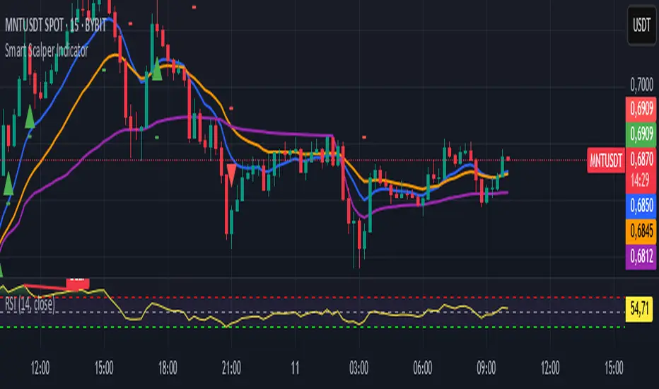
Smart Scalper Indicator🎯 How the Smart Scalper Indicator Works
1. EMA (Exponential Moving Average)
EMA 10 (Blue Line):
Shows the short-term trend.
If the price is above this line, the trend is bullish; if below, bearish.
EMA 20 (Orange Line):
Displays the longer-term trend.
If EMA 10 is above EMA 20, it indicates a bullish trend (Buy signal).
2. SuperTrend
Green Line:
Represents support levels.
If the price is above the green line, the market is considered bullish.
Red Line:
Represents resistance levels.
If the price is below the red line, the market is considered bearish.
3. VWAP (Volume Weighted Average Price)
Purple Line:
Indicates the average price considering volume.
If the price is above the VWAP, the market is strong (Buy signal).
If the price is below the VWAP, the market is weak (Sell signal).
4. ATR (Average True Range)
Used to measure market volatility.
An increasing ATR indicates higher market activity, enhancing the reliability of signals.
ATR is not visually displayed but is factored into the signal conditions.
⚡ Entry Signals
Green Up Arrow (Buy):
EMA 10 is above EMA 20.
The price is above the SuperTrend green line.
The price is above the VWAP.
Volatility (ATR) is increasing.
Red Down Arrow (Sell):
EMA 10 is below EMA 20.
The price is below the SuperTrend red line.
The price is below the VWAP.
Volatility (ATR) is increasing.
🔔 Alerts
"Buy Alert" — Notifies when a Buy condition is met.
"Sell Alert" — Notifies when a Sell condition is met.
✅ How to Use the Indicator:
Add the indicator to your TradingView chart.
Enable alerts to stay updated on signal triggers.
Check the signal:
A green arrow suggests a potential Buy.
A red arrow suggests a potential Sell.
Set Stop-Loss:
Below the SuperTrend line or based on ATR levels.
Take Profit:
Target 1-2% for short-term trades.
Profit Hunter @DaviddTechProfit Hunter @DaviddTech is an advanced multi-strategy indicator designed to give traders a significant edge in identifying high-probability trading opportunities across all market conditions. By combining the power of T3 adaptive moving averages, ADX-based trend strength analysis, SuperTrend trailing stops, and dynamic support/resistance detection, this indicator delivers a complete trading system in one powerful package.
## 📊 Recommended Usage
Timeframes: Most effective on 1H, 4H, and Daily charts for swing trading; 5M and 15M for day trading
Markets: Works across all markets including Forex, Crypto, Indices, and Stocks
Setup Guidelines: Look for T3 crossovers with strong ADX readings (>25) coinciding with breakout signals (yellow dots/red crosses) near key support/resistance levels for highest probability entries
## 🔥 Key Features:
### T3 Adaptive Trend Detection:
Utilizes premium T3 adaptive indicators instead of standard EMAs for superior smoothing and accuracy
Dynamic color-shifting cloud formation between fast and slow T3 lines reveals immediate trend direction
Proprietary transparency algorithm intensifies cloud colors during strong trends based on real-time ADX readings
### Advanced Support & Resistance Mapping:
Automatically identifies and marks key market structure levels during T3 crossovers
Dynamic horizontal level plotting with optional extension for monitoring future price interactions
Intelligent level validation - converts to dotted lines when price breaks through, maintaining visual clarity
### SuperTrend Trailing Stoploss System:
Professional-grade white trailing stop indicator adapts to market volatility using ATR calculations
Generates precise entry and exit signals with optional buy/sell labels at critical reversal points
Visual trend state highlighting for immediate assessment of current market position
### Breakout Detection & Confirmation:
Sophisticated dual-algorithm breakout system combining Bollinger Bands and Keltner Channels
Visual breakout alerts with yellow dots (bullish) and red crosses (bearish) for instant pattern recognition
Validates breakouts against T3 trend direction to minimize false signals
### Alpha Edge Color System:
Utilizes DaviddTech's signature color scheme with bullish green and bearish pink
Revolutionary transparency algorithm translates ADX readings into precise visual intensity
Higher ADX values produce more vivid colors, instantly communicating trend strength without additional indicators
## 💰 Trading Applications:
Alpha Discovery: Identify emerging trends before the majority of market participants
Precision Entry/Exit: Use SuperTrend signals combined with support/resistance levels for optimal trade execution
Risk Management: Set stops based on the white trailing stoploss line for mathematically-optimized protection
Trend Confirmation: Validate setups using the T3 cloud direction and ADX-based intensity
Breakout Trading: Capture explosive moves with confirmed Bollinger/Keltner breakout signals
Swing Position Management: Monitor extended support/resistance levels for multi-day positioning
## ✨ Strategy Example
As shown in the chart image, ideal entries occur when:
The T3 cloud turns bullish (green) or bearish (pink) with strong color intensity
A yellow dot (bullish) or red cross (bearish) breakout signal appears
Price respects the white SuperTrend line as support/resistance
The trade aligns with key horizontal support/resistance levels identified by the indicator
## 📝 Attribution
This indicator builds upon and enhances concepts from:
Market Trend Levels Detector by BigBeluga (support/resistance detection framework)
T3 indicator implementation by DaviddTech (adaptive moving average system)
Average Directional Index (ADX) methodology for trend strength measurement
Profit Hunter @DaviddTech represents the culmination of advanced technical analysis methodologies in one seamless system.
Accurate Trend IndicatorAccurate Trend Indicator
The Accurate Trend Indicator is a powerful trend-following tool designed to help traders identify optimal buy and sell opportunities with precision. Based on the Supertrend algorithm, this indicator dynamically tracks market trends and provides clear entry and exit signals.
Features:
✅ Supertrend-Based Signals – Uses ATR (Average True Range) to determine trend direction.
✅ Buy & Sell Alerts – Displays green "BUY" labels and red "SELL" labels when trend changes.
✅ Color-Coded Candles – Bullish candles turn green, and bearish candles turn red for better visualization.
✅ Works on Any Market – Compatible with Forex, Stocks, Crypto, and Commodities.
✅ Customizable Inputs – Adjust the ATR length and multiplier to fit your trading strategy.
How It Works:
A BUY signal appears when the price crosses above the Supertrend line.
A SELL signal appears when the price crosses below the Supertrend line.
Candle colors change based on trend direction to enhance clarity.
This indicator is ideal for traders who want a simple yet effective tool to follow market trends and make informed decisions.
🚀 Try it now and enhance your trading strategy! 🚀

Range Filtered Trend Signals [AlgoAlpha]Introducing the Range Filtered Trend Signals , a cutting-edge trading indicator designed to detect market trends and ranging conditions with high accuracy. This indicator leverages a combination of Kalman filtering and Supertrend analysis to smooth out price fluctuations while maintaining responsiveness to trend shifts. By incorporating volatility-based range filtering, it ensures traders can differentiate between trending and ranging conditions effectively, reducing false signals and enhancing trade decision-making.
:key: Key Features
:white_check_mark: Kalman Filter Smoothing – Minimizes market noise while preserving trend clarity.
:bar_chart: Supertrend Integration – A dynamic trend-following mechanism for spotting reversals.
:fire: Volatility-Based Range Detection – Detects trending vs. ranging conditions with precision.
:art: Color-Coded Trend Signals – Instantly recognize bullish, bearish, and ranging market states.
:gear: Customizable Inputs – Fine-tune Kalman parameters, Supertrend settings, and color themes to match your strategy.
:bell: Alerts for Trend Shifts – Get real-time notifications when market conditions change!
:tools: How to Use
Add the Indicator – Click the star icon to add it to your TradingView favorites.
Analyze Market Conditions – Observe the color-coded signals and range boundaries to identify trend strength and direction.
Use Alerts for Trade Execution – Set alerts for trend shifts and market conditions to stay ahead without constantly monitoring charts.
:mag: How It Works
The Kalman filter smooths price fluctuations by dynamically adjusting its weighting based on market volatility. It helps remove noise while keeping the signal reactive to trend changes. The Supertrend calculation is then applied to the filtered price data, providing a robust trend-following mechanism. To enhance signal accuracy, a volatility-weighted range filter is incorporated, creating upper and lower boundaries that define trend conditions. When price breaks out of these boundaries, the indicator confirms trend continuation, while signals within the range indicate market consolidation. Traders can leverage this tool to enhance trade timing, filter false breakouts, and identify optimal entry/exit zones.

Fibonacci Trend [ChartPrime]Fibonacci Trend Indicator
This powerful indicator leverages supertrend analysis to detect market direction while overlaying dynamic Fibonacci levels to highlight potential support, resistance, and optimal trend entry zones. With its straightforward design, it is perfect for traders looking to simplify their workflow and enhance decision-making.
⯁ KEY FEATURES AND HOW TO USE
⯌ Supertrend Trend Identification :
The indicator uses a supertrend algorithm to identify market direction. It displays purple for downtrends and green for uptrends, ensuring quick and clear trend analysis.
⯌ Fibonacci Levels for Current Swings :
Automatically calculates Fibonacci retracement levels (0.236, 0.382, 0.618, 0.786) for the current swing leg.
- These levels act as key zones for potential support, resistance, and trend continuation.
- The high and low swing points are labeled with exact prices, ensuring clarity.
- If the swing range is insufficient (less than five times ATR), Fibonacci levels are not displayed, avoiding irrelevant data.
⯌ Extended Fibonacci Levels :
User-defined extensions project Fibonacci levels into the future, aiding traders in planning price targets or projecting key zones.
⯌ Optimal Trend Entry Zone :
A filled area between 0.618 and 0.786 levels visually highlights the optimal entry zone for trend continuation. This allows traders to refine their entry points during pullbacks.
⯌ Diagonal Trend Line :
A dashed diagonal line connects the swing high and low, visually confirming the range and trend strength of the current swing.
⯌ Visual Labels for Fibonacci Levels :
Each Fibonacci level is marked with a label displaying its value for quick reference.
⯁ HOW TRADERS CAN POTENTIALLY USE THIS TOOL
Fibonacci Retracements:
Use the Fibonacci retracement levels to find key support or resistance zones where the price may pull back before continuing its trend.
Example: Enter long trades when the price retraces to 0.618–0.786 levels in an uptrend.
Fibonacci Extensions:
Use Fibonacci extensions to project future price targets based on the current trend's swing leg. Levels like 127.2% and 161.8% are commonly used as profit-taking zones.
Reversal Identification:
Spot potential reversals by monitoring price reactions at key Fibonacci retracement levels (e.g., 0.236 or 0.382) or the swing high/low.
Optimal Trend Entries:
The filled zone between 0.618 and 0.786 is a statistically strong area for entering a position in the direction of the trend.
Example: Enter long positions during retracements to this range in an uptrend.
Risk Management:
Set stop-losses below key Fibonacci levels or the swing low/high, and take profits at extension levels, enhancing your trade management strategies.
⯁ CONCLUSION
The Fibonacci Trend Indicator is a straightforward yet effective tool for identifying trends and key Fibonacci levels. It simplifies analysis by integrating supertrend-based trend identification with Fibonacci retracements, extensions, and optimal entry zones. Whether you're a beginner or experienced trader, this indicator is an essential addition to your toolkit for trend trading, reversal spotting, and risk management.

Rolling Straddle with swing High/Low [Bluechip Algos]The Rolling Straddle and Strangle indicator is designed for options traders, particularly those trading in Indian indices such as NIFTY, BANKNIFTY, and others. This script not only allows users to analyze rolling straddle and strangle strategies by plotting various metrics but also has several indicators to apply on top of straddle/strangle charts. Especially indicators like swing high/low and ATR stop loss help you identify potential entry and exit points respectively.
About the Indicator
This indicator plots rolling straddles and strangles based on the selected symbol, strike prices, and expiry dates. Users can choose between analyzing single or multiple charts, and the script dynamically adjusts for different symbols, including NIFTY, BANKNIFTY, and other indices. Additionally, it incorporates several popular technical indicators to assist in decision-making.
Features
Dynamic Strike Price Calculation: Automatically adjusts strike prices based on the selected symbol and ATM (At-The-Money) reference.
Straddle and Strangle Analysis: Offers both rolling straddle and rolling strangle options, providing detailed views of option prices.
Table Plotting: Displays a table with the strike prices and corresponding CE (Call) and PE (Put) prices, including combined values.
Integrated Indicators: Includes customizable indicators such as Swing High/Low levels, ATR Stop Loss, Moving Averages, SuperTrend, and VWAP each designed to enhance strategy analysis.
Understanding the Indicator
1. Swing High/Low Levels
Purpose: This indicator identifies swing highs and lows in the price data, which are key levels that traders often use for placing stop-loss orders or for identifying potential reversal points.
Parameters:
Swing Length: The number of bars before and after the current bar that must be lower/higher to confirm a swing high/low.
How It Works: The indicator marks the highest high and lowest low over the specified period, helping traders to identify key support and resistance levels.
2. ATR Stop Loss
Purpose: The ATR Stop Loss is used to determine a dynamic stop-loss level based on the volatility of the asset. It adjusts the stop-loss level as the market conditions change.
Parameters:
ATR Period: The number of periods over which the ATR is calculated.
Multiplier: Factor used to adjust the stop-loss distance from the current price.
How It Works: The stop-loss level is adjusted dynamically based on the ATR value, providing protection against large, unexpected moves.
3. Moving Average (MA)
Purpose: The Moving Average is used to smooth out price data, providing a clearer view of the price trend over time. It is particularly useful for identifying the direction of the trend.
Parameters:
MA Source: The data series used for calculating the Moving Average (e.g., Close price).
MA Length: The number of periods over which the Moving Average is calculated.
MA Smoothing: The method used for smoothing the data, such as SMA (Simple Moving Average), EMA (Exponential Moving Average), WMA (Weighted Moving Average), or RMA (Running Moving Average).
4. SuperTrend
Purpose: The SuperTrend indicator is a trend-following indicator that helps traders identify the prevailing trend. It is based on the ATR (Average True Range) and provides clear buy/sell signals.
Parameters:
Factor: Multiplier applied to the ATR to calculate the upper and lower bands.
ATR Period: The period over which the ATR is calculated.
How It Works: When the price is above the SuperTrend line, it indicates a bullish trend, and when the price is below, it indicates a bearish trend.
5. VWAP (Volume Weighted Average Price)
Purpose: VWAP is a trading benchmark used by traders that gives the average price a security has traded at throughout the day, based on both volume and price. It is often used to determine the general direction of the market and as a basis for intraday trading strategies.
How It Works: VWAP calculates the cumulative price-volume divided by the cumulative volume over a specified period, providing a weighted average price that is more reflective of true market activity.
Input Parameters
Chart Type: Select between "Rolling Straddle" and "Rolling Strangle."
Symbol Selection: Choose from NIFTY, BANKNIFTY, MIDCAP, FINNIFTY, SENSEX, BANKEX, or a custom symbol.
Strike Interval: Customize strike intervals for different indices.
Expiry Date: Select the option expiry date.
Table Settings: Configure the table's position and colors for better visibility.
Indicator Settings: Customize each indicator’s parameters to suit your trading strategy, including lengths, smoothing methods, and colors.
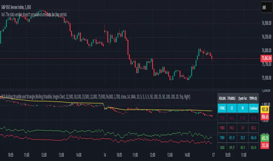
Ladder ATRThis indicator shows the upwards (green) and downward (red) volatility of the market. It is a moving average of the true range values like the ATR indicator does but with a twist! For the upwards volatility, only the green candles are taken into account, and for the downwards only the red candles are.
To the best of my knowledge, this technique had been introduced by HeWhoMustNotBeNamed in his "Supertrend - Ladder ATR" publication where the different types of volatility helped to improve the "trend reversal" conditions compared to the "Supertrend" indicator.
However, the actual "Ladder ATR" values were hard to see. This indicator shows the actual upward and downward volatility making it easy to reason about long and short price moves and potential biases in each direction.
In layman's terms this indicator "Ladder ATR" is to the "Supertrend - Ladder ATR" what the "Average True Range" indicator is to the "Supertrend" indicator.
TriexDev - SuperBuySellTrend (PLUS+)Minimal but powerful.
Have been using this for myself, so thought it would be nice to share publicly. Of course no script is correct 100% of the time, but this is one of if not the best in my basic tools. (This is the expanded/PLUS version)
Github Link for latest/most detailed + tidier documentation
Base Indicator - Script Link
TriexDev - SuperBuySellTrend (SBST+) TradingView Trend Indicator
---
SBST Plus+
Using the "plus" version is optional, if you only want the buy/sell signals - use the "base" version.
## What are vector candles?
Vector Candles (inspired to add from TradersReality/MT4) are candles that are colour coded to indicate higher volumes, and likely flip points / direction changes, or confirmations.
These are based off of PVSRA (Price, Volume, Support, Resistance Analysis).
You can also override the currency that this runs off of, including multiple ones - however adding more may slow things down.
PVSRA - From MT4 source:
Situation "Climax"
Bars with volume >= 200% of the average volume of the 10 previous chart TFs, and bars
where the product of candle spread x candle volume is >= the highest for the 10 previous
chart time TFs.
Default Colours: Bull bars are green and bear bars are red.
Situation "Volume Rising Above Average"
Bars with volume >= 150% of the average volume of the 10 previous chart TFs.
Default Colours: Bull bars are blue and bear are blue-violet.
A blue or purple bar can mean the chart has reached a top or bottom.
High volume bars during a movement can indicate a big movement is coming - or a top/bottom if bulls/bears are unable to break that point - or the volume direction has flipped.
This can also just be a healthy short term movement in the opposite direction - but at times sets obvious trend shifts.
## Volume Tracking
You can shift-click any candle to get the volume of that candle (in the pair token/stock), if you click and drag - you will see the volume for that range.
## Bollinger Bands
Bollinger Bands can be enabled in the settings via the toggle.
Bollinger Bands are designed to discover opportunities that give investors a higher probability of properly identifying when an asset is oversold (bottom lines) or overbought (top lines).
>There are three lines that compose Bollinger Bands: A simple moving average (middle band) and an upper and lower band.
>The upper and lower bands are typically 2 standard deviations +/- from a 20-day simple moving average, but they can be modified.
---
Base Indicator
## What is ATR?
The average true range (ATR) is a technical analysis indicator, which measures market volatility by decomposing the entire range of an asset price for that period.
The true range indicator is taken as the greatest of the following:
- current high - the current low;
- the absolute value of the current high - the previous close;
- and the absolute value of the current low - the previous close.
The ATR is then a moving average, generally using 10/14 days, of the true ranges.
## What does this indicator do?
Uses the ATR and multipliers to help you predict price volatility, ranges and trend direction.
> The buy and sell signals are generated when the indicator starts
plotting either on top of the closing price or below the closing price. A buy signal is generated when the ‘Supertrend’ closes above the price and a sell signal is generated when it closes below the closing price.
> It also suggests that the trend is shifting from descending mode to ascending mode. Contrary to this, when a ‘Supertrend’ closes above the price, it generates a sell signal as the colour of the indicator changes into red.
> A ‘Supertrend’ indicator can be used on equities, futures or forex, or even crypto markets and also on daily, weekly and hourly charts as well, but generally, it will be less effective in a sideways-moving market.
Thanks to KivancOzbilgic who made the original SuperTrend Indicator this was based off
---
## Usage Notes
Two indicators will appear, the default ATR multipliers are already set for what I believe to be perfect for this particular (double indicator) strategy.
If you want to break it yourself (I couldn't find anything that tested more accurately myself), you can do so in the settings once you have added the indicator.
Basic rundown:
- A single Buy/Sell indicator in the dim colour; may be setting a direction change, or just healthy movement.
- When the brighter Buy/Sell indicator appears; it often means that a change in direction (uptrend or downtrend) is confirmed.
---
You can see here, there was a (brighter) green indicator which flipped down then up into a (brighter) red sell indicator which set the downtrend. At the end it looks like it may be starting to break the downtrend - as the price is hitting the trend line. (Would watch for whether it holds above or drops below at that point)
Another example, showing how sometimes it can still be correct but take some time to play out - with some arrow indicators.
Typically I would also look at oscillators, RSI and other things to confirm - but here it held above the trend lines nicely, so it appeared to be rather obvious.
It's worth paying attention to the trend lines and where the candles are sitting.
Once you understand/get a feel for the basics of how it works - it can become a very useful tool in your trading arsenal.
Also works for traditional markets & commodities etc in the same way / using the same ATR multipliers, however of course crypto generally has bigger moves.
---
You can use this and other indicators to confirm likeliness of a direction change prior to the brighter/confirmation one appearing - but just going by the 2nd(brighter) indicators, I have found it to be surprisingly accurate.
Tends to work well on virtually all timeframes, but personally prefer to use it on 5min,15min,1hr, 4hr, daily, weekly. Will still work for shorter/other timeframes, but may be more accurate on mid ones.
---
This will likely be updated as I go / find useful additions that don't convolute things. The base indicator may be updated with some limited / toggle-able features in future also.

OZ Trade IndicatorThis is a simple indicator combining both Pivot Point SuperTrend and Madrid Moving Average Ribbon .
I also added some alerts when:
- Madrid Moving Average are all green (buy) and red (sell) lines.
- Madrid Moving Average MA05 and MA100 crossover (buy) and crossunder (sell)
Aside from this, all are unchanged for both indicators.
Idea:
BUY
- If SuperTrend printed Up
- If Madrid Ribbon lines are Green (🟢)
- If Madrid Ribbon MA05 and MA100 printed Crossover (▲)
SELL
- If SuperTrend printed Down
- If Madrid Ribbon lines are Red (🔴)
- If Madrid Ribbon MA05 and MA100 printed Crossover (🔻)
