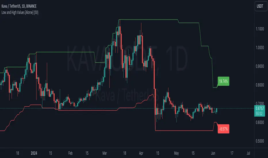
Low and High Values [Alorse]🌟 What does this indicator do?
This magical indicator shows you the lowest (Low) and highest (High) values of the last X candles directly on your chart. Not only that, but it also tells you how much the price has changed from the opening price of the current candle to these key points, all in percentage format. You'll have a clear and precise view of market movement!
🔧 Customize to your liking
Want to adjust the number of candles to consider? No problem! You can easily change this parameter to suit your preference. Whether you like short-term strategies with just a few candles or prefer more extensive analysis with many candles, our indicator adapts to you.
🚀 How can this indicator help you?
Identify Support and Resistance: By showing the lowest and highest points, it helps you identify key support and resistance levels. Perfect for planning your entries and exits!
Trend Analysis: With the percentage labels, you can quickly see how the price has moved relative to recent extremes, helping you confirm trends or anticipate possible reversals.
Trading Strategies: Imagine the price is near a recent low, but the percentage indicates a significant drop from the opening. This could be a buy signal if you expect a rebound. Conversely, if the price is near a recent high with a large percentage increase, you might consider selling.
Calculate Stop Loss: Use this indicator to determine your Stop Loss levels by leaving a bit of margin between the indicator value and your desired SL. This helps protect your positions while allowing for some price fluctuation.
📊 Examples of Use
Intraday Trader: Use the indicator with 10-20 candles to capture quick moves and capitalize on daily fluctuations.
Mid-term Trader: Set the indicator to consider 50 candles for a broader view of trends and reversal points.
Long-term Strategist: Adjust the indicator to 100 candles or more to identify highs and lows over larger time frames.
🛠️ Customizable Parameters
Number of Candles: Define the number of candles the indicator will analyze to calculate the lowest and highest values. It's all up to you!
Cari dalam skrip untuk "support"
Savage MorningMade for those Savage morning where you need to plot your values quicker.
The following section defines several input variables with default values that can be configured by the user:
resistance, weak_resistance, support, weak_support, gap_price, gap_price2, last_close, key_price, key_price1, key_price2, key_price3: These variables represent various price levels such as resistance, support, gap prices, and key levels. Users can input their own values for these levels when adding the indicator to their chart.
Next, there are boolean input variables that control the visibility of each line:
show_res, show_weak_res, show_sup, show_weak_sup, show_gap, show_gap2, show_last_close, show_key, show_key1, show_key2, show_key3: These variables allow users to choose which lines should be displayed on the chart by toggling them on or off.
Following that, there are multiple plot statements. These statements create plot series for each line that may be displayed on the chart. The plot function determines the value to be plotted based on the user's input and the visibility settings:
plot_res, plot_weak_res, plot_sup, plot_weak_sup, plot_gap, plot_gap2, plot_last_close, plot_key, plot_key1, plot_key2, plot_key3: These variables store the values to be plotted for the respective lines based on the user's input and visibility settings.
After defining the plot series, there are multiple plot statements that actually plot the lines on the chart. Each line has its own color and title specified.
Finally, labels are added on the right side of the lines to provide additional information. The label.new function is used to create labels for each line, displaying their names ("Res," "Weak Res," "Sup," etc.) at the corresponding price levels on the chart.
In summary, this Pine Script code creates a custom indicator named "Savage Morning" that allows users to input various price levels and choose which of these levels should be displayed on their chart. It plots these levels as lines with different colors and labels them for easy identification on the chart. The indicator is designed to help traders visualize important price levels and gaps that they have determined for themselves and make it easier for them to plot or change their own levels.

MTF Breakout/RetestIntroducing the MTF (Multi Timeframe) Breakout and Retest Indicator:
This indicator is designed to enhance your trading strategy by providing a clear view of support and resistance levels across multiple timeframes. What this simply means is that you can input your levels, and be on a lower timeframe such as the 1 minute timeframe, and are able to see when your support or resistance level has a breakout
📈 Short Trade Breakout Condition:
- Definition: A short breakout occurs when a candle closes below your specified support level on any chosen timeframe.
- Confirmation: It confirms as a valid short signal when a second candle closes below the support level without retesting.
- Visual Clarity: The indicator highlights the timeframe in which this breakout has occurred.
(Long conditions are same but reversed, and will be displayed in color green)
📊 Multi-Timeframe Insights:
- Scope: You can analyze support and resistance levels across various timeframes, including 5, 15, 30, and 60 minutes, while trading on a lower timeframe like 1 minute.
🎨 Dynamic Color-Coding:
- Visual Signaling: The indicator employs color-coding to visually signal breakout events. When a short breakout occurs on any timeframe the timeframe color will highlight red, and vice versa for long will highlight green. The physical line will change color based on the current timeframe you are viewing
- Real-Time Tracking: Colors reset when a level is retested, helping you track market sentiment in real-time.
🪙 Need Your Help
- I am still very much new to coding, and this code is clearly not optimized well. This code was mainly the based idea, and over the next coming months I will be working to enhance the code but I need tradingview help. If you are a coder and see a way to optimize this code please please let me know :)

Yearly Open LevelsThis script is a custom indicator for TradingView that shows the yearly open price levels on a chart. It differs from other scripts as it plots a single line for each year, showing the open price for that year, and labels the line with the year and open price. This indicator can be useful for identifying key levels of support and resistance based on the yearly open price.
To use this indicator, you need to add it to your TradingView chart and adjust the input parameters, such as the starting year and color. The script will then automatically plot lines and labels for each year's open price.
This script can be used in any market that has a yearly open price, such as stocks, futures, forex, and cryptocurrencies. However, it may be most useful in markets that tend to have significant year-to-year price movements, as it can help identify important levels of support and resistance. It may also be most effective in markets with a clear yearly cycle, such as those that tend to be influenced by seasonal factors.

All time Fibonacci [ Unlimited ]This indicator can help traders identify key support and resistance levels based on Fibonacci retracements. By displaying these levels on a chart, traders can use them to make informed trading decisions.

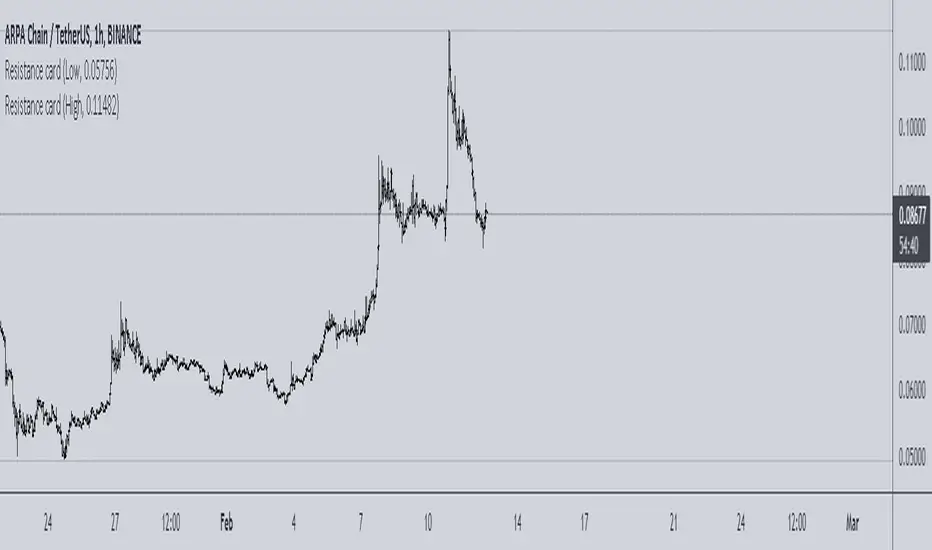
Resistance cardThis is very simple resistance card that you can make. It is recommended to be used on Daily time frame.
How to Use:
If you want to find Resistance levels (above current price), Get the pivot Low value and input in indicator settings. As you are using Low select "Low" in indicator settings, this will draw resistance lines.
If you want to find Support levels (Below current price), Get the pivot High value and input in indicator settings. As you are using Low select "High" in indicator settings, this will draw Support lines.
Magnum PivotsThis script will automatically plot levels for ES and the NQ, which this script is ONLY meant for. It will take the overnight highs and lows, from 6pm to 6am EST, and subtract/add 110 for NQ and 33 for ES, add a middle line that is the average of those two lines, and then deviations inbetween, built in support for up to 7, of deviation lines (13.75 point difference for each value on the NQ, and 4 for the ES). This lines become support/resistance depending on price action.

Margin buying pressure levelsPredicts local tops and resistance levels. Simply enter a strong support level (Settings > Liquidation Support Level), and this indicator shows you levels where margin buying pressure is likely to drop off. This is based off of the assumption that leveraged traders will likely want their liquidation point protected below a strong support level.
2x - blue
3x - green
4x - yellow
5x - orange
10x - red

Wick Structure FinderFor those who trade structure based support and resistance methods from wicks.
Useful for break and retest trading methods. Mark out the zone and look for S/R flips.
Calculation uses 3 wicks that are next to each other to spot structure.
Includes optional filter for filtering wicks smaller than the average over X previous periods.
S&R study of different MAs and lengthsThis is a study on different moving averages across different lenghts to see which lengths or ma types have the most S&R action on them.
In the data window you can see the number of support and resistance instances for each length divided by the number of price crosses of the ma
Also you can see in time adjusted which % of the time that line acted as a S&R
Then it lets you select the best MA and length and see with the bar colors the areas where it behaved as S&R or when it didn't

sDEFI Synthetix ExchangeTradingView allows combining/summing up to a maximum of only 10 tickers in its search field. Their support staff suggested I could combine up to 40 by using Pine Script, so here it is, for a specific 'basket' of crypto tokens.
This study displays the combination of price history for Synthetix Exchange’s sDEFI index.
Tokens included in the index are COMP, MKR, KNC, SNX, ZRX, REP, LEND, REN, LRC, BNT, BAL and UMA. You will see the prices only go back as far as July 31st 2020, which is when the most recent of the compilation (UMA) started its trading history on TradingView. (The study can only display prices for days that *all* the tickers were trading.)
The price history will display as a study, below an existing chart. You will need to resize the windows, to see this study at a larger size. (Grab the window border and move it up, once you have added this study to a chart)
Unfortunately you will not be able to interact with it like a normal chart, i.e. drawing trendlines, adding moving averages, notes or annotations, etc.
May I suggest you send a support request to TradingView, asking for them to allow us to enter more than 10 (perhaps up to 40) tickers with + symbol between them, in the search field, which gives a ‘proper’ chart to analyse?
Please note that when publishing this script, I was required to choose a category from a list that does not contain a relevant category. Given that I had to choose something from the list to proceed, I used 'Support and Resistance', since chartists can see S and R levels by looking at this study.
I trust this study is useful for you sDEFI traders.

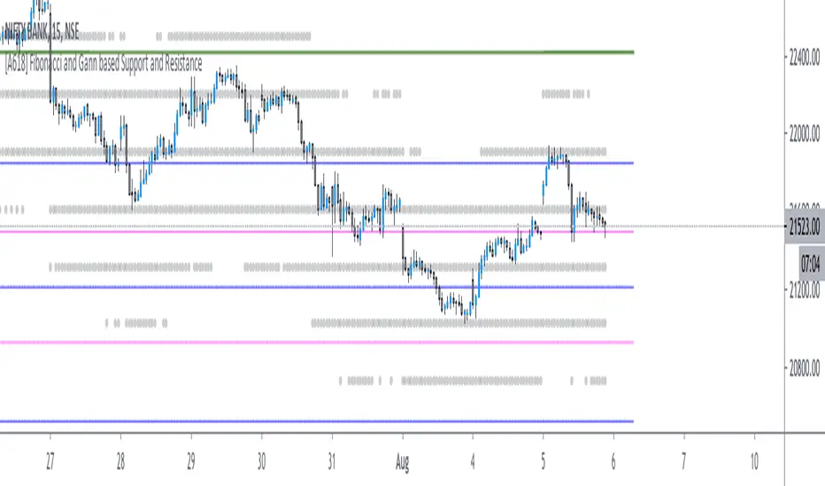
[A618] Fibonacci and Gann based Support and ResistanceThe scripts plots,
Gann and Fibonacci Levels onto the charts taking into account the price action of past 1 year,
The plots are plotted dynamically
Enjoy !
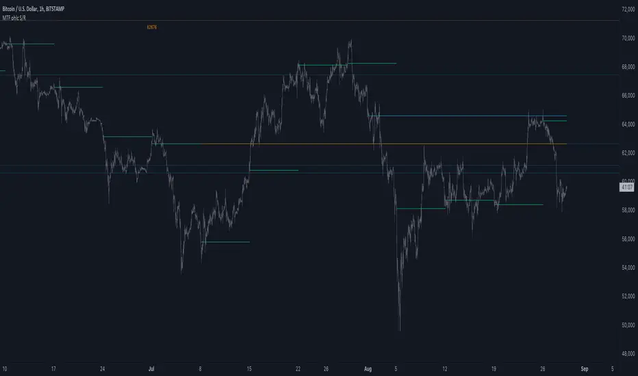
MTF ohlc S/RA very simple idea, a close (or high, low, ohlc4 or open) from a higher Time Frame
will give future Support/Resistance area's
In this example of BTC/USD we see:
- Yearly close 2017 gave Resistance in June 2019
- Yearly close 2018 gave Support in March 2020
We are now pushing to the Resistance of Yearly close 2019...
Since there is a limit for the amount of lines (since it is just too much if everything is plotted)
there are different options:
- 4 different Time Frames, each can be enabled/disabled,
- TF can be chosen,
- source can be changed (close, open, high, low, ohlc4)
- Period can be changed, for example TF Month:
You can choose just to show a particular year, Month,...
You also can choose between which prices you want to see lines,
for example Monthly close, since the beginning till now, but only between $6000 - $8000:
This helps to know the closest S/R around the present price
Other example:
- Lines can be extended to the right, or not
- Labels can be enabled/disabled:
- Linewidth and brightness of the line can be changed, also the style (solid, dashed or dotted line)
Default only 2 very high TF's are enabled (3 Month = one quarter, and 1 Year)
The 3 Month has a dotted line, which helps distinguish the line against the yearly line
- Prices above 1000 are rounded since it seems distracting to see for example 6478,878654,
seems better just to see 6479, prices below 1000 are just seen as intended
Have fun!
S/R Barry, extended by PeterOSimple script showing S/R lines.
I have extended this script
What have I added precisely? I extended S/R lines. Now there are 2 most recent support lines and 2 most recent resistance lines visible on the chart at all times.
Original S/R Barry script showed only 1 support and 1 resistance lines at a time. So it was showing where the price reversed, but didn't provide value in "retest" situation. Extended version is aimed at working with these "retests".
Enjoy!
highs and lowsThis system allow you to detect the highs and the lows based on open and close and donchian channel
with this system you can easy find the resistance and the support level
good from 4 hour chart to 5 min chart
The black line are the 10% margin which you can use as you exit point or your stop once we find a low by the donochian cahannel
The system try to help you to find the target of your take profit once you decided to go either short or long
There is no alerts but they can be added if one wish to do it
one can add TP to it or change settings as he wish if want to play with code. I keep it as idea only
main scripts are made from scripts that are open in TV
15 min graph
4 hour graph
Wave Trend Arrows [Salty]This is just like WT_LB, but with arrows that increase in size to show cross over points. The larger down arrows indicate resistance for overbought levels, and the larger up arrows indicate support for oversold levels.

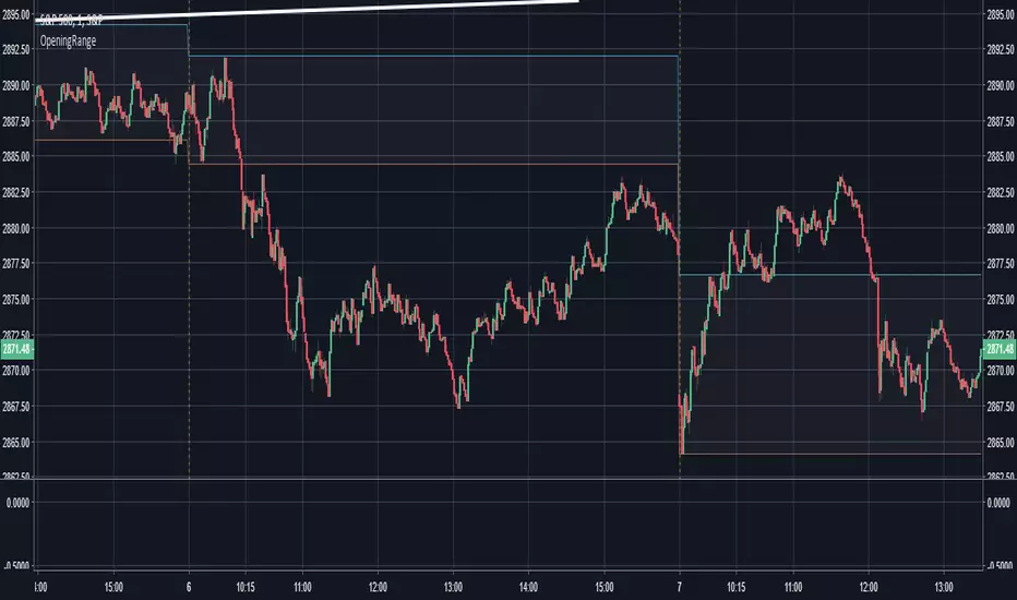
Opening Range - 30m range based on Chris Moody'sThis is a very simple 30-minute opening range script based on Chris Moody's.
It simply highlights the high and low of the opening 30-minutes of trading on a day chart.
This high/low often holds as the range for the day, or can signify an early breakout, often acting as support/resistance once the breakout occurs.
Pivot S/RThis support/resistance indicator draws a horizontal line at historical Daily swing points.
I've found this to be a very accurate indicator for determining current levels of support and resistance. Double lines and clusters of lines provide particularly strong levels.
Most of the settings are changeable.

open_is_low(VOL)Like market profile VPOC, the Virgin Open_is_Low (VOL) is a Point of Control below which price has not closed in past.
Once price closes below VOL the indicator would not paint further.
This indicator will act as Support and Resistance.

open_is_high(VOH)
Like market profile VPOC, the Virgin Open_is_High (VOH) is a Point of Control above which price has not closed in past.
Once price closes above VOH the indicator would not paint further.
This indicator will act as Support and Resistance.

open_is_high(VOH)
Like market profile VPOC, the Virgin Open_is_High (VPOC) is a Point of Control above which price has not closed in past.
Once price closes above VOH the indicator would not paint further.
This indicator will act as Support and Resistance.

Fibline GlanceThis is a set of three indicators combined into one script. The source of the three indicators comes from the tradingview user fibline (www.tradingview.com). The lines remind me of ichimoku, because at a glance, you can tell what the stock is up to. To me, the orange line does an excellent job of showing support and resistance. I'd be happy to add more to the script if anyone has any ideas.
See one of his charts:

Profit target areaUpdate.
- you can specify count of bars used to detect reversal pattern
- you can specify count of bars used to determine lowest or highest price to place support or resistance
- area between lines is filled by green - ascending, red - descending trend
To trade:
- open position using stop command on S/R
- close position using limit command on retracement line
- close position when background colour indicates trend change
(erratum: last balloon on right should say "buy limit")
