Simultaneous INSIDE Bar Break IndicatorSimultaneous Inside Bar Break Indicator (SIBBI) for The Strat Community
Overview:
The Simultaneous Inside Bar Break Indicator (SIBBI) is designed to help traders using The Strat methodology identify one of the most powerful breakout patterns: the Simultaneous Inside Bar Break across multiple symbols. This indicator detects when all four user-selected symbols form inside bars on the previous candle and then break those inside bars in the same direction (either bullish or bearish) on the current candle.
Inside bars represent consolidation periods where price action does not break the high or low of the previous candle. When a simultaneous break occurs across multiple symbols, this often signals a strong move in the market, making this a key actionable signal in The Strat trading strategy.
Key Features:
Multi-Symbol Analysis: You can track up to four different symbols simultaneously. By default, the indicator comes with SPY, QQQ, IWM, and DIA, but you can modify these to track any other assets or symbols.
Inside Bar Detection: The indicator checks whether all four symbols have inside bars on the previous candle. It only triggers when all symbols meet this condition, making it a highly specific and reliable signal.
Simultaneous Break Detection: Once all symbols have inside bars, the indicator waits for a breakout in the same direction across all four symbols. A simultaneous bullish break (prices breaking above the previous candle’s high) triggers a green label, while a simultaneous bearish break (prices breaking below the previous candle’s low) triggers a red label.
Dynamic Label Timeframe: The indicator dynamically adjusts the timeframe in the label based on the user’s selected timeframe. This allows traders to know precisely which timeframe the break is occurring on. If the user selects "Chart Timeframe," the indicator will evolve with the current chart's timeframe, making it more versatile.
Timeframe Flexibility: The indicator can be set to analyze any timeframe—15-minute, 30-minute, 60-minute, daily, weekly, and so on. It only works for the specific timeframe you set it to in the settings. If set to "Chart Timeframe," the label will adapt dynamically based on the timeframe you are currently viewing.
Customizable Labels: The user can choose the size of the labels (tiny, small, or normal), ensuring that the visual output is tailored to individual preferences and chart layouts.
Best Use Case:
The Simultaneous Inside Bar Break Indicator is particularly powerful when applied to multiple timeframes. Here’s how to use it for maximum impact:
Multi-Timeframe Setup: Set the indicator on various timeframes (e.g., 15-minute, 30-minute, 60-minute, and daily) across multiple charts. This allows you to monitor different timeframes and identify when lower timeframe breaks trigger potential moves on higher timeframes.
Anticipating Strong Moves: When a simultaneous inside bar break occurs on one timeframe (e.g., 30-minute), keep an eye on the higher timeframes (e.g., 60-minute or daily) to see if those timeframes also break. This stacking of inside bar breaks can signal powerful market moves.
Higher Conviction Signals: The indicator is designed to provide high-conviction signals. Since it requires all four symbols to break in the same direction simultaneously, it reduces false signals and focuses on higher probability setups, which is crucial for traders using The Strat to time their trades effectively.
How the Indicator Works:
Inside Bar Formation: The indicator first checks that all four selected symbols had inside bars in the previous bar (i.e., the current high and low are contained within the previous bar’s high and low).
Simultaneous Break Detection: After detecting inside bars, the indicator checks if all four symbols break out in the same direction—bullish (breaking above the previous bar’s high) or bearish (breaking below the previous bar’s low).
Label Display: When a simultaneous inside bar break occurs, a label is plotted on the chart—either green for a bullish break (below the candle) or red for a bearish break (above the candle). The label will display the timeframe you set in the settings (e.g., "IBSB 60" for a 60-minute break).
Chart Timeframe Option: If you prefer, you can set the indicator to evolve with the chart’s current timeframe. In this mode, the label will not show a specific timeframe but will still display the simultaneous inside bar break when it occurs.
Recommendations for Usage:
Focus on Multiple Timeframes: The Strat methodology is all about understanding the relationship between different timeframes. Use this indicator on multiple timeframes to get a better picture of potential moves.
Pair with Other Strat Techniques: This indicator is most powerful when combined with other Strat tools, such as broadening formations, timeframe continuity, and actionable signals (e.g., 2-2 reversals). The simultaneous inside bar break can help confirm or invalidate other signals.
Customize Symbols and Timeframes: Although the default symbols are SPY, QQQ, IWM, and DIA, feel free to replace them with symbols more relevant to your trading. This indicator works well across equities, indices, futures, and forex pairs.
How to Set It Up:
Select Symbols: Choose four symbols that you want to track. These can be index ETFs (like SPY and QQQ), individual stocks, or any other tradable instruments.
Set Timeframe: In the indicator’s settings, choose a specific timeframe (e.g., 15-minute, 30-minute, daily). The label will reflect the selected timeframe, making it clear which time-based break you are seeing.
Optional - Chart Timeframe Mode: If you want the indicator to adapt to the chart’s current timeframe, select the "Chart Timeframe" option in the settings. The indicator will plot the breaks without showing a specific timeframe in the label.
Customize Label Size: Depending on your chart layout and personal preference, you can adjust the size of the labels (tiny, small, or normal) in the settings.
Conclusion:
The Simultaneous Inside Bar Break Indicator is a powerful tool for traders using The Strat methodology, offering a highly specific and reliable signal that can indicate potential large market moves. By monitoring multiple symbols and timeframes, you can gain deeper insight into the market's behavior and act with greater confidence. This indicator is ideal for traders looking to catch high-conviction moves and align their trades with broader market continuity.
Note: The indicator works best when paired with multi-timeframe analysis, allowing you to see how breaks on lower timeframes might influence larger trends. For traders who prefer simplicity, setting it to the "Chart Timeframe" mode offers flexibility while maintaining the core benefits of this indicator.
Cari dalam skrip untuk "track"
Global Market Cap of all measuable assets# Comprehensive Global Market Cap Overview
This indicator provides a dynamic, real-time estimate of the total global market value across multiple asset classes and economic sectors. It aims to give traders and analysts a broad perspective on the state of global markets and wealth.
## Features:
- Real-time data for major market segments including stocks, bonds, real estate, cryptocurrencies, and commodities
- Estimates for hard-to-quantify sectors like derivatives, private equity, and OTC markets
- Includes often-overlooked categories such as cash deposits, insurance markets, and natural resources
- Static estimates for art/collectibles and intellectual property
- Total global value calculation and breakdown by category
- Easy-to-read table display of all categories
## Categories Tracked:
1. Global Stock Market
2. Global Bond Market
3. Real Estate
4. Cryptocurrencies
5. Commodities
6. Derivatives Market
7. Private Equity and Venture Capital
8. Cash and Bank Deposits
9. Insurance Markets
10. Sovereign Wealth Funds
11. OTC Markets
12. Natural Resources
13. Art and Collectibles
14. Intellectual Property
## Data Sources:
- Uses popular ETFs and indices as proxies for global markets where possible
- Incorporates data from specific company stocks to represent certain markets (e.g., CME for derivatives, OTCM for OTC markets)
- Utilizes FRED data for bank deposits
- Includes static estimates for categories without reliable real-time data sources
## Notes:
- All values are approximate and should be used for general perspective rather than precise financial analysis
- Some categories use scaled proxy data, which may not perfectly represent global totals
- Static estimates are used where real-time data is unavailable and should be updated periodically
- The total global value includes human capital but this is not displayed in the table due to its speculative nature
This indicator is designed to provide a comprehensive overview of global market value, going beyond traditional market capitalization metrics. It's ideal for traders, researchers, and anyone interested in gaining a broader understanding of global wealth distribution across various sectors.
Please note that due to the complexity of global markets and limitations in data availability, all figures should be considered estimates and used as part of a broader analysis rather than as definitive values.
Temporal Value Tracker: Inception-to-Present Inflation Lens!What we're looking at here is a chart that does more than just display the price of gold. It offers us a time-traveling perspective on value. The blue line, that's our nominal price—it's the straightforward market price of gold over time. But it's the red line that takes us on a deeper journey. This line adjusts the nominal price for inflation, showing us the real purchasing power of gold.
Now, when we talk about 'real value,' we're not just philosophizing. We're anchoring our prices to a point in time when the journey began—let's say when gold trading started on the markets, or any inception point we choose. By 'shadowing' certain years—say, from the 1970s when the gold standard was abandoned—we can adjust this chart to reflect what the inflation-adjusted price means since that key moment in history.
By doing so, we're effectively isolating our view to start from that pivotal year, giving us insight into how gold, or indeed any asset, has held up against the backdrop of economic changes, policy shifts, and the inevitable rise in the cost of living. If you're analyzing a stock index like the S&P 500, you might begin your inflation-adjusted view from the index's inception date, which allows you to measure the true growth of the market basket from the moment it started.
This adjustment isn't just academic. It influences how we perceive value and growth. Consider a period where the nominal price skyrockets. We might toast to our brilliance in investment! But if the inflation-adjusted line lags, what we're seeing is nominal growth without real gains. On the other hand, if our red line outpaces the blue even during stagnant market periods, we're witnessing real growth—our asset is outperforming the eroding effects of inflation.
Every asset class can be evaluated this way. Stocks, bonds, real estate—they all have their historical narratives, and inflation adjustment tells us if these stories are tales of genuine growth or illusions masked by inflation.
So, as informed traders and investors, we need to keep our eyes on this inflation-adjusted line. It's our measure against the silent thief that is inflation. It ensures we're not just keeping up with the Joneses of the market, but actually outpacing them, building real wealth over time

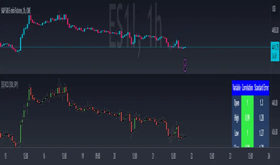
Regression Candle Conversion IndicatorHey everyone!
I got a pseudo-request a while ago for something like this, essentially the ability to track where another ticker would fall based on an alternative ticker.
I did create my ticker correlation reference indicator which directly looks at the correlation between 2 tickers. However, this is an indicator that operates on the same principle but is more pragmatic for trading.
What does it do?
Well, in keeping with the theme of what I call my indicators, this has a title that explains exactly what it does, "Regression Candle Conversion Indicator" or "RCCI" for short. It uses simple regression to convert one ticker to another. So while you are tracking one indicator, you can see where the expected value should fall on the other.
Applications?
The big application of this for me is being able to track where SPY/QQQ or IWM is falling during overnight trading sessions. Extended trading hours close at 8 pm NYSE time. After that, you have to guess where futures prices will put the ETF version of it. This indicator will allow you to track where, theoretically, the underlying ETF ticker will fall based on the current trading behaviour.
Some other applications are just the ability to track how similar or dissimilar one stock is to the other. For example, if we wanted to trade, say, Boeing using shares of DFEN or ITA (a defence specific ETF), here is what we get:
In the chart above we can see BA as the primary chart and ITA as the RCCI converted chart. We will see 2 major things that should cause us concern.
First, there is a really poor correlation between the two tickers. This indicates that ITA may not produce the best exposure if I am directly looking for Boeing exposure.
Second, there is a wide standard error. this means that the results that the RCCI is providing may be skewed up to +/- 2 points (as indicated by the standard error chart).
Let's take a look at BA and DFEN:
In the above, we can see that the correlation is not great, but the standard error is quite low.
This means that, while this may not be the best ticker for Boeing exposure, the RCCI is able to confidently calculate the ticker within +/- 0.50 cents based on BA's underlying data.
However, its important to note that it is not advisable to really rely on these results if the correlation is less than + 0.5 or greater than -0.5.
Let's take a look at a few more examples:
Above we have BA (NYSE) vs BA (NEO TSX CAD Hedged). We can see the strong relationship and high confidence calculations.
And some others:
SPX (primary) and ES1! (secondary):
RTY and IWM:
ES1! and SPY:
Customizations:
As you can see above, it is pretty straight forward. There are 3 options:
Lookback Length: Determines the length of assessment for correlation and the regression assessment.
Manual Ticker Input: The indicator will pull the data from your current chart and compare it against a manually selected indicator. You must tell the indicator which ticker you are comparing against.
Data Table: This will show you the data table which contains the standard error assessment and the correlation assessment. These are determined by your lookback length. The lookback length is defaulted to 500.
And that's the indicator! It's pretty straight forward. Hopefully you find it helpful, especially if you track futures during overnight sessions.
Leave your comments/questions and feedback below.
Thanks for checking it out!
Automated Anchored VWAPThis was reasonably easy to put together and I can't find one that does this in the Library and I've been wanting one. Of course, the drawing tool is just fantastic, but sometimes it can be forgotten as new pivots emerge.
What you'll find elsewhere in the Library is a nice variety of fancier methods for determining an anchor point with labels, lines, timestamps and standard deviations.
This is just a simple script to pull the Anchored VWAP off of the most recent pivot and update that as new pivots become defined.
I wanted it to be really portable so it could easily work into other things you're working on while also keeping the chart reasonably clean.
The way this functions is as follows: A new pivot is found and VWAP is calculated from it. At that point the prior aVWAP is no longer tracked and it picks up from the new pivot .
Of course this means that the plot doesn't generate until the pivot is actually confirmed, which in turn means that the plot doesn't reach back to the pivot , it begins based on whatever "right bars" period you end up choosing.
I kind of like it that way, because you have your eyes on the one that matters until the new one matters.
The downside is that it doesn't track old pivots . The old aVWAP might still be in play. But if you track all of the old one's you'll have a 100 lines on your chart and no one wants that.
I recommend when you look back and think the old one is still in play, use the drawing tool to keep it on the chart.
Otherwise, let the script do the work for you.
Hope its helpful. Let me know what you think should be done to make it better.

[turpsy] Midnight Opening Range-Fractal Midnight Open Range-Fractal Combined Trading System
Overview
This indicator combines Midnight Opening Range (MOR) analysis with HTF candle structure and fractal patterns to provide a comprehensive intraday trading framework. Unlike simple mashups, this system integrates three complementary methodologies that work together to identify high-probability trading zones.
Core Components & Synergy
1. MOR (Midnight Opening Range) Indicator
- Tracks the first 30 minutes of each trading day (00:00-00:30)
- Draws historical and current session boxes with quartile levels (25%, 50%, 75%)
- Custom opening price lines for key market times (NY Open 9:30, London Close, etc.)
- Concept:
Price tends to respect the opening range boundaries; quartiles act as support/resistance
2. HTF (Higher Timeframe) Candles
- Displays up to 6 higher timeframe candles alongside your chart
- Shows Fair Value Gaps (FVG) and Volume Imbalances (VI)
- Presents First Presented FVG (PFVG) - the initial gap after a fractal
- Concept:
HTF structure provides context for LTF entries; FVGs are magnetic price targets
3. Fractal Pattern Detection with CISD
- Identifies swing highs/lows using HTF candle structure
- CISD (Change in State of Delivery) lines mark confirmed fractal breaks
- Chart sweeps show liquidity grabs
- Concept: Fractals mark key market structure; CISD confirms directional bias
4. Killzones & Session Analysis
- Asia, London, NewYork AM/PM, and Lunch sessions
- Session highs/lows with pivot tracking
- Day/Week/Month opens and separators
- Concept: Specific sessions show characteristic volatility and directional behavior
5. ADR/CDR Analysis
- Average Daily Range and Current Daily Range tracking
- Shows percentage of ADR completed
- Concept: Helps gauge if there's room for continuation or if exhaustion is likely
How They Work Together
1. Context: It uses HTF candles and MOR boxes to identify the bigger picture structure
2. Timing: It uses Killzones to show when institutional activity is highest
3. Entry: It uses Fractals with CISD confirm structure breaks; FVGs provide entry zones
4. Risk Management: ADR/CDR helps set realistic profit targets and assess if move is extended
Original Contributions
This script significantly improves upon the base components by:
- Integrating 1-minute data feed for accurate Midnight Open Range calculations on all timeframes
- Adding PFVG detection synchronized with fractal patterns
- Creating logarithmic midpoint calculations between HTF candles
- Implementing chart sweep detection for liquidity analysis
- Adding CISD projection lines at 0.5, 1.0, 1.5, 2.0 extensions
How to Use
1. Enable desired HTF timeframes and MOR settings
2. Watch for PFVG formation after HTF candle closes
3. Look for CISD line breaks during killzone sessions
4. Enter at FVG mitigation zones aligned with MOR quartiles
5. Monitor ADR% to gauge move potential
Credits
- HTF Candles base structure: fadizeidan & tradeforopp
- Midnight opening range: trades-dont-lie
- I made the Significant modifications and integration

BTC - Cycle Integrity Index (CII) BTC - Cycle Integrity Index (CII) | RM
Are we following a calendar or a capital flow? Is the Halving still the heartbeat of Bitcoin, or has the institutional "Engine" taken over?
The most polarized debate in the digital asset space today centers on a single question: Is the 4-year Halving Cycle dead? While some market participants wait for a pre-ordained calendar countdown, the reality of 2026 suggests that visual guesswork is no longer sufficient. As institutional gravity takes hold, we cannot rely on the simple "Clock" of the past. Instead, we must audit the Integrity of the present.
The Cycle Integrity Index (CII) was engineered to move beyond simple price action and provide a clinical answer to the market's biggest mystery: "Is this trend supported by structural substance, or is it merely speculative foam?" By aggregating eight diverse Pillars into a single 0-100% score, this model uses Gaussian Distributions and Sigmoid Normalization to distinguish between professional accumulation and retail-driven chaos. We aren't guessing where we are in a cycle; we are measuring the internal health of the asset's engine in real-time.
Why these 8 Pillars?
The CII does not rely on a single indicator because the "New Era" of Bitcoin is multi-dimensional. To capture the full picture, I selected eight specific pillars that cover the three layers of market truth:
• The Capital Layer: Global Liquidity (M2) and ETF Flows (Wall Street Absorption).
• The Network Layer: Mining Difficulty and Security Backbone expansion.
• The Sentiment Layer: Long-Term Holder conviction, Valuation Heat (MVRV), and Corporate Adoption (MSTR). While alternatives like the Pi Cycle or RSI exist, they are often "one-dimensional." The CII is a synthesis—a modular engine where every part validates the others.
How the Calculation Works
The CII is a sophisticated model for Bitcoin. It aggregates 8 diverse pillars into a single 0-100% score in the following way:
• Mathematical Normalization: We don't just use raw prices. We use Gaussian Distributions to find "Institutional DNA" in drawdowns and Sigmoid (S-Curve) functions to score volatility and valuation.
• Dynamic Weighting: The index is modular. If a data source (like a specific on-chain metric) is toggled off, the engine automatically redistributes the weight among the active sensors so the final integrity score is always balanced to 100%.
• Multi-Source Integration: The script pulls from Global Liquidity (M2), ETF flows, Corporate Treasury premiums (MSTR), and Network Difficulty to create a truly "Full-Stack" view of the asset.
The 8 Pillars of Integrity
Pillar 1: Drawdown DNA The "Identity Crisis" Filter
• Concept: Audits the depth of corrections to distinguish between "Institutional Floors" and "Retail Panics."
• Logic: Historically, retail crashes reached -80%, while institutions view -20% to -25% as primary value entries.
• Implementation: Uses a Gaussian (Normal) Distribution centered at -25%. Scores of 10/10 are awarded for holding institutional targets; scores decay as drawdowns accelerate toward legacy "crash" levels.
Basis: DNA Drawdown
Pillar 2: Volatility Regime The "Smoothness" Audit
• Concept: Measures the "vibration" of the trend. High-integrity moves are characterized by "smooth" price action.
• Logic: Erratic volatility signals speculative bubbles; consistent "volatility clusters" indicate professional trend-following.
• Implementation: Calculates a Z-Score of the 14-day ATR against a 100-day benchmark. This is passed through a Sigmoid function to penalize "chaotic" price shocks while rewarding stability.
Basis: RVPM
Pillar 3: Liquidity Sync (Global M2) The Macro Heartbeat
• Concept: Audits whether price growth is fueled by monetary expansion or internal speculative leverage.
• Logic: True cycle integrity requires a positive correlation between Central Bank balance sheets and price action.
• Implementation: Aggregates a custom Global Liquidity Proxy (Fed, RRP, TGA, PBoC, ECB, BoJ). It measures the Pearson Correlation between BTC and M2 with a standardized 80-day transmission lag.
Basis: Liquisync
Pillar 4: ETF Absorption (Wall Street Entry) The "Cost Basis" Defense
• Concept: Tracks the aggregate institutional cost-basis since the January 2024 Spot ETF launch.
• Logic: Integrity is high when the "Wall Street Floor" is defended; it fails when the aggregate position is underwater.
• Implementation: A Cumulative VWAP engine tracking the "Big 3" (IBIT, FBTC, BITB). Scoring decays based on the percentage distance the price drifts below this institutional average entry.
Basis: Institutional Cost Corridor
Note: Turning this to OFF will significantly expand the timeframe of the indicator on the chart (otherwise it will just start in 2024)
Pillar 5: LTH Dormancy (Conviction) The HODL Floor Audit
• Concept: Monitors the conviction of Long-Term Holders (LTH) to identify supply-side constraints.
• Logic: Sustainable cycles require stable or increasing 1Y+ dormant supply; rapid "thawing" signals distribution.
• Implementation: Uses Min-Max Normalization on the Active 1Y Supply over a 252-day window. A score of 10/10 indicates peak annual holding conviction.
Basis: RHODL Proxy & VDD Multiple
Pillar 6: Valuation Intensity The MVRV Heat Map
• Concept: Measures market "overheat" by comparing Market Value to Realized Value.
• Logic: High integrity trends rise steadily; vertical spikes in MVRV indicate "speculative foam" and bubble risk.
• Implementation: Performs a Relative Rank Analysis of the MVRV Ratio over a 730-day window, passed through a high-steepness Sigmoid curve to identify extreme valuation anomalies.
Pillar 7: Miner Stress The Security Backbone
• Concept: Tracks Mining Difficulty to ensure network infrastructure is expanding alongside price.
• Logic: Difficulty expansion signals health; drops in difficulty (Miner Stress) signal capitulation and sell-side pressure.
• Implementation: Monitors the 30-day Rate of Change (ROC) of Global Mining Difficulty. Maintains a 10/10 score during expansion; decays rapidly during network contraction.
Pillar 8: Corporate Adoption The MSTR NAV Proxy
• Concept: Audits the MicroStrategy (MSTR) premium as a barometer for institutional demand.
• Logic: A high premium indicates a willingness to pay a "convenience fee" for BTC exposure; a collapsing premium signals waning appetite.
• Implementation: Calculates the Adjusted Enterprise Value (Market Cap + Debt - Cash) relative to the Net Asset Value (NAV) of its BTC holdings.
Note1: Debt and share parameters are user-adjustable to maintain accuracy as corporate balance sheets evolve.
Note2: I just included this because I was curious about the mNAV calculation I saw in other scripts, where the printed value often does not match exactly the propagated value from the MSTR page itself. Hence, for my live calculation, we calculate the Adjusted Enterprise Value to find the "Market NAV" (mNAV). Unlike simpler scripts that only look at Market Cap vs. Bitcoin holdings, our engine accounts for the Capital Structure . We explicitly factor in the corporate debt (approx. $8.24B long-term + $7.95B convertible notes) and subtract the cash reserves (approx. $2.18B) to find the true cost Wall Street is paying for the underlying Bitcoin. Since this will ran "old" very quickly, I recommend to update in the code by yourself from time to time, or just de-select this parameter.
Interpretation Guide
• Score 100% (The Perfect Storm): This represents a state of "Maximum Integrity." All 8 pillars are in perfect institutional alignment—liquidity is surging, conviction is at yearly highs, and price action is perfectly smooth. This is the hallmark of a healthy, structural parabolic run.
• 75% - 100% (High Integrity): Robust trend. Price is supported by structural demand and macro tailwinds.
• 35% - 75% (Equilibrium): Transition zone. The market is digesting gains or waiting for a new liquidity pulse.
• 0% - 35% (Fragile): Speculative foam. Structural support has failed.
• Score 0% (The Ghost Trend): Absolute structural failure. All pillars (liquidity, miners, LTH, ETFs) have broken down. Note: Due to the robust nature of the Bitcoin network, the index naturally floors around 20-30% during deep bear markets, as specific pillars (like Miner Security) rarely drop to zero.
To provide a complete experience, I have included the Cycle Triad —a visualization layer consisting of the Halving, Ideal Peak, and Ideal Low. It is important to understand the role of this feature:
• Benchmark Only (Not Calculated): The Triad is based purely on historical evidence from previous Bitcoin epochs. While the Halving is fixed anyway, the "Ideal Peak" or "Ideal Low" are not calculated or computed by the 8 pillars. These are user-adjustable temporal anchors drawn on the chart to provide a static map of the "Legacy 4-Year Cycle."
• The Temporal Audit: The power of the CII lies in comparing the Engine (the 8 Pillars) against the Clock (the Triad) . By overlaying historical time-windows on top of our integrity math, we can see if the "New Era" is currently ahead of, behind, or perfectly in sync with the past.
• The "Peak Divergence" Logic: Based on the specific models selected for this ECU—specifically Volatility Decay and Valuation Heat —traders will notice that a cycle peak often coincides with a low integrity score (Red Zone) . While the index measures structural health, a low score is a byproduct of a market that has become "too hot to handle."
• Regime Detection: Although the primary goal is to audit the "New Era," the CII is highly effective at detecting overheated regimes. When the score drops toward the 25–35% range, the structural floor is giving way to speculative foam—making it a dual-purpose tool for both cycle analysis and risk management.
Dashboard Calibration & Settings
Cycle Triad Calibration
• Ideal Peak/Trough Window: Defines the historical "Average Days" from a Halving to the cycle top and bottom. This sets the vertical anchors for the Halving, Peak, and Low labels.
• Show Cycle Triad: A master toggle to enable or disable the temporal lines and labels on your dashboard.
The CII Master ECU is fully modular. You can toggle individual pillars ON/OFF to focus on specific market dimensions, and calibrate the sensitivity of each sensor to match your strategic bias.
• P1: Drawdown DNA Lookback (Weeks): Defines the window for the "Rolling High." Inst. Target (%): The specific percentage drawdown you define as "Institutional Support" (e.g., -25%).
• P2: Volatility Regime Benchmark (Days): The historical window used to define "Normal" vs. "Abnormal" volatility.
• P3: Liquidity Sync Corr. Window (Bars): The lookback for the Pearson Correlation calculation. Transmission Lag (Bars): The delay (standard 80 days) for Central Bank M2 to hit price.
• P4: ETF Absorption FBTC Ticker: The data source for the ETF volume audit (Default: CBOE:FBTC).
• P5: LTH Dormancy LTH Source: The ticker for 1Y+ Active Supply (Default: GLASSNODE:BTC_ACTIVE1Y). Norm. Window: The lookback (252 days) used to rank current conviction.
• P6: Valuation Intensity MVRV Source: The ticker for the MVRV Ratio (Default: INTOTHEBLOCK:BTC_MVRV). Relative Window: The lookback (730 days) to calculate the valuation rank.
• P7: Miner Stress Mining Diff: The data source for Global Mining Difficulty (Default: QUANDL:BCHAIN/DIFF).
• P8: Corporate Adoption Shares (M) & BTC (K): The balance sheet parameters for MicroStrategy (MSTR). Update these as the company executes new purchases to maintain mNAV accuracy.
Operational Usage This index is best used on the Daily (D) (recommended - description for inputs optimized for this time-window) or Weekly (W) timeframes. While the code is optimized to fetch daily data regardless of your chart setting, the structural "Integrity" of a cycle is a macro phenomenon and should be viewed with a medium-to-long-term lens.
The Verdict: Is the 4-Year Cycle Still Alive?
Based on the data provided by the CII Master ECU, the answer remains a nuanced "Work in Progress." The evidence presents a fascinating conflict between legacy patterns and the new institutional regime:
• The Case for the Cycle: Historically, a local "Peak" in price corresponds with a "Local Low" in our integrity indicator (Red Zone). We observed this exact phenomenon in October 2025. When viewed through the lens of the "Ideal Peak" anchor, this alignment suggests that the 4-year temporal rhythm is still exerts a massive influence on market behavior.
• The Case for the New Era: While the timing of the October 2025 peak followed the legacy script, the intensity did not. Previous cycle tops produced far more aggressive and persistent "Red Zone" clusters. The relative brevity of the integrity breakdown suggests that the "Institutional Era" provides a much higher floor than the retail-driven bubbles of 2017 and 2021.
• The Institutional Floor: Our data shows that while "Tops" still resemble the 4-year cycle, the "Lows" now reflect a regime of constant institutional absorption. This suggests that the brutal 80% drawdowns of the past may be replaced by the "Institutional DNA" of Pillar 1.
Final Outlook: As we move through 2026, the ultimate test lies in the Q3/Q4 window. While classical theory demands a "Cycle Low" during this period, the CII will be our primary auditor. We cannot definitively say the cycle is dead, but we can say it has evolved. We will not know if the 4-year low will manifest until the model either flags a total structural breakdown or confirms that the institutional "Floor" has permanently shifted the rhythm of the asset.
Tags: Bitcoin, Institutional, Macro, On-chain, Liquidity, MSTR, ETF, Cycle
Note to Moderators: This script is a "Master Index" that aggregates several quantitative models I have previously published on this platform (including DNA Drawdown, RVPM, and Liquisync). I am the original author of the logic and source code referenced in the "Basis" sections of the description.

Strategy MTF ScannerDescription:
Stop guessing which timeframe is best for your strategy. This tool performs a "Top-Down Analysis" instantly by running a unified strategy simulation across 5 different timeframes simultaneously.
Why Use This?
A strategy that fails on the 1-Hour chart might print massive returns on the 4-Hour chart due to reduced noise. This scanner calculates the Equity Curve, Max Drawdown, and Win Rate for 15m, 1H, 4H, Daily, and Weekly charts (customizable) and presents the winner in a dashboard.
Features:
Simultaneous Backtesting: Runs 5 independent simulations inside request.security.
Equity & Drawdown Tracking: See not just how much you make, but how much risk is required on each timeframe.
Instant Comparison: Identify "Fractal Resonance" where multiple timeframes align in profitability.
Strategy Logic (Fully Customizable):
The default entry logic is a generic EMA 9/21 Crossover with a Trend Filter.
Note: This is an open-source framework. You can modify the calc_strategy_results function in the source code to substitute the crossover with your own custom entry conditions (RSI, Stochastic, Price Action, etc.).
Workflow:
Load this scanner to identify the dominant timeframe (e.g., 4H).
Switch your chart to the 4H timeframe.
Use the Strategy Grid Optimizer to fine-tune the specific EMA and ATR settings for that timeframe.

Daily Gap + Pre-Market Zones + EMA 9Intraday Gap Zones & Pre-Market Range
Description
Concept & Overview This indicator is designed for intraday traders (Indices and Equities) who focus on structural price action at the market open. The script automates the drawing of two critical liquidity zones:
The Gap Zone: The empty space between the previous Regular Trading Hours (RTH) Close and the current day's Open.
The Pre-Market Range: The High and Low established between 04:00 AM and 09:30 AM ET.
By visualizing these levels automatically, traders can instantly see if the market is opening inside value or gapping out of range. It also includes an EMA 9 to assist with trend determination.
Key Features
Automated Gap Visualization: Automatically draws a box from yesterday's 4:00 PM Close to today's 9:30 AM Open. This box extends to the right, creating a visual reference for potential "Gap Fill" plays.
Pre-Market High/Low: Captures the full range of the pre-market session. Once the market opens, these levels are locked and extended as key Support/Resistance levels for the day.
Timezone Intelligence: The script is hardcoded to America/New_York time. This ensures accurate level detection regardless of your local timezone or chart settings.
Smart Alerts (Context Aware): Unlike standard EMA alerts, this script utilizes specific logic. Alerts are only triggered if an EMA crossover occurs inside the Gap Zone. This filters out noise and focuses on reversals or continuations specifically within the gap.
How it Works
Session Tracking: The script distinguishes between Pre-Market (04:00-09:30 ET) and RTH (09:30-16:00 ET).
Level Locking: At 09:30 AM ET, the script takes a snapshot of the pre-market high/low and the calculated gap. It draws the boxes and locks them for the remainder of the trading day.
EMA Filter: A standard 9-period EMA runs continuously.
Signal Generation: If price is strictly trading inside the Gap Box during RTH, and it crosses the EMA 9, a signal is generated.
Settings & Customization
Gap Zone Color: Customize the color and transparency of the Gap box.
Pre-Market Zone Color: Customize the look of the pre-market range.
EMA Length: Adjust the moving average period (Default: 9).
Best Practices
Timeframe: Best used on intraday timeframes (1m, 3m, 5m, 15m).
Markets: Optimized for US Equities and Indices (SPY, QQQ, NVDA, TSLA, etc.) due to the specific RTH logic.
Disclaimer & Risk Warning
For Educational Purposes Only This script and the indicators generated are for educational and informational purposes only. They do not constitute financial advice, investment recommendations, or a solicitation to buy or sell any securities.
Risk Warning Trading financial markets involves a high level of risk and may not be suitable for all investors. You should be aware of all the risks associated with trading and seek advice from an independent financial advisor if you have any doubts.
No Guarantee: Past performance of any trading system or methodology is not necessarily indicative of future results.
Software Limitations: While every effort has been made to ensure the accuracy of the calculations in this script, technology failures, data feed errors, or bugs may occur. Always verify levels manually before executing trades.
Usage By using this script, you acknowledge that you are solely responsible for your own trading decisions and results.

HaP Williams %R Pro+This indicator combines the classic Williams %R (Percent Range) oscillator with multi-timeframe (MTF) analysis, allowing you to visualize the general market direction on a single chart. Thanks to its advanced dashboard feature, you can instantly monitor overbought/oversold conditions across all periods, ranging from the 1-minute chart to the 1-month chart.
With the AVG F feature added to the table, short-term price movements and momentum changes (specifically for Scalping) can be detected much faster.
🚀 Key Features
Multi-Timeframe (MTF) Support: Simultaneously calculates Williams %R values for 1m, 5m, 15m, 30m, 1h, 2h, 4h, Daily, Weekly, and Monthly periods.
Smart Dashboard: The table located in the corner of the screen displays values and color codes for all timeframes.
AVG S (Slow Average): This is the average of 5m, 15m, 30m, and 1h data. It indicates the general trend direction.
AVG F (Fast Average) : This is the average of 1m, 5m, and 15m data. It is used for instant momentum and scalping entries.
Signal Smoothing: Williams %R data is smoothed with a Simple Moving Average (SMA) to reduce market noise.
Dynamic Coloring: Colors on the dashboard and chart automatically change according to the strength of the trend.
🎨 Color Codes and Meanings
The dashboard and chart lines are colored according to the following logic:
🟢 Bright Green (Lime): If the value is above -20. This is the "Overbought" zone, but it indicates a strong Bullish trend. Momentum is very high.
🌿 Dark Green: If the value is between -20 and -50. The market is in the positive zone; the upward tendency continues.
🔴 Red: If the value is between -50 and -80. The market is in the negative zone; the downward tendency dominates.
🛑 Bright Red: If the value is below -80. This is the "Oversold" zone. Momentum is very low, and the Bearish trend is strong.
💡 How to Use? (Strategy Suggestions)
General Trend Tracking: Look at the AVG S (Slow Average) column in the dashboard. If it is green, the general direction is up; if red, it is down.
Scalp Trades: The AVG F (Fast Average) column is ideal for catching short-term reversals. Entry reliability increases when the AVG F color aligns with AVG S.
Crossovers: Crossovers between the Fast Average (Red Line) and Slow Average (Black Line) on the chart can signal potential trend changes.
Dashboard Harmony: If all boxes (or the vast majority) in the dashboard are the same color (e.g., all green), it indicates a very strong trend in that direction. You should avoid opening positions in the opposite direction.
⚙️ Settings
Williams %R Period: Default is 14; you can change it according to your strategy.
Dashboard Position: You can move the dashboard to the top-right, bottom-right, or bottom-left corner of the screen.
Show Lines: If you want to prevent chart clutter, you can toggle off the lines and use only the dashboard.
Disclaimer: This indicator is a support tool and does not contain definitive buy/sell signals. You should make your investment decisions based on your own analysis and risk management.

Moving Average Structure ZigZag [Stable & Filtered]
(日本語説明)
このインジケーターは、移動平均線(MA)の転換に基づき、相場の「真の構造」を可視化するために開発されました。 通常のZigZagのように価格の単純な反転に依存せず、「MAのトレンド転換 + 指定した値幅の到達」という2つの条件を用いることで、レンジ相場の細かなノイズ(ダマシ)を排除し、ダウ理論に基づいた重要な高値・安値だけを結びます。
💡 主な機能
MAタイプの切り替え: SMA, EMA, HMA, VW-HMAなど、目的に合わせたトレンド感度を選択可能。
値幅フィルター(Min Deviation): 添付画像のように、小さな値動きをカットし、大きな市場構造だけを抽出します。
価格アクションへの追従: ラインはMAの数値ではなく、期間内の実最高値・最安値を正確に結び、高値更新時には自動で延伸されます。
🛠 活用シーン
環境認識: 上位足での大きな波形を確認し、現在のフェーズを定義。
ノイズ除去: 市場の主要な節目(レジサポ候補)の特定。
ダウ理論の視覚化: 高値・安値の切り上がり・切り下がりを明確化。
(English Description)
This indicator was developed to visualize the "True Market Structure" based on Moving Average (MA) reversals. Unlike standard ZigZag which relies solely on price reversals, this tool combines MA Trend Reversals and a Minimum Deviation filter to eliminate market noise and highlight significant swing highs and lows based on Dow Theory.
💡 Key Features
Multiple MA Types: Select from SMA, EMA, HMA, VW-HMA, etc., to match your preferred trend sensitivity.
Min Deviation Filter: As shown in the attached image, it filters out minor price fluctuations to extract only the major market waves.
Price Action Tracking: The lines connect the actual High/Low prices within the period, not the MA values themselves. Lines automatically extend when a trend continues to new highs/lows.
🛠 Use Cases
Market Context: Identify major wave patterns on higher timeframes to define the current phase.
Noise Reduction: Pinpoint key market levels and potential support/resistance.
Dow Theory Visualization: Clearly visualize higher highs/lows and trend shifts.
Settings
MA Type: Choose the type of Moving Average.
Moving Average Length: The lookback period for structure.
Min Deviation (Pips): The threshold to filter noise. Adjust according to the volatility of the pair.

Options Gamma Flip Zones [BackQuant]Options Gamma Flip Zones
A market-structure style “gamma flip” mapper that builds adaptive strike-like zones, scores how price interacts with them, then promotes the strongest candidates into confirmed flip zones. Designed to highlight pinning, failed breaks, and rotational behavior without needing live options chain data.
What this indicator does
This script identifies price levels that behave like “strike magnets” during conditions that resemble options pinning, then draws dynamic zones around those levels.
Instead of assuming every round number matters, it:
Creates a strike ladder (auto or manual step).
Applies a regime filter that looks for “pin-friendly” market conditions.
Tracks and scores repeated interactions with the level.
Upgrades a zone from candidate to confirmed when enough evidence accumulates.
Invalidates zones when price achieves sustained acceptance away from them.
The output is a set of shaded boxes (zones) centered on strike-like levels, with text readouts that show the current state of each zone.
Key concept: “Gamma proxy”
A true gamma flip requires options positioning data. This indicator does not use options chain gamma.
Instead, it uses a proxy approach:
When markets have elevated volatility relative to their recent baseline AND trend strength is weak, price often behaves “sticky” around key levels.
In those conditions, repeated touches and failed escapes around a level behave similarly to pinning around strikes.
So this tool is best read as:
“Where would a strike-like magnet likely exist right now, based on price behavior and regime conditions?”
How zones are created
Zones only start forming when the script detects a pin-friendly regime.
1) Strike Ladder (level selection)
Auto Strike Step selects a step size based on current price magnitude (bigger price, bigger step).
Manual Strike Step lets you force a fixed increment.
The current “active level” is the nearest rounded level to price.
Major Level Every optionally marks major ladder levels (multiples of step).
2) Band construction (zone thickness)
Each zone is a symmetric band around the level, using one of two modes:
ATR mode scales thickness with volatility.
Percent mode scales thickness as a fraction of price.
This matters because “pin behavior” is not a single tick. It’s a region where price repeatedly probes and rejects.
Regime filter (when the script is allowed to believe in pinning)
A zone is only eligible to form and strengthen when Pin Regime is active. Pin Regime is a conjunction of:
1) IV proxy (ATR z-score)
Uses ATR as a volatility proxy.
Converts ATR% into a z-score relative to a long lookback.
IV Proxy Threshold controls how elevated volatility must be before the script considers pinning likely.
2) Weak trend requirement
The script also requires price action to be non-trending:
EMA spread must be small (fast vs slow EMA not diverging strongly).
ADX must be below a ceiling, confirming weak directional trend strength.
Interpretation:
High “IV proxy” + weak trend is where pin-like behavior is most common.
If trend is strong, zones are less meaningful because price is more likely to accept away from levels.
Flip confirmation logic (what upgrades a zone)
A zone is not “confirmed” just because price is near it once. The script builds conviction via evidence accumulation.
Evidence types:
Touches : price comes close to the level within tolerance.
Failed escapes : price pushes outside the band but closes back inside (rejection).
Acceptance run : consecutive closes outside the band, suggesting price is accepting away from the zone.
Protections:
Touch Cooldown prevents counting the same micro-chop as multiple touches.
Acceptance Bars defines what “real acceptance” means, so the zone does not get invalidated by one noisy bar.
A zone becomes confirmed when:
Touches meet the “evidence” requirement.
Failed escapes meet the “rejection” requirement.
The regime filter still says the market is pin-friendly.
That is important, it avoids promoting levels that only worked briefly in a trending tape.
Zone scoring and lifecycle
Each zone maintains a score that evolves over time. Think of score as “how much this level has recently behaved like a magnet.”
Score dynamics:
Decay per bar : score fades over time if price stops respecting the zone.
+ per touch : repeated proximity increases score.
+ per failed escape : rejections add stronger reinforcement.
- per acceptance bar : sustained trading outside reduces score.
Min score to draw : prevents clutter from weak, low-confidence zones.
Invalidation:
If the score becomes very weak AND price achieves sustained acceptance away from the zone, the zone is deleted.
This keeps the chart clean and ensures zones represent current market behavior, not ancient levels.
How to read the plot on chart
1) Zone fill and border
Each zone is drawn as a box extended to the right.
Fill opacity adapts to zone strength, strong zones are visually more prominent.
Border color encodes the current directional context and special events.
2) Bullish vs bearish coloring
A zone is colored bullish when price is currently trading above the zone’s mid-level.
A zone is colored bearish when price is currently trading below it.
This is not a trade signal by itself, it is a state cue for “which side is in control around the level.”
3) Failed escape highlighting
If price attempts to break above the band and fails, the border temporarily highlights as a failed up escape.
If price attempts to break below the band and fails, the border temporarily highlights as a failed down escape.
These are the moments where pin behavior is most visible:
Break attempt.
Immediate rejection.
Return to the band.
4) Midline (optional)
The zone midline is the strike-like level itself.
It is dotted to distinguish it from price structure lines.
5) Optional strike ladder overlay
When enabled, the script draws major and minor ladder lines near current price.
Major levels are thicker and less transparent.
This is a visualization aid for “where the algorithm is rounding,” not a prediction tool.
On-chart text readout (what the box text means)
Each box prints a compact state summary, designed for fast scanning:
Γ CANDIDATE means the zone is being tracked but not yet validated.
Γ FLIP (PROXY) means the zone has met confirmation requirements.
BULL/BEAR indicates which side price is on relative to the mid-level.
L prints the level value.
T is touch count, repeated proximity events.
F is fail count, rejected escape attempts.
IVz is the volatility proxy z-score at the moment.
ADX is the trend strength context.
Practical use cases
1) Pinning and range trading context
Confirmed zones often act like gravity wells in sideways or rotational regimes.
When price repeatedly fails to escape, fading outer edges can be reasonable context for mean reversion workflows.
2) Breakout validation
If price achieves acceptance outside the band for multiple bars, that is stronger breakout context than a single wick.
Zones that invalidate cleanly can mark transitions from pinning to directional move.
3) Time your “do nothing” periods
When Pin Regime is active and a zone is confirmed, the tape often becomes sticky and inefficient for trend chasing.
This helps avoid taking trend entries into a pin environment.
Alerts
Standalone alertconditions are included:
Zone Confirmed : a candidate becomes confirmed.
Zone Touch : price touches an active zone within tolerance.
Zone Invalidated : the zone loses relevance and is removed.
Tuning guidelines
Sensitivity vs quality
Lower Touches Needed and Failed Escapes Needed creates more zones faster, but with lower quality.
Higher values create fewer zones, but the ones that remain are more behaviorally “proven.”
Band width
ATR mode adapts to volatility and is typically safer across assets.
Percent mode is consistent visually but can feel too tight in high vol or too wide in low vol if not tuned.
Regime thresholds
If you want fewer zones, raise IV proxy threshold and tighten weak-trend filters.
If you want more zones, lower IV proxy threshold and loosen weak-trend filters.
Limitations
This is a proxy model, not live options gamma.
In strong trends, pinning assumptions can break, the regime filter is there to reduce that risk, but not eliminate it.
Auto strike step is designed for typical market ranges, manual step is recommended for niche tick sizes or custom markets.
Disclaimer
Educational and informational only, not financial advice.
Not a complete trading system.
Always validate settings per asset and timeframe.

CME Quarterly ShiftsCME Quarterly Shifts - Institutional Quarter Levels
Overview:
The CME Quarterly Shifts indicator tracks price action based on actual CME futures contract rollover dates, not calendar quarters. This indicator plots the Open, High, Low, and Close (OHLC) for each quarter, with quarters defined by the third Friday of March, June, September, and December - the exact dates when CME quarterly futures contracts expire and roll over.
Why CME Contract Dates Matter:
Institutional traders, hedge funds, and large market participants typically structure their positions around futures contract expiration cycles. By tracking quarters based on CME rollover dates rather than calendar months, this indicator aligns with how major institutional players view quarterly timeframes and position their capital.
Key Features:
✓ Automatic CME contract rollover date calculation (3rd Friday of Mar/Jun/Sep/Dec)
✓ Displays Quarter Open, High, Low, and Close levels
✓ Vertical break lines marking the start of each new quarter
✓ Quarter labels (Q1, Q2, Q3, Q4) for easy identification
✓ Adjustable history - show up to 20 previous quarters
✓ Fully customizable colors and line widths
✓ Works on any instrument and timeframe
✓ Toggle individual OHLC levels on/off
How to Use:
Quarter Open: The opening price when the new quarter begins (at CME rollover)
Quarter High: The highest price reached during the current quarter
Quarter Low: The lowest price reached during the current quarter
Quarter Close: The closing price from the previous quarter
These levels often act as key support/resistance zones as institutions reference them for quarterly performance, rebalancing, and position management.
Settings:
Display Options: Toggle quarterly break lines, OHLC levels, and labels
Max Quarters: Control how many historical quarters to display (1-20)
Colors: Customize colors for each level and break lines
Styles: Adjust line widths for OHLC levels and quarterly breaks
Best Practices:
Combine with other Smart Money Concepts (liquidity, order blocks, FVGs)
Watch for price reactions at quarterly Open levels
Monitor quarterly highs/lows as potential targets or stop levels
Use on higher timeframes (4H, Daily, Weekly) for clearer institutional perspective
Pairs well with monthly and yearly levels for multi-timeframe confluence
Perfect For:
ICT (Inner Circle Trader) methodology followers
Smart Money Concepts traders
Swing and position traders
Institutional-focused technical analysis
Traders tracking quarterly performance levels
Works on all markets: Forex, Indices, Commodities, Crypto, Stocks

PDH/PDL Breakout Pip MeasurerThe indicator tracks and measures daily breakout performance when price breaks the Previous Day's High (PDH) or Previous Day's Low (PDL). This indicator provides exact pip/point measurements of how far breakouts travel before hitting your stop-loss, with comprehensive statistics for strategy optimization.
Function
Tracks breakouts above PDH (Previous Day's High) and below PDL (Previous Day's Low)
Measures maximum distance price travels after breakout before stop-loss hit
Calculates exact pip/point gains for every breakout move
Provides statistical analysis of breakout performance over time
Identifies only first breakout of each day for clean signals
Performance Metrics
Exact pip measurement for every breakout move
Statistics table with Count, Average, Min, Max pips
Separate tracking for bullish and bearish breakouts
Historical performance accumulation over time
Active breakout monitoring in real-time
Settings
Adjustable pip multiplier - works with any instrument (Forex, indices, crypto)
Separate stop-loss settings for bull/bear breakouts
Visual control - show/hide levels, labels, table
Built-in alerts for breakout notifications

SMC Alpha Sentiment Hunter [Crypto Trade]The SMC Alpha Sentiment Hunter is an institutional-grade decision-support tool developed by the Crypto Trade community.
Unlike traditional lagging indicators, this script focuses on Smart Money Concepts (SMC) by analyzing real-time market sentiment data directly from Binance Futures.
Key Features:
- Real-time Open Interest (OI) Tracking: Confirms institutional capital flow.
- Long/Short Ratio (LSR) Analysis: Identifies retail positioning to spot "liquidity traps".
- Volume & Volatility Filters: Built-in ATR and Volume Moving Average to validate entry signals.
- Multi-Asset Compatibility: Optimized for a broad range of Binance Futures pairs on the 15-minute timeframe.
Logic:
Signals are triggered when institutional interest (OI) rises while retail traders (LSR) are caught on the wrong side of the trend, confirmed by RSI exhaustion and strong volume.
Disclaimer: For educational purposes only. Trading involves risk.

Multitime ATR with ATR Heat Line# Multi-Timeframe ATR Supertrend with ATH Finder
## Overview
This advanced Pine Script indicator combines multi-timeframe ATR-based Supertrend analysis with an All-Time High (ATH) tracking system. Designed for swing traders who need comprehensive trend analysis across multiple timeframes while monitoring key price levels.
## Key Features
### 1. Multi-Timeframe ATR Supertrend (1H, 4H, 1D)
- **1 Hour Supertrend** (Blue): Short-term trend identification
- **4 Hour Supertrend** (Purple): Medium-term trend confirmation
- **1 Day Supertrend** (Green/Red): Primary trend direction
- Each timeframe displays independent trend lines with customizable colors and visibility
### 2. Dual ATR Data System (1D Only)
- **Previous Day ATR** (lookahead_off): Used for main ATR lines - enables pre-market study and avoids intraday crossover issues
- **Current Day ATR** (lookahead_on): Used for Overheating Line calculation - provides real-time profit-taking signals
### 3. Overheating Line
- Dynamically calculated as: `1D ATR + (ATR Width × 1.3)`
- Orange line indicating potential overextension zones
- Uses current day real-time ATR for intraday decision-making
- Only displays during uptrends
- Customizable multiplier (default: 1.3)
### 4. ATH (All-Time High) Finder
- Automatically tracks and displays the all-time high with a horizontal line
- **Line Color**: Lime green (customizable)
- **Label System**:
- Green label when price is at ATH
- Red label when ATH is historical
- Toggle label visibility independently
- **Bug Fix**: Prevents vertical line display when ATH occurs on current bar
- Line extends to the right for easy visualization
### 5. Warning & Break Signals
Each timeframe provides two types of alerts:
- **Warning Signal** (⚠️): Price closes below uptrend line (potential reversal warning)
- **Break Signal** (⚡): Price closes above downtrend line (potential breakout)
- Smart timing intervals prevent signal spam:
- 1H: Checks every 4 hours (warning) / 1 hour (break)
- 4H/1D: Max 2 signals per day
### 6. Trend Change Indicators
- Small circles mark the exact bar where trend changes occur
- Color-coded for each timeframe
- Helps identify reversal points and trend strength
### 7. Master Control Switches
Efficiently manage all visual elements:
- **Master Highlighter**: Toggle all background fills on/off
- **Master Signals**: Toggle all warning/break signals
- **Master Up Trend**: Toggle all uptrend lines and circles
- **Master Down Trend**: Toggle all downtrend lines and circles
### 8. Fast Cut Lines (Optional)
- Additional support/resistance lines offset by a percentage from main ATR lines
- Useful for tighter stop-loss management
- Separate controls for up and down trends
- Default: OFF (customizable offset percentage)
### 9. Timeframe Visibility Control
- **Hide on Daily+**: Automatically hides indicators (except 1D ATR) on daily timeframes and above
- Reduces chart clutter on higher timeframes
- 1D ATR always visible regardless of chart timeframe
### 10. EMA Integration (Optional)
- Display 20/50/200 EMAs for confluence with ATR trends
- Toggle on/off independently
## Use Cases
### For Swing Traders
1. **Entry Timing**: Wait for multiple timeframe alignment (1H, 4H, 1D all in uptrend)
2. **Trend Confirmation**: Use trend change circles to identify momentum shifts
3. **Profit Taking**: Monitor Overheating Line for potential exit zones
### For Position Management
1. **Stop Loss Placement**: Use 1D ATR line or Fast Cut lines as dynamic stop levels
2. **Risk Assessment**: Distance between timeframe ATR lines indicates volatility
3. **Breakout Trading**: Break signals (⚡) identify potential breakout opportunities
### For Pre-Market Analysis
- 1D ATR uses previous day data, allowing traders to:
- Study support/resistance levels before market open
- Plan entry/exit strategies based on confirmed data
- Avoid false signals from incomplete daily candles
## Settings Guide
### ATH Finder Settings
- **Show ATH Line**: Toggle ATH line visibility
- **Show ATH Label**: Toggle ATH label display (can hide label while keeping line)
- **ATH Line Color**: Customize line color (default: lime)
- **ATH Line Width**: Adjust line thickness (1-5)
### Timeframe Settings (Each timeframe has independent controls)
- **ATR Period**: Lookback period for ATR calculation (default: 10)
- **ATR Multiplier**: Distance multiplier from price (default: 1.0)
- **Show Label**: Display " " / " " / " " text labels
- **Show Warning/Break Signals**: Toggle alert symbols
- **Highlighter**: Toggle background fill between price and ATR line
### Overheating Line Settings
- **Show Overheating Line**: Toggle visibility
- **Overheating Multiplier**: Adjust distance above 1D ATR (default: 1.3)
### Cut Lines Settings
- **Show Fast Cut Line (Up/Down)**: Toggle visibility
- **Fast Cut Offset %**: Percentage distance from ATR lines (default: 1.0%)
## Color Scheme
- **Current TF**: Green (up) / Red (down)
- **1H ATR**: Blue (#1848cc) / Dark Blue (#210ba2)
- **4H ATR**: Purple (#7b1fa2) / Dark Purple (#4e0f60)
- **1D ATR**: Green (#4caf50) / Dark Red (#8c101a)
- **Overheating Line**: Orange (#ff9800)
- **ATH Line**: Lime (customizable)
## Technical Notes
### ATR Calculation
- Uses True Range for volatility measurement
- Option to switch between SMA and EMA calculation methods
- Adapts to both volatile and stable market conditions
### Performance Optimization
- Maximum 500 lines and 500 labels to prevent memory issues
- Bar index limitations prevent historical data errors
- Efficient repainting prevention for 1D timeframe
### Alert System
Built-in alert conditions for:
- Buy/Sell signals (Current TF)
- Warning signals (all timeframes)
- Break signals (all timeframes)
## Best Practices
1. **Multiple Timeframe Confirmation**: Don't trade against higher timeframe trends
2. **Overheating Awareness**: Consider profit-taking when price reaches orange line
3. **ATH Monitoring**: Exercise caution near all-time highs (increased volatility risk)
4. **Signal Filtering**: Use warning signals as alerts, not immediate action triggers
5. **Stop Loss Management**: Place stops below the most relevant ATR line for your timeframe
## Version Information
- Pine Script Version: 5
- Indicator Type: Overlay
- Max Lines: 500
- Max Labels: 500
## Credits
Created by @yohei ogura with <3
Modified for Multi-Timeframe functionality with ATH tracking

Microstructure Participation & Acceptance Indicator📊 Microstructure Participation & Acceptance Indicator
An advanced participation-based filter combining VWAP distance analysis, volume delta detection, and real-time acceptance/rejection state identification—designed for smaller timeframe trading.
📊 FEATURES
VWAP Distance Normalization
Context-aware fair value measurement:
Automatically resets based on selected anchor (Session/Week/Month)
ATR-normalized distance calculation for universal application
Identifies when price is extended or compressed relative to equilibrium
Configurable extreme distance threshold (default: 1.5 ATR)
Adjustable source input (default: HLC3)
Volume Delta Proxy
Bull vs Bear participation tracking:
Calculates volume imbalance between bullish and bearish candles
EMA smoothing for cleaner signal generation (default: 9 periods)
Delta ratio measurement to identify dominant side
Expansion/compression detection to gauge momentum commitment
Configurable expansion threshold (default: 1.3x)
Acceptance/Rejection State Machine
Real-time market regime identification with six distinct states:
🟢 Accepted Long
Price moving away from VWAP with expanding bullish delta
Distance from VWAP increasing
Volume confirming the move
Indicates real buying pressure—trade WITH the move
🟢 Accepted Short
Price moving away from VWAP with expanding bearish delta
Distance from VWAP increasing
Volume confirming the move
Indicates real selling pressure—trade WITH the move
🟠 Fade Long
Price extended beyond threshold (>1.5 ATR above VWAP)
Delta not supporting the extension
Volume participation absent or diminishing
Potential mean-reversion short setup
🟠 Fade Short
Price extended beyond threshold (>1.5 ATR below VWAP)
Delta not supporting the extension
Volume participation absent or diminishing
Potential mean-reversion long setup
⚪ Chop
Price compressed near VWAP
Bollinger Bands tight (width compressed)
Delta neutral—no clear commitment
NO TRADE ZONE—wait for expansion
⚪ Neutral
Transitional state between regimes
Momentum shifting but not yet confirmed
Monitor for next acceptance signal
Bollinger Bands
Standard volatility measurement with TradingView default styling:
Adjustable period length (default: 20)
Configurable standard deviation multiplier (default: 2.0)
Visual fill between bands for volatility context
Used internally for chop/compression detection
Live Dashboard
Real-time metrics display (top-right corner):
Current market state with color coding
VWAP distance in ATR units
Delta ratio (bull/bear volume balance)
Delta state (Expanding/Compressing)
High-contrast design for instant readability
🎯 HOW TO USE
For Trend Trading:
Accepted Long/Short backgrounds indicate confirmed participation—stay with the trend
Strong moves typically travel 1-1.5 ATR from VWAP with delta support
Use VWAP as dynamic support/resistance
Combine with momentum indicators (MACD, RSI) for confluence
Price above VWAP + Accepted Long state = bullish bias
Price below VWAP + Accepted Short state = bearish bias
For Mean Reversion:
Fade Long/Short states signal overextension without participation
Price beyond 1.5 ATR from VWAP with weak delta = potential reversal
Look for price return to VWAP when extended
Bollinger Band extremes + Fade state = high-probability mean reversion setup
VWAP acts as mean reversion anchor during range-bound sessions
For Risk Management:
Chop state = avoid new entries
Bollinger Band compression + Chop = pre-expansion zone (wait for breakout)
Delta compression after strong move = early exhaustion warning
State transitions (Accepted → Neutral → Fade) = tighten stops
Signal Confirmation:
Strongest setups occur when multiple factors align:
BB breakout + Accepted state + price above/below VWAP
Price rejection at BB bands + Fade state
VWAP support/resistance hold + state transition
Delta expansion + distance increasing + trend direction
⚙️ SETTINGS
All components are fully customizable through organized input groups:
VWAP Distance Group:
VWAP source (default: HLC3)
Anchor period (Session/Week/Month)
ATR length for normalization (default: 14)
Extreme distance threshold in ATR multiples (default: 1.5)
Volume Delta Group:
Delta EMA length (default: 9)
Delta expansion threshold (default: 1.3)
Acceptance Logic Group:
Acceptance lookback period (default: 5)
Chop threshold in VWAP/ATR units (default: 0.3)
Bollinger Bands Group:
BB length (default: 20)
Standard deviation multiplier (default: 2.0)
Display Group:
Toggle state backgrounds
Toggle state change labels
Toggle VWAP line
Toggle Bollinger Bands
💡 EDUCATIONAL VALUE
This indicator teaches important concepts:
How institutional money identifies fair value (VWAP)
The difference between price movement and market acceptance
Why volume participation matters more than price action alone
How to distinguish between noise and committed directional moves
The relationship between volatility compression and expansion cycles
Why distance from equilibrium predicts mean reversion probability
⚠️ IMPORTANT NOTES
This indicator is for educational and informational purposes only
This is a filter, not a standalone trading system
No indicator is perfect—always use proper risk management
Past performance does not guarantee future results
Combine with your own analysis and risk tolerance
Test thoroughly on historical data before live trading
This is not financial advice—use at your own risk
🔧 TECHNICAL DETAILS
Pine Script Version 6
Overlay indicator (displays on price chart)
All calculations use standard, well-documented formulas
No repainting—all signals are confirmed on bar close
Compatible with all timeframes and instruments
Optimized for smaller timeframes (1-5 minute charts)
Minimal computational overhead
📝 CHANGELOG
Version 1.0
Initial release
VWAP distance normalization with ATR scaling
Volume delta proxy system (bull/bear EMA)
6-state acceptance/rejection state machine
Bollinger Bands integration
Real-time dashboard with live metrics
State change labels and background coloring
Full customization options
Developed for traders who need objective participation filters to distinguish high-probability setups from low-quality noise—without cluttering their charts with multiple indicator panels.

ADX Volatility Waves [BOSWaves]ADX Volatility Waves - Trend-Weighted Volatility Mapping with State-Based Wave Transitions
Overview
ADX Volatility Waves is a regime-aware volatility framework designed to map statistically significant price extremes through adaptive wave structures driven by trend strength.
Rather than treating volatility as a static dispersion metric, this indicator conditions all volatility expansion, contraction, and zone placement on ADX-derived trend intensity. Price behavior is interpreted through wave-like transitions between balance, expansion, and exhaustion states rather than isolated band interactions.
The result is a dynamic, gradient-based wave system that visually encodes volatility cycles and regime shifts in real time, allowing traders to contextualize price movement within trend-weighted volatility waves.
Price is evaluated not by static thresholds, but by its position and progression within adaptive volatility waves shaped by directional strength.
Conceptual Framework
ADX Volatility Waves is built on the premise that volatility unfolds in waves, not straight lines.
Traditional volatility tools identify dispersion but fail to account for how volatility behaves differently across trend regimes. By embedding ADX directly into volatility construction, this indicator ensures that volatility waves expand during strong directional phases and compress during weak or transitioning regimes.
Three guiding principles define the framework:
Volatility must be conditioned on trend strength
Extremes occur within zones, not at lines
Signals should emerge from completed wave transitions, not instantaneous touches
This reframes analysis from reactive mean-reversion toward regime-aware wave interpretation.
Theoretical Foundation
The indicator fuses directional movement theory with statistical volatility modeling.
Bollinger-derived dispersion provides the structural base, while ADX normalization controls the amplitude of volatility waves. As ADX increases, volatility waves widen and deepen; as ADX weakens, waves compress and tighten around equilibrium.
From this foundation, extended upper and lower wave zones are constructed and smoothed to represent statistically significant expansion and contraction phases.
At its core are three interacting systems:
ADX-Controlled Volatility Engine : Standard deviation is dynamically scaled using normalized ADX values, producing trend-weighted volatility waves.
Wave Zone Construction : Smoothed volatility boundaries are offset and expanded to form upper and lower wave zones, defining overextension and compression regions.
State-Based Wave Transition Logic : Signals occur only after price completes a full wave cycle: expansion into an extreme wave zone followed by a confirmed return to equilibrium.
This structure ensures that signals reflect completed volatility waves, not transient noise.
How It Works
ADX Volatility Waves processes price action through layered wave mechanics:
Trend-Weighted Volatility Calculation : Volatility boundaries are dynamically adjusted using ADX influence, allowing wave amplitude to scale with trend strength.
Structural Smoothing : Volatility boundaries are smoothed to stabilize wave geometry and reduce short-term distortions.
Wave Offset & Expansion : Upper and lower wave zones are positioned beyond equilibrium and expanded proportionally to volatility range, forming clearly defined expansion waves.
Gradient Wave Depth Mapping : Each wave zone is subdivided into multiple gradient layers, visually encoding increasing extremity as price moves deeper into a wave.
Wave State Tracking & Cooldown Control : The system tracks prior wave occupancy, enforces neutral stabilization periods, and applies cooldowns to prevent overlapping wave signals.
Compression Detection : Volatility width monitoring identifies compression phases, highlighting conditions where new volatility waves are likely to form.
Together, these processes create a continuous, adaptive wave map of volatility behavior.
Interpretation
ADX Volatility Waves reframes market reading around volatility cycles:
Upper Volatility Waves (Red Gradient) : Represent upside expansion phases. Deeper wave penetration indicates increased overextension relative to trend-adjusted volatility.
Lower Volatility Waves (Green Gradient) : Represent downside expansion phases. Sustained presence signals pressure, while exits toward balance suggest wave completion.
Equilibrium Zone : The neutral region between volatility waves. Confirmed re-entry into this zone marks the completion of a wave cycle and forms the basis for BUY and SELL signals.
Regime Context via ADX : Strong ADX regimes widen waves, reducing premature reversal signals. Weak ADX regimes compress waves, increasing sensitivity to reversion.
Wave progression and completion matter more than single-bar interactions.
Signal Logic & Visual Cues
ADX Volatility Waves produces single-entry BUY and SELL labels as its visual cues, plotted only when price first enters a volatility wave zone after the defined cooldown period.
Buy Signal (Bottom Zone Entry) : A BUY label appears when price enters the lower volatility wave (oversold zone). This highlights potential expansion into undervalued extremes, providing visual context for trend assessment rather than a guaranteed execution trigger.
Sell Signal (Top Zone Entry) : A SELL label appears when price enters the upper volatility wave (overbought zone). This marks potential overextension into upper volatility extremes, serving as a contextual indicator of trend stress.
All labels respect cooldown tracking to prevent clustering. Alerts are tied directly to these zone-entry signals, and a separate alert monitors volatility squeezes for awareness of compression periods.
Strategy Integration
ADX Volatility Waves integrates cleanly into volatility-aware trading frameworks:
Wave Context Mapping : Use wave depth to assess expansion and exhaustion risk rather than forcing immediate entries.
Transition-Based Execution : Prioritize BUY and SELL signals formed after confirmed wave completion.
Trend-Regime Filtering : In strong ADX regimes, treat waves as continuation pressure. In weak regimes, favor completed wave reversions.
Volatility Cycle Awareness : Monitor compression phases to anticipate the emergence of new volatility waves.
Multi-Timeframe Alignment : Apply higher-timeframe ADX regimes to contextualize lower-timeframe wave behavior.
Technical Implementation Details
Core Engine : ADX-normalized volatility expansion
Wave System : Smoothed, offset, expanded volatility waves
Visualization : Multi-layer gradient wave zones
Signal Logic : State-based wave transitions with cooldown enforcement
Alerts : Wave entry, wave completion, volatility compression
Performance Profile : Lightweight, real-time optimized overlay
Optimal Application Parameters
Timeframe Guidance:
1 - 5 min : Short-term volatility waves and intraday transitions
15 - 60 min : Structured intraday wave cycles
4H - Daily : Macro volatility regimes and expansion phases
Suggested Baseline Configuration:
BB Length : 20
BB StdDev : 1.5
ADX Length : 14
ADX Influence : 0.8
Wave Offset : 1.0
Wave Width : 1.0
Neutral Confirmation : 5 bars
These suggested parameters should be used as a baseline; their effectiveness depends on the asset volatility, liquidity, and preferred entry frequency, so fine-tuning is expected for optimal performance.
Performance Characteristics
High Effectiveness:
Markets exhibiting rhythmic volatility expansion and contraction
Assets with responsive ADX regime behavior
Reduced Effectiveness:
Erratic, news-driven price action
Illiquid markets with distorted volatility metrics
Integration Guidelines
Confluence : Combine with BOSWaves structure or trend tools
Discipline : Respect wave completion and cooldown logic
Risk Framing : Interpret wave depth probabilistically, not predictively
Regime Awareness : Always contextualize waves within ADX strength
Disclaimer
ADX Volatility Waves is a professional-grade volatility and regime-mapping tool. It does not predict price and does not guarantee profitability. Performance depends on market conditions, parameter calibration, and disciplined execution. BOSWaves recommends using this indicator as part of a comprehensive analytical framework incorporating trend, volatility, and structural context.

FX Session High/Low Bands - Last 5 EST Days
FX Session High/Low Bands - Last 5 Days
Description:
This indicator plots horizontal bands representing the high and low price levels from the major forex trading sessions over the last 5 days. It helps traders identify key support and resistance zones based on recent session activity.
Features:
Multiple Session Tracking: Displays high/low levels for major FX sessions:
Asian Session (Tokyo)
European Session (London)
US Session (New York)
5-Day Lookback: Captures the highest high and lowest low from each session over the previous 5 trading days
Visual Bands: Clear horizontal lines or filled zones showing session boundaries
Dynamic Updates: Automatically recalculates as new session data becomes available
How to Use:
Support/Resistance: Previous session highs/lows often act as key price levels
Breakout Trading: Watch for price breaking above/below session bands
Range Trading: Trade within the bands during consolidation periods
Session Overlap: Pay attention to multiple session bands converging
Ideal For:
Forex day traders
Session-based trading strategies
Support/resistance identification
Multi-timeframe analysis

Z-Score & StatsThis is an advanced indicator that measures price deviation from its mean using statistical z-scores, combined with multiple analytical features for trading signals.
Core Functionality-
Z-Score Calculation Engine:
The indicator uses a custom standardization function that calculates how many standard deviations the current price is from its rolling mean. Unlike simple moving averages, this provides a normalized view of price extremes. The calculation maintains a sliding window of data points, efficiently updating mean and variance values as new data arrives while removing old data points. This approach handles missing values gracefully and uses sample variance (rather than population variance) for more accurate statistical measurements.
Statistical Zones & Visual Framework:
The indicator creates a visual representation of statistical probability zones:
±1 Standard Deviation: Encompasses about 68% of normal price behavior (green zone)
±2 Standard Deviations: Covers approximately 95% of price movements (orange zone)
±3 Standard Deviations: Represents 99.7% probability range (red zone)
±3.5 and ±4 Thresholds: Extreme outlier levels that trigger special alerts
The z-score line changes color dynamically based on which zone it occupies, making it easy to identify the current market extremity at a glance.
Advanced Features:
Volume Contraction Analysis
The script monitors volume patterns to identify periods of reduced trading activity. It compares current volume against a moving average and flags when volume drops below a specified threshold (default 70%). Volume contraction often precedes significant price moves and is factored into the optimal entry detection system.
Momentum-Based Direction Model:
Rather than just showing current z-score levels, the indicator projects where the z-score is likely to move based on recent momentum. It calculates the rate of change in the z-score and extrapolates forward for a specified number of bars. This creates a directional arrow that indicates whether conditions are bullish (negative z-score with upward momentum) or bearish (positive z-score with downward momentum).
Divergence Detection System:
The script automatically identifies four types of divergences between price action and z-score behavior :-
Regular Bullish Divergence: Price makes lower lows while z-score makes higher lows, suggesting weakening downward pressure
Regular Bearish Divergence: Price makes higher highs while z-score makes lower highs, indicating exhaustion in the uptrend
Hidden Bullish Divergence: Price makes higher lows while z-score makes lower lows, confirming trend continuation in an uptrend
Hidden Bearish Divergence: Price makes lower highs while z-score makes higher highs, confirming downtrend continuation
The system uses pivot detection with configurable lookback periods and distance requirements, then draws connecting lines and labels directly on the chart when divergences occur.
Yearly Statistics Tracking:
The indicator maintains historical records of maximum z-score deviations over yearly periods (configurable bar count). This provides context by showing whether current extremes are unusual compared to typical annual ranges. The average yearly maximum helps traders understand if the current market is exhibiting normal volatility or exceptional conditions.
Mean Reversion Probability:
Based on the current z-score magnitude, the indicator calculates and displays the statistical probability that price will revert toward the mean. Higher absolute z-scores indicate stronger mean reversion probabilities, ranging from 38% at ±0.5 standard deviations to 99.7% at ±3 standard deviations.
Comprehensive Statistics Table:
A customizable on-chart table displays real-time statistics including:
Current z-score value with directional indicator
Predicted z-score based on momentum
Current year's maximum absolute z-score
Historical average yearly maximum
Mean reversion probability percentage
Zone status classification (Normal, Moderate, High, Extreme)
Directional bias (Bullish, Bearish, Neutral)
Active divergence status
Volume contraction status with ratio
Optimal setup detection (combining extreme z-scores with volume contraction)
Optimal Entry Setup Detection:
The most sophisticated feature identifies high-probability trading setups by combining multiple factors. An "Optimal Long" signal triggers when z-score reaches -3.5 or below AND volume is contracted. An "Optimal Short" signal appears when z-score exceeds +3.5 AND volume is contracted. This combination suggests extreme price deviation occurring on low volume, often preceding strong reversals.
Alert System:
The script includes a unified alert mechanism that triggers when z-score crosses specific thresholds:
Crossing above/below ±3.5 standard deviations (extreme levels)
Crossing above/below ±4 standard deviations (critical levels)
Alerts fire once per bar with confirmation (previous bar must be on opposite side of threshold) to avoid false signals.
Practical Application:
This indicator is designed for mean reversion traders who seek statistically significant price extremes. The combination of z-score measurement, volume analysis, momentum projection, and divergence detection creates a multi-layered confirmation system. Traders can use extreme z-scores as potential reversal zones, while the direction model and divergence signals help time entries more precisely. The volume contraction filter adds an additional layer of confluence, identifying moments when reduced participation may precede explosive moves back toward the mean.
Chart Attached: NSE GMR Airports, EoD 12/12/25
DISCLAIMER: This information is provided for educational purposes only and should not be considered financial, investment, or trading advice.Happy Trading

Smart Money Alpha Signals (Performance Dashboard) Smart Money Alpha Signals: Identifying Market Leaders & Generating Alpha
GMP Alpha Signals (Global Market Performance Alpha) is a specialized analysis tool designed not merely to find stocks that are rising, but to identify "Alpha" assets—Market Leaders that defend their price or rise even under adverse conditions where the market index falls or consolidates.
This indicator visualizes the concept of Comparative Relative Strength (RS) and Smart Money accumulation patterns, helping traders capture profit opportunities even during bearish market phases.
Key Objectives (Purpose)
Alpha Capture: Identifying assets generating 'excess returns' that outperform the market Beta.
Smart Money Tracking: Detecting traces of 'institutional buying' and 'accumulation' that defend prices during index plunges.
Decoupling Identification: Spotting assets moving on independent catalysts or momentum, regardless of the broader market direction.
Stop Hunt Filtering: Distinguishing 'fake drops' where price dips temporarily, but Relative Strength remains intact.
Dashboard Guide
Interpretation of the information panel (Table) displayed on the chart.
Rel. Performance: Shows the excess return compared to the index over the set period. (Positive/Green = Stronger than the market).
Decoupling Strength: The correlation coefficient with the index. Lower values (0 or negative) indicate movement independent of market risk.
Bullish: The count/rate of rising or limiting losses when the index drops sharply (e.g., < -0.5%). (Gold = Market Crash Leader).
Defended: The count/rate of holding support levels when the index shows mild weakness (e.g., < -0.05%). (Gold = Strong Accumulation).
Bench. Defense: The defense rate of the comparison benchmark (e.g., TSLA, ETH). Your target asset must be higher to be considered the sector leader.
Input Options & Settings Guide
You can optimize settings according to your trading style and asset class (Stocks/Crypto).
(1) Main Settings
Major Index: The baseline market index for comparison.
(US Stocks: NASDAQ:NDX or TVC:SPX / Crypto: BINANCE:BTCUSDT)
Benchmark Symbol: A competitor within the sector.
(e.g., Set NVDA when analyzing Semiconductor stocks).
Correlation Lookback: The lookback period for judging decoupling. (Default: 30)
Performance Lookback: The number of bars to calculate cumulative returns and defense rates. (Default: 60)
(2) Dashboard Thresholds
These settings define the criteria for what qualifies as "Defended" or "Bullish".
Performance (Max %): Used to find assets that haven't pumped yet. Signals trigger only when Alpha is below this value.
Defended Logic:
Index Drop Condition: The index must drop by at least this amount to start checking. (e.g., -0.05%)
Asset Buffer: How much the asset must outperform the index drop.
(Example: If Index drops -1.0% and Buffer is 0.2%, the asset must be at least -0.8% to count as 'Defended').
Bullish Logic: Measures resilience during steeper market dumps (e.g., -0.5% drop) compared to the Defended Logic.
Volume Settings: Decides whether to count Defended/Bullish instances only when accompanied by volume above the SMA.
(3) Signal Logic Settings (Crucial)
Customize conditions to trigger alerts. The choice between AND / OR is crucial.
AND: Condition must be met SIMULTANEOUSLY with other active conditions (Conservative/High Certainty).
OR: Condition triggers the signal INDEPENDENTLY (Aggressive/Opportunity Capture).
Performance: Is the relative performance within the threshold? (Basic Filter).
Decoupling: Has the correlation dropped? (Start of independent move).
Bullish Rate: Is the Bullish rate high during market dumps?
Defended Rate (High): (Recommended) Is there continuous price defense occurring? (Accumulation detection).
Defended Rate (Low): (Warning) Has the defense rate broken down? (For Stop Loss).
Defended > Benchmark: Is it stronger than the Benchmark (2nd tier)?
Volume Spike: Has volume surged compared to the average? (Institutional involvement).
RSI Oversold: Is it in oversold territory? (Counter-trend trading).
Decoupling Move: Does the current bar show the "Index Down / Asset Up" pattern?
Min USD Volume: Transaction value filter (To exclude low liquidity assets).

Adaptive Volatility Stop by Pedro Paulo de MeloStop ATR is a clean and reliable volatility-based trailing stop system, built to adapt dynamically to market conditions using the Average True Range (ATR).
It identifies trend direction, adjusts the stop level using stair-step logic, and automatically flips the stop when price reversals occur.
How it works
Uses ATR × Multiplier to calculate an adaptive volatility buffer
Tracks trend direction internally
Recomputes and repositions the stop when a trend flip is detected
Plots separate lines for bullish and bearish stop states
Works on any market and timeframe (crypto, forex, commodities, indices, stocks)
Why it’s useful
This Stop ATR implementation is extremely stable and visually clean.
It is particularly effective for:
Trend following
Position management
Swing and position trading
Systematic stop placement
Unlike many ATR-based stop versions, this script uses a corrected flip-handling method that prevents stop misalignment and ensures consistent trend state tracking.
Inputs
Period — ATR length
Multiplier — ATR factor that defines stop distance
Author
Developed by Pedro Paulo de Melo, open-source version.

SMC N-Gram Probability Matrix [PhenLabs]📊 SMC N-Gram Probability Matrix
Version: PineScript™ v6
📌 Description
The SMC N-Gram Probability Matrix applies computational linguistics methodology to Smart Money Concepts trading. By treating SMC patterns as a discrete “alphabet” and analyzing their sequential relationships through N-gram modeling, this indicator calculates the statistical probability of which pattern will appear next based on historical transitions.
Traditional SMC analysis is reactive—traders identify patterns after they form and then anticipate the next move. This indicator inverts that approach by building a transition probability matrix from up to 5,000 bars of pattern history, enabling traders to see which SMC formations most frequently follow their current market sequence.
The indicator detects and classifies 11 distinct SMC patterns including Fair Value Gaps, Order Blocks, Liquidity Sweeps, Break of Structure, and Change of Character in both bullish and bearish variants, then tracks how these patterns transition from one to another over time.
🚀 Points of Innovation
First indicator to apply N-gram sequence modeling from computational linguistics to SMC pattern analysis
Dynamic transition matrix rebuilds every 50 bars for adaptive probability calculations
Supports bigram (2), trigram (3), and quadgram (4) sequence lengths for varying analysis depth
Priority-based pattern classification ensures higher-significance patterns (CHoCH, BOS) take precedence
Configurable minimum occurrence threshold filters out statistically insignificant predictions
Real-time probability visualization with graphical confidence bars
🔧 Core Components
Pattern Alphabet System: 11 discrete SMC patterns encoded as integers for efficient matrix indexing and transition tracking
Swing Point Detection: Uses ta.pivothigh/pivotlow with configurable sensitivity for non-repainting structure identification
Transition Count Matrix: Flattened array storing occurrence counts for all possible pattern sequence transitions
Context Encoder: Converts N-gram pattern sequences into unique integer IDs for matrix lookup
Probability Calculator: Transforms raw transition counts into percentage probabilities for each possible next pattern
🔥 Key Features
Multi-Pattern SMC Detection: Simultaneously identifies FVGs, Order Blocks, Liquidity Sweeps, BOS, and CHoCH formations
Adjustable N-Gram Length: Choose between 2-4 pattern sequences to balance specificity against sample size
Flexible Lookback Range: Analyze anywhere from 100 to 5,000 historical bars for matrix construction
Pattern Toggle Controls: Enable or disable individual SMC pattern types to customize analysis focus
Probability Threshold Filtering: Set minimum occurrence requirements to ensure prediction reliability
Alert Integration: Built-in alert conditions trigger when high-probability predictions emerge
🎨 Visualization
Probability Table: Displays current pattern, recent sequence, sample count, and top N predicted patterns with percentage probabilities
Graphical Probability Bars: Visual bar representation (█░) showing relative probability strength at a glance
Chart Pattern Markers: Color-coded labels placed directly on price bars identifying detected SMC formations
Pattern Short Codes: Compact notation (F+, F-, O+, O-, L↑, L↓, B+, B-, C+, C-) for quick pattern identification
Customizable Table Position: Place probability display in any corner of your chart
📖 Usage Guidelines
N-Gram Configuration
N-Gram Length: Default 2, Range 2-4. Lower values provide more samples but less specificity. Higher values capture complex sequences but require more historical data.
Matrix Lookback Bars: Default 500, Range 100-5000. More bars increase statistical significance but may include outdated market behavior.
Min Occurrences for Prediction: Default 2, Range 1-10. Higher values filter noise but may reduce prediction availability.
SMC Detection Settings
Swing Detection Length: Default 5, Range 2-20. Controls pivot sensitivity for structure analysis.
FVG Minimum Size: Default 0.1%, Range 0.01-2.0%. Filters insignificant gaps.
Order Block Lookback: Default 10, Range 3-30. Bars to search for OB formations.
Liquidity Sweep Threshold: Default 0.3%, Range 0.05-1.0%. Minimum wick extension beyond swing points.
Display Settings
Show Probability Table: Toggle the probability matrix display on/off.
Show Top N Probabilities: Default 5, Range 3-10. Number of predicted patterns to display.
Show SMC Markers: Toggle on-chart pattern labels.
✅ Best Use Cases
Anticipating continuation or reversal patterns after liquidity sweeps
Identifying high-probability BOS/CHoCH sequences for trend trading
Filtering FVG and Order Block signals based on historical follow-through rates
Building confluence by comparing predicted patterns with other technical analysis
Studying how SMC patterns typically sequence on specific instruments or timeframes
⚠️ Limitations
Predictions are based solely on historical pattern frequency and do not account for fundamental factors
Low sample counts produce unreliable probabilities—always check the Samples display
Market regime changes can invalidate historical transition patterns
The indicator requires sufficient historical data to build meaningful probability matrices
Pattern detection uses standardized parameters that may not capture all institutional activity
💡 What Makes This Unique
Linguistic Modeling Applied to Markets: Treats SMC patterns like words in a language, analyzing how they “flow” together
Quantified Pattern Relationships: Transforms subjective SMC analysis into objective probability percentages
Adaptive Learning: Matrix rebuilds periodically to incorporate recent pattern behavior
Comprehensive SMC Coverage: Tracks all major Smart Money Concepts in a unified probability framework
🔬 How It Works
1. Pattern Detection Phase
Each bar is analyzed for SMC formations using configurable detection parameters
A priority hierarchy assigns the most significant pattern when multiple detections occur
2. Sequence Encoding Phase
Detected patterns are stored in a rolling history buffer of recent classifications
The current N-gram context is encoded into a unique integer identifier
3. Matrix Construction Phase
Historical pattern sequences are iterated to count transition occurrences
Each context-to-next-pattern transition increments the appropriate matrix cell
4. Probability Calculation Phase
Current context ID retrieves corresponding transition counts from the matrix
Raw counts are converted to percentages based on total context occurrences
5. Visualization Phase
Probabilities are sorted and the top N predictions are displayed in the table
Chart markers identify the current detected pattern for visual reference
💡 Note:
This indicator performs best when used as a confluence tool alongside traditional SMC analysis. The probability predictions highlight statistically common pattern sequences but should not be used as standalone trading signals. Always verify predictions against price action context, higher timeframe structure, and your overall trading plan. Monitor the sample count to ensure predictions are based on adequate historical data.
