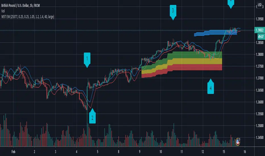
W5T Bar number for Elliott Wave IsolationSpecial Bar counting tool to allow Isolation of Elliott Wave wave count. Watch the Video Tour >>HERE<<< of this full and comprehensive Elliott Wave Indicator Suite.
Cari dalam skrip untuk "wave"

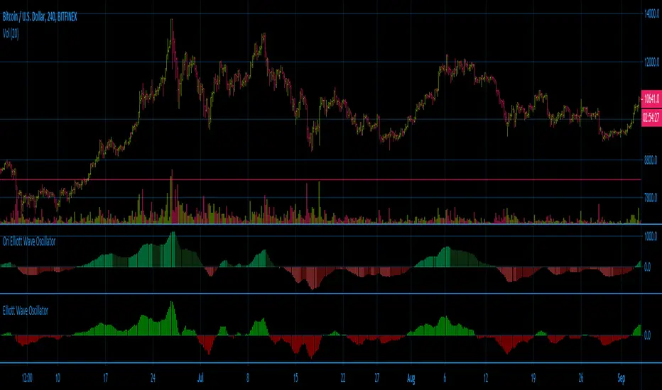
W5T Elliott Wave OscillatorSpecial Elliott Wave Oscillator which is part of the W5T Elliott Wave Indicator suite. Watch the quick Video tour >>>HERE<<< and find out about this incredible and complete Elliott Wave Indicator Suite

W5T Elliott Wave Indicator SuiteThe Elliott Wave Indicator Suite brings order and reason to the world of Swing Trading, Intraday Trading and Day Trading. It greatly illuminates the path through the forest of chaotic markets versus getting lost among all the trees. Perfect for Stocks, Forex, Futures, Commodities, Indexes and even Crypto Currency markets. Watch the Video Tour and find out More >>>HERE<<<
Includes:
Elliott Wave Indicator
High Probability Pull Back Zones
Elliott Wave isolation
Automated Target Zones
False Breakout Stochastic
Automated Elliott Wave Count
Special 5/35 Pull Back Oscillator
6/4 MA High & Low for Trade Entry & Management
Training Bootcamp
Free Monthly Live Support Webinars
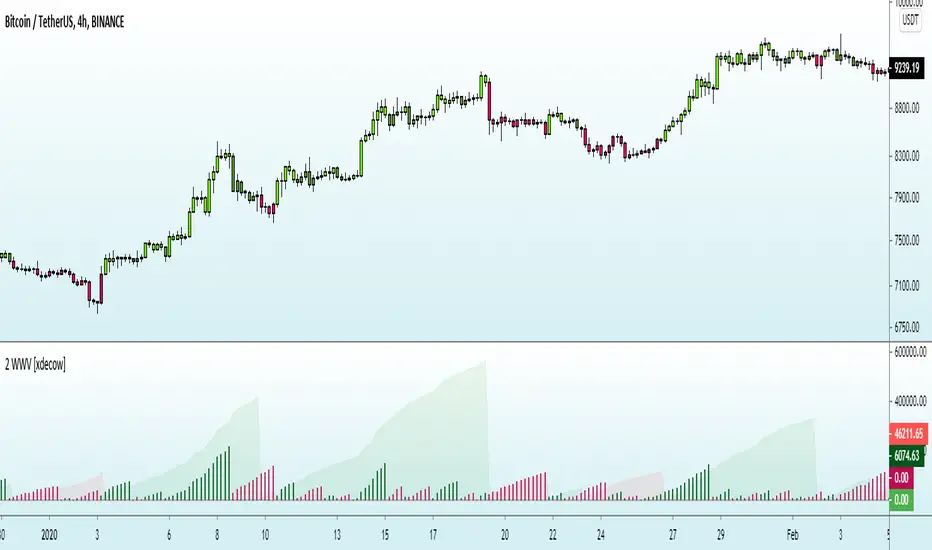
Weis Wave Volume (Pinescript 4)Port of LazyBear's Weis Wave Volume indicator to pinescript v4 from v2.

Weiss Wave Open Interest BarsFirstly :
LazyBear ' s "Weiss Wave " codes are used for open interests.
Original Weiss Wave Volume :
Let's start :
Open Interest vs. Volume: An Overview
Volume and open interest are two key measurements that describe the liquidity and activity of contracts In the options and futures markets. However, their meanings and applications are different. Volume refers to the number of contracts traded in a given period, while open interest denotes the number of active contracts.
Volume
Trading volume measures the number of options or futures contracts being exchanged between buyers and sellers, identifying the level of activity for that particular contract. For every buyer, there is a seller, and the transaction itself counts toward the daily volume.
Open Interest
Open interest indicates the number of options or futures contracts that are held by traders and investors in active positions. These positions have not been closed out, expired, or exercised. Open interest decreases when holders and writers of options (or buyers and sellers of futures) close out their positions. To close out positions, they must take offsetting positions or exercise their options. Open interest increases once again when investors and traders open new long positions or writers/sellers take on new short positions. Open interest also increases when new options or futures contracts are created.
Options or futures contract trading volume can only increase while open interest can either increase or decrease. While trading volume indicates the number of contracts that have been bought or sold, open interest identifies the number of contracts that are currently held.
Reference : www.investopedia.com
*** Worked to define all futures . You can look them in codes (between line : 13 to line 94 )
** CAUTION 1 : Since each instrument in the list has its own unique contract data, you must first enter its name to display it. I recommend you to select OANDA from the markets. Finally, when the COT reports are issued, it may repaints. However, this repaint is usually close to closing or after close .(When COT reports are so sharp ) So use this script only 1W ( 1 week ) or 1 M ( 1 month ) timeframe.
** CAUTION 2 : This data is taken to Tradingview with the help of Quandl. This is a tremendous possibility, but the system will not work if there is a malfunction.
Best regards.


*FIBAUS Wave TrenderSimple 100 ema with a wave multi timeframe SMA
Alerts can be set on the wave alone or when the wave crosses the 100 ema

Renko Weis Wave VolumeA volume bulls vs bears power indicator that is based entirely on Wyckoff Weis Wave Volume trends. This indicator is part of my DIVINE series RENKO indicators that run on an engine capable of extracting Renko brick information from a time series. As with the Renko RSI and Renko Trend Momentum indicators, swapping between Renko and time series type charts(bar, candlestick , heikin ashi) is seamless.
The algorithm uses the cumulative volume sum during the lifetime of a Renko brick formation. It tries hard to dissect and distribute volume when multiple bricks are formed during a single time candle (bar, candlestick , heikin ashi). Both positive and negative volume are plotted simultaneously, so that any instance where multiple bricks are created in a single time candle, positive and negative volume will be shown.
4 color themes as with all of the other DIVINE series indicators and strategies.
Shows ares of accumulation, distribution, capitulation. volatility .
Shows volatile brick locations with counts that indicate the number of nested bricks that were contained in a single time based candle.
Works well with Renko Price Bars Overlay script.
Reference to explanation of volatile brick information tips.
All feature requests are welcome. PM for access.


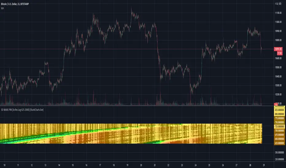
3D-WAVE-PM indicatorThis is an extension of the WAVE-PM indicator as explained by Mark Whistler in his book Volatility Illuminated .
This heatmap represent different lengths of WAVE-PM indicator, starting from 20 and incremented by 15 until 485.
As a reminder, WAVE-PM compare the size of the current distribution to the last 100.
The result is represented as a number between 0 and 1.
The more close to 0, the more contracted the distribution is.
The more close to 1, the more expanded the distribution is.
The color code is the same as my standard WAVE-PM indicator :
Between 0.35 and 0.5 also known as the "Gear change" level => Grey
Between 0.5 and 0.7 also known as the "Consolidation" level => Green
Between 0.7 and 0.9 also known as the "Breakout" level => Blue
Between 0.9 and 1 also known as the "Danger" level => Red
Note that i have colored results below 0.35 as black
Note also that each level has been divided in 2 colors : The light one for the lower half of the range and the dark one for the higher half.
You should resize the indicator window to have a clear and continuous heatmap.
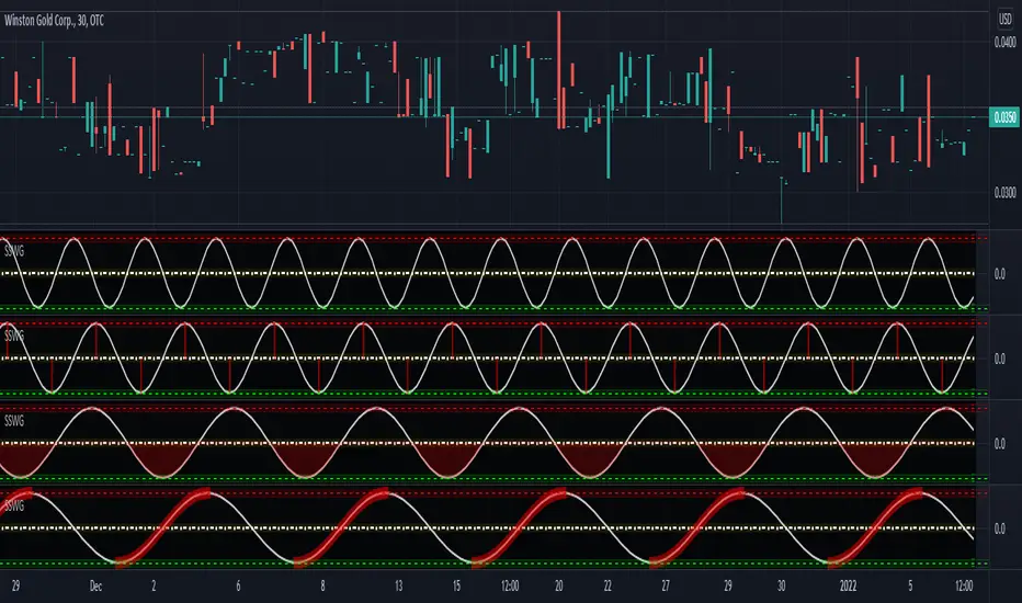
[AU] Fast Wave/Godmode Caution Dashboard Component Fast Wave/Godmode Caution Dashboard Component v01
Standalone Godmode caution to overlay on any indicator of your choice, i.e. the 5m BB SMA Dashboard Component:

Morphed Sine WaveIntroduction
If you rescale a sine wave to the price you will need to correlate it with it in order to show good results, today i present a different method that does not involve correlation to "morph" a sine wave to the price in order to provide forecast's and highlight market periodic patterns.
Parameters
length control the period of the sine wave, power control the "morphing" amount, if you see for example that the results are going nuts try to increase power , if the results are just the price and the delayed price try to decrease power .
power = 1
power = 100
Those settings might be different depending on which market you are in.
Various Uses
You can do a lot of things with this indicator, use filters as source :
Use the indicator as source for oscillators in order to create cycles indicators :
And certainly many more things
Conclusion
I presented a way to morph a sine wave to the price i order to highlight cycles. You can use any function that return a value between -1 and 1 instead of sin , this can be a scaled rsi/stochastic or correlation coefficient, its up to you :)
If you need help don't hesitate to commend or pm me. I hope you will like the indicator and that it will inspire you to make great things.
Thanks for reading !

Vegas Wave - MSSimple Vegas Wave implementation, all 3 EMA's in one indicator for those of you with indicator limitations :D
PpSignal Wyckoff Wave
the original script is from @modhelius.
I add color trend, alarm (up and down), and volume weighted Average convert to smooth elder.


Simple Sine Wave GeneratorThe title pretty much sums up what purpose this tool serves. It is NOT an indicator, just a simple sine wave generator. You may use it to attempt to measure cycle periods occurring in the markets using "Wave Length (Bars)" setting in the "Format" panel. Other features include the sine wave phase is shift-able to the left and the right, and there is also an amplitude adjustment as well.
3D WAVE-PM (3x Res Log 625-2000) [acatwithcharts]This is an (il)logical extreme adaptation of my (il)logical extreme adaption of Mark Whistler's WAVE-PM script, originally published in his book Volatility Illuminated as a MetaTrader script.
In 3D WAVE-PM, I plotted 32 period lengths from 14 to 600 at height equal to their length, reading out colors based on their value. I chose those lengths to create a relatively continuous indicator on log scale.
What I really wanted to do though was to (1) have the option to view this indicator in either linear or log and (2) not lose as much data resolution across nearly 600 periods. Within the limitations of Pinescript, the best solution I could find was to make multiple indicators hard-coding the different period lengths to create linear and log ranges such that I could make a composite heatmap with several different indicators on the same pane.
...but then I went a step further on the log scale version, noticing that I could easily make a 4th indicator that covers the 625-2000 period region at similar resolution to the other 3. So I did. This is therefore the "4th of 3 indicators" for log scale 3x resolution WAVE-PM.
It adds significant lag on top of what was already caused by 3x WAVE-PM, but I have found it broadly useful enough when looking at large expansions that I'm going to go ahead and launch it. I strongly recommend doing any other analysis in a separate tab from the one in which you have high-res 3D indicators open.
I'm excited to announce that we're putting the finishing touches on a subscription service for the volatility theory indicators, and assuming no hiccups will launch them within days. Subscriptions will be available in several packages through SharkCharts.live
Current pricing and subscription details will be kept up-to-date on SharkCharts.live
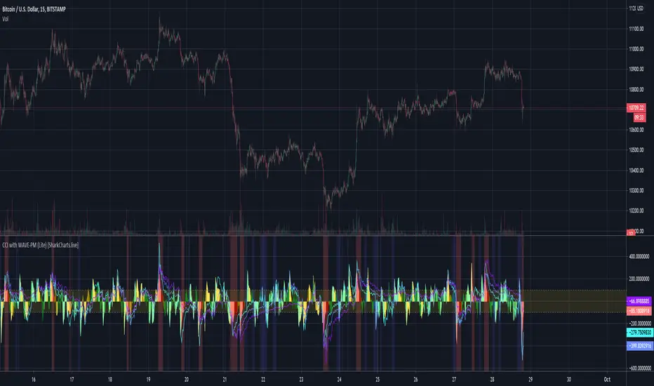
CCI + WAVE-PM (Lite) [ACatWithCharts]This indicator adds WAVE-PM overexpansion highlighting to CCI. This is a "lite" version of the script - it is limited to using just SMA and regular STDEV, resulting in a faster-loading and more stable indicator for general use.
CCI and particularly relatively short-period CCI rollovers provide a useful entry signal when trading a volatility-based strategy, as it in effect provides similar readings to a 1.25 STDEV BBand in the format of an oscillator. WAVE-PM offers a tool for choosing spots where overhead period lengths have been heavily compressed or overexpanded, creating and entry/exit condition, while a short period length CCI then can provide a reasonable signal to trigger the entry/exit.
I'm excited to announce that we're putting the finishing touches on a subscription service for the volatility theory indicators, and assuming no hiccups will launch them within days. Subscriptions will be available in several packages through SharkCharts.live
Current pricing and subscription details will be kept up-to-date on SharkCharts.live
Paisa Wave SetupPaisa wave setup is made up of below ideas
Trend
****************************
Wave Tunnel
Raghee Wave
Trend pattern
Propulsion (TODO)
Support/ Resistance
****************************
Pivots -Renko
HL levels
Darvas box (TODO)
Oscillators (Individual scripts)
****************************
Slow Stoch
Awesome Oscillator
Trend is your friend.
Base of this script is Trend.
Look for trend on bigger timeframes like 1D, 4Hr & ride the trend with lower timeframes like 1Hr, 30min or 15min.
I have explained my setup many times on my tweet handle TraderPaisa and will continue to do so.
I will be adding more features and more explanation here later.

3D WAVE-PM (Lite) [acatwithwithcharts]This is a "lite" version of my 3D WAVE-PM script. It is limited to using just SMA and regular STDEV, resulting in a faster-loading and more stable indicator for general use.
3D WAVE-PM is an (il)logical extreme adaptation of Mark Whistler's WAVE-PM script, originally published in his book Volatility Illuminated as a MetaTrader script. Instead of displaying WAVE-PM as several oscillator lines oscillating within a range, it plots 32 different period lengths at height equal to their length and reads out colors based on their value. The period lengths are spaced out such that it makes a relatively continuous heatmap when displayed on log scale. It has the same customization options as my regular WAVE-PM Meow Mix script.
Light and dark colors are utilized to visualize whether the oscillator trace on that period is increasing or decreasing, as determined by comparing to an average of the past few readings. Empirically I found a lookback length of 4 to offer a reasonable balance between reacting quickly and filtering noise.
(It may be necessary to move the scale around to see the indicator - it ranges from 14 to 600 and the scale on the chart seems to default to a range below it.)
I am posting these as invite-only and have a short list of collaborators in mind who will get access if they want it. It is not being made available to the general public as of this posting; I’m vaguely working towards eventually offering being able to offer some sort of paid indicator offering in the future.
Rather than shut the door entirely, I will say that if someone approaches me by PM with a really interesting idea on how they’d like to test this or my other indicators, I’m willing to consider giving access. I’m not giving this away just to anyone who asks and will, for my own time and sanity, probably just ignore requests by people who don't come to me already knowing what this indicator does and how they might want to use it.
I will also say that I am interested in ideas for other applications for heatmap indicators. If you think you have an interesting idea/proposal/collaboration to propose, feel free to PM me.
