Market Electromagnetic Field [The_lurker]Market Electromagnetic Field
An innovative analytical indicator that presents a completely new model for understanding market dynamics, inspired by the laws of electromagnetic physics — but it's not a rhetorical metaphor, rather a complete mathematical system.
Unlike traditional indicators that focus on price or momentum, this indicator portrays the market as a closed physical system, where:
⚡ Candles = Electric charges (positive at bullish close, negative at bearish)
⚡ Buyers and Sellers = Two opposing poles where pressure accumulates
⚡ Market tension = Voltage difference between the poles
⚡ Price breakout = Electrical discharge after sufficient energy accumulation
█ Core Concept
Markets don't move randomly, but follow a clear physical cycle:
Accumulation → Tension → Discharge → Stabilization → New Accumulation
When charges accumulate (through strong candles with high volume) and exceed a certain "electrical capacitance" threshold, the indicator issues a "⚡ DISCHARGE IMMINENT" alert — meaning a price explosion is imminent, giving the trader an opportunity to enter before the move begins.
█ Competitive Advantage
- Predictive forecasting (not confirmatory after the event)
- Smart multi-layer filtering reduces false signals
- Animated 3D visual representation makes reading price conditions instant and intuitive — without need for number analysis
█ Theoretical Physical Foundation
The indicator doesn't use physical terms for decoration, but applies mathematical laws with precise market adjustments:
⚡ Coulomb's Law
Physics: F = k × (q₁ × q₂) / r²
Market: Field Intensity = 4 × norm_positive × norm_negative
Peaks at equilibrium (0.5 × 0.5 × 4 = 1.0), and decreases at dominance — because conflict increases at parity.
⚡ Ohm's Law
Physics: V = I × R
Market: Voltage = norm_positive − norm_negative
Measures balance of power:
- +1 = Absolute buying dominance
- −1 = Absolute selling dominance
- 0 = Balance
⚡ Capacitance
Physics: C = Q / V
Market: Capacitance = |Voltage| × Field Intensity
Represents stored energy ready for discharge — increases with bias combined with high interaction.
⚡ Electrical Discharge
Physics: Occurs when exceeding insulation threshold
Market: Discharge Probability = min(Capacitance / Discharge Threshold, 1.0)
When ≥ 0.9: "⚡ DISCHARGE IMMINENT"
📌 Key Note:
Maximum capacitance doesn't occur at absolute dominance (where field intensity = 0), nor at perfect balance (where voltage = 0), but at moderate bias (±30–50%) with high interaction (field intensity > 25%) — i.e., in moments of "pressure before breakout".
█ Detailed Calculation Mechanism
⚡ Phase 1: Candle Polarity
polarity = (close − open) / (high − low)
- +1.0: Complete bullish candle (Bullish Marubozu)
- −1.0: Complete bearish candle (Bearish Marubozu)
- 0.0: Doji (no decision)
- Intermediate values: Represent the ratio of candle body to its range — reducing the effect of long-shadow candles
⚡ Phase 2: Volume Weight
vol_weight = volume / SMA(volume, lookback)
A candle with 150% of average volume = 1.5x stronger charge
⚡ Phase 3: Adaptive Factor
adaptive_factor = ATR(lookback) / SMA(ATR, lookback × 2)
- In volatile markets: Increases sensitivity
- In quiet markets: Reduces noise
- Always recommended to keep it enabled
⚡ Phase 4–6: Charge Accumulation and Normalization
Charges are summed over lookback candles, then ratios are normalized:
norm_positive = positive_charge / total_charge
norm_negative = negative_charge / total_charge
So that: norm_positive + norm_negative = 1 — for easier comparison
⚡ Phase 7: Field Calculations
voltage = norm_positive − norm_negative
field_intensity = 4 × norm_positive × norm_negative × field_sensitivity
capacitance = |voltage| × field_intensity
discharge_prob = min(capacitance / discharge_threshold, 1.0)
█ Settings
⚡ Electromagnetic Model
Lookback Period
- Default: 20
- Range: 5–100
- Recommendations:
- Scalping: 10–15
- Day Trading: 20
- Swing: 30–50
- Investing: 50–100
Discharge Threshold
- Default: 0.7
- Range: 0.3–0.95
- Recommendations:
- Speed + Noise: 0.5–0.6
- Balance: 0.7
- High Accuracy: 0.8–0.95
Field Sensitivity
- Default: 1.0
- Range: 0.5–2.0
- Recommendations:
- Amplify Conflict: 1.2–1.5
- Natural: 1.0
- Calm: 0.5–0.8
Adaptive Mode
- Default: Enabled
- Always keep it enabled
🔬 Dynamic Filters
All enabled filters must pass for discharge signal to appear.
Volume Filter
- Condition: volume > SMA(volume) × vol_multiplier
- Function: Excludes "weak" candles not supported by volume
- Recommendation: Enabled (especially for stocks and forex)
Volatility Filter
- Condition: STDEV > SMA(STDEV) × 0.5
- Function: Ignores sideways stagnation periods
- Recommendation: Always enabled
Trend Filter
- Condition: Voltage alignment with fast/slow EMA
- Function: Reduces counter-trend signals
- Recommendation: Enabled for swing/investing only
Volume Threshold
- Default: 1.2
- Recommendations:
- 1.0–1.2: High sensitivity
- 1.5–2.0: Exclusive to high volume
🎨 Visual Settings
Settings improve visual reading experience — don't affect calculations.
Scale Factor
- Default: 600
- Higher = Larger scene (200–1200)
Horizontal Shift
- Default: 180
- Horizontal shift to the left — to focus on last candle
Pole Size
- Default: 60
- Base sphere size (30–120)
Field Lines
- Default: 8
- Number of field lines (4–16) — 8 is ideal balance
Colors
- Green/Red/Blue/Orange
- Fully customizable
█ Visual Representation: A Visual Language for Diagnosing Price Conditions
✨ Design Philosophy
The representation isn't "decoration", but a complete cognitive model — each element carries information, and element interaction tells a complete story.
The brain perceives changes in size, color, and movement 60,000 times faster than reading numbers — so you can "sense" the change before your eye finishes scanning.
═════════════════════════════════════════════════════════════
🟢 Positive Pole (Green Sphere — Left)
═════════════════════════════════════════════════════════════
What does it represent?
Active buying pressure accumulation — not just an uptrend, but real demand force supported by volume and volatility.
● Dynamic Size
Size = pole_size × (0.7 + norm_positive × 0.6)
- 70% of base size = No significant charge
- 130% of base size = Complete dominance
- The larger the sphere: Greater buyer dominance, higher probability of bullish continuation
Size Interpretation:
- Large sphere (>55%): Strong buying pressure — Buyers dominate
- Medium sphere (45–55%): Relative balance with buying bias
- Small sphere (<45%): Weak buying pressure — Sellers dominate
● Lighting and Transparency
- 20% transparency (when Bias = +1): Pole currently active — Bullish direction
- 50% transparency (when Bias ≠ +1): Pole inactive — Not the prevailing direction
Lighting = Current activity, while Size = Historical accumulation
● Pulsing Inner Glow
A smaller sphere pulses automatically when Bias = +1:
inner_pulse = 0.4 + 0.1 × sin(anim_time × 3)
Symbolizes continuity of buy order flow — not static dominance.
● Orbital Rings
Two rings rotating at different speeds and directions:
- Inner: 1.3× sphere size — Direct influence range
- Outer: 1.6× sphere size — Extended influence range
Represent "influence zone" of buyers:
- Continuous rotation = Stability and momentum
- Slowdown = Momentum exhaustion
● Percentage
Displayed below sphere: norm_positive × 100
- >55% = Clear dominance
- 45–55% = Balance
- <45% = Weakness
═════════════════════════════════════════════════════════════
🔴 Negative Pole (Red Sphere — Right)
═════════════════════════════════════════════════════════════
What does it represent?
Active selling pressure accumulation — whether cumulative selling (smart distribution) or panic selling (position liquidation).
● Visual Dynamics
Same size, lighting, and inner glow mechanism — but in red.
Key Difference:
- Rotation is reversed (counter-clockwise)
- Visually distinguishes "buy flow" from "sell flow"
- Allows reading direction at a glance — even for colorblind users
📌 Pole Reading Summary:
🟢 Large + Bright green sphere = Active buying force
🔴 Large + Bright red sphere = Active selling force
🟢🔴 Both large but dim = Energy accumulation (before discharge)
⚪ Both small = Stagnation / Low liquidity
═════════════════════════════════════════════════════════════
🔵 Field Lines (Curved Blue Lines)
═════════════════════════════════════════════════════════════
What do they represent?
Energy flow paths between poles — the arena where price battle is fought.
● Number of Lines
4–16 lines (Default: 8)
More lines: Greater sense of "interaction density"
● Arc Height
arc_h = (i − half_lines) × 15 × field_intensity × 2
- High field intensity = Highly elevated lines (like waves)
- Low intensity = Nearly straight lines
● Oscillating Transparency
transp = 30 + phase × 40
where phase = sin(anim_time × 2 + i × 0.5) × 0.5 + 0.5
Creates illusion of "flowing current" — not static lines
● Asymmetric Curvature
- Upper lines curve upward
- Lower lines curve downward
- Adds 3D depth and shows "pressure" direction
⚡ Pro Tip:
When you see lines suddenly "contract" (straighten), while both spheres are large — this is an early indicator of impending discharge, because the interaction is losing its flexibility.
═════════════════════════════════════════════════════════════
⚪ Moving Particles
═════════════════════════════════════════════════════════════
What do they represent?
Real liquidity flow in the market — who's driving price right now.
● Number and Movement
- 6 particles covering most field lines
- Move sinusoidally along the arc:
t = (sin(phase_val) + 1) / 2
- High speed = High trading activity
- Clustering at a pole = That side's control
● Color Gradient
From green (at positive pole) to red (at negative)
Shows "energy transformation":
- Green particle = Pure buying energy
- Orange particle = Conflict zone
- Red particle = Pure selling energy
📌 How to Read Them?
- Moving left to right (🟢 → 🔴): Buy flow → Bullish push
- Moving right to left (🔴 → 🟢): Sell flow → Bearish push
- Clustered in middle: Balanced conflict — Wait for breakout
═════════════════════════════════════════════════════════════
🟠 Discharge Zone (Orange Glow — Center)
═════════════════════════════════════════════════════════════
What does it represent?
Point of stored energy accumulation not yet discharged — heart of the early warning system.
● Glow Stages
Initial Warning (discharge_prob > 0.3):
- Dim orange circle (70% transparency)
- Meaning: Watch, don't enter yet
High Tension (discharge_prob ≥ 0.7):
- Stronger glow + "⚠️ HIGH TENSION" text
- Meaning: Prepare — Set pending orders
Imminent Discharge (discharge_prob ≥ 0.9):
- Bright glow + "⚡ DISCHARGE IMMINENT" text
- Meaning: Enter with direction (after candle confirmation)
● Layered Glow Effect (Glow Layering)
3 concentric circles with increasing transparency:
- Inner: 20%
- Middle: 35%
- Outer: 50%
Result: Realistic aura resembling actual electrical discharge.
📌 Why in the Center?
Because discharge always starts from the relative balance zone — where opposing pressures meet.
═════════════════════════════════════════════════════════════
📊 Voltage Meter (Bottom of Scene)
═════════════════════════════════════════════════════════════
What does it represent?
Simplified numeric indicator of voltage difference — for those who prefer numerical reading.
● Components
- Gray bar: Full range (−100% to +100%)
- Green fill: Positive voltage (extends right)
- Red fill: Negative voltage (extends left)
- Lightning symbol (⚡): Above center — reminder it's an "electrical gauge"
- Text value: Like "+23.4%" — in direction color
● Voltage Reading Interpretation
+50% to +100%:
Overwhelming buying dominance — Beware of saturation, may precede correction
+20% to +50%:
Strong buying dominance — Suitable for buying with trend
+5% to +20%:
Slight bullish bias — Wait for additional confirmation
−5% to +5%:
Balance/Neutral — Avoid entry or wait for breakout
−5% to −20%:
Slight bearish bias — Wait for confirmation
−20% to −50%:
Strong selling dominance — Suitable for selling with trend
−50% to −100%:
Overwhelming selling dominance — Beware of saturation, may precede bounce
═════════════════════════════════════════════════════════════
📈 Field Strength Indicator (Top of Scene)
═════════════════════════════════════════════════════════════
What it displays: "Field: XX.X%"
Meaning: Strength of conflict between buyers and sellers.
● Reading Interpretation
0–5%:
- Appearance: Nearly straight lines, transparent
- Meaning: Complete control by one side
- Strategy: Trend Following
5–15%:
- Appearance: Slight curvature
- Meaning: Clear direction with light resistance
- Strategy: Enter with trend
15–25%:
- Appearance: Medium curvature, clear lines
- Meaning: Balanced conflict
- Strategy: Range trading or waiting
25–35%:
- Appearance: High curvature, clear density
- Meaning: Strong conflict, high uncertainty
- Strategy: Volatility trading or prepare for discharge
35%+:
- Appearance: Very high lines, strong glow
- Meaning: Peak tension
- Strategy: Best discharge opportunities
📌 Golden Relationship:
Highest discharge probability when:
Field Strength (25–35%) + Voltage (±30–50%) + High Volume
← This is the "red zone" to monitor carefully.
█ Comprehensive Visual Reading
To read market condition at a glance, follow this sequence:
Step 1: Which sphere is larger?
- 🟢 Green larger ← Dominant buying pressure
- 🔴 Red larger ← Dominant selling pressure
- Equal ← Balance/Conflict
Step 2: Which sphere is bright?
- 🟢 Green bright ← Current bullish direction
- 🔴 Red bright ← Current bearish direction
- Both dim ← Neutral/No clear direction
Step 3: Is there orange glow?
- None ← Discharge probability <30%
- 🟠 Dim glow ← Discharge probability 30–70%
- 🟠 Strong glow with text ← Discharge probability >70%
Step 4: What's the voltage meter reading?
- Strong positive ← Confirms buying dominance
- Strong negative ← Confirms selling dominance
- Near zero ← No clear direction
█ Practical Visual Reading Examples
Example 1: Ideal Buy Opportunity ⚡🟢
- Green sphere: Large and bright with inner pulse
- Red sphere: Small and dim
- Orange glow: Strong with "DISCHARGE IMMINENT" text
- Voltage meter: +45%
- Field strength: 28%
Interpretation: Strong accumulated buying pressure, bullish explosion imminent
Example 2: Ideal Sell Opportunity ⚡🔴
- Green sphere: Small and dim
- Red sphere: Large and bright with inner pulse
- Orange glow: Strong with "DISCHARGE IMMINENT" text
- Voltage meter: −52%
- Field strength: 31%
Interpretation: Strong accumulated selling pressure, bearish explosion imminent
Example 3: Balance/Wait ⚖️
- Both spheres: Approximately equal in size
- Lighting: Both dim
- Orange glow: Strong
- Voltage meter: +3%
- Field strength: 24%
Interpretation: Strong conflict without clear winner, wait for breakout
Example 4: Clear Uptrend (No Discharge) 📈
- Green sphere: Large and bright
- Red sphere: Very small and dim
- Orange glow: None
- Voltage meter: +68%
- Field strength: 8%
Interpretation: Clear buying control, limited conflict, suitable for following bullish trend
Example 5: Potential Buying Saturation ⚠️
- Green sphere: Very large and bright
- Red sphere: Very small
- Orange glow: Dim
- Voltage meter: +88%
- Field strength: 4%
Interpretation: Absolute buying dominance, may precede bearish correction
█ Trading Signals
⚡ DISCHARGE IMMINENT
Appearance Conditions:
- discharge_prob ≥ 0.9
- All enabled filters passed
- Confirmed (after candle close)
Interpretation:
- Very large energy accumulation
- Pressure reached critical level
- Price explosion expected within 1–3 candles
How to Trade:
1. Determine voltage direction:
• Positive = Expect rise
• Negative = Expect fall
2. Wait for confirmation candle:
• For rise: Bullish candle closing above its open
• For fall: Bearish candle closing below its open
3. Entry: With next candle's open
4. Stop Loss: Behind last local low/high
5. Target: Risk/Reward ratio of at least 1:2
✅ Pro Tips:
- Best results when combined with support/resistance levels
- Avoid entry if voltage is near zero (±5%)
- Increase position size when field strength > 30%
⚠️ HIGH TENSION
Appearance Conditions:
- 0.7 ≤ discharge_prob < 0.9
Interpretation:
- Market in energy accumulation state
- Likely strong move soon, but not immediate
- Accumulation may continue or discharge may occur
How to Benefit:
- Prepare: Set pending orders at potential breakouts
- Monitor: Watch following candles for momentum candle
- Select: Don't enter every signal — choose those aligned with overall trend
█ Trading Strategies
📈 Strategy 1: Discharge Trading (Basic)
Principle: Enter at "DISCHARGE IMMINENT" in voltage direction
Steps:
1. Wait for "⚡ DISCHARGE IMMINENT"
2. Check voltage direction (+/−)
3. Wait for confirmation candle in voltage direction
4. Enter with next candle's open
5. Stop loss behind last low/high
6. Target: 1:2 or 1:3 ratio
Very high success rate when following confirmation conditions.
📈 Strategy 2: Dominance Following
Principle: Trade with dominant pole (largest and brightest sphere)
Steps:
1. Identify dominant pole (largest and brightest)
2. Trade in its direction
3. Beware when sizes converge (conflict)
Suitable for higher timeframes (H1+).
📈 Strategy 3: Reversal Hunting
Principle: Counter-trend entry under certain conditions
Conditions:
- High field strength (>30%)
- Extreme voltage (>±40%)
- Divergence with price (e.g., new price high with declining voltage)
⚠️ High risk — Use small position size.
📈 Strategy 4: Integration with Technical Analysis
Strong Confirmation Examples:
- Resistance breakout + Bullish discharge = Excellent buy signal
- Support break + Bearish discharge = Excellent sell signal
- Head & Shoulders pattern + Increasing negative voltage = Pattern confirmation
- RSI divergence + High field strength = Potential reversal
█ Ready Alerts
Bullish Discharge
- Condition: discharge_prob ≥ 0.9 + Positive voltage + All filters
- Message: "⚡ Bullish discharge"
- Use: High probability buy opportunity
Bearish Discharge
- Condition: discharge_prob ≥ 0.9 + Negative voltage + All filters
- Message: "⚡ Bearish discharge"
- Use: High probability sell opportunity
✅ Tip: Use these alerts with "Once Per Bar" setting to avoid repetition.
█ Data Window Outputs
Bias
- Values: −1 / 0 / +1
- Interpretation: −1 = Bearish, 0 = Neutral, +1 = Bullish
- Use: For integration in automated strategies
Discharge %
- Range: 0–100%
- Interpretation: Discharge probability
- Use: Monitor tension progression (e.g., from 40% to 85% in 5 candles)
Field Strength
- Range: 0–100%
- Interpretation: Conflict intensity
- Use: Identify "opportunity window" (25–35% ideal for discharge)
Voltage
- Range: −100% to +100%
- Interpretation: Balance of power
- Use: Monitor extremes (potential buying/selling saturation)
█ Optimal Settings by Trading Style
Scalping
- Timeframe: 1M–5M
- Lookback: 10–15
- Threshold: 0.5–0.6
- Sensitivity: 1.2–1.5
- Filters: Volume + Volatility
Day Trading
- Timeframe: 15M–1H
- Lookback: 20
- Threshold: 0.7
- Sensitivity: 1.0
- Filters: Volume + Volatility
Swing Trading
- Timeframe: 4H–D1
- Lookback: 30–50
- Threshold: 0.8
- Sensitivity: 0.8
- Filters: Volatility + Trend
Position Trading
- Timeframe: D1–W1
- Lookback: 50–100
- Threshold: 0.85–0.95
- Sensitivity: 0.5–0.8
- Filters: All filters
█ Tips for Optimal Use
1. Start with Default Settings
Try it first as is, then adjust to your style.
2. Watch for Element Alignment
Best signals when:
- Clear voltage (>│20%│)
- Moderate–high field strength (15–35%)
- High discharge probability (>70%)
3. Use Multiple Timeframes
- Higher timeframe: Determine overall trend
- Lower timeframe: Time entry
- Ensure signal alignment between frames
4. Integrate with Other Tools
- Support/Resistance levels
- Trend lines
- Candle patterns
- Volume indicators
5. Respect Risk Management
- Don't risk more than 1–2% of account
- Always use stop loss
- Don't enter every signal — choose the best
█ Important Warnings
⚠️ Not for Standalone Use
The indicator is an analytical support tool — don't use it isolated from technical or fundamental analysis.
⚠️ Doesn't Predict the Future
Calculations are based on historical data — Results are not guaranteed.
⚠️ Markets Differ
You may need to adjust settings for each market:
- Forex: Focus on Volume Filter
- Stocks: Add Trend Filter
- Crypto: Lower Threshold slightly (more volatile)
⚠️ News and Events
The indicator doesn't account for sudden news — Avoid trading before/during major news.
█ Unique Features
✅ First Application of Electromagnetism to Markets
Innovative mathematical model — Not just an ordinary indicator
✅ Predictive Detection of Price Explosions
Alerts before the move happens — Not after
✅ Multi-Layer Filtering
4 smart filters reduce false signals to minimum
✅ Smart Volatility Adaptation
Automatically adjusts sensitivity based on market conditions
✅ Animated 3D Visual Representation
Makes reading instant — Even for beginners
✅ High Flexibility
Works on all assets: Stocks, Forex, Crypto, Commodities
✅ Built-in Ready Alerts
No complex setup needed — Ready for immediate use
█ Conclusion: When Art Meets Science
Market Electromagnetic Field is not just an indicator — but a new analytical philosophy.
It's the bridge between:
- Physics precision in describing dynamic systems
- Market intelligence in generating trading opportunities
- Visual psychology in facilitating instant reading
The result: A tool that isn't read — but watched, felt, and sensed.
When you see the green sphere expanding, the glow intensifying, and particles rushing rightward — you're not seeing numbers, you're seeing market energy breathing.
⚠️ Disclaimer:
This indicator is for educational and analytical purposes only. It does not constitute financial, investment, or trading advice. Use it in conjunction with your own strategy and risk management. Neither TradingView nor the developer is liable for any financial decisions or losses.
المجال الكهرومغناطيسي للسوق - Market Electromagnetic Field
مؤشر تحليلي مبتكر يقدّم نموذجًا جديدًا كليًّا لفهم ديناميكيات السوق، مستوحى من قوانين الفيزياء الكهرومغناطيسية — لكنه ليس استعارة بلاغية، بل نظام رياضي متكامل.
على عكس المؤشرات التقليدية التي تُركّز على السعر أو الزخم، يُصوّر هذا المؤشر السوق كـنظام فيزيائي مغلق، حيث:
⚡ الشموع = شحنات كهربائية (موجبة عند الإغلاق الصاعد، سالبة عند الهابط)
⚡ المشتريون والبائعون = قطبان متعاكسان يتراكم فيهما الضغط
⚡ التوتر السوقي = فرق جهد بين القطبين
⚡ الاختراق السعري = تفريغ كهربائي بعد تراكم طاقة كافية
█ الفكرة الجوهرية
الأسواق لا تتحرك عشوائيًّا، بل تخضع لدورة فيزيائية واضحة:
تراكم → توتر → تفريغ → استقرار → تراكم جديد
عندما تتراكم الشحنات (من خلال شموع قوية بحجم مرتفع) وتتجاوز "السعة الكهربائية" عتبة معيّنة، يُصدر المؤشر تنبيه "⚡ DISCHARGE IMMINENT" — أي أن انفجارًا سعريًّا وشيكًا، مما يمنح المتداول فرصة الدخول قبل بدء الحركة.
█ الميزة التنافسية
- تنبؤ استباقي (ليس تأكيديًّا بعد الحدث)
- فلترة ذكية متعددة الطبقات تقلل الإشارات الكاذبة
- تمثيل بصري ثلاثي الأبعاد متحرك يجعل قراءة الحالة السعرية فورية وبديهية — دون حاجة لتحليل أرقام
█ الأساس النظري الفيزيائي
المؤشر لا يستخدم مصطلحات فيزيائية للزينة، بل يُطبّق القوانين الرياضية مع تعديلات سوقيّة دقيقة:
⚡ قانون كولوم (Coulomb's Law)
الفيزياء: F = k × (q₁ × q₂) / r²
السوق: شدة الحقل = 4 × norm_positive × norm_negative
تصل لذروتها عند التوازن (0.5 × 0.5 × 4 = 1.0)، وتنخفض عند الهيمنة — لأن الصراع يزداد عند التكافؤ.
⚡ قانون أوم (Ohm's Law)
الفيزياء: V = I × R
السوق: الجهد = norm_positive − norm_negative
يقيس ميزان القوى:
- +1 = هيمنة شرائية مطلقة
- −1 = هيمنة بيعية مطلقة
- 0 = توازن
⚡ السعة الكهربائية (Capacitance)
الفيزياء: C = Q / V
السوق: السعة = |الجهد| × شدة الحقل
تمثّل الطاقة المخزّنة القابلة للتفريغ — تزداد عند وجود تحيّز مع تفاعل عالي.
⚡ التفريغ الكهربائي (Discharge)
الفيزياء: يحدث عند تجاوز عتبة العزل
السوق: احتمال التفريغ = min(السعة / عتبة التفريغ, 1.0)
عندما ≥ 0.9: "⚡ DISCHARGE IMMINENT"
📌 ملاحظة جوهرية:
أقصى سعة لا تحدث عند الهيمنة المطلقة (حيث شدة الحقل = 0)، ولا عند التوازن التام (حيث الجهد = 0)، بل عند انحياز متوسط (±30–50%) مع تفاعل عالي (شدة حقل > 25%) — أي في لحظات "الضغط قبل الاختراق".
█ آلية الحساب التفصيلية
⚡ المرحلة 1: قطبية الشمعة
polarity = (close − open) / (high − low)
- +1.0: شمعة صاعدة كاملة (ماروبوزو صاعد)
- −1.0: شمعة هابطة كاملة (ماروبوزو هابط)
- 0.0: دوجي (لا قرار)
- القيم الوسيطة: تمثّل نسبة جسم الشمعة إلى مداها — مما يقلّل تأثير الشموع ذات الظلال الطويلة
⚡ المرحلة 2: وزن الحجم
vol_weight = volume / SMA(volume, lookback)
شمعة بحجم 150% من المتوسط = شحنة أقوى بـ 1.5 مرة
⚡ المرحلة 3: معامل التكيف (Adaptive Factor)
adaptive_factor = ATR(lookback) / SMA(ATR, lookback × 2)
- في الأسواق المتقلبة: يزيد الحساسية
- في الأسواق الهادئة: يقلل الضوضاء
- يوصى دائمًا بتركه مفعّلًا
⚡ المرحلة 4–6: تراكم وتوحيد الشحنات
تُجمّع الشحنات على lookback شمعة، ثم تُوحّد النسب:
norm_positive = positive_charge / total_charge
norm_negative = negative_charge / total_charge
بحيث: norm_positive + norm_negative = 1 — لتسهيل المقارنة
⚡ المرحلة 7: حسابات الحقل
voltage = norm_positive − norm_negative
field_intensity = 4 × norm_positive × norm_negative × field_sensitivity
capacitance = |voltage| × field_intensity
discharge_prob = min(capacitance / discharge_threshold, 1.0)
█ الإعدادات
⚡ Electromagnetic Model
Lookback Period
- الافتراضي: 20
- النطاق: 5–100
- التوصيات:
- المضاربة: 10–15
- اليومي: 20
- السوينغ: 30–50
- الاستثمار: 50–100
Discharge Threshold
- الافتراضي: 0.7
- النطاق: 0.3–0.95
- التوصيات:
- سرعة + ضوضاء: 0.5–0.6
- توازن: 0.7
- دقة عالية: 0.8–0.95
Field Sensitivity
- الافتراضي: 1.0
- النطاق: 0.5–2.0
- التوصيات:
- تضخيم الصراع: 1.2–1.5
- طبيعي: 1.0
- تهدئة: 0.5–0.8
Adaptive Mode
- الافتراضي: مفعّل
- أبقِه دائمًا مفعّلًا
🔬 Dynamic Filters
يجب اجتياز جميع الفلاتر المفعّلة لظهور إشارة التفريغ.
Volume Filter
- الشرط: volume > SMA(volume) × vol_multiplier
- الوظيفة: يستبعد الشموع "الضعيفة" غير المدعومة بحجم
- التوصية: مفعّل (خاصة للأسهم والعملات)
Volatility Filter
- الشرط: STDEV > SMA(STDEV) × 0.5
- الوظيفة: يتجاهل فترات الركود الجانبي
- التوصية: مفعّل دائمًا
Trend Filter
- الشرط: توافق الجهد مع EMA سريع/بطيء
- الوظيفة: يقلل الإشارات المعاكسة للاتجاه العام
- التوصية: مفعّل للسوينغ/الاستثمار فقط
Volume Threshold
- الافتراضي: 1.2
- التوصيات:
- 1.0–1.2: حساسية عالية
- 1.5–2.0: حصرية للحجم العالي
🎨 Visual Settings
الإعدادات تُحسّن تجربة القراءة البصرية — لا تؤثر على الحسابات.
Scale Factor
- الافتراضي: 600
- كلما زاد: المشهد أكبر (200–1200)
Horizontal Shift
- الافتراضي: 180
- إزاحة أفقيّة لليسار — ليركّز على آخر شمعة
Pole Size
- الافتراضي: 60
- حجم الكرات الأساسية (30–120)
Field Lines
- الافتراضي: 8
- عدد خطوط الحقل (4–16) — 8 توازن مثالي
الألوان
- أخضر/أحمر/أزرق/برتقالي
- قابلة للتخصيص بالكامل
█ التمثيل البصري: لغة بصرية لتشخيص الحالة السعرية
✨ الفلسفة التصميمية
التمثيل ليس "زينة"، بل نموذج معرفي متكامل — كل عنصر يحمل معلومة، وتفاعل العناصر يروي قصة كاملة.
العقل يدرك التغيير في الحجم، اللون، والحركة أسرع بـ 60,000 مرة من قراءة الأرقام — لذا يمكنك "الإحساس" بالتغير قبل أن تُنهي العين المسح.
═════════════════════════════════════════════════════════════
🟢 القطب الموجب (الكرة الخضراء — يسار)
═════════════════════════════════════════════════════════════
ماذا يمثّل؟
تراكم ضغط الشراء النشط — ليس مجرد اتجاه صاعد، بل قوة طلب حقيقية مدعومة بحجم وتقلّب.
● الحجم المتغير
حجم = pole_size × (0.7 + norm_positive × 0.6)
- 70% من الحجم الأساسي = لا شحنة تُذكر
- 130% من الحجم الأساسي = هيمنة تامة
- كلما كبرت الكرة: زاد تفوّق المشترين، وارتفع احتمال الاستمرار الصعودي
تفسير الحجم:
- كرة كبيرة (>55%): ضغط شراء قوي — المشترون يسيطرون
- كرة متوسطة (45–55%): توازن نسبي مع ميل للشراء
- كرة صغيرة (<45%): ضعف ضغط الشراء — البائعون يسيطرون
● الإضاءة والشفافية
- شفافية 20% (عند Bias = +1): القطب نشط حالياً — الاتجاه صعودي
- شفافية 50% (عند Bias ≠ +1): القطب غير نشط — ليس الاتجاه السائد
الإضاءة = النشاط الحالي، بينما الحجم = التراكم التاريخي
● التوهج الداخلي النابض
كرة أصغر تنبض تلقائيًّا عند Bias = +1:
inner_pulse = 0.4 + 0.1 × sin(anim_time × 3)
يرمز إلى استمرارية تدفق أوامر الشراء — وليس هيمنة جامدة.
● الحلقات المدارية
حلقتان تدوران بسرعات واتجاهات مختلفة:
- الداخلية: 1.3× حجم الكرة — نطاق التأثير المباشر
- الخارجية: 1.6× حجم الكرة — نطاق التأثير الممتد
تمثّل "نطاق تأثير" المشترين:
- الدوران المستمر = استقرار وزخم
- التباطؤ = نفاد الزخم
● النسبة المئوية
تظهر تحت الكرة: norm_positive × 100
- >55% = هيمنة واضحة
- 45–55% = توازن
- <45% = ضعف
═════════════════════════════════════════════════════════════
🔴 القطب السالب (الكرة الحمراء — يمين)
═════════════════════════════════════════════════════════════
ماذا يمثّل؟
تراكم ضغط البيع النشط — سواء كان بيعًا تراكميًّا (التوزيع الذكي) أو بيعًا هستيريًّا (تصفية مراكز).
● الديناميكيات البصرية
نفس آلية الحجم والإضاءة والتوهج الداخلي — لكن باللون الأحمر.
الفرق الجوهري:
- الدوران معكوس (عكس اتجاه عقارب الساعة)
- يُميّز بصريًّا بين "تدفق الشراء" و"تدفق البيع"
- يسمح بقراءة الاتجاه بنظرة واحدة — حتى للمصابين بعَمَى الألوان
📌 ملخص قراءة القطبين:
🟢 كرة خضراء كبيرة + مضيئة = قوة شرائية نشطة
🔴 كرة حمراء كبيرة + مضيئة = قوة بيعية نشطة
🟢🔴 كرتان كبيرتان لكن خافتتان = تراكم طاقة (قبل التفريغ)
⚪ كرتان صغيرتان = ركود / سيولة منخفضة
═════════════════════════════════════════════════════════════
🔵 خطوط الحقل (الخطوط الزرقاء المنحنية)
═════════════════════════════════════════════════════════════
ماذا تمثّل؟
مسارات تدفق الطاقة بين القطبين — أي الساحة التي تُدار فيها المعركة السعرية.
● عدد الخطوط
4–16 خط (الافتراضي: 8)
كلما زاد العدد: زاد إحساس "كثافة التفاعل"
● ارتفاع القوس
arc_h = (i − half_lines) × 15 × field_intensity × 2
- شدة حقل عالية = خطوط شديدة الارتفاع (مثل موجة)
- شدة منخفضة = خطوط شبه مستقيمة
● الشفافية المتذبذبة
transp = 30 + phase × 40
حيث phase = sin(anim_time × 2 + i × 0.5) × 0.5 + 0.5
تخلق وهم "تيّار متدفّق" — وليس خطوطًا ثابتة
● الانحناء غير المتناظر
- الخطوط العلوية تنحني لأعلى
- الخطوط السفلية تنحني لأسفل
- يُضفي عمقًا ثلاثي الأبعاد ويُظهر اتجاه "الضغط"
⚡ تلميح احترافي:
عندما ترى الخطوط "تتقلّص" فجأة (تستقيم)، بينما الكرتان كبيرتان — فهذا مؤشر مبكر على قرب التفريغ، لأن التفاعل بدأ يفقد مرونته.
═════════════════════════════════════════════════════════════
⚪ الجزيئات المتحركة
═════════════════════════════════════════════════════════════
ماذا تمثّل؟
تدفق السيولة الحقيقية في السوق — أي من يدفع السعر الآن.
● العدد والحركة
- 6 جزيئات تغطي معظم خطوط الحقل
- تتحرك جيبيًّا على طول القوس:
t = (sin(phase_val) + 1) / 2
- سرعة عالية = نشاط تداول عالي
- تجمّع عند قطب = سيطرة هذا الطرف
● تدرج اللون
من أخضر (عند القطب الموجب) إلى أحمر (عند السالب)
يُظهر "تحوّل الطاقة":
- جزيء أخضر = طاقة شرائية نقية
- جزيء برتقالي = منطقة صراع
- جزيء أحمر = طاقة بيعية نقية
📌 كيف تقرأها؟
- تحركت من اليسار لليمين (🟢 → 🔴): تدفق شرائي → دفع صعودي
- تحركت من اليمين لليسار (🔴 → 🟢): تدفق بيعي → دفع هبوطي
- تجمّعت في المنتصف: صراع متكافئ — انتظر اختراقًا
═════════════════════════════════════════════════════════════
🟠 منطقة التفريغ (التوهج البرتقالي — المركز)
═════════════════════════════════════════════════════════════
ماذا تمثّل؟
نقطة تراكم الطاقة المخزّنة التي لم تُفرّغ بعد — قلب نظام الإنذار المبكر.
● مراحل التوهج
إنذار أولي (discharge_prob > 0.3):
- دائرة برتقالية خافتة (شفافية 70%)
- المعنى: راقب، لا تدخل بعد
توتر عالي (discharge_prob ≥ 0.7):
- توهج أقوى + نص "⚠️ HIGH TENSION"
- المعنى: استعد — ضع أوامر معلقة
تفريغ وشيك (discharge_prob ≥ 0.9):
- توهج ساطع + نص "⚡ DISCHARGE IMMINENT"
- المعنى: ادخل مع الاتجاه (بعد تأكيد شمعة)
● تأثير التوهج الطبقي (Glow Layering)
3 دوائر متحدة المركز بشفافية متزايدة:
- داخلي: 20%
- وسط: 35%
- خارجي: 50%
النتيجة: هالة (Aura) واقعية تشبه التفريغ الكهربائي الحقيقي.
📌 لماذا في المركز؟
لأن التفريغ يبدأ دائمًا من منطقة التوازن النسبي — حيث يلتقي الضغطان المتعاكسان.
═════════════════════════════════════════════════════════════
📊 مقياس الجهد (أسفل المشهد)
═════════════════════════════════════════════════════════════
ماذا يمثّل؟
مؤشر رقمي مبسّط لفرق الجهد — لمن يفضّل القراءة العددية.
● المكونات
- الشريط الرمادي: النطاق الكامل (−100% إلى +100%)
- التعبئة الخضراء: جهد موجب (تمتد لليمين)
- التعبئة الحمراء: جهد سالب (تمتد لليسار)
- رمز البرق (⚡): فوق المركز — تذكير بأنه "مقياس كهربائي"
- القيمة النصية: مثل "+23.4%" — بلون الاتجاه
● تفسير قراءات الجهد
+50% إلى +100%:
هيمنة شرائية ساحقة — احذر التشبع، قد يسبق تصحيح
+20% إلى +50%:
هيمنة شرائية قوية — مناسب للشراء مع الاتجاه
+5% إلى +20%:
ميل صعودي خفيف — انتظر تأكيدًا إضافيًّا
−5% إلى +5%:
توازن/حياد — تجنّب الدخول أو انتظر اختراقًا
−5% إلى −20%:
ميل هبوطي خفيف — انتظر تأكيدًا
−20% إلى −50%:
هيمنة بيعية قوية — مناسب للبيع مع الاتجاه
−50% إلى −100%:
هيمنة بيعية ساحقة — احذر التشبع، قد يسبق ارتداد
═════════════════════════════════════════════════════════════
📈 مؤشر شدة الحقل (أعلى المشهد)
═════════════════════════════════════════════════════════════
ما يعرضه: "Field: XX.X%"
الدلالة: قوة الصراع بين المشترين والبائعين.
● تفسير القراءات
0–5%:
- المظهر: خطوط مستقيمة تقريبًا، شفافة
- المعنى: سيطرة تامة لأحد الطرفين
- الاستراتيجية: تتبع الترند (Trend Following)
5–15%:
- المظهر: انحناء خفيف
- المعنى: اتجاه واضح مع مقاومة خفيفة
- الاستراتيجية: الدخول مع الاتجاه
15–25%:
- المظهر: انحناء متوسط، خطوط واضحة
- المعنى: صراع متوازن
- الاستراتيجية: تداول النطاق أو الانتظار
25–35%:
- المظهر: انحناء عالي، كثافة واضحة
- المعنى: صراع قوي، عدم يقين عالي
- الاستراتيجية: تداول التقلّب أو الاستعداد للتفريغ
35%+:
- المظهر: خطوط عالية جدًّا، توهج قوي
- المعنى: ذروة التوتر
- الاستراتيجية: أفضل فرص التفريغ
📌 العلاقة الذهبية:
أعلى احتمال تفريغ عندما:
شدة الحقل (25–35%) + جهد (±30–50%) + حجم مرتفع
← هذه هي "المنطقة الحمراء" التي يجب مراقبتها بدقة.
█ قراءة التمثيل البصري الشاملة
لقراءة حالة السوق بنظرة واحدة، اتبع هذا التسلسل:
الخطوة 1: أي كرة أكبر؟
- 🟢 الخضراء أكبر ← ضغط شراء مهيمن
- 🔴 الحمراء أكبر ← ضغط بيع مهيمن
- متساويتان ← توازن/صراع
الخطوة 2: أي كرة مضيئة؟
- 🟢 الخضراء مضيئة ← اتجاه صعودي حالي
- 🔴 الحمراء مضيئة ← اتجاه هبوطي حالي
- كلاهما خافت ← حياد/لا اتجاه واضح
الخطوة 3: هل يوجد توهج برتقالي؟
- لا يوجد ← احتمال تفريغ <30%
- 🟠 توهج خافت ← احتمال تفريغ 30–70%
- 🟠 توهج قوي مع نص ← احتمال تفريغ >70%
الخطوة 4: ما قراءة مقياس الجهد؟
- موجب قوي ← تأكيد الهيمنة الشرائية
- سالب قوي ← تأكيد الهيمنة البيعية
- قريب من الصفر ← لا اتجاه واضح
█ أمثلة عملية للقراءة البصرية
المثال 1: فرصة شراء مثالية ⚡🟢
- الكرة الخضراء: كبيرة ومضيئة مع نبض داخلي
- الكرة الحمراء: صغيرة وخافتة
- التوهج البرتقالي: قوي مع نص "DISCHARGE IMMINENT"
- مقياس الجهد: +45%
- شدة الحقل: 28%
التفسير: ضغط شراء قوي متراكم، انفجار صعودي وشيك
المثال 2: فرصة بيع مثالية ⚡🔴
- الكرة الخضراء: صغيرة وخافتة
- الكرة الحمراء: كبيرة ومضيئة مع نبض داخلي
- التوهج البرتقالي: قوي مع نص "DISCHARGE IMMINENT"
- مقياس الجهد: −52%
- شدة الحقل: 31%
التفسير: ضغط بيع قوي متراكم، انفجار هبوطي وشيك
المثال 3: توازن/انتظار ⚖️
- الكرتان: متساويتان تقريباً في الحجم
- الإضاءة: كلاهما خافت
- التوهج البرتقالي: قوي
- مقياس الجهد: +3%
- شدة الحقل: 24%
التفسير: صراع قوي بدون فائز واضح، انتظر اختراقًا
المثال 4: اتجاه صعودي واضح (لا تفريغ) 📈
- الكرة الخضراء: كبيرة ومضيئة
- الكرة الحمراء: صغيرة جداً وخافتة
- التوهج البرتقالي: لا يوجد
- مقياس الجهد: +68%
- شدة الحقل: 8%
التفسير: سيطرة شرائية واضحة، صراع محدود، مناسب لتتبع الترند الصعودي
المثال 5: تشبع شرائي محتمل ⚠️
- الكرة الخضراء: كبيرة جداً ومضيئة
- الكرة الحمراء: صغيرة جداً
- التوهج البرتقالي: خافت
- مقياس الجهد: +88%
- شدة الحقل: 4%
التفسير: هيمنة شرائية مطلقة، قد يسبق تصحيحاً هبوطياً
█ إشارات التداول
⚡ DISCHARGE IMMINENT (التفريغ الوشيك)
شروط الظهور:
- discharge_prob ≥ 0.9
- اجتياز جميع الفلاتر المفعّلة
- Confirmed (بعد إغلاق الشمعة)
التفسير:
- تراكم طاقة كبير جدًّا
- الضغط وصل لمستوى حرج
- انفجار سعري متوقع خلال 1–3 شموع
كيفية التداول:
1. حدد اتجاه الجهد:
• موجب = توقع صعود
• سالب = توقع هبوط
2. انتظر شمعة تأكيدية:
• للصعود: شمعة صاعدة تغلق فوق افتتاحها
• للهبوط: شمعة هابطة تغلق تحت افتتاحها
3. الدخول: مع افتتاح الشمعة التالية
4. وقف الخسارة: وراء آخر قاع/قمة محلية
5. الهدف: نسبة مخاطرة/عائد 1:2 على الأقل
✅ نصائح احترافية:
- أفضل النتائج عند دمجها مع مستويات الدعم/المقاومة
- تجنّب الدخول إذا كان الجهد قريبًا من الصفر (±5%)
- زِد حجم المركز عند شدة حقل > 30%
⚠️ HIGH TENSION (التوتر العالي)
شروط الظهور:
- 0.7 ≤ discharge_prob < 0.9
التفسير:
- السوق في حالة تراكم طاقة
- احتمال حركة قوية قريبة، لكن ليست فورية
- قد يستمر التراكم أو يحدث تفريغ
كيفية الاستفادة:
- الاستعداد: حضّر أوامر معلقة عند الاختراقات المحتملة
- المراقبة: راقب الشموع التالية بحثًا عن شمعة دافعة
- الانتقاء: لا تدخل كل إشارة — اختر تلك التي تتوافق مع الاتجاه العام
█ استراتيجيات التداول
📈 استراتيجية 1: تداول التفريغ (الأساسية)
المبدأ: الدخول عند "DISCHARGE IMMINENT" في اتجاه الجهد
الخطوات:
1. انتظر ظهور "⚡ DISCHARGE IMMINENT"
2. تحقق من اتجاه الجهد (+/−)
3. انتظر شمعة تأكيدية في اتجاه الجهد
4. ادخل مع افتتاح الشمعة التالية
5. وقف الخسارة وراء آخر قاع/قمة
6. الهدف: نسبة 1:2 أو 1:3
نسبة نجاح عالية جدًّا عند الالتزام بشروط التأكيد.
📈 استراتيجية 2: تتبع الهيمنة
المبدأ: التداول مع القطب المهيمن (الكرة الأكبر والأكثر إضاءة)
الخطوات:
1. حدد القطب المهيمن (الأكبر حجماً والأكثر إضاءة)
2. تداول في اتجاهه
3. احذر عند تقارب الأحجام (صراع)
مناسبة للإطارات الزمنية الأعلى (H1+).
📈 استراتيجية 3: صيد الانعكاس
المبدأ: الدخول عكس الاتجاه عند ظروف معينة
الشروط:
- شدة حقل عالية (>30%)
- جهد متطرف (>±40%)
- تباعد مع السعر (مثل: قمة سعرية جديدة مع تراجع الجهد)
⚠️ عالية المخاطرة — استخدم حجم مركز صغير.
📈 استراتيجية 4: الدمج مع التحليل الفني
أمثلة تأكيد قوي:
- اختراق مقاومة + تفريغ صعودي = إشارة شراء ممتازة
- كسر دعم + تفريغ هبوطي = إشارة بيع ممتازة
- نموذج Head & Shoulders + جهد سالب متزايد = تأكيد النموذج
- تباعد RSI + شدة حقل عالية = انعكاس محتمل
█ التنبيهات الجاهزة
Bullish Discharge
- الشرط: discharge_prob ≥ 0.9 + جهد موجب + جميع الفلاتر
- الرسالة: "⚡ Bullish discharge"
- الاستخدام: فرصة شراء عالية الاحتمالية
Bearish Discharge
- الشرط: discharge_prob ≥ 0.9 + جهد سالب + جميع الفلاتر
- الرسالة: "⚡ Bearish discharge"
- الاستخدام: فرصة بيع عالية الاحتمالية
✅ نصيحة: استخدم هذه التنبيهات مع إعداد "Once Per Bar" لتجنب التكرار.
█ المخرجات في نافذة البيانات
Bias
- القيم: −1 / 0 / +1
- التفسير: −1 = هبوطي، 0 = حياد، +1 = صعودي
- الاستخدام: لدمجها في استراتيجيات آلية
Discharge %
- النطاق: 0–100%
- التفسير: احتمال التفريغ
- الاستخدام: مراقبة تدرّج التوتر (مثال: من 40% إلى 85% في 5 شموع)
Field Strength
- النطاق: 0–100%
- التفسير: شدة الصراع
- الاستخدام: تحديد "نافذة الفرص" (25–35% مثالية للتفريغ)
Voltage
- النطاق: −100% إلى +100%
- التفسير: ميزان القوى
- الاستخدام: مراقبة التطرف (تشبع شرائي/بيعي محتمل)
█ الإعدادات المثلى حسب أسلوب التداول
المضاربة (Scalping)
- الإطار: 1M–5M
- Lookback: 10–15
- Threshold: 0.5–0.6
- Sensitivity: 1.2–1.5
- الفلاتر: Volume + Volatility
التداول اليومي (Day Trading)
- الإطار: 15M–1H
- Lookback: 20
- Threshold: 0.7
- Sensitivity: 1.0
- الفلاتر: Volume + Volatility
السوينغ (Swing Trading)
- الإطار: 4H–D1
- Lookback: 30–50
- Threshold: 0.8
- Sensitivity: 0.8
- الفلاتر: Volatility + Trend
الاستثمار (Position Trading)
- الإطار: D1–W1
- Lookback: 50–100
- Threshold: 0.85–0.95
- Sensitivity: 0.5–0.8
- الفلاتر: جميع الفلاتر
█ نصائح للاستخدام الأمثل
1. ابدأ بالإعدادات الافتراضية
جرّبه أولًا كما هو، ثم عدّل حسب أسلوبك.
2. راقب التوافق بين العناصر
أفضل الإشارات عندما:
- الجهد واضح (>│20%│)
- شدة الحقل معتدلة–عالية (15–35%)
- احتمال التفريغ مرتفع (>70%)
3. استخدم أطر زمنية متعددة
- الإطار الأعلى: تحديد الاتجاه العام
- الإطار الأدنى: توقيت الدخول
- تأكد من توافق الإشارات بين الأطر
4. دمج مع أدوات أخرى
- مستويات الدعم/المقاومة
- خطوط الاتجاه
- أنماط الشموع
- مؤشرات الحجم
5. احترم إدارة المخاطرة
- لا تخاطر بأكثر من 1–2% من الحساب
- استخدم دائمًا وقف الخسارة
- لا تدخل كل الإشارات — اختر الأفضل
█ تحذيرات مهمة
⚠️ ليس للاستخدام المنفرد
المؤشر أداة تحليل مساعِدة — لا تستخدمه بمعزل عن التحليل الفني أو الأساسي.
⚠️ لا يتنبأ بالمستقبل
الحسابات مبنية على البيانات التاريخية — النتائج ليست مضمونة.
⚠️ الأسواق تختلف
قد تحتاج لضبط الإعدادات لكل سوق:
- العملات: تركّز على Volume Filter
- الأسهم: أضف Trend Filter
- الكريبتو: خفّض Threshold قليلًا (أكثر تقلّبًا)
⚠️ الأخبار والأحداث
المؤشر لا يأخذ في الاعتبار الأخبار المفاجئة — تجنّب التداول قبل/أثناء الأخبار الرئيسية.
█ الميزات الفريدة
✅ أول تطبيق للكهرومغناطيسية على الأسواق
نموذج رياضي مبتكر — ليس مجرد مؤشر عادي
✅ كشف استباقي للانفجارات السعرية
يُنبّه قبل حدوث الحركة — وليس بعدها
✅ تصفية متعددة الطبقات
4 فلاتر ذكية تقلل الإشارات الكاذبة إلى الحد الأدنى
✅ تكيف ذكي مع التقلب
يضبط حساسيته تلقائيًّا حسب ظروف السوق
✅ تمثيل بصري ثلاثي الأبعاد متحرك
يجعل القراءة فورية — حتى للمبتدئين
✅ مرونة عالية
يعمل على جميع الأصول: أسهم، عملات، كريبتو، سلع
✅ تنبيهات مدمجة جاهزة
لا حاجة لإعدادات معقدة — جاهز للاستخدام الفوري
█ خاتمة: عندما يلتقي الفن بالعلم
Market Electromagnetic Field ليس مجرد مؤشر — بل فلسفة تحليلية جديدة.
هو الجسر بين:
- دقة الفيزياء في وصف الأنظمة الديناميكية
- ذكاء السوق في توليد فرص التداول
- علم النفس البصري في تسهيل القراءة الفورية
النتيجة: أداة لا تُقرأ — بل تُشاهد، تُشعر، وتُستشعر.
عندما ترى الكرة الخضراء تتوسع، والتوهج يصفرّ، والجزيئات تندفع لليمين — فأنت لا ترى أرقامًا، بل ترى طاقة السوق تتنفّس.
⚠️ إخلاء مسؤولية:
هذا المؤشر لأغراض تعليمية وتحليلية فقط. لا يُمثل نصيحة مالية أو استثمارية أو تداولية. استخدمه بالتزامن مع استراتيجيتك الخاصة وإدارة المخاطر. لا يتحمل TradingView ولا المطور مسؤولية أي قرارات مالية أو خسائر.
Cari dalam skrip untuk "wave"

Smart Margin Zone
SMART MARGIN ZONE - CME-BASED SUPPORT & RESISTANCE INDICATOR
TITLE FOR PUBLICATION:
Smart Margin Zone - CME Margin-Based Support and Resistance
CATEGORY:
Support and Resistance
SHORT DESCRIPTION (for preview):
Automatically plots margin zones based on CME Group requirements. These zones represent critical price levels where leveraged traders face margin calls, creating natural support and resistance through forced liquidations.
═══════════════════════════════════════════════════════════════
FULL DESCRIPTION FOR TRADINGVIEW:
═══════════════════════════════════════════════════════════════
📊 Smart Margin Zone - Professional Trading Zones Based on CME Data
This indicator automatically calculates and displays margin zones derived from official CME Group margin requirements. These zones represent critical price levels where traders using leverage receive margin calls, triggering forced position closures that create natural support and resistance levels.
═══════════════════════════════════════════════════════════════
🎯 CORE CONCEPT
═══════════════════════════════════════════════════════════════
When price reaches calculated margin zones, traders using 2:1 or 4:1 leverage on CME futures receive margin calls. Brokers automatically liquidate these positions, creating waves of buying or selling pressure that form strong support and resistance levels.
This is not theoretical - it's based on actual margin requirements from CME Group, the world's largest derivatives marketplace.
═══════════════════════════════════════════════════════════════
📐 CALCULATION METHODOLOGY
═══════════════════════════════════════════════════════════════
The indicator uses the following formula to calculate zone sizes:
Zone Size = (Margin Requirement / Tick Value) × Tick Size × 1.10
Where:
• Margin Requirement = Official CME initial margin (updated November 2024)
• Tick Value = Dollar value of minimum price movement
• Tick Size = Minimum price increment
• 1.10 = 10% buffer for realistic zone width
SUPPORTED INSTRUMENTS WITH CME DATA:
Currency Pairs:
• EURUSD: $2,100 margin → 0.0168 zone size
• GBPUSD: $1,800 margin → 0.0144 zone size
• AUDUSD: $1,300 margin → 0.0065 zone size
• NZDUSD: $1,100 margin → 0.0055 zone size
• USDJPY: $3,200 margin → custom calculation
• USDCAD: $950 margin → calculated
• USDCHF: $1,650 margin → calculated
Commodities:
• Gold (XAUUSD): $8,000 margin → 80 points zone size
• Silver (XAGUSD): $6,500 margin → calculated
• WTI Crude Oil: $4,500 margin → calculated
═══════════════════════════════════════════════════════════════
🔍 HOW IT WORKS
═══════════════════════════════════════════════════════════════
1. SWING POINT DETECTION
The indicator automatically identifies swing highs and swing lows using a configurable lookback period (default 10 bars). These become anchor points for zone calculations.
2. FIVE ZONE LEVELS
From each swing point, five zone levels are calculated:
• Zone 1/4 (25%) - First correction level
• Zone 1/2 (50%) - KEY ZONE for trend determination
• Zone 3/4 (75%) - Intermediate level
• Zone 1/1 (100%) - Full margin zone (strongest level)
• Zone 5/4 (125%) - Extended zone
3. TREND IDENTIFICATION
• Close above Zone 1/2 resistance = Bullish trend
• Close below Zone 1/2 support = Bearish trend
• Between zones = Range/consolidation
4. HISTORICAL CONTEXT
Current zones are displayed prominently with fills and labels. Historical zones appear as thin, semi-transparent lines for context without cluttering the chart.
═══════════════════════════════════════════════════════════════
⚙️ FEATURES
═══════════════════════════════════════════════════════════════
AUTOMATED CALCULATION:
✅ Auto-detection of swing highs and lows
✅ Real-time zone updates as new swings form
✅ CME margin data built-in for major instruments
✅ Manual override option for custom calculations
VISUAL CLARITY:
✅ Color-coded zones (red=resistance, green=support)
✅ Adjustable transparency for fills and lines
✅ Current zones bold with fills and price labels
✅ Historical zones thin and transparent
✅ Swing point markers show calculation origins
CUSTOMIZATION:
✅ Show/hide individual zone levels (1/4, 1/2, 3/4, 1/1, 5/4)
✅ Toggle historical zones on/off
✅ Adjustable lookback period (5-50 bars)
✅ Customizable colors for all elements
✅ Line width and transparency controls
✅ Zone extension options (none/right/both)
TREND ANALYSIS:
✅ Optional trend background coloring
✅ Customizable trend colors and transparency
✅ Real-time trend identification display
STATISTICS:
✅ Live statistics table showing:
- Current instrument
- Active zone size
- Calculation mode
- Current trend direction
- Number of zones displayed
ALERTS:
✅ Zone 1/2 breakout (up/down)
✅ Full margin zone 1/1 reached
✅ Customizable alert messages
═══════════════════════════════════════════════════════════════
📈 TRADING APPLICATIONS
═══════════════════════════════════════════════════════════════
ENTRY SIGNALS:
• Bounces from zone levels = potential entry points
• Zone 1/2 breakouts = trend continuation entries
• Zone rejections = reversal opportunities
RISK MANAGEMENT:
• Zone levels = logical stop-loss placement
• Zone 1/1 = maximum risk level
• Zone spacing = position sizing guide
PROFIT TARGETS:
• Next zone level = first target
• Zone 1/1 = full profit target
• Zone breakouts = extended targets
TREND CONFIRMATION:
• Price above Zone 1/2 resistance = confirmed uptrend
• Price below Zone 1/2 support = confirmed downtrend
• Consolidation between zones = wait for breakout
═══════════════════════════════════════════════════════════════
📚 USAGE INSTRUCTIONS
═══════════════════════════════════════════════════════════════
GETTING STARTED:
1. Add indicator to chart of any supported instrument
2. Zones automatically calculate and display
3. Adjust swing detection period if needed (default 10 works well)
4. Customize colors and visibility to your preference
OPTIMAL SETTINGS:
• Best timeframes: H1, H4, Daily, Weekly
• Default swing length (10) suitable for most markets
• Show 2-3 historical zones for context
• Enable swing point markers to see calculation origins
INTERPRETATION:
• Watch for price reactions at zone boundaries
• Strong bounces = respect for margin level
• Clean breaks = momentum continuation
• Multiple touches = zone strength confirmation
SET ALERTS:
• Zone 1/2 breakouts for trend entries
• Zone 1/1 reaches for profit-taking
• Custom alerts for your specific strategy
═══════════════════════════════════════════════════════════════
⚠️ IMPORTANT NOTES
═══════════════════════════════════════════════════════════════
DATA ACCURACY:
• CME margin requirements updated November 2024
• Margins change periodically - check CME Group website
• Manual mode available for latest margin data
• Indicator provides analysis tool, not financial advice
STATISTICAL PERFORMANCE:
• Historical data shows >60% probability of continued movement after Zone 1/2 breakout
• Zone effectiveness varies by market conditions
• Best results in trending markets with clear swings
LIMITATIONS:
• Margin requirements change - monitor CME updates
• Works best on liquid instruments with clear swings
• Not a standalone trading system
• Should be combined with additional analysis
═══════════════════════════════════════════════════════════════
🔧 METHODOLOGY CREDIT
═══════════════════════════════════════════════════════════════
This indicator is based on the margin zones concept developed by Alexander Bazylev (BTrade indicator for MetaTrader platforms).
The TradingView implementation has been completely rewritten with original enhancements:
• Multiple zone levels instead of single level
• Automatic swing point detection algorithm
• Direct CME data integration
• Historical zone visualization
• Advanced customization options
• Comprehensive statistics and alerts
All code is original and specifically designed for TradingView's Pine Script v5 environment.
═══════════════════════════════════════════════════════════════
💡 BEST PRACTICES
═══════════════════════════════════════════════════════════════
COMBINE WITH:
• Volume analysis for confirmation
• Trend indicators for direction bias
• Price action patterns at zones
• Higher timeframe analysis
AVOID:
• Trading against strong trends at minor zones
• Over-leveraging based solely on zone placement
• Ignoring broader market context
• Expecting perfect bounces every time
OPTIMIZE:
• Adjust swing length for different timeframes
• Shorter period (5-7) for intraday trading
• Longer period (15-20) for swing trading
• Test historical effectiveness on your instruments
═══════════════════════════════════════════════════════════════
📖 EDUCATIONAL VALUE
═══════════════════════════════════════════════════════════════
This indicator helps traders understand:
• How institutional margin requirements affect price
• Where forced liquidations create pressure
• Natural support and resistance formation
• Relationship between leverage and price levels
• Market structure and key technical levels
═══════════════════════════════════════════════════════════════
🔄 VERSION HISTORY
═══════════════════════════════════════════════════════════════
Version 1.0 (Initial Release):
• CME-based zone calculation for 10 instruments
• Automatic swing high/low detection
• 5 zone levels with customizable display
• Historical zones with transparency control
• Swing point markers
• Trend background indicator
• Live statistics table
• Multiple alert conditions
• Fully customizable colors and styles
• English language interface
═══════════════════════════════════════════════════════════════
📞 SUPPORT & FEEDBACK
═══════════════════════════════════════════════════════════════
Questions or suggestions? Leave a comment below!
If you find this indicator useful:
⭐ Please leave a like
💬 Share your experience in comments
🔔 Follow for updates and new indicators
═══════════════════════════════════════════════════════════════
⚖️ DISCLAIMER
═══════════════════════════════════════════════════════════════
This indicator is provided for educational and analytical purposes only. It is not financial advice and should not be the sole basis for trading decisions.
• Past performance does not guarantee future results
• Trading involves substantial risk of loss
• CME margin requirements subject to change
• Always do your own research and risk management
• Consult a financial advisor for investment advice
The creator is not responsible for any trading losses incurred through use of this indicator.

DANGHIEU EMA 34/89/200 Ribbon (Scaled HTF)📘 Indicator Description – EMA 34/89/200 Ribbon (Scaled HTF)
The EMA 34/89/200 Ribbon (Scaled HTF) indicator is designed to replicate higher-timeframe EMAs directly on your current chart without switching timeframes.
Using a precise HTF Scaling Algorithm, the script converts EMAs from 1H, 2H, 4H, 6H, 12H, 1D, and even 1W into equivalent lengths on lower timeframes—allowing traders to perform true multi-timeframe trend analysis on a single chart.
The 34-EMA and 89-EMA form a dynamic trend ribbon that changes color based on the relationship between the two moving averages. This helps traders quickly identify trend direction, momentum strength, and potential market reversals. The indicator also includes optional crossover markers (X symbols) to highlight bullish and bearish crossovers for cleaner signal recognition. EMA200 is included as the long-term trend anchor.
This tool is ideal for scalpers, day traders, and swing traders who require higher-timeframe context while trading lower-timeframe entries.
🟦 How to Use the Indicator
1. Choose the Higher Timeframe to Simulate
Use the “HTF to Simulate” dropdown to select the timeframe you want to emulate (e.g., 4H, 2H, 1D, 1W).
The script automatically scales the EMA lengths so they match the selected HTF.
2. Read the Ribbon for Trend Direction
Green Ribbon → EMA34 above EMA89 → Bullish momentum
Red Ribbon → EMA34 below EMA89 → Bearish momentum
The ribbon expands when momentum strengthens and contracts during consolidation.
3. Use EMA Crossovers as Signal Zones
Optional X markers highlight crossover points:
Bullish Crossover → EMA34 crosses above EMA89
Bearish Crossover → EMA34 crosses below EMA89
These crossovers often align with trend shifts or early momentum changes.
4. EMA200 as Trend Filter
The EMA200 acts as the macro trend filter:
Price above EMA200 → only consider long setups
Price below EMA200 → only consider short setups
Combining ribbon trend + EMA200 alignment improves signal accuracy.
5. Multi-Timeframe Trading Strategy
This indicator is powerful for:
Scalping with HTF bias
Pullback entry on lower timeframe during HTF trend
Identifying trend exhaustion when the ribbon flips
Confirming wave structure (Elliott Wave, Dow Theory)
Spotting strong momentum phases and squeeze zones
Example workflow:
Select 4H as HTF simulation.
Trade on 15m or 5m chart.
Enter only when price aligns with the HTF ribbon + EMA200 trend.
Use EMA crossovers as confirmation signals.

Stochastic Ensembling of OutputsStochastic Ensembling of Outputs
🙏🏻 This is a simple tool/method that would solve naturally many well known problems:
“Price reversed 1 tick before the actual level, not executing my limit order”
“I consider intraday trend change by checking whether price is above/below VWAP, but is 1 tick enough? What to do, price is now whipsawing around vwap...”.
“I want to gradually accumulate a position around a chosen anchor. But where exactly should I put my orders? And I want to automate it ofc.“
“All these DSP adepts are telling you about some kind of noise in the markets… But how can I actually see it?”
The easy fix is to make things more analog less digital, by synthesizing numerous noise instances & adding it to any price-applied metric of yours. The ones who fw techno & psytrance, and other music, probably don’t need any more explanations. Then by checking not just 2 lines or 1 process against another one, you will be checking cloud vs cloud of lines, even allowing you to introduce proxies of probabilities. More crosses -> more confirmation to act.
How-to use:
The tool has 2 inputs: source and target:
Sources should always be the underlying process. If you apply the tool to price based metric, leave it hlcc4 unless you have a better one point estimate for each bar;
Target is your target, e.g if you want to apply it to VWAP, pick VWAP as target. You can thee on the chart above how trading activity recently never exactly touched VWAP, however noised instances of VWAP 'were' touched
The code is clean and written in modular form, you can simply copy paste it to any script of yours if you don't want to have multiple study-on-study script pairs.
^^ applied to prev days highs and lows
^^ applied to MBAD extensions and basis
^^ applied to input series itself
Here’s how it works, no ML, no “AI”, no 1k lines of code, just stats:
The problem with metrics, even if they are time aware like WMA, is that they still do not directly gain information about “changes” between datapoints. If we pick noise characteristics to match these changes, we’d effectively introduce this info into our ops.
^^ this screenshot represents 2 very different processes: a sine wave and white noise, see how the noise instances learned from each process differ significantly.
Changes can be represented as AR1 process . It’s dead simple, no PHD needed, it’s just how the current datapoint is related (or not) to the previous datapoint, no more than 1, and how this relationship holds/evolves over time. Unlike the mainstream approach like MLE, I estimate this relationship (phi parameter) via MoM but giving more weights to more recent datapoints via exponential smoothing over all the data available on your charts (so I encode temporal information), algocomplexity is O(1), lighting fast, just one pass. <- that gives phi , we’d use it as color for our noise generator
Then we just need to estimate noise amplitude ( gamma ) via checking what AR1 model actually thought vs the reality, variance of these innovations. Same via exponential smoothing, time aware, O(1), one pass, it’s all it does.
Then we generate white gaussian noise, and apply 2 estimated parameters (phi and gamma), and that’s all.
Omg, I think I just made my first real DSP script xd
Just like Monte Carlo for risk management, this is so simple and natural I can’t believe so many “pros” hide it and never talk about it in open access. Sharing it here on TradingView would’ve not done anything critical for em, but many would’ve benefited.
∞

كلاستر
Detailed Description – Fibonacci Cluster Zones + OB + FVG (AR34)
This script is an advanced multi-layer confluence system developed under the AR34 Trading Framework, designed to identify high-accuracy reversal zones, liquidity imbalances, institutional footprints, and trend direction using a unified analytic engine.
It combines Fibonacci mathematics, Smart Money Concepts, market structure, and smart trend signals to produce precise, reliable trading zones.
⸻
🔶 1 — Fibonacci Retracement Zones + Custom Smart Levels
The script calculates the highest and lowest prices over a selected lookback period to generate key Fibonacci retracement levels:
• 0.236
• 0.382
• 0.500
• 0.618
• 0.786
• 1.000
You can also add up to three custom Fibonacci levels (0.66, 0.707, 0.88 or any value you want).
✔ Each level is drawn as a horizontal line
✔ Optional label display for every level
✔ Color and activation fully customizable
These levels help identify pullback zones and potential turning points.
⸻
🔶 2 — True Fibonacci Cluster Detection
The script automatically identifies Cluster Zones, which occur when:
1. A Fibonacci level
2. An Order Block
3. A Fair Value Gap
all overlap in the same price range.
When all three conditions align, the script prints a CLUSTER marker in yellow.
These zones represent:
• High-probability reversal areas
• Strong institutional footprints
• Highly reactive price levels
⸻
🔶 3 — Automatic Order Block (OB) Detection
The indicator detects Order Blocks based on structural candle behavior:
• Bearish candle → followed by bullish
• Price interacts with a Fibonacci level
• Area aligns with institutional order flow
When detected, the OB is marked for easy visualization.
⸻
🔶 4 — Fair Value Gap (FVG) Mapping
The script scans for liquidity imbalances using the classic FVG logic:
• low > high
When an FVG exists, it draws a green liquidity box.
This highlights:
• Gaps left by institutional moves
• High-value return zones
• Efficient price retracement levels
⸻
🔶 5 — Fibonacci Extension Projections
The script calculates extension targets using:
• 1.272
• 1.618
• 2.000
These are drawn as dashed teal lines and help forecast:
• Breakout continuation targets
• Wave extension objectives
• Take-profit areas
⸻
🔶 6 — Smart Trend Signal (EMA-200 Engine)
Trend direction is determined using the EMA 200:
• Price above EMA → uptrend
• Price below EMA → downtrend
A green or red signal icon appears only when the trend flips, reducing noise and improving clarity.
This helps detect:
• Trend shifts early
• Cleaner entries and exits
• Trend-based filtering
⸻
🔶 7 — Four-EMA Multi-Trend System
The indicator includes optional visualization of four moving averages:
• EMA 20 → Short-term
• EMA 50 → Medium-term
• EMA 100 → Long-term
• EMA 200 → Major trend
All are fully customizable (length + color + visibility).
⸻
🔶 8 — Dynamic Negative Fibonacci Levels (Green Only)
When enabled, the script calculates deep retracement zones using:
• –0.23
• –0.75
• –1.20
These negative Fibonacci levels are drawn in green and help identify:
• Deep liquidity capture points
• Hidden structural supports
• Potential reversal bottoms
⸻
🔶 9 — Complete User Control
Users maintain full control over:
✔ Enabling/disabling OB detection
✔ Enabling/disabling FVG detection
✔ Activating custom Fibonacci levels
✔ Showing or hiding labels
✔ Selecting timeframe for Fib calculations
✔ Adjusting moving average parameters
✔ Activating dynamic Fibonacci
The script is designed to be flexible, scalable, and suitable for any trading style.
⸻
🎯 Summary
This indicator is a powerful all-in-one analytical system that merges:
✔ Fibonacci Mathematics
✔ Smart Money Concepts (OB + FVG)
✔ Trend-based filtering
✔ Institutional cluster detection
✔ Dynamic extensions + retracements
✔ Multi-EMA trend mapping
شرح السكربت بالتفصيل – Fibonacci Cluster Zones + OB + FVG (AR34)
هذا السكربت هو نظام تحليل احترافي متكامل من تطوير AR34 Framework يجمع بين أقوى أدوات التداول الحديثة في مؤشر واحد، ويهدف إلى كشف مناطق الانعكاس القوية، والتجميع الذكي، والاتجاه العام، باستخدام مزيج علمي من فيبوناتشي + السيولة + الاتجاه.
يعمل هذا المؤشر بأسلوب Confluence Trading بحيث يدمج عدة مدارس مختلفة في طبقة واحدة لتحديد مناطق الانعكاس والارتداد والاختراق بدقة عالية.
⸻
🔶 1 — مناطق فيبوناتشي (Retracement) + الكلاستر الذكي
يقوم المؤشر بحساب أعلى وأدنى سعر خلال عدد محدد من الشموع (Retracement Length) ثم يرسم مستويات فيبوناتشي الكلاسيكية:
• 0.236
• 0.382
• 0.500
• 0.618
• 0.786
• 1.000
مع إمكانية إضافة 3 مستويات خاصة من اختيارك (0.66 – 0.707 – 0.88 وغيرها).
✔️ كل مستوى يتم رسمه بخط مستقل
✔️ يظهر بجانبه رقم المستوى إذا تم تفعيل خيار Show Fib Labels
✔️ يمكن تغيير لونه، قيمته، وتفعيله حسب رغبتك
⸻
🔶 2 — كاشف الكلاستر الحقيقي (Cluster Detection)
الكلاستر يُعتبر أقوى مناطق الارتداد في التحليل الفني.
السكربت يحدد الكلاستر عندما تتداخل 3 عناصر مع مستوى فيبوناتشي:
1. مستوى فيبوناتشي مهم
2. Order Block
3. Fair Value Gap
إذا اجتمعت الثلاثة في نفس المنطقة، يتم رسمها باللون الأصفر وتظهر كلمة CLUSTER.
هذا يعطيك:
• أقوى منطقة انعكاس
• أعلى دقة في تحديد نقاط الدخول
• مناطق ذات سيولة مرتفعة
⸻
🔶 3 — دمج Order Blocks تلقائياً
يكتشف المؤشر الـ OB الحقيقي باستخدام شروط حركة الشموع:
• bearish candle → bullish candle
• السعر لمس مستوى فيبوناتشي
• منطقة محتملة لتجميع المؤسسات
إذا تحققت الشروط يظهر OB باللون الأحمر.
⸻
🔶 4 — دمج Fair Value Gaps (FVG)
يكتشف الفجوات السعرية بين الشمعتين الأولى والثالثة:
• low > high
ويقوم برسم بوكس أخضر حول الفجوة (FVG Zone).
يساعدك على معرفة:
• مناطق اختلال السيولة
• أهداف السعر القادمة
• مناطق “العودة” المحتملة
⸻
🔶 5 — امتدادات فيبوناتشي (Fibonacci Extensions)
يقوم بحساب الامتدادات من مستويات:
• 1.272
• 1.618
• 2.0
ويظهرها بخطوط متقطعة (Teal Color).
هذه المستويات مهمة لتوقع:
• أهداف اختراق
• مناطق TP
• امتداد موجات السعر
⸻
🔶 6 — إشارة الاتجاه الذكية (Smart Trend Engine – EMA200)
يعتمد على EMA 200 لتحديد الاتجاه العام:
• إذا السعر فوق EMA200 → اتجاه صاعد
• إذا السعر تحت EMA200 → اتجاه هابط
ويظهر المؤشر:
🟢 سهم أخضر عند تحول الاتجاه لصعود
🔴 سهم أحمر عند تحول الاتجاه لهبوط
ميزة التحول فقط عند تغيير الاتجاه (No Noise).
⸻
🔶 7 — أربع موفنقات احترافية (EMA 20 – 50 – 100 – 200)
المؤشر يعرض الموفنقات الأربعة الأساسية:
• EMA 20 → اتجاه قصير
• EMA 50 → متوسط
• EMA 100 → طويل
• EMA 200 → الاتجاه الرئيسي
مع إمكانية:
• تغيير اللون
• تغيير الطول
• إخفائها وإظهارها
⸻
🔶 8 — فيبوناتشي الديناميكي (Dynamic Green Fib)
ميزة قوية جداً تظهر فقط عند تفعيلها.
تحسب أعلى وأدنى سعر في Lookback Period ثم ترسم مستويات سلبية:
• –0.23
• –0.75
• –1.20
هذه المستويات تظهر كخطوط خضراء تحت السعر وتستخدم لـ:
• تحديد مناطق الانعكاس المخفية
• رصد الدعم الديناميكي
• اكتشاف القيعان المحتملة
⸻
🔶 9 — المرونة الكاملة للمستخدم
المؤشر يسمح لك التحكم بكل شيء:
✔️ تفعيل/إلغاء الـ OB
✔️ تفعيل/إلغاء الـ FVG
✔️ تفعيل/إلغاء مستويات فيبوناتشي
✔️ إضافة مستويات مخصصة
✔️ اختيار الفريم المستخدم
✔️ تغيير الألوان
✔️ التحكم في الاتجاه والموفنقات
⸻
🎯 الخلاصة
هذا السكربت يعمل كنظام تحليلي متكامل يجمع:
✔️ فيبوناتشي
✔️ السيولة المؤسسية (OB + FVG)
✔️ الاتجاه الذكي
✔️ الكلاستر الاحترافي
✔️ الموفنقات
✔️ فيبوناتشي الديناميكي

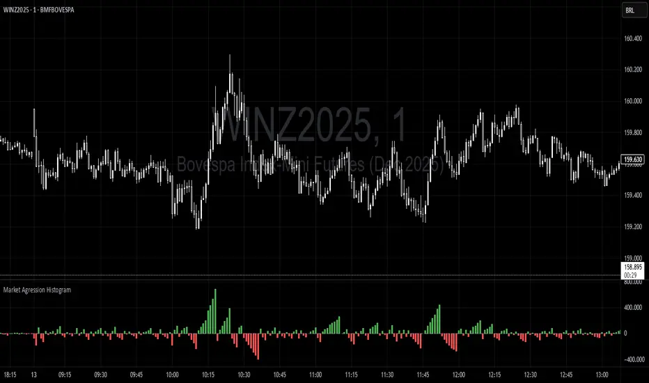
Trading Range Aggression Histogram
This indicator is a histogram that accumulates the net volume of aggressive buying and selling per candle, representing the dominant market pressure within defined time-frame.
The indicator works by continuously summing volumes as long as the aggression remains in the same direction, resetting and reversing the accumulation when the pressure changes sides.
This creates visual waves that facilitate the perception of phases dominated by buyers and sellers over time. The tool is useful to identify moments of strength, weakness, and potential reversals in a dynamic market, especially in short-term trading.
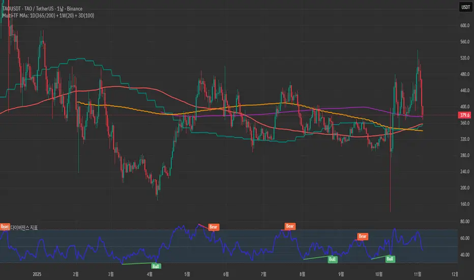
Golden Flow MapGolden Flow Map is a multi–timeframe moving–average system
designed to reveal the underlying direction of long–term market flow,
beyond daily volatility or short–term signals.
This script overlays four major trend lines — each representing a different layer of market rhythm:
Timeframe Length Meaning
🟣 1D – 365 MA Annual average — the true life line of the trend
🔴 1D – 200 MA Institutional benchmark — the long-term threshold
🟢 1W – 20 MA Mid-cycle momentum guide
🟠 3D – 100 MA Wave transition detector — captures trend shifts early
By combining these four perspectives on a single chart,
you can instantly distinguish between a short-term bounce and a major trend reversal.
🧭 How to Use
When all four lines align in one direction → that’s the main current of the market.
If price loses the 200D or 365D, ignore small rebounds — the structure has shifted.
The cross between Weekly 20 and 3D 100 often marks a wave transition.
Focus on alignment order rather than crossovers —
markets ultimately return to the direction of the higher timeframe.
⚙️ Features
SMA / EMA toggle
Individual MA on/off controls
Built-in alerts for 200D and 1W20 cross events
🧠 Concept
“Indicators are not signals — they are maps.”
This tool is not meant to predict, but to reveal the pulse of the market
and guide you through its long-term structure.
✍️ Creator’s Note
Developed from DDU’s personal long-term trend framework,
this indicator serves as a visual compass to expand a trader’s vision
from short-term reactions to macro-level flow.
VMMA Ribbon + Q1/Q3 Echo Rayssimulates a series of vwma lines in a wave. Basically puts them in an array and calculates highest lowest values among other things ... The VMMA Ribbon + Q1/Q3 Echo Rays is a Pine Script v5 indicator that combines a dynamic Volume-Weighted Moving Average (VWMA) ribbon with interactive support/resistance "echo rays" based on the ribbon’s inner quartiles (Q1 and Q3). The ribbon is built from multiple VWMAs of increasing lengths, forming a band with an upper edge, lower edge, midline, and Q1/Q3 lines (representing the 25th and 75th percentiles of the band).
Edges are colored by slope (bullish = green, bearish = red) or use a default color.
Echo rays extend horizontally from recent swing lows in Q1 and swing highs in Q3, acting as dynamic support/resistance levels that "echo" past extremes until broken or surpassed.
Key Use CasesUse Case
Description
1. Trend Strength & Direction
Ribbon expansion = volatility; compression = consolidation. Slope-colored edges show momentum shifts early.
2. Dynamic Support & Resistance
Q1/Q3 echo rays mark high-probability reversal zones. Price respecting rays = continuation; break = reversal.
3. Mean Reversion Entries
Buy near Q1 ray in uptrend (oversold within band); sell near Q3 ray in downtrend.
4. Breakout Confirmation
Price breaking upper/lower edge + Q3/Q1 ray termination confirms strong breakout.
5. Volume-Weighted Context
Uses VWMA → more reactive to volume spikes than SMA → better for stocks/crypto with sudden volume surges.

mysourcetypesncsLibrary "mysourcetypes"
Libreria personale per sorgenti estese (Close, Open, High, Low, Median, Typical, Weighted, Average, Average Median Body, Trend Biased, Trend Biased Extreme, Volume Body, Momentum Biased, Volatility Adjusted, Body Dominance, Shadow Biased, Gap Aware, Rejection Biased, Range Position, Adaptive Trend, Pressure Balanced, Impulse Wave)
rclose()
Regular Close
Returns: Close price
ropen()
Regular Open
Returns: Open price
rhigh()
Regular High
Returns: High price
rlow()
Regular Low
Returns: Low price
rmedian()
Regular Median (HL2)
Returns: (High + Low) / 2
rtypical()
Regular Typical (HLC3)
Returns: (High + Low + Close) / 3
rweighted()
Regular Weighted (HLCC4)
Returns: (High + Low + Close + Close) / 4
raverage()
Regular Average (OHLC4)
Returns: (Open + High + Low + Close) / 4
ravemedbody()
Average Median Body
Returns: (Open + Close) / 2
rtrendb()
Trend Biased Regular
Returns: Trend-weighted price
rtrendbext()
Trend Biased Extreme
Returns: Extreme trend-weighted price
rvolbody()
Volume Weighted Body
Returns: Body midpoint weighted by volume intensity
rmomentum()
Momentum Biased
Returns: Price biased towards momentum direction
rvolatility()
Volatility Adjusted
Returns: Price adjusted by candle's volatility
rbodydominance()
Body Dominance
Returns: Emphasizes body over wicks
rshadowbias()
Shadow Biased
Returns: Price biased by shadow length
rgapaware()
Gap Aware
Returns: Considers gap between candles
rrejection()
Rejection Biased
Returns: Emphasizes price rejection levels
rrangeposition()
Range Position
Returns: Where close sits within the candle range (0-100%)
radaptivetrend()
Adaptive Trend
Returns: Adapts based on recent trend strength
rpressure()
Pressure Balanced
Returns: Balances buying/selling pressure within candle
rimpulse()
Impulse Wave
Returns: Detects impulsive moves vs corrections

Quantum Rotational Field MappingQuantum Rotational Field Mapping (QRFM):
Phase Coherence Detection Through Complex-Plane Oscillator Analysis
Quantum Rotational Field Mapping applies complex-plane mathematics and phase-space analysis to oscillator ensembles, identifying high-probability trend ignition points by measuring when multiple independent oscillators achieve phase coherence. Unlike traditional multi-oscillator approaches that simply stack indicators or use boolean AND/OR logic, this system converts each oscillator into a rotating phasor (vector) in the complex plane and calculates the Coherence Index (CI) —a mathematical measure of how tightly aligned the ensemble has become—then generates signals only when alignment, phase direction, and pairwise entanglement all converge.
The indicator combines three mathematical frameworks: phasor representation using analytic signal theory to extract phase and amplitude from each oscillator, coherence measurement using vector summation in the complex plane to quantify group alignment, and entanglement analysis that calculates pairwise phase agreement across all oscillator combinations. This creates a multi-dimensional confirmation system that distinguishes between random oscillator noise and genuine regime transitions.
What Makes This Original
Complex-Plane Phasor Framework
This indicator implements classical signal processing mathematics adapted for market oscillators. Each oscillator—whether RSI, MACD, Stochastic, CCI, Williams %R, MFI, ROC, or TSI—is first normalized to a common scale, then converted into a complex-plane representation using an in-phase (I) and quadrature (Q) component. The in-phase component is the oscillator value itself, while the quadrature component is calculated as the first difference (derivative proxy), creating a velocity-aware representation.
From these components, the system extracts:
Phase (φ) : Calculated as φ = atan2(Q, I), representing the oscillator's position in its cycle (mapped to -180° to +180°)
Amplitude (A) : Calculated as A = √(I² + Q²), representing the oscillator's strength or conviction
This mathematical approach is fundamentally different from simply reading oscillator values. A phasor captures both where an oscillator is in its cycle (phase angle) and how strongly it's expressing that position (amplitude). Two oscillators can have the same value but be in opposite phases of their cycles—traditional analysis would see them as identical, while QRFM sees them as 180° out of phase (contradictory).
Coherence Index Calculation
The core innovation is the Coherence Index (CI) , borrowed from physics and signal processing. When you have N oscillators, each with phase φₙ, you can represent each as a unit vector in the complex plane: e^(iφₙ) = cos(φₙ) + i·sin(φₙ).
The CI measures what happens when you sum all these vectors:
Resultant Vector : R = Σ e^(iφₙ) = Σ cos(φₙ) + i·Σ sin(φₙ)
Coherence Index : CI = |R| / N
Where |R| is the magnitude of the resultant vector and N is the number of active oscillators.
The CI ranges from 0 to 1:
CI = 1.0 : Perfect coherence—all oscillators have identical phase angles, vectors point in the same direction, creating maximum constructive interference
CI = 0.0 : Complete decoherence—oscillators are randomly distributed around the circle, vectors cancel out through destructive interference
0 < CI < 1 : Partial alignment—some clustering with some scatter
This is not a simple average or correlation. The CI captures phase synchronization across the entire ensemble simultaneously. When oscillators phase-lock (align their cycles), the CI spikes regardless of their individual values. This makes it sensitive to regime transitions that traditional indicators miss.
Dominant Phase and Direction Detection
Beyond measuring alignment strength, the system calculates the dominant phase of the ensemble—the direction the resultant vector points:
Dominant Phase : φ_dom = atan2(Σ sin(φₙ), Σ cos(φₙ))
This gives the "average direction" of all oscillator phases, mapped to -180° to +180°:
+90° to -90° (right half-plane): Bullish phase dominance
+90° to +180° or -90° to -180° (left half-plane): Bearish phase dominance
The combination of CI magnitude (coherence strength) and dominant phase angle (directional bias) creates a two-dimensional signal space. High CI alone is insufficient—you need high CI plus dominant phase pointing in a tradeable direction. This dual requirement is what separates QRFM from simple oscillator averaging.
Entanglement Matrix and Pairwise Coherence
While the CI measures global alignment, the entanglement matrix measures local pairwise relationships. For every pair of oscillators (i, j), the system calculates:
E(i,j) = |cos(φᵢ - φⱼ)|
This represents the phase agreement between oscillators i and j:
E = 1.0 : Oscillators are in-phase (0° or 360° apart)
E = 0.0 : Oscillators are in quadrature (90° apart, orthogonal)
E between 0 and 1 : Varying degrees of alignment
The system counts how many oscillator pairs exceed a user-defined entanglement threshold (e.g., 0.7). This entangled pairs count serves as a confirmation filter: signals require not just high global CI, but also a minimum number of strong pairwise agreements. This prevents false ignitions where CI is high but driven by only two oscillators while the rest remain scattered.
The entanglement matrix creates an N×N symmetric matrix that can be visualized as a web—when many cells are bright (high E values), the ensemble is highly interconnected. When cells are dark, oscillators are moving independently.
Phase-Lock Tolerance Mechanism
A complementary confirmation layer is the phase-lock detector . This calculates the maximum phase spread across all oscillators:
For all pairs (i,j), compute angular distance: Δφ = |φᵢ - φⱼ|, wrapping at 180°
Max Spread = maximum Δφ across all pairs
If max spread < user threshold (e.g., 35°), the ensemble is considered phase-locked —all oscillators are within a narrow angular band.
This differs from entanglement: entanglement measures pairwise cosine similarity (magnitude of alignment), while phase-lock measures maximum angular deviation (tightness of clustering). Both must be satisfied for the highest-conviction signals.
Multi-Layer Visual Architecture
QRFM includes six visual components that represent the same underlying mathematics from different perspectives:
Circular Orbit Plot : A polar coordinate grid showing each oscillator as a vector from origin to perimeter. Angle = phase, radius = amplitude. This is a real-time snapshot of the complex plane. When vectors converge (point in similar directions), coherence is high. When scattered randomly, coherence is low. Users can see phase alignment forming before CI numerically confirms it.
Phase-Time Heat Map : A 2D matrix with rows = oscillators and columns = time bins. Each cell is colored by the oscillator's phase at that time (using a gradient where color hue maps to angle). Horizontal color bands indicate sustained phase alignment over time. Vertical color bands show moments when all oscillators shared the same phase (ignition points). This provides historical pattern recognition.
Entanglement Web Matrix : An N×N grid showing E(i,j) for all pairs. Cells are colored by entanglement strength—bright yellow/gold for high E, dark gray for low E. This reveals which oscillators are driving coherence and which are lagging. For example, if RSI and MACD show high E but Stochastic shows low E with everything, Stochastic is the outlier.
Quantum Field Cloud : A background color overlay on the price chart. Color (green = bullish, red = bearish) is determined by dominant phase. Opacity is determined by CI—high CI creates dense, opaque cloud; low CI creates faint, nearly invisible cloud. This gives an atmospheric "feel" for regime strength without looking at numbers.
Phase Spiral : A smoothed plot of dominant phase over recent history, displayed as a curve that wraps around price. When the spiral is tight and rotating steadily, the ensemble is in coherent rotation (trending). When the spiral is loose or erratic, coherence is breaking down.
Dashboard : A table showing real-time metrics: CI (as percentage), dominant phase (in degrees with directional arrow), field strength (CI × average amplitude), entangled pairs count, phase-lock status (locked/unlocked), quantum state classification ("Ignition", "Coherent", "Collapse", "Chaos"), and collapse risk (recent CI change normalized to 0-100%).
Each component is independently toggleable, allowing users to customize their workspace. The orbit plot is the most essential—it provides intuitive, visual feedback on phase alignment that no numerical dashboard can match.
Core Components and How They Work Together
1. Oscillator Normalization Engine
The foundation is creating a common measurement scale. QRFM supports eight oscillators:
RSI : Normalized from to using overbought/oversold levels (70, 30) as anchors
MACD Histogram : Normalized by dividing by rolling standard deviation, then clamped to
Stochastic %K : Normalized from using (80, 20) anchors
CCI : Divided by 200 (typical extreme level), clamped to
Williams %R : Normalized from using (-20, -80) anchors
MFI : Normalized from using (80, 20) anchors
ROC : Divided by 10, clamped to
TSI : Divided by 50, clamped to
Each oscillator can be individually enabled/disabled. Only active oscillators contribute to phase calculations. The normalization removes scale differences—a reading of +0.8 means "strongly bullish" regardless of whether it came from RSI or TSI.
2. Analytic Signal Construction
For each active oscillator at each bar, the system constructs the analytic signal:
In-Phase (I) : The normalized oscillator value itself
Quadrature (Q) : The bar-to-bar change in the normalized value (first derivative approximation)
This creates a 2D representation: (I, Q). The phase is extracted as:
φ = atan2(Q, I) × (180 / π)
This maps the oscillator to a point on the unit circle. An oscillator at the same value but rising (positive Q) will have a different phase than one that is falling (negative Q). This velocity-awareness is critical—it distinguishes between "at resistance and stalling" versus "at resistance and breaking through."
The amplitude is extracted as:
A = √(I² + Q²)
This represents the distance from origin in the (I, Q) plane. High amplitude means the oscillator is far from neutral (strong conviction). Low amplitude means it's near zero (weak/transitional state).
3. Coherence Calculation Pipeline
For each bar (or every Nth bar if phase sample rate > 1 for performance):
Step 1 : Extract phase φₙ for each of the N active oscillators
Step 2 : Compute complex exponentials: Zₙ = e^(i·φₙ·π/180) = cos(φₙ·π/180) + i·sin(φₙ·π/180)
Step 3 : Sum the complex exponentials: R = Σ Zₙ = (Σ cos φₙ) + i·(Σ sin φₙ)
Step 4 : Calculate magnitude: |R| = √
Step 5 : Normalize by count: CI_raw = |R| / N
Step 6 : Smooth the CI: CI = SMA(CI_raw, smoothing_window)
The smoothing step (default 2 bars) removes single-bar noise spikes while preserving structural coherence changes. Users can adjust this to control reactivity versus stability.
The dominant phase is calculated as:
φ_dom = atan2(Σ sin φₙ, Σ cos φₙ) × (180 / π)
This is the angle of the resultant vector R in the complex plane.
4. Entanglement Matrix Construction
For all unique pairs of oscillators (i, j) where i < j:
Step 1 : Get phases φᵢ and φⱼ
Step 2 : Compute phase difference: Δφ = φᵢ - φⱼ (in radians)
Step 3 : Calculate entanglement: E(i,j) = |cos(Δφ)|
Step 4 : Store in symmetric matrix: matrix = matrix = E(i,j)
The matrix is then scanned: count how many E(i,j) values exceed the user-defined threshold (default 0.7). This count is the entangled pairs metric.
For visualization, the matrix is rendered as an N×N table where cell brightness maps to E(i,j) intensity.
5. Phase-Lock Detection
Step 1 : For all unique pairs (i, j), compute angular distance: Δφ = |φᵢ - φⱼ|
Step 2 : Wrap angles: if Δφ > 180°, set Δφ = 360° - Δφ
Step 3 : Find maximum: max_spread = max(Δφ) across all pairs
Step 4 : Compare to tolerance: phase_locked = (max_spread < tolerance)
If phase_locked is true, all oscillators are within the specified angular cone (e.g., 35°). This is a boolean confirmation filter.
6. Signal Generation Logic
Signals are generated through multi-layer confirmation:
Long Ignition Signal :
CI crosses above ignition threshold (e.g., 0.80)
AND dominant phase is in bullish range (-90° < φ_dom < +90°)
AND phase_locked = true
AND entangled_pairs >= minimum threshold (e.g., 4)
Short Ignition Signal :
CI crosses above ignition threshold
AND dominant phase is in bearish range (φ_dom < -90° OR φ_dom > +90°)
AND phase_locked = true
AND entangled_pairs >= minimum threshold
Collapse Signal :
CI at bar minus CI at current bar > collapse threshold (e.g., 0.55)
AND CI at bar was above 0.6 (must collapse from coherent state, not from already-low state)
These are strict conditions. A high CI alone does not generate a signal—dominant phase must align with direction, oscillators must be phase-locked, and sufficient pairwise entanglement must exist. This multi-factor gating dramatically reduces false signals compared to single-condition triggers.
Calculation Methodology
Phase 1: Oscillator Computation and Normalization
On each bar, the system calculates the raw values for all enabled oscillators using standard Pine Script functions:
RSI: ta.rsi(close, length)
MACD: ta.macd() returning histogram component
Stochastic: ta.stoch() smoothed with ta.sma()
CCI: ta.cci(close, length)
Williams %R: ta.wpr(length)
MFI: ta.mfi(hlc3, length)
ROC: ta.roc(close, length)
TSI: ta.tsi(close, short, long)
Each raw value is then passed through a normalization function:
normalize(value, overbought_level, oversold_level) = 2 × (value - oversold) / (overbought - oversold) - 1
This maps the oscillator's typical range to , where -1 represents extreme bearish, 0 represents neutral, and +1 represents extreme bullish.
For oscillators without fixed ranges (MACD, ROC, TSI), statistical normalization is used: divide by a rolling standard deviation or fixed divisor, then clamp to .
Phase 2: Phasor Extraction
For each normalized oscillator value val:
I = val (in-phase component)
Q = val - val (quadrature component, first difference)
Phase calculation:
phi_rad = atan2(Q, I)
phi_deg = phi_rad × (180 / π)
Amplitude calculation:
A = √(I² + Q²)
These values are stored in arrays: osc_phases and osc_amps for each oscillator n.
Phase 3: Complex Summation and Coherence
Initialize accumulators:
sum_cos = 0
sum_sin = 0
For each oscillator n = 0 to N-1:
phi_rad = osc_phases × (π / 180)
sum_cos += cos(phi_rad)
sum_sin += sin(phi_rad)
Resultant magnitude:
resultant_mag = √(sum_cos² + sum_sin²)
Coherence Index (raw):
CI_raw = resultant_mag / N
Smoothed CI:
CI = SMA(CI_raw, smoothing_window)
Dominant phase:
phi_dom_rad = atan2(sum_sin, sum_cos)
phi_dom_deg = phi_dom_rad × (180 / π)
Phase 4: Entanglement Matrix Population
For i = 0 to N-2:
For j = i+1 to N-1:
phi_i = osc_phases × (π / 180)
phi_j = osc_phases × (π / 180)
delta_phi = phi_i - phi_j
E = |cos(delta_phi)|
matrix_index_ij = i × N + j
matrix_index_ji = j × N + i
entangle_matrix = E
entangle_matrix = E
if E >= threshold:
entangled_pairs += 1
The matrix uses flat array storage with index mapping: index(row, col) = row × N + col.
Phase 5: Phase-Lock Check
max_spread = 0
For i = 0 to N-2:
For j = i+1 to N-1:
delta = |osc_phases - osc_phases |
if delta > 180:
delta = 360 - delta
max_spread = max(max_spread, delta)
phase_locked = (max_spread < tolerance)
Phase 6: Signal Evaluation
Ignition Long :
ignition_long = (CI crosses above threshold) AND
(phi_dom > -90 AND phi_dom < 90) AND
phase_locked AND
(entangled_pairs >= minimum)
Ignition Short :
ignition_short = (CI crosses above threshold) AND
(phi_dom < -90 OR phi_dom > 90) AND
phase_locked AND
(entangled_pairs >= minimum)
Collapse :
CI_prev = CI
collapse = (CI_prev - CI > collapse_threshold) AND (CI_prev > 0.6)
All signals are evaluated on bar close. The crossover and crossunder functions ensure signals fire only once when conditions transition from false to true.
Phase 7: Field Strength and Visualization Metrics
Average Amplitude :
avg_amp = (Σ osc_amps ) / N
Field Strength :
field_strength = CI × avg_amp
Collapse Risk (for dashboard):
collapse_risk = (CI - CI) / max(CI , 0.1)
collapse_risk_pct = clamp(collapse_risk × 100, 0, 100)
Quantum State Classification :
if (CI > threshold AND phase_locked):
state = "Ignition"
else if (CI > 0.6):
state = "Coherent"
else if (collapse):
state = "Collapse"
else:
state = "Chaos"
Phase 8: Visual Rendering
Orbit Plot : For each oscillator, convert polar (phase, amplitude) to Cartesian (x, y) for grid placement:
radius = amplitude × grid_center × 0.8
x = radius × cos(phase × π/180)
y = radius × sin(phase × π/180)
col = center + x (mapped to grid coordinates)
row = center - y
Heat Map : For each oscillator row and time column, retrieve historical phase value at lookback = (columns - col) × sample_rate, then map phase to color using a hue gradient.
Entanglement Web : Render matrix as table cell with background color opacity = E(i,j).
Field Cloud : Background color = (phi_dom > -90 AND phi_dom < 90) ? green : red, with opacity = mix(min_opacity, max_opacity, CI).
All visual components render only on the last bar (barstate.islast) to minimize computational overhead.
How to Use This Indicator
Step 1 : Apply QRFM to your chart. It works on all timeframes and asset classes, though 15-minute to 4-hour timeframes provide the best balance of responsiveness and noise reduction.
Step 2 : Enable the dashboard (default: top right) and the circular orbit plot (default: middle left). These are your primary visual feedback tools.
Step 3 : Optionally enable the heat map, entanglement web, and field cloud based on your preference. New users may find all visuals overwhelming; start with dashboard + orbit plot.
Step 4 : Observe for 50-100 bars to let the indicator establish baseline coherence patterns. Markets have different "normal" CI ranges—some instruments naturally run higher or lower coherence.
Understanding the Circular Orbit Plot
The orbit plot is a polar grid showing oscillator vectors in real-time:
Center point : Neutral (zero phase and amplitude)
Each vector : A line from center to a point on the grid
Vector angle : The oscillator's phase (0° = right/east, 90° = up/north, 180° = left/west, -90° = down/south)
Vector length : The oscillator's amplitude (short = weak signal, long = strong signal)
Vector label : First letter of oscillator name (R = RSI, M = MACD, etc.)
What to watch :
Convergence : When all vectors cluster in one quadrant or sector, CI is rising and coherence is forming. This is your pre-signal warning.
Scatter : When vectors point in random directions (360° spread), CI is low and the market is in a non-trending or transitional regime.
Rotation : When the cluster rotates smoothly around the circle, the ensemble is in coherent oscillation—typically seen during steady trends.
Sudden flips : When the cluster rapidly jumps from one side to the opposite (e.g., +90° to -90°), a phase reversal has occurred—often coinciding with trend reversals.
Example: If you see RSI, MACD, and Stochastic all pointing toward 45° (northeast) with long vectors, while CCI, TSI, and ROC point toward 40-50° as well, coherence is high and dominant phase is bullish. Expect an ignition signal if CI crosses threshold.
Reading Dashboard Metrics
The dashboard provides numerical confirmation of what the orbit plot shows visually:
CI : Displays as 0-100%. Above 70% = high coherence (strong regime), 40-70% = moderate, below 40% = low (poor conditions for trend entries).
Dom Phase : Angle in degrees with directional arrow. ⬆ = bullish bias, ⬇ = bearish bias, ⬌ = neutral.
Field Strength : CI weighted by amplitude. High values (> 0.6) indicate not just alignment but strong alignment.
Entangled Pairs : Count of oscillator pairs with E > threshold. Higher = more confirmation. If minimum is set to 4, you need at least 4 pairs entangled for signals.
Phase Lock : 🔒 YES (all oscillators within tolerance) or 🔓 NO (spread too wide).
State : Real-time classification:
🚀 IGNITION: CI just crossed threshold with phase-lock
⚡ COHERENT: CI is high and stable
💥 COLLAPSE: CI has dropped sharply
🌀 CHAOS: Low CI, scattered phases
Collapse Risk : 0-100% scale based on recent CI change. Above 50% warns of imminent breakdown.
Interpreting Signals
Long Ignition (Blue Triangle Below Price) :
Occurs when CI crosses above threshold (e.g., 0.80)
Dominant phase is in bullish range (-90° to +90°)
All oscillators are phase-locked (within tolerance)
Minimum entangled pairs requirement met
Interpretation : The oscillator ensemble has transitioned from disorder to coherent bullish alignment. This is a high-probability long entry point. The multi-layer confirmation (CI + phase direction + lock + entanglement) ensures this is not a single-oscillator whipsaw.
Short Ignition (Red Triangle Above Price) :
Same conditions as long, but dominant phase is in bearish range (< -90° or > +90°)
Interpretation : Coherent bearish alignment has formed. High-probability short entry.
Collapse (Circles Above and Below Price) :
CI has dropped by more than the collapse threshold (e.g., 0.55) over a 5-bar window
CI was previously above 0.6 (collapsing from coherent state)
Interpretation : Phase coherence has broken down. If you are in a position, this is an exit warning. If looking to enter, stand aside—regime is transitioning.
Phase-Time Heat Map Patterns
Enable the heat map and position it at bottom right. The rows represent individual oscillators, columns represent time bins (most recent on left).
Pattern: Horizontal Color Bands
If a row (e.g., RSI) shows consistent color across columns (say, green for several bins), that oscillator has maintained stable phase over time. If all rows show horizontal bands of similar color, the entire ensemble has been phase-locked for an extended period—this is a strong trending regime.
Pattern: Vertical Color Bands
If a column (single time bin) shows all cells with the same or very similar color, that moment in time had high coherence. These vertical bands often align with ignition signals or major price pivots.
Pattern: Rainbow Chaos
If cells are random colors (red, green, yellow mixed with no pattern), coherence is low. The ensemble is scattered. Avoid trading during these periods unless you have external confirmation.
Pattern: Color Transition
If you see a row transition from red to green (or vice versa) sharply, that oscillator has phase-flipped. If multiple rows do this simultaneously, a regime change is underway.
Entanglement Web Analysis
Enable the web matrix (default: opposite corner from heat map). It shows an N×N grid where N = number of active oscillators.
Bright Yellow/Gold Cells : High pairwise entanglement. For example, if the RSI-MACD cell is bright gold, those two oscillators are moving in phase. If the RSI-Stochastic cell is bright, they are entangled as well.
Dark Gray Cells : Low entanglement. Oscillators are decorrelated or in quadrature.
Diagonal : Always marked with "—" because an oscillator is always perfectly entangled with itself.
How to use :
Scan for clustering: If most cells are bright, coherence is high across the board. If only a few cells are bright, coherence is driven by a subset (e.g., RSI and MACD are aligned, but nothing else is—weak signal).
Identify laggards: If one row/column is entirely dark, that oscillator is the outlier. You may choose to disable it or monitor for when it joins the group (late confirmation).
Watch for web formation: During low-coherence periods, the matrix is mostly dark. As coherence builds, cells begin lighting up. A sudden "web" of connections forming visually precedes ignition signals.
Trading Workflow
Step 1: Monitor Coherence Level
Check the dashboard CI metric or observe the orbit plot. If CI is below 40% and vectors are scattered, conditions are poor for trend entries. Wait.
Step 2: Detect Coherence Building
When CI begins rising (say, from 30% to 50-60%) and you notice vectors on the orbit plot starting to cluster, coherence is forming. This is your alert phase—do not enter yet, but prepare.
Step 3: Confirm Phase Direction
Check the dominant phase angle and the orbit plot quadrant where clustering is occurring:
Clustering in right half (0° to ±90°): Bullish bias forming
Clustering in left half (±90° to 180°): Bearish bias forming
Verify the dashboard shows the corresponding directional arrow (⬆ or ⬇).
Step 4: Wait for Signal Confirmation
Do not enter based on rising CI alone. Wait for the full ignition signal:
CI crosses above threshold
Phase-lock indicator shows 🔒 YES
Entangled pairs count >= minimum
Directional triangle appears on chart
This ensures all layers have aligned.
Step 5: Execute Entry
Long : Blue triangle below price appears → enter long
Short : Red triangle above price appears → enter short
Step 6: Position Management
Initial Stop : Place stop loss based on your risk management rules (e.g., recent swing low/high, ATR-based buffer).
Monitoring :
Watch the field cloud density. If it remains opaque and colored in your direction, the regime is intact.
Check dashboard collapse risk. If it rises above 50%, prepare for exit.
Monitor the orbit plot. If vectors begin scattering or the cluster flips to the opposite side, coherence is breaking.
Exit Triggers :
Collapse signal fires (circles appear)
Dominant phase flips to opposite half-plane
CI drops below 40% (coherence lost)
Price hits your profit target or trailing stop
Step 7: Post-Exit Analysis
After exiting, observe whether a new ignition forms in the opposite direction (reversal) or if CI remains low (transition to range). Use this to decide whether to re-enter, reverse, or stand aside.
Best Practices
Use Price Structure as Context
QRFM identifies when coherence forms but does not specify where price will go. Combine ignition signals with support/resistance levels, trendlines, or chart patterns. For example:
Long ignition near a major support level after a pullback: high-probability bounce
Long ignition in the middle of a range with no structure: lower probability
Multi-Timeframe Confirmation
Open QRFM on two timeframes simultaneously:
Higher timeframe (e.g., 4-hour): Use CI level to determine regime bias. If 4H CI is above 60% and dominant phase is bullish, the market is in a bullish regime.
Lower timeframe (e.g., 15-minute): Execute entries on ignition signals that align with the higher timeframe bias.
This prevents counter-trend trades and increases win rate.
Distinguish Between Regime Types
High CI, stable dominant phase (State: Coherent) : Trending market. Ignitions are continuation signals; collapses are profit-taking or reversal warnings.
Low CI, erratic dominant phase (State: Chaos) : Ranging or choppy market. Avoid ignition signals or reduce position size. Wait for coherence to establish.
Moderate CI with frequent collapses : Whipsaw environment. Use wider stops or stand aside.
Adjust Parameters to Instrument and Timeframe
Crypto/Forex (high volatility) : Lower ignition threshold (0.65-0.75), lower CI smoothing (2-3), shorter oscillator lengths (7-10).
Stocks/Indices (moderate volatility) : Standard settings (threshold 0.75-0.85, smoothing 5-7, oscillator lengths 14).
Lower timeframes (5-15 min) : Reduce phase sample rate to 1-2 for responsiveness.
Higher timeframes (daily+) : Increase CI smoothing and oscillator lengths for noise reduction.
Use Entanglement Count as Conviction Filter
The minimum entangled pairs setting controls signal strictness:
Low (1-2) : More signals, lower quality (acceptable if you have other confirmation)
Medium (3-5) : Balanced (recommended for most traders)
High (6+) : Very strict, fewer signals, highest quality
Adjust based on your trade frequency preference and risk tolerance.
Monitor Oscillator Contribution
Use the entanglement web to see which oscillators are driving coherence. If certain oscillators are consistently dark (low E with all others), they may be adding noise. Consider disabling them. For example:
On low-volume instruments, MFI may be unreliable → disable MFI
On strongly trending instruments, mean-reversion oscillators (Stochastic, RSI) may lag → reduce weight or disable
Respect the Collapse Signal
Collapse events are early warnings. Price may continue in the original direction for several bars after collapse fires, but the underlying regime has weakened. Best practice:
If in profit: Take partial or full profit on collapse
If at breakeven/small loss: Exit immediately
If collapse occurs shortly after entry: Likely a false ignition; exit to avoid drawdown
Collapses do not guarantee immediate reversals—they signal uncertainty .
Combine with Volume Analysis
If your instrument has reliable volume:
Ignitions with expanding volume: Higher conviction
Ignitions with declining volume: Weaker, possibly false
Collapses with volume spikes: Strong reversal signal
Collapses with low volume: May just be consolidation
Volume is not built into QRFM (except via MFI), so add it as external confirmation.
Observe the Phase Spiral
The spiral provides a quick visual cue for rotation consistency:
Tight, smooth spiral : Ensemble is rotating coherently (trending)
Loose, erratic spiral : Phase is jumping around (ranging or transitional)
If the spiral tightens, coherence is building. If it loosens, coherence is dissolving.
Do Not Overtrade Low-Coherence Periods
When CI is persistently below 40% and the state is "Chaos," the market is not in a regime where phase analysis is predictive. During these times:
Reduce position size
Widen stops
Wait for coherence to return
QRFM's strength is regime detection. If there is no regime, the tool correctly signals "stand aside."
Use Alerts Strategically
Set alerts for:
Long Ignition
Short Ignition
Collapse
Phase Lock (optional)
Configure alerts to "Once per bar close" to avoid intrabar repainting and noise. When an alert fires, manually verify:
Orbit plot shows clustering
Dashboard confirms all conditions
Price structure supports the trade
Do not blindly trade alerts—use them as prompts for analysis.
Ideal Market Conditions
Best Performance
Instruments :
Liquid, actively traded markets (major forex pairs, large-cap stocks, major indices, top-tier crypto)
Instruments with clear cyclical oscillator behavior (avoid extremely illiquid or manipulated markets)
Timeframes :
15-minute to 4-hour: Optimal balance of noise reduction and responsiveness
1-hour to daily: Slower, higher-conviction signals; good for swing trading
5-minute: Acceptable for scalping if parameters are tightened and you accept more noise
Market Regimes :
Trending markets with periodic retracements (where oscillators cycle through phases predictably)
Breakout environments (coherence forms before/during breakout; collapse occurs at exhaustion)
Rotational markets with clear swings (oscillators phase-lock at turning points)
Volatility :
Moderate to high volatility (oscillators have room to move through their ranges)
Stable volatility regimes (sudden VIX spikes or flash crashes may create false collapses)
Challenging Conditions
Instruments :
Very low liquidity markets (erratic price action creates unstable oscillator phases)
Heavily news-driven instruments (fundamentals may override technical coherence)
Highly correlated instruments (oscillators may all reflect the same underlying factor, reducing independence)
Market Regimes :
Deep, prolonged consolidation (oscillators remain near neutral, CI is chronically low, few signals fire)
Extreme chop with no directional bias (oscillators whipsaw, coherence never establishes)
Gap-driven markets (large overnight gaps create phase discontinuities)
Timeframes :
Sub-5-minute charts: Noise dominates; oscillators flip rapidly; coherence is fleeting and unreliable
Weekly/monthly: Oscillators move extremely slowly; signals are rare; better suited for long-term positioning than active trading
Special Cases :
During major economic releases or earnings: Oscillators may lag price or become decorrelated as fundamentals overwhelm technicals. Reduce position size or stand aside.
In extremely low-volatility environments (e.g., holiday periods): Oscillators compress to neutral, CI may be artificially high due to lack of movement, but signals lack follow-through.
Adaptive Behavior
QRFM is designed to self-adapt to poor conditions:
When coherence is genuinely absent, CI remains low and signals do not fire
When only a subset of oscillators aligns, entangled pairs count stays below threshold and signals are filtered out
When phase-lock cannot be achieved (oscillators too scattered), the lock filter prevents signals
This means the indicator will naturally produce fewer (or zero) signals during unfavorable conditions, rather than generating false signals. This is a feature —it keeps you out of low-probability trades.
Parameter Optimization by Trading Style
Scalping (5-15 Minute Charts)
Goal : Maximum responsiveness, accept higher noise
Oscillator Lengths :
RSI: 7-10
MACD: 8/17/6
Stochastic: 8-10, smooth 2-3
CCI: 14-16
Others: 8-12
Coherence Settings :
CI Smoothing Window: 2-3 bars (fast reaction)
Phase Sample Rate: 1 (every bar)
Ignition Threshold: 0.65-0.75 (lower for more signals)
Collapse Threshold: 0.40-0.50 (earlier exit warnings)
Confirmation :
Phase Lock Tolerance: 40-50° (looser, easier to achieve)
Min Entangled Pairs: 2-3 (fewer oscillators required)
Visuals :
Orbit Plot + Dashboard only (reduce screen clutter for fast decisions)
Disable heavy visuals (heat map, web) for performance
Alerts :
Enable all ignition and collapse alerts
Set to "Once per bar close"
Day Trading (15-Minute to 1-Hour Charts)
Goal : Balance between responsiveness and reliability
Oscillator Lengths :
RSI: 14 (standard)
MACD: 12/26/9 (standard)
Stochastic: 14, smooth 3
CCI: 20
Others: 10-14
Coherence Settings :
CI Smoothing Window: 3-5 bars (balanced)
Phase Sample Rate: 2-3
Ignition Threshold: 0.75-0.85 (moderate selectivity)
Collapse Threshold: 0.50-0.55 (balanced exit timing)
Confirmation :
Phase Lock Tolerance: 30-40° (moderate tightness)
Min Entangled Pairs: 4-5 (reasonable confirmation)
Visuals :
Orbit Plot + Dashboard + Heat Map or Web (choose one)
Field Cloud for regime backdrop
Alerts :
Ignition and collapse alerts
Optional phase-lock alert for advance warning
Swing Trading (4-Hour to Daily Charts)
Goal : High-conviction signals, minimal noise, fewer trades
Oscillator Lengths :
RSI: 14-21
MACD: 12/26/9 or 19/39/9 (longer variant)
Stochastic: 14-21, smooth 3-5
CCI: 20-30
Others: 14-20
Coherence Settings :
CI Smoothing Window: 5-10 bars (very smooth)
Phase Sample Rate: 3-5
Ignition Threshold: 0.80-0.90 (high bar for entry)
Collapse Threshold: 0.55-0.65 (only significant breakdowns)
Confirmation :
Phase Lock Tolerance: 20-30° (tight clustering required)
Min Entangled Pairs: 5-7 (strong confirmation)
Visuals :
All modules enabled (you have time to analyze)
Heat Map for multi-bar pattern recognition
Web for deep confirmation analysis
Alerts :
Ignition and collapse
Review manually before entering (no rush)
Position/Long-Term Trading (Daily to Weekly Charts)
Goal : Rare, very high-conviction regime shifts
Oscillator Lengths :
RSI: 21-30
MACD: 19/39/9 or 26/52/12
Stochastic: 21, smooth 5
CCI: 30-50
Others: 20-30
Coherence Settings :
CI Smoothing Window: 10-14 bars
Phase Sample Rate: 5 (every 5th bar to reduce computation)
Ignition Threshold: 0.85-0.95 (only extreme alignment)
Collapse Threshold: 0.60-0.70 (major regime breaks only)
Confirmation :
Phase Lock Tolerance: 15-25° (very tight)
Min Entangled Pairs: 6+ (broad consensus required)
Visuals :
Dashboard + Orbit Plot for quick checks
Heat Map to study historical coherence patterns
Web to verify deep entanglement
Alerts :
Ignition only (collapses are less critical on long timeframes)
Manual review with fundamental analysis overlay
Performance Optimization (Low-End Systems)
If you experience lag or slow rendering:
Reduce Visual Load :
Orbit Grid Size: 8-10 (instead of 12+)
Heat Map Time Bins: 5-8 (instead of 10+)
Disable Web Matrix entirely if not needed
Disable Field Cloud and Phase Spiral
Reduce Calculation Frequency :
Phase Sample Rate: 5-10 (calculate every 5-10 bars)
Max History Depth: 100-200 (instead of 500+)
Disable Unused Oscillators :
If you only want RSI, MACD, and Stochastic, disable the other five. Fewer oscillators = smaller matrices, faster loops.
Simplify Dashboard :
Choose "Small" dashboard size
Reduce number of metrics displayed
These settings will not significantly degrade signal quality (signals are based on bar-close calculations, which remain accurate), but will improve chart responsiveness.
Important Disclaimers
This indicator is a technical analysis tool designed to identify periods of phase coherence across an ensemble of oscillators. It is not a standalone trading system and does not guarantee profitable trades. The Coherence Index, dominant phase, and entanglement metrics are mathematical calculations applied to historical price data—they measure past oscillator behavior and do not predict future price movements with certainty.
No Predictive Guarantee : High coherence indicates that oscillators are currently aligned, which historically has coincided with trending or directional price movement. However, past alignment does not guarantee future trends. Markets can remain coherent while prices consolidate, or lose coherence suddenly due to news, liquidity changes, or other factors not captured by oscillator mathematics.
Signal Confirmation is Probabilistic : The multi-layer confirmation system (CI threshold + dominant phase + phase-lock + entanglement) is designed to filter out low-probability setups. This increases the proportion of valid signals relative to false signals, but does not eliminate false signals entirely. Users should combine QRFM with additional analysis—support and resistance levels, volume confirmation, multi-timeframe alignment, and fundamental context—before executing trades.
Collapse Signals are Warnings, Not Reversals : A coherence collapse indicates that the oscillator ensemble has lost alignment. This often precedes trend exhaustion or reversals, but can also occur during healthy pullbacks or consolidations. Price may continue in the original direction after a collapse. Use collapses as risk management cues (tighten stops, take partial profits) rather than automatic reversal entries.
Market Regime Dependency : QRFM performs best in markets where oscillators exhibit cyclical, mean-reverting behavior and where trends are punctuated by retracements. In markets dominated by fundamental shocks, gap openings, or extreme low-liquidity conditions, oscillator coherence may be less reliable. During such periods, reduce position size or stand aside.
Risk Management is Essential : All trading involves risk of loss. Use appropriate stop losses, position sizing, and risk-per-trade limits. The indicator does not specify stop loss or take profit levels—these must be determined by the user based on their risk tolerance and account size. Never risk more than you can afford to lose.
Parameter Sensitivity : The indicator's behavior changes with input parameters. Aggressive settings (low thresholds, loose tolerances) produce more signals with lower average quality. Conservative settings (high thresholds, tight tolerances) produce fewer signals with higher average quality. Users should backtest and forward-test parameter sets on their specific instruments and timeframes before committing real capital.
No Repainting by Design : All signal conditions are evaluated on bar close using bar-close values. However, the visual components (orbit plot, heat map, dashboard) update in real-time during bar formation for monitoring purposes. For trade execution, rely on the confirmed signals (triangles and circles) that appear only after the bar closes.
Computational Load : QRFM performs extensive calculations, including nested loops for entanglement matrices and real-time table rendering. On lower-powered devices or when running multiple indicators simultaneously, users may experience lag. Use the performance optimization settings (reduce visual complexity, increase phase sample rate, disable unused oscillators) to improve responsiveness.
This system is most effective when used as one component within a broader trading methodology that includes sound risk management, multi-timeframe analysis, market context awareness, and disciplined execution. It is a tool for regime detection and signal confirmation, not a substitute for comprehensive trade planning.
Technical Notes
Calculation Timing : All signal logic (ignition, collapse) is evaluated using bar-close values. The barstate.isconfirmed or implicit bar-close behavior ensures signals do not repaint. Visual components (tables, plots) render on every tick for real-time feedback but do not affect signal generation.
Phase Wrapping : Phase angles are calculated in the range -180° to +180° using atan2. Angular distance calculations account for wrapping (e.g., the distance between +170° and -170° is 20°, not 340°). This ensures phase-lock detection works correctly across the ±180° boundary.
Array Management : The indicator uses fixed-size arrays for oscillator phases, amplitudes, and the entanglement matrix. The maximum number of oscillators is 8. If fewer oscillators are enabled, array sizes shrink accordingly (only active oscillators are processed).
Matrix Indexing : The entanglement matrix is stored as a flat array with size N×N, where N is the number of active oscillators. Index mapping: index(row, col) = row × N + col. Symmetric pairs (i,j) and (j,i) are stored identically.
Normalization Stability : Oscillators are normalized to using fixed reference levels (e.g., RSI overbought/oversold at 70/30). For unbounded oscillators (MACD, ROC, TSI), statistical normalization (division by rolling standard deviation) is used, with clamping to prevent extreme outliers from distorting phase calculations.
Smoothing and Lag : The CI smoothing window (SMA) introduces lag proportional to the window size. This is intentional—it filters out single-bar noise spikes in coherence. Users requiring faster reaction can reduce the smoothing window to 1-2 bars, at the cost of increased sensitivity to noise.
Complex Number Representation : Pine Script does not have native complex number types. Complex arithmetic is implemented using separate real and imaginary accumulators (sum_cos, sum_sin) and manual calculation of magnitude (sqrt(real² + imag²)) and argument (atan2(imag, real)).
Lookback Limits : The indicator respects Pine Script's maximum lookback constraints. Historical phase and amplitude values are accessed using the operator, with lookback limited to the chart's available bar history (max_bars_back=5000 declared).
Visual Rendering Performance : Tables (orbit plot, heat map, web, dashboard) are conditionally deleted and recreated on each update using table.delete() and table.new(). This prevents memory leaks but incurs redraw overhead. Rendering is restricted to barstate.islast (last bar) to minimize computational load—historical bars do not render visuals.
Alert Condition Triggers : alertcondition() functions evaluate on bar close when their boolean conditions transition from false to true. Alerts do not fire repeatedly while a condition remains true (e.g., CI stays above threshold for 10 bars fires only once on the initial cross).
Color Gradient Functions : The phaseColor() function maps phase angles to RGB hues using sine waves offset by 120° (red, green, blue channels). This creates a continuous spectrum where -180° to +180° spans the full color wheel. The amplitudeColor() function maps amplitude to grayscale intensity. The coherenceColor() function uses cos(phase) to map contribution to CI (positive = green, negative = red).
No External Data Requests : QRFM operates entirely on the chart's symbol and timeframe. It does not use request.security() or access external data sources. All calculations are self-contained, avoiding lookahead bias from higher-timeframe requests.
Deterministic Behavior : Given identical input parameters and price data, QRFM produces identical outputs. There are no random elements, probabilistic sampling, or time-of-day dependencies.
— Dskyz, Engineering precision. Trading coherence.

Thematic Portfolio: Quantum Computing & Core TechThis indicator tracks the aggregated performance of a curated thematic portfolio representing the Quantum Computing & Core Technology sector.
It combines leading equities and ETFs with predefined weights to reflect a diversified exposure across quantum hardware, AI infrastructure, and semiconductor backbones.
Composition:
Stocks: Rigetti (RGTI), IonQ (IONQ), D-Wave (QBTS), Palantir (PLTR), Intel (INTC), Arqit (ARQQ)
ETFs: BUG, QTUM, SOXX, IHAK
Methodology:
Each component’s normalized performance is weighted according to its strategic importance within the theme (R&D intensity, infrastructure leverage, and hardware dependence). The indicator dynamically aggregates the weighted series to visualize the cumulative return of the quantum computing ecosystem versus traditional benchmarks.
Intended use:
Compare thematic returns vs. S&P 500 or NASDAQ
Identify macro inflection points in the quantum tech narrative
Backtest thematic exposure strategies or structure twin-win / delta-one certificates
Note: This script is for analytical and educational purposes only and does not constitute financial advice.
Grok's xAI Signal (GXS) Indicator for BTC V6Grok's xAI Signal (GXS) Indicator: A Simple Guide
Imagine trying to decide if Bitcoin is a "buy," "sell," or "wait" without staring at 10 different charts. The GXS Indicator does that for you—it's like a smart dashboard for BTC traders, overlaying signals right on your price chart. It boils down complex market clues into one easy score (from -1 "super bearish" to +1 "super bullish") and flashes green/red arrows or shaded zones when action's needed. No fancy math overload; just clear visuals like tiny triangles for trades, colored clouds for trends, and a bottom "mood bar" (green=up vibe, red=down, gray=meh).
At its core, GXS mixes three big-picture checks:
Price Momentum (50% weight): Quick scans of RSI (overbought/oversold vibes), MACD (speed of ups/downs), EMAs (is price riding the trend wave?), and Bollinger Bands (is the market squeezing for a breakout?). This catches short-term "hot or not" energy.
Network Health (30% weight): A simple "NVT" hack using trading volume vs. price to spot if BTC feels undervalued (buy hint) or overhyped (sell warning). It's like checking if the crowd's too excited or chill.
Trend Strength (20% weight): ADX filter ensures signals only fire in "trending" markets (not choppy sideways noise), plus a MACD boost for extra momentum nudge.
Why this approach? BTC's wild—pure price charts give false alarms in flat times, while ignoring volume/network ignores the "why" behind moves. GXS blends old-school TA (reliable for patterns) with on-chain smarts (crypto-specific "under the hood" data) and a trend gate (skips 70% of bad trades). It's conservative: Signals need the score to cross ±0.08 and a strong trend, reducing noise for swing/position traders. Result? Fewer emotional guesses, more "wait for confirmation" patience—perfect for volatile assets like BTC where hype kills.
Quick Tips to Tweak for Better Results
Start with defaults, then experiment on historical charts (backtest via TradingView's strategy tester if pairing with one):
Fewer False Signals: Bump thresholds to ±0.15 (buy/sell)—trades only on stronger conviction, cutting whipsaws by 20-30% in choppy markets. Or raise ADX thresh to 28 for "only big trends."
Faster/Slower Response: Shorten EMAs (e.g., 5/21) or RSI (10) for quicker scalps; lengthen (12/50) for swing holds. Test on 4H/daily BTC.
Volume Sensitivity: If NVT flips too often, extend its length to 20—smooths on-chain noise in bull runs.
Visual Polish: Crank cloud opacity to 80% for subtler fills; toggle off EMAs if they clutter. Enable table for score breakdowns during live trades.
Risk Tip: Always pair with stops (e.g., 2-3% below signals). On BTC, tweak in bull markets (looser thresh) vs. bears (tighter).
In short, GXS is your BTC "sixth sense"—balanced, not black-box. Tweak small, track win rate, and let trends lead. Happy trading!

Trend Following Reflectometry🧭 Trend Following Reflectometry (TFR)
Author: Stef Jonker
Version: Pine Script® v6
The Trend Following Reflectometry (TFR) indicator translates market behavior into the language of impedance and signal reflection theory, providing a unique way to measure trend strength, stability, and purity.
🧩 Summary
Trend Following Reflectometry acts as a trend-quality meter, helping traders identify when a trend is strong, efficient, and worth following — or when the market is too noisy to trust.
It blends physics-inspired logic with practical trading insight, offering both a directional oscillator and a trend stability filter in one tool.
⚙️ Concept
Inspired by electrical impedance matching, this tool compares the market’s characteristic impedance (Z₀) — its natural volatility-to-price behavior — with the load impedance (Zₗ), representing current trend momentum.
The interaction between these two produces a reflection coefficient (Gamma) and a VSWR ratio, which reveal how efficiently market trends are transmitting energy (moving smoothly) versus reflecting noise (becoming unstable).
📊 Core Components
Z₀ (Characteristic Impedance): Market baseline, derived from ATR and SMA.
Zₗ (Load Impedance): Trend momentum based on fast and slow EMAs.
Γ (Gamma – Reflection Coefficient): Measures the mismatch between Z₀ and Zₗ.
VSWR (Voltage Standing Wave Ratio): Quantifies trend purity — lower = cleaner trend.
Impedance Oscillator: Combines momentum and reflection to produce directional bias.
⚡ Gamma & VSWR Interpretation
Gamma (Γ) represents the reflection coefficient — how much of the market’s trend energy is being reflected instead of transmitted.
When Gamma is low, the market trend is smooth and efficient, moving with little resistance.
When Gamma is high, the market becomes unstable or overextended, signaling potential turbulence, exhaustion, or reversal pressure.
VSWR (Voltage Standing Wave Ratio) measures trend purity — how clean or distorted the current trend is.
A low VSWR indicates a well-aligned, steady trend that’s likely to continue smoothly.
A high VSWR suggests an unbalanced or noisy market, where trends may struggle to sustain or could soon reverse.
Together, Gamma and VSWR help identify how well the market’s current momentum aligns with its natural behavior — whether the trend is stable and efficient or reflecting instability beneath the surface.

ZS Master Vision Pro - Advanced Multi-Timeframe Trading SystemZS MASTER VISION PRO - PROFESSIONAL TRADING SUITE
Created by Zakaria Safri
A comprehensive, all-in-one trading system combining multiple proven technical analysis methods into a single, powerful indicator. Designed for traders who demand precision, clarity, and actionable signals across all timeframes.
KEY FEATURES
CORE TREND ALGORITHM
Adaptive ATR-based trend detection with dynamic support and resistance zones. Features Type A and Type B signal modes for different trading styles, strong signal detection in key reversal zones, and optional EMA source smoothing for noise reduction.
MULTI-LAYER EMA CLOUD SYSTEM
Five customizable EMA cloud layers for multi-timeframe analysis with theme-adaptive color coding across five professional themes. Optional line display for detailed MA tracking with configurable periods from scalping to position trading.
WAVE TREND OSCILLATOR
Advanced momentum oscillator with channel-based calculations featuring smart reversal detection at extreme overbought and oversold levels. Includes directional strength confirmation and customizable sensitivity with adjustable reaction periods.
DIVERGENCE SCANNER
Detects four types of divergence automatically:
- Regular Bullish: Price making lower lows while oscillator making higher lows
- Regular Bearish: Price making higher highs while oscillator making lower highs
- Hidden Bullish: Trend continuation signals in uptrends
- Hidden Bearish: Trend continuation signals in downtrends
Automatic fractal-based detection with clear visual labels on chart.
MARKET BIAS INDICATOR
Heikin Ashi-based trend strength analysis with real-time bias calculation showing Bullish or Bearish combined with Strong or Weak conditions. Smoothed for cleaner signals and perfect for trend confirmation.
MOMENTUM SYSTEM
Proprietary momentum calculation using adaptive smoothing with growing and falling state detection. Normalized values for consistent interpretation and responsive to rapid market changes.
DYNAMIC SUPPORT AND RESISTANCE
Automatic pivot-based support and resistance level detection with adjustable left and right bar lookback. Non-repainting levels with visual clarity through color-coded lines.
LIVE INFORMATION DASHBOARD
Real-time market analysis panel displaying current trend direction, market bias based on Heikin Ashi, Wave Trend status and value, and momentum trend with state. Customizable display options with theme-adaptive colors.
VISUAL CUSTOMIZATION
FIVE PROFESSIONAL COLOR THEMES:
Pro - Modern green and red color scheme (default)
Classic - Traditional teal and red combination
Cyberpunk - Neon cyan and magenta contrast
Ocean - Blue and orange contrast
Sunset - Gold and red warmth
SIGNAL STYLES:
Labels with emoji indicators (BUY with rocket, SELL with bear, STRONG with lightning)
Arrows for clean minimal appearance
Triangles for classic approach
DISPLAY OPTIONS:
Color-coded candles following trend direction
Trend background highlighting for instant trend recognition
Optional EMA line display for detailed analysis
Adjustable transparency levels for personal preference
SMART ALERTS
Pre-configured alert conditions for all major signals:
Buy signals for standard entry opportunities
Sell signals for standard exit or short opportunities
Strong buy signals for high-confidence long entries
Strong sell signals for high-confidence short entries
Bullish divergence detection alerts
Bearish divergence detection alerts
Alert messages automatically include ticker symbol, current price, and specific signal type for quick decision making.
HOW TO USE
FOR TREND TRADERS:
Enable EMA Clouds with focus on Cloud 5 featuring 50 and 200 period moving averages. Wait for trend background color change to confirm direction. Enter on STRONG signals aligned with higher timeframe trend direction. Use support and resistance levels for strategic exits.
FOR SWING TRADERS:
Enable Wave Trend Oscillator information display. Look for oversold and overbought reversal setups. Confirm potential reversals with divergence scanner. Enter on smart reversal signals with proper risk management.
FOR SCALPERS:
Use Type B signal mode for more frequent trading signals. Enable Cloud 1 with 5 and 13 periods for quick trend confirmation. Focus on momentum growing and falling states for entry timing. Take quick entries on regular buy and sell signals.
FOR POSITION TRADERS:
Use Type A mode with higher ATR multiplier set to 3.0 or above. Enable only Cloud 5 with 50 and 200 periods for major trend confirmation. Only take STRONG signals for highest probability setups. Hold positions through minor pullbacks and noise.
RECOMMENDED SETTINGS
STOCKS ON DAILY TIMEFRAME:
Trend Period: 180
ATR Period: 155
ATR Multiplier: 2.1
Signal Mode: Type A
FOREX ON HOURLY AND 4-HOUR TIMEFRAMES:
Trend Period: 150
ATR Period: 120
ATR Multiplier: 2.5
Signal Mode: Type A
CRYPTOCURRENCY ON 15-MINUTE AND 1-HOUR TIMEFRAMES:
Trend Period: 100
ATR Period: 80
ATR Multiplier: 3.0
Signal Mode: Type B
SCALPING ON 1-MINUTE AND 5-MINUTE TIMEFRAMES:
Trend Period: 50
ATR Period: 40
ATR Multiplier: 2.0
Signal Mode: Type B
WHAT IS INCLUDED
Trend Analysis using ATR-based adaptive algorithm
Five EMA Cloud Layers for multi-timeframe confluence
Wave Trend Oscillator for momentum and reversal detection
Divergence Scanner detecting four types of divergence
Market Bias using Heikin Ashi-based trend strength
Momentum System with advanced momentum tracking
Support and Resistance Levels with automatic pivot detection
Live Dashboard showing real-time market analysis
Smart Alerts featuring six pre-configured alert types
Five Color Themes offering professional visual options
TECHNICAL DETAILS
CALCULATION METHODS:
Average True Range (ATR) for volatility adaptation
Exponential Moving Average (EMA) and Simple Moving Average (SMA) for trend smoothing
Wave Trend channel oscillator for momentum analysis
Fractal-based divergence detection algorithm
Heikin Ashi transformation for bias calculation
Logarithmic momentum calculation for precision
PERFORMANCE CHARACTERISTICS:
Optimized for maximum speed and efficiency
No repainting signals ensuring reliability
Works on all timeframes from 1 minute to monthly
Compatible with all instruments including stocks, forex, crypto, and futures
RISK DISCLAIMER
This indicator is a technical analysis tool and should not be used as the sole basis for trading decisions. Always use proper risk management and never risk more than you can afford to lose. Combine with other analysis methods and practice on demo accounts first. Past performance does not guarantee future results. Trading carries substantial risk and is not suitable for all investors.
SUPPORT AND UPDATES
Regular updates and continuous improvements
Based on proven technical analysis principles
Developed following Pine Coders best practices and standards
Clean, well-documented, and optimized code structure
WHY CHOOSE ZS MASTER VISION PRO
All-in-one solution eliminating the need for multiple indicators
Highly customizable to adapt to your specific trading style
Professional grade analysis with institutional-quality standards
Clean interface that is not cluttered or confusing
Works everywhere across all markets and all timeframes
Smart signals filtered for quality over quantity
Beautiful design featuring five professional color themes
Active development with regular improvements and updates
Transform your trading with ZS Master Vision Pro today.
Version 2.0 | Created by Zakaria Safri | Pine Script Version 5
SuperTrend MAAfter building SuperBands, I kept thinking about what happens at the midpoint between those two volatility-adaptive envelopes. The upper and lower bands are both trailing price based on ATR and EMA smoothing, but they're operating independently in opposite directions. Taking their average seemed like it might produce an interesting centerline that adapts to volatility in a way that regular moving averages don't. Turns out it does, and that's what this indicator is.
The core concept is straightforward. Instead of plotting the upper and lower SuperBands separately, this calculates both of them internally, averages their values, and then applies an additional smoothing pass with EMA to create a single centerline. That centerline sits roughly in the middle of where the bands would be, but because it's derived from ATR-offset trailing stops rather than direct price smoothing, it behaves differently than a standard moving average of the same length. During trending periods, the centerline tracks closer to price because one of the underlying bands is actively trailing while the other is dormant. During consolidation, both bands compress toward price and the centerline tends to oscillate more with shorter-term movements.
What's interesting is that this acts like a supertrend all by itself with directional behavior baked in. When one of the underlying supertrend waves dominates, meaning price is strongly trending in one direction and only one band is active, you get what feels like a "true" supertrend, whatever that means exactly. The centerline locks into trend-following mode and the color gradient reflects that commitment. You get bright bullish colors during sustained uptrends when the upper band is doing all the work, and strong bearish colors during downtrends when the lower band dominates. But when both bands are active and fighting for control, which happens during consolidation or choppy conditions, the centerline settles into more neutral tones that clearly signal you're in a ranging environment. The colors really do emphasize this behavior and make it visually obvious which regime you're in.
The smoothing parameter controls how aggressively the underlying SuperBand trails adapt to price, which indirectly affects how responsive the centerline is. Lower values make the bands tighter and more reactive, so the centerline follows price action more closely. Higher values create wider bands that only respond to sustained moves, which produces a smoother centerline that filters out more noise. The center smoothing parameter applies a second EMA pass specifically to the averaged midpoint, giving you independent control over how much additional lag you want on the final output versus the raw band average.
What makes this different from just slapping an EMA on price is that the underlying bands are already volatility-aware through their ATR calculations. When volatility spikes, the bands widen and the centerline adjusts its position relative to price based on where those bands settle. A traditional moving average would just smooth over the volatility spike without adjusting its distance from price. This approach incorporates volatility information into the centerline's positioning, which can help it stay relevant during regime changes where fixed-period moving averages tend to lag badly or whipsaw.
The color gradient adds a momentum overlay using the same angle-based calculation from SuperBands. The centerline's rate of change gets normalized by an RMS estimate of its historical movement range, converted to an angle through arctangent scaling, and then mapped to a color gradient. When the centerline is rising, it gradients from neutral toward your chosen bullish color, with brightness increasing as the rate of ascent steepens. When falling, it shifts toward the bearish color with intensity tied to the descent rate. This gives you an immediate visual sense of whether the centerline is accelerating, decelerating, or moving at a stable pace.
Configuration is simpler than SuperBands since you're only dealing with a single output line instead of separate bull and bear envelopes. The length parameter controls the underlying band behavior. ATR period and multiplier determine how much space the bands allocate around price before they trail. Center smoothing adds the extra EMA pass on the averaged midpoint. You can tune these independently to get different characteristics. A tight ATR multiplier with heavy center smoothing creates a smooth line that stays close to price. A wide multiplier with light center smoothing produces a line that swings more freely and adapts faster to directional changes.
From a practical standpoint, this works well as a trend filter or dynamic support and resistance reference. Price above the centerline with bullish coloring suggests a favorable environment for long positions. Price below with bearish coloring indicates the opposite. Crossovers can signal trend changes, though like any moving average system, you'll get whipsaws in choppy conditions. The advantage over traditional MAs is that the volatility adaptation tends to reduce false signals during transitional periods where volatility is expanding but direction hasn't fully committed.
The implementation reuses the entire SuperBands logic, which means all the smoothing and state management for the trailing stops is identical. The only addition is averaging the two band outputs and applying the final EMA pass. The color calculation follows the same RMS-normalized angle approach but applies it to the centerline's delta rather than the individual band deltas. This keeps the coloring consistent with how SuperBands handles momentum visualization while adapting it to a single line instead of dual envelopes.
What this really highlights is that you can derive moving averages from mechanisms other than direct price smoothing. By building the centerline from volatility-adjusted trailing stops, you get adaptive behavior that responds to both price movement and volatility regime without needing separate inputs or complex multi-stage calculations. Whether that adaptation provides a meaningful edge depends on your strategy and market, but it's a fundamentally different approach than the typical fixed-period or adaptive MAs that adjust length based on volatility or momentum indicators.

Gold and Bitcoin: The Evolution of Value!The Eternal Luster of Gold
In the dawn of time, when the earth was young and rivers whispered secrets to the stones, a wanderer named Elara found a gleam in the silt of a sun-kissed stream. It was pure gold, radiant like a captured star fallen from the heavens. She held it in her palm, feeling its warmth pulse like a heartbeat, and in that moment, humanity’s soul awakened to the allure of eternity.
As seasons turned to centuries, gold wove itself into the story of empires. In ancient Egypt, pharaohs crowned themselves with its glow, believing it to be the flesh of gods. It built pyramids that reached for the sky and tombs that guarded kings forever. Across the sands in Mesopotamia, merchants traded it for spices and silks, its weight a promise of power and trust.
Translation moment: Gold became the first universal symbol of value. People trusted it more than words or promises because it did not rust, fade, or vanish.
The Greeks saw in gold not only wealth but wisdom, the symbol of the sun’s eternal fire. Alexander the Great carried it across the continent, forging an empire of golden threads. Rome rose on its back, minting coins whose clink echoed through history.
Through the ages, gold endured the rush of California’s dreamers, the halls of Versailles, and the quiet vaults of modern fortunes. It has been both a curse and a blessing, the fuel of wars and the gift of love, whispering of beauty’s fragility and the human desire for something that lasts beyond the grave. In its shine, we see ourselves fragile yet forever chasing light.
The Digital Dawn of Bitcoin
Centuries later, under the glow of computer screens, a visionary named Satoshi dreamed of a new gold born not from the earth but from the ether of ideas. Bitcoin appeared in 2009 amid a world weary of banks and broken trust.
Like gold’s ancient gleam, Bitcoin was mined not with picks but with puzzles solved by machines. It promised freedom, a currency without kings, flowing from person to person, unbound by borders or empires.
Translation moment: Bitcoin works like digital gold. Instead of digging the ground, miners use computers to solve problems and unlock new coins. No one controls it, and that is what makes it powerful.
Through doubt and frenzy, it rose as a beacon for those seeking sovereignty in a digital world. Its volatility became its soul, a reminder that true value is built on belief. Bitcoin speaks to ingenuity and rebellion, a star of code guiding us toward a future where wealth is weightless yet profoundly honest.
Gold’s Cycles: Echoes of War and Crisis
In the early 20th century, gold was held under fixed prices until the Great Depression of 1929 shattered these illusions. The 1934 dollar devaluation lifted it from 20.67 to 35, restoring faith amid despair. When World War II erupted in 1939, gold’s role as a refuge was muted by controls, yet it quietly held its place as the world’s silent guardian.
The 1970s awakened its wild spirit. The Nixon Shock of 1971 freed gold from 35, sparking a bull run during the 1973 Oil Crisis. The 1979 Iranian Revolution led to a 1980 peak of 850, a leap of more than 2,000 percent, as investors sought safety from the chaos.
Translation moment: When fear rises, people rush to gold. Every major war or economic crisis has sent gold upward because it feels safe when paper money loses trust.
The 1987 stock crash caused brief dips, but the 1990 Gulf War reignited its glow. Around 2000, after the Dot-com Bust, gold found new life, climbing from $ 270 to over $1,900 during the 2008 Financial Crisis. It dipped to 1050 in 2015, then surged again past 2000 during the 2020 pandemic.
The 2022 Ukraine War added another chapter with prices climbing above 2700 by 2025. Across a century of crises, gold has risen whenever fear tested humanity’s resolve, teaching patience and fortitude through its quiet endurance.
Bitcoin’s Cycles: Echoes of Innovation and Crisis
Born from the ashes of the 2008 Financial Crisis, Bitcoin began its story at mere cents. It traded below $1 until 2011, when it reached $30 before crashing by 90 percent following the MTGOX collapse.
In 2013, it soared to 1242 only to fall again to 200 in 2015 as regulations tightened. The 2017 bull run lifted it to nearly 20000 before another long winter brought it to 3200 in 2018. Each fall taught resilience, each rise renewed belief.
During the 2020 pandemic, it fell below 5000 before rallying to 69000 in 2021. The Ukraine War and the FTX collapse of 2022 brought it down to 16000, but also proved its role in humanitarian aid. By 2024, the halving and ETF approvals helped it break 100000, marking Bitcoin’s rise as digital gold.
Translation moment: Bitcoin’s rhythm follows four-year halving cycles when mining rewards are cut in half. This keeps supply limited, which often triggers new bull runs as demand returns.
Every four years, it's halving cycles 2012, 2016, 2020, 2024, fueling new waves of adoption and correction. Bitcoin grows strongest in times of uncertainty, echoing humanity’s drive to evolve beyond limits.
The Harmony of Gold and Bitcoin Modern Parallels
In today’s markets, gold’s ancient glow meets Bitcoin’s electric pulse. As of October 17, 2025, their correlation stands near 0.85, close to its historic high of 0.9. Both rise as guardians against inflation and the erosion of trust in the dollar.
Gold trades near 4310 per ounce a record high while Bitcoin hovers around 104700 showing brief fractures in their unity. Gold offers the comfort of touch while Bitcoin provides the thrill of code. Together, they reflect fear and hope, the twin emotions that drive every market.
Translation moment: A correlation of 0.85 means they often move in the same direction. When fear or inflation rises, both gold and Bitcoin tend to rise in tandem.
Analysts warn of bubbles in stocks, gold, and crypto, yet optimism remains for Bitcoin’s growth through 2026, while gold holds its defensive strength.
Gold carries risks of storage cost and theft, but steadiness in chaos. Bitcoin carries volatility and regulatory challenges, but it also offers unmatched innovation and reach. One is the anchor, the other the dream, and both reward those who hold conviction through uncertainty.
Epilogue: The Timeless Balance
Gold and Bitcoin form a bridge between the ancient and the future. Gold, the earth’s eternal treasure, stands as a symbol of stability and truth. Bitcoin, the digital heir, shines with the spark of innovation and freedom.
Experts view gold as the ultimate inflation hedge, forged in fire and tested over centuries. They see Bitcoin as its digital counterpart, scarce by code and limitless in reach.
Gold’s weight grounds us in reality while Bitcoin’s light expands our imagination. In 2025, as gold surpasses $4,346 and Bitcoin hovers near $105,000, the wise investor sees not rivals but reflections.
Translation moment: Gold reminds us to protect what we have. Bitcoin reminds us to dream of what could be. Together, they balance caution and courage, the two forces every generation must master.
One whispers of legacy, the other of evolution, yet together they tell humanity’s oldest story, our unending quest to preserve value against time and to chase the light that never fades.
🙏 I ask (Allah) for guidance and success. 🤲
Volume v4 (Dollar Value) by Koenigsegg📊 Volume v3 (Dollar Value) by Koenigsegg
🎯 Purpose:
Volume v3 (Dollar Value) by Koenigsegg transforms traditional raw-unit volume into dollar-denominated volume, revealing how much money actually flows through each candle.
Instead of measuring how many coins or contracts were traded, this version calculates the total traded value = volume × average price (hlc3), allowing traders to visually assess capital intensity and market participation within each move.
⚙️ Core Features
- Converts raw volume into USD-based traded value for each candle.
- Color-coded bars show bullish (green/teal) vs. bearish (red) activity.
- Built-in SMA and SMMA overlays highlight sustained shifts in value flow.
- Designed for visual clarity to support momentum, exhaustion, and divergence studies.
📖 How to Read It
Rising Dollar Volume — indicates growing market participation and strong capital flow, often aligning with impulsive waves in trend direction.
Falling Dollar Volume — signals waning interest or reduced participation, potentially hinting at correction or exhaustion phases.
Comparing Legs — when price makes new highs/lows but dollar volume weakens, it can reveal divergences between price movement and actual capital commitment.
SMA / SMMA Lines — use them to identify longer-term accumulation or depletion of market activity, separating short bursts from sustained inflows or outflows.
The goal is to visualize the strength of market moves in terms of capital energy, not just tick activity. This distinction helps traders interpret whether a trend is being driven by genuine money flow or low-liquidity drift.
⚠️ Disclaimer
This script is provided for research and educational purposes only.
It does not constitute financial advice, investment recommendations, or trading signals.
Always conduct your own analysis and manage your own risk when trading live markets.
The author accepts no liability for financial losses incurred from use of this tool.
🧠 Credits
Developed and published by Koenigsegg.
Written in Pine Script® v6, fully compliant with TradingView’s House Rules for Pine Scripts.
Licensed under the Mozilla Public License 2.0.
phx_kroLibrary "phx_kro"
compute(src, bandwidth, bbwidth, sdLook, sdMult, obos_mult)
Parameters:
src (float)
bandwidth (int)
bbwidth (float)
sdLook (int)
sdMult (float)
obos_mult (float)
start_flags(src, bandwidth, bbwidth)
Parameters:
src (float)
bandwidth (int)
bbwidth (float)
KROFeed
Fields:
Wave (series float)
is_green (series bool)
is_red (series bool)
band_width (series float)
band_width_sma (series float)
band_width_std (series float)
is_hyper_wide (series bool)
wave_sma (series float)
wave_std (series float)
wave_ob_threshold (series float)
wave_os_threshold (series float)
is_overbought (series bool)
is_oversold (series bool)
is_oversold_confirmed (series bool)
is_overbought_confirmed (series bool)
enhanced_os_confirmed (series bool)
enhanced_ob_confirmed (series bool)
triple_green_transition (series bool)
triple_red_transition (series bool)
startwave_bull (series bool)
startwave_bear (series bool)
Triple Gaussian Smoothed Ribbon [BOSWaves]Triple Gaussian Smoothed Ribbon – Adaptive Gaussian Framework
Overview
The Triple Gaussian Smoothed Ribbon is a next-generation market visualization framework built on the principles of Gaussian filtering - a mathematical model from digital signal processing designed to remove noise while preserving the integrity of the underlying trend.
Unlike conventional moving averages that suffer from phase lag and overreaction to volatility spikes, Gaussian smoothing produces a symmetrical, low-lag curve that isolates meaningful directional shifts with exceptional clarity.
Developed under the Adaptive Gaussian Framework, this indicator extends the classical Gaussian model into a multi-stage smoothing and visualization system. By layering three progressive Gaussian filters and rendering their interactions as a gradient-based ribbon field, it translates market energy into a coherent, visually structured trend environment. Each ribbon layer represents a progressively smoothed component of price motion, producing a high-fidelity gradient field that evolves in sync with real-time trend strength and momentum.
The result is a uniquely fluid trend and reversal detection system - one that feels organic, adapts seamlessly across timeframes, and reveals hidden transitions in market structure long before traditional indicators confirm them.
Theoretical Foundation
The Gaussian filter, derived from the Gaussian function developed by Carl Friedrich Gauss in 1809, operates on the principle of weighted symmetry, assigning higher importance to central price data while tapering influence toward historical extremes following a bell-curve distribution. This symmetrical design minimizes phase distortion and smooths without introducing lag spikes — a stark contrast to exponential or linear filters that sacrifice temporal accuracy for responsiveness.
By cascading three Gaussian stages in sequence, the indicator creates a multi-frequency decomposition of price action:
The first stage captures immediate trend transitions.
The second absorbs mid-term volatility ripples.
The third stabilizes structural directionality.
The final composite ribbon reflects the market’s dominant frequency - a smoothed yet reactive trend spine - while an independent, heavier Gaussian smoothing serves as a reference layer to gauge whether the primary motion leads or lags relative to broader market structure.
This multi-layered Gaussian framework effectively replicates the behavior of a signal-processing filter bank: isolating meaningful cyclical movements, suppressing random noise, and revealing phase shifts with minimal delay.
How It Works
Triple Gaussian Core
Price data is passed through three successive Gaussian smoothing stages, each refining the trend further and removing higher-frequency distortions.
The result is a fluid, continuously adaptive baseline that responds naturally to directional changes without overshooting or flattening key inflection points.
Adaptive Ribbon Architecture
The indicator visualizes its internal dynamics through a five-layer gradient ribbon. Each layer represents a progressively delayed Gaussian curve, creating a color field that dynamically shifts between bullish and bearish tones.
Expanding ribbons indicate accelerating momentum and trend conviction.
Compressing ribbons reflect consolidation and volatility contraction.
The smooth color gradient provides a real-time depiction of energy buildup or dissipation within the trend, making it visually clear when the market is entering a state of expansion, transition, or exhaustion.
Momentum-Weighted Opacity
Ribbon transparency adjusts according to normalized momentum strength.
As trend force builds, colors intensify and layers become more opaque, signifying conviction.
When momentum wanes, ribbons fade - an early visual cue for potential reversals or pauses in trend continuation.
Candle Gradient Integration
Optional candle coloring ties the chart’s candles to the prevailing Gaussian gradient, allowing traders to view raw price action and smoothed wave dynamics as a unified system.
This integration produces a visually coherent chart environment that communicates directional intent instantly.
Signal Detection Logic
Directional cues emerge when the smoother, broader Gaussian curve crosses the faster-reacting Gaussian line, marking structural inflection points in the filtered trend.
Bullish shifts : short-term momentum transitions upward through the long-term baseline after a localized trough.
Bearish shifts : momentum declines through the baseline following a local peak.
To maintain integrity in choppy markets, the framework applies a trend-strength and separation filter, which blocks weak or overlapping conditions where movement lacks conviction.
Interpretation
The Triple Gaussian Smoothed Ribbon provides a layered, intuitive read on market structure:
Trend Continuation : Expanding ribbons with deep color intensity confirm directional strength.
Reversal Phases : Color gradients flip direction, indicating a phase shift or exhaustion point.
Compression Zones : Tight, pale ribbons reveal equilibrium phases often preceding breakouts.
Momentum Divergence : Fading color intensity despite continued price movement signals weakening conviction.
These transitions mirror the natural ebb and flow of market energy - captured through the Gaussian filter’s ability to represent smooth curvature without distortion.
Strategy Integration
Trend Following
Engage during strong directional expansions. When ribbons widen and color gradients intensify, the trend is accelerating with high confidence.
Reversal Identification
Monitor for full gradient inversion and fading momentum opacity. These conditions often precede transitional phases and early reversals.
Breakout Anticipation
Flat, compressed ribbons signal low volatility and energy buildup. A sudden gradient expansion with renewed opacity confirms breakout initiation.
Multi-Timeframe Alignment
Use higher timeframes to establish directional bias and lower timeframes for entry during compression-to-expansion transitions.
Technical Implementation Details
Triple Gaussian Stack : Sequential smoothing stages produce low-lag, high-purity signals.
Adaptive Ribbon Rendering : Five-layer Gaussian visualization for gradient-based trend depth.
Momentum Normalization : Opacity dynamically tied to trend strength and volatility context.
Consolidation Filter : Suppresses false signals in low-energy or range-bound conditions.
Integrated Candle Mode : Optional color synchronization with underlying gradient flow.
Alert System : Built-in notifications for bullish and bearish transitions.
This structure blends the precision of digital signal processing with the readability of visual market analysis, creating a clean but information-rich framework.
Optimal Application Parameters
Asset Recommendations
Cryptocurrency : Higher smoothing and sigma for stability under volatility.
Forex : Balanced parameters for cycle identification and reduced noise.
Equities : Moderate Gaussian length for responsive yet stable trend reads.
Indices & Futures : Longer smoothing periods for structural confirmation.
Timeframe Recommendations
Scalping (1 - 5m) : Use shorter smoothing for fast reactivity.
Intraday (15m - 1h) : Mid-length Gaussian chain for balance.
Swing (4h - 1D) : Prioritize clarity and opacity-driven trend phases.
Position (Daily - Weekly) : Longer smoothing to capture macro rhythm.
Performance Characteristics
Most Effective In :
Trending markets with recurring volatility cycles.
Transitional phases where early directional confirmation is crucial.
Less Effective In:
Ultra-low volume markets with erratic tick data.
Random, micro-chop conditions with no structural flow.
Integration Guidelines
Pair with volatility or volume expansion tools for enhanced breakout confirmation.
Use ribbon compression to anticipate volatility shifts.
Align entries with gradient expansion in the dominant color direction.
Scale position size relative to opacity strength and ribbon width.
Disclaimer
The Triple Gaussian Smoothed Ribbon – Adaptive Gaussian Framework is designed as a signal visualization and trend interpretation tool, not a standalone trading system. Its accuracy depends on appropriate parameter tuning, contextual confirmation, and disciplined risk management. It should be applied as part of a comprehensive technical or algorithmic trading strategy.
Fib Retrace + Extensions (v6– safe version) v 1🌀 Fib Extension Plus Retracement Strategy: Complete Overview
📊 Purpose and Core Idea
The Fib Extension Plus Retracement Strategy is a hybrid price-action methodology that blends Fibonacci Retracement and Fibonacci Extension tools to map high-probability entry, exit, and target zones within trending markets.
It is designed for precision timing, measured risk exposure, and trend-continuation trading.
By uniting both retracement and extension logic, traders can capture the entire lifecycle of a move — from the pullback phase to the breakout and projected expansion wave.

VWAP Deviation Oscillator [BackQuant]VWAP Deviation Oscillator
Introduction
The VWAP Deviation Oscillator turns VWAP context into a clean, tradeable oscillator that works across assets and sessions. It adapts to your workflow with four VWAP regimes plus two rolling modes, and three deviation metrics: Percent, Absolute, and Z-Score. Colored zones, optional standard deviation rails, and flexible plot styles make it fast to read for both trend following and mean reversion.
What it does
This tool measures how far price is from a chosen VWAP and expresses that gap as an oscillator. You can view the deviation as raw price units, percent, or standardized Z-Score. The plot can be a histogram or a line with optional fills and sigma bands, so you can quickly spot polarity shifts, overbought and oversold conditions, and strength of extension.
VWAP modes track a session VWAP that resets (4H, Daily, Weekly) or a rolling VWAP that updates continuously over a fixed number of bars or days.
Deviation modes let you choose the lens: Percent, Absolute, or Z-Score. Each highlights different aspects of stretch and mean pressure.
Visual encoding uses a 10-zone color palette to grade the magnitude of deviation on both sides of zero.
Volatility guards compute mode-specific sigma so thresholds are stable even when volatility compresses.
Why this works
VWAP is a high signal anchor used by institutions to gauge fair participation. Deviations around VWAP cluster in regimes: mild oscillations within a band, decisive pushes that signal imbalance, and standardized extremes that often precede either continuation or snapback. Expressing that distance as a single time series adds clarity: bias is the oscillator’s sign, risk context is its magnitude, and regime is the way it behaves around sigma lines.
How to use it
Trend following
Favor the side of the zero line. Bullish when the oscillator is above zero and making higher swing highs. Bearish when below zero and making lower swing lows. Use +1 sigma and +2 sigma in your mode as strength tiers. Pullbacks that hold above zero in uptrends, or below zero in downtrends, are often continuation entries.
Mean reversion
Fade stretched readings when structure supports it. Look for tests of +2 sigma to +3 sigma that fail to progress and roll back toward zero, or the mirror on the downside. Z-Score mode is best when you want standardized gates across assets. Percent mode is intuitive for intraday scalps where a given percent stretch tends to mean revert.
Session playbook
Use Daily or Weekly VWAP for intraday or swing context. Rolling modes help when the asset lacks clean session boundaries or when you want a continuous anchor that adapts to liquidity shifts.
Key settings
VWAP computation
VWAP Mode = 4 Hours, Daily, Weekly, Rolling (Bars), Rolling (Days). Session modes reset the VWAP when a new session begins. Rolling modes compute VWAP over a fixed trailing window.
Rolling (Lookback: Bars) controls the trailing bar count when using Rolling (Bars).
Rolling (Lookback: Days) converts days to bars at runtime and uses that trailing span.
Use Close instead of HLC3 switches the price reference. HLC3 is smoother. Close makes the anchor track settlement more tightly.
Deviation measurement
Deviation Mode
Percent : 100 * (Price / VWAP - 1). Good for uniform scaling across instruments.
Absolute : Price - VWAP. Good when price units themselves matter.
Z-Score : Standardizes the absolute residual by its own mean and standard deviation over Z/Std Window . Ideal for cross-asset comparability and regime studies.
Z/Std Window sets the mean and standard deviation window for Z-Score mode.
Volatility controls
Percent Mode Volatility Lookback estimates sigma for percent deviations.
Absolute Mode Volatility Lookback estimates sigma for absolute deviations.
Minimum Sigma Guard (pct pts) prevents the percent sigma from collapsing to near zero in extremely quiet markets.
Visualization
Plot Type = Histogram or Line. Histogram emphasizes impulse and polarity changes. Line emphasizes trend waves and divergences.
Positive Color / Negative Color define the palette for line mode. Histogram uses a 10-bucket gradient automatically.
Show Standard Deviations plots symmetric rails at ±1, ±2, ±3 sigma in the current mode’s units.
Fill Line Oscillator and Fill Opacity add a soft bias band around zero for line mode.
Line Width affects both the oscillator and the sigma rails.
Reading the zones
The oscillator’s color and height map deviation to nine graded buckets on each side of zero, with deeper greens above and deeper reds below. In Percent and Absolute modes, those buckets are scaled by their mode-specific sigma. In Z-Score mode the bucket edges are fixed at 0.5, 1.0, 2.0, and 2.8.
0 to +1 sigma weak positive bias, usually rotational.
+1 to +2 sigma constructive impulse. Pullbacks that hold above zero often continue.
+2 to +3 sigma strong expansion. Watch for either trend continuation or exhaustion tells.
Beyond +3 sigma statistical extreme. Requires structure to avoid fading too soon.
Mirror logic applies on the negative side.
Suggested workflows
Trend continuation checklist
Pick a session VWAP that matches your timeframe, for example Daily for intraday or Weekly for position trades.
Wait for the oscillator to hold the correct side of zero and for a sequence of higher swing lows in the oscillator (uptrend) or lower swing highs (downtrend).
Buy pullbacks that stabilize between zero and +1 sigma in an uptrend. Sell rallies that stabilize between zero and -1 sigma in a downtrend.
Use the next sigma band or a prior price swing as your target reference.
Mean reversion checklist
Switch to Z-Score mode for standardized thresholds.
Identify tests of ±2 sigma to ±3 sigma that fail to extend while price meets support or resistance.
Enter on a polarity change through the prior histogram bar or a small hook in line mode.
Fade back to zero or to the opposite inner band, then reassess.
Notes on the three modes
Percent is easy to reason about when you care about proportional stretch. It is well suited to intraday and multi-asset dashboards.
Absolute tracks cash distance from VWAP. This is useful when instruments have tight ticks and you plan risk in price units.
Z-Score standardizes the residual and is best for quant studies, cross-asset comparisons, and threshold research that must be scale invariant.
What the alerts can tell you
Polarity changes at zero can mark the start or end of a leg.
Crosses of ±1 sigma identify overbought or oversold in the current mode’s units.
Zone changes signal an upgrade or downgrade in deviation strength.
Troubleshooting and edge cases
If your instrument has long flat periods, keep Minimum Sigma Guard above zero in Percent mode so the rails do not vanish.
In Rolling modes, very short windows will respond quickly but can whip around. Session modes smooth this by resetting at well known boundaries.
If Z-Score looks erratic, increase Z/Std Window to stabilize the estimate of mean and sigma for the residual.
Final thoughts
VWAP is the anchor. The deviation oscillator is the narrative. By separating bias, magnitude, and regime into a simple stream you can execute faster and review cleaner. Pick the VWAP mode that matches your horizon, choose the deviation lens that matches your risk framework, and let the color graded zones guide your decisions.

FSVZO | Lyro RSFSVZO | Lyro RS
This script is a technical analysis tool called the FSVZO, or Fourier Smoothed Volume Zone Oscillator. It is designed to analyze market momentum and trend strength by combining price and volume data with advanced smoothing techniques. The goal is to help identify potential trends, overbought/oversold conditions, and divergence signals in a clear visual format.
Understanding the Indicator's Components
The indicator plots a main oscillator line and several supporting elements on a separate pane below the chart.
The Main Oscillator: This is the primary, colored wave. Its movement and color are key to interpretation.
Trend Direction: The color shifts between bullish and bearish tones based on the momentum of the oscillator. This provides a quick visual reference for the prevailing short-term trend.
Key Levels: Horizontal lines mark significant levels such as +60, +85, -60, and -85. Movements above +60 or below -60 can indicate strong momentum, while approaches to the extreme levels (+85/-85) may suggest overbought or oversold conditions.
Divergence Detection: The indicator can plot labels ("ℝ" for Regular, "ℍ" for Hidden) on the oscillator to signal potential divergences. These occur when the indicator's direction differs from the price action on the main chart and can sometimes foreshadow reversals or continuations.
Moving Average (MA): A central moving average line, based on the oscillator, helps to smooth out the data further and can act as a dynamic support or resistance level within the indicator pane.
White Noise Filter (Optional): This feature displays a histogram that represents market noise. It can be toggled on or off. Analyzing the histogram's behavior may provide additional context on the stability or volatility of the current trend.
Dynamic Background: The background of the indicator pane can change color to highlight periods where the momentum is particularly strong, based on the position of the moving average.
Suggested Use and Interpretation
Traders might use this indicator in several ways:
Trend Identification: Observe the color and position of the main oscillator. A predominantly bullish-colored oscillator above the zero line may suggest an upward trend, while a bearish-colored one below zero may suggest a downward trend.
Signal Confirmation: Look for the oscillator to cross key levels (like +/-40 or +/-60) in the direction of a suspected trend as a confirmation signal.
Divergence Analysis: When the price makes a new high or low that is not confirmed by a new high or low on the FSVZO oscillator (a divergence), it can be a warning of potential weakness in the trend. The "ℝ" and "ℍ" labels help to identify these scenarios.
Extreme Readings: Readings near the +85 or -85 levels can indicate that a price move may be overextended, which could precede a pause or reversal.
Customization Options
The indicator includes settings groups that allow you to adjust its behavior and appearance:
FSVZO Settings: Adjust parameters like Length and Sensitivity to make the oscillator more or less responsive to market movements.
Signals & Display: Modify visual aspects such as Smooth Length and Glowing Amount, or toggle features like the dynamic background on and off.
Colors: Choose from several pre-set color palettes to suit your visual preferences.
⚠️Disclaimer
This indicator is a tool for technical analysis and does not provide guaranteed results. It should be used in conjunction with other analysis methods and proper risk management practices. The creators of this indicator are not responsible for any financial decisions made based on its signals.
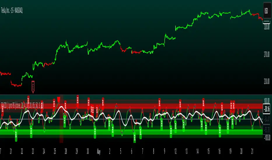
Oscillator Matrix [Alpha Extract]A comprehensive multi-oscillator system that combines volume-weighted money flow analysis with enhanced momentum detection, providing traders with a unified framework for identifying high-probability market opportunities across all timeframes. By integrating two powerful oscillators with advanced confluence analysis, this indicator delivers precise entry and exit signals while filtering out market noise through sophisticated threshold-based regime detection.
🔶 Volume-Weighted Money Flow Analysis
Utilizes an advanced money flow calculation that tracks volume-weighted price movements to identify institutional activity and smart money flow. This approach provides superior signal quality by emphasizing high-volume price movements while filtering out low-volume market noise.
// Volume-weighted flows
up_volume = price_up ? volume : 0
down_volume = price_down ? volume : 0
// Money Flow calculation
up_vol_sum = ta.sma(up_volume, mf_length)
down_vol_sum = ta.sma(down_volume, mf_length)
total_volume = up_vol_sum + down_vol_sum
money_flow_ratio = total_volume > 0 ? (up_vol_sum - down_vol_sum) / total_volume : 0
🔶 Enhanced Hyper Wave Oscillator
Features a sophisticated MACD-based momentum oscillator with advanced normalization techniques that adapt to different price ranges and market volatility. The system uses percentage-based calculations to ensure consistent performance across various instruments and timeframes.
// Enhanced MACD-based oscillator
fast_ma = ta.ema(src, hw_fast)
slow_ma = ta.ema(src, hw_slow)
macd_line = fast_ma - slow_ma
signal_line = ta.ema(macd_line, hw_signal)
// Proper normalization using percentage of price
price_base = ta.sma(close, 50)
macd_normalized = macd_line / price_base
hyper_wave = macd_range > 0 ? macd_normalized / macd_range : 0
🔶 Multi-Factor Confluence System
Implements an intelligent confluence scoring mechanism that combines signals from both oscillators to identify high-probability trading opportunities. The system assigns strength scores based on multiple confirmation factors, significantly reducing false signals.
🔶 Fixed Threshold Levels
Uses predefined threshold levels optimized for standard oscillator ranges to distinguish between normal market fluctuations and significant momentum shifts. The dual-threshold system provides clear visual cues for overbought/oversold conditions while maintaining consistent signal criteria across different market conditions.
🔶 Overflow Detection Technology
Advanced overflow indicators identify extreme market conditions that often precede major reversals or continuation patterns. These signals highlight moments when market momentum reaches critical levels, providing early warning for potential turning points.
🔶 Dual Oscillator Integration
The indicator simultaneously tracks volume-weighted money flow and momentum-based price action through two independent oscillators. This dual approach ensures comprehensive market analysis by capturing both institutional activity and technical momentum patterns.
// Multi-factor confluence scoring
confluence_bull = (mf_bullish ? 1 : 0) + (hw_bullish ? 1 : 0) +
(mf_overflow_bull ? 1 : 0) + (hw_overflow_bull ? 1 : 0)
confluence_bear = (mf_bearish ? 1 : 0) + (hw_bearish ? 1 : 0) +
(mf_overflow_bear ? 1 : 0) + (hw_overflow_bear ? 1 : 0)
confluence_strength = confluence_bull > confluence_bear ? confluence_bull / 4 : -confluence_bear / 4
🔶 Intelligent Signal Generation
The system generates two tiers of reversal signals: strong signals that require multiple confirmations across both oscillators, and weak signals that identify early momentum shifts. This hierarchical approach allows traders to adjust position sizing based on signal strength.
🔶 Visual Confluence Zones
Background coloring dynamically adjusts based on confluence strength, creating visual zones that immediately communicate market sentiment. The intensity of background shading corresponds to the strength of the confluent signals, making pattern recognition effortless.
🔶 Threshold Visualization
Color-coded threshold zones provide instant visual feedback about oscillator positions relative to key levels. The fill areas between thresholds create clear overbought and oversold regions with graduated color intensity.
🔶 Candle Color Integration
Optional candle coloring applies confluence-based color logic directly to price bars, creating a unified visual framework that helps traders correlate indicator signals with actual price movements for enhanced decision-making.
🔶 Overflow Alert System
Specialized circular markers highlight extreme overflow conditions on both oscillators, drawing attention to potential climax moves that often precede significant reversals or accelerated trend continuation.
🔶 Customizable Display Options
Comprehensive display controls allow traders to toggle individual components on or off, enabling focused analysis on specific aspects of the indicator. This modularity ensures the indicator adapts to different trading styles and analytical preferences.
1 Week
1 Day
15 Min
This indicator provides a complete analytical framework by combining volume analysis with momentum detection in a single, coherent system. By offering multiple confirmation layers and clear visual hierarchies, it empowers traders to identify high-probability opportunities while maintaining precise risk management across all market conditions and timeframes. The sophisticated confluence system ensures that signals are both timely and reliable, making it an essential tool for serious technical analysts.
