time_and_sessionA library that provides utilities for working with trading sessions and time-based conditions. Functions include session checks, date range checks, day-of-week matching, and session high/low calculations for daily, weekly, monthly, and yearly timeframes. This library streamlines time-related calculations and enhances time-based strategies and indicators.
Library "time_and_session"
Provides functions for checking time and session-based conditions and retrieving session-specific high and low values.
is_session(session, timeframe, timezone)
Checks if the current time is within the specified trading session
Parameters:
session (string) : The trading session, defined using input.session()
timeframe (string) : The timeframe to use, defaults to the current chart's timeframe
timezone (string) : The timezone to use, defaults to the symbol's timezone
Returns: A boolean indicating whether the current time is within the specified trading session
is_date_range(start_time, end_time)
Checks if the current time is within a specified date range
Parameters:
start_time (int) : The start time, defined using input.time()
end_time (int) : The end time, defined using input.time()
Returns: A boolean indicating whether the current time is within the specified date range
is_day_of_week(sunday, monday, tuesday, wednesday, thursday, friday, saturday)
Checks if the current day of the week matches any of the specified days
Parameters:
sunday (bool) : A boolean indicating whether to check for Sunday
monday (bool) : A boolean indicating whether to check for Monday
tuesday (bool) : A boolean indicating whether to check for Tuesday
wednesday (bool) : A boolean indicating whether to check for Wednesday
thursday (bool) : A boolean indicating whether to check for Thursday
friday (bool) : A boolean indicating whether to check for Friday
saturday (bool) : A boolean indicating whether to check for Saturday
Returns: A boolean indicating whether the current day of the week matches any of the specified days
daily_high(source)
Returns the highest value of the specified source during the current daily session
Parameters:
source (float) : The data series to evaluate, defaults to high
Returns: The highest value during the current daily session, or na if the timeframe is not suitable
daily_low(source)
Returns the lowest value of the specified source during the current daily session
Parameters:
source (float) : The data series to evaluate, defaults to low
Returns: The lowest value during the current daily session, or na if the timeframe is not suitable
regular_session_high(source, persist)
Returns the highest value of the specified source during the current regular trading session
Parameters:
source (float) : The data series to evaluate, defaults to high
persist (bool) : A boolean indicating whether to retain the last value outside of regular market hours, defaults to true
Returns: The highest value during the current regular trading session, or na if the timeframe is not suitable
regular_session_low(source, persist)
Returns the lowest value of the specified source during the current regular trading session
Parameters:
source (float) : The data series to evaluate, defaults to low
persist (bool) : A boolean indicating whether to retain the last value outside of regular market hours, defaults to true
Returns: The lowest value during the current regular trading session, or na if the timeframe is not suitable
premarket_session_high(source, persist)
Returns the highest value of the specified source during the current premarket trading session
Parameters:
source (float) : The data series to evaluate, defaults to high
persist (bool) : A boolean indicating whether to retain the last value outside of premarket hours, defaults to true
Returns: The highest value during the current premarket trading session, or na if the timeframe is not suitable
premarket_session_low(source, persist)
Returns the lowest value of the specified source during the current premarket trading session
Parameters:
source (float) : The data series to evaluate, defaults to low
persist (bool) : A boolean indicating whether to retain the last value outside of premarket hours, defaults to true
Returns: The lowest value during the current premarket trading session, or na if the timeframe is not suitable
postmarket_session_high(source, persist)
Returns the highest value of the specified source during the current postmarket trading session
Parameters:
source (float) : The data series to evaluate, defaults to high
persist (bool) : A boolean indicating whether to retain the last value outside of postmarket hours, defaults to true
Returns: The highest value during the current postmarket trading session, or na if the timeframe is not suitable
postmarket_session_low(source, persist)
Returns the lowest value of the specified source during the current postmarket trading session
Parameters:
source (float) : The data series to evaluate, defaults to low
persist (bool) : A boolean indicating whether to retain the last value outside of postmarket hours, defaults to true
Returns: The lowest value during the current postmarket trading session, or na if the timeframe is not suitable
weekly_high(source)
Returns the highest value of the specified source during the current weekly session. Can fail on lower timeframes.
Parameters:
source (float) : The data series to evaluate, defaults to high
Returns: The highest value during the current weekly session, or na if the timeframe is not suitable
weekly_low(source)
Returns the lowest value of the specified source during the current weekly session. Can fail on lower timeframes.
Parameters:
source (float) : The data series to evaluate, defaults to low
Returns: The lowest value during the current weekly session, or na if the timeframe is not suitable
monthly_high(source)
Returns the highest value of the specified source during the current monthly session. Can fail on lower timeframes.
Parameters:
source (float) : The data series to evaluate, defaults to high
Returns: The highest value during the current monthly session, or na if the timeframe is not suitable
monthly_low(source)
Returns the lowest value of the specified source during the current monthly session. Can fail on lower timeframes.
Parameters:
source (float) : The data series to evaluate, defaults to low
Returns: The lowest value during the current monthly session, or na if the timeframe is not suitable
yearly_high(source)
Returns the highest value of the specified source during the current yearly session. Can fail on lower timeframes.
Parameters:
source (float) : The data series to evaluate, defaults to high
Returns: The highest value during the current yearly session, or na if the timeframe is not suitable
yearly_low(source)
Returns the lowest value of the specified source during the current yearly session. Can fail on lower timeframes.
Parameters:
source (float) : The data series to evaluate, defaults to low
Returns: The lowest value during the current yearly session, or na if the timeframe is not suitable
Cari dalam skrip untuk "weekly"
Futures Auto Levels [NariCapitalTrading]Futures Auto Levels Indicator
Introduction
The "Futures Auto Levels" (FAL) indicator shows the previous day's levels, weekly open, high, low, and the Initial Balance Range (IBR).
Indicator Components
The FAL indicator comprises the following components:
Previous Day's Levels: These include the open, high, low, and close of the previous trading day. They are represented on the chart by lines and labels, helping to identify significant price levels from the prior session.
Weekly Open, High, Low: These levels represent the open, high, and low prices of the current trading week.
Initial Balance Range (IBR): The IBR is calculated based on the price range during the first 60 minutes of the trading day. It helps identify initial trading range and potential breakout levels.
How to Use the Indicator
1. Previous Day's Levels:
Monitor the previous day's open, high, low, and close to identify key support and resistance levels.
Use these levels to gauge market sentiment and potential price reversals.
2. Weekly Open, High, Low:
Pay attention to the weekly open, high, and low to understand the market's behavior within the weekly timeframe.
These levels can act as reference points for setting profit targets and stop-loss orders.
3. Initial Balance Range (IBR):
Watch for price movements within the IBR to identify potential trading opportunities.
Breakouts above or below the IBR may signal the beginning of a new trend or continuation of the current trend.
Suggested/Potential Strategies
Reversal Trading: Look for price reversals around previous day's levels, especially when they coincide with other technical indicators or significant support/resistance zones.
Trend Following: Follow the trend by trading breakouts above/below the IBR or weekly high/low levels. Use trailing stops to capture profits while the trend remains intact.
Range Trading: Trade within the IBR when the market is consolidating. Buy near the IBR low and sell near the IBR high, with tight stop-loss orders to manage risk.
Conclusion
The Futures Auto Levels indicator is designed to help incorporate levels into trading analysis and trading strategies to improve profitability and consistency.

Algoflow's Levels PlotterAlgoflow's Levels Plotter - Indicator
Release Date: Jan. 15, 2024
Release version: v3 r1
Release notes date: Jan. 15, 2024
Overview
Parses user's input of levels to be plotted and labeled on the chart for NQ & ES futures
Features
Quick plotting of predetermined price levels.
- Type or copy from another source of values in a predetermined output format.
Supports separate line plotting for Weekly, OVN and RTH values
- Plot only Weekly, OVN or RTH levels, or all
- Configure colors separately for Inflection Points, Weekly, OVN & RTH levels
- Shift/place price labels separately to easily identify levels
User Impacts of Changes
Requires users to remove previous version and re-add indicator "Algoflow's Levels Plotter", then re-add values. Colors and shift values will need to be re-entered and/or reconfigured
Support
Questions, feedbacks, and requests are welcomed. Please feel free to use Comments or direct private message via TradingView.
Quick usage notes:
The indicator allows you to enter data for both ES & NQ at the same time. This is useful in single chart window/layout situations, like viewing on the phone. When you switch between futures, the data is already there.
If you leave the entries blank, nothing will be plotted. This is useful if you want to have separate charts for ES & NQ. So you can just enter only the relevant data of either.
As an indicator, input values are saved within it, until it is removed from the chart. Input for one chart will not update other charts of the same ticker, even in the same layout.
The easiest and quickest way to share the inputs across all charts and layouts is to use the Indicator Templates feature.
- After input values are entered (for both ES & NQ futures) via the indicator's Settings, select ""Save as Default"".
- Click on ""Indicator Templates"" (4 squares icon), and click on ""Save Indicator template...""
- Remove the previous version of the indicator in other charts.
- Click on ""Indicator Templates"" icon, and select the newly created template. Repeat this for other charts of the same futures ticker
The labels can be disabled in settings > Style tab. Use the Inputs tab to configure orientation (left or right of current bar on chart), and how much spacing from the current (in distance of bars)
Format example:
Primary directional inflection point: 1234
For Bulls: 1244.25, 1254, 1264.50
For Bears: 1224, 1214, 1204
Changes
v3 r1 - Fixed erroneous default values in Weekly input sections. Added options to en/disable display of each set (session) of levels. Default label text size to normal, from small.
- Jan 15, 2024
v2 r9 - Added support for USTEC & US500.
- Dec. 10, 2023
v2 r8 - Added configuration features for users to modify the labels' text colors and size. Simplified code further by moving inputs processing modules into a single user function.
- Oct. 31, 2023
v2 r7 - Added support for the micro NQ & ES. Modified to ignore string case in inputs
- Oct 18, 2023
v2 r4 - Added support of weekly lines and labels features. Began the process of optimizing/simplifying code
- Oct. 15, 2023
v2 r3 - Made Inflection Point levels' colors configurable
- Oct. 04, 2023
v2 r2 - Removed comments & debug codes from development build revision #518
- Oct. 04, 2023
v2 r1 - Released from development revision #518. Major rewrite to fix previous and overlapping plots of lines and labels.
- Oct. 04, 2023
v1 r2 - First release of indicator
- Oct. 02, 2023

Sunday Vertical Lines (00:00 NY)Short Description:
Experience enhanced chart clarity with our "Sunday Midnight Vertical Lines" indicator. This tool elegantly marks every Sunday at 00:00 New York time, providing traders with a clear reference point for weekly market resets and potential strategy adjustments.
Detailed Description:
Purpose:
The "Sunday Midnight Vertical Lines" indicator is designed to help traders and market analysts visually segment their charts based on weeks. By clearly demarcating the start of each trading week, this tool aids in performing weekly analyses, understanding market rhythms, and preparing for the week ahead.
Key Features:
Automatic Time Zone Adjustment: The indicator adjusts for New York time, ensuring accuracy regardless of the user's local time zone.
Visual Clarity: Draws a distinct red vertical line at 00:00 each Sunday, offering a stark contrast against typical chart elements.
Performance Optimized: Efficiently coded to maintain chart performance, even on data-rich interfaces.
User-Friendly: No complex settings required. The tool works immediately upon addition to the chart, facilitating ease of use for traders of all skill levels.
Use Cases:
Weekly Market Analysis: Ideal for traders who conduct weekly market reviews, as it visually segments the chart at the beginning of each trading week.
Strategic Planning: Useful for planning and adjusting weekly trading strategies.
Historical Reference: Assists in historical market analysis by providing clear reference points for the start of each week.
Conclusion:
Whether you're a day trader, swing trader, or long-term investor, the "Sunday Midnight Vertical Lines" indicator is a simple yet powerful tool to enhance your chart analysis. It offers a clear, visual reference point for the start of each trading week, aiding in strategy development and market understanding.

[KenStrat] - Catching trend for the PipsDescription:
The " - Catching trend for the Pips" indicator is designed to help traders identify potential trend reversal points and capture significant price movements, with a focus on both daily and weekly perspectives.
**Friday Close Analysis:**
This component of the indicator concentrates on the Friday close of each week. The script displays visual elements on the daily chart exclusively. Specifically, it marks key price levels, providing insights into the closing position relative to the week's range. The indicator categorizes the closing price into three zones: above 66%, between 33% and 66%, and below 33%. This distinction aids traders in assessing the strength and directionality of the market at the end of the week. The displayed label offers a concise summary of the Friday's closing behavior, aiding in quick trend analysis.
**Weekly Trend Verification:**
The second part of the indicator focuses on verifying the weekly trend. By identifying the highest highs and lowest lows of the past two weeks, the script determines whether the current price action exhibits a bullish or bearish trend. The visualization on the chart helps traders assess the broader trend direction and make informed decisions based on the prevailing market sentiment. The label dynamically updates to indicate whether the overall trend is bullish, bearish, or neutral.
**Key Features:**
- Differentiates between Friday closing price zones for trend assessment.
- Weekly trend verification based on highest highs and lowest lows.
- Visual representation of trend conditions on the chart.
- Dynamic labels for quick interpretation of trend strength and direction.
- Exclusively designed for daily and weekly timeframes.
The " - Catching trend for the Pips" indicator provides a comprehensive tool for traders seeking to capture and analyze trend movements efficiently, allowing for informed decision-making in the dynamic Forex market.

ICT True Day Range [MK]The indicator displays the following:
Vertical line day separator from 00:00 to 00:00 EST
High/Low lines for the days true range from 00:00 to EOD
Opening line from 00:00 EST to EOD
Opening line from 08:30 EST to EOD
Weekly Opening line from Sunday open at 18:00 EST to last bar in the week
Monday range high/low/mid line, which can be extended to EOW
Text displaying Days of the Week
All functions can be fully customized regarding color/style and line width.
Below shows image of indicator with day separator: (it didn't show on the main chart despite being enabled?)
All of the above are to be used to give the user all the tools necessary to analyze the following concepts which can be studied on ICTs you tube channel:
Weekly profile, eg, has the weekly manipulated below the weekly open to then rise the rest of the week?
Daily profile, eg, has the day manipulated below the daily open (00:00 EST) to then rise the rest of the day?
Daily liquidity grab, eg has the current day taken PDH/PDL at the start of the current day?
Daily targets, eg will the current day end up taking liquidity from the PDH/PDL?
Monday range, will Mondays high/low range act as the accumulation phase of the weekly AMD profile?
Tuesday/Wednesday/Thursday/Friday reversal, eg, does a day of the week line up with a HTF target and a high volatility news event which could see price reverse after the manipulation phase of the weekly AMD profile?
In strong trending markets, will the 0830 open line be used in the NY session as manipulation reference in the same manner as the 00:00 line is normally used?
The above examples of how the indicator 'could' be used are not the only ways to use the indicator.
The indicator is by no means a trading strategy on its own. Users should be fully aware of ICT concepts and have performed extensive back-testing before using the indicator with live accounts.
RVol LabelThis Code is update version of Code Provided by @ssbukam, Here is Link to his original Code and review the Description
Below is Original Description
1. When chart resolution is Daily or Intraday (D, 4H, 1H, 5min, etc), Relative Volume shows value based on DAILY. RVol is measured on daily basis to compare past N number of days.
2. When resolution is changed to Weekly or Monthly, then Relative Volume shows corresponding value. i.e. Weekly shows weekly relative volume of this week compared to past 'N' weeks. Likewise for Monthly. You would see change in label name. Like, Weekly chart shows W_RVol (Weekly Relative Volume). Likewise, Daily & Intraday shows D_RVol. Monthly shows M_RVol (Monthly Relative Volume).
3. Added a plot (by default hidden) for this specific reason: When you move the cursor to focus specific candle, then Indicator Value displays relative volume of that specific candle. This applies to Intraday as well. So if you're in 1HR chart and move the cursor to a specific candle, Indicator Value shows relative volume for that specific candlestick bar.
4. Updating the script so that text size and location can be customized.
Changes to Updated Label by me
1. Added Today's Volume to the Label
2. Added Total Average Volume to the Label
3. Comparison vs Both in Single Line and showing how much volume has traded vs the average volume for that time of the day
4. Aesthetic Look of the Label
How to Use Relative Volume for Trading
Using Relative Volume (RVol) in trading can be a valuable tool to help you identify potential trading opportunities and gain insight into market behavior. Here are some ways to use RVol in your trading strategy:
Identifying High-Volume Breakouts: RVol can help you spot potential breakouts when the volume surges significantly above its average. High RVol during a breakout suggests strong market interest, increasing the probability of a sustained move in the direction of the breakout.
Confirming Trends and Reversals: RVol can act as a confirmation tool for trends and reversals. A trend accompanied by rising RVol indicates a strong and sustainable move. Conversely, a trend with declining RVol might suggest a weakening trend or potential reversal.
Spotting Volume Divergence: When the price is moving in one direction, but RVol is declining or not confirming the move, it may indicate a divergence. This discrepancy could suggest a potential reversal or trend change.
Support and Resistance Confirmation: High RVol near key support or resistance levels can indicate potential price reactions at those levels. This confirmation can be valuable in determining whether a level is likely to hold or break.
Filtering Trade Signals: Incorporate RVol into your existing trading strategy as a filter. For example, you might consider taking trades only if RVol is above a certain threshold, ensuring that you focus on high-impact trading opportunities.
Avoiding Low-Volume Traps: Low RVol can indicate a lack of interest or participation in the market. In such situations, price movements may be erratic and less reliable, so it's often wise to avoid trading during low RVol periods.
Monitoring News Events: Around significant news events or earnings releases, RVol can help you gauge the market's reaction to the information. High RVol during such events can present trading opportunities but be cautious of increased volatility and potential gaps.
Adjusting Trade Size: During periods of extremely high RVol, it might be prudent to adjust your position size to account for higher risk.
Using Relative Volume in Morning Session
If the Volume traded in first 15 minute to 30 Minutes is already at 50% or 100% depending upon the ticker, it means that it is going to have very high Volume vs average by end of the day.
This gives me conviction for Long or Short Trades
Remember that RVol is not a standalone indicator; it works best when used in conjunction with other technical and fundamental analysis tools. Additionally, RVol's effectiveness may vary across different markets and trading strategies. Therefore, backtesting and validating the use of RVol in your trading approach is essential.
Lastly, risk management is crucial in trading. While RVol can provide valuable insights, it cannot guarantee profitable trades. Always use appropriate risk management strategies, such as setting stop-loss levels, and avoid overexposing yourself to the market based solely on RVol readings.
ICT HTF Liquidity Levels /w Alert [MsF]Japanese below / 日本語説明は英文の後にあります。
-------------------------
*This indicator is based on sbtnc's "HTF Liquidity Levels". It's a very cool indicator. thank you.
It has 3 functions: visualization of HTF liquidity (with alert), candle color change when displacement occurs, and MSB (market structure break) line display.
=== Function description ===
1. HTF liquidity (with alert)
Lines visualize the liquidity pools on the HTF bars. Alerts can be set for each TF's line.
Once the price reaches the line, the line is repaint.
To put it plainly, the old line disappears and a new line appears. The line that disappeared remains as a purged line. (It is also possible to hide the purged line with a parameter)
The alert will be triggered at the moment the line disappears. An alert will be issued when you touch the HTF's liquid pools where the loss is accumulated, so you can notice the stop hunting with the alert.
This alert is an original feature of this indicator.
The timeframe of the HTF can't modify. You can get Monthly, weekly, daily and H1 and H4.
Each timeframe displays the 3 most recent lines. By narrowing it down to 3, it is devised to make it easier to see visually. (This indicator original)
2. Displacement
Change the color display of the candlesticks when a bullish candle stick or bearish candle stick is attached. Furthermore, by enabling the "Require FVG" option, you can easily discover the FVG (Fair Value Gap). It is a very useful function for ICT trading.
3. MSB (market structure break)
Displays High/Low lines for the period specified by the parameter. It is useful for discovering BoS & CHoCH/MSS, which are important in ICT trading.
=== Parameter description ===
- HTF LIQUIDITY
- Daily … Daily line display settings (color, line width)
- Weekly … Weekly line display settings (color, line width)
- Monthly … Monthly line display settings (color, line width)
- INTRADAY LIQUIDITY
- 1H … 1H line display settings (color, line width)
- 4H … 4H line display settings (color, line width)
- PURGED LIQUIDITY … Display setting of the line once the candle reaches
- Show Purge Daily … Daily purged line display/non-display setting
- Show Purge Weekly … Weekly purged line display/non-display setting
- Show Purge Monthly … Monthly purged line display/non-display setting
- Show Purge 1H … 1H purged line display/non-display setting
- Show Purge 4H … 4H purged line display/non-display setting
- MARKET STRUCTURE BREAK - MBS
- Loopback … Period for searching High/Low
- DISPLACEMENT FOR FVG
- Require FVG … Draw only when FVG occurs
- Displacement Type … Displacement from open to close? or from high to low?
- Displacement Length … Period over which to calculate the standard deviation
- Displacement Strength … The larger the number, the stronger the displacement detected
-------------------------
このインジケータはsbtncさんの"HTF Liquidity Levels"をベースに作成しています。
上位足流動性の可視化(アラート付き)、変位発生時のローソク色変更、MSB(market structure break)ライン表示の3つの機能を有します。
<機能説明>
■上位足流動性の可視化
上位足の流動性の吹き溜まり(ストップが溜まっているところ)をラインで可視化します。ラインにはアラートを設定することが可能です。
一度価格がラインに到達するとそのラインは再描画されます。
平たく言うと、今までのラインが消えて新しいラインが出現する。という事です。
消えたラインはpurgeラインとして残ります。(パラメータでpurgeラインを非表示にすることも可能です)
アラートはラインが消える瞬間に発報します。上位足の損切り溜まってるところにタッチするとアラートを発報するので、アラートにてストップ狩りに気づくことができます。
このアラート発報については本インジケータオリジナルの機能となります。
表示可能な上位足のタイムフレームは固定です。月足、週足、日足およびH1とH4を表示することができます。
各タイムフレーム、直近から3つのラインを表示します。3つに絞ることで視覚的に見やすく工夫しています。(本インジケータオリジナル)
■変位発生時のローソク色変更
大きな陽線、陰線を付けた場合に、そのローソク足をカラー表示を変更します。
さらに"Require FVG"オプションを有効にすることで、FVG(Fair Value Gap)を容易に発見することができます。ICTトレードにを行うにあたり大変有用な機能となっています。
■MSB(market structure break)ライン表示
パラメータで指定した期間のHigh/Lowをライン表示します。ICTトレードで重要視しているBoS & CHoCH/MSSの発見に役立ちます。
<パラメータ説明>
- HTF LIQUIDITY
- Daily … 日足ライン表示設定(色、線幅)
- Weekly … 週足ライン表示設定(色、線幅)
- Monthly … 月足ライン表示設定(色、線幅)
- INTRADAY LIQUIDITY
- 1H … 1時間足ライン表示設定(色、線幅)
- 4H … 4時間足ライン表示設定(色、線幅)
- PURGED LIQUIDITY … 一度到達したラインの表示設定
- Show Purge Daily … 日足ライン表示/非表示設定
- Show Purge Weekly … 週足ライン表示/非表示設定
- Show Purge Monthly … 月足ライン表示/非表示設定
- Show Purge 1H … 1時間足ライン表示/非表示設定
- Show Purge 4H … 4時間足ライン表示/非表示設定
- MARKET STRUCTURE BREAK - MBS
- Loopback … High/Lowを探索する期間
- DISPLACEMENT FOR FVG
- Require FVG … FVG発生時のみ描画する
- Displacement Type … openからcloseまでの変位か?highからlowまでの変位か?
- Displacement Length … 標準偏差を計算する期間
- Displacement Strength … 変位の強さ(数字が大きいほど強い変位を検出)
Higher Time Frame Average True RangesPurpose: This script will help an options trader asses risk and determine good entry and exit strategies
Background Information: The true range is the greatest of: current high minus the current low; the absolute value of the current high minus the previous close; and the absolute value of the current low minus the previous close. The Average True Range (ATR) is a 14-day moving average of the true range. Traders use the ATR indicator to assess volatility in stocks and decide when to enter and exit trades. It is important to note the limitations of using True Range and ATR: These indications cannot tell you the direction of your options trade (call vs. put) and they cannot tell you whether a particular trend is about to reverse. However, it can be used to assess if volatility has peaked for a particular direction and time period.
How this script works: This indicator calculates true range for the daily (DTR), weekly (WTR), and monthly (MTR) time frames and compares it to the Average True Range (ATR) for each of those time frames (DATR, WATR, and MATR). The comparison is displayed into a colored table in the upper right-hand corner of the screen. When a daily, weekly, or monthly true range reaches 80% of its respective ATR, the row for that time frame will turn Orange indicating medium risk for staying in the trade. If the true range goes above 100% of the respective ATR, then the row will turn Red indicating high risk for staying in the trade. When the row for a time period turns red, volatility for the time period has likely peaked and traders should heavily consider taking profits. It is important to note these calculations start at different times for each time frame: Daily (Today’s Open), Weekly (Monday’s Open), Monthly (First of the Month’s Open). This means if it’s the 15th of the month then the Monthly True Range is being calculated for the trading days in the first half of the month (approximately 10 trade days).
The script also plots three sets of horizontal dotted lines to visually represent the ATR for each time period. Each set is generated by adding and subtracting the daily, weekly, and monthly ATRs from that time periods open price. For example, the weekly ATR is added and subtracted from Mondays open price to visually represent the true range for that week. The DATR is represented by red lines, the WATR is represented by the green lines, and the MATR is represented by the blue lines. These plots could also be used to assess risk as well.
How to use this script: Use the table to assess risk and determine potential exit strategies (Green=Low Risk, Orange=Medium Risk, Red=High Risk. Use the dotted lines to speculate what a stock’s price could be in a given time period (Daily=Red, Weekly=Green, and Monthly=Blue). And don’t forget the true range’s calculation and plots starts at the beginning of each time period!

Invest-Long : Script for quick checks before investingA simple script to verify RSI, SMAs, VWMA, and Pivots on Daily, Weekly, and Monthly time frames.
In case if you are not interested in SMA's or want to add different cheks -- simply copy the script to local and edit.
Happy investing.
Add the script to any chart and table values remain the same irrespective of current chart resolution, as it checks on Daily, Weekly, and Monthly time frames.
The table has multiple columns.
1st column checks on RSI value on all 3 timeframes. Ideally, look for all green and D>W>M
2nd Column: Check current Close is above 20 SMA and 50 SMA on Daily / Weekly / Monthly time frames
3rd Column: Check SMA 13> SMA 34, SMA 34 > SMA 55 and SMA 20 > SMA 50 on Daily / Weekly time frames
4th Column: Check Current close is above Weekly Pivot and Monthly Pivot. And also verify Close is above 4 Week High.
5th Column: Verify Close is above Daily VWMA. Also Daily VWMA is > Weekly VWMA and Weekly > Monthly.
// Similarly you can add more checks based on different time frames
Feel free to trouble me incase if need help.

VWAP + EMA Analysis [Joshlo]Overview and Use Case
VWAP Analysis gives the possibility to combine multiple time frames of VWAP along with a triplet of exponential moving averages. This can provide insight into potential scalp, swing and longer term trades, depending on your time frame. The use of this indicator with it's setup is based off the the Scalp Setup Alerts provided by Roensch Capital.
The primary use for this script is to help with intraday scalp set ups. Using the Daily VWAP, turned on by default, we can look for price to respect and bounce from one of the VWAP lines (support or resistance) back toward equilibrium, we can also look for price to bounce off of equilibrium and move back toward VWAP support or resistance.
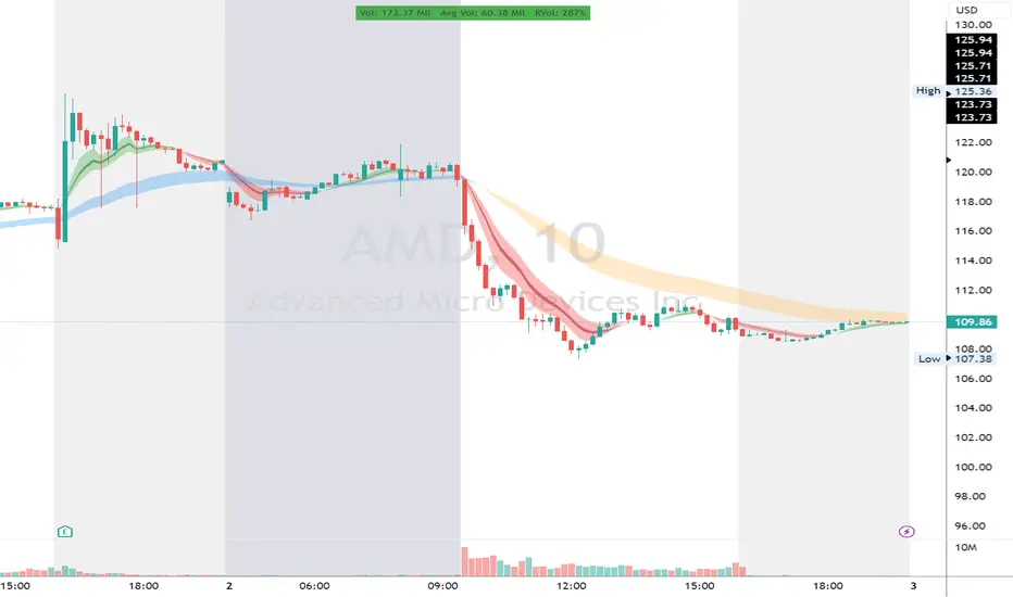
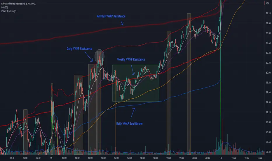
The chart attached shows AMD bouncing off of the Daily time frame VWAP Resistance level multiple times (see yellow boxes), often with confirmation given by an increase in volume which is often far higher than the average volume. In many of these cases a short position could've been opened or put option could have been placed with a profitable outcome.
Every line projected onto the chart via this indicator has the potential to create support or resistance as well as causing 'hang ups', meaning price loses it's momentum, slows down and hangs out in the particular area. This is shown on the chart within the green box.
Chart walkthrough - See attached chart
After a rejection off of the Daily VWAP Resistance line (depicted by the white circle), price starts to move back toward Daily VWAP Equilibrium. In order to reach this line, price needs to move through the 20EMA (white) and 50EMA (purple), the Weekly VWAP Resistance (red circles) and the 200EMA (orange). All of these lines are a part of this single indicator.
The 20EMA seems to offer little resistance but follows the price on it's move, offering some resistance to a volatile move upward. Initially upon contact with the 50EMA, price hangs up and bounces above and below the line whilst finding support on the Weekly VWAP Resistance at the same time. This causes a 'hang up' or sideways movement for around 20 minutes of trading. A potential trade may have entered at the white circle with a VWAP Resistance rejection and exited upon contact with the 50EMA in anticipation of multiple EMAs and support / resistance lines converging which is known to cause price movement to slow.
Eventually with an increase in volume, price breaks below the 20EMA (white), 50EMA (purple) and the Weekly VWAP Resistance level (red circles). Price then finds support on the 200EMA (orange), although there was potential for the price to fall to the Daily VWAP Equilibrium (solid blue). As the Red VWAP lines tend to act more often as resistance as opposed to support (price is rarely above these lines for extended periods), the trade from earlier may have profited more by awaiting contact with the 200EMA before exiting, taking the assumption that the Weekly VWAP Resistance was more likely to act as resistance than support.
A period of consolidation in the green box, around the Weekly VWAP Resistance, 20EMA, 50EMA and with support from the 200EMA eventually resulted in another break out where the price came back up to the Daily VWAP Resistance. Prior to the end of this trading day, there were two more opportunities for scalp setups based off of the price showing consistent rejections off the Daily VWAP Resistance back down to the 50EMA.
In the final example, price breaks above the Daily VWAP Resistance but quickly rejects off of the Monthly VWAP Resistance. For examples where the VWAP Resistance or Support or broken, it can help to look at an indicator such as the RSI to look for bullish divergence or bearish divergence.
Just as this example shows bounces and rejection off of VWAP Resistance, the same applies around the Equilibrium and Support VWAP lines.
The perfect scenario would be to find a ticker where there has already been two or three bounces off of one of these levels, with the goal of taking the trade on the next bounce and either using a percentage price target or technical price target based off of the EMAs or VWAP lines. If there are EMAs close in the direction you want to take the trade, there is a higher chance of hang ups and reversals, so a clear run is the more desired trade set up.
You can also look for these indicator lines to stack up in order to form a stronger support and resistance. For example the 200EMA and Daily VWAP Equilibrium being close to each other may suggest it would take more of an effort to break both of these levels, but one by itself may break more easily.
Indicator Setup
In the settings for the indicator, almost everything you might want to change can be done from the Input tab.
The three options for VWAP (daily, weekly and monthly) allow for analysis on multiple time frames. Daily is turned on as standard.
Standard Deviation Multiplier is set to 2 as standard, this effects the distance of the VWAP support and resistance from the equilibrium line. This seems to be a level that works well with finding support and resistance lines, however if there is excessively high or low volume, occasionally the lines can be thrown off. You can adjust this level if required to find a 'sweet spot' where price likes to reject or find support.
The colors for all VWAPs can be adjusted via the Inputs tab, however if you'd like to change the type of line these are depicted as, this can be done from the Styles tab.
The 3 EMAs (20, 50 and 200) can be toggled on or off and also have their color changed. The style of the lines can be adjusted from with the Styles tab if required.
[CP]Pivot Boss Multi Timeframe CPR Inception with MACD and EMAINTRODUCTION:
This indicator combines multi-timeframe CPR bands with MACD Momentum and EMA trend, all projected on the candlestick chart through a novel visualization.
If you have seen my other indicators on TradingView, you would know that I use floor pivots a lot and “Secrets of a Pivot Boss” is my favorite book. While using floor pivots, time and again I have noticed an interesting price behavior,
Trending moves in price typically start from around the Central Pivot Range (CPR). The CPR could be from ANY timeframe. These moves can easily be caught using simple momentum and trend indicators like MACD and EMA crossovers.
Yes, it is that simple. Follow along to understand how to use this indicator.
INDICATOR SETTINGS:
RANGEBOUND MACD AND EMA MARKINGS:
TradingView limits the max number of labels that can be shown on a chart to 500. Therefore, if you go far back enough, you won't see any markings for the MACD or EMA setups. If you are looking to test the efficacy of this indicator in the past, change the start and end dates to your desired timeframe and then select the ‘Mark MACD and EMA Setups in Range?’ option.
MULTI TIMEFRAME CENTRAL PIVOT RANGE:
Here you can select CPRs and their bands from which timeframes are shown on the chart. I will share my favorite settings later in this description.
CPR CONFIGURATION:
Show CPR Labels: CPRs markings can carry labels, so that you don’t confuse between which line is what. Use this setting to toggle them On/Off.
Show Next Time Period Pivots: Check this option if you want to see the CPR of the next time period. This is typically done to figure out the ’Two Day CPR Relationship’ . Read the book, “Secrets of a Pivot Boss”, to understand more.
EMA TREND:
Show EMA on the Chart: EMAs will be plotted on the chart. Standard stuff.
Mark EMA Crossovers on Chart: EMA crossovers will be marked on the chart in diamond shapes. If you are using EMA crossovers, I recommend setting this option to True.
Rest of the EMA settings are fairly obvious.
MACD MOMENTUM:
Projecting MACD parameters directly on the candlesticks is surely going to give you a new perspective about price action and MACD.
Also, in order to better understand the MACD projections on the chart, you can add a standard MACD indicator on the chart with default settings to figure out what my indicator is actually showing you.
Marking MACD Crossovers on Chart: Marks the MACD signal crossovers on the chart. This visualization was a game changer for me.
Show MACD Histogram on Chart: Projects the complete MACD Histogram in a novel fashion (Try it!). You will be able to visually see the ebbs and flow of momentum in the charts.
Mark MACD Histogram Peaks on Chart: Marks only the MACD peaks instead of the complete histogram. Peaks are a great way to enter an ongoing trend and to play an intraday rangebound market.
Rest of the settings are just the standard settings that you will find in a typical MACD indicator.
ALERTS:
Not shown in the settings panel, but I have added alerts for EMA and MACD Crossovers so that you don’t have to sit in front of the charts or constantly check the price all day long.
If you don’t know how to set alerts in TradingView, then please Google it.
INDICATOR USAGE EXAMPLES:
This indicator can be used in intraday as well as in higher timeframes.
There are quite a few variations possible, I personally prefer to use the EMA crossovers in intraday (5m) and MACD on Daily timeframes.
This is just a matter of personal preference, some people might prefer using EMAs only or MACD only in all timeframes.
Here are my personal settings for the intraday 5-minute timeframe:
Turn on all the CPR pivots starting from Yearly all the way to Daily. You can turn on 6 hourly and 4 hourly as well if you want.
Hourly CPR is mostly used when the price is in a strong trend and you missed the entry and don’t know when to enter. Price will typically experience pullbacks towards the Hourly CPR, before resuming in the direction of the trend. That is your chance to hop onto the bandwagon.
For Intraday, I keep the Bands off. Just a personal preference here.
You can turn ON the Show CPR Labels , if you want.
Turn ON both the options in the EMA TREND section. You would want to see the EMA crossovers marked on the chart as well as the EMAs themselves, as the distance between the two EMAs will give you an idea about the strength of the trend.
Keep rest of the settings in the EMA section as default (you can change the colors if you wish). I keep the same EMAs as the ones kept in the MACD indicator. I like to keep things simple.
In the MACD MOMENTUM section, turn ON Mark MACD Histogram Peaks on Chart and all the other options turned OFF. Leave the other settings as default. By the way, these are the default settings of the standard MACD Indicator.
You can set up EMA Bullcross and Bearcross alarms if you like.
Before checking out the examples, remember one super simple rule:
SOME OF THE BEST TRENDING MOVES IN THE MARKET, BE IT INTRADAY OR OTHERWISE, ORIGINATE IN THE VICINITY OF A LARGER TIMEFRAME PIVOT/CPR.
Look for price settling above/below a pivot, and then a move away from the pivot in any direction is typically a trending move.
You can use hourly pivots or MACD Histogram peaks marked on the chart to enter an existing trend, or add to your positions.
Let’s have a look at a few recent intraday examples from the Crypto, Indian, and US equity markets.
I have added my comments in the charts to make you easily understand what is going on.
Understand that both, moving average crossover and MACD, will give out a lot of signals (chop) every day. But almost 70% of them are going to be fake signals. It is the signals that you get when the price is near a Pivot, that tend to convert into gorgeous trending moves that last.
BTC 5m Charts
NIFTY Futures 5m Charts (good intraday trends are hard to find here, as the market is very efficient)
TSLA 5m Charts
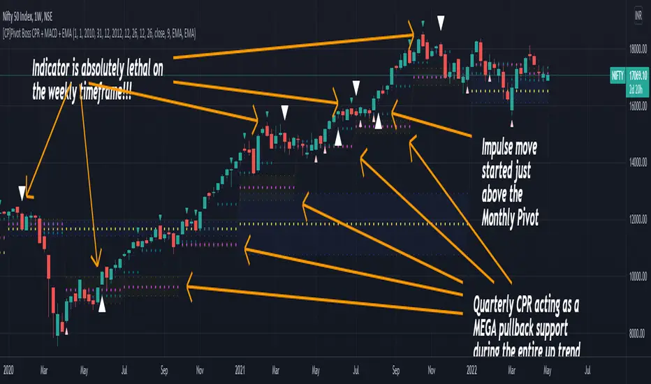
Some important points for using this indicator in higher timeframes:
For higher timeframes, my personal preference is to go with the MACD indicator. I personally find MACD to be lethal on daily and weekly timeframes, if you know how to use it well.
The default settings of the indicator are the settings I use for both, Daily and Weekly, timeframes. Additionally, I turn off the CPR labels.
In theory large trending moves still have a big probability to start near an important pivot level, however, in larger timeframes, trending moves can start from anywhere. They need not start in the vicinity of any important pivot (but they often do!).
Weekly pivots can act as great pullback levels when the price is in strong momentum, when trading on the daily timeframe.
Quarterly Pivots act as great pullback levels when the price is in strong momentum, when trading on the weekly timeframe.
BTC Weekly Chart
BTC Daily Chart
Nifty Weekly Chart
Nifty Daily Chart
NASDAQ Weekly Chart
NASDAQ Daily Chart
FINAL WORDS:
Please understand that I have Cherry Picked the examples to showcase the capability of the indicator and its usage.
DO NOT conflate the accuracy of examples with the accuracy of this indicator.
Biggest catch is the fact that this indicator, like every other indicator out there, will have whipsaws. Some I have also marked in the example charts.
You need to come up with your own technique to avoid whipsaws, one technique I have shared here…… big moves typically start near pivots.
Work on avoiding whipsaws and finding you own edge in the markets.
If you really want to learn how to use Pivots, read the book ’Secrets of a Pivot Boss’ . This book can change your life.
My:HTF O/H/L/C█ MY Higher Time Frame Open / High / Low / Close
This indicator shows one line per Higher Time Frame Price of Interest.
We are interested to know whether we are currently seeing support or resistance at previous daily / weekly / monthly price of interest.
Each price of interest can be displayed or hidden in the configuration. Each line has a label attached to it with the (short) label on it to help identifying what is this line.
Price of interest with (short) label :
Current Daily Open (CDO)
Current Daily High (CDH)
Current Daily Low (CDL)
Previous Daily Open (PDO)
Previous Daily High (PDH)
Previous Daily Low (PDL)
Previous Daily Close (PDC)
Current Weekly Open (CWO)
Current Weekly High (CWH)
Current Weekly Low (CWL)
Previous Weekly Open (PWO)
Previous Weekly High (PWH)
Previous Weekly Low (PWL)
Previous Weekly Close (PWC)
Current Monthly Open (CMO)
Current Monthly High (CMH)
Current Monthly Low (CML)
Previous Monthly Open (PMO)
Previous Monthly High (PMH)
Previous Monthly Low (PML)
Previous Monthly Close (PMC)

RVC-Trade-With-Pivot-LevelsHow to Use PIVOT Levels for Trading
Always remember ->: *Trade with trend*
About script:
1. Daily and Weekly close above Pivot Level.
-- Sentiment is highly positive. Pivot Level acts as strong support.
2. Daily Close above Pivot and Weekly Close Below Pivot
-- Sentiment is positive.Weekly Pivot Level may act as strong resistance.
3. Daily close below Pivot and weekly close above Pivot
-- Sentiment is negative but weekly Pivot Level can acts as strong support.
4. Daily and Weekly Close below Pivot Level
-- Sentiment is highly Negative. Pivot Level acts as strong resistance.
BUY/SELL -- ENTRY
BUY ABOVE 23.6% UPWARD
IF Trend is positive and price cross and sustains above 23.6%(R1) upside, then it will be entry from BUY perspective.
If R1 is entry, R2/R3/R4/R5 ... will be targets.
SELL Below 23.6% Downward
IF Trend is negative and price cross and sustains below 23.6%(S1) downside, then it will be entry from SELL perspective.
If S1 is Sell side entry, S2/S3/S4/S5 will be targets.
Before taking ENTRY on BUY or SELL Side, please know your risk levels, Stop Loss and trade EXECUTION process.
Finally:
My view is my view and remains with me only. Once you accept it and trade it, it becomes your view. So credit or blame all yours.:)

Double RSIThis is double RSI script which plots one time frame higher RSI along with the current time frame i.e
For Weekly chart it display Weekly and Monthly RSI
For Daily chart it display Daily and Weekly RSI
For Intraday chart it display Intraday and Daily RSI.
Usage:
If Daily RSI is above 60 and weekly above 40 and moving up then stock is in a good uptrend look for buying when Daily takes support at 60. Usually First test of Daily produces a good entry for subsequent entries probability decreases.
For Downtrend look for Daily RSI below 40 and weekly below 60.
Volumeweighted macd leader with bb squeezethis indicator is very useful for stocks or crytpto especialy 3d and weekly charts
daily shows good too but if u re a daily trader use it if not dont use it coz 4h and daily is noisy some when there is no trend
thats why weekly and 3d is good because it ll give u accurate signal and trend reversals
this is not my script just a combination of lazybear squeeze momentum, macdleader and volume weighted macd of kivanc
i merge them so it also shows bb squeeze on zero line and settings name is median
macd leader is 2 differen color above zero line and below zero line
above zero line if macd leader is green its buy signal and trend is up
if blue it meand no trend or trend reversal so sell or wait if u use 4h or daily but 3d and weekly it means sell
below zero line macd leader color is red and means that there is downtrend and do not buy
when 3d or weekly turns blue on macd leader it means trend reversal about the start
good with heiken ashi candles
DO NOT FORGET THIS IS NOT PERFECT INDICATOR FOR SHORT TERM, PREFER IT 3D AND WEEKLY FR BETTER RESULTS

HIGHS & LOWS RusosTITLE: HIGHS & LOWS Rusos - Multi-Timeframe Liquidity Engine
DESCRIPTION:
HIGHS & LOWS Rusos is a professional-grade structural liquidity tool designed to identify key Highs and Lows across multiple timeframes with a smart filtering engine. This script focuses on high-probability liquidity zones while maintaining a clean and organized chart.
Key Features:
Hierarchical Priority: The script uses a "Waterfall" logic. Monthly levels take priority over Weekly, Weekly over Daily, and so on. If levels from different timeframes overlap (within a tick margin), only the higher-order level is displayed to avoid clutter.
Multi-Timeframe Tracking: Automatically plots Monthly (HM/LM), Weekly (HS/LS), Daily (HD/LD), and 4-Hour (H4h/L4h) structural points.
Precision Anchoring: Lines are drawn from the exact start of their respective cycles (Month, Week, Day), providing accurate historical context.
Dynamic Mitigation: When price touches a level, the line is cut and marked with an "×". You can fully customize the opacity of these mitigated levels in the settings to keep your focus on active liquidity.
Optimized Performance: Built-in memory management limits the number of active and historical lines to ensure smooth performance.
Technical Hierarchy:
Monthly > Weekly > Daily > 4 Hours Lower timeframe levels are automatically hidden when viewing higher timeframe charts to prevent visual artifacts.

TEMA_1h_1D_1W_1MTEMA_1h_1D_1W_1M (Multi-Timeframe Triple Exponential Moving Average) indicator on TradingView.
Title: TEMA Multi-Timeframe (1h/1D/1W/1M) - Low Lag Trend
Short Description:
Plots TEMA (Triple Exponential Moving Average) from 1h, Daily, Weekly, and Monthly timeframes onto your current chart for instant, low-lag trend context.
Detailed Description:
Overview
The TEMA_1h_1D_1W_1M indicator is a comprehensive, multi-timeframe (MTF) analysis tool designed to visualize the Triple Exponential Moving Average (TEMA) from higher timeframes (HTF) directly on your current trading chart. By using TEMA instead of a standard EMA, this indicator significantly reduces lag, allowing you to identify trend changes faster without sacrificing trend smoothing.
Key Features
Four Timeframe Integration: Plots TEMA lines for 1-Hour (1h), Daily (1D), Weekly (1W), and Monthly (1M) timeframes.
Multi-Timeframe Compatibility: Displays higher timeframe TEMA lines on lower timeframe charts (e.g., 5m, 15m) without "stair-stepping" artifacts.
Low Lag, High Smoothness: TEMA provides a more responsive trendline than traditional EMAs, aiding in earlier trend detection.
Customizable Lengths: Fully adjustable TEMA lengths for each timeframe (default usually 20, 50, or 200).
Visual Clarity: Each timeframe's TEMA can be colored and styled separately to identify trend alignment at a glance.
Trading Applications
Trend Alignment: Confirm the long-term trend (e.g., Monthly/Weekly TEMA) aligns with the short-term trend (e.g., Hourly TEMA) before entering trades.
Dynamic Support/Resistance: Higher timeframe TEMAs act as robust, dynamic support and resistance levels.
Breakout Confirmation: Use 1h TEMA to confirm trend reversals, while using 1D/1W TEMA to filter out false signals.
Indicator Inputs
TEMA Periods: Separately adjustable lengths for 1h, 1D, 1W, and 1M.
Styling: Toggle visibility, colors, and line thickness for each timeframe.
Disclaimer: Education purpose only. TEMA works best in trending markets and may produce false signals in choppy, ranging markets.

VSA Trading SystemMaster Reference Guide
📚 TABLE OF CONTENTS
PART 1: Core VSA Framework & Philosophy
PART 2: Volume Analysis Deep Dive
PART 3: Key VSA Setups (Complete)
PART 4: Wyckoff Accumulation & Distribution
PART 5: Multi-Timeframe Analysis
PART 6: Candle & Spread Analysis
PART 7: Entry, Stop Loss & Take Profit Rules
PART 8: Position Sizing & Risk Management
PART 9: Complete Trade Checklists
PART 10: Common Mistakes & Quick Reference
PART 11: Trade Journal Template
PART 1: CORE VSA FRAMEWORK & PHILOSOPHY
The Foundation Principle
╔════════════════════════════════════════════════════════════════╗
║ VSA FOUNDATION PRINCIPLE ║
╠════════════════════════════════════════════════════════════════╣
║ ║
║ "Smart Money leaves footprints in VOLUME" ║
║ ║
║ • Institutions cannot hide their activity ║
║ • Large orders create volume anomalies ║
║ • Price can lie, but volume confirms truth ║
║ • Volume is the FUEL, Price is the VEHICLE ║
║ • No fuel = No real move ║
║ ║
╚════════════════════════════════════════════════════════════════╝
The Golden Rule: Effort vs. Result
┌─────────────────────────────────────────────────────────────┐
│ HARMONY = TREND CONTINUATION │
│ ANOMALY = TREND REVERSAL │
└─────────────────────────────────────────────────────────────┘
Volume-Price Harmony Matrix
Price Action Volume Signal Interpretation
Rising ↑ Rising ↑ ✅ STRONG BULLISH Healthy uptrend, buyers in control
Rising ↑ Falling ↓ ⚠️ WEAK BULLISH Fuel running out, reversal near
Falling ↓ Rising ↑ ✅ STRONG BEARISH Aggressive selling, downtrend healthy
Falling ↓ Falling ↓ ⚠️ WEAK BEARISH Sellers exhausted, bottom forming
Effort vs. Result Complete Matrix
╔══════════════════════════════════════════════════════════════════╗
║ EFFORT VS RESULT MATRIX ║
╠═══════════════╦══════════════════╦════════════════════════════════╣
║ EFFORT ║ RESULT ║ INTERPRETATION ║
║ (Volume) ║ (Price Move) ║ ║
╠═══════════════╬══════════════════╬════════════════════════════════╣
║ ║ ║ ║
║ HIGH Volume ║ WIDE Spread ║ ✅ Normal - Trend healthy ║
║ ║ ║ ║
╠═══════════════╬══════════════════╬════════════════════════════════╣
║ ║ ║ ║
║ HIGH Volume ║ NARROW Spread ║ ⚠️ Absorption - Reversal soon ║
║ ║ ║ ║
╠═══════════════╬══════════════════╬════════════════════════════════╣
║ ║ ║ ║
║ LOW Volume ║ WIDE Spread ║ ⚠️ Fake move - Will reverse ║
║ ║ ║ ║
╠═══════════════╬══════════════════╬════════════════════════════════╣
║ ║ ║ ║
║ LOW Volume ║ NARROW Spread ║ 😐 No interest - Wait ║
║ ║ ║ ║
╚═══════════════╩══════════════════╩════════════════════════════════╝
PART 2: VOLUME ANALYSIS DEEP DIVE
Volume Classification (Compare to 20-period MA):
━━━━━━━━━━━━━━━━━━━━━━━━━━━━━━━━━━━━━━━━━━━━━━━━━━━
ULTRA HIGH ▓▓▓▓▓▓▓▓▓▓▓▓▓▓▓▓ (>200% of 20-period average)
→ Major institutional activity
→ Potential climax or absorption
HIGH ▓▓▓▓▓▓▓▓▓▓▓▓ (150-200% of average)
→ Significant interest
→ Breakout/breakdown confirmation
ABOVE AVERAGE ▓▓▓▓▓▓▓▓▓ (100-150% of average)
→ Healthy trend participation
→ Normal directional moves
AVERAGE ▓▓▓▓▓▓ (80-120% of average)
→ Baseline activity
→ Consolidation periods
LOW ▓▓▓ (50-80% of average)
→ Lack of interest
→ Test bars, pullbacks
ULTRA LOW ▓ (<50% of average)
→ No participation
→ Holiday/pre-news quiet
Volume Bar Colors & Meanings
┌─────────────────────────────────────────────────────────────┐
│ VOLUME BAR ANALYSIS │
├─────────────────────────────────────────────────────────────┤
│ │
│ GREEN Volume Bar (Buying Volume Dominant) │
│ ▓▓▓▓▓▓▓▓▓ │
│ + Green Candle = Healthy Buying │
│ + Red Candle = Possible Accumulation (watch for reversal) │
│ │
├─────────────────────────────────────────────────────────────┤
│ │
│ RED Volume Bar (Selling Volume Dominant) │
│ ░░░░░░░░░ │
│ + Red Candle = Healthy Selling │
│ + Green Candle = Possible Distribution (watch for drop) │
│ │
└─────────────────────────────────────────────────────────────┘
Volume Context Analysis
┌─────────────────────────────────────────────────────────────────┐
│ CONTEXT IS EVERYTHING │
├─────────────────────────────────────────────────────────────────┤
│ │
│ Same high volume candle means DIFFERENT things: │
│ │
│ AT SUPPORT: AT RESISTANCE: │
│ ┌─────────────┐ ┌─────────────┐ │
│ │ High Volume │ │ High Volume │ │
│ │ Small Body │ │ Small Body │ │
│ │ = BUYING │ │ = SELLING │ │
│ │ (Bullish) │ │ (Bearish) │ │
│ └─────────────┘ └─────────────┘ │
│ │
│ IN UPTREND: IN DOWNTREND: │
│ ┌─────────────┐ ┌─────────────┐ │
│ │ High Volume │ │ High Volume │ │
│ │ Small Body │ │ Small Body │ │
│ │ = Potential │ │ = Potential │ │
│ │ TOP │ │ BOTTOM │ │
│ └─────────────┘ └─────────────┘ │
│ │
└─────────────────────────────────────────────────────────────────┘
Volume Spike Interpretation
SCENARIO 1: Volume Spike at Support
─────────────────────────────────────
│
↓ ← Price drops to support
═════════════ Support Line
▼
▓▓▓▓▓▓▓▓▓▓▓▓ ← ULTRA HIGH Volume
→ INTERPRETATION: Absorption/Accumulation
→ ACTION: Prepare for LONG entry after confirmation
─────────────────────────────────────
SCENARIO 2: Volume Spike at Resistance
─────────────────────────────────────
▓▓▓▓▓▓▓▓▓▓▓▓ ← ULTRA HIGH Volume
▲
═════════════ Resistance Line
↑ ← Price rises to resistance
│
→ INTERPRETATION: Churning/Distribution
→ ACTION: Prepare for SHORT entry OR exit longs
─────────────────────────────────────
SCENARIO 3: Volume Spike on Breakout
─────────────────────────────────────
↗ ← Price breaks out
═════════════════════════════ Resistance
│
▓▓▓▓▓▓▓▓▓ ← HIGH Volume on breakout
→ INTERPRETATION: Valid Breakout
→ ACTION: ENTER in breakout direction
─────────────────────────────────────
SCENARIO 4: Low Volume on Breakout
─────────────────────────────────────
↗ ← Price breaks out
═════════════════════════════ Resistance
│
▓▓ ← LOW Volume on breakout
→ INTERPRETATION: FAKE Breakout
→ ACTION: DO NOT ENTER, wait for failure
─────────────────────────────────────
Recommended Volume Indicators
ESSENTIAL INDICATORS:
━━━━━━━━━━━━━━━━━━━━━━━━━━━━━━━━━━━━━━━
1. STANDARD VOLUME
└─ Basic but essential
└─ Color-coded by candle direction
2. VOLUME MOVING AVERAGE (20-period)
└─ Shows average volume
└─ Helps identify "high" vs "low" volume
└─ CRITICAL: Only consider signals where Volume > 1.5x MA
└─ Ultra High = Volume > 2x MA
3. VOLUME WEIGHTED AVERAGE PRICE (VWAP)
└─ Intraday fair value
└─ Institutional reference point
OPTIONAL BUT USEFUL:
━━━━━━━━━━━━━━━━━━━━━
• On-Balance Volume (OBV) - Cumulative flow, good for divergences
• Accumulation/Distribution Line - Money flow direction
• Volume Profile - Price levels with most volume
• Money Flow Index - Volume-weighted RSI
PART 3: KEY VSA SETUPS (COMPLETE)
Setup 1: Test No Supply (Bullish)
VISUAL:
Prior Uptrend
↗
↗
↗
↗
↗
↗ ┌───┐
↗ │ R │ ← Small RED candle (Test)
↗ └───┘
↗ │
↗ │ LOW VOLUME
↗ │
↗ ══════╧══════
COMPLETE CHECKLIST:
□ Existing uptrend (HH + HL pattern)
□ Small pullback candle (red/bearish)
□ Volume BELOW average (ideally <70% of 20-MA)
□ Volume LESS than previous 2 bars
□ Spread (range) is NARROW
□ Candle closes near its high (upper half)
□ Doesn't break previous swing low
□ Wicks are small (no heavy selling)
ENTRY TRIGGER:
→ Next candle closes green above test candle high
→ Volume on entry candle is average or above
STOP LOSS:
→ Below the test candle low
→ OR below the previous swing low
WHY IT WORKS:
Smart money "tests" to see if sellers remain.
Low volume = No sellers left = Safe to push higher
Setup 2: Test No Demand (Bearish)
VISUAL:
┌───┐
│ G │ ← Small GREEN candle (Test)
└───┘
│ LOW VOLUME
↗ │
↗ ══════════╧══════
↗ ↘
↗ ↘
↘
↘ Downtrend continues
COMPLETE CHECKLIST:
□ UP bar (close > open) - Green candle
□ Volume LESS than previous 2 bars
□ Volume BELOW average (ideally <70% of 20-MA)
□ Spread (range) is NARROW
□ Close in MIDDLE or LOW of bar
□ Located at resistance OR after uptrend
□ Price struggling to make new highs
ENTRY TRIGGER:
→ Next candle closes red below test candle low
STOP LOSS:
→ Above the test candle high
WHY IT WORKS:
Buyers tried but professionals not interested.
Low volume = No demand = Prepare for drop
Setup 3: Spring (Bull Trap Reversal)
VISUAL:
Support Line
═══════════════════════════════
↓↗ ← Spring (false breakdown + quick recovery)
Spring
(Bear Trap)
Price Chart:
════════════════════ Support
↓
↓ ← Break below support
▼
SPRING ← Ultra low point
↗
↗ ← Quick recovery above support
════════════════════
↗
↗ ← Uptrend begins
Volume Pattern:
On Spring: ▓▓▓ (Can be high or low)
On Test: ▓ (Must be LOW)
On Breakout: ▓▓▓▓▓▓▓ (High)
CHECKLIST:
□ Price dipped below support (Spring)
□ Quickly reversed back above support
□ Pullback test shows LOW VOLUME
□ Test candle doesn't break spring low
ENTRY:
→ Enter LONG on low volume test after spring
→ OR enter when price closes above spring high
STOP LOSS:
→ Below the spring low
Setup 4: Upthrust (Bear Trap Reversal)
VISUAL:
↑ False breakout above resistance
═══════════════════════════════ Resistance
↗↓ ← Upthrust (break above + fail)
Upthrust
(Bull Trap)
Price Chart:
↗
↗ ← Price rises
════════════════════ Resistance
↗
UPTHRUST ← Ultra high point (false break)
↓
↓ ← Quick rejection below resistance
════════════════════
↓
↘ ← Downtrend begins
Volume Pattern:
On Upthrust: ▓▓▓▓▓ (Often high - sucking in buyers)
On Test: ▓ (Must be LOW)
On Breakdown: ▓▓▓▓▓▓▓ (High)
CHECKLIST:
□ Price broke ABOVE resistance
□ Quickly FAILED and fell back below
□ Pullback test (rally) shows LOW VOLUME
□ Test candle doesn't break upthrust high
ENTRY:
→ Enter SHORT on low volume test after upthrust
→ OR enter when price closes below upthrust low
STOP LOSS:
→ Above the upthrust high
Setup 5: Absorption (Churning)
BEARISH ABSORPTION (Distribution at Top):
━━━━━━━━━━━━━━━━━━━━━━━━━━━━━━━━━━━━━━━
Price: ──────────────── Resistance
│ ▲ │
│ █ │ ← Small GREEN body
│ ▼ │ (buyers trying to push up)
─────┴───┴─────
Volume: ▓▓▓▓▓▓▓▓▓▓▓▓▓▓▓▓ ← MASSIVE (>200% average)
COMPLETE CHECKLIST:
□ Small/Medium GREEN candle
□ Volume > 2x average
□ Close in MIDDLE or LOWER half of candle
□ Located at resistance OR after extended uptrend
□ Price NOT making significant new highs despite volume
INTERPRETATION:
• Price tries to go up
• Huge volume BUT small price movement
• Where did all that buying go?
• Answer: Institutions ABSORBED it by selling
CONFIRMATION:
□ Next candle should be RED
RESULT: Expect price drop
═══════════════════════════════════════════════════
BULLISH ABSORPTION (Accumulation at Bottom):
━━━━━━━━━━━━━━━━━━━━━━━━━━━━━━━━━━━━━━━━━━━
│ ▼ │
│ █ │ ← Small RED body
│ ▲ │ (sellers trying to push down)
─────┴───┴─────
Price: ──────────────── Support
Volume: ▓▓▓▓▓▓▓▓▓▓▓▓▓▓▓▓ ← MASSIVE (>200% average)
COMPLETE CHECKLIST:
□ Small/Medium RED candle
□ Volume > 2x average
□ Close in MIDDLE or UPPER half of candle
□ Located at support OR after extended downtrend
□ Price NOT making significant new lows despite volume
INTERPRETATION:
• Price tries to go down
• Huge volume BUT small price movement
• Where did all that selling go?
• Answer: Institutions ABSORBED it by buying
CONFIRMATION:
□ Next candle should be GREEN
RESULT: Expect price rise
Setup 6: Climactic Action
BUYING CLIMAX (Marks the TOP):
━━━━━━━━━━━━━━━━━━━━━━━━━━━━━━
▲
/│\ ← WIDEST candle in uptrend
/ │ \ + Close near HIGH
/ │ \
/ │ \
▓▓▓▓▓▓▓▓▓▓▓▓▓ ← HIGHEST volume in uptrend
CHARACTERISTICS:
□ Widest spread (range) in the trend
□ Highest volume in the trend
□ Usually closes near the high
□ Euphoria/FOMO buying
□ Professionals SELLING to public
→ Signals END of Uptrend
→ Distribution phase begins
→ DO NOT BUY - Wait for short setup
═══════════════════════════════════════════
SELLING CLIMAX (Marks the BOTTOM):
━━━━━━━━━━━━━━━━━━━━━━━━━━━━━━━━━━
\ │ /
\ │ /
\ │ /
\│/ ← WIDEST candle in downtrend
▼ + Often closes OFF the lows
▓▓▓▓▓▓▓▓▓▓▓▓▓ ← HIGHEST volume in downtrend
CHARACTERISTICS:
□ Widest spread (range) in the trend
□ Highest volume in the trend
□ Often closes in middle or upper half (key difference!)
□ Panic selling
□ Professionals BUYING from public
→ Signals END of Downtrend
→ Accumulation phase begins
→ DO NOT SELL - Wait for long setup after TEST
Setup 7: Stopping Volume
STOPPING VOLUME (Bottom Formation):
━━━━━━━━━━━━━━━━━━━━━━━━━━━━━━━━━━━
Price falling...
↓
↓
↓
┌───────────┐
│ ███████ │ ← Wide spread DOWN bar
│ ███████ │ BUT closes OFF the lows
│ │ │ (Close in UPPER half - KEY!)
└─────│─────┘
│
▓▓▓▓▓▓▓▓▓▓▓▓▓▓ ← ULTRA HIGH volume
CHECKLIST:
□ Downtrend in progress
□ Wide spread (large range) candle
□ Ultra high volume (>200% of average)
□ Closes in UPPER HALF of the bar (critical!)
□ May have long lower wick
INTERPRETATION:
→ Professionals absorbing all selling
→ Supply being removed from market
NEXT STEPS:
→ Expect sideways consolidation
→ Wait for LOW VOLUME TEST before entry
→ Do NOT enter immediately - wait for confirmation
Setup 8: Breakout Confirmation
VALID BREAKOUT: FAKE BREAKOUT:
─────────────── ───────────────
│ ↑ HIGH VOLUME │ ↑ LOW VOLUME
─────│───────── ─────│─────────
│ │
▓▓▓▓▓▓▓▓▓ (Volume >150% avg) ▓▓▓ (Volume <100% avg)
✅ ENTER TRADE ❌ DO NOT ENTER
(Wait for failure/retest)
VALID BREAKOUT CHECKLIST:
□ Price closes ABOVE resistance (for long) or BELOW support (for short)
□ Volume > 150% of 20-period average
□ Candle closes near the extreme (high for long, low for short)
□ Preferably preceded by low volume consolidation
□ Higher timeframes support the direction
ENTRY:
→ Enter on close of breakout candle
→ OR enter on low volume retest of breakout level
STOP LOSS:
→ Below breakout level (for longs)
→ Above breakout level (for shorts)
PART 4: WYCKOFF ACCUMULATION & DISTRIBUTION
WYCKOFF ACCUMULATION
Price:
│
│ PS SC
│ ↘ ↓
│ ↘ ↓ AR
│ ↘ ↓ ↗
│ ↘ ↓ ↗ ST
│ ↓↗──────────┐ LPS
│ PHASE A │ PHASE B │ ↘ ↗ SOS
│ │ │ ↘ ↗ ↗
│ │ │ ↓ ↗
│ │ │ SPRING↗
│ │ PHASE C│ │↗ PHASE D
│ │ │ ↗
└────────────┴─────────┴────┴──────────→
PHASE DEFINITIONS:
━━━━━━━━━━━━━━━━━━
PHASE A - Stopping the Downtrend:
PS = Preliminary Support (first buying appears)
SC = Selling Climax (panic selling absorbed - HIGH volume)
AR = Automatic Rally (dead cat bounce)
ST = Secondary Test (retest of SC lows - lower volume than SC)
PHASE B - Building the Cause:
→ Sideways accumulation
→ Volume generally decreasing
→ Multiple tests of support and resistance
→ "Backing up to the creek" patterns
PHASE C - The Test:
SPRING = False breakdown below support (bear trap)
→ Can be high or low volume
→ Key: Quick recovery above support
TEST = Low volume retest after spring (CRITICAL ENTRY POINT)
PHASE D - Markup Begins:
SOS = Sign of Strength (strong rally with high volume)
LPS = Last Point of Support (final low volume pullback)
→ This is the LAST safe entry before markup
PHASE E - Markup (Not shown):
→ Strong uptrend with increasing volume
→ Higher highs and higher lows
VOLUME PATTERN:
━━━━━━━━━━━━━━━
▓▓▓▓▓▓ ▓▓ ▓▓ ▓▓▓▓▓
(High) (Lower) (Low on) (High on
at SC during Spring SOS)
Phase B Test
Key Accumulation Entry Point
ENTRY CHECKLIST - THE SPRING + TEST:
━━━━━━━━━━━━━━━━━━━━━━━━━━━━━━━━━━━━━
□ Phase A complete (SC and AR visible)
□ Phase B complete (sideways range established)
□ Spring occurred (price dipped below support)
□ Price quickly recovered above support
□ Test pullback has LOW VOLUME (critical!)
□ Test doesn't break spring low
ENTRY TRIGGER:
→ Enter LONG after low volume test
→ OR enter on break above spring high with volume
STOP LOSS:
→ Below spring low
TARGET:
→ Measure the range (support to resistance)
→ Project that distance above resistance
Wyckoff Distribution Schematic--
WYCKOFF DISTRIBUTION
Price:
│ PSY
│ ↗ BC
│ ↗ ↗ ↘
│ PHASE D ↗ ↗ ↘ UTAD
│ ↘ ↗ ↗ ↘ ↗↘
│ ↘ ↗ ↗────────↘↗ ↘
│ ↘ ↗ │ PHASE B │ ↘ SOW
│ ↘ ↗ │ │ ↘
│ ↘ │ PHASE C │ ↘
│ LPSY │ │ ↘
│ │ │ ↘
└────────────────┴─────────┴─────────→
PHASE DEFINITIONS:
━━━━━━━━━━━━━━━━━━
PHASE A - Stopping the Uptrend:
PSY = Preliminary Supply (first selling appears)
BC = Buying Climax (euphoric buying absorbed - HIGH volume)
AR = Automatic Reaction (first drop)
ST = Secondary Test (retest of BC highs - lower volume than BC)
PHASE B - Building the Cause:
→ Sideways distribution
→ Volume patterns show supply entering on rallies
→ Multiple tests of support and resistance
PHASE C - The Test:
UTAD = Upthrust After Distribution (false breakout above resistance)
→ Bull trap
→ Often high volume (sucking in late buyers)
TEST = Low volume retest after upthrust (ENTRY POINT FOR SHORTS)
PHASE D - Markdown Begins:
SOW = Sign of Weakness (strong drop with high volume)
LPSY = Last Point of Supply (final low volume rally)
→ This is the LAST safe short entry before markdown
PHASE E - Markdown (Not shown):
→ Strong downtrend with increasing volume
→ Lower highs and lower lows
PART 5: MULTI-TIMEFRAME ANALYSIS
The 4-Step Alignment Process
╔════════════════════════════════════════════════════════════════╗
║ 4-HOUR CHART (MACRO VIEW) ║
╠════════════════════════════════════════════════════════════════╣
║ ║
║ PURPOSE: Determine the PRIMARY trend direction ║
║ ║
║ ANALYZE: ║
║ □ Overall trend (Uptrend/Downtrend/Range) ║
║ □ Major support/resistance levels ║
║ □ Volume trend (increasing/decreasing with price) ║
║ □ Any divergences forming (Price↑ Volume↓ = warning) ║
║ □ Look for Accumulation/Distribution phases ║
║ ║
║ SIGNALS TO NOTE: ║
║ • Climax volume at extremes ║
║ • Trend line breaks ║
║ • Higher timeframe absorption patterns ║
║ ║
║ RULE: Only trade in the direction of 4H trend ║
║ ║
╚════════════════════════════════════════════════════════════════╝
↓ ALIGNED?
╔════════════════════════════════════════════════════════════════╗
║ 1-HOUR CHART (STRUCTURE) ║
╠════════════════════════════════════════════════════════════════╣
║ ║
║ PURPOSE: Confirm trend and identify key levels ║
║ ║
║ ANALYZE: ║
║ □ Trend alignment with 4H ║
║ □ Key swing highs and lows ║
║ □ Support/resistance zones ║
║ □ Moving average positions (if used) ║
║ □ Current Wyckoff phase ║
║ □ Volume pattern on recent moves ║
║ ║
║ SIGNALS TO NOTE: ║
║ • Structure breaks (BOS - Break of Structure) ║
║ • Change of character (CHoCH) ║
║ • Volume spikes at key levels ║
║ ║
║ RULE: Structure must support trade direction ║
║ ║
╚════════════════════════════════════════════════════════════════╝
↓ ALIGNED?
╔════════════════════════════════════════════════════════════════╗
║ 30-MIN CHART (SETUP) ║
╠════════════════════════════════════════════════════════════════╣
║ ║
║ PURPOSE: Identify specific trade setups ║
║ ║
║ ANALYZE: ║
║ □ Pullback/rally quality ║
║ □ Is pullback volume DECREASING? (Required for entry) ║
║ □ Approach to key levels ║
║ □ VSA patterns forming ║
║ □ Price action quality ║
║ ║
║ SIGNALS TO NOTE: ║
║ • Test patterns (No Supply/No Demand) ║
║ • Absorption at levels ║
║ • Volume drying up on counter-moves ║
║ ║
║ RULE: Wait for low volume pullback before entry ║
║ ║
╚════════════════════════════════════════════════════════════════╝
↓ ALIGNED?
╔════════════════════════════════════════════════════════════════╗
║ 15-MIN CHART (ENTRY TRIGGER) ║
╠════════════════════════════════════════════════════════════════╣
║ ║
║ PURPOSE: Precise entry timing ║
║ ║
║ ANALYZE: ║
║ □ Entry trigger candle forming ║
║ □ Volume on trigger candle ║
║ □ Exact stop loss placement ║
║ □ Immediate support/resistance ║
║ ║
║ ENTRY TRIGGERS (Need one): ║
║ • Test No Supply / Test No Demand ║
║ • Spring/Upthrust + Test ║
║ • Absorption + Confirmation candle ║
║ • Breakout with High Volume ║
║ ║
║ CRITICAL RULE: Wait for candle CLOSE before entering ║
║ ║
╚════════════════════════════════════════════════════════════════╝
↓ ALL ALIGNED?
═══════════════════════════
✅ EXECUTE TRADE
═══════════════════════════
PART 6: CANDLE & SPREAD ANALYSIS
Candle Close Position Analysis
WHERE DOES THE CANDLE CLOSE?
Strong Bullish: Neutral: Bearish:
┌─────────┐ ┌─────────┐ ┌─────────┐
│ ████████│ ← Close │ │ │ │ │
│ ████████│ at TOP │ │ │ ← Close │ │ │
│ ████████│ (Upper │ ████ │ MIDDLE │ │ │
│ │ │ third) │ ████ │ │ ████████│ ← Close
│ │ │ │ │ │ │ ████████│ BOTTOM
└─────────┘ └─────────┘ └─────────┘
✅ Buyers won ⚠️ Struggle ❌ Sellers won
decisively (indecision) decisively
APPLICATION RULES:
━━━━━━━━━━━━━━━━━━
□ Close in UPPER 1/3 + High Volume = Strong Buying
□ Close in LOWER 1/3 + High Volume = Strong Selling
□ Close in MIDDLE + High Volume = Battle (Wait for clarity)
FOR ABSORPTION SIGNALS:
□ Bearish Absorption: Green candle closes in MIDDLE or LOWER half
□ Bullish Absorption: Red candle closes in MIDDLE or UPPER half
Spread (Range) Analysis-
SPREAD = High - Low of Candle
┌──────────────────────────────────────────────────────────────┐
│ SPREAD ANALYSIS │
├──────────────────────────────────────────────────────────────┤
│ │
│ WIDE SPREAD + HIGH VOLUME: │
│ ┌─────────────────────┐ │
│ │ │ │ │
│ │ ███████████ │ → HEALTHY momentum │
│ │ ███████████ │ → Trend continuation │
│ │ │ │ → Strong commitment │
│ └─────────────────────┘ │
│ ▓▓▓▓▓▓▓▓▓▓▓▓▓▓▓▓▓▓▓▓▓ │
│ │
├──────────────────────────────────────────────────────────────┤
│ │
│ NARROW SPREAD + HIGH VOLUME: │
│ ┌───────────┐ │
│ │ ████ │ ← Small body │
│ │ ████ │ │
│ └───────────┘ → ABSORPTION warning! │
│ ▓▓▓▓▓▓▓▓▓▓▓▓ → Effort with no result │
│ → Expect reversal │
│ │
├──────────────────────────────────────────────────────────────┤
│ │
│ WIDE SPREAD + LOW VOLUME: │
│ ┌─────────────────────┐ │
│ │ │ │ │
│ │ ███████████ │ → FAKE MOVE warning! │
│ │ ███████████ │ → No commitment │
│ │ │ │ → Will likely reverse │
│ └─────────────────────┘ │
│ ▓▓▓ │
│ │
├──────────────────────────────────────────────────────────────┤
│ │
│ NARROW SPREAD + LOW VOLUME: │
│ ┌───────────┐ │
│ │ ████ │ → No interest │
│ │ ████ │ → Consolidation │
│ └───────────┘ → WAIT for signal │
│ ▓▓ │
│ │
└──────────────────────────────────────────────────────────────┘
PART 7: ENTRY, STOP LOSS & TAKE PROFIT RULES
╔═══════════════════════════════════════════════════════════════╗
║ LONG ENTRY CRITERIA ║
╠═══════════════════════════════════════════════════════════════╣
║ ║
║ MULTI-TIMEFRAME CHECK: ║
║ ──────────────────── ║
║ □ 4H: Uptrend + Rising Volume (or no bearish divergence) ║
║ □ 1H: Uptrend + Price holding above support ║
║ □ 30M: Pullback with DECREASING volume ║
║ □ 15M: Entry trigger present ║
║ ║
║ VOLUME CONFIRMATION: ║
║ ─────────────────── ║
║ □ Pullback candles have LOW volume ║
║ □ No bearish absorption at highs ║
║ □ Prior trend showed harmony (price↑ + volume↑) ║
║ □ Volume compared to 20-MA (signal volume significant?) ║
║ ║
║ CANDLE CONFIRMATION: ║
║ ─────────────────── ║
║ □ Entry candle closes in upper half ║
║ □ No abnormally wide spread with low volume (fake move) ║
║ □ Test candle had appropriate close position ║
║ ║
║ ENTRY TRIGGERS (Any One): ║
║ ──────────────────────── ║
║ ○ Test No Supply confirmed (low vol red, next green) ║
║ ○ Spring + Low Volume Test ║
║ ○ Breakout with High Volume (>150% of average) ║
║ ○ Bullish Absorption at support + green confirmation ║
║ ○ Stopping volume + Test ║
║ ║
║ WAIT FOR CANDLE CLOSE BEFORE ENTERING! ║
║ ║
╚═══════════════════════════════════════════════════════════════╝
Short Entry Criteria-
╔═══════════════════════════════════════════════════════════════╗
║ SHORT ENTRY CRITERIA ║
╠═══════════════════════════════════════════════════════════════╣
║ ║
║ MULTI-TIMEFRAME CHECK: ║
║ ──────────────────── ║
║ □ 4H: Downtrend OR Bearish Divergence (price↑ volume↓) ║
║ □ 1H: Lower Highs forming OR at resistance ║
║ □ 30M: Rally with DECREASING volume ║
║ □ 15M: Entry trigger present ║
║ ║
║ VOLUME CONFIRMATION: ║
║ ─────────────────── ║
║ □ Rally candles have LOW volume ║
║ □ No bullish absorption at lows ║
║ □ Bearish Absorption visible at resistance ║
║ □ Anomaly present (price↑ but volume↓) ║
║ ║
║ CANDLE CONFIRMATION: ║
║ ─────────────────── ║
║ □ Entry candle closes in lower half ║
║ □ No abnormally wide spread with low volume (fake move) ║
║ □ Test candle had appropriate close position ║
║ ║
║ ENTRY TRIGGERS (Any One): ║
║ ──────────────────────── ║
║ ○ Test No Demand confirmed (low vol green, next red) ║
║ ○ Upthrust + Low Volume Test ║
║ ○ Sign of Weakness (SOW) - Big red + High Volume ║
║ ○ Breakdown with High Volume (>150% of average) ║
║ ○ Bearish Absorption at resistance + red confirmation ║
║ ║
║ WAIT FOR CANDLE CLOSE BEFORE ENTERING! ║
║ ║
╚═══════════════════════════════════════════════════════════════╝
Stop Loss Placement Rules-
╔════════════════════════════════════════════════════════════╗
║ STOP LOSS PLACEMENT RULES ║
╠════════════════════════════════════════════════════════════╣
║ ║
║ FOR LONG TRADES: ║
║ ───────────────── ║
║ Option A: Below the TEST candle low ║
║ Option B: Below the Spring low (if Spring setup) ║
║ Option C: Below support zone + ATR buffer ║
║ ║
║ BUFFER FORMULA: ║
║ SL = Support Level - (0.5 × ATR of entry timeframe) ║
║ ║
║ VISUAL: ║
║ ─────────────────────────────── Support/Demand Zone ║
║ ← Entry Point ║
║ ║
║ ─────────────────────────────── SL: Below Support ║
║ │← 1-2% below zone OR below spring low ║
║ ║
╠════════════════════════════════════════════════════════════╣
║ ║
║ FOR SHORT TRADES: ║
║ ────────────────── ║
║ Option A: Above the TEST candle high ║
║ Option B: Above the Upthrust high (if Upthrust setup) ║
║ Option C: Above resistance zone + ATR buffer ║
║ ║
║ BUFFER FORMULA: ║
║ SL = Resistance Level + (0.5 × ATR of entry timeframe) ║
║ ║
║ VISUAL: ║
║ │← SL: Above resistance/recent high ║
║ ─────────────────────────────── Resistance Zone ║
║ ← Entry Point (Short) ║
║ ║
╚════════════════════════════════════════════════════════════╝
Take Profit Rules-
╔════════════════════════════════════════════════════════════╗
║ TAKE PROFIT RULES ║
╠════════════════════════════════════════════════════════════╣
║ ║
║ MINIMUM RISK:REWARD = 1:2 ║
║ ║
║ TP LEVELS (Based on Structure): ║
║ ──────────────────────────── ║
║ TP1: First resistance/support level = Aim for 1R ║
║ TP2: Second resistance/support level = Aim for 2R ║
║ TP3: Major level OR measured move = Aim for 3R+ ║
║ ║
║ SCALING OUT METHOD: ║
║ ───────────────────── ║
║ □ TP1 (33-40%): Close first portion at 1R ║
║ → Move SL to breakeven after TP1 hit ║
║ ║
║ □ TP2 (33-40%): Close second portion at 2R ║
║ → Trail SL to 1R profit level ║
║ ║
║ □ TP3 (20-34%): Close final portion at 3R or trail ║
║ → Use trailing stop below each new swing ║
║ ║
║ TRAILING STOP METHOD: ║
║ ────────────────────────────── ║
║ Longs: Trail SL below each new Higher Low ║
║ Shorts: Trail SL above each new Lower High ║
║ ║
║ VISUAL (Long Trade): ║
║ ║
║ TP3 ─────────────── (Major Resistance: 3R) ║
║ ║
║ TP2 ─────────────── (Next Resistance: 2R) ║
║ ║
║ TP1 ─────────────── (First Resistance: 1R) ║
║ ║
║ ENTRY ────────────── ║
║ ║
║ SL ───────────────── ║
║ ║
╠════════════════════════════════════════════════════════════╣
║ ║
║ EXIT ON VSA WEAKNESS SIGNALS: ║
║ ───────────────────────────── ║
║ Exit immediately if you see: ║
║ □ Climactic volume against your position ║
║ □ Absorption candle against your position ║
║ □ Break of structure on entry timeframe ║
║ □ Test No Demand (if long) or Test No Supply (if short) ║
║ ║
╚════════════════════════════════════════════════════════════╝
PART 8: POSITION SIZING & RISK MANAGEMENT
Position Size Calculator-
╔════════════════════════════════════════════════════════════════╗
║ POSITION SIZE CALCULATOR ║
╠════════════════════════════════════════════════════════════════╣
║ ║
║ STEP 1: Define Account Risk ║
║ ───────────────────────────── ║
║ Account Size: $__________ ║
║ Risk Per Trade: ____% (Recommended: 1-2%) ║
║ Dollar Risk: $__________ (Account × Risk%) ║
║ ║
║ STEP 2: Define Trade Risk ║
║ ──────────────────────── ║
║ Entry Price: $__________ ║
║ Stop Loss: $__________ ║
║ Risk Per Unit: $__________ (Entry - SL, absolute value) ║
║ ║
║ STEP 3: Calculate Position ║
║ ───────────────────────── ║
║ ║
║ Dollar Risk ║
║ Position Size = ───────────────── ║
║ Risk Per Unit ║
║ ║
║ ═══════════════════════════════════════════════════════════ ║
║ EXAMPLE: ║
║ ═══════════════════════════════════════════════════════════ ║
║ ║
║ Account: $10,000 ║
║ Risk: 1% = $100 ║
║ Entry: $50.00 ║
║ Stop Loss: $48.00 ║
║ Risk Per Share: $2.00 ║
║ ║
║ Position Size = $100 ÷ $2.00 = 50 shares ║
║ ║
╚════════════════════════════════════════════════════════════════╝
Risk Management Rules-
╔════════════════════════════════════════════════════════════╗
║ RISK MANAGEMENT RULES ║
╠════════════════════════════════════════════════════════════╣
║ ║
║ CAPITAL PROTECTION: ║
║ ─────────────────── ║
║ □ Never risk more than 1-2% per trade ║
║ □ Maximum 3 trades open at same time ║
║ □ Maximum 5% total portfolio risk at any time ║
║ □ Reduce size by 50% after 2 consecutive losses ║
║ □ Stop trading after 3 consecutive losses (review) ║
║ ║
║ CORRELATION AWARENESS: ║
║ ────────────────────── ║
║ □ Don't take same-direction trades in correlated pairs ║
║ □ Treat correlated positions as single larger position ║
║ ║
║ DRAWDOWN RULES: ║
║ ─────────────── ║
║ □ 5% daily drawdown = Stop trading for the day ║
║ □ 10% weekly drawdown = Review and reduce size ║
║ □ 20% monthly drawdown = Pause and full strategy review ║
║ ║
╚════════════════════════════════════════════════════════════╝
Position Scaling Strategy-
ENTRY SCALING (Building Position):
━━━━━━━━━━━━━━━━━━━━━━━━━━━━━━━━━━━━━━━
┌─────────────────────────────────────┐
│ │
│ Initial Entry: 50% of position │
│ First Add: 25% of position │
│ Second Add: 25% of position │
│ │
│ Add ONLY when: │
│ • Price moves in your favor │
│ • Volume confirms the move │
│ • Move SL to breakeven first │
│ • New VSA confirmation present │
│ │
└─────────────────────────────────────┘
EXIT SCALING (Taking Profits):
━━━━━━━━━━━━━━━━━━━━━━━━━━━━━━━━
┌─────────────────────────────────────┐
│ │
│ TP1 (1R): Close 40% of position │
│ → Move SL to breakeven │
│ │
│ TP2 (2R): Close 40% of position │
│ → Trail SL to 1R │
│ │
│ TP3 (3R+): Close remaining 20% │
│ → Trail or let run │
│ │
└─────────────────────────────────────┘
PART 9: COMPLETE TRADE CHECKLISTS
Pre-Trade Validation Checklist-
╔════════════════════════════════════════════════════════════════════╗
║ COMPLETE VSA TRADE CHECKLIST ║
╠════════════════════════════════════════════════════════════════════╣
║ ║
║ TRADE TYPE: □ LONG □ SHORT ║
║ DATE: ___________ PAIR/ASSET: ___________ ║
║ ║
║ ═══════════════════════════════════════════════════════════════ ║
║ SECTION A: MULTI-TIMEFRAME ALIGNMENT (Must have 4/4) ║
║ ═══════════════════════════════════════════════════════════════ ║
║ ║
║ 4H CHART: ║
║ □ Trend aligned with trade direction ║
║ □ Volume confirms trend (harmony) ║
║ □ No major resistance/support blocking immediately ║
║ □ No bearish/bullish divergence against trade ║
║ ║
║ 1H CHART: ║
║ □ Trend aligned with trade direction ║
║ □ Structure intact (HH/HL for long, LH/LL for short) ║
║ □ Key level identified and respected ║
║ □ Wyckoff phase supports trade ║
║ ║
║ 30M CHART: ║
║ □ Trend aligned with trade direction ║
║ □ Pullback/Rally has DECREASING volume (LOW volume) ║
║ □ Near support zone (long) or resistance zone (short) ║
║ □ VSA setup forming ║
║ ║
║ 15M CHART: ║
║ □ Entry signal clearly present ║
║ □ Volume confirming the signal ║
║ □ Candle close position supports trade ║
║ □ Waiting for candle CLOSE before entry ║
║ ║
║ ═══════════════════════════════════════════════════════════════ ║
║ SECTION B: VOLUME ANALYSIS (Must have 4/4) ║
║ ═══════════════════════════════════════════════════════════════ ║
║ ║
║ □ Volume compared to 20-MA (is signal volume significant?) ║
║ □ Volume and Price in Harmony OR Clear reversal signal ║
║ □ Pullback/Rally has LOW volume (below average) ║
║ □ No absorption signals against trade direction ║
║ ║
║ ═══════════════════════════════════════════════════════════════ ║
║ SECTION C: CANDLE/SPREAD ANALYSIS (Must have 3/3) ║
║ ═══════════════════════════════════════════════════════════════ ║
║ ║
║ □ Spread (range) appropriate for the signal ║
║ □ Close position supports trade direction ║
║ □ No wide spread + low volume moves (fake move warning) ║
║ ║
║ ═══════════════════════════════════════════════════════════════ ║
║ SECTION D: ENTRY SIGNAL (Must have 1 confirmed) ║
║ ═══════════════════════════════════════════════════════════════ ║
║ ║
║ □ Test No Supply / Test No Demand ║
║ □ Spring / Upthrust + Low Volume Test ║
║ □ Absorption at key level + Confirmation candle ║
║ □ Breakout with High Volume (>150% average) ║
║ □ Stopping Volume + Test ║
║ ║
║ ═══════════════════════════════════════════════════════════════ ║
║ SECTION E: RISK MANAGEMENT (Must have 5/5) ║
║ ═══════════════════════════════════════════════════════════════ ║
║ ║
║ □ Risk ≤ 1-2% of account ║
║ □ Risk:Reward ≥ 1:2 ║
║ □ Stop Loss placed at logical structure level ║
║ □ Position size calculated correctly ║
║ □ Not during major news event (checked economic calendar) ║
║ ║
║ Entry Price: _______________ ║
║ Stop Loss: _______________ ║
║ Risk Per Unit: _______________ ║
║ Position Size: _______________ ║
║ TP1 (1R): _______________ ║
║ TP2 (2R): _______________ ║
║ TP3 (3R): _______________ ║
║ ║
║ ═══════════════════════════════════════════════════════════════ ║
║ SECTION F: FINAL CONFIRMATION ║
║ ═══════════════════════════════════════════════════════════════ ║
║ ║
║ □ Wait for candle CLOSE (don't enter mid-candle) ║
║ □ Check spread/slippage acceptable ║
║ □ Trade noted in journal before entering ║
║ ║
║ ════════════════════════════════════════════════════════════ ║
║ MINIMUM REQUIREMENTS: ║
║ • Section A: 4/4 timeframes aligned ║
║ • Section B: 4/4 volume checks passed ║
║ • Section C: 3/3 candle checks passed ║
║ • Section D: 1+ entry signal confirmed ║
║ • Section E: 5/5 risk checks passed ║
║ • Section F: All final checks done ║
║ ║
║ TOTAL: 17+ checks must be YES to execute ║
║ ════════════════════════════════════════════════════════════ ║
║ ║
║ ════════════════════════════ ║
║ ✅ EXECUTE TRADE ║
║ ════════════════════════════ ║
║ ║
╚════════════════════════════════════════════════════════════════════╝
Quick Decision Flowchart-
┌─────────────────┐
│ POTENTIAL │
│ TRADE SPOTTED │
└────────┬────────┘
│
▼
┌──────────────────────────┐
│ Is 4H trend in your │
│ trade direction? │
└──────────────┬───────────┘
│ │
YES NO
│ │
▼ ▼
┌──────────────┐ ┌─────────────┐
│ Check 1H │ │ NO TRADE │
│ alignment │ │ ─────── │
└──────┬───────┘ └─────────────┘
│
ALIGNED?
│ │
YES NO → NO TRADE
│
▼
┌───────────────────┐
│ Is 30M showing │
│ LOW VOLUME │
│ pullback/rally? │
└─────────┬─────────┘
│
YES │ NO
│ │
│ ▼
│ ┌────────────┐
│ │ WAIT │
│ │ for setup │
│ └────────────┘
│
▼
┌───────────────────┐
│ VSA Signal on │
│ 15M Chart? │
│ (Candle CLOSED?) │
└─────────┬─────────┘
│
YES │ NO → WAIT
│
▼
┌───────────────────┐
│ R:R at least 1:2? │
└─────────┬─────────┘
│
YES │ NO → NO TRADE
│
▼
┌───────────────────┐
│ Risk ≤ 2% of │
│ account? │
└─────────┬─────────┘
│
YES │ NO → REDUCE SIZE
│
▼
┌───────────────────┐
│ Major news │
│ within 30 min? │
└─────────┬─────────┘
│
NO │ YES → WAIT
│
▼
╔═════════════════════╗
║ EXECUTE TRADE ║
║ ═══════════════ ║
║ • Set Entry ║
║ • Set Stop Loss ║
║ • Set Targets ║
║ • Log in Journal ║
╚═════════════════════╝
PART 10: COMMON MISTAKES & QUICK REFERENCE
Top 10 VSA Mistakes to Avoid-
╔════════════════════════════════════════════════════════════╗
║ TOP 10 VSA MISTAKES ║
╠════════════════════════════════════════════════════════════╣
║ ║
║ 1. ❌ Analyzing volume in ISOLATION ║
║ ✅ Always combine volume + price + location + context ║
║ ║
║ 2. ❌ Entering on HIGH volume pullback ║
║ ✅ Only enter on LOW volume pullback (Test) ║
║ ║
║ 3. ❌ Ignoring the CLOSE position of candle ║
║ ✅ Where it closes matters as much as volume ║
║ ║
║ 4. ❌ Trading VSA signals against higher TF trend ║
║ ✅ Always align with 4H/1H direction first ║
║ ║
║ 5. ❌ Chasing breakouts without volume confirmation ║
║ ✅ Wait for high volume OR don't enter ║
║ ║
║ 6. ❌ Entering during NEWS events ║
║ ✅ Volume is distorted during news - wait 30min ║
║ ║
║ 7. ❌ Misreading climax volume as continuation ║
║ ✅ Recognize climax = potential reversal ║
║ ║
║ 8. ❌ Not waiting for TEST confirmation ║
║ ✅ Wait for Spring/Upthrust to be TESTED (low volume) ║
║ ║
║ 9. ❌ Ignoring spread (candle range) ║
║ ✅ Wide spread + Low volume = FAKE MOVE warning ║
║ ║
║ 10. ❌ Not using relative volume ║
║ ✅ Compare to 20-period volume MA ║
║ ║
╚════════════════════════════════════════════════════════════╝
Critical Rules - Never Break These-
╔═══════════════════════════════════════════════════════════════╗
║ NEVER BREAK THESE RULES ║
╠═══════════════════════════════════════════════════════════════╣
║ ║
║ 1. NEVER enter without volume confirmation ║
║ ║
║ 2. NEVER trade against the higher timeframe trend ║
║ ║
║ 3. NEVER chase breakouts with low volume ║
║ ║
║ 4. ALWAYS wait for the TEST after accumulation/distribution ║
║ ║
║ 5. ALWAYS use stop loss - no exceptions ║
║ ║
║ 6. ALWAYS confirm 4H → 1H → 30M → 15M alignment ║
║ ║
║ 7. ALWAYS wait for candle CLOSE before entering ║
║ ║
║ 8. When Volume and Price DIVERGE → Expect REVERSAL ║
║ ║
║ 9. High Volume + Small Candle = Smart Money Activity ║
║ ║
║ 10. Low Volume on Pullback = Healthy Trend (entry zone) ║
║ ║
║ 11. High Volume on Pullback = Warning Sign (don't enter) ║
║ ║
║ 12. NEVER risk more than 2% on any single trade ║
║ ║
╚═══════════════════════════════════════════════════════════════╝
PART 11: TRADE JOURNAL TEMPLATE
Trade Journal Entry--
╔════════════════════════════════════════════════════════════════════╗
║ TRADE JOURNAL ║
╠════════════════════════════════════════════════════════════════════╣
║ ║
║ TRADE #: _____ DATE: ___________ TIME: ___________ ║
║ ║
║ PAIR/ASSET: _______________ DIRECTION: □ LONG □ SHORT ║
║ ║
║ ═══════════════════════════════════════════════════════════════ ║
║ PRE-TRADE ANALYSIS ║
║ ═══════════════════════════════════════════════════════════════ ║
║ ║
║ TIMEFRAME ALIGNMENT: ║
║ 4H: _____________________________________________ ║
║ 1H: _____________________________________________ ║
║ 30M: ____________________________________________ ║
║ 15M: ____________________________________________ ║
║ ║
║ VSA SETUP TYPE: ________________________________ ║
║ ║
║ VOLUME OBSERVATION: ____________________________ ║
║ _________________________________________________ ║
║ ║
║ CANDLE/SPREAD NOTES: ___________________________ ║
║ _________________________________________________ ║
║ ║
║ ═══════════════════════════════════════════════════════════════ ║
║ TRADE PARAMETERS ║
║ ═══════════════════════════════════════════════════════════════ ║
║ ║
║ Entry Price: _______________ ║
║ Stop Loss: _______________ ║
║ Position Size: _______________ ║
║ Risk Amount: $_____________ (____% of account) ║
║ ║
║ TP1: _______________ (1R) ║
║ TP2: _______________ (2R) ║
║ TP3: _______________ (3R) ║
║ ║
║ ═══════════════════════════════════════════════════════════════ ║
║ POST-TRADE ANALYSIS ║
║ ═══════════════════════════════════════════════════════════════ ║
║ ║
║ RESULT: □ WIN □ LOSS □ BREAKEVEN ║
║ ║
║ Exit Price: _______________ ║
║ P&L: $_____________ (____R) ║
║ ║
║ WHAT WENT WELL: ║
║ _________________________________________________ ║
║ _________________________________________________ ║
║ ║
║ WHAT COULD IMPROVE: ║
║ _________________________________________________ ║
║ _________________________________________________ ║
║ ║
║ DID I FOLLOW MY RULES? □ YES □ NO ║
║ If NO, which rule was broken? _____________________ ║
║ ║
║ SCREENSHOT SAVED: □ YES ║
║ ║
║ LESSONS LEARNED: ║
║ _________________________________________________ ║
║ _________________________________________________ ║
║ _________________________________________________ ║
║ ║
╚════════════════════════════════════════════════════════════════════╝
Weekly Review Template-
╔════════════════════════════════════════════════════════════════════╗
║ WEEKLY REVIEW ║
╠════════════════════════════════════════════════════════════════════╣
║ ║
║ WEEK OF: _______________ ║
║ ║
║ STATISTICS: ║
║ ─────────── ║
║ Total Trades: _____ ║
║ Wins: _____ (____%) ║
║ Losses: _____ (____%) ║
║ Breakeven: _____ ║
║ Total R Gained/Lost: _____R ║
║ P&L: $_____ ║
║ ║
║ BEST TRADE THIS WEEK: ║
║ Setup: ______________ R Gained: _____R ║
║ Why it worked: ____________________________________ ║
║ ║
║ WORST TRADE THIS WEEK: ║
║ Setup: ______________ R Lost: _____R ║
║ Why it failed: ____________________________________ ║
║ ║
║ RULES FOLLOWED: _____% ║
║ RULES BROKEN: _____% ║
║ ║
║ PATTERNS NOTICED: ║
║ _________________________________________________ ║
║ _________________________________________________ ║
║ ║
║ GOALS FOR NEXT WEEK: ║
║ 1. _______________________________________________ ║
║ 2. _______________________________________________ ║
║ 3. _______________________________________________ ║
║ ║
╚════════════════════════════════════════════════════════════════════╝
FINAL SUMMARY
╔════════════════════════════════════════════════════════════════╗
║ THE VSA TRADING PROCESS ║
╠════════════════════════════════════════════════════════════════╣
║ ║
║ 1. SCAN for volume anomalies on charts ║
║ ║
║ 2. IDENTIFY the pattern (Test, Absorption, Spring, etc.) ║
║ ║
║ 3. CONFIRM across multiple timeframes (4H → 1H → 30M → 15M) ║
║ ║
║ 4. ANALYZE candle close position and spread ║
║ ║
║ 5. WAIT for trigger (don't anticipate, react to confirmation) ║
║ ║
║ 6. CALCULATE position size based on stop distance ║
║ ║
║ 7. EXECUTE with predefined entry, stop, and targets ║
║

NQ Top 2025 Stocks Screener by ProjectSyndicate📊 NQ Top 2025 Stocks Screener (TradingView) — by ProjectSyndicate
Executive Summary
This document provides comprehensive documentation for the NQ TOP 2025 Stocks Screener, a powerful Pine Script™ indicator for TradingView.
The screener is designed to give traders and investors a high-level overview of performance and advanced risk metrics for a curated list of 40 top-performing Nasdaq stocks in 2025. By presenting rich data in a clean, customizable dashboard, users can quickly:
• Identify market leaders
• Assess risk-adjusted returns
• Make more informed trading decisions
The script includes performance metrics across multiple timeframes, plus sophisticated risk and volatility parameters—such as the Kelly Criterion, Sharpe Ratio, and Z-Score—often found in professional-grade institutional tools.
________________________________________
⭐ Top 10 Key Features
# Feature Description
1 Curated Stock List Monitors a list of 40 hand-picked, high-performing Nasdaq stocks.
2 Multi-Timeframe Performance Tracks performance across 6 timeframes: Week, Month, Quarter, 6 Months, 12 Months, and YTD.
3 Advanced Risk Metrics Includes institutional-grade metrics: Beta, Sharpe, Sortino, Omega, Z-Score, Kelly%.
4 Dynamic Sorting Sort the dashboard by any of the 6 performance metrics to instantly find top movers.
5 Customizable Dashboard Control table position (Top/Middle/Bottom + Left/Center/Right) and text size (Small/Normal/Large).
6 Color-Coded Performance Uses a 7-level gradient (bright green → bright red) for quick strength/weakness scanning.
7 Merged Title Heading Full-width title at the top for a clean, professional dashboard look.
8 Daily Timeframe Lock Detects non-daily timeframes and prompts a switch to ensure calculation accuracy.
9 Clean & Readable Code Well-organized and commented for easier understanding and modification.
10 Lightweight & Efficient Optimized to run smoothly on TradingView with minimal lag.
________________________________________
📖 Overview
The NQ TOP 2025 Stocks Screener brings institutional-style market analysis to everyday traders.
Instead of reviewing dozens of individual charts, it consolidates the most important data points for 40 Nasdaq stocks into a single, elegant dashboard—helping users save time and quickly spot opportunities while staying aware of risk.
________________________________________
🛠️ Installation
1. Open TradingView and navigate to any chart.
2. Open the Pine Editor tab at the bottom of the screen.
3. Copy the entire script from NQ_TOP_2025_Stocks_Screener.pine.
4. Paste it into the Pine Editor (replacing any existing text).
5. Click Add to Chart.
✅ The dashboard will appear on your chart.
📌 Recommended timeframe: Daily (for accurate calculations).
________________________________________
📊 Dashboard Layout (16 Columns)
# Header Description
1 No. Rank of the stock based on the current sort order.
2 Ticker Stock ticker symbol.
3 Stock Name Company name.
4 Week% % price change over the last week.
5 Mnt% % price change over the last month.
6 Quarter% % price change over the current quarter.
7 6Mnt% % price change over the current 6 months.
8 12Mnt% % price change over the current 12 months.
9 YTD% % price change from the start of the current year.
10 Wk Vol Annualized weekly volatility.
11 Beta Volatility relative to Nasdaq-100 (QQQ).
12 Sharpe Sharpe Ratio (risk-adjusted return).
13 Sortino Sortino Ratio (downside-risk focused).
14 Omega Omega Ratio (probability of gains vs losses).
15 Z-Score Distance from mean in standard deviations.
16 Kelly% Kelly Criterion (theoretical optimal position sizing).
________________________________________
🔬 Advanced Risk & Volatility Parameters
This screener goes beyond basic performance to provide deeper risk insight.
Parameter Description
Wk Vol (Weekly Volatility) Annualized standard deviation of weekly returns. Higher = larger price swings.
Beta Volatility vs Nasdaq-100 (QQQ). Beta > 1 = more volatile than index; Beta < 1 = less volatile.
Sharpe Ratio Excess return per unit of total volatility. Higher = better risk-adjusted return.
Sortino Ratio Like Sharpe, but only uses downside volatility (penalizes harmful volatility).
Omega Ratio Probability-weighted gains vs losses relative to a threshold. Higher = more favorable return distribution.
Z-Score How far a value is from its mean (in standard deviations); helps detect extremes vs average behavior.
Kelly% (Kelly Criterion) Suggests an optimal allocation % based on performance and variance (theoretical position sizing).
________________________________________
⚙️ Customization (Settings Menu)
You can customize the dashboard appearance and behavior via the script settings:
• Table Position: Choose vertical (Top/Middle/Bottom) and horizontal (Left/Center/Right) placement
• Text Size: Small / Normal / Large
• Sort By: Select the primary sorting column from any of the 6 performance metrics
________________________________________
📋 Stock List (40 Nasdaq Stocks)
The screener includes the following top-performing Nasdaq stocks in 2025:
HYMC, CELC, TERN, AUGO, ONDS, ERAS, ASTS, GRAL, SATS, WDC, COGT, ATRO, OPEN, VSAT, APLD, LASR, PRAX, ALMS, MU, TTMI, ARWR, LITE, CIFR, SSRM, FTAI, MLYS, KTOS, GPCR, RKLB, STX, NVTS, VISN, EOSE, RVMD, LQDA, PPTA, WBD, INDV, ACMR, BLTE

N Option Selling 2
---
## 📌 Script Description
**NIFTY Weekly Option Seller – Regime-Based Risk-Controlled System**
This indicator is designed for **systematic weekly option selling on NIFTY**, using a **rule-based regime and scoring framework** to decide **what to sell, how aggressively to sell, and when to defend or harvest**.
The script does **not generate buy/sell signals**.
Instead, it acts as a **decision and risk-management engine** for option sellers.
---
## 🔹 Core Idea
The market is always in one of three regimes:
1. **Iron Condor (IC)** → Range / mean-reverting market
2. **Put Credit Spread (PCS)** → Bullish trending market
3. **Call Credit Spread (CCS)** → Bearish trending market
This script **scores all three regimes (0–5)** on the current chart timeframe and automatically selects the **dominant regime**.
---
## 🔹 How Scoring Works (High Level)
Each regime score is built using **price structure + volatility + momentum context**:
### PCS (Bullish bias)
* EMA alignment (8 > 13 > 34)
* ADX trend strength
* Price above VWAP
* CPR breakout
* RSI sanity checks (size is reduced in extremes)
* Daily trend confirmation
### CCS (Bearish bias)
* EMA alignment (8 < 13 < 34)
* ADX trend strength
* Price below VWAP
* CPR breakdown
* RSI sanity checks (size is reduced in extremes)
* Daily trend confirmation
### IC (Range bias)
* Low ADX (both intraday & daily)
* Price inside CPR
* Price near VWAP
* Price inside Camarilla H3–L3
* RSI near equilibrium (45–55)
A **cross-penalty system** ensures that strong trends suppress IC scores and vice-versa, preventing conflicting signals.
Scores are **smoothed** to reduce noise and avoid over-trading.
---
## 🔹 Regime Selection Logic
* The regime with the **highest score** is selected.
* If scores tie:
* **Trending markets → PCS / CCS**
* **Non-trending markets → IC**
This ensures **trend takes priority over range** when volatility expands.
---
## 🔹 Strike Selection (ATR-Based)
The script suggests **volatility-adjusted strike distances** using ATR:
* **Iron Condor:** ±1.0 × ATR
* **PCS / CCS:** ±1.25 × ATR
This adapts automatically to changing volatility instead of using fixed point distances.
---
## 🔹 Risk-First Trade Management
The script provides **three actionable alerts only**:
### 🔴 DEFEND
Triggered when:
* Price approaches short strike
* Trend breaks beyond Camarilla levels
* Volatility expansion threatens the position
→ Signals the need to **roll, widen, or convert**
### 🟢 HARVEST
Triggered when:
* Adequate price cushion exists
* Market remains range-bound or stable
→ Signals opportunity to **book profits or roll closer**
### 🔵 REGIME CHANGE
Triggered when:
* Market structure flips decisively
→ Signals need to **switch strategy bias**
A **cooldown system** prevents alert spam.
---
## 🔹 Position Sizing Philosophy
* Scores determine **directional conviction**
* RSI-based **size multiplier** automatically reduces exposure in extreme momentum conditions
* Optional **minimum lot floor** ensures participation without over-risking
* Designed to support **Risk:Reward frameworks (1:2 or 1:3)** through premium-based stop discipline
---
## 🔹 Visual & UX Features
* Background color reflects active regime and conviction
* On-chart panel displays:
* Active strategy
* Scores (IC / PCS / CCS)
* ADX & RSI
* VWAP, CPR, Camarilla levels
* Clean, non-repainting levels (previous day data)
---
## 🔹 Intended Use
* Weekly option selling (IC / PCS / CCS)
* Works best on **30m–1h charts**
* Designed for **rule-based traders**, not discretionary scalpers
* Focused on **capital preservation, consistency, and disciplined adjustments**
---
## ⚠️ Disclaimer
This script is **not financial advice**.
It is a **decision-support and risk-management tool** for experienced option sellers who already understand spreads, adjustments, and margin dynamics.

Larry Williams Qualified Trend Break Signals [tradeviZion]Larry Williams Qualified Trend Break Signals - Description
📖 Introduction
Welcome to the Larry Williams Qualified Trend Break Signals indicator. This description explains how the indicator works, its settings, and how to use it.
This indicator demonstrates Larry Williams' Qualified Trend Line Break technique - his preferred method for timing precise entries on daily charts when you already have a confirmed market setup.
---
🎯 About This Script
This indicator implements the Qualified Trend Line Break system - an entry technique that qualifies trend line breaks for better timing.
Important: This is NOT a signal generator. It's an entry timing tool for traders who already have a market setup and confirmation. Use it only after establishing weekly bias and daily confirmation.
Why We Made This Indicator:
This indicator demonstrates Larry Williams' favorite entry technique for daily timeframe trading. It's designed to be used as part of his complete methodology:
How To Use It Properly:
First, establish your setup: Check weekly chart for overall market bias (bullish/bearish)
Then confirm on daily: Look for confirmation signals on daily timeframe
Finally, use trend breaks: Enter trades only when trend breaks align with your setup direction
Important Warning: This is NOT a standalone buy/sell signal indicator. Using trend breaks without proper setup and confirmation will likely produce poor results. It's a timing tool for entries, not a signal generator.
---
About The Qualification Rules
The system improves on qualification methodology with these key changes:
For BUY signals (breaking above downtrend lines):
Break is usually bad if previous bar closed higher
But can still be good if:
Previous bar was inside the prior bar AND that prior bar closed lower
Price gaps above trend line and moves up at least one tick
Previous bar closed below its own opening price
For SELL signals (breaking below uptrend lines):
Break is usually bad if previous bar closed lower
But can still be good if:
Previous bar was inside the prior bar AND that prior bar closed higher
Price gaps below trend line and moves down at least one tick
Previous bar closed above its own opening price
---
📐 How The Qualification System Works
The trend break system is based on qualification methodology as developed by Larry Williams . It solves the problem where trend line breaks often fail and price goes back.
Trend Line Setup:
For BUY signals: Connect the two most recent declining swing highs to make a downtrend line
For SELL signals: Connect the two most recent rising swing lows to make an uptrend line
Inside Bar Rule:
A key principle: Trend breaks that occur on inside bars are completely ignored. The system only evaluates breaks that occur on regular bars, making signals more reliable.
How It Works In The Code
The indicator follows these steps:
Finds swing points: Identifies highs and lows in the price action
Draws trend lines: Connects 2 recent swing points to make trend lines
Checks inside bars: Ignores breaks that happen on inside bars
Qualifies signals: Uses the rules to check if breaks are good or bad
Shows signals: Only displays qualified BUY/SELL signals
Optional feature: Can show disqualified signals
⚙️ Settings
The indicator has 3 groups of settings to customize how it works.
---
📊 Signal Settings
Show Signals
Default: ON
ON: Displays green/red labels when trend breaks qualify for entry
OFF: Hides entry labels (trend lines still show for analysis)
Remember: These are entry TIMING signals, not standalone buy/sell signals
Signal Selection
Default: Both | Options: Buy Only, Sell Only, Both
Buy Only: Shows only BUY signals
Sell Only: Shows only SELL signals
Both: Shows both BUY and SELL signals
Break Validation
Default: Close | Options: Break Level, Close
Break Level: Signal when price touches the trend line (more signals)
Close: Signal when bar closes beyond trend line (fewer signals)
Tip: Try "Close" first for better signals
Show Disqualified
Default: OFF | Options: ON/OFF
What it does: Shows bad breaks
ON: Shows gray ❌ labels with explanations
OFF: Hides bad signals
👁️ Display Settings
Show Trend Lines
Default: ON
What it does: Shows trend lines on the chart
Looks like: Dashed blue lines connecting swing points
Goes to: Extends into future bars
Why: Shows where breakouts are expected
Show Swing Points
Default: ON
What it does: Marks highs/lows used for trend lines
Looks like: Shape markers at swing locations
Shows: How trend lines are constructed
Marker Style
Default: Circle | Options: Circle, Triangle, Square, Diamond, Cross
What it does: Choose shape for swing markers
Options: Circle, Triangle, Square, Diamond, Cross
Best choice: Circle is clear without being busy
Marker Size
Default: 3 | Range: 1-10
What it does: Controls marker size
Range: 1 (tiny) to 10 (large)
Show Inside Bars
Default: ON
What it does: Highlights inside bars
Looks like: Light orange background on inside bars
Note: These bars are ignored for break qualification
Important: Inside bars are ignored for break qualification
🎨 Colors
Signal Colors
Buy Signal (Default: Green) - Color for good BUY signals
Sell Signal (Default: Red) - Color for good SELL signals
Disqualified (Default: Gray) - Color for bad signals
Display Colors
Trend Line (Default: Blue) - Color for trend lines and markers
Inside Bar (Default: Light Orange) - Background for inside bars
💡 How To Use It In Larry Williams Methodology
Step 1 - Weekly Setup: Identify market bias on weekly chart (clear bullish/bearish trend)
Step 2 - Daily Confirmation: Find confirmation signals on daily timeframe
Step 3 - Trend Break Entry: Use qualified trend breaks only in setup direction
Important: Never enter based on trend breaks alone - always require setup + confirmation first
⚠️ Important Notice
This indicator implements Larry Williams' trend break entry technique. It should NOT be used as standalone buy/sell signals. Only use trend breaks for entry timing after you have established a proper market setup and confirmation. Poor results will occur if using signals without the complete Larry Williams methodology.
Credits: Based on Larry Williams' trading approach and qualification methodology. Swing detection logic adapted from "Larry Williams: Market Structure" by Smollet.

Week High/LowThis indicator plots the Previous Week High and Low as two horizontal dashed lines.
It is designed to appear only on the Daily (D) and Weekly (W) timeframes, ensuring a clean higher-timeframe context without lower-timeframe noise.
The levels are calculated from the completed weekly candle and automatically update at the start of each new week.
These levels serve as weekly liquidity references, commonly used to assess premium/discount zones, potential stop-run areas, and higher-timeframe market reactions.
