Weekly H/L DOTWThe Weekly High/Low Day Breakdown indicator provides a detailed statistical analysis of the days of the week (Monday to Sunday) on which weekly highs and lows occur for a given timeframe. It helps traders identify recurring patterns, correlations, and tendencies in price behavior across different days of the week. This can assist in planning trading strategies by leveraging day-specific patterns.
The indicator visually displays the statistical distribution of weekly highs and lows in an easy-to-read tabular format on your chart. Users can customize how the data is displayed, including whether the table is horizontal or vertical, the size of the text, and the position of the table on the chart.
Key Features:
Weekly Highs and Lows Identification:
Tracks the highest and lowest price of each trading week.
Records the day of the week on which these events occur.
Customizable Table Layout:
Option to display the table horizontally or vertically.
Text size can be adjusted (Small, Normal, or Large).
Table position is customizable (top-right, top-left, bottom-right, or bottom-left of the chart).
Flexible Value Representation:
Allows the display of values as percentages or as occurrences.
Default setting is occurrences, but users can toggle to percentages as needed.
Day-Specific Display:
Option to hide Saturday or Sunday if these days are not relevant to your trading strategy.
Visible Date Range:
Users can define a start and end date for the analysis, focusing the results on a specific period of interest.
User-Friendly Interface:
The table dynamically updates based on the selected timeframe and visibility of the chart, ensuring the displayed data is always relevant to the current context.
Adaptable to Custom Needs:
Includes all-day names from Monday to Sunday, but allows for specific days to be excluded based on the user’s preferences.
Indicator Logic:
Data Collection:
The indicator collects daily high, low, day of the week, and time data from the selected ticker using the request.security() function with a daily timeframe ('D').
Weekly Tracking:
Tracks the start and end times of each week.
During each week, it monitors the highest and lowest prices and the days they occurred.
Weekly Closure:
When a week ends (detected by Sunday’s daily candle), the indicator:
Updates the statistics for the respective days of the week where the weekly high and low occurred.
Resets tracking variables for the next week.
Visible Range Filter:
Only processes data for weeks that fall within the visible range of the chart, ensuring the table reflects only the visible portion of the chart.
Statistical Calculations:
Counts the number of weekly highs and lows for each day.
Calculates percentages relative to the total number of weeks in the visible range.
Dynamic Table Display:
Depending on user preferences, displays the data either horizontally or vertically.
Formats the table with proper alignment, colors, and text sizes for easy readability.
Custom Value Representation:
If set to "percentages," displays the percentage of weeks a high/low occurred on each day.
If set to "occurrences," displays the raw count of weekly highs/lows for each day.
Input Parameters:
High Text Color:
Color for the text in the "Weekly High" row or column.
Low Text Color:
Color for the text in the "Weekly Low" row or column.
High Background Color:
Background color for the "Weekly High" row or column.
Low Background Color:
Background color for the "Weekly Low" row or column.
Table Background Color:
General background color for the table.
Hide Saturday:
Option to exclude Saturday from the analysis and table.
Hide Sunday:
Option to exclude Sunday from the analysis and table.
Values Format:
Dropdown menu to select "percentages" or "occurrences."
Default value: "occurrences."
Table Position:
Dropdown menu to select the table position on the chart: "top_right," "top_left," "bottom_right," "bottom_left."
Default value: "top_right."
Text Size:
Dropdown menu to select text size: "Small," "Normal," "Large."
Default value: "Normal."
Vertical Table Format:
Checkbox to toggle the table layout:
Checked: Table displays days vertically, with Monday at the top.
Unchecked: Table displays days horizontally.
Start Date:
Allows users to specify the starting date for the analysis.
End Date:
Allows users to specify the ending date for the analysis.
Use Cases:
Day-Specific Pattern Recognition:
Identify if specific days, such as Monday or Friday, are more likely to form weekly highs or lows.
Seasonal Analysis:
Use the start and end date filters to analyze patterns during specific trading seasons.
Strategy Development:
Plan day-based entry and exit strategies by identifying recurring patterns in weekly highs/lows.
Historical Review:
Study historical data to understand how market behavior has changed over time.
TradingView TOS Compliance Notes:
Originality:
This script is uniquely designed to provide day-based statistics for weekly highs and lows, which is not a common feature in other publicly available indicators.
Usefulness:
Offers practical insights for traders interested in understanding day-specific price behavior.
Detailed Description:
Fully explains the purpose, features, logic, input settings, and use cases of the indicator.
Includes clear and concise details on how each input works.
Clear Input Descriptions:
All input parameters are clearly named and explained in the script and this description.
No Redundant Functionality:
Focused specifically on tracking weekly highs and lows, ensuring the indicator serves a distinct purpose without unnecessary features.
Cari dalam skrip untuk "weekly"
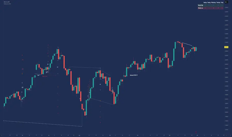
Weekly High/Low Day BreakdownThe "Weekly High/Low Day Breakdown" is a tool designed to help identify patterns in market behaviour by analysing the days of the week when weekly highs and lows occur. This indicator calculates the frequency and percentage of weekly highs and lows for each day from Monday to Sunday within the visible range of your chart.
Features:
Weekly Analysis: Calculates weekly highs and lows based on daily open high and low prices from Monday to Sunday.
Day-Specific Breakdown: Tracks which day of the week each weekly high and low occurred.
Visible Range Focus: Only considers data within the current visible range of your chart for precise analysis.
Interactive Table Display: Presents the results in an easy-to-read table directly on your chart.
How It Works:
Data Collection: Fetches daily high, low, day of the week, and time data regardless of your chart's timeframe. Uses these daily figures to determine the weekly high and low for each week.
Weekly Tracking: Monitors the day of the week when the weekly high and low prices occur. Resets tracking at the end of each week (Sunday).
Visible Range Analysis: Only includes weeks that fall entirely within the visible time range of your chart. Ensures that the analysis is relevant to the period you are focusing on.
Percentage Calculation: Counts the occurrences of weekly highs and lows for each day. Calculates the percentage based on the total number of weeks in the visible range.
Result Display: Generates a table with days of the week as columns and "Weekly High" and "Weekly Low" as rows. Displays the percentage values, indicating how often highs and lows occur on each day.
How to Use:
Add the Indicator: Apply the "Weekly High/Low Day Breakdown" indicator to your TradingView chart.
Adjust Visible Range: Zoom in or out to set the desired visible time range for your analysis.
Interpret the Table:
Columns: Represent days from Monday to Sunday.
"Weekly High" Row: Shows the percentage of times the weekly high occurred on each day. "Weekly Low" Row: Shows the percentage of times the weekly low occurred on each day.
Colors: Blue text indicates high percentages, red text indicates low percentages.
Example Interpretation:
If the table shows a 30% value under "Tuesday" for "Weekly High," it means that in 30% of the weeks within the visible range, the highest price of the week occurred on a Tuesday.
Similarly, a 40% value under "Friday" for "Weekly Low" indicates that 40% of the weekly lows happened on a Friday.

Weekly Regime Filter - Trend + Momentum + Structure (MTF)A multi-timeframe weekly regime indicator that classifies market conditions into BULL , BEAR , or CHOP using three components: trend, momentum, and market structure.
Works on any timeframe while always referencing weekly data — no repainting.
━━━━━━━━━━━━━━━━━━━━━━━━━━━━━━
🎯 WHAT IT DOES
Answers one question: What is the weekly regime?
• Trend — EMA hierarchy (Price > EMA Fast > EMA Slow)
• Momentum — DI+ vs DI- with optional ADX filter
• Structure — Break of Structure (BOS) and Change of Character (CHOCH)
BULL = All three bullish
BEAR = All three bearish
CHOP = Mixed signals
━━━━━━━━━━━━━━━━━━━━━━━━━━━━━━
⚡ KEY FEATURES
• Multi-Timeframe (MTF) — View on 1H, 4H, Daily; regime stays consistent
• Auto-Detect Asset Type — Automatically applies optimized settings for Crypto, Stocks, Forex, Gold, Silver, Oil, Commodities
• BOS/CHOCH Labels — Visual market structure breaks on chart
• Live Status Panel — Shows regime, components, and active parameters
• Non-Repainting — Uses confirmed weekly closes only
━━━━━━━━━━━━━━━━━━━━━━━━━━━━━━
📊 ASSET PRESETS
• Crypto — EMA 50/200, ADX Off, Pivot 2
• Stocks/Indices — EMA 50/200, ADX >20, Pivot 3
• Forex — EMA 30/100, ADX >25, Pivot 2
• Gold — EMA 40/150, ADX >20, Pivot 3
• Silver — EMA 40/150, ADX >22, Pivot 3
• Oil — EMA 30/100, ADX >25, Pivot 2
• Commodities — EMA 40/120, ADX >20, Pivot 3
Select "Custom" to use your own values.
━━━━━━━━━━━━━━━━━━━━━━━━━━━━━━
📈 HOW TO USE
For Swing Trading:
• Set chart to Daily
• Use Auto-Detect or select preset
• Long only when BULL, short only when BEAR
• Reduce size or avoid when CHOP
Structure Signals:
• CHOCH ↑ after bear regime = Early reversal signal
• CHOCH ↓ after bull regime = Tighten stops
• BOS in regime direction = Trend continuation
━━━━━━━━━━━━━━━━━━━━━━━━━━━━━━
🔔 ALERTS
• Regime → BULL
• Regime → BEAR
• CHOCH → Bull
• CHOCH → Bear
━━━━━━━━━━━━━━━━━━━━━━━━━━━━━━
⚙️ SETTINGS
Preset: Auto-Detect, Crypto, Stocks, Forex, Gold, Silver, Oil, Commodities, Custom
Custom Settings (when Custom selected):
• EMA Fast/Slow lengths
• ADX Length & Threshold
• ADX Filter toggle
• Pivot Left/Right
Display:
• Plot Weekly EMAs
• Show BOS/CHOCH Labels
• Show Regime Background
• Background Opacity
• Show Status Label
━━━━━━━━━━━━━━━━━━━━━━━━━━━━━━
📝 NOTES
• Needs ~200 weeks of history for full calculation
• Weekly signals are slower by design — filters noise
• Not a standalone system — combine with entries and risk management
• When using presets, Custom input fields won't visually update (Pine limitation) — status label shows actual values

Weekly macro ratio indicator tracking Silver/Gold with a 30-weekWhat this indicator does
This indicator tracks the Silver/Gold ratio on a weekly basis to determine whether silver is leading gold (risk appetite returning inside metals) or gold is leading silver (more defensive precious-metals posture).
Why Silver/Gold matters
When Silver/Gold rises, silver is outperforming gold — often associated with reflation, growth expectations, or broad risk appetite.
When Silver/Gold falls, gold is outperforming silver — often associated with defense, uncertainty, or tighter financial conditions.
This ratio is not a timing tool — it’s a regime/leadership indicator.
How it works (regime rules)
Using weekly data:
Compute Silver ÷ Gold
Apply a 30-week SMA
Regime definitions:
Bull: Ratio above a rising 30-week SMA (silver leading)
Bear: Ratio below a falling 30-week SMA (gold leading)
Neutral: Transition/range
A clear label marks the current regime.
How to use it in your system - This indicator is designed to be used as part of the broader TQ Weekly Macro Framework, alongside other TQ indicators such as TQ Gold Trend (Weekly Macro), TQ Gold / DXY (Weekly Macro), and TQ Gold / SPY (Weekly Macro).
Each indicator can also be used independently.
Use after confirming:
Pane 1: Gold Trend
Pane 2: Gold/DXY
Pane 3: Gold/SPY
If Silver/Gold is Bull, metals participation is broadening and silver often has more upside torque.
If Silver/Gold is Bear, gold leadership is defensive; silver exposure may underperform.
Neutral often signals rotation or consolidation.
Best timeframe
Designed for weekly macro regime analysis.

Weekly Open + Monday High/Low (After Monday Close)b]Description
This indicator marks key weekly reference levels based on Monday’s price behavior.
It automatically detects each trading week and tracks:
• Weekly Open – the first traded price of the new week
• Monday High – the highest price reached on Monday
• Monday Low – the lowest price reached on Monday
Logic
The Monday range is fully captured only after Monday has closed .
No levels are plotted during Monday.
Starting from Tuesday, the indicator displays thin dots showing the completed Monday High, Monday Low, and Weekly Open for the remainder of the week.
When a new week begins, the indicator resets automatically and begins tracking the new week’s Monday.
Customization
The user can choose colors for:
• Monday High/Low
• Weekly Open
Purpose
This indicator helps traders visualize weekly structure, monitor weekly opening levels, and quickly identify Monday’s range for weekly bias analysis or strategy development.
It can also be used to manually backtest Monday range strategies .

Weekly Session DividerThis indicator plots vertical divider lines at the start of each new weekly trading session (Sunday 8 PM ET / Monday 00:00 UTC in crypto).
It helps traders quickly spot the opening point of every weekly candle when viewing intraday charts.
Features:
Automatically detects the start of a new week using TradingView’s weekly time stamps.
Customizable line color, width, and style (solid, dashed, dotted).
Only displays on intraday timeframes to keep higher-timeframe charts clean.
Extends divider lines above and below the current chart for easy visibility.
Use case:
Great for crypto and futures traders who want to align intraday trading setups with higher-timeframe weekly opens, track session-to-session structure, or mark where the market’s new weekly trend may begin.

Weekly/Monthly Golden ATR LevelsWeekly/Monthly Golden ATR Levels
This indicator is designed to give traders a clear, rule-based framework for identifying support and resistance zones anchored to prior period ranges and the market’s own volatility. It uses the Average True Range (ATR) as a measure of how far price can realistically stretch, then projects fixed levels from the midpoint of the prior week and prior month.
Rather than “moving targets” that repaint, these levels are frozen at the start of each new week and month and stay fixed until the next period begins. This makes them reliable rails for both intraday and swing trading.
What It Plots
Weekly Midpoint (last week’s High + Low ÷ 2)
From this mid, the script projects:
Weekly +1 / −1 ATR
Weekly +2 / −2 ATR
Monthly Midpoint (last month’s High + Low ÷ 2)
From this mid, the script projects:
Monthly +1 / −1 ATR
Monthly +2 / −2 ATR
Customization
Set ATR length & timeframe (default: 14 ATR on Daily bars).
Adjust multipliers for Level 1 (±1 ATR) and Level 2 (±2 ATR).
Choose line color, style, and width separately for weekly and monthly bands.
Toggle labels on/off.
How to Use
Context at the Open
If price opens above last week’s midpoint, bias favors upside toward +1 / +2.
If price opens below the midpoint, bias favors downside toward −1 / −2.
Weekly Bands = Short-Term Rails
+1 / −1 ATR: Rotation pivots. Expect intraday reaction.
+2 / −2 ATR: Extreme stretch zones. Reversals or breakouts often occur here.
Monthly Bands = Big Picture Rails
Use these for swing positioning, or as “outer guardrails” on intraday charts.
When weekly and monthly bands cluster → high-confluence zone.
Trade Playbook
Trend Day: Hold above +1 → target +2. Break below −1 → target −2.
Range Day: Fade first test of ±2, scalp toward ±1 or midpoint.
Catalyst/News Day: Use with caution—levels provide context, not barriers.
Risk Management
Place stops just outside the band you’re trading against.
Scale profits at the next inner level (e.g., short from +2, cover partial at +1).
Runners can trail to the midpoint or opposite side.
Why It Works
ATR measures volatility—how far price tends to travel in a given period.
Anchoring to prior highs and lows captures where real supply/demand last clashed.
Combining the two gives levels that are statistically relevant, widely observed, and psychologically sticky.
Trading books from Mark Douglas (Trading in the Zone), Jared Tendler (The Mental Game of Trading), and Oliver Kell (Victory in Stock Trading) all stress the importance of having objective, repeatable reference points. These levels deliver that discipline—removing guesswork and reducing emotional trading

Weekly opening targets +-5%## Summary
This indicator automatically plots key percentage-based price levels above and below the current week's opening price. It is designed to provide traders with a clear map of potential intra-week support, resistance, and target zones based on clean, mathematical levels.
The script is lightweight and focuses on providing a clutter-free visual guide, making it easy to identify significant price areas at a glance.
## Features
Weekly Open Pivot: A central blue line clearly marks the opening price for the current week, acting as the primary baseline for all calculations.
Precise 1% Levels: The indicator calculates and draws horizontal lines at exact 1% increments away from the weekly open, covering a range from +/- 1% up to +/- 5%.
Color-Coded Zones: Levels above the weekly open are colored green (representing potential resistance or target zones), while levels below are colored red (representing potential support).
Real-Time Price Labels: To ensure clarity, clean labels are displayed on the right-hand side of the chart. Each label shows both its percentage deviation and the exact price, updating automatically with the latest data.
## How to Use
This tool is versatile, but here are a few common applications:
Identifying Support & Resistance: The primary use is to watch for price reactions at these calculated levels. A bounce off a lower (red) level could signal support, while a rejection from an upper (green) level could signal resistance.
Setting Profit Targets: The levels serve as excellent, non-subjective price targets. For example, if you enter a long position near the weekly open, the +1% and +2% levels are logical areas to consider taking profit.
Gauging Weekly Momentum: The distance price travels between these levels can help gauge the strength of the weekly trend. Consistently breaking through levels indicates strong momentum, while failing to do so may suggest consolidation.
This indicator is particularly useful for day traders and swing traders who use the weekly open as a key reference point for market sentiment and direction.

Weekly VwapsThe Weekly Vwaps indicator lets you plot weekly Volume-Weighted Average Price (VWAP) lines for up to six months of your choosing, with years ranging from 2020 to 2050. It’s a focused tool pulled straight from the weekly VWAP section of the Advanced VWAP Calendar indicator, keeping all the same controls and look but expanded to handle more months. You can use it alongside the original indicator if you need extra weekly VWAPs (up to 30 lines total) or run it on its own for a clean, dedicated setup.
How It Works: Six Month Groups: Pick any six months (e.g., Jan 2020, Sep 2025, or Jul 2040) and enable up to five weekly VWAPs per month (W1–W5), starting from Monday midnight.
Default Setup: Loads with September 2025 VWAPs turned on, with other months (August–April 2025) off but ready to enable. All default to 2025.
Customization: Toggle all weeks in a month or pick specific ones. Adjust label sizes (tiny to huge) and line widths (1–5). Colors are teal, fuchsia, red, green, and yellow/orange for weeks 1–5, with clear labels like “W1 Sep 2025 123.45”.
Label Control: A “Show All Labels” switch lets you hide labels to keep your chart tidy.
Intraday Only: Works on intraday timeframes (e.g., 5-minute, 1-hour) for accurate VWAPs.
Why Use It: Add to Advanced VWAP Calendar: If the original’s two-month limit isn’t enough, this adds six more months of weekly VWAPs for deeper analysis.
Standalone Option: Perfect if you only want weekly VWAPs without other features, with flexibility to pick any months and years.
User-Friendly: Ready to go with September 2025 enabled, easy to tweak for past or future data.
Get Started: Add it to your TradingView chart, and September 2025 VWAPs will show up instantly. Adjust months, years, or toggles in the settings to focus on what you need. Test it on intraday charts and use the label toggle to manage clutter. Great for traders wanting precise, customizable weekly VWAPs!
Weekly Volume USDT## Description
This Pine Script indicator displays the trading volume for each day of the current week (Monday through Sunday) in a clean table format on your TradingView chart. The volume is calculated in USDT equivalent and displayed in the top-right corner of the chart.
## Features
- **Weekly Volume Breakdown**: Shows individual daily volumes from Monday to Sunday
- **USDT Conversion**: Automatically converts volume to USDT using the average price (open + close / 2)
- **Smart Formatting**:
- Large numbers are formatted with K (thousands) and M (millions) suffixes
- Example: 1,234,567 → 1.23M USDT
- **Clean Table Display**: Fixed position table in the top-right corner
- **Current Week Focus**: Displays volumes for the current week only
- **Future Days Handling**: Days that haven't occurred yet in the current week show as "-"
## How It Works
1. The indicator calculates the average price for each day using (Open + Close) / 2
2. Multiplies the daily volume by the average price to get USDT-equivalent volume
3. Displays the results in an easy-to-read table format
## Use Cases
- **Volume Analysis**: Quickly identify which days of the week have the highest trading activity
- **Pattern Recognition**: Spot weekly volume patterns and trends
- **Trading Decisions**: Use volume information to inform your trading strategies
- **Market Activity Monitoring**: Keep track of market participation throughout the week
## Installation
Simply add this indicator to your TradingView chart and it will automatically display the weekly volume table in the top-right corner.
## Tags
#volume #weekly #USDT #table #analysis #trading #cryptocurrency

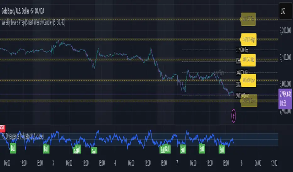
Weekly Levels Prep (Smart Weekly Candle)This script draws key weekly levels based on the most recent completed weekly candle (Monday–Friday). It automatically calculates and plots:
✅ Weekly High & Low
✅ Midpoint (50% level)
✅ Extension levels above and below
All levels are dynamically updated every new week and are visually marked with clean color-coded horizontal lines. Price values are shown near the price axis for clear visibility across all timeframes.
Great for:
Weekly preparation
Swing trading setups
Mean reversion and range breakouts
🔄 Works on all timeframes
🔍 Lightweight and non-intrusive
Built by a trader, for traders. 💼📈
Weekly MA SuiteThe Weekly MA Suite is a multi-layered moving average indicator designed for traders and investors who analyze market trends across weekly and long-term timeframes. It combines three critical trend layers—short-term (1W EMA/VWMA), mid-term (30W EMA/VWMA), and long-term (200W HMA)—providing clear insights into market momentum, structure, and cycle trends.
This indicator is ideal for:
✅ Swing traders looking for weekly momentum shifts
✅ Position traders tracking multi-week to multi-month trends
✅ Long-term investors monitoring macro market cycles
Each layer has customizable colors, transparency, and visibility toggles, ensuring traders can tailor the indicator to their specific needs.
📊 Breakdown of Components
🔹 Short-Term Trend (1W EMA/VWMA Ribbon – Top Layer)
Purpose: Captures weekly momentum and volume dynamics
• 1W EMA (Exponential Moving Average) reacts quickly to price changes
• 1W VWMA (Volume-Weighted Moving Average) accounts for volume to confirm trend strength
• Ribbon fill highlights the divergence between price-based momentum (EMA) and volume-weighted trends (VWMA), making trend shifts easier to spot
Usage:
• If the 1W EMA is above the 1W VWMA, momentum is strong and price is trending higher with support from volume
• If the EMA crosses below the VWMA, it may indicate weakening trend strength or distribution
• A widening ribbon suggests increasing momentum, while a narrowing ribbon signals potential consolidation or reversal
🔸 Mid-Term Trend (30W EMA/VWMA Ribbon – Middle Layer)
Purpose: Provides insight into the broader market structure over multiple months
• 30W EMA represents the dominant trend direction over roughly half a year
• 30W VWMA smooths this trend while weighting price by trading volume
• Ribbon fill allows for a visual representation of how volume impacts trend direction
Usage:
• A bullish trend is confirmed when price remains above the 30W EMA, with the ribbon widening in an uptrend
• A bearish shift occurs when the 30W EMA crosses below the 30W VWMA, signaling weakening demand
• If the ribbon narrows or twists frequently, the market may be in a choppy, range-bound phase
🔻 Long-Term Trend (200W HMA – Background Layer)
Purpose: Identifies major market cycles and deep trend shifts
• The 200W Hull Moving Average (HMA) is a long-term smoothing tool that reduces lag while maintaining trend clarity
• Unlike traditional moving averages, the HMA reacts faster to trend changes without excessive noise
Usage:
• When price is above the 200W HMA, the broader trend remains bullish, even during short-term corrections
• A cross below the 200W HMA may indicate a macro downtrend or deep market cycle shift
• Long-term investors can use this as a dynamic support or resistance zone
🎯 How to Use the Weekly MA Suite for Trading
📅 Identifying Market Phases
• In strong uptrends, the 1W EMA and 30W EMA will be aligned above their VWMA counterparts, with price well above the 200W HMA
• In sideways markets, the ribbons will frequently narrow or cross, signaling indecision
• In bear markets, price will typically trade below the 30W EMA, with the 200W HMA acting as a long-term resistance
📈 Entry and Exit Strategies
• A bullish trade setup occurs when the 1W EMA crosses above the 1W VWMA while the 30W EMA holds above the 30W VWMA, confirming multi-timeframe momentum
• A bearish setup is confirmed when the 1W EMA crosses below the 1W VWMA and price is also trending below the 30W EMA
• The 200W HMA can be used as a trend filter—staying long when price is above it and avoiding longs when price is below
🚦 Customizing for Your Trading Style
• Scalpers can focus on the 1W ribbon for faster trend shifts
• Swing traders can use the 30W ribbon for trend-following entries and exits
• Long-term investors should watch price action relative to the 200W HMA for market cycle positioning
🔧 Final Thoughts
The Weekly MA Suite simplifies multi-timeframe analysis by layering key moving averages in an intuitive and structured format. By combining short, medium, and long-term trend indicators, traders can confidently navigate market conditions and improve decision-making. Whether trading weekly trends or monitoring multi-year cycles, this tool provides a clear visual framework to enhance market insights.

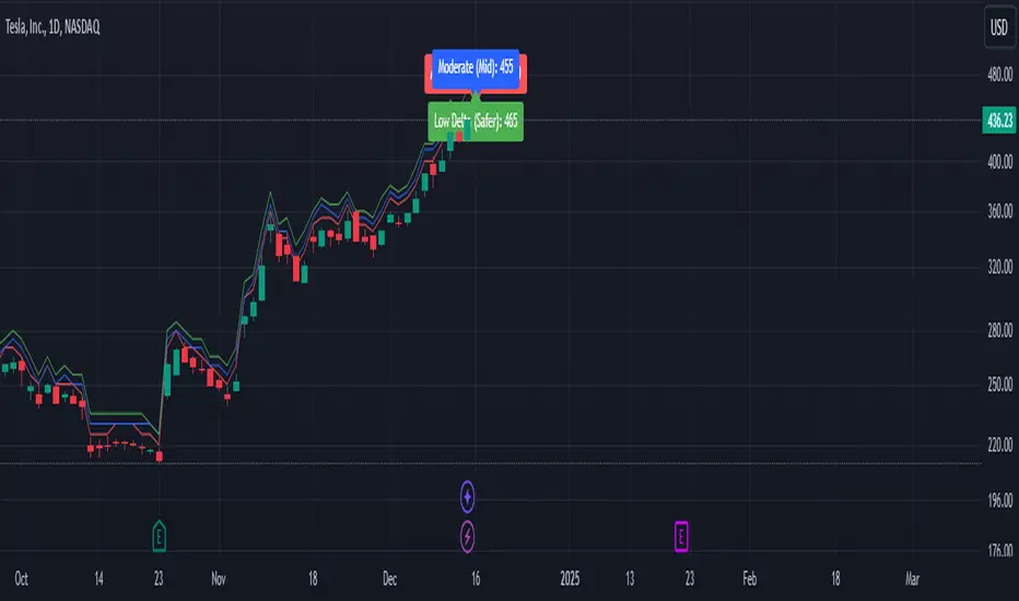
Weekly Covered Calls StrategyWhat Does This Indicator Do?
This indicator is a tool to help you pick strike prices for your weekly covered call options strategy. It does two things:
Plots two suggested strike prices on your chart:
Aggressive Strike (red label): A strike price closer to the current price, offering higher premiums but with a higher chance of assignment.
Moderate Strike (blue label): A strike price further from the current price, offering lower premiums but with a lower chance of assignment.
Uses technical analysis (volatility) to calculate these strike prices dynamically. It adjusts them based on the market's volatility and your chosen risk settings.
How It Works:
The indicator uses the following inputs to determine the strike prices:
ATR (Average True Range):
This measures the stock's volatility (how much the stock moves up or down over a given period).
A higher ATR = more volatile stock = wider range for strike prices.
Delta Adjustments:
The default settings use Delta values of 0.12 (Aggressive) and 0.18 (Moderate).
Delta is a concept in options trading that estimates the likelihood of the option being "in the money" (ITM) by expiration.
A 0.12 Delta = 12% chance of assignment (Aggressive)
A 0.18 Delta = 18% chance of assignment (Moderate)
Volatility Factor:
This multiplies the ATR by a factor (default is 1.5) to estimate the expected price move and adjust strike prices accordingly.
How to Use the Indicator:
Step 1: Understand the Labels
Red Label (Aggressive Strike):
Closer to the current stock price.
You’ll collect higher premiums because the strike price is riskier (closer to being ITM).
Best for traders comfortable with a higher risk of assignment.
Blue Label (Moderate Strike):
Further from the current stock price.
You’ll collect lower premiums because the strike price is safer (further from being ITM).
Best for traders looking to avoid assignment and collect safer weekly income.
Step 2: Match It to the Options Chain
Open your options chain (like the one you see in Fidelity, TOS, or TradingView).
Look for the strike prices closest to the red (aggressive) and blue (moderate) labels plotted by the indicator.
Compare the premiums (the amount you collect for selling the call) and decide:
If you want higher income: Go with the Aggressive Strike.
If you want safety: Go with the Moderate Strike.
Step 3: Manage Your Risk and Income
Avoid Assignment:
If you do not want your shares to be called away, choose strike prices further from the current price (e.g., moderate strike).
Maximize Premiums:
If you’re okay with a chance of your shares being called away, choose the closer aggressive strike for higher premium income.
Weekly Income Goal:
Use this strategy consistently each week to collect premium income while holding your shares.
Step 4: Adjust for Your Risk Tolerance
You can adjust the Delta values (0.12 for Aggressive and 0.18 for Moderate) to suit your risk tolerance:
Lower Delta (e.g., 0.08–0.10): Safer, fewer chances of assignment, lower premiums.
Higher Delta (e.g., 0.20–0.25): Riskier, higher chances of assignment, higher premiums.
Technical Analysis Summary (What the Indicator Uses):
The indicator uses ATR (Average True Range) to measure volatility and estimate how far the price might move.
It then multiplies ATR by a Volatility Factor to calculate the strike prices.
Using the Delta Adjustment settings, it adjusts these strike prices to give you a balance between risk and reward.
Putting It All Together:
Look at the Chart: The indicator will show two lines and labels for strike prices.
Check the Options Chain: Find the closest strike prices and compare premiums.
Decide Your Strategy:
Want higher premium income? Choose the Aggressive Strike (red label).
Want lower risk of assignment? Choose the Moderate Strike (blue label).
Collect Weekly Income: Sell the call option and repeat this process weekly to generate consistent income.
Happy trading, and may your premiums roll in while your shares stay safe! 🎯📊
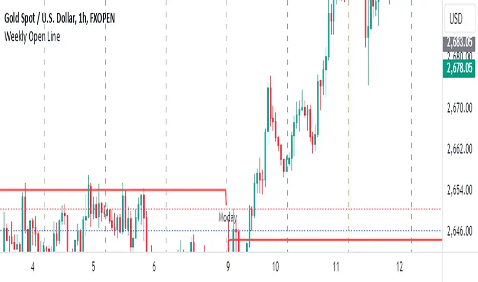
Weekly Open LineThis indicator displays the weekly open price on the chart. It automatically updates every Monday to reflect the opening price of the current week. A dashed line is drawn to indicate the weekly open, and a label stating "Monday" is shown on each Monday for easy identification.
Features:
Automatically calculates the weekly open on Mondays.
Displays a dashed line at the weekly open price.
Labels the weekly open with the text "Monday" for visibility.
Indikator ini menampilkan harga open mingguan di grafik. Indikator ini secara otomatis diperbarui setiap hari Senin untuk mencerminkan harga pembukaan minggu berjalan. Garis putus-putus digambar untuk menunjukkan open mingguan, dan sebuah label yang menyatakan "Moday" ditampilkan setiap hari Senin untuk memudahkan identifikasi.
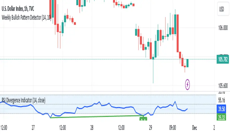
Weekly Bullish Pattern DetectorThis script is a TradingView Pine Script designed to detect a specific bullish candlestick pattern on the weekly chart. Below is a detailed breakdown of its components:
1. Purpose
The script identifies a four-candle bullish pattern where:
The first candle is a long green (bullish) candlestick.
The second and third candles are small-bodied candles, signifying consolidation or indecision.
The fourth candle is another long green (bullish) candlestick.
When this pattern is detected, the script:
Marks the chart with a visual label.
Optionally triggers an alert to notify the trader.
2. Key Features
Overlay on Chart:
indicator("Weekly Bullish Pattern Detector", overlay=true) ensures the indicator draws directly on the price chart.
Customizable Inputs:
length (Body Size Threshold):
Defines the minimum percentage of the total range that qualifies as a "long" candle body (default: 14%).
smallCandleThreshold (Small Candle Body Threshold):
Defines the maximum percentage of the total range that qualifies as a "small" candle body (default: 10%).
Candlestick Property Calculations:
bodySize: Measures the absolute size of the candle body (close - open).
totalRange: Measures the total high-to-low range of the candle.
bodyPercentage: Calculates the proportion of the body size relative to the total range ((bodySize / totalRange) * 100).
isGreen and isRed: Identify bullish (green) or bearish (red) candles based on their open and close prices.
Pattern Conditions:
longGreenCandle:
Checks if the candle is bullish (isGreen) and its body percentage exceeds the defined length threshold.
smallCandle:
Identifies small-bodied candles where the body percentage is below the smallCandleThreshold.
consolidation:
Confirms the second and third candles are both small-bodied (smallCandle and smallCandle ).
Bullish Pattern Detection:
bullishPattern:
Detects the full four-candle sequence:
The first candle (longGreenCandle ) is a long green candle.
The second and third candles (consolidation) are small-bodied.
The fourth candle (longGreenCandle) is another long green candle.
Visualization:
plotshape(bullishPattern):
Draws a green label ("Pattern") below the price chart whenever the pattern is detected.
Alert Notification:
alertcondition(bullishPattern):
Sends an alert with the message "Bullish Pattern Detected on Weekly Chart" whenever the pattern is found.
3. How It Works
Evaluates Candle Properties:
For each weekly candle, the script calculates its size, range, and body percentage.
Identifies Each Component of the Pattern:
Checks for a long green candle (first and fourth).
Verifies the presence of two small-bodied candles (second and third).
Detects and Marks the Pattern:
Confirms the sequence and marks the chart with a label if the pattern is complete.
Sends Alerts:
Notifies the trader when the pattern is detected.
4. Use Cases
This script is ideal for:
Swing Traders:
Spotting weekly patterns that indicate potential bullish continuations.
Breakout Traders:
Identifying consolidation zones followed by upward momentum.
Pattern Recognition:
Automatically detecting a commonly used bullish formation.
5. Key Considerations
Timeframe: Works best on weekly charts.
Customization: The thresholds for "long" and "small" candles can be adjusted to suit different markets or volatility levels.
Limitations:
It doesn't confirm the pattern's success; further analysis (e.g., volume, support/resistance levels) may be required for validation
Weekly Stacked Daily Changes [LuxAlgo]The Weekly Stacked Daily Changes tool allows traders to compare daily net price changes for each day of the week, stacked by week. It provides a very convenient way to compare daily and weekly volatility at the same time.
🔶 USAGE
The tool requires no configuration and works perfectly out of the box, displaying the net price change for each day of the week as stacked boxes of the appropriate size.
Traders can adjust the width of the columns and the spacing between days and weeks, options to change the color and disable the months and new month lines are also available.
🔹 Bottom Stack Bias
This feature allows traders to compare weekly volatility in two different ways.
With this feature disabled, all weeks use zero as the bottom of the stack, so traders can see at a glance weeks with more volatility and weeks with less volatility.
Enabling this feature will cause the tool to display the stacks with the weekly net price change as the bottom, so if a stack starts below the zero line it means that week has a negative net return, and if it starts above the zero line it means that week has a positive net return.
🔶 SETTINGS
Width: Select the fixed width for each column.
Offset: Choose the fixed width between each column.
Spacing: Select the distance between each day within each column.
🔹 Style
Bottom Stack Bias: Use weekly net price change as the bottom of the stack.
Bullish Change: Color for days with positive net price change
Bearish Change: Color for days with negative net price change
Show Months: Under each week stack, display the month
Show Months Delimiter: Display a line indicating the start of a new month

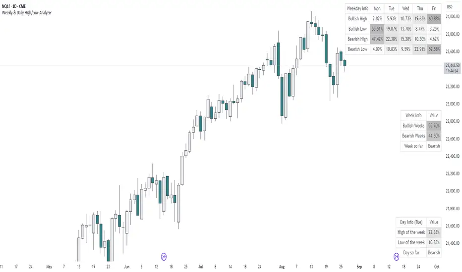
Weekly & Daily High/Low AnalyzerOverview
The Weekly & Daily High/Low Analyzer indicator is designed to analyze the likelihood of achieving the High or Low of the day or week based on user-specified parameters. This tool is ideal for traders who want to identify potential turning points in the market by examining historical data.
Features
Weekly High/Low Analysis: Available exclusively on the daily timeframe, this feature allows users to analyze past weeks to determine the probability of reaching the weekly high or low. Users can specify the number of weeks to analyze via the "Number of Weeks to Calculate" input field. Setting this field to 0 includes all available historical data. Note that the current week is excluded from the analysis as it is incomplete, and weekends (Saturdays and Sundays) are not analyzed.
Daily High/Low Analysis: Available exclusively on the 1-hour timeframe, this feature analyzes past days to determine the probability of reaching the daily high or low. Users can specify the number of days to analyze via the "Number of Days to Calculate" input field. Setting this field to 0 includes all available historical data. The current day is excluded from the analysis as it is incomplete, and weekends (Saturdays and Sundays) are not analyzed.
Visualization
A table is displayed in the top right corner of the chart, showing the results of the analysis. The table highlights the hours or days with the highest probabilities in darker colors for easy identification.
How It Works
Weekly Analysis: On the daily timeframe, the script analyzes each week's high and low points. It differentiates between bullish and bearish weeks and calculates the probability of reaching the high or low on each day of the week (Monday to Friday).
Daily Analysis: On the 1-hour timeframe, the script examines the high and low points of each trading day. It differentiates between bullish and bearish days and calculates the probability of reaching the high or low at each hour of the trading day.
Inputs
Number of Weeks to Calculate: An integer input that determines the number of past weeks to include in the analysis. Setting this to 0 includes all historical data.
Number of Days to Calculate: An integer input that determines the number of past days to include in the analysis. Setting this to 0 includes all historical data.
Calculation and Display
The indicator uses arrays to count the occurrences of highs and lows on bullish and bearish weeks and days.
Probabilities are calculated and displayed in a table, with each row representing a day (for weekly analysis) or an hour (for daily analysis).
Colors in the table indicate the strength of the probability, making it easy to identify significant patterns.
Implementation
The script includes detailed logic for resetting values at the start of a new week or day, capturing opening and closing prices, and counting occurrences of highs and lows. The table displays data in a user-friendly format, with gradient colors indicating the probability strength.
Example Usage
Swing Traders: Can use the weekly analysis to identify potential high or low points for the week, aiding in setting entry or exit points.
Day Traders: Can use the daily analysis to determine the most likely hours for reaching the high or low of the day, optimizing intraday trading strategies.
Additional Information
This indicator is inspired by the knowledge shared by Omor and aims to provide traders with a statistical edge in predicting market movements.
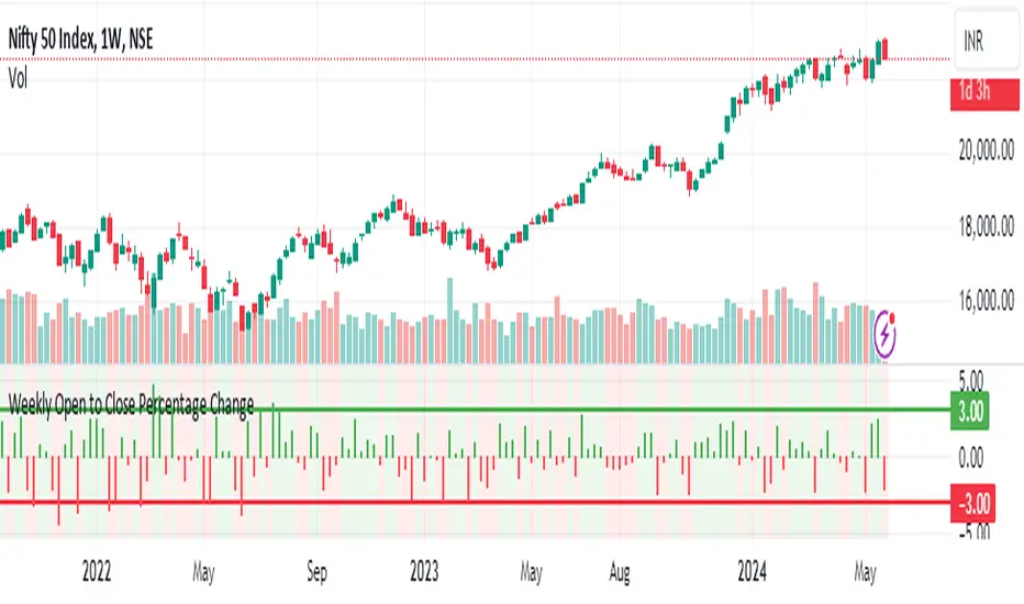
Weekly Open to Close Percentage ChangeThe "Weekly Open to Close Percentage Change Indicator" is a powerful tool designed to help traders and investors track the percentage change in price from the open of the current week's candle to its close. This indicator provides a clear visualization of how the price has moved within the week, offering valuable insights into weekly market trends and momentum.
Key Features:
Weekly Analysis: Focuses on weekly time frames, making it ideal for swing traders and long-term investors.
Percentage Change Calculation: Accurately calculates the percentage change from the open price of the current week's candle to the close price.
Color-Coded Visualization: Uses color coding to differentiate between positive and negative changes:
Green for positive percentage changes (price increase).
Red for negative percentage changes (price decrease).
Histogram Display: Plots the percentage change as a histogram for easy visual interpretation.
Background Highlighting: Adds a background color with transparency to highlight the nature of the change, enhancing chart readability.
Optional Labels: Includes an option to display percentage change values as small dots at the top for quick reference.
How to Use:
Add the script to your TradingView chart by opening the Pine Editor, pasting the script, and saving it.
Apply the indicator to your chart. It will automatically calculate and display the weekly percentage change.
Use the color-coded histogram and background to quickly assess weekly price movements and make informed trading decisions.
Use Cases:
Trend Identification: Quickly identify whether the market is trending upwards or downwards on a weekly basis.
Market Sentiment: Gauge the market sentiment by observing the weekly price changes.
Swing Trading: Ideal for swing traders who base their strategies on weekly price movements.
Note: This indicator is designed for educational and informational purposes. Always conduct thorough analysis and consider multiple indicators and factors when making trading decisions.
Weekly Put SaleWeekly Put Sale
This study is a tool I use for selling weekly puts at the suggested strike prices.
1. The suggested strike prices are based on the weekly high minus an ATR multiple which can be adjusted in the settings
2. You can also adjust the settings to Monthly strike prices if you prefer selling options further out
3. I suggest looking for Put sale premium that is between 0.25% to 0.75% of the strike price for weekly Puts and 1% to 3% of the strike price for monthly Puts
Disclaimers: Selling Puts is an advanced strategy that is risky if you are not prepared to acquire the stock at the strike price you sell at on the expiration date. You must make your own decisions as you will bear the risks associated with any trades you place. To sum it up, trading is risky, and do so at your own risk.
Weekly open line + SeparatorA toolkit to organize your chart by weekly vertical separation and the weekly horizontal line for support and resistance on H1 charts.
Key Features:
Weekly Open Line (WOL):
Automatically plots a clean horizontal line at each week's opening price (CET/Berlin Time).
Selective Extension:
Want to track a major historical level? Select any past week via the calendar and extend its WOL infinitely to the right for S/R analysis.
Vertical Session Breaks:
Distinct dashed lines for new weeks and months to provide instant structural clarity.
Smart Labels:
Displays English Month names (Jan, Feb...) and Week numbers (W1, W2...)
Fully Customizable:
Adjust colors, visibility, and line widths for all elements independently in the settings.

Weekly High/Low Day StatisticsThis indicator analyzes historical price data to determine which day of the week (Monday through Friday) most frequently hosts the weekly high and low prices. It provides overall counts, percentages, and the total number of weeks analyzed. Ideal for traders studying seasonal or day-of-week patterns in markets like futures (e.g., ES1!, NQ1!) or stocks (e.g., SPY).
Key Features:
Overall Statistics: Aggregates data across all available history, including the current partial week if applicable.
High/Low Tracking: Counts how many times each day was the weekly high or low, with percentages calculated over the total weeks.
Tie Handling: Uses the first occurrence in case of price ties (e.g., if multiple days hit the same high, the earliest day is credited).
Futures-Friendly: Utilizes time_tradingday for accurate day-of-week detection on continuous contracts like ES1!, accounting for session timings in UTC.
Table Display: Results are presented in a clean, semi-transparent table in the top-right corner, with columns for counts, percentages, and a total weeks summary.
Dynamic Updates: Processes all available historical bars on daily (1D) charts, supporting deep history (e.g., back to 2001 for ES1!). Note: On intraday timeframes, historical depth may be limited by TradingView's bar constraints.
How It Works:
The script iterates through daily bars, identifying the start of each new week via ta.change(time("W")). It tracks the highest and lowest prices within each week and assigns them to the corresponding trading day. At the end of each complete week, it tallies the results. The current incomplete week is included for real-time relevance.
Percentages are calculated as: (Count / Total Weeks) * 100, rounded to one decimal place.
Usage Tips:
Recommended Timeframe: Daily (1D) for maximum historical analysis. Works on intraday charts but with shallower data.
Symbols: Best for markets trading Monday-Friday, like indices, futures, or equities. Sunday/Saturday data is ignored as it's typically non-trading.
Customization: If ties should favor the last day instead, modify the comparison operators from >/< to >=/<= in the update logic.
Performance: Efficient for large datasets; no max_bars_back needed as it avoids deep historical references.
This tool can help uncover patterns, such as whether Fridays tend to be highs in bullish markets or Mondays lows during volatility. Use it alongside other indicators for comprehensive strategy building. Feedback welcome—feel free to suggest improvements!

Weekly macro ratio indicator comparing gold vs SPY 30 SMAWhat this indicator does
This indicator tracks the Gold/SPY ratio on a weekly basis to show whether gold is outperforming U.S. equities (risk assets). It helps you determine if the market is favoring hard money / defensive leadership vs risk-on equity leadership.
Why Gold/SPY matters
Gold can rise during equity booms and during equity stress.
The Gold/SPY ratio tells you which asset class is winning in relative terms.
Rising Gold/SPY often signals defensive leadership, shifting macro preferences, or risk repricing.
How it works (regime rules)
Using weekly data:
Compute Gold ÷ SPY
Apply a 30-week SMA
Regime definitions:
Bull: Ratio above a rising 30-week SMA (gold leading equities)
Bear: Ratio below a falling 30-week SMA (equities leading gold)
Neutral: Transition/range
A clear label marks the current regime.
How to use it in your system
Use after Pane 1 (Gold Trend) and Pane 2 (Gold/DXY).
If Gold/SPY is Bull, gold is leading risk assets — metals tend to behave stronger and more “macro-relevant.”
If Gold/SPY is Bear, equities are winning — gold moves may be less dominant.
Neutral usually means rotation or consolidation.
Best timeframe
Designed for weekly macro regime analysis, not short-term trading.

Weekly macro trend indicator for gold using a 30-week SMAWhat this indicator does
This indicator identifies the macro trend regime of gold using a simple, time-tested framework: the weekly price of gold relative to its 30-week simple moving average.
It is designed to answer one question only:
Is gold currently in a monetary uptrend?
How it works
The indicator uses weekly data and applies a 30-week SMA regime filter:
Bullish (Monetary Uptrend):
Gold price is above a rising 30-week SMA.
Bearish (Monetary Downtrend):
Gold price is below a falling 30-week SMA.
Neutral (Transition):
All other conditions (range-bound or early trend change).
A clear on-chart label displays the current regime.
How to use it
Use this as the first filter before analyzing silver, miners, or relative-strength ratios.
When gold is Bull, precious metals deserve attention.
When gold is Bear, most precious-metal trades lose their edge.
When gold is Neutral, patience is usually rewarded.
Best timeframe
This indicator is designed for weekly charts and macro-level decision-making.
It is not intended for day trading or short-term signals.
Who this is for:
Investors and traders focused on macro trends
Those treating gold as a monetary asset, not a short-term trade
Anyone looking for a clean, objective regime filter.
