Multi-Timeframe Trend Analysis [LevelUp]Multi-Timeframe Trend Analysis was created through a collaborative effort with David Ryan, three-time winner of the U.S. Investing Championship. In addition to working with William O'Neil, founder of Investor's Business Daily, David managed the New USA Growth Fund at William O’Neil + Company.
Identifying Trends and Box Types
It's easy to get caught up with the noise of tracking price movement, bar by bar. This is even more relevant on lower timeframes. When performing trend analysis, it can be very helpful to step back and look at the bigger picture.
To help facilitate visualizing trends, with this indicator you can view higher timeframe data without changing to a new chart:
■ View the weekly trend from a daily chart.
■ View the monthly trend from a weekly chart.
■ View the quarterly trend from a monthly chart.
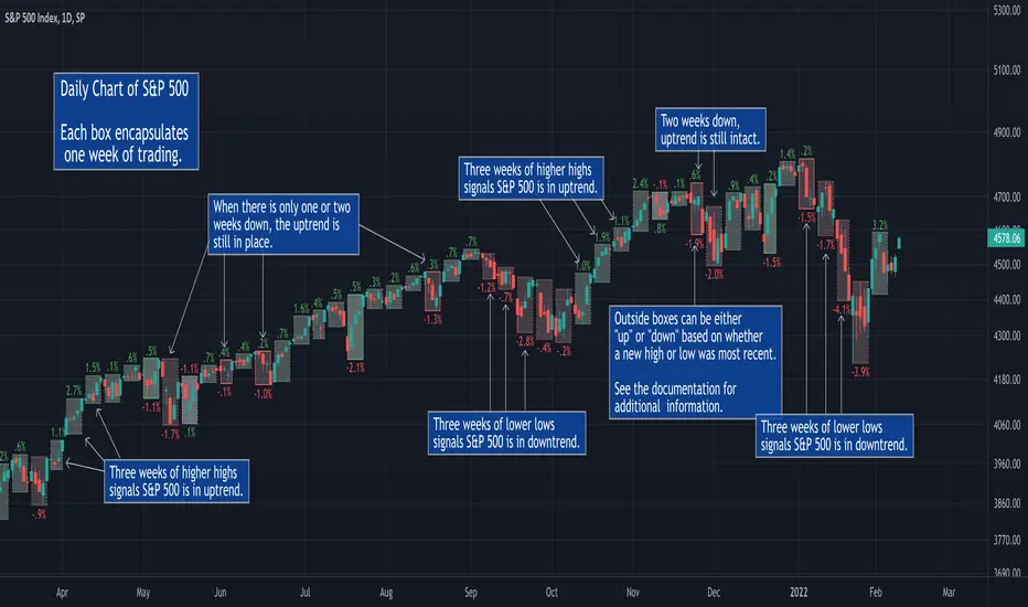
The weekly chart of GOOGL is shown below. Each box encapsulates one month of trading activity. You can also see the four types of boxes that may be shown: up, down, inside and outside.
Up Box - When a box highest high is above the previous box high, it is considered an up box. The percent change shows the increase from the previous box highest high to the highest high of the current box.
Down Box - When a box lowest low is below the previous box lowest low, it is considered a down box. The percent change shows the decrease from the previous box lowest low to the lowest low of the current box.
Inside Box - When a box highest high is below the previous box highest high, and the box lowest low is greater than the previous box lowest low, it is considered an inside box. Two percent changes are shown. One indicating the decrease from previous box highest high to the highest high of the current box. The other indicating the increase from the previous box lowest low to the lowest low of the current box.
Outside Box - When a box highest high is above the previous box highest high, and the box lowest low is below the previous box lowest low, it is considered an outside box. Two percent changes are shown. One indicating the increase from previous box highest high to the highest high of the current box. The other indicating the decrease from the previous box lowest low to the lowest low of the current box.
Special Note for Outside Boxes: As far as outside boxes and whether they are continuing or changing the trend, it depends on the action of the most recent high or low. The box is considered to be an up box if the highest high is more recent than the lowest low, and vice versa.
How to Use the Indicator
The goal of this indicator is to help spot changes in the trend. Historical price data has shown that movements up/down often occur in threes. By looking for boxes encapsulating higher timeframe moves, we can see when a trend may be changing.
Three Higher Highs - If price movement is sideways or down and is followed by three consecutive higher highs, this may be the start of an uptrend.
Three Lower Lows - If price movement is sideways or up and is followed by three consecutive lower lows, this may be the start of a downtrend.
Percent Change Information
Each box has an optional percent (%) change value. Refer to the image and description below for more information.
Additional Examples
Features
■ View price action trends of higher timeframes without changing the chart timeframe.
■ View percent gain/loss from one box to another.
■ Customize box border and background colors.
■ Show/hide percent change values.
Cari dalam skrip untuk "weekly"
Institutional Behavior AnalyticsJapanese below / 日本語説明は下記
■Summary
This indicator provides analysis on institutional investors/traders’ behavior by discovering and interpreting patterns of CFTC positions and price action in order to help users follow market directions that maker makers create and make decisions.
■What can we do with this indicator?
●Display institutional investors/traders’ position(CFTC COT position)
●Analyze institutional investors/traders’ behavior
Analyze institutional investors’ behavior from CFTC position data and price action and patternize the movement where strong buying/selling pressures are indicated
●Notify institutional investors’ behavioral changes with signals and alerts
In case strong buying/selling pressures detected, signals will be displayed along with the factors by which the behavioral changes identified. Alerts can be set with the same condition as signals.
■Why is it important to analyze institutional investors/traders behavior?
Financial markets are created by institutional investors/traders aka market makers. Analyzing their behavior and knowing where they are heading are chances for retail traders for trend trading.
■Functions
There is three core functions in this indicator.
1. CFTC COT Positions
2. Institutional Behavior Analysis
3. Alert
■Function Details:
1. CFTC COT Positions
1-1. CFTC COT Position
This indicator shows COT(Commitment of Traders) positions provided by CFTC with selection of legacy format and new format.
Users also can select position type from Futures only and Futures and Options.
Data source is quandle.com
The indicator shows the data of the assets listed below based on the code and the ticker code of which users open charts.
This is upgrade functions of CFTC Positions by COT Report(Legacy and New Format) Indicator which I previously released by adding more assets and new functions; (1)manual CFTC code entry, (2)display of changes from previous week and (3) Auto-identification of peak position level (see below)
CFTC Positions by COT Report(Legacy and New Format)
Indices:
Dow Jones Industrial Average / CFTC code:12460P / when DJI/US30 open
S&P 500 STOCK INDEX / CFTC code:13874P / when SPX / SPX500USD /US500 open
NASDAQ-100 STOCK INDEX / CFTC code:20974P / when NDX/US100 open
E-MINI Russel2000 INDEX / CFTC code:239742 / when RUT/US2000 open
NIKKEI STOCK AVERAGE / CFTC code:240741 / when NI225 / JP225USD open
Currencies:
EURO / CFTC code:099741 / when EURUSD open
Japanese Yen / CFTC code:097741 / when USDJPY open
British Pound / CFTC code:096742 / when GBPUSD or EURGBP open
Australian Dollars / CFTC code:232741 / when AUDUSD open
New Zealand Dollars / CFTC code:112741 / when NZDUSD open
Canadian Dollars / CFTC code:090741 / when USDCAD open
Swiss Franc / CFTC code:092741 / when USDCHF open
Commodities:
USOIL / CFTC code:067411 / when USOIL open
Brent oil / CFTC code:06765T / when UKOIL open
GOLD / CFTC code:088691 / when GOLD or XAUUSD open
Silver / CFTC code:084691 / when SILVER or XAGUSD open
Platinum / CFTC code:076651 / when PLATINUM or XPTUSD open
Palladium / CFTC code:075651 / when PALLADIUM or XPDUSD open
Copper(Grade#1) / CFTC code:085692 / HG1! or HG2! Open
Natural Gas(Henry Hub) / CFTC code:023391 / when NATURALGAS open)
Corn / CFTC code:002602 / ZC1! Or ZC2! Open
Cryptos:
Bitcoin / CFTC code:133741 / when BTCUSD open
Ether / CFTC code:146021 / when ETHUSD open
Data to be displayed:
Legacy format:
1. Open Interest
2. Non Commercial Long
3. Non Commercial Short
4. Non Commercial Net Positions (calculated by 2 and 3)
5. Non Commercial Spreads
6. Commercial Long
7. Commercial Short
8. Commercial Net Positions(calculated by 6 and 7)
9. Total Long
10. Total Short
11. Non Reportable Positions Long
12. Non Reportable Positions Short
13. Non Reportable Net Positions(calculated by 11 and 12)
New format:
1. Open Interest
2. Producer/Merchant/Processor/User Longs
3. Producer/Merchant/Processor/User Shorts
4. Producer/Merchant/Processor/User Net Positions(calculated by 2 and 3)
5. Swap Dealer Longs
6. Swap Dealer Shorts
7. Swap Dealer Net Positions(calculated by 5 and 6)
8. Swap Dealer Spreads
9. Money Manager Longs
10. Money Manager Shorts
11. Money Manager Net Positions(calculated by 9 and 10)
12. Money Manager Spreads
13. Other Reportable Longs
14. Other Reportable Shorts
15. Other Reportable Net Positions(calculated by 13 and 14)
16. Other Reportable Spreads
17. Total Reportable Longs
18. Total Reportable Shorts
19. Non Reportable Longs
20. Non Reportable Shorts
21. Non Reportable Net Positions(calculated by 19 and 20)
Sample chart
Colors and chart type are configurable.
❶.Non commercial long(green)/short(purple)/net(blue) position
❷.All data in legacy format
❸. All net positions in new format
1-2 Manual CFTC code entry
Besides the assets above, users now can enter CFTC code manually when they want to specify CFTC code regardless of charts they are opening and see other assets' COT position data.
1-3 Changes from previous week
Changes from previous week are displayed as text for Open interest, Non Commercial Long/Short/Net positions.
1-4 Auto-identification of peak position level in past N week
By specifying number of weeks(=N), the indicator automatically identify highest position level in the past N weeks for Non-commercial long and short positions.
By knowing this, users can prepare for trend reversal possibilities.
Sample chart
2. Institutional Behavior Analysis
This indicator detects institutional behavior changes based on changes of positions and price action and then categorizes them into patterns where strong buying/selling pressures of institutional investors are indicated.
Once the patterns identified, those will be displayed as signals and also it plots the factors in text by which the patterns are identified in order to support users’ decision making.
Sample chart
What makes indicator suggest institutional investors’ strong buy/sell will be remarked in the bottom right corner.
Please be noted that this function works on weekly timeframe only as institutional investors positions are updated on weekly basis by CFTC.
3. Alert
Alerts can be set with the same condition as signals so that users do not miss indicated strong buying/selling pressure of institutional investors.
■What timeframe/trading style is this indicator for?
As CFTC position updated on weekly basis, weekly, daily and 4H timeframes are most appropriate hence swing trading and day trading is best fitting trading style.
Scalping? Possible but why would we aim such small movement, knowing the directions that institutional investors are going to which could lead to big trends.
---------------------------------------------------
■サマリー
機関投資家の建玉とプライスアクションに基づいて機関投資家の行動分析を提供するインジケーターです。
機関投資家の強い買い圧力、売り圧力が示唆されるケースをその構成要素と共にパターン分類。
マーケットメーカーの作り出す相場の方向性に追従しやすくなるように、ユーザーの意思決定を支援します。
■このインジケーターでできること
●CFTC建玉の分析
CFTC(アメリカ商品先物取引委員会)が公開するCOT(Commitment of Traders)レポートに基づき機関投資家や商業筋の建玉データを分析することができます。
●機関投資家の行動分析
建玉データと値動きから機関投資家の行動を分析することが可能です。
インジケーターは建玉データとプライスアクションを基に機関投資家の強い買い圧力、売り圧力が示唆されるケースをその構成要素と共にパターン分類します。
●機関投資家の行動変化をシグナルとアラートで通知
機関投資家の強い買い圧力、売り圧力が検知された場合、その構成要素と共にシグナルを表示します。またシグナル表示のタイミングでアラート設定することも可能です。
■なぜ機関投資家の建玉や行動を分析することが重要なのか?
相場はマーケットメーカーと呼ばれる機関投資家によって作られています。
彼らのポジション状況や行動を分析し、彼らがどの方向に進んでいるのかを知ることは、個人投資家にとってトレンドフォローでトレードする機会、特に大きなトレンドに乗る機会を見出すことに繋がります。
機能
このインジケーターには主に3つの機能が搭載されています。
1. CFTC建玉データの表示
2. 機関投資家の行動分析
3. アラート
1. CFTC建玉データの表示
1-1. CFTC建玉データの表示
COTレポートが提供するCFTC建玉をサブウィンドウに表示することができます。
データレイアウトについては、レガシーフォーマットと新フォーマットの二つのレポートフォーマットを選択可能です。
またポジション種類として先物のみを表示するか、先物とオプションを含んだポジションを表示するかの選択も可能です。
インジケーターが表示する対象の資産と該当のCFTCコード、どのティッカーコードのチャートで表示されるかは以下の通りです。(データソースはquandle.com)
この機能は以前リリースしたCFTC Positions by COT Report(Legacy and New Format) Indicatorのアップグレードバージョン機能です。
対象データが追加されている他、新機能として(1)マニュアルでのCFTCコード指定、(2)前週比の表示、(3)過去のピークポジションのレベルライン自動描画が追加されています。
(詳細は下記)
CFTC Positions by COT Report(Legacy and New Format)
株価インデックス:
ダウ工業平均 / CFTC code:12460P / DJI/US30 を開いたとき
S&P500 / CFTC code:13874P / SPX / SPX500USD /US500
ナスダック100指数 / CFTC code:20974P / NDX/US100
E-MINI ラッセル2000指数 / CFTC code:239742 / RUT/US2000
日経平均 / CFTC code:240741 / NI225 / JP225USD
通貨:
ユーロ / CFTC code:099741 / EURUSDを開いた時
円 / CFTC code:097741 / USDJPY
ポンド / CFTC code:096742 / GBPUSD または EURGBP
豪ドル / CFTC code:232741 / AUDUSD
ニュージーランドドル / CFTC code:112741 / NZDUSD
カナダドル / CFTC code:090741 / USDCAD
スイスフラン / CFTC code:092741 / USDCHF
コモディティ:
WTI原油 / CFTC code:067411 / USOIL
北海ブレント原油 / CFTC code:06765T / UKOIL
ゴールド / CFTC code:088691 / GOLD または XAUUSD
シルバー / CFTC code:084691 / SILVER または XAGUSD
プラチナ / CFTC code:076651 / PLATINUM または XPTUSD
パラジウム / CFTC code:075651 / PALLADIUM または XPDUSD
銅(Grade#1) / CFTC code:085692 / HG1! または HG2!
天然ガス(Henry Hub) / CFTC code:023391 / NATURALGAS
コーン / CFTC code:002602 / ZC1! または ZC2!
暗号資産:
ビットコイン / CFTC code:133741 / BTCUSD
イーサ / CFTC code:146021 / ETHUSD
表示されるデータ:
レガシーフォーマット(一般的によく見るのはこのフォーマットです。)
1. Open Interest
2. Non Commercial Long
3. Non Commercial Short
4. Non Commercial Net Positions (calculated by 2 and 3)
5. Non Commercial Spreads
6. Commercial Long
7. Commercial Short
8. Commercial Net Positions (calculated by 6 and 7)
9. Total Long
10. Total Short
11. Non Reportable Positions Long
12. Non Reportable Positions Short
13. Non Reportable Net Positions(calculated by 11 and 12)
新フォーマット:
1. Open Interest
2. Producer/Merchant/Processor/User Longs
3. Producer/Merchant/Processor/User Shorts
4. Producer/Merchant/Processor/User Net Positions(calculated by 2 and 3)
5. Swap Dealer Longs
6. Swap Dealer Shorts
7. Swap Dealer Net Positions(calculated by 5 and 6)
8. Swap Dealer Spreads
9. Money Manager Longs
10. Money Manager Shorts
11. Money Manager Net Positions(calculated by 9 and 10)
12. Money Manager Spreads
13. Other Reportable Longs
14. Other Reportable Shorts
15. Other Reportable Net Positions(calculated by 13 and 14)
16. Other Reportable Spreads
17. Total Reportable Longs
18. Total Reportable Shorts
19. Non Reportable Longs
20. Non Reportable Shorts
21. Non Reportable Net Positions(calculated by 19 and 20)
サンプルチャート:
色とグラフ/線種は変更可能です。
❶.Non commercial(いわゆる投機筋)のポジション: ロング(緑)/ショート(紫)/ネット(青)
❷.レガシーフォーマットの全データ出力
❸. 新フォーマットで提供される全てのネットポジション
1-2 CFTCコードのマニュアル入力
上記のアセットに加え、任意のCFTCコードを指定して建玉データを表示することができます。
現在開いているチャートに関係なく、特定のアセットの建玉を確認したい時、他のアセットの建玉との相関を見るときに活用できます。
1-3 前週比の表示
Open Interest, Non Commercial(投機筋)のLong/Short/Netについて、前週比を表示します。
1-4. 過去N週間における建玉のピークを自動表示
過去N週間(Nはパラメータ設定)におけるNon Commercial(投機筋)のロング·ショートポジションのピークを自動で表示します。
過去の建玉のピークを知ることで、建玉が再びそのラインに接近した時のトレンド転換の可能性に備えることが可能です。
サンプルチャート
2. 機関投資家の行動分析
この機能では建玉の変化とプライスアクションから機関投資家の行動変化を検知し、機関投資家の強い買い、売りの存在が示唆されるケースをパターン分類します。
パターンが特定されたタイミングでシグナル表示するとともに、パターンを構成する要素(何を以て機関投資家の強い買い/売りの存在を判断したか)をテキストで表示することでユーザーの意思決定を支援します。
サンプルチャート
インジケーターが機関投資家の強い買い·売りの存在が示唆されると判断した要素がサブウィンドウの右下に記載されます。
この機能は週足でのみ有効です。
3. アラート
上記2のシグナルが表示されるタイミングでアラートを設定することができます。
機関投資家の強い買い·売りを検知したタイミングを逃さないよう活用してください。
■このインジケーターが適しているタイムフレーム
CFTCのポジションが週次で更新されることから、長めの時間軸である週足、日足から4時間足くらいまでが適しています。
トレードスタイルとしては、機関投資家が作る大きなトレンドに追尾するスイングトレードが最も適していると考えますが、デイトレードにも使えます。

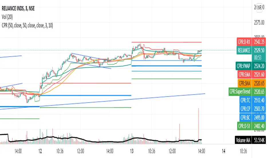
Share market aasan hai CPR with MA & VWAP This script will allow to add CPR with Standard Pivots and 4 Indicators.
Standard Pivot has 9 levels of support and 9 levels of resistance lines. It has CPR , 3 levels of Day-wise pivots , 3 levels of Weekly pivots and 3 Levels of Monthly Pivots .
In Addition to the CPR and Pivot , this script will allow user to Add 4 more Indicators - SMA , EMA , VWAP and SuperTrend as well.
All the Support and resistance levels can be enabled / disabled from settings. It will allow to select multiple combinations of support and resistance levels across 3 levels at any of the 3 time-frames individually and combined.
All 4 Indicators can be can be enabled / disabled from settings. This will allow the indicators to be plotted individually and combined along with any combination of CPR & Pivots .
These number of combinations will allow user to visualize the charts with desired indicators, pivot support & resistance levels on all or any of the 3 time frames.
For Ease of access, listed few points on how the script works..
- CPR and day-wise level 1 & 2 (S1 & R1) enabled by default and can be changed from settings
- Day-wise Level 2 & 3 (S2, R2, S3 & L3) can be enabled from settings
- Weekly 3 levels and Monthly 3 levels can be enabled from settings
- CPR & pivot levels colored in blue lines
- All support levels colored in Green
- All resistance levels Colored in Red
- Day-wise pivot , support & resistance are straight lines
- Weekly pivot , support & resistance are cross (+) lines
- Weekly pivot , support & resistance are circle (o) lines
- SMA , EMA , VWAP and SuperTrend Enabled by Default
- SMA
- EMA
- SuperTrend
Key Levels Importer (blockFlow)Introduction
This script was inspired by the Chart Champions team who generously share the key levels that they are monitoring with the group.
It provides a way for TradingView users to import the levels from a text file (known as the “dataset”) which can also be shared with the community.
The script will plot the levels with different colours depending on whether they are daily, weekly, monthly. volume or fibs.
It will also calculate and draw the high/low for the previous day.
The dataset
The format for the dataset is as follows:
:=::
The type value can be:
D - Daily level
W - Weekly level
M- Monthly level
V - Volume level (eg. VAH, POC, VAL)
F - Fib level
Alternatively you can use freeform text for the type but it may not be colour-coded as you wish
Note, lines and fields without an “=“ are ignored.
Example dataset
:#BTCUSD
:
:---------------------------
:Daily levels
:---------------------------
:
:D=57220:
:D=47724:
:D=40711:
:D=38190:
:D=29775.5:
:
:---------------------------
:Weekly levels
:---------------------------
:
:W=65560.5:
:W=50776:
:W=43190:
:W=31773:
:
:---------------------------
:Monthly levels
:---------------------------
:
:M=61421.5:
:M=43800:
:M=35027:
:
:---------------------------
:Fib levels MTF/HTF
:---------------------------
:
:F=59693.5:
:F=58521.5:
:F=44180.5:
:F=42481.5:
:F=28773:
:F=25984:
:
:---------------------------
:Other levels
:---------------------------
:
:nPOC=47980.5:
:nPOC=48340:
:Global_VAH=63775:
:Global_POC=57364.5:
:Global_VAL=40217:
:MTF_POC=47174:
:MTF_POC=34125.5:
How to import the dataset
It is recommended to create the dataset with a text editor.
To import it:
Open the indicator settings
Click the ‘Import Dataset’ field, press Control-A and Delete to clear out the contents
Copy/paste the dataset into the field
Click Ok
Additional settings
You can choose the line colour for each type of level
Show imported datarows - Check this box to displays the imported dataset values in tabular format on the bottom-left of the chart
Show yellow dots - Show yellow diamonds when price touches a level - see alerting below.
Hide levels > N% from current price - Levels more than 20% away from the current price will be hidden if this box is checked. The percentage value can be changed.
Alerting
The script can raise alerts when the price touches any of the levels.
This is visually represented on the chart by a yellow dot when the "show yellow dots option" is checked.
To avoid duplicate alerts when price repeatedly touches the level, the following criteria must be satisfied before an alert is raised (or a yellow dot printed).
1) Price first touches the level (open,high,low or close)
2) Price did not touch the level in the previous 10 candles

Central Pivot Ranges (CPR) & 3 x VWAP & BarcolorsThis Script Combines daily, weekly and monthly VWAP (Volume Weighted Average Price) with a intraday, daily, weekly and monthly CPR (Central Pivot Range) - which is considered by some traders as the bread and butter of the market for a reason. A combination of Multiple CPRs and VWAPs from different timeframes can provide you with interesting confluences that can give you more confidence in performing your trades.
CPR Features:
- The option to look at current or developing CPRs.
- A resolution selector for all 4 CPRs
- Options to hide and show Tops, Bottoms and Pivots separately
- Various Styling options
- Alerts
VWAP Features:
- 3 x preset VWAPs set to daily, weekly and monthly
- VWAP Lines from the daily O&C or H&L
- Previous VWAP for S/R
- Line Styling options
General Features:
- Barcolors by pivots crossed or daily, weekly and monthly VWAP.
- Barcolors by daily VWAP additionally contain an O and C check instead of just taking the price above or below the VWAP into consideration.

ORB with Shorty Targets
The ORBS indicator study utilizes the theory of an Opening Range Breakout occurring on a security. The indicator uses data collected from the first thirty minute session of the trading day to create fibonacci retracements at specific positions. The 'session' high and low are derived from the first thirty minutes and used as a basis to plot these values. Fibonacci retracement lines are plotted at key positions above and below the high/low values pulled during the opening 'session'. These fibonacci retracement lines are plotted at: 0 (ORB high); 1.272; 1.618; 2.00; 2.175; 2.618; and 3.236. Levels in-between these values are known as 'ranges'. Upper lines are shown green in color and indicate key levels at which the price may react within the market. No guarantees are given nor implied - ORBs is simply a tool to help plot out key fibonacci levels at specific levels accurately and completely.
This will only work on 3min or 5mins and it is intended for intraday trading only.
ORH - opening range high
ORL - opening range low
OR50% - mid between ORH and ORL aka 50% fib
The way i use ORBS:
1. ORH break - i go long on 3min or 5 min close above ORH. I use heiken-ashi candles.
2. ORL breal - i will short on 3min or 5 min close below ORL
3. Double bottoms on reclaims of ORL - i will go long with SL being the ORL
4. Double tops on ORH considering market is weak i will short with SL being the ORH
Trendbar:
Trendbar use combo of CCI and ATR to help figure out the trend the stock is in. Stock moving below the trendbar indicates it is loosing the trend dependent on what time-frame you are using it.
Pivots:
Shorty Pivots are a collection of daily/weekly/ monthly pivots indicator that allows for plotting a daily, weekly, and monthly line on a chart. The values are pulled from the three separate resolutions (daily, weekly, and monthly), and shown on the chart each day. Calculations pulled from each respective high/low/close (divided by 3.0) for the session values.
Settings:
Show Daily/Weekly/Monthly Pivot - Shows/Hides each respective pivot .
Pivot Colors - Change the color of each pivot .
Pivot Width - Line width of the plotted pivot .
Line Style - Choose Solid, Dashed, or Dotted to view different styled lines.
Label Text Color - Choose the label text color if it clashes with your chosen line color(s).
Extend Pivot Lines to Right Offset: This allws you to extend each pivot line to the right by an offset of X bars.
Day Session Timeframe - Ignore this setting.
Pivot Adjustment Timeframe - Ignore this setting.

Extended Volume With Historical & Realtime Intrabar ProfileExtended Volume With Historical & Realtime Intrabar Profile
This indicator displays some additional information on the normal volume bars. Apart from the normal co-relation between price action, it is possible to configure an intrabar timeframe.
Intrabar volume analysis
On historical bars, this will calculate the last intrabar timeframe minutes volumes. The intrabar timeframe is user input. On a realtime bar, it will calculate the "rolling/forward" minutes cumulative volume . Which means from the time the script is loaded, it will on subsequent volume ticks, calculate the cumulative volume till then. The realtime cumulative volume will roll-over once the intrabar timeframe minutes is reached. For example, if the script was set to an intrabar timeframe of 30 minutes and loaded on the chart at 2:00 PM, then the realtime bar, will start adding up the volume on each volume tick. At 2:30 PM, this cumulative volume will be reset to zero, again start the same process for 30 minutes till 3:00 PM. It must be noted that fetching lower timeframe data from higher timeframe is not supported/guaranteed in pine script, yet. So the data is approximate and can be erroneous at times. Physical checking maybe required on lower timeframes to confirm the actions.
Price Action and Volume
Each volume bar is coloured on the basis of resulting price action and relative to volume bars prior to this day. This is very helpful in spotting "unusual" volumes.
Color Codes
A normal day volume on an up day, (today close > previous close) is displayed in Blue.
A normal day volume on a down day, is displayed in Fuchsia.
An up day with up volume day with today's volume higher than daily average volume is displayed in Teal.
A down volume day but with high close with lower average volume maybe a sign of weak hands, displayed in Orange.
An up day with volume above the weekly average is displayed in Lime.
Special Info
When enabled, a 52W High volume bar is noted by the sign "1Yr H".
When enabled (for historical bars), if the last intrabar cumulative volume is greater than 1.5 times the 5 day's average intrabar volume , "HD:XX" is displayed on top of the volume bar. The ratio of the day's volume to last 5 day's is displayed. For many markets, a higher value is indicative of delivery based trades near the end of the trading sessions when intraday volumes reside.
Nudge
A modification of the "Volume Buzz", this is a percentage change of the current rolling volume to the daily average of the intrabar volumes for realtime bar. For historical bars, it is the percentage change of the day volume to the daily average volume . The realtime "Nudge" is displayed in the
RT Box
The RT Box, displays the following information:
Elapsed Time - Time elapsed since realtime monitoring, will reset to 0 after intrabar timeframe is elapsed
Vol : Cumulative volume till recent tick since start of monitoring
Chng% : Change in price between the current time and the price at start of the monitoring
Nudge : The volume Nudge value, as explained above
Input controls
Intrabar volumes
Session Closing Volumes, when enabled activates realtime monitoring
Lookback minutes , in steps of 15 minutes, define the intrabar timeframe. Max 210 minutes. Minimum 15 minutes.
Show Only Intrabar Volumes , display on the intrabar timeframe volumes on historical bars, turn off normal day volumes
RT Box , when enabled displays realtime stats about rolling volumes on realtime bar
Volume Averages
Daily Avg Lookback , enable and set the lookback for daily volume average - disabled when "Only Last bars Info" is selected
Weekly Avg Lookback , enable and set the lookback for weekly volume average
Intrabars Avg Lookback , enable and set the lookback for intrabar volume average - enabled only when "Only Last bars Info" is selected
Debug & Info
Display Debug info on each volume bar, set by offset. 0 will show on last bar, 1 on the second last and sop on.
Enhanced Info : When enabled displays "1 Yr H" and "HD" data as explained above
Known Issue
The intrabar volume average does not get displayed on the last historical bar during market-off hours.

Reditum SniperReditum Sniper synchronizes multiple time frames POC's (Point of Control) to a single graph, allowing its user to find valuable area's which may act as key levels to take educated decisions. Furthermore it uses custom made formulas to find the lookback period of previously mentioned values.
Reditum Sniper vs Reditum Scanner
Reditum Sniper aproaches the markets in a similar way as the Reditum Scan, yet it counts with several updates and overall a rebrand. The Reditum Sniper includes bug fixes, weekly poc has been added, the ability to fix the max_bars_back error in any security, less memory use which is required due to errors presented in later versions of the TradingView platform, functions which simplify the code and much more!
Components of Reditum Scan:
POC's (30 min, 60 min, 120 min, 240 min, daily, weekly)
How does it work?
The algorithm allows you to identify areas of strong support and resistance , based on where most of the trading activity takes place.
What are the strategies for considering placing a trade?
1.Cluster (agglomeration of multiple POC's) to cluster (by identifying two clusters, the price could go smoothly from one Cluster to the other).
2. From cluster (agglomeration of multiple POCs, each with unique color. Now, from this cluster important movements may begin).
3. Towards a cluster (like the “from cluster” pattern, we identify areas of high interest for institutional companies, in this pattern the cluster acts like a magnet, if price is near it may be fully attracted towards the agglomeration).
If you are a member of the mastermind tribe please contact the support team within the tribe to access the indicator (do not leave personal or subscription data in the comments on this page), if not, please visit the link located in our signature.
Thanks for taking a look!
---------------------------------------------------------------------------------------------------------------------------------------------------------------
Reditum Sniper sincroniza múltiples POC's (Puntos de Control) de distintos marcos de tiempo a un único grafico, permitiéndole al usuario encontrar áreas de alto valor que pueden actuar como niveles clave para tomar una decisión educada en su inversión. Además utiliza formulas propias para encontrar la cantidad de data utilizada para los valores previamente mencionados.
Reditum Sniper vs Reditum Scanner
Reditum Sniper enfrenta el mercado de una manera similar al Reditum Scan, aun así cuenta con una gran cantidad de cambios y sobre todo un cambio de marca. El Reditum Sniper incluye una gran cantidad de arreglos de bugs, el poc weekly ya esta incluido por default, la habilidad de solucionar el error max_bars_back que se presentaba en ciertos marcos de tiempo, menor uso de memoria el cual se requiere debido a que se presentaba este error en nuevas versiones de la plataforma, funciones que simplifican el código y mucho más!
Componentes de Reditum Scan:
POC´s (30 min, 60 min, 120 min, 240 min, diario, semanal)
¿Cómo funciona?
El algoritmo le permite identificar áreas de fuerte soporte y resistencia, según el lugar donde se lleva a cabo la mayor parte de la actividad comercial.
¿Cuáles son las estrategias para considerar una entrada?
1.Cluster (aglomeración de múltiples POC´s) a cluster (al identificar dos cluster el precio podría ir con fluidez desde uno al otro que lo recibe).
2.Desde cluster (lo identificamos con la aglomeración de múltiples POC identificados con colores que hacen fácil la lectura. Ahora, desde este cluster podrían iniciar movimientos importantes).
3.Hacia cluster (al igual que el patrón “desde cluster” identificamos zonas de alto interés para los institucionales, en este patrón el cluster actúa como un imán para el precio, de modo que cuando el precio está lejos de él, lo podría atraer con fuerza).
Para acceder a la herramienta, si usted es miembro de la tribu mastermind por favor comunicarse con el equipo de soporte dentro de la tribu (no dejar datos personales ni de suscripción en los comentarios de esta página), si no es miembro por favor visite el enlace a continuación en nuestra Firma.
Gracias por echarle un vistazo!.

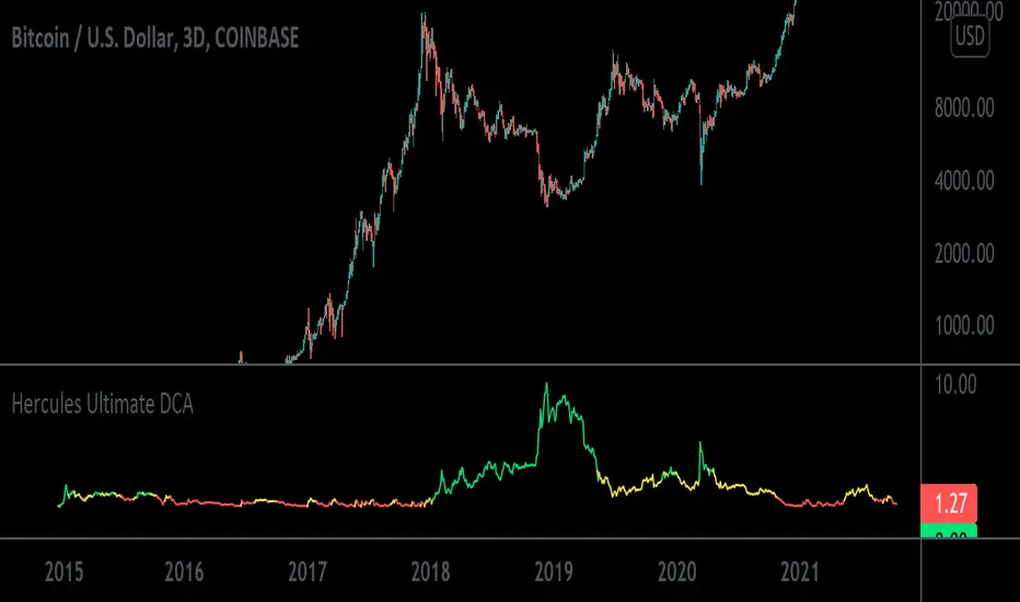
Hercules Ultimate DCA™The Problem Most People Face When Trading & Investing:
If anyone tells you they know where the market is going, they’re either lying or they’re time travelers.
The truth is NOBODY knows whether the markets will move up or down tomorrow, next week, next year, or over any period of time.
If we all knew, we’d all be rich. What would suit most Investors is to Invest consistently over long periods of time into sound financial products.
When Creating This Investing Tool We Had 5 Requirements in Mind:
1. To create a tool that ANYONE with little to no experience could use to outperform 95% of traders and speculators.
2. To ignore the Charts, Candlesticks, Indicators, and Volatility in any market so you can rest easy at night, never having to look at the price of your asset and still remain profitable.
3. To create a tool that tells you exactly HOW MUCH to invest every day or week which takes the stress away in guessing which direction the market will go.
3. To minimize your risk and and exposure to downside even if you started buying a crypto at or near the top of a market.
4. To buy a crypto at or near the bottom of every single major swing or trend.
5. To make Investing Easy, Simple, and Fun for the average joe.
We achieved that goal with the Hercules Ultimate DCA™ Tool!
WHO Created it & HOW was it Created?
This tool uses complex math and an algorithm designed by a Quantitative Military Mathematician (who wishes to remain anonymous, so we’ll call him Satoshi) over a period of 5 and a half months.
To start, we wanted to keep things simple, and extensively researched 6 of the top investing strategies of all time:
1. Buy and Hold
2. Active Investing
3. Dollar Cost Averaging
4. Index Investing
5. Growth Investing
6. Value Investing
Most of the strategies above work well depending on your goals or how risk adverse you are, however most DO NOT check off all of the requirements we mentioned above. Comprehensive home-work and price-action history in Cryptocurrency Markets led us to the Dollar Cost Averaging (DCA) Strategy.
According to Fidelity,
“Dollar Cost Averaging is a strategy where you invest your money in equal portions, at regular intervals, regardless of which direction the market or a particular investment is going. In other words, your purchases occur regardless of the changes in price for the stock or other investment, potentially helping reduce the impact of volatility on the overall purchase.”
With this in mind our High IQ math friend got to work and formulated over 17 Different Variable Algorithms on the DCA Strategy before arriving to the one we named Hercules Ultimate DCA™.
WHY the Hercules Ultimate DCA™ Works BETTER Than Anything Else.
Rigorous backtesting & forward-testing led us to create what we believe is the most effective and efficient strategy to extract the most money from the markets while at the same time minimizing nearly all the risk when investing your hard earned money in small increments in a truly effortless way.
The Hercules Ultimate DCA™ is essentially a DCA strategy put on steroids because no two investments are alike.
As we mentioned above, a traditional DCA approach assumes you purchase the same dollar amount of any asset at scheduled times, no matter where the price of your purchased asset is.
Example: If you have $1,000 dollars and decided to invest 50 dollars per week into Bitcoin, you would invest over a period of 20 weeks before you run out of money. Now, let’s assume the price of bitcoin is 50k during your first week, you would invest $50 dollars. Then next week the price rises to 60k, you would still invest $50 Dollars. The third week, if the Price of BTC rose to 70k, you would invest $50 dollars, so on and so forth. This approach is flawed because although you would still do better than many speculators and traders over a long period of time, it essentially leaves you penniless at the end of twenty weeks with no gunpowder left to buy BTC if it drops to all-time lows.
The Hercules Ultimate DCA™ works so well because it tells you to invest less as the price goes up and far more if the prices drops. What feels counterintuitive to most investors is typically what provides the most returns. Take the example above. If you have $1,000 dollars to invest weekly and Bitcoin currently sits at 50k, you would start by investing $50 dollars. Then next week, let’s say BTC rises to 60k, you would now invest $30 dollars. And your third week, BTC reaches 70k, you would now invest $10 dollars. Not only does strategy preserve your capital but it tells you to invest less into an asset at all time highs and far more into an asset at lows.
Now obviously the math in this tool is more complex, but it’s also more cost effective. At the time of writing this, the current Crypto Market has tanked from all-time-highs. Bitcoin currently sits at a price of $32,000 and is 51% down from its high of $64,900 dollars.
Just using this tool over the last 6 years, you would have invested a total of $5758.71 dollars and accumulated 4.328 Bitcoins for an average purchase of $1330.34 dollars. Your current Portfolio value would be $138,519.77 for a whopping percentage gain total of 2305%.
In other words, even with this massive crypto dump, you’d be rolling handsomely in your profits and you’d feel pretty smart too.
What’s more unique is that the Hercules Ultimate DCA™ will ALWAYS tell you to Invest More Dollars at the Literal Bottom of ANY market.
Dips in a market you believe in are far more exciting and will provide far more returns. The only way this tool fails is if the user (you) choose a market that goes to zero or is a rugpull.
How Do You Use the The Hercules Ultimate DCA™?
Step 1: Scroll to your “Invite-Only Scripts” in your indicators tab on Tradingview, then click on the indicator titled, “Hercules Ultimate DCA.”
Step 2: You should see the Indicator Populate at the Bottom of your chart with two lines, the Green line indicating how much you should buy that day, and the Blue line indicating how much of the asset you’ve purchased.
Step 3: (If you haven’t already) Make sure you turn on the Indicator Label. Navigate to the top right of the Crypto Product you would like to purchase and you will see a small settings gear. Once open, navigate on the left-hand side to the “Scales” tab and find the “Indicator Last Value Label.” Make sure it’s turned on and you will see the direct price.
Step 4: The amount you invest will now populate on the right hand side of the indicator with a number. That’s the exact dollar amount you invest in a disciplined manner no matter how large or small the number may seem.
Step 5: Get familiar with the indicator by opening the settings on the indicator itself. You will notice on the first tab it has a multiplier. If you increase it to 2, then the indicator will tell you to invest double the amount. If you input 10, then it will tell you to invest 10x the amount.
Step 6: Choose a Chart Timeframe and time of day to invest. If you choose to go with a once weekly investment then we recommend you increase your multiplier. If you choose a daily investment (and lack the necessary capital to invest large amounts daily) then we recommend keeping your multiplier down to lower numbers incase we see a lot of volatility. For most folks, once weekly on a 10x multiplier is most convenient. Set your chart to a weekly time-frame and increase your multiplier to 10. Then each week around the same time, you must invest.
Step 7: STAY DISCIPLINED. This method and tool only works if you invest the exact amount it tells you to invest over sustained periods of time.
Step 8: Enjoy Investing Made Easy 🙂
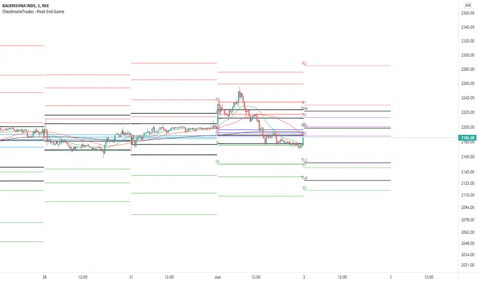
CheckmateTrades - Pivots End GameThis indicator is based on the Pivot study. Traders will be able to plot CPR, Standard floor pivots as well as Camarilla Pivots on multiple timeframes.
Why pivots from multiple timeframes are relevant and included in this one indicator?
We can analyse pivots on multiple timeframes for different trading setups. As in, Daily floor pivots are best suited for analysing the market trend for Day trading. Similarly, Weekly and Monthly floor pivots can be analysed for Swing and positional trading entries. Whereas yearly pivot is best suited for trend analysis for investment purpose.
What is the relevance of plotting tomorrow's pivot level in advance?
Pivot are calculated based on the price happened on a previous day. And hence trader can plot tomorrow pivots in advance to shortlist stocks for tomorrow's trading session.
TimeFrames Available to traders are –
1. Daily
2. Weekly
3. Monthly
A) Daily Pivots
Present Day –
1. Trader can plot Daily CPR
2. Trader can plot Daily R1, R2, R3 and R4 pivot resistance levels
3. Trader can plot Daily S1, S2, S3 and S4 pivot support levels
4. Trader can plot Daily Camarilla levels
Future Day –
1. Trader can plot Tomorrow CPR
2. Trader can plot Tomorrow R1, R2, R3 and R4 pivot resistance levels
3. Trader can plot Tomorrow S1, S2, S3 and S4 pivot support levels
4. Trader can plot Tomorrow Camarilla levels
5. Previous Day High and Low
B) Weekly Pivots
Present Week –
1. Trader can plot Present week CPR
2. Trader can plot Present week R1, R2, R3 and R4 pivot resistance levels
3. Trader can plot Present week S1, S2, S3 and S4 pivot support levels
4. Trader can plot Present week Camarilla levels
Next Week –
1. Trader can plot Next week CPR
2. Trader can plot Next week R1, R2, R3 and R4 pivot resistance levels
3. Trader can plot Next week S1, S2, S3 and S4 pivot support levels
4. Trader can plot Next week Camarilla levels
5. Previous Week High and Low
C) Monthly Pivots
Present Month –
1. Trader can plot Present Month CPR
2. Trader can plot Present Month R1, R2, R3 and R4 pivot resistance levels
3. Trader can plot Present Month S1, S2, S3 and S4 pivot support levels
4. Trader can plot Present Month Camarilla levels
Next Month –
1. Trader can plot Next Month CPR
2. Trader can plot Next Month R1, R2, R3 and R4 pivot resistance levels
3. Trader can plot Next Month S1, S2, S3 and S4 pivot support levels
4. Trader can plot Next Month Camarilla levels
5. Previous Month High and Low
Moreover, I have also included SMA (Simple moving averages) study in this indicator. Trader can add 20,50 & 200 SMA on there charts.
Why is it relevant? Trader can get a visual confirmation of an up-trending or an down-trending move by looking at rising or falling 20 & 50 SMA respectively
Usually in an uptrending stocks. 20 & 50 SMA will move in parallel to each other and will rise upwards. Price will tend to trade above the 20 SMA and 20 SMA will continue to act as a support.
CPR, Camarilla & Moving AverageThis script is created primarily for Intraday trading but can also be used for short and long term trading. This is a combination of Central Pivot Range (CPR), Moving Averages and Camarilla Pivot levels (with inner levels). This helps you to combine the strategies of CPR and Moving Averages to identify the best trading opportunities with greater edge. Central Pivot Range and Camarilla pivots are taken from PivotBoss by Franc Ochoa.
Key features:
# Daily CPR levels
# Weekly CPR levels
# Monthly CPR levels
# Previous Day High and Lows
# Previous Week Highs and Lows
# Previous Month Highs and Lows
# Camarilla Pivots with inner Levels
# CPR Levels for the next Day, Week and Month
# 5 Simple moving averages and 5 Exponential Moving Averages
What separates this script from other scripts with CPR and Moving averages?
# One of the few indicators (if not the only one) which combines the 2 types of Moving Averages, CPR and also Camarilla Pivots.
# CPR Levels for not just the next Day, but for next Week(Weekly CPR) and Month(Monthly CPR) also.
# Hide the previous day's levels according to your wish. This is the most unique feature of this indicator. You can set the number of Daily CPR levels you want to load in the chart. This is not just for the Daily CPR but also for the Weekly and Monthly CPR also. This makes the chart less cluttered and prevents the candles from getting buried in the indicators. Please notice how the previous day's CPR levels are hidden in the displayed demo chart on the script page. In the chart, only one trading day's data is shown(by default).
# This script is OPEN SOURCE.
Strategies :
For CPR & Camarilla Strategies for intraday trading and swing trading refer to the book 'Secrets of a Pivot Boss: Revealing Proven Methods for Profiting in the Market' by Franklin O. Ochoa.
Moving averages strategies :
Moving averages can be combined and also used individually for several strategies
* 9 EMA can be used as trailing stop loss for strong moving trends that helps you to catch big moves.
* 20sma can be used not just trailing stop loss but also for taking re-entry to the trend.
* Golden cross - The golden cross occurs when a short-term moving average crosses over a major long-term moving average to the upside. This indicates a bullish turn in the market. Eg: 50 SMA cuts 200 SMA from below.
* Death Cross - The death cross occurs when the short term moving average crosses the long-term average from above. This indicates a bearish turn in the market. Eg: 50 SMA cuts 200 SMA from above.
* When 20 SMA is above 50 SMA and 20 SMA and 50 SMA are angling up like parallel lines, then it denotes bullish strength. If this happens right after Golden Cross, big moves to the upside can be expected.
* When 20 SMA is below 50 SMA and 20 SMA and 50 SMA are angling down like parallel lines, then it denotes bearish strength. If this happens right after Death Cross, big moves to the downside can be expected.
* When 20SMA and 50 SMA are going flat and crossing each other, then it denotes sideways sentiment.
Moving average strategies are taken from the book 'How to Make Money in Intraday Trading' by Ashwani Gujral. For learning more about how to combine CPR and Moving averages in your trading please refer to this book.

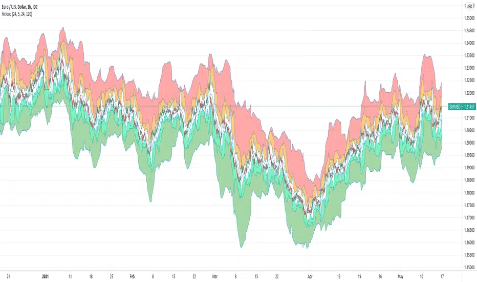
[JL] High-Low CloudJust got this idea and made this one.
Default use 1-hour chart to watch 5-hour, daily and weekly high-low. Of course you can set up any parameters as you like.
It is more like an art. So I do not really know how to use it to trade at this moment. If you have good ideas, feel free to post comments. Thanks.
- Green cloud, SMA - Weekly HL ~ SMA - Daily HL
- Lime cloud, SMA - Daily HL ~ SMA - 5-Hour HL
- White cloud, SMA - 5-Hour HL ~ SMA + 5-Hour HL
- Organge cloud, SMA + 5-Hour HL ~ SMA + Daily HL
- Red Cloud, SMA + Daily HL ~ SMA + Weekly HL
To watch it, probably take care of :
- Angles
- cloud size changes
- divergence
- Oversold, overbought
Multi-Function RSI(MTF, divergence, signal and alert)Japanese below / 日本語説明は下記
Overview
Multi-function RSI indicator with functions below.
1.MTF with display timeframe control
2.Auto divergence drawing incl. hidden divergence
3.Signal when RSI crosses over upper band/crosses under lower band
4.Color background when MTF RSI crosses over/under lower band
5.Alert when RSI crosses over upper band/crosses under lower bands
Please see the details below.
Functions:
1.MTF with display timeframe control
You can display daily, 4hour or 1 hour RSI or all of them as upper timeframe MTF RSI.
How is it different from other MTF indicators?
Problems with other MTF RSI indicators are;
-If you set higher timeframe RSI, it will also be shown on further higher timeframes.
i.e. If you set 4hour chart’s RSI on 1 hour or lower time frame charts, it will also appear on daily and weekly chart, which is not necessary.
To tackle these problems, this indicator has incorporated functions below.
-To show MTF RSI on timeframe lower than the upper timeframe you set as MTF timeframe.
For example, if you select daily timeframe for MTF RSI , the RSI will be shown only on 4 hour or lower timeframes(1H, 30M, 15M, 5M, 1M).
Left: 4hour chart, Middle: Daily chart, Right: Weekly chart
If you look at 4hour chart, daily chart’s RSI is shown(pale blue and orange) but weekly chart does not show daily chart’s RSI.
2.Auto divergence drawing incl. hidden divergence
Regular divergence line and hidden divergence line will be automatically drawn for current timeframe RSI as per the logic below.
Bearish : When two consecutive pivot highs go up but RSI values corresponding to each high go down.
Bullish: When two consecutive pivot lows go down but RSI values corresponding to each low go up.
Pivot highs(lows) are identified when those are preceded by n lower highs(lows) and proceeded by n lower highs(lows).
* n is parameterized.
See the diagram below.
Bearish : When two consecutive pivot highs go down but RSI values corresponding to each highs go up.
Bullish : When two consecutive pivot lows go up but RSI values corresponding to each low go down.
3.Signal when RSI crossing upper/lower bands
Signal will be shown when;
-RSI(current timeframe) crosses over upper band
-RSI(current timeframe) crosses under lower band
Example:
Purple triangle is signals.
4.Color background when MTF RSI crosses over/under lower band
Background color can be applied when MTF RSI crosses over upper band/under lower band.
Example:
Pale purple is daily RSI on 4 hour chart. Background color applied while daily RSI is outside upper/lower bands.
5.Alert when RSI crosses over upper band/under lower band
Alert can be set when;
-RSI crosses over upper band
-RSI crosses under lower band
How to use this indicator?
This indicator is paid indicator and invited-only indicator.
Please contact me via private chat or follow links in my signature so that I can grant the access right to the indicator.
Comment section is only for comments on the indicator or updates. Please refrain from contacting me using comments to follow TradingView house rules.
———————————————————————————————————————
多機能RSIインジケーターです。以下の機能が搭載されています。
1.マルチタイムフレーム機能(表示時間足制御機能付き)
2.ダイバージェンス自動描画機能(ヒドゥンダイバージェンス対応)
3.RSIがアッパーバンド、ロワーバンドとクロスした時にシグナル表示
4.上位足RSI(MTF RSI)がアッパーバンドより上にある時、ロワーバンドより下にある時に背景をハイライト
5.RSIがアッパーバンド、ロワーバンドとクロスした時にアラート設定
機能詳細は以下の通りです。
機能詳細
1.マルチタイムフレーム機能(表示時間足制御機能付き)
日足、4時間足、1時間足のいずれか、もしくは全てをRSIをマルチタイムフレームRSIとして表示することができます。(不要な場合は非表示可能)
他のマルチタイムフレームRSIとの違い
他のマルチタイムフレームRSIのインジケーターでは、以下の問題に直面します。
・上位足のRSIを表示すると、さらに上位足でもそのRSIが表示され見にくくなる。
例: 4時間足のRSIを下位足で表示可能な様に設定すると、日足や週足でも表示され、チャートが見にくくなる。
この問題に対して、このインジケーターでは、
・上位足のRSIを表示する時間軸を制御することで上位足で不必要な情報を表示させない。
という機能を加えることでこの問題を解決しています。
具体的には、マルチタイムフレーム用に選択した上位足のタイムフレームより小さいタイムフレームでのみ上位足のRSIが表示されるようになっています。
例えば、上位足として日足を選択した場合、日足のRSIは4時間足、1時間足、30分足、15分足、5分足、1分足にのみ表示されます。
<サンプルチャート>
左から4時間足、日足、週足です。
4時間足では日足のRSI(薄いパープルのライン)が表示されていますが、週足には表示されません。これはオシレーターが表示される時間軸を裏側のロジックで制御しているためです。
2.ダイバージェンス自動描画機能(ヒドゥンダイバージェンス対応)
以下のロジックに基づきダイバージェンスを自動描画します。(不要な場合は非表示可能)
<通常のダイバージェンス>
下降示唆:2つの連続する高値(*)が切り上げられているが、 それぞれの高値に対応するRSIの値は切り下げている場合
上昇示唆:2つの連続する安値(*)が切り下がっているが、 それぞれの安値に対応するRSIの値は切り上がっている場合
*高値(安値)は、左右n本(**)ずつのローソク足の高値(安値)より高い(低い)高値(安値)をピボットハイ・ローとして算出しています。
** nはユーザ設定値です。
<例: ダイバージェンス>
高値PH1はPH1のローソクの高値より左側にn個のより低い高値、右側にn個のより低い高値があった場合に高値として認識されます。
上記の例では高値がPH2>PH1と切り上がっていますが、対応するRSIの値はvalue2
下降継続示唆:2つの連続する高値(*)が切り下がっているが、 それぞれの高値に対応するRSIの値は切り上がっている場合
上昇継続示唆:2つの連続する安値(*)が切り上がっているが、 それぞれの安値に対応するRSIの値は切り下がっている場合
言うまでもないことですが、ダイバージェンスが出たから逆張り、などの安易な発想は避けるべきです。
環境認識の一つの要素として見るべき指標でしょう。
3.RSIがアッパーバンドを上抜いた時、ロワーバンドを下抜いた時にシグナル表示
アッパーバンド(初期値70)とロワーバンド(初期値30)の数値は変更可能です。
サンプルチャート:
4.上位足RSI(MTF RSI)がアッパーバンドより上にある時、ロワーバンドより下にある時に背景をハイライト
サンプルチャート:
日足のRSI(薄いパープルのライン)がアッパーラインより上にある時に背景がグレーがかっています。
このように上位足のRSIの状況を視覚的に認識したい時に役立つでしょう。
日足RSIラインは非表示にすることができますので、背景色だけ表示しておいて、背景に色が付き、かつダイバージェンスも出たら反転を警戒といった状況判断が可能です。
5.RSIがアッパーバンド、ロワーバンドとクロスした時にアラート設定
アラートを設定したいタイムフレームを開いた状態で、アラート設定の画面を開き以下の条件を選択することができます。
・RSIがアッパーバンドを上抜いた時
・RSIがロワーバンドを下抜いた時
インジケーターの使用について
当インジケーターは招待制インジケーター(有料)となっています。
使用を希望される方はプライベートチャットや下記リンクのDMでご連絡ください。
このページのコメント欄はインジケーターそのものに対するコメントやアップデートの記載のためのものとなっております。Tradingviewのハウスルールを守るためにもコメント欄からの連絡はご遠慮ください。
NVME Vanquisher X"Enter with precision, focus on the mission, dismiss the indecision, support NVME's vision" ~ That is what the Vanquisher X will provide.
One may ask, what is so unique about it compared to other algorithms?
We have our own calculation module and strategy that uses other indicators and maths to determine the next location of the trend and with our algorithm you can have full customisation of all the features we have. You can change the overall colour scheme of every single plot within the indicator, you can change the algorithms sensitivity and scalar to as many different numbers as possible, there are helpful drawings, trend confirming drawings, pullback drawings, pair mark-ups, custom dashboards and much more. Our settings panel is also simple and easy to use providing you with different appropriately named subsections for each feature and there are tooltips to let you know what each tab or input does. So, traders if that doesn't get you hooked then keeping reading!
Traders commonly struggle to decide whether or not to enter a trade, hold a trade, stop a trade or take profit and that is what makes us different. You stop when you see the opposite signal or a change in candle colour, you can follow our automatic TP and SL levels for trade goals and you enter when a signal meets your analysis.
NVME Vanquisher X is to be used as confluence with your analysis or trading style and should not in anyway shape or form be used as a indication to buy or sell just because the signal says so, it is there to give you a higher chance of having a high probability trade though past results is not indicative of future results and getting access doesn't mean you will become a millionaire in a day as it is not a get rich quick indicator so it won't guarantee 100% success.
What is your goal?
Our goal is to give you traders an edge in trading, whether it be for stocks, indices, cryptos, forex, commodities, futures and altcoins, all assets are supported and we want to make the best of every trader with NVME.
Recommended Timeframes:
15 Minutes, 1 Hour, 4 Hour with our settings of 2 or 3 sensitivity and 144 on the algo scalar.
Does it support all chart types?
Yes, all charts supported, however we recommend Heikin-Ashi as an optimal choice for trading but if you are already experienced with something else then you can use that :)
Screenshots:
Features:
/Trend Confirming Drawings:
-200 EMA (Added so that free users don't have to waste 1 indicator space)
-Trend Cloud (Colour switches from negative to positive depending on the trend and the cloud has a low fill opacity)
-Confirmation Highlight (Highlights the background with a positive or negative colour depending on the trend identified)
-Following Highlight (Unique highlighting to the background that shows either a positive or negative colour based on the trend however it doesn't identify ranging markets)
//Combinations//
-TC+EMA, EMA+Highlight, Cloud+Highlight, FH+EMA, FH+CLOUD, All v1 (EMA+CLOUD+CH), All v2 (EMA+CLOUD+FH)
/Helpful Drawings:
-Predictive Channel (Using candle maths, this will plot a price following linear regression channel that can be useful for breakout trading or using as support and resistance)
-Predictive S/R (Using candle maths and validation, this will plot support and resistance zones across the market to show you different areas where price could reject or reverse)
-Predictive Trend-Lines (Using candle maths and EMA, this will plot a trend-line in the direction of the trend and this can be useful for breakout trading or following the trend)
-Predictive Supply and Demand Highlight (Using other indicators, this will plot a highlight filled plot that will outline areas of supply and demand, which can be useful for support and resistance trading)
-Previous Order Blocks (Using candle maths, validation and confirmation latency, this will plot filled in squares of potential orders blocks from the past so they can be used for future reference in analysis)
-Predictive ZigZag (Using candle maths, this will plot a price following line that forms a zig zag pattern to show if the market is going in a higher high and higher low formation or lower low and lower high formation)
-Predictive Pivot-Points (Using candle maths and higher-timeframe data, this will plot pivot zones up to support 5 and resistance 5 with midpoints for every section there is)
/Pullback Drawings:
-EMA Pullback (Added so that free users don't have to waste 1 indicator space)
-Bollinger Heatbands (Using the Bollinger Bands indicator, we have created a price following support and resistance heat-map that shows you the whereabouts of the dynamic support and resistance that is indicator based)
-EMA+HB (This combines the ema and the heatbands)
-Fib Retracements (This feature will automatically plot a fibonacci retracement based off predictive market data and our own optimal settings so that you don't need to change them)
/Pair Mark-Ups:
-Weekly Info (This will show you the previous lows and high of the weekly candle and using an ATR, we have added potential reversal zones in those areas and we have a midpoint too)
-Daily Info (Same as the weekly info but for the daily timeframe)
-4 Hr Info (Same as the weekly info but for the 4 hourly timeframe)
/Colour Schemes:
-Default (Strong green, dark purple, strong red)
-Blue and Orange
-Strawberry and Lime
-Apple and Mango
-Orange Passionfruit
-Rhubarb and Custard
-Black and White
-Forest Greens
-Galaxy
-No Colour Scheme (removes the preset colours so they are the same as your TradingView bar settings)
-Show ATR TP and SL levels (This will plot 4 lines, 3 lines are the take profit levels, and the 4th line is the stop loss line, since it is atr based it may fluctuate the distance between each line indicating possible liquidity)
/Dashboard Settings
-High (Will place the dashboard's Y position to follow the high of the price)
-Middle (Will place the dashboard's Y position to the difference of the lowest low and highest high)
-Forced Middle (Will place the dashboard's Y position to the difference of the lowest low further back and highest high further back)
-Low (Will place the dashboard's Y position to follow the low of the price)
-No Dashboard (Deletes the dashboard from the charts)
-Dashboard's X position (Input field, this will change the X value, the higher it is the further away it is from price and the lower it is the closer the dashboard is towards price)
/Dashboard W/R Goals:
-Adaptive (Randomly chooses a strategy follow, can be highly inaccurate, and when price hits tp 1 it will add a win and if it hits sl it will count as a loss)
-5 Pips to 5 Pips (This will change the calculator to only add values for this set condition and this won't be strategy based but instead signal based)
-5 Pips to 10 Pips (1:2 Risk Reward)
-10 Pips to 20 Pips (1:2 Risk Reward, Higher Stop and TP)
-10 Pips to 30 Pips (1:3 Risk Reward, Higher Stop and TP)
-20 Pips to 40 Pips (1:2 Risk Reward, Higher Stop and TP)
/Dashboard Add-ons:
-MTF Trends (This will add more text onto the dashboard and this will show you the trends of the higher timeframes)
-EMA (This will show you the EMA trends on the dashboard)
-VWMA (This will show you the VWMA trends on the dashboard)
-HMA (This will show you the HMA trends on the dashboard)
-Text Colour (This is a colour input and this allows you to change the colour of the dashboard to anything you like)
/Customisable Alerts:
-Buy Alerts (This will allow buy alerts to be sent through any TradingView notifications)
-Sell Alerts (This will allow sell alerts to be sent through any TradingView notifications)
-Range to Uptrend (May be buggy, this will send an alert if the colour goes from undecided to an uptrend colour (positive colour))
-Range to Downtrend (May be buggy, this will send an alert if the colour goes from undecided to a downtrend colour (negative colour))
-Previous Bullish Order Block (This will send an alert if a previous bullish order block has been printed to help with your analysis)
-Previous Bearish Order Block (This will send an alert if a previous bearish order block has been printed to help with your analysis)

[RickAtw] O1 Opening Market LineThis indicator helps to identify current support and resistance based on the opening of the Asian, London and New York sessions.
Function
You can make good trade entries based on these lines. Shows daily and weekly openings of each session
It will also help you to look at which session you are currently trading)
Purple ----> Asian session
Red ----> London session
Blue ----> New York session
Key Signal
buy ---> A strong buy signal is a bounce from the low and the presence of a weekly or day open line.
sell ---> A strong sell signal is a bounce from the maximum and the presence of a weekly or day open line.
P.S. Be sure to test on your pair!
Remarks
This will help you determine the approximate area of support and resistance.
Since we cannot look into the future, it does not inform you about the exact records, but a possible change in trends.
Readme
In real life, I am a professional investor. And I check each of my indicators on my portfolio and how effective it is. I will not post a non-working method. The main thing is to wait for the beginning of trends and make money!
I would be grateful if you subscribe ❤️
Multi-Function Stochastic(MTF, divergence, signal and alert)Japanese below / 日本語説明は下記
Overview
Multi-function Stochastic indicator with functions below.
1.MTF with display timeframe control
2.Auto divergence drawing incl. hidden divergence
3.Signal when % K crosses over %D incl. MTF %K and %D
4.Alert when % K crosses over %D
Please see the details below.
Functions:
1.MTF with display timeframe control
You can select one upper timeframe from monthly, weekly, daily, 4hour, 1hour, 30mins, 15mins, 5mins to display upper timeframe’s Stochastic as MTF Stochastic.
How is it different from other MTF indicators?
Problems with other MTF Stochastic indicators are;
-If you set higher timeframe Stochastic, it will also be shown on further higher time frames.
i.e. If you set 4hour chart’s Stochastic on 1 hour or lower time frame charts, it will also appear on daily and weekly chart, which is not necessary.
To tackle these problems, this indicator has incorporated functions below.
-To show MTF Stochastic on timeframe lower than the upper timeframe you set as MTF timeframe.
For example, if you select daily timeframe for MTF Stochastic , the Stochastic will be shown only on 4 hour or lower timeframes(1H, 30M, 15M, 5M, 1M).
Left: 4hour chart, Middle: Daily chart, Right: Weekly chart
If you look at 4hour chart, daily chart’s Stochastic is shown(pale blue and orange) but weekly chart does not show daily chart’s Stochastic.
2.Auto divergence drawing incl. hidden divergence
Divergence line and hidden divergence line will be automatically drawn for the current timeframe Stochastic as per the logic below.
Bearish : When two consecutive pivot highs go up but %K values corresponding to each high go down.
Bullish: When two consecutive pivot lows go down but %K values corresponding to each low go up.
Pivot highs(lows) are identified when those are preceded by n lower highs(lows) and proceeded by n lower highs(lows).
* n is parameterized.
See the diagram below.
Bearish : When two consecutive pivot highs go down but %K values corresponding to each highs go up.
Bullish : When two consecutive pivot lows go up but %K values corresponding to each low go down.
3.Signal when % K crossing %D
Signal will be shown when;
-%K crosses over %D below lower band
-%K crosses under %D above upper band
-%K(MTF) crosses over %D(MTF) below lower band
-%K(MTF) crosses under %D(MTF) above upper band
4.Alert when % K crossing %D
Alert can be set when;
-%K crosses over %D below lower band
-%K crosses under %D above upper band
How to use this indicator?
This indicator is paid indicator and invited-only indicator.
Please contact me via private chat or follow links in my signature so that I can grant the access right to the indicator.
Comment section is only for comments on the indicator or updates. Please refrain from contacting me using comments to follow TradingView house rules.
———————————————————————————————————————
多機能ストキャスティクスインジケーターです。以下の機能が搭載されています。
1.マルチタイムフレーム機能(表示時間足制御機能付き)
2.ダイバージェンス自動描画機能(ヒドゥンダイバージェンス対応)
3.%Kが%Dをクロスした時にシグナル表示(MTFの%Kと%Dでも同様)
4.%Kが%Dをクロスした時にアラート設定可能
機能詳細は以下の通りです。
機能詳細
1.マルチタイムフレーム機能(表示時間軸制御機能付き)
月足、週足、日足、4時間足、1時間足、30分足、15分足、5分足の中から一つを選択し、上位足のストキャスティクスとして表示することができます。(不要な場合は非表示可能)
他のマルチタイムフレームストキャスティクスとの違い
他のマルチタイムフレームストキャスティクスのインジケーターでは、以下の問題に直面します。
・上位足のストキャスティクスを表示すると、さらに上位足でもそのストキャスティクスが表示され見にくくなる。
例: 4時間足のストキャスティクスを下位足で表示可能な様に設定すると、日足や週足でも表示され、チャートが見にくくなる。
この問題に対して、このインジケーターでは、
・上位足のストキャスティクスを表示する時間軸を制御することで上位足で不必要な情報を表示させない。
という機能を加えることでこの問題を解決しています。
具体的には、マルチタイムフレーム用に選択した上位足のタイムフレームより小さいタイムフレームでのみ上位足のストキャスティクスが表示されるようになっています。
例えば、上位足として日足を選択した場合、日足のストキャスティクスは4時間足、1時間足、30分足、15分足、5分足、1分足にのみ表示されます。
<サンプルチャート>
左から4時間足、日足、週足です。
4時間足では日足のストキャスティクスが表示されていますが、週足には表示されません。
2.ダイバージェンス自動描画機能(ヒドゥンダイバージェンス対応)
以下のロジックに基づきダイバージェンスを自動描画します。(不要な場合は非表示可能)
<通常のダイバージェンス>
下降示唆: 2つの連続する高値(*)が切り上げられているが、 それぞれの高値に対応するストキャスティクスの値は切り下げている場合
上昇示唆: 2つの連続する安値(*)が切り下がっているが、 それぞれの安値に対応するストキャスティクスの値は切り上がっている場合
*高値(安値)は、左右n本(**)ずつのローソク足の高値(安値)より高い(低い)高値(安値)をピボットハイ・ローとして算出しています。
** nはユーザ設定値です。
<例: ダイバージェンス>
高値SH1はSH1のローソクの高値より左側にn個のより低い高値、右側にn個のより低い高値があった場合に高値として認識されます。
上記の例では高値がSH1>SH2と切り上がっていますが、対応する%Kの値はvalue2>value1と切り下がっているためダイバージェンスと認識されダイバージェンスラインが自動描画されます。
<ヒドゥンダイバージェンス>
下降継続示唆: 2つの連続する高値(*)が切り下がっているが、 それぞれの高値に対応するストキャスティクスの値は切り上がっている場合
上昇継続示唆: 2つの連続する安値(*)が切り上がっているが、 それぞれの安値に対応するストキャスティクスの値は切り下がっている場合
言うまでもないことですが、ダイバージェンスが出たから逆張り、などの安易な発想は避けるべきです。
環境認識の一つの要素として見るべき指標でしょう。
3.%Kが%Dとクロスした時にシグナル表示(MTFの%Kと%Dでも同様)
以下の条件を満たした時にシグナルを表示します。
-ロワーバンドより下で、%Kが%Dを上抜けた時
-アッパーバンドより上で、%Kが%Dを下抜けた時
-ロワーバンドより下で、%K(MTF)が%D(MTF)を上抜けた時
-アッパーバンドより上で、%K(MTF)が%D(MTF)を下抜けた時
4.%Kが%Dとクロスした時にアラート設定
以下の条件でアラート設定が可能です。
-ロワーバンドより下で、%Kが%Dを上抜けた時
-アッパーバンドより上で、%Kが%Dを下抜けた時
インジケーターの使用について
当インジケーターは招待制インジケーター(有料)となっています。
使用を希望される方はプライベートチャットや下記リンクのDMでご連絡ください。
このページのコメント欄はインジケーターそのものに対するコメントやアップデートの記載のためのものとなっております。Tradingviewのハウスルールを守るためにもコメント欄からの連絡はご遠慮ください。

Chart Champions - Part 3 - SessionsThank you for sparing you time to read my indicator.
This indicator has been created as a suite of 3. This was to ensure that those with only the Free Trading View account could benefit (with their restriction to 3 indicators). Please ensure you install each indicator and read each indicator write up to fully understand what has tried to achieved.
Chart Champions – Part 1 –Lvls nPOC VWAPS
This indicator is broken down into:
• Levels
• VWAPS
• Naked Point of Control
Levels
It displays the levels to the right of the price Axis to enable the user to have a cleaner chart.
The below levels will automatically appear:
dOpen – pdHigh – pdLow – pdEQ – pwEQ
Optional Levels include:
mOpen – pmOpen – pdOpen – dbyOpen – wOpen – pwOpen
VWAPs
Optional VWAPs
Daily (including pdVWAP close) – Weekly – Monthly
Naked Points of Control (nPOC)
To view the nPOC move the chart back in time to pick up the nPOCs.
Chart Champions – Part 2 – CCV IBs POC
This indicator is broken down into:
• Chart Champions Value
• Initial Balance
• Points of Control
Chart Champions Value (CCV)
CCV is based on the 80% rule of the dOpen opening outside of the pdVAH/pdVAL. Please do you own research to fully understand how this trading strategy works (readily avaliable online).
Initial Balance (IB)
IB is based on the first 60 minutes of the market opening. It captures the highest and lowest points within that 60 minutes. Please do you own research to fully understand how this trading strategy works (readily avaliable online).
Points of Control (POCs)
POC are the price levels where the most volume was traded.
Developing POC (dPOC) will constantly move with volume/price action through out the day.
Optional POCs
Previous Day POC (pdPOC) – Day Before Yesterday POC (dbyPOC)
Chart Champions – Part 3 – Sessions - Manual Input
This indicator is broken down into:
• Manual Inputs (daily, weekly, monthly)
• IGOR SessionsTtimes
• Pre + Market Openings
Manual Input
Daily x3
Weekly x 3
Monthly x 3
This allows the trader to put in specific levels.
IGOR Session Times
This is a user specific requirement to highlight cetain times during the day, displayed at the bottom of the chart in the colour strip.
Pre + Market Openings
This allows the user to see when pre market trading has started and with the live maket has started, displayed at the top of the chart in colours.
A huge thank you goes out to:
Stackoverflow users AnyDozer and Bjorn.
TV user ahancock for allow me use of this code.
Disclaimer the lower the timeframe the more information it processes.

Chart Champions - Part 2 - CCV IBs POCsThank you for sparing you time to read my indicator.
This indicator has been created as a suite of 3. This was to ensure that those with only the Free Trading View account could benefit (with their restriction to 3 indicators). Please ensure you install each indicator and read each indicator write up to fully understand what has tried to achieved.
Chart Champions – Part 1 –Lvls nPOC VWAPS
This indicator is broken down into:
• Levels
• VWAPS
• Naked Point of Control
Levels
It displays the levels to the right of the price Axis to enable the user to have a cleaner chart.
The below levels will automatically appear:
dOpen – pdHigh – pdLow – pdEQ – pwEQ
Optional Levels include:
mOpen – pmOpen – pdOpen – dbyOpen – wOpen – pwOpen
VWAPs
Optional VWAPs
Daily (including pdVWAP close) – Weekly – Monthly
Naked Points of Control (nPOC)
To view the nPOC move the chart back in time to pick up the nPOCs.
Chart Champions – Part 2 – CCV IBs POC
This indicator is broken down into:
• Chart Champions Value
• Initial Balance
• Points of Control
Chart Champions Value (CCV)
CCV is based on the 80% rule of the dOpen opening outside of the pdVAH/pdVAL. Please do you own research to fully understand how this trading strategy works (readily avaliable online).
Initial Balance (IB)
IB is based on the first 60 minutes of the market opening. It captures the highest and lowest points within that 60 minutes. Please do you own research to fully understand how this trading strategy works (readily avaliable online).
Points of Control (POCs)
POC are the price levels where the most volume was traded.
Developing POC (dPOC) will constantly move with volume/price action through out the day.
Optional POCs
Previous Day POC (pdPOC) – Day Before Yesterday POC (dbyPOC)
Chart Champions – Part 3 – Sessions - Manual Input
This indicator is broken down into:
• Manual Inputs (daily, weekly, monthly)
• IGOR SessionsTtimes
• Pre + Market Openings
Manual Input
Daily x3
Weekly x 3
Monthly x 3
This allows the trader to put in specific levels.
IGOR Session Times
This is a user specific requirement to highlight cetain times during the day, displayed at the bottom of the chart in the colour strip.
Pre + Market Openings
This allows the user to see when pre market trading has started and with the live maket has started, displayed at the top of the chart in colours.
A huge thank you goes out to:
Stackoverflow users AnyDozer and Bjorn.
TV user ahancock for allow me use of this code.
Disclaimer the lower the timeframe the more information it processes.
Chart Champions - Part 1 - nPOC - Levels - VWAPsThank you for sparing you time to read my indicator.
This indicator has been created as a suite of 3. This was to ensure that those with only the Free Trading View account could benefit (with their restriction to 3 indicators). Please ensure you install each indicator and read each indicator write up to fully understand what has tried to achieved.
Chart Champions – Part 1 –Lvls nPOC VWAPS
This indicator is broken down into:
• Levels
• VWAPS
• Naked Point of Control
Levels
It displays the levels to the right of the price Axis to enable the user to have a cleaner chart.
The below levels will automatically appear:
dOpen – pdHigh – pdLow – pdEQ – pwEQ
Optional Levels include:
mOpen – pmOpen – pdOpen – dbyOpen – wOpen – pwOpen
VWAPs
Optional VWAPs
Daily (including pdVWAP close) – Weekly – Monthly
Naked Points of Control (nPOC)
To view the nPOC move the chart back in time to pick up the nPOCs.
Chart Champions – Part 2 – CCV IBs POC
This indicator is broken down into:
• Chart Champions Value
• Initial Balance
• Points of Control
Chart Champions Value (CCV)
CCV is based on the 80% rule of the dOpen opening outside of the pdVAH/pdVAL. Please do you own research to fully understand how this trading strategy works (readily avaliable online).
Initial Balance (IB)
IB is based on the first 60 minutes of the market opening. It captures the highest and lowest points within that 60 minutes. Please do you own research to fully understand how this trading strategy works (readily avaliable online).
Points of Control (POCs)
POC are the price levels where the most volume was traded.
Developing POC (dPOC) will constantly move with volume/price action through out the day.
Optional POCs
Previous Day POC (pdPOC) – Day Before Yesterday POC (dbyPOC)
Chart Champions – Part 3 – Sessions - Manual Input
This indicator is broken down into:
• Manual Inputs (daily, weekly, monthly)
• IGOR SessionsTtimes
• Pre + Market Openings
Manual Input
Daily x3
Weekly x 3
Monthly x 3
This allows the trader to put in specific levels.
IGOR Session Times
This is a user specific requirement to highlight cetain times during the day, displayed at the bottom of the chart in the colour strip.
Pre + Market Openings
This allows the user to see when pre market trading has started and with the live maket has started, displayed at the top of the chart in colours.
A huge thank you goes out to:
Stackoverflow users AnyDozer and Bjorn.
TV user ahancock for allow me use of this code.
Disclaimer the lower the timeframe the more information it processes.

RSI, Range, and Key Level Support Tool v2.1This indicator is actually 3 different indicators combined to be able to watch key levels such as daily/weekly/monthly opens, previous days and week range highs and lows, as well as see Oversold and Overbought conditions relating to the Relative Strength Index (RSI).
- RSI DOTS SYSTEM
The first part is a custom Relative Strength Index indicator that shows RSI dots above in Red and Below in Green of the bars.
As the RSI Dots go from dark and barely visible to bright and Red For Oversold or Green for Overbought it gives a direct representation above the bar chart of Overbought or Oversold conditions. The brighter the color, the closer to 100 (Overbought and Red) or 0 (Oversold and Green) the current RSI is.
As the Overbought and Oversold conditions reverse this will show a bright Yellow Dot over the bar if it crosses a value from Overbought conditions to not Overbought conditions and the same if it crosses from Oversold conditions to not oversold conditions. To put it simply, it shows RSI reversal.
- KEY LEVELS OPENS - Daily, Weekly, Monthly Opens
This is a simple line indicator that shows 3 key levels: Daily Open, Weekly Open, and Monthly Open.
These higher time frame key levels show precisely at what price that time frame opened based on 0 UTC.
- PREVIOUS HIGHS/LOWS
This part of the indicator will show the previous day and even week highs and lows. This will help the user establish a functional range of the previous days and weeks.
The highs and lows for the daily are rows of circles above and below the high and low for that specific day and the previous weekly range are rows of crosses above and below the high and low for the past week.
How to Best use the indicator:
The RSI dots will help the user find the tops and bottoms where the Key Levels Opens and Previous Highs and Lows will help the user establish the range.
Knowing where the local top/bottom is in correlation to the potential range tops and bottoms allows the user to effectively time trend reversals and potential tops/bottoms.
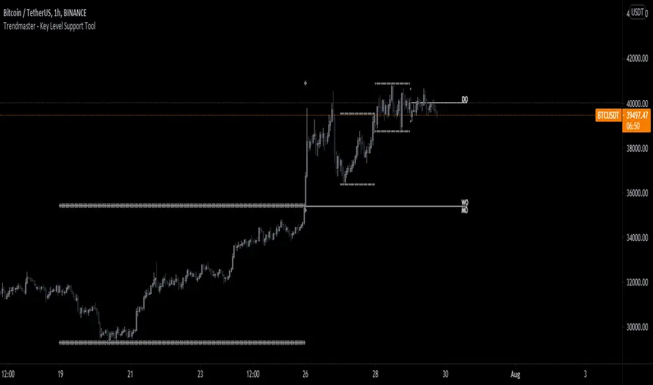
MTF CCI with timeframe control function and signal/alertJapanese below. / 日本語説明は下記
Summary
This indicator shows CCI of the current timeframe and another CCI from upper timeframe as MTF CCI with ability to show signals and set alerts when crossing upper/bottom bands.
For general use of CCI, please refer to the link below(by TradingView)
jp.tradingview.com
How is it different from other MTF CCI indicators?
Problems with other MTF CCI indicators are;
-If you set higher timeframe CCI(MTF CCI), it will also be shown on further higher time frames.
i.e. If you set 4hour chart’s CCI on 1 hour or lower time frame charts, it will also appear on daily and weekly chart, which is not necessary.
To tackle these problems, this indicator has incorporated functions below.
-To be able to control timeframes where MTF CCI is displayed to eliminate unnecessary information when you open higher time frame’s charts.
For example, if you select daily timeframe for MTF CCI, the CCI will be shown only on 4 hour or lower timeframes.
These are the values added on this indicator.
Specifications
-This indicator shows one CCI from the current timeframe and another CCI from another timeframe(MTF).
-For MTF CCI, you can select upper timeframe from monthly, weekly, daily, 4hour, 1hour, 30mins, 15mins, 5mins.
Again, if you select weekly for MTF, for instance, then MTF CCI will be displayed on daily or lower timeframes. Other timeframes work same.
-For both CCI(current timeframe) and CCI(MTF), signals will be shown when they cross over/under upper band and lower band, which you can control display on style tab of the indicator.
-Alert can be set same as signal conditions.
Please see the sample chart below.
Brown triangle is signal for CCI(current timeframe) and maroon signal is for MTF CCI.
--------------------------------------------------------------------------------------------------
現在時間軸のCCIと上位足のCCIを表示するマルチタイムフレームCCI(MTF CCI)インジケーターです。アッパーバンド、ロワーバンドと交差した時にシグナルを表示するとともに、アラートの設定も可能です。
CCIの一般的な使い方は以下のリンク(TradingView)を参照ください。
jp.tradingview.com
他のマルチタイムフレームCCIとの違い
他のマルチタイムフレームCCIのインジケーターでは、以下の問題に直面します。
・上位足のCCIを表示すると、さらに上位足でもそのCCIが表示され見にくくなる。
例: 4時間足のCCIを下位足で表示可能な様に設定すると、日足や週足でも表示され、チャートがノイズだらけに・・・
この問題に対して、このインジケーターでは、
・上位足のCCIを表示する時間軸を制御することで上位足で不必要な情報を表示させない。
という機能を加えることでこれらの問題を解決しています。
機能概要
・このインジケーターでは現在の時間軸のCCIと上位足から一つのCCIを表示します。
・上位足は月足、週足、日足、4時間足、1時間足、30分足、15分足、5分足から選択することが可能です。
・上位足のCCIは選択した時間軸未満の時間軸に表示されます。
例:
日足のCCI : 4時間足、1時間足、30分足、15分足、5分足、1分足チャートにのみ表示
4時間足のCCI : 1時間足、30分足、15分足、5分足、1分足チャートにのみ表示
・上位足のCCIは選択した時間軸未満の時間軸に表示されます。
・現在時間軸のCCI、MTF CCIともに、アッパーバンド/ロワーバンドと交差したタイミングでシグナルを表示することができます。(アッパーバンド/ロワーバンドそれぞれに対して上に交差、下に交差のタイミングで表示されます。不要なものはスタイル設定画面で非表示とすることができます。)
・シグナルは設定画面で表示・非表示の切り替えができます。
・シグナルと同じ条件でアラート通知の設定が可能です。
サンプルチャート
1時間足に4時間足のCCIを表示したものです。茶色の三角が現在時間軸のCCIのシグナル。赤の三角がMTF CCIのシグナルです。

PivotcallThis script is based on Secret of Pivot Boss book by Frank Ochoa. also suggested by Pivotcall This is the same Combination used by Pivotcall comes with Daily CPR and weekly/Monthly Pivots along with previous Day high/low
You can view all S/R from S1 to S3 and R1 to R3 (support/resistance)
You can view Daily CPR / support/resistance .
You can view weekly pivot and Support/resistance.
You can view monthly Pivot and support/resistance
You can View Previous day High/Low and have option to turn on/off
You can turn on/off Daily/weekly/monthly Pivots and support/resistance

Bitcoin Bulls and Bears by @dbtrBitcoin 🔥 Bulls & Bears 🔥
v1.0
This free-of-charge BTC market analysis indicator helps you better understand what's going with Bitcoin from a high-level perspective. At a glance, it will give you an immediate understanding of Bitcoin’s historic price channel dating back to 2011, past and current market cycles, as well as current key support levels.
Usage
Use this indicator with any BTCUSD pairs , ideally with a long price history (such as BNC:BLX )
We recommend to use this indicator in log mode, combined with Weekly or Monthly timeframe.
Features
🕵🏻♂️ Historic price channel curve since 2011
🚨 Bull & bear market cycles (dynamic)
🔥 All-time highs (dynamic)
🌟 Weekly support (dynamic, based on 20 SMA )
💪 Long-term support (channel bottom)
🔝 Potential future price targets (dynamic)
❎ Overbought RSI coloring
📏 Log/non-log support
🌚 Dark mode support
Remarks
With exception of the price channel curve, anything in this indicator is calculated dynamically , including bull/bear market cycles (based on a tweaked 20SMA), ATHs, and so on. As a result, historic market cycles may not be 100% accurately reflected and may also differ slightly in between various time-frames (closest result: Monthly). The indicator may even consider periods of heavy ups/downs as their own market cycles, even though they weren’t. Due to its dynamic nature, this indicator can however adapt to the future and helps you quickly identify potential changes in market structure, even if the indicator is no longer updated.
On top of that bullmarket cycles (colored in green) feature an ingrained RSI: the darker the green color, the more the RSI is overbought and close to a correction (darkest color in the chart = 90 Weekly RSI). In comparison with past bull cycles, it helps you easily spot potential reversal zones.
Thanks
Thanks to @quantadelic and @mabonyi which both have worked on the BTC "growth zones" indicator including the price channel, of which I have used parts of the code as well as the actual price channel data.
Follow me
Follow me here on TradingView to be notified as soon as new free and premium indicators and trading strategies are published. Inquire me for any other requests.
Enjoy & happy trading!
