BTC Swing Plan Levels & ZonesThis indicator visualizes a clean, rules-based Bitcoin swing-trade plan with clearly defined entry, target, and risk zones.
🔹 What it shows
• Breakout Entry Level
• Multiple Profit Target Zones (T1 → T4)
• Primary & Hard Stop Risk Zone
• Mid-levels for structure awareness
• Optional background highlight when price is above the breakout (plan active)
All levels are fully editable from the settings panel, allowing you to adapt the framework to any BTC market regime or timeframe.
🔹 How to use
Wait for price to break and hold above the Entry level
Manage the trade target-by-target
Respect the defined stop zone for risk control
Stretch target (T4) is optional and meant for strong trend continuation
🔹 Designed for
• Swing traders
• Structure-based traders
• Risk-managed BTC positioning
• Clean chart layouts (no indicators, no noise)
This tool is not a signal generator — it is a visual trade-planning framework.
Always manage position size and risk responsibly.
Cari dalam skrip untuk "zone"

Smart Margin Zone
SMART MARGIN ZONE - CME-BASED SUPPORT & RESISTANCE INDICATOR
TITLE FOR PUBLICATION:
Smart Margin Zone - CME Margin-Based Support and Resistance
CATEGORY:
Support and Resistance
SHORT DESCRIPTION (for preview):
Automatically plots margin zones based on CME Group requirements. These zones represent critical price levels where leveraged traders face margin calls, creating natural support and resistance through forced liquidations.
═══════════════════════════════════════════════════════════════
FULL DESCRIPTION FOR TRADINGVIEW:
═══════════════════════════════════════════════════════════════
📊 Smart Margin Zone - Professional Trading Zones Based on CME Data
This indicator automatically calculates and displays margin zones derived from official CME Group margin requirements. These zones represent critical price levels where traders using leverage receive margin calls, triggering forced position closures that create natural support and resistance levels.
═══════════════════════════════════════════════════════════════
🎯 CORE CONCEPT
═══════════════════════════════════════════════════════════════
When price reaches calculated margin zones, traders using 2:1 or 4:1 leverage on CME futures receive margin calls. Brokers automatically liquidate these positions, creating waves of buying or selling pressure that form strong support and resistance levels.
This is not theoretical - it's based on actual margin requirements from CME Group, the world's largest derivatives marketplace.
═══════════════════════════════════════════════════════════════
📐 CALCULATION METHODOLOGY
═══════════════════════════════════════════════════════════════
The indicator uses the following formula to calculate zone sizes:
Zone Size = (Margin Requirement / Tick Value) × Tick Size × 1.10
Where:
• Margin Requirement = Official CME initial margin (updated November 2024)
• Tick Value = Dollar value of minimum price movement
• Tick Size = Minimum price increment
• 1.10 = 10% buffer for realistic zone width
SUPPORTED INSTRUMENTS WITH CME DATA:
Currency Pairs:
• EURUSD: $2,100 margin → 0.0168 zone size
• GBPUSD: $1,800 margin → 0.0144 zone size
• AUDUSD: $1,300 margin → 0.0065 zone size
• NZDUSD: $1,100 margin → 0.0055 zone size
• USDJPY: $3,200 margin → custom calculation
• USDCAD: $950 margin → calculated
• USDCHF: $1,650 margin → calculated
Commodities:
• Gold (XAUUSD): $8,000 margin → 80 points zone size
• Silver (XAGUSD): $6,500 margin → calculated
• WTI Crude Oil: $4,500 margin → calculated
═══════════════════════════════════════════════════════════════
🔍 HOW IT WORKS
═══════════════════════════════════════════════════════════════
1. SWING POINT DETECTION
The indicator automatically identifies swing highs and swing lows using a configurable lookback period (default 10 bars). These become anchor points for zone calculations.
2. FIVE ZONE LEVELS
From each swing point, five zone levels are calculated:
• Zone 1/4 (25%) - First correction level
• Zone 1/2 (50%) - KEY ZONE for trend determination
• Zone 3/4 (75%) - Intermediate level
• Zone 1/1 (100%) - Full margin zone (strongest level)
• Zone 5/4 (125%) - Extended zone
3. TREND IDENTIFICATION
• Close above Zone 1/2 resistance = Bullish trend
• Close below Zone 1/2 support = Bearish trend
• Between zones = Range/consolidation
4. HISTORICAL CONTEXT
Current zones are displayed prominently with fills and labels. Historical zones appear as thin, semi-transparent lines for context without cluttering the chart.
═══════════════════════════════════════════════════════════════
⚙️ FEATURES
═══════════════════════════════════════════════════════════════
AUTOMATED CALCULATION:
✅ Auto-detection of swing highs and lows
✅ Real-time zone updates as new swings form
✅ CME margin data built-in for major instruments
✅ Manual override option for custom calculations
VISUAL CLARITY:
✅ Color-coded zones (red=resistance, green=support)
✅ Adjustable transparency for fills and lines
✅ Current zones bold with fills and price labels
✅ Historical zones thin and transparent
✅ Swing point markers show calculation origins
CUSTOMIZATION:
✅ Show/hide individual zone levels (1/4, 1/2, 3/4, 1/1, 5/4)
✅ Toggle historical zones on/off
✅ Adjustable lookback period (5-50 bars)
✅ Customizable colors for all elements
✅ Line width and transparency controls
✅ Zone extension options (none/right/both)
TREND ANALYSIS:
✅ Optional trend background coloring
✅ Customizable trend colors and transparency
✅ Real-time trend identification display
STATISTICS:
✅ Live statistics table showing:
- Current instrument
- Active zone size
- Calculation mode
- Current trend direction
- Number of zones displayed
ALERTS:
✅ Zone 1/2 breakout (up/down)
✅ Full margin zone 1/1 reached
✅ Customizable alert messages
═══════════════════════════════════════════════════════════════
📈 TRADING APPLICATIONS
═══════════════════════════════════════════════════════════════
ENTRY SIGNALS:
• Bounces from zone levels = potential entry points
• Zone 1/2 breakouts = trend continuation entries
• Zone rejections = reversal opportunities
RISK MANAGEMENT:
• Zone levels = logical stop-loss placement
• Zone 1/1 = maximum risk level
• Zone spacing = position sizing guide
PROFIT TARGETS:
• Next zone level = first target
• Zone 1/1 = full profit target
• Zone breakouts = extended targets
TREND CONFIRMATION:
• Price above Zone 1/2 resistance = confirmed uptrend
• Price below Zone 1/2 support = confirmed downtrend
• Consolidation between zones = wait for breakout
═══════════════════════════════════════════════════════════════
📚 USAGE INSTRUCTIONS
═══════════════════════════════════════════════════════════════
GETTING STARTED:
1. Add indicator to chart of any supported instrument
2. Zones automatically calculate and display
3. Adjust swing detection period if needed (default 10 works well)
4. Customize colors and visibility to your preference
OPTIMAL SETTINGS:
• Best timeframes: H1, H4, Daily, Weekly
• Default swing length (10) suitable for most markets
• Show 2-3 historical zones for context
• Enable swing point markers to see calculation origins
INTERPRETATION:
• Watch for price reactions at zone boundaries
• Strong bounces = respect for margin level
• Clean breaks = momentum continuation
• Multiple touches = zone strength confirmation
SET ALERTS:
• Zone 1/2 breakouts for trend entries
• Zone 1/1 reaches for profit-taking
• Custom alerts for your specific strategy
═══════════════════════════════════════════════════════════════
⚠️ IMPORTANT NOTES
═══════════════════════════════════════════════════════════════
DATA ACCURACY:
• CME margin requirements updated November 2024
• Margins change periodically - check CME Group website
• Manual mode available for latest margin data
• Indicator provides analysis tool, not financial advice
STATISTICAL PERFORMANCE:
• Historical data shows >60% probability of continued movement after Zone 1/2 breakout
• Zone effectiveness varies by market conditions
• Best results in trending markets with clear swings
LIMITATIONS:
• Margin requirements change - monitor CME updates
• Works best on liquid instruments with clear swings
• Not a standalone trading system
• Should be combined with additional analysis
═══════════════════════════════════════════════════════════════
🔧 METHODOLOGY CREDIT
═══════════════════════════════════════════════════════════════
This indicator is based on the margin zones concept developed by Alexander Bazylev (BTrade indicator for MetaTrader platforms).
The TradingView implementation has been completely rewritten with original enhancements:
• Multiple zone levels instead of single level
• Automatic swing point detection algorithm
• Direct CME data integration
• Historical zone visualization
• Advanced customization options
• Comprehensive statistics and alerts
All code is original and specifically designed for TradingView's Pine Script v5 environment.
═══════════════════════════════════════════════════════════════
💡 BEST PRACTICES
═══════════════════════════════════════════════════════════════
COMBINE WITH:
• Volume analysis for confirmation
• Trend indicators for direction bias
• Price action patterns at zones
• Higher timeframe analysis
AVOID:
• Trading against strong trends at minor zones
• Over-leveraging based solely on zone placement
• Ignoring broader market context
• Expecting perfect bounces every time
OPTIMIZE:
• Adjust swing length for different timeframes
• Shorter period (5-7) for intraday trading
• Longer period (15-20) for swing trading
• Test historical effectiveness on your instruments
═══════════════════════════════════════════════════════════════
📖 EDUCATIONAL VALUE
═══════════════════════════════════════════════════════════════
This indicator helps traders understand:
• How institutional margin requirements affect price
• Where forced liquidations create pressure
• Natural support and resistance formation
• Relationship between leverage and price levels
• Market structure and key technical levels
═══════════════════════════════════════════════════════════════
🔄 VERSION HISTORY
═══════════════════════════════════════════════════════════════
Version 1.0 (Initial Release):
• CME-based zone calculation for 10 instruments
• Automatic swing high/low detection
• 5 zone levels with customizable display
• Historical zones with transparency control
• Swing point markers
• Trend background indicator
• Live statistics table
• Multiple alert conditions
• Fully customizable colors and styles
• English language interface
═══════════════════════════════════════════════════════════════
📞 SUPPORT & FEEDBACK
═══════════════════════════════════════════════════════════════
Questions or suggestions? Leave a comment below!
If you find this indicator useful:
⭐ Please leave a like
💬 Share your experience in comments
🔔 Follow for updates and new indicators
═══════════════════════════════════════════════════════════════
⚖️ DISCLAIMER
═══════════════════════════════════════════════════════════════
This indicator is provided for educational and analytical purposes only. It is not financial advice and should not be the sole basis for trading decisions.
• Past performance does not guarantee future results
• Trading involves substantial risk of loss
• CME margin requirements subject to change
• Always do your own research and risk management
• Consult a financial advisor for investment advice
The creator is not responsible for any trading losses incurred through use of this indicator.

The Vishnu Zone Ver 2 by Dr. Sudhir Khollam## 📜 **The Vishnu Zone — Trade When the Brahma Zone Ends**
**Author:** Dr. Sudhir Khollam (SALSA© Method of Astrology & Market Psychology)
**Category:** Volatility Phase Detection / Bollinger Band Expansion Analysis
---
### 🔶 **Concept Overview**
In the **SALSA© Market Philosophy**, every market phase follows a cosmic rhythm —
* **Brahma Phase** represents *creation and expansion* (high volatility and strong directional movement).
* **Vishnu Phase** represents *maintenance and stability* (where expansion cools down and balanced opportunities appear).
**“The Vishnu Zone”** indicator identifies the exact moments when the **Brahma Phase ends** — signaling that the expansion has completed and the market is likely to enter a more stable, tradable state.
This is a **precision-timing indicator** that helps traders avoid entering at the end of impulsive phases and instead prepare for equilibrium-based trades (mean reversion, range setups, or steady trends).
---
### ⚙️ **How It Works**
The indicator measures **Bollinger Band Width (BBW)** to quantify expansion and contraction in volatility.
1. It calculates the **adaptive expansion threshold** using the average BBW over a rolling lookback period.
2. When the current BBW **drops below** this adaptive threshold **after being above it**, the script marks it as the **end of the Brahma Phase**.
3. This moment is shown visually as:
* 🕉 **“Vishnu” label** above the candle
* A **horizontal dotted line** extending for several bars
Together, these mark a **Vishnu Zone**, where the market transitions from expansion to consolidation — an ideal time for stabilization or entry planning.
---
### 📊 **Inputs & Settings**
| Parameter | Description |
| ---------------------------------- | ------------------------------------------------------------------------------ |
| **Bollinger Band Length** | The number of bars used for SMA and standard deviation (default 20). |
| **Bollinger Multiplier** | Determines the width of Bollinger Bands (default 2.0). |
| **Adaptive Lookback Period** | Rolling window to calculate the mean BBW for dynamic adjustment (default 150). |
| **Expansion Multiplier** | Multiplies the mean BBW to define the expansion threshold (default 1.35). |
| **Horizontal Line Extension Bars** | Number of bars to extend the Vishnu Zone line into the future (default 40). |
| **Show End-of-Brahma Labels?** | Toggle 🕉 labels on/off. |
| **Show Horizontal Lines?** | Toggle Vishnu Zone lines on/off. |
---
### 🔔 **Alerts**
When the **Brahma Phase ends**, the indicator triggers an alert:
> *“Brahma Phase Ends, Vishnu has taken over.”*
This helps traders receive real-time notification of volatility contraction and possible entry zones.
---
### 🧠 **Best Practices**
* Works effectively on **5-minute to 1-hour timeframes** for intraday trading.
* Best paired with **momentum or volume filters** to confirm trend exhaustion.
* Avoid entering during rapid expansion (Brahma phase). Wait for a Vishnu signal to ensure market stabilization.
---
### 🌌 **Philosophical Interpretation (SALSA© Principle)**
Just as Vishnu sustains the universe after Brahma’s creation, the market too enters a **maintenance phase** after every burst of expansion.
Recognizing this shift allows traders to align with **cosmic rhythm and price psychology**, not just technical metrics.
---
### 🧩 **Summary**
✅ Detects when expansion volatility ends
✅ Marks transition zones between impulsive and stable phases
✅ Sends real-time alerts
✅ Adaptive and self-adjusting across markets and assets
✅ Simple, clean visualization — ideal for disciplined trading
---
### ⚡ **Use Case**
Perfect for traders who:
* Prefer **low-risk entries** after volatility spikes
* Trade **mean reversion**, **range breakouts**, or **volatility collapses**
* Believe in the **cyclic nature of market energy**
---

Session VWAP & ATR H/L ZonesThis script is a comprehensive tool for day traders, designed to visualize key price levels and zones based on volume and volatility within a specific trading session.
Traders would use your script to identify potential areas of support and resistance, gauge the session's trend, and spot opportunities for mean reversion or breakout trades.
Core Concepts Explained
Your script plots three main types of information on the chart, each serving a different purpose for a trader.
1. Session VWAP (Volume-Weighted Average Price) 📈
What it is: The yellow line is the VWAP, which is the average price of an asset for the current trading session, weighted by the volume traded at each price level. It essentially shows the "fair" price for the day according to the market's activity.
How it's used:
Trend Gauge: If the price is consistently trading above the VWAP, it's generally considered a bullish intraday trend. If it's below, the trend is bearish.
Dynamic Support/Resistance: During a trend, traders often look for the price to pull back to the VWAP to find an entry point (e.g., buying a dip to the VWAP in an uptrend).
VWAP Bands: The optional gray, red, and green bands are standard deviations from the VWAP. They measure how far the price has strayed from its "fair value."
2. ATR High/Low Zones (Support & Resistance) 🎯
What they are: These are the shaded green and red areas at the top and bottom of the session's price range.
The red zone (resistance) is calculated by taking the session's current high and subtracting a value based on the Average True Range (ATR), which is a measure of recent volatility.
The green zone (support) is calculated by taking the session's current low and adding the ATR-based value.
How they're used: These are not just lines; they are zones of interest.
Profit-Taking Areas: A trader who is long might consider taking profits when the price enters the red resistance zone.
Reversal Signals: When the price enters one of these zones and shows signs of stalling (e.g., with specific candlestick patterns), it could signal a potential reversal.
3. Previous Session High & Low 📊
What they are: The script plots the high and low from the previous trading session as straight horizontal lines (teal and fuchsia by default).
How they're used: These are extremely significant static levels that many traders watch.
Price Magnets: Price is often drawn to these levels.
Key Inflection Points: A decisive break above the previous day's high can signal strong bullish momentum. Conversely, a failure to break it can indicate weakness. These levels frequently act as strong support or resistance.
Volume Heat ZoneVolume Zones Indicator
This Pine Script creates a volume-based zone analysis tool for TradingView.
Function:
Divides the price range (high to low) into 20 levels over a 100-candle lookback period
Measures volume activity at each price level
Draws boxes at levels with above-average volume (1.5x threshold)
Key Settings:
Lookback Period (100): Number of candles analyzed
Price Levels (20): Price range subdivisions
Volume Threshold (1.5): Minimum volume multiplier for zones
Candle Offset (1): Excludes current candle from analysis
Projection Bars (10): Extends boxes 10 bars into the future
How it works:
The indicator identifies price levels where significant trading volume occurred historically, highlighting potential support/resistance zones. Boxes are redrawn on each confirmed candle, showing dynamic volume concentration areas that traders can use for entry/exit decisions.

Adaptive Trend Cloud + Smart Reversal Zones [@darshakssc]This indicator combines a volatility-adjusted trend cloud with RSI- and volume-based reversal signals to help traders visually spot potential trend continuation or reversal zones.
It’s designed to look clean, colorful, and informative — great for both beginners and experienced traders looking for chart clarity and actionable insights.
🔍 How It Works
🔵 1. Trend Cloud
1. The cloud is created using a 34-period EMA as the base and adjusted with a 14-period ATR multiplier.
2. When price is above the EMA, the cloud turns green (bullish).
3. When price is below the EMA, it turns red (bearish).
4. A neutral gray tone shows when price is inside the cloud, signaling potential indecision.
🔁 2. Smart Reversal Signal Logic
1. Signals appear only when price enters the cloud zone, indicating a potential change in direction.
2. To confirm the reversal, the following conditions must also be met:
3. RSI is below 40 (for bullish reversals) or above 60 (for bearish reversals)
4. A volume spike occurs (1.8× the 20-bar volume average)
5. A cooldown of 10 bars between signals prevents overplotting
🎯 3. TP & SL Labels
1. When a valid buy or sell signal appears:
🎯 TP (Take Profit) is placed at 2× ATR distance
🛑 SL (Stop Loss) is placed at 1× ATR distance
These levels are shown via chart labels for visual reference
🛎️ 4. Alerts
1. Built-in alerts trigger on:
🟢 Buy reversal signals
🔴 Sell reversal signals
✅ How to Use
1. Apply the indicator to any chart (works best on 5min–4h timeframes)
2. Look for the 🟢 Buy / 🔴 Sell labels when price touches the cloud
3. Use the visual TP/SL markers as reference zones — not financial advice
4. Combine with your own risk management, price action or confluence tools
⚙️ Customization Options
1. EMA & ATR lengths and multipliers
2. RSI and volume thresholds
3. Signal cooldown to reduce noise
4. Toggle TP/SL zones on or off
⚠️ Disclaimer
This script is for educational purposes only and does not constitute financial advice. Always test on demo accounts and combine with your own trading system.

ATR RopeATR Rope is inspired by DonovanWall's "Range Filter". It implements a similar concept of filtering out smaller market movements and adjusting only for larger moves. In addition, this indicator goes one step deeper by producing actionable zones to determine market state. (Trend vs. Consolidation)
> Background
When reading up on the Range Filter indicator, it reminded me exactly of a Rope stabilization drawing tool in a program I use frequently. Rope stabilization essentially attaches a fixed length "rope" to your cursor and an anchor point (Brush). As you move your cursor, you are pulling the brush behind it. The cursor (of course) will not pull the brush until the rope is fully extended, this behavior filters out jittery movements and is used to produce smoother drawing curves.
If compared visually side-by-side, you will notice that this indicator bears striking resemblance to its inspiration.
> Goal
Other than simply distinguishing price movements between meaningful and noise, this indicator strives to create a rigid structure to frame market movements and lack-there-of, such as when to anticipate trend, and when to suspect consolidation.
Since the indicator works based on an ATR range, the resulting ATR Channel does well to get reactions from price at its extremes. Naturally, when consolidating, price will remain within the channel, neither pushing the channel significantly up or down. Likewise, when trending, price will continue to push the channel in a single direction.
With the goal of keeping it quick and simple, this indicator does not do any smoothing of data feeds, and is simply based on the deviation of price from the central rope. Adjusting the rope when price extends past the threshold created by +/- ATR from the rope.
> Features & Behaviors
- ATR Rope
ATR Rope is displayed as a 3 color single line.
This can be considered the center line, or the directional line, whichever you'd prefer.
The main point of the Rope display is to indicate direction, however it also is factually the center of the current working range.
- ATR Rope Color
When the rope's value moves up, it changes to green (uptrend), when down, red (downtrend).
When the source crosses the rope, it turns blue (flat).
With these simple rules, we've formed a structure to view market movements.
- Consolidation Zones
Consolidation Zones generate from "Flat" areas, and extend into subsequent trend areas. Consolidation is simply areas where price has crossed the Rope and remains inside the range. Over these periods, the upper and lower values are accumulated and averaged together to form the "Consolidation Zone" values. These zones are draw live, so values are averaged as the flat areas progress and don't repaint, so all values seen historically are as they would appear live.
- ATR Channel
ATR Channel displays the upper and lower bounds of the working range.
When the source moves beyond this range, the rope is adjusted based on the distance from the source to the channel. This range can be extremely useful to view, but by default it is hidden.
> Application
This indicator is not created to provide signals, or serve as a "complete" system.
(People who didn't read this far will still comment for signals. :) )
This is created to be used alongside manual interpretation and intuition. This indicator is not meant to constrain any users into a box, and I would actually encourage an open mind and idea generation, as the application of this indicator can take various forms.
> Examples
As you would probably already know, price movement can be fast impulses, and movement can be slow bleeds. In the screenshot below, we are using movements from and to consolidation zones to classify weak trend and strong trend. As you can see, there are also areas of consolidation which get broken out of and confirmed for the larger moves.
Author's Note: In each of these examples, I have outlined the start and end of each session. These examples come from 1 Min Future charts, and have specifically been framed with day trading in mind.
"Breakout Retest" or "Support/Resistance Flips" or "Structure Retests" are all generally the same thing, with different traders referring to them by different names, all of which can be seen throughout these examples.
In the next example, we have a day which started with an early reversal leading into long, slow, trend. Notice how each area throughout the trend essentially moves slightly higher, then consolidates while holding support of the previous zone. This day had a few sharp movements, however there was a large amount of neutrality throughout this day with continuous higher lows.
In contrast to the previous example, next up, we have a very choppy day. Throughout which we see a significant amount of retests before fast directional movements. We also see a few examples of places where previous zones remained relevant into the future. While the zones only display into the resulting trend area, they do not become immediately meaningless once they stop drawing.
> Abstract
In the screenshot below, I have stacked 2 of these indicators, using the high as the source for one and the low as the source for the other. I've hidden lines of the high and low channels to create a 4 lined channel based on the wicks of price.
This is not necessary to use the indicator, but should help provide an idea of creative ways the simple indicator could be used to produce more complicated analysis.
If you've made it this far, I would hope it's clear to you how this indicator could provide value to your trading.
Thank you to DonovonWall for the inspiration.
Enjoy!

+ Stochastic S/R ZonesHey, all. I have a new indicator here that displays zones on your price chart where the stochastic oscillator has moved out of overbought or oversold back into the range of the indicator that is bounded by those two levels.
I know there are many support and resistance indicators on TradingView already, at least a couple of which use the RSI in a similar way as I am using the stochastic here, but I still believe this is a fairly novel interpretation of the stochastic, and it is, in my opinion, a better oscillator than the RSI to be used in this way.
In addition to the zones being plotted on the chart, the indicator also, optionally, can color candles or plot shapes above candles when the 50 line is crossed, so if you want to use this as a simple momentum indicator without desire of having the below chart indicator taking up screen space, you're pretty much covered on the typical signals you might want from it (with the exception of %K / %D crosses, but there are alerts for that).
Visually, it is a simple, clean indicator. There are the zones, and then candle colors or shapes if you opt to add those. These zones are actually drawn from the candle preceding the cross over or cross under. Reason for that is often times the candle of the cross is fairly impulsive and exiting a consolidation. That period of consolidation is what is important to highlight, at least as far as I am concerned. The zones themselves extend until they are broken by a candle. A support zone stops at the candle that closes below its low. Vice versa for a resistance zone.
Usage is fairly simple. All the standard stochastic inputs are available for you to adjust to your heart's content. Additionally, you can choose either the %K or %D line to use as the source from which the zones are drawn, candles are colored, and shapes are plotted. Not sure if this will matter to most people, but I figured it should be made available.
This should be obvious, but I feel it must be said, just because an oscillator (any oscillator) has exited overbought or oversold does not mean that there must be a reversal (or in the case of a trend pullback, continuation). The oscillator can always simply immediately move back into overbought/sold. Just because a support box prints does not mean you should mortgage your house on a long trade. In strong trends, and depending on your oscillator settings, the indicator might draw a box then only a couple of candles later break it, continuing on with the trend. This of course is telling you something, and you would be wise to listen. As with all things trading, context is important.
Here are a few extra screens for you.
I really hope you all like this. It's been ages since I've created anything new, and despite its simplicity and the few lines of code that make it up, it took a lot of work, as I am a poor coder.
Enjoy,
Scott

300-Candle Weighted Average Zones w/50 EMA SignalsThis indicator is designed to deliver a more nuanced view of price dynamics by combining a custom, weighted price average with a volatility-based zone and a trend filter (in this case, a 50-period exponential moving average). The core concept revolves around capturing the overall price level over a relatively large lookback window (300 candles) but with an intentional bias toward recent market activity (the most recent 20 candles), thereby offering a balance between long-term context and short-term responsiveness. By smoothing this weighted average and establishing a “zone” of standard deviation bands around it, the indicator provides a refined visualization of both average price and its recent volatility envelope. Traders can then look for confluence with a standard trend filter, such as the 50 EMA, to identify meaningful crossover signals that may represent trend shifts or opportunities for entry and exit.
What the Indicator Does:
Weighted Price Average:
Instead of using a simple or exponential moving average, this indicator calculates a custom weighted average price over the past 300 candles. Most historical candles receive a base weight of 1.0, but the most recent 20 candles are assigned a higher weight (for example, a weight of 2.0). This weighting scheme ensures that the calculation is not simply a static lookback average; it actively emphasizes current market conditions. The effect is to generate an average line that is more sensitive to the most recent price swings while still maintaining the historical context of the previous 280 candles.
Smoothing of the Weighted Average:
Once the raw weighted average is computed, an exponential smoothing function (EMA) is applied to reduce noise and produce a cleaner, more stable average line. This smoothing helps traders avoid reacting prematurely to minor price fluctuations. By stabilizing the average line, traders can more confidently identify actual shifts in market direction.
Volatility Zone via Standard Deviation Bands:
To contextualize how far price can deviate from this weighted average, the indicator uses standard deviation. Standard deviation is a statistical measure of volatility—how spread out the price values are around the mean. By adding and subtracting one standard deviation from the smoothed weighted average, the indicator plots an upper band and a lower band, creating a zone or channel. The area between these bands is filled, often with a semi-transparent color, highlighting a volatility corridor within which price and the EMA might oscillate.
This zone is invaluable in visualizing “normal” price behavior. When the 50 EMA line and the weighted average line are both within this volatility zone, it indicates that the market’s short- to mid-term trend and its average pricing are aligned well within typical volatility bounds.
Incorporation of a 50-Period EMA:
The inclusion of a commonly used trend filter, the 50 EMA, adds another layer of context to the analysis. The 50 EMA, being a widely recognized moving average length, is often considered a baseline for intermediate trend bias. It reacts faster than a long-term average (like a 200 EMA) but is still stable enough to filter out the market “chop” seen in very short-term averages.
By overlaying the 50 EMA on this custom weighted average and the surrounding volatility zone, the trader gains a dual-dimensional perspective:
Trend Direction: If the 50 EMA is generally above the weighted average, the short-term trend is gaining bullish momentum; if it’s below, the short-term trend has a bearish tilt.
Volatility Normalization: The bands, constructed from standard deviations, provide a sense of whether the price and the 50 EMA are operating within a statistically “normal” range. If the EMA crosses the weighted average within this zone, it signals a potential trend initiation or meaningful shift, as opposed to a random price spike outside normal volatility boundaries.
Why a Trader Would Want to Use This Indicator:
Contextualized Price Level:
Standard MAs may not fully incorporate the most recent price dynamics in a large lookback window. By weighting the most recent candles more heavily, this indicator ensures that the trader is always anchored to what the market is currently doing, not just what it did 100 or 200 candles ago.
Reduced Whipsaw with Smoothing:
The smoothed weighted average line reduces noise, helping traders filter out inconsequential price movements. This makes it easier to spot genuine changes in trend or sentiment.
Visual Volatility Gauge:
The standard deviation bands create a visual representation of “normal” price movement. Traders can quickly assess if a breakout or breakdown is statistically significant or just another oscillation within the expected volatility range.
Clear Trade Signals with Confirmation:
By integrating the 50 EMA and designing signals that trigger only when the 50 EMA crosses above or below the weighted average while inside the zone, the indicator provides a refined entry/exit criterion. This avoids chasing breakouts that occur in abnormal volatility conditions and focuses on those crossovers likely to have staying power.
How to Use It in an Example Strategy:
Imagine you are a swing trader looking to identify medium-term trend changes. You apply this indicator to a chart of a popular currency pair or a leading tech stock. Over the past few days, the 50 EMA has been meandering around the weighted average line, both confined within the standard deviation zone.
Bullish Example:
Suddenly, the 50 EMA crosses decisively above the weighted average line while both are still hovering within the volatility zone. This might be your cue: you interpret this crossover as the 50 EMA acknowledging the recent upward shift in price dynamics that the weighted average has highlighted. Since it occurred inside the normal volatility range, it’s less likely to be a head-fake. You place a long position, setting an initial stop just below the lower band to protect against volatility.
If the price continues to rise and the EMA stays above the average, you have confirmation to hold the trade. As the price moves higher, the weighted average may follow, reinforcing your bullish stance.
Bearish Example:
On the flip side, if the 50 EMA crosses below the weighted average line within the zone, it suggests a subtle but meaningful change in trend direction to the downside. You might short the asset, placing your protective stop just above the upper band, expecting that the statistically “normal” level of volatility will contain the price action. If the price does break above those bands later, it’s a sign your trade may not work out as planned.
Other Indicators for Confluence:
To strengthen the reliability of the signals generated by this weighted average zone approach, traders may want to combine it with other technical studies:
Volume Indicators (e.g., Volume Profile, OBV):
Confirm that the trend crossover inside the volatility zone is supported by volume. For instance, an uptrend crossover combined with increasing On-Balance Volume (OBV) or volume spikes on up candles signals stronger buying pressure behind the price action.
Momentum Oscillators (e.g., RSI, Stochastics):
Before taking a crossover signal, check if the RSI is above 50 and rising for bullish entries, or if the Stochastics have turned down from overbought levels for bearish entries. Momentum confirmation can help ensure that the trend change is not just an isolated random event.
Market Structure Tools (e.g., Pivot Points, Swing High/Low Analysis):
Identify if the crossover event coincides with a break of a previous pivot high or low. A bullish crossover inside the zone aligned with a break above a recent swing high adds further strength to your conviction. Conversely, a bearish crossover confirmed by a breakdown below a previous swing low can make a short trade setup more compelling.
Volume-Weighted Average Price (VWAP):
Comparing where the weighted average zone lies relative to VWAP can provide institutional insight. If the bullish crossover happens while the price is also holding above VWAP, it can mean that the average participant in the market is in profit and that the trend is likely supported by strong hands.
This indicator serves as a tool to balance long-term perspective, short-term adaptability, and volatility normalization. It can be a valuable addition to a trader’s toolkit, offering enhanced clarity and precision in detecting meaningful shifts in trend, especially when combined with other technical indicators and robust risk management principles.

Fear/Greed Zone Reversals [UAlgo]The "Fear/Greed Zone Reversals " indicator is a custom technical analysis tool designed for TradingView, aimed at identifying potential reversal points in the market based on sentiment zones characterized by fear and greed. This indicator utilizes a combination of moving averages, standard deviations, and price action to detect when the market transitions from extreme fear to greed or vice versa. By identifying these critical turning points, traders can gain insights into potential buy or sell opportunities.
🔶 Key Features
Customizable Moving Averages: The indicator allows users to select from various types of moving averages (SMA, EMA, WMA, VWMA, HMA) for both fear and greed zone calculations, enabling flexible adaptation to different trading strategies.
Fear Zone Settings:
Fear Source: Select the price data point (e.g., close, high, low) used for Fear Zone calculations.
Fear Period: This defines the lookback window for calculating the Fear Zone deviation.
Fear Stdev Period: This sets the period used to calculate the standard deviation of the Fear Zone deviation.
Greed Zone Settings:
Greed Source: Select the price data point (e.g., close, high, low) used for Greed Zone calculations.
Greed Period: This defines the lookback window for calculating the Greed Zone deviation.
Greed Stdev Period: This sets the period used to calculate the standard deviation of the Greed Zone deviation.
Alert Conditions: Integrated alert conditions notify traders in real-time when a reversal in the fear or greed zone is detected, allowing for timely decision-making.
🔶 Interpreting Indicator
Greed Zone: A Greed Zone is highlighted when the price deviates significantly above the chosen moving average. This suggests market sentiment might be leaning towards greed, potentially indicating a selling opportunity.
Fear Zone Reversal: A Fear Zone is highlighted when the price deviates significantly below the chosen moving average of the selected price source. This suggests market sentiment might be leaning towards fear, potentially indicating a buying opportunity. When the indicator identifies a reversal from a fear zone, it suggests that the market is transitioning from a period of intense selling pressure to a more neutral or potentially bullish state. This is typically indicated by an upward arrow (▲) on the chart, signaling a potential buy opportunity. The fear zone is characterized by high price volatility and overselling, making it a crucial point for traders to consider entering the market.
Greed Zone Reversal: Conversely, a Greed Zone is highlighted when the price deviates significantly above the chosen moving average. This suggests market sentiment might be leaning towards greed, potentially indicating a selling opportunity. When the indicator detects a reversal from a greed zone, it indicates that the market may be moving from an overbought condition back to a more neutral or bearish state. This is marked by a downward arrow (▼) on the chart, suggesting a potential sell opportunity. The greed zone is often associated with overconfidence and high buying activity, which can precede a market correction.
🔶 Why offer multiple moving average types?
By providing various moving average types (SMA, EMA, WMA, VWMA, HMA) , the indicator offers greater flexibility for traders to tailor the indicator to their specific trading strategies and market preferences. Different moving averages react differently to price data and can produce varying signals.
SMA (Simple Moving Average): Provides an equal weighting to all data points within the specified period.
EMA (Exponential Moving Average): Gives more weight to recent data points, making it more responsive to price changes.
WMA (Weighted Moving Average): Allows for custom weighting of data points, providing more flexibility in the calculation.
VWMA (Volume Weighted Moving Average): Considers both price and volume data, giving more weight to periods with higher trading volume.
HMA (Hull Moving Average): A combination of weighted moving averages designed to reduce lag and provide a smoother curve.
Offering multiple options allows traders to:
Experiment: Traders can try different moving averages to see which one produces the most accurate signals for their specific market.
Adapt to different market conditions: Different market conditions may require different moving average types. For example, a fast-moving market might benefit from a faster moving average like an EMA, while a slower-moving market might be better suited to a slower moving average like an SMA.
Personalize: Traders can choose the moving average that best aligns with their personal trading style and risk tolerance.
In essence, providing a variety of moving average types empowers traders to create a more personalized and effective trading experience.
🔶 Disclaimer
Use with Caution: This indicator is provided for educational and informational purposes only and should not be considered as financial advice. Users should exercise caution and perform their own analysis before making trading decisions based on the indicator's signals.
Not Financial Advice: The information provided by this indicator does not constitute financial advice, and the creator (UAlgo) shall not be held responsible for any trading losses incurred as a result of using this indicator.
Backtesting Recommended: Traders are encouraged to backtest the indicator thoroughly on historical data before using it in live trading to assess its performance and suitability for their trading strategies.
Risk Management: Trading involves inherent risks, and users should implement proper risk management strategies, including but not limited to stop-loss orders and position sizing, to mitigate potential losses.
No Guarantees: The accuracy and reliability of the indicator's signals cannot be guaranteed, as they are based on historical price data and past performance may not be indicative of future results.

RSI Based Automatic Supply and DemandA script that draws supply and demand zones based on the RSI indicator. For example if RSI is under 30 a supply zone is drawn on the chart and extended for as long as there isn't a new crossunder 30. Same goes for above 70. The threshold which by default is set to 30, which means 30 is added to 0 and subtracted from 100 to give us the classic 30/70 threshold on RSI, can be set in the indicator settings.
By only plotting the Demand Below Supply Above indicator you get automatic SD level that is updated every time RSI reaches either 30 or 70. If you plot the Resistance Zone / Support Zone you get an indicator that extends the zone instead of overwrite the earlier zone. Due to the zone being extended the chart can get a bit messy if there isn't a clear range going on.
There is also a "confirmation bars" setting where you can tell the script how many bars under over 30 / 70 you want before a zone is drawn.
Here is an image of only using the "Demand Below / Supply Above" plot.
As you can see, this could be useful "Price Flow" indicator, where we would only short if a zone appears below another zone, or long if two zones in a row are going up, like stairs.

Market Structure- Zig Zag, BoS and Supply/Demand Zones LIMITLESS// This Pine Script® code is subject to the terms of the Mozilla Public License 2.0 at mozilla.org
// © The_Forex_Steward
//@version=6
indicator("Market Structure- Zig Zag, BoS and Supply/Demand Zones", overlay=true)
// === User Inputs ===
htf = input.timeframe("", title="Timeframe")
internalShiftMode = input.string("Engulfment", title="Calculate Zig-Zag By", options= )
x = input.int(1, minval=1, maxval= 3, title="# of Candles for Zones (1-3)")
showBearishOrderBlocks = input.bool(true, title="Show Supply Zones")
showBullishOrderBlocks = input.bool(true, title="Show Demand Zones")
orderBlockDuration = input.int(10, title="Zone Duration (bars)")
deleteMitigatedBoxes = input.bool(false, title="Delete Mitigated Zones")
deleteBrokenBoxes= input.bool(true, title = "Delete Broken Zones")
dimMitigatedBoxes = input.bool(true, title="Dim Mitigated Zones")
bearishBlockColor = input.color(color.rgb(255, 82, 82, 50), title="Supply Zone Fill")
bullishBlockColor = input.color(color.rgb(76, 175, 79, 50), title="Demand Zone Fill")
lighterBullishColor = color.new(bullishBlockColor, 85) // More transparent
lighterBearishColor = color.new(bearishBlockColor, 85)
zigzagLineColor = input.color(color.black, title="ZigZag Line Color")
zigzagLineWidth = input.int(2, title="Width of Lines", minval=1, maxval=10)
zigzagLineStyle = input.string("Solid", title="ZigZag Line Style", options= )
internalShiftColor = color.new(zigzagLineColor, 75) // More transparent
bosBullishLineColor = input.color(color.green, title="Bullish BOS Line Color")
bosBearishLineColor = input.color(color.red, title="Bearish BOS Line Color")
bosLineStyle = input.string("Dotted", title="BOS Line Style", options= )
bosLineStyleConst = bosLineStyle == "Solid" ? line.style_solid : bosLineStyle == "Dotted" ? line.style_dotted : line.style_dashed
alertMode = input.string("MTF", title= "Enable/Disable for Any Alert() Function Call↓ Alert Status→", options= )
alertSupplyandDemand = input.bool(true, title= "Supply & Demand Zones")
alertHighsandLows = input.bool(true, title= "Swing Highs & Lows")
alertBoS = input.bool(true, title= "BoS")
alertMS = input.bool(true, title= "Market Shifts")
hhBackgroundColor = color.rgb(76, 175, 79, 100)
hhTextColor = color.green
lhBackgroundColor = color.rgb(0, 137, 123, 100)
lhTextColor = color.red
llBackgroundColor = color.rgb(255, 82, 82, 100)
llTextColor = color.red
hlBackgroundColor = color.rgb(255, 153, 0, 100)
hlTextColor = color.green
HtfOpen = request.security(syminfo.tickerid, htf, open)
HtfHigh = request.security(syminfo.tickerid, htf, high)
HtfLow = request.security(syminfo.tickerid, htf, low)
HtfClose = request.security(syminfo.tickerid, htf, close)
prevHtfHigh = request.security(syminfo.tickerid, htf, high )
prevHtfLow = request.security(syminfo.tickerid, htf, low )
isHTFBarClose = ta.change(HtfClose) != 0
// Track the bar_index of the current bar when HTF closes
var int HtfBarIndex = na
if isHTFBarClose
HtfBarIndex := bar_index
// === Initialization ===
var int lastSignal = 0 // 0 = none, 1 = bull, -1 = bear
var float runningLowestHigh = na
var float runningHighestLow = na
// Track engulfed ranges
var float engulfedHigh = na
var float engulfedLow = na
// === Step 1: Detect "starter" engulfing ===
starterBull = HtfClose < HtfOpen and HtfClose > HtfOpen and HtfClose > HtfHigh
starterBear = HtfClose > HtfOpen and HtfClose < HtfOpen and HtfClose < HtfLow
if lastSignal == 0
if starterBull
lastSignal := 1
runningHighestLow := HtfLow
engulfedHigh := HtfHigh
engulfedLow := HtfLow
else if starterBear
lastSignal := -1
runningLowestHigh := HtfHigh
engulfedHigh := HtfHigh
engulfedLow := HtfLow
// === Step 2: Update running references ===
if lastSignal == -1 // last was bearish → waiting for bullish
runningLowestHigh := na(runningLowestHigh) ? HtfHigh : math.min(runningLowestHigh, HtfHigh)
else if lastSignal == 1 // last was bullish → waiting for bearish
runningHighestLow := na(runningHighestLow) ? HtfLow : math.max(runningHighestLow, HtfLow)
// === Step 3: Check for new engulfment ===
newBull = lastSignal == -1 and not na(runningLowestHigh) and HtfClose > runningLowestHigh
newBear = lastSignal == 1 and not na(runningHighestLow) and HtfClose < runningHighestLow
var int lastBullIndex = na
var int lastBearIndex = na
if newBull
lastBullIndex := HtfBarIndex
// store engulfed candle values (the one we just broke over)
engulfedHigh := runningLowestHigh
engulfedLow := HtfLow // or HtfLow depending on how you define "engulfed"
if newBear
lastBearIndex := HtfBarIndex
engulfedLow := runningHighestLow
engulfedHigh := HtfHigh
// === Step 4: Confirm and flip state ===
if newBull
lastSignal := 1
runningLowestHigh := na
runningHighestLow := HtfLow
else if newBear
lastSignal := -1
runningHighestLow := na
runningLowestHigh := HtfHigh
// === Track Boxes ===
var box bullishBoxes = array.new()
var box bearishBoxes = array.new()
// === Mitigation Flags ===
var bool bullishMitigated = false
var bool bearishMitigated = false
var bool bullishBreak = false
var bool bearishBreak = false
// === Delete invalidated boxes ===
if deleteBrokenBoxes
if array.size(bullishBoxes) > 0
for i = array.size(bullishBoxes) - 1 to 0
boxItem = array.get(bullishBoxes, i)
if HtfClose < box.get_bottom(boxItem)
box.delete(boxItem)
array.remove(bullishBoxes, i)
if array.size(bearishBoxes) > 0
for i = array.size(bearishBoxes) - 1 to 0
boxItem = array.get(bearishBoxes, i)
if HtfClose > box.get_top(boxItem)
box.delete(boxItem)
array.remove(bearishBoxes, i)
// === Delete mitigated boxes (optional) ===
if deleteMitigatedBoxes
if array.size(bullishBoxes) > 0
for i = array.size(bullishBoxes) - 1 to 0
boxItem = array.get(bullishBoxes, i)
if HtfLow < box.get_top(boxItem)
bullishMitigated := true
box.delete(boxItem)
array.remove(bullishBoxes, i)
if array.size(bearishBoxes) > 0
for i = array.size(bearishBoxes) - 1 to 0
boxItem = array.get(bearishBoxes, i)
if HtfHigh > box.get_bottom(boxItem)
bearishMitigated := true
box.delete(boxItem)
array.remove(bearishBoxes, i)
if dimMitigatedBoxes
if array.size(bullishBoxes) > 0
for i = 0 to array.size(bullishBoxes) - 1
boxItem = array.get(bullishBoxes, i)
if HtfLow < box.get_top(boxItem)
bullishMitigated := true
box.set_bgcolor(boxItem, lighterBullishColor)
box.set_border_color(boxItem, lighterBullishColor)
if array.size(bearishBoxes) > 0
for i = 0 to array.size(bearishBoxes) - 1
boxItem = array.get(bearishBoxes, i)
if HtfHigh > box.get_bottom(boxItem)
bearishMitigated := true
box.set_bgcolor(boxItem, lighterBearishColor)
box.set_border_color(boxItem, lighterBearishColor)
// Peramters for boxes
zoneHigh = ta.highest(HtfHigh , x)
zoneLow = ta.lowest(HtfLow , x)
// Create new order blocks with adjusted alignment
if showBullishOrderBlocks and newBull
bullishBox = box.new(left= HtfBarIndex , right=HtfBarIndex + orderBlockDuration, top=zoneHigh, bottom=zoneLow, border_color=bullishBlockColor, bgcolor=bullishBlockColor)
array.push(bullishBoxes, bullishBox)
if showBearishOrderBlocks and newBear
bearishBox = box.new(left= HtfBarIndex , right=HtfBarIndex + orderBlockDuration, top=zoneHigh, bottom=zoneLow, border_color=bearishBlockColor, bgcolor=bearishBlockColor)
array.push(bearishBoxes, bearishBox)
// === Internal Structure Logic ===
var int bullishCount = 0
var int bearishCount = 0
var float lowestBullishPrice = na
var float highestBearishPrice = na
var float firstBullishOpen = na
var float firstBearishOpen = na
var int lastInternalShift = 0
var float lastBullishInternalShiftPrice = na
var float lastBearishInternalShiftPrice = na
var float currentSwingHigh = na
var int currentSwingHighIndex = na
var float currentSwingLow = na
var int currentSwingLowIndex = na
var float prevSwingHigh = na
var float prevSwingLow = na
var bool isHH = false
var bool isHL = false
var bool isLL = false
var bool isLH = false
var bool isLiquiditySweep = false
var float lastOpposingLow = na // For HH
var float lastOpposingHigh = na // For LL
var bool internalShiftBullish = false
var bool internalShiftBearish = false
if ((internalShiftMode == "Engulfment") or (internalShiftMode == "Market Shift (Engulfment)"))
internalShiftBullish := newBull
internalShiftBearish := newBear
allowInternalShiftBearish = internalShiftBearish and lastInternalShift != -1
allowInternalShiftBullish = internalShiftBullish and lastInternalShift != 1
var bool plotBearishInternalShift = false
var bool plotBullishInternalShift = false
// === Determine Internal Shift Based on User Input ===
plotBearishInternalShift := false
plotBullishInternalShift := false
if allowInternalShiftBearish
plotBearishInternalShift := true
lastInternalShift := -1
if allowInternalShiftBullish
plotBullishInternalShift := true
lastInternalShift := 1
// === Plot internal shift markers ==
plotshape(plotBullishInternalShift, title="Bullish Internal Shift", location=location.belowbar, color=internalShiftColor, style=shape.triangleup, size=size.tiny)
plotshape(plotBearishInternalShift, title="Bearish Internal Shift", location=location.abovebar, color=internalShiftColor, style=shape.triangledown, size=size.tiny)
// === Highest High Between Alternate Bearish Break and Last Bullish Break (Safe) ===
var float localHigh = na
var int localHighIndex = na
maxHistory = 10000
if plotBearishInternalShift and ((internalShiftMode == "Engulfment") or (internalShiftMode == "Market Shift (Engulfment)"))
float highestHigh = na
int highestIndex = na
int startIndex = math.max(lastBullIndex, bar_index - maxHistory)
int endIndex = HtfBarIndex
for i = startIndex to endIndex
int lookback = bar_index - i // Convert i to relative offset for series access
if lookback >= 0 and lookback < maxHistory and not na(HtfHigh )
if na(highestHigh) or HtfHigh > highestHigh
highestHigh := HtfHigh
highestIndex := i
localHigh := highestHigh
localHighIndex := highestIndex
// === Lowest Low Between Alternate Bullish Break and Last Bearish Break (Safe) ===
var float localLow = na
var int localLowIndex = na
if plotBullishInternalShift and ((internalShiftMode == "Engulfment") or (internalShiftMode == "Market Shift (Engulfment)"))
float lowestLow = na
int lowestIndex = na
int startIndex = math.max(lastBearIndex, HtfBarIndex - maxHistory)
int endIndex = bar_index
for i = startIndex to endIndex
int lookback = bar_index - i // Convert i to relative offset
if lookback >= 0 and lookback < maxHistory and not na(HtfLow )
if na(lowestLow) or HtfLow < lowestLow
lowestLow := HtfLow
lowestIndex := i
localLow := lowestLow
localLowIndex := lowestIndex
// === Track Last Non-Alternating Break of Structure (BoS) ===
var int lastBullishBoSBarNA = na
var int lastBearishBoSBarNA = na
var float lastBullishBoSPriceNA = na
var float lastBearishBoSPriceNA = na
var bool bullishBOSOccurred = false
var bool bearishBOSOccurred = false
var int lastLowIndex = na
var int lastHighIndex = na
var float lastSwingHigh = na
var float lastSwingLow = na
// Reset flags
var bool canBreakBullish = true
var bool canBreakBearish = true
// BoS Conditions (non-alternating)
bullishBoS = canBreakBullish and HtfOpen < localHigh and HtfClose > localHigh
bearishBoS = canBreakBearish and HtfOpen > localLow and HtfClose < localLow
if bullishBoS and internalShiftMode == "Engulfment"
lastBullishBoSBarNA := bar_index
lastBullishBoSPriceNA := HtfClose
canBreakBullish := false // prevent further BoS on same localHigh
bullishBOSOccurred := true
line.new(x1=localHighIndex, y1=localHigh, x2=bar_index, y2=localHigh, color=bosBullishLineColor, width=zigzagLineWidth, style=bosLineStyleConst)
lastSwingHigh := na
if bearishBoS and internalShiftMode == "Engulfment"
lastBearishBoSBarNA := bar_index
lastBearishBoSPriceNA := HtfClose
canBreakBearish := false // prevent further BoS on same localLow
bearishBOSOccurred := true
line.new(x1=localLowIndex, y1=localLow, x2=bar_index, y2=localLow, color=bosBearishLineColor, width=zigzagLineWidth, style=bosLineStyleConst)
lastSwingLow := na
// Reset logic — allow new break only if local high/low changes
if ta.change(localHigh) != 0
canBreakBullish := true
if ta.change(localLow) != 0
canBreakBearish := true
// === Track Last MS Event ===
var int lastBullishBoSBar = na
var int lastBearishBoSBar = na
var float lastBullishBoSPrice = na
var float lastBearishBoSPrice = na
var bool SwingHighBOSOccurred = false
var bool SwingLowBOSOccurred = false
var int lastSwingLowIndex = na
var int lastSwingHighIndex = na
var float lastSSwingHigh = na
var float lastSSwingLow = na
// Track last BoS type: 1 = bullish, -1 = bearish, 0 = none yet
var int lastBoSType = 0
// === Track Last MS Type ===
var int lastMSType = na // 1 = bullish, -1 = bearish
// === MS Detection Logic ===
rawBullishMS = HtfClose > localHigh
rawBearishMS = HtfClose < localLow
// === Enforce Alternation ===
canBullishMS = na(lastMSType) or lastMSType == -1
canBearishMS = na(lastMSType) or lastMSType == 1
bullishMS = rawBullishMS and canBullishMS
bearishMS = rawBearishMS and canBearishMS
plotshape(bullishMS, title="Bullish Market Shift", location=location.belowbar, color=zigzagLineColor, style=shape.triangleup, size=size.tiny)
plotshape(bearishMS, title="Bearish Market Shift", location=location.abovebar, color=zigzagLineColor, style=shape.triangledown, size=size.tiny)
// === Update Last MS Type and BoS Bars ===
if bullishMS
lastMSType := 1
lastBullishBoSBar := bar_index
if bearishMS
lastMSType := -1
lastBearishBoSBar := bar_index
// === Lowest Low Between Last Bearish MS and This Bullish MS ===
var float msLocalLow = na
var int msLocalLowIndex = na
msMaxHistory = 5000
if bullishMS
float msLowestLow = na
int msLowestIndex = na
int msStartIndex = na(lastBearishBoSBar) ? bar_index - msMaxHistory : lastBearishBoSBar
int msEndIndex = bar_index // safer than using HtfBarIndex unless defined
for i = msStartIndex to msEndIndex
int msLookback = bar_index - i
if msLookback >= 0 and msLookback < msMaxHistory and not na(HtfLow )
if na(msLowestLow) or HtfLow < msLowestLow
msLowestLow := HtfLow
msLowestIndex := i
msLocalLow := msLowestLow
msLocalLowIndex := msLowestIndex
// === Highest High Between Last Bullish MS and This Bearish MS ===
var float msLocalHigh = na
var int msLocalHighIndex = na
if bearishMS
float msHighestHigh = na
int msHighestIndex = na
int msStartIndex = na(lastBullishBoSBar) ? bar_index - msMaxHistory : lastBullishBoSBar
int msEndIndex = bar_index
for i = msStartIndex to msEndIndex
int msLookback = bar_index - i
if msLookback >= 0 and msLookback < msMaxHistory and not na(HtfHigh )
if na(msHighestHigh) or HtfHigh > msHighestHigh
msHighestHigh := HtfHigh
msHighestIndex := i
msLocalHigh := msHighestHigh
msLocalHighIndex := msHighestIndex
// === Persistent variables for multiple line handling ===
var line zigzagLines = array.new()
var int lastBearishShiftBar = na
var int lastBullishShiftBar = na
var float lastZigzagPrice = na
var string lastSwingType = ""
// Save shift bar indices
if plotBearishInternalShift
lastBearishShiftBar := bar_index
if plotBullishInternalShift
lastBullishShiftBar := bar_index
// Bearish shift followed by Bullish shift → Track lowest low
if plotBullishInternalShift and internalShiftMode == "Engulfment"
// Plot zigzag line
// Plot zigzag line for LL and HL separately
if not na(prevSwingLow)
if localLow < prevSwingLow // LL
if zigzagLineStyle == "Solid"
line.new(x1=localHighIndex, y1=localHigh, x2=localLowIndex, y2=localLow, color=zigzagLineColor, width=zigzagLineWidth, style=line.style_solid)
else if zigzagLineStyle == "Dotted"
line.new(x1=localHighIndex, y1=localHigh, x2=localLowIndex, y2=localLow, color=zigzagLineColor, width=zigzagLineWidth, style=line.style_dotted)
else if zigzagLineStyle == "Dashed"
line.new(x1=localHighIndex, y1=localHigh, x2=localLowIndex, y2=localLow, color=zigzagLineColor, width=zigzagLineWidth, style=line.style_dashed)
else // LH
if zigzagLineStyle == "Solid"
line.new(x1=localHighIndex, y1=localHigh, x2=localLowIndex, y2=localLow, color=zigzagLineColor, width=zigzagLineWidth, style=line.style_solid)
else if zigzagLineStyle == "Dotted"
line.new(x1=localHighIndex, y1=localHigh, x2=localLowIndex, y2=localLow, color=zigzagLineColor, width=zigzagLineWidth, style=line.style_dotted)
else if zigzagLineStyle == "Dashed"
line.new(x1=localHighIndex, y1=localHigh, x2=localLowIndex, y2=localLow, color=zigzagLineColor, width=zigzagLineWidth, style=line.style_dashed)
// Update swing low and plot label (HL or LL)
if not na(prevSwingLow)
isLL := not na(prevSwingLow) and localLow < prevSwingLow
isHL := not na(prevSwingLow) and localLow > prevSwingLow
if isLL
if bearishBOSOccurred
label.new(localLowIndex, localLow, "LL", color=llBackgroundColor, style=label.style_label_up, textcolor=llTextColor, size=size.small)
isLiquiditySweep := false // Definitely not a sweep if BOS occurred
else
label.new(localLowIndex, localLow, "LS", color=color.rgb(155, 39, 176, 100), style=label.style_label_up, textcolor=color.orange, size=size.small)
isLiquiditySweep := true
else
isLiquiditySweep := false // Reset only if not LL
lastOpposingHigh := prevSwingHigh
bearishBOSOccurred := false
if isHL
label.new(localLowIndex, localLow, "HL", color=hlBackgroundColor, style=label.style_label_up, textcolor=hlTextColor, size=size.small)
lastOpposingHigh := prevSwingHigh
bearishBOSOccurred := false
prevSwingLow := localLow
lastZigzagPrice := localLow
lastSwingLow := localLow
lastLowIndex := localLowIndex
lastBearishShiftBar := bar_index
if bullishMS and internalShiftMode == "Market Shift (Engulfment)"
// Plot zigzag line
// Plot zigzag line for LL and HL separately
if not na(prevSwingLow)
if msLocalLow < prevSwingLow // LL
if zigzagLineStyle == "Solid"
line.new(x1=msLocalHighIndex, y1=msLocalHigh, x2=msLocalLowIndex, y2=msLocalLow, color=zigzagLineColor, width=zigzagLineWidth, style=line.style_solid)
else if zigzagLineStyle == "Dotted"
line.new(x1=msLocalHighIndex, y1=msLocalHigh, x2=msLocalLowIndex, y2=msLocalLow, color=zigzagLineColor, width=zigzagLineWidth, style=line.style_dotted)
else if zigzagLineStyle == "Dashed"
line.new(x1=msLocalHighIndex, y1=msLocalHigh, x2=msLocalLowIndex, y2=msLocalLow, color=zigzagLineColor, width=zigzagLineWidth, style=line.style_dashed)
else // LH
if zigzagLineStyle == "Solid"
line.new(x1=msLocalHighIndex, y1=msLocalHigh, x2=msLocalLowIndex, y2=msLocalLow, color=zigzagLineColor, width=zigzagLineWidth, style=line.style_solid)
else if zigzagLineStyle == "Dotted"
line.new(x1=msLocalHighIndex, y1=msLocalHigh, x2=msLocalLowIndex, y2=msLocalLow, color=zigzagLineColor, width=zigzagLineWidth, style=line.style_dotted)
else if zigzagLineStyle == "Dashed"
line.new(x1=msLocalHighIndex, y1=msLocalHigh, x2=msLocalLowIndex, y2=msLocalLow, color=zigzagLineColor, width=zigzagLineWidth, style=line.style_dashed)
// Update swing low and plot label (HL or LL)
if not na(prevSwingLow)
isLL := not na(prevSwingLow) and msLocalLow < prevSwingLow
isHL := not na(prevSwingLow) and msLocalLow > prevSwingLow
if isLL
label.new(msLocalLowIndex, msLocalLow, "LL", color=llBackgroundColor, style=label.style_label_up, textcolor=llTextColor, size=size.small)
if isHL
label.new(msLocalLowIndex, msLocalLow, "HL", color=hlBackgroundColor, style=label.style_label_up, textcolor=hlTextColor, size=size.small)
lastOpposingHigh := prevSwingHigh
SwingLowBOSOccurred := false
prevSwingLow := msLocalLow
lastZigzagPrice := msLocalLow
lastSwingLow := msLocalLow
lastLowIndex := msLocalLowIndex
lastBearishShiftBar := bar_index
//========================================================================================
if plotBearishInternalShift and internalShiftMode == "Engulfment"
// Plot zigzag line
if not na(prevSwingHigh)
if localHigh > prevSwingHigh // HH
if zigzagLineStyle == "Solid"
line.new(x1=localLowIndex, y1=localLow, x2=localHighIndex, y2=localHigh, color=zigzagLineColor, width=zigzagLineWidth, style=line.style_solid)
else if zigzagLineStyle == "Dotted"
line.new(x1=localLowIndex, y1=localLow, x2=localHighIndex, y2=localHigh, color=zigzagLineColor, width=zigzagLineWidth, style=line.style_dotted)
else if zigzagLineStyle == "Dashed"
line.new(x1=localLowIndex, y1=localLow, x2=localHighIndex, y2=localHigh, color=zigzagLineColor, width=zigzagLineWidth, style=line.style_dashed)
else // LH
if zigzagLineStyle == "Solid"
line.new(x1=localLowIndex, y1=localLow, x2=localHighIndex, y2=localHigh, color=zigzagLineColor, width=zigzagLineWidth, style=line.style_solid)
else if zigzagLineStyle == "Dotted"
line.new(x1=localLowIndex, y1=localLow, x2=localHighIndex, y2=localHigh, color=zigzagLineColor, width=zigzagLineWidth, style=line.style_dotted)
else if zigzagLineStyle == "Dashed"
line.new(x1=localLowIndex, y1=localLow, x2=localHighIndex, y2=localHigh, color=zigzagLineColor, width=zigzagLineWidth, style=line.style_dashed)
// Update swing high and plot label (HH or LH)
if not na(prevSwingHigh)
isHH := not na(prevSwingHigh) and localHigh > prevSwingHigh
isLH := not na(prevSwingHigh) and localHigh < prevSwingHigh
if isHH
if bullishBOSOccurred
label.new(localHighIndex, localHigh, "HH", color=hhBackgroundColor, style=label.style_label_down, textcolor=hhTextColor, size=size.small)
isLiquiditySweep := false
else
label.new(localHighIndex, localHigh, "LS", color=color.rgb(155, 39, 176, 100), style=label.style_label_down, textcolor=color.orange, size=size.small)
isLiquiditySweep := true
else
isLiquiditySweep := false
bullishBOSOccurred := false
if isLH
label.new(localHighIndex, localHigh, "LH", color=lhBackgroundColor, style=label.style_label_down, textcolor=lhTextColor, size=size.small)
lastOpposingLow := prevSwingLow
bullishBOSOccurred := false
prevSwingHigh := localHigh
lastZigzagPrice := localHigh
lastSwingHigh := localHigh
lastHighIndex := localHighIndex
lastBullishShiftBar := bar_index
if bearishMS and internalShiftMode == "Market Shift (Engulfment)"
// Plot zigzag line
if not na(prevSwingHigh)
if msLocalHigh > prevSwingHigh // HH
if zigzagLineStyle == "Solid"
line.new(x1=msLocalLowIndex, y1=msLocalLow, x2=msLocalHighIndex, y2=msLocalHigh, color=zigzagLineColor, width=zigzagLineWidth, style=line.style_solid)
else if zigzagLineStyle == "Dotted"
line.new(x1=msLocalLowIndex, y1=msLocalLow, x2=msLocalHighIndex, y2=msLocalHigh, color=zigzagLineColor, width=zigzagLineWidth, style=line.style_dotted)
else if zigzagLineStyle == "Dashed"
line.new(x1=msLocalLowIndex, y1=msLocalLow, x2=msLocalHighIndex, y2=msLocalHigh, color=zigzagLineColor, width=zigzagLineWidth, style=line.style_dashed)
else // LH
if zigzagLineStyle == "Solid"
line.new(x1=msLocalLowIndex, y1=msLocalLow, x2=msLocalHighIndex, y2=msLocalHigh, color=zigzagLineColor, width=zigzagLineWidth, style=line.style_solid)
else if zigzagLineStyle == "Dotted"
line.new(x1=msLocalLowIndex, y1=msLocalLow, x2=msLocalHighIndex, y2=msLocalHigh, color=zigzagLineColor, width=zigzagLineWidth, style=line.style_dotted)
else if zigzagLineStyle == "Dashed"
line.new(x1=msLocalLowIndex, y1=msLocalLow, x2=msLocalHighIndex, y2=msLocalHigh, color=zigzagLineColor, width=zigzagLineWidth, style=line.style_dashed)
// Update swing high and plot label (HH or LH)
if not na(prevSwingHigh)
isHH := not na(prevSwingHigh) and msLocalHigh > prevSwingHigh
isLH := not na(prevSwingHigh) and msLocalHigh < prevSwingHigh
if isHH
label.new(msLocalHighIndex, msLocalHigh, "HH", color=hhBackgroundColor, style=label.style_label_down, textcolor=hhTextColor, size=size.small)
SwingHighBOSOccurred := false
if isLH
label.new(msLocalHighIndex, msLocalHigh, "LH", color=lhBackgroundColor, style=label.style_label_down, textcolor=lhTextColor, size=size.small)
lastOpposingLow := prevSwingLow
SwingHighBOSOccurred := false
prevSwingHigh := msLocalHigh
lastZigzagPrice := msLocalHigh
lastSwingHigh := msLocalHigh
lastHighIndex := msLocalHighIndex
lastBullishShiftBar := bar_index
// === Alert Conditions ===
alertcondition(newBull, title="New Supply Zone", message="New supply zone available.")
alertcondition(newBear, title="New Demand Zone", message="New demand zone available.")
alertcondition(plotBullishInternalShift, title="Bullish Internal Shift (All Lows)", message="Bullish Internal Shift detected! Check Swing Low.")
alertcondition(plotBearishInternalShift, title="Bearish Internal Shift (All Highs)", message="Bearish Internal Shift detected! Check Swing High.")
alertcondition(bullishBOSOccurred, title="Bullish Break of Structure", message="Bullish BoS detected.")
alertcondition(bearishBOSOccurred, title="Bearish Break of Structure", message="Bearish BoS detected.")
alertcondition(bullishMS, title="Bullish Market Shift", message="Bullish market shift detected.")
alertcondition(bearishMS, title="Bearish Market Shift", message="Bearish market shift detected.")
alertcondition(isHH and plotBearishInternalShift and not isLiquiditySweep, title="Higher High (HH)", message="Higher High (HH) detected")
alertcondition(isHL and plotBullishInternalShift, title="Higher Low (HL)", message="Higher Low (HL) detected")
alertcondition(isLL and plotBullishInternalShift and not isLiquiditySweep, title="Lower Low (LL)", message="Lower Low (LL) detected")
alertcondition(isLH and plotBearishInternalShift, title="Lower High (LH)", message="Lower High (LH) detected")
alertcondition((isLiquiditySweep and isLL and plotBullishInternalShift) or (isLiquiditySweep and isHH and plotBearishInternalShift), title="Liquidity Sweep (LS)", message="Liquidity Sweep (LS) detected")
// === Alerts ===
if alertMode == "LTF"
if isHH and plotBearishInternalShift and not isLiquiditySweep and (alertHighsandLows == true)
alert("Higher High (HH) detected (LTF)", alert.freq_once_per_bar_close)
if isHL and plotBullishInternalShift and (alertHighsandLows == true)
alert("Higher Low (HL) detected (LTF)", alert.freq_once_per_bar_close)
if isLL and plotBullishInternalShift and not isLiquiditySweep and (alertHighsandLows == true)
alert("Lower Low (LL) detected (LTF)" , alert.freq_once_per_bar_close)
if isLH and plotBearishInternalShift and (alertHighsandLows == true)
alert("Lower High (LH) detected (LTF)", alert.freq_once_per_bar_close)
if ((isLiquiditySweep and isLL and plotBullishInternalShift) or (isLiquiditySweep and isHH and plotBearishInternalShift)) and (alertHighsandLows == true)
alert("Liquidity Sweep (LS) detected (LTF)", alert.freq_once_per_bar_close)
if newBear and (alertSupplyandDemand == true)
alert("New supply zone available. (LTF)", alert.freq_once_per_bar_close)
if newBull and (alertSupplyandDemand == true)
alert("New demand zone available. (LTF)", alert.freq_once_per_bar_close)
if bullishBOSOccurred and (alertBoS == true)
alert("Bullish BoS detected. (LTF)", alert.freq_once_per_bar_close)
if bearishBOSOccurred and (alertBoS == true)
alert("Bearish BoS detected. (LTF)", alert.freq_once_per_bar_close)
if bullishMS and (alertMS == true)
alert("Bullish market shift detected (LTF).", alert.freq_once_per_bar_close)
if bearishMS and (alertMS == true)
alert("Bearish market shift detected (LTF).", alert.freq_once_per_bar_close)
if alertMode == "MTF"
if isHH and plotBearishInternalShift and not isLiquiditySweep and (alertHighsandLows == true)
alert("Higher High (HH) detected (MTF)", alert.freq_once_per_bar_close)
if isHL and plotBullishInternalShift and (alertHighsandLows == true)
alert("Higher Low (HL) detected (MTF)", alert.freq_once_per_bar_close)
if isLL and plotBullishInternalShift and not isLiquiditySweep and (alertHighsandLows == true)
alert("Lower Low (LL) detected (MTF)" , alert.freq_once_per_bar_close)
if isLH and plotBearishInternalShift and (alertHighsandLows == true)
alert("Lower High (LH) detected (MTF)", alert.freq_once_per_bar_close)
if ((isLiquiditySweep and isLL and plotBullishInternalShift) or (isLiquiditySweep and isHH and plotBearishInternalShift)) and (alertHighsandLows == true)
alert("Liquidity Sweep (LS) detected (MTF)", alert.freq_once_per_bar_close)
if newBear and (alertSupplyandDemand == true)
alert("New supply zone available. (MTF)", alert.freq_once_per_bar_close)
if newBull and (alertSupplyandDemand == true)
alert("New demand zone available. (MTF)", alert.freq_once_per_bar_close)
if bullishBOSOccurred and (alertBoS == true)
alert("Bullish BoS detected. (MTF)", alert.freq_once_per_bar_close)
if bearishBOSOccurred and (alertBoS == true)
alert("Bearish BoS detected. (MTF)", alert.freq_once_per_bar_close)
if bullishMS and (alertMS == true)
alert("Bullish market shift detected (MTF).", alert.freq_once_per_bar_close)
if bearishMS and (alertMS == true)
alert("Bearish market shift detected (MTF).", alert.freq_once_per_bar_close)
if alertMode == "HTF"
if isHH and plotBearishInternalShift and not isLiquiditySweep and (alertHighsandLows == true)
alert("Higher High (HH) detected (HTF)", alert.freq_once_per_bar_close)
if isHL and plotBullishInternalShift and (alertHighsandLows == true)
alert("Higher Low (HL) detected (HTF)", alert.freq_once_per_bar_close)
if isLL and plotBullishInternalShift and not isLiquiditySweep and (alertHighsandLows == true)
alert("Lower Low (LL) detected (HTF)" , alert.freq_once_per_bar_close)
if isLH and plotBearishInternalShift and (alertHighsandLows == true)
alert("Lower High (LH) detected (HTF)", alert.freq_once_per_bar_close)
if ((isLiquiditySweep and isLL and plotBullishInternalShift) or (isLiquiditySweep and isHH and plotBearishInternalShift)) and (alertHighsandLows == true)
alert("Liquidity Sweep (LS) detected (HTF)", alert.freq_once_per_bar_close)
if newBear and (alertSupplyandDemand == true)
alert("New supply zone available. (HTF)", alert.freq_once_per_bar_close)
if newBull and (alertSupplyandDemand == true)
alert("New demand zone available. (HTF)", alert.freq_once_per_bar_close)
if bullishBOSOccurred and (alertBoS == true)
alert("Bullish BoS detected. (HTF)", alert.freq_once_per_bar_close)
if bearishBOSOccurred and (alertBoS == true)
alert("Bearish BoS detected. (HTF)", alert.freq_once_per_bar_close)
if bullishMS and (alertMS == true)
alert("Bullish market shift detected (HTF).", alert.freq_once_per_bar_close)
if bearishMS and (alertMS == true)
alert("Bearish market shift detected (HTF).", alert.freq_once_per_bar_close)

The Institutional Anchor (Daily OC Zone)The Institutional Anchor (Daily OC)
This indicator is a high-performance tool for traders who rely on "Institutional Candles" or "Opening Candles" (OC) to define their daily bias. Built on the latest Pine Script® v6 engine, it provides a stable, non-repainting foundation for identifying key institutional support and resistance levels.
Core Features & Technical Edge
1. Dual-Mode Zone Definition
Traders have different ways of defining institutional strength. This script supports both methods to suit your specific strategy:
Body-Only Mode: Focuses on the "Real Move" by using the Open and Close of the anchor candle.
Full Range Mode (Wicks): Accounts for total liquidity grabs and volatility by including the High and Low.
2. Precision Equilibrium (Mean Threshold)
In institutional trading, the 50% level of a candle is the "Fair Value" or Mean Threshold.
Includes a customizable Midline with independent styling (Solid, Dashed, Dotted).
Automatically calculates the exact mathematical center, helping you spot high-probability rejections at the "Equilibrium" of the move.
3. Professional Visualization Suite
Global Timezone Alignment: A built-in UTC Offset ensures you can align with New York (UTC-5), London (UTC+0), or your specific exchange time without manual calculations.
Auto-Naming System: Automatically labels zones with the Day of the Week (e.g., "Monday OC") to help you track weekly cycles and "Power of 3" (Accumulation/Manipulation/Distribution).
Historical Memory: Choose to show only the current day's active zone for a clean workspace, or display historical zones to find "nested" levels from previous days.
4. Dynamic Price Action Alerts
Stay notified without being glued to the screen. The script includes pre-configured, logically consistent alert conditions:
Equilibrium Touch: Triggers the moment price interacts with the 50% Mean Threshold.
Boundary Breach: Notifies you when price exits or taps the upper or lower edges of the zone.
5. Universal Market Compatibility
BTC & Crypto Optimized: Handles 24/7 data streams flawlessly without logic gaps.
Forex Precision: Perfect for London Open or Midnight Open strategies on pairs like EUR/USD.
Non-Repainting: Once the anchor hour closes, the zone is locked, providing a reliable reference point for the rest of the trading day.
How to Use
Market Open Hour: Enter the hour (24h format) of your chosen anchor candle (e.g., 2 for 2:00 AM).
UTC Offset: Match the offset to your preferred trading session time.
Customize Style: Adjust colors, transparency, and line styles to match your chart theme.

Friday Statistical Zones - Last 30 Fridays Only BTC 📊 Friday Statistical Zones (Pre / Dump / After)
This indicator highlights statistical risk zones for Fridays, based on the last 30 completed Fridays.
It analyzes historical price and volume behavior to determine:
• When a Pre-Dump phase typically starts
• When selling pressure statistically peaks
• When the After-Dump phase usually occurs
The result is a time-based overlay with three zones:
🟡 Pre-Dump · 🔴 Dump · 🟡 After-Dump
⚠️ This is not a signal indicator.
It does not predict price direction.
It provides risk-timing context only.
Best used for risk management and situational awareness on Fridays, not as a standalone trading strategy.

Etwas31 Precision zones and trendTitle: Etwas31 Precision zones and trend
Overview: Get a complete market overview at a single glance. This script combines a comprehensive trend/volatility dashboard with automated, high-precision supply and demand zones. It filters out noise and highlights key market structures to improve your trading accuracy.
Key Features:
1. 📊 Advanced MTF Dashboard (5m - 1W)
Trend Monitor: Uses EMA 20 & 50 alignment to accurately detect Bullish, Bearish, or Neutral (Choppy) markets. No more guessing the trend.
Volatility Scanner: Utilizing ATR logic, it signals whether the market is active (High ⚡) or dormant (Low 💤) for each timeframe.
2. 🎯 Precision Support & Resistance Zones
Real Structure: Unlike simple lines, zones are drawn based on candle wicks (High to Body / Low to Body) to reflect the actual "thickness" of market interest.
Visual Hierarchy:
Weak Zones (15m, 30m): Displayed as Hollow/Dashed boxes. Ideal for scalping or short-term targets.
Strong Zones (1H, 4H, 1D, 1W): Displayed as Solid/Filled boxes. These are key levels for reversals and major trend continuation.
Auto-Extension: Zones automatically extend to the current price action for easy tracking.
3. ⚙️ Customizable & Clean
Fully customizable colors and visibility settings.
Optimized to prevent chart clutter while providing maximum information.
How to Use:
Use the Dashboard to align your trades with the higher timeframe trend (e.g., trade with the 4H trend).
Wait for Volatility (⚡) to confirm momentum.
Enter trades when price reacts at Solid Zones (Strong S/R) or use Hollow Zones for intraday scalp targets.

Delta Zones Buy/Sell Pressure UT Plus Delta Zones Buy/Sell Pressure: All-in-One Smart Trading Indicator
💡 Summary: This Indicator is designed as a powerful All-in-One analysis tool, consolidating 4 crucial trading strategies: Delta Zones (Extreme Pressure), Orderblocks & Breaker Blocks (Market Structure), Multi-Indicator Signals (RSI/CCI/Stoch), and UT Bot Alerts (Trend Signals). It provides a comprehensive trading setup on a single chart.
🔎 Key Features:
Delta Zones (Extreme Buy/Sell Pressure): Utilizes Standard Deviation to spot candles with abnormal Buy/Sell Pressure, often indicating institutional activity or stop hunts.
Orderblocks & Breaker Blocks: Automatically analyzes Market Structure Shifts (MSS) to draw Orderblocks and convert them into Breaker Blocks, serving as key support/resistance zones.
Multi-Indicator Signals (RSI/CCI/Stoch): Provides confirmed Buy/Sell signals when RSI, CCI, and Stochastic are in Oversold/Overbought conditions and show reversal action (Users can select the combination).
UT Bot Alerts: Includes a ATR-based Trailing Stop system and secondary Buy/Sell signals for trend confirmation.
🚀 How to Use:
Use the "BUY/SELL" signals from the Multi-Indicator section as the primary trigger.
Use the Delta Zones or Orderblocks/Breaker Blocks as high-confidence confirmation zones for entry/exit, and as precise Stop Loss placement areas.
⚠️ Note on Performance: This Indicator uses complex logic (especially Array and Box drawing functions) and may be resource-intensive on lower timeframes.

Supply & Demand ZonesThis indicator detects high-probability supply and demand zones using a multi-step smart money concept approach:
Liquidity Sweep Detection: Identifies when price sweeps above a pivot high (supply setup) or below a pivot low (demand setup), capturing liquidity grabs by institutional traders.
Displacement Confirmation: Requires a strong displacement candle (measured by ATR and body percentage) or fair value gap (FVG/imbalance) in the opposite direction after the sweep.
Volume Confirmation: Optional filter ensures zones form only when volume exceeds the user-defined threshold, indicating institutional participation.
Smart Filtering: Built-in logic prevents overlapping zones, enforces minimum spacing between signals, and requires confirmation bars to eliminate false signals.
Zone Lifecycle Management: Zones are automatically removed when price closes through them with momentum. Breached zones can optionally "flip" to the opposite type when re-tested with strong displacement.
✨ Key Features
Clean Visual Display: Small "D" (Demand) and "S" (Supply) labels with shaded zone boxes
Non-Repainting: All signals use confirmed historical data—no lookahead or repainting
Volume Filter: Optional confirmation using volume spike detection
Zone Flip Logic: Breached demand zones can become supply (and vice versa) when violated
Overlap Prevention: Smart algorithm prevents clustered or duplicate zones
Confirmation Delay: Configurable wait period after sweep to confirm genuine setups
Customizable Inputs: Adjust pivot sensitivity, displacement thresholds, volume filters, and more
Alert Ready: Built-in alert conditions for new supply and demand zone formations
🎯 How to Add to Your Chart
Favorite the Indicator: Click the star icon to add this script to your favorites
Open Your Chart: Navigate to the asset and timeframe you want to trade (works best on 5m-1H intraday charts)
Add Indicator: Click "Indicators" at the top, search for "Supply & Demand Zones (Smart Filtered)", and add to chart
Customize Settings: Click the gear icon ⚙️ to adjust inputs based on your trading style and instrument volatility
Set Alerts: Right-click the indicator name → "Add alert" → Select "Supply Zone" or "Demand Zone" conditions
📖 How to Use
Demand Zones (Green "D" Labels):
Price swept below a swing low (liquidity grab)
Strong bullish displacement or imbalance followed
Trading Action: Look for LONG entries when price returns to the zone or on immediate continuation
Stop Loss: Place just below the zone or sweep low
Target: Next resistance level, supply zone, or risk-reward ratio target
Supply Zones (Red "S" Labels):
Price swept above a swing high (liquidity grab)
Strong bearish displacement or imbalance followed
Trading Action: Look for SHORT entries when price returns to the zone or on immediate continuation
Stop Loss: Place just above the zone or sweep high
Target: Next support level, demand zone, or risk-reward ratio target
Flipped Zones (Orange Labels):
Previous demand/supply zone was broken with strong momentum
Zone has flipped polarity and may now act as the opposite type
Trading Action: Exercise caution—wait for additional confirmation before trading flipped zones
🔍 What to Look For
High-Quality Setups:
Zone forms with above-average volume (check volume filter is enabled)
Clear liquidity sweep visible on the chart
Strong displacement candle with large body percentage
Zone aligns with overall market trend or key structure levels
Multiple timeframe confirmation (check higher timeframe for context)
Avoid These Setups:
Zones forming in choppy, low-volume conditions
Multiple overlapping zones in the same area (indicator filters these automatically)
Zones that appear immediately after news events (set confirmation bars higher)
Counter-trend zones without additional confluence
⚙️ Recommended Settings by Timeframe
5-Minute Charts (Scalping):
Pivot Lookback: 3/3
Min Displacement ATR: 0.9
Confirmation Bars: 1
Min Zone Spacing: 3-5 bars
Volume Threshold: 1.2x
15-Minute Charts (Intraday):
Pivot Lookback: 4/4 (default)
Min Displacement ATR: 1.0 (default)
Confirmation Bars: 2 (default)
Min Zone Spacing: 5-8 bars
Volume Threshold: 1.2x
1-Hour Charts (Swing Trading):
Pivot Lookback: 5/5
Min Displacement ATR: 1.2-1.5
Confirmation Bars: 3
Min Zone Spacing: 8-12 bars
Volume Threshold: 1.3x
💡 Trading Tips & Best Practices
Combine with Price Action: Use this indicator alongside candlestick patterns, support/resistance, and trendlines for confirmation
Multiple Timeframe Analysis: Check higher timeframes for overall bias and major zones
Volume is Key: Enable volume filter to focus on institutional-backed moves
Risk Management: Always use stop losses and proper position sizing
Backtesting: Test settings on your preferred instruments and timeframes before live trading
Context Matters: Consider market conditions, news events, and session times
Wait for Confirmation: Don't rush entries—wait for price reaction at the zone
⚠️ Important Disclaimers
Educational Purpose Only: This indicator is provided for educational and informational purposes. It does not constitute financial advice, investment recommendations, or trading signals.
No Guarantees: Past performance and backtested results do not guarantee future results. Trading involves substantial risk of loss.

Market Extreme Zones IndexThe Market Extreme Zones Index is a new mean reversion (valuation) tool focused on catching long term oversold/overbought zones. Combining an enhanced RSI with a smoothed Z-score this indicator allows traders to find oppurtunities during highly oversold/overbought zones.
I will separate the explanation into the following parts:
1. How does it work?
2. Methodologies & Concepts
3. Use cases
How does it work?
The indicator attempts to catch highly unprobable events in either direction to capture reversal points over the long term. This is done by calculating the Z-Score of an enhanced RSI.
First we need to calculate the Enhanced RSI:
For this we need to calculate 2 additional lengths:
Length1 = user defined length
Length2 = Length1/2
Length3 = √Length
Now we need to calculate 3 different RSIs:
1st RSI => uses classic user defined source and classic user defined length.
2nd RSI => uses classic user defined source and Length 2.
3rd RSI => uses RSI 2 as source and Length 2
Now calculate the divergence:
RSI_base => 2nd RSI * 3 - 1st RSI - 3rd RSI
After this we need to calculate the median of the RSI_base over √Length and make a divergence of these 2:
RSI => RSI_base*2 - median
All that remains now is the Z-score calculations:
We need:
Average RSI value
Standard Deviation = a measure of how dispersed or spread out a set of data values are from their average
Z-score = (Current Value - Average Value) / Standard Deviation
After this we just smooth the Z-score with a Weighted Moving average with √Length
Methodology & Concepts
Mean Reversion Methodology:
The methodology behind mean reversion is the theory that asset prices will eventually return to their long-term average after deviating significantly, driven by the belief that extreme moves are temporary.
Z-Score Methodology:
A Z-score, or standard score, is a statistical measure that indicates how many standard deviations a data point is from the mean of a dataset. A positive z-score means the value is above the mean, a negative score means it's below, and a score of zero means the value is equal to the mean.
You might already be able to see where I am going with this:
Z-Score could be used for the extreme moves to capture reversal points.
By applying it to the RSI rather than the Price, we get a more accurate measurement that allow us to get a banger indicator.
Use Cases
Capturing reversal points
Trend Direction
- while the main use it for mean reversion, the values can indicate whether we are in an uptrend or a downtrend.
Advantages:
Visualization:
The indicator has many plots to ensure users can easily see what the indicator signals, such as highlighting extreme conditions with background colors.
Versatility:
This indicator works across multiple assets, including the S&P500 and more, so it is not only for crypto.
Final note:
No indicator alone is perfect.
Backtests are not indicative of future performance.
Hope you enjoy Gs!
Good luck!

Wick Pressure Zones [BigBeluga]
The Wick Pressure Zones indicator highlights areas where extreme wick activity occurred, signaling strong buy or sell pressure. By measuring unusually long upper or lower wicks and mapping them into gradient volume zones , the tool helps traders identify levels where liquidity was absorbed, leaving behind footprints of supply and demand imbalances. These zones often act as support, resistance, or liquidity sweep magnets .
🔵 CONCEPTS
Extreme Wicks : Large upper or lower shadows indicate aggressive rejection — upper wicks suggest selling pressure, lower wicks suggest buying pressure.
Volumatic Gradient Zones : From each detected wick, the indicator projects a layered gradient zone, proportional to the wick’s size, showing where most pressure occurred.
Liquidity Footprints : These zones mark levels where significant buy/sell volume was executed, often becoming reaction points on future retests.
Automatic Expiration : Zones persist until price decisively trades through them, after which they are cleared to keep the chart clean.
🔵 FEATURES
Automatic Wick Detection : Identifies extreme upper and lower wick events using percentile filtering and Realative Strength Index.
Gradient Zone Visualization : Builds a 10-layer zone from the wick top/bottom, shading intensity according to pressure strength.
Volume Labels : Each zone is annotated with the bar’s volume at the origin point for added context.
Dynamic Zone Extension : Zones extend to the right as long as they remain relevant; once price closes through them, they are removed.
Support & Resistance Mapping : Upper wick zones (red) behave like supply/resistance, lower wick zones (green) like demand/support.
Clutter Control : Limits the number of active zones (default 10) to keep charts responsive.
Background Highlighting : Optional background shading when new wick zones appear (red for sell, green for buy).
🔵 HOW TO USE
Look for Upper Wick Zones (red) : Indicate strong selling pressure; watch for resistance, reversals, or liquidity sweeps above.
Look for Lower Wick Zones (green) : Indicate strong buying pressure; watch for support or liquidity sweeps below.
Trade Retests : When price returns to a zone, expect a reaction (bounce or rejection) due to leftover liquidity.
Combine with Context : Align wick pressure zones with HTF support/resistance, order blocks, or volume profile for stronger signals.
Use Volume Labels : High-volume wicks indicate more significant liquidity events, making the zone more likely to act as a strong reaction point.
🔵 CONCLUSION
The Wick Pressure Zones is a powerful way to visualize hidden liquidity and aggressive rejections. By mapping extreme wick events into dynamic, volume-annotated zones, it shows traders where the market absorbed heavy buy/sell pressure. These levels frequently act as magnets or turning points, making them valuable for timing entries, stop placement, or fade strategies.

SMC - Institutional Confidence Oscillator [PhenLabs]📊 Institutional Confidence Oscillator
Version: PineScript™v6
📌 Description
The Institutional Confidence Oscillator (ICO) revolutionizes market analysis by automatically detecting and evaluating institutional activity at key support and resistance levels using our own in-house detection system. This sophisticated indicator combines volume analysis, volatility measurements, and mathematical confidence algorithms to provide real-time readings of institutional sentiment and zone strength.
Using our advanced thin liquidity detection, the ICO identifies high-volume, narrow-range bars that signal institutional zone formation, then tracks how these zones perform under market pressure. The result is a dual-wave confidence oscillator that shows traders when institutions are actively defending price levels versus when they’re abandoning positions.
The indicator transforms complex institutional behavior patterns into clear, actionable confidence percentiles, helping traders align with smart money movements and avoid common retail trading pitfalls.
🚀 Points of Innovation
Automated thin liquidity zone detection using volume threshold multipliers and zone size filtering
Dual-sided confidence tracking for both support and resistance levels simultaneously
Sigmoid function processing for enhanced mathematical accuracy in confidence calculations
Real-time institutional defense pattern analysis through complete test cycles
Advanced visual smoothing options with multiple algorithmic methods (EMA, SMA, WMA, ALMA)
Integrated momentum indicators and gradient visualization for enhanced signal clarity
🔧 Core Components
Volume Threshold System: Analyzes volume ratios against baseline averages to identify institutional activity spikes
Zone Detection Algorithm: Automatically identifies thin liquidity zones based on customizable volume and size parameters
Confidence Lifecycle Engine: Tracks institutional defense patterns through complete observation windows
Mathematical Processing Core: Uses sigmoid functions to convert raw market data into normalized confidence percentiles
Visual Enhancement Suite: Provides multiple smoothing methods and customizable display options for optimal chart interpretation
🔥 Key Features
Auto-Detection Technology: Automatically scans for institutional zones without manual intervention, saving analysis time
Dual Confidence Tracking: Simultaneously monitors both support and resistance institutional activity for comprehensive market view
Smart Zone Validation: Evaluates zone strength through volume analysis, adverse excursion measurement, and defense success rates
Customizable Parameters: Extensive input options for volume thresholds, observation windows, and visual preferences
Real-Time Updates: Continuously processes market data to provide current institutional confidence readings
Enhanced Visualization: Features gradient fills, momentum indicators, and information panels for clear signal interpretation
🎨 Visualization
Dual Oscillator Lines: Support confidence (cyan) and resistance confidence (red) plotted as percentage values 0-100%
Gradient Fill Areas: Color-coded regions showing confidence dominance and strength levels
Reference Grid Lines: Horizontal markers at 25%, 50%, and 75% levels for easy interpretation
Information Panel: Real-time display of current confidence percentiles with color-coded dominance indicators
Momentum Indicators: Rate of change visualization for confidence trends
Background Highlights: Extreme confidence level alerts when readings exceed 80%
📖 Usage Guidelines
Auto-Detection Settings
Use Auto-Detection
Default: true
Description: Enables automatic thin liquidity zone identification based on volume and size criteria
Volume Threshold Multiplier
Default: 6.0, Range: 1.0+
Description: Controls sensitivity of volume spike detection for zone identification, higher values require more significant volume increases
Volume MA Length
Default: 15, Range: 1+
Description: Period for volume moving average baseline calculation, affects volume spike sensitivity
Max Zone Height %
Default: 0.5%, Range: 0.05%+
Description: Filters out wide price bars, keeping only thin liquidity zones as percentage of current price
Confidence Logic Settings
Test Observation Window
Default: 20 bars, Range: 2+
Description: Number of bars to monitor zone tests for confidence calculation, longer windows provide more stable readings
Clean Break Threshold
Default: 1.5 ATR, Range: 0.1+
Description: ATR multiple required for zone invalidation, higher values make zones more persistent
Visual Settings
Smoothing Method
Default: EMA, Options: SMA/EMA/WMA/ALMA
Description: Algorithm for signal smoothing, EMA responds faster while SMA provides more stability
Smoothing Length
Default: 5, Range: 1-50
Description: Period for smoothing calculation, higher values create smoother lines with more lag
✅ Best Use Cases
Trending market analysis where institutional zones provide reliable support/resistance levels
Breakout confirmation by validating zone strength before position entry
Divergence analysis when confidence shifts between support and resistance levels
Risk management through identification of high-confidence institutional backing
Market structure analysis for understanding institutional sentiment changes
⚠️ Limitations
Performs best in liquid markets with clear institutional participation
May produce false signals during low-volume or holiday trading periods
Requires sufficient price history for accurate confidence calculations
Confidence readings can fluctuate rapidly during high-impact news events
Manual fallback zones may not reflect actual institutional activity
💡 What Makes This Unique
Automated Detection: First Pine Script indicator to automatically identify thin liquidity zones using sophisticated volume analysis
Dual-Sided Analysis: Simultaneously tracks institutional confidence for both support and resistance levels
Mathematical Precision: Uses sigmoid functions for enhanced accuracy in confidence percentage calculations
Real-Time Processing: Continuously evaluates institutional defense patterns as market conditions change
Visual Innovation: Advanced smoothing options and gradient visualization for superior chart clarity
🔬 How It Works
1. Zone Identification Process:
Scans for high-volume bars that exceed the volume threshold multiplier
Filters bars by maximum zone height percentage to identify thin liquidity conditions
Stores qualified zones with proximity threshold filtering for relevance
2. Confidence Calculation Process:
Monitors price interaction with identified zones during observation windows
Measures volume ratios and adverse excursions during zone tests
Applies sigmoid function processing to normalize raw data into confidence percentiles
3. Real-Time Analysis Process:
Continuously updates confidence readings as new market data becomes available
Tracks institutional defense success rates and zone validation patterns
Provides visual and numerical feedback through the oscillator display
💡 Note:
The ICO works best when combined with traditional technical analysis and proper risk management. Higher confidence readings indicate stronger institutional backing but should be confirmed with price action and volume analysis. Consider using multiple timeframes for comprehensive market structure understanding.

S&R Zones MTF (TechnoBlooms)S&R Zones MTF – Multi-Timeframe Support & Resistance Boxes
🔍 Overview
S&R Zones MTF is a professional-grade yet beginner-friendly indicator that dynamically plots Support & Resistance zones across multiple timeframes, helping traders recognize high-probability reversal areas, entry confirmations, and price reaction points.
This tool visualizes structured zones as colored boxes, allowing both new and experienced traders to analyze multi-timeframe confluence with ease and clarity.
🧠 What Is This Indicator?
S&R Zones MTF automatically detects the most significant support and resistance levels from up to four custom timeframes, using a configurable lookback period. These zones are displayed as colored horizontal boxes directly on the chart, making it easy to:
Spot where price has historically reacted
Identify potential reversal or breakout zones
Confirm entries with institutional-style precision
🛠️ Key Features
✅ Multi-Timeframe Zone Detection (up to 4 timeframes)
📦 Auto Plotted Boxes for Support (Blue) & Resistance (Pink)
🧱 Dynamic Height based on average price range or fixed input
🏷️ Timeframe Labels to instantly identify zone origin
🎛️ Customizable inputs: Lookback length, box color, height style
🔁 Real-time updates as price structure changes
🎓 Educational & Easy to Use
Whether you’re a new trader learning about price structure, or a professional applying institutional concepts, this tool offers an educational layout to understand:
How price respects historic zones
Why multi-timeframe zones offer stronger confluence
How to use zones for entry, exit, or risk placement
📈 How to Use (Multi-Timeframe Strategy)
Select Your Timeframes – Customize up to 4 higher timeframes (e.g., 1m, 5m, 15m, 1h).
Observe Overlapping Zones – When multiple timeframes agree, those zones are more significant.
Entry Confirmation – Wait for price to reach a zone, then look for reversal patterns (engulfing candle, pin bar, etc.)
Combine with Other Tools – Use alongside indicators like RSI, MACD, or Order Blocks for added confidence.
💡 Pro Tips
Zones from higher timeframes (1H, 4H) are often more powerful and reliable.
Confluence matters: If a 15m support zone aligns with a 1H support zone — that's a high-probability reaction area.
Use break-and-retest strategies with zone rejections for sniper entries.
Enable "Auto Height" for a more adaptive, volatility-based zone display.
🌟 Summary
S&R Zones MTF blends precision, clarity, and professional analysis into a visual structure that’s easy to understand. Whether you're learning support & resistance or optimizing your MTF edge — this tool will bring clarity to your charts and confidence to your trades.
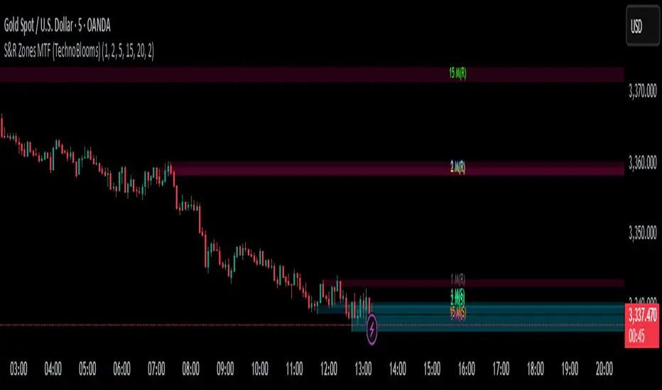
IU Pivot Zones + GMADESCRIPTION:
IU Pivot Zones + GMA is a smart price-action-based indicator that detects meaningful support and resistance zones formed through pivot highs/lows while combining them with dynamic zone generation and Geometric Moving Averages (GMA). This tool is built to help traders visualize institutional breakout/rejection zones with clear, logical mapping and live box management — helping you stay ahead of the move.
The indicator is designed for intraday, swing, and positional traders who want to enhance their trading decisions with visual confluence zones and market structure logic.
USER INPUTS
* Pivot point Lengths: Number of bars used to detect pivot highs/lows
* Zone length: Controls the thickness of the support/resistance zone; higher values create wider zones
* GMA Length: Period for calculating the geometric moving averages based on highs and lows
* Allow Bar/candle Color: Enables or disables special candle coloring when price interacts with the zones
LOGIC OF THE INDICATOR:
* Detects pivot highs and pivot lows using the user-defined length
* Compares consecutive pivot levels to determine if they fall within a valid ATR-based price band to form a zone
* If confirmed, the indicator dynamically plots a resistance or support box between those pivot points, colored respectively (red for resistance, green for support)
* The boxes update in real-time based on price action. If price respects the zone, the box extends forward. If price breaks the zone, the box disappears
* Geometric Moving Averages (GMA) based on logarithmic mean of highs and lows are plotted to offer a trend bias
* Candles that touch the top of the support zone are colored yellow, and those touching the bottom of the resistance zone are orange, enhancing zone reaction visibility
WHY IT IS UNIQUE:
* Uses logarithmic-based GMAs, which are smoother and less reactive than traditional moving averages
* ATR-based zone logic makes it adaptive to volatility instead of using fixed-width zones
* Combines structural levels (pivots), volatility filters (ATR), and trend overlays (GMA) in one unified tool
* Real-time zone extension and disappearance logic based on price interaction
HOW USER CAN BENEFIT FROM IT:
* Spot high-probability breakout or reversal zones that price respects consistently
* Use the GMA cloud for trend confirmation — for example, bullish bias when price is above both GMAs
* Build price action strategies around zone touches, breakouts, or rejections
* Use color-coded candles as real-time alerts for potential entry/exit signals near S/R levels
* Save time by avoiding manual marking of zones on charts across timeframes
DISCLAIMER:
This indicator is created for educational and informational purposes only. It does not constitute financial advice or a recommendation to buy or sell any asset. All trading involves risk, and users should conduct their own analysis or consult with a qualified financial advisor before making any trading decisions. The creator is not responsible for any losses incurred through the use of this tool. Use at your own discretion.
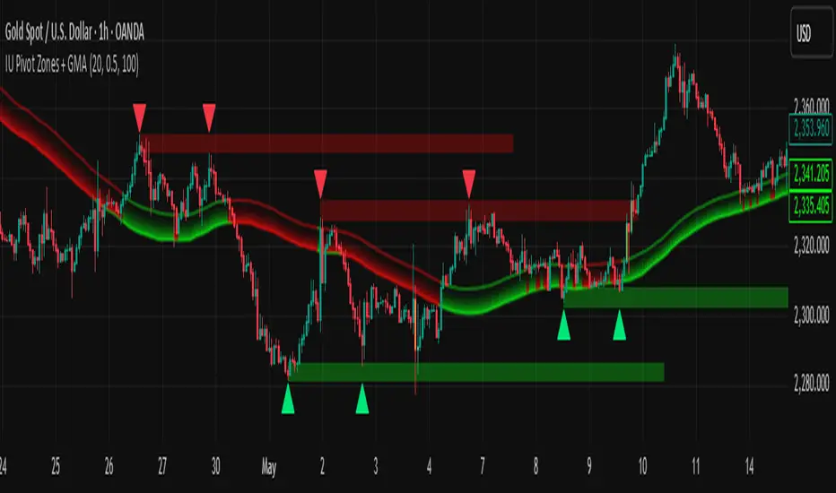
Custom EMA Zone1. Overview
The Custom EMA Cloud Indicator is a technical analysis tool designed to visually display a dynamic zone (or cloud) between two user-defined EMAs. It supports different EMA lengths and allows users to calculate these EMAs using custom timeframes. This flexibility makes it a powerful tool for identifying trends, key price zones, and potential trade signals.
2. Components of the Indicator
2.1. Exponential Moving Averages (EMAs)
EMA 1 (Faster EMA): Calculated using a shorter period (e.g., 21).
EMA 2 (Slower EMA): Calculated using a longer period (e.g., 50).
Users can customize the periods for both EMAs.
2.2. Timeframe Customization
Each EMA can be calculated using a higher timeframe than the chart’s timeframe (e.g., calculate EMA 50 on a 1-hour chart while viewing on a 5-minute chart).
This feature allows users to incorporate higher timeframe trend context into lower timeframe charts.
2.3. Cloud Zone
The cloud is the shaded area between EMA 1 and EMA 2.
Color Logic:
Light Green: Price opens and closes above both EMAs (bullish momentum).
Light Red: Price opens and closes below both EMAs (bearish momentum).
3. How to Use the Indicator
3.1. Trend Identification
When the entire price action is above the cloud, it signals a probable uptrend.
When the entire price action is below the cloud, it indicates a probable downtrend.
When the price is inside the cloud, it reflects probable market consolidation or indecision.
4. Use Cases in Trading Styles
4.1. Scalping
Use short EMAs (e.g., EMA 5 and EMA 13) on 1-minute or 3-minute charts.
Ideal for quick entries and exits during strong momentum moves.
4.2. Swing Trading
Use longer EMAs (e.g., EMA 21 and EMA 50) on 4-hour or daily charts.
Helps capture trend continuation over multiple days.
4.3. Trend Following
Combine with RSI or MACD to confirm trend strength before entering trades.
Stay in the trade as long as price respects the cloud direction.
5. Advantages
Visual Clarity: Simplifies decision-making with clearly defined zones.
Multi-Timeframe Insight: Offers a higher timeframe trend reference.
Customizable: Fits various strategies through adjustable EMAs and timeframes.
6. Limitations
Lagging Nature: As with all moving averages, there may be lag during fast reversals.
False Signals in Sideways Markets: May produce whipsaws during consolidation