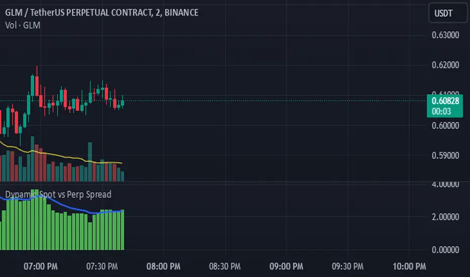
Dynamic Spot vs Perp Spread### **Description for TradingView Publication**
---
**Dynamic Spot vs Perp Spread**
(For USDT-Spot and USDT.P-Perp)
Summary of Usefulness:
This indicator is a valuable tool for traders who want to monitor and capitalize on the relationship between spot and perpetual futures (perp) prices. When the spot price exceeds the perp price, it's often a leading signal that the perp price will follow, creating potential trading opportunities. While this behavior doesn't happen every time, divergences between spot and perp prices can frequently signal significant market movements.
What it Does:
This indicator calculates and displays the price spread (percentage difference) between the spot price and perpetual futures (perp) price of a cryptocurrency asset. It dynamically adjusts to the instrument being viewed, ensuring that spot dominance (spot price higher) is plotted above the zero line and perp dominance (perp price higher) is plotted below the zero line. Additionally, the indicator accounts for symbols with multipliers (e.g., `1000SHIBUSDT.P`) to ensure accurate calculations.
Key features include:
- Automatic symbol detection and adjustment for Spot/Perp pairs.
- Dynamic handling of price multipliers for assets with prefixes like `1000`.
- Visualization of spread with a histogram and optional smoothing using an EMA (Exponential Moving Average).
- Configurable alerts for significant spread changes and spread flips.
- No repainting: the indicator uses the `barmerge.lookahead_off` setting to ensure stable, non-repainting values.
---
### **How to Use**
1. **Add the Indicator:**
- Search for "Dynamic Spot vs Perp Spread" in the TradingView Indicators library and add it to your chart.
2. **Understand the Visualization:**
- A positive spread (green histogram) indicates that the spot price is higher than the perp price (spot dominance).
- A negative spread (red histogram) indicates that the perp price is higher than the spot price (perp dominance).
3. **Customize Settings:**
- **EMA Length:** Use the input field to smooth the spread data over a chosen number of periods.
- **Alert Threshold:** Set a threshold to receive alerts when the spread exceeds a specific percentage.
4. **Receive Alerts:**
- Enable alerts for spread flips (when dominance shifts between spot and perp) or when the spread exceeds the defined threshold.
5. **Use Case Examples:**
- **Spot vs. Perp Arbitrage:** Traders can monitor significant deviations between spot and perp prices to identify potential arbitrage opportunities.
- **Market Sentiment Analysis:** Persistent spot dominance may indicate stronger buying interest in the spot market, while perp dominance may suggest futures market speculation.
---
### **Repainting Behavior**
This indicator **does not repaint** because it uses `barmerge.lookahead_off` for all calculations, ensuring that data from the comparison symbol (spot or perp) is locked to the currently completed candle. This means the values plotted and alerts triggered are reliable and do not change retrospectively.
Repainting occurs when an indicator uses future-looking or incomplete data for calculations. By design, this indicator avoids such practices, making it suitable for live trading and analysis.
---
Cari dalam skrip untuk "新泻天鹅vs川崎前锋"
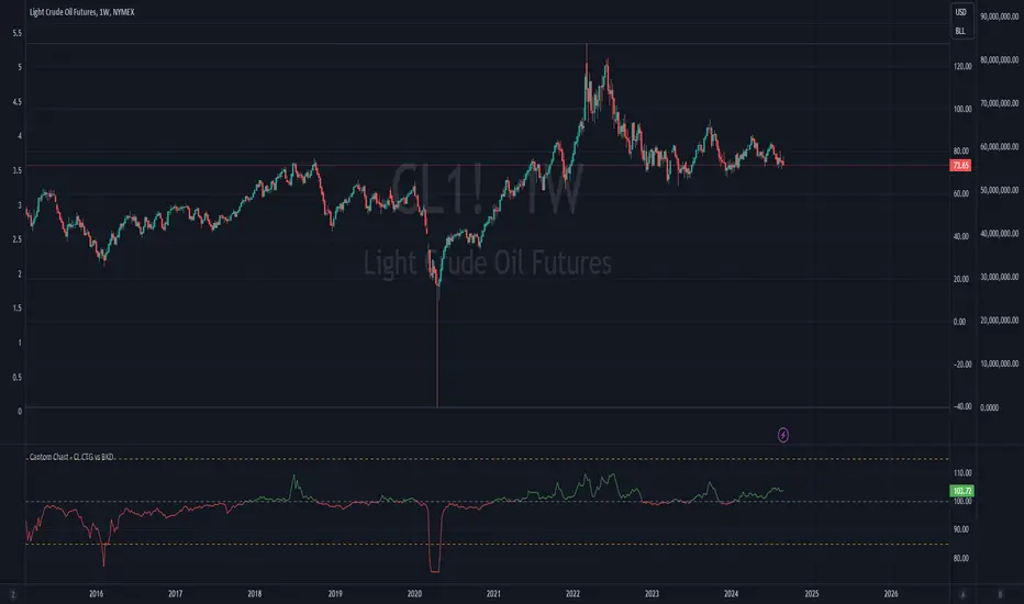
Cantom Chart - CL CTG vs BKDEnglish : This Pine Script indicator, named "Cantom Chart - CL CTG vs BKD," uniquely analyzes the immediate state of oil futures contracts to determine if they are in contango or backwardation. The script uses the price ratio between the nearest (CL1) and the next nearest (CL2) NYMEX crude oil futures contracts. It multiplies this ratio by 100 for clarity and scales fluctuations for enhanced visibility.
Key Features:
Dynamic Ratio Calculation: Computes the ratio (CL1/CL2 * 100) to determine the immediate market state.
Market State Interpretation: A ratio above 100 indicates backwardation, suggesting higher demand than supply, while a ratio below 100 indicates contango, suggesting higher supply than demand.
Volatility Adjustment: Amplifies market state changes by tripling the deviation from the baseline of 100, making it easier to observe subtle shifts.
Anomaly Detection: Caps the adjusted ratio at 125 for highs and 75 for lows, maintaining these limits until the ratio returns to normal levels.
Usage: This indicator is especially useful for traders analyzing supply-demand dynamics and inflationary pressures in the oil market. To apply it, simply add the script to your TradingView chart and adjust the 'Lower Threshold' and 'Upper Threshold' lines as needed based on your trading strategy.
-----
日本語 : この「Cantom Chart - CL CTG vs BKD」Pine Scriptインジケーターは、直近の原油先物契約がコンタンゴまたはバックワーデーションにあるかを特定するための独自の分析を提供します。最近の(CL1)と次の(CL2)NYMEX原油先物契約間の価格比を使用し、この比率に100を掛けて明確性を高め、変動の視認性を向上させます。
主要機能:
動的比率計算: 市場の即時状態を判断するために比率(CL1/CL2 * 100)を計算します。
市場状態の解釈: 比率が100を超える場合はバックワーデーション(需要が供給を上回る)、100未満の場合はコンタンゴ(供給が需要を上回る)を示します。
変動調整: 基準値100からの偏差を3倍にして、微妙な変化を容易に観察できるようにします。
異常値検出: 調整された比率を高値で125、低値で75に制限し、通常のレベルに戻るまでこれらの限界を維持します。
使用方法: このインジケーターは、原油市場における需給ダイナミクスとインフレ圧力を分析するトレーダーにとって特に有用です。使用するには、このスクリプトをTradingViewチャートに追加し、トレーディング戦略に基づいて「Lower Threshold」と「Upper Threshold」のラインを必要に応じて調整します。
Bearish vs Bullish ArgumentsThe Bearish vs Bullish Arguments Indicator is a tool designed to help traders visually assess and compare the number of bullish and bearish arguments based on their custom inputs. This script enables users to input up to five bullish and five bearish arguments, dynamically displaying the bias on a clean and customizable table on the chart. This provides traders with a clear, visual representation of the market sentiment they have identified.
Key Features:
Customizable Inputs: Users can input up to five bullish and five bearish arguments, which are displayed in a table on the chart.
Bias Calculation: The script calculates the bias (Bullish, Bearish, or Neutral) based on the number of bullish and bearish arguments provided.
Color Customization: Users can customize the colors for the table background, text, and headers, ensuring the table fits seamlessly into their charting environment.
Reset Functionality: A reset switch allows users to clear all input arguments with a single click, making it easy to start fresh.
How It Works:
Input Fields: The script provides input fields for up to five bullish and five bearish arguments. Each input is a simple text field where users can describe their arguments.
Bias Calculation: The script counts the number of non-empty bullish and bearish arguments and determines the overall bias. The bias is displayed in the table with a dynamically changing color to indicate whether the market sentiment is bullish, bearish, or neutral.
Customizable Table: The table is positioned on the chart according to the user's preference (top-left, top-right, bottom-left, bottom-right) and can be customized in terms of background color and text color.
How to Use:
Add the Indicator: Add the Bearish vs Bullish Arguments Indicator to your chart.
Input Arguments: Enter up to five bullish and five bearish arguments in the provided input fields in the script settings.
Customize Appearance: Adjust the table's background color, text color, and position on the chart to fit your preferences.
Example Use Case:
A trader might use this indicator to visually balance their arguments for and against a particular trade setup. By entering their reasons for a bullish outlook in the bullish argument fields and their reasons for a bearish outlook in the bearish argument fields, they can quickly see which side has more supporting points and make a more informed trading decision.
This script was inspired by Arjoio's concepts

VIX: Backwardation Vs ContangoVIX: Backwardation Vs Contango
Quickly visualize Contango vs Backwardation in the S&P 500 Volatility Index by plotting the prices of the futures contracts over the next 9 months
Note: indicator does not map to time axis in the same way as price; it simply plots the progression of contract months out into the future; left to right; so timeframe DOESN'T MATTER for this plot
TO UPDATE(every few months recommended): in REQUEST CONTRACTS section, delete old contracts (top) and add new ones (bottom). Then in PLOTTING section, Delete old contract labels (bottom); add new contract labels (top); adjust the X in 'bar_index-(X+_historical)' numbers accordingly
This is one of several similar indicators: Meats | Metals | Grains | VIX
Tips:
-Right click and reset chart if you can't see the plot; or if you have trouble with the scaling.
-Right click and pin to Scale A to plot on the same scale as price
--Added historical input: input days back in time; to see the historical shape of the Futures curve via selecting 'days back' snapshot
updated 15th June 2022
© twingall

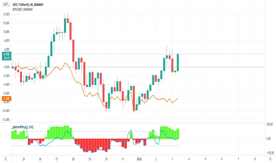
ROC vs BTCThis is a modification of my Rate of Change Percentile script, used to compare the current ticker (e.g. Altcoins) to BTC.
Essentially we are looking at (Current Ticker ROC percentile) vs (Bitcoin ROC percentile).
In other words, we are using the ROC value of both the current ticker and BTC, and ranking each based on their previous ROC.
We compare the rankings to gauge the relative overperformance or underperformance of the current ticker vs BTC.
The blue line is BTC, the columns are the current ticker.
Green columns above the blue line indicate positive ROC and current ticker has higher ROC ranking than BTC.
Red columns below the blue line indicate negative ROC and current ticker has a higher ROC ranking than BTC.
*** PLEASE LEAVE A LIKE AND FOLLOW IF YOU ENJOY THE SCRIPT ***
Any questions, comments or feedback I'd love to hear from you below!
Percentile - Price vs FundamentalsThis is done in the same lines of below scripts
Drawdown-Price-vs-Fundamentals
Drawdown-Range
Instead of using drawdown, here we are only plotting percentile of drawdown. Also added few more fundamental stats to the indicator. Also using part of the code from Random-Color-Generator/ to automatically generate colors. This in turn uses code from @RicardoSantos for convering color based on HSL to RGB
This is how the study can be used:
Study plots percentile of price and each of the listed fundamentals based on history. History can be chose All time or particular window. If any fundamental or price is near 100 - which means it is nearer to its peak. And if something is near its bottom, it is nearer to its 0th percentile.
Price of the stock is considered undervalued based on historical levels when it is below most of the fundamentals. Price is considered overvalued based on historical levels when it is above all the fundamentals. Please note, being undervalued does not guarantee immediate mean reversion. Stocks can stay undervalued for prolonged time and can go further down. Similarly overvalued stock can stay overvalued for prolonged time before correcting itself or justifying the position. Hence, further discretion needs to be used while using this study.
Few examples:
AMZN seems to be trading in range and so are the fundamentals:
MSFT at peak along with half of the fundamentals. But, debt levels are going up along with margins reducing.
LPX is trading at 15% discount whereas most of the fundamentals are at the peak.
FLGT price seems to have gone down further whereas fundamentals look pretty healthy.

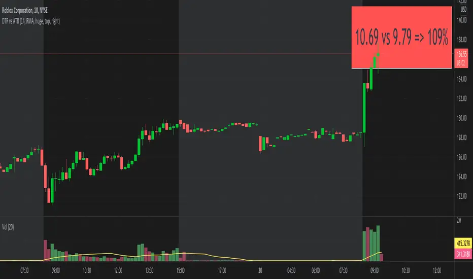
DTR vs ATRThis script shows DTR vs ATR (Today's True Range vs 14 days Avg True Range) along with percentage. The label automatically changes color based on percent value. <=70 is GREEN, >=90 is RED and between 70 & 90 is ORANGE.
The location of the script not stick to one place. There is no such a functionality to keep it static at one location (like top right corner). But I think that feature is coming soon. I may be wrong.
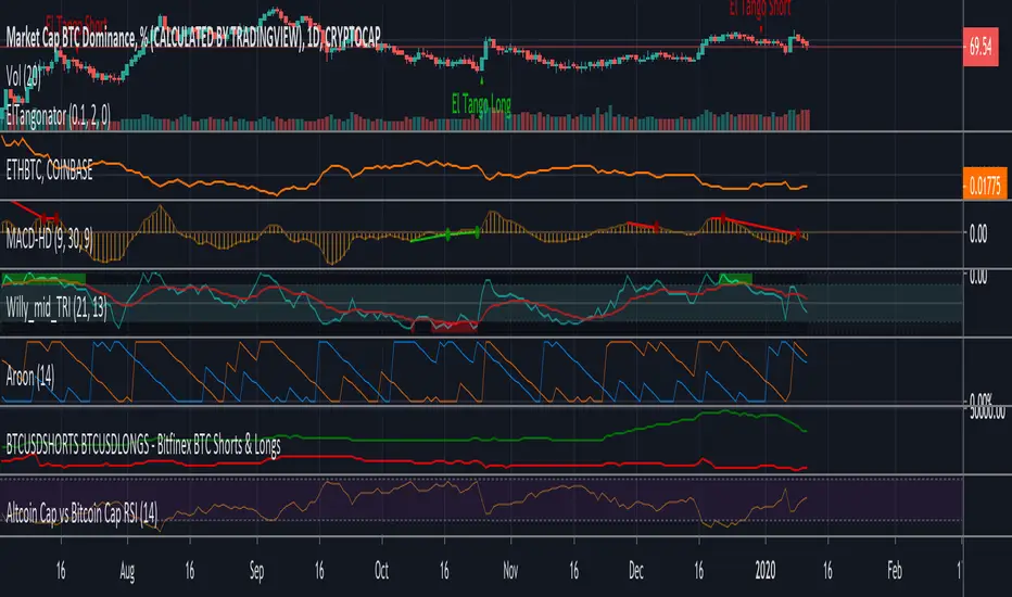
Altcoin Cap vs Bitcoin Cap RSIFollowing Willy Woo study of Altcoin Cap vs Bitcoin Cap RSI
charts.woobull.com
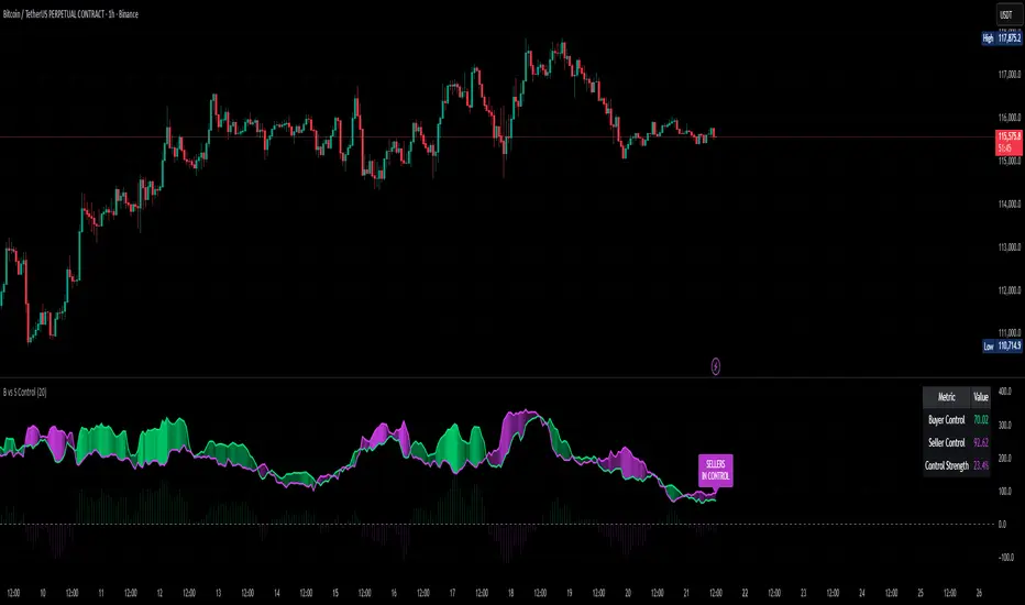
Buyer vs Seller Control BUYER vs SELLER CONTROL INDICATOR
Identify market dominance and potential trend shifts with wick analysis
What This Indicator Measures:
This indicator analyzes who controls the market by measuring the battle between buyers and sellers on each candle:
Buyer Control: How far the closing price is above the candle's low (bottom wick strength)
Seller Control: How far the closing price is below the candle's high (top wick strength)
What's Plotted:
Lime Line: 20-period moving average of buyer control
Fuchsia Line: 20-period moving average of seller control
Dynamic Fill: Area between lines - color shows who's winning
Histogram: Shows the difference between buyer and seller control
Control Label: Text showing current market dominance
Info Table: Real-time values and control strength percentage
How to Read the Signals:
🟢 LIME FILL = BUYERS IN CONTROL
When the lime line is above fuchsia, buyers are dominating. The brighter the fill, the stronger their control.
🔴 FUCHSIA FILL = SELLERS IN CONTROL
When the fuchsia line is above lime, sellers are dominating. The brighter the fill, the stronger their control.
Trading Applications:
Trend Confirmation: Strong buyer control confirms uptrends, strong seller control confirms downtrends
Reversal Signals: Watch for control shifts - when lines cross, momentum may be changing
Entry Timing: Enter long when buyer control strengthens, short when seller control strengthens
Market Structure: Persistent control by one side suggests strong directional bias
Key Features:
Works on any timeframe
Customizable moving average period (default: 20)
Optional info table display
Dynamic transparency shows control strength
Clean visual design for both dark and light themes
Pro Tip: Use this with your favorite trend or momentum indicators for confluence. Strong buyer/seller control often precedes significant price moves!
// Based on wick analysis and moving averages
// Green = Buyers dominating market
// Red = Sellers dominating market
// Fill intensity = Control strength
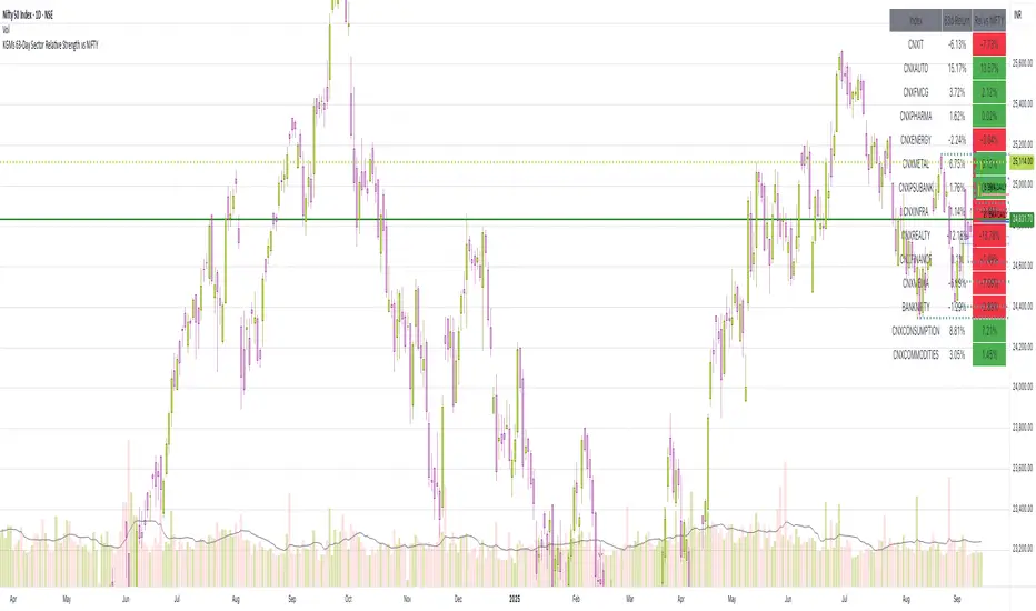
63-Day Sector Relative Strength vs NIFTYThis script calculates and displays the 63-day returns of major NSE sectoral indices and their relative strength versus the NIFTY 50.
It,
Covered Indices: CNXIT, CNXAUTO, CNXFMCG, CNXPHARMA, CNXENERGY, CNXMETAL, CNXPSUBANK, CNXINFRA, CNXREALTY, CNXFINANCE, CNXMEDIA, BANKNIFTY, CNXCONSUMPTION, CNXCOMMODITIES
How to use this: Quickly identify which sectors are outperforming or underperforming relative to the NIFTY over the past 63 trading sessions (approx. 3 months).
EMA 9 vs 21 Spread VarianceEMA 9 vs 21 Spread Variance
What it does
Tracks the distance between EMA 9 and EMA 21, then measures how volatile that distance has been over your chosen lookback. The indicator plots the EMA spread around zero and a rolling variance of that spread. Rising variance signals expanding dispersion between the fast and slow EMAs, which often precedes momentum bursts or regime shifts. Falling variance points to compression and mean-reversion conditions.
How it is calculated
Fast EMA and slow EMA are computed on the selected source.
Spread = EMA9 minus EMA21, plotted around zero.
Variance = rolling variance of the spread over Variance Lookback. Variance is always non-negative.
For readability you can show the variance either on its raw scale, or fitted to the spread’s recent range so both lines are comparable in one pane.
How to read it
Spread near zero with variance rising suggests an impending expansion from balance.
Large positive spread with elevated variance confirms a strong up-trend that is still dynamic.
Large negative spread with elevated variance confirms a strong down-trend that is still dynamic.
Variance rolling over after a run warns that momentum dispersion is cooling and that a consolidation or pullback is likely.
The horizontal zero line applies to the spread only. Variance does not cross zero.
Inputs
Source: price series for EMAs.
Fast EMA Length and Slow EMA Length: defaults 9 and 21.
Variance Lookback: window for the spread variance, common ranges 20 to 100 on intraday charts and 50 to 200 on higher timeframes.
Show spread line and Fit variance to spread scale: display controls.
Suggested use
Combine with your breakout logic. Look for variance expansion from low levels as a filter before taking continuation entries.
Use as a volatility context for EMA cross systems. Crosses that occur with rising variance tend to travel farther than crosses that occur during compression.
Caveats
Variance reacts to spikes in the spread, so it can jump around news bars. Smoothing reduces noise but adds lag. Consider pairing with ATR or session filters if you only want signals during liquid hours.
Global Liquidity Proxy vs BitcoinGlobal Liquidity Proxy vs Bitcoin. Helps to understand the cycles with liquidty.
Stop Loss vs Take Profit Probability and EVThis stop loss and take profit calculator uses a Monte Carlo simulation to calculate the probability of hitting your Stop Loss or Take Profit levels across different time horizons (expressed in bars).
It provides data-driven insights to optimize your risk management and position sizing by showing Expected Value for each scenario.
As a quant, I love using statistical data to help my decisions and get better EV from my trades.
🔬 How It's Calculated
Monte Carlo Simulation: Runs 1,000-10,000 price simulations using a random walk model
Volatility Analysis: Combines ATR-based and Historical Volatility for accurate price movement modeling
Expected Value: Calculates profit/loss expectation using formula: (TP_Probability × Reward) - (SL_Probability × Risk)
Time Horizons: Tests multiple timeframes (1, 5, 10, 20, 50 bars) to find optimal holding periods
Risk/Reward Ratios: Automatically calculates and displays R:R ratios for quick assessment
💡 Use Cases
Position Sizing - Determine optimal risk per trade based on Expected Value
Time Horizon Optimization - Find the best holding period for your strategy
Stop Loss Placement - Validate SL levels using probability analysis
Take Profit Optimization - Set TP levels with statistical backing
Strategy Backtesting - Compare different R:R setups before entering trades
Risk Management - Avoid trades with negative Expected Value
Swing vs Day Trading - Choose timeframes with highest success probability
🎯 How to Use
Setup Trade: Enter your entry price, stop loss, and take profit levels
You can add or remove time horizons denominated in bars. Say you are looking at 1h candles, adding a 24-bar time horizon means you are looking into 24 hours
Choose Direction: Select Long or Short position
Review Table
Analyze Expected Value: Focus on positive EV scenarios (green background)
Optimize Timing: Select time horizons with best risk/reward profile
Adjust Parameters: Modify volatility calculation method and simulation count if needed
Examples
Here's how you can read the tables.
Example 1:
In this chart, we are analyzing the TP and SL probabilities as well as the EV (expected value) for a stock. I want to check what the likelihood is that my SL and TP get triggered over the next 5 days. The stock market is open for 6.5 hours per day, which is 13 bars in this 30-minute bar chart. 26 bars is 2 days, 39 bars is 3 days and so on.
Although this trade is more likely to trigger my SL than my TP, in some of the time horizons we have a positive expected value because of the risk/reward of our trade (i.e. distance of the SL and TP from the price) and the probability of hitting SL and TP.
Example 2:
In this example, we have applied the indicator to gold. Because the TP is much closer to the price, the probability of hitting the TP is much higher.
We can also observe that the expected Value in the shorter time frames is better than in the longer ones. This can give us some clues to set up our trade. If we know that the EV is positive, we can allocate more to that specific trade.
Enjoy, and please let me know your feedback! 😊🥂

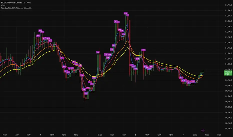
EMA 3 vs EMA 21 % Difference AdjustableTitle: EMA 3 vs EMA 21 % Difference with Adjustable Labels
Description:
This script calculates the percentage difference between EMA 3 and EMA 21 and displays it directly on the chart as a label. Labels are shown only when the difference exceeds a user-defined threshold, helping traders easily spot significant deviations.
Features:
Calculates EMA 3 and EMA 21.
Displays percentage difference as labels above or below candles.
Adjustable label style and size.
User-defined percentage threshold for label visibility.
Plots EMA lines for visual reference.
Ideal for traders who want to monitor short-term EMA divergence relative to a longer-term trend in a clean and customizable way.
1H Candlestick vs EMA Crossover# Description — 1H Candlestick vs EMA Crossover (Pine Script)
This indicator is built in **TradingView Pine Script v5** and is designed to track the relationship between the **1‑hour candlestick close** and the **1‑hour Exponential Moving Average (EMA)**. It works on any chart timeframe but always pulls in **1H data** using `request. security`.
### Core Features
* **Customizable EMA length** (default = 200)
* **Plots the 1H EMA** as an orange line on your chart
* Optionally shows the **1H close** as a faint gray line for reference
* Detects and highlights when the **1H candle close crosses above or below the 1H EMA**
* **Arrows**: Green triangles appear below the bar when a bullish crossover happens (1H close > EMA); red triangles appear above the bar when a bearish crossover happens (1H close < EMA)
* **Alerts**: Built‑in `alert condition` statements let you create TradingView alerts whenever a crossover occurs
### How to Use
1. Adjust the EMA length if you want a faster or slower moving average.
2. Enable alerts: Right‑click the chart → Add Alert → choose this indicator and select either “crossed ABOVE EMA” or “crossed BELOW EMA.”
### Trading Applications
* **Trend Confirmation**: Use the 1H EMA as a higher‑timeframe filter while trading on lower timeframes.
* **Entry/Exit Signals**: Crossovers can mark potential entry points for trend continuation or reversals.
* **Scalping/Intraday**: Even on a 5m or 15m chart, you can overlay the 1H EMA to align your trades with the bigger trend.
This makes the indicator a simple yet powerful tool for aligning trades with higher‑timeframe momentum and avoiding false signals from lower‑timeframe noise.
Spreads CCC/BBB/AAA vs Treasury 10Y//@version=5
indicator("Spreads CCC/BBB/AAA vs Treasury 10Y", overlay=false)
// Tickes de ejemplo (debes reemplazar con los que tengas disponibles en TradingView)
ccc = request.security("XCCC", "D", close) // High Yield CCC
bbb = request.security("LQD", "D", close) // Investment Grade BBB
aaa = request.security("QLTA", "D", close) // AAA
treasury = request.security("US10Y", "D", close) // US Treasury 10Y
// Cálculo del spread (yield bono - yield Treasury)
spread_ccc = ccc - treasury
spread_bbb = bbb - treasury
spread_aaa = aaa - treasury
// Umbral para alerta de riesgo
umbral = input.float(2.0, "Umbral spread (%)")
// Plot de los spreads
plot(spread_ccc, color=color.red, title="Spread CCC")
plot(spread_bbb, color=color.orange, title="Spread BBB")
plot(spread_aaa, color=color.green, title="Spread AAA")
// Señal visual cuando el spread supera el umbral
plotshape(spread_ccc > umbral, title="Alerta CCC", color=color.red, style=shape.triangledown, location=location.abovebar, size=size.tiny)
plotshape(spread_bbb > umbral, title="Alerta BBB", color=color.orange, style=shape.triangledown, location=location.abovebar, size=size.tiny)
plotshape(spread_aaa > umbral, title="Alerta AAA", color=color.green, style=shape.triangledown, location=location.abovebar, size=size.tiny)

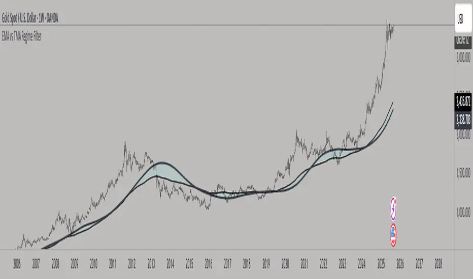
EMA vs TMA Regime FilterEMA vs TMA Regime Filter
This indicator is built as a visual study tool to compare the behavior of the Exponential Moving Average (EMA) and the Triangular Moving Average (TMA).
The EMA applies an exponential weighting to price data, giving stronger importance to the most recent values. This makes it a faster, more responsive line that reflects short-term momentum. The TMA, by contrast, applies a double-smoothing process (or in the “True TMA” option, a split SMA sequence), which produces a much slower curve. The TMA emphasizes balance over reactivity, often used for filtering noise and observing longer-term structure.
When both are plotted on the same chart, their differences become clear. The shaded region between them highlights times when short-term price dynamics diverge from longer-term smoothing. This is where the idea of “regime” comes in — not as a trading signal, but as a descriptive way of seeing whether market action is currently dominated by speed or by stability.
Users can customize:
Line styles, widths, and colors.
Cloud transparency for visual clarity.
Whether to color bars based on relative position (optional, purely visual).
The goal is not to create a system, but to help traders experiment, observe, and learn how different smoothing techniques can emphasize different aspects of price. By switching between the legacy and true TMA, or adjusting lengths, users can study how each approach interprets the same data differently.
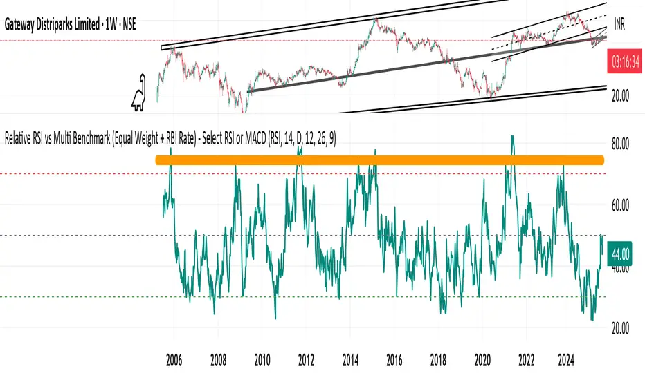
Relative RSI vs Multi Benchmark (Equal Weight + RBI Rate)Relative RSI vs Multi Benchmark (Equal Weight + RBI Rate) - Select RSI or MACD
Alt Season vs USDT Flow DashboardWhat the script tells you (the signals)
It builds four “alt vs stables” lenses and colors the background when they agree.
ALT ex-ETH / STABLES (TOTAL3 / (USDT+USDC+DAI))
Think: “How much alt cap per $1 of dry-powder stables?”
Bullish when price is above its 200-day SMA and rising → risk appetite expanding toward smaller alts.
ALT Share of Risk-On ((TOTAL − STABLES − BTC − ETH) / (TOTAL − STABLES))
Of the non-stable crypto pie, how much is flowing to ex-BTC/ETH alts?
Uptrend = broadening alt participation (late-early to mid alt-season behavior).
Dominance Spread ((TOTAL3 / TOTAL) − (STABLES / TOTAL))
Alts’ share minus stables’ share.
Widening spread means stables are being converted into alts (not just into BTC).
Flow Ratio ROC(TOTAL3, N) / ROC(STABLES, N) (default N=30 days)
Compares alts’ growth rate to stable supply growth.
> 1 and sustained → alts expanding faster than new “dry powder” is appearing.
The background color (“regime”)
Green (ALT-on) when all three conditions align:
ALT/Stable > its SMA
Dominance Spread > its SMA
Flow Ratio > 1
Red (ALT-off) when the opposite holds.
No color = mixed/chop.
How to read it (quick playbook)
Early alt-season tell:
BTC.D starts to slip, total market cap (TOTAL) rising.
ALT/Stable breaks above its 200-SMA and stays there.
Dominance Spread climbs (alts gaining share, stables losing share).
Flow Ratio > 1 for a few weeks.
Maturing phase: ALT Share of Risk-On rises (money broadens from ETH/L1s → mid/small caps).
Exhaustion/false start: Flow Ratio dips < 1 or ALT/Stable loses the 200-SMA while BTC.D stabilizes or rises.
Practical tips
Timeframes: Make calls on 1D. Use 1W to avoid whipsaw; use 4H only for entries once the 1D regime is green.
Smoothing: If you see noisy spikes from market-cap revisions, add a light smoother (e.g., 7D SMA on the plotted lines).
Parameters:
Try ROC length 21–45 days.
Try SMA 150–250 days (200 is a good middle).
Confluence: Keep BTC.D and ETH.D in another pane. Best alt windows: BTC.D trending down, ETH.D flat-to-up initially, then ETH.D flattens as TOTAL3 momentum spreads to mid/small caps.
Risk checks: If USDT.D/USDC.D (stable dominance) spike up while your signals are green, that’s a caution flag (capital retreating to stables).

Relative Weighted Rate of Change (WROC) vs Nifty 50Relative Weighted Rate of Change (WROC) vs Nifty 50

ALTSEASON Monitor: Macro vs Crypto (normalized)ALTSEASON Monitor: Macro vs Crypto (normalized)
Set 1W or 1M timeframe for the macro picture.
If your provider does not have some symbols, change the tickers in the script settings (for example, ETHBTC from another exchange).
For detailed trading, keep this monitor on the second window and watch local entries on individual charts.

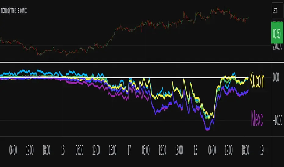
XMR Divergences vs KrakenSUMMARY
This script finds the percentage difference between Kraken, and multiple other exchanges, for the price of XMRUSD, and then runs a variable length moving average of those differences. Optionally, you can multiply by the reported volume of the exchange in question. Skip to "USAGE" at the bottom for a quick view of the settings. But I recommend reading DETAILED DESCRIPTION as well.
PURPOSE
The purpose of this script is to get a look into the relative funds flows of XMR between Kraken and the other exchanges. So long as an exchange withdraws are open: 1) Negative divergences indicate XMR outflows from the exchange under consideration, 2) Postive divergences indicate XMR inflows from Kraken to the exchange.
This appears to be moderately correlated with price movements in Monero (but not always). There is also the theory that positive accumulation is a leading indication of a growing probability of postive price action in the general crypto market, and negative accumulation is a leading indicator of an upcoming peak. In other words, exchanges like to accumulate Monero quietly during calm downtimes, and they like to manage its price from gaining too much attention (pump) during broad market positivity.
BACKGROUND
It's well known among XMR traders that most exchanges are operating on a heavy fractional reserve basis as regards Monero. The past 2 years have seen regular and repeated withdraw freezes, sometimes for weeks/months at a time. Occasionally, liquidity stress tests have been performed, with predictable results - none of these exchanges are able to continue supporting withdraws.
Kraken is the only exchange of meaningful volume that has never frozen withdraws for more than an hour or so. Thus, we theorize that Kraken is operating with all, or most of the XMR they claim to have.
Furthermore, we have seen in the past, large price negative price divergences of these fractional reserve exchanges relative to Kraken. As the social outcry grew stronger for this malfeasance, these exchanges have gone to greater lengths to hide their price divergences.
On minute-by-minute ; hour-by-hour basis, typically, a look with the naked eye would show oscillation around the zero point. But when you average it out, especially on lower timeframes (like the 1 and 5 min candles), you can very clearly see that when withdraws are shut down, these exchanges simultaneously diverge their prices downwards as well.
DETAILED DESCRIPTION
The ideal view of price divergence would compare second-by-second prices, and then run something like a rolling 4-hr or 1-day SMA to average out the overall divergences. However, due to limitations of TradingView, this is impractical/impossible for actual usage/viewing. As a result, a balance must be struck, when selecting the combination of the candle period, and the SMA lookback length.
I find that 5min candles, with a 48-period lookback (that equates to a rolling 4-hour SMA), offers the best view of recent and historical price divergence activity. This of course means that we're only sampling price divergences once every 5 minutes, but it still provides a decent look at what's happening. If this script gets popular, I wouldn't be surprised if these exchanges start timing their candle closes to mask their misdeeds, but that's of course speculative on my part.
The other important factor here, *IS TO MULTIPLY BY VOLUME*. Some of these no-volume exchanges have large price divergences. But if they're not doing any real volume, then it doesn't really have any real market impact. Thus, I recommend keeping the "Make volume adjustment" option on.
If that ends up happening, we'll have to infer that by comparing the difference in close prices, vs the difference in the highest or lowest intra-candle prices (wicks). Typically a divergence should have all 3 showing similar results.
Notes regarding "Sum_of_All": This only makes sense when multiplying by volume. So only check this if you also made the volume adjustment. Generally I believe that *Binance* sets the tone. However, we have seen numerous occasions where Binance diverges down, and the others diverge up. I believe this is a social influence tactic, since most people look at Binance price. Meanwhile, they're trying to accumulate some small amount on the other exchanges to minimize their overall loss. This of course assumes collusion by these exchanges, which is a high likely hood, seeing as how in May 2021, they all diverged together simultaneously (among other evidence).
USAGE
I recommend using your browser zoom, to see data beyond 1 month in the past.
Lookback - The number of candles over which to conduct a moving average. On 5-min candles for example, here's how the math works out:
12 - Equates to a 1 hr MA
24 - 2 hrs
48 - 4 hrs (default)
288 - 1 day
2880 - 10 days
Make Volume Adjustment - Recommend that you usually keep this on.
Line Widths - Set to preference
Show_Close_Price? - You can compute the difference at candle close. Or you can check the other boxes to compare the highest/lowest prices for intra candle prices (wicks).
Show Sum_of_All? - You can sum all of the differences, which only makes sense if you're making the volume adjustement. Default is off. Below, you can also choose which exchanges to include in the sum.
This works best on lower timeframes, like the 1m, 5, and 15m charts. I personally use 5m, with 48 or 96 length lookback. You get a better view of the real time price divergences that way.
Market Energy – Trend vs Retest (with Saturation %)Market Energy – Trend vs Retest Indicator
This indicator measures the bullish and bearish energy in the market based on volume-weighted price changes.
It calculates two smoothed energy waves — bullish energy and bearish energy — using exponential moving averages of volume-adjusted price movements.
The indicator detects trend changes and retests by comparing the relative strength of these waves.
A saturation percentage quantifies the intensity of the current dominant side (bulls or bears) relative to recent highs.
- High saturation (>70%) indicates strong momentum and dominance by bulls or bears.
- Low saturation (<30%) suggests weak momentum and possible market indecision or consolidation.
The background color highlights the current control: green for bulls, red for bears, with transparency indicating the saturation level.
A label shows which side is currently in control along with the saturation percentage for quick interpretation.
Use this tool to identify strong trends, possible retests, and momentum strength to support your trading decisions.
