Planetary Speed - CEPlanetary Speed - Community Edition
Welcome to the Planetary Speed - Community Edition , a specialized tool designed to enhance W.D. Gann-inspired trading by plotting the speed of selected planets. This indicator measures changes in planetary ecliptic longitudes, which may correlate with market timing and volatility, making it ideal for traders analyzing equities, forex, commodities, and cryptocurrencies.
Overview
The Planetary Speed - Community Edition calculates the speed of a chosen planet (Mercury, Venus, Mars, Jupiter, Saturn, Uranus, Neptune, or Pluto) by comparing its ecliptic longitude across time. Supporting heliocentric and geocentric modes, the script plots speed data with high precision across various chart timeframes, particularly for markets open 24/7 like cryptocurrencies. Traders can customize line colors and add multiple instances for multi-planet analysis, aligning with Gann’s belief that planetary cycles influence market trends.
Key Features
Plots the speed of eight planets (Mercury, Venus, Mars, Jupiter, Saturn, Uranus, Neptune, Pluto) based on ecliptic longitude changes
Supports heliocentric and geocentric modes for flexible analysis
Customizes line colors for clear visualization of planetary speed data
Projects future speed data up to 250 days with daily resolution
Works across default TradingView timeframes (except monthly) for continuous markets
Enables multiple script instances for tracking different planets on the same chart
How to Use
Access the script’s settings to configure preferences
Choose a planet from Mercury, Venus, Mars, Jupiter, Saturn, Uranus, Neptune, or Pluto
Select heliocentric or geocentric mode for calculations
Customize the line color for speed data visualization
Review plotted speed data to identify potential market timing or volatility shifts
Add multiple instances to track different planets simultaneously
Get Started
The Planetary Speed - Community Edition provides full functionality for astrological market analysis. Designed to highlight Gann’s planetary cycles, this tool empowers traders to explore celestial influences. Trade wisely and harness the power of planetary speed!
Speed

Median Speed BarThe "Median Speed Bar" is a custom trading indicator designed to classify market candlesticks based on their volatility relative to historical price ranges. It calculates two median price ranges: a short-term median using a customizable period and a long-term median over a much larger timeframe. These medians are based on either the difference between the opening and closing prices or the high and low prices of the candlesticks, depending on user input. The percentage ratio of the short-term median to the long-term median is used to categorize the current candlestick into one of four types: EXTREME, FAST, NORMAL, or SLOW. Each category is linked to customizable thresholds, which are set by the user as percentages.
The script then displays the classification of the current bar in a table at the bottom right corner of the chart, offering an easily readable overview of current market conditions. If the bar's percentage exceeds the extreme threshold, it's classified as "EXTREME" and highlighted in red. Other categories—FAST, NORMAL, and SLOW—are visually distinguished by different colors (orange, green, and blue, respectively). This allows traders to quickly assess volatility and make informed decisions based on how the current price action compares to historical medians.

Marcos Ruiz :Price Change Speed Descripción:
Este indicador en Pine Script está diseñado para analizar y visualizar dinámicamente la velocidad de los cambios de precio en un gráfico de TradingView. El indicador permite a los usuarios seleccionar diferentes tipos de medias móviles y fuentes de precios para calcular y mostrar el cambio porcentual en el precio durante un período especificado
Características:
Selección de Fuente de Precio: Elige entre cierre, apertura, alto, o bajo para los cálculos de precios
Tipos de Media Móvil: Selecciona entre SMA, WMA, EMA, HMA, o VWMA para determinar la media móvil utilizada en el cálculo de la velocidad promedio
Coloreado Dinámico: El color de la línea de la media móvil cambia según la velocidad de cambio de precio
Aumento de Velocidad: Cuando la velocidad del cambio de precio está aumentando, la media móvil se colorea según upColor definido por el usuario
Disminución de Velocidad: Cuando la velocidad está disminuyendo, la media móvil se colorea según downColor definido por el usuario
Posición Neutral: Coloreado adicional para escenarios donde el precio está por encima o por debajo de la media móvil, pero no cumple con las condiciones de aumento/disminución
Factor de Refuerzo: Ajusta la sensibilidad del cálculo del cambio de velocidad
Uso:
Parámetros de Entrada:
Define el Período para establecer la ventana de retroceso para calcular la velocidad
Elige la Fuente de Precio para determinar qué datos de precios usar
Selecciona el Tipo de Media Móvil y ajusta la Longitud de EMA para la comparación
Interpretación:
El indicador traza la media móvil seleccionada con colores dinámicos basados en la velocidad calculada del cambio de precio
Los cambios positivos y negativos en la velocidad se indican con diferentes colores, proporcionando una representación visual del momento y la fuerza de la tendencia del precio
Nota: Este script es el resultado de un desarrollo y pruebas extensivas. Se agradecen mucho sus comentarios y contribuciones
Description:
This Pine Script indicator is designed to dynamically analyze and visualize the speed of price changes on a TradingView chart. The indicator allows users to select different moving average types and price sources to compute and display the percentage change in price over a specified period
Features:
Price Source Selection: Choose from close, open, high, or low for price calculations
Moving Average Types: Select from SMA, WMA, EMA, HMA, or VWMA to determine the moving average used for computing average speed
Dynamic Coloring: The moving average line's color changes based on the speed of price change
Increasing Speed: When the price change speed is increasing, the moving average is colored according to the user-defined upColor
Decreasing Speed: When the speed is decreasing, the moving average is colored according to the user-defined downColor
Neutral Position: Additional coloring for scenarios where the price is above or below the moving average but not meeting the increase/decrease conditions
Reinforcement Factor: Adjusts the sensitivity of the speed change calculation
Usage:
Input Parameters:
Set the Period to define the lookback window for calculating speed
Choose the Price Source to determine which price data to use
Select the Moving Average Type and adjust the EMA Length for comparison
Interpretation:
The indicator plots the selected moving average with dynamic colors based on the calculated speed of price change
Positive and negative changes in speed are indicated by different colors, providing a visual representation of price momentum and trend strength
Note: This script is the result of extensive development and testing. Your feedback and contributions are highly appreciated
Volatility SpeedometerThe Volatility Speedometer indicator provides a visual representation of the rate of change of volatility in the market. It helps traders identify periods of high or low volatility and potential trading opportunities. The indicator consists of a histogram that depicts the volatility speed and an average line that smoothes out the volatility changes.
The histogram displayed by the Volatility Speedometer represents the rate of change of volatility. Positive values indicate an increase in volatility, while negative values indicate a decrease. The height of the histogram bars represents the magnitude of the volatility change. A higher histogram bar suggests a more significant change in volatility.
Additionally, the Volatility Speedometer includes a customizable average line that smoothes out the volatility changes over the specified lookback period. This average line helps traders identify the overall trend of volatility and its direction.
To enhance the interpretation of the Volatility Speedometer, color zones are used to indicate different levels of volatility speed. These color zones are based on predefined threshold levels. For example, green may represent high volatility speed, yellow for moderate speed, and fuchsia for low speed. Traders can customize these threshold levels based on their preference and trading strategy.
By monitoring the Volatility Speedometer, traders can gain insights into changes in market volatility and adjust their trading strategies accordingly. For example, during periods of high volatility speed, traders may consider employing strategies that capitalize on price swings, while during low volatility speed, they may opt for strategies that focus on range-bound price action.
Adjusting the inputs of the Volatility Speedometer indicator can provide valuable insights and flexibility to traders. By modifying the inputs, traders can customize the indicator to suit their specific trading style and preferences.
One input that can be adjusted is the "Lookback Period." This parameter determines the number of periods considered when calculating the rate of change of volatility. Increasing the lookback period can provide a broader perspective of volatility changes over a longer time frame. This can be beneficial for swing traders or those focusing on longer-term trends. On the other hand, reducing the lookback period can provide more responsiveness to recent volatility changes, making it suitable for day traders or those looking for short-term opportunities.
Another adjustable input is the "Volatility Measure." In the provided code, the Average True Range (ATR) is used as the volatility measure. However, traders can choose other volatility indicators such as Bollinger Bands, Standard Deviation, or custom volatility measures. By experimenting with different volatility measures, traders can gain a deeper understanding of market dynamics and select the indicator that best aligns with their trading strategy.
Additionally, the "Thresholds" inputs allow traders to define specific levels of volatility speed that are considered significant. Modifying these thresholds enables traders to adapt the indicator to different market conditions and their risk tolerance. For instance, increasing the thresholds may highlight periods of extreme volatility and help identify potential breakout opportunities, while lowering the thresholds may focus on more moderate volatility shifts suitable for range trading or trend-following strategies.
Remember, it is essential to combine the Volatility Speedometer with other technical analysis tools and indicators to make informed trading decisions.

Volume Tick ExperimentThis ticks-based indicator provides real-time volume information for a trading asset. Volume is analyzed and updated continuously, not just at candle close. It is based on DGT's Bull vs Bear Power indicator but adds a gas signal that activates when buying or selling volume percentage reaches a predetermined threshold.
This indicator can also help traders determine the direction and aggressiveness of pushes in buying or selling volume. By monitoring the volume percentages and gas signals, traders can get an idea of whether the market is pushing in a particular direction and how strong the push is. This information can be helpful in making trading decisions and identifying potential entry or exit points.
The indicator uses open, high, low, and close prices of the asset to calculate volume information. It determines the average volume over a selected period and calculates volume for both buying and selling. This information is used to calculate the percentage of buying and selling volume. A gas signal is triggered when either the buying or selling percentage reaches a predetermined threshold.
Enjoy!

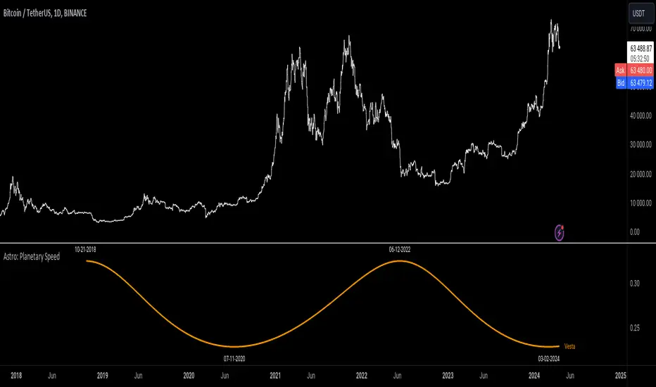
Astro: Planetary SpeedPlanetary speed refers to the rate at which a planet moves along its orbit around the Sun. The speed of a planet can vary depending on its distance from the Sun, and is generally fastest at the point in its orbit where it is closest to the Sun (perihelion) and slowest at the point where it is farthest from the Sun (aphelion).
The significance of planetary speeds lies in their astrological interpretation. In astrology, the speed of a planet is thought to influence its energy and influence earthly affairs. Fast-moving planets, such as Mercury and Venus, are believed to have a more immediate and fleeting influence, while slower-moving planets, such as Jupiter and Saturn, are thought to have a more long-lasting and significant impact.
Astrologers use the speed of the planets, along with their positions, aspects, and other factors, to interpret their influence. By understanding the energy and symbolism associated with each planet, astrologers can provide insight and guidance to individuals seeking a greater understanding.
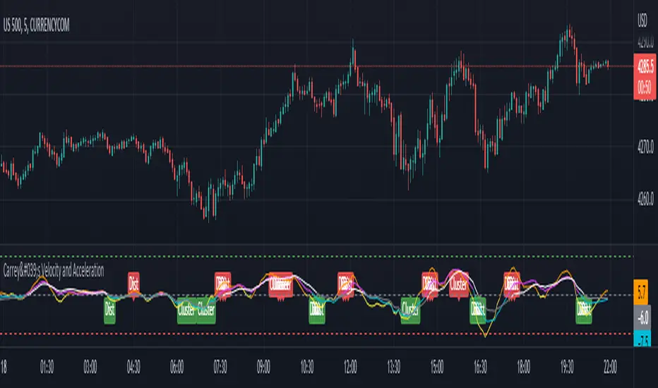
Carrey's Velocity and AccelerationThis is initially based on the MA Speed indicator from TradeStation () and expanded upon greatly. This implements 3 different variable MAs and calculates and plots both speed and acceleration of each. Also, a single line composite option is included for both speed and acceleration that changes color based on directional confluence of each MA's speed/acceleration. Additionally, optional labels are included to show where the 3 MAs are clustered, and a volatile move is expected, and where they are more distributed, expecting a temporary reversal.
The additional acceleration concept comes from kinematics in physics. Utilizing time-based derivatives, we can calculate the velocity and acceleration of the moving averages, which can help us identify momentum of price action and locate reversals sooner.
Time Machine█ OVERVIEW
This script is designed to display future and current time resistance levels based on multiple techniques such as candle behaviors and count and some significant financial times according to Gann and more.
Each chart consists of an X-Axis ( time ) and a Y-Axis ( price ). Price can travel up and down giving you both support and resistance levels, on the other hand, time only travels forward which is why they are called time resistance levels.
Time resistance happens at multiple significant places. Have you noticed that when a triangle breaks north or south that the tip of the triangle acts as time resistance level where something happens ? Many patterns and techniques are designed
to detect and these levels through patters, candle behavior and more. This script aims to assist in detecting these levels ahead of time or at candle opens . This is a very important point. A signal of time resistance can be displayed at candle open
or ahead of time. both of these cases mean that the time resistance is confirmed. These resistance levels are rated on a scale from 0 to 3 and this scale could change and more filtering could be applied in the future to make this script
even more powerful. I would say this is a functional beta version ( v0.5 ) that could be improved upon and that's what I intend to do. scroll down to see if there are any other upgrades to this script. Each time frame has its own time resistance levels. Future levels could appear at any point;
for example, if there are no future time resistance levels within the next 6 days -lets say,- this does not mean that one doesn't appear tomorrow. A regular check would give you an edge in this script. Of course this is something that can be improved in the near future. This script does not reprint ( confirmed data does not change ) but more future data can be added no previous data.
Enjoy!
█ Future Plans and upgrades to this script may include :
1. Adding more astro influencers into the script.
2. Fine tuning the script a bit more to filter unwanted noise.
3. Adding toggle switches for users to select from. ( toggle between multiple techniques )
and more! feel free to let me know what you'd like to see!
█ How to use :
1. Put the script on your chart
give the script a few seconds and you should be set.
This script is coded as an addon to the Gann ToolBox package/scripts.

Planetary Speed█ OVERVIEW
This script is designed to measure the speed of planets from Mercury to Pluto by comparing longitude data across time.
Planetary Speed cycles are very important for those trading Gann theory / Time theory and for Astrology Traders alike. You can toggle the mode of the planet
from a heliocentric setting to a geocentric one. This script is especially important for those who want to research the market and observe the effects of planetary cycles.
Planetary Speed works better on markets that do not close at the moment and on selected time frames ( all the default tradingview timeframes except the monthly ).
This script can also plot 250 days of future data with ease.
█ Future Plans and upgrades to this script may include :
1. Capability to work on different markets that do not open 24/7.
2. Adding lunar and solar speed.
And more! Feel free to contact me with any feature that you would like to see in this script
█ How to use :
1. Open the settings.
2. Select the planet.
3. Choose between Heliocentric and Geocentric
Then Press OK & give the script a few seconds and you should be set. You can add this script to your chart more than once!
This script is coded as an addon to the Gann ToolBox package/scripts.

XPace* XPACE INDICATOR *
The XPace indicator represents a histogram view of the Tape Speed of the Floor. The Tape Speed (aka Pace) is represented as red and green bars drawn in a histogram view.
As the red histogram bars grow larger and increase in frequency, this shows that the BIDS are in kontrol at that time. And conversely, when the green histogram bars grow larger and instead in frequency, this shows that the OFFERS are in kontrol.
Weighing in whether the BIDS or OFFERS are in kontrol can be a helpful indicator to decide what direction the market could move in.
What is helpful about XPace is that it will show you the raw value of the BID and OFFER kontrol. This can be combined with XKontrol which will classify the kontrol as either Initial, Strong, and Total. Using these 2 indicators combined has added value.
* WHAT MAKES IT ORIGINAL *
Up to this point, there is not another indicator that represents the BIDS and OFFERS that correlate and represent the Tape Speed of the Floor.
* XKONTROL INDICATOR *
The other indicator on this chart is XKontrol, as shown as dots of varying sizes on the chart. The dots are a visual representation of who is in Kontrol relative to the Tape Speed of the Floor. The XKontrol indicator will show you who is in Kontrol, the BIDS or the OFFERS. This is a very powerful indicator. Great for long term plays and a *SCALPERS* paradise.
The XKontrol indicator reads the BIDS Being hit and the OFFERS being lifted, and then represents the strength of the Bids being hit and Offers being lifted as dots on the chart. The various dot sizes produced by XKontrol show the level of control the Bids or the Offers have at that point of time in the chart.
As the Dots grow larger, the level of Kontrol is increased. There are 3 dot sizes ranging from Small, Medium, and Large. Respectively they represent Intial Kontrol, Strong Kontrol, and Total Kontrol. Total Kontrol is achieved when either the BIDS or the OFFERS are dominating at the time. This is generally the direction you want to place your trades in and show that either the Bids or the Offers are flooding the market.
As the BID dots increase in frequency and in size this shows that the BIDS are in kontrol and dominating. Vice versa, when the OFFER dots increase in frequency and in size this shows that the offers are in kontrol and dominating. When you see the large dot that is generally a strong sign of the direction price may go. However, it also can be climactic and price could reverse. That would symbolize a case of Effort / No Result. For Example, when the BIDS are in Kontrol and dominating, make a lower low, and then price quickly reverses, it could symbolize a climax.
Usually XKontrol is used in conjunction with XPace, as XKontrol deciphers the Tape Speed of the Floor and draws graphical dots to show whether the BIDS or the OFFERS are dominating right on the chart. Reading XPace will show visually in the histogram the strength of the BID and OFFER Kontrol in the histogram.
* XKONTROL ALERTS *
Alerts can be set very easily with the instructions below.
1. Right Click Chart -> Add Alert...
2. Select Condition to be "XKontrol"
3. Select any level of Kontrol. For example you can Select "Offers Total Kontrol"
4. Select "Greater Than" with Value = 0
5. Options set "Once Per Bar Close" to only fire alert after bar closes
6. Customize Any other Alert Options you want
* EXAMPLE AND USE CASES *
Some practical examples of using XKontrol + XPace combined could be the following:
1. XKontrol Large Green Dot + XPace Large Green Bar could be that the OFFERS have gained total kontrol and are dominating against the Bids. Once would want to watch for higher prices to be potentially reached after that.
2. XKontrol Small Red Dot + XPace Large Red Bar could be that there was a lot of effort on behalf of the BIDS, but they failed to achieve any significant kontrol. The small red dot in XKontrol represents only initial kontrol which is weak kontrol. An application would be to watch for a potential break out on the up side and that will confirm that the BIDS overexerted their effort and was oversold.
3. XKontrol Red and Green Dots mixed could show that it has not been decided whether the BIDS or OFFERS are dominating and the outlook is neutral. If the XPace histogram bars don't stand out either, it would add another point for a neutral analysis.
* AUTHOR *
This script is published by MBoxWave LLC

XKontrol* XKONTROL INDICATOR *
Is a visual representation of who is in Kontrol relative to the Tape Speed of the Floor. The XKontrol indicator will show you who is in Kontrol, the BIDS or the OFFERS. This is a very powerful indicator. Great for long term plays and a *SCALPERS* paradise.
* WHAT THE SCRIPT DOES *
The XKontrol indicator reads the BIDS Being hit and the OFFERS being lifted, and then represents the strength of the Bids being hit and Offers being lifted as dots on the chart. The various dot sizes produced by XKontrol show the level of control the Bids or the Offers have at that point of time in the chart.
* HOW IT WORKS *
As the Dots grow larger, the level of Kontrol is increased. There are 3 dot sizes ranging from Small, Medium, and Large. Respectively they represent Intial Kontrol, Strong Kontrol, and Total Kontrol. Total Kontrol is achieved when either the BIDS or the OFFERS are dominating at the time. This is generally the direction you want to place your trades in and show that either the Bids or the Offers are flooding the market.
* HOW TO USE IT *
As the BID dots increase in frequency and in size this shows that the BIDS are in kontrol and dominating. Vice versa, when the OFFER dots increase in frequency and in size this shows that the offers are in kontrol and dominating. When you see the large dot that is generally a strong sign of the direction price may go. However, it also can be climactic and price could reverse. That would symbolize a case of Effort / No Result. For Example, when the BIDS are in Kontrol and dominating, make a lower low, and then price quickly reverses, it could symbolize a climax.
Usually XKontrol is used in conjunction with XPace, as XKontrol deciphers the Tape Speed of the Floor and draws graphical dots to show whether the BIDS or the OFFERS are dominating right on the chart. Reading XPace will show visually in the histogram the strength of the BID and OFFER Kontrol in the histogram.
* WHAT MAKES IT ORIGINAL *
Up to this point, there is not another indicator that shows BID and OFFER Kontrol on the chart, that correlates and represents the Tape Speed of the Floor.
* XKONTROL ALERTS *
Alerts can be set very easily with the instructions below.
1. Right Click Chart -> Add Alert...
2. Select Condition to be "XKontrol"
3. Select any level of Kontrol. For example you can Select "Offers Total Kontrol"
4. Select "Greater Than" with Value = 0
5. Options set "Once Per Bar Close" to only fire alert after bar closes
6. Customize Any other Alert Options you want
* XPACE INDICATOR *
The other indicator on the chart shown in the Histogram is called XPace. It represents a histogram view of the Tape Speed of the Floor. It correlates to XKontrol, but instead of Dots will draw histogram bars showing the extent of the BID or OFFER Control.
As the red histogram bars grow larger and increase in frequency, this shows that the BIDS are in kontrol at that time. And conversely, when the green histogram bars grow larger and instead in frequency, this shows that the OFFERS are in kontrol.
Weighing in whether the BIDS or OFFERS are in kontrol can be a helpful indicator to decide what direction the market could move in.
What is helpful about XPace is that it will show you the raw value of the BID and OFFER kontrol whereas XKontrol will classify the kontrol as either Initial, Strong, and Total. Using these 2 indicators combined has added value.
* EXAMPLE AND USE CASES *
Some practical examples of using XKontrol + XPace combined could be the following:
1. XKontrol Large Green Dot + XPace Large Green Bar could be that the OFFERS have gained total kontrol and are dominating against the Bids. Once would want to watch for higher prices to be potentially reached after that.
2. XKontrol Small Red Dot + XPace Large Red Bar could be that there was a lot of effort on behalf of the BIDS, but they failed to achieve any significant kontrol. The small red dot in XKontrol represents only initial kontrol which is weak kontrol. An application would be to watch for a potential break out on the up side and that will confirm that the BIDS overexerted their effort and was oversold.
3. XKontrol Red and Green Dots mixed could show that it has not been decided whether the BIDS or OFFERS are dominating and the outlook is neutral. If the XPace histogram bars don't stand out either, it would add another point for a neutral analysis.
* AUTHOR *
This script is published by MBoxWave LLC

[VDB]HTF-Momentum-SpeedThis script is for plotting momentum and speed of higher timeframe using MACD Histograms.
Settings are hardcoded to 35/70/20 for momentum while speeds change slow length to 100, 200 and 300.
There is an option to use the user defined higher timeframe is case auto selection is inappropriate.
DISCLAIMER: This indicator has been created for educational reference only and do not constitute investment advice. This indicator should not be relied upon as a substitute for extensive independent market research before making your actual trading decisions. Market data or any other content is subject to change at any time without notice. Liability for any loss or damage, including without limitation any loss of profit, which may arise directly or indirectly from use of this indicator is accountability of user using it.

Speed DiamondSpeed Diamond allows the user to easily view their chosen price target in relation to the current price of the chart.
It displays a Diamond at the bar where the (theoretical) trade would have been entered and a line at the entry price.
Displayed on the line is the amount of bars it has taken to arrive at your price target (current price).
Price targets can be set in Percentage, Ticks, and Price.
This indicator was not developed to be predictive and is simply intended for reference.
A potential use case could be discovering potential support and resistance zones.

Speed IndicatorThe indicator showcases the Speed at which the prices change based on the set length. It does not show trend direction simply because Speed is a scalar quantity. It helps to identify when the prices are racing, slowing down, or in a range.
The formula used for calculation is Speed = Total Distance Travelled / Time.
Time is the period range that can be defined to set the lookback period.
The length is calculated by finding the absolute value of the difference between the current and closing prices one period ago. The lengths are added for the defined Time, and the Total Distance Travelled by the price is calculated. The formula of 'current price' - price 'Time' periods ago is not used, which calculates the displacement of the price used in figuring the velocity .
The Speed is then calculated using the defined formula.
For example, in the last 20 days, a stock price moved a total of 15000 points, then the Speed of the price would be 750 points per day. Therefore the price is expected to be moving around 750 points, either up or down.
There is also an application of the Donchian Channels to the calculated Speed. It helps to define a dynamic range of the Speed and easily visualize if the Speed is increasing, decreasing, or being stable. The range showcases a Speedometer , hence easing the interpretation of the Speed. Speed Range can also be customized for the Donchian channel. The contraction of the channels would occur when the Speed has been steady for some time, which would mean the price has not moved out from its range.
The importance of the indicator is to identify when the prices have slowed down to enter positions safely, since entering positions during higher speeds would be like jumping onto a fast-moving train. Although, it is up to the user's risk appetite if they wish to enter during low speeds or high speeds. The basic strategy is to enter during slow speeds, hold as speed increases, exit as Speed starts to slow down for its highs. That is the basic idea but can be customized as per the user.

Spread DifferentialThe Spread Differential tries to measure the speed of the market in any given direction. The histogram plots levels above or below zero in a sequence of Humps and Waves. Humps are repetitions of the previous trend before dropping to or near 0 whilst Waves are similar to Humps but the histogram must drop to or near 0 prior to forming another wave. You might notice that in no trend does the indicator ever form more than 2 waves. The indicator should be used in conjunction with the MA's selected in the panel to identify possible points of failure.

Heat Zone Relative Volatility Index 2.0v2 of Heat Zone RVI
• Updated aesthetics and added various alerts.
• The use of temperature descriptions with these Heat Zone scripts is more so metaphoric of the interpretations from what the RVI attempts to indicate primarily.
--- Due to the additions of the Overheated and Freezing Zones , the indicator-pane scaling is a little different from the original Heat Zone RVI .
Ex.)
--- If you like the scaling the way it was on v1, you can change it back by going into the settings , opening up the style page, and unchecking/turning off the Overheated Top Line as well as the Freezing Bottom Line . Otherwise, you can leave the settings be in regards to this matter.
Ex.)
Disclaimer : I am by no means a highly skilled or professional coder/programmer. I just enjoy dabbling and tinkering every now and again.
HOPE YOU ENJOY

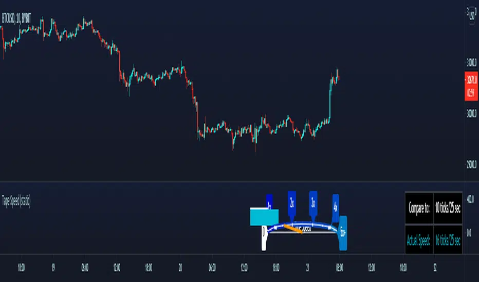
Tape Speed (static)Variation of my prior Tape Speed indicator.
This one lets you input the ticks per second value that you want to compare the real-time data to, and lets you skip the waiting time required in the other script to begin producing averages.
ex:
You want to compare the rate of incoming ticks to the speed of 10 ticks per 10 seconds. The indicator will automatically start the comparison with the live data, and display the speed on the table. It will also display the ratio (2x, 3x, 4x, etc.) of the real-time speed compared to the chosen input value on the speedometer and the horizontal (white, aqua) bars.
___________________________________________
Thanks again to user rumpypumpydumpy for giving me permission to use his semicircle logic from his "Speedometer Toolbox" to display my own data.
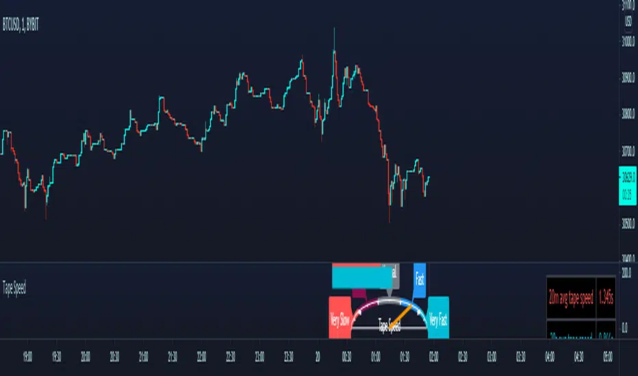
Tape SpeedChoose a long term averaging period (minutes) and a short term averaging period (seconds)
The indicator will begin loading ticks for the duration of the specified longer term averaging period.
ex: If the indicator is set to have a long term average of 10min, you must run the indicator for 10min first for it to begin its averaging process.
When the required duration of ticks have loaded, it will display the average time elapsed between each tick during that time.
It will also continue to read incoming ticks and calculate new averages once the initial load is finished.
The longer term average is displayed as a static red horizontal bar, the entire speedomter gauge, and the value is also explicitly stated in the top right corner with the table.
The blue bar, the needle, and the bottom row of the table are all representations of the shorter term period's average time between ticks.
The shorter term average is compared against the longer term average to determine whether the short term incoming orders are coming in more aggressively/less aggressively or normally compared to the longer period's average.
___________________________________________________________
Thanks to user rumpypumpydumpy for giving me permission to use his semicircle logic from his "Speedometer Toolbox" to display my own data.
[RS]Supertrend GridDynamic grid system based on supertrend.
note: the input nlines/nfractions are not locked so if values too high might start overlapping line objects.
safac-RSUthis is a indicator that shows the speed of price Not the movement of price
when this go up speed of price go up and when it go down speed of price go down
WT3 speedup[WOZDUX]=Velocity and acceleration of the CCIModification of the CCI indicator WT3.
1) three indicators in one window. "kluch2" includes display 2 additional lines.
2) you can calculate the indicator by closing price and you can calculate the volume price. The key is the "key" includes the calculations according to the bulk price.
3) "kluchperegib" shows inflection points
4) For the line with the period "n1" the width of the channel on which it moves is calculated. The channel helps to track the boundaries of fluctuations.The channel width is Set in the "lband" variable.
5)" obLevel1 " defines the critical levels for the cci indicator.
6) since the meaning of the cci indicator and its modification wt is that it is the speed of price movement. Calculate the acceleration of prices. the variable "nwt"is used for this purpose.
The lilac line shows the acceleration of the price. Acceleration used to warn us about the reversal of the movement.
The General line of the indicator and the acceleration line together give more accurate information about the market mood. If the acceleration falls from top to bottom in advance, then wait for a quick price reversal from top to bottom. If the acceleration starts to rise from the bottom up, then also wait for a turn from the bottom up.
---------------
Скорость и ускорение CCI .
Модификация индикатора CCI под названием wt.
1) три индикатора в одном окне. "kluch2" включает дисплей 2 дополнительных линий.
2) Вы можете рассчитать индикатор по цене закрытия, и вы можете рассчитать цену объема. Ключ "ключ" включает в себя расчеты по объемной цене.
3)" kluchperegib " показывает пункты перегиба
4) Для линии с периодом "n1" рассчитывается Ширина канала, по которому она движется. Канал помогает отслеживать границы колебаний.Ширина канала Задается в переменной "lband".
5) "obLevel1" определяет критические уровни для индикатора cci.
6) так как смысл индикатора cci и его модификации wt заключается в том, что это скорость движения цены. Рассчитаем ускорение цены. для этого используется переменная "nwt".
Сиреневая линия показывает ускорение цены. Ускорение раньше предупреждало нас о развороте движения.
Общая линия индикатора и линия ускорения вместе дают более точную информацию о настроении рынка. Если ускорение падает сверху вниз заранее, то ждите быстрого разворота цены сверху вниз. Если ускорение начинает подниматься снизу вверх, то также ждите разворота снизу вверх.

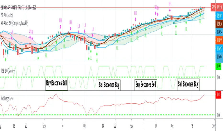
Arbitrage LevelThe hardest question to answer in trading is "should I be in this trade"
With the help of Arbitrage Level, We can answer that question on whatever time frame you would like to trade.
How it works:
Just like a carpentry level, we want to know when there is more momentum up or down. So using momentum indicator (our red line) we can not only measure how fast it's moving but also in what direction.
So if the red line crosses over the dotted green line a new up trend should be beginning. If it crosses under it's time to go to cash.
Enjoy!