Next Gen Auto S/RThis indicator will automatically plot support and resistance levels and will also allow you to overlay multi time frame support and resistance on any time frame that you are currently conducting analysis on. In addition you can also set alerts when a support and resistance level is tested, fine tune how many levels you would like to view on your charts, option to input how many candlesticks minimum you would like between support and resistance levels. You can also select breakout mode which will turn old support into resistance by a colour change and turn old resistance into support. NEW you can now use extended levels and change your zones into lines.
Supplylevel

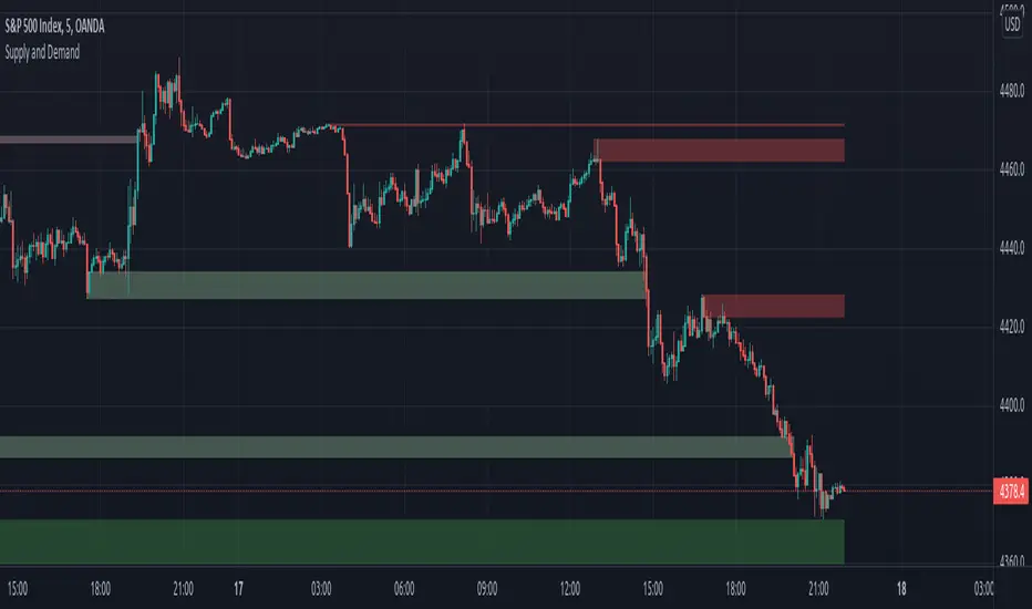
Supply and DemandOur Indicator “Supply and Demand” offers an insight into the structure of any given Instrument applied to. Understanding Supply and Demand is essential for using this Indicator. If you are familiar with the concept, then you will most likely find this indicator useful in your trading. If you are unfamiliar with the concept and are interested then continue reading a “Brief Concept of Supply and Demand” at the end of the description, where we will provide some informational Links.
This description will provide a High Level description of how our Indicator identifies and visualizes Supply and Demand, followed by how to use the Indicator in your trading. At the end we would like to introduce our team and experience.
High Level Description of “Supply and Demand”:
Our indicator searches for price zones where the current Instrument has experienced a significant liquidity imbalance in the recent relative past. Our indicator uses a Multi timeframe approach to identify these areas. These Zones will be referred to as “Active Zones” from now on.
When Price exceeds the outer boundary of the Active Zones, then this Supply or Demand Zone will be identified as “Expired”, and the zone is no longer in play. These Zones will be referred to as “Expired Zones” from now on.
Visualisation:
What do the Boxes mean:
Our Indicator visualises active Supply and Demand Zones. Supply zones are red and Demand Zones are green. Furthermore, our indicator shows a brief history of Expired Supply and Demand Zones. These Zones have the same color as the active Supply and Demand Zones, just with a higher color transparency so that you can distinguish between active and Expired Zones.
The boxes start at the time where the supply/demand has occurred historically, providing a simple method to review the Market reaction to the historic supply/demand event.
History:
Due to the high calculation effort, the history is limited to 20 Zones in total. All zones prior to that will not be displayed.
Important:
All Zones will not be repainted. That being said, once our indicator has started displaying a Zone, then it will be visible until it exceeds the 20 Zone history limit and “falls of” the chart.
How to use it:
Approaching an Active Supply/Demand Zone:
When price is approaching or entering an active Supply/Demand Zone, look for reversal patterns you are familiar with. It is important that you have a tested method behind your entry and exit strategy. Please note, that the indicator itself just presents price areas where there is a potential for a price reversal, and that these levels should not be traded blindly.
Expired Supply/Demand Zones:
Expired Supply and Demand Zones are mainly just to provide a small History of Supply and Demand Zones to you. There are more advanced concepts for also using Expired Supply and Demand Zones in your Trading, but this is not the focus of this Indicator.
Time frame:
This indicator is programmed to be used on all Timeframes.
Instruments:
This indicator aims to visualize areas of where Market price has the potential to reversal, hence this is a mean reverting Indicator.
Taking this statement to account, it is recommended to apply this Indicator to Instruments with a mean reverting character.
Examples of mean reverting markets could be for example …
...all FOREX instruments, as FOREX is considered a mean reverting Market.
...an instrument that is in a consolidation, or which you are expecting to enter a period of consolidation.
Indicator settings and configuration:
The Indicator has no functional parameters, to reduce User error, and only has visual parameters. The color of the Supply and Demand Zones can be tailored to your liking.
Brief concept of Supply and Demand:
Supply and Demand is a concept that has been around for a very long time. Following links are helpful to get a grasp of the concept:
en.wikipedia.org www.investopedia.com
www.investopedia.com
Our Team:
We are a team of 3 Traders with a combined experience of 40 years. We are using our experiences from the market to create Indicators to Visualize the most relevant Patterns to us in our trading today. Our goal is to reconstruct these patterns to match our understanding of the market and to simplify the process of creating reproducible trading Strategies.
Eric Smith Supply and Demand V3Supply Demand, look back limited for now until Tradingview supports arrays.
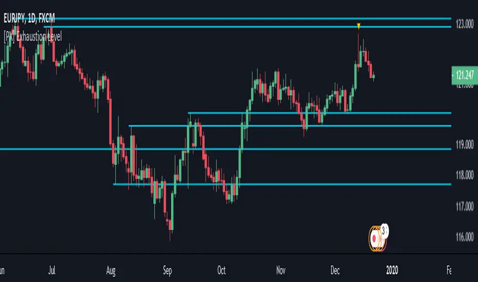
[PX] Exhaustion LevelHello guys,
I love to play around with different methods for detecting support and resistance level. So today here is a new approach, which could be interesting to a few of you. I call it exhaustion level.
I'll give a brief introduction on how the indicator works and leave the testing/applying to you.
How does it work?
The method is basically very simple. The indicator constantly keeps track of the difference between the current close and the VWAP. The detected value will then be normalized and therefore put into comparison to it's previous "n" candles. (You decide yourself which value will be used for "n" by setting the "Length" -parameter in the settings tab.)
Once the normalized value equals "1", the price movement is considered to be somewhat overheated and the indicator starts plotting a level at the current high. The level will continually change until the movement goes the opposite way. Then it will settle and change its color.
The same approach takes place when the normalized value reaches "0", this time plotting a level at the low.
I hope some of you will find it useful and if so, please leave a " like " :)
Have fun, happy trading and merry Christmas :)))
Supply and Demand ZonesSupply and Demand zones do offer a great insights into the structure of any market. If you have an idea of how to trade with support and resistance zones, you might find supply and demand zones very similar.
1. Focus on a price level (zone)
It’s difficult to analyze the market without a focal point. If you look for turning points at every price level, you will only find confusion.
How do you know which price level to focus on? Which price levels are potential market turning points?
2. Observe what happened (happens) at the potential support/resistance
Signs of strong demand
When the market tests a potential support, look out for:
Bullish price pattern
Inability to clear below the support
Increased volume
Congestion
Signs of strong supply
When the market tests a potential resistance, look out for:
Bearish price pattern
Inability to clear above the resistance
Increased volume
Congestion
Look for these price action signals in the past, as well as in real-time price action. The more signs you see, the more likely you’ve found a true support/resistance zone.

Demand and Supply Zones indicatorThis Script automatically marks Demand and Supply Zone on the chart

Fibonacci Moving Average (EMA/SMA) Bundle //@v1.2 Fibonacci Moving Average (EMA/SMA) Bundle
//By Tantamount
//Save your TV indicator use counts by using the Fibonacci SMA/EMA all in one indicator! Toggle between Exponetial or Simple moving averages functionality, using Fibonacci the sequence.
//Fib moving averages are very good at locating support and resistance zones on multiple time frames.
//Customize and or input your very own moving average nomenclature by simply changing the input options from default: SMA (21, 55, 89, 144, 233) or EMA (21, 55, 89, 144, 233) Example: (8,13,21,55,89)
Support and Resistance Lines
