OverbalanceOverbalance script tracks trend moves and biggest corrections in those moves.
Based on last trend extreme value (low or high) it can draw line symbolizing correction equal to
the biggest correction in that trend. It can track up to 20 independent (both up and down) trends on one chart.
Overbalance method works on an assumption that trend continues until we have correction bigger than the biggest existing correction in that trend. Comparing the historically biggest correction with the current one can give a warning signal.
There are markets and instruments for which the size of corrections is repeated, and tracking corrections in the trend can be used to predict the trend change moment. - Just remember that if something happened in the past it is not guaranteed that it will happen again.
This script can be used by ANY user. You DO NOT NEED to have PRO or PREMIUM account to use it.
Script settings:
Trend min change - Filter out price moves smaller than % of current price.
OB up - Showing overbalance in up trends
OB down - Showing overbalance in down trends
Historical with precision - Showing corrections moves that were equal to biggest previous correction in that trend with a given (%) precision.
OB prediction up - Showing overbalance threshold in current up trends
OB prediction down - Showing overbalance threshold in current down trends
OB Exceeded - Showing broken overbalance thresholds
Arrows - Showing overbalance thresholds with an arrows
(with labels) - Showing labels over overbalance threshold arrows
Price line - It draws a line at the price level, under the arrows.
Troubleshooting:
In case of any problems, send error details to the author of the script.
Trend

CARNAC Magic DCAThe "CARNAC Magic DCA" indicator is designed for investors looking for the best opportunities for Dollar-Cost Averaging (DCA).
How it works:
The Carnac Dynamic DCA Threshold calculates a dynamic threshold for DCA entries using Exponential Moving Average (EMA), Average True Range (ATR), and the maximum distance from the EMA over a full lookback period, aiding in identifying optimal buy opportunities. It also only signals a DCA buying opportunity after a bearish candle, which helps lower the average DCA price.
Configurable Inputs:
EMA Start Length: Sets the initial length for the series of EMAs, affecting their sensitivity to price changes.
ATR Length: Determines the period for the ATR calculation, influencing the dynamic DCA threshold's responsiveness to market volatility.
ATR Multiplier: Modifies the impact of the ATR on the DCA threshold, allowing for finer control over the threshold's sensitivity to volatility.
Start Calculation From: Enables setting a specific start date for calculations, tailoring the analysis to a particular trading period.
DCA Buy Signal Alert: Generates an alert when the price is below both the dynamic DCA threshold and the opening price, indicating a potential buy signal based on DCA strategy.
Ten EMAs: Carnac Magic DCA includes a ten EMA plot, which decrease in length from the user-defined starting length, offering a multi-layered trend analysis.
EMA Color Coding: The sequential arrangement of EMAs is visually represented through color coding, facilitating quick trend recognition.
Average Buy Price Analysis: Calculates and displays the average buy price and its percentage difference from the average closing price since the user-defined start date, helping assess the strategy’s effectiveness compared to traditional DCA methods (purchasing at the close of every candle).
Visual Indicators and Labels: Includes visual alerts for buy signals and informative labels showing average buy prices and related statistics.

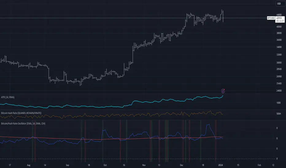
Bitcoin/Hash Rate Oscillator & MAWhat it does:
Finds the ratio of BTC price to the Hash Rate with an additional MA applied to find changes in volatility with relative context. Best used as a two lines cross indicator.
When the ratio of price to hashrate increases, it may be a sign miners cannot or will not sell as much.
When the ratio decreases, it may indicate miners have more capability and/or incentive to sell.
How it works:
The indicator uses a MA applied to the hashrate(first MA input), then finds the difference between it and the actual hash rate. Then it finds the STD of that to create an oscillating value. BTC is divided by said value. Then a second MA is applied to that ratio(second MA input)
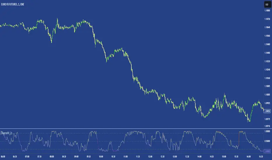
FX DispersionThis script calculates the dispersion of a basket of 5 FX pairs and then calculates the z-score the z-score is then made into a composite using the 30 and 60 ema of the z-score to smooth any noise. It must be used on one of the FX pairs in the basket and on the 1-minute timeframe as it has been hardcoded for 1 min use below.
Interpretation - Dispersion is a component of volatility - the dispersion of the underlying basket increases above 0.5 and decreases below 0.5.
Although increased dispersion is beneficial to momentum and trend-following strategies on the monthly and weekly timeframes. Observe this on the 1-minute timeframe and how dispersion crossing above/ below 0.5 it can signal reversion or momentum for the next period.
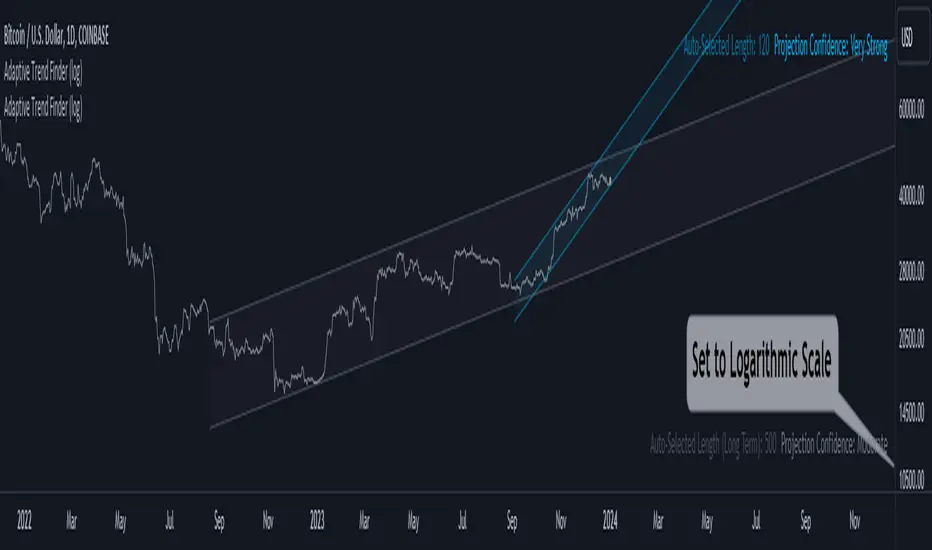
Adaptive Trend Finder (log)In the dynamic landscape of financial markets, the Adaptive Trend Finder (log) stands out as an example of precision and professionalism. This advanced tool, equipped with a unique feature, offers traders a sophisticated approach to market trend analysis: the choice between automatic detection of the long-term or short-term trend channel.
Key Features:
1. Choice Between Long-Term or Short-Term Trend Channel Detection: Positioned first, this distinctive feature of the Adaptive Trend Finder (log) allows traders to customize their analysis by choosing between the automatic detection of the long-term or short-term trend channel. This increased flexibility adapts to individual trading preferences and changing market conditions.
2. Autonomous Trend Channel Detection: Leveraging the robust statistical measure of the Pearson coefficient, the Adaptive Trend Finder (log) excels in autonomously locating the optimal trend channel. This data-driven approach ensures objective trend analysis, reducing subjective biases, and enhancing overall precision.
3. Precision of Logarithmic Scale: A distinctive characteristic of our indicator is its strategic use of the logarithmic scale for regression channels. This approach enables nuanced analysis of linear regression channels, capturing the subtleties of trends while accommodating variations in the amplitude of price movements.
4. Length and Strength Visualization: Traders gain a comprehensive view of the selected trend channel, with the revelation of its length and quantification of trend strength. These dual pieces of information empower traders to make informed decisions, providing insights into both the direction and intensity of the prevailing trend.
In the demanding universe of financial markets, the Adaptive Trend Finder (log) asserts itself as an essential tool for traders, offering an unparalleled combination of precision, professionalism, and customization. Highlighting the choice between automatic detection of the long-term or short-term trend channel in the first position, this indicator uniquely caters to the specific needs of each trader, ensuring informed decision-making in an ever-evolving financial environment.
WPO Modified [BackQuant]The Wave Period Oscillator (WPO), developed by Akram El Sherbini, is a sophisticated technical analysis tool that offers traders a dynamic way to interpret market cycles. Its design is inspired by the natural ebb and flow of markets, which often follow cyclical patterns driven by underlying economic, political, and psychological factors. The oscillator's unique contribution to market analysis lies in its ability to smooth out the "noise" inherent in daily price movements, thus providing a clearer view of the market's rhythmic fluctuations over time.
-----> Time Cycle Oscillators' in the IFTA Journal 2018 (page 66 - 77), as found below:
ifta.org
El Sherbini's WPO is grounded in the concept of wave period analysis, which suggests that financial markets move in waves or cycles. The oscillator translates these movements into a visual tool that oscillates above and below a central zero line. Peaks and troughs on the oscillator correspond to the crests and troughs of market price waves, providing a visual representation of the market's heartbeat.
The WPO is not merely a tool for identifying trends but also for detecting shifts in market momentum. It does this through a mathematical model that measures divergence—when the direction of the oscillator deviates from the direction of price movement. Such divergences can be precursors to potential reversals or continuations in the market, offering traders advance notice of significant changes in price direction.
Further refining its utility, the WPO incorporates methods for calculating divergence that are sensitive to the unique conditions of different markets and securities. This includes adjusting for volatility and market velocity, allowing the oscillator to provide relevant signals regardless of the market environment.
In practical terms, traders use the WPO to time their entries and exits with greater precision. When the oscillator shows a high peak or a deep trough, it can signal that a market is potentially overbought or oversold, respectively. The WPO's smoothing property ensures that these signals are not just reactionary to short-term price spikes or drops, but indicative of more substantial, sustained movements.
By providing a more measured and smoothed analysis of market cycles, the WPO helps to filter out insignificant price movements and focus on the ones that matter—those that indicate a significant wave of buying or selling pressure. This can be particularly valuable in the cryptocurrency markets, where volatility is high, and traditional indicators may struggle to provide clear signals.
For traders and analysts alike, the Wave Period Oscillator represents a convergence of technical precision and market psychology. By focusing on the periodic nature of market movements, it aligns traders with the rhythm of the markets, potentially leading to more harmonious trading decisions that are in step with the market's natural waves.
Please see the backtest here:
For more simple terms:
You can use this indicator as a the oscillator
Above 0 for long
Below 0 for short
OR
WPO MA
Above 0 for long
Below 0 for short

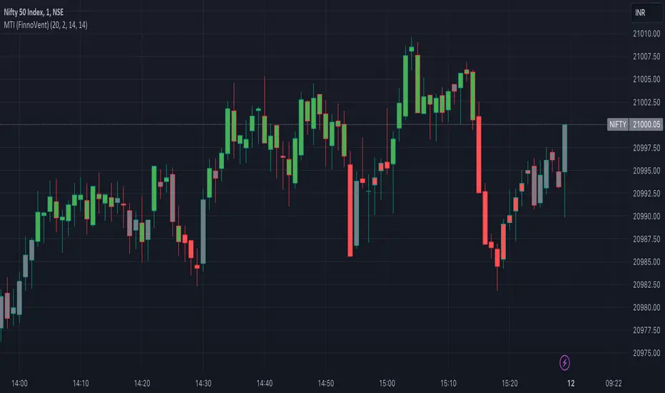
Market Trend Indicator (FinnoVent)The Market Trend Indicator (FinnoVent) is a comprehensive trading tool designed to provide clear visual cues for market trends on TradingView charts. This indicator combines the principles of Exponential Moving Averages (EMAs), Bollinger Bands, the Average Directional Index (ADX), and the Relative Strength Index (RSI) to offer a nuanced view of market movements.
How It Works:
Trend Identification with EMAs: The indicator uses two EMAs (3-period and 30-period) to identify the primary trend. An upward trend is signaled when the 3-period EMA crosses above the 30-period EMA, while a downward trend is indicated when the 3-period EMA crosses below the 30-period EMA.
Sideways Market Detection: To identify sideways trends, the indicator employs Bollinger Bands, ADX, and RSI. A sideways (or consolidating) market condition is identified when:
The price is between the middle 60% of the Bollinger Bands (avoiding the top and bottom 20%).
The ADX is below 30, indicating a lack of a strong trend.
The RSI is between 40 and 60, suggesting a neutral market momentum.
Visual Representation:
Bar Colors: The indicator colors the price bars on the chart based on the identified trend:
Green Bars: Indicate an upward trend.
Red Bars: Indicate a downward trend.
Grey Bars: Indicate a sideways or consolidating market.
How to Use:
Trend Following: Use the colored bars as a guide for trend following. Green bars suggest a potential entry for a long position, while red bars may indicate opportunities for short positions.
Sideways Market Caution: Grey bars signal a sideways market. In such conditions, traders might exercise caution and avoid trend-following strategies, as the market lacks a clear direction.
Complementary Analysis: While the Market Trend Indicator (FinnoVent) provides valuable insights, it's recommended to use it in conjunction with other forms of analysis (like fundamental analysis, other technical indicators, or price action) for comprehensive decision-making.
Suitable for: This indicator is versatile and can be applied to various timeframes and trading instruments, including stocks, forex, commodities, and indices.
Important Notes:
The indicator is designed to minimize repainting but always consider the latest data for the most accurate analysis.
Like all indicators, it is not foolproof. It works best when combined with a solid trading plan and risk management strategies.
Digital Market Insight's Dream IndicatorWhy the Digital Market Insight’s Dream Indicator Blends Sixteen Technical Indicators
Analyzing markets can be overwhelming with so many technical indicators available. Choosing the right ones and combining them effectively can be a challenge. This indicator simplifies this by leveraging the power of collaboration.
Unleashing the power of automation, Digital Market Insight's Dream Indicator simplifies both day trading and long-term investing by automatically generating buy and sell signals.
This user-friendly indicator simplifies everything, making it easy to identify profitable trades where other indicators usually fall short.
Instead of relying on a few popular indicators, the Digital Market Insight’s Dream Indicator incorporates sixteen diverse metrics. Each offers unique insights into different aspects of market behavior, giving you a complete picture that goes beyond what any single indicator can provide.
Combining indicators that analyze trends, momentum, volume, and volatility allows you to see the market from different angles. This combination creates a powerful tool that can uncover opportunities missed by traditional indicators.
Digital Market Insight’s Dream Indicator uses sophisticated algorithms to balance the influence of each individual indicator. This ensures that no single metric dominates the analysis, providing a more objective perspective.
In short, Digital Market Insight’s Dream Indicator makes the complex task of choosing and combining indicators seamless and automated. This allows traders of all experience levels to benefit from powerful technical analysis, unlocking potentially profitable opportunities they might have missed otherwise.
Leveraging sixteen popular technical indicators, the Dream Indicator from Digital Market Insight meticulously dissects trends, momentum, volume, and volatility to offer comprehensive market insights. Inspired by the Relative Strength Index (RSI), it scales these indicators and identifies breakouts with optimized overbought and underbought thresholds. This combined data is compared to the security, generating a divergence line. The line's magnitude and speed are monitored, leading to the creation of buy and sell signals.
The following is a list of the sixteen indicators that it tracks:
• Parabolic SAR
• Directional Movement Index
• Chande Momentum Oscillator
• Commodity Channel Index
• Volume-Weighted Average Price
• On-Balanced Volume
• Money Flow Index
• Relative Strength Index
• Moving average convergence divergence
• Bollinger Band
• Stochastic
• True Strength Index
• Chaikin Money Flow
• Williams %R
• Sentiment
• Supertrend
While the combination of technical indicators is intriguing, the Dream Indicator's true power lies in its dynamic false signal suppression settings. This system can adapt to frequent market changes in real-time, allowing for a nuanced understanding of market direction. Imagine a rapid price swing triggered by a news announcement. While other indicators provide static signals, the Dream Indicator takes a dynamic approach. By offering multiple adjustable factors, it allows users to customize the indicator to their specific needs and preferences, potentially revealing deeper insights into market trends.
The following is the list of suppression settings:
• Suppress Using an SMA Window? Size?
This suppresses when the security price varies outside a simple moving average window. The window size can be adjusted.
• Suppress Using Supertrend Direction? Factor?
This suppresses when the Supertrend’s direction, increasing or decreasing, is contrary to the security’s gain. The Supertrends factor can be adjusted.
• Suppress Using Security ROC? ROC?
This suppresses when the security’s rate of change (ROC) is above a selectable value.
• Suppress Unfavorable Convergence/Divergence?
The buy alert is suppressed when the faster exponential moving average is less than the slower exponential moving average for both the sentiment and standard MACD. The sell alert is suppressed when the slower exponential moving average is less than the faster exponential moving average for both the sentiment and standard MACD.
• Suppress Unfavorable Trending Sentiment?
This suppresses buy alerts when the sentiment value is lowering and its value is currently below zero. This suppresses sell alerts when the sentiment value is rising and its value is currently above zero.
• Suppress Using Contrary Accumulated Forecast?
Suppress when the combined buy/sell signal is contrary to the security trend.
• Don’t Suppress First Alert?
Always Display First Alert.
How to use:
1. Activate the Indicator:
• Add the Digital Market Insight’s Dream Indicator.
• Select a security.
• Adjust the Alert Frequency, if desired.
• Configure the ATR Multiplier for optimal trailing stop orders, if desired.
2. Set audible alerts, if desired:
1. Select a security and adjust settings if you haven’t yet.
2. Select Alert at the top of the TradingView window or press + .
3. Select Digital Market Insight’s Dream Indicator across from Condition.
4. Select Alert for Buy across from Condition.
5. Select Once Per Bar Close across from Trigger.
6. Select Notifications at the top of the Create Alert window.
7. Select the Play sound checkbox.
8. Select the Create button at the bottom of the Create Alert window.
9. Repeat steps 2–8, substituting Alert for Sell in step 4.
3. Watch displayed information for opportunities:
• Circle Alerts: Green circles indicate buy signals, red ones signal sell opportunities. Larger circles are audible, providing immediate trading prompts.
• SMA Gain: This metric reflects the average profit potential per trade, assuming a sideways trend.
4. Utilize False-Signal Suppression:
• Select the appropriate false-signal suppression methods based on your trading strategy and risk tolerance.
• Monitor the SMA Gain and Circle Alerts as you adjust these settings to see their impact.
• Eliminate misleading signals and gain a clearer picture of the market.
5. Combine with Other Indicators:
• Consider displaying the Sentiment MACD and Divergence RSI for further insights.
• Utilize these additional indicators alongside Dream Indicator's signals for a more comprehensive analysis.
The following describes the displayed information and how to use it. It is in three levels: location/displayed text/description.
Upper Left/Week:/
Displays week gain.
Upper Left/Day:/
Displays day’s gain.
Upper Left/SMA:/
Displays SMA’s gain. The SMA gain is calculated from the average difference between the buy and sell alerts and a simple moving average. This makes it easy to compare differences between securities and setting changes. Basically, the SMA gain is the average profit that can be expected from a single buy sell trade, assuming that the security is trending sideways. Note: With a free TradingView account, the data will be limited, and therefore this value will be less accurate.
Upper Center/Misc. text/
A variety of security information is displayed here, including description, country, type, sector, and industry. The analyst's recommendation is also displayed when selected in the settings section.
Upper Right/ #🕪⚠:/
Displays number of audible alerts. This shows how many audible alerts you’ll get per day on average for the selected security. You will see this number change as you adjust the Alert Frequency setting in the indicator settings section.
Lower Right/ ATR × X.X:/
Displays the Average True Range (ATR) multiplied by a multiplier that is located in the indicator settings section. The upper and lower ATR values are also displayed. The Average True Range is a measure of price volatility and can be used for things like trailing stop orders. Place your stop-loss order a multiple of the ATR below your entry price for long trades and above your entry price for short trades. This will give your trade some room to breathe while still protecting you from significant losses. Adjust the multiple based on market volatility. In more volatile markets, use a larger multiple to account for potentially wider price swings.
The following is a description of important items in the indicator settings section:
--- MISC. SETTINGS ---
Alert Frequency
Alert Frequency will increase or decrease both the displayed alerts and audible alerts. This is one of the more important indicator settings and should be adjusted according to your investing style. If you have a large number of active alerts, you may want to reduce the alert frequency to avoid being overwhelmed. However, if you set this too low, you may miss some trading opportunities.
ATR Multiplier
The ATR multiplier is a multiplier for the Average True Range which is described above. It can help with finding trailing stop order values.
Use Sentiment Coloring
This changes the color of some graphs to a color gradient, indicating the security's sentiment, and may help you identify trend changes.
Sentiment Calc Index
This setting mainly affects the sentiment color scheme and the displayed sentiment graph. Adjust it to match the index in which the security is traded. You can find it at the top left of the TradingView window.
Display Analyst’s Recommendations
This will display the analyst's recommendations and could be handy when unsure whether a security is worth investing in. :-)
--- GRAPH DISPLAY SETTINGS ---
These are additional graphs that can be displayed and can be a valuable addition to your investing. Consider displaying the Sentiment MACD and the Divergence RSI which are both variations of the standard MACD and RSI indicators.
--- FALSE ALERT SUPPRESSION ---
These settings will allow suppression of false signals and are an important feature of this indicator. They will manipulate the gain. Watch the displayed SMA Gain and Circle Alerts as you toggle some of these settings. Some Circle Alerts will appear or vanish, and the SMA Gain will change. Remember, the larger circle alerts are the only ones that will be audible. Both small and large circles indicate a buy or sell alert: green for buy and red for sell.
Disclaimer:
This is not Investment Advice. Trading involves inherent risks, and all decisions should be made at your own discretion.

Cloud Channel Indicators [Quantigenics]The "Cloud Channel Indicators " script forms an integral part of a sophisticated trading approach, offering in-depth market analysis through its High Precision Oscillator and Trend Bias Indicator. These components provide traders with nuanced insights into market momentum and overall trend direction, making them invaluable for informed trading decisions. This script is further enhanced when used alongside its intended counterpart, the "Cloud Channel Signals " script, which displays the “cloud” indicator and Buy/Sell signals on charts. This combination creates a comprehensive and integrated trading system, suitable for various market conditions and trading styles.
The "Cloud Channel Indicators” script is a detailed trading indicator that merges advanced data analysis techniques with user-customizable features. It combines oscillators, dynamic levels, trend bias, and color settings, allowing users to tailor its functionality and visual representation. Unique to this script is its use of Gaussian and Rational Quadratic kernel estimates for data smoothing, enhancing the calculation of oscillator values. It dynamically adjusts OverBought and OverSold levels based on the oscillator's behavior and leverages array operations for tracking market peaks and lows. The script also integrates a Trend Bias indicator using highest highs, lowest lows, and exponential moving averages (EMAs), all of which are displayed through a range of plotting and visual elements. This synthesis of sophisticated techniques provides a multifaceted tool for technical market analysis.
As with all of our scripts, the "Cloud Channel Indicators"script, is designed to work on ANY symbol and time frame. The input parameters can be adjusted to fit your specific trading style.
Technical Composition :
High Precision Oscillator : This component focuses on capturing market momentum and identifying critical turning points. It uses advanced kernel-based estimations combined with a unique oscillator line and signal line setup to pinpoint market extremes, offering traders insights into potential entry and exit points.
Trend Bias Indicator : This indicator offers a broad view of the market's overall direction. It employs a combination of high and low-price averages, smoothed with an EMA, to indicate the prevailing market trend. The indicator is essential for verifying and complementing the insights provided by the High Precision Oscillator, ensuring that trades align with the broader market trend.
How to Use :
Integration with "Cloud Channel Signals" Script : For optimal use, synchronize this script with the "Cloud Channel Signals " script. This is essential for the script to provide meaningful analysis and insights.
Please note: The signals and cloud indicator displayed in this screenshot are part of the companion 'Cloud Channel Signals' script, which is not included in the 'Cloud Channel Indicators' script you are currently viewing.
The 'Cloud Channel Signals' script can be found here:
Analyzing Market Momentum with High Precision Oscillator : Utilize the High Precision Oscillator to identify market momentum and critical turning points. Look for extreme values on the oscillator line and signal line to pinpoint potential entry and exit points.
Understanding Market Trend with Trend Bias Indicator : Use the Trend Bias Indicator to get a broad view of the market's overall direction. This indicator helps confirm the insights provided by the High Precision Oscillator, aligning trades with the market trend.
Customizing Indicator Settings : Tailor the script to your trading style by adjusting the input parameters such as Oscillator Length, Trend Bias Length, and levels for top and bottom bounds. Ensure these settings match those in the "Cloud Channel Signals" script.
Interpreting Oscillator and Trend Bias : Monitor the High Precision Oscillator for overbought or oversold conditions. Use the Trend Bias Indicator to determine if the market is in an uptrend or downtrend and align your trades accordingly.
Using Dynamic Levels : Activate the Dynamic Level feature for an adaptive analysis that adjusts to current market conditions.
Visual Analysis : Pay attention to the color changes and histogram patterns in the script's visualization to quickly assess market conditions and momentum.
Risk Management : Combine these insights with proper risk management strategies, adjusting positions based on oscillator extremes and trend bias indications. Additionally, further risk management and stop loss levels are provided when used with the "Cloud Channel Signals” script (see description for "Cloud Channel Signals”)
Input Parameter Settings :
Important Usage Guidance : For seamless integration with its counterpart, the "Cloud Channel Signals" script, it's crucial to align the input parameter settings across both scripts. When adjusting values from their defaults, ensure that corresponding parameters in both scripts are identically set. This synchronization is key to achieving a cohesive and accurate representation on your charts.
Show Indicator Name (ShowName) : Toggles the display of the indicator names on the chart.
Show Oscillator Indicator (ShowOscillator) : Controls the visibility of the High Precision Oscillator.
Oscillator Length (OscillatorLength) : Sets the period for the oscillator's kernel estimation.
Top Level and Bottom Level (TopLevel, BottomLevel) : Defines the upper and lower bounds for the oscillator, indicating overbought and oversold conditions.
Dynamic Level Toggle (Dynamic_Level_OnOff) : Enables the use of dynamic levels for more adaptive analysis.
Show Trend Bias Indicator (ShowTrendBias) : Toggles the display of the Trend Bias Indicator.
Trend Bias Length (TrendBiasLength) : Adjusts the calculation period for the Trend Bias Indicator.
Show Peak/Valley EMA Lines (ShowEmaLines) : Controls the display of additional EMA lines for peak and valley analysis.
Color Customization : Offers options to customize the color of various elements like Top Level, Bottom Level, Zero Line, and more. These parameters provide traders with extensive control and customization of the indicators, allowing for tailored analysis and application in various market conditions and trading styles.
The "Cloud Channel Indicators " script is a versatile and advanced tool designed for traders who seek a deep understanding of market trends and momentum. Its combination of the High Precision Oscillator and Trend Bias Indicator offers a multi-dimensional view of market behavior. The scripts was designed and intended to be used with the "Cloud Channel Signals " script, which complements the "Cloud Channel Indicators" by showing the “cloud” indicator as well as Buy/Sell signals on the charts.
Traders are advised to familiarize themselves with the functionalities of these indicators for effective application in their trading strategies. As with all trading tools, remember that trading involves risk and past performance is not indicative of future results.
You can see the “Author’s instructions" below to get immediate access to Cloud Channel Indicators & the rest of the “Quantigenics Premium Indicator Suite.
GOLD MonitorI'm using this platform from sometime and I carry out trading on Gold, using a kind of scalping strategy.
Scalping is not an easy task to do. Personally I found a lot of problems while detecting the trend direction.
So I decided to develop an indicator that is capable, in a discrete way, to give an instant-view on the market that is interesting.
This indicator can summarize in a small table all interesting figures related to gold scalping trading and is useful while joined with technical and fundamental analysis.
In this way it is possible to easy take under control all important aspects related to gold trading that I summarize here and you can find inside the table:
1) Gold / USD current direction
2) USD dollar strength (instant DXY) indicator take under consideration the DXY value every each tick and measures the increase or decrease in percentage. If there is a decrease the indicator displays a red low arrow, if there is an increase the indicator displays a green high arrow
also Gold friends are important so it is possible to find also:
3) NZDUSD (that is a Gold friend) variation percentage. If there is a decrease the indicator displays a red low arrow, if there is an increase the indicator displays a green high arrow
4) AUDUSD (that is a Gold friend) variation percentage. If there is a decrease the indicator displays a red low arrow, if there is an increase the indicator displays a green high arrow
then it is possible to find DXY USD dollar strength calculated between previous period (e.g. in timeframe M5 last 5 minutes) and current period (current 5 minutes). This indication is represented by an high arrow if there has been an increase, or by an low arrow if there has been a decrease.
Last but not least the information about the Gold trend itself with the possible forecast for the current period. This information must be carefully interpreted together with other instruments for technical analysis like Fibonacci lines.
Multi-Timeframe EMA Tracker by Ox_kaliThis script is an advanced trend analysis indicator crafted for traders who seek a detailed and customizable view of market trends across multiple timeframes. This tool utilizes exponential moving averages (EMAs) to offer insights into market direction and momentum.
Key Features:
Multi-Timeframe Analysis: MTEMA-Tracker covers a wide range of timeframes, including 1, 2, 3, 5, 10, 15, 30 minutes; 1, 2, 4, 6, 12 hours; 1 day; and 1 week. This allows traders to analyze market trends from various perspectives, from short-term fluctuations to longer-term movements.
EMA-Based Trend Determination: The indicator employs two EMAs (50 and 200 periods) for each timeframe to ascertain the market trend. A higher EMA50 compared to EMA200 indicates an uptrend, while the opposite scenario suggests a downtrend.
User-Defined Trend Colors: Traders can personalize the appearance of the trend lines with custom colors for upward and downward trends, enhancing visual clarity and quick interpretation.
Selectable Timeframe Display: MTEMA-Tracker by Ox_kali offers the flexibility to choose which timeframes to display, enabling traders to focus on the most relevant data for their trading strategy.
Average Trend Calculation: A unique feature of MTEMA-Tracker is its ability to compute the average trend across all selected timeframes, providing a holistic view of the market's general direction.
List of Parameters:
Color of the trend: Customizable color settings for both upward and downward trends.
Settings for the Lengths of the EMAs: Options to set the lengths of the short and long-term EMAs.
Display Options for Each Timeframe's EMA Trend: Ability to activate or deactivate the display of EMAs for each selected timeframe.
Indicators and Financial Name Label settings: To ensure maximum clarity and understanding of the displayed trends, users should not hesitate to use the function to display "indicators and financial name labels" in their settings. This feature will help in identifying the legends for each trend, making it easier to interpret the market direction for the selected timeframes.
Please note that the MTEMA-Tracker is not a guarantee of future market performance and should be used in conjunction with proper risk management. Always ensure that you have a thorough understanding of the indicator’s methodology and its limitations before making any investment decisions. Additionally, past performance is not indicative of future results.
Rainbow Fibonacci Momentum - SuperTrend🌈 "Rainbow Fibonacci Momentum - SuperTrend" Indicator 🌈
IMPORTANT: as this is a complex and elaborate TREND ANALYSIS on the graph, ALL INDICATORS REPAINT.
Experience the brilliance of "Rainbow Fibonacci Momentum - SuperTrend" for your technical analysis on TradingView! This versatile indicator allows you to visualize various types of Moving Averages, including Simple Moving Averages (SMA), Exponential Moving Averages (EMA), Weighted Moving Averages (WMA), Hull Moving Averages (HMA), and Volume Weighted Moving Averages (VWMA).
Each MA displayed in a unique color to create a stunning rainbow effect. This makes it easier for you to identify trends and potential trading opportunities.
Key Features:
📊 Multiple Moving Average Types - Choose from a range of moving average types to suit your analysis.
🎨 Stunning Color Gradient - Each moving average type is displayed in a unique color, creating a beautiful rainbow effect.
📉 Overlay Compatible - Use it as an overlay on your price chart for clear trend insights.
With the "Rainbow Fibonacci Momentum - SuperTrend" indicator, you'll add a burst of color to your trading routine and gain a deeper understanding of market trends.
HOW IT WORKS
MA Lines:
MA - 5: purple lines
MA - 8: blue lines
MA - 13: green lines
MA - 21: yellow lines
MA - 34: orange lines
MA - 55: red line
Header Color Indicators:
Purple: MA-5 is in uptrend on the chart
Blue: MA-5 and MA-8 are in the uptrend on the chart
Green: MA-5, MA-8 and MA-13 are in the uptrend on the chart
Yellow: MA-5, MA-8, MA-13 and MA-21 are in the uptrend on the chart
Orange: MA-5, MA-8, MA-13, MA-21 and MA-34 are in the uptrend on the chart
Red: MA-5, MA-8, MA-13, MA-21, MA-34 and MA-55 are in the uptrend on the chart
Red + White Arrow: All MAs are correctly aligned in the uptrend on the chart
Footer Color Indicators:
Purple: MA-5 is in downtrend on the chart
Blue: MA-5 and MA-8 are in the downtrend on the chart
Green: MA-5, MA-8 and MA-13 are in the downtrend on the chart
Yellow: MA-5, MA-8, MA-13 and MA-21 are in the downtrend on the chart
Orange: MA-5, MA-8, MA-13, MA-21 and MA-34 are in the downtrend on the chart
Red: MA-5, MA-8, MA-13, MA-21, MA-34 and MA-55 are in the downtrend on the chart
Red + White Arrow: All MAs are correctly aligned in the downtrend on the chart
Background Colors:
Light Red: All MAs are on the rise!
Red: All MAs are align correctly on the rise!
Light Green: All MAs are in freefall!
Green: All MAs are align correctly in freefall!
Tiny Arrows Indicators/Alerts:
Down Arrow: All MAs are in freefall!
Up Arrow: All MAs are on the rise!
Big Arrows Indicators/Alerts:
Down Arrow: All MAs are align correctly in freefall!
Up Arrow: All MAs are align correctly on the rise!
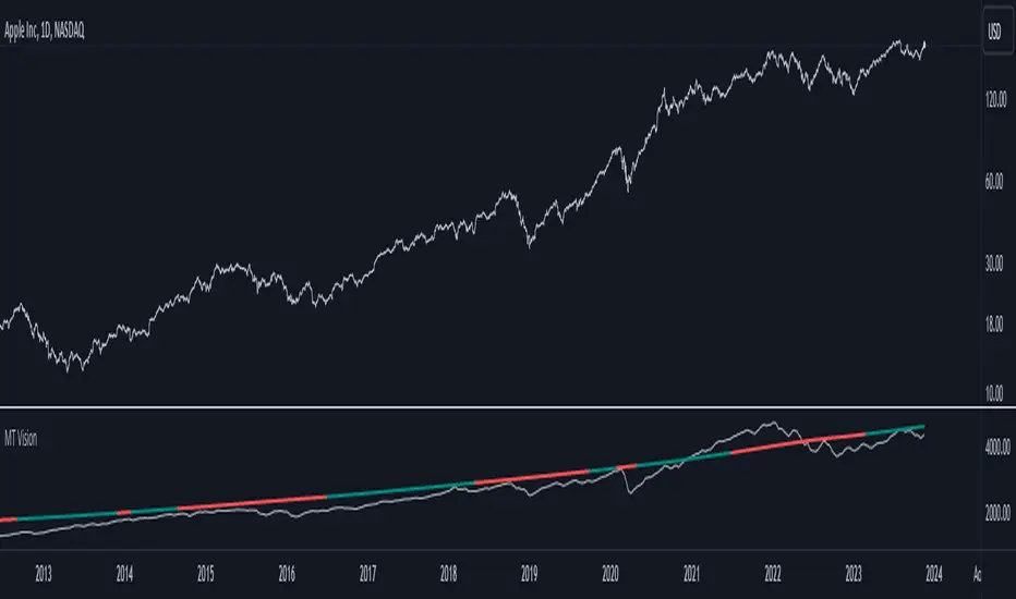
MacroTrend VisionThe "MacroTrend Vision" indicator is crafted with a singular goal – to provide traders with a quick and insightful snapshot of a country's global index. Seamlessly combining macroeconomic and technical perspectives, this tool is designed for those seeking a straightforward yet comprehensive overview. Let's explore the key features that make the "MacroTrend Vision" a valuable asset for traders looking to grasp both the big-picture economic context and technical nuances.
1. Long-Term Vision with Weekly Periods:
Gain a genuine long-term perspective with the ability to process 2500 weekly periods. This feature ensures a holistic understanding of global indices from both macroeconomic and technical viewpoints.
2. Composite Leading Indicator (CLI) Conditions:
Integrate both macroeconomic trends and technical signals through Composite Leading Indicator (CLI) conditions derived from the Relative Strength Index (RSI), offering a comprehensive outlook for informed decision-making.
3. Deviation Bands for Volatility Analysis:
Refine market analysis with strategically integrated deviation bands (0.2 and 0.4) based on smoothed linear regression. Anticipate volatility and potential trend shifts, aligning macro and technical insights.
4. Logarithmic Scale Transformation:
Enhance precision in understanding price movements with a logarithmic scale transformation, especially beneficial for assets with exponential growth patterns.
5. Separated Window for Easy Navigation:
Streamline your analysis with a user-friendly design – a separated window allowing easy navigation through different symbols without altering indicator settings.
6. Alert System for CLI Conditions:
Stay informed about critical shifts with an alert system for both long and close conditions based on the RSI of the CLI. Even during periods of limited chart monitoring, this feature keeps you connected to macroeconomic and technical changes.
In essence, the "MacroTrend Vision" is your go-to tool for a balanced view, simplifying the complexities of global indices with a blend of macroeconomic insights and technical clarity.
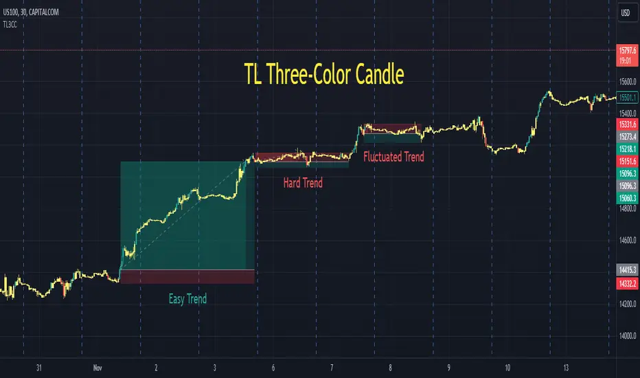
TL Three-Color CandleA traditional candle only has two colors, either green or red. A TL candle goes one step further, it has three colors: green for bullish (perfectly bullish), red for bearish (perfectly bearish), and yellow for ranging (wake-up, sleeping). A green TL candle means that its close is not only higher than its open but also higher than previous close, previous open and especially previous high, among other conditions. In the other extreme, a red TL candle indicates that its close is not only lower than its open but also lower than previous close, previous open and especially lower than previous low, among other conditions. TL candle does its best to tackle the trap of going against the trend: short when the price seems to be high in an uptrend or buy when the price seems to be low in a downtrend.
Parameters:
Volume Active Percentile % , Min Height Percentile of Bullish/Bearish Candle % . (Intraday)
Back Two Candles . (Intraday, day and above)
Usage:
After adding TL3CC to the chart, find Visual Order or Object Tree and bring TL3CC forward to be above the chart candle.
While a bullish trend includes green and yellow TL candles, a bearish trend includes red and yellow ones. It is the best to enter after the first bullish/bearish TL candle of each trend. It is extremely important, never ever try to go against TL candle.
There are many cases when red and green TL candles are twisted and we could have profit in both directions. It is the time that market is fluctuating strongly. We enter when TL candle has one color, but it changes to the opposite color after that as the price pulls back. In those cases, be calm and patient to wait for the first reversal to exit, it should come.
Markets: Developed and tested on: US100. Timeframes: Developed and tested on: 30m.
Multi-TrendMulti-Trend is an indicator that simplifies the task of tracking market trends across up to 10 custom timeframes. With the flexibility to select your preferred timeframes, with current or any specific data in past, this indicator offers a clear visual representation of the market's direction.
For each chosen timeframe and history, Multi-Trend provides a straightforward arrow-based signal system: an upward arrow signifies a rising market, a downward arrow indicates a falling market, and a right arrow denotes a market at equilibrium. These default symbols can be effortlessly personalized to your choice of symbols or text, allowing you to tailor the indicator to your specific needs.
The trend direction is calculated using a reliable methodology based on the percentage change in the close price for the selected timeframe.

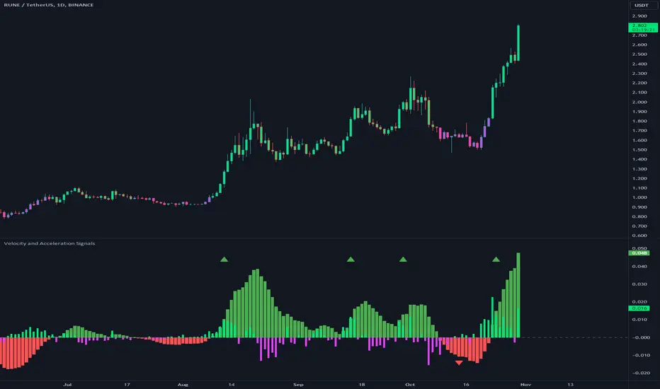
Velocity and Acceleration SignalsThe "Velocity and Acceleration Signals" indicator is a versatile tool designed to provide traders with valuable insights into price momentum and acceleration. By harnessing the power of mathematics and visualization, this indicator helps traders make informed decisions in the fast-paced world of financial markets.
Crunching the Numbers: How It Works
At its core, the indicator relies on two key concepts: velocity and acceleration. Here's how it operates:
-- Velocity Calculation : The indicator takes a step back in time, considering a user-defined historical period (typically around 14 bars). It calculates the velocity of price movements during this period. Velocity represents the speed at which an asset's price is changing and is derived by examining how much the price has moved between bars. Specifically, it computes the rate of change in price over time.
-- Acceleration Calculation : Building upon velocity, the indicator goes one step further and calculates acceleration. Acceleration signifies how quickly the velocity is changing. It quantifies whether the price is speeding up or slowing down in its ascent or descent.
-- Smoothing with EMA : To enhance clarity and reduce noise, the indicator smooths the velocity using an Exponential Moving Average (EMA) with a user-defined length. This smoothed velocity provides a more comprehensive view of the price momentum trend.
Visualizing Market Dynamics
The indicator doesn't just crunch numbers; it also paints a vivid picture of market sentiment:
-- Coloration : The indicator employs a color scheme to visualize market conditions. It uses lime for positive acceleration and fuchsia for negative acceleration. The color green represents positive smoothed velocity, while red denotes negative smoothed velocity. A gray hue signals a neutral or transitional phase.
-- Plotting Velocity and Acceleration : The indicator provides visual representations of both smoothed velocity and acceleration. Smoothed velocity is depicted as columns, with green or red coloring indicating the direction. Acceleration is displayed as a histogram, with lime or fuchsia bars showcasing bullish or bearish momentum. A gray zero line offers a reference point for changes in momentum direction.
-- Strong Up and Strong Down Conditions : For traders seeking distinctive signals, the indicator identifies "Strong Up" and "Strong Down" conditions. A "Strong Up" occurs when smoothed velocity crosses above a user-defined threshold, coupled with positive acceleration. Conversely, a "Strong Down" emerges when smoothed velocity crosses below another threshold, accompanied by negative acceleration. These conditions are marked with prominent triangular shapes.
Unlocking Trading Potential
Now, let's explore how traders can leverage the indicator:
-- Trend Confirmation : Traders can use this indicator to validate the prevailing market trend. A robust smoothed velocity, combined with acceleration in the same direction, can confirm the current trend.
-- Contrarian Signals : Extreme conditions signaled by a strong crossover or crossunder of the smoothed velocity threshold, along with appropriate acceleration, can hint at potential trend reversals.
-- Divergence Analysis : Savvy traders can employ this indicator to identify divergences between price movements and momentum. If the price exhibits higher highs while the indicator shows lower highs (or vice versa), it may signify a weakening or strengthening trend.
Navigating Limitations
As with any trading tool, it's essential to acknowledge the indicator's limitations:
-- Lookback Period : The indicator's effectiveness may vary based on the chosen historical period. Longer periods smooth out fluctuations but may lag in capturing recent changes in sentiment.
-- Threshold Sensitivity : Interpreting threshold crossovers or crossunders can be subjective. Traders should carefully fine-tune these threshold values based on their trading strategy and market conditions.
-- Context Matters : The indicator focuses solely on velocity and acceleration signals and does not incorporate other critical factors such as trading volume, market news, or fundamental analysis. Therefore, traders should use it in conjunction with additional indicators and analysis techniques.
While the primary focus is on trend and momentum analysis, this indicator indirectly provides information about volatility as well. Rapid changes in velocity and acceleration can indicate increasing volatility in the market, which may be of interest to traders looking for opportunities during volatile conditions.
However, this indicator doesn't directly measure volume. To incorporate volume analysis into your trading strategy, you may want to combine this indicator with volume-based indicators or consider other tools specifically designed for volume analysis.
In conclusion, this indicator is a valuable ally for traders looking to decode market dynamics and make data-driven trading decisions. While it offers powerful insights, it's crucial to recognize its limitations and deploy it as part of a comprehensive trading strategy.
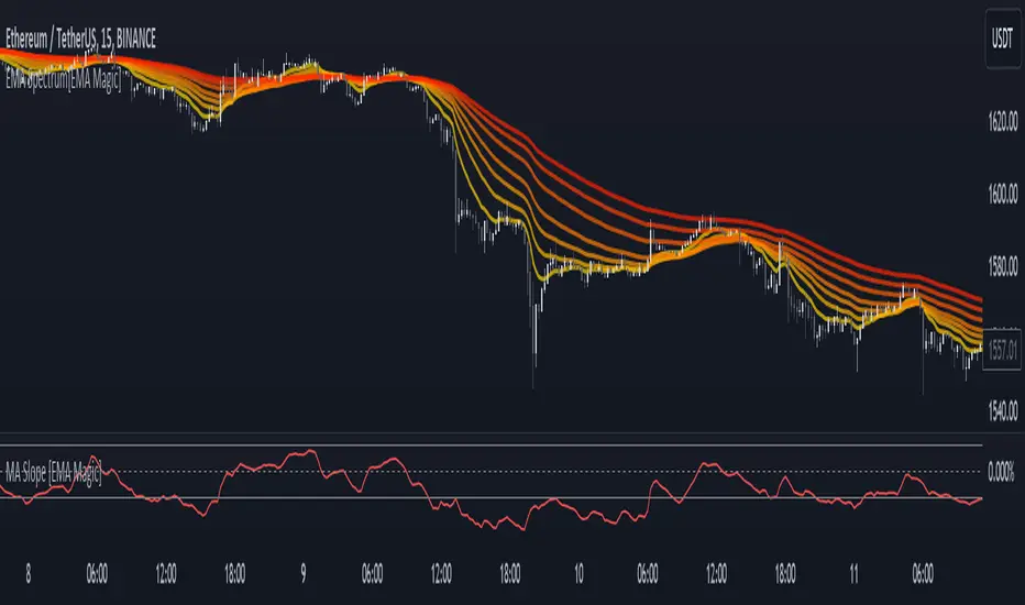
MA Slope [EMA Magic]█ Overview:
The MA Slope calculates the slope based on a given moving average.
The Moving Average Slope indicator allows you to identify the direction and the strength of a trend.
It calculates the rate of change in percentage based on the user-defined moving average.
█ Calculation: This indicator calculates the slope based on the changes of moving average and normalizes it with Average True Range(ATR).
The default value of ATR is 7.I recommend not changing it unless you know exactly what are you doing.
█ Input Settings:
The settings are divided into three sections:
The first section is for time frame adjustments. Modify it separately from the chart, Allows you to use moving averages from different time frames.
In the second section, you can configure the base calculation,including Moving Average and Average True Range(ATR) settings.
In the third section, you can detect breakout and sudden change signals, which are highlighted in the background of the indicator.
Note that When you change the breakout limit value, it also affects the band limit indicator on your chart.
To avoid signal confusion, use only one at a time.
Here is the example the breakout signals:
█ Usage:
When the slope is increasing, it indicates an uptrend.
When the slope is decreasing, it indicates a downtrend.
When the slope is moving around zero and choppy, it indicates no specific trend or price is in a range zone.
Uptrend and Range Zone example:
Downtrend example:
Slope peaks on extreme levels can signal a potential trend reversal point.
Breakout of the upper or lower bands can be translated into a trading signal.Indicating that price will probably continue to move in the direction of the breakout.
Favor long setups when the slope is increasing or it is positive and favor short setups when the slope is decreasing or it is negative.
Fits with any moving average you use, e.g., EMA, WMA, MA Ribbon, and more.
█ Alert
Alerts are available for both signal conditions.
█ Recap
Take the time to study price movements alongside this indicator for a deeper understanding.Whether you're a novice or experienced trader, this indicator can come helpful
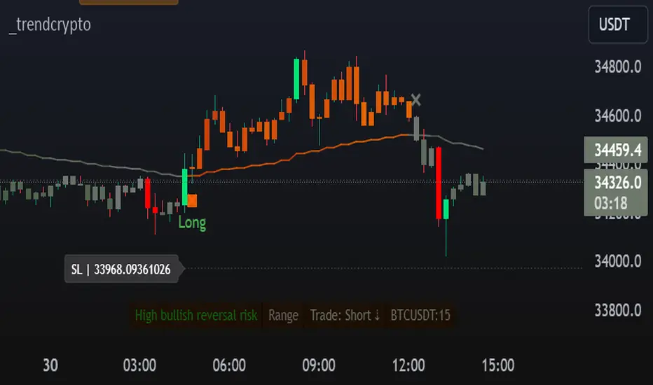
TrendCryptoThe _trendcrypto script is a trading strategy that uses a variety of indicators to identify potential trading opportunities, including the Parabolic SAR, ADX, and RSI.
The script first calculates the RMA, SMA, and trend direction. The RMA is a moving average that is weighted more heavily towards recent prices. The SMA is a simple moving average that gives equal weight to all prices in the period. The trend direction is calculated by comparing the current price to the price a certain number of periods ago.
The script then uses the RMA, SMA, and trend direction to identify potential trading opportunities. If the current price is above the RMA and the trend direction is up, the script will generate a buy signal. If the current price is below the RMA and the trend direction is down, the script will generate a sell signal.
The script also calculates the Parabolic SAR, which is a technical indicator that helps traders identify potential trend reversals. The Parabolic SAR is calculated using a formula that takes into account the high and low prices of a security over a specified period of time.
The script also calculates the ADX, which is a trend strength indicator. The ADX is calculated using a formula that takes into account the difference between the high and low prices of a security, as well as the difference between the closing price and the previous close.
The script also calculates the RSI, which is a momentum indicator that measures the magnitude of recent price changes to evaluate overbought or oversold conditions in the price of a stock or other asset. The RSI is calculated over a specified period of time, and the default value in the code is 14.
The script also allows users to specify a stop loss and take profit level for each trade. The default stop loss level is 4% and the default take profit level is 7%.
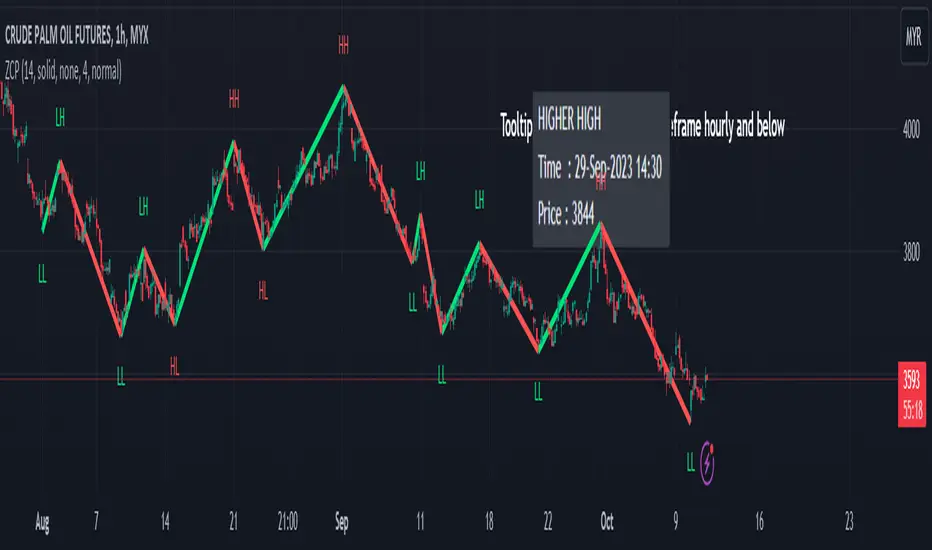
Zigzag Chart Points█ OVERVIEW
This indicator displays zigzag based on high and low using latest pine script version 5 , chart.point which using time, index and price as parameters.
Pretty much a strip down using latest pine script function, without any use of library .
This allow pine script user to have an idea of simplified and cleaner code for zigzag.
█ CREDITS
LonesomeTheBlue
█ FEATURES
1. Label can be show / hide including text can be resized.
2. Hover to label, can see tooltip will show price and time.
3. Tooltip will show date and time for hourly timeframe and below while show date only for day timeframe and above.
█ NOTES
1. I admit that chart.point just made the code much more cleaner and save more time. I previously using user-defined type(UDT) which quite hassle.
2. I have no plan to extend this indicator or include alert just I thinking to explore log.error() and runtime.error() , which I may probably release in other publications.
█ HOW TO USE'
Pretty much similar inside mentioned references, which previously I created.
█ REFERENCES
1. Zigzag Array Experimental
2. Simple Zigzag UDT
3. Zig Zag Ratio Simplified
4. Cyclic RSI High Low With Noise Filter
5. Auto AB=CD 1 to 1 Ratio Experimental
RMI Trend SniperThe "RMI Trend Sniper" is a powerful trend-following indicator designed to help traders identify potential buy and sell signals in the market.
It combines elements of the Relative Strength Index (RSI) and the Money Flow Index (MFI) to provide a comprehensive view of market momentum and strength.
🔷 Key Features:
🔹 Customizable Settings : Tailor the indicator to your trading preferences with customizable input parameters, including RSI and MFI lengths, threshold levels, and visual settings.
🔹 Momentum Signals : The indicator generates clear bullish and bearish momentum signals, allowing you to spot potential trend reversals or continuations.
🔹 The positive condition considers the previous RMI value, current RMI value, and positive change in the 5-period exponential moving average (EMA) of the closing price.
🔹 The negative condition looks at the current RMI value and negative change in the 5-period EMA.
🔹 Visual Bands : Visualize market volatility with dynamically plotted bands around the Range Weighted Moving Average (RWMA), providing insights into potential price fluctuations.
🔹 Candlestick Coloring : Easily identify bullish and bearish conditions with color-coded candlesticks, helping you make informed trading decisions.
The "RMI Trend Sniper" is a versatile tool suitable for traders of all experience levels. Whether you are a novice or an experienced trader, this indicator can help you enhance your technical analysis and improve your trading strategies.

Kalman MomentumKalman Filter
The Kalman Filter is an algorithm used for recursive estimation and filtering of time-series data. It was developed by Rudolf E. Kálmán in the 1960s and has found widespread applications in various fields, including control systems, navigation, signal processing, and finance.
The primary purpose of the Kalman filter is to estimate the state of a dynamic system based on a series of noisy measurements over time. It operates recursively, meaning it processes each new measurement and updates its estimate of the system state as new data becomes available.
Kalman Momentum Indicator
This indicator implements the Kalman Filter to provide a smoothed momentum indicator using returns. The momentum in this indicator is calculated by getting the logarithmic returns and then getting the expected value.
The Kalman calculation in this indicator is used to filter and predict the next value based on the logarithmic returns expected value.
Here's a simplified explanation of the steps and how they are applied in the Script:
State Prediction: Predict the current state based on the previous state estimate.
Error Covariance Prediction: Predict the covariance of the prediction error.
Correction Step:
Kalman Gain Calculation: Calculate the Kalman gain, which determines the weight given to the measurement.
State Correction: Update the state estimate based on the measurement.
Error Covariance Correction: Update the error covariance.
In this Script, the Kalman Filter is applied to estimate the state of the system, with two state variables.
When the Kalman Momentum is above 0, there is positive momentum or positive smoothed expected value.
When the Kalman Momentum is below 0, there is negative momentum or negative smoothed expected value.
How to Use:
Trend Identification:
Positive values of the Kalman Momentum Indicator indicates positive expected value, while negative values suggest negative expected value.
You can look for changes in the sign of the indicator to identify potential shifts in market direction.
Volatility Analysis:
Observe the behavior of the indicator during periods of high and low volatility. Changes in the volatility of the Kalman Momentum Indicator may precede changes in market conditions.
Filtering Noise:
The Kalman Filter is known for its ability to filter out noise in time series data. Use the Kalman Momentum Indicator to filter out the noise in momentum to catch the trend more clearly.
Squeezes:
At time there may be squeezes, and these are zones with low volatility. What could follow after these zones are expansions and huge trending moves.
Indicator Settings:
You can change the source of the calculations.
There is also a lookback for the log returns.
Understanding Expected Value in Trading:
The Expected Value is a fundamental concept that shows the potential outcomes of a trading strategy or individual trade over a series of occurrences. It is a measure that represents the average outcome when a particular action is repeated multiple times.
Images of the indicator:

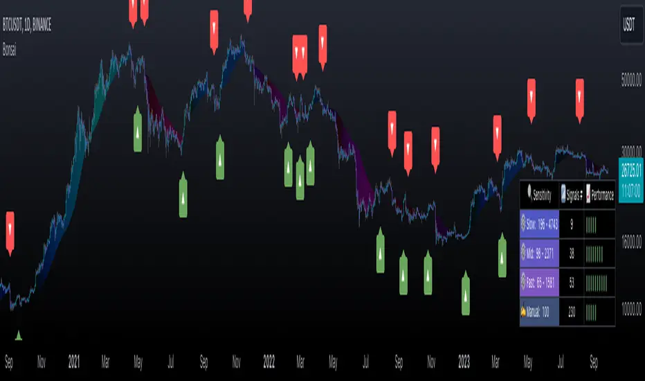
BonsaiBonsai is a tailored tech analysis tool for all traders. It uses dynamic thresholds, sensitivity modes, and averaging to identify market trends. Its scoring system, visual cues, and alerts offer an intuitive trading journey.
═════════════════════════════════════════════════════════════════════════
🌳 Bonsai 🌳 Trend Analysis Indicator
📘 Overview
Bonsai is designed to aid traders in recognizing market trends, utilizing sensitivity as its pivotal component.
📌 Script Logic
• Threshold-Based Trends: Bonsai sets dynamic thresholds based on market deviations from previous highs or lows to identify trend reversals.
• Signal Generation: After ascertaining the trend direction, Bonsai provides buy/sell signals from trend crossovers and crossunders.
• Returns & Scoring: Each signal's potential returns are calculated, considering asset-specific trading fees. A scoring system (1-10) is introduced for traders to evaluate potential profitability quickly.
• Auto-Threshold: Threshold adjustments are made depending on the selected sensitivity mode, optimizing adaptability.
• Visual Indicators: Bonsai visualizes potential market highs and lows through trend lines. Colors differentiate between bullish and bearish market sentiments.
• Trend Line Enhancement with ALMA : Bonsai integrates the Arnaud Legoux Moving Average (ALMA), aiming to refine trend line representation. ALMA may reduce noise, providing a smoother trend line, which might be useful during volatile market conditions. This can potentially lead to improved trend forecasts with fewer fakeouts.
🎯 Purpose
• For Experienced Traders: Bonsai complements professional analysis with its data-driven insights, catering to diverse trading strategies.
• For Newcomers: Serving as an entry to technical analysis, Bonsai's intuitive design and streamlined settings are beginner-friendly.
🛠 Key Elements
• Dynamic Thresholds: Bonsai’s thresholds are dynamic, adapting to market conditions and user-selected sensitivity mode.
• Scoring System: Bonsai’s unique scoring system is grounded on potential returns, streamlining complex market data interpretation.
Performance Table Breakdown
🔧 Classic Elements & Value Added
• Refined Moving Averages: Bonsai incorporates standard moving averages like the EMA, SMA and ALMA to smooth and refine trend lines.
• Enhanced Visual Representation: Bonsai strives to provide clarity beyond just displaying market directions. Its visuals are crafted to help traders understand and potentially act promptly. The deliberate use of color dynamics, trend indications, and integration of moving averages come together to create a representation that aims to stand out in its clarity and simplicity.
📊 Features
• Dynamic Sensitivity Modes : Settings include:
• (Auto) Slow, Mid, Fast : These modes allow Bonsai to auto-adjust its sensitivity in line with market changes.
• 'Slow': Aims to capture larger market moves with fewer signals.
• 'Mid': A balanced mode with a moderate signal frequency.
• 'Fast': Caters to rapid market changes, providing more signals.
• Manual : For traders who prefer setting their sensitivity.
• Visualization: Green indicates bullish trends, and Red indicates bearish ones. Trend colors are customizable in gradient intensity and opacity.
• Performance Insights : A table displaying the effectiveness of all modes, guiding your strategy choices.
• Dashboard Themes : Users can switch between light and dark themes.
• Alert System : Real-time buy/sell signal notifications.
• Compatibility : Output can be integrated as a source for other indicators.
Indicator Settings Menu
🎛 How To Use Bonsai
1. Select your sensitivity mode.
2. Use color cues to analyze market directions.
3. Check the performance insights for strategy adjustment.
4. Set alerts to stay updated.
📜 Feedback & Improvement
We value your feedback. As the trading world evolves, Bonsai will adapt, meeting traders' dynamic needs.
❗️ Disclaimer
Bonsai serves as an analytical tool and isn’t a standalone trading strategy. Its performance table is for reference, and accuracy isn’t guaranteed. Always research thoroughly and be mindful of trading risks. Bonsai facilitates analysis but doesn’t promise particular outcomes.
AI Momentum [YinYang]Overview:
AI Momentum is a kernel function based momentum Indicator. It uses Rational Quadratics to help smooth out the Moving Averages, this may give them a more accurate result. This Indicator has 2 main uses, first it displays ‘Zones’ that help you visualize the potential movement areas and when the price is out of bounds (Overvalued or Undervalued). Secondly it creates signals that display the momentum of the current trend.
The Zones are composed of the Highest Highs and Lowest lows turned into a Rational Quadratic over varying lengths. These create our Rational High and Low zones. There is however a second zone. The second zone is composed of the avg of the Inner High and Inner Low zones (yellow line) and the Rational Quadratic of the current Close. This helps to create a second zone that is within the High and Low bounds that may represent momentum changes within these zones. When the Rationalized Close crosses above the High and Low Zone Average it may signify a bullish momentum change and vice versa when it crosses below.
There are 3 different signals created to display momentum:
Bullish and Bearish Momentum. These signals display when there is current bullish or bearish momentum happening within the trend. When the momentum changes there will likely be a lull where there are neither Bullish or Bearish momentum signals. These signals may be useful to help visualize when the momentum has started and stopped for both the bulls and the bears. Bullish Momentum is calculated by checking if the Rational Quadratic Close > Rational Quadratic of the Highest OHLC4 smoothed over a VWMA. The Bearish Momentum is calculated by checking the opposite.
Overly Bullish and Bearish Momentum. These signals occur when the bar has Bullish or Bearish Momentum and also has an Rationalized RSI greater or less than a certain level. Bullish is >= 57 and Bearish is <= 43. There is also the option to ‘Factor Volume’ into these signals. This means, the Overly Bullish and Bearish Signals will only occur when the Rationalized Volume > VWMA Rationalized Volume as well as the previously mentioned factors above. This can be useful for removing ‘clutter’ as volume may dictate when these momentum changes will occur, but it can also remove some of the useful signals and you may miss the swing too if the volume just was low. Overly Bullish and Bearish Momentum may dictate when a momentum change will occur. Remember, they are OVERLY Bullish and Bearish, meaning there is a chance a correction may occur around these signals.
Bull and Bear Crosses. These signals occur when the Rationalized Close crosses the Gaussian Close that is 2 bars back. These signals may show when there is a strong change in momentum, but be careful as more often than not they’re predicting that the momentum may change in the opposite direction.
Tutorial:
As we can see in the example above, generally what happens is we get the regular Bullish or Bearish momentum, followed by the Rationalized Close crossing the Zone average and finally the Overly Bullish or Bearish signals. This is normally the order of operations but isn’t always how it happens as sometimes momentum changes don’t make it that far; also the Rationalized Close and Zone Average don’t follow any of the same math as the Signals which can result in differing appearances. The Bull and Bear Crosses are also quite sporadic in appearance and don’t generally follow any sort of order of operations. However, they may occur as a Predictor between Bullish and Bearish momentum, signifying the beginning of the momentum change.
The Bull and Bear crosses may be a Predictor of momentum change. They generally happen when there is no Bullish or Bearish momentum happening; and this helps to add strength to their prediction. When they occur during momentum (orange circle) there is a less likely chance that it will happen, and may instead signify the exact opposite; it may help predict a large spike in momentum in the direction of the Bullish or Bearish momentum. In the case of the orange circle, there is currently Bearish Momentum and therefore the Bull Cross may help predict a large momentum movement is about to occur in favor of the Bears.
We have disabled signals here to properly display and talk about the zones. As you can see, Rationalizing the Highest Highs and Lowest Lows over 2 different lengths creates inner and outer bounds that help to predict where parabolic movement and momentum may move to. Our Inner and Outer zones are great for seeing potential Support and Resistance locations.
The secondary zone, which can cross over and change from Green to Red is also a very important zone. Let's zoom in and talk about it specifically.
The Middle Zone Crosses may help deduce where parabolic movement and strong momentum changes may occur. Generally what may happen is when the cross occurs, you will see parabolic movement to the High / Low zones. This may be the Inner zone but can sometimes be the outer zone too. The hard part is sometimes it can be a Fakeout, like displayed with the Blue Circle. The Cross doesn’t mean it may move to the opposing side, sometimes it may just be predicting Parabolic movement in a general sense.
When we turn the Momentum Signals back on, we can see where the Fakeout occurred that it not only almost hit the Inner Low Zone but it also exhibited 2 Overly Bearish Signals. Remember, Overly bearish signals mean a momentum change in favor of the Bulls may occur soon and overly Bullish signals mean a momentum change in favor of the Bears may occur soon.
You may be wondering, well what does “may occur soon” mean and how do we tell?
The purpose of the momentum signals is not only to let you know when Momentum has occurred and when it is still prevalent. It also matters A LOT when it has STOPPED!
In this example above, we look at when the Overly Bullish and Bearish Momentum has STOPPED. As you can see, when the Overly Bullish or Bearish Momentum stopped may be a strong predictor of potential momentum change in the opposing direction.
We will conclude our Tutorial here, hopefully this Indicator has been helpful for showing you where momentum is occurring and help predict how far it may move. We have been dabbling with and are planning on releasing a Strategy based on this Indicator shortly.
Settings:
1. Momentum:
Show Signals: Sometimes it can be difficult to visualize the zones with signals enabled.
Factor Volume: Factor Volume only applies to Overly Bullish and Bearish Signals. It's when the Volume is > VWMA Volume over the Smoothing Length.
Zone Inside Length: The Zone Inside is the Inner zone of the High and Low. This is the length used to create it.
Zone Outside Length: The Zone Outside is the Outer zone of the High and Low. This is the length used to create it.
Smoothing length: Smoothing length is the length used to smooth out our Bullish and Bearish signals, along with our Overly Bullish and Overly Bearish Signals.
2. Kernel Settings:
Lookback Window: The number of bars used for the estimation. This is a sliding value that represents the most recent historical bars. Recommended range: 3-50.
Relative Weighting: Relative weighting of time frames. As this value approaches zero, the longer time frames will exert more influence on the estimation. As this value approaches infinity, the behavior of the Rational Quadratic Kernel will become identical to the Gaussian kernel. Recommended range: 0.25-25.
Start Regression at Bar: Bar index on which to start regression. The first bars of a chart are often highly volatile, and omission of these initial bars often leads to a better overall fit. Recommended range: 5-25.
If you have any questions, comments, ideas or concerns please don't hesitate to contact us.
HAPPY TRADING!
