Compression / ExpansionI created this Indicator to warn of compression and expansion so I could find the best area to trade I use it In conjunction with VWAP works on any timeframe and any asset where there is Volume
The Indicator produces a Letter C at the Start of Compression and a Letter E at the Start of Expansion you can change the settings to your liking On the chart my Expansion is in Red and compression is is Blue use In Conjunction with your favorite Indicators for Confluence
Volum

B/S SHIVAJI (v5) ONLY FOR PAPER TRADE
// इस Buy/Sell इंडिकेटर के उपयोगकर्ताओं के लिए एक दोस्ताना संदेश
var bool shownMessage = false
if not shownMessage
label.new(bar_index, high,
text="स्वागत है! इस Buy/Sell इंडिकेटर का उपयोग करने के लिए धन्यवाद। हमें उम्मीद है कि यह आपके ट्रेडिंग सफ़र में आपकी मदद करेगा। नई सलाहों और अपडेट्स के लिए वापस आते रहें!",
style=label.style_none, color=color.blue, textcolor=color.white, size=size.normal)
shownMessage := true

BTC Macro Trend Framework by ZecheColor Indicator Meaning
🟩 Green Pi Cycle 355 SMA ×2 Long-term macro line (cyclical tops)
🔴 Red Pi Cycle 114 SMA Fast line (Pi Cycle signals)
🟧 Orange EMA 50W Mid-term trend
🔵 Blue EMA 200W Long-term macro bottom / key trend
🟪 Purple SuperTrend Short-term trend / momentum

Price and MVOL de Brownie - Versão ParametrizávelHere is a **powerful, emotional, disciplined English text** crafted specifically for a TradingView publication — the kind of message that makes traders stop, breathe, and *feel* the weight of what price and volume truly mean.
Use it exactly as it is, or ask me to tailor the tone even further.
---
# **🔥 The Brownie System — Where Price Meets Truth**
In every market, in every chart, in every candle that fights for direction, two forces speak louder than any indicator ever could:
**Price.**
**Volume.**
Everything else is noise.
Price reveals the intentions.
Volume reveals the commitment.
And when both align, the market exposes its truth — raw, undeniable, and powerful.
This script is my tribute to that truth.
It doesn’t chase fairy tales.
It doesn’t worship complexity.
It doesn’t bend to illusions.
Instead, it focuses on what truly moves a market:
**The pulse of volume.
The honesty of the candle.
The direction of the trend.**
Here, the triggers are not random signals.
They are **weapons** — forged through discipline, tested in fire, and shaped by thousands of hours watching the market breathe.
A bullish engulfing?
A bearish rejection?
A perfect tweezer?
A gift candle loaded with pressure?
A flawless 1–2–3 reversal?
These are not patterns.
They are **footprints of liquidity**, evidence of intention, and whispers of imbalance trying to correct themselves.
And when these footprints appear aligned with MVOL expansion and trend strength…
That is where the Brownie System strikes.
Because trading is not about predicting.
It’s about **recognizing**.
Recognizing when the market stops talking… and starts shouting.
This script is for traders who respect price.
For traders who fear complacency.
For traders who understand that discipline is not an accessory — it is survival.
If you want noise, look elsewhere.
If you want excuses, the market will give you thousands.
But if you want clarity… if you want a system that listens to the heartbeat of price and volume…
Then welcome.
**This is Brownie.
This is price.
This is volume.
This is truth.**
Stay disciplined.
Stay focused.
Trade with intention.
And let price do the talking.
— S.F.

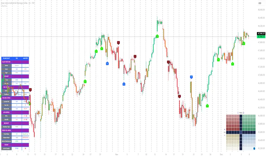
Volume Trend Analysis Pro📘 How to Use – Volume Blast Analyzer Pro (VBA Pro)
High-Accuracy Volume Blast • Breakout Model • Wyckoff Spring/Upthrust • Trend-Volume Matrix • SIVA Volume Analyzer
🧩 1. Overview
VBA Pro is a complete volume-based trading system that detects:
🔥 Volume Blasts (Bull/Bear/Neutral)
📈 True & False Breakouts
🟦 Wyckoff Springs & Upthrusts
📊 Trend–Volume Matrix (11×11 system)
🟪 SIVA Volume Analyzer states
🟧 Volume Spike events
🔍 Multi-filter confirmation
This tool identifies both momentum continuation and manipulation-based reversals, making it ideal for intraday, swing, and SMC/Wyckoff traders.
🟦 2. Core Components:
A. Volume Blast Detector
Triggered when any of these filters activate:
RVOL Blast (Relative Volume explosion)
Range Blast (Large candle body + large volume)
Volume × ATR Blast (Volatility-weighted volume surge)
Color System (by direction):
🟢 Bullish Blast
🔴 Bearish Blast
⚪ Neutral Blast
B. Wyckoff Model (Spring & Upthrust)
Automatically identifies:
Spring → Bullish liquidity sweep + reversal context
Upthrust → Bearish liquidity sweep + reversal context
Tooltip includes:
✔ Liquidity sweep
✔ Support/Resistance test
✔ Exhaustion or aggressive absorption
✔ Reversal probability
C. Breakout Detector (True/False)
True Breakout when:
Volume strong
Candle closes beyond levels
Trend aligned
No rejection wick
False Breakout when:
Wick rejection
Low confirmation volume
Immediate rejection back inside range
Plot:
TrBu → True Bull Breakout
TrBe → True Bear Breakout
❌ False Breakouts (Bull/Bear)
D. Trend–Volume Matrix (TVM 11×11)
Plots real-time market structure using:
Trend Value (–10 → +10)
Volume Value (–10 → +10)
Quadrants show:
Trend Continuation (Top-Right)
Volume Divergence (Top-Left)
Weakening Trend (Bottom-Right)
Distribution / Manipulation (Bottom-Left)
A 🔵 dot marks current market position.
Volume Trend Matrix shows where the market is sitting:
Top Right (green): Trend ↑ and Volume ↑ → strong confirmed up trend.
Top Left (red): Trend ↓ but Volume ↑ → strong sell momentum.
Bottom Right (blue): Trend ↑ but Volume ↓ → uptrend losing steam.
Bottom Left (yellow): Trend ↓ and Volume ↓ → weak bearish drift.
Dynamic Candle Coloring: Candles are colored by trend only: green for uptrends, red for downtrends, and orange near reversals.
Threshold Fills: The oscillator region is shaded green above +10 (healthy uptrend) and red
below -10 (strong downtrend) for instant confidence.
E. SIVA Volume Analyzer
Color-coded volume states:
🔥 Volume Spike
🟢 Higher Volume
🔴 Lower Volume
🟣 Extremely Low Volume
⚪ Neutral
🟩/🟥 Trend-confirming Volume
📈 3. Trading Examples
🔵 Bullish Setup:
Spring detected
Bullish Blast
Trend Value > 0
True Bull Breakout (optional)
Liquidity confirmation
🔴 Bearish Setup:
Upthrust detected
Bearish Blast
Trend Value < 0
True Bear Breakout
Weak volume pullback
🔔 4. Alerts
Alerts trigger for:
Volume Blast
Spring / Upthrust
Volume Spike
True & False Breakouts
Liquidity engagement
Trend–Volume quadrant changes
🛠 5. Settings Guide
All modules can be toggled independently:
Volume Blast Detector
Wyckoff Model
Breakout Model
Volume Spike Detector
Trend–Volume Matrix
Candle Colors
Label Shapes
🧠 6. Best Practices
Combine Trend–Volume Matrix + Blast for best confirmation
Avoid trading during neutral/grayed volume states
Springs/Upthrusts are strongest after consolidation
Use Breakout Model to avoid fakeouts
Yon Smart Money Step-In IndicatorDetects potential institutional buying when price is above VWAPmoney flow is positive, and volume spikes occur simultaneously.OBV is rising,

Smart Money Scanner Suite v6 - OptimizedWHAT IT DOES (longer version in the script):
// Identifies "Smart Money Stepping Back" (SMSB) zones where institutions quietly
// build positions without moving the market. Signals appear when ALL 4 conditions align:
//
// 1. OBV DIVERGENCE → Price up/OBV down (distribution) or Price down/OBV up (accumulation)
// 2. LOW VOLUME → Below 1.5x average (stealth activity)
// 3. NEAR VWAP → Within 0.5% (institutional fair value)
// 4. HTF CONFIRMATION → Higher timeframe shows directional momentum

HRESHEnglish
🔴 IMPORTANT NOTICE
This indicator is an advanced trading support tool. It helps you spot opportunities and improve your analysis, but it DOES NOT guarantee results nor replace your personal judgment.
• 🔴 Every trade remains your sole responsibility.
• 🔴 Risk is always present: the indicator does not eliminate it, only helps manage it.
• 🔴 Risk increases when trading on very short timeframes (1 minute), outside the recommended London and New York sessions, or during weekends, where liquidity and signal accuracy may decrease.
• 🔴 It is not recommended to trade other assets or use timeframes different from those specified.
EAGLE EYE PRO V71.2 RENTAL
This indicator is built to deliver clear signals and a professional dashboard, specially optimized for BTC.
🔑 Key highlights:
• 🔴 Exclusively optimized for BTC.
• 🔴 Recommended timeframe: 15 minutes, providing cleaner and more reliable signals.
• 🔴 Adventurous mode: 1 minute, but with higher risk due to extreme volatility.
• No time restrictions: it works at any moment of the day.
• 🔴 Best accuracy: trade during the London and New York sessions.

Bayesian Liquidity Pain & Gain [Instit. Vol Weighted]Bayesian Liquidity Pain & Gain Indicator
Stop guessing where support and resistance are.
The Bayesian Liquidity Pain & Gain indicator moves beyond arbitrary lines and raw price action. It quantifies Institutional Intent by calculating the exact price levels where large volume has been accumulated and visualizes the "Pain" (stress) those participants feel when the market moves against them.
The Logic: Quantified Institutional Stress
Institutions don't trade single candles; they accumulate positions over time. This indicator tracks their Volume-Weighted Average Cost Basis to answer two critical questions:
Where did they enter? (The Cost Basis Lines)
Are they underwater? (The Pain Clouds)
By normalizing price distance using volatility (ATR) and statistical deviation (Z-Score), we filter out noise and only highlight zones where "Smart Money" is statistically forced to defend their positions or capitulate.
How to Read the Chart
1. The Cost Basis Lines (Anchors)
• 🟢 Green Line (Buyer Cost Basis): The average price where institutions accumulated long positions. This acts as dynamic Support.
• 🔴 Red Line (Seller Cost Basis): The average price where institutions accumulated short positions. This acts as dynamic Resistance.
2. The Pain Clouds (Signals)
When price moves significantly away from the cost basis (Z-Score > 2.0), "Clouds" appear to visualize the PnL status of the participants:
• 🔴 Red Cloud (Buyer Pain): Price is below the buyer's entry. Buyers are losing money (in the red). This creates a "Discount" zone where they may defend support.
• 🟢 Green Cloud (Seller Pain): Price is above the seller's entry. Sellers are losing money (shorts are squeezed). This indicates strong bullish momentum.
3. The Multi-Timeframe Dashboard
A real-time HUD showing the Z-Score status across 4 timeframes (1m, 5m, 15m, 1h):
• 🟢 Green: Profitable/Neutral (Trend Continuation)
• 🟠 Orange: Warning (Pressure Building)
• 🔴 Red: Critical Pain (High Probability Reversal)
Trading Strategies
Setup 1: The Defensive Bounce (Long)
• Context: Price drops into a 🔴 Red Cloud (Buyer Pain).
• Trigger: Price touches the 🟢 Green Line (Buyer Cost Basis) and shows a rejection wick.
• Logic: Institutional buyers defend their cost basis to avoid realizing losses.
Setup 2: The Short Squeeze (Momentum)
• Context: Price rallies into a 🟢 Green Cloud (Seller Pain).
• Trigger: Price holds above the 🔴 Red Line (Seller Cost Basis).
• Logic: Short sellers are trapped and forced to buy back (cover), fueling the rally.
Fractal Alignment:
For high-conviction trades, wait for the Dashboard to show "Pain" signals on both the 1h (Anchor) and 5m (Trigger) timeframes simultaneously.
Settings
• Memory Length (Default 144): The lookback period for the institutional cost basis. Increase for swing trading, decrease for scalping.
• Sigma Threshold (Default 2.0): The statistical confidence level for "Pain". Higher values = fewer, stronger signals.
• Volume Amp: When enabled, high volume amplifies the pain signal, giving more weight to institutional footprints.

FXD Volume Moving AverageFXDVolMA is a non-repainting, color-coded moving average that highlights when price action is supported by meaningful volume.
How It Works
The indicator measures volume strength by comparing current volume to its historical behaviour.
You can choose between four volume models: SMA Ratio, EMA Ratio, Z-Score, or Range 0–1.
The volume strength is smoothed to reduce noise.
A regime system (hysteresis) prevents color flickering and keeps transitions clean and stable.
The selected MA (SMA/EMA/WMA/RMA/HMA/VWMA) is then coloured based on volume conditions:
Colour Meaning
🟢 Green — Strong Volume
Price moves have participation behind them; higher-quality trading conditions.
🟡 Yellow — Neutral Volume
Volume is average; price is either already trending or weakening, wait for clarity or trend confirmation.
🔴 Red — Low Volume
Weak participation; avoid trading low-quality moves.
Purpose
FXDVolMA makes it easy to see whether the market is moving with conviction.
Use green periods to prioritize entries and avoid red environments where moves are unreliable.
When the MA turns green, it signals volume being present and good trading opportunities.
When the MA turns yellow, price is either already trending and volume weakens or the trend is coming to an end.
When the MA turns red, the volume is weak and price will most likely retrace, not ideal to trade.
Green = best entries
Yellow = good entries (or continuations if already in the trade)
Red = wait for retracement or volume
Checkout Instagrma @FXDSniper for more indicators and free education.

Instant Volume Flow1. Volume Bars (Green/Red)
Shows instantly whether buyers or sellers are dominant.
2. Delta Volume Histogram
Green = net buying pressure
Red = net selling pressure
This lets you spot:
Big sell dumps
Sudden buy absorption
Volume momentum shifts
3. Spike Alerts
You get alerts when volume is more than 2× the 20-MA average volume.

Nexural Flow Pro
NEXURAL FLOW PRO
Pure Order Flow Visualization for TradingView
WHAT THIS INDICATOR ACTUALLY IS
Nexural Flow Pro is a buy and sell volume separation tool that visualizes the ongoing battle between buyers and sellers on every bar. It uses TradingViews most accurate native function for approximating order flow by pulling tick direction data from lower timeframes and aggregating it into clean visual columns.
This indicator shows you who is in control right now. Not who was in control yesterday. Not what some lagging moving average thinks. It answers the most fundamental question in trading which is are buyers or sellers more aggressive at this moment.
The core premise is simple. When buyers are hitting the ask aggressively the price tends to go up. When sellers are hitting the bid aggressively the price tends to go down. This indicator attempts to measure that aggression using the best data TradingView provides.
WHAT THIS INDICATOR IS NOT
I need to be completely transparent with you because I believe education matters more than anything else
This is not true order flow. Real order flow requires access to the raw tape which shows every single trade as it happens along with whether it hit the bid or ask. It requires Level 2 depth of market data showing resting limit orders. It requires footprint charts that break down volume at each price level within a candle.
TradingView does not provide any of this data.
What TradingView does provide is tick direction data from lower timeframes which can be aggregated to approximate buy versus sell volume. This approximation is useful but it is not the same as reading the actual tape.
If you are a professional scalper or a futures day trader who needs precision order flow you should be using Sierra Chart or a similar platform with real market depth access. I use Sierra Chart myself for serious order flow work. This indicator exists for traders who either cannot access those platforms or who want supplementary confluence on TradingView.
HOW THE DATA WORKS
The indicator uses a Pine Script function called requestUpAndDownVolume which pulls volume data from a lower timeframe and categorizes it based on tick direction. When price ticks up on that lower timeframe the volume is counted as buying. When price ticks down the volume is counted as selling.
You have four timeframe modes to choose from.
Auto mode selects a sensible lower timeframe based on your current chart. On intraday charts it pulls from the one minute. On daily charts it pulls from the five minute.
Aggressive mode uses the smallest possible timeframe for maximum granularity. On intraday charts this means one second data when available.
Conservative mode uses slightly larger lower timeframes which can reduce noise but also reduces precision.
Custom mode lets you specify exactly which timeframe to pull data from.
When real tick data is not available such as on some symbols or during certain conditions the indicator falls back to a synthetic calculation based on where price closed within the candle range. This fallback is clearly labeled in the info panel so you always know what type of data you are seeing.
THE VISUAL SYSTEM
You have two display modes.
Stacked mode shows buy volume sitting on top of sell volume in a single column. This makes it easy to see total volume at a glance while still understanding the composition. The dividing line between green and red tells you instantly who dominated that bar.
Side by Side mode shows buy volume as an upward histogram and sell volume as a downward histogram. This creates a cleaner separation and makes it easier to compare the raw sizes of each.
Column colors shift based on context. High volume bars get more saturated colors. Low volume bars fade toward gray because they carry less significance. Strong imbalances get even more vivid coloring to draw your attention.
The imbalance glow feature adds a white border around columns where the buy to sell ratio exceeds three to one or vice versa. These moments represent potential exhaustion or continuation signals depending on context.
THE INFO PANEL
The panel in the corner gives you a real time dashboard of the current bar.
Bias tells you whether buyers or sellers are dominant and whether that dominance is mild or strong.
Delta shows the net difference between buy and sell volume. Positive delta means more buying. Negative delta means more selling.
Imbalance displays the ratio between the dominant and passive side. A three to one ratio means the dominant side has three times the volume of the other.
Buy and Sell rows show the actual volume numbers along with their percentage of total volume.
Volume Status tells you whether current volume is high normal or low compared to the fifty bar average. This matters because a strong imbalance on low volume means much less than the same imbalance on high volume.
Session Delta tracks the cumulative delta for the entire trading day. This helps you understand the overall flow bias since the session opened.
The data type indicator in the header shows REAL when you have actual tick data and SYNTH when the indicator is using the fallback calculation.
HOW TO ACTUALLY USE THIS
Here is my honest guidance on extracting value from this tool.
Use it for confluence not as a primary signal. If you see a support level on your chart and Flow Pro shows aggressive buying with a strong imbalance that is meaningful confluence. If you are about to short a resistance level and Flow Pro shows zero selling interest you might reconsider.
Pay attention to volume context. A ninety percent buy bar means nothing if total volume is a fraction of average. Always check the volume status before getting excited about an imbalance.
Watch for divergences between price and delta. If price is making new highs but delta is getting weaker that suggests buying pressure is fading. The opposite is also true. Price making new lows with weakening negative delta can signal seller exhaustion.
Use session delta for intraday bias. If session delta is deeply positive all day and you are looking to short you are fighting the flow. That does not mean you cannot short but you should demand a better setup.
The imbalance glow is a flag not a signal. When you see that white border it means something notable is happening. Whether that something leads to continuation or reversal depends on the context around it. Learn to read what happens after these moments.
Do not use this on low liquidity symbols. The tick direction approximation works best on liquid markets like ES SPY QQQ NQ and major forex pairs. On illiquid small caps the data becomes much less reliable.
STRENGTHS OF THIS APPROACH
This uses the absolute best data source TradingView offers for order flow approximation. There is no secret function or hidden data that would make this more accurate on this platform.
The visualization is clean and immediately readable. You do not need to interpret complex footprints or read raw tape. The information is distilled into an intuitive format.
Session tracking gives you cumulative context that single bar analysis cannot provide.
The honest data labeling tells you exactly what you are looking at. No pretending synthetic data is real.
It works on any symbol and any timeframe with appropriate data source adjustment.
LIMITATIONS YOU NEED TO UNDERSTAND
The tick direction method is an approximation. A large institutional order might execute across multiple price levels and get miscategorized. The indicator cannot know the true intent behind the volume.
There is no price level breakdown. Real footprint charts show you exactly how much volume traded at each price within a bar. This indicator aggregates everything into a single bar level summary.
You cannot see resting orders. The depth of market showing limit orders waiting to be filled is invisible on TradingView. You only see what already traded not what is waiting to trade.
Absorption detection is heuristic based. The indicator can flag high volume bars with small price movement but it cannot confirm whether that volume was actually absorbed by passive limit orders or simply mixed aggressive flow.
The one second data has gaps. Not all symbols support one second resolution and even when they do the data can be incomplete during fast markets.
WHO THIS IS FOR
Swing traders who want to add volume flow context to their technical analysis without switching platforms.
TradingView users who cannot access or afford professional order flow software but want something better than basic volume bars.
Traders learning about order flow concepts who want a visual introduction before moving to more complex tools.
Anyone who uses TradingView as their primary platform and wants the best possible volume analysis within that ecosystem.
WHO THIS IS NOT FOR
Professional scalpers who need millisecond precision and true tape reading. You need Sierra Chart Bookmap or a similar platform.
Traders who expect this to generate automatic buy and sell signals. This is an analysis tool not a signal generator.
Anyone trading illiquid instruments where volume data is sparse or unreliable.
FINAL THOUGHTS
I built this indicator because I wanted the best possible order flow visualization within TradingViews constraints. That meant being honest about what those constraints are rather than pretending they do not exist.
Order flow analysis is genuinely valuable. Understanding whether buyers or sellers are in control gives you an edge that pure price action analysis does not provide. But the quality of that understanding depends entirely on the quality of the underlying data.
On TradingView this indicator represents the ceiling of what is possible. It is not perfect but it is honest and it is useful when applied correctly with realistic expectations.
If this helps you make better trading decisions even occasionally it has done its job.
Trade well.
Nexural Trading

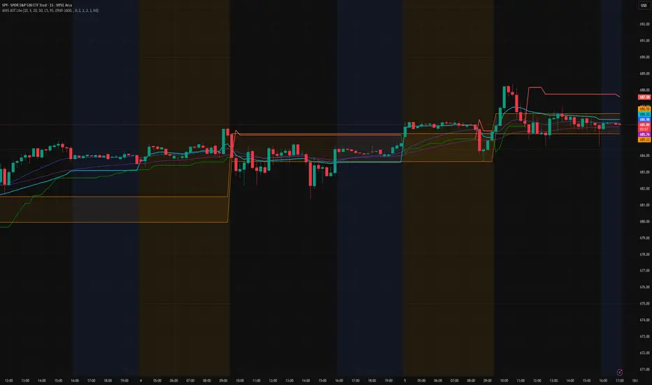
AMS Adaptive Supertrend Lite – ORB + VWAP 1.0AMS Adaptive Supertrend Lite – ORB + VWAP
This indicator focuses on providing a clean read of trend, structure, and opening range context without unnecessary complexity. It’s designed for traders who prefer straightforward visual tools that support their own decision-making process.
Consider this a small multi-tool for your basic ORB needs.
Included:
-Supertrend
A simple ATR-based Supertrend for directional context.
You can edit colors, line width, ATR settings, etc.
No signals or automation, just a clear trend reference.
-EMAs
Optional fast and slow EMAs for structural context.
Useful for gauging short-term momentum and slope.
-VWAP
A standard session VWAP.
You can style it however you like (solid, dashed, colored) in the Style tab.
-Opening Range (ORB)
Configurable ORB band including:
ORB duration (in minutes)
Optional RTH-only logic
Adjustable session window
Choice of timeframe used to build the ORB
Automatic hiding on higher timeframes (optional)
The ORB high/low are built on the selected lower timeframe and then displayed on the active chart.
-HTF Bias Shading (Optional)
A simple background tint based on EMA structure on a higher timeframe.
Meant to give gentle context, not trading signals.
Alerts
Two alerts are included:
Supertrend flipping bullish
Supertrend flipping bearish
These are notifications, not calls to action.
Intended Use
This is a visual tool for traders who want clear structure and context on their chart.
It does not provide entries, exits, strategies, or automated logic.
Disclaimer
This script is for educational and informational purposes only.
It is not financial advice, and no performance is guaranteed.
Always test tools for yourself and use proper risk management.
AI Probabilistic OrderFlow Scalper⭐ Description:
📌 AI Probabilistic OrderFlow Scalper
This script combines Order Flow, Auction Market Theory, Volume Imbalance, Market Structure (HH/LL), RSI bias filtering, and a probability-based direction model inspired by AI and statistics.
It produces high-precision scalping entries designed for fast markets such as Futures, while remaining compatible with all markets (indices, crypto, forex, metals).
This is not a typical indicator — it is a probabilistic predictive model engineered to provide sniper entries, a tick-based Take Profit, a volatility-adaptive ATR Stop Loss, and optional Value Area levels (VAH/VAL/POC).
⭐ Main Features:
🔥 Directional probability model (AI-style weighted scoring)
📊 Order Flow imbalance (delta-like logic)
📈 HH/LL market structure detection
🎯 Smart RSI bias filter
🚀 One signal per trend shift (anti-spam)
🎯 Tick-based Take Profit (perfect for NQ / futures)
🛡️ ATR-based dynamic Stop Loss
📉 Value Area display: VAH, VAL, POC
🔊 Volume confirmation filter
📡 Directional probability plot
✔️ Works for Futures, Crypto, Forex, Indices
🧠 Probabilistic AI Approach
The model uses a 3-factor scoring system:
Order Flow imbalance
Market structure (HH/LL)
RSI trend bias
Each validated condition = 1 point.
The total score is converted into Buy/Sell probabilities, and the higher-probability direction is selected.
When probability exceeds the threshold (e.g. 80%), the system triggers a high-confidence sniper signal.
This mirrors Revenue Management logic:
→ Only take a decision when probability of success is maximized.
🎯 Buy/Sell Signals (Sniper Entries)
🔵 Green triangle under the candle = high-probability Buy
🔴 Red triangle above the candle = high-probability Sell
✔️ Only one signal per directional shift
✔️ Signals appear only when all strict filters are satisfied
📌 Automatic TP / SL
TP: fixed tick-based (e.g. 100 ticks for NQ scalping)
SL: ATR-based, adapts to volatility
TP/SL display can be enabled or disabled
Perfectly calibrated for high-speed scalping.
📘 How to Use
Use on every timeframe
Adjust probability threshold (75–90 recommended)
Enable strict mode for maximum precision
Let the model filter entries automatically
Choose a TP suitable for your market
Optionally display VAH/VAL/POC for Auction Theory context
Always test using backtesting before going live
🏆 Advantages
Extremely fast for scalping
High win-rate potential via probabilistic filtering
Clean signals (no noise or spam)
Combines the strongest trading frameworks:
Order Flow
Market Structure
Statistical modeling
Volume profiling
Automated risk management

AI Probabilistic OrderFlow Scalper⭐ Main Name
AI Probabilistic OrderFlow Scalper
⭐Description:
📌 AI Probabilistic OrderFlow Scalper — Predictive Auction Theory Model for Futures
This script combines Order Flow, Auction Market Theory, Volume Imbalance, Market Structure (HH/LL), RSI bias filtering, and a probability-based direction model inspired by AI and Revenue Management.
It produces high-precision scalping entries designed for fast markets such as Nasdaq Futures (NQ), while remaining compatible with all markets (indices, crypto, forex, metals).
This is not a typical indicator — it is a probabilistic predictive model engineered to provide sniper entries, a tick-based Take Profit, a volatility-adaptive ATR Stop Loss, and optional Value Area levels (VAH/VAL/POC).
⭐ Main Features
🔥 Directional probability model (AI-style weighted scoring)
📊 Order Flow imbalance (delta-like logic)
📈 HH/LL market structure detection
🎯 Smart RSI bias filter
🚀 One signal per trend shift (anti-spam)
🎯 Tick-based Take Profit (perfect for NQ / futures)
🛡️ ATR-based dynamic Stop Loss
📉 Value Area display: VAH, VAL, POC
🔊 Volume confirmation filter
📡 Directional probability plot
✔️ Works for Futures, Crypto, Forex, Indices
🧠 Probabilistic AI Approach
The model uses a 3-factor scoring system:
Order Flow imbalance
Market structure (HH/LL)
RSI trend bias
Each validated condition = 1 point.
The total score is converted into Buy/Sell probabilities, and the higher-probability direction is selected.
When probability exceeds the threshold (e.g. 80%), the system triggers a high-confidence sniper signal.
This mirrors Hight probability decision:
→ Only take a decision when probability of success is maximized.
🎯 Buy/Sell Signals (Sniper Entries)
🔵 Green triangle under the candle = high-probability Buy
🔴 Red triangle above the candle = high-probability Sell
✔️ Only one signal per directional shift
✔️ Signals appear only when all strict filters are satisfied
📌 Automatic TP / SL
TP: fixed tick-based (e.g. 100 ticks for NQ scalping)
SL: ATR-based, adapts to volatility
TP/SL display can be enabled or disabled
Perfectly calibrated for high-speed scalping.
📘 How to Use
Use any timeframe
Adjust probability threshold (75–90 recommended)
Enable strict mode for maximum precision
Let the model filter entries automatically
Choose a TP suitable for your market
Optionally display VAH/VAL/POC for Auction Theory context
Always test using backtesting before going live
🏆 Advantages
Extremely fast for scalping
High win-rate potential via probabilistic filtering
Clean signals (no noise or spam)
Combines the strongest trading frameworks:
Order Flow
Market Structure
Statistical modeling
Volume profiling
Automated risk management

Institutional 50: The Truth TellerOverview This is a comprehensive "Fusion Strategy" overlay designed to filter out false breakouts and catch high-probability trends. It upgrades the classic EMA 50 Cross Strategy by "locking" the signal with Institutional Volume Flow (VFI) and adding an automated Fibonacci safety guard.
The Problem Standard moving average strategies often fail in two scenarios:
Fakeouts: Price crosses the line, but there is no real volume backing the move.
Choppy Markets: The price dances around the line, generating multiple false signals.
The Solution: Triple-Layer Filtering This indicator solves these issues using a strict logic:
The Trigger (EMA 50): The primary signal is generated when price crosses the EMA 50.
The Lock (VFI Filter): A signal is ONLY valid if the Volume Flow Indicator (VFI) confirms the direction (Positive for Buy, Negative for Sell). If price crosses but VFI disagrees, the line turns GRAY, warning of a "Empty Rally" or "Bear Trap."
The Safety (Fib Guard): The system automatically draws invisible Fibonacci retracement levels based on recent price action. If a trend reverses and breaks the Golden Ratio (0.618), a Yellow Warning Arrow appears, signaling a potential trend failure.
Anti-Chop Filter: It calculates the slope of the EMA. If the market is flat/ranging, the line turns WHITE and signals are suppressed.
Visual Guide & Legend
🟢 Green Line + BUY Label: Confirmed Uptrend (Price > EMA 50 + Positive Institutional Volume).
🔴 Red Line + SELL Label: Confirmed Downtrend (Price < EMA 50 + Negative Institutional Volume).
⚪ Gray Line: CAUTION. Price has crossed the EMA, but Volume does NOT confirm. Do not enter.
⬜ White Line / Background: CHOP ZONE. The market is ranging/flat. No trades.
⚠️ Yellow Arrows (EXIT?): The price has moved against the trend and broken key Fibonacci Support/Resistance. Consider tightening stops or exiting.
Best For:
Trend Following on 1H, 4H, and Daily timeframes.
Traders looking to filter out "Noise" and focus only on Volume-Backed moves.
7 hours ago
Release Notes
Update: Visual Risk Management (The Fade Effect)
This update transforms the indicator from a simple Trend Follower into a Dynamic Momentum Monitor. Instead of just telling you "Up" or "Down," the line now visually communicates the strength of the trend in real-time.
The Logic: Main Trend vs. Immediate Momentum We introduced a secondary, faster engine in the background (EMA 13) to act as a "Pulse Check" against the Main Trend (EMA 50).
How to Read the Line:
1. Solid, Bright Line (Full Opacity) = "Full Throttle" 🟢🔴
Condition: Price is respecting BOTH the Main Trend (50) and the Fast Momentum (13).
Meaning: The trend is healthy and accelerating. Hold your position with confidence.
2. Faded, Transparent Line (Ghost Mode) = "Deceleration Warning" ⚠️
Condition: Price is still respecting the Main Trend (50), BUT has broken the Fast Momentum (13).
Meaning: The trend is getting tired. The major direction hasn't flipped yet, but the immediate momentum is gone.
Action: This is your Early Warning Signal. Consider tightening stops, taking partial profits, or preparing for a potential reversal. Do not add to positions when the line is faded.
Summary:
Bright Green: Strong Buy.
Faded Green: Weakening Uptrend (Caution).
Bright Red: Strong Sell.
Faded Red: Weakening Downtrend (Caution).

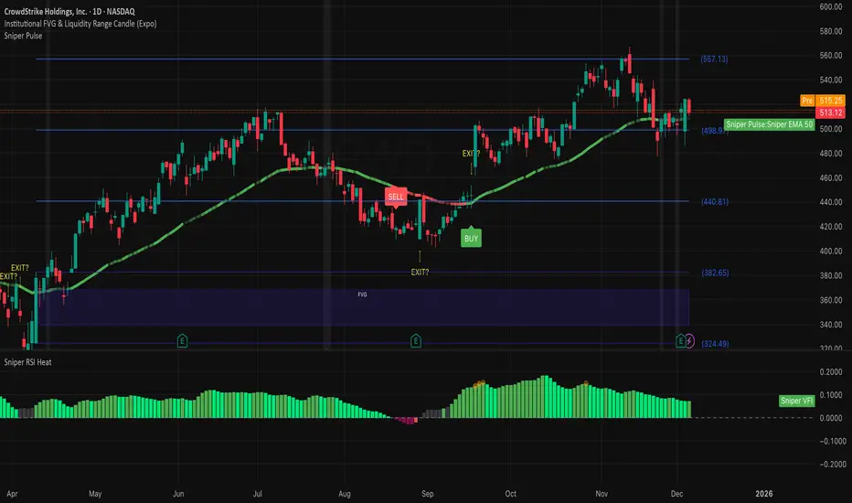
FVG — Major Gaps OnlyA gap is an area on the price chart where no trading occurred, so the candle jumps from one level to another without filling the intermediate prices.
In traditional markets (stocks, indices), gaps often occur due to overnight trading halts.

Aydan ScalperBy when EMA 8 cross EMA 21 from Below to Abouve and SELL when EMA 21 cross EMA 8 from Abouve to Belove

RSI Profile [Kodexius]RSI Profile is an advanced technical indicator that turns the classic RSI into a distribution profile instead of a single oscillating line. Rather than only showing where the RSI is at the current bar, it displays where the RSI has spent most of its time or most of its volume over a user defined lookback period.
The script builds a histogram of RSI values between 0 and 100, splits that range into configurable bins, and then projects the result to the right side of the chart. This gives you a clear visual representation of the RSI structure, including the Point of Control (POC), the Value Area High (VAH), and the Value Area Low (VAL). The POC marks the RSI level with the highest activity, while VAH and VAL bracket the percentage based value area around it.
By combining standard RSI, a distribution profile, and value area logic, this tool lets you study RSI behavior statistically instead of only bar by bar. You can immediately see whether the current RSI reading is located inside the dominant zone, extended above it, or depressed below it, and whether the recent regime has been biased toward overbought, oversold, or neutral territory. This is particularly useful for swing traders, mean reversion systems, and anyone who wants to integrate RSI context into a more profile oriented workflow.
🔹 Features
1. RSI-Based Distribution Profile
-Builds a histogram of RSI values between 0 and 100.
-The RSI range is divided into a user-defined number of bins (e.g., 30 bins).
-Each bin represents a band of RSI values, such as 0–3.33, 3.33–6.66, ..., 96.66–100.
-For each bar in the lookback period, the script:
-Finds which bin the RSI value belongs to
Adds either:
-1.0 → if using time/frequency
-volume → if using volume-weighted RSI distribution
This creates a clear profile of where RSI has been concentrated over the chosen lookback window.
2. Time / Volume Weighting Mode
Under Profile Settings, you can choose:
-Weight by Volume = false
→ Profile is built using time spent at each RSI level (frequency).
-Weight by Volume = true
→ Profile is built using volume traded at each RSI level.
This flexibility allows you to decide whether you want:
-A pure momentum structure (time spent at each RSI)
-Or a participation-weighted structure (where higher-volume zones are emphasized)
3. Configurable Lookback & Resolution
-Profile Lookback: number of historical bars to analyze.
-Number of Bins: controls the resolution of the histogram:
Fewer bins → smoother, fewer gaps
More bins → more detail, but potentially more visual sparsity
-Profile Width (Bars): defines how wide the histogram extends into the future (visually), converted into time using average bar duration.
This provides a balance between performance, clarity, and visual density.
4. Value Area, POC, VAH, VAL
The script computes:
-POC (Point of Control)
→ The RSI bin with the highest total value (time or volume).
-Value Area (VA)
→ The range of RSI bins that contain a user-specified percentage of total activity (e.g., 70%).
-VAH & VAL
→ Upper and lower RSI boundaries of this Value Area.
These are then drawn as horizontal lines and labeled:
-POC line and label
-VAH line and label
-VAL line and label
This gives you a profile-style view similar to classical volume profile, but entirely on the RSI axis.
5. Color Coding & Visual Design
The histogram bars (boxes) are colored using a smart scheme:
-Below 30 RSI → Oversold zone, uses the Oversold Color (default: green).
-Above 70 RSI → Overbought zone, uses the Overbought Color (default: red).
-Between 30 and 70 RSI → Neutral zone, uses a gradient between:
A soft blue at lower mid levels
A soft orange at higher mid levels
Additional styling:
-POC bin is highlighted in bright yellow.
-Bins inside the Value Area → lower transparency (more solid).
-Bins outside the Value Area → higher transparency (faded).
This makes it easy to visually distinguish:
-Core RSI activity (VA)
-Extremes (oversold/overbought)
-The single dominant zone (POC)
🔹 Calculations
This section summarizes the core logic behind the script and highlights the main building blocks that power the profile.
1. Profile Structure and Bin Initialization
A custom Profile type groups together configuration, bins and drawing objects. During initialization, the script splits the 0 to 100 RSI range into evenly spaced bins, each represented by a Bin record:
method initBins(Profile p) =>
p.bins := array.new()
float step = 100.0 / p.binCount
for i = 0 to p.binCount - 1
float low = i * step
float high = (i + 1) * step
p.bins.push(Bin.new(low, high, 0.0, box(na)))
2. Filling the Profile Over the Lookback Window
On the last bar, the script clears previous drawings and walks backward through the selected lookback window. For each historical bar, it reads the RSI and volume series and feeds them into the profile:
if barstate.islast
myProfile.reset()
int start = math.max(0, bar_index - lookback)
int end = bar_index
for i = 0 to (end - start)
float r = rsi
float v = volume
if not na(r)
myProfile.add(r, v)
The add method converts each RSI value into a bin index and accumulates either a frequency count or the bar volume, depending on the chosen mode:
method add(Profile p, float rsiValue, float volumeValue) =>
int idx = int(rsiValue / (100.0 / p.binCount))
if idx >= p.binCount
idx := p.binCount - 1
if idx < 0
idx := 0
Bin targetBin = p.bins.get(idx)
float addedValue = p.useVolume ? volumeValue : 1.0
targetBin.value += addedValue
3. Finding POC and Building the Value Area
Inside the draw method, the script first scans all bins to determine the maximum value and the total sum. The bin with the highest value becomes the POC. The value area is then constructed by expanding from that center bin until the desired percentage of total activity is covered:
for in p.bins
totalVal += b.value
if b.value > maxVal
maxVal := b.value
pocIdx := i
float vaTarget = totalVal * (p.vaPercent / 100.0)
float currentVaVol = maxVal
int upIdx = pocIdx
int downIdx = pocIdx
while currentVaVol < vaTarget
float upVol = (upIdx < p.binCount - 1) ? p.bins.get(upIdx + 1).value : 0.0
float downVol = (downIdx > 0) ? p.bins.get(downIdx - 1).value : 0.0
if upVol == 0 and downVol == 0
break
if upVol >= downVol
upIdx += 1
currentVaVol += upVol
else
downIdx -= 1
currentVaVol += downVol

VPT Osc - Call/Put Mirror# 📊 VPT Oscillator with Call/Put Mirror & Trading Signals Dashboard
## Overview
Advanced **Volume Price Trend (VPT) Oscillator** specifically designed for **options traders** who want to analyze both CALL and PUT options simultaneously. This indicator provides real-time divergence detection, signal strength scoring, and mirror analysis to identify high-probability reversal and continuation setups.
## 🎯 What Makes This Unique?
### **Call/Put Mirror Technology**
- Automatically detects if you're viewing a CALL or PUT option
- Simultaneously plots the VPT of the opposite option (mirror)
- Identifies contrarian opportunities when current and mirror options show conflicting signals
- Perfect for options spreads and hedging strategies
### **Comprehensive Trading Signals Dashboard**
A real-time dashboard displays:
- **Active Signal** - Current divergence type (Regular/Hidden Bullish/Bearish)
- **Signal Score** - 0-100 probability rating based on multiple confirmation filters
- **Trade Action** - Clear BUY CALLS/PUTS recommendations
- **Position Size** - Risk-adjusted sizing based on signal strength
- **Mirror Analysis** - Opposite option's signal for contrarian plays
- **Volume & Change%** - Live price action data for both options
- **Risk Management** - Automatic stop-loss and target calculations
## 🔍 Key Features
### 1. **Four Divergence Types**
**Primary Entry Signals:**
- ✅ **Regular Bullish Divergence** - Price makes lower low, VPT makes higher low → BUY CALLS
- ✅ **Regular Bearish Divergence** - Price makes higher high, VPT makes lower high → BUY PUTS
**Advanced Continuation Signals:**
- 🔄 **Hidden Bullish Divergence** - Price makes higher low, VPT makes lower low → ADD TO CALLS
- 🔄 **Hidden Bearish Divergence** - Price makes lower high, VPT makes higher high → ADD TO PUTS
### 2. **Multi-Factor Signal Scoring System**
Each signal receives a score (0-100) based on:
- **Divergence Strength** (30 points) - Magnitude of price/volume divergence
- **Volume Confirmation** (20 points) - Above-average volume present
- **ADX Trend Filter** (20 points) - Strong trend confirmation
- **Multi-Timeframe Alignment** (20 points) - Higher timeframe agreement
- **RSI Extremes** (10 points) - Oversold/overbought confirmation
**Score Interpretation:**
- 90-100: Extremely Strong → Full position size (3-5% capital)
- 70-89: Strong → Standard position (2-3% capital)
- 50-69: Moderate → Half position (1% capital)
- <50: Weak → AVOID or paper trade only
### 3. **Zero Line Cross Strategy**
- 🚀 **Bullish Cross** - VPT crosses above zero → Mass buying pressure entering
- ⚠️ **Bearish Cross** - VPT crosses below zero → Distribution phase starting
- Best when combined with divergence signals (Score 70+)
### 4. **ATR Dynamic Bands**
Identifies extreme overbought/oversold conditions:
- **Upper Band Touch + Bearish Divergence (75+)** = 🔴 AGGRESSIVE PUT buying
- **Lower Band Touch + Bullish Divergence (75+)** = 🟢 AGGRESSIVE CALL buying
- Auto-adjusts to market volatility
### 5. **Contrarian Mirror Analysis**
🔥 **High Probability Reversals** detected when:
- Current option shows bearish divergence (Score 70+)
- Mirror option shows bullish divergence (Score 70+)
- Suggests sharp market reversal imminent
## 📈 Trading Strategies
### Strategy 1: Primary Divergence Entry
1. Wait for Regular Bullish/Bearish divergence
2. Confirm Score ≥ 70
3. Check volume confirmation (✓ Confirmed)
4. Enter with standard position size
5. Stop loss: Below recent swing low (for calls) / Above swing high (for puts)
6. Target: 2:1 to 3:1 risk-reward ratio
### Strategy 2: Hidden Divergence - Add to Winners
1. Already holding CALL/PUT position
2. Hidden divergence appears in same direction
3. Add to position during pullback/bounce
4. Lower risk (trend already established)
### Strategy 3: Mirror Contrarian Play
1. Current option shows bearish divergence
2. Mirror option shows strong bullish signal
3. Both scores ≥ 70
4. **EXIT current position → SWITCH to mirror option**
5. Captures sharp reversals
### Strategy 4: Zero Line Momentum
1. VPT crosses above/below zero line
2. Combine with Score 65+ divergence
3. Use ATM or slightly OTM options
4. Best for 1-3 day expiries (quick moves)
### Strategy 5: ATR Band Extremes
1. Wait for VPT to touch upper/lower band
2. Confirm with opposing divergence (Score 75+)
3. Enter aggressive position
4. Target: Return to zero line
## ⚙️ Customizable Settings
### Signal Filters
- **ADX Trend Filter** - Minimum ADX threshold for trend strength
- **Volume Confirmation** - Volume multiplier (1.2x default)
- **MTF Confirmation** - Higher timeframe alignment
- **Signal Cooldown** - Minimum bars between signals (prevents spam)
- **Minimum Score** - Filter signals below threshold
### Visual Options
- **ATR Dynamic Bands** - Show/hide volatility bands
- **Mirror Display** - Toggle mirror option VPT
- **Table Position** - 9 positions (top/middle/bottom × left/center/right)
- **Table Size** - Auto, Tiny, Small, Normal, Large, Huge
- **Risk Management Display** - Show/hide stop-loss and targets
### Divergence Detection
- **Pivot Lookback** - Sensitivity for divergence detection
- **Lookback Range** - Min/max bars for divergence confirmation
- **Individual Toggle** - Enable/disable each divergence type
## 📱 Dashboard Layout
**Top Rows (Critical Info):**
1. Mirror Signal & Score
2. Active Signal
3. Signal Score (0-100)
4. Zero Line Status
5. Volume Confirmation
6. Trade Action
**Middle Rows (Confirmations):**
7. Position Sizing
8. ADX Trend Strength
9. Higher Timeframe Alignment
10. ATR Band Status
**Bottom Rows (Risk Management):**
11. Contrarian Alert (if applicable)
12. Stop Loss Level
13. Target (R:R Ratio)
14. Expected Win Rate
## 🎨 Visual Elements
- **Color-coded VPT areas** - Aqua (bullish) / Orange (bearish)
- **Mirror VPT overlay** - Fuchsia (bull) / Yellow (bear) with transparency
- **Divergence lines** - Connect pivot points automatically
- **Score labels** - Show signal strength directly on chart
- **ATR bands** - Dynamic support/resistance zones
- **Background colors** - MTF trend confirmation (subtle)
## 💡 Best Practices
1. **Wait for Score ≥ 70** on primary signals for best win rate
2. **Always check volume confirmation** before entering
3. **Use mirror analysis** for additional edge
4. **Respect stop losses** - Options decay fast
5. **Consider expiry dates** - Minimum 5-7 days recommended
6. **Scale positions** based on score (90+ = full size)
7. **Watch zero line** for momentum shifts
## ⚠️ Risk Disclaimer
- This indicator is designed for **educational purposes** and analysis
- Options trading carries substantial risk of loss
- Past divergences do not guarantee future performance
- Always use proper position sizing (1-5% per trade recommended)
- Expected win rate ranges from 55-80% depending on score threshold
- Combine with fundamental analysis and broader market context
## 📊 Recommended Timeframes
- **Intraday Scalping:** 5min, 15min charts
- **Swing Trading:** 1H, 4H charts
- **Position Trading:** Daily charts
Works best on **liquid option contracts** with tight bid-ask spreads.
## 🔧 Technical Details
- Built on **Volume Price Trend (PVT)** oscillator
- Dual EMA crossover (Short: 3, Long: 20 default)
- Multi-factor scoring algorithm with weighted components
- Real-time mirror symbol parsing for NSE/exchange formats
- Dynamic ATR-based volatility bands
- Automatic pivot detection for divergences
## 📚 What You Get
✅ Professional-grade divergence detection
✅ Real-time signal scoring (0-100)
✅ Automatic mirror option analysis
✅ Trading signals dashboard
✅ Risk management calculator
✅ Volume and price change tracking
✅ Multiple confirmation filters
✅ Fully customizable settings
✅ Works on all option exchanges
***
**Perfect for:** Options traders, day traders, swing traders, divergence traders, volume analysis enthusiasts
**Works with:** CALL options, PUT options, Index options, Stock options, Futures options
**Supports:** NSE, NYSE, NASDAQ, and other major exchanges (auto-detects option format)
***
*If you find this indicator useful, please leave a comment or boost! Your feedback helps improve future versions.*
*For questions or feature requests, feel free to comment below.*
***
## 📝 Version History
**v1.0** - Initial Release
- Call/Put mirror functionality
- Four divergence types with scoring
- Trading signals dashboard
- ATR dynamic bands
- Zero line cross detection
- Volume and change% tracking
- Risk management module
***
**Tags:** #options #VPT #divergence #volumeanalysis #callput #tradingsignals #optionstrading #technicalanalysis #volumepricetrend

Institutional 50: The Truth TellerOverview This is a comprehensive "Fusion Strategy" overlay designed to filter out false breakouts and catch high-probability trends. It upgrades the classic EMA 50 Cross Strategy by "locking" the signal with Institutional Volume Flow (VFI) and adding an automated Fibonacci safety guard.
The Problem Standard moving average strategies often fail in two scenarios:
Fakeouts: Price crosses the line, but there is no real volume backing the move.
Choppy Markets: The price dances around the line, generating multiple false signals.
The Solution: Triple-Layer Filtering This indicator solves these issues using a strict logic:
The Trigger (EMA 50): The primary signal is generated when price crosses the EMA 50.
The Lock (VFI Filter): A signal is ONLY valid if the Volume Flow Indicator (VFI) confirms the direction (Positive for Buy, Negative for Sell). If price crosses but VFI disagrees, the line turns GRAY, warning of a "Empty Rally" or "Bear Trap."
The Safety (Fib Guard): The system automatically draws invisible Fibonacci retracement levels based on recent price action. If a trend reverses and breaks the Golden Ratio (0.618), a Yellow Warning Arrow appears, signaling a potential trend failure.
Anti-Chop Filter: It calculates the slope of the EMA. If the market is flat/ranging, the line turns WHITE and signals are suppressed.
Visual Guide & Legend
🟢 Green Line + BUY Label: Confirmed Uptrend (Price > EMA 50 + Positive Institutional Volume).
🔴 Red Line + SELL Label: Confirmed Downtrend (Price < EMA 50 + Negative Institutional Volume).
⚪ Gray Line: CAUTION. Price has crossed the EMA, but Volume does NOT confirm. Do not enter.
⬜ White Line / Background: CHOP ZONE. The market is ranging/flat. No trades.
⚠️ Yellow Arrows (EXIT?): The price has moved against the trend and broken key Fibonacci Support/Resistance. Consider tightening stops or exiting.
Best For:
Trend Following on 1H, 4H, and Daily timeframes.
Traders looking to filter out "Noise" and focus only on Volume-Backed moves.
Sniper 50: VFI Lockedבבקשה. הנה תיאור מקצועי, חד וברור באנגלית עבור האינדיקטור הסופי שבנינו (Sniper 50: VFI Locked). זה כתוב בצורה שמתאימה לפרסום ב-TradingView או לשיתוף עם סוחרים אחרים, ומסביר בדיוק את ה"מוח" מאחורי המערכת.
תעתיק את זה:
Name:
Sniper 50: VFI Locked & Fib Guard
Description:
Overview This is a comprehensive "Fusion Strategy" overlay designed to filter out false breakouts and catch high-probability trends. It upgrades the classic EMA 50 Cross Strategy by "locking" the signal with Institutional Volume Flow (VFI) and adding an automated Fibonacci safety guard.
The Problem Standard moving average strategies often fail in two scenarios:
Fakeouts: Price crosses the line, but there is no real volume backing the move.
Choppy Markets: The price dances around the line, generating multiple false signals.
The Solution: Triple-Layer Filtering This indicator solves these issues using a strict logic:
The Trigger (EMA 50): The primary signal is generated when price crosses the EMA 50.
The Lock (VFI Filter): A signal is ONLY valid if the Volume Flow Indicator (VFI) confirms the direction (Positive for Buy, Negative for Sell). If price crosses but VFI disagrees, the line turns GRAY, warning of a "Empty Rally" or "Bear Trap."
The Safety (Fib Guard): The system automatically draws invisible Fibonacci retracement levels based on recent price action. If a trend reverses and breaks the Golden Ratio (0.618), a Yellow Warning Arrow appears, signaling a potential trend failure.
Anti-Chop Filter: It calculates the slope of the EMA. If the market is flat/ranging, the line turns WHITE and signals are suppressed.
Visual Guide & Legend
🟢 Green Line + BUY Label: Confirmed Uptrend (Price > EMA 50 + Positive Institutional Volume).
🔴 Red Line + SELL Label: Confirmed Downtrend (Price < EMA 50 + Negative Institutional Volume).
⚪ Gray Line: CAUTION. Price has crossed the EMA, but Volume does NOT confirm. Do not enter.
⬜ White Line / Background: CHOP ZONE. The market is ranging/flat. No trades.
⚠️ Yellow Arrows (EXIT?): The price has moved against the trend and broken key Fibonacci Support/Resistance. Consider tightening stops or exiting.
Best For:
Trend Following on 1H, 4H, and Daily timeframes.
Traders looking to filter out "Noise" and focus only on Volume-Backed moves.

Advanced Delta Trading System ProAdvanced Delta Trading System Pro
Overview
This indicator is an advanced order flow analysis tool that combines Delta Volume Analysis, Cumulative Volume Delta (CVD), Multi-Timeframe Trend Confirmation, and Volume Profile Zones to identify high-probability trading opportunities based on institutional buying and selling pressure.
🔍 Core Concepts & Methodology
1. Range-Weighted Delta Calculation (Original Implementation)
Unlike basic delta indicators that simply subtract selling volume from buying volume, this script uses a range-weighted approach:
Range Weight = |Price Movement| / Candle Range
Bar Delta = Volume × Direction × Range Weight
Why this matters:
Accounts for intra-bar price action strength
Provides more accurate representation of directional conviction
Filters out low-conviction volume during ranging periods
2. Cumulative Volume Delta (CVD) with Momentum
The script calculates CVD by accumulating bar deltas and applies:
EMA smoothing to reduce noise (adjustable period)
Delta Momentum indicator: Measures the rate of change of delta relative to its average
CVD Slope detection: Identifies accumulation/distribution phases
Formula:
Delta Momentum = Current Absolute Delta / Average Absolute Delta
This normalized momentum metric helps filter low-conviction signals.
3. Multi-Timeframe CVD Confluence (Unique Feature)
The indicator pulls CVD trend data from a higher timeframe (default: 15min) to:
Confirm signals only when aligned with HTF institutional flow
Display HTF bias in the dashboard (Bull ▲ / Bear ▼ / Neutral)
Prevent counter-trend trades against larger timeframe momentum
Edge: Many delta indicators operate on single timeframes; this multi-timeframe approach significantly reduces false signals.
4. Volume Profile Zone Detection
Instead of static support/resistance, the script dynamically identifies:
High Volume Nodes (HVN): Areas with 1.5x above-average volume - potential magnets/reversal zones
Low Volume Nodes (LVN): Areas with <0.5x average volume - breakout zones with minimal resistance
These zones are visualized as semi-transparent boxes on the chart, updated in real-time.
5. Delta-CVD Divergence Detection
The script identifies:
Bullish Divergence: Price makes lower low while CVD makes higher low (accumulation)
Bearish Divergence: Price makes higher high while CVD makes lower high (distribution)
Uses pivot detection with adjustable lookback periods and draws divergence lines automatically.
🎯 Signal Generation Logic
Buy Signal Requirements:
Bar delta exceeds threshold (Average Delta × Imbalance Multiplier)
Delta momentum ≥ minimum threshold (default: 1.2)
CVD slope is positive (accumulation phase)
Higher timeframe CVD is bullish (if MTF enabled)
Candle closes green (price confirmation)
Sell Signal Requirements:
Same criteria but inverted for selling pressure.
Enhanced Signals:
Signals are strengthened when accompanied by divergences, combining immediate imbalance with underlying accumulation/distribution patterns.
📊 Visual Features
1. Intelligent Candle Coloring
Color intensity based on delta momentum (0-3 scale)
Lime: Strong buying | Red: Strong selling | Gray: Neutral
Helps quickly identify conviction behind price moves
2. Delta Labels
Optional labels showing exact delta values (in thousands for readability)
Adjustable frequency (every Nth bar)
Color-coded by strength
3. Real-Time Dashboard
Displays:
Current bar delta
Cumulative Volume Delta (CVD)
Delta momentum reading
Higher timeframe bias
Active signals and divergences
⚙️ Customization Options
Delta Settings:
CVD Smoothing: Controls EMA period for CVD line
Avg Delta Length: Lookback for delta average calculation
Delta Momentum Period: Smoothing for momentum indicator
Signal Filters:
Imbalance Multiplier: Threshold for signal generation (higher = fewer, stronger signals)
CVD Confluence: Require/disable CVD trend alignment
Min Momentum: Filter weak signals below threshold
Volume Zones:
Lookback Period: Bars analyzed for HVN/LVN detection
Max Zone Boxes: Limit visual clutter
Toggle HVN/LVN independently
Multi-Timeframe:
Select any higher timeframe for CVD analysis
HTF Bias Panel: Show/hide dashboard element
🔔 Alert Conditions
Long/Short Signals: Fires when all confluence conditions met
Divergence Alerts: Bullish/Bearish divergence detected
Extreme Momentum: Delta momentum exceeds 2.5× average
HTF Trend Change: Higher timeframe CVD reverses
💡 How to Use
For Scalping:
Use 1-5min charts with 15min HTF confirmation
Focus on extreme momentum alerts (>2.5×)
Enter on signals near HVN zones for better R:R
For Swing Trading:
Use 15min-1H charts with 4H HTF confirmation
Wait for divergences + signal confluence
Avoid LVN zones (price likely to slice through)
Volume Profile Strategy:
Buy at HVN support with bullish delta
Sell at HVN resistance with bearish delta
Target LVN zones for breakout trades
🆚 What Makes This Script Unique
Unlike standard delta indicators, this combines:
Range-weighted delta (more accurate than simple volume delta)
Multi-timeframe confirmation (institutional flow alignment)
Dynamic volume profile zones (not static S/R)
Momentum-filtered signals (reduces noise significantly)
Divergence integration (catches reversals early)
Compared to free alternatives: Most delta scripts show raw cumulative delta without momentum filtering, MTF analysis, or volume profile integration. This script provides a complete order flow analysis system in one indicator.
⚠️ Important Notes
Not a standalone system: Use with price action and market structure
Optimize settings per asset: Crypto needs different settings than forex/stocks
Higher timeframes = more reliable: Reduce noise on lower timeframes with longer smoothing
Volume quality matters: Works best on high-liquidity assets with accurate volume data
📈 Best Timeframes
Scalping: 1m-5m (with 15m HTF)
Day Trading: 5m-15m (with 1H HTF)
Swing Trading: 1H-4H (with D HTF)
This indicator is designed for traders who understand order flow concepts and want a comprehensive, multi-layered approach to delta analysis beyond basic cumulative volume delta indicators.
