Renko with Multi-Timeframe RSI (Non-Repaint)This is a Renko-based Multi-Timeframe RSI indicator with Inverted Volatility Oscillator that combines three technical analysis concepts to provide trading signals without repainting issues.
Core Components
1. Renko Chart Foundation
Instead of using time-based candles, this indicator creates Renko bricks based on price movement:
Green brick = Price moved up by one brick size
Red brick = Price moved down by one brick size
Brick size = Either ATR-based (dynamic) or fixed value
Key advantage: Filters out market noise by ignoring time and small price fluctuations
Non-Repaint Feature: Only processes confirmed bars (barstate.isconfirmed), ensuring signals don't disappear or change after they appear.
2. Volume-Weighted RSI (Multiple Timeframes)
Three RSI calculations:
a) Renko RSI (Purple line)
Calculated directly from Renko brick close prices
Shows momentum based on actual brick formations
More stable than traditional RSI since it's based on significant price moves
b) 1-Hour RSI (Blue line)
Standard RSI from 1-hour timeframe
Provides medium-term momentum context
c) 4-Hour RSI (Orange line)
Standard RSI from 4-hour timeframe
Shows longer-term momentum trends
RSI Interpretation:
Above 70: Overbought (potential sell signal)
Below 30: Oversold (potential buy signal)
Above 50: Bullish momentum
Below 50: Bearish momentum
3. Inverted Volatility Oscillator (Yellow line)
Measures the opposite of price volatility in Renko brick closes:
What It Actually Is:
Simply calculates volatility (standard deviation of rate of change)
Normalizes it to 0-100 scale
Inverts it (100 minus volatility)
Result: When prices are volatile, the number is LOW. When prices are calm, the number is HIGH.
This is just repackaged volatility:
Above 80: Low volatility period (calm, stable prices)
50-80: Below-average volatility
20-50: Above-average volatility
Below 20: High volatility period (choppy, erratic prices)
The "Fear/Greed" Marketing: The assumption is that high volatility = panic/fear, and low volatility = complacency/greed. But this is just a narrative wrapper around basic volatility measurement. Markets can be:
Highly volatile during euphoric rallies (not fear)
Very calm during sustained downtrends (not greed)
The relationship between volatility and sentiment is assumed, not measured.
How It Works
Signal Generation
Buy Signals occur when:
Renko RSI < 30 (oversold) OR
1H RSI < 30 OR
4H RSI < 30 OR
Inverted Volatility < 20 (high volatility = "extreme fear")
Sell Signals occur when:
Renko RSI > 70 (overbought) OR
1H RSI > 70 OR
4H RSI > 70 OR
Inverted Volatility > 80 (low volatility = "extreme greed")
Exit Conditions:
Brick color changes (green→red or red→green)
Any RSI enters opposite extreme zone
Multiple confirmations increase signal reliability
What You're Actually Getting
Legitimately Useful:
Renko filtering: Real noise reduction
Multi-timeframe RSI: Valid momentum confirmation across timeframes
Non-repainting: Reliable signal timing
Marketing Fluff: The "Fear/Greed Index" is:
Just normalized, inverted volatility
Given emotional labels to sound sophisticated
Based on an assumption (volatility = fear) that's often wrong
No actual measurement of fear, greed, sentiment, or psychology
Adds no information you couldn't get from a standard volatility indicator
Reality Check
What the indicator claims: "Fear/Greed Index measures market psychology"
What it actually does: Calculates volatility of Renko closes, flips the scale, and slaps emotional labels on different levels
Better description: "Low Volatility Warning" (>80) and "High Volatility Warning" (<20)
The indicator works fine as a multi-timeframe RSI system with Renko smoothing. The volatility component can be useful for identifying regime changes. But calling it "Fear/Greed" is pure marketing - it's just repackaged volatility with psychology buzzwords.
Bottom Line
Use this for:
Renko trend following (genuinely useful)
Multi-timeframe momentum confirmation (valid approach)
Volatility regime detection (what the yellow line actually measures)
Don't use this thinking:
It reads market psychology (it doesn't)
It's measuring actual fear or greed (it isn't)
It's anything more than inverted volatility (it's not)
// ============ DISCLAIMER ============
// EDUCATIONAL PURPOSE ONLY - NOT FINANCIAL ADVICE
// This indicator is provided for educational and informational purposes only.
// It does NOT constitute financial, investment, trading, or any other type of advice.
//
// PAST PERFORMANCE IS NOT INDICATIVE OF FUTURE RESULTS
// No trading system or indicator can guarantee profits or prevent losses.
//
// RISKS:
// - Trading and investing involve substantial risk of loss
// - You can lose some or all of your invested capital
// - Only trade with money you can afford to lose
// - Indicators can produce false signals and lag price action
//
// "FEAR/GREED INDEX" DISCLAIMER:
// The so-called "Fear/Greed Index" is simply inverted normalized volatility.
// It does NOT actually measure fear, greed, sentiment, or market psychology.
// It is a mathematical calculation based on price volatility with emotional
// labels applied for marketing purposes. The relationship between volatility
// and sentiment is ASSUMED, not measured or proven.
//
// NO REPAINTING GUARANTEE:
// While designed to avoid repainting, no indicator is perfect. Always verify
// signals on confirmed bars and test thoroughly before live trading.
//
//(RESPONSIBILITY):
// By using this indicator, you acknowledge that:
// - All trading decisions are your own responsibility
// - You have tested this indicator on historical data
// - You understand the risks involved in trading
// - The creator(s) of this indicator are not liable for any losses
//
// ALWAYS:
// - Do your own research and due diligence
// - Consult with qualified financial professionals
// - Use proper risk management and position sizing
// - Never risk more than you can afford to lose
// - Practice on paper/demo accounts before live trading
// =======================================
Candlestick analysis

First Candle + FVGs🕯️ First Candle + 🟢🔴 FVG (Gated After Breakout)
Must be traded on the 1-minute timeframe.
• Step 1: At 9:30 AM NY time, the indicator starts tracking the first 15-minute range (9:30–9:45).
• Step 2: At 9:45 AM, it locks that range and draws two horizontal lines: First Candle High and First Candle Low.
• Step 3: The FVG logic is OFF until price breaks outside that locked range (above the high or below the low).
• Step 4: After the breakout happens, the FVG logic turns ON for the rest of the day.
• Step 5: The indicator detects bullish or bearish FVGs, but shows only one direction at a time:
• If a bullish FVG triggers → all bearish drawings are cleared/hidden.
• If a bearish FVG triggers → all bullish drawings are cleared/hidden.
• Step 6: For each active FVG, it plots:
• The FVG box
• The entry line (BUY or SELL)
• The stop-loss line (default light orange, using your selected SL rule)
• A number label for the FVG sequence
• Step 7: It resets everything on the next NY trading day and starts over.

First Candle's FVGsBull & Bear FVG – One at a Time
This indicator is rule #1 designed to be used with the First 15-Minute Candle indicator. It’s intended strictly for the 1-minute timeframe and should only be applied after 9:45 AM.
In other words, once the market breaks outside the high or low of the first 15-minute candle of the day, that’s when this FVG logic kicks in. It will detect either bullish or bearish Fair Value Gaps and display only one direction at a time: hiding bearish levels when bullish is active and hiding bullish levels when bearish is active.
In short, it waits for the market to break that initial 15-minute range and then helps you focus on a single FVG direction at a time for cleaner and simpler trading.

SCOTTGO - RVOL Bull/Bear Painter (Real-Time) SCOTTGO - RVOL Bull/Bear Painter (Real-Time Momentum Detection)
📌Overview
The RVOL Bull/Bear Painter is a Pine Script indicator designed to instantly highlight high-momentum candles driven by significant Relative Volume (RVOL).
It provides a clear visual signal (bar color, shape, and label) when a candle's volume exceeds its average by a user-defined threshold, confirming strong bullish or bearish interest in real-time. This helps traders quickly identify potential institutional accumulation/distribution or breakout/breakdown attempts.
✨ Key Features
Relative Volume (RVOL) Calculation: Automatically calculates the ratio of the current bar's volume to its moving average (SMA or EMA) over a customizable lookback period.
Momentum Confirmation: Paints the candle green (bullish) or red (bearish) only when both price direction and high RVOL criteria are met.
Real-Time Detection: Uses a plotshape method to display the signal triangle as soon as the RVOL and direction conditions are met on the currently forming candle, aiming for faster alerts than bar-close coloring.
Customizable Threshold: Easily adjust the RVOL multiplier (e.g., 1.5x, 2.0x, 3.0x) to filter out noise and only focus on truly significant volume events.
Labels and Alerts: Displays a volume multiplier label (e.g., BULL 2.55x) and includes pre-configured alert conditions for automated notifications.
🛠️ How to Use It
1. Identify High-Conviction Moves
Look for the painted candles and the corresponding labels. A candle painted green with a BULL label (e.g., BULL 2.5x) indicates that buyers stepped in with 2.5 times the typical volume to drive the price higher.
2. Configure Your Sensitivity
The power of the script lies in customizing the inputs:
RVOL Lookback Period: Determines the length of the volume moving average.
Shorter periods (e.g., 9-20) make the indicator more reactive to recent volume changes.
Longer periods (e.g., 50-200) require a much larger volume spike to trigger a signal.
RVOL Threshold: This is the multiplier.
Lower values (e.g., 1.5) will generate more signals.
Higher values (e.g., 3.0) will generate fewer, but generally higher-conviction, signals.
3. Set Up Alerts
Use the pre-configured alert conditions (Bullish RVOL Signal and Bearish RVOL Signal) in TradingView's alert menu. Crucially, set the alert frequency to "Once per bar" or "Once per minute" to receive notifications as soon as the high RVOL event occurs, without waiting for the bar to close.

Raeinex Momentum Liquidity IndexEntry arrow signals with volumetric momentum (buying and selling pressure) and the possibility to use all entry signals as liquidity area for price retest.

Unfinished Candles (UNF) CustomizableMarks out candles with no top/bottom wick with customisable tolerance.
Customisable colours and other features.

fenxingFractal Sequence Trading System (Final Stable Version) identifies trends formed by two consecutive fractals based on three or five candlesticks.

Monday Tuesday Initial Balance and Range ProjectionsThis indicator is based on Stacey Burke’s definition of Initial Balance, where Monday and Tuesday together establish the Initial Balance for the trading week.
The high and low formed across Monday and Tuesday define the Initial Balance. Once Tuesday closes, this range is locked in and used as a structural reference for the remainder of the week.
What the Indicator Displays
Initial Balance High (Monday–Tuesday high)
Initial Balance Low (Monday–Tuesday low)
Optional midpoint
Optional range projections:
0.5 range extension to the upside/downside
1.0 range extension to the upside/downside
These extensions are calculated using the Monday–Tuesday range, projected above the Initial Balance High.
Why This Matters
In a large percentage of weeks:
The weekly high or low is established by Monday or Tuesday
One side of the Initial Balance tends to hold, while the other may break and trend
The range provides context for high-probability setups, not trade signals
Price will typically:
Reject the Initial Balance extremes (reversal / three-day setup)
Break and hold outside the balance (trend week)
Rotate within the balance (consolidation)
How to Use It
This tool is designed for context and structure, supporting:
Three Day Setups
First Green / First Red Days
False breaks
Weekly pump-and-dump / dump-and-pump scenarios
Trade execution should still be aligned with session timing, 15-minute structure, price action confirmation, and news awareness.

Tails and WicksTails and Wicks 📊
A clean price action tool that spots strong wick rejection candles and draws semi-transparent colored boxes around their high-to-low range. 🔍
Boxes extend forward to highlight potential S/R zones – perfect for pinbars, hammers, shooting stars & indecision dojis! 🚀
Features:
• 🟢 Bullish tails (long lower wick – default green)
• 🔴 Bearish tails (long upper wick – default red)
• 🟠 Indecision (both long wicks – default orange)
• Independent toggles & custom colors 🎨
• Adjustable wick % threshold (default 60%)
• Fixed or infinite right extension ➡️
• Limit recent zones per type (default 4) to keep charts tidy 🧹
• Pure visual – no text clutter (disable "Labels on price scale" in indicator Style tab if needed)
Lightweight, customizable, and great for clean price action trading! 💹

Timeframe Overlay 24HrDaily High–Low Box (00:00–23:59)
This indicator highlights each trading day with a shaded box spanning from 00:00 to 23:59 (based on the selected timezone) and covering the day’s highest and lowest price.
• Green box when the day closes above its open
• Red box when the day closes below its open
• Historical days are fully drawn for easy comparison
• Current day box builds dynamically as new candles form
Useful for visualising daily range, market bias, and intraday structure across all timeframes.

Fixed 5 Point Levels 21 Lines Stable by Pie789The 500-point lines (upper and lower) don't need to be drawn manually. Simply define the center point and adjust it afterwards to create a 500-point frame.

wally H4 Rango Dominante + scanner X20ENGLISH
This script marks the range of the last largest candlestick. You can configure the number of candlesticks to search for the range!
Once it mitigates a high or low and re-enters the range, a signal label appears!
You can lower the timeframe to look for entry confirmation!
It comes with a scanner for 20 manually configurable currencies!

[AlscapeLabs] HTF Candle Stack (Multi-Timeframe)
Overview
The HTF Candle Stack (Multi-TF) indicator is a powerful visualization tool designed to overlay high-timeframe (HTF) price action directly onto your current chart, independent of the chart's price scale. This gives traders a clear, aligned, and non-overlapping view of simultaneous price movements across customizable timeframes.
By stacking the candles horizontally next to the chart's price action, the indicator allows for quick identification of multi-timeframe correlation, trend confluence, and key levels without switching chart timeframes.
Key Features
6 Independent Stacks: Configure up to 6 separate timeframes (e.g., 5m, 15m, 1H, 4H, Daily, Weekly) to view the complete market fractals from micro to macro.
Price-Aligned Visualization : All HTF candle stacks are perfectly aligned with the main chart's vertical price axis
Replay Mode Safe : Includes dedicated logic to prevent "duplicate candles" during Bar Replay, ensuring accurate backtesting and historical analysis.
Toggleable Stacks : Each stack can be individually enabled or disabled via input settings
Dynamic Spacing : The distance between active stacks is automatically calculated and adjusted based on the visibility of the preceding stack.
Settings Guide
Stack Configuration (1 - 6)
Each of the six stacks has identical controls:
Show/Hide : Enable or disable this specific stack.
Timeframe : The specific HTF to display (e.g., "60" for 1 Hour, "D" for Daily).
[*} Count : How many candles to show in this stack (Current Active Candle + Past Closed Candles). Tip: Use higher counts (10-12) for lower TFs (Stack 1-2) and lower counts (2-4) for higher TFs (Stack 5-6)
Candle Color
Controls global coloring
Bullish / Bearish : Customize the body colors.
Wick : Separate control for wick color and transparency
Layout
Distance from Chart : How far (in bars) to the right the first stack begins
Space between Stacks : The gap (in bars) between each active stack.
Candle Width : The thickness of the HTF candles.
Labels
Displays a time-frame next to the active (live) candle in each stack
Show TF Labels : Enable or disable labels through all stacks
Text Color : Label text color
Background : Label background color
Style : Label position (Left, Down)
Size : Label text size (Tiny, Small, Normal, Large, Huge)
Developed by AlscapeLabs

EMA 8 / 20 / 200Created to easily use the 8/20/200 strategy.
This indicator is designed to give a clear, multi-timeframe view of trend, momentum, and structure using three exponential moving averages.
1. Trend direction (EMA 200 – pink)
The 200 EMA acts as the long-term trend filter.
Price above the 200 EMA suggests a bullish market bias.
Price below the 200 EMA suggests a bearish market bias.
Many traders avoid taking trades against this higher-timeframe direction.
2. Momentum and trade bias (EMA 20 – blue)
The 20 EMA reflects short-term momentum.
When price respects the 20 EMA in an uptrend, pullbacks often provide continuation entries.
In downtrends, the 20 EMA frequently acts as dynamic resistance.
3. Entry timing (EMA 8 – yellow)
The 8 EMA is a fast reaction line used for precise timing.
Crosses of the 8 EMA over the 20 EMA can signal momentum shifts.
Strong trends often show price holding above (or below) the 8 EMA during impulse moves.
4. Confluence and trade filtering
The indicator works best when the EMAs are aligned:
Bullish alignment: EMA 8 > EMA 20 > EMA 200
Bearish alignment: EMA 8 < EMA 20 < EMA 200
Misaligned EMAs usually indicate consolidation or low-probability conditions.
5. Risk management context
EMAs can act as dynamic support and resistance:
Stops are often placed beyond the 20 EMA or 200 EMA depending on trade horizon.
Loss of EMA structure is a warning sign that the trend may be weakening.
In short, the indicator is a trend-first, momentum-second framework that helps you decide when to trade, in which direction, and when to stay out.


Monthly Hotness RSI (Auto-Calibrated)Indicator of the previous months volatility/vol compared to averages over the last 3-5 years. helps show trend and if the market is 'hot'. indicator is good for showing favourable market conditions.

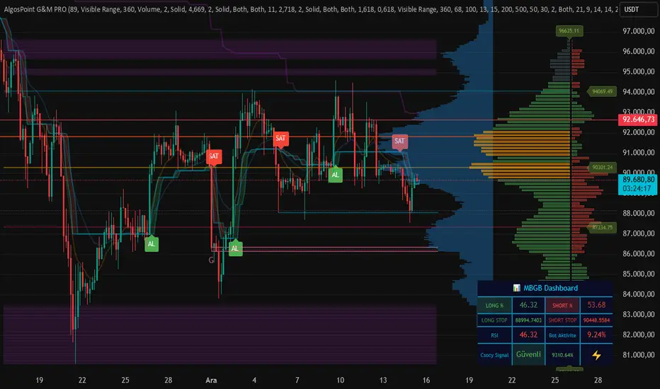
AlgosPoint G&MPoint Breaking 2025 (MB&GB Breaking Point Pro)
What It Does:
A comprehensive TradingView indicator that combines multiple technical analysis tools to identify key market breakout points, support/resistance levels, and trading opportunities. It integrates Volume Profile analysis, AlphaTrend signals, and custom risk assessment metrics.
Key Features:
Volume Profile Analysis: Displays Point of Control (POC), Value Area High/Low (VAH/VAL), and volume distribution
Support & Resistance Detection: Automatically identifies key price levels based on volume or price action
AlphaTrend Signals: Generates BUY/SELL signals with visual labels on chart
Volume Spike Detection: Highlights unusual volume activity indicating potential exhaustion or breakout
High Volatility Alerts: Marks periods of increased market volatility using ATR
Risk Assessment Dashboard: Real-time panel showing:
Long/Short percentages (RSI-based)
Stop levels for both directions
Bot activity percentage
Csocy Signal status (Safe/Undecided/Risky)
How to Use:
Add to Chart: Apply indicator to any timeframe (works best on 15m-4H)
Configure Settings: Adjust parameters in grouped sections:
📊 General Settings (lookback periods)
🎯 Support & Resistance (line styles/colors)
💥 Volume Spike (threshold sensitivity)
⚡ High Volatility (ATR multiplier)
📈 Volume Profile (display options)
🔥 AlphaTrend (signal sensitivity)
Read Signals:
BUY label = Potential long entry when AlphaTrend crosses up
SELL label = Potential short entry when AlphaTrend crosses down
Dashboard colors: Green = bullish, Red = bearish, Yellow = neutral
Set Alerts: Built-in alerts for price crosses, volume spikes, and signal confirmations
Risk Management: Use displayed stop levels and Csocy Signal status to manage position sizing
Best For:
Day traders and swing traders
Crypto, Forex, and Stock markets
Identifying high-probability breakout zones
Volume-based trading strategies
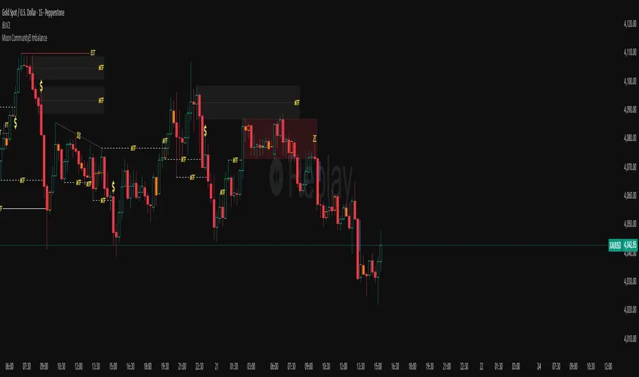
RSI Divergence LiquidityRSI Divergence Liquidity is an indicator designed to help you catch high-probability BUY reversals by combining two powerful concepts:
OANDA:XAUUSD
Liquidity Sweep / Swing Low: automatically marks swing-low levels and tracks when price sweeps below them and reacts back.
Bullish RSI Divergence: filters noise by comparing RSI at the swing area versus RSI at the retest, favoring reversals with stronger momentum confirmation.
How it works
The script draws Swing Low lines using Pivot Lows. When a new Swing Low forms, the previous one is cut/frozen .
When price retests a Swing Low and the candle conditions are met (bar n bullish, bar n-1 bearish), the script checks:
Whether RSI at n/n-1 is higher than the RSI at the swing (bullish divergence logic)
Whether min RSI at the swing is below a threshold (default < 36) to focus on oversold swing areas
If all conditions pass, the indicator prints an upward triangle right when bar n closes → a potential BUY signal.
How to use
Enter BUY when an up triangle appears at/near the Swing Low (liquidity sweep zone).
Stop Loss idea: below the most recent swing low / below the sweep wick.
Take Profit idea: nearest supply zone, prior high, or fixed RR such as 1:2 / 1:3 depending on your system.
Recommended settings
Best on: M5–H1 (depending on your style), especially effective when price is trending down and performs a clear sweep.
For stricter filtering: lower Max minRSI at Swing (x) to only take signals from deeper RSI lows.
Smaller Pivot Lookback → more swings/signals; larger values → fewer but cleaner swings.
Note: This tool improves probability, not certainty. Combine it with market structure / key levels and proper risk management for best results.

Quarter Levels Auto recentering - With Advance mode📌 Indicator Description
Quarter Levels — Auto Recentering (Advanced Mode) plots a structured set of quarter-price levels around the current market price and keeps them auto-centered as price moves.
These levels represent natural price decision zones where markets frequently pause, react, reject, break, or retest.
The indicator is designed to support price-action trading across futures, stocks, crypto, and forex.
This is a decision-support tool, not a buy/sell signal system.
🔢 Understanding The Quarter Levels
The indicator plots multiple types of quarter levels, each serving a different purpose.
Think of them as a price map, not targets or predictions.
🟦 00 / 25 / 50 / 75 — Core Structure Levels
These are the primary quarter levels and form the backbone of the system.
00 → Whole number / major psychological level
25 & 75 → Mid-range reaction levels inside the block
50 → Equilibrium / balance point of the range
How price behaves here:
Strong reactions and pauses
Common areas for consolidation
Frequent support or resistance flips
These levels are ideal for:
Structure analysis
Scaling in or out
Identifying balance vs. imbalance
🟪 10 / 80 — Rejection & Extension Zones
These levels sit just inside the edge of the quarter block.
10 → Shallow rejection / early defense zone
80 → Late extension / exhaustion zone
How price behaves here:
Fast reactions
Sharp rejections or continuations
Momentum decision points
These levels often act as:
Early warning zones
“Last defense” areas before a break
Extension points during strong moves
🟥 35 / 65 / 90 — Momentum & Continuation Levels
These levels represent momentum checkpoints inside and beyond the quarter structure.
35 & 65 → Internal momentum acceptance zones
90 → High-pressure continuation or failure point
How price behaves here:
Acceptance above/below suggests continuation
Failure often leads to rotation back toward balance
Useful for trend confirmation or invalidation
These levels help answer:
“Is price accepting higher or lower?”
“Is this move real, or failing?”
🔍 Advanced Glow (Optional)
When Advanced Mode is enabled, the indicator automatically highlights:
The strongest confirmed support below price
The strongest confirmed resistance above price
These highlights:
Are based on recent touches and candle behavior
Lock on candle close to keep the display stable
Help reduce clutter by focusing attention on the most important nearby levels
🧭 How Traders Commonly Use This Indicator
Identify key support and resistance zones
Wait for price reaction, not prediction
Trade with structure, not into it
Use the next quarter level as a logical checkpoint
Combine with trend, volume, VWAP, or higher-timeframe bias
Each level is a decision area, not a signal.
📉 Hybrid Trailing Stop (Visual Only)
An optional visual trailing stop can be displayed:
Anchored to confirmed quarter structure
Updates on candle close
Intended only as a risk-management reference
It does not place trades or generate signals.
⚠️ Important Notes
This indicator does not repaint
It does not provide buy/sell signals
It is designed for price-action traders
Always manage risk appropriately
✅ Best Use Cases
✔ Intraday & scalping
✔ Futures, stocks, crypto, forex
✔ Structure-based trading
✔ Traders who want clarity without clutter

Market + Direction + Entry + Hold + Exit v1.5 FINALOverview
This script is a complete trend-based trading framework designed to filter market conditions, determine directional bias, detect high-quality pullback entries, manage active trades, and identify trend-weakening exit points.
It is optimized for NQ futures, Gold (XAUUSD), and Bitcoin, with adaptive parameters for each asset.
The logic focuses on trading only when conditions are favorable, aligning entries with the primary trend, and avoiding low-probability setups.
1. Market Condition Filter
Before any signal appears, the script checks whether the market is active using three conditions:
ATR compared to ATR moving average (volatility condition)
Volume compared to average volume (liquidity condition)
Price distance from VWAP (suppression of mean-reversion environments)
A trade environment is considered active when at least two of these three conditions are positive.
2. Trend Direction Filter
Directional bias is defined by:
EMA21 relative to EMA55
Price relative to VWAP
Heikin-Ashi structure
When these conditions align, the script switches into long-only or short-only mode.
No counter-trend signals are displayed.
3. Entry Logic (L, L2, L3 and S, S2, S3)
The system identifies pullback entries within a confirmed trend.
Long entries require:
Uptrend confirmation
Price dipping toward EMA21 or EMA55
A constructive Heikin-Ashi candle
Market environment active
Short entries mirror the same structure in bearish conditions.
Re-entries (L2, L3, S2, S3) are given only if the trend remains intact after the first entry.
4. Hold Logic
A hold signal appears if momentum remains aligned with the trend.
Momentum is evaluated using the Stochastic indicator (K and D lines).
5. Exit Logic
An exit signal appears when:
The recent structural low (for longs) or high (for shorts) is broken, and
The EMA slope indicates weakening trend strength
This combination identifies high-probability trend exhaustion.
How to Use
Add the script to your chart.
Select an asset preset (NQ, GOLD, BTC).
Wait for the market to be active.
Follow the entry signals (L, L2, L3 or S, S2, S3).
Hold signals help confirm continuation.
Exit signals indicate potential trend reversal or weakness.
Feature Summary
Market environment filter
Trend direction filter
Pullback-based entry system
Multi-stage re-entry framework
Momentum-based hold signal
Structure-based exit
Asset-adaptive parameters
Clean chart visualization
Disclaimer
This script is for research and educational use.
It does not constitute financial advice.
Always backtest before using in live markets.
개요
이 스크립트는 시장 상태 필터링, 추세 방향 판단, 고품질 눌림목 진입, 보유 판단, 추세 약화 기반 청산까지 모두 포함하는 완전한 트레이딩 프레임워크입니다.
NQ, 골드(XAUUSD), 비트코인에 맞게 최적화되어 있습니다.
1. 시장 필터
다음 세 가지 중 두 가지 이상이 충족될 때만 매매 환경을 ‘활성’으로 판단합니다.
ATR 기준 변동성 체크
거래량 활성도 체크
가격의 VWAP 거리 체크
2. 방향(추세) 필터
다음 조건을 기반으로 상승·하락 추세를 결정합니다.
EMA21 vs EMA55
가격 vs VWAP
Heikin-Ashi 구조
이 조건이 일치할 때만 롱 전용 또는 숏 전용 모드로 진입합니다.
3. 진입 로직
추세가 유지되는 상태에서 EMA21 또는 EMA55까지 눌림이 나올 때
L 또는 S 신호를 제공합니다.
추세가 유지되면 L2/L3, S2/S3 재진입 신호가 추가로 발생합니다.
4. 보유(Hold)
모멘텀이 추세 방향과 일치할 때 보유 신호를 제공합니다.
5. 청산(Exit)
다음 두 조건이 동시에 나타날 때 청산 신호가 표시됩니다.
직전 구조(스윙)가 붕괴될 때
EMA 기울기가 약화될 때
사용 방법
차트에 스크립트를 추가합니다.
자산 프리셋(NQ, GOLD, BTC)을 선택합니다.
시장이 활성일 때만 신호를 참고합니다.
L/S 진입 신호와 보유/청산 신호를 활용해 매매 흐름을 관리합니다.

Body Direction Ratio (Fixed Range)Overview
The Body Direction Ratio (Fixed Range) indicator measures directional participation inside a user-defined time range by analyzing candle bodies only.
Instead of counting candles, the indicator sums the actual body size of bullish and bearish candles within the selected range and displays their percentage relationship. This provides a clear view of who was in control during that period: buyers or sellers.
What the indicator does
Within the selected time range, the indicator:
Calculates bullish body size (close > open)
Calculates bearish body size (open > close)
Sums both values
Computes the percentage ratio between bullish and bearish bodies
Draws a range box covering the high/low of the selected period
Assigns a Bullish or Bearish bias
Colors the box automatically based on that bias
There is no “Balanced” state by design. The result is always either Bullish or Bearish, ensuring a clear directional context.
Bias Logic
Bullish Bias: Bullish body sum ≥ Bearish body sum
Bearish Bias: Bearish body sum > Bullish body sum
The box color reflects the detected bias instantly.
Fixed Range Control
Fully manual start and end time
Optional Auto End = Current Bar toggle
End time is always guaranteed to come after start time
No automatic extending unless explicitly enabled
This ensures precise and reproducible analysis.
How to use it (recommended workflow)
This indicator is not a signal tool. It is a context and participation tool.
A powerful use case is applying the indicator on lower timeframes at higher-timeframe points of interest.
Examples of points of interest:
Higher-timeframe support and resistance levels
Supply and demand zones
Daily or weekly key levels
Session ranges and reaction areas
Workflow example:
Identify a higher-timeframe level (e.g. daily resistance)
Switch to a lower timeframe (e.g. 5m or 15m)
Select a fixed range around the reaction area
Observe whether buyers or sellers dominated inside that range
Use the result as contextual information, not as an entry trigger
This helps answer questions such as:
Was the reaction buyer-driven or seller-driven?
Is participation expanding or fading?
Does price acceptance or rejection make structural sense?
Input Parameters
Time Range
Start Time
Defines the beginning of the fixed analysis range. Only candles whose time is equal to or after this timestamp are included in the calculation.
End Time
Defines the end of the fixed analysis range. Only candles whose time is equal to or before this timestamp are included in the calculation.
Auto End = Current Bar
When enabled, the end time is automatically set to the current bar. This allows the range to extend dynamically while keeping the start time fixed. When disabled, the range remains strictly fixed between Start Time and End Time.
Visual
Bullish Box Color
Sets the box color when bullish body participation is greater than or equal to bearish body participation.
Bearish Box Color
Sets the box color when bearish body participation is greater than bullish body participation.
Text Color
Defines the text color used for the information label displayed on the chart.
Important notes
This indicator does not predict price
It does not generate buy or sell signals
It should always be used together with structure, levels, and higher-timeframe context
Key benefits
Measures real participation instead of candle count
Works on any timeframe
Especially effective on lower timeframes around HTF levels
Clear directional bias without ambiguity
Clean, non-lagging, fixed-range logic

Universe PACut through the noise: The "Universe PA" Strategy
You don't need to get lost in thousands of complex terms like Order Flow, PO3, or Judas Swing. This indicator is based on the purest and most effective form of Price Action: Simplicity.
The Core Philosophy: While many traders focus on old history, the real opportunity lies in the last valid break (BOS). We call this the "Magic Line". The key is the Supply/Demand zone that caused that specific break.
Key Features:
Magic Line (BOS): Automatically marks the level where structure is broken.
Auto Supply & Demand Zones: Identifies the origin of the move (Order Block) that caused the break and draws a zone.
Smart Clean: Keeps your chart clean by automatically removing old/invalid zones, focusing only on the latest opportunity.
Entry Signals: Detects Pinbar (P) and Engulfing (E) patterns to help you time your entry perfectly within the zones.
How to Use:
Identify the "Magic Line" break and the Zone on higher timeframes (e.g., H4).
Wait for price to return (retest) to the Zone.
Look for "P" or "E" signals inside the zone for confirmation.
Simplicity pays.
