Smart FlexRange Breakout [The_lurker]The Smart FlexRange Breakout tool aims to identify trading opportunities based on price breakouts of dynamic levels (CALL, PUT) with a dotted centerline and the ability to select the applicable market. The tool relies on candlestick analysis over a specific time period (such as 3 hours). Candle data (searchHours) is collected to identify the most significant candle based on candlestick patterns and trading volume during the selected timeframe. Breakout levels and take-profit (TP) targets are then plotted, along with buy and sell signals, breakout notifications, and up/down trend lines based on Pivot Points.
The tool is run according to the selected timeframe.
Practical Use
1- Setup: Adjust the market, timeframe, number of hours, and time zone to suit the trader's needs.
2- Trading: Monitor signals (BUY/SELL) and TP levels to determine entry and exit points.
3- Trend Lines: Use them to understand the overall trend and confirm signals.
---
1. Objective: Identify trading opportunities based on price breakouts
- Trading opportunities: The indicator is designed to help traders identify moments when significant price movements are likely, allowing them to enter buy or sell trades based on market changes.
- Price breakouts: The indicator focuses on moments when prices break through key levels (resistance or support). A breakout occurs when the price exceeds a resistance level (up) or breaks a support level (down), indicating a potential continuation of the movement in the same direction.
- Dynamic: Resistance and support levels are not static; rather, they are calculated based on candlestick analysis over a specific period of time, making them adaptive to current market conditions.
---
2. Dynamic levels (resistance and support levels)
- Resistance levels: These represent prices that the price is difficult to break above, defined here as the high of the most significant candle during the specified period.
- Support levels: These represent prices below which the price is difficult to fall, defined as the low of the most significant candle.
- Dynamic: These levels are recalculated every new search period (searchHours), meaning they change based on the latest market data, unlike traditional static levels.
---
3. Adding a Dotted Center Line
- Center Line: A horizontal dotted line is drawn at the midpoint between the high and low of the most significant candle.
- Purpose:
- Provides a visual reference point for determining the current price position relative to support and resistance levels.
- Helps assess whether the price is moving toward a breakout (near resistance) or a breakout (near support).
- Dotted: The dotted pattern distinguishes it from the solid upper and lower lines, making it easier to distinguish visually.
---
4. Relying on candlestick analysis over a specific time period (searchHours)
- Candlestick Analysis: The indicator examines candlesticks to determine which ones have the most influence on price movement.
- Timeframe (searchHours):
- The user specifies the number of hours (1-6) for candle analysis, which determines the range of data the indicator relies on.
- Example: If searchHours = 3 and timeframe = 30 minutes, 6 candles are analyzed (3 hours ÷ 30 minutes).
- Flexibility: This period can be adjusted to suit different markets (such as volatile cryptocurrencies or more stable Forex).
---
5. Determining the Most Important Candle Based on Candle Patterns and Volume
- The most important candle: is the candle believed to have the greatest impact on price movement based on specific criteria.
- Candle Patterns:
- Candles are analyzed using a candlestick pattern library (such as Engulfing, Hammer, Doji).
- Reversal patterns (such as Morning Star, Shooting Star) are given a high importance score (100 points) because they indicate potential trend changes.
- Trading Volume:
- The trading volume of each candle is measured and compared to the maximum and minimum during the period.
- Volume is calculated as a percentage (0-100) and added to the pattern score to determine the most significant candle.
- Result: The candle with the highest score (patterns + volume) is used to determine support and resistance levels.
---
6. Timeframe
- Time interval: The user selects a time frame for the candles (15, 30, or 60 minutes).
- Importance:
- Determines the number of candles analyzed during the searchHours period.
- Affects the accuracy and speed of the signals (shorter timeframe = faster but less reliable signals; longer timeframe = slower but more reliable signals).
- Example: If the timeframe is 60 minutes and searchHours is 3, only 3 candles are analyzed.
---
7. Drawing Breakout Levels and Take Profit Targets (TP)
- Breakout Levels:
- Upper line (resistance): Drawn at the highest price of the most significant candle and is labeled "CALL".
- Lower line (support): Drawn at the lowest price of the most important candle and is called "PUT."
- These lines represent levels where a breakout is expected to lead to a strong price movement.
- Take Profit Targets (TP):
- Up to 8 bullish (above the upper line) and bearish (below the lower line) TP levels are calculated.
- They are calculated based on a percentage (tpPercentage) added or subtracted from the base lines.
- Example: If tpPercentage = 0.6% and the high price = 100, then bullish TP1 = 100.6, TP2 = 101.2, etc.
- Labels: Labels are drawn for each TP level indicating the value and level (TP1, TP2, etc.).
---
8. Buy and Sell Signals
- Buy (BUY) signal:
- Generated when the price breaks the upper line (ta.crossover).
- The "BUY" label is drawn with the redrawing of the TP levels.
- Sell signal (SELL):
- Generated when the price breaks the lower line (ta.crossunder).
- The "SELL" label is drawn with the redrawing of the TP levels.
- Purpose: To provide clear signals to the trader for making trade entry decisions.
=========================================================================
Thank you, n00btraders.
For using the import library: n00btraders/Timezone/1
For using the import library: The_lurker/AllCandlestickPatternsLibrary/1
========================================================================
Disclaimer:
The information and publications are not intended to be, nor do they constitute, financial, investment, trading, or other types of advice or recommendations provided or endorsed by TradingView.
تهدف أداة Smart FlexRange Breakout إلى تحديد فرص التداول بناءً على اختراقات الأسعار للمستويات الديناميكية (CALL، PUT) مع خط مركزي منقط، مع إمكانية اختيار السوق المناسب. تعتمد الأداة على تحليل الشموع اليابانية على مدى فترة زمنية محددة (مثل 3 ساعات). تُجمع بيانات الشموع (searchHours) لتحديد أهم شمعة بناءً على أنماط الشموع وحجم التداول خلال الإطار الزمني المحدد. ثم تُرسم مستويات الاختراق وأهداف جني الأرباح (TP)، بالإضافة إلى إشارات البيع والشراء، وإشعارات الاختراق، وخطوط الاتجاه الصعودي/الهبوطي بناءً على نقاط المحور.
يتم تشغيل الاداه حسب الفاصل المختار timeframe
الاستخدام العملي
1- الإعداد: اضبط السوق، والإطار الزمني، وعدد الساعات، والمنطقة الزمنية لتناسب احتياجات المتداول.
2- التداول: راقب إشارات (الشراء/البيع) ومستويات جني الأرباح لتحديد نقاط الدخول والخروج.
3- خطوط الاتجاه: استخدمها لفهم الاتجاه العام وتأكيد الإشارات.
1. الهدف: تحديد فرص التداول بناءً على اختراقات الأسعار
- فرص التداول: صُمم هذا المؤشر لمساعدة المتداولين على تحديد اللحظات التي يُحتمل فيها حدوث تحركات سعرية كبيرة، مما يسمح لهم بالدخول في صفقات شراء أو بيع بناءً على تغيرات السوق.
- اختراقات الأسعار: يُركز المؤشر على اللحظات التي تخترق فيها الأسعار مستويات رئيسية (مقاومة أو دعم). يحدث الاختراق عندما يتجاوز السعر مستوى مقاومة (صعودًا) أو يخترق مستوى دعم (هبوطًا)، مما يُشير إلى احتمال استمرار الحركة في نفس الاتجاه.
- ديناميكي: مستويات المقاومة والدعم ليست ثابتة؛ بل تُحسب بناءً على تحليل الشموع اليابانية على مدى فترة زمنية محددة، مما يجعلها مُكيفة مع ظروف السوق الحالية.
2. المستويات الديناميكية (مستويات المقاومة والدعم)
- مستويات المقاومة: تُمثل هذه الأسعار التي يصعب على السعر تجاوزها، وتُعرف هنا بأنها ارتفاع الشمعة الأكثر أهمية خلال الفترة المحددة.
- مستويات الدعم: تُمثل هذه الأسعار التي يصعب على السعر الانخفاض دونها، وتُعرف بأنها أدنى مستوى للشمعة الأكثر أهمية.
- ديناميكي: تُعاد حساب هذه المستويات مع كل فترة بحث جديدة (ساعات البحث)، مما يعني أنها تتغير بناءً على أحدث بيانات السوق، على عكس المستويات الثابتة التقليدية.
3. إضافة خط مركزي منقط
- خط المركز: يُرسم خط أفقي منقط عند نقطة المنتصف بين أعلى وأدنى شمعة ذات أهمية.
- الغرض:
- يوفر نقطة مرجعية بصرية لتحديد وضع السعر الحالي بالنسبة لمستويات الدعم والمقاومة.
- يساعد في تقييم ما إذا كان السعر يتحرك نحو اختراق (بالقرب من المقاومة) أو اختراق (بالقرب من الدعم).
- منقط: يُميزه النمط المنقط عن الخطوط العلوية والسفلية المتصلة، مما يُسهّل تمييزه بصريًا.
4. الاعتماد على تحليل الشموع اليابانية على مدى فترة زمنية محددة (ساعات البحث)
- تحليل الشموع اليابانية: يفحص المؤشر الشموع اليابانية لتحديد أيها الأكثر تأثيرًا على حركة السعر.
- الإطار الزمني (ساعات البحث):
- يُحدد المستخدم عدد الساعات (من 1 إلى 6) لتحليل الشموع، والذي يُحدد نطاق البيانات التي يعتمد عليها المؤشر.
- مثال: إذا كانت ساعات البحث = 3 والإطار الزمني = 30 دقيقة، فسيتم تحليل 6 شموع (3 ساعات ÷ 30 دقيقة).
- المرونة: يُمكن تعديل هذه الفترة لتناسب الأسواق المختلفة (مثل العملات المشفرة المتقلبة أو سوق الفوركس الأكثر استقرارًا).
5. تحديد الشمعة الأكثر أهمية بناءً على أنماط الشموع وحجم التداول
- الشمعة الأكثر أهمية: هي الشمعة التي يُعتقد أن لها التأثير الأكبر على حركة السعر بناءً على معايير محددة.
- أنماط الشموع:
- يتم تحليل الشموع باستخدام مكتبة أنماط الشموع (مثل شمعة الابتلاع، وشمعة المطرقة، وشمعة الدوجي).
- تُمنح أنماط الانعكاس (مثل نجمة الصباح، ونجم الشهاب) درجة أهمية عالية (100 نقطة) لأنها تُشير إلى تغيرات محتملة في الاتجاه.
- حجم التداول:
- يُقاس حجم تداول كل شمعة ويُقارن بالحد الأقصى والأدنى خلال الفترة.
- يُحسب الحجم كنسبة مئوية (0-100) ويُضاف إلى درجة النمط لتحديد الشمعة الأكثر أهمية.
- النتيجة: تُستخدم الشمعة ذات أعلى درجة (الأنماط + الحجم) لتحديد مستويات الدعم والمقاومة.
٦. الإطار الزمني
- الفاصل الزمني: يختار المستخدم إطارًا زمنيًا للشموع (١٥، ٣٠، أو ٦٠ دقيقة).
- الأهمية:
- يحدد عدد الشموع المُحللة خلال فترة ساعات البحث.
- يؤثر على دقة وسرعة الإشارات (الإطار الزمني الأقصر = إشارات أسرع ولكن أقل موثوقية؛ الإطار الزمني الأطول = إشارات أبطأ ولكن أكثر موثوقية).
- مثال: إذا كان الإطار الزمني ٦٠ دقيقة وساعات البحث ٣، فسيتم تحليل ٣ شموع فقط.
---
٧. رسم مستويات الاختراق وأهداف جني الأرباح (TP)
- مستويات الاختراق:
- الخط العلوي (المقاومة): يُرسم عند أعلى سعر للشمعة الأكثر أهمية ويُسمى "CALL".
- الخط السفلي (الدعم): يُرسم عند أدنى سعر للشمعة الأكثر أهمية ويُسمى "PUT".
- تمثل هذه الخطوط المستويات التي يُتوقع أن يؤدي فيها الاختراق إلى حركة سعرية قوية.
- أهداف جني الأرباح (TP):
- يتم حساب ما يصل إلى 8 مستويات جني أرباح صعودية (فوق الخط العلوي) وهبوطية (تحت الخط السفلي).
- يتم حسابها بناءً على نسبة مئوية (tpPercentage) تُضاف أو تُطرح من خطوط الأساس.
- مثال: إذا كانت نسبة جني الأرباح = 0.6% وكان أعلى سعر = 100، فإن هدف الربح الصعودي الأول = 100.6، وهدف الربح الثاني = 101.2، وهكذا.
- العلامات: تُرسم علامات لكل مستوى جني أرباح تشير إلى القيمة والمستوى (TP1، TP2، وهكذا).
---
8. إشارات الشراء والبيع
- إشارة الشراء (BUY):
- تُولّد عند اختراق السعر للخط العلوي (ta.crossover).
- تُرسم علامة "الشراء" مع إعادة رسم مستويات جني الأرباح.
- إشارة البيع (SELL):
- تُولّد عند اختراق السعر للخط السفلي (ta.crossunder). - يُرسم مؤشر "بيع" مع إعادة رسم مستويات جني الأرباح.
- الغرض: توفير إشارات واضحة للمتداول لاتخاذ قرارات دخول الصفقة.
==========================================================================
شكرًا لكم، أيها المتداولون الجدد.
لاستخدام مكتبة الاستيراد: n00btraders/Timezone/1
لاستخدام مكتبة الاستيراد: The_lurker/AllCandlestickPatternsLibrary/1
==============================================================================
إخلاء مسؤولية:
لا يُقصد بهذه المعلومات والمنشورات أن تكون، ولا تُشكل، نصائح أو توصيات مالية أو استثمارية أو تجارية أو أي نوع آخر من النصائح أو التوصيات المُقدمة من TradingView أو المُعتمدة منها.
Candlestick analysis

LRCDescription:
🐊 LRCandle – Linear Regression Based Indicator
The indicator plots linear regression channels for open, high, low and close prices. Core logic:
BUY signal when regression open line (L_open) crosses close line (L_close) upwards
SELL signal when crossing downwards
Bar colors change according to trend direction
Settings:
Regression length (default 8)
Alternative timeframe selection
Color bars display option
Signal labels display
Automatically switches to higher timeframe for analysis:
1M → 30M
5M → 60M
15M → 240M
1H → 12H
4H → 1D
etc.

棉花(爱老婆版本) – 云图Below is a concise English guide so you—or anyone on your team—can load, understand, and trade with the script you just updated. 云图 开源 收费的都是骗子

Bollinger Band Reversal Strategy//@version=5
strategy("Bollinger Band Reversal Strategy", overlay=true)
// Bollinger Band Parameters
length = input.int(20, title="BB Length")
src = input(close, title="Source")
mult = input.float(2.0, title="BB Multiplier")
basis = ta.sma(src, length)
dev = mult * ta.stdev(src, length)
upper = basis + dev
lower = basis - dev
plot(basis, "Basis", color=color.gray)
plot(upper, "Upper Band", color=color.red)
plot(lower, "Lower Band", color=color.green)
// Get previous and current candle data
prev_open = open
prev_close = close
cur_close = close
// Check for upper band touch and reversal
bearish_reversal = high >= upper and cur_close < prev_open
// Check for lower band touch and reversal
bullish_reversal = low <= lower and cur_close > prev_open
// Plotting arrows
plotshape(bearish_reversal, title="Down Arrow", location=location.abovebar, color=color.red, style=shape.arrowdown, size=size.small)
plotshape(bullish_reversal, title="Up Arrow", location=location.belowbar, color=color.green, style=shape.arrowup, size=size.small)
// Optional: Add strategy entry signals
if (bullish_reversal)
strategy.entry("Buy", strategy.long)
if (bearish_reversal)
strategy.entry("Sell", strategy.short)

Custom RSI & EMA Crosscreated a turkey that shows when the conditions of the RSI and EMA match from different TF and values

Rich HarvesterDynamic leverage management: supports flexible adjustment from 0.1 to 100 times to adapt to different risk preferences
Dual stop loss mechanism:
Fixed stop loss: initial protection based on ATR multiple (atr_mult)
Trailing stop loss: profit protection through slPoints and slOffset
Fund risk control: calculate the position according to the equity percentage (usr_risk), formula: risk amount = total funds × risk% × leverage
Professional signal filtering
Triple trend verification:
Fast EMA > Medium EMA > Slow SMA (bullish trend)
Fast EMA < Medium EMA < Slow SMA (bearish trend)
Pin Bar pattern enhancement:
Requires classic reversal pattern with shadows accounting for more than 66%
Filter conditions combined with trend direction
Time window control: ent_canc parameter automatically cancels expired signals

Multi-Timeframe Continuity Custom Candle ConfirmationMulti-Timeframe Continuity Custom Candle Confirmation
Overview
The Timeframe Continuity Indicator is a versatile tool designed to help traders identify alignment between their current chart’s candlestick direction and higher timeframes of their choice. By coloring bars on the current chart (e.g., 1-minute) based on the directional alignment with selected higher timeframes (e.g., 10-minute, daily), this indicator provides a visual cue for confirming trends across multiple timeframes—a concept known as Timeframe Continuity. This approach is particularly useful for day traders, swing traders, and scalpers looking to ensure their trades align with broader market trends, reducing the risk of trading against the prevailing momentum.
Originality and Usefulness
This indicator is an original creation, built from scratch to address a common challenge in trading: ensuring that price action on a lower timeframe aligns with the trend on higher timeframes. Unlike many trend-following indicators that rely on moving averages, oscillators, or other lagging metrics, this script directly compares the bullish or bearish direction of candlesticks across timeframes. It introduces the following unique features:
Customizable Timeframes: Users can select from a range of higher timeframes (5m, 10m, 15m, 30m, 1h, 2h, 4h, 1d, 1w, 1M) to check for alignment, making it adaptable to various trading styles.
Neutral Candle Handling: The script accounts for neutral candles (where close == open) on the current timeframe by allowing them to inherit the direction of the higher timeframe, ensuring continuity in trend visualization.
Table: A table displays the direction of each selected timeframe and the current timeframe, helping identify direction in the event you don't want to color bars.
Toggles for Flexibility: Options to disable bar coloring and the debug table allow users to customize the indicator’s visual output for cleaner charts or focused analysis.
This indicator is not a mashup of existing scripts but a purpose-built tool to visualize timeframe alignment directly through candlestick direction, offering traders a straightforward way to confirm trend consistency.
What It Does
The Timeframe Continuity Indicator colors bars on your chart when the direction of the current timeframe’s candlestick (bullish, bearish, or neutral) aligns with the direction of the selected higher timeframes:
Lime: The current bar (e.g., 1m) is bullish or neutral, and all selected higher timeframes (e.g., 10m) are bullish.
Pink: The current bar is bearish or neutral, and all selected higher timeframes are bearish.
Default Color: If the directions don’t align (e.g., 1m bar is bearish but 10m is bullish), the bar remains the default chart color.
The indicator also includes a debug table (toggleable) that shows the direction of each selected timeframe and the current timeframe, helping traders diagnose alignment issues.
How It Works
The script uses the following methodology:
1. Direction Calculation: For each timeframe (current and selected higher timeframes), the script determines the candlestick’s direction:
Bullish (1): close > open / Bearish (-1): close < open / Neutral (0): close == open
Higher timeframe directions are fetched using Pine Script’s request.security function, ensuring accurate data retrieval.
2. Alignment Check: The script checks if all selected higher timeframes are uniformly bullish (full_bullish) or bearish (full_bearish).
o A higher timeframe must have a clear direction (bullish or bearish) to trigger coloring. If any selected timeframe is neutral, alignment fails, and no coloring occurs.
3. Coloring Logic: The current bar is colored only if its direction aligns with the higher timeframes:
Lime if the higher timeframes are bullish and the current bar is bullish or neutral.
Maroon if the higher timeframes are bearish and the current bar is bearish or neutral.
If the current bar’s direction opposes the higher timeframe (e.g., 1m bearish, 10m bullish), the bar remains uncolored.
Users can disable bar coloring entirely via the settings, leaving bars in their default chart color.
4. Direction Table:
A table in the top-right corner (toggleable) displays the direction of each selected timeframe and the current timeframe, using color-coded labels (green for bullish, red for bearish, gray for neutral).
This feature helps traders understand why a bar is or isn’t colored, making the indicator accessible to users unfamiliar with Pine Script.
How to Use
1. Add the Indicator: Add the "Timeframe Continuity Indicator" to your chart in TradingView (e.g., a 1m chart of SPY).
2. Configure Settings:
Timeframe Selection: Check the boxes for the higher timeframes you want to compare against (default: 10m). Options include 5m, 10m, 15m, 30m, 1h, 2h, 4h, 1D, 1W, and 1M. Select multiple timeframes if you want to ensure alignment across all of them (e.g., 10m and 1d).
Enable Bar Coloring: Default: true (bars are colored lime or maroon when aligned). Set to false to disable coloring and keep the default chart colors.
Show Table: Default: true (table is displayed in the top-right corner). Set to false to hide the table for a cleaner chart.
3. Interpret the Output:
Colored Bars: Lime bars indicate the current bar (e.g., 1m) is bullish or neutral, and all selected higher timeframes are bullish. Maroon bars indicate the current bar is bearish or neutral, and all selected higher timeframes are bearish. Uncolored bars (default chart color) indicate a mismatch (e.g., 1m bar is bearish while 10m is bullish) or no coloring if disabled.
Direction Table: Check the table to see the direction of each selected timeframe and the current timeframe.
4. Example Use Case:
On a 1m chart of SPY, select the 10m timeframe.
If the 10m timeframe is bearish, 1m bars that are bearish or neutral will color maroon, confirming you’re trading with the higher timeframe’s trend.
If a 1m bar is bullish while the 10m is bearish, it remains uncolored, signaling a potential misalignment to avoid trading.
Underlying Concepts
The indicator is based on the concept of Timeframe Continuity, a strategy used by traders to ensure that price action on a lower timeframe aligns with the trend on higher timeframes. This reduces the risk of entering trades against the broader market direction. The script directly compares candlestick directions (bullish, bearish, or neutral) rather than relying on lagging indicators like moving averages or RSI, providing a real-time, price-action-based confirmation of trend alignment. The handling of neutral candles ensures that minor indecision on the lower timeframe doesn’t interrupt the visualization of the higher timeframe’s trend.
Why This Indicator?
Simplicity: Directly compares candlestick directions, avoiding complex calculations or lagging indicators.
Flexibility: Customizable timeframes and toggles cater to various trading strategies.
Transparency: The debug table makes the indicator’s logic accessible to all users, not just those who can read Pine Script.
Practicality: Helps traders confirm trend alignment, a key factor in successful trading across timeframes.

[T] Current Candle High/Low - Left LinesThis script can be used to see if the current candle has hit a FVG or OB to the left.
Useful for setting if price has hit the CE of a previous FVG or OB on the same timeframe.

Custom RSI & EMA Crosscreated a turkey that shows when the conditions of the RSI and EMA match from different TF and values

QoQ PAT & Sales % Labels by GauravThis indicator automatically displays the Quarter-over-Quarter (QoQ) percentage change of Sales and PAT (Profit After Tax) directly under the candlestick chart whenever quarterly results are released. It fetches financial data using TradingView’s request.financial() function and calculates the % change compared to the previous quarter. Labels are plotted at the exact bar where earnings are announced, helping traders quickly visualize fundamental growth alongside price action.

Tatanka - Auto Equidistant Levels ✦🔹 Tatanka – Auto Equidistant Levels
Automatically plot equidistant support & resistance levels based on any two price anchors. Build your levels grid in one click, fully tailored to your style and branding.
Key Features
• Auto-Spacing – Calculates N levels above & below your base line with adjustable spacing factor (e.g. 50%, 200%).
• Full Style Control – Customize line width, style (solid/dashed/dotted), colors, extend direction (left/right/both/none).
• Labels & Tags – Auto-generated “L0”, “L±1”, etc., so you always know which level you’re trading.
• Region Fills – Color-fill each zone between levels with per-region color picks for maximum clarity.
• One-Click Draw – Enter two prices, choose your settings, then hit “Apply” to render the entire grid on your chart.
Inputs & Tabs
• Parameters : Base & Next Level prices, number of levels, spacing factor & horizontal length.
• Style : Line width, color & style, draw direction, label mode, fill zones & per-region fill colors.
How to Use
1. Draw two horizontal lines at your desired anchor prices.
2. Copy those prices into the “Line1” & “Line2” inputs.
3. Tweak “Number of Levels” and “Spacing Factor” to suit your strategy.
4. Go to the Style tab to brand your grid: colors, line styles, fills & extension.
5. Apply and start trading with clear, evenly spaced levels!
About Tatanka
Tatanka is a leading fintech brand committed to empowering traders with intuitive, professional-grade tools. Our mission: deliver real-time insights, advanced indicators, and seamless charting utilities—all under one Tatanka badge. Join our growing community and elevate your edge
Enjoy and trade confidently—powered by Tatanka!
www.youtube.com

Color Change Entry Arrow//@version=5
indicator("Color Change Entry Arrow", overlay=true)
// Settings
point = input.float(1.0, title="Point Value", step=0.1)
move_points = input.float(5.0, title="Move Threshold", step=0.1)
// Candle info
close1 = close
open2 = open
close2 = close
// Color difference
isColorDifferent = (close > open and close < open) or (close < open and close > open)
// Open-close proximity
withinRange = math.abs(open2 - close1) <= point
// Price movement in direction of candle 2
bullMove = close - open >= move_points
bearMove = open - close >= move_points
// Signal conditions
longSignal = withinRange and isColorDifferent and close > open and bullMove
shortSignal = withinRange and isColorDifferent and close < open and bearMove
// Plot arrows
plotshape(longSignal, title="Long Entry", location=location.belowbar, color=color.green, style=shape.arrowup, size=size.small)
plotshape(shortSignal, title="Short Entry", location=location.abovebar, color=color.red, style=shape.arrowdown, size=size.small)

Rally Sweep ReversalThis indicator identifies rallies into a sweep to identify liquidity runs into key levels which often lead to reversals. I personally like prior day high/low and overnight high/low as my key levels. The signal should happen after sweeping the level, not before.

Kripto Stratejisi v2.2 (TP Ekli)Yapay Zeka desteği alarak bir Buy-Sell indikatörü yapmaya çalıştım. Umarım faydalı olur. YTD

My script
// Description:
// This indicator is developed by my script to assist traders in identifying key entry and exit points
// based on a combination of price action, custom trend filters, and momentum analysis.
// It is designed for use on intraday and positional charts and aims to provide high-probability signals
// in trending as well as ranging market conditions.
//
// Features:
// - Custom trend direction logic
// - Dynamic buy/sell signal generation
// - Works across multiple timeframes and instruments
// - Can be used standalone or alongside other strategies
//
// Public Release:
// This script is public and free to use. Please give credit if reused or modified.
// Follow my script on TradingView for updates, strategy breakdowns, and market insights.
//
// Disclaimer:
// This tool is for educational purposes only and should not be considered financial advice.
// Always use proper risk management.
//

Entry Buy/Sell + Support/Resistance Zones//@version=5
indicator("Entry Buy/Sell + Support/Resistance Zones", overlay=true)
// === Tham số ===
length = input.int(5, title="Pivot Length")
maxZones = input.int(10, title="Số lượng vùng tối đa")
zoneWidth = input.int(20, title="Độ rộng vùng (số nến)")
showEntry = input.bool(true, title="Hiển thị Entry Buy/Sell?")
// === Phát hiện pivot ===
pivotHigh = ta.pivothigh(high, length, length)
pivotLow = ta.pivotlow(low, length, length)
// === Mảng vùng hỗ trợ/kháng cự ===
var supportLevels = array.new_float()
var resistanceLevels = array.new_float()
// === Cập nhật vùng hỗ trợ ===
if pivotLow
sLevel = low
if not array.includes(supportLevels, sLevel)
array.unshift(supportLevels, sLevel)
if array.size(supportLevels) > maxZones
array.pop(supportLevels)
// === Cập nhật vùng kháng cự ===
if pivotHigh
rLevel = high
if not array.includes(resistanceLevels, rLevel)
array.unshift(resistanceLevels, rLevel)
if array.size(resistanceLevels) > maxZones
array.pop(resistanceLevels)
// === Vẽ vùng hỗ trợ ===
for i = 0 to array.size(supportLevels) - 1
sl = array.get(supportLevels, i)
box.new(bar_index - zoneWidth, sl, bar_index, sl, border_color=color.green, bgcolor=color.new(color.green, 85))
// === Vẽ vùng kháng cự ===
for i = 0 to array.size(resistanceLevels) - 1
rl = array.get(resistanceLevels, i)
box.new(bar_index - zoneWidth, rl, bar_index, rl, border_color=color.red, bgcolor=color.new(color.red, 85))
// === Entry logic ===
entryLong = showEntry and close > array.get(resistanceLevels, 0)
entryShort = showEntry and close < array.get(supportLevels, 0)
// === Vẽ tín hiệu Entry ===
plotshape(entryLong, title="Entry Buy", location=location.belowbar, color=color.green, style=shape.labelup, text="BUY")
plotshape(entryShort, title="Entry Sell", location=location.abovebar, color=color.red, style=shape.labeldown, text="SELL")
// Đảm bảo script hợp lệ
plot(na)


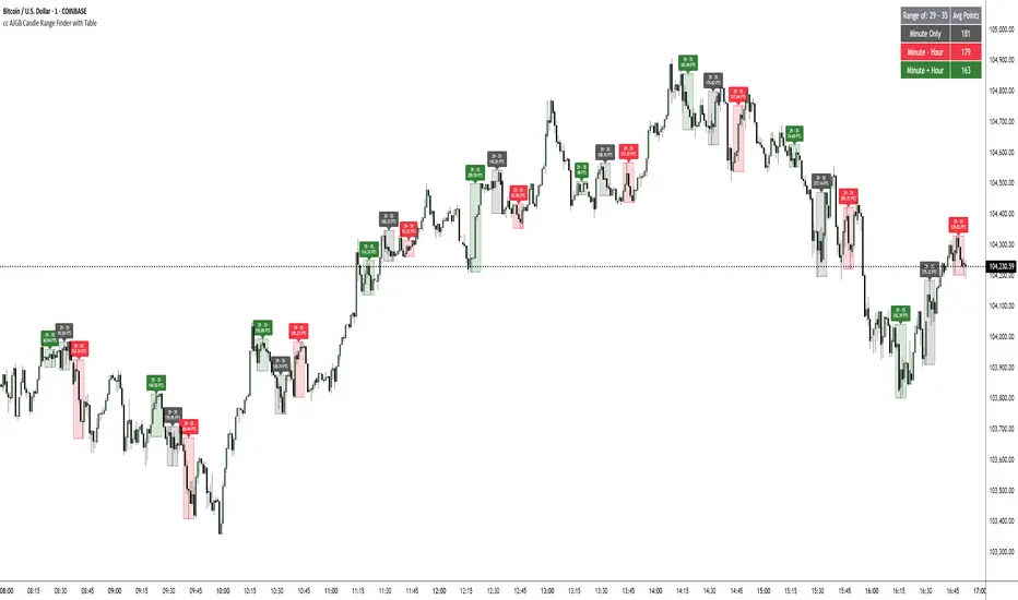
cc AJGB Candle Range Finder with TableOverview:
The "cc AJGB Candle Range Finder with Table" is a versatile Pine Script indicator designed to identify and visualize price ranges within the 1 minute charts based on UTC+2 Time Zone. Unlike traditional range indicators, it offers three unique calculation methods to define ranges based on minute and hour interactions, displays ranges as boxes with labeled point values, and summarizes average range sizes in a customizable table. This tool is ideal for analyzing price ranges of specific time based ranges.
Features:
Customizable Time Range: Users specify a start and end minute (0-59) to define the range period (e.g., 29th to 35th minute).
Three Calculation Methods:
Minute Only: Uses the minute of each bar to identify ranges (e.g., matches user-specified minutes).
Minute - Hour: Adjusts the minute by subtracting the hour, allowing for dynamic range detection across hourly cycles.
Minute + Hour: Combines minute and hour values for a unique range calculation, useful for specific intraday patterns.
Visual Output: Draws boxes around detected ranges, with labels showing the start/end minutes and range size in points.
Summary Table: Displays the average range size (in points) for each method, with customizable position, colors, and text size.
How It Works:
The indicator evaluates each bar’s timestamp in (UTC+2 ONLY) to match user-specified minutes using one or more selected methods. When a start minute is detected, it tracks the high and low prices until the end minute, drawing a box to highlight the range and labeling it with the range size in points. A table summarizes the average range size for each method, helping traders assess typical price movements during the specified period.
Market Analysis: Compare range sizes across different methods to understand intraday volatility patterns.
Settings Customization: Adjust colors, table position, and label sizes to suit your chart preferences.
Settings:
Range to Find: Set start and end minutes.
Range Selection: Enable/disable each method and customize colors.
Range Label Size: Choose label size (Tiny to Huge).
Table Settings: Configure table position (Top, Bottom, Left, Right), sub-position, text size, and colors.
Notes:
Only works on 1 minute charts
The indicator works best using Start Times that are lower than the End Times.
Ensure the chart is set to UTC+2 Time Zone for accurate range detection.
Why It’s Unique:
Unlike standard range indicators that focus on sessions or fixed periods, this tool allows precise minute-based range detection with three distinct calculation methods, offering flexibility for data gathering. The interactive table provides quick insights into average range sizes.

Long-Term Investing Signals + Trend Formation (Daily)Steven Paul Jobs (February 24, 1955 – October 5, 2011) was an American businessman, inventor, and investor best known for co-founding the technology company Apple Inc. Jobs was also the founder of NeXT and chairman and majority shareholder of Pixar. He was a pioneer of the personal computer revolution of the 1970s and 1980s, along with his early business partner and fellow Apple co-founder Steve Wozniak.
Jobs was born in San Francisco in 1955 and adopted shortly afterwards. He attended Reed College in 1972 before withdrawing that same year. In 1974, he traveled through India, seeking enlightenment before later studying Zen Buddhism. He and Wozniak co-founded Apple in 1976 to further develop and sell Wozniak's Apple I personal computer. Together, the duo gained fame and wealth a year later with production and sale of the Apple II, one of the first highly successful mass-produced microcomputers.
Jobs saw the commercial potential of the Xerox Alto in 1979, which was mouse-driven and had a graphical user interface (GUI). This led to the development of the largely unsuccessful Apple Lisa in 1983, followed by the breakthrough Macintosh in 1984, the first mass-produced computer with a GUI. The Macintosh launched the desktop publishing industry in 1985 (for example, the Aldus Pagemaker) with the addition of the Apple LaserWriter, the first laser printer to feature vector graphics and PostScript.
In 1985, Jobs departed Apple after a long power struggle with the company's board and its then-CEO, John Sculley. That same year, Jobs took some Apple employees with him to found NeXT, a computer platform development company that specialized in computers for higher-education and business markets, serving as its CEO. In 1986, he bought the computer graphics division of Lucasfilm, which was spun off independently as Pixar. Pixar produced the first computer-animated feature film, Toy Story (1995), and became a leading animation studio, producing dozens of commercially successful and critically acclaimed films.
In 1997, Jobs returned to Apple as CEO after the company's acquisition of NeXT. He was largely responsible for reviving Apple, which was on the verge of bankruptcy. He worked closely with British designer Jony Ive to develop a line of products and services that had larger cultural ramifications, beginning with the "Think different" advertising campaign, and leading to the iMac, iTunes, Mac OS X, Apple Store, iPod, iTunes Store, iPhone, App Store, and iPad. Jobs was also a board member at Gap Inc. from 1999 to 2002. In 2003, Jobs was diagnosed with a pancreatic neuroendocrine tumor. He died of tumor-related respiratory arrest in 2011; in 2022, he was posthumously awarded the Presidential Medal of Freedom. Since his death, he has won 141 patents; Jobs holds over 450 patents in total.

Asymmetric Coinbase Premium Histogram (Multi-Exchange)This Indicator plots the absolute US Dollar or percentage difference between the Bitcoin Coinbase spot price and the average Bitcoin spot price of 5 different leading exchanges.

Bitcoin Weekend FadeThis indicator is a tool for setting a bias based on weekend price movements, with the assumption that the crypto market often experiences stronger moves over the weekend due to thinner order books. It helps identify potential fade opportunities, suggesting that price movements from Saturday and Sunday may reverse during the weekdays.
How to use:
Sets a bias based on weekend price action.
Sets a bias based on weekend price action.
Use weekday price action for confirmation before acting on the bias.
Best suited for range-bound markets, where the price tends to revert to the mean.
Avoid fading high-timeframe breakouts, as they often indicate strong trends.
