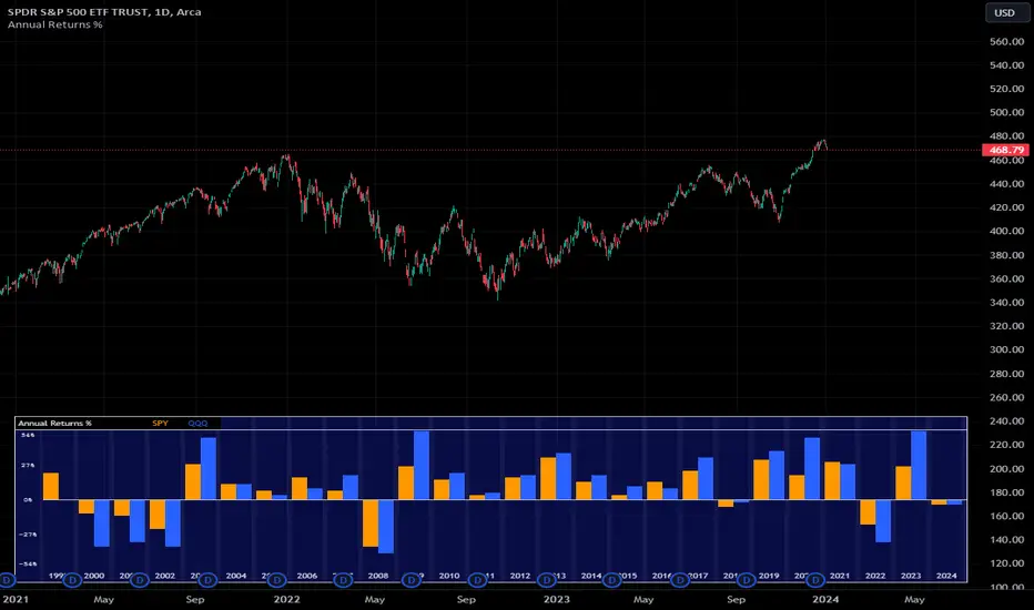
Annual Returns % Comparison [By MUQWISHI]Overview
The Annual Returns % Comparison indicator aimed to compare the historical annual percentage change of any two symbols. The indicator output shows a column-plot that was developed by two using a pine script table, so each period has pair columns showing the yearly percentage change for entered symbols.
Features
- Enter date range.
- Fill up with any two symbols.
- Choose the output data whether adjusted or not.
- Change the location of the table plot
- Color columns by a symbol.
- Size the height and width of columns.
- Color background, border, and text.
- The tooltip of the column value appears once the cursor sets above the specific column. As it seen below.
Let me know if you have any questions.
Thanks.
Change
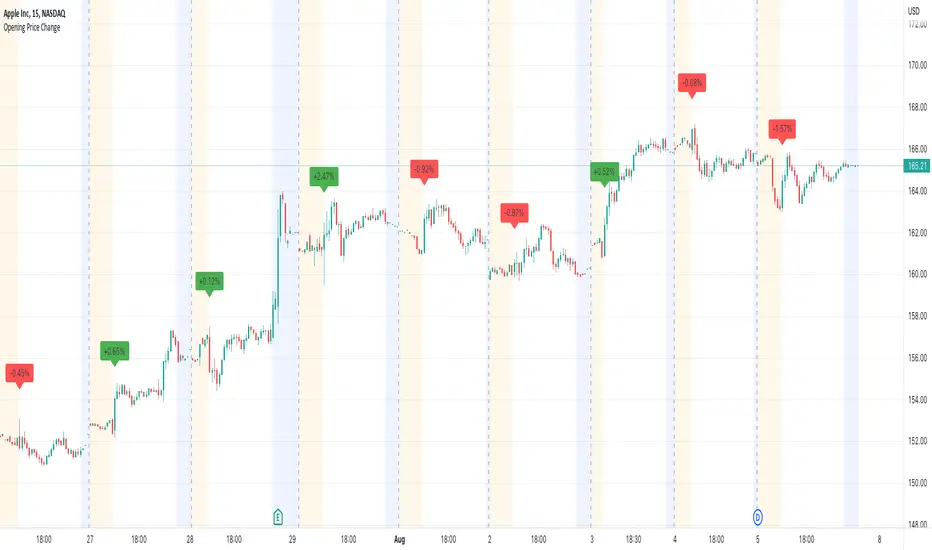
Opening Price ChangeThis script shows the change from the market opening price to the market closing price of the previous day in percent.
With this you can quickly get an overview of historical data for the change of the respective day.
Important: the market closing price is always used for the calculation and not the pre/post market price.
The label with the change value is always placed above the first opens regular market bar. If the change is positive, the label is draw with a green background, is the change is negative you will have a red background.
Candle Overlay and Change From Open PercentCandle Overlay and Change from Open Percentage
This script is free for all to use was designed to be non-cluttering for those who like their charts clean. This script features two things:
1) An option to allow a candle overlay over the existing stock/security in a charting window.
- By default, the additional candle overlay uses the same ticker you're currently looking at
- By default, the chart resolution for the additional candle overlay uses the same chart resolution as the current charting window you're using
- Please note that if you enable an additional candle overlay for a stock/security that has a wider gap in the stock price between the two different stock/securities, the additional candle overlay may not be visible, due to the big variances in stock price (unless you zoom out to get both charts to fit).
- The benefit to having this feature, is the ability to use a line chart as the primary and the candle chart as the secondary (each overlaying another)
2) An information window showing the percentage change from the market open
- If the market is not currently open, you will see a message, which reads "MARKET CLOSED" and underneath it, the stock/security price from the prior trading day
- If the market is open, you will see a couple of things:
a) The information window will either be green or red and geared towards mostly day traders. This color is based on whether the current price is above or below the market open price. The default color if the current price is at or above market open price is green and the default color if the current price is below the market open price is red. Although, not always the case, you can generally assume if the stock price is above the market open price that the overall trend is generally bullish (but again, not always the case, as there's other varying factors that come into play).
b) There's two lines displayed on the information window and these information automatically changes depending on the color of the information window.
c) The first line that starts with a star symbol begins with the current percentage change/move from the market open price and the secondary number on the same line is either the absolute highest (or lowest) percentage change uncovered during the current trading day. If the information window is green, this percentage number is the highest percentage uncovered. If the information window is red, this percentage number is the lowest percentage uncovered. Please note that nobody knows the absolute highest and lowest price of any particular stock on any particular day; therefore, sometimes the only way to have a better sense of what the absolute highest (or lowest) percentage possible on a stock/security is when the day progresses into power hour and into the market close.
d) The second line that starts with either an UP and DOWN arrow indicates the estimated projected max percentage (again depending on whether the information window is green or red). Please note that this feature is completely experimental and subject to future code changes. If the information window is green, this percentage number guesses what the max percentage change the stock price will go up to. If the information window is red, this percentage number guesses what the max percentage change the stock price will go down to.
e) Please note that the second line which provides the estimated max percentage (either up to down) should not be used as an indicator for your trading, but rather just for entertainment. The estimated percentage max change can auto-adjust itself throughout the day. Stock news, unexpected high trading volume, etc... can cause a stock/security price to exceed (or shortfall) this estimated max percentage.
* Please note that this script is in its early beta stage and there could be bugs. This is being provided as is and the information provided by this script is meant for informational/entertainment purposes only.

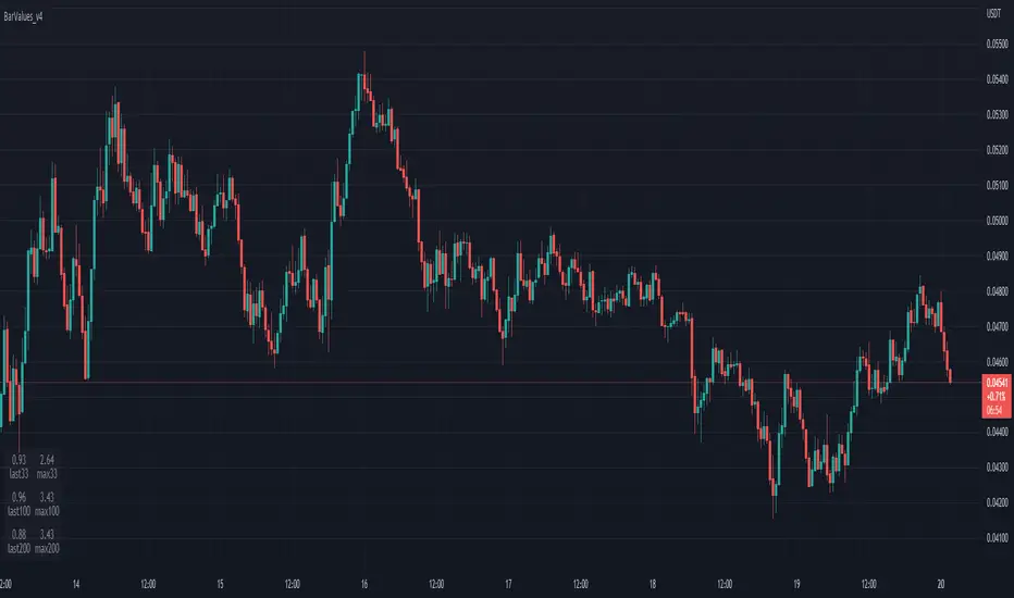
TableBarValues_v4It give you the absolute value of bar changes for different period of tims (33, 100, 200) AND the max barchange ont the same period.
Can be added in v4 in all codes. Stupid but useful.
You can add it to any v4 script. The location of the table can be changed easily
Inspired from the tradingview community. Don't forget to hydrate. @Magnumm
ToleranceThis indicator measures the Tolerance in the price, it works on all timeframes,
The main goal actually was to indicate the undefined trend zones like when the price is squeezed, the indicator value will be very close to zero (at this zone you should not place any orders)
But also the moving averages may give a good signals on the indicator, crossing up moving average indicate a long signal, you may need aid of other indicators to make sure this zone is long before going long in a bullish trap!

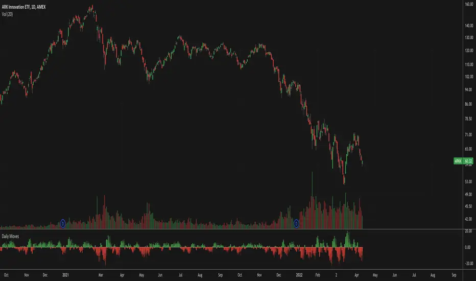
Daily MovesShow percent daily moves with a 5 period look back. This helps visualize recent performance.
Heatmap WatchlistThis is a Heatmap for custom watchlist tickers. Similar to S&P500 Heatmap .
Add up to 20 tickers.
Check higher timeframe from a lower timeframe.
Check previous candle for any timeframe.
Switch on/off "Price%" and/or "Volume%" heatmap.

Bitcoin Movement vs. Coin's Movement MTFThis script tracks the percent change of Bitcoin vs. the percent change of the coin on the chart. Crypto markets are usually affected greatly by Bitcoin swings so being able to see if the given coin is trending above or below Bitcoin is useful market data. All choices made with this script are your own! Thanks.

Signal Table - AutoFib - SMA - EMA - RSI - ATR - VolWith this indicator you can add a table on top of your chart.
What's in this table?
On which graph you open this table, the indicator data at the selected time of that graph are written. In the image below, you can see the table in the upper right.
You can also see two EMAs above the chart in this indicator. You can adjust their length.
You can add automatic fibonacci retracement levels to the top of the chart. In this way, you can see the Fibonacci levels on the chart and determine the support resistance. If the price is above the Fibonacci level, it will appear green on the chart, and red if below. You will understand as you use it.
It turns red if the RSI is below 30 and green if it is above 70.
Likewise, if the price is above the moving averages you have set, it appears as green, and if it is below it, it appears as red.
You can hide and activate the EMA and Fibonacci levels above the chart.
For example, you can get the ETH chart while the BTC chart is open in front of you. I think you will understand everything clearly from the settings tab below. Please support me. I hope you will be satisfied using it.
ADX Change
––––History & Credit
The idea of ADX change came from a trading book I read by Charles Le Beau and David Lucas (Computer Analysis of the Futures Market).
–––––What it does
The script calculates the Average Directional Index (ADX) and the period to period change. The script calculated 4 conditions:
– ADX accelerating to the upside (color cyan):
ADX>20
DMI+>DMI-
This period's absolute ADX number is HIGHER than pervious' period ADX number
- ADX momentum slowing to the upside (color blue):
ADX>20
DMI+>DMI-
This period's absolute ADX number is LOWER than pervious' period ADX number
- ADX momentum accelerating to the downside (color yellow):
ADX>20
DMI->DMI+
This period's absolute ADX number is HIGHER than pervious' period ADX number
- ADX momentum slowing to the downside (color yellow):
ADX>20
DMI->DMI+
This period's absolute ADX number is LOWER than pervious' period ADX number
–––––How to use it
I combine the ADX Change as a secondary indicator, that confirms my positions. I combine it with other momentum indicators like the TTM Squeeze.
If I am in position and the ADX Change is cyan, I would hold on the position until I see some shift in momentum or ADX change. This helps me hold on to my winners.
For the more advanced traders, it could be used to indicate shifts in momentum and buy points.

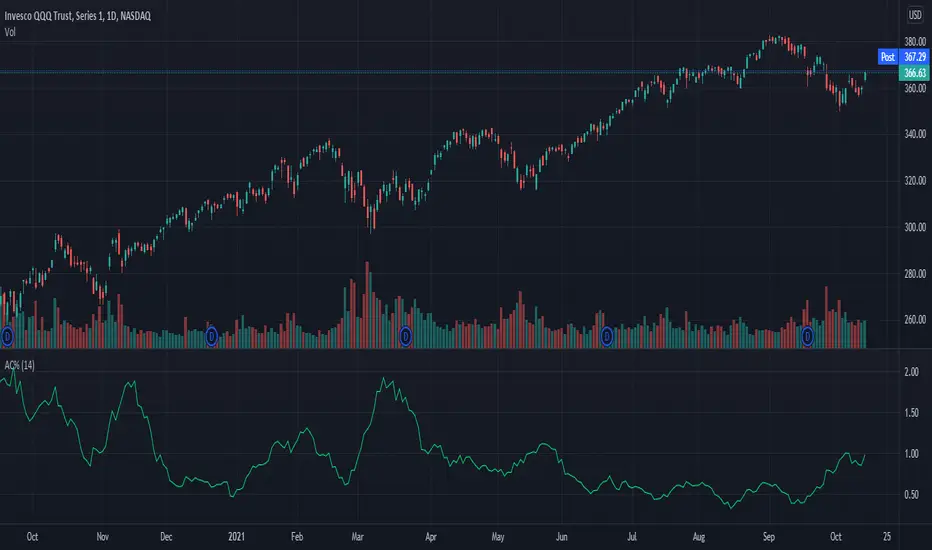
Average Change % (14-day)Simple script which calculates and shows the average change in a percentage format over a 14-day period.
Created due to the fact I couldn't find a percentage measure of average change when searching for it.
I have very little coding experience in Pine or otherwise so feel free to take and edit the script to make it a bit more user friendly.
% Divergence of RSIA simple script that plots the difference between the %ROC of price vs the %ROC of RSI, AKA the % of divergence. A simple way to analyze how strong a potential divergence is. Top reversals are above 0, bottom reversals are below. A value of 0 means price and RSI are changing by the same % value. So, if oscillator is moving up as price moves up, it means divergence is increasing. If oscillator moves down as price moves up, it means divergence is decreasing.
Screener Price Percentage ChangeA screener that displays price percentage change in actual chart timeframe and the default Daily, Weekly and Monthly.
The actual time frame also displays last value percentage change.
For example, if actual timeframe is "Monthly, it is going to display also the last "previous Monthly percentage price change.
Can select 3 more assets to display.
Full control of Panel position and size.
A modified version of @Mohamed3nan
Para el Shiaks

MTF Price/Volume % [Anan]Hello friends,
This is a multi-timeframe table with these features:
Display price change percentage compared with the last timeframe candle close.
Display price change percentage compared with the last timeframe candle close MA.
Displays change percentage compared with the last timeframe candle volume.
Displays change percentage compared with the last timeframe candle volume MA.
Change type/length of MA for Price/Volume.
Full control of Panel position and size.
Full control of displaying any row or column.

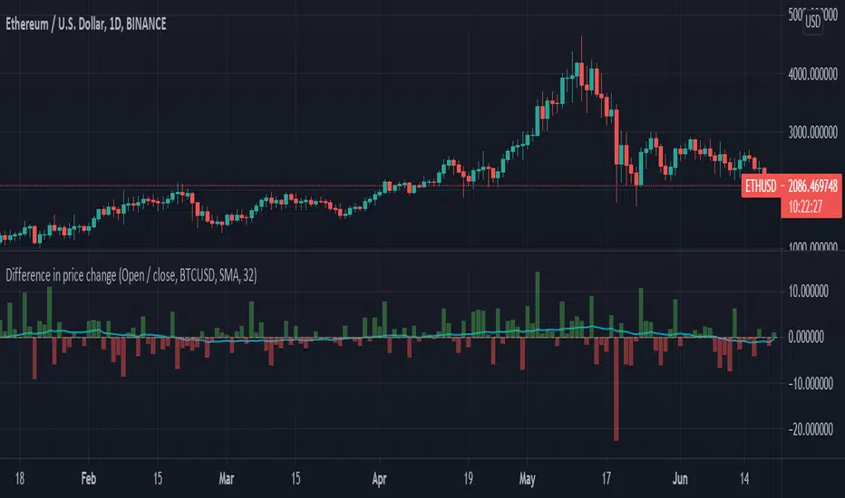
Difference in price changeCompares price change between current symbol and other one (eg. BTC vs S&P500). It calculates price change on each bar (from high to low or from open to close) and compares with price change of equivalent bar from the other source.
Example
Current symbol
open = 10 USD
close = 7 USD
change = -3 USD
% change = -30%
Second symbol
open = 3 USD
close = 4 USD
change = +1 USD
% change = +33%
Performance of price change = (-30) - (+30) = -63 // It means that current source has weaker performance right now
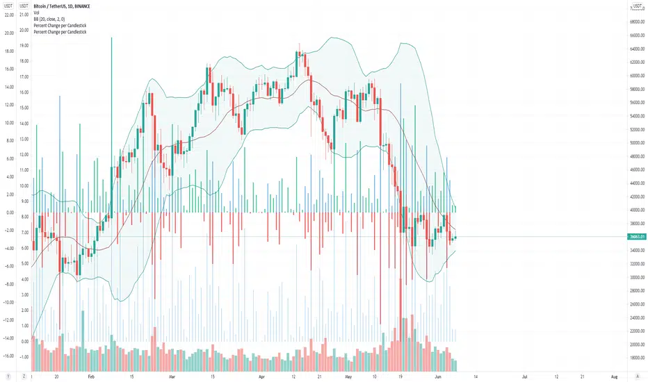
Percent Change per CandlestickThe script has two options: volatility (absolute value of change) and updown which has positive and negatives. That's it. useful for alerts.
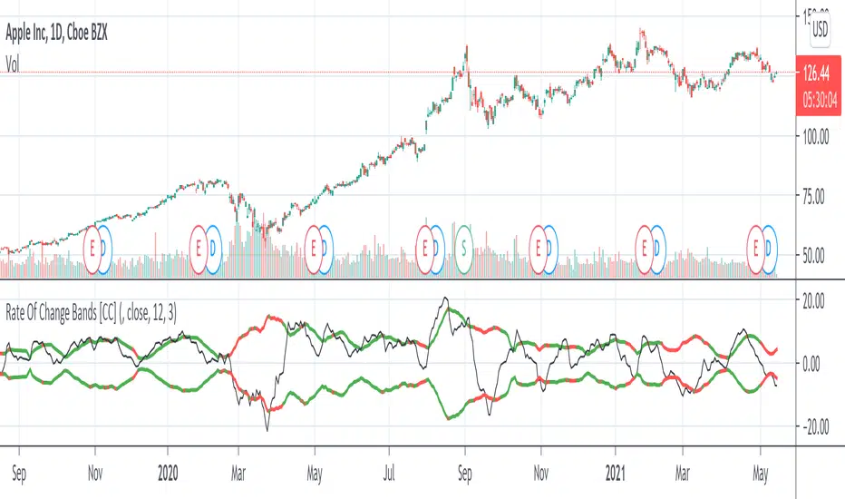
Rate Of Change Bands [CC]The Rate Of Change Bands were created by Vitali Apirine (Stocks and Commodities March 2021 pg 14) and this indicator is a great method to not only check the momentum but also check the trend strength as well. I have color coded the lines so buy when the line turns green and sell when it turns red.
Let me know if there are any other indicators you want me to publish!
Bell Curve LevelsScript which plots the % change from the open and overlays the 1, 1.5, 2 & 3% levels on the chart.
The bell curve offers a quantifiable clue to the persistent percentages the price moves in the fx market. A simple histogram will convey the %change in bins
this indicator just reflects that with levels on the chart.
Can be an aide for intraday or longer term levels.
Feel free to message me with any queries.
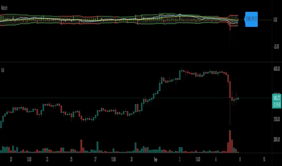
Return (Percent Change)This Script displays Regular or Log Returns as either a line or histogram and labels the current bar.
If something other than price is selected as the source, the result is percent change with a positive or negative slope.
If a moving average of price is used as the source, the result is analogous to a strength index
Other options include a look-back period adjustment (the default is 1),
smoothing results by converting to an EMA, and
Bollinger Bands with Length and Standard Deviation inputs.
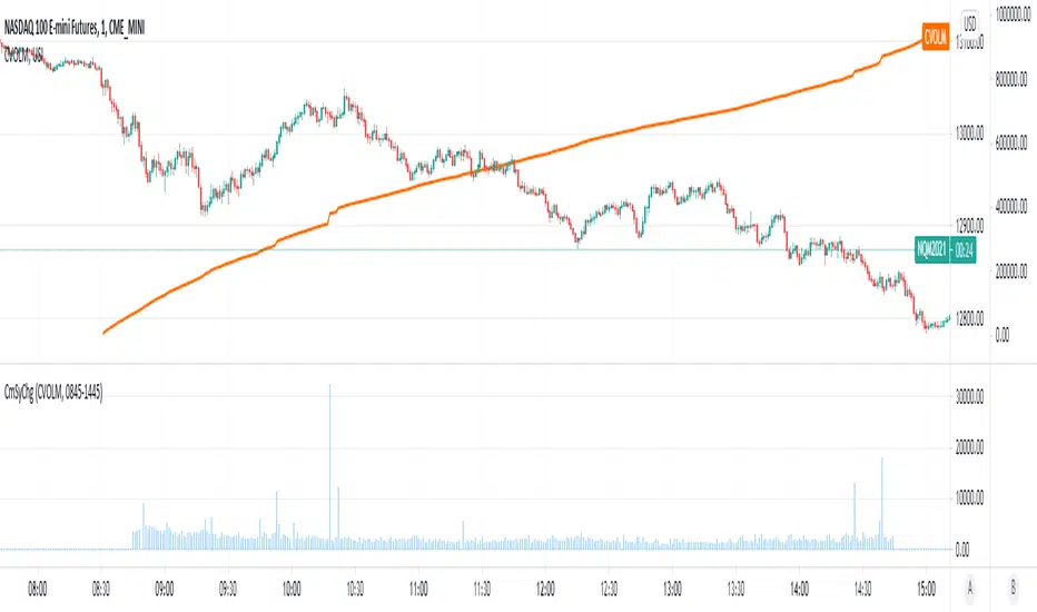
Cumulative Symbol ChangeSome symbols in trading view are cumulative - meaning they increment continuously throughout the trading day and are reset to 0 at the new trading day.
For example USI:CVOLM (Call Volume in Miami).
This script subtracts the current cumulative value from the prior cumulative value, so the change/delta in the cumulative value can be determined bar-by-bar.
Moving average of 1-period Percent ChangeAnother way of finding the average range of the bars using 1 period percentage change of the price and taking an average of them. It's given in percentages and the absolute value of the average can be shown when the option is turned on, or the average including the up and down bars can be shown. Perhaps an alternative way of looking at volatility or range of the bars. If you prefer a line version over histogram, just simply change the style under the settings of the indicator.
Percent changeThis indicator shows WMA ribbons of the percentage of price movements.
Strong peaks show unusual price movement and might indicate a good time to close your position.
A narrow band shows stable price movement and could indicate a good time to get into a position. (Squeeze)

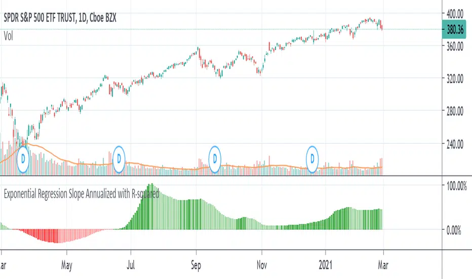
Exponential Regression Slope Annualized with R-squared HistogramMy other indicator shows the linear regression slope of the source. This one finds the exponential regression slope and optionally multiplies it by R-squared and optionally annualizes it. Multiplying by R-squared makes sure that the price movement was significant in order to avoid volatile movements that can throw off the slope value. Annualizing the exponential slope will let you see how much percentage you will make in a year if the price continues at its current pace.
The annualized number is the number of trading days in a year. This and the length might need adjusting for the extra bars that might be in futures or other markets. The number does not have to be a year. For example, it can be a month if you set the number to 20 or so trading days to find how much you would make in a month if price continues at its current pace, etc. This can also be used as an alternative to relative strength or rate of change.