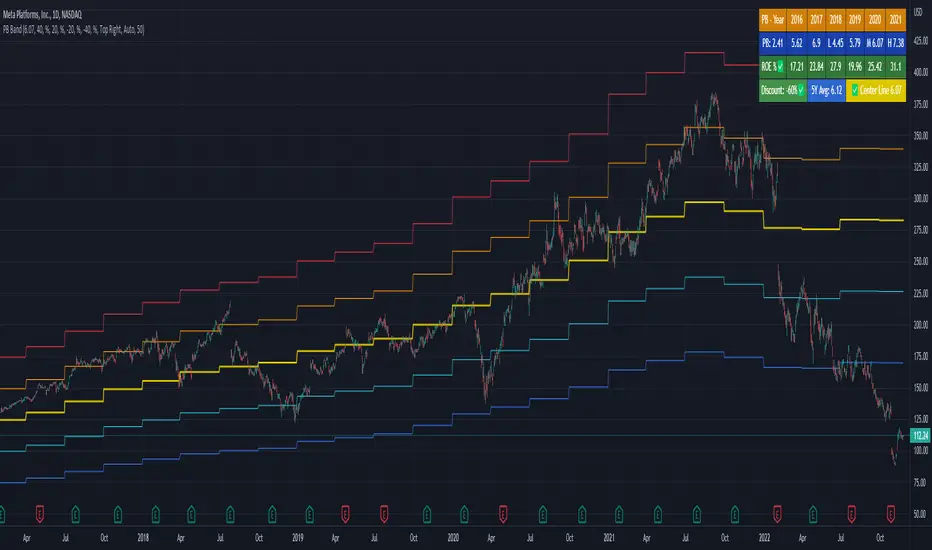
PB BandPB Band is a very practical stock selection technique for investors, which can be used to judge whether the company's stock price is currently overvalued or undervalued.
The PB ratio center line of the stock must be set every time the stock is changed because of the program limitation of Tradingview.
Usually we use the 5-year median to judge whether the company's stock price has a discount.
Not all stocks are suitable for using PB Band, especially cyclical stocks.
You can also use ROE to determine whether the company is a cyclical stock.
Perolehan
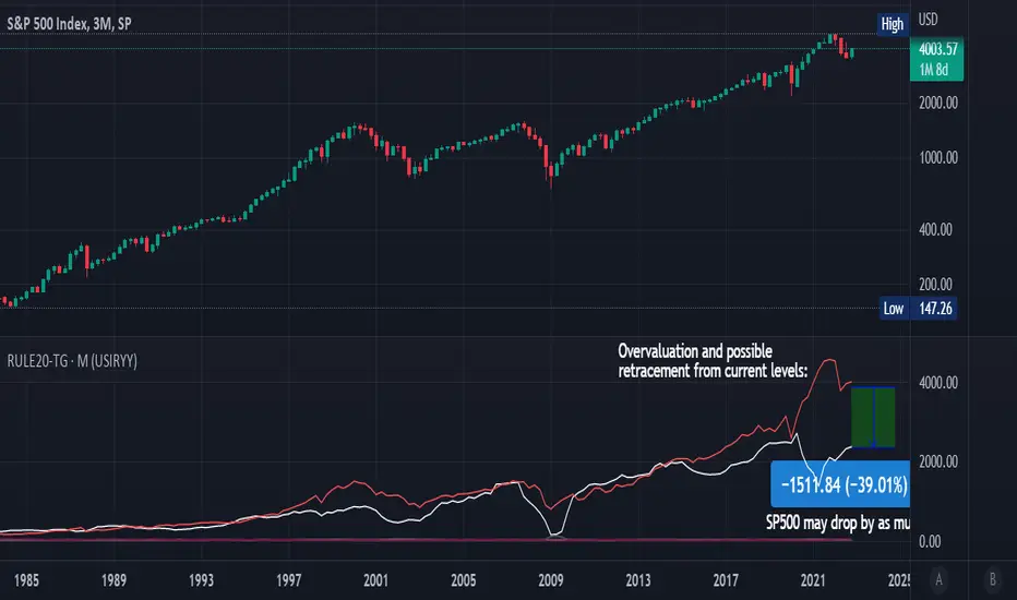
Rule Of 20 - Fair Value Estimation by Inflation & Earnings (TG)The Rule Of 20 is a heuristic calculation to find the fair value of an asset or market given its earnings and current inflation.
Its calculation is straightforward: the fair multiple of the price or price-to-earnings ratio of a stock should be 20 minus the rate of inflation.
In math terms: fair_price-to-earnings_ratio = (20 - inflation) ; fair_value = current_price * fair_price-to-earnings_ratio / real_price-to-earnings_ratio
For example, if a stock or index was trading on 11 times earnings and inflation was 2%, then the theory would be that the fair price-to-earnings ratio would be 20-2 = 18, which is much higher than the real price-to-earnings ratio of 11, and hence the asset would be undervalued.
Conversely, a market or company that was trading on 18 times price-to-earnings ration when inflation was 8% was seen as overvalued, because of the fair price-to-earnings ratio being 20-8=12, hence much lower than the real price-to-earnings ratio of 18.
We can then project the delta between the fair PE and real PE onto the asset's value to obtain the projected fair value, which may be a target of future value the asset may reach or hover around.
For example, as of 1st November 2022, SPX stood at 3871.97, with a PE ratio of 20.14 and an inflation in the US of 7.70. Using the Rule Of 20, we find that the fair PE ratio is 20-7.7=12.3, which is much lower than the current PE ratio of 20.14 by 39%! This may indicate a future possibility of a further downside risk by 39% from current valuation levels.
The origins of this rule are unknown, although the legendary US fund manager Peter Lynch is said to have been an active proponent when he was directing the Fidelity’s Magellan fund from 1977 to 1990.
For more infos about the Rule Of 20, reading this article is recommended: www.sharesmagazine.co.uk
This indicator implements the Rule Of 20 on any asset where the Financials are availble to TradingView, and also for the entire SP:SPX index as a way to assess the wider US stock market. Technically, the calculation is a bit different for the latter, as we cannot access earnings of SPX through Financials on TradingView, so we access it using the QUANDL:MULTPL/SP500_PE_RATIO_MONTH ticker instead.
By default are displayed:
current asset value in red
fair asset value according to the Rule Of 20 in white for SPX, or different shades of purple/maroon for other assets. Note that for SPX there is only one calculation, whereas for other assets there are multiple different ways to calculate earnings, so different fair values can be computed.
fair price-to-earnings ratio (PE ratio) in light grey.
real price-to-earnings ratio in darker grey.
This indicator can be used on SP:SPX ticker, and on most NASDAQ:* tickers, since they have Financials integrated in TradingView. Stocks tickers from other exchanges may not provide Financials data, so this indicator won't work then. If this happens, try to find the same ticker on NASDAQ instead.
Note that by default, only the US stock market is considered. If you want to consider stocks or assets in other regions of the world, please change the inflation ticker to a ticker that reflect the target region's inflation.
Also adding a table to ease interpretation was considered, but then the Timeframe MTF parameter would not work, and since the big advantage of this indicator is to allow for historical comparisons, the table was dropped.
Enjoy, and keep in mind that all models are wrong, but some are useful.
Trade safely!
TG
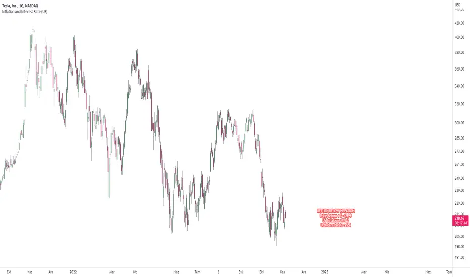
Price Comparison with Inflation and Interest RateHello dear traders.
This indicator creates a label on the chart.
It measures the difference between the price of the selected symbol at the beginning of the year and the current price, and tells you whether it has more returns than the inflation rate in the region you selected.
The return of the selected symbol on the label since the beginning of the year, the inflation value of the selected region and the interest rate of the selected region are written.
If the symbol's return since the beginning of the year is higher than the inflation return, the label color will be green, otherwise it will be red.
Below you can see a stock with an above-inflationary return.
You can select a region from the inputs section. Currently, Turkey, America and Europe regions can be selected.
While preparing this indicator, tradingview resources were used.
Implied Move with NASA Ideas & Price LineThis script allows you to customize the Implied Move Percentage and fully customize the way it is shown.
Can be used on any stock that has earnings and works based on the Implied Move (Percent).
Basically, it lets you visualize how the stock moved after reporting earnings and seeing if it reached the implied move or not.
This is helpful as it's important to know what earnings are worth keeping an eye on and which should be avoided.
There is also an added custom text input which was inspired to make from a frogman named NASA.
It lets you input whatever text you want on whatever price you want.
To summarize, it's basically a Post-It Note that you can add to any price level for any stock.
Alerts can be set if wanted, They can be alerted for the Implied Moves (If the stock price goes Above/ Below the set percentage) and NASA Ideas (if the stock price goes Above/ Below the set price).
There is also an added custom price line which is mostly for having a nonintrusive price line and label.
This price line and label can be switched to show the (Open, High, Low, Close, Extended High, Extended Low, Yesterday's Open, Yesterday's High, Yesterday's Low, and Yesterday's Close).

PEG Ratio (Most Accurate)Price Earnings To Growth (PEG) Ratio
PEG ratio is a stock's PE ratio divided by the growth rate of its earnings for a specified time period.
The PEG ratio is used to determine a stock's value while also factoring in the company's expected earnings growth, and it is thought to provide a more complete picture than the more standard P/E ratio.
PEG ratio 1 is fair value.
PEG ratio above > 2 is are generally considered overvalued.
PEG ratio below < 1 is Undervalued.
Negative PEG ratio indicate the company no growing in specified time period.
Example of How to Use the PEG Ratio
The PEG ratio provides useful information to compare competitive companies and see which stock might be the better choice for an investor's needs, as follows.
Google (13-Sep-2022) 👍
PEG ratio = 0.38%
P/E ratio = 19.17%
Meta (13-Sep-2022) 👎
PEG ratio = 0.63%
P/E ratio = 12.55%
Many investors may look at Meta and find it more attractive since it has a lower P/E ratio. But compared to Google, it doesn't have a high enough growth rate to justify its current P/E.
Google is trading at a discount to its growth rate and investors purchasing it are paying less per unit of earnings growth. Based on its lower PEG, Google may be relatively the better buy.

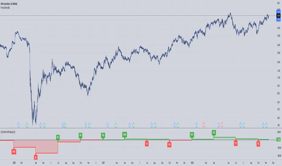
[GTH] Net Profit Margin (%)Displays the Net Profit Margin in a more "readable" fashion than the built-in TV Indicator.
This indicator concludes the series of 'Minervini-indicators', consisting of "GTH Earnings", "GTH Revenues" and "GTH Net Profit Margin (%)".
Famous trader Mark Minervini repeately describes rising earnings, revenues and net profit margin as the most important financials for finding superperformers.
In case of reporting a malfunction: Please be specific. Statements like "does not work" are useless. Thanks.
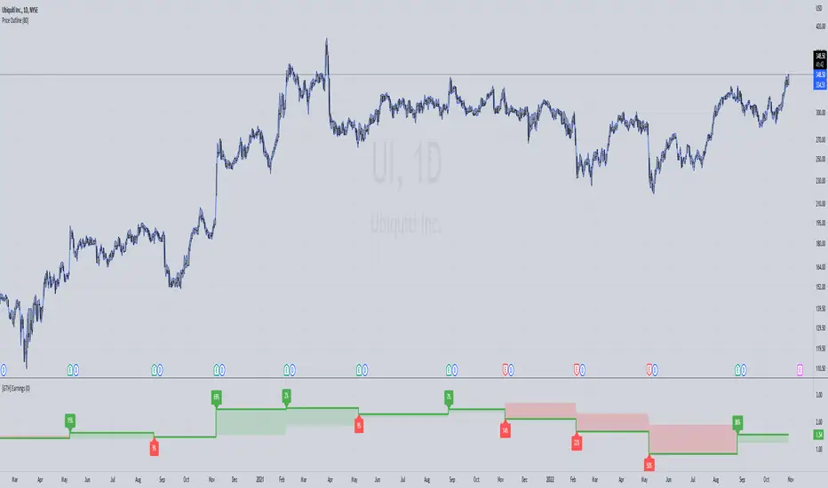
[GTH] Earnings
Black line -> actually Reported Earnings
Colored bars -> positive/negative surprise in regard to Estimated Earnings
Labels -> percentage of change in regard of the previous Reported Earnings
EPS & SalesHi everyone,
I just adapted a little utility script to visualise EPS % increase (quarters vs Year -1) and sales.
I used the code from @ARUN_SAXENA and modified it to fix what I saw as issues.
(Using base 3M instead of 1M +
request.earnings(syminfo.tickerid, earnings.actual, ignore_invalid_symbol=true)
instead of
request.financial(syminfo.tickerid, "EARNINGS_PER_SHARE", "FQ")
Data will differ from MarketSmith because they use sometimes actual EPS sometimes standard, but think we can at least trust what we see in term of %
The tool is far from being perfect !

[dj]visible financial report
visible financial report
visible financial report (year-on-year) is a indicator for us market only, other market's data are wrong.
please check the "E" symbol's if the tradingview's data accurate.
this script using both request.financial and request.earnings. EARNINGS_ESTIMATE / earnings.estimate / TOTAL_REVENUE / TOTAL_OPER_EXPENSE
i share this script's for the purpose of tradingview staff will improve their financial data accuracy.
some stocks data are wrong, or missing such as NYSE:KR
i got many recommendations for improvemenet on tradingview ....but....
Nabz-BBMACD-2022-V1.1I have tried to make script which triggers indicators on combination of different feedback including Bollinger bands and MACD. Also used some of my logic by trial and error, It gave 744%+ profit on back-testing on coin RUNE/USDT from Jan 2021. It is my first script, I am happy to help the community. Please share your feedback.

EPS DashboardThis script creates a little table in an indicator below your chart that allows you to view the earnings per share over the last year as well as calculates the year over year earnings per share growth. According to IBD, strong EPS growth is a great indicator of a potential super-performer stock so hopefully this will make it easier to keep an eye on this metric. Note it does not work on things without financial data like crypto, indexes, and ETFs.

Swing School MetricsI wrote this script to give me a few metrics I follow and to quickly identify if they have the strength and momentum I am looking for. The metrics are used by StockBee and Qullamaggie to distinguish fast moving stocks gaining momentum.
The measures are:
Average Daily Range similar to TradingView's Monthly Volatility is above 5%
Intermediate moving average is above long term or short term is over intermediate term
Trend Intensity above 1.05 calculated by (SMA7/SMA65)
Recent ER Beat
Recent Sales Beat
I also list the market cap, average daily dollar volume, and float to give an idea of liquidity and tradability.

Earnings Price Move Cheat Sheet [KT]Hello!
This script looks to distinguish replicable sequences and correlations between earnings releases and price. The indicator calculates the average 1-session to 20-session performance of an asset prior to an earnings release, and the 1-session to 20-session performance of an asset subsequent an earnings release.
You can select the number of sessions the script calculates for asset performance.
In the image above the script calculates the average 1-session performance following an earnings surprise, earnings miss, and in general. 20 sessions is the maximum value!
Also measured is the average performance of an asset before and after earnings, in addition to the average performance following an earnings surprise "green earnings" and the average performance following an earnings miss "red earnings".
I included VaR and CVaR calculations - using the historical method - in the script. For those of you unfamiliar with the metrics, both look to quantify the risk of financial loss for a portfolio, or even a particular position.
The script also calculates the 1st - 5th percentile for earnings losses. A more comprehensive explanation of the metrics is stored in tooltips in the user input tab.
The script also calculates the highest high and lowest low following an earnings release, up to 20 sessions, and calculates the difference between the two.
Keep in mind that a company might not have a significant number of earnings misses, or may have only traded publicly for a short while. If true, the resulting earnings/price calculations *will* be misleading - there is an insufficient sample size; no correlations are ascertainable.
I will be working on this script more, so let me know if there is anything you would like included!

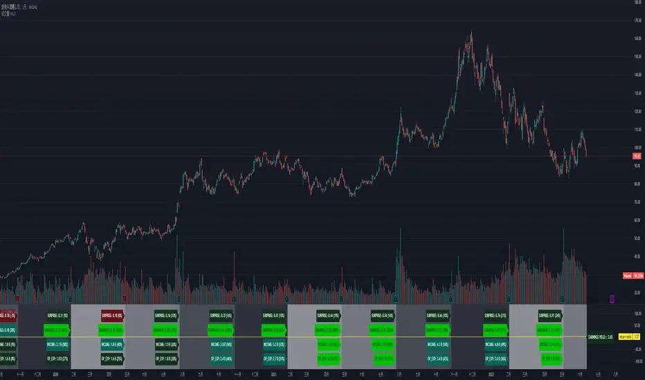
ds Revenue, Margins, Earnings TrendsPURPOSE: Looks for trends in Revenue, Margins, Earnings (RME) and provides a quick indication of where to focus your attention. Developed for educational purposes for my Investing Program Students at Everett Community College, Everett, WA.
WHAT IT DOES:
Based on the principle that fundamental trends support technical price trends this indicator intends to help swing and position trading students evaluate the income statement by exposing recent trends in the revenue, margins, and earnings looking at eight quarters of data. It requires three quarters to determine a trend therefore there is a heavy focus on the last three quarters of data. Tools and indicators should be used to "tell something useful" in this case it is specifically is revenue, margins, and earnings expanding, contracting, or flat? Is this movement accelerating or decelerating? Lastly some logic is used to interpret at glance whether this stock warrants a closer look into the fundamentals and technicals of this particular company.
HOW TO:
This is a brief description on how to use this tool
1. TOP ROW: This shows the symbol and then provides a summation indicator (Green Checkmark, Yellow caution triangle, Red X) for each section (Revenue, Margins, Earnings). At a glance shows strength/weakness/concerns.
2. TABLE: You will see 8 quarters of data assuming it is available broken into sections for Revenue, Margins, and Earnings.
3. COLUMNS: The text color red does not denote a negative number and the text color green does not denote a positive number. Rather in the column of data where it is displayed, the green text helps visually show a bullish trend when each value is greater than the prior value and the red text helps visually show a bearish trend when each value is less than the prior value. Yellow background in columns highlights values which should not normally be negative numbers.
4. 3Q TREND ROW: This row analyzes the last three quarters of data in the column to determine if the trend is rising, falling, or flat.
5. 3Q ROCK ROW: This row analyzes the last three quarters of data to determine if the trend is accelerating up, accelerating down, or momentum (MOM) is sideways.
6. BOTTOM ROW INDICATORS: Based on whether the numbers are negative or positive and the trend, This row shows one of the following results:
6a. Green Checkmark is considered acceptable performance.
6b. Yellow Caution Triangle indicates a closer inspection of this columns data is warranted.
6c. Orange Diamond is more serious than the Caution but not as bad as a Red Flag. Extra caution is required here.
6d. Red Flag indicates a warning that undesirable performance characteristics are associated with the data in this column.
Financial GrowthThis indicator will acquire the financial data provided by Tradview.
the data is compare between Quarter, Annual and TTM in term of percent of growth.
YoY, QoQ and CAGR is also available by this script (The minimum is 4).
in addition, ploting of data, label and table also available (you can check the mark to toggle on / off).
Data : Revenue, Net Income, EBITDA, EPS, DVPS, Free Cash Flow and Forward PE .
How to use it.
just select the financial data, period and size of data to compare.
you can check the box to toggle the plotting line, label and table.
Enjoy.
HighLow Box Highlight between EarningsHighLow Box Highlight between Earnings
This is an indicator to highlight area between two earning periods and their highest and lowest points.
It also alternates the highlight color in each subsequent block.
Tested to work in 1D charts and 1M charts
Just drop a message, if you want this further developed with more features.
Note: This was requested by user Meatpye on a forum.

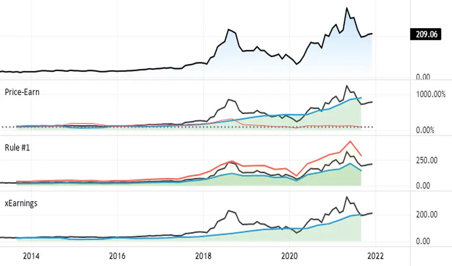
Silen's Financials Fair ValueIt is finally here! 🔥 My 3rd and most important script in my Financial series! 🚀
Ever imagined to see all fundamentals (or many that is) combined into one indicator that is right on your chart, showing you how your favorite stock is trading compared to its fundamentals?
Well, here is your answer! 📡
____________________________________________________________________________________________
This script shows you my own personal interpretation of fair value, based solely on the financial fundamentals of a company compared to market averages.
I don't believe that certain sectors of the market should be priced higher than others. If you look at historical data you'll see that favored sectors always rotate - placing insanely high P/E multiples on some sectors. Once they are "out" and people rotate away from those sectors you're left with nothing but the naked fundamentals that matter. So, you'll see many companies, that have been doing well on paper, see their share price decline by 70-90% for no other reasons than people favoring other sectors.
That's why it's even more important to focus on fair value that is solely fundamentals-based. Know when your stock gets to expensive. 🤯
____________________________________________________________________________________________
To give you some examples:
- Most Megacaps trade at historically high valuations, several times my fair value. Those include AAPL, MSFT, NVDA, AMZN, TSLA, JPM, TSM, V and so on. And no, in the past they partially traded below (my) fair value.
- Most Cybersecurity / Cloud companies are trading at truly massive multiples of my fair value. (NET, DDOG, etc)
- Many Smallcaps & Midcaps are trading several multiples (OESX, CODX, QFIN) below my fair value. And no, in the past they partially traded above (my) fair value.
Ok, so much about the market. You ultimately decide how much you want to orientate on fair value. 👨🏫
____________________________________________________________________________________________
This fair value indicator (purple line):
Takes the P/E rate of the company and compares it to the market (50% weight)
Takes the P/S rate of the company and compares it to the market (50% weight)
Then adds boni and mali f or debt/equity rates and debt and equity itself
Also looks at past growth and calculates future P/E and P/S rates which adds , in some cases, value to the fair value (green line)
Also compares how historical valuations have behaved compared to fair value and simulates a fair value guideline (dark blue line)
____________________________________________________________________________________________
This script is part 3️⃣ of a series of indicators that work well together.
Script 1️⃣ of the series is:
P/E & P/S Rates
Script 2️⃣ of the series is:
Debt & Equity
If you use all 3 scripts together it will look like this, giving you truly deep and simple information about the fundamentals of a company:
Example 1 - AMD
Example 2 - HZO
Example 3 - APPS
I hope this script makes your investing and stock picks a lot easier! 🔆💹🕗
Disclaimer: Fair value is always subjective. There are many different approaches to fair value. This one is only my personal interpretation.
Disclaimer 2: This script works only for the Day-Timeframe.
Disclaimer 3: This script uses 17,5 P/E and 3,0 P/S as market averages. The actual average keeps changing but, historically speaking, these seemed to be good numbers.
Feel free to share your thoughts and feedback! 🙃

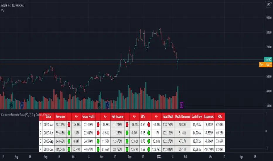
[TG] Complete Financial DataHISTORY & CREDITS
Complete Financial Data is basic, yet very effective tool, that will show the most important information from the company's latest financial statements at a glance.
WHAT IT DOES
The table is designed to show comprehensive financial data about the selected ticker.
Revenue - often referred to as sales or the top line, is the money received from normal business operations.
Gross profit , also called gross income, is calculated by subtracting the cost of goods sold from revenue.
Net income , also called net earnings, is calculated as sales minus cost of goods sold, selling, general and administrative expenses, operating expenses, depreciation, interest, taxes, and other expenses.
Earnings per share (EPS) is calculated as a company's profit divided by the outstanding shares of its common stock. The resulting number serves as an indicator of a company's profitability.
Total debt includes long-term liabilities, such as mortgages and other loans that do not mature for several years, as well as short-term obligations, including loan payments and accounts payable balances.
The debt-to-revenue ratio is a financial measure that compares a company's monthly debt payment to its monthly gross income.
The term cash flow refers to the net amount of cash and cash equivalents being transferred in and out of a company. Cash received represents inflows, while money spent represents outflows.
An expense is the cost of operations that a company incurs to generate revenue. As the popular saying goes, “it costs money to make money.”
Return on equity (ROE) is a measure of financial performance calculated by dividing net income by shareholders' equity.
HOW TO USE IT
Even if you are entirely a technical analyst, it's always a good practice to take a look at the company's fundamentals, in order to understand more about the heath of the business. Look for companies that beat expectations and show positive growth numbers.
FX Profit CalculatorWith this indicator, you will be able to see how much you earn in forex in dollar terms.
It asks you 3 things when adding the indicator.
TP point
SL point
Position Entry point
If you have selected the TP point above, the entry zone below it, and the SL point below it, the indicator will automatically understand that there is a BUY order and will make the calculations accordingly.
The same is true for the opposite.
When you use the indicator in any parity, you will have problems switching to other parities.
So either use it only in one parity, or update your targets from the indicator settings at every parity change.
You will get the same error if:
Your trading entry point should be between your TP and SL points. If you do not set it this way, the indicator will warn that please fix it.
If you are in the trade, tick the settings and show the dollar-based profit of your position according to the instant closing price.
The percentage variable works like this:
When you adjust for one parity, shifts occur in the chart when you switch to the other parity. When switching to non-circulating graphics at the same prices, the user is prompted to re-enter so that the graphic does not deteriorate.
BONUS : You can move these lines up and down with your mouse on the graphic :)

FlōatFloat by AlphanumetriX is an invaluable tool to aid and abet the trader and investor.
Float can...
Assist in managing positions
Assist in identifying new positions
Assist in your accounting practices
Assist with risk management
What is Float?
The value of Float is in its simplicity. After becoming accustomed to it, you will wonder how you ever traded without it.
Float is not a ‘Buy and Sell’ indicator, it can be considered a calculator/risk management tool and position manager.
Float has advanced mathematics built into its code that allows you to set complex parameters that will be clearly displayed over your TradingVeiw charts.
View your P/L in percentage % terms after leverage and in Fiat $ terms after Leverage.
Box
After entering all commands in the settings, you are clearly able to view all pertinent information of your trade in real-time.
Float will apply and recalculate any amendments that you enter instantaneously.
BEFORE entering a trade, use Float to…
Identify where your liquidation point would be, relative to the amount of leverage applied to the trade.
Identify where a potential Stop Loss or Take Profit point could be placed.
Assess the Risk/Reward of the trade.
Run mock trades to gauge your performance prior to live trading.
Calculate the Capital and Quantity of assets post leverage.
Some examples below

Silen's Financials Debt & EquityThis Script shows Debt (red) & Equity (green), as well as Total Equity and Net Income in a preformatted way for a symbol. Total revenue's and Net income's visibility is turned off by default and can be activated in the indicator settings. 🍳
Disclaimer: Any content in this script can be completely replicated by using Tradingview's Build-In Financial Indicators: Total debt, Total equity, Net income and Total revenue. It requires a lot of formatting work to get them to this state though. 👌
However, you are going to need 4 Financial Indicators clogging 🚽 your screen. With this indicator you have them preformatted as an overlay on your chart so you know exactly what's going on with your ticker's financials. 💰
I recommend only using Debt & Equity OR Total Equity & Net Income together. Although displaying all 4 indicators together is possible, it will make your chart quite messy.
This is how the indicator looks like for Total equity and Net Income:
This Script (2) is part of a Series that will contain 3 scripts to help you easily evaluate if a stock is trading in harmony with its fundamentals or not. ☯
Script 1 already exists:
Script 3 will be a Fair Value Indicator. 📣
Script 1 and 2 combined will look like this: 🌄
If you have any questions, let me know! 🙂

Estimate, Earnings, Surprise EarningsThis plot helps you to show estimate earnings , reported earnings , and surprise earnings of a company inside a chart.
Estimate earnings is the projection of earnings of a company by the analysts for a given period of time.
Earnings is a company's reported profits (or sometimes a loss if going negative) in a given quarter or fiscal year.
Surprise earnings is an earning (or sometimes a loss if going negative) which is above (or even below) the estimated or reported earnings.
Estimate earning is plotted by white lines
Reported Earnings is plotted by columns, where positive number is blue and negative number is purple.
Surprise Earnings is plotted by columns, where positive number is green and negative number is red.
You surely will be able to tweak and customize all the colors above with color you find comfortable.
Since earnings are reported every quarter of the year, this plot will gives a good view when you put it inside a 3 Months timeframe.
Hope this helpful.
