EdgeXplorer - Profit Bottoms EdgeXplorer – Profit Bottoms
⸻
🔍 What This Indicator Does
Profit Bottoms is a custom momentum oscillator designed to reveal price strength inflections through correlation logic. It identifies potential market exhaustion zones, highlights overbought/oversold conditions, and visually marks swing tops and bottoms — helping traders pinpoint profit-taking opportunities or early reversals across any asset or timeframe.
It features a flexible histogram view, color-coded background trends, and precision labels for clearer insight into market sentiment momentum shifts.
⸻
⚙️ How It Works
At the core of this indicator is a correlation function:
• It measures how strongly the price (close) correlates with bar index progression over a lookback window — essentially evaluating how directional recent price action has been.
• This results in a “strength index” ranging between +1 (strong uptrend) and -1 (strong downtrend).
• It tracks the slope of this index to infer trend direction and visually represent shifts.
From there, the indicator layers on:
• Dynamic overbought/oversold zones (±0.9)
• Swing high/low detection based on local peaks and troughs
• Trend background shading based on momentum slope
• Optional histogram and fill display styles
⸻
📈 Visual Components Explained
Element Meaning
🔮 Pulse Strength Line (purple line) Primary oscillator showing strength of directional movement
🌈 Colored Fill Fills above/below baseline to represent bullish/bearish intensity
🟢 Green Background Slope of strength index is rising (trend gaining)
🔴 Red Background Slope of strength index is falling (trend weakening)
🔼 ↑ Label Price is entering extreme overbought territory
🔽 ↓ Label Price is entering extreme oversold territory
🟠 Circle Markers Swing Top (Teal) or Swing Bottom (Orange)
📊 Histogram / Line Style Alternate visualizations of the oscillator based on user preference
⸻
📊 Input Settings Explained
Setting Description
Window Size Lookback period for correlation calculation
Bull Fill / Bear Fill Gradient colors for up/down momentum
Mark Tops/Bottoms Enables visual detection of swing highs/lows
Highlight Overbought/Oversold Displays zone entry markers (↑/↓) near extremes
Show Pulse Histogram Adds either histogram or line view
Histogram Style Choose between histogram bars, a thin line, or hide the visual entirely
⸻
🧠 How to Interpret in Different Market Conditions
Condition Interpretation
Strength Index near +1 Strong upward correlation — trend likely maturing or overbought
Strength Index near -1 Strong downward correlation — trend possibly exhausted or oversold
Cross below 0 Momentum shift from bullish to bearish
Cross above 0 Momentum shift from bearish to bullish
Swing Top Detected Potential short-term exhaustion — profit zone for longs
Swing Bottom Detected Early reversal zone or buying opportunity
The colored background makes it easy to visually segment the chart by trend environment, while the swing markers and zone labels add precision entry/exit timing cues.
⸻
🧪 Use Cases & Strategy Tips
• Scalpers & intraday traders: Use swing tops/bottoms with zone labels for tight entries.
• Swing traders: Watch for strength fading as a warning sign to exit positions.
• Divergence Spotting: Compare price action to the oscillator for hidden signals.
• Momentum Riders: Use histogram mode with background coloring to stay in trend longer.
For example:
If you see a swing bottom occur just below the -0.9 zone, paired with a background color flip from red to green — that’s a high-probability setup for reversion or breakout.
⸻
🧷 Alerts Included
This indicator provides built-in alerts for key conditions:
• EPS+ Top Detected → Swing Top
• EPS+ Bottom Detected → Swing Bottom
• EPS+ Overbought Zone → Strength Index > 1
• EPS+ Oversold Zone → Strength Index < -1
These can be used in alert-based automation or simply for manual signal confirmation.
Analisis Fundamental

EdgeXplorer - Sessions Roulette 🕰️ EdgeXplorer – Sessions Roulette
⸻
🔍 What This Indicator Does
Sessions Roulette is a highly customizable tool that visualizes the four primary global trading sessions — New York, London, Tokyo, and Sydney — directly on your chart.
It not only highlights each session’s time window with color-coded boxes, but also tracks key session-level data like:
• Highs and lows
• Average (mean) price
• (Optional) VWAP line (toggle included for future use)
This tool is purpose-built for traders who rely on time-based volatility patterns, session transitions, and liquidity windows.
⸻
⚙️ How It Works (Technical Breakdown in Plain English)
This indicator checks — for each trading session — whether the current bar falls within the defined session time range. If it does:
1. A colored box is drawn from session open to close
2. High/Low levels for that session are tracked dynamically
3. The session’s mean price is calculated incrementally as new bars come in
4. Session labels are rendered as text (optional)
5. Once the session ends, the data locks and resets on the next session start
The timezone can be defined manually via UTC offset or aligned with the chart’s exchange timezone using a toggle.
⸻
📈 Visual Components Explained
Each session (NY, LDN, TYO, SYD) has its own:
• Colored Box Range: This fills the background of the session with a semi-transparent box.
• Session Label: A tag that names the session.
• Mean Line: Tracks average price during the session (toggle).
• High/Low Plots: Draw horizontal lines showing session high and low prices (toggle).
• VWAP Line: Placeholder toggle exists — functionality is not yet implemented.
• Box Outline: Optional stroke around each session box.
⸻
📊 Input Settings & Customization
🔧 General Settings:
• Timezone Offset (UTC ±): Manually adjust sessions to your preferred UTC offset.
• Use Chart Exchange Timezone: Toggle to override the offset and align sessions to the chart’s market timezone.
🎯 Per-Session Settings:
For each of the four sessions, you can configure:
Option Description
Enable Session Toggles the session on or off
Session Label Custom text for labeling
Time Window Start and end time for session
Color Box and line color
Highlight Range Whether to draw the background box
Trend Line (Reserved for future)
Average Line Shows running mean of price during session
VWAP Line (Toggle available; VWAP logic not yet implemented)
High/Low Lines Horizontal lines at the session high/low
🧪 Display Options:
• Range Fill Opacity: Controls transparency of the session box.
• Draw Range Outline: Adds a border to the session box.
• Session Label: Toggles visibility of the session name label.
⸻
🧠 How Traders Can Interpret It
Session tools are most powerful when:
• You trade session-to-session behaviors (e.g., NY open reaction to LDN range)
• You study liquidity zones or order flow around session highs/lows
• You want to anchor technical setups to session timing
• You analyze volatility compression/expansion across global markets
Each session often brings different behaviors:
Session Use Insight
Tokyo Often range-bound, ideal for pre-positioning
London Brings first significant volatility
New York Tends to expand volatility or reverse trends
Sydney Quietest — good for range analysis or preparing for Asia open
⸻
🧪 Use Cases & Strategy Integration
• Breakout Traders: Set alerts when price breaks previous session highs/lows.
• Scalpers: Time entries based on opening ranges.
• Algo Developers: Use plotted session bounds as logic for entry/exit filters.
• Liquidity Tracking: Identify common sweep behavior before/after session shifts.

Inverted USDT.DSignal Logic at a Glance
Exits happen automatically if price crosses EMA200 in the opposite direction, or whenever any SAR cross occurs (strict stop on your “risky” trades).
The indicator’s core logic uses a 200-period EMA crossover on USDT.D (and optionally VIX) to define the primary trend—price crossing above the EMA closes shorts and opens longs, while crossing below does the opposite—and then layers on “risky” entries whenever the Parabolic SAR flips within that trend (SAR dot appearing below price in an uptrend for add-on longs, above price in a downtrend for add-on shorts). All positions—main and risky—are closed automatically if price crosses the EMA against your trade or any SAR cross occurs. An invert toggle flips every entry/exit rule, letting you trade the opposite signals, and identical logic runs in parallel on VIX to offer complementary or hedged signals.
Step-by-Step Usage Example
1. Set your timeframe (e.g., Daily or 4H).
2. Watch for the Main Long label (green arrow up).
3. When it appears, the strategy will close any short and open a new long.
4. Optionally, use a Sar Long label as a signal to add to your position.
5. Stay in the trade while price remains above EMA200.
6. Exit on either a Main Short or when SAR flips against you.
Tips for Real-World Trading
• Turn on alerts for each label type so you never miss a signal.
• Use the built-in Strategy Tester to optimize your SAR parameters and position sizing.
• Combine with a fixed stop-loss or take-profit discipline off-chart.
• Experiment with the Invert Signal toggle in different market regimes.

Auto LevelsSimple auto level tracker that automatically detects and plots the high/low for the current week, day, and month, as well as the previous week/day/month.
Includes a built-in dashboard that shows how close or far price is from each level, along with directional guidance (above/below). The closest level to current price is automatically highlighted for quick awareness.
Everything is fully toggleable to only show the levels and info that is needed.

Ultra Supply & DemandUltra Supply and Demand fixed.
Order Block Detection: Identifies potential order blocks (demand/supply zones)


Custom Time LinesMarks out London and Asia Session open times and close times to help when trading New York Session

Market to NAV Premium Arbitrage Alpha IndicatorMARKET TO NAV PREMIUM ARBITRAGE ALPHA INDICATOR
A quantitative tool for identifying statistical mispricings between market capitalization and net asset value (NAV), designed specifically for arbitrage strategies and alpha generation in Bitcoin-holding companies like MicroStrategy (MSTR), companies or SPACS used mostly to hold crypto, Bitcoin ETFs, and other NAV-based instruments. Can probably be also used in certain spin-offs.
📊 KEY FEATURES:
✅ Real-time Premium/Discount Calculation
• Automatically retrieves market cap data from TradingView
• Calculates precise NAV based on underlying asset holdings
• Formula: (Market Cap - NAV) / NAV × 100
✅ Statistical Analysis Framework
• Historical percentile rankings (customizable lookback period)
• Standard deviation bands (2σ) for extreme value detection
• Smoothing options to reduce noise
✅ Multi-Source Market Cap Detection
• Priority system: TradingView data → Calculated → Manual override
• Automatic fallback mechanisms for data reliability
✅ Advanced NAV Modeling
• Basic NAV: Asset holdings + cash
• Adjusted NAV: Includes software business value, debt, preferred shares. If the company has a lot of this kind of intrinsic value, put it in the "cash" field
• Support for any underlying asset (BTC, ETH, etc.)
📈 TRADING APPLICATIONS:
🎯 Pairs Trading Signals
• Long/Short opportunities when premium reaches statistical extremes
• Mean reversion strategies based on historical ranges
• Risk-adjusted position sizing using percentile ranks
🎯 Arbitrage Detection
• Identifies when market pricing significantly deviates from fair value
• Quantifies the magnitude of mispricing for profit potential
• Historical context for timing entry/exit points
🔧 CONFIGURATION OPTIONS:
• Underlying Asset: Any symbol (default: COINBASE:BTCUSD) NEED MANUAL INPUT
• Asset Quantity: Precise holdings amount. NEED MANUAL INPUT
• Cash Holdings: Additional liquid assets. NEED MANUAL INPUT
• Market Cap Mode: Auto-detect, calculated, or manual
• Advanced Adjustments: Business value, debt, preferred shares
• Display Settings: Lookback period, smoothing, custom colors
🎯 PERFECT FOR:
• Quantitative traders focused on statistical arbitrage
• Institutional investors monitoring NAV-based instruments
• Bitcoin ETF and MSTR traders seeking alpha generation
• Risk managers tracking premium/discount exposures
• Academic researchers studying market efficiency (as you can see, markets are not efficient 😉)
🔗 CONNECT & SUPPORT:
Follow for updates and additional quantitative trading tools. Feedback and suggestions welcome!

Asset Premium/Discount Monitor📊 Overview
The Asset Premium/Discount Monitor is a tool for analyzing the relative value between two correlated assets. It measures when one asset is trading at a premium or discount compared to its historical relationship with another asset, helping traders identify potential mean reversion opportunities, or pairs trading opportunities.
🎯 Use Cases
Perfect for analyzing:
NASDAQ:MSTR vs CRYPTO:BTCUSD - MicroStrategy's premium/discount to Bitcoin
NASDAQ:COIN vs BITSTAMP:BTCUSD - Coinbase's relative value to Bitcoin
NASDAQ:TSLA vs NASDAQ:QQQ - Tesla's premium to tech sector
Regional banks AMEX:KRE vs AMEX:XLF - Individual bank stocks vs financial sector
Any two correlated assets where relative value matters
Example of a trade: MSTR vs BTC - When indicator shows MSTR at 95% percentile (extreme premium): Short MSTR, Buy BTC. Then exit when the spread reverts to the mean, say 40-60% percentile.
🔧 How It Works
Core Calculation
Ratio Analysis: Calculates the price ratio between your asset and the correlated asset
Historical Baseline: Establishes the "normal" relationship using a 252-day moving average. You can change this.
Premium Measurement: Measures current deviation from historical average as a percentage
Statistical Context: Provides percentile rankings and standard deviation bands
The Math
Premium % = (Current Ratio / Historical Average Ratio - 1) × 100
🎨 Customization Options
Correlated Asset: Choose any symbol for comparison
Lookback Period: Adjust historical baseline (50-1000 days)
Smoothing: Reduce noise with moving average (1-50 days)
Visual Toggles: Show/hide bands and percentile lines
Color Themes: Customize premium/discount colors
📊 Interpretation Guide
Premium/Discount Reading
Positive %: Asset trading above historical relationship (premium)
Negative %: Asset trading below historical relationship (discount)
Near 0%: Asset at fair value relative to correlation
Percentile Ranking
90%+: Near recent highs - potential selling opportunity
10% and below: Near recent lows - potential buying opportunity
25-75%: Normal trading range
Signal Classifications
🔴 SELL PREMIUM: Asset expensive relative to recent range
🟡 Premium Rich: Moderately expensive, monitor for reversal
⚪ NEUTRAL: Fair value territory
🟡 Discount Opportunity: Moderately cheap, potential accumulation zone
🟢 BUY DISCOUNT: Asset cheap relative to recent range
🚨 Built-in Alerts
Extreme Premium Alert: Triggers when percentile > 95%
Extreme Discount Alert: Triggers when percentile < 5%
⚠️ Important Notes
Works best with highly correlated assets
Historical relationships can change - monitor correlation strength
Not investment advice - use as one factor in your analysis
Backtest thoroughly before implementing any strategy
🔄 Updates & Future Features
This indicator will be continuously improved based on user feedback. So... please give me your feedback!

Revenue, Income, Profit, Debt & Cash Flow (FQ)Revenue, Net Income, Gross Profit, Net Debt & Free Cash Flow (FQ)
show basic financial number

EdgeXplorer - Phantom FlowPhantom Flow by EdgeXplorer
Phantom Flow is a high-precision, visual market structure toolkit inspired by core ICT (Inner Circle Trader) concepts — including Order Blocks (OBs), Fair Value Gaps (FVGs), Market Structure Shifts (MSS), Liquidity Zones, Killzones, and Balance Price Ranges (BPRs). Designed for real-time clarity and SMC-aligned trading, this tool enhances raw ICT theory with practical execution features: extended zone logic, session filters, and pivot-sensitive rendering.
Whether you’re swing trading on HTF or scalping intraday moves in New York or London, Phantom Flow gives you a clean, structured lens through which to interpret price behavior — without clutter or noise.
⸻
🔍 What Does Phantom Flow Do?
This indicator maps out multiple price action phenomena in one system. It detects and plots:
• Order Blocks (OBs) — potential institutional footprints
• Fair Value Gaps (FVGs) — inefficiencies or imbalance zones
• Market Structure Shifts (MSS) — directional break points
• Liquidity Zones — buy-side and sell-side wick traps
• Balance Price Ranges (BPRs) — overlap zones from opposing FVGs
• Killzones (Sessions) — session-specific high-probability windows
Each element is toggleable, color-coded, and drawn directly on the chart, creating an intuitive visual environment to identify potential setups or confirm directional bias.
⸻
⚙️ How It Works – Technical Breakdown
1. Pivot Engine
Phantom Flow uses ta.pivothigh() and ta.pivotlow() with a configurable lookback period to establish reactive swing points for structure and liquidity logic.
2. Market Structure Shifts (MSS)
MSS logic checks for breaks above prior highs or below prior lows:
• If price closes above a previous pivot high, it flags a bullish MSS.
• If price closes below a previous pivot low, it flags a bearish MSS.
Each MSS is marked with a line and label at the structure break.
3. Order Blocks (OBs)
When a swing high or low is confirmed:
• A bearish OB is plotted between the open and high of the pivot bar.
• A bullish OB is plotted between the low and open of the pivot bar.
OB zones are drawn as transparent boxes that project forward several candles.
4. Fair Value Gaps (FVGs)
Imbalance zones are defined when:
• A bullish FVG occurs if the current low is above the high from two candles ago, and price closed bullish.
• A bearish FVG occurs if the current high is below the low from two candles ago, and price closed bearish.
These are visualized as boxes with “FVG” labels.
5. Balance Price Ranges (BPRs)
If both a bullish and bearish FVG overlap in the same bar:
• A gray BPR box is plotted to represent the zone where those inefficiencies cancel or compress into a range.
Useful for tracking potential accumulation or consolidation.
6. Liquidity Zones (Wick Detection)
Using ATR-based wick thresholds:
• Buy-side Liquidity is identified where long lower wicks form beneath pivot lows.
• Sell-side Liquidity is identified where long upper wicks form above pivot highs.
These zones indicate where stop hunts or liquidity grabs may occur.
7. Killzones (Sessions)
Two sessions are visualized using background colors:
• New York Killzone (default: 7:00–9:00 EST) — yellow background
• London Killzone (default: 2:00–5:00 GMT) — blue background
Sessions are dynamically aligned with your chart’s timeframe and location.
⸻
📈 What Each Visual Element Represents
Element Meaning
Green OB Box Bullish order block (potential demand zone)
Red OB Box Bearish order block (potential supply zone)
Teal FVG Box Bullish fair value gap (imbalance to the upside)
Maroon FVG Box Bearish fair value gap (imbalance to the downside)
Gray BPR Box Balance price range — compression of opposing gaps
Blue Liquidity Zone Buy-side liquidity below a swing low
Orange Liquidity Zone Sell-side liquidity above a swing high
Lime Line + Label Bullish Market Structure Shift (MSS ↑)
Fuchsia Line + Label Bearish Market Structure Shift (MSS ↓)
Yellow / Blue Background Killzone time blocks for NY or London
All shapes are bounded in time and logic — there are no arbitrary plots.
⸻
📊 Inputs & Settings Explained
Input Description
Execution Mode (Live / Backtest) Determines whether to run real-time or backtest-friendly calculations
Pivot Sensitivity (lookback) Controls how far back to look for pivots — higher values = stronger swing filters
Show MSS Toggle to display Market Structure Shift lines and labels
Show OB Toggle to display Order Block zones from swing points
Show FVG Toggle to visualize Fair Value Gaps as they appear
Show Liquidity Zones Displays wick-based buy/sell-side liquidity traps
Show BPR Zones Highlights overlapping bullish and bearish FVGs as compression zones
Show Killzones Enables session-based background highlighting for NY/London
Color Settings
Customize each visual element with transparency-controlled colors for OBs, FVGs, MSS lines, liquidity zones, and killzones.
⸻
🧠 How Traders Can Use Phantom Flow
Phantom Flow is not a signal generator. It’s a market narrative visualizer. Here’s how to integrate it into your approach:
• OB + FVG = Confluence: Look for fair value gaps forming around order blocks. These often suggest institutional entry zones.
• MSS + Liquidity = Trap Setup: Market structure shifts occurring after price taps liquidity often signal reversals or fakeouts.
• BPRs = Choke Points: If opposing FVGs compress, expect consolidation or expansion shortly after.
• Killzones = Context Windows: Use sessions to filter signal quality. For example, only trade FVGs during the London/NY overlap.
This tool works best when layered with:
• BOS/CHOCH detection
• Premium/Discount logic
• Risk-based execution models
⸻
🧪 Optional Use Case Ideas
• Intraday scalping based on NY/London killzone + MSS
• Swing trading off HTF OB + LQ zones
• Fade or trend-continuation setups using FVGs + BPR
• Combine with displacement candles or volume to validate zones

Dex Stoch RSI + WaveTrend Dots [Enhanced]Wave indicator with RSI and dots signaling. dots signals when its over bought or over sold but it also follows the rsi trend when bullish or bearish momentum is coming.

🟢 RSI + MACD Bullish Divergence Scannerrsi/macd bullish divergence enter off green bubble. size accordingly.

Price Ranged FVG📌 Price Ranged FVG
Is a clean and efficient tool designed to detect Fair Value Gaps (FVGs) with adjustable filters and structural context. It’s especially useful for traders looking to filter out insignificant gaps and focus on high-probability areas, particularly around swing breaks or structural shifts.
🧠 What is a Fair Value Gap (FVG)?
A Fair Value Gap appears when there’s a price imbalance between candles — typically after a strong move — where the market skips over certain price levels without trading there. These zones can act as potential areas for price to return to (mean reversion), or serve as support/resistance depending on market structure.
🔍 FVG Detection Types
You can choose between three different detection modes under the "FVG Detection" input:
Same Type: Only detects FVGs where the last 3 candles are in the same direction (all bullish or all bearish).
All: Detects any FVG, regardless of candle direction.
Twin Close: Detects FVGs only when the last two candles are in the same direction and close accordingly — offering a stricter confirmation.
🎯 FVG % Filters
To filter out noise or insignificant gaps, this indicator includes:
Minimum FVG % Filter: Ignores FVGs smaller than your specified percentage of the current close.
Maximum FVG % Filter: Ignores overly large gaps that may be unreliable or caused by anomalies.
These filters help focus on relevant FVGs that are more likely to act as reaction zones.
🏛 Structural Context (Swing Highs and Lows)
The indicator plots swing highs and swing lows with dots to provide structure-based context:
Set Swing Strength to 3 for detecting internal structure (shorter-term moves).
Use a higher setting like 5 to focus on external structure (more significant highs/lows).
These levels can help you determine whether an FVG is forming within a consolidation, breakout, or key structural transition.
✅ Use Case (My Personal Workflow)
I personally use this indicator to:
Filter out weak or irrelevant FVGs using the % filters.
Watch for price interaction at swing breaks — especially when an FVG aligns with a break in internal or external structure.
Refine entry and exit planning in confluence with other tools or strategies.
⚠️ Disclaimer
This indicator is not financial advice. It is a technical analysis tool intended to support your own decision-making process. Always do your own research and risk management.

FutureObitz Official Bank Levels// © 2025 FutureObitz - Custom version for private use
This Bank Levels indicator automatically calculates daily high, low, mid, and premium/discount zones using dynamic ranges.
Ideal for intraday traders using supply/demand, liquidity concepts, and institutional levels. Labels are cleanly aligned and update once per day for minimal chart clutter.
This version was customized for my personal trading style and refined for visual clarity.

Shavarie Gordon’s Phantom Trigger The Phantom Trigger is a precision-engineered confluence indicator developed by Shavarie Gordon — the result of 7 years of trading experience distilled into one clean, powerful tool.
This system filters out noise and focuses only on high-quality trades, combining three powerful elements:
🔹 Momentum Bend Detection – custom logic to detect shifts in directional strength
🔹 Delta Volume Pressure – smoothed order flow showing who’s in control (buyers vs sellers)
🔹 RSI Bend Confirmation – micro-level reversal insight from RSI (length 1 by default)
When all three align, the Phantom Trigger activates:
📈 Line bends up → high-probability buy
📉 Line bends down → high-probability sell
Key Features:
Built for confluence-based traders who want sniper accuracy
Filters out random or weak setups — no low-quality trades
Perfect for scalping, swing, or smart intraday positioning
Lightweight, non-repainting, and easy to read
👑 Final Note:
This tool isn’t for guessing — it’s for traders who wait, confirm, and strike.
Every signal reflects the precision and patience of a 7-year trading journey.
Disclaimer:
This indicator is for educational and informational purposes only and does not constitute financial advice. Use at your own discretion and always apply risk management.

EdgeXplorer // Swing SequenceEdgeXplorer - Swing Sequence
Swing Sequence is an advanced structural mapping indicator designed to detect and visualize internal swing formations, sequence logic, and multi-leg transitions directly on the chart. This tool is particularly useful for traders applying Smart Money Concepts (SMC), Wyckoff theory, or Elliott-style structure recognition, where the accuracy of pivot timing, internal leg evaluation, and pattern tracking is mission-critical.
Instead of drawing arbitrary zig-zags, this indicator uses real market structure to extract and label potential bullish or bearish reversal sequences, including optional point 5 confirmations and internal double-top/double-bottom logic — all in real time.
⸻
🔍 What Does Swing Sequence Do?
Swing Sequence dynamically identifies structured pivot points and evaluates swing sequences composed of up to 6 labeled legs (A, B, 1, 2, 3, 4) and an optional 5th confirmation point. Once a valid bullish or bearish pattern is recognized based on defined structural rules, it plots:
• Pivot labels (A through 5)
• Swing zones or boxes outlining the full formation
• Optional pathlines to visualize swing flow
• Dotted projection lines for context
It also uses internal logic to detect double-point confirmations, creating a highly structured, rule-based method for visualizing potential reversals or continuations.
⸻
⚙️ How It Works – Technical Breakdown
1. Pivot Detection
The script calculates two sets of pivots:
• External Swings using Swing Pivot Length (len)
• Internal Swings using Internal Pivot Length (ilen)
Both use high/low extremities to determine directional bias (BULL or BEAR).
2. Sequence Evaluation
Once enough pivots are collected (at least six), the algorithm attempts to construct valid sequences:
• Bullish: A → B → 1 → 2 → 3 → 4 (+ optional 5)
• Bearish: A → B → 1 → 2 → 3 → 4 (+ optional 5)
Each candidate is evaluated using logical price containment, directional flow, and a unique “point 4 beyond point 2” condition (optional).
3. Double Point Logic
If enabled, the indicator looks for a second internal pivot that aligns in price proximity with point 4 (adjustable via Strict Double-Top/Bottom and ATR-based Threshold), allowing traders to require confirmation before considering a sequence valid.
4. Sequence Validation
Sequences are only plotted if:
• All structural rules are met
• There’s no overlap with a previously plotted sequence
• Optional filters (like show/hide point 5) are satisfied
⸻
📈 What You See on the Chart
Visual Purpose
Labels A–5 Marks each structural point in the sequence. Label 5 is optional.
Colored Box Encapsulates the swing structure:
• Green Box → Bullish sequence
• Red Box → Bearish sequence
Dotted Lines Horizontal projection from each swing point to end of sequence
Polyline (Path) (Optional) Connects all swing points to show flow
Auto-Coloring Box and line colors change based on bullish or bearish pattern, unless overridden
⸻
📊 Inputs & Settings Explained
Detection Settings
Input Description
Swing Pivot Length (len) Controls the lookback for external high/low pivots. Larger values = broader swings
Internal Pivot Length (ilen) Controls lookback for internal swing structure — used for validation and double-point logic
4 Beyond 2 Forces point 4 to go beyond point 2 for sequence to be valid
Show Point 5 Toggles whether point 5 is included in plotted sequences
Strict Double-Top/Bottom Enables stricter proximity matching between internal pivots (uses absolute levels vs. price containment)
Threshold Sets sensitivity of double-point matching, scaled by ATR(200) for dynamic precision
Display Settings
Input Description
Path Plots a polyline that connects all labeled points in a sequence
Boxes Toggles the shaded swing box zone
Line Color Default color for path and projection lines when auto-coloring is disabled
Auto-Color Automatically changes box and label colors based on trend direction
Show Lines Toggles horizontal dotted projection lines from each swing point
⸻
🧠 How to Read & Use Swing Sequence
Swing Sequence is a visual structural analyzer, not a signal tool. Here’s how to interpret what you see:
Bullish Sequence Example
A (high)
↓
B (low)
↓
1 → 2 → 3 → 4 (lower highs/lows)
↓
5 (double bottom)
Interpretation: Price is forming a potential reversal base. Confirmation at point 5 adds confluence for long setups.
Bearish Sequence Example
A (low)
↑
B (high)
↑
1 → 2 → 3 → 4 (higher highs/lows)
↑
5 (double top)
Interpretation: Market may be topping out. Point 5 adds structural symmetry and possible short confluence.
⸻
🧪 Use Cases & Strategy Integration
• 🔍 Smart Money Traders: Use the sequences to identify where price is structurally exhausting liquidity or forming distribution/accumulation
• 🔄 Reversal Traders: Use point 5 or sequence completion as part of your entry filter
• 🎯 Structure-Based Confirmation: Use Swing Sequence to validate bias after FVG, OB, or BOS breaks
• 📏 Target Zones: Swing boxes can define range-based targets, stop zones, or breaker levels

BTC/ETH RatioThis indicator allows us to calculate altcoin and bitcoin season from the btc divided by eth ratio. The golden ratio is 37!

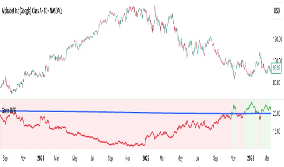
Greer Value Yields Line📈 Greer Value Yields Line – Valuation Signal Without the Clutter
Part of the Greer Financial Toolkit, this streamlined indicator tracks four valuation-based yield metrics and presents them clearly via the Data Window, GVY Score badge, and an optional Yield Table:
Earnings Yield (EPS ÷ Price)
FCF Yield (Free Cash Flow ÷ Price)
Revenue Yield (Revenue per Share ÷ Price)
Book Value Yield (Book Value per Share ÷ Price)
✅ Each yield is compared against its historical average
✅ A point is scored for each metric above average (0–4 total)
✅ Color-coded GVY Score badge highlights valuation strength
✅ Yield trend-lines Totals (TVAVG & TVPCT) help assess direction
✅ Clean layout: no chart clutter – just actionable insights
🧮 GVY Score Color Coding (0–4):
⬜ 0 = None (White)
⬜ 1 = Weak (Gray)
🟦 2 = Neutral (Aqua)
🟩 3 = Strong (Green)
🟨 4 = Gold Exceptional (All metrics above average)
Total Value Average Line Color Coding:
🟥 Red – Average trending down
🟩 Green – Average trending up
Ideal for long-term investors focused on fundamental valuation, not short-term noise.
Enable the table and badge for a compact yield dashboard — or keep it minimal with just the Data Window and trend-lines.

Greer Book Value Yield📘 Script Title
Greer Book Value Yield – Valuation Insight Based on Balance Sheet Strength
🧾 Description
Greer Book Value Yield is a valuation-focused indicator in the Greer Financial Toolkit, designed to evaluate how much net asset value (book value) a company provides per share relative to its current market price. This script calculates the Book Value Per Share Yield (BV%) using the formula:
Book Value Yield (%) = Book Value Per Share ÷ Stock Price × 100
This yield helps investors assess whether a stock is trading at a discount or premium to its underlying assets. It dynamically highlights when the yield is:
🟢 Above its historical average (potentially undervalued)
🔴 Below its historical average (potentially overvalued)
🔍 Use Case
Analyze valuation through asset-based metrics
Identify buy opportunities when book value yield is historically high
Combine with other scripts in the Greer Financial Toolkit:
📘 Greer Value – Tracks year-over-year growth consistency across six key metrics
📊 Greer Value Yields Dashboard – Visualizes multiple valuation-based yields
🟢 Greer BuyZone – Highlights long-term technical buy zones
🛠️ Inputs & Data
Uses Book Value Per Share (BVPS) from TradingView’s financial database (Fiscal Year)
Calculates and compares against a static average yield to assess historical valuation
Clean visual feedback via dynamic coloring and overlays
⚠️ Disclaimer
This tool is for educational and informational purposes only and should not be considered financial advice. Always conduct your own research before making investment decisions.
Greer EPS Yield📘 Script Title
Greer EPS Yield – Valuation Insight Based on Earnings Productivity
🧾 Description
Greer EPS Yield is a valuation-focused indicator from the Greer Financial Toolkit, designed to evaluate how efficiently a company generates earnings relative to its current stock price. This script calculates the Earnings Per Share Yield (EPS%), using the formula:
EPS Yield (%) = Earnings Per Share ÷ Stock Price × 100
This yield metric provides a quick snapshot of valuation through the lens of profitability per share. It dynamically highlights when the EPS yield is:
🟢 Above its historical average (potentially undervalued)
🔴 Below its historical average (potentially overvalued)
🔍 Use Case
Quickly assess valuation attractiveness based on earnings yield.
Identify potential buy opportunities when EPS% is above its long-term average.
Combine with other indicators in the Greer Financial Toolkit for a fundamentals-driven investment strategy:
📘 Greer Value – Tracks year-over-year growth consistency across six key metrics
📊 Greer Value Yields Dashboard – Visualizes valuation-based yield metrics
🟢 Greer BuyZone – Highlights long-term technical buy zones
🛠️ Inputs & Data
Uses fiscal year EPS data from TradingView’s built-in financial database.
Tracks a static average EPS Yield to compare current valuation to historical norms.
Clean, intuitive visual with automatic color coding.
⚠️ Disclaimer
This tool is for educational and informational purposes only and should not be considered financial advice. Always conduct your own research before making investment decisions.

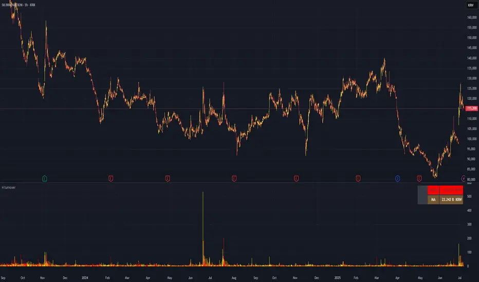
H turnoverTrading Value refers to the total monetary amount of all transactions for a particular stock or the entire market over a specific period. It is calculated by multiplying the trading volume (the number of shares traded) by the price at which they were traded. For example, if 10,000 shares of a stock are traded in a day at an average price of 50,000 KRW, the trading value for that day would be 500,000,000 KRW.
Key points about trading value:
Market Activity and Liquidity: A high trading value indicates an active and liquid market.
Flow of Investment Funds: Increasing trading value suggests more money is flowing into the market or a particular stock.
Relationship with Price Movements: When both trading value and price rise together, it often signals strong buying interest. Conversely, significant price changes with low trading value may be less reliable.
Market Sentiment Indicator: Changes in trading value can reflect shifts in investor interest and sentiment.
In summary, trading value is the total amount of money exchanged in trades and serves as an important indicator of market activity, liquidity, and investor sentiment.
Quarterly Revenue & Growthinspired by TrendSpider. Monitoring a company's earning revenue quarter by quarter.
