Square of Nine Levels [RC] Basic📐 Square of Nine Levels Basic— Precision Market Geometry for Dynamic Price Targets
The Square of Nine Levels Basic indicator is a powerful price-projection and level-mapping tool based on W.D. Gann’s legendary Square of Nine mathematical system. This indicator transforms market prices into geometric rotations and harmonic levels—revealing price zones where markets historically accelerate, pause, or reverse with uncanny accuracy.
Unlike static Fibonacci tools, Square of Nine levels expand radially around a chosen base price, creating concentric price cycles that align with vibrational mathematics and cyclical market resonance. When price interacts with these rotational degrees, traders often witness structural reactions that are invisible to standard indicators.
🧭 What This Indicator Does
Once a trader inputs (or clicks) a Base Price, the indicator automatically:
✔️ Computes Square of Nine projections in upward and downward directions
✔️ Plots concentric price circles (levels of expansion) (Basic Version 1 Level Only)
✔️ Highlights rotational harmonics and midpoint attractors
✔️ Shows Golden Ratio (0.786 / 0.618 / 0.382 / 0.236) cyclic divisions
✔️ Provides clear visual level markers & labels for analysis
✔️ Adjusts dynamically as price trends evolve
These levels act as mathematical magnets, where price frequently:
Finds hidden support or resistance
Creates fair value rejection zones
Forms breakout thresholds
Completes wave and time cycles
Resonates with prior swing pivots
🔍 Key Features
Feature Benefit
_________________________________________________________________________
Auto Square-of-Nine Level Calculation Zero manual computation—instant geometry
Adjustable Circles & Points Model Gann expansions as per your theory
Golden Ratio & Midpoint Zones Adds confluence for precision entries
Multi-color Cycle Layers Instantly differentiate price cycles
Minimal UI Designed for professional clean charts
🧠 Why the Square of Nine Matters
Gann believed that price does not move randomly—it rotates through degrees, harmonics, and vibrational frequencies. The Square of Nine captures this rotation mathematically:
Price in time equals price in space.
This tool reveals those rotational levels, allowing traders to anticipate when price is likely to pivot or continue—with mathematically predictable targets.
🎯 Best Use-Cases
Identifying major support/resistance levels
Timing cycle inflection points
Swing, positional, and index-level forecasting
If you trade using Gann methods, cycles, harmonics, Square of 9, or astro-geometry, this indicator becomes a foundational levels and projection engine.
🚀 Take Your Charting to the Next Dimension
The Square of Nine Levels Basic is not just a level plotter—it is a market resonance system. Once you understand how price vibrates around these circles, you gain a structural edge that most traders never discover.
Gann

Square of Nine Levels [RC] Advance📐 Square of Nine Levels — Precision Market Geometry for Dynamic Price Targets
The Square of Nine Levels indicator is a powerful price-projection and level-mapping tool based on W.D. Gann’s legendary Square of Nine mathematical system. This indicator transforms market prices into geometric rotations and harmonic levels—revealing price zones where markets historically accelerate, pause, or reverse with uncanny accuracy.
Unlike static Fibonacci tools, Square of Nine levels expand radially around a chosen base price, creating concentric price cycles that align with vibrational mathematics, planetary motion analogies, and cyclical market resonance. When price interacts with these rotational degrees, traders often witness structural reactions that are invisible to standard indicators.
🧭 What This Indicator Does
Once a trader inputs (or clicks) a Base Price, the indicator automatically:
✔️ Computes Square of Nine projections in upward and downward directions
✔️ Plots concentric price circles (levels of expansion)
✔️ Highlights rotational harmonics and midpoint attractors
✔️ Shows Golden Ratio (0.618 / 0.382) cyclic divisions
✔️ Provides clear visual level markers & labels for analysis
✔️ Adjusts dynamically as price trends evolve
These levels act as mathematical magnets, where price frequently:
Finds hidden support or resistance
Creates fair value rejection zones
Forms breakout thresholds
Completes wave and time cycles
Resonates with prior swing pivots
🔍 Key Features
Feature Benefit
_________________________________________________________________________
Auto Square-of-Nine Level Calculation Zero manual computation—instant geometry
Adjustable Circles & Points Model Gann expansions as per your theory
Golden Ratio & Midpoint Zones Adds confluence for precision entries
Multi-color Cycle Layers Instantly differentiate price cycles
Minimal UI Designed for professional clean charts
🧠 Why the Square of Nine Matters
Gann believed that price does not move randomly—it rotates through degrees, harmonics, and vibrational frequencies. The Square of Nine captures this rotation mathematically:
Price in time equals price in space.
This tool reveals those rotational levels, allowing traders to anticipate when price is likely to pivot or continue—with mathematically predictable targets.
🎯 Best Use-Cases
Identifying major support/resistance levels
Timing cycle inflection points
Confluence with Wave Theory, SMC, FVGs, and geometry
Swing, positional, and index-level forecasting
If you trade using Gann methods, cycles, harmonics, Square of 9, or astro-geometry, this indicator becomes a foundational timing and projection engine.
🚀 Take Your Charting to the Next Dimension
The Square of Nine Levels is not just a level plotter—it is a market resonance system. Once you understand how price vibrates around these circles, you gain a structural edge that most traders never discover.

PyraTime Harmonic Matrix [Quad Horizon]Concept and Architecture
The PyraTime Harmonic Matrix is the quantitative engine of the PyraTime ecosystem. It is a multi-dimensional time projection tool that applies Digital Root Mathematics across a variable scalar grid.
While standard time analysis focuses on linear cycles, the Harmonic Matrix calculates Non-Linear Digital Roots (174, 285, 396...) and projects them through a proprietary "Event Horizon" logic. This allows the system to identify deep-structure market turning points that exist far beyond the current price action.
Technical Features
The Quad-Horizon Engine This script features a variable "Horizon Depth" setting, allowing traders to loop the harmonic sequence into the future to identify macro-scale pivots:
Standard Horizon: Projects the base Digital Root sequence (1x).
Double Horizon: Projects the sequence a second time (+999 intervals).
Triple/Quad Horizon: Extends the calculation up to 4x the standard length, identifying "Grand Cycle" completions on higher timeframes.
The Apex Sequence (963) The script mathematically identifies the completion of the Digital Root sum (The 963 Interval).
Visual Logic: These vectors are rendered in Gold with a lightning symbol (⚡), indicating a Cycle Termination point.
Event Horizon Dashboard To manage the complexity of multi-timeframe analysis, the script includes a live Head-Up Display (HUD).
Function: It scans all enabled timeframes (from 1m to Weekly) and calculates the exact time remaining to the single nearest future harmonic event.
Confluence Strategy (The Ecosystem) The Harmonic Matrix provides the "Time" (X-Axis). For a complete structural analysis, it is designed to be overlayed with our specific momentum and exhaustion tools:
Momentum Trigger: Use the Harmonic Sniper Trigger to identify entry signals when price hits a Matrix line:
Exhaustion Filter: Use the Sequential Exhaustion 9/13 to confirm trend fatigue at Matrix intervals:
Disclaimer This tool is for quantitative time analysis. It projects mathematical intervals and does not predict price direction. Past performance is not indicative of future results.

Great Pyramid Master Architecture [GPM] PyraTimeThe Wisdom of the Ancients
The Great Pyramid of Giza is not just a tomb; it is a monument to mathematical perfection, aligned with celestial mechanics and constructed using precise harmonic ratios. The Great Pyramid Master (GPM) Architecture applies these same ancient geometric laws to modern financial markets.
While standard analysis treats time as linear (a straight line), GPM treats time as geometric (a spiral). By anchoring this tool to a significant "Origin Pivot," the script projects a sequence of vertical time markers derived from the sacred number 30 and its harmonic multiples (e.g., 72, 144, 360).
Why It Works: The Physics of Time
Markets do not move randomly; they vibrate. Just as a musical string vibrates at specific frequencies, market trends exhaust their energy at specific time intervals.
* Price tells you where the market is.
* GPM tells you when the market will turn.
This indicator visualizes the invisible "Time Lattice" that underpins price action. When price arrives at a GPM Vertical Line, it has hit a geometric wall where the previous energy vector is mathematically likely to terminate.
The Full PyraTime Ecosystem
The GPM Architecture is the "Map" of the system. To trade it successfully, you must pair it with our two dedicated companion indicators found in our library:
1. The Map (This Indicator): Identifies the Time Window. Wait for price to touch a vertical line.
2. The Trigger (Search for "PyraFish"): Use the Harmonic Sniper Trigger to confirm momentum is flipping exactly when the GPM line hits or click below
3. The Exit (Search for "PyraTD"): Use the Sequential Exhaustion to identify price exhaustion (9/13 count) and signal when to close the trade or click below
How to Use (Step-by-Step)
1. Identify the Origin: Find a major "Scam Wick" or structural pivot (High/Low) on your chart.
2. Set the Anchor: Open Settings and input the exact Date and Time of that pivot. The geometric web will instantly project into the future.
3. Monitor the Clusters: Watch for areas where multiple cycle lines (Standard and Esoteric) converge. These "Super Pivots" often mark significant trend reversals.
Features
Esoteric & Standard Cycles: Tracks both conventional market hours and the hidden harmonic sequence simultaneously.
Smart Dashboard: Displays a countdown to the next major energy shift.
Clean Visuals: All lines are rendered at 50% opacity to keep your chart professional and readable.
Disclaimer: This tool is for technical analysis and educational purposes only. It projects potential geometric time pivots, not guaranteed price movements. Always manage your risk.

[iQ]PRO Quant GANN FOURIER VZO RANGE+🔮 PRO Quant GANN FOURIER VZO RANGE+
A Highly Adaptive and Proprietary Quantitative Strategy for Precision Market Analysis
This is the official description for the PRO Quant GANN FOURIER VZO RANGE+ strategy, a sophisticated, closed-source system engineered for high-level market engagement. This tool integrates multiple independent quantitative models into a single, cohesive Ensemble Signal, providing an edge through robust, multi-dimensional analysis.
🔬 Core Quantitative Architecture
The strategy is built on the convergence of several powerful, state-of-the-art analytical components, each designed to capture a distinct facet of market dynamics:
Proprietary Gann Swing Models: We utilize a dual-approach to Gann analysis.
Array–Based Gann Swing: A proprietary implementation leveraging advanced Pine Script array structures for dynamic tracking of significant price pivots and structure shifts. This component continuously monitors market momentum and potential areas of interest, including proprietary "ChoCh" (Change of Character) detection—a highly sensitive mechanism for identifying early trend inflection points. This core mechanism provides a high-frequency structural view of the market.
Composite Multi-Timeframe Gann Swing: This model synthesizes traditional swing analysis across two distinct timeframes to filter noise and confirm structural trends, ensuring the system operates with conviction against the backdrop of a higher-level market perspective.
VZO/VSA (Volume Zone Oscillator/Volume Spread Analysis) Hybrid: This module is engineered to analyze the crucial relationship between price momentum and volume flow, specifically using a Volume Zone Oscillator (VZO) approach integrated with Volume Spread Analysis (VSA) principles. It is designed to identify underlying accumulation and distribution activity with a unique dual-timeframe composite for enhanced signal quality.
Trend and Statistical Component: A dedicated module assesses the statistical bias and slope of the aggregated market movement, providing a crucial check against overextension and ensuring alignment with the underlying price regression trajectory.
⚖️ The Ensemble Signal and Trade Logic
All independent signals—Gann Array, Composite Gann, VZO/VSA, and Trend—are processed through a Weighted Ensemble Logic.
Weighted Voting: Each component's signal is assigned a customizable weight (input parameters wGannComp, wVZO, etc.) to reflect its relative importance in the current market environment.
Threshold-Based Decision: The weighted average of all signals results in an Ensemble Signal. Only when this signal decisively exceeds a customizable Signal Threshold does the system generate a Final Signal for trade execution. This rigor is key to filtering lower-conviction setups.
The strategy's execution logic is designed to open and close positions dynamically based on the Final Signal, maintaining maximum control with a default position size of 15% of equity per trade. A dedicated toggle allows for aggressive position management to "stay in" trades longer under specific conditions identified by the proprietary swing models.
⚙️ Strategic Advantages and Exclusivity
This strategy is marked by its extreme adaptability, incorporating features such as:
Higher Timeframe Synthesis: Crucial components utilize multi-timeframe confirmation to validate signals.
Price Smoothing: An optional, light-touch EMA smoothing is applied to the input price data to enhance signal clarity and reduce spurious whipsaws.
Due to the proprietary nature and complexity of the underlying swing detection algorithms and array management, the source code is kept strictly closed-source. This ensures the continued analytical edge and integrity of the model for our exclusive community.
OG INDICATOR TO MESS AROUND WITH, USE RIGHT, AND ENJOY. PRO STRATS COMING TOO
NFA.
MKNiQ

PyraTime Harmonic 369Concept and Methodology PyraTime Harmonic 369 is a quantitative time-projection tool designed to apply Modular Arithmetic to market analysis. Unlike linear time indicators, this tool projects non-linear integer sequences derived from Digital Root Summation (Base-9 Reduction).
The core logic utilizes the mathematical progression of the 3-6-9 constants. By anchoring to a user-defined "Origin Pivot," the script projects three distinct harmonic triads to identify potential Temporal Confluence—moments where mathematical time cycles align with price action.
Technical Features This script focuses on the Standard Scalar (1x) projection of the Digital Root sequence:
The Root-3 Triad (Red): Projects intervals of 174, 285, 396. (Mathematical Sum: 1+7+4=12→3)
The Root-6 Triad (Green): Projects intervals of 417, 528, 639. (Mathematical Sum: 4+1+7=12→3, inverted)
The Root-9 Triad (Blue): Projects intervals of 741, 852, 963. (Mathematical Sum: 7+4+1=12→3... completion to 9)
How to Use
Set Anchor: Input the time of a significant High or Low in the settings.
Select Resolution: This tool is optimized for 1-minute (Micro-Harmonics) and 15-minute (Intraday Harmonics) charts.
Analyze Clusters: The vertical lines represent calculated harmonic intervals. Traders look for "Clusters" where a Root-3 and Root-9 cycle land on adjacent bars, indicating a high-probability pivot.
System Architecture & Version Comparison This script represents the foundational layer of the PyraTime ecosystem.
This Script (PyraTime Harmonic 369):
Scalar: Standard 1x Multiplier only.
Focus: Intraday & Micro-structure (1m, 15m).
Engine: Core Digital Root Integers.
PyraTime Harmonic Matrix (Advanced Edition):
Scalar Engine: Unlocks Quad-Fractal (4x), Tri-Fractal (3x), and Bi-Fractal (2x) multipliers for institutional cycle analysis.
Apex Logic: Auto-detection of the "963" Completion Sequence (Gold Highlight).
Event Horizon: Includes a live Predictive Dashboard that calculates the time-delta to the next harmonic event across all scalar groups.
Disclaimer This tool is for the educational analysis of Number Theory in financial markets. It projects time intervals and does not predict price direction. Past performance does not guarantee future results.

PyraTime Intraday Cycles**Concept and Methodology**
PyraTime Intraday Cycles is a technical analysis tool designed to introduce the concept of **Temporal Cycle Projection**. While most indicators analyze price action (Y-axis), this tool focuses exclusively on the X-axis (Time).
By anchoring to a specific "Origin Pivot" (a user-defined High or Low), the script projects harmonic time intervals into the future. These vertical vectors serve as a grid, helping traders identify moments where time-based cycles may align with price structure.
**Technical Features**
This edition is optimized for **Multi-Timeframe Harmonic Flows**, utilizing a fixed algorithm for key intervals:
* **Anchor Point Logic:** The user manually selects a significant market pivot. The script calculates forward projections from this exact timestamp.
* **Standard Rhythms:** This version renders the **5-minute**, **15-minute**, **1-hour**, and **Daily** harmonic sequences. This allows for analysis across scalping, intraday, and swing trading structures.
* **Visual Confluence:** The indicator draws vertical lines to highlight potential zones of temporal exhaustion or acceleration.
**How to Use**
1. **Identify a Pivot:** Locate a significant High or Low on the chart.
2. **Set the Origin:** Open the settings and input the date/time of that pivot.
3. **Analyze Confluence:** Watch how price behaves when it approaches a vertical line. If price hits a key support/resistance level *at the same time* it hits a PyraTime vertical line, this is considered a high-probability "Time/Price" intersection.
**Version Comparison**
This script represents the foundational layer of the Great Pyramid system (PyraTime Apex).
* **PyraTime Intraday Cycles (This Script):** Focuses on Standard Timeframes (5m, 15m, 1h, Daily).
* **GPM Architecture (Advanced):** The full methodology extends these calculations to Esoteric Sequences (33, 144, 108), includes 3x Cycle Extensions, and features a Predictive Dashboard for complex multi-timeframe analysis.
**Disclaimer**
This tool is for educational and analytical purposes only. It identifies time cycles, not price direction. Past performance of a time cycle does not guarantee future results.

Gann Levels (Auto) by RRR📌 Gann Levels (Auto) — Intraday, Swing & Elliott Wave Precision Tool
Gann Levels (Auto) is a high-accuracy price-reaction indicator designed for intraday scalpers, swing traders, and Elliott Wave traders who want clean, auto-updating support and resistance levels without manually drawing anything.
The indicator automatically detects the latest swing high & swing low and plots the 8 Gann Octave Levels between them. These levels act as a complete price map—showing equilibrium, structure, trend continuation zones, and reversal points with extreme precision.
🔥 Why This Indicator Stands Out
✔ Fully automatic swing detection
Levels update as structure evolves — no manual adjustments.
✔ All Gann Octave levels
Plots 1/8 through 8/8 including the critical 4/8 midpoint.
✔ Intraday-optimized
Exceptional on 1m, 3m, 5m, and 15m charts.
✔ Ultra-clean support & resistance
Levels act as reliable barriers and breakout zones.
⭐ MOST IMPORTANT LEVELS FOR INTRADAY
4/8 – Midpoint (Major Decision Pivot)
Strongest Gann level.
Controls trend or reversal for the session.
Breakout → Trend Day
Rejection → Reversal Day
8/8 & 0/8 – Extreme Structure Edges
Most likely zones for intraday reversals.
Perfect for scalp entries when combined with volume exhaustion.
🎯 How to Trade ELLIOTT WAVE Using Gann Levels
This indicator is exceptionally powerful when combined with Elliott Wave Theory.
Here is how to use it wave-by-wave:
🔵 Wave 2 → Identify Bottom Using 0/8 or 1/8 Levels
Wave 2 typically retraces deep but remains above key structure.
Gann confirmation:
Price stops at 0/8 or 1/8 zone
Rejection wick + low volume breakdown attempt
Bullish intent starts forming
This gives a perfect Wave 3 entry zone.
🔴 Wave 3 → Breakout Above 4/8 Midpoint
Wave 3 is the strongest impulsive wave.
The 4/8 level works like a force-field.
Wave 3 confirmation:
Price breaks and retests 4/8
Strong volume
No deep pullbacks after break
This is one of the most reliable Elliott + Gann trades.
🟡 Wave 4 → Uses 3/8 or 5/8 as Support/Resistance
Wave 4 is corrective and shallow compared to Wave 2.
Gann alignment:
Wave 4 often consolidates between 3/8 and 5/8
Levels act like range boundaries
Avoid trading inside chop; wait for breakout
This gives perfect continuation entries for Wave 5.
🟣 Wave 5 → Ends Near 7/8 or 8/8 Extreme Zone
Wave 5 usually ends in overbought territory.
Gann confirmation:
Price hits 7/8 or 8/8
Momentum weakens
Divergence builds (RSI/MACD optional)
Last push = exhaustion
This is where reversals or major pullbacks begin.
💥 BONUS: Corrective Waves (A-B-C)
Wave A:
Often rejects from 4/8 or 5/8.
Wave B:
Typically trapped between 3/8–5/8.
Wave C:
Usually ends around 0/8 (for bullish trend)
or 8/8 (for bearish trend).
These zones give ultra-high confidence entries.
⚙️ Who This Indicator Is Perfect For
Elliott Wave traders
Intraday scalpers
Swing traders
Price action & structure traders
Traders who want automatic support-resistance levels
Traders who want clean, non-cluttered levels
⚠️ Disclaimer
This indicator is for educational purposes only.
Trading involves risk. Always use proper risk management.

QuantMotions - Pivot Timeline ProjectionQuantMotions – Pivot Timeline Projections is an advanced time-based forecasting tool that uses a unique Twin Pivot model to project future price-time structures.
It combines classical Gann principles with modern quantitative logic to generate highly precise time projections, dynamic angles, and future support/resistance timelines across multiple timeframes.
Whenever two matching pivots (High ↔ Low) of the same length are detected, the indicator calculates a true calendar-time angle and extends it forward, forming dynamic Gann-style fans that adapt to the market in real time.
Perfect for traders who want to integrate price + time forecasting into their strategy.
Key Features:
✔ Twin Pivot Detection
Automatically identifies valid pivot pairs of equal cycle length and opposite direction.
Once confirmed, the pivot becomes a time anchor for future projections.
✔ True Time-Based Angle Projections
Unlike standard Gann tools that rely on bar-counting, this indicator uses real calendar time (milliseconds) to calculate:
This produces significantly more accurate forecasting lines.
✔ Multi-Timeframe Pivot Cycles
Activate time cycles such as:
30M, 1H, 4H, 12H
1D, 7D, 30D
60D, 90D, 120D, 180D, 270D, 360D
Each cycle uses a dedicated color and projection style for clarity.
✔ Dynamic Support/Resistance Timefans
- Every confirmed pivot generates two future projections:
- The main time-angle projection (Gann-style forward fan)
- A secondary projection based on a fixed ratio (1/8), acting as dynamic future support
Both extend until the structure breaks based on ATR tolerance.
✔ ATR-Based Validation
Projection lines remain valid until price breaks them with a configurable ATR multiplier.
This removes noise and keeps only meaningful structures.
✔ Volume Delta Tracking (Optional)
Tracks up-volume and down-volume along the time cycle to validate directional bias.
Info labels show:
- cycle length
- angle
- delta volume
- delta percentage
Seconds-based volume tracking supported for Premium users.
✔ Smart Info Labels
Displays detailed pivot information only for the highest-timeframe pivot at each bar
→ ensures high usability without chart clutter.
🔷 Why This Indicator Is Special
This tool merges Gann angles, time cycles, and quantitative price action into a single engine.
It does not rely on static angles or simple bar offsets.
Instead, it uses:
- real time
- real slope
- real cycle symmetry
- real price movement
The result is a uniquely accurate forecasting model that is extremely difficult to replicate manually.
🔷 Perfect For
- Intraday traders
- Swing traders
- Index, Crypto, Metals, and FX traders
- Gann and cycle-based analysts
- Structure and trend change detection
- Time/price projection strategies
🔷 Inputs & Customization
- ATR break tolerance
- Multiple cycle activation toggles
- Custom color sets for each timeframe
- Second-based or standard timeframe volume tracking
- Enable/Disable info labels
🔷 Note
Some features (like seconds-based volume tracking) depend on TradingView Premium and additional broker data sources.
Loading times may vary when many long-term cycles are enabled simultaneously.
🔷 Access
This is an Invite-Only Script by QuantMotions.
Access is granted after purchase.
For more information, please visit the official product page or contact us directly.

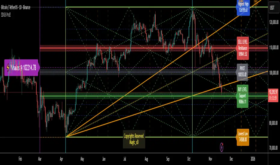
Dynamic Gann Square Pro - [Magic_xD]Premium Gann Analysis System for Professional Traders
Dynamic Gann Square Pro is an advanced technical analysis tool that combines classical Gann theory with modern geometric analysis to identify high-probability support/resistance zones, time cycles, and market turning points.
🎯 What This Indicator Does
This indicator provides a comprehensive suite of Gann-based analytical tools designed to help traders identify:
Dynamic Support & Resistance Levels: Automatically calculated key price zones based on market structure
Gann Square of 9 Calculations: Multiple calculation methods including Range, Daily, Weekly, and Monthly timeframes
Advanced Time Cycle Analysis: Gann cycles, Fibonacci time projections, and Square Root cycles for anticipating market turns
Geometric Pattern Recognition: Gann Stars with customizable shapes (Square, Triangle, Pentagon, Hexagon, Octagon, and more)
Price Action Zones: Color-coded zones highlighting critical decision points
Whale Detection System: Volume-weighted analysis to identify institutional activity
Multi-Timeframe Dashboard: Real-time technical rating system combining 10+ indicators (RSI, MACD, Stochastic, ADX, Bollinger Bands, and more)
📊 Key Features
Flexible Calculation Modes:
Select Candle Mode: Click directly on your chart to select your reference point
Lookback Mode: Define custom lookback periods (1-5000 bars)
Auto-Timeframe Detection: Automatically adjusts to Daily, Weekly, or Monthly ranges
Advanced Gann Tools:
Configurable Gann Square spacing with 17 precision levels (from 0.00000001 to 100000000)
Cycle multipliers (1-10 cycles) representing 360° to 3600° rotations
14 geometric shapes for market division analysis
Infinite Squares projection system for extended future projections
Time Cycle Systems:
Classical Gann Time Cycles with automatic repetition
Extended Fibonacci Time Ratios (0.382, 0.618, 1.618, 2.618, 3.618, up to 21.0)
W.D. Gann Square Root Method for geometric time expansion
Time grid subdivisions with customizable styles
Visual Clarity:
Multiple color themes (Dark Blue, Dark Gray, Black, Dark Green, Dark Purple)
Adjustable line styles (Solid, Dashed, Dotted) for all elements
Customizable labels with offset controls
Zone highlighting with transparency controls
Clean, professional chart presentation
🔮 Who Should Use This
This indicator is designed for:
Experienced traders familiar with Gann analysis methodology
Swing traders looking for high-probability reversal zones
Position traders using geometric and time-based analysis
Technical analysts who incorporate classical market theory
Gold & Forex traders (optimized for XAUUSD, BTCUSD, and major pairs)
⚙️ How to Use
Select Your Mode: Choose between "Select Candle" (click a pivot) or "Lookback" (automatic detection)
Configure Calculation Method: Pick your preferred Gann Square method (Range, Sqr9, Daily, Weekly, Monthly)
Adjust Cycles & Shape: Set the number of cycles and geometric division pattern
Enable Desired Features: Toggle Gann levels, Stars, Time Cycles, Trendlines, and Dashboard as needed
Customize Visual Style: Match your chart theme and preferences
The indicator automatically updates as new price data arrives, continuously calculating fresh support/resistance zones and time projections.
📈 What Makes This Different
Unlike simple support/resistance indicators, Dynamic Gann Square Pro implements authentic W.D. Gann methodology including:
True Square of 9 spiral calculations
Geometric price-time relationships
Natural angle divisions based on sacred geometry
Volume-weighted institutional detection
Multi-indicator consensus analysis
The system combines price analysis with time analysis, recognizing that Gann theory emphasizes both dimensions equally for accurate market forecasting.
⚠️ Important Notes
This is a technical analysis tool and should be used alongside proper risk management
Best results achieved when combined with your existing trading strategy
The indicator works on all timeframes but is optimized for H1, H4, and Daily charts
Customization is key: Spend time adjusting settings to match your trading instrument and style
The dashboard provides a technical rating but is not financial advice
🎓 Educational Foundation
This indicator is built on the teachings of W.D. Gann, one of the most legendary traders of the 20th century, incorporating:
Square of 9 theory
Natural geometric divisions (360° cycles)
Price-time equivalence principles
Support/resistance zone analysis.
Coded by Magic_xD - Ahmed Ramzey
Professional Algorithmic Trading System Developer
All copyrights reserved. This indicator represents years of research into Gann theory combined with modern programming techniques.
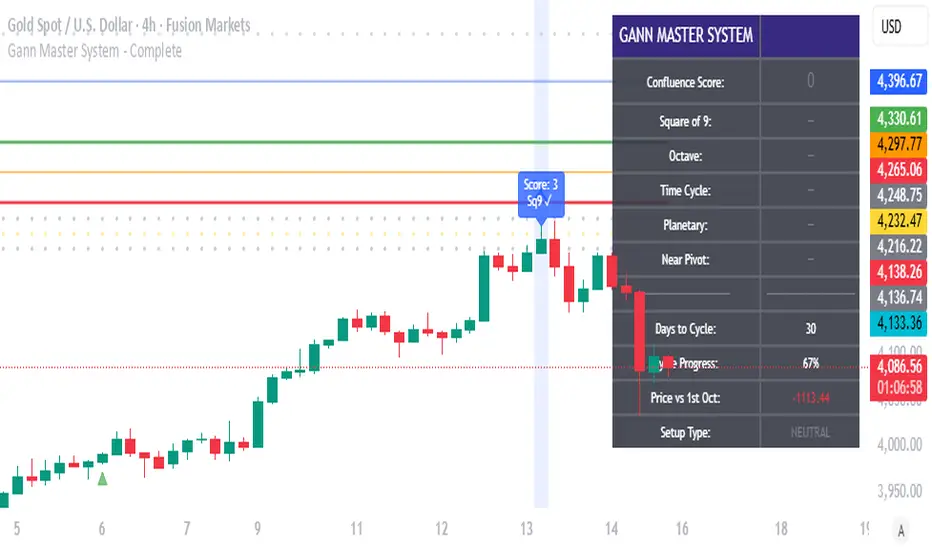
Gann Master System - CompleteGann Master Trading System - Multi-Factor Confluence Indicator
Advanced implementation of W.D. Gann methodology combining Square of 9 calculations, Octave Theory projections, Time Cycle analysis, and Planetary Aspect windows into a systematic confluence-based trading system.
Key Features:
Square of 9 geometric price levels (180°, 270°, 360° rotations)
Octave Theory targets with harmonic divisions (0.5x, 1x, 2x, 4x)
Time cycle tracking with sub-cycle analysis
10 configurable planetary aspect windows (manual input from ephemeris)
Automatic swing pivot detection
Multi-factor confluence scoring (0-20+ points)
Visual signals: Blue (score 3-6), Red (7-10), Purple (11+)
Real-time info panel with factor status
Built-in alerts for high-probability setups
How It Works:
System calculates multiple Gann factors simultaneously and awards points when price aligns with key levels. Higher confluence scores indicate stronger probability of reversal. Combines objective mathematics with astronomical timing for systematic edge.
Best For: Daily/4H charts on Gold, Forex majors, Indices
Signal Frequency: 2-4 high-quality setups per month (score 11+)
Recommended Min Score: 7 for trading, 11+ for highest probability
Setup Required: Configure Square of 9 pivot, Octave base range, Time cycle start date, and planetary aspect dates. See full documentation for detailed guide.
Gann Square of 144 (Master Price & Time)This indicator is a fully reconstructed and highly precise version of W.D. Gann’s Square of 144, designed for deep analysis of price-time balance, harmonic movements, and cyclical turning points.
It allows traders to anchor the Square directly to any pivot (date + price), making the tool adaptable for all markets and all timeframes.

Geometric Price-Time Triangle Calculator═══════════════════════════════════════════════════
GEOMETRIC PRICE-TIME TRIANGLE CALCULATOR
═══════════════════════════════════════════════════
Calculates Point C of a geometric triangle using different rotation angles from any selected price swing. Based on Bradley F. Cowan's Price-Time Vector (PTV) methods from "Four-Dimensional Stock Market Structures and Cycles."
📐 WHAT IT DOES
────────────────────────────────────────────────────
Select two points (A and B) on any swing, choose an angle, and the indicator calculates where Point C would be mathematically. It's just vector rotation applied to price charts.
This shows you where Point C lands in both price AND time based on pure geometry - not a prediction, just a calculation.
🎯 FEATURES
────────────────────────────────────────────────────
✓ 10 Different Angles
• Gann ratios: 18.435° (1x3), 26.565° (1x2), 45° (1x1), 63.435° (2x1), 71.565° (3x1)
• Other angles: 30°, 60°, 90°, 120°, 150°
✓ Visual Triangle
• Adjustable colors and opacity for points A, B, C
• Line styles: Solid, Dashed, Dotted
• Extend lines: None, Left, Right, Both
✓ Crosshair at Point C
• Shows where Point C is located
• Vertical line = bar position
• Horizontal line = price level
✓ Data Table
• Shows all calculations
• Price-to-Bar ratio
• Point C location (price and bars from A/B)
• Toggle on/off
🔧 HOW TO USE
────────────────────────────────────────────────────
1. Pick your swing start date (Point A)
2. Pick your swing end date (Point B) - make sure these dates capture the actual high/low of your swing
3. Choose an angle from the dropdown
4. Look at Point C - that's where the geometry puts it
Different angles = different Point C locations. Whether price actually goes there is up to the market.
📊 THE ANGLES
────────────────────────────────────────────────────
- 18.435° (1x3) - Shallow rotation
- 26.565° (1x2) - Moderate rotation
- 45° (1x1) - Gann's balanced ratio
- 60° - Equilateral triangle (default)
- 63.435° (2x1) - Steeper rotation
- 71.565° (3x1) - Very steep rotation
- 90° - Right angle
- 120°-150° - Obtuse angles
💡 PRACTICAL USE
────────────────────────────────────────────────────
→ See where geometric patterns would complete
→ Test if your market respects certain angles
→ Find where multiple angles converge
→ Compare projected Point C to actual price action
→ Use 90° to see symmetrical price/time relationships
→ Backtest historical swings to see what worked
⚙️ HOW IT WORKS
────────────────────────────────────────────────────
1. Takes your AB swing
2. Calculates the BA vector (reverse direction)
3. Normalizes price and time using Price-to-Bar ratio
4. Rotates the vector by your selected angle
5. Converts back to chart coordinates
Basic trigonometry. That's all it is.
📚 BACKGROUND
────────────────────────────────────────────────────
Based on Bradley F. Cowan's Price-Time Vector (PTV) concept from "Four-Dimensional Stock Market Structures and Cycles" and W.D. Gann's geometric angle analysis. Cowan observed that markets sometimes complete geometric patterns. This tool calculates where those patterns would complete mathematically. Whether price actually respects these geometric relationships is something you need to test yourself.
⚠️ IMPORTANT
────────────────────────────────────────────────────
- This is geometric calculation, not prediction
- Point C shows where the math puts it, not where price will go
- Some angles might work for your market, some won't
- Test it yourself on historical data
- Price-to-Bar Ratio stays constant regardless of angle
- Don't trade based on this alone
- Works on all timeframes and assets
🎨 CUSTOMIZATION
────────────────────────────────────────────────────
- Show/hide triangle
- Individual colors for A, B, C points
- Adjust opacity (0-100)
- Line styles for each triangle side
- Extend lines left/right/both/none
- Show/hide data table
- Crosshair color and width
- Customizable table colors
═══════════════════════════════════════════════════

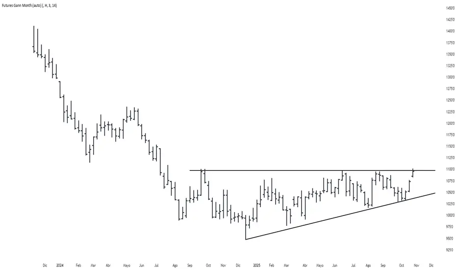
Futures Gann MonthBuilds a a continuous chart of the same month for a futures contract (e.g. ZSH2026).
This means such a chart consists of March '22, March '23, March '24, March '25, March '26...
The script goes back 20 years at most (depending on the current ticker selected in TradingView).
GANN Friday RulesFriday Rules Indicator Description
Purpose:
The Friday Rules indicator identifies and marks specific Friday candlestick patterns based on
weekly price action and candle body-to-wick relationships.
How it Works:
The indicator tracks the weekly high and low from Monday to Friday, then analyzes Friday's
candle to determine its significance and body/wick characteristics.
Signal Types:
🟢 Green F ▲ - Strong Bullish Friday
- Friday makes the weekly high
- Body closes within 1% of the high (minimal upper wick)
- Indicates strong buying pressure with little rejection
🟡 Yellow F ▲ - Weak Bullish Friday
- Friday makes the weekly high
- Body does NOT close near the high (significant upper wick)
- Shows buying interest but with selling pressure/rejection at highs
🔴 Red F ▼ - Strong Bearish Friday
- Friday makes the weekly low
- Body closes within 1% of the low (minimal lower wick)
- Indicates strong selling pressure with little support
🟠 Orange F ▼ - Weak Bearish Friday
- Friday makes the weekly low
- Body does NOT close near the low (significant lower wick)
- Shows selling pressure but with buying support at lows
⚪ White F - Neutral Friday
- Friday does not make weekly high or low
- Regular Friday with no extreme weekly price action
Key Features:
- Resets weekly tracking every Monday
- All signals positioned above the candle for clean visibility
- Arrow direction indicates bullish (▲) vs bearish (▼) bias
- Color coding shows strength: Green/Red = strong, Yellow/Orange = weak, White = neutral
Usage:
Use this indicator to identify significant Friday price action that may influence next week's
trading, weekend sentiment, and weekly closing patterns.

DCA Percent SignalOverview
The DCA Percent Signal Indicator generates buy and sell signals based on percentage drops from all-time highs and percentage gains from lowest lows since ATH. This indicator is designed for pyramiding strategies where each signal represents a configurable percentage of equity allocation.
Definitions
DCA (Dollar-Cost Averaging): An investment strategy where you invest a fixed amount at regular intervals, regardless of price fluctuations. This indicator generates signals for a DCA-style pyramiding approach.
Gann Bar Types: Classification system for price bars based on their relationship to the previous bar:
Up Bar: High > previous high AND low ≥ previous low
Down Bar: High ≤ previous high AND low < previous low
Inside Bar: High ≤ previous high AND low ≥ previous low
Outside Bar: High > previous high AND low < previous low
ATH (All-Time High): The highest price level reached during the entire chart period
ATL (All-Time Low): The lowest price level reached since the most recent ATH
Pyramiding: A trading strategy that adds to positions on favorable price movements
Look-Ahead Bias: Using future information that wouldn't be available in real-time trading
Default Properties
Signal Thresholds:
Buy Threshold: 10% (triggers every 10% drop from ATH)
Sell Threshold: 30% (triggers every 30% gain from lowest low since ATH)
Price Sources:
ATH Tracking: High (ATH detection)
ATL Tracking: Low (low detection)
Buy Signal Source: Low (buy signals)
Sell Signal Source: High (sell signals)
Filter Options:
Apply Gann Filter: False (disabled by default)
Buy Sets ATL: False (disabled by default)
Display Options:
Show Buy/Sell Signals: True
Show Reference Lines: True
Show Info Table: False
Show Bar Type: False
How It Works
Buy Signals: Trigger every 10% drop from the all-time highest price reached
Sell Signals: Trigger every 30% increase from the lowest low since the most recent all-time high
Smart Tracking: Uses configurable price sources for signal generation
Key Features
Configurable Thresholds: Adjustable buy/sell percentage thresholds (default: 10%/30%)
Separate Price Sources: Independent sources for ATH tracking, ATL tracking, and signal triggers
Configurable Signals: Uses low for buy signals and high for sell signals by default
Optional Gann Filter: Apply Gann bar analysis for additional signal filtering
Optional Buy Sets ATL: Option to set ATL reference point when buy signals occur
Visual Debug: Detailed labels showing signal parameters and values
Usage Instructions
Apply to Chart: Use on any timeframe (recommended: 1D or higher for better signal quality)
Risk Management: Adjust thresholds based on your risk tolerance and market volatility
Signal Analysis: Monitor debug labels for detailed signal information and validation
Signal Logic
Buy signals are blocked when ATH increases to prevent buying at peaks
Sell signals are blocked when ATL decreases to prevent selling at lows
This ensures signals only trigger on subsequent bars, not the same bar that establishes new reference points
Buy Signals:
Calculate drop percentage from ATH to buy signal source
Trigger when drop reaches threshold increments (10%, 20%, 30%, etc.)
Always blocked on ATH bars to prevent buying at peaks
Optional: Also blocked on up/outside bars when Gann filter enabled
Sell Signals:
Calculate gain percentage from lowest low to sell signal source
Trigger when gain reaches threshold increments (30%, 60%, 90%, etc.)
Always blocked when ATL decreases to prevent selling at lows
Optional: Also blocked on down bars when Gann filter enabled
Limitations
Designed for trending markets; may generate many signals in sideways/ranging markets
Requires sufficient price movement to be effective
Not suitable for scalping or very short timeframes
Implementation Notes
Signals use optimistic price sources (low for buys, high for sells), these can be configured to be more conservative
Gann filter provides additional signal filtering based on bar types
Debug information available in data window for real-time analysis
Detailed labels on each signal show ATH, lowest low, buy level, sell level, and drop/gain percentages

Gann Dynamic Levels [SmartFoxy]# 🌌 Gann Dynamic Levels
Gann Dynamic Levels is a dynamic Gann-based framework that calculates proportional and exponential levels using customizable methods — including planetary ratios.
Perfect for traders focused on cycles , ratios , and harmonic structures .
Inspired by the geometric and harmonic principles of W.D. Gann , this multifunctional tool automatically plots time–price projection levels based on user-defined anchor points.
It combines multiple calculation techniques to capture both linear and exponentia l market symmetries.
The indicator adapts dynamically to price movement, helping traders identify potential reversal zones , time clusters , and harmonic expansions derived from proportional and planetary relationships.
---
## ⚙️ Core Features
Five Calculation Methods — Linear, ratio-based, geometric, and exponential spacing for multi-perspective analysis.
Planetary Scaling Mode — Optional mode based on astronomical distances (Titius–Bode Law), adding an astronomical dimension to level spacing.
Adaptive Offset Control — Shifts all projected levels left or right proportionally without changing their internal spacing.
Automatic Label Management — Dynamically updates or reuses labels for better clarity and improved chart performance.
Custom Styling — Full control over colors, widths, label positions, and line styles for each method.
---
## 🌐 Purpose
Designed for traders who combine Gann theory , harmonic ratios , and cyclical timing to visualize equilibrium zones and future market symmetry.
Whether used for short-term timing or long-term structural projections, Gann Dynamic Levels provides an adaptive, geometry-based framework for interpreting market behavior.
---
## 📘 How to Use
When first applied, the indicator prompts you to place two points on the chart — for example, at the start and end of a significant price range.
The indicator calculates the number of bars between these two points, known as Delta .
Delta serves as the base unit for all calculations in Methods #1–#5 .
The computed results are displayed in Table 1 , which can be toggled using the parameter “📱 Show Gann Levels Table”.
You can reset or reposition the initial points in two ways:
Drag the existing points to new positions on the chart.
Hover over the indicator name, click ⦁⦁⦁ (More) → select “ Reset Points ”, then set new reference points.
---
## ⚙️ Method Logic
Classic – Evenly spaced levels based on the base Delta value. Ideal for identifying key support and resistance zones.
Coefficient (Coeff) – Scales Delta by fractional or whole-number coefficients for proportional level spacing.
Rounded – Rounds each calculated level to the nearest significant price value to align with major zones.
Subtractive – Generates levels by subtracting multiples of Delta from a reference point, emphasizing retracement-type structures.
Exponential – Applies an exponential growth model (10a = 4 + 3×2ⁿ) to project dynamic, non-linear level expansion.
Planetary – Uses the average distances of planets from the Sun (in Astronomical Units, AU ) as ratio multipliers to create harmonic projections.
Planetary distances can be customized in the user settings.
Data for Method #6 (Planetary) is displayed in Table 2 , toggled via “ 🪐 Show Planetary Table. ”
---
## ➡️ Additional Feature
Offset – Shifts all Gann levels horizontally (left or right) without changing their spacing.
Useful for visually aligning levels with key market structures.
---
### 🧭 Summary
A multi-method Gann framework combining geometric, harmonic, and planetary ratios for dynamic level projection and cycle analysis.

Square of 9 NumbersThis will mark all Square of numbers with digit addition of 9
One can create a system to buy above or below that number
GANN square of numbers concept if anybody knows will help


Comprehensive 3'bars Gann Swings v6.5 (Architecture Fix)An indicator that displays 3-bar swings based on an original method inspired by the works of W.D. Gann.
___________________________________________________________________________________Индикатор отображающий 3 барные свинги по авторской методике, основанной на работах В.Д.Ганна

Gann Trading Strategy📈 Simple & Powerful Gann-Based Trading System
This indicator automatically calculates key Gann support and resistance levels based on W.D. Gann's mathematical principles. Simply input either the highest price (for bearish setups) or lowest price (for bullish setups), and the indicator automatically generates all trading levels.
🎯 Key Features:
Automatic Level Calculation - Just select High/Low price projection basis
Complete Trading Framework - Entry zone, 3 Take Profit levels, and Exit level
Visual Trading Zones - Color-coded zones around each level for better entry/exit timing
Smart Alerts - Get notified when price reaches key levels
Bullish & Bearish Setups - Works for both long and short trading strategies
Customizable Display - Show/hide levels, adjust colors, line styles, and zone widths
🚀 How to Use:
Select "Lowest Price" for bullish setup or "Highest Price" for bearish setup
Input the relevant high or low price from your analysis
The indicator automatically calculates and displays all trading levels
Use the green entry zone for entries, blue levels for take profits, red level for exits
📊 Perfect for:
Swing trading
Position sizing and risk management
Support/resistance analysis
Multi-timeframe analysis
Uses time-tested Gann principles to automatically find key price levels for trading.

Double-Numbered Hexagon Price and Time Chart ⬢️ Double-Numbered Hexagon Price and Time Chart ⬢️
Overview
The Double-Numbered Hexagon Price and Time Chart is an advanced overlay indicator for TradingView that fuses William D. Gann’s geometric principles with modern charting tools. Inspired by the work of Patrick Mikula in Gann’s Scientific Methods Unveiled (Volumes 1 & 2), this tool reimagines Gann’s hexagonal number spirals—where market price and time unfold within a structured 360° framework.
This indicator constructs a dynamic, double-numbered hexagonal grid expanding from a central seed. Users can anchor from a price high or low , or override with a manual seed to start the chart from any desired value. As prices progress or regress from this origin, the chart plots swing pivots directly onto the hexagonal grid , allowing users to assess whether historical highs and lows align with key angles. The grid displays 12 angular spokes (0° to 330° in 30° steps) by default, and users can highlight any single angle , which applies a color-coded emphasis to both the spoke and its corresponding horizontal levels—helping reveal potential support, resistance, and geometric symmetry .
It supports automatic detection of pivots, live tracking of current price within the grid, and detailed display customizations—making it ideal for Gann-style geometric analysis, pivot-based strategies, and time/price harmonic research.
---
Key Features
* Hexagonal Spiral Structure: Constructs a grid of expanding rings from a central price seed, with each cell aligned to a 360° angular framework (in 30° increments).
* Anchor Customization: Seed from a bar's high/low using a selected timestamp, or override with a manual starting value.
* Increment/Decrement Control: Define step size for upward progression (positive) or downward regression (negative).
* Angle Highlighting and Lines: Select from 12 angles (0° to 330°) to highlight hexagon spokes and project price lines from the anchor.
* Swing Pivot Detection: Automatically identifies post-anchor highs/lows using `ta.pivothigh/low` logic with user-defined left/right bars.
* Real-Time Close Highlight: Dynamically marks the cell closest to the current close (unconfirmed bars).
* Display Customization: Control cell size, text size, table position, colors, and label visibility.
* Pivot Label Options: Show/hide labels for swing highs/lows with full color control.
* Rounding Precision: Set decimal places for all displayed values.
---
How to Use
1. Add to Chart: Apply the indicator as an overlay on your preferred symbol and timeframe.
2. Set the Anchor:
* Select anchor date/time using the calendar icon.
* Choose price source (High or Low).
* Set rounding to match instrument precision.
3. Configure Hexagon:
* Set number of rings to expand the grid.
* Define increment (positive or negative).
* Enable time index values for time-based sequencing.
4. Manual Override (Optional):
* Enable manual mode and input custom seed value.
5. Customize Display:
* Adjust cell and text sizes, table position, and color themes.
6. Angle Settings:
* Choose any angle (e.g., 90°) to highlight spokes and draw horizontal lines from anchor price.
7. Swing Pivots:
* Configure pivot detection using left/right bar settings.
* Toggle pivot label visibility.
8. Interpretation:
* Center cell = anchor price.
* Rings = stepped price levels.
* Spokes = geometric angles for support/resistance.
* Highlighted pivots = potential alignment zones.
* Real-time cell = current price’s position in the grid.
---
Methodology
The indicator uses hexagonal math to plot a spiral of price levels outward from a seed, calculated with degree-based geometry and coordinates. Pivots are identified using built-in TradingView functions and color-coded based on user settings. Angle highlights represent key 30° divisions for price projection.
This tool reinterprets Gann’s spiral and double-numbered techniques without astrological overlays, offering a modern and interactive way to explore time/price relationships geometrically.
---
Limitations and Notes
* Real-Time Behavior: Close highlight updates on unconfirmed bars; locks on candle close.
* Not a Signal Generator: This is a Gann research and visualization tool. Past confluences do not guarantee future outcomes. Use with proper strategy and risk management.
* Future Updates: More features may be added pending feedback and TradingView approval.

Gann Fan Strategy [KedarArc Quant]Description
A single-concept, rule-based strategy that trades around a programmatic Gann Fan.
It anchors to a swing (or a manual point), builds 1×1 and related fan lines numerically, and triggers entries when price interacts with the 1×1 (breakout or bounce). Management is done entirely with the fan structure (next/previous line) plus optional ATR trailing.
What TV indicators are used
* Pivots: `ta.pivothigh/ta.pivotlow` to confirm swing highs/lows for anchor selection.
* ATR: `ta.atr` only to scale the 1×1 slope (optional) and for an optional trailing stop.
* EMA: `ta.ema` as a trend filter (e.g., only long above the EMA, short below).
No RSI/MACD/Stoch/Heikin/etc. The logic is one coherent framework: Gann price–time geometry, with ATR as a scale and EMA as a risk filter.
How it works
1. Anchor
* Auto: chooses the most recent *confirmed* pivot (you control Left/Right).
* Manual: set a price and bar index and the fan will hold that point (no re-anchoring).
* Optional Re-anchor when a newer pivot confirms.
2. 1×1 Slope (numeric, not cosmetic)
* ATR mode: `1×1 = ATR(Length) × Multiplier` (adapts to volatility).
* Fixed mode: `ticks per bar` (constant slope).
Because slope is numeric, it doesn’t change with chart zoom, unlike the drawing tool.
3. Fan Lines
Builds classic ratios around the 1×1: 1/8, 1/4, 1/3, 1/2, 1/1, 2/1, 3/1, 4/1, 8/1.
4. Signals
* Breakout: cross of price over/under the 1×1 in the EMA-aligned direction.
* Bounce (optional): touch + reversal across the 1×1 to reduce whipsaw.
5. Exits & Risk
* Take-profit at the next fan line; Stop at the previous fan line.
* If a level is missing (right after re-anchor), a fallback Risk-Reward (RR) is used.
* Optional ATR trailing stop.
Why this is unique
* True numeric fan: The 1×1 slope is calculated from ATR or fixed ticks—not from screen geometry—so it is scale-invariant and reproducible across users/timeframes.
* Deterministic anchor logic: Uses confirmed pivots (with your L/R settings). No look-ahead; anchors update only when the right bars complete.
* Fan-native trade management: Both entries and exits come from the fan structure itself (with a minimal ATR/EMA assist), keeping the method pure.
* Two entry archetypes: Breakout for momentum days; Bounce for range days—switchable without changing the core model.
* Manual mode: Lock a session’s bias by anchoring to a chosen swing (e.g., day’s first major low/high) and keep the fan constant all day.
Inputs (quick guide)
* Auto Anchor (Left/Right): pivot sensitivity. Higher values = fewer, stronger anchors.
* Re-anchor: refresh to newer pivots as they confirm.
* Manual Anchor Price / Bar Index: fixes the fan (turn Auto off).
* Scale 1×1 by ATR: on = adaptive; off = use ticks per bar.
* ATR Length / ATR Multiplier: controls adaptive slope; start around 14 / 0.25–0.35.
* Ticks per bar: exact fixed slope (match a hand-drawn fan by computing slope ÷ mintick).
* EMA Trend Filter: e.g., 50–100; trades only in EMA direction.
* Use Bounce: require touch + reverse across 1×1 (helps in chop).
* TP/SL at fan lines; Fallback RR for missing levels; ATR Trailing Stop optional.
* Transparency/Plot EMA: visual preferences.
Tips
* Range days: larger pivots (L/R 8–12), Bounce ON, ATR Multiplier \~0.30–0.40, EMA 100.
* Trend days: L/R 5–6, Breakout, Multiplier \~0.20–0.30, EMA 50, ATR trail 1.0–1.5.
* Match the TV Gann Fan drawing: turn ATR scale OFF, set ticks per bar = `(Δprice between anchor and 1×1 target) / (bars) / mintick`.
Repainting & testing notes
* Pivots require Right bars to confirm; anchors are set after confirmation (no look-ahead).
* Signals use the current bar close with TradingView strategy mechanics; real-time vs. bar-close can differ slightly, as with any strategy.
* Re-anchoring legitimately moves the structure when new pivots confirm—by design.
⚠️ Disclaimer
This script is provided for educational purposes only.
Past performance does not guarantee future results.
Trading involves risk, and users should exercise caution and use proper risk management when applying this strategy.
