Stef's Enterprise Value CalculatorI have learned the hard way why Enterprise Value is far more superior than Market Cap. That's why I made this indicator, but more importantly, why I added several features that other similar indicators just don't have. The key thing is to not just show you Enterprise Value of a company (it's true worth) but also the capability to see that line colored in a specific way, with key stats as a neat table, and the ability to chart the key facts that go into Enterprise Value, which are debt and cash.
I'll say it again: Market Cap is not nearly as good as Enterprise Value. Don't get tricked by what Market Cap does NOT show you and instead focus on Enterprise Value. I hope my indicator, and the features you see below, help investors and traders all over the world better understand this.
Here are the key features:
Enterprise Value Indicator Features:
1. Real-Time Enterprise Value (EV) Display: Track the EV of a company directly on your chart, providing a comprehensive measure of its true market value.
2. Custom Color Trends: Customize the color of your EV line based on specific trends you’re monitoring, allowing for personalized and insightful visual analysis.
3. Debt & Cash Visualization: Plot both debt and cash & equivalents on the same chart, offering a clear and concise view of a company’s financial health.
4. Key Metrics Table: View a table displaying essential metrics including:
- Average EV
- Highest EV
- Lowest EV
- MC-EV (Market Cap minus Enterprise Value)
MC-EV Charting: Easily chart MC-EV to understand how much debt a company has relative to its market cap, providing insight into financial leverage and growth potential.
Why MC-EV Matters: This metric is crucial for evaluating a company’s financial risk and operational efficiency, giving you an edge in making informed investment decisions.
Thanks for reading and I hope you find some value in this! More updates to come.
Pertumbuhan

Stef's Money Supply IndicatorI have been fascinated by the growth in the Money Supply. Well, I think we ALL have been fascinated by this and the corresponding inflation that followed. That's why I created my Money Supply Indicator because I always wanted to chart and analyze my symbols based on the Money Supply. This indicator gives you that capability in a way that no other indicator in this field currently offers. Let me explain:
How does the indicator work?
Chart any symbol, turn on this indicator, and instantly it will factor in the M2 money supply on the asset's underlying price. Essentially, you are seeing the price of the asset normalized for the corresponding rise in the money supply. In some ways, this is a rather unique inflation-adjusted view of a symbol's price.
More importantly, you can compare and contrast the symbol's price adjusted for the rise in the Money Supply vs. the symbol's price without that adjustment by indexing all lines to 100. This is essential for understanding if the asset is at all-time highs, lows, or possibly undervalued or overvalued based on the current money supply situation.
Why does this matter?
This tool provides a deeper understanding of how the overall money supply influences the value of assets over time. By adjusting asset prices for changes in the money supply, traders can see the true value of assets relative to the amount of money in circulation.
What features can you access with this indicator?
The ability to normalize all lines to a starting point of 100 allows traders to compare the performance of the Money Supply, the symbol price, and the symbol price adjusted for the money supply all on one readable chart. This feature is particularly useful for spotting divergences and understanding relative performance over time with a rising or falling Money Supply.
What else can you do?
This is just version 1, and so I'll be adding more features rather soon, but there are two other important features in the settings menu including the following:
• Get the capability to quickly spot the highest and lowest points on the Money Supply adjusted price of your asset.
• Get the capability to change the gradient colors of the line when going up or down.
• Turn on the Brrrrrrr printer text as a reminder of our Fed Overlord Jerome Powell... lol
• Drag this indicator onto your main chart to combine it with your candlesticks or other charting techniques.
Stef's Money Supply Indicator! I look forward to hearing your feedback.

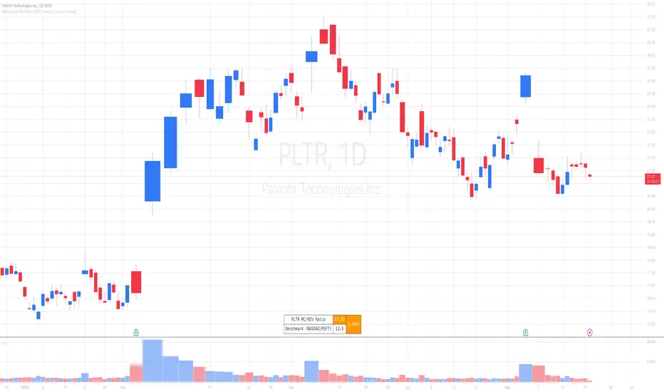
Market Cap / Revenue RatioA variation of the P/S ratio, this script takes the future estimated revenue of the current stock versus it's Market Cap. It then compares the aforementioned Market Cap:Revenue ratio against a market bellwether's corresponding ratio (MSFT by default) to determine the following:
- Light green when the ratio is extremely low (Stock is very undervalued)
- Green when the ratio is low (Stock's multiple is lower by 20-50%)
- Blue when the ratio is close to the benchmark (Stock is fairly valued to benchmark multiple)
- Red when the ratio is high (Stock's mulitple is higher by 50% or more)
- Dark red when the ratio is extremely high (Stock is very overvalued)
CONFIGURABLE
- Full Table: Show the entire calculation table
- Minimalist: Go minimal and show only the ratio and color code
- Show Benchmark Multiple: Show the multiple ratio calculated between the current stock and the benchmark stock (MSFT by default)
NOTES
- When calculating the Market Cap, TradingView sometimes under-reports the number of shares and thus skews the Market Cap too low. This seems to happen for stocks with multiple share classes like GOOGL so be mindful that the data can be wrong for these kinds of stocks. You can check on this by going into the Indicator's Settings and select Show Full Table which will show the number of shares outstanding reported by TradingView.
- For certain stocks such as foreign ADRs, there won't be a future revenue estimate so the script will automatically use the Total Revenue for the most recent Quarter in these cases
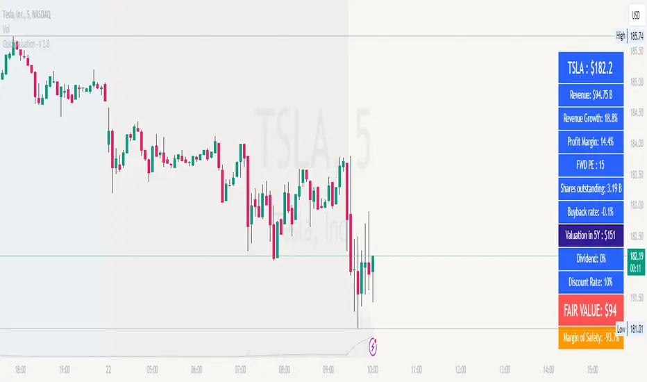
Fair Value Calculator V 1.0Fair Value Calculator V 1.0
This indicator calculates the fair value of a stock based on the revenue growth rate and net profit margin of a company, providing a quick estimate of its intrinsic worth. The calculation takes into account:
Current Revenue: The company's current revenue
5-Year Growth Rate: Expected revenue annual growth rate (CAGR) over the next 5 years
Average PE Ratio: The average Price-to-Earnings ratio for the next 5 years
Average Profit Margin: The average profit margin for the next 5 years
Share Outstanding: The total number of shares outstanding
Yearly Share Buyback Rate: The percentage of shares bought back by the company each year
Discount Rate: The rate used to calculate the present value of the fair value
Using these inputs, the indicator estimates the fair value of the stock, providing a valuable tool for investors and traders to make informed decisions.
Note: all values can be adjusted by the user by entering the desired value and selecting the item in the setup menu.
How it works
The indicator calculates the future revenue based on the current revenue and the expected revenue annual growth rate (CAGR).
It then estimates the future earnings using the average profit margin.
The future price is calculated using the exit value of the PE ratio.
The present value of the fair value is calculated using the discount rate.
The indicator adjusts the fair value based on the yearly share buyback rate.
Benefits
Provides a quick but valuable estimate of a stock's fair value based on the revenue growth and the expected profit.
Helps investors and traders identify undervalued or overvalued stocks.
Allows users to adjust inputs to suit their own assumptions and scenarios.
Note
This indicator is for informational purposes only and should not be considered as investment advice. Always do your own research and consider multiple perspectives before making investment decisions.
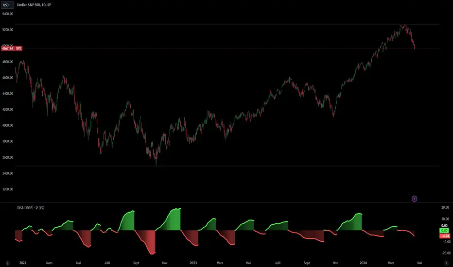
[Global Contraction Expansion Index SGM]Script Features
Dynamic Period Choice: The user can adjust the calculation period (period) for relative performance, allowing flexibility according to specific market analysis needs.
Sector Selection: The script takes into account different economic sectors through well-known ETFs like QQQ (technology), XLF (financial), XLY (consumer discretionary), XLV (healthcare), XLI (industrial) and XLE (energy). This diversification helps gain a general overview of economic health across different market segments.
Relative Performance Calculation: For each sector, the script calculates the relative performance using a simple moving average (SMA) of the price change over the specified period. This helps identify price trends adjusted for normal market fluctuations.
GCEI Index: The GCEI Index is calculated as the average of the relative performance of all sectors, multiplied by 100 to express it as a percentage. This provides an overall indicator of sectoral economic performance.
Crossover Signals: The script detects and marks points where the overall index (GCEI) crosses its own exponential moving average (emaGCEI), indicating potential changes in the overall trend of market performance.
Visualization: Results are visualized through graphs, where positive and negative regions are colored differently. Fills between the zero line and the index curves make it easy to see periods of contraction or expansion
When this index diverges from the SP500, it may be a sign that the technology sector is outperforming other sectors.
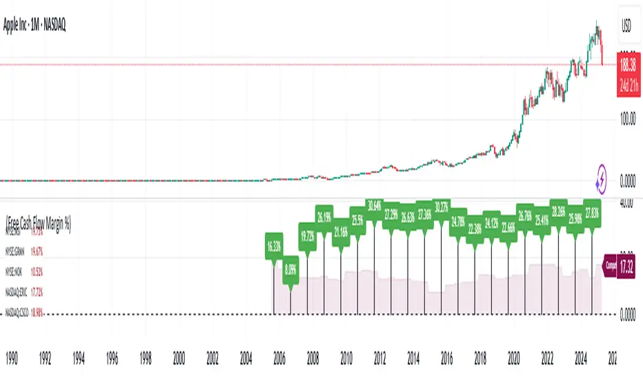
Financial Ratio Analysis (with / without Competitors)What Is Financial Ratio Analysis?
Financial Ratio Analysis is a quantitative technique used to assess a company's liquidity, operational efficiency, and profitability by examining its financial statements, including the balance sheet, income statement, and cash flow statement. It provides valuable insights into a company's performance over time and allows for comparisons with other companies within the same industry or sector.
What Are the Uses of Financial Ratio Analysis?
Analysis of financial ratios serves two main purposes:
1. Track company performance
Determining individual financial ratios per period and tracking the change in their values over time is done to spot trends that may be developing in a company.
Current Ratio for Adobe Inc. NASDAQ:ADBE
2. Make comparative judgments regarding company performance
Comparing financial ratios with those of major competitors enables the identification of whether a company is performing better or worse than the industry average. This comparative analysis aids in understanding the company's competitive position and potential areas for improvement.
For comparison, the script would automatically select a maximum of 5 competitors from the US markets based on the ticker's industry. This ensures a relevant comparison with industry peers to evaluate performance and assess competitive positioning.
To compare the Free Cash Flow Margin of Apple Inc. NASDAQ:AAPL with its competitors.
To compare the Free Cash Flow Margin of Apple Inc. NASDAQ:AAPL with its competitors’ average.
Customized competitors list
To customize your own competitors list, you can specify the companies or tickers you want to include in the comparison. This allows for a tailored analysis based on your specific preferences and industry knowledge.
Example:
To compare PayPal NASDAQ:PYPL with NASDAQ:MELI , NASDAQ:DLO , and NYSE:PAY , users can input the following text into the competitors list:
NASDAQ:MELI,NASDAQ:DLO,NASDAQ:PYPL,NYSE:PAY;
This will ensure that the comparison includes these specific companies alongside PayPal.
Financial ratios are grouped into the following categories:
Liquidity ratios
Leverage ratios
Efficiency ratios
Profitability ratios
Market value ratios
Liquidity Ratios
Liquidity ratios are financial ratios that measure a company’s ability to repay both short-term and long-term obligations.
Current Ratio measures a company’s ability to pay off short-term liabilities with current assets:
Current ratio = Total current assets / Total current liabilities
Cash To Debt Ratio measures a company’s ability to pay off short-term liabilities with cash and cash equivalents. A high ratio indicates a company can pay off its debt and remain solvent into the foreseeable future. In addition, it also means that if necessary, the company can take on a larger amount of debt because it has the cash to support that.
Cash to debt ratio = Cash and Short Term Investments / Total debt
Leverage Financial Ratios
Leverage ratios measure the amount of capital that comes from debt. In other words, leverage financial ratios are used to evaluate a company’s debt levels.
Debt To Assets Ratio measures the relative amount of a company’s assets that are provided from debt. This indicator is a measure of assets that are growing at the expense of debt. Because of this, you can see how a company acquired its assets over time. It can be used to assess a company's ability to meet its current debt obligations.
Debt to assets ratio = Total debt / Total assets
Debt To Equity Ratio calculates the weight of total debt and financial liabilities against shareholders’ equity:
Debt to equity ratio = Total liabilities / Shareholder’s equity
Interest Coverage Ratio shows how easily a company can pay its interest expenses:
Interest coverage ratio = Operating income / Interest expense
Efficiency Ratios
Efficiency ratios, also known as activity financial ratios, are used to measure how well a company is utilizing its assets and resources.
Research & Development (R&D) Expense to Revenue Ratio measures the percentage of sales that is allocated to R&D expenditures.
R&D to revenue ratio = Research and development expense / Total revenue * 100%
Asset Turnover Ratio measures a company’s ability to generate sales from assets. The higher it is, the more efficient the company is, since higher ratios mean that the company generates more income per dollar of assets. Conversely, if the company has a low Asset turnover, this indicates that it is inefficiently using its assets.
Asset turnover ratio = Revenue / Average total assets for two periods
Inventory Turnover shows how quickly a company sells its stock. A low turnover can mean weak sales, while a high one can mean good sales or insufficient stock. Inventory turnover is an important indicator of a company's performance.
Inventory turnover = Cost of goods sold / Total inventories
Days Sales Outstanding measures the average number of days it takes for a company to collect cash from credit purchases.
Days sales outstanding = Average Accounts Receivable / Revenue x 365 Days
Days Inventory shows the time in days that is spent turning a company's inventory into sales. This metric is an indicator of a company's inventory management. Low values are preferred for Days Inventory, which means items are selling faster and there is a quick turnaround. Large values indicate that a company has invested too much in stocks and does not have time to sell them.
Days inventory = Average inventories / Cost of goods sold * Days in period
Profitability Ratios
Profitability ratios measure a company’s ability to generate income relative to revenue, balance sheet assets, operating costs, and equity.
Gross Margin compares the gross profit of a company to its net sales to show how much profit a company makes after paying its cost of goods sold:
Gross margin % = Gross income / Total revenue * 100
Operating Margin , sometimes known as the return on sales ratio, compares the operating income of a company to its net sales to determine operating efficiency:
Operating margin = Operating income / Revenue * 100%
Free Cash Flow Margin is a profitability ratio that compares a company's free cash flow to its revenue to understand the proportion of revenue that becomes free cash flow. The higher the percentage, the more cash is available from sales. A company that shows an increasing cash flow margin from year to year is certainly getting stronger with time. This is a good indicator of its probability for long-term success.
Free cash flow margin = Free Cash Flow / Total Revenue
Return On Assets measures how efficiently a company is using its assets to generate profit. A high ROA indicates that a company successfully converts invested money into income.
Return on assets = Net income before discontinued operations / Total average assets
Return On Equity measures how efficiently a company is using its equity to generate profit:
Return on equity = Net income / Shareholder’s equity
Revenue Growth refers to the increase in a company’s total revenue or income over a specific period
Revenue growth = (Current period revenue - previous period revenue) / Previous period revenue * 100%
Earnings Per Share Growth illustrates the growth of earnings per share over time.
Earnings per share growth = ( Current period EPS - previous period EPS ) / Previous period EPS * 100%
Operating Cash Flow Growth is the long term rate of growth of operating cash, the money that is actually coming into the bank from business operations.
Operating cash flow growth = ( Current period operating cash flow - previous period operating cash flow) / Previous period operating cash flow* 100%
Market Value Ratios
Market value ratios are used to evaluate the share price of a company’s stock.
Book Value Per Share calculates the per-share value of a company based on the equity available to shareholders. In case of the company liquidation, the book value per share shows the monetary value remaining for common shareholders after all assets are sold and all debt is paid. If a company’s Book value per share is higher than a market price of its share, then the stock may be considered undervalued.
Book value per share = Total common equity / Total common shares outstanding
Dividend Yield measures the amount of dividends attributed to shareholders relative to the market value per share:
Dividend yield = Dividends TTM for the primary issue excluding special dividends / Price of the primary issue
Diluted Earnings per Share (Diluted EPS)
EPS stands for earnings per share. Investors use EPS to measure how much money a company makes for every outstanding share the company has. Diluted EPS is slightly different in that it measures the earnings per share for a company if all convertible securities (such as preferred stocks, convertible debt instruments, stock options and warrants) were used to calculate the metric.
Earnings Line+Growth stock investors are concerned with Earnings per share that is growing, Sales (Revenue) that is growing and Increasing gross margins. This indicator helps view each of these parameters.
On the chart is Tesla (TSLA) gross margin (blue line) on a 12 trailing months basis (TTM). As you can see, TSLA's margins appear to be eroding.
The user selects one of the following parameters to display from the input drop down menu:
"EARNINGS_PER_SHARE_BASIC", "TOTAL_REVENUE", or "GROSS_MARGIN".
The value axis for your selection will appear on the left side of the chart.
The user also selects one of the following periods: "FY", "FQ" or "TTM" (Fiscal year, fiscal quarter or 12-trailing months). You have an option to display the inputs by checking the box. This is useful as a reminder but can be removed if the label is in the way.
The chart will render on any chart time scale, however longer time scales will probably be of more value. Weekly charts work well.
It is not possible to display more than one line simultaneously because of axis incompatibilities. However, it is possible to load this indicator multiple times and select different items in each. In this case additional left-side scales will be shown as well as additional lines. Common pairings are Revenue (Sales) and Earnings, or, Revenue and Gross Margin.
@ jmikes

Optimal Buy Day (Zeiierman)█ Overview
The Optimal Buy Day (Zeiierman) indicator identifies optimal buying days based on historical price data, starting from a user-defined year. It simulates investing a fixed initial capital and making regular monthly contributions. The unique aspect of this indicator involves comparing systematic investment on specific days of the month against a randomized buying day each month, aiming to analyze which method might yield more shares or a better average price over time. By visualizing the potential outcomes of systematic versus randomized buying, traders can better understand the impact of market timing and how regular investments might accumulate over time.
These statistics are pivotal for traders and investors using the script to analyze historical performance and strategize future investments. By understanding which days offered more shares for their money or lower average prices, investors can tailor their buying strategies to potentially enhance returns.
█ Key Statistics
⚪ Shares
Definition: Represents the total number of shares acquired on a particular day of the month across the entire simulation period.
How It Works: The script calculates how many shares can be bought each day, given the available capital or monthly contribution. This calculation takes into account the day's opening price and accumulates the total shares bought on that day over the simulation period.
Interpretation: A higher number of shares indicates that the day consistently offered better buying opportunities, allowing the investor to acquire more shares for the same amount of money. This metric is crucial for understanding which days historically provided more value.
⚪ AVG Price
Definition: The average price paid per share on a particular day of the month, averaged over the simulation period.
How It Works: Each time shares are bought, the script calculates the average price per share, factoring in the new shares purchased at the current price. This average evolves over time as more shares are bought at varying prices.
Interpretation: The average price gives insight into the cost efficiency of buying shares on specific days. A lower average price suggests that buying on that day has historically led to better pricing, making it a potentially more attractive investment strategy.
⚪ Buys
Definition: The total number of transactions or buys executed on a particular day of the month throughout the simulation.
How It Works: This metric increments each time shares are bought on a specific day, providing a count of all buying actions taken.
Interpretation: The number of buys indicates the frequency of investment opportunities. A higher count could mean more consistent opportunities for investment, but it's important to consider this in conjunction with the average price and the total shares acquired to assess overall strategy effectiveness.
⚪ Most Shares
Definition: Identifies the day of the month on which the highest number of shares were bought, highlighting the specific day and the total shares acquired.
How It Works: After simulating purchases across all days of the month, the script identifies which day resulted in the highest total number of shares bought.
Interpretation: This metric points out the most opportune day for volume buying. It suggests that historically, this day provided conditions that allowed for maximizing the quantity of shares purchased, potentially due to lower prices or other factors.
⚪ Best Price
Definition: Highlights the day of the month that offered the lowest average price per share, indicating both the day and the price.
How It Works: The script calculates the average price per share for each day and identifies the day with the lowest average.
Interpretation: This metric is key for investors looking to minimize costs. The best price day suggests that historically, buying on this day led to acquiring shares at a more favorable average price, potentially maximizing long-term investment returns.
⚪ Randomized Shares
Definition: This metric represents the total number of shares acquired on a randomly selected day of the month, simulated across the entire period.
How It Works: At the beginning of each month within the simulation, the script selects a random day when the market is open and calculates how many shares can be purchased with the available capital or monthly contribution at that day's opening price. This process is repeated each month, and the total number of shares acquired through these random purchases is tallied.
Interpretation: Randomized shares offer a comparison point to systematic buying strategies. By comparing the total shares acquired through random selection against those bought on the best or worst days, investors can gauge the impact of timing and market fluctuations on their investment strategy. A higher total in randomized shares might indicate that over the long term, the specific days chosen for investment might matter less than consistent market participation. Conversely, if systematic strategies yield significantly more shares, it suggests that timing could indeed play a crucial role in maximizing investment returns.
⚪ Randomized Price
Definition: The average price paid per share for the shares acquired on the randomly selected days throughout the simulation period.
How It Works: Each time shares are bought on a randomly chosen day, the script calculates the average price paid for all shares bought through this randomized strategy. This average price is updated as the simulation progresses, reflecting the cost efficiency of random buying decisions.
Interpretation: The randomized price metric helps investors understand the cost implications of a non-systematic, random investment approach. Comparing this average price to those achieved through more deliberate, systematic strategies can reveal whether consistent investment timing strategies outperform random investment actions in terms of cost efficiency. A lower randomized price suggests that random buying might not necessarily result in higher costs, while a higher average price indicates that systematic strategies might provide better control over investment costs.
█ How to Use
Traders can use this tool to analyze historical data and simulate different investment strategies. By inputting their initial capital, regular contribution amount, and start year, they can visually assess which days might have been more advantageous for buying, based on historical price actions. This can inform future investment decisions, especially for those employing dollar-cost averaging strategies or looking to optimize entry points.
█ Settings
StartYear: This setting allows the user to specify the starting year for the investment simulation. Changing this value will either extend or shorten the period over which the simulation is run. If a user increases the value, the simulation begins later and covers a shorter historical period; decreasing the value starts the simulation earlier, encompassing a longer time frame.
Capital: Determines the initial amount of capital with which the simulation begins. Increasing this value simulates starting with more capital, which can affect the number of shares that can be initially bought. Decreasing this value simulates starting with less capital.
Contribution: Sets the monthly financial contribution added to the investment within the simulation. A higher contribution increases the investment each month and could lead to more shares being purchased over time. Lowering the contribution decreases the monthly investment amount.
-----------------
Disclaimer
The information contained in my Scripts/Indicators/Ideas/Algos/Systems does not constitute financial advice or a solicitation to buy or sell any securities of any type. I will not accept liability for any loss or damage, including without limitation any loss of profit, which may arise directly or indirectly from the use of or reliance on such information.
All investments involve risk, and the past performance of a security, industry, sector, market, financial product, trading strategy, backtest, or individual's trading does not guarantee future results or returns. Investors are fully responsible for any investment decisions they make. Such decisions should be based solely on an evaluation of their financial circumstances, investment objectives, risk tolerance, and liquidity needs.
My Scripts/Indicators/Ideas/Algos/Systems are only for educational purposes!

[Spinn] All Time High MonitorThis indicator is made in addition to the free |Spinn| All Time High indicator (here's the link: click ). With this Monitor, you can see the status of a large number of coins at once and choose a coin for analysis, while with the second indicator, you can analyze the chart of the selected coin.
Definitions
For simplification, in the following text, I will refer to the price movement from one value to another, expressed in percentages and/or multiples, as "distance".
ATH - All Time High
Low - the minimum reached after the ATH
Price - current price
Last Dump - distance from ATH to Low
Potential Growth - distance from Price to ATH
The indicator displays a table with the names of the coins. For each coin, you can see the distance from Price to ATH, and the distance from ATH to Low.
Since it is impossible to process more than forty coins in one indicator, the table contains up to forty coins (plus you can see the current coin). However, you can make several copies of the indicator and monitor up to nine tables simultaneously on one chart in different parts of the screen - that's more than three hundred coins. By the way, to prevent the current chart from obstructing the view, I recommend hiding it - for this, you need to click on the 👁️ next to the coin's name in the object tree (on the right, on the panel).
The code of the indicator includes 360 coins (9 sets of 40 coins), taken from the Coinmarketcap website at the time of the indicator's publication, and exchanges: Binance, Bybit, Okx, Bitget, BingX, and Huobi. Additionally, there is an option to set your custom set of coins (in the zero set). By default, the coins are sorted by the Coinmarketcap rating, but they can be sorted alphabetically. In the settings, you can specify any exchange and base currency (by default, it is USDT).
If a particular coin is not traded on the exchange, the background will be dark gray. You can set three thresholds of multiples, for which coins will be highlighted in different colors. Additionally, coins with the last dump of 99% or more are marked with the ⛔️ sign (you can change this parameter).
The indicator works on a weekly timeframe, if the timeframe is smaller, an error will be displayed. This is done to ensure that historical bars are not "cut off" on junior timeframes. Moreover, the indicator works faster this way.
----------
Этот индикатор сделан в дополнение к бесплатному индикатору |Spinn| All Time High (вот ссылка на него: тыц ). С помощью данного Монитора вы можете увидеть статус большого количества монет одновременно и выбрать монету для анализа, с помощью второго индикатора вы можете анализировать график выбранной монеты.
Определения
Для упрощения дальше в тексте я буду называть расстоянием ход цены от одного значения к другому, выраженный в процентах и/или иксах.
ATH - исторический максимум
Low - минимум, который был достигнут после ATH
Price - текущая цена
Последний дамп - расстояние от ATH до Low
Потенциальный рост - расстояние от Price до ATH
Индикатор выводит таблицу с названиями монет. Для каждой монеты можно увидеть расстояние от Price до ATH, расстояние от ATH до Low.
Поскольку невозможно обрабатывать более сорока монет в одном индикаторе, то таблица содержит до сорока монет (плюс можно видеть текущую монету). Однако можно сделать несколько копий индикатора и мониторить на одном графике одновременно до девяти таблиц в разных частях экрана - это три с лишним сотни монет. Кстати, чтобы текущий график не закрывал обзор, я рекомендую его скрыть - для этого надо кликнуть на 👁️ возле названия монеты в дереве объектов (справа, на панели).
В код индикатора зашиты 360 монет (9 наборов по 40 монет), взятых с сайта Coinmarketcap в момент публикации индикатора, а также биржи: Binance, ByBit, Okx, BitGet, BingX, Huobi, GateIO, MEXC, CoinEx и KuCoin. Кроме того, есть возможность задать свой кастомный набор монет (в нулевом наборе). По умолчанию монеты отсортированы по рейтингу Coinmarketcap, но их можно отсортировать по алфавиту. В настройках можно задать любую биржу и базовую валюту (по умолчанию это USDT).
Если данная монета не торгуется на бирже, то фон будет темно-серый. Вы можете задать три порога иксов, для которых монеты будут подсвечены разными цветами. Кроме того, знаком ⛔️ помечены монеты, у которых последний дамп составил 99% и больше (вы можете менять этот параметр).
Индикатор работаеть на недельном таймфрейме, если таймфрейм будет меньше, то будет выдана ошибка. Это сделано для того, чтобы не были «обрезаны» исторические бары на более младших таймфреймах. Кроме того, индикатор так работает шустрее.

[Spinn] All Time HighOverall, the cryptocurrency market moves cyclically upwards. There is a renewal of the All Time High (ATH), followed by a dump, accumulation over several years, and a new renewal of the ATH.
In a bullish cryptocurrency market, Bitcoin usually grows before other coins (which makes sense - the crowd invests money first in what is growing), then there is a shift of money from Bitcoin to altcoins, and altcoins catch up to Bitcoin (and often grow by larger percentages than Bitcoin, as their market capitalization is significantly less).
After Bitcoin grew and it became obvious that we are at the beginning of a bull market, I thought it would be a good idea to invest a certain amount in altcoins that have the potential for good growth. (By the way, I like the idea of closing half of the position at two times the gain to get back my investment and have free coins - even in the case of a "black swan" there will be profit and one can sleep peacefully.)
Therefore, I made this indicator to understand which alts are still at the bottom, to be able to buy them as an investment. Of course, this does not cancel out other analysis - the number of coins held by early investors, etc., but for starters, I wanted to choose a list of coins for further research.
The main goal of this indicator is to find coins that are far from their All Time High, to understand the distance they need to travel from the current price to the ATH. The indicator can also be used as a quick marker - to see on which exchanges from a given list the current coin is traded (for this, you can remove all drawing elements except for the second table) - after all, it's cool: you switch between coins and instantly see how many exchanges it is traded on.
In the process, the indicator searches for the All Time High (ATH), after which it searches for the Low, after which it searches for the High again. All three points are marked with horizontal lines. For simplicity, in the text below, I will refer to the price movement from one value to another, expressed in percentages and/or multiples, as "distance."
As a criterion for analysis, I chose the distance between the All Time High and the dump (distance from ATH to Low) after it. Firstly, I will not consider coins where the dump was more than 99%. Sure, many of them will shoot up and may even give hundreds of multiples, but I do not consider it sensible to experiment with them. Moreover, many coins have already grown quite significantly - they do not interest me either. In this study, I am interested in coins that existed before the beginning of Bitcoin's dump in the fall of 2021 and that can show from 5 to 10 multiples, as well as coins that fell very little during this Bitcoin dump, such as OKB from the Okx exchange.
The indicator outputs two tables. In the first one, it outputs values for the current chart:
Distance from the current price (Price) to ATH
Distance from Low to ATH
Ratio of segments |Low..Price| to |Price..ATH|
The same, but comparing not with the current price, but with High
The size of the drop (distance) from ATH to Low
Distance from Low to ATH
In the second one, it compares three indicators of the current trading pair on several exchanges (Binance, Okx, Bitget, Bybit, BingX, Huobi, GateIO, MEXC, CoinEx, KuCoin). You can set the names of the exchanges yourself:
Distance from Price to ATH
Distance from Low to ATH
ATH
Start date of trading for the trading pair (date of the first bar)
The size of the chart history in weeks
The indicator compares charts to USDT, USDC, USD, and USDT.P and selects the pair with the longest history. Here it shows the ticker of the selected currency
To understand how close we are to the All Time High, I analyze such parameters:
The size of the last big dump
How many percent from the current price is needed to reach ATH
How many percent we have already grown from the lowest point of the fall
What part of the path from the lowest point to ATH we have already passed
Furthermore, you can plot a dotted horizontal line on the chart, which will divide the distance from Low to ATH in a given ratio, for example, as 20 to 80 or as 10 to 90. This way, we can assess whether the price is below this line, which may help in our analysis.
It is intended that the indicator should work on a weekly timeframe; if the timeframe is smaller, there is a risk that not all historical bars will be processed, and then the results will be false. Nevertheless, on most charts, even the hourly timeframe works fine (although, perhaps, this depends on your subscription to Tradingview - lower subscriptions provide a smaller number of historical bars).
Note 1.
On coins with a short history, such analysis does not make sense, the indicator is useless. Also, if the coin made a new high and there has not been a dump yet, then the indicator has fulfilled its function, and it will only be useful on the next dump.
Note 2.
If the price made a +100% increase, then the value doubled, i.e., the coin made two multiples. If the price grew by 900%, then the value increased tenfold = 10 multiples.
Note 3.
This indicator is not a guarantee that the coin will reach its All Time High. It is merely a kind of calculator that helps analyze the price position on the chart and make trading decisions.
----------
В целом, рынок криптовалют движется циклически вверх. Происходит обновление исторического максимума (All Time High или ATH), потом происходит дамп, накопление в течение нескольких лет, и новое обновление исторического максимума.
На бычьем рынке криптовалют Биткоин обычно растет раньше других монет (это и понятно - толпа вкладывает деньги в первую очередь в то, что растет), затем происходит перелив денег из биткоина в альткоины, и альткоины подтягиваются к битку (и часто растут на бОльшие проценты, чем биткоин, так как их капитализация существенно меньше).
После того, как биткоин вырос и стало очевидно, что мы находимся в начале бычьего рынка, я задумался, что неплохо было бы инвестировать некую сумму в альткоины, которые имеют потенциал к хорошему росту. (Кстати, мне нравится идея закрывать половину позиции при двух иксах, чтобы вернуть себе инвестицию и иметь бесплатные монеты - даже в случае «черного лебедя» будет профит и можно спать спокойно.)
Поэтому я сделал этот индикатор, чтобы понять, какие альты еще болтаются внизу, чтобы успеть их купить в качестве инвестиции. Понятно, что никто не отменял прочий анализ - количество монет у ранних инвесторов и т.п., но для начала я хотел выбрать список монет для дальнейшего исследования.
Итак, главная цель данного индикатора - найти монеты, которые находятся далеко от своего исторического максимума, чтобы понять, какое расстояние им нужно пройти от текущей цены до ATH. Также индикатор можно использовать в качестве быстрого маркера - на каких биржах из заданного списка торгуется текущая монета (для этого можно убрать все элементы рисования кроме второй таблицы) - ведь это круто: переключаетесь между монетами и мгновенно видите на скольки биржах она торгуется.
В процессе работы индикатор ищет исторический максимум (ATH), после которого он ищет минимум (Low), после которого он снова ищет максимум (High). Все три точки отмечены горизонтальными линиями. Для упрощения дальше в тексте я буду называть расстоянием ход цены от одного значения к другому, выраженный в процентах и/или иксах.
В качестве критерия для анализа я выбрал расстояние между историческим максимумом и дампом (расстояние от ATH до Low) после него. Во-первых, я не буду рассматривать монеты, у которых дамп был больше 99%. Нет, конечно, многие из них выстрелят, и дадут может даже и сотни иксов, но ставить эксперименты с ними я не считаю целесообразным. Кроме того, многие монеты подросли уже достаточно сильно - они меня тоже не интересуют. В данном исследовании меня интересуют монеты, которые существовали до начала дампа битка осенью 2021-го года и которые могут показать от 5 до 10 иксов, а также монеты, которые на этом дампе битка упали совсем мало, как, например, OKB от биржи Okx.
Индикатор выводит две таблицы. В первой он выводит значения для текущего графика:
расстояние от текущей цены (Price) до ATH
расстояние от Low до ATH
соотношение отрезков |Low..Price| и |Price..ATH|
то же самое, но сравниваем не с текущей ценой, а с High
размер падения (расстояние) от ATH до Low
расстояние от Low до ATH
Во второй - он сравнивает три показателя текущей торговой пары на нескольких биржах (Binance, Okx, Bitget, Bybit, BingX, Huobi, GateIO, MEXC, CoinEx, KuCoin, названия бирж можно задавать самостоятельно):
расстояние от Price до ATH
расстояние от Low до ATH
ATH
Дата старта торгов по торговой паре (дата первого бара)
Размер истории графика в неделях
Индикатор сравнивает графики к USDT, USDC, USD и USDT.P и выбирает пару с самой длинной историей. Здесь он показывает тикер выбранной валюты
Для того, чтобы понять, насколько мы приблизились к историческому максимуму, я анализирую такие параметры:
размер последнего большого дампа
на сколько процентов от текущей цены надо вырасти, чтобы достичь ATH
на сколько процентов мы уже выросли от самой нижней точки падения
какую часть пути от нижней точки до ATH мы уже прошли
Кроме того, можно вывести на график пунктирную горизонтальную линию, которая будет разделять расстояние от Low до ATH в заданном соотношении, например, как 20 к 80 или как 10 к 90. Таким образом, мы сможем оценивать, находится ли цена ниже этой линии, что может помочь в нашем анализе.
Предусмотрено, что индикатор должен работать на недельном таймфрейме, если таймфрейм будет меньше, то есть риск, что не все исторические бары будут обработаны, и тогда результаты будут ложными. Тем не менее, на большинстве графиков даже часовой таймфрейм работает нормально (хотя, наверное, это зависит от вашей подписки на Tradingview - на младших подписках предоставляется меньшее количество исторических баров).
Примечание 1.
На монетах с короткой историей такой анализ смысла не имеет, индикатор бесполезен. Также, если монета сделала перехай и еще не было дампа, то индикатор выполнил свою функцию, и он пригодится только на следующем дампе.
Примечание 2.
Если цена сделала +100%, то стоимость увеличилась в 2 раза, то есть, монета сделала два икса. Если цена выросла на 900%, то стоимость увеличилась в 10 раз = 10 иксов.
Примечание 3.
Данный индикатор не является гарантией того, что монета достигнет своего исторического максимума. Он является лишь своего рода калькулятором, который помогает анализировать положение цены на графике и принимать торговые решения.

Debasement Adjusted CAGREquity growth may appear less significant when juxtaposed with the expansion of the money supply. This is because markets tend to adjust prices to reflect changes in money supply almost immediately.
Our indicator offers a unique perspective by adjusting the current ticker price for the M2 money supply and normalizing this data to show the percentage appreciation since the first visible bar on the chart. Users can also select alternative money supply measures, such as the EU-M2, via the indicator's settings.
This approach essentially redefines the price as the "growth of the relative share of the total money supply," providing a novel lens through which to view equity performance.
Additionally, the indicator computes both the Compound Annual Growth Rate (CAGR) and the total growth observed from this adjusted standpoint. These metrics are calculated within the context of the selected time range, adding depth to the analysis.
Although this indicator is compatible with all timeframes, it is primarily designed as a macroeconomic tool. It yields the most meaningful insights when applied to longer-term perspectives, such as weekly or monthly timeframes.
This tool builds upon the foundational work presented in the "Inflation Adjusted Performance Ticker," accessible at Inflation Adjusted Performance Ticker , enhancing its application by normalizing the results and computing CAGR and total growth.

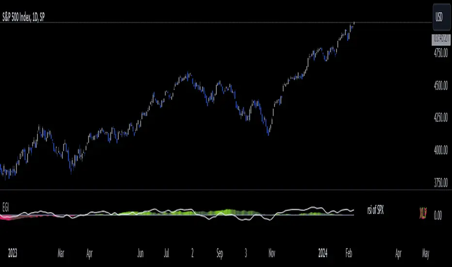
Economic Growth Index (XLY/XLP)Keeping an eye on the macroeconomic environment is an essential part of a successful investing and trading strategy. Piecing together and analysing its complex patterns are important to detect probable changing trends. This may seem complicated, or even better left to experts and gurus, but it’s made a whole lot easier by this indicator, the Economic Growth Index (EGI).
Common sense shows that in an expanding economy, consumers have access to cash and credit in the form of disposable income, and spend it on all sorts of goods, but mainly crap they don’t need (consumer discretionary items). Companies making these goods do well in this phase of the economy, and can charge well for their products.
Conversely, in a contracting economy, disposable income and credit dry up, so demand for consumer discretionary products slows, because people have no choice but to spend what they have on essential goods. Now, companies making staple goods do well, and keep their pricing power.
These dynamics are represented in EGI, which plots the Rate of Change of the Consumer Discretionary ETF (XLY) in relation to the Consumer Staples ETF (XLP). Put simply, green is an expanding phase of the economy, and red shrinking. The signal line is the market, a smoothed RSI of the S&P500. Run this on a Daily timeframe or higher. Check it occasionally to see where the smart money is heading.
ROCE with 3-Year EMAThis Pine Script indicator, "3-Year EMA of Return on Capital Employed (ROCE)," is designed for investors and traders who incorporate both fundamental and technical analysis in their market approach. ROCE is a crucial metric for evaluating the efficiency and profitability of a company's capital employment. Our script enhances this analysis by overlaying a 3-year Exponential Moving Average (EMA) on the ROCE, allowing users to compare current performance against a longer-term trend.
Key Features:
ROCE Calculation: The script calculates the Return on Capital Employed (ROCE) using EBIT (Earnings Before Interest and Taxes) for the Trailing Twelve Months (TTM) and Capital Employed (Total Assets minus Short Term Debt) for the Fiscal Year (FY). This calculation provides a snapshot of how effectively a company is using its capital to generate profits.
3-Year EMA Overlay: The script features a 3-year EMA of the ROCE, providing a smoothed, long-term trend line. This EMA helps in identifying broader trends in a company's operational efficiency and profitability, making it easier to spot deviations from the historical norm.
Customizable for Different Data Frequencies: Whether your data is quarterly, monthly, or weekly, the script is adaptable. The length of the EMA is adjustable to suit the data frequency, ensuring accurate representation over a 3-year period.
Visualization: The ROCE and its 3-year EMA are plotted with distinct colors for easy comparison and analysis. This visual representation aids in quickly assessing the company's current performance against its historical trend.
Customization: Users can adjust the EMA length to match the frequency of their data (e.g., 12 for quarterly, 36 for monthly, 156 for weekly data).
Usage Tips:
Best used on companies with stable and consistent reporting.
Combine with other fundamental and technical indicators fo
r comprehensive analysis.
Disclaimer: This script is provided for informational and educational purposes only and should not be construed as investment advice.

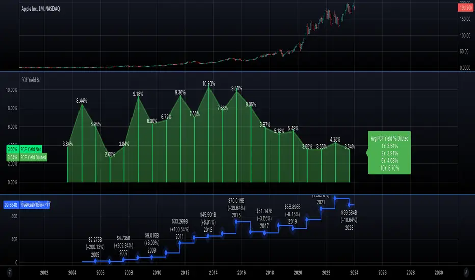
Free cash flow yieldThis script shows
- FCF Yield Net based on enterprise value. See reference: www.investopedia.com
- FCF Yield Diluted: which reduced CFC net by dilution amount.
- FCF % change.
This should give you a good overview on how well the company is at growing FCF and how efficiently they are creating FCF.
TASC 2023.12 Growth and Value Switching System█ OVERVIEW
This script implements a rotation system for trading value and growth ETFs, as developed by Markos Katsanos and detailed in the article titled 'Growth Or Value?' in TASC's December 2023 edition of Traders' Tips . The purpose of this script is to demonstrate how short-term momentum can be employed to track market trends and provide clarity on when to switch between value and growth.
█ CONCEPTS
The central concept of the presented rotation strategy is based on the observation that the stock market undergoes cycles favoring either growth or value stocks. Consequently, the script introduces a momentum trading system that is designed to switch between value and growth equities based on prevailing market conditions. Specifically tailored for long-term index investors, the system focuses on trading Vanguard's value and growth ETFs ( VTV and VUG ) on a weekly timeframe.
To identify the ETF likely to outperform, the script uses a custom relative strength indicator applied to both VTV and VUG in comparison with an index ( SPY ). To minimize risk and drawdowns during bear markets, when both value and growth experience downtrends, the script employs the author's custom volume flow indicator (VFI) and blocks trades when its reading indicates money outflow . Positions are closed if the relative strength of the current open trade ETF falls below that of the other ETF for two consecutive weeks and is also below its moving average. Additionally, the script implements a stop-loss when the ETF is trading below its 40-week moving average, but only during bear markets.
The script plots the relative strengths of the value and growth equities along with the signals triggered by the aforementioned rules. Information about the current readings of the relative strength and volume flow indicators, along with the current open position, is displayed in a table.
█ CALCULATIONS
The script uses the request.security() function to gather price data for both equities and the reference index. Custom relative strength and volume flow indicators are calculated based on the formulas presented in the original article. By default, the script employs the same parameters for these indicators as proposed in the original article for VTV and VUG on a weekly timeframe.

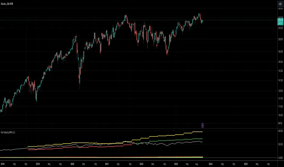
Fair Value by MMEnglish
IMPORTANT NOTICE
This indicator is used to find fair value based on historical data. Past growth data may not be sustainable, which will cause the price targets given by the indicator to be inaccurate. Any price on this indicator cannot be considered as investment advice. Trading decisions are the responsibility of the person using the indicator.
What is the Fair Value by MM indicator?
This is an indicator that tries to find the fair value of a stock by looking at its historical data and growth over a certain period of time. By analyzing a stock's historical growth data, it generates a fair value and potential price estimate.
The indicator presents the financial data of a stock with 3 different data sets.
1. Summary and Valuation
2. Average Quarterly Growth
3. Profit margins
** Number of Lookback Periods for Quarters **
The first input of the indicator is where you specify how many quarters back to value the stock. By default, it is based on the last 12 quarters, i.e. 3 years. Since there is not enough historical data for newly listed companies, you can change this figure according to the company you are analyzing.
** Show Summary **
The Indicator starts in this mode by default. This mode gives you data such as sales, EBITDA, EBIT, net profit and free cash flow in PER SHARE and TTM values. The reason for using per share values is that a company's price is per share, and it saves you time to look at all other metrics on a per share basis. For example, if a company with a share price of $10 has sales per share of $5, we can say that this company has generated half of its market capitalization in sales revenue in the last 1 year.
In the indicator's default mode (Show Summary);
1. Sales per share TTM (Red)
2. EBITDA per share TTM (Orange)
3. EBIT per share TTM (Yellow)
4. Net Income per share TTM (Blue)
5. Free Cash Flow per share TTM (Green)
6. Share close price (White)
7. Fair value of the share (Green if price is below fair value, Red if price is above fair value)
8. Price target for the next 12 months (Yellow)
** Show AVG Growth QoQ **
When this option is selected, you can see the average quarterly growth in sales, EBITDA, EBIT, net profit and free cash flow, respectively, over the period you have selected (e.g. the last 12 quarters). This data gives an idea about the company's growth and the pace of its growth.
** Show Profit Margins **
When this option is selected, you can see gross profit margin, EBITDA margin, EBIT margin, net profit margin and free cash flow margin data respectively. It provides a quick overview to determine whether the company is increasing revenue by narrowing profit margins or increasing both revenue growth and profit margins.
** Include Sales **
When this option is selected, sales revenues are included in the company's valuation.
** Include Ebitda **
When this option is selected, EBITDA is included in the valuation of the company.
** Include Ebit **
When this option is selected, EBIT is included in the valuation of the company.
** Include Net Profit **
When this option is selected, net profit is included in the valuation of the company.
** Include FCF **
When this option is selected, free cash flow is included in the valuation of the company.
By default, the valuation is based on sales, EBITDA and EBIT. Net profit and free cash flow can be optionally selected. Or the metrics you do not want can be excluded from the valuation calculation.
What do the colors mean?
** Red **
Represents the company's data related to the company's sales.
** Orange **
Represents the company's data related to the company's EBITDA.
** Yellow **
Represents the company's data related to the company's EBIT.
** Blue **
Represents the company's data related to the company's Net Income.
** Green **
Represents the company's data related to the company's Free Cash Flow.
Turkish
ÖNEMLİ UYARI
Bu indikatör geçmiş verileri baz alarak adil değer bulmaya yarar. Geçmişte oluşan büyüme verileri sürdürelebilir olmayabilir, bu da indikatörün verdiği fiyat hedeflerinin yanılmasına sebep olacaktır. Bu indikatör üzerinde yer alan herhangi bir fiyat, yatırım tavsiyesi kapsamında değerlendirilemez. Alım/satım kararları indikatörü kullanan kişinin sorumluluğundadır.
Fair Value by MM indikatörü nedir?
Bu bir hissenin belirli bir periyotu kapsayan geçmiş verilerine ve gelişimlerine bakarak adil değerini bulmaya çalışan bir indikatördür. Bir hissenin geçmiş büyüme verilerini analiz ederek adil değer ve potansiyel fiyat tahmini oluşturur.
İndikatör bir hissenin finansal datasını 3 farklı veri seti ile sunmaktadır.
1. Özet ve Değerleme
2. Ortalama Çeyreklik Büyümeler
3. Kar marjları
** Number of Lookback Periods for Quarters **
İndikatörün ilk input’u, hisseyi değerlemek için kaç çeyrek geriye bakacağınızı belirttiğiniz kısımdır. Varsayılan olarak son 12 çeyrek, yani 3 yılı baz alır. Yeni arz olmuş şirketlerde yeterli geçmiş veri bulunmadığı için bu rakamı incelediğiniz şirkete göre değiştirebilirsiniz.
** Show Summary **
İndikatör varsayılan olarak bu modda başlar. Bu mod, satışlar, favök, esas faaliyet karı, net kar ve serbest nakit akışı gibi verileri HİSSE BAŞINA ve YILLIKLANDIRILMIŞ değerleri ile size verir. Hisse başına değerlerin kullanılmasındaki sebep, bir şirketin fiyatı hisse başınadır, ve diğer tüm metriklere hisse başına bakmak size zaman kazandırır. Örneğin, hisse fiyatı $10 olan bir şirketin, hisse başına satışları $5 ise, bu şirket son 1 yılda piyasa değerinin yarısı kadar satış geliri elde etmiş diyebiliriz.
İndikatörün varsayılan modunda (Show Summary);
1. Hisse başına yıllıklandırılmış Satışlar (Kırmızı)
2. Hisse başına yıllıklandırılmış FAVÖK (Turuncu)
3. Hisse başına yıllıklandırılmış Esas Faaliyet Karı (Sarı)
4. Hisse başına yıllıklandırılmış Net Kar (Mavi)
5. Hisse başına yıllıklandırılmış Serbest Nakit Akışı (Yeşil)
6. Hisse kapanış fiyatı (Beyaz)
7. Hissenin adil değeri (Fiyat Adil değerin altında ise Yeşil, Üstünde ise Kırmızı)
8. Önümüzdeki 12 aylık fiyat hedefi (Sarı)
** Show AVG Growth QoQ **
Bu seçenek seçildiğinde, sırası ile satışlar, favök, esas faaliyet karı, net kar ve serbest nakit akışının, seçmiş olduğunuz periyotta (örneğin son 12 çeyrek), çeyreklik olarak ortalama % kaç büyüdüğünü görebilirsiniz. Bu veri, şirketin gelişimi ve gelişim hızı hakkında fikir vermektedir.
** Show Profit Margings **
Bu seçenek seçildiğinde, sırası ile brüt kar marjı, favök marjı, esas faaliyet kar marjı, net kar marjı ve serbest nakit akışı marjı verilerini görebilirsiniz. Şirketin karlılık marjlarını daraltarak mı gelirini arttırdığını yoksa hem gelir artışı hem de kar marjlarını arttırdığını tespit etmek için hızlı bir bakış sunar.
** Include Sales **
Bu seçenek seçildiğinde, şirketin değerlemesine satış gelirleri dahil edilir.
** Include Ebitda **
Bu seçenek seçildiğinde, şirketin değerlemesine favök dahil edilir.
** Include Ebit **
Bu seçenek seçildiğinde, şirketin değerlemesine esas faaliyet karları dahil edilir.
** Include Net Profit **
Bu seçenek seçildiğinde, şirketin değerlemesine net kar dahil edilir.
** Include FCF **
Bu seçenek seçildiğinde, şirketin değerlemesine serbest nakit akışı dahil edilir.
Varsayılan olarak, satışlar, favök ve esas faaliyet karı üzerinden değerleme yapılır. Net kar ve serbest nakit akışı isteğe göre seçilebilir. Ya da istemediğiniz metrikler değerleme hesaplamasından çıkarılabilir.
Renkler ne anlama geliyor?
** Kırmızı **
Şirketin satışları ile ilgili verilerini temsil eder.
** Turuncu **
Şirketin favök’ü ile ilgili verilerini temsil eder.
** Sarı **
Şirketin esas faaliyet karı ile ilgili verilerini temsil eder.
** Mavi **
Şirketin net karı ile ilgili verileri temsil eder.
** Yeşil **
Şirketin serbest nakit akışı ile ilgili verilerini temsil eder.
100% Daily Gain LevelsThis script takes the previous days closing value and calculates the current 100%, 200%, 300% and 400% levels for that stock.
Using that information it draws a dotted persistent line (with labels on the far right) at those levels. This information can be useful as it can then, at times, act as a support/resistance for momentum stocks. So when a stock runs 100% and holds that level, historically, that stock has a good chance to continue rising. Same when hitting additional "100%" ranges.
The user has the option to deselect the labels and/or lines.
If people find this useful then I can work on adding options that allow users more freedom to adjust how the lines are displayed as well as some enhancements to the display.

Inflation-adjusted performanceOVERVIEW
The Inflation-adjusted performance indicator plots an adjusted closing price for the asset
on the main chart by multiplying the asset price by an inflation factor which is derived from CPI-U. The indicator has a `lookback` length, which is used to lookup the CPI-U index value from `lookback` years ago.
The inflation adjusted price is then calculated as `inflationAdjustedPrice = CPIToday / CPIBackThen * currentPrice`
CONCEPTS
This can be a useful tool to assess how an asset has performed as a store of value and inflation hedge over a given period.
The following are the key concepts and user inputs for the oscillator:
Input: The user can specify the lookback period, in years, using the `lookback` attribute on the settings widget. Defult is 13.
CPI Data: The indicator uses CPI data from tradingview's BLS feed.
Inflation Factor: An inflation factor is calculated by dividing today's CPI by the CPI from the lookback period. This factor represents the increase in prices due to inflation over the lookback period.
Inflation-adjusted Price: The offer price of the asset from `lookback` years ago is adjusted for inflation using the calculated inflation factor. This adjusted price represents what the offer price would be today if it had kept up with inflation.

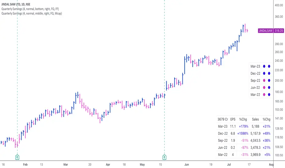
Quarterly EarningsThis script displays quarterly earnings per share (EPS) and sales data, and their year-on-year percentage change.
The script builds upon the Volume Price and Fundamentals script by Mohit_Kakkar08 and improves upon the array functions to keep the code light-weight & the output as accurate as possible. This script uses diluted EPS data for calculating the quarterly earnings. New quarters are auto-generated by the script as the earnings data gets updated in Tradingview every quarter.
Features:
⦿ View quarterly earnings per share (EPS) and sales data.
⦿ The percentage change is a YoY (year on year) comparison of the current quarter to the same quarter of the previous year.
⦿ Option to change the data from Quarterly (FQ) to Yearly (FY) .
⦿ Long mode : Option to increase the number of previous quarters displayed in the table (default is the past 4 quarters) to any number.
⦿ Location & size of the table can be changed.
⦿ Option for a 1-click dark mode
⦿ Option for a ' Mini mode ' where the values are replaced by traffic lights for a quick visual:
🟢 or 🔵 YoY increase in earnings/sales
🔴 or 🟣 YoY decrease in earnings/sales
🟡 or 🟠 YoY earnings/sales unchanged
⚪️ No data available
⦿ The top-left cell has the option to display either the free float (FF) or the marketcap (Mcap) of the stock.
Please note that sometimes the Tradingview data reflected in the script output might differ a bit from MarketSmith. Also make sure you are viewing the 'consolidated' data there.
This script was developed as a collaboration between me & @EquityCraze .
Fundamental ScreenerThis indicator is designed to compare the year-over-year earnings and sales growth, as well as the P/E ratio of up to 10 stocks simultaneously .
This provides valuable insights into the fundamental performance of multiple stocks at the same time, allowing traders to quickly identify which stocks are outperforming or underperforming their peers.
The earnings and sales growth figures are calculated on a year-over-year basis , comparing the most recent quarter to the same quarter 1 year ago.
The P/E ratio is a valuation metric that measures a company's stock price relative to its trailing twelve months earnings per share.
By comparing these three key metrics across multiple stocks, traders can quickly identify which stock in a group has superior fundamentals.
Customization
Chose to compare 5 or 10 symbols
Table position, color, and size
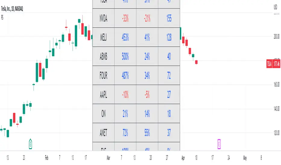
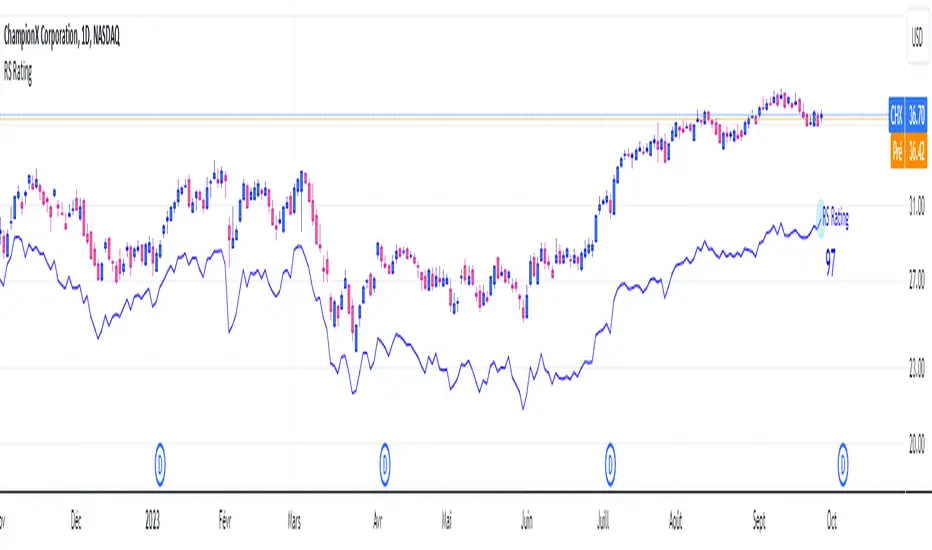
RS RatingHello everyone.
The RS Rating (or Relative Strenght Rating) is a metric that tracks a stock's price performance relative to the rest of the market. Specifically, it looks at a stock's relative strength over the last 52 weeks.
It allows you to identify at a glance stocks that are outperforming the market and may be poised for further gains.
Designed for break-out traders, trend follower, value investors, the RS Rating can help you identify promising opportunities and make informed investment decisions.
The Rating stands as follow:
- From 1 (worst) to 99 (best)
- 99 rating means the stock is outperforming 99% of all stocks in terms of relative share price performance over the last 52 weeks.
The RS Rating is accompanied by the RS line which is a representation of the progress of the asset against the comparative symbol. (Here SP500)
Of course this script is inspired by the IBD rating system.
The results may be equivalent but it is not guaranteed.
This indicator proposes a scoring system in the style of the one proposed by IBD.
Indeed for an optimal result, it would be necessary to compare the relative performance of all actions, which is not yet possible on PineScript.
Here is the formula for calculating the score:
RS Score = 40% * P3 + 20% * P6 + 20% * P9 + 20% * P12
With
P3 = Performance over the last 3 months
P6 = Performance over the last 6 months
P9 = Performance over the last 9 months
P12 = Performance over the last 12 months
There is no equivalent solution for the moment on TradingView.
The rating score will only appear on the daily timeframe.
For now it's my pleasure to share!
Fair Price [XSfera]The indicator allows you to quickly compare business growth rates (by default, earnings per share, EPS) and stock prices to determine overbought or undervalued.
The financial parameter as a percentage fits together several years ago, by default 5, and displays the dynamics. To date, it allows you to see how much the price is higher or lower than fair. The lag in the share price from the growth rate of the business is often called the margin of safety, which makes it safer to invest. Of course, this does not mean that the market will quickly return to a fair course, the market can live its life for a long time.
It is important that the dynamics will be incorrect if the financial parameter at the beginning of the docking is negative, for example, as in TSLA and not very correct in the case of a low base, i.e. when the company only went into profit 5 years ago.
Индикатор позволяет быстро сравнить темпы роста бизнеса (по-умолчанию прибыль на акцию, EPS ) и цены акции, для определения перекупленности или недооценки.
Финансовый параметр в процентном соотношении стыкуется несколько лет назад, по-умолчанию 5, и отображает динамику. На сегодняшний день позволяет увидеть насколько цена выше или ниже справедливой. Отставание цены акции от темпов роста бизнеса, часто называют маржой безопастности, которая позволяет безопаснее инвестировать. Само собой это не значит что рынок быстро вернется в справедливое русло, рынок может долгое время жить своей жизнью.
Важно что динамика будет неверной если финансовый параметр на начало стыковки будет отрицательным, например как в TSLA и не очень корректным в случае низкой базы, т.е. когда компания только только 5 лет назад вышла в прибыль.

(CF|DB) Caruso Financial DashboardThe Caruso Financial Dashboard brings a rich amount of company financial data straight to your TradingView chart along with additional vital stock-related information. At a glance, you can see EPS (Diluted), Sales, growth rates, and EPS/Sales surprises either quarter by quarter on the daily chart or for Fiscal Years on the weekly chart.
On the daily chart, the financial table also has helpful highlights to visually display if a quarter’s EPS or Sales are higher than the same quarter a year ago. Also, EPS and Sales data has a helpful green shading when a new record high number has been achieved for the metric. Additional stock-based metrics include the stock’s Up/Down volume ratio, Beta, Average Daily Volume in terms of shares traded or dollar value traded, the percentage distance to a moving average of choice, as well as the stock’s 52-week high and low.
The weekly chart shows financial data for fiscal years. It also has additional stock-based metrics from those available on the daily chart. These include; Market Cap, Shares in Float and the Float as a percentage of all shares outstanding, the distance from the stock’s 52-week high, the distance to a moving average of choice (10 sma by default), the P/E and P/S ratios.
To further help an investor understand a company’s growth rates, the CF|DB allows a user to hide all or part of the table and plot EPS, EPS TTM (Trailing Twelve Months), and Sales TTM lines on the chart. This can be applied to either the daily or weekly chart.
The CF|DB provides financial and market data for international markets (US, EU, Canada, Australia, Hong Kong, Japan, and more), making its applicability global.
Features On Daily Chart
· Quarterly EPS
· Quarterly EPS growth rate YoY
· Quarterly EPS Surprise vs consensus estimate
· Quarterly Sales
· Quarterly Sales growth rate YoY
· Quarterly Sales Surprise vs consensus estimate
· Green/Red dot highlighting YoY growth or decline
· EPS/Sales green highlight for 8 quarter high or record high numbers
· Up/Down Volume Ratio
· Beta
· Average Daily Volume (shares trade). Period for the average can be configured
· Average Daily Volume (dollar value traded). Period for the average can be configured
· Distance to a moving average. The average can be configured. 21 ema by default
· 52-week high and low
· New 52-week highs and lows are highlighted by a red or green box shading
· Ability to plot EPS, EPS TTM, Sales lines
· Ability to hide part or all of the financial data table
Features On Weekly Chart
· FY EPS
· FY EPS growth rate YoY
· FY EPS Surprise vs consensus estimate
· FY Sales
· FY Sales growth rate YoY
· FY Sales Surprise vs consensus estimate
· EPS/Sales green highlight for 8-year high or record high numbers
· Market Cap
· Shares in float
· Share in float as a percentage of all shares outstanding
· Distance to new 52-week highs
· Distance to a moving average. The average can be configured. 10 sma by default
· Ability to plot EPS, EPS TTM, Sales lines
· Ability to hide part or all of the financial data table
