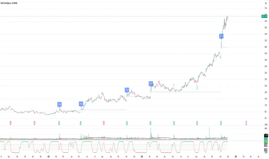
EPS, Revenue & NPM Growth Marker v2This indicator visually tracks fundamental growth by plotting smart labels on earnings dates, showing three key metrics:
EPS (Earnings Per Share)
Revenue (Sales)
Net Profit Margin (NPM)
It overlays compact, readable labels on the chart allowing you to evaluate a company's financial performance — both sequentially (QoQ) and annually (YoY).
EPS, Revenue & NPM Growth Marker v2 uses both official earnings data and fallback logic (EPS/Revenue/NPM changes) to ensure consistent detection of earnings events.
⭐ Key Features
Three Metrics: Displays EPS, Revenue, and Net Profit Margin
Growth Breakdown: Shows Absolute, Quarter-over-Quarter %, and Year-over-Year % change
Smart Arrows: Trend direction shown with emoji arrows (🡩🡫)
Earnings Detection: Aligns labels to official earnings events or fallback data
Highly Customizable: Full control over visible metrics, growth types, label style, placement, and max label count
Clean Display: Keeps the chart clean with a limit on max labels
⚙️ Customization Options
You can personalize the indicator to match your charting style:
Select metrics to display: EPS, Revenue, NPM
Toggle row types: Absolute, QoQ %, YoY %
Choose label position: Above Bar, Below Bar, Top, or Bottom
Customize line style, colors, and label text color
Set the maximum number of labels shown on chart
🧠How It Works
Absolute Value: Latest reported figure for each metric (e.g., EPS = ₹3.20)
QoQ % Change: (Current - Previous Quarter) / |Previous| * 100
YoY % Change: (Current - Same Quarter Last Year) / |Previous Year| * 100
The script uses TradingView’s request.earnings() data when available. If official earnings data is missing, it intelligently detects earnings events based on changes in EPS, Revenue, or NPM figures.
This is a major update to EPS & Sales/Revenue Growth Marker script, with expanded metrics, enhanced logic, and greater customization.
Developed & Published by: @learningvitals
Pertumbuhan

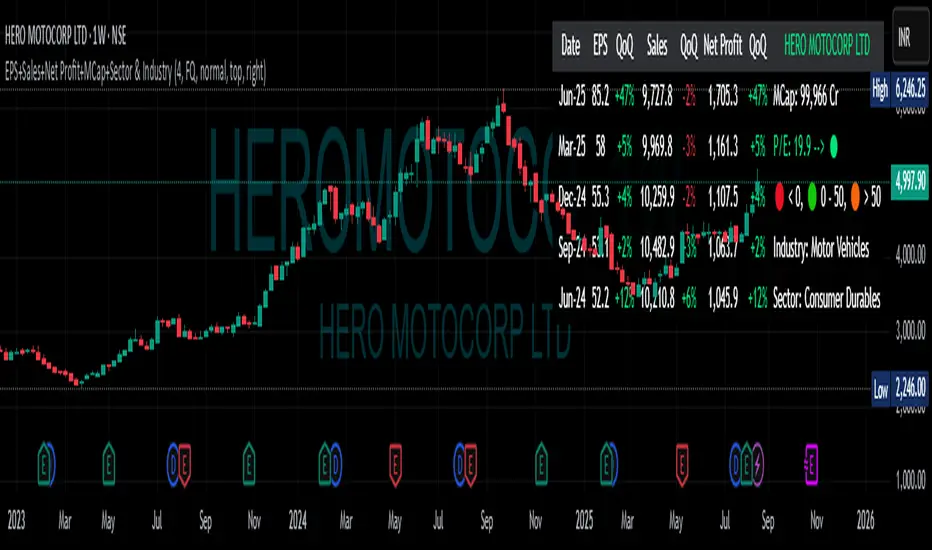
EPS+Sales+Net Profit+MCap+Sector & Industry📄 Full Description
This script displays a comprehensive financial data panel directly on your TradingView chart, helping long-term investors and swing traders make informed decisions based on fundamental trends. It consolidates key financial metrics and business classification data into a single, visually clear table.
🔍 Key Features:
🧾 Financial Metrics (Auto-Fetched via request.financial):
EPS (Earnings Per Share) – Displayed with trend direction (QoQ or YoY).
Sales / Revenue – In ₹ Crores (for Indian stocks), trend change also included.
Net Profit – Also in ₹ Crores, along with percentage change.
Market Cap – Automatically calculated using outstanding shares × price, shown in ₹ Cr.
Free Float Market Cap – Based on float shares × price, also in ₹ Cr.
🏷️ Sector & Industry Info:
Automatically identifies and displays the Sector and Industry of the stock using syminfo.sector and syminfo.industry.
Displayed inline with metrics, making it easy to know what business the stock belongs to.
📊 Table View:
Compact and responsive table shown on your chart.
Columns: Date | EPS | QoQ | Sales | QoQ | Net Profit | QoQ | Metrics
Metrics column dynamically shows:
Market Cap
Free Float
Sector (Row 4)
Industry (Row 5)
🌗 Appearance:
Supports Dark Mode and Mini Mode toggle.
You can also customize:
Number of data points (last 4+ quarters or years)
Table position and size
🎯 Use Case:
This script is ideal for:
Fundamental-focused traders who use EPS/Sales trends to identify momentum.
Swing traders who combine price action with fundamental tailwinds.
Portfolio builders who want to see sector/industry alignment quickly.
It works best with fundamentally sound stocks where earnings and profitability are a major factor in price movements.
✅ Important Notes:
Script uses request.financial which only works with supported symbols (mostly stocks).
Market Cap and Free Float are calculated in ₹ Crores.
All financial values are rounded and formatted for readability (e.g., 1,234 Cr).
🙏 Credits:
Developed and published by Sameer Thorappa
Built with a clean, minimalist approach for high readability and functionality.
Mereks Wick Theory🚨 Wick Precision Zones – Top & Bottom Sniper
📈 Timeframes: 1H & 4H | 🔍 Powered by Smart Wick Logic + FVG Detection
Mark the exact 50% of key wicks where smart money reacts.
This advanced indicator auto-detects Fair Value Gaps (FVGs), Order Blocks, and liquidity zones, then highlights precision reversal levels with color-coded lines (🔴 short / 🟢 long).
✅ Alerts before and when price hits the zone
✅ Works even with just a strong wick inside FVG
✅ Filters in real-time to increase signal accuracy
✅ Built for top- and bottom-ticking entries

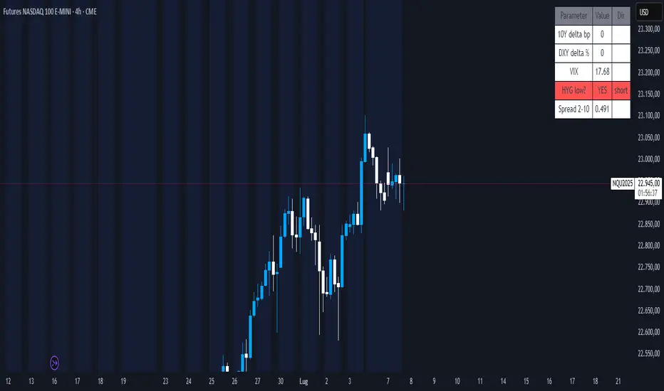
Nasdaq Macro Radar 3.5Nasdaq Macro Radar is an intraday tool that condenses five macro-drivers of the Nasdaq-100 into a single color-coded table:
• real-time moves in the 10- and 2-year Treasury yields
• dollar strength via the Dollar Index
• equity volatility level (VIX)
• risk tone in high-yield credit (HYG ETF)
• dynamic slope of the 2-10-year curve
Each cell flips from neutral to “long” or “short” on the fly, letting you see at a glance whether the macro backdrop is helping trend continuation or signalling a potential reversal.
• No extra pane – the table sits directly on your price chart and can be parked in any corner.
• All sensitivity thresholds are user-adjustable from Settings.
• Built-in alerts for the most critical levels.
Designed for scalpers and day-traders who need an instant macro check without juggling multiple charts
Nasdaq Macro Radar è un indicatore intraday che sintetizza, in un’unica tabella color-code, cinque motori macro-finanziari chiave per il Nasdaq-100:
• movimento dei rendimenti Treasury a 10 a & 2 a
• variazioni del Dollar Index
• livello della volatilità implicita (VIX)
• tono del mercato credito high-yield (ETF HYG)
• pendenza dinamica della curva 2-10 a
Ogni cella passa dal neutro a “long” o “short” in tempo reale, consentendo di valutare a colpo d’occhio se il contesto macro favorisce prosecuzioni o inversioni del trend di prezzo.
• Nessuna finestra separata: la tabella resta sovrapposta al grafico e può essere spostata in qualsiasi angolo.
• Parametri di sensibilità completamente regolabili dal pannello Settings.
• Alert integrati per le soglie critiche più importanti.
Pensato per chi fa scalping o day-trading sul Nasdaq e vuole un check macro immediato senza aprire dieci grafici di supporto.
Greer Revenue Yield📊 Greer Revenue Yield – RPS%
Author: Sean Lee Greer
Date Published: June 23, 2025
🔍 Overview
The Greer Revenue Yield indicator evaluates a stock's Revenue Per Share Yield (RPS%), giving investors a unique lens into how much top-line revenue a company produces per share relative to its stock price. This can help identify under- or over-valued conditions based on fundamental efficiency.
Revenue per Share = Total Revenue ÷ Shares Outstanding
Revenue Yield (%) = Revenue per Share ÷ Stock Price × 100
A simple yet powerful valuation metric, dynamically visualized with smart coloring:
🟢 Green = Yield is above average (potential value opportunity)
🔴 Red = Yield is below average (potentially overvalued)
🧠 Use Case
Use this tool to assess whether a company’s price justifies its revenue output on a per-share basis. Especially useful in combination with other indicators in the Greer Financial Toolkit:
📘 Greer Value – Tracks year-over-year growth consistency across 6 key financial metrics
📊 Greer Value Yields Dashboard – Visualizes multiple valuation-based yields
🟢 Greer BuyZone – Identifies long-term technical entry points based on trend cycles and valuation zones
⚠️ Disclaimer
This script is for educational purposes only and should not be considered financial advice. Always conduct your own research or consult a financial advisor before making investment decisions.

Greer Value📈 Greer Value
This indicator evaluates the year-over-year (YoY) growth consistency of five key fundamental metrics for any stock:
Book Value Per Share
Free Cash Flow
Operating Margin
Total Revenue
Net Income
The script tracks whether each metric increases annually based on financial statement data (FY), then calculates both individual and aggregate increase percentages over time. A color-coded table is displayed on the most recent bar showing:
Raw counts of increases vs. checks per metric
Percentage of years with growth
Overall "Greer Value" score indicating total consistency across all five metrics
✅ Green = Strong YoY growth
❌ Red = Weak or inconsistent growth
Use this tool to help identify fundamentally improving companies with long-term value creation potential.

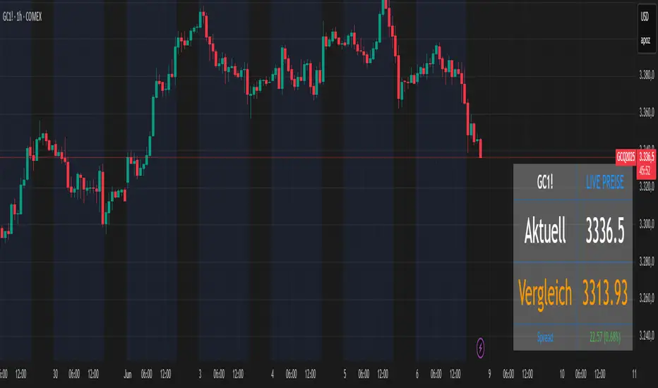
Futures vs CFD Price Display
🎯 Trading the same asset in CFDs and Futures but tired of switching charts to compare prices? This is your indicator!
Stop the constant chart hopping! This live price comparison shows you instantly where the better conditions are.
✨ What you get:
Bidirectional: Works in both Futures AND CFD charts
Live prices: Real-time comparison of both markets
Spread calculation: Automatic difference in points and percentage
Fully customizable: Colors, position, size to your liking
Professional design: Clean display with symbol header
🎯 Perfect for:
Gold traders (Futures vs CFD)
Arbitrage strategies
Spread monitoring
Multi-broker comparisons
⚙️ Customization:
3 sizes (Small/Normal/Large) for all screens
4 positions available
Individual color schemes
Toggle features on/off
💡 Simply enter the symbol and keep both markets in sight!
Notice: "Co-developed with Claude AI (Anthropic) - because even AI needs to pay the server bills! 😄"
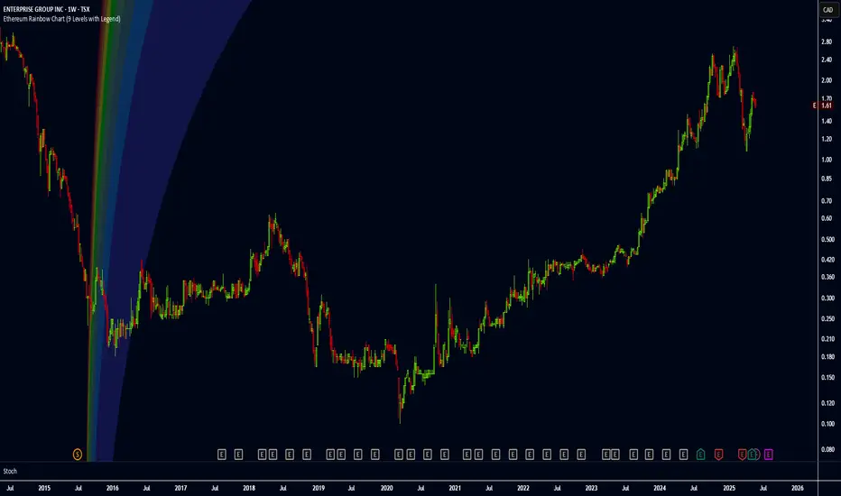
Ethereum Rainbow Chart (9 Levels with Legend)The Ethereum Rainbow Chart is a long-term, color-coded chart that displays Ethereum’s price on a logarithmic scale to show historical trends and growth patterns. It uses colored bands to highlight different price zones, helping to visualize how ETH’s price has moved over time without focusing on short-term fluctuations.
QoQ PAT, Sales & OPM% Labels by GauravThis indicator automatically displays the Quarter-over-Quarter (QoQ) percentage change in Sales, PAT (Profit After Tax), and Operating Profit Margin (OPM%) directly on the price chart.
It fetches quarterly financial data using TradingView’s request.financial() function for:
Sales (TOTAL_REVENUE),
PAT (NET_INCOME),
Operating Profit (OPER_INCOME).
For each earnings update, it calculates:
Sales QoQ %: Growth in sales vs. the previous quarter,
PAT QoQ %: Growth in PAT vs. the previous quarter,
OPM %: Operating Profit Margin = (Operating Profit / Sales) × 100.
This helps traders and investors quickly visualize fundamental growth trends right alongside the candlestick chart, improving fundamental + technical analysis integration.

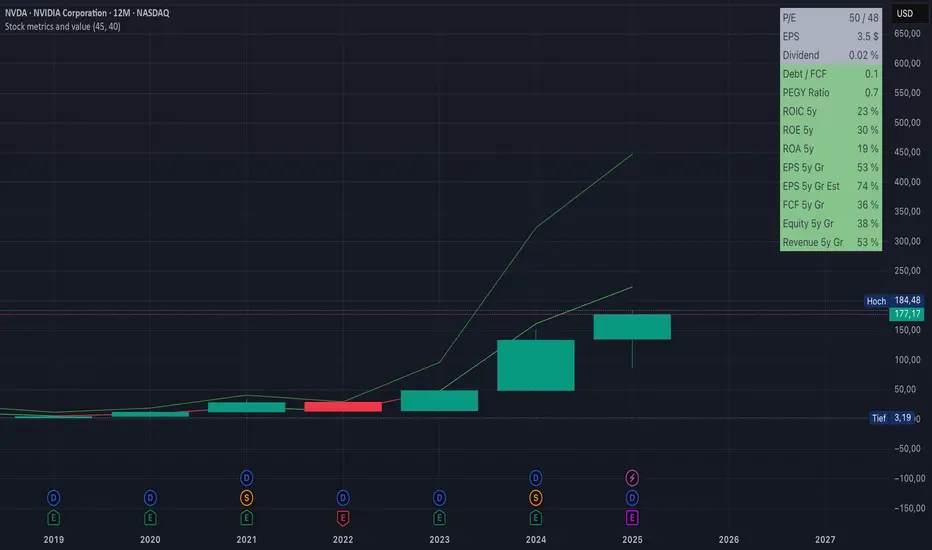
Stock metrics and valueThis indicator shows:
- the valuation metrics for a stock on a table on top right: PE, EPS, dividend, ROIC, ROE, ROA, EPS growth, FCF growth, Equity growth, revenue Growth
- the fair value and the value with 50% margin of safety as chart lines
The lines will be red when they are above the current price and red when they are below the current price.
The colors on the table will be red when the values are below 10% and green when they are above, that means when everything is green the metrics for the stock are good.
Fair value and MOSShowing the fair value and margin of safety for a Stock.
Works best with 12 months timeframe.
The calculations are based on historical data for multiple years, up to 10 years.
You will see the following as numbers at the indicator line:
- Forward EPS Growth in %
- Forward PE Calculated
- Forward PE Estimated
The two lines will be shown in green if they are above the current price and in red if the price is bellow the lines.
- The upper line shows the fair value of the stock, calculated with 15% (or 4x in 10 years) expected EPS growth for your investment.
- The lower line shows the margin of safety, calculated at 50% of the fair value.
You can adjust the values at "Forward EPS Growth in %" and "Expected future PE" in order to show your fair price and the price with margin of safety.

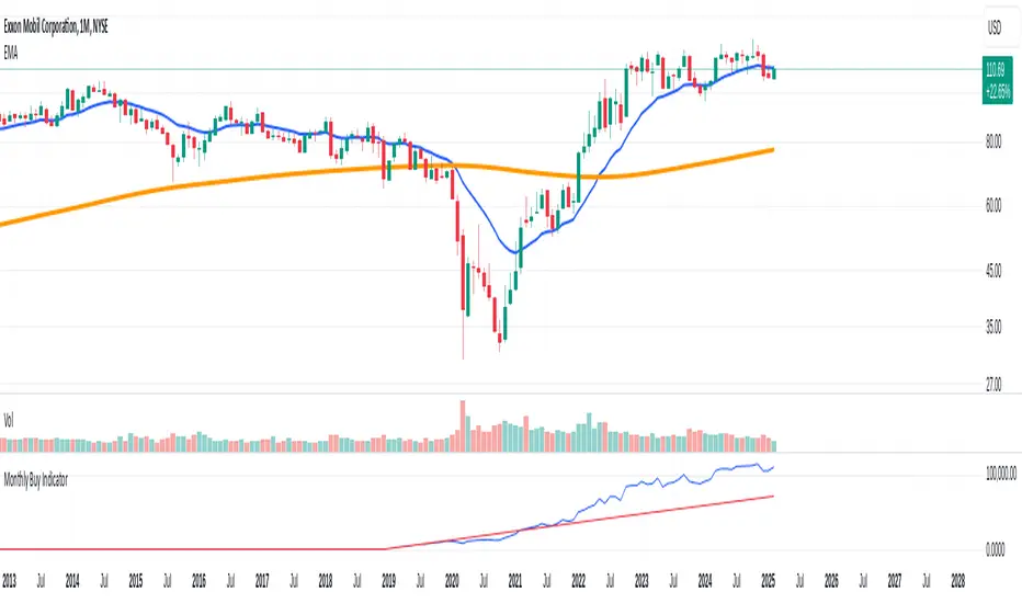
Monthly Buy IndicatorIt shows us the the total balance when buying monthly, ploting the total invested amount and total current balance along the time.
Opening the Data Window, it displays the profit (%) and the number of trades.
The "Allow Fractional Purchase" flag can be used to check the the performance of the ticker, disregarding how much the monthly amount is set vs the price of the ticker.
The trades are considering buying the available amount on the 1st candle of each month, at the Open price. The "Total Balance" considers the close price of each candle.
Cross Market Ratio with Time DelayEnglish Description
Cross Market Ratio with Time Delay
This indicator computes the ratio between two market prices, where Ticker 1 is taken from the current chart and Ticker 2 is specified via the settings (for example, NYMEX:CL1! for crude oil). It features a configurable time delay (in days) for Ticker 2, making it ideal for analyzing cross-market relationships with a lag effect.
Key features include:
• Time Delay & Bars per Day: Apply a delay to Ticker 2’s price (calculated as delayDays × barsPerDay) so that you can study historical relationships between the two markets.
• Smoothing Options: Choose between SMA and EMA to smooth the ratio over a defined Evaluation Period. This helps reduce noise and highlight underlying trends.
• Z‑Score Calculation: The indicator calculates a z‑score based on the standard deviation of the ratio. This measures how many standard deviations the current ratio deviates from its moving average.
• Scaled Index: The z‑score is converted into a scaled index where 50 represents the average, and each standard deviation corresponds to 10 index points. The index is clamped between 0 and 100.
• Dynamic Normalization (Optional): When enabled, the indicator re‐scales the index dynamically over a chosen period to adapt to recent market conditions.
• Visual Aids: Horizontal reference lines at 70 (indicating potential overvaluation) and 30 (indicating potential undervaluation) are displayed. Optionally, you can also plot the raw ratio and the z‑score for deeper insight.
• Ticker Labels: Both ticker symbols are displayed on the chart (with an adjustable offset) to keep you informed about the instruments being compared.
This tool is especially useful for traders looking to explore inter-market dynamics and to identify potential divergences or shifts in relative performance.
Deutsche Beschreibung
Cross Market Ratio with Time Delay
Dieser Indikator berechnet das Verhältnis zwischen den Preisen zweier Märkte, wobei Ticker 1 aus dem aktuellen Chart übernommen wird und Ticker 2 in den Einstellungen frei wählbar ist (zum Beispiel NYMEX:CL1! für Öl). Dank eines einstellbaren Zeitversatzes (in Tagen) für Ticker 2 eignet er sich hervorragend zur Analyse marktübergreifender Zusammenhänge mit Verzögerungseffekt.
Wichtige Funktionen im Überblick:
• Zeitversatz & Balken pro Tag: Wenden Sie einen Zeitversatz auf den Preis von Ticker 2 an (berechnet als delayDays × barsPerDay), um historische Beziehungen zwischen den beiden Märkten zu untersuchen.
• Glättungsmethoden: Wählen Sie zwischen SMA und EMA, um das Verhältnis über einen definierten Evaluationszeitraum zu glätten. Dies reduziert das Rauschen und hebt die zugrunde liegenden Trends hervor.
• Berechnung des Z‑Scores: Der Indikator ermittelt den z‑Score basierend auf der Standardabweichung des Verhältnisses. Dieser zeigt an, um wie viele Standardabweichungen der aktuelle Wert vom gleitenden Durchschnitt abweicht.
• Skalierter Index: Der z‑Score wird in einen Index umgerechnet, bei dem 50 dem Durchschnitt entspricht und jede Standardabweichung 10 Indexpunkte ausmacht. Der Index wird dabei auf einen Bereich von 0 bis 100 begrenzt.
• Dynamische Normalisierung (Optional): Bei Aktivierung passt der Indikator den Index dynamisch über einen festgelegten Zeitraum an die aktuellen Marktbedingungen an.
• Visuelle Unterstützung: Horizontale Referenzlinien bei 70 (potenzielle Überbewertung) und 30 (potenzielle Unterbewertung) werden angezeigt. Zusätzlich können Sie optional den Rohwert des Ratios und den z‑Score mitplotten.
• Ticker-Labels: Beide Ticker-Symbole werden im Chart (mit einstellbarem Versatz) angezeigt, sodass Sie stets wissen, welche Instrumente verglichen werden.
Dieser Indikator eignet sich besonders für Trader, die intermarktliche Dynamiken analysieren und potenzielle Divergenzen oder Veränderungen in der relativen Performance frühzeitig erkennen möchten.

QoQ Economic & Financial Indicator ChangesA straightforward indicator for analyzing quarter-over-quarter (QoQ) percentage changes in economic and financial data series. Perfect for visualizing dynamic changes in:
Economic Indicators (GDP, House Price Indices, Employment Figures)
Company Financial Metrics (Revenue, EPS, Operating Margins)
Balance Sheet Items (Assets, Liabilities, Equity)
Cash Flow Statement Components
Other Quarterly Economic & Financial Data
Features:
Automatically calculates QoQ percentage changes
Color-coded visualization (green for positive, red for negative changes)
Displays exact percentage values
Includes adjustable scale factor for different data series
Zero line reference for easy trend identification

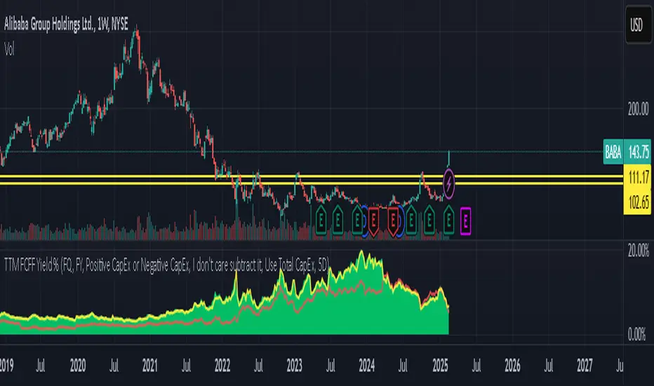
TTM FCFF Yield %An indicator that shows the Free Cash Flow yield daily for the underlying ticker. Useful for when you need to screen for ideas, or the news just broke out and you want to make a calculated purchase - rather than buying at whatever price it is at the moment.
Green line tracks daily Free Cash Flow yield to Enterprise Value.
Where Free Cash Flow is defined as = Cashflow from Operations + Depreciation and Amortization (from the income statement) - Capital Expenditure (fixed assets) - Change in Working Capital
And where Enterprise Value is defined as = Market Capitalization + Net Debt
Red line tracks Free Cash Flow of financial year and what FCFF yield does that equate to if the stock current trades at the price right now.
Reminder: When working with international equities. Be mindful of whether they report FQ or FH. For example, France only reports FH, so it's better to use TTM FHFree Cash Flow results. If you didn't toggle FH in the indicator settings, it will automatically set as FQ and it will not show anything.
GLHF
Year-over-Year % Change for PCEPILFEHello, traders!
This indicator is specifically for FRED:PCEPILFE , which is a 'Personal Consumption Expenditures (PCE) Index excluding food and energy.'
What this indicator does is compare the monthly data to that of the same month last year to see how it has changed over the year. This comparison method is widely known as YoY(Year-over-Year).
While I made this indicator to use for FRED:PCEPILFE , you may use it for different charts as long as they show monthly data.
FRED:PCEPILFE is one of the main measures of inflation the Federal Reserve uses.
You can see the YoY % change of the PCE Index excluding food and energy in the official website for the Bureau of Labor Statistics, but unfortunately, I couldn't find one in TradingView.
So instead, I decided to make my own indicator showing the changes using FRED:PCEPILFE .
The code is very simple: it compares the data to the data 12 points ago because 12 points would mean 12 months in this chart. We then multiply the result by 100 for percentage.
Doing so, we compare the current month to the same month of the previous year.
Because I am only interested in the YoY % Change of the index, I pulled the indicator all the way up, covering the original chart data entirely. (Or you could achieve the same by simply moving your indicator to the pane above. But this way, the original chart data is also visible.)
I hope this indicator helps you with your analysis. Feel free to ask questions if have any!
God bless!

DCA Buy v1Key Features
1. Selective Entry Filters
Trend Filter
Enabled through "Enable Trend Filter?" using the "EMA Length" setting to ensure entries align with prevailing trends.
Momentum Filter
Configured using "Enable Momentum Filter?" combined with "RSI Length" and "RSI Source" to detect oversold conditions.
Bollinger Filter
Activated via "Enable Bollinger Filter?" along with "BB Length" and "BB Multiplier" to focus entries on deeper price dips below Bollinger Bands.
2. DCA Configuration
Base Order Settings
Choose between a percentage ("Base Order % of Equity/Initial Capital") or fixed value ("Base Order Value ($)").
Safety Order Settings
Fine-tune "Initial Deviation (%)" and "Price Deviation Multiplier" to control the spacing of safety orders.
Use "Volume Scaling Factor (Qty)" to scale the size of each subsequent safety order.
Customize the "First Safety Order Type" as either value-based or a multiplier of the base order using "1st Safety Order Value ($)" or "1st Safety Order Multiplier (Qty)".
Set the maximum number of safety orders through "Max Safety Orders".
3. Profit and Risk Management
Take Profit Settings
"Take Profit (%)" triggers a sell when a specific profit percentage above the average entry is reached.
Use "Trailing Take Profit (%)" to lock in profits while capturing additional upside if prices continue to rise.
Stop Loss Settings
Configure "Stop Loss (%)" to prevent excessive drawdowns by closing all positions when prices drop below a defined percentage.
4. Time Control & Visualization
Time Filters
Define trading windows with "Start Time" and "End Time".
Use "Cooldown (Seconds)" to avoid frequent entries during rapid price movements.
Visualization
Enable "Show Average Entry Price", "Show Take Profit Level", and "Show Stop Loss Level" to plot key levels on the chart for better monitoring.
5. Performance Metrics
Built-in performance tracking includes:
Net Profit (%): Measures overall profitability.
Win Rate (%): Displays the ratio of winning trades.
Max Drawdown (%): Tracks the largest equity decline.
Trading Days: Calculates the duration of active trades.
Profit/Day (%): Evaluates daily returns.
The performance table also shows average cycle duration and utilization of available capital.

Pivotal Point Detection
The indicator highlights price gaps (overnight gaps) with significantly increased volume in the daily chart only. These price jumps can occur after earnings reports or other significant news and often point to an important event (e.g., a new product or business model). According to Jesse Livermore, these are called Pivotal Points.
The price jumps displayed by the indicator are not a guarantee that they represent a true Pivotal Point, but they provide a hint of a significant business development - especially when they occur repeatedly alongside revenue growth. This can help identify potentially strong growth stocks and high-performing investments. However, the underlying events and connections must be investigated through additional research.
make posible to find stocks like:
NYSE:PLTR NASDAQ:ROOT NASDAQ:NVDA NYSE:CVNA NYSE:LRN
A "pivotal price line" is drawn at the opening price of the Pivotal Point. This line is considered a support level. If the price falls below this line, the Pivotal Point loses its validity.
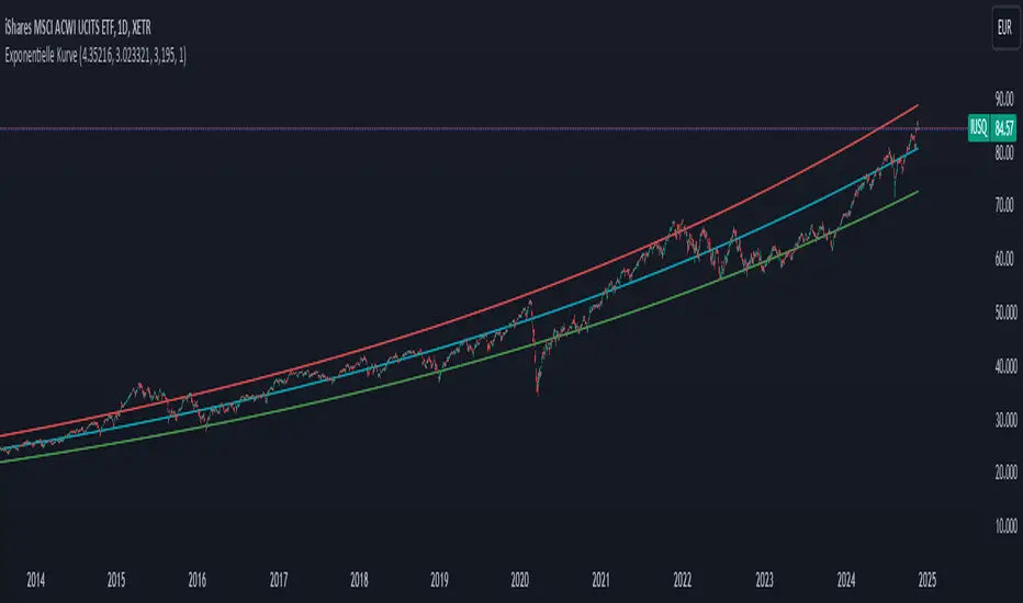
Exponential growthPurpose
The indicator plots an exponential curve based on historical price data and supports toggling between exponential regression and linear logarithmic regression. It also provides offset bands around the curve for additional insights.
Key Inputs
1. yxlogreg and dlogreg:
These are the "Endwert" (end value) and "Startwert" (start value) for calculating the slope of the logarithmic regression.
2. bars:
Specifies how many historical bars are considered in the calculation.
3.offsetchannel:
Adds an adjustable percentage-based offset to create upper and lower bands around the main exponential curve.
Default: 1 (interpreted as 10% bands).
4.lineareregression log.:
A toggle to switch between exponential function and linear logarithmic regression.
Default: false (exponential is used by default).
5.Dynamic Labels:
Creates a label showing the calculated regression values and historical bars count at the latest bar. The label is updated dynamically.
Use Cases
Exponential Growth Tracking:
Useful for assets or instruments exhibiting exponential growth trends.
Identifying Channels:
Helps identify support and resistance levels using the offset bands.
Switching Analysis Modes:
Flexibility to toggle between exponential and linear logarithmic analysis.
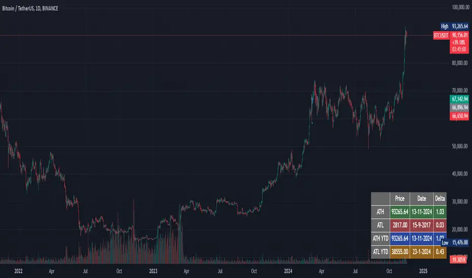
ATH/ATL trackerThis script calculates and displays in a table in realtime:
- ATH, date of occurrence, and that price/current price
- ATL, date of occurrence, and that price/current price
- ATH of the current year, date of occurrence, and that price/current price
- ATL of the current year, date of occurrence, and that price/current price
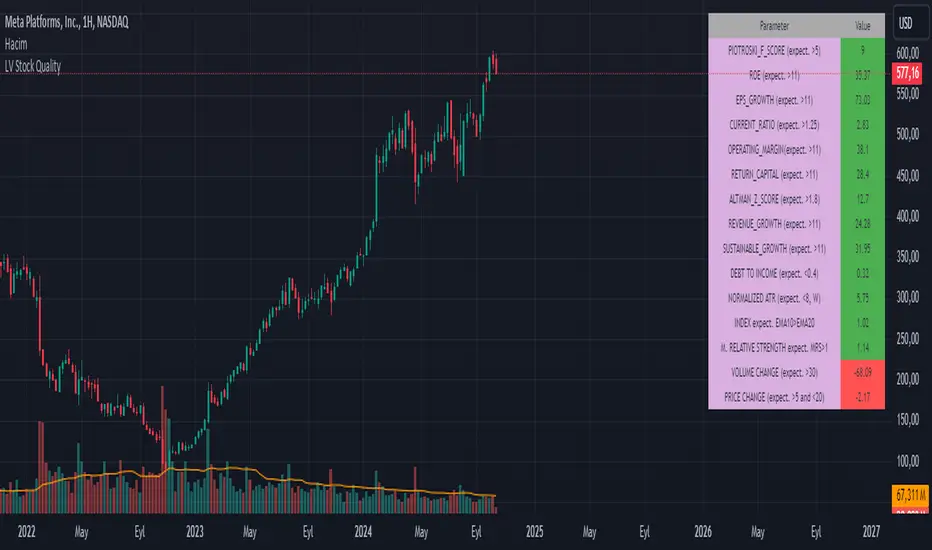
LV Stock QualityCritical financial and technical values are listed in the table.
PIOTROSKI_F_SCORE (expect. >5) -> The Piotroski score is a discrete score between zero and nine that reflects nine criteria used to determine the strength of a firm's financial position. The Piotroski score is used to determine the best value stocks, with nine being the best and zero being the worst. Having a score bigger than 5 is a good sign for the strength of a firm's financial position
ROE (expect. >11) --> Return on equity (ROE) is a measure of a company's financial performance. It is calculated by dividing net income by shareholders' equity. Because shareholders' equity is equal to a company’s assets minus its debt, ROE is a way of showing a company's return on net assets. A “good” ROE will depend on the company’s industry and competitors.
EPS_GROWTH (expect. >11) --> This indicator is calculated as the percentage change in Basic earnings per share for one year. This indicator reflects the growth rate of a company's basic profit per share outstanding for one year. It is calculated based using only common shares. An increase in EPS growth may signal that a company is becoming more profitable and efficient in its operations. A decline in EPS growth may signal that a company is spending more or losing business share. EPS growth should be viewed alongside other metrics like revenue and costs.
CURRENT_RATIO (expect. >1.25) --> The current ratio measures a company’s ability to pay current, or short-term, liabilities (debt and payables) with its current, or short-term, assets (cash, inventory, and receivables). Current ratios over 1.00 indicate that a company's current assets are greater than its current liabilities, meaning it could more easily pay of short-term debts.
OPERATING_MARGIN(expect. >11) --> The operating margin measures how much profit a company makes on a dollar of sales after paying for variable costs of production, such as wages and raw materials, but before paying interest or tax.
RETURN_CAPITAL (expect. >11) --> Return of capital (ROC) is a payment that an investor receives as a portion of their original investment and that is not considered income or capital gains from the investment.
ALTMAN_Z_SCORE (expect. >1.8) --> The Altman Z-score is the output of a credit-strength test that gauges a publicly traded manufacturing company's likelihood of bankruptcy. An Altman Z-score close to 0 suggests a company might be headed for bankruptcy, while a score closer to 3 suggests a company is in solid financial positioning.
REVENUE_GROWTH (expect. >11) --> Quarterly revenue growth is an increase in a company's sales in one quarter compared to sales of a different quarter. Comparing a company's financials from one period to another gives a clear picture of its revenue growth rate and can help investors identify the catalyst for such growth.
SUSTAINABLE_GROWTH (expect. >11) --> The sustainable growth rate (SGR) is the maximum rate of growth that a company or social enterprise can sustain without having to finance growth with additional equity or debt. In other words, it is the rate at which the company can grow while using its own internal revenue without borrowing from outside sources.
DEBT TO INCOME (expect. <0.4) --> A debt-to-income (DTI) ratio is a financial metric used by lenders to determine your borrowing risk. Your DTI ratio represents the total amount of debt you owe compared to the total amount of money you earn each month.
NORMALIZED ATR (expect. <8, W) --> The Normalized Average True Range (Normalized ATR) is an indicator used to measure market volatility by normalizing the average true range values. It does this by dividing the Average True Range (ATR) by the asset's closing price, converting it into a percentage. This normalization allows for the comparison of volatility levels across different securities or market conditions, regardless of the asset's price levels. The Normalized ATR helps traders to adjust their strategies based on relative volatility, rather than absolute price movements.
INDEX expect. EMA10>EMA20 --> it is expected to have EMA 10 > EMA 20 in weekly basis graph. It is known that having a strong trend in index will also increases chance of strong trend on stock levels. You need to select INDEX Market of stock via settings.
M. RELATIVE STRENGTH expect. MRS>1 --> Stan Weinstein uses the Mansfield RS indicator as another relative strength indicator. The indicator measures the variation in the 52-week ratio of stock and market.
VOLUME CHANGE (expect. >30) --> Having an increase on volume comparing to previous week can be a good sign if it occurs at the same time of breakout.
PRICE CHANGE (expect. >5 and <20) --> Having an increase on price comparing to previous week can be a good sign if it occurs at the same time of breakout.
It is better to look on weekly basis graphs.
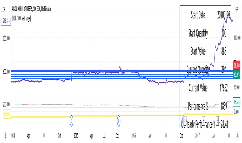
DRIP Yearly PerformanceOverview: The DRIP Yearly Performance indicator is designed for long-term investors using Dividend Reinvestment Plans (DRIP). This script calculates both the total and average yearly performance of an asset, factoring in the reinvestment of dividends over time. It provides key insights into portfolio growth by tracking the number of accumulated units from dividend reinvestment and how this impacts overall performance.
Key Features:
Dividend Reinvestment (DRIP) Calculation: Automatically adjusts the number of units held by reinvesting dividends, enhancing the calculation of total returns.
Custom Start Date: Choose a custom start date to begin tracking performance from a specific time period, allowing for more tailored performance analysis.
Performance Metrics: Displays key metrics such as the initial investment value, current value, total performance percentage, and the average yearly performance, all in an easy-to-read table format.
Visual Representation: Plots accumulated units and overall performance on the chart, with customizable colors for clarity.
Inputs Explained:
Start Quantity: Define the initial number of units (shares) held at the start of the investment.
Dividend Type: Choose between tracking Net or Gross dividends for reinvestment purposes. Net is always better unless you have a special case and you need to base your calculations on gross.
Start Date: Select a custom date to begin tracking performance. This allows users to focus on performance from any historical point.
Table Size: Customize the size of the text in the performance table to suit your visual preferences.
Performance Line Color: Choose the color of the performance plot line that tracks the value of your investment over time.
Accumulator Line Color: Customize the color of the line that tracks the accumulated units (shares) due to reinvested dividends.
Who Can Benefit: This indicator is ideal for long-term investors and dividend growth investors who want to measure their investment returns over time while factoring in the effects of dividend reinvestment.
Use Cases:
Tracking Dividend Impact: See how reinvesting dividends enhances your overall portfolio value.
Custom Performance Analysis: Set a custom start date to analyze performance from a specific point in time.
Visualizing Growth: Use the chart's plots to visually track your growing number of shares (units) and overall performance.
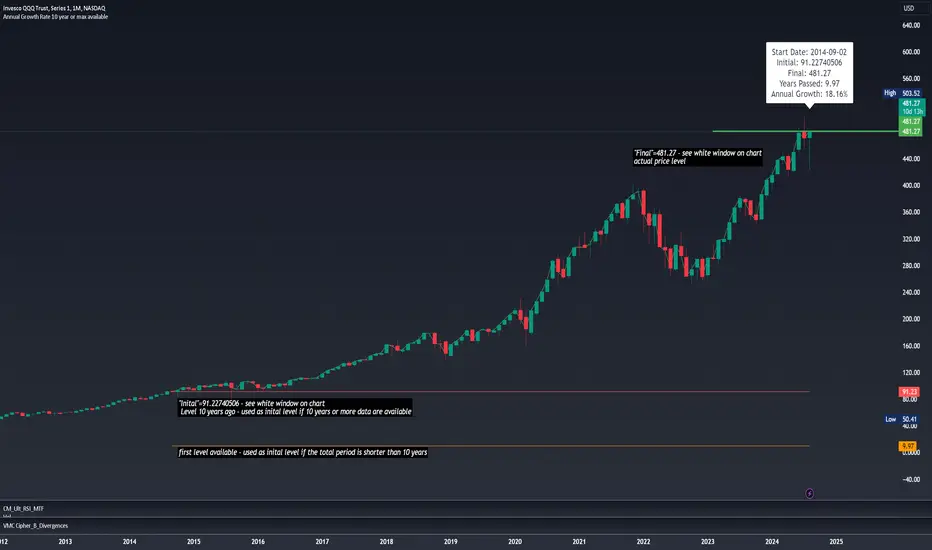
10-Year CAGR Calculator: Uncover Long-Term Growth TrendsThis script calculates the Compound Annual Growth Rate (CAGR) over a 10-year period or the maximum available historical data for any asset. The calculated growth rate is displayed as a label on the last bar of the chart.
Ideal for investors and analysts, this tool helps you easily visualize and assess the long-term growth potential of your investments, providing valuable insights into the historical performance of any asset over an extended period.