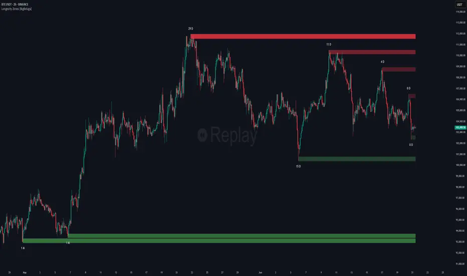
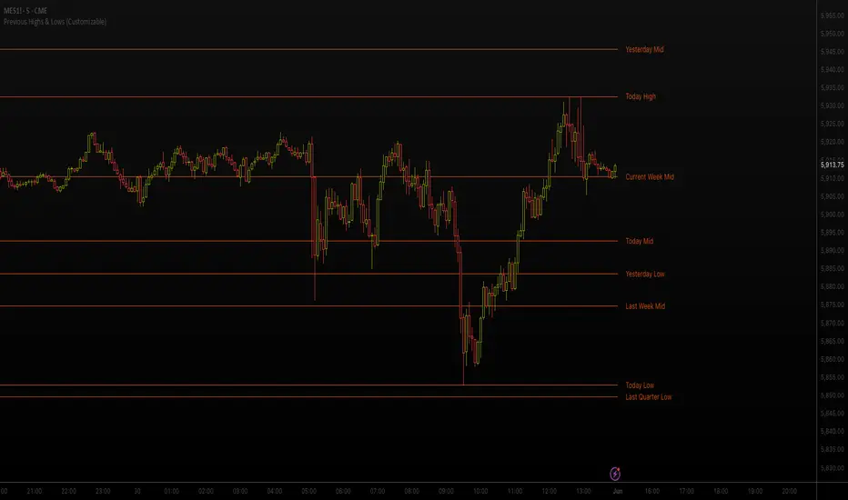
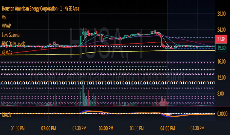
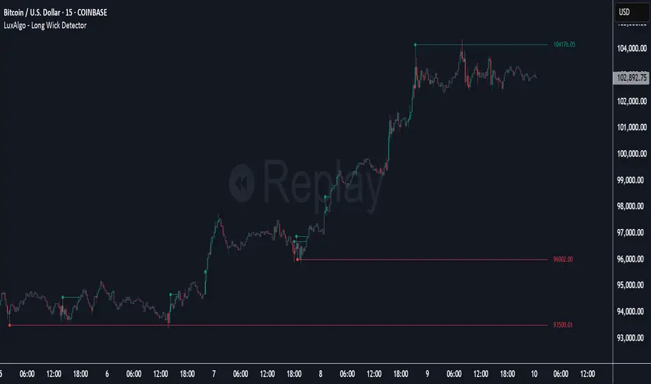
Rogue Overnight Volume ProfileRogue Overnight Volume Profile
The Rogue Overnight Volume Profile is an institutional-style overnight volume profile designed specifically for futures traders who use overnight auction structure to prepare for the Regular Trading Hours (RTH) session.
Unlike traditional session volume profiles that remain fixed throughout the day, Rogue Overnight Profile automatically builds the overnight distribution, identifies the most important price levels, and projects them into the current trading session for easy decision making.
Features:
Overnight Volume Profile
Automatically builds a complete volume profile during the overnight session.
Adjustable profile resolution with up to 1,000 price rows.
Value Area (default 70%)
Point of Control (POC)
Value Area High (OVAH)
Value Area Low (OVAL)
Customizable profile colors and placement.
Dynamic Overnight Levels
The indicator automatically calculates and plots:
OVAH (Overnight Value Area High)
OPOC (Overnight Point of Control)
OVAL (Overnight Value Area Low)
These levels begin at the start of the completed overnight profile and extend just beyond current price during the New York session, keeping the chart clean while maintaining important reference levels.
Historical overnight levels are retained for previous sessions to assist with market structure analysis.
Developing Overnight Range:
Monitor the overnight auction as it forms with an optional shaded developing range, allowing traders to visualize overnight balance before the market opens.
Weekly VWAP
Includes a built-in Weekly VWAP with customizable color and line width to provide higher-timeframe context and institutional bias.
5-Period Moving Average
A configurable 5-period moving average (EMA or SMA) can be displayed to help identify short-term momentum and trend direction.
First Touch Detection
Automatically identifies the first interaction with overnight profile levels during the New York session.
Supported first-touch signals include:
OVAH First Touch
OPOC First Touch
OVAL First Touch
These areas often act as important decision points where responsive buyers or sellers may enter the market.
Break & Retest Detection
The indicator can also detect break-and-retest setups after price establishes acceptance above or below an overnight level.
Bullish and bearish retest opportunities are labeled automatically, making it easier to identify continuation setups around key profile references.
Fully Customizable
Every major component can be enabled, disabled, or customized, including:
Session times
Profile resolution
Value Area percentage
Historical sessions displayed
Colors
Labels
Weekly VWAP
Moving Average
Touch detection
Retest detection
Designed For
Nasdaq Futures (NQ)
S&P Futures (ES)
Dow Futures (YM)
Russell Futures (RTY)
Crude Oil (CL)
Any market where overnight auction structure influences the regular session.
Best Used For
Identifying overnight support and resistance.
Planning opening scenarios.
Fade and acceptance trades around OVAH, OPOC, and OVAL.
Breakout confirmation.
Break-and-retest continuation setups.
Understanding overnight market positioning before the RTH open.
Disclaimer: This indicator is intended as a decision-support tool and does not provide financial advice. Always incorporate sound risk management and additional market context before entering any trade. Penunjuk

RSI Levels & Regime Map Heatmap & Cardwell Reversal SignalsOVERVIEW
RSI is the most-used oscillator in the world, and almost nobody trades it — because "RSI is 62" is not something you can place an order against.
This tool moves RSI onto price.
RSI IS INVERTIBLE. Wilder's smoothing can be solved backwards, so for any RSI value there is an EXACT price that would produce it on the next bar. Instead of "RSI is 62", the chart tells you:
Close above 24,278 -> RSI 70 (resistance)
Close below 24,193 -> RSI 30 (support)
Those are real levels. You can put a stop there. You can put a target there.
The script draws the full ladder (30 / 40 / 50 / 60 / 70, all configurable), shades the bands between them into a regime heatmap, measures the Cardwell range regime, marks Cardwell positive and negative reversals with projected targets, shows a multi-timeframe strip — and then does the thing nobody else does: IT FORWARD-TESTS WHETHER ANY OF IT ACTUALLY HOLDS.
This is a research and framing tool. It is NOT a strategy, NOT a signal service, and NOT a validated edge.
THE MATHS (exact, not an approximation)
RSI = 100 - 100/(1 + AG/AL), where AG and AL are the Wilder-smoothed average gain and loss.
For a target T, let RSt = T/(100 - T). Solving the next bar's RSI for the move x required:
an UP move needs x = (n-1) * (RSt*AL - AG)
a DOWN move needs x = (n-1) * (AL - AG/RSt)
Level = close + x. The up form applies when it is non-negative; otherwise the down form does.
This is algebra, not curve fitting. Feed the derived price back through RSI and you get the target value back exactly. The levels are not estimates — they are the precise prices at which the RSI state changes, recomputed every bar. The ladder breathes with volatility on its own: it tightens in quiet markets and widens in violent ones, with no smoothing parameter to tune.
WHY THESE PARTS ARE ONE TOOL (mashup rationale)
1. THE INVERSE-RSI LADDER — the core. Every rung is the exact price at which RSI would print a chosen value.
2. THE HEATMAP — the bands between the rungs, shaded by regime. It shows at a glance how far price must travel to change the RSI story, which is the one question the oscillator pane can never answer.
3. THE CARDWELL REGIME — Andrew Cardwell's observation: in a BULL market RSI holds roughly 40-80, and 40 becomes SUPPORT. In a BEAR market it holds 20-60, and 60 becomes RESISTANCE. So "RSI 40" means the OPPOSITE thing in the two regimes. A tool that ignores this will cheerfully tell you to buy oversold all the way down a trend. The regime here is MEASURED over a lookback, not assumed — and the rung the script watches follows the regime rather than a fixed number.
4. CARDWELL REVERSALS — the signal almost nobody implements. A POSITIVE REVERSAL is RSI making a LOWER low while PRICE makes a HIGHER low. That is the mirror image of classic divergence, and it is a CONTINUATION signal, not a trend reversal. A NEGATIVE REVERSAL is the bearish mirror. A measured target is projected from each.
5. THE HONESTY LAYER — everyone says RSI 30 is support. Nobody checks. Every level test and every Cardwell reversal is logged and graded with a triple barrier against an unconditional control.
Remove any one and you are left with a prettier RSI that still cannot tell you whether RSI works.
THE CALIBRATION — AND THE TWO TRAPS IT TOOK A LIVE TEST TO FIND
Two subtle biases can make a level tool look brilliant while it is doing nothing at all. Both are handled explicitly here, and both are worth understanding whichever tool you use.
TRAP 1 — THE FILL ADVANTAGE.
A support test fires when price dips INTO the rung and closes back ABOVE it. If you enter the event AT THE RUNG (below the close) but compare it with a control entered at the CLOSE, the event gets a strictly better fill on EVERY trade. It then "beats" the control by construction — not because the level held, but because it bought lower. That is a rigged comparison, and it produces a large fake edge.
THE FIX: the level test is treated as a SIGNAL, NOT A FILL. The event and the control enter at the SAME reference price — the bar's close. The only thing that differs is which bars were selected.
TRAP 2 — DIRECTIONAL DRIFT.
Indices drift upward. If level tests are mostly LONG while the control is 50/50, the events win on drift alone and prove nothing.
THE FIX: longs are compared only with control longs, shorts only with control shorts, then blended back using the events' OWN direction mix. The panel also reports the baseline drift directly, so you can see whether the instrument is simply going up.
The control is UNCONDITIONAL: the same trade geometry taken on arbitrary bars, selected by no signal at all. If the levels cannot beat that, they carry no edge.
Results are reported as EXPECTANCY IN R, not hit rate. A Welch t-test decides whether the difference is real or luck — the panel does not say PROVEN unless t > 1.96.
Other conventions, all chosen so the tool cannot flatter itself:
· Both barriers touched on one bar -> the STOP is assumed first.
· Expired trades are marked to market, not booked as losses.
· The level tested is the one computed at the END OF THE PREVIOUS BAR — the price a trader could actually have rested an order at. Using the current bar's own level would be a look-ahead.
· Everything is logged and resolved on confirmed bars only.
HOW TO USE IT
1. READ THE REGIME FIRST. In a bull regime the 40 rung is support and you are hunting long tests of it. In a bear regime the 60 rung is resistance. In neutral, the ladder is simply a map.
2. The rungs are LEVELS. Price closing through one changes the RSI state, by definition.
3. A CARDWELL REVERSAL is a continuation signal with a projected target.
4. READ THE CALIBRATION BEFORE YOU WEIGHT ANY OF IT — and read the baseline-drift row next to it. If level tests show no proven edge on your instrument, the ladder is a MAP, not a probability.
5. Entry, stop and target are drawn at the same price the calibration measures. They are arithmetic, not advice.
DATA / SCOPE
Any symbol, any timeframe. No volume required. The source is an input, so the ladder can be built from close, hlc3, or even another indicator's plot.
NON-REPAINTING
The ladder is computed from confirmed values and projects FORWARD — it is a statement about what the NEXT bar would need to do, so it necessarily moves as new bars arrive. That is a projection, not a repaint, and it is stated plainly rather than hidden.
Level tests are evaluated against the PREVIOUS bar's level, so no future information is used. Reversal pivots use ta.pivot* and confirm a few bars after the fact; once printed, they do not move. The calibration harness logs AND resolves on confirmed bars only, so its statistics cannot inflate intrabar.
HONEST LIMITATIONS — PLEASE READ
The ALGEBRA is exact. THE CLAIMS ABOUT RSI ARE NOT.
"RSI 30 is support" is folklore until it is measured, which is exactly why this script measures it — and why it is built to be able to return "not proven".
Calibration figures are IN-SAMPLE, with no costs or slippage, and use overlapping windows. A proven in-sample edge is NOT a guarantee out-of-sample. Real fills, spreads and commissions will all reduce it.
Cardwell's rules are discretionary in origin and are mechanised here in one particular way. A different mechanisation would give different numbers.
Small samples are unreliable even when they look good. If the edge is near zero, negative, or unstable across timeframes, the honest conclusion is that it is not there.
Nothing here predicts price.
CONCEPT CREDITS
Relative Strength Index and its Wilder smoothing — J. Welles Wilder Jr.
Range rules, positive and negative reversals, and the measured-move projection — Andrew Cardwell.
Triple-barrier forward labelling — Marcos López de Prado.
Welch's t-test — B. L. Welch.
The inverse-RSI level engine, the regime map, the unconditional direction-matched control and the significance testing are the author's own. Clean-room implementation; no third-party code is reused. Not affiliated with, nor endorsed by, any of the above.
DISCLAIMER
Research and educational tool only. NOT financial advice, NOT a recommendation, and NO guarantee of results. Indicators describe past behaviour; they do not predict the future. Entry, stop and target output is arithmetic, not advice. Trading carries a risk of loss. Test out-of-sample and make your own decisions. The author accepts no liability for any use of this script. Penunjuk

Penunjuk

Support - Resistance & Fibonacci [StrixEDGE]StrixZONE automatically detects Support and Resistance zones from price structure and overlays Fibonacci retracement levels — with a deliberate visual separation between the two. S/R zones are drawn historically (left of current price), while Fibonacci levels project into the future (right of current price). This separation ensures zero overlap and a clean, readable chart.
━━━━━━━━━━━━━━━━━━━━━━━━━━━━━━━━━━
HOW IT WORKS
The indicator operates on two independent analytical layers:
LAYER 1 — SUPPORT & RESISTANCE (Historical)
Automatically detects swing highs and swing lows using configurable pivot lookback detection. The most recent three resistance levels (R1, R2, R3) and three support levels (S1, S2, S3) are tracked and displayed as colored zones extending across the historical portion of the chart, stopping at the current bar.
R1/S1 is the most recent and visually strongest. R2/S2 and R3/S3 progressively fade, reflecting their age and diminishing relevance. Resistance zones are red, support zones are teal. Each zone has a configurable thickness based on ATR, creating a price band rather than a single line — because in practice, support and resistance are zones, not exact prices.
LAYER 2 — FIBONACCI RETRACEMENT (Forward Projection)
Calculates the highest high and lowest low over a 120-bar lookback and draws seven standard Fibonacci levels between them: 0%, 23.6%, 38.2%, 50%, 61.8%, 78.6%, and 100%. All levels project forward from the current bar by a configurable number of bars (default 20), showing where key retracement levels sit ahead of price.
The 50% and 61.8% levels are drawn with thicker solid lines. All others use thinner dashed lines. The 50%–61.8% region is highlighted as the Golden Zone — the area where retracements most frequently find support or resistance in trending markets. Each level displays its exact price at the right edge.
━━━━━━━━━━━━━━━━━━━━━━━━━━━━━━━━━━
VISUAL SEPARATION — WHY IT MATTERS
Most indicators that combine S/R with Fibonacci draw everything on top of the same price area, creating visual clutter that makes the chart harder to read. StrixZONE deliberately separates the two layers in time:
→ S/R zones occupy the left side of the chart (historical price action where the levels were established)
→ Fibonacci levels occupy the right side (projected forward where price is heading)
→ The current bar is the boundary — S/R stops here, Fibonacci starts here
This means you can see at a glance where historical structure sits versus where retracement math says the next key levels are. When a Fibonacci level aligns with a nearby S/R zone, that confluence is immediately visible without the two drawing systems overlapping.
━━━━━━━━━━━━━━━━━━━━━━━━━━━━━━━━━━
SUPPORT & RESISTANCE DETAILS
Detection uses the standard pivot high/low method with a configurable lookback (default 10 bars). A swing high requires the bar's high to be higher than all bars within the lookback window on both sides. The same logic applies in reverse for swing lows.
Levels shift automatically as new pivots are detected. When a new resistance pivot forms, R1 becomes R2, R2 becomes R3, and the new level takes the R1 position. This ensures the most current market structure is always prioritized.
Visual hierarchy:
→ R1 / S1 — most opaque, largest label (most recent, most relevant)
→ R2 / S2 — slightly faded (still relevant but older)
→ R3 / S3 — most faded (historical context, may be invalidated)
Zone width is ATR-based (default 0.2× ATR), so zones automatically adapt to the instrument's volatility. A high-volatility asset gets wider zones; a stable asset gets tighter zones.
━━━━━━━━━━━━━━━━━━━━━━━━━━━━━━━━━━
FIBONACCI DETAILS
Levels are calculated from the absolute highest high and lowest low over the lookback period (default 120 bars). This captures the dominant price range for retracement analysis.
All seven levels are drawn as horizontal lines projecting right from the current bar:
→ 0% and 100% — range boundaries (dashed, subtle gray)
→ 23.6% and 78.6% — minor retracement levels (dashed)
→ 38.2% — standard retracement (dashed)
→ 50% — midpoint (solid, thick, yellow)
→ 61.8% — golden ratio (solid, thick, orange)
The Golden Zone (50%–61.8%) is filled with a translucent highlight and labeled. This is the area where price most commonly reverses during healthy retracements in trending markets.
Each level includes a price label at the right edge showing the percentage and exact price value, making it easy to set orders at these levels.
━━━━━━━━━━━━━━━━━━━━━━━━━━━━━━━━━━
DASHBOARD
A compact table in the top-right corner displays:
→ R1 — nearest resistance price
→ S1 — nearest support price
→ FIB 50% — the midpoint price for quick reference
→ POSITION — current price as a percentage of the Fibonacci range (e.g., 72% means price is in the upper portion of the range)
━━━━━━━━━━━━━━━━━━━━━━━━━━━━━━━━━━
SETTINGS
Support & Resistance:
• Pivot Lookback (default 10) — bars required on each side to confirm a swing. Higher values detect fewer but more significant levels.
• Zone Width (default 0.2 ATR) — thickness of each S/R zone. Increase for wider zones on volatile instruments.
Fibonacci:
• Fibonacci Bars Right (default 20) — how far the levels project into the future.
• Golden Zone toggle — show or hide the 50–61.8% highlight.
Display:
• Show S/R Zones — toggle the entire S/R layer.
• Show Fibonacci — toggle the entire Fibonacci layer.
• Show Dashboard — toggle the status table.
━━━━━━━━━━━━━━━━━━━━━━━━━━━━━━━━━━
WHAT MAKES THIS ORIGINAL
StrixZONE is not simply S/R lines drawn next to Fibonacci lines. Its originality lies in the deliberate temporal separation: S/R zones render historically from where they were established, while Fibonacci levels project exclusively into the future. This design choice eliminates the visual clutter that occurs when both systems draw over the same price bars — a problem common to multi-layer overlay indicators. The ATR-adaptive zone width, the three-tier visual hierarchy for level relevance, and the clean forward projection of Fibonacci create a tool that is structurally distinct from standard S/R or Fibonacci indicators.
━━━━━━━━━━━━━━━━━━━━━━━━━━━━━━━━━━
RECOMMENDED USE
Designed for all timeframes and all markets with OHLC data: crypto, forex, stocks, indices, commodities. Particularly effective on 15-minute to 4-hour charts for day and swing trading. Works well as a standalone structural analysis tool or alongside momentum indicators like StrixEDGE or StrixPULSE.
Look for confluence: when a Fibonacci level (especially 50% or 61.8%) sits near an S/R zone, that price area carries double significance as a potential reversal or breakout point.
━━━━━━━━━━━━━━━━━━━━━━━━━━━━━━━━━━
ALERTS
Two alert conditions available:
→ Resistance Breakout — price closes above R1
→ Support Breakdown — price closes below S1
━━━━━━━━━━━━━━━━━━━━━━━━━━━━━━━━━━
DISCLAIMER
This indicator is a technical analysis tool, not financial advice. No indicator guarantees profitable outcomes. Past performance does not indicate future results. Always apply proper risk management. Penunjuk

Intraday MTF SR Zones | ProjectSyndicateIntraday MTF S/R Zones · Reaction Matrix builds the session's support and resistance from real pivot structure on four timeframes at once, then power-ranks every level so you know which ones actually deserve a trade. Each session it pulls confirmed pivot highs and lows from M30, H1, H2 and H4 by default, wraps each one in a uniform ATR-scaled band, fuses overlapping levels into single confluence zones tagged with every timeframe involved, and grades all of them 0–10. The whole tool runs on one idea: not all levels are equal — a level that four timeframes agree on, that rejected price with a violent wick, and that stands far out from the local mean is a different animal from a shallow M30 pivot, and it should not look the same on your chart.
This is a reaction matrix, not a signal generator. It tells you where the auction has previously reacted, how many timeframes are stacked at that price, how hard price was rejected there, and which zone is the strongest one on the chart right now. The read is directional only in the sense that you can see, at a glance, whether the session's structure is stacked with resistance above or support below.
🟢🔴 Summary how to trade this more details below, read entire guide. Two clean approaches: react at the zone, or trade the break of it. Prefer STRONG / ELITE grades and ◆ confluence zones — the shallow low-graded zones tag constantly and mean little. The dashboard's Nearest Res / Nearest Sup and Room in ATR tell you instantly whether a trade from here has space to work. Runs on any intraday timeframe, i.e. M1 M5 M10 M15 M30 H1 H2 H4 +.
🧱 The Pivot Core the only source of truth — Every zone in this tool descends from a confirmed swing pivot, never from an indicator line, a moving average or a projected level. Pivot strength is set left/right 5/5 by default, so a pivot must be the highest high or lowest low of its neighborhood before it counts. Each of the four timeframe slots runs its own pivot scan independently and reports back. Nothing is drawn from a guess.
📐 Four-Timeframe Stacking — Four independent slots, each toggleable, defaulted to M30 · H1 · H2 · H4. A pivot found on H4 spawns a zone; so does one on M30. They are graded very differently — timeframe rank is the heaviest input to the score — but they all live on the same chart, in the same session, in one coherent ladder. Every zone is labeled with the exact timeframe set that produced it, so an M30·H1·H4 zone announces itself as such.
BTCUSD
◆ Confluence Merge the signature feature — This is where the tool separates from a stack of plain pivot lines. Within a session, same-side zones whose bands overlap within a 0.35 ATR tolerance are fused into a single confluence zone. The merged zone inherits a wick-weighted average level, the deepest prominence, the highest timeframe rank, and the union of every timeframe that contributed to it. It is then re-scored, tagged with a ◆ marker, painted in the dedicated confluence color, and given a scoring bonus for every extra timeframe present. Instead of four near-identical lines cluttering the same price, you get one zone that reads M30·H1·H2·H4 and grades near-elite. Merging repeats until the session settles, so three or four overlapping levels collapse cleanly into one.
🏷️ The 0–10 Strength Engine — Every zone carries a live grade with stars and a tier word FORMING → WEAK → MODERATE → STRONG → ELITE. The score is a weighted blend of four independently measurable properties, and all four weights are user-adjustable:
▪️ Timeframe Rank 0.40 — an H4 pivot outranks an M30 pivot. The dominant term.
▪️ Confluence 0.28 — how many timeframes are stacked at this price, plus a flat bonus per extra timeframe.
▪️ Rejection Wick 0.18 — the actual wick beyond the candle body at the pivot, normalized against ATR. A pivot that speared price and snapped back scores higher than a soft rounded turn.
▪️ Pivot Prominence 0.14 — how far the pivot stands out from the local mean, normalized against ATR. An isolated extreme outranks a pivot buried inside congestion.
Read the grade as a descriptive conviction ranking for which zone deserves your attention — it is not a backtested win-rate. A score filter hides everything below a level you choose, so you can strip the chart down to STRONG and ELITE only.
GBPUSD
🗓️ Session Engine & Auto-Cleanup — A fresh stack of zones is born on every new bar of the session timeframe daily by default. Zones span exactly their own session and close cleanly at the boundary — no bleed into the next day. The current session extends a configurable number of bars to the right so live price has room to interact with it. The last N sessions are kept 3 by default and older ones are deleted automatically. Within each session a hard cap 14 by default keeps the stack clean: once it is hit, the weakest-scoring zones are dropped first, so what survives on your chart is by construction the strongest structure of that session.
🎨 Strength-Graded Shading — Four shades per side, graded weak → elite, with opacity scaling directly off the score. Weak zones stay faint, elite zones render solid, and confluence zones take the dedicated confluence color regardless of side. You are reading conviction with your peripheral vision before you read a single number. Resistance runs the teal family, support the magenta-red-purple family, and the whole palette plus transparency floor, opacity span and borders are fully user-editable.
🔎 In-Zone Labels — Each zone is labeled at its center with a ▲ resistance / ▼ support / ◆ confluence marker, the exact timeframe set, the star grade, the X.X/10 score and the tier word. Labels can be restricted to the latest session only, or turned off entirely for a pure heatmap look. Four label sizes.
XAUUSD
📋 Live Dashboard — A compact panel that answers the questions you actually ask a levels tool:
▪️ Per-timeframe breakdown — how many resistance and how many support zones each of the four timeframes currently holds, with a ▲ RES / ▼ SUP / ● BAL bias tag per timeframe. Structure stacked above or below, at a glance, timeframe by timeframe.
▪️ ★ Strongest — the single highest-graded zone on the chart: its price, its timeframe set, its score and tier, marked ◆ when it is a confluence zone.
▪️ ▲ Nearest Res / ▼ Nearest Sup — the closest zone above and below price, each with its price, timeframe set and score. Your immediate context.
▪️ Price Position & Room — whether price sits nearer support or nearer resistance, and the distance between the two nearest zones expressed in ATR. Room tells you whether there is anything to trade for.
▪️ Session state — zones this session vs total kept, confluence count, average score, current session Asian / London / NY, pivot setting, merge state, per-session cap and the strong-zone threshold.
🔒 Non-Repainting — Higher-timeframe data is requested with lookahead disabled, and zones only spawn on confirmed bars. A pivot is only a pivot once its right-hand bars have printed, so a level appears after its confirmation delay and then never moves, never repaints, and never disappears retroactively. Past sessions are frozen exactly as they were drawn. This is the honest tradeoff of pivot structure: confirmation costs you bars, and in exchange the level is real.
🔔 Native Alerts — New Resistance Level and New Support Level fire the moment a fresh pivot zone forms on any enabled timeframe. Price At Resistance Zone and Price At Support Zone fire on a touch. Price At STRONG Zone fires only when price tests a zone above your strong-zone threshold — the one alert most people will actually run.
ES
🔧 Fully Customizable — Four timeframe slots and their toggles, pivot strength left/right, resistance/support toggles, session timeframe, sessions kept, per-session zone cap, right-extension, zone thickness by ATR multiple or percent of price, ATR length, merge toggle and merge distance, confluence bonus, all four scoring weights, the score filter, the strong-zone threshold, label visibility/size/scope, the full eight-shade palette, confluence color, transparency floor, opacity span, borders, and dashboard position and size — all adjustable.
🎯 Why this is different — Most S/R tools draw every pivot they find and leave you staring at forty identical lines, all weighted the same, with no way to tell the H4 confluence shelf apart from an M30 blip. This one grades them, merges them, caps them and shades them by conviction, so the chart itself does the filtering. You read the level, the timeframes stacked at it, and the conviction score — at a glance.
🚀 Apply to Gold XAUUSD, Silver, Forex, Crypto and Indices on any intraday timeframe.
🎯 How To Trade It — Two Approaches
Everything hinges on the grade. A FORMING or WEAK zone is noise you can see; a STRONG or ELITE ◆ confluence zone is where multiple timeframes have already fought. Trade the graded zones, and use Room in ATR to confirm the trade has somewhere to go.
◾ 1 REACT at the zone — trade the rejection
This is the tool's core use. Price arrives at a high-graded zone and you fade the touch back toward the opposite side of the ladder.
▪️ Setup: wait for price to reach a STRONG / ELITE zone — ideally a ◆ confluence zone carrying three or four timeframes. Check the dashboard: is it the ★ Strongest zone? Is Room to the opposite zone worth the risk?
▪️ Entry: on rejection out of the zone, with your own confirmation — a wick, an engulfing close, a lower-timeframe structure break. The zone is the location; it is not the trigger.
▪️ Stop: on the far side of the zone band. The band has real thickness for exactly this reason. A decisive close through the zone means the level failed and the thesis is wrong.
▪️ Targets: the Nearest Sup / Nearest Res on the opposite side, then step through the ladder tier by tier, banking partials at each graded zone.
⚖️ The cleanest version: price runs into a ◆ confluence zone that four timeframes share, grades ELITE, sits at the top of an empty stretch of Room, and rejects on the first touch. First touches of fresh high-graded zones are the setup; the fifth retest of the same zone is not.
◾ 2 TRADE THE BREAK — the zone flips role
The mirror case, and the one that saves you when approach 1 fails.
▪️ Setup: a decisive close through a high-graded zone — especially a ◆ confluence zone — is meaningful information. It took real displacement to break a level that many timeframes were defending.
▪️ Entry: on the retest of the broken zone from the other side, once it has flipped from resistance to support or support to resistance.
▪️ Stop: back on the original side of the zone. If price reclaims it, the break failed.
▪️ Targets: the next graded zone in the direction of travel, then the next. Use the per-timeframe bias tags on the dashboard: breaking into a region where every timeframe shows ▼ SUP means thin structure ahead.
⚖️ Watch the ★ Strongest readout. When the strongest zone on the chart breaks and holds as a flip, that is the session's structural event.
Rule of thumb: ⭐ First touch of a fresh STRONG / ELITE ◆ zone with Room behind it → look for the rejection trade. ⭐ Decisive close through a high-graded zone → stop fading it, wait for the retest and trade the flip. ⭐ Low grades, no Room, or a zone already tested repeatedly → no trade. The score exists to tell you when to do nothing.
⚠️ IMPORTANT NOTICE: Intraday MTF S/R Zones · Reaction Matrix maps and ranks pivot-derived support and resistance across four timeframes. The 0–10 score is a descriptive conviction ranking built from timeframe rank, confluence, rejection wick and pivot prominence — it is not a backtested win-rate, and this indicator tracks no trade outcomes and reports no performance statistics. Zones are locations, not entries. Pivot confirmation means a level appears only after its right-hand bars have printed. These zones are decision support, not a standalone trade trigger. Always combine them with your own strategy, price-action confirmation and risk management. Past behavior does not guarantee future results. Penunjuk

Pivot Support & Resistance Matrix [ChartPrime]Pivot Support & Resistance Matrix
🔶 OVERVIEW
Traders often struggle to identify which support and resistance levels are truly critical and which ones are just temporary market noise. The Pivot Support & Resistance Matrix solves this by combining automated, proximity-filtered structural lines with a real-time, volume-cleared Polyline Pivot Profile Engine .
Instead of cluttering your chart with every single minor pivot, this script utilizes an ATR-based buffer system to only track key structural levels. Furthermore, it pools all historical pivot points into a customized histogram matrix displayed right in your margin, pinpointing the absolute **Pivot Point of Control (POC)** where historical order blocks are most heavily clustered.
🔶 HOW IT WORKS
The script processes market structure through a multi-tiered calculation architecture:
Proximity-Filtered S/R Generation: The script monitors classic structural highs and lows ($Pivot\ High / Low$). To prevent messy line stacking, it implements an automated proximity filter using an NYSE:ATR \times Multiplier$ threshold. A fresh Support or Resistance line will only spawn if there isn't an active, unbroken line already sitting within that price buffer.
Dynamic Breakout Conversion & Volume Logging: Active lines automatically extend forward in time. The exact moment price closes past a level, the script transforms its state: it turns into a dashed, neutral-colored broken level, and replaces its price label with the exact transaction volume that occurred on the breakout candle (formatted cleanly as K or M).
Polyline Profile Matrix: At the right edge of your screen, the script divides the high-to-low calculation lookback window into a customized array of price bins. It then scans through all historical pivots, plotting a seamless, shaded polyline histogram based on pivot density.
Pivot Point of Control (POC): The single price bin that contains the highest concentration of historical pivot touches is highlighted across your entire chart as a solid red **Pivot POC Line**, displaying exactly how many times institutions used that precise level for market reversals.
🔶 KEY FEATURES
Smart ATR Density Filtering: Prevents redundant lines from overlapping in tightly consolidated ranges, providing clean, high-conviction key levels instead of generic lines on every candle.
Post-Breakout Volume Memory: Instead of deleting broken lines, they switch to a dashed visual state while logging the breakout volume. This tells you instantly whether a level was smashed with heavy institutional backup or weakly drifted through.
Adaptive Profile Theme Coloring: The polyline histogram dynamically matches the current market state. If more historical support pivots have been registered than resistance levels inside your lookback window, the profile automatically adopts the Support color theme, signaling a bullish structural baseline (and vice versa).
Bin Smoothing Radius Configuration: To account for minor market fluctuations, each pivot point distributes its structural weight to adjacent price bins based on a user-defined radius, creating a smooth, professional-grade market profile.
🔶 TRADING APPLICATIONS
High-Volume Breakout Validation: When an established support or resistance line is broken, check the volume tag left on the line. A break showing high volume (e.g., $4.5M$) indicates a high-probability trend continuation or verified Market Structure Shift.
Pivot POC Magnet Re-entries: The red Pivot POC line acts as a major institutional fair-value anchor. When price expands far away from it, it serves as an excellent structural target; conversely, during macro retracements, it behaves as the strongest anticipated bounce zone.
Profile Value Area Exits: Use the outer limits of the polyline histogram to judge market extensions. If price stretches completely beyond the top or bottom boundaries of the pivot profile, it indicates highly overextended conditions, alerting you to tighten stop losses or secure open profits.
🔶 SETTINGS
Pivot Left/Right Bars: Sets the lookback structural count required to verify a local swing high or swing low. Higher values isolate macro key levels, while lower values target scalping ranges.
Calculation Lookback Window: Restricts profile tracking and line management to a strict historical window (e.g., last 600 bars), preserving processing speeds and focusing your data on recent market developments.
ATR Proximity Multiplier: The minimum distance required between horizontal lines. Increase this multiplier to dramatically clean up your chart and leave only the most prominent structural boundaries.
Number of Bins & Smoothing Radius: Controls the resolution of your polyline profile. Higher bins provide finer price accuracy, while a higher smoothing radius blends adjacent bins for a cleaner visual histogram.
🔶 CONCLUSION
The Pivot Support & Resistance Matrix indicator completely modernizes standard support and resistance trading. By combining price-filtered line tracking with a structural density profile, it allows traders to clearly see where major liquidity walls stand and precisely how much volume was required to break them down. Penunjuk

Auto Support & Resistance [ForexCracked]🔷 OVERVIEW
Auto Support & Resistance finds the levels that matter and scores how strong they are. It builds zones from confirmed swing pivots, merges nearby pivots into one level, counts every touch, and rates each zone from one to five stars. Levels never repaint: a zone only appears once its swing is confirmed.
🔷 HOW IT WORKS
Confirmed pivot highs become resistance zones and confirmed pivot lows become support zones. Pivots that land within half an ATR of an existing zone merge into it, and each merge or retest adds a touch. More touches means a more solid fill on the chart and a higher star rating. When price closes through a zone, the level flips: broken resistance becomes support, and broken support becomes resistance, exactly as classic technical analysis describes. Zones that nothing has touched for a long time fade off the chart, and only the strongest levels per side are kept, so the chart stays clean.
🔷 THE DASHBOARD
A compact panel shows the nearest resistance and nearest support: the exact level, how far away it is in pips, and its strength in stars. Drop it in any corner.
🔷 HOW TO USE
Treat the zones as areas of interest, not automatic trades. Watch how price reacts at a strong level: rejections at four and five star zones in the direction of your higher timeframe bias are the classic play, and a clean break and retest of a flipped level is the second. Always confirm with your own analysis and use a stop.
🔷 SETTINGS
Pivot strength, merge distance and zone height (x ATR), max levels per side, break buffer, zone age, colours, and dashboard position.
🔷 ALERTS
Level broken (flip), and New confirmed level.
Free and open-source. Educational tool, not financial advice. Penunjuk

Penunjuk

NEXUS Three professional modules. One unified indicator.🌐 WHAT IS NEXUS?
NEXUS combines three independent professional-grade
modules into a single, clean indicator — eliminating
the need to stack multiple scripts on your chart.
- MODULE 1 — Market Sessions Visualizer
- MODULE 2 — Volume–Price Divergence Detector
- MODULE 3 — Key Levels & Structural Reference Engine
━━━━━━━━━━━━━━━━━━━━━
MODULE 1 — MARKET SESSIONS
━━━━━━━━━━━━━━━━━━━━━
Visualize the four major Forex/Futures trading sessions
with precision and full customization.
★ Sessions covered:
· Tokyo (default: 00:00–09:00 UTC)
· London (default: 07:00–16:00 UTC)
· New York (default: 13:00–22:00 UTC)
· Sydney (default: 21:00–06:00 UTC)
★ Display modes:
· Boxes — classic high/low range boxes
· Zones — colored background highlights
· Timeline — compact bar-level session markers
· Candles — colored candle bodies per session
★ Additional tools:
· Session Open/Close line
· Session 0.5 midpoint level
· Merge overlapping sessions
· Live pip / % change labels
· Weekend exclusion toggle
· Fully customizable colors, borders & label sizes
· Lookback depth control (default: 150 days)
· All session times entered in UTC — no timezone
conflicts regardless of your chart setting
★ Alerts:
Session open · New session high · New session low
━━━━━━━━━━━━━━━━━━━━━
MODULE 2 — VOLUME–PRICE DIVERGENCE
━━━━━━━━━━━━━━━━━━━━━
Identifies moments when volume surges significantly
but price barely moves — a classic footprint of
institutional accumulation or distribution.
★ Two signal types:
· 🔴 DIV (Divergence) — high volume + small price body
→ Strong sign of hidden positioning
· 🟠 SHADOW — high volume + large wick / shadow candle
→ Rejection or absorption signal
★ How it works:
· Compares current volume against a 20-bar SMA
· Volume spike threshold: configurable (default 600%)
· Price change measured via 3 selectable methods:
— Body / Open
— Body / Range
— Range / Open
· Shadow detection with adjustable body-to-wick ratio
★ Visual aids:
· Color-coded volume histogram
(Gray → Yellow → Orange → Red)
· On-chart signal shapes with text labels
· Live info table (top-left):
current volume · volume % change · price % change
body/range ratio · current signal status
★ Alerts:
Volume spike · Shadow candle · Full divergence signal
━━━━━━━━━━━━━━━━━━━━━
MODULE 3 — KEY LEVELS & STRUCTURAL REFERENCE
━━━━━━━━━━━━━━━━━━━━━
A comprehensive reference engine that plots all
critical price levels a professional trader monitors.
★ Session High/Low levels:
· Asia Session (18:00–03:00 ET, configurable)
· London Session (03:00–08:00 ET, configurable)
· New York Session (08:30–17:00 ET, configurable)
→ Lines auto-update in real time
→ Auto-detect and label when a level is broken
★ Market structure levels (ET — NYSE aligned):
· Key time opens: 00:00 · 02:00 · 05:00 · 08:30
09:30 · 10:00 · 14:00 · 15:00 · 16:00 · 17:00
· 4H Open · Daily Open · Weekly Open · Monthly Open
★ Range midpoint levels:
· Previous Day Mid Range (50%)
· Market Open Mid Range (live, updates intraday)
· Weekly Mid Range
· Monthly Mid Range
★ Higher-timeframe levels:
· Previous Day High / Low
· Weekly High / Low
· Monthly High / Low
· All-Time High
★ Pivot calculations (previous day data):
· Standard Pivot Points: PP · R1 · R2 · S1 · S2
· Central Pivot Range (CPR): TC · PP · BC
with CPR width % context label (Trending / Mixed / Range)
★ Smart features:
· Auto-Simplify on HTF — automatically hides granular
levels on higher timeframes to reduce visual noise
· Smart label positioning that adapts to screen view
· Level confluence detection — merges labels when
two levels share the same price
· Vertical day separator lines at 17:00 ET (last 14 days)
· Days-of-week labels at session open
· Extend All Lines toggle
· Global color & text size override
· Full per-level style control (color · style · width)
· Timezone selector for all session calculations
━━━━━━━━━━━━━━━━━━━━━
⚙️ QUICK SETUP GUIDE
━━━━━━━━━━━━━━━━━━━━━
1. Add NEXUS to any intraday chart (1m to 4H recommended)
2. Sessions Module
→ All session times are in UTC by default
→ No need to change your chart timezone
→ Toggle sessions on/off individually
→ Choose your preferred display mode
3. Divergence Module
→ Start with default settings
→ Lower the Volume Threshold (%) on low-liquidity
instruments if signals are too rare
→ Enable "Show Debug Info" for manual calibration
4. Key Levels Module
→ Set your timezone (default: America/New_York)
→ Toggle each level group independently
→ Enable "Auto-Simplify on Higher Timeframes" to keep
the chart clean when zooming out
→ Use "Extend All Lines" for a forward-looking view
━━━━━━━━━━━━━━━━━━━━━
📌 RECOMMENDED TIMEFRAMES
━━━━━━━━━━━━━━━━━━━━━
All modules active → 1m · 3m · 5m · 15m · 30m
Sessions + Levels → 1H · 2H · 4H
Levels only → Daily
⚠️ Sessions module is intraday-only by design.
It will not plot on Daily or higher timeframes.
━━━━━━━━━━━━━━━━━━━━━
📊 COMPATIBLE INSTRUMENTS
━━━━━━━━━━━━━━━━━━━━━
Futures (ES, NQ, MES, MNQ, YM, CL, GC...)
Forex (all major, minor & exotic pairs)
Crypto (BTC, ETH and all altcoins with volume)
Equities (US stocks & ETFs with intraday data)
Indices (SPX, NDX, DXY...)
━━━━━━━━━━━━━━━━━━━━━
📋 RELEASE NOTES
━━━━━━━━━━━━━━━━━━━━━
v1.0 — Initial release
· Full integration of all three modules
· Smart label positioning engine
· Timeframe-aware auto-simplification
· Confluence level merging
· Complete alert system
━━━━━━━━━━━━━━━━━━━━━
⚠️ DISCLAIMER
━━━━━━━━━━━━━━━━━━━━━
This indicator is for informational and educational
purposes only. It does not constitute financial advice.
Past signals do not guarantee future results.
Always manage risk appropriately. Penunjuk

ATH/ATL Fibonacci Retracement - Labels, Golden Pocket & AlertsPlots Fibonacci retracement levels anchored to the all-time high and all-time low of the loaded chart history. The range updates automatically as new highs or lows print, so the levels always reflect the full extent of price action without manual redrawing.
Features:
- Auto ATH/ATL tracking — the 0% and 100% anchors update dynamically across all available history.
- Flip toggle — switch 0% between the top (all-time high) and the bottom (all-time low) to suit your bias or the direction of the move you're measuring.
- Standard Fib levels — 0%, 23.6%, 38.2%, 50%, 61.8%, 78.6%, and 100%, each color-coded.
- On-chart labels — every level shows its retracement percentage alongside the exact price, placed to the right of the last bar. Adjustable offset.
- Golden pocket shading — the 61.8%–78.6% reaction zone is highlighted for quick visual reference. Toggle on/off.
- Built-in alerts — alert conditions on crosses of each major level, plus a golden-pocket entry alert, ready to wire up from the Create Alert dialog.
Notes: Levels are based on the chart's loaded history, so the all-time high/low depends on how far back your data goes and your timeframe. This is an analysis tool, not financial advice — use it alongside your own process and risk management. Penunjuk

Adaptive RSI Supertrend [MarkitTick]💡 A highly advanced, multi-dimensional momentum and volatility tracking ecosystem designed for professional market analysis. Rather than relying on traditional price-based trailing stops, this indicator projects a volatility-banded Supertrend directly onto an Adaptive Relative Strength Index (ARSI). This creates an incredibly responsive momentum oscillator that dynamically adjusts its own thresholds based on underlying market kinematics. By integrating high-order digital signal processing filters, higher timeframe confirmations, and volume-weighted validation, this tool provides a comprehensive, terminal-style perspective on market regime, momentum acceleration, and localized price extremes without succumbing to the noise typical of standard oscillators.
✨ Originality and Utility
The standard Relative Strength Index is frequently plagued by false signals, erratic whipsaws during consolidation, and a failure to contextualize momentum within broader structural trends. This script resolves these systemic inefficiencies through a deliberate and mathematically sound synthesis of disparate analytical domains. The combination of an ARSI with a localized Supertrend is not an arbitrary pairing; it solves the problem of static overbought/oversold boundaries. By mapping average true range (ATR) bands onto the RSI itself, the indicator creates dynamic, breathing support and resistance levels for momentum. Furthermore, the integration of advanced smoothing algorithms (Kalman and LLAMA) strips out high-frequency noise, ensuring that crossovers between the ARSI and the Supertrend-derived Merged Line represent statistically significant momentum shifts rather than fleeting market anomalies. This unified framework replaces the need for an overlapping array of disparate indicators, offering a singular, high-contrast dashboard for absolute market clarity.
🔬 Methodology and Concepts
The internal architecture of this tool is built upon several synchronized analytical layers, heavily optimized to protect the integrity of the underlying logic while delivering seamless visual output.
● Adaptive Momentum Core
At the heart of the script is the ARSI, which abandons traditional static lookbacks in favor of a responsive differential tracking model. It evaluates the absolute range of price action against directional movement, feeding these differences through a recursive smoothing engine. This results in an oscillator that remains highly sensitive to genuine trend initiation while heavily penalizing sideways chop.
● Digital Signal Processing (DSP) Filters
The raw momentum data is processed through user-selectable DSP algorithms to extract the true signal from market noise. The Kalman Filter dynamically estimates the true state of momentum by balancing process noise against measurement noise, adapting instantly to volatility spikes. Alternatively, the LLAMA filter applies an efficiency-ratio-driven alpha scaling model, tightening its smoothing factor during periods of low efficiency and relaxing it during strong directional bursts.
● Oscillator-Bound Supertrend
Instead of applying a Supertrend to price, the script calculates a specialized ATR based on the frame-to-frame variance of the ARSI. It then projects upper and lower deviation bands around the ARSI, maintaining a directional bias based on trailing breakouts. The resulting baseline is then averaged with the DSP-filtered signal to create the "Merged Line," serving as the ultimate zero-lag trailing threshold for momentum.
● Multi-Factor Regime Scoring
The script continuously evaluates the broader market context by scoring four distinct components: the absolute level of the ARSI, the trigonometric angle of the ARSI trajectory, the state of the oscillator Supertrend, and the relationship of price to a macroeconomic baseline moving average. These factors are normalized and aggregated into a 0-100 Regime Score, offering a unified metric of trend health.
🎨 Visual Guide
The visual presentation is engineered for high-contrast, dark-mode optimized aesthetics, providing immediate, terminal-style data processing without chart clutter.
● Chart Elements
Color-Matched Candles: Price candles are painted based on the kinetic relationship between the ARSI and its signal line. Neon Cyan indicates strong bullish momentum, Dark Teal indicates weak bullish momentum, Deep Crimson indicates strong bearish momentum, and Maroon denotes weak bearish pressure. Slate Gray represents a neutral momentum state.
Dynamic Support/Resistance Boxes: Translucent, neon-bordered zones (Cyan for Support, Crimson for Resistance) highlight localized structural extremes, providing immediate context for price breakouts.
Trade Projection Labels: When crossover signals fire, dashed projection lines emerge, extending forward to display precisely calculated Entry (Slate), Stop Loss (Crimson), and multi-tiered Take Profit (Neon Green) levels based on dynamic risk-to-reward parameters.
Chart Angle Label: A floating text label displays the exact trigonometric angle and classification of the current trend (e.g., "Strong Uptrend / 45.2°").
● Oscillator Pane Elements
Adaptive RSI Line: Plotted with a dynamic gradient that transitions from Deep Crimson (extreme weakness) to Neon Cyan (extreme strength), instantly conveying momentum depth.
Merged Signal Line: A distinct Neon Purple to Deep Pink gradient line acting as the trailing support/resistance for the ARSI.
Divergence Histogram: Translucent Cyan and Red histogram bars plot the delta between the ARSI and the Merged Line, visualizing the acceleration or deceleration of momentum crosses.
Background Shading: The oscillator pane background shifts to a deep blue/purple tone during overbought (above 80) and oversold (below 20) extremes. A striking Electric Gold background illuminates periods where momentum enters a highly compressed "Squeeze" state.
Signal Markers: Crisp "BULL" (Cyan) and "BEAR" (Red) text labels appear on the oscillator when fully validated crossovers occur.
● The Analytics Dashboard
A fixed, dark-background HUD presents granular telemetry using segmented block bars and color-coded text for rapid scannability:
ARSI Level: Percentage reading of the current momentum state.
Signal Strength: Block visualization of the DSP-filtered baseline.
Angle Momentum & Acceleration: Metrics tracking the velocity and delta-velocity of the trend trajectory.
Supertrend & Market Bias: Text readouts indicating the dominant structural direction.
HTF Trend & Volume: Validation checks displaying the alignment of higher timeframes and localized volume surges.
Volatility ATR & Last Cross: Precise numerical readouts of market expansion and the duration since the last major signal.
Regime Score: The composite 0-100 metric, color-coded from Crimson (Bear) to Neon Magenta (Transition) to Cyan (Bull).
📖 How to Use
Identify Momentum Regime: Monitor the Dashboard's Regime Score. A score above 70 combined with a Neon Cyan ARSI line indicates an environment where long positions are statistically favored.
Trade the Crossover: Wait for the ARSI to cross the Merged Line. Validated crosses will generate a distinct "BULL" or "BEAR" label. Check the Dashboard to ensure the Volume Filter and HTF Trend are aligned (marked with a green checkmark).
Navigate Squeezes: When the oscillator background turns Electric Gold, the market is experiencing a severe volatility contraction. Avoid initiating new positions during the squeeze. Wait for the background color to clear, accompanied by an Alert indicating a Squeeze Breakout, before trading the subsequent expansion.
Manage Risk via Trade Labels: Upon a valid signal, utilize the automatically projected Entry, SL, and TP lines on the main chart to structure your position sizing according to the script's ATR-derived risk mechanics.
⚙️ Inputs and Settings
ARSI & Signal Lengths: Controls the primary lookback periods for the oscillator and its baseline.
Signal Filter Type: Select between RMA, Kalman Filter, or LLAMA to dictate the specific mathematical model used for noise reduction.
Supertrend ATR Length & Factor: Adjusts the sensitivity and width of the volatility bands applied to the oscillator.
Volume Filter Multiplier: Determines the threshold required for volume validation (e.g., 1.5 requires volume to be 50% above its moving average).
HTF Timeframe: Defines the higher timeframe used for macro-trend alignment (defaults to Daily).
Squeeze Angle Threshold: The maximum absolute angle permitted to trigger a volatility contraction state.
Trade Labels (Risk:Reward): Allows fine-tuning of the Stop Loss padding and the precise ratios for TP1, TP2, and TP3 targets.
🔍 Deconstruction of the Underlying Scientific and Academic Framework
This indicator relies on a robust foundation of applied mathematics and digital signal processing. The core methodology employs non-linear dynamic state estimation. Unlike standard moving averages that suffer from inherent group delay, the integration of algorithms akin to the Kalman filter allows the script to recursively project the next state of momentum and update that projection based on incoming price data. This minimizes lag while aggressively smoothing standard deviation anomalies.
Furthermore, the application of volatility banding (ATR) directly to an bounded oscillator (RSI) represents a shift from price-domain analysis to momentum-domain analysis. By calculating the variance of the momentum itself, the script acknowledges that momentum has its own distinct volatility profile, independent of price action. The kinematics of the trend are evaluated using trigonometric functions to derive the slope (velocity) and the rate of change of the slope (acceleration). This multidimensional approach ensures that signals are not generated merely by price crossing a threshold, but by a mathematically validated shift in the kinetic energy of the market.
⚠️ Disclaimer
All provided scripts and indicators are strictly for educational exploration and must not be interpreted as financial advice or a recommendation to execute trades. We expressly disclaim all liability for any financial losses or damages that may result, directly or indirectly, from the reliance on or application of these tools. Market participation carries inherent risk where past performance never guarantees future returns, leaving all investment decisions and due diligence solely at your own discretion. Penunjuk

IPDA Data Ranges - 20 40 601. Daily Lookback Ranges
At the core of the IPDA theory, institutions look back over specific windows of time (usually 20, 40, and 60 days) to identify "Old Highs" and "Old Lows", which act as liquidity pools.
The script automatically calculates the highest high and lowest low of the last 20, 40, and 50 days (customizable in settings).
It uses a special function (request.security with the "D" resolution) to strictly pull this data from the Daily timeframe. This means even if you drop down to a 5-minute or 1-hour chart, the boxes will always accurately represent the daily ranges, rather than just 20 or 40 "intraday candles."
2. Box Visualization
Instead of cluttering your chart with lines, the script draws three overlapping transparent rectangle boxes representing these dealing ranges.
The X-axis (Time): The left side of each box starts at the exact opening time of the day the lookback period began, and the right side extends to the current live candle.
The Y-axis (Price): The top of the box rests exactly on the highest price within that window, and the bottom rests on the lowest price.
3. Dynamic Rendering & Performance
To keep TradingView running smoothly and prevent memory bloat, the script uses a barstate.islast check.
Rather than drawing hundreds of historical boxes over past price action, the script only draws three dynamic boxes on your chart.
On every new live tick, it simply updates the borders and boundaries of these 3 existing boxes in real-time, anchoring them perfectly to the right side of the chart.
4. Customization Engine
You have full control over the script’s display through the settings:
Lookback Periods: You can change the 20/40/50 day windows to any number of days.
Labels: You can customize the text labels (e.g., typing "Short Term IPDA" instead of "20 Day IPDA").
Text Alignment: You can use dropdown menus to snap the labels to any corner or center of the box (Left, Center, Right, Top, Bottom) so they don't cover your candles.
Aesthetics: You can tweak the background fill color and the solid border color for each box to match your chart theme. Penunjuk

Dynamic Gravity Attractor (DGA) [MarkitTick]💡 An advanced technical indicator designed to identify, weight, and visualize significant price zones using a physics-inspired gravitational model. By treating historical price pivots as physical masses that exert gravitational pull on the current price, this tool dynamically highlights levels of high structural importance. This offers traders a unique, quantitative perspective on support, resistance, and the overarching market equilibrium based on continuous volume and touch data.
✨ Originality and Utility
Unlike standard static support and resistance indicators that simply draw horizontal lines at arbitrary swing highs and lows, this system introduces a dynamic, weighted engine based on volume execution and touch frequency.
Traditional indicators often clutter the chart with dozens of obsolete lines. This tool resolves the issue by clustering proximate price levels using an Average True Range based spatial resolution. This synthesizes fragmented levels into cohesive, highly actionable Gravity Zones.
The core utility lies in its ability to quantify the relative strength of these zones using a gravitational constant. Instead of merely sorting by recency, it sorts by actual structural pull. This allows traders to cleanly distinguish between minor intraday speed bumps and major macroeconomic price attractors that have a high probability of influencing future price routing.
🔬 Methodology and Concepts
The script operates on a robust foundation of interconnected logical pillars, ensuring a precise reading of historical market structure:
• Pivot Detection and Clustering: The indicator identifies standard non-repainting pivot highs and lows using a defined lookback window. Instead of plotting each pivot individually and causing chart noise, it evaluates if a new pivot falls within an existing cluster radius. This radius is dynamically determined by a user-defined percentage of the 14-period Average True Range. If a match is found, the cluster aggregate price, volume, and touch count are updated using a volume-weighted average formula.
• Mass Calculation: Each clustered zone is assigned a quantitative mass. This mass is a blended metric derived from the total trading volume transacted at that specific level and the frequency of price touches it has endured. Users can dynamically adjust the weighting of these two components to favor volume-heavy execution levels or frequently tested psychological levels.
• Gravitational Pull: Applying a concept directly akin to classical physics, the indicator calculates the gravitational force of each active zone relative to the current closing price. The formula incorporates the zone calculated mass, a user-defined Gravitational Constant, and the inverse square of the absolute distance between the zone and the current price.
• Net Force and Equilibrium: By aggregating the gravitational pull of all active zones above the current price and subtracting the zones below, the script calculates a continuous Live Net Force. This net force dictates the overall directional bias of the underlying market structure.
🎨 Visual Guide
The tool provides a rich, multi-layered visual experience, utilizing dark-mode optimized palettes to allow traders to interpret complex market structures at a rapid glance:
• Gravity Zone Lines: Horizontal lines representing the clustered price levels. The strongest mathematical attractor is plotted with a solid line, while weaker zones use dashed line styles to indicate secondary importance. The thickness of the line directly correlates with its top-ranking status.
• Zone Colors: Levels situated above the current price are colored in a visual gradient from vibrant purple to deep violet, representing resistance or overhead gravity. Levels situated below are colored in a gradient from yellow to dark orange, representing support or underlying gravity. The color intensity and opacity scale dynamically with the calculated mass of each zone.
• Gravity Fields (Halos): Semi-transparent background boxes surrounding the strongest top-ranked gravity zones. The vertical height of the box represents the zone mathematical sphere of influence, calculated using the true range and the zone specific mass.
• Gravity Center: A distinct dotted cyan line plotting the weighted center-of-mass between the strongest overhead attractor and the strongest underlying attractor. This acts as the market current fulcrum.
• Dynamic Labels: Textual tags attached to the right of the gravity lines. These indicate the exact price level, an arrow denoting if the force is pushing up or down, and a percentage representing its gravitational strength relative to the maximum active zone.
• Heatmap Candles: The main chart candles are recolored based on the Live Net Force. A bullish bias paints the candles in a specific underlying color, while a bearish bias paints them in an overhead color. Border and wick colors adapt similarly to show micro-shifts in pressure.
• Gravity Dashboard: A comprehensive on-chart data table displaying the active number of tracked levels, the exact prices of the top upper and lower attractors, the Net Force bias, the current cluster size, and a visual block-bar representation of the highest active mass percentage.
📖 How to Use
• Trend Identification: Observe the Heatmap Candles and the Net Force metric on the Gravity Dashboard. A sustained bullish color bias suggests the price is being pulled upward by a stronger overhead attractor or violently pushed from a massive underlying support base. Traders should look to align their directional trades with this dominant net force.
• Targeting and Exits: Use the strongest Gravity Zone Lines as primary profit targets or areas to scale out of positions. Because these zones possess high mass, price tends to inevitably gravitate toward them over time.
• Entry Confirmation: Wait for the price to enter a Gravity Field. If price action demonstrates rejection patterns, long wicks, or volume anomalies within these specific halo zones, it provides a high-probability entry for mean-reversion trades.
• Equilibrium Trading: The Gravity Center line represents a literal point of balance between the primary opposing structural forces. Observing the price crossing, retesting, and holding this level can indicate a fundamental shift in structural control from sellers to buyers, or vice versa.
• Automated Alerts: The script includes built-in alert conditions for when the price comes within a tight proximity to the strongest above or below zones. It also fires alerts when the overall Net Force shifts direction. All alerts and webhooks are constructed as strictly formatted JSON strings designed for flawless third-party execution, dynamically calculating and including the Entry Price, the precise Take Profit target, and the exact Stop Loss invalidation price.
⚙️ Inputs and Settings
• History Depth (bars): Determines how far back in time the script looks to evaluate active pivots. A higher number tracks long-term macro zones, while a lower number focuses on immediate intraday structure.
• Number of Gravity Zones: Limits the maximum number of attractor lines drawn on the chart to prevent visual clutter.
• Level Cluster Resolution (ATR%): Controls how closely pivots must be to merge into a single, heavier zone. A higher value aggregates more historical levels together, creating fewer but stronger zones.
• Gravitational Constant G: A mathematical multiplier that scales the overall gravity calculations. Adjusting this tweaks the sensitivity of the Net Force output.
• Mass Components (Volume & Touch Weight): Fractional sliders allowing the user to adjust whether a zone mass is more heavily derived from transacted volume or the sheer number of times the price has historically tested the level.
• Minimum Touch Count: The baseline number of times a price level must be tested before it is officially registered as having enough mass to generate gravity.
• Visual Settings: Comprehensive toggles to independently turn lines, text labels, halo fields, the dashboard table, and center-of-gravity boxes on or off according to individual visual preference and chart cleanliness. All colors are fully user-configurable without hardcoding.
🔍 Deconstruction of the Underlying Scientific and Academic Framework
The tool borrows directly from classical mechanics, specifically the law of universal gravitation, to mathematically model financial market microstructure. In standard physics, the attractive force of gravity between two independent objects is directly proportional to the product of their masses and inversely proportional to the square of the distance between their centers.
In the context of this script, the current market closing price acts as a dynamic point mass navigating a static field of larger, stationary masses, representing the historical support and resistance clusters. The script operationalizes this concept by calculating Mass as a composite statistical index of cumulative trading volume and historical test frequency. Volume acts as the density of the price level, representing committed capital and trapped liquidity, while touch frequency represents the psychological reinforcement and memory of the level among market participants.
By rigidly utilizing the inverse square law of distance, the indicator mathematically guarantees that nearby price levels exert exponentially more influence on current price action than distant levels. This accurately reflects the highly localized nature of market liquidity, order book depth, and slippage. Furthermore, the clustering algorithm employs a dynamic threshold based on Average True Range, introducing a volatility-normalized spatial resolution. This specific mechanism ensures that the radius of a mass point expands in highly volatile environments and contracts in tight consolidations, strictly adhering to established principles of adaptive signal processing, robust statistical smoothing, and dynamic time warping.
⚠️ Disclaimer
All provided scripts and indicators are strictly for educational exploration and must not be interpreted as financial advice or a recommendation to execute trades. We expressly disclaim all liability for any financial losses or damages that may result, directly or indirectly, from the reliance on or application of these tools. Market participation carries inherent risk where past performance never guarantees future returns, leaving all investment decisions and due diligence solely at your own discretion. Penunjuk

Median Point of ControlMedian Point of Control calculates and displays the median OHLC4 price for customizable time periods, along with percentage-based upper and lower bands. It provides a statistical reference framework for identifying potential support, resistance, and mean-reversion zones.
What It Does
This indicator computes the median of all OHLC4 values within a defined period and plots three horizontal levels:
Median Line — The statistical middle price of the period
Upper Band — Median + user-defined percentage
Lower Band — Median - user-defined percentage
The current period's levels update dynamically as new bars form. Completed periods are preserved as historical reference lines.
Why Median Instead of Average?
The median is the "middle" value when all prices are sorted. Unlike the mean (average), the median is resistant to outliers — a single extreme wick or price spike won't distort the level. This makes it more representative of typical price action during the period.
Two Calculation Modes
Timeframe Mode Define periods using standard timeframes: 4H, Daily, Weekly, Monthly, etc. The indicator automatically detects when each period begins and ends.
Bars Mode Define periods by a fixed number of bars (e.g., every 50 bars, every 100 bars). Useful for non-time-based analysis or custom period lengths that don't align with standard timeframes.
Settings
Calculation Mode: Choose between Timeframe or Bars
Timeframe: Period length when using Timeframe mode
Bars: Number of bars per period when using Bars mode
Band Distance (%): Percentage offset for upper/lower bands from median
Line Colors: Customize colors for median, upper, and lower bands
Line Width: Thickness of the plotted lines
Historical Transparency: Opacity of completed period lines
Max Historical Periods: Number of past periods to display
How To Use
Identify the range: The upper and lower bands create a price envelope based on the period's median. When price approaches these levels, watch for reactions.
Mean reversion reference: The median line represents the "fair value" of the period. Price tends to oscillate around this level.
Breakout detection: If price breaks and holds beyond a band, it may signal trend continuation rather than reversion.
Multi-timeframe analysis: Use Daily median on intraday charts to see where price stands relative to the day's statistical center.
Important Notes
This indicator does not predict price direction. It provides statistical reference levels only.
The current period's median updates with each new bar — this is expected behavior, not repainting.
Historical period lines are fixed once their period closes.
For best results, use on liquid instruments (stocks, forex majors, major crypto pairs).
Penunjuk

Machine Learning Smart Money Concepts | GainzAlgo
What It Is
This is a TradingView indicator that fuses two ideas that don't usually share a chart:
Smart Money Concepts (SMC): classic structure-based trading, specifically Change of Character (CHoCH) detection off swing highs/lows.
K-Nearest Neighbors (KNN) : a simple, non-parametric machine learning method — used to score each new structure break against the most similar structure breaks that happened earlier on the same chart, and to project price targets from how those similar setups actually played out.
In plain terms: every time price breaks structure, the indicator asks 'what did the last several breaks that looked like this one actually do?' and uses that historical evidence to assign a probability and a set of price targets, instead of relying on a fixed, one-size-fits-all rule.
Structure first (the SMC layer)
The indicator finds swing points using ta.pivothigh / ta.pivotlow with a configurable pivot length. It tracks a simple internal trend state (marketTrend: up / down / neutral) and flags a CHoCH:
Bullish CHoCH: price closes above the last swing high while the prevailing state was not already bullish (i.e., a flip up).
Bearish CHoCH: price closes below the last swing low while the prevailing state was not already bearish (i.e., a flip down).
This is the standard SMC definition of "change of character", the first sign that the prior trend may be giving way to a new one.
Turning the break into an actionable trade
When a CHoCH fires, the script doesn't just say "structure broke", it measures how it broke, using three features computed over the bars since the prior swing point:
Volume delta: An estimate of buy vs. sell pressure on each bar (derived from where the close sits within the bar's range, weighted by volume), averaged over the move. Positive = buyers dominant, negative = sellers dominant.
Displacement: The size of the price move since the swing point, normalized by ATR. This tells you whether the break was a forceful, large-range move or a weak, barely-there one, independent of the instrument's raw volatility.
Velocity: Displacement divided by the number of bars it took (i.e., how fast the move happened.)
Finding lookalikes (the KNN engine)
The script keeps a rolling database (capped at 2,000 records, with a "Historical Memory Window" limiting how far back it'll search) of every previous CHoCH's fingerprint, along with what actually happened afterward.
For a new CHoCH, it:
Filters the database to past events of the same direction (bullish vs. bearish) within the memory window.
Computes Euclidean distance between the new fingerprint and every stored one.
Pulls the K nearest neighbors (default 5) — the most similar past setups.
Uses those neighbors to calculate:
1. A Significance Score = % of the K neighbors where price moved further in the favorable direction than the adverse direction (i.e., a "win rate" among lookalikes).
2. Three price targets, built from the distribution of how far those neighbor setups actually ran:
TP1 (mean × conservative scalar) — a toned-down average outcome.
TP2 (median) — the typical outcome.
TP3 (75th percentile) — a stretch/aggressive outcome.
These 3 targets are represented by a drawn box on the chart.
How the database learns (the "training" loop)
This is the part that makes it adaptive rather than a static rule set. On every bar, the script checks: did a CHoCH happen exactly lookahead bars ago (default 20)? If so, it now has enough hindsight to grade that old setup:
It walks forward through those 20 bars and finds the maximum favorable excursion and maximum adverse excursion from the price at the time of that old CHoCH.
It labels the outcome (favorable > adverse → success) and records the fingerprint as it existed at that time, plus the result, into the database.
So the model is continuously and only ever trained on fully resolved history, never on the bar currently forming. It's an online-learning loop: today's signal is scored against yesterday's already-graded outcomes, and today's setup itself won't be graded and added to the database until lookahead bars from now.
What's Drawn on the Chart
CHoCH connector line: solid line from the broken swing point to the breakout close.
Broken level marker: dashed line showing the swing high/low that got taken out, plus a short dotted line marking the actual break.
Wick trace: a stylized multi-layer glow line tracing the wicks leading into the break (purely visual/aesthetic).
CHoCH region fill: soft fill color between the wick trace and the broken level.
Probability badge: small label (▲/▼ + %) printed near the break; gets a ★ if direction confidence is ≥85%.
CHoCH tag: secondary tiny label showing "+CHoCH / −CHoCH" and the raw significance score.
Target box — a shaded box from TP1 to TP3 with a dotted TP2 line through the middle, extended a fixed number of bars to the right.
Dynamic Target Ribbon: a smoothed (SMA-based) pair of lines tracking the most recent bull/bear target, with a fill between them, giving a continuously-updating visual "zone."
Side panel (table): live readout of bias (bullish/bearish/neutral), current significance score, last TP1/TP2/TP3 with counts of how many of each tier are still outstanding (unhit), database size, current volume delta, the active swing high/low, and the K / Window settings.
Settings Guide
🧠 Quant Engine
Look-Ahead Window (Bars): how many bars forward the model waits before grading a past CHoCH and adding it to the database. Larger = more patient/accurate labeling but slower to build a dataset.
Historical Memory Window: how far back (in bars) the KNN search is allowed to look for neighbors. Smaller = more regime-adaptive (recent behavior only); larger = more data per query but less responsive to regime shifts.
K-Nearest Neighbors (K): how many lookalikes to average over. Lower K = more reactive/noisy; higher K = smoother but slower to reflect new behavior.
Min Significance Score (%): the threshold below which the indicator visually marks a signal as low-conviction (greyed badge) rather than colored.
ATR Period: used both for the displacement feature and for badge placement offsets.
Pivot Length: swing-point sensitivity; smaller = more (and earlier, but less confirmed) swings.
🎯 Target Levels
Conservative Scalar: multiplier applied to the mean neighbor outcome to produce TP1.
Target Extension (Bars): how far right the target box are drawn.
How to Use It
Wait for a CHoCH badge. Direction is shown by the arrow; the percentage is the KNN-derived probability that this break behaves like the favorable-outcome neighbors.
Check the significance score against your threshold. Setups below your Min Significance Score print in a neutral grey, treat these as "structure broke, but the model has no strong opinion" rather than as a clean signal.
Use the target box as a planning zone, not a guarantee. TP1 is the conservative/likely zone, TP2 the typical outcome among similar past moves, TP3 the stretch target, read it as a probability-weighted range, not a prediction.
Watch "DB Records" in the side panel. Early on a chart, or on a symbol with limited history, the database will be small and the KNN matches less statistically meaningful. The model gets more reliable as it accumulates more graded history.
Use the ★ marker as an extra filter. It only appears when directional confidence (not the raw significance score, but the bull/bear probability split) is ≥85%.
Cross-reference with the bias/volume-delta in the panel for a quick read on whether the broader trend state and the most recent candle pressure agree with the new signal.
Helpful Trade Tips
Tip 1: Works extremely well on larger timeframes. Sweet spot is hourly and daily, which positions this indicator well for swing traders. Let's take a look at some examples:
Example 1: SPY 30-Minute timeframe
Here, with extended hours disabled, SPY snagged 8/9 of its target boxes.
Example 2: QQQ Weekly
Here, QQQ touched all recent targets.
This highlights the strength of SMC to aid traders in having higher timeframe and longer range expectations based on the structural changes of the market.
Let's highlight a few other examples:
Example 3: BTCUSD on the Daily timeframe
Here, BTC shows its loyalty to SMC, hitting the majority of its targets on the daily timeframe.
Note: One thing to be aware of, to prevent the chart from looking overly cluttered, the box length has been sized to the immedate range to prevent a messy looking chart. However, you can manually adjust the size by using the "Manual Extension (Bars)" feature in the settings menu to increase the width of the target boxes. Here is an example:
Alerts
You can set custom alerts with this indicator to trigger buy and sell signals based on a probability threshold. You can set the probability thresholds for bearish and bullish conditions within the indicators setting menus. Then, toggle over to the alerts menu and set your Buy and Sell alerts. From there, you will be notified when there is a CHoCH that meets your specific probability threshold. Penunjuk

Level Range Scanner-WatchlistLevel Range Scanner — Watchlist
See how price is progressing toward your key levels across an entire watchlist at a glance. No more flipping between 18 charts wondering how much further a stock has to go before it tags premarket or prior-day levels — this scanner draws a live progress bar for every level on every symbol, so you can instantly see what's coiled and about to break.
WHAT IT DOES
Track up to 20 symbols in a single on-chart table. For each ticker it monitors four critical intraday levels and shows you, with a filling progress bar, exactly how close price is to breaking each one:
- PDH — Previous Day High
- PDL — Previous Day Low
- PMH — Premarket High
- PML — Premarket Low
When price has room to run, you see a partially filled bar (more fill = closer to the level). The moment a level breaks, the bar flips to a green dot (high broken) or red dot (low broken) so confirmed breaks jump out instantly.
HOW TO USE IT
1. Add the indicator to any intraday chart (1m–15m works best — it needs intraday data for premarket levels).
2. Open settings and type your tickers into Symbol 01–20. Leave slots blank to hide them.
3. Watch the table. Bars filling toward the top of a range = building pressure toward a breakout; bars filling toward the bottom = pressure toward a breakdown.
4. Set an alert (see below) and let it watch the list for you.
READING THE COLUMNS
- Ticker / Price / Volume — Symbol, last price, and accumulated session volume (auto-formatted K/M/B).
- % Change — Move vs. the prior close — green up, red down.
- PDH / PDL Break — Progress bar from the opposite level toward the prior-day high/low. Green/red dot on break.
- PMH / PML Break — Same idea, for the premarket high/low.
- Trend — Up arrow = price broke BOTH PDH and PMH (bullish trend established). Down arrow = broke BOTH PDL and PML (bearish). Warning icon = mixed / not yet confirmed.
The Trend column is the headline signal: an up or down arrow means a symbol has cleared both its daily AND premarket level in the same direction — a higher-conviction continuation setup than a single-level poke.
ALERTS
Use "LE Scanner Triggered." It fires whenever any watched symbol breaks both its premarket and prior-day level in the same direction (i.e. flips to an up or down arrow). Add it once and the scanner watches all 20 names for you in the background.
SETTINGS
- Table Size / Position — fit it anywhere on your layout.
- Show Empty Rows — keep or hide blank symbol slots.
NOTES
- Levels are calculated using extended-hours data (premarket/after-hours included), so PDH/PDL reflect the full trading day, not regular session only.
- Requires an intraday timeframe for the premarket columns to populate.
- Best on liquid stocks/ETFs where premarket and prior-day levels carry weight.
Penunjuk

EdgeHunter Levels & SweepsEdgeHunter Levels + Sweeps is a multi-timeframe reference level tracker that draws the key highs and lows traders use for context, monitors each level for sweeps in real time using 1-minute resolution, tracks whether a higher timeframe close has reclaimed back inside a swept level, and fires alerts at each stage. All levels, sweep states, and reclaim status are summarised in a live on-chart table.
Levels Tracked
The indicator draws and monitors the following levels simultaneously:
Previous Day High and Low — sourced from the daily timeframe, updated each new session
Previous 1-Hour High and Low — sourced from the 60-minute timeframe, updated each new hour
Previous 4-Hour High and Low — sourced from the 4-hour timeframe, updated each new 4-hour close
Asia Session High and Low — built from a configurable Asia session window (default 20:00–00:00 NY time)
London Session High and Low — built from a configurable London session window (default 02:00–05:00 NY time)
Midnight Open — the opening price of the 00:00 candle in the configured timezone, tracked as a reference level for the trading day
Previous Day Volume Profile Levels — manually entered VAH, VAL, and POC from an external volume profile tool
Each level is drawn from its originating bar and extends forward until swept, at which point the line stops extending and its style switches to dotted to visually indicate it has been taken.
Sweep Detection
All sweep detection runs internally against 1-minute data, regardless of the timeframe the chart is set to. A level is marked swept the moment any 1-minute bar's high crosses above a high level or low crosses below a low level. This ensures sweeps are caught without waiting for a higher timeframe candle to close.
Reclaim Tracking
After a level is swept, the indicator continues monitoring whether price has closed back inside — on a user-selected higher timeframe (configurable, e.g., 1-hour). Each level carries one of three states at any time: Unswept, Outside (swept and the HTF close confirmed outside), or Inside (swept and the HTF close confirmed back inside the level). This reclaim state is what many traders consider confirmation that the sweep was a liquidity grab rather than a genuine directional break.
Status Table
A live table displays every tracked level with its name, current sweep status (SWEPT / UNSWEPT), and current close status relative to the chosen HTF. The table background colour changes to indicate swept levels at a glance. The table position, text size, and colour scheme are fully configurable.
Label Anti-Stacking
When multiple levels are close together in price, labels are automatically staggered vertically to prevent overlap. A configurable minimum separation and step size control how aggressively labels are pushed apart. This keeps the chart readable even when session highs and lows cluster in a narrow range.
Alerts
Three categories of alerts are available:
Level Swept (1m) — fires when any tracked level is crossed using 1-minute precision, naming the level and price
HTF Closed Inside — fires when a previously swept level is reclaimed on the chosen HTF close, indicating a potential false break
VP Level Touch — fires when price touches the manually entered VAH, VAL, or POC, on a per-level or combined basis
All alerts use once per bar close to prevent repeated firing and include the level name and price in the message. Penunjuk

Monthly Statistical LevelsMonthly Statistical Levels is an open-source indicator that plots monthly reference levels based on historical monthly price extensions from the monthly open.
The goal of the script is to provide a clean statistical map for the current and recent months. It is designed as a market structure and reference-level tool, not as a buy/sell signal system.
How it works
The script uses completed monthly candles from TradingView data.
For each completed month, it calculates two historical extensions:
High extension:
Monthly High minus Monthly Open, divided by Monthly Open.
Low extension:
Monthly Open minus Monthly Low, divided by Monthly Open.
These historical extensions are stored separately for upside and downside movement.
At the start of each new month, the script uses the current monthly open and projects five reference levels:
Strong High
Avg High
Open
Avg Low
Strong Low
Avg High is based on the historical average upside extension from the monthly open.
Avg Low is based on the historical average downside extension from the monthly open.
Strong High uses the average upside extension plus a configurable standard deviation multiplier.
Strong Low uses the average downside extension plus a configurable standard deviation multiplier.
By default, the strong multiplier is set to 1.0, meaning strong levels use the historical average extension plus one standard deviation.
Lookback options
Users can choose the statistical lookback used for the calculations:
24 months
36 months
60 months
120 months
All available history
Using all available history can make the levels more stable, but it may also mix different market regimes. This is especially important for assets with structural changes, short trading histories, or very different behavior across cycles.
No lookahead logic
The indicator uses completed monthly candles to build the historical sample.
Each month keeps the levels calculated with the information available at the start of that month. The current month is used only for its monthly open, which is known once the month begins.
This means the levels are not recalculated using future monthly highs or lows.
How to use it
The levels can be used as a visual reference for monthly range structure.
Possible uses include:
Identifying where price is trading relative to its monthly statistical range.
Comparing the current month with recent monthly behavior.
Observing when price reaches average or stronger historical extension zones.
Keeping a cleaner chart with only the most recent visible months.
Main settings
Visible months:
Controls how many recent months are displayed. The default is 6 and the maximum is 12 to keep the chart readable.
Statistical lookback:
Controls the historical sample used to calculate average and strong levels.
Minimum closed months:
Defines the minimum number of completed monthly candles required before plotting levels.
Strong multiplier:
Controls how far strong levels are placed from average extension levels using standard deviation.
Labels:
Users can show labels only for the current month, for all visible months, or turn labels off.
Alerts
The script includes optional alert conditions for touches of:
Strong High
Avg High
Open
Avg Low
Strong Low
Limitations
This indicator does not predict future price movement.
It does not identify support or resistance with certainty.
It does not generate buy or sell signals.
It does not evaluate trend, fundamentals, macro conditions, liquidity, positioning, or news.
The levels depend on the TradingView symbol selected, the available historical data, and the chosen lookback window.
Why it may be useful
Many traders look at monthly opens, monthly ranges, and volatility-based zones separately. This script combines those ideas into one clean open-source tool: monthly open-based statistical levels built from completed historical monthly extensions.
It helps traders visualize where price is trading relative to its own historical monthly behavior, while keeping the chart simple and readable. Penunjuk

Friction Map [NovaLens]Friction Map reads price structure the way a floor trader reads a room: it finds the price shelves where the market actually spent time, marks which ones are still live versus which the market has abandoned, and measures how much clear air you have to the nearest live shelf in each direction. It is a map of where structure is, how alive it is, and where the open space sits - not a buy or sell signal.
Most support/resistance tools draw static lines and leave them there forever, so the chart fills with levels that stopped mattering 300 bars ago. Friction Map keeps the same structure honest over time: every shelf carries a freshness that decays once the market stops trading at it, so the orange (live) shelves are the ones price has interacted with recently and the gray (fading) ones visibly age out.
═════════════════════════════════════════
◈ HOW TO READ IT
Friction Map draws directly on the price chart. There are two views of the same structure.
The shelves.
Orange = LIVE - price traded here recently; this is the current structure context.
Gray = FADING - price has not returned in a while; the market has moved on and the shelf dims the longer it stays untouched.
Faint dotted = BROKEN - price closed through it; an x-cross marks the exact bar it failed, and the dotted tail is kept so you can still see it existed.
KEY LEVEL - the strongest live shelf on the map (boldest line, brightest tag). The eye's anchor.
The room boxes. On the right edge, a box runs from current price to the nearest LIVE shelf above and below, with a label that reads the distance as a near-to-far range in ATR, for example "1 to 2.1 ATR" - meaning roughly 1 ATR of clear air, then the shelf running out to 2.1 ATR. ATR units make the read comparable on any symbol and timeframe. Teal means clear room; orange means a live shelf sits within about 1 ATR. When there is no live shelf in a direction the label reads "open air".
The breakout badge. On a confirmed close that breaks the recent range, and only at the extremes, the map prints a one-word context badge: CLEAR RUNWAY when there is no live shelf within the runway band ahead, or WALLED (with the distance) when a live shelf stands within about 1 ATR of the path. Only one CLEAR RUNWAY prints per clear-air leg - no repeats while price keeps running in the same open space, and it resets once price pulls back into a shelf. It is breakout context, never a direction call.
The info panel. A compact info panel compiles the read: the structure memory in bars; Room above and Room below as ATR ranges; Price now (open air, on a live shelf, or on a fading shelf); Last breakout (the most recent badge and how many bars ago); Shelves (how many live versus fading); and a one-line Reading takeaway.
The two views (Level view).
Anchored (default): each shelf line starts at its origin diamond, shows its current live (orange) / fading (gray) state from that origin, and marks the x-cross where it broke. An anchored structure story - where structure formed, how it reads now, and where it broke if broken - not a full per-era ledger.
Zones : every live shelf drawn as a clean full-width band straight across the chart, like a supply/demand map. Instant "where are my levels right now". No origin/break markers; broken shelves drop off.
═════════════════════════════════════════
◉ HOW IT WORKS
The density field. Across the lookback window, the indicator measures how often each price level sat inside the high-low range of the lookback bars - a time-at-price-style structure read. For every bar it asks which price levels the bar's high-low range covered, and accumulates that into a density field using a difference-array method (O(L+bins) per bar) so the script stays fast even on long charts and heavy lookbacks. Price levels where many bars overlapped are dense; levels price passed through quickly are thin.
Where shelves are born. A shelf forms at a density peak whose strength clears a RELATIVE floor - it must be at least a set fraction of the strongest peak currently on the map. That relative test is self-calibrating: it adapts to each asset and regime instead of relying on a fixed tick count, so the same indicator is designed to read BTC, SPY, EURUSD and gold without constant retuning. A small absolute floor screens out noise on near-empty windows.
Data-driven width. Each shelf's band is not a fixed width. It expands outward from the peak for as long as the neighbouring density holds at least half the peak value, then is capped to a readable range in ATR units. A wide consolidation earns a wide shelf; a tight one stays thin.
Aliveness (freshness). Every shelf carries a freshness equal to an exponential decay of the bars since the band was last traded (2^(-barsSinceTouch / halfLife)). Freshness is 1 while price is in the band and halves every half-life once price leaves. Above the live threshold a shelf renders LIVE (orange); below it the shelf renders FADING (gray) and dims further until it drops off the map.
Causal lifecycle. Shelves are born on confirmed bars and never re-placed. A shelf becomes BROKEN only when price, after arming on one side with real separation, closes through to the other side - the break bar is frozen and the line continues as a faint dotted tail. The ORIGIN anchor (the earliest bar within the lookback where price actually traded that level) and the BREAK anchor are both set once and never rewritten. That frozen history is the trust element: the map cannot quietly redraw the past to look right.
═════════════════════════════════════════
✦ HOW WE USE IT
A common read on a liquid crypto or index chart, default memory: price is pushing toward the top of its recent range. The panel Room above reads "0.4 to 1.6 ATR" in orange - there is a live shelf close overhead, so the map reads the upside as walled in the near term. Room below reads "open air" - nothing live underneath. Price is sitting in open air between an overhead live shelf and abandoned structure far below.
Now price closes through the recent high. Because the nearest live shelf overhead was inside the runway band, the map prints WALLED with the distance, not CLEAR RUNWAY - the break is into immediate structure, not open space. The badge does not say the break fails; it says there is a live shelf standing in the path, which is the context a discretionary trader wants before deciding whether the move has room.
Flip the situation: a confirmed break with Room ahead reading "open air" prints CLEAR RUNWAY . In our testing, clear-runway breakouts travelled further on average than walled ones (the effect was modest and weakest on rates). That is an observation about context, not a guarantee about the next bar.
The point of the map is the same in every case: see where the live structure is, see how much clear air you have to it in ATR, and read the breakout against that structure instead of against a static line.
═════════════════════════════════════════
❖ OTHER APPLICATIONS
Trade-location context : read entries against the nearest live shelf rather than a static S/R line - the orange shelves are the structure price has interacted with most recently.
Breakout context : CLEAR RUNWAY versus WALLED on a confirmed break, as a read on whether there is open space ahead or a live shelf in the path.
Stop and target context : the room ranges in ATR give a structure-aware sense of where the nearest live shelves sit above and below, for evaluating whether planned stops or targets sit near recent structure or out in open air, instead of at round numbers.
Chop filter : many overlapping live shelves with price standing on one ("on a live shelf" in the panel) is a congested read; sustained open air is cleaner trend space.
Structure classifier : use the Shelves row (live versus fading) and Room rows as a top-down structure filter for any external trade plan, independent of the badges.
Alert-driven workflow : subscribe to the clear-runway and walled breakout alerts and check the chart only when a confirmed breakout actually changes the structural picture.
═════════════════════════════════════════
⚙ GETTING STARTED
Friction Map ships with pre-tuned memory profiles plus a Custom override. Pick a memory and start reading the map - the default Auto setting matches the chart timeframe for you.
Structure memory:
Auto (match timeframe) (default): reads the chart - 30-minute and faster get Short, everything slower gets Medium.
Short (60 bars) : about one trading day on 5m, a week on 1H. Faster-moving map.
Medium (120 bars) : about a month on 1H, six months on 1D. Balanced.
Long (240 bars) : slow, full-cycle structure.
Custom : unlocks the Advanced group for full manual control.
Core display:
Level view : Anchored (causal story, default) or Zones (clean full-width bands).
Structure shelves : master toggle for the shelf lines. On by default. Under it, three per-state toggles let you choose which states draw:
Live shelves (orange) , Fading shelves (gray) , Broken shelves (dotted) - all on by default. Turn Broken off to declutter when a level has rebuilt live on top of old broken tails.
Room boxes + labels : the price-to-nearest-live-shelf boxes and ATR range labels. On by default.
Breakout badge : CLEAR RUNWAY / WALLED context badges on confirmed breakouts. On by default.
Shelf state tags : a small LIVE / FADING / KEY LEVEL tag at the right end of each shelf. On by default; turn off for a cleaner chart once the colours are familiar.
Show real shelf width : off by default (live shelves get a thin subtle halo). On draws each live shelf at its true data-driven width as a wider transparent band.
Info panel : pick where the summary panel anchors - Top Right (default), Top Left, Bottom Right, Bottom Left, Middle Right, or Off to hide it.
Dark theme panel : panel colours for dark charts; turn off on a light background.
Level reach (bars) : how far back the shelf lines and halos draw, so old structure does not stretch across the whole chart.
Appearance / Colours (4 pickers):
Live shelf, Fading shelf, Clear air, Broken shelf - each on its own line. The shelf lines, halos, room boxes, tags and badges all reference these inputs, so the palette adapts for colour-blind, light-mode or brand themes without forking the script.
Advanced (Memory = Custom only): Custom opens on the same defaults as the Medium profile (not a live copy of whichever profile you are currently on), so coming from Medium the switch is seamless; coming from Short or Long the map steps to that baseline first. Then every dial below is yours.
Lookback (bars) : structure memory in bars. Larger = more history considered, slower-moving map.
Freshness half-life : how fast a shelf fades once the market stops trading at it. After this many bars untouched a shelf is at half freshness.
Breakout lookback : a breakout is a confirmed close that newly breaks beyond the prior N-bar high or low (a fresh cross, so a sustained trend does not re-fire it every bar).
Min strength (vs strongest) : a shelf is born only if its density is at least this fraction of the strongest peak on the map. Raise for fewer, stronger shelves.
Merge distance (ATR) : shelf candidates closer than this to an existing shelf refresh it instead of spawning a duplicate.
Max shelves : cap on simultaneously tracked (non-broken) shelves; the weakest is pruned when a stronger one is born.
Live threshold : freshness above this renders a shelf LIVE (orange).
Runway band (ATR) : how far ahead of a breakout to scan for live shelves when deciding CLEAR RUNWAY versus WALLED.
═════════════════════════════════════════
△ LIMITATIONS
Descriptive, not predictive : Friction Map shows where price spent time and how alive that structure is. It makes no claim that a shelf will hold or that a breakout will follow through. There is no buy or sell signal anywhere in the tool.
Time-at-price, not volume : the density field is built from how much of the traded range sat at each level, not from volume. That keeps the read universally stable across every asset and data feed (crypto volume is fractured by exchange, FX volume is a tick proxy), but it does not weight a busy bar more than a quiet one.
Backward-looking by construction : in fast moves and gaps, room can jump to "open air" quickly as price leaps into untraded territory. That is accurate but may not persist.
Room measures to LIVE shelves only : the room ranges and the badge ignore fading shelves on purpose - the room read focuses on the current (orange) structure. A fading shelf still shows on the chart as a gray line; it just is not counted as room.
The breakout effect is context, not edge : in testing, clear-runway breakouts travelled further than walled ones on average, but the difference was modest and weakest on rates. Treat the badge as context to read alongside your own plan, not as a validated signal.
Recency fade : a structurally important level that has not been traded in a long time will fade from the map even if you still consider it important. Lengthen the memory or half-life if you want older structure to persist.
═════════════════════════════════════════
🔔 ALERTS
Two alert conditions are built in so you can monitor structure without watching every bar:
Clear-runway breakout : a confirmed breakout into clear air (no live shelf within the runway band ahead).
Walled breakout : a confirmed breakout into nearby live structure (a live shelf within about 1 ATR of the path).
Both fire on bar close (gated on `barstate.isconfirmed`) - no intrabar repaint. The indicator also emits a richer alert with a pure-JSON payload for routing to your own automation or webhook stack. The payload carries the brand, the indicator name, the event, the direction, the up and down clearance in ATR, the current price, the ticker, the timeframe and the bar time (the clearance fields are sent as text and read "open" when there is no live shelf that way). Pick ONE mechanism per event - the dropdown alert condition for a simple notification, or the JSON alert for a webhook - so you do not get duplicate notifications. Badges and alerts fire even when the on-chart badge is toggled off; alerts should not require chart clutter.
═════════════════════════════════════════
⌁ NOTES
Built on a containment-count density field (time-at-price), with data-driven band width, exponential freshness decay, and a causal frozen lifecycle (origin and break anchors set once and never moved).
Method lineage: the density field is a time-at-price construction, in the tradition of Market Profile (J. Peter Steidlmayer, popularised at the CBOT in the 1980s), which reads structure from where the market spent time rather than from volume. Friction Map adds the freshness decay and the causal live/fading/broken lifecycle on top of that classical time-at-price idea.
Repaint: non-repainting on confirmed bars. Births, breaks, clearance, badges and alerts are computed on bar close; the current bar updates in real time. Live/fading colour reflects current state, so a re-traded faded shelf can re-colour live - no past origin or break anchor is ever changed.
Original construction. The engine is built from first principles for this tool; there is no external reference implementation, so no validation-correlation claim is made.
Open-source under MPL 2.0. Free to use, fork, study.
NovaLens Penunjuk

Liquidity Sweep Retracements [MarkitTick]💡An advanced analytical framework designed to decode market micro-structure by evaluating the depth, speed, and statistical probability of price pullbacks. Rather than relying solely on static Fibonacci levels, this tool dynamically tracks the historical characteristics of an asset's swing behavior, alerting the user to structural anomalies and shifts in momentum. By intersecting retracement analysis with liquidity sweep detection and a built-in heatmap, this framework offers a comprehensive lens into market behavior, isolating environments where trend continuation is highly probable versus areas prone to exhaustion.
✨ Originality and Utility
Standard market analysis often relies on rigid tools that do not adapt to changing volatility conditions. This script introduces a highly original dynamic evaluation method by actively saving the characteristics of recent price swings into an internal array and establishing a moving statistical baseline.
The primary utility of this script lies in its multidimensional analysis. It does not just measure how far price has pulled back; it calculates how fast the pullback occurred and compares this velocity to the asset's recent historical baseline. This enables the framework to categorize price action not merely as a "pullback," but as a statistically significant "Anomaly" or an "Aggressive" move. Furthermore, by weaving Higher Timeframe (HTF) trend alignments and localized liquidity sweep detections into a single, cohesive dashboard and visual charting environment, it reduces chart clutter while exponentially increasing the depth of available data.
🔬 Methodology and Concepts
● Swing Structuring and Pivot Detection
The foundational logic relies on identifying structural pivot highs and lows through a localized lookback and look-forward window. The algorithm requires a definitive peak or trough isolated by user-defined left and right bars, establishing the anchor points for all subsequent mathematical measurements.
● Dynamic Retracement Scoring
Once a swing structure is confirmed, the script calculates the exact percentage of the retracement relative to the preceding impulse. These percentages are continuously categorized into defined behavioral zones:
Impulse (Less than 23%)
Shallow (Less than 38%)
Healthy (Up to 61.8%)
Deep (Up to 78.6%)
Reversal (Beyond 78.6%)
● Retracement Momentum Velocity (RMV)
Time and price are merged to extract velocity. By dividing the total percentage of the retracement by the number of bars it took to form, the script generates a velocity reading. This reading is dynamically compared against an array of historical velocities to determine if the current counter-trend move is unusually aggressive.
● Statistical Anomaly Detection
The script manages historical arrays of past retracement data, calculating a rolling mean (average) and standard deviation. An anomaly is triggered when a live retracement deviates significantly from this moving baseline, determined by a user-defined standard deviation multiplier. This mathematically highlights structural shifts before they mature into full trend reversals.
● Liquidity Sweep Verification
The indicator actively monitors price interactions with localized structural extremes. A bullish sweep occurs when price pierces a recent significant low but closes decisively above it, creating a structural trap. Bearish sweeps apply the inverse logic to structural highs.
🎨 Visual Guide
● Heatmap Candles
The script overrides standard candle colors with a dynamic heatmap that visually translates the health and speed of the current retracement:
Green indicates a healthy, standard retracement zone.
Orange highlights a weak zone, suggesting the trend is losing foundational strength.
Red warns of a deep structural violation bordering on a reversal.
Purple explicitly signifies an aggressive Retracement Momentum Velocity (RMV), warning of high counter-trend momentum.
● Price Action Overlays and Labels
Pivot Highs and Lows are marked precisely with small red and green crosses. (Note: These appear retroactively once the defined right-side bars confirm the pivot).
Data Labels are plotted at swing extremes. These carry a dark blue-gray background with dynamic text colors. They display the exact retracement percentage alongside quality badges, anomaly alerts (orange for opportunity, red for danger), and RMV warnings.
● Liquidity Markers
When a sweep is detected, small distinct shapes appear. "LS" text markers are plotted in bright green below bullish sweeps and bright red above bearish sweeps, visually anchoring liquidity traps directly onto the price action.
● The Analytical Dashboard
Located in the top right corner, this panel serves as the central intelligence hub. It utilizes shaded backgrounds to organize critical data natively on the chart.
Retracement and Health bars utilize block characters (█/░) to visualize strength out of 100%.
HTF Alignment displays the macro bias via clear text and color codes (Green for Bullish, Red for Bearish).
The dashboard aggregates averages, velocities, and quality metrics into a readable, high-contrast matrix.
📌 Note : the best way to resolve visual overlap is to navigate to the Object Tree and drag the indicator above the main chart layer, or simply hide the native candles in your chart settings.
📖 How to Use
Traders should monitor the dynamic relationship between the visual candle heatmap and the dashboard metrics.
Trend Continuation: Look for retracements that remain within the "Healthy" or "Shallow" zones (highlighted by green candles and positive dashboard health scores) that align with a bullish HTF signal.
Anomaly Exploitation: If an anomaly label appears marking a shallow retracement (orange text warning), this historically suggests an unusually strong impulse where standard deep pullbacks may not materialize.
Exhaustion Warnings: If the candles shift to purple, indicating an RMV Aggressive state, the counter-trend velocity is statistically high. Traders may use this to delay entries until momentum normalizes, or to identify structural traps if this aggression ends in a marked Liquidity Sweep (LS marker).
⚙️ Inputs and Settings
• Swing Settings
Controls the sensitivity of pivot detection. Higher values filter out market noise for major swing structures, while lower values react quickly to micro-trends.
• Retracement and Anomaly Parameters
Dictates the maximum number of historical retracements held in the memory array. The Standard Deviation Threshold allows users to expand or contract the mathematical boundary for what qualifies as an anomaly.
• RMV (Velocity) Limits
Controls the aggression threshold. Adjusting the multiplier determines how much faster a retracement must be compared to the historical average to trigger the purple heatmap and aggressive warnings.
• Liquidity Sweeps
Defines the lookback length for identifying local highs and lows that act as liquidity pools.
• Alerts and Dashboard Configuration
Enables fully customizable JSON-formatted alerts based on statistical deviations, and allows users to toggle or completely restyle the visual dashboard and heatmap components.
🔍 Deconstruction of the Underlying Scientific and Academic Framework
This indicator is heavily anchored in statistical mechanics and kinematics principles applied to financial time-series data.
• Gaussian Distribution and Variance
Instead of utilizing fixed geometric sequences (such as the Golden Ratio), the framework treats market swings as a dataset exhibiting normal distribution characteristics. By calculating the variance and extracting the standard deviation of historical swing depths, the script establishes mathematically sound confidence intervals. When price action breaches these standard deviation bands, it represents a statistically significant outlier, formally alerting the user to a fat-tail market event.
• Financial Kinematics
The integration of Retracement Momentum Velocity (RMV) introduces physics-based kinematic principles to price action. In traditional mechanics, velocity is the rate of change of position with respect to a frame of reference. The algorithm defines the frame of reference as the structural swing, calculating velocity as the percentage of displacement per unit of time (bars). By tracking the rolling average of this velocity, the script can algorithmically determine when kinetic energy in a counter-trend direction is statistically abnormal, independent of the actual price level reached.
⚠️ Disclaimer
All provided scripts and indicators are strictly for educational exploration and must not be interpreted as financial advice or a recommendation to execute trades. We expressly disclaim all liability for any financial losses or damages that may result, directly or indirectly, from the reliance on or application of these tools. Market participation carries inherent risk where past performance never guarantees future returns, leaving all investment decisions and due diligence solely at your own discretion. Penunjuk

Penunjuk

XRS Session Highs & LowsXRS Session Highs & Lows is a clean session-liquidity indicator designed to mark key highs and lows from major trading sessions and higher-timeframe reference levels.
This tool plots and labels:
• Asia session high and low
• London session high and low
• New York session high and low
• Previous day high and low
• Weekly high and low
• Monthly high and low
• All-time high and all-time low
The script is built for traders who use liquidity, session ranges, prior highs/lows, and auction-market structure as part of their analysis. It helps identify obvious liquidity pools, sweep zones, breakout levels, and potential reaction areas without needing to manually mark every session.
Key features include:
• Custom session times
• Custom timezone selection
• Optional text labels and price labels
• Global color controls for simplified chart styling
• Auto-simplification on higher timeframes to reduce clutter
• Optional line extension
• Smart label positioning based on visible chart range
• Automatic combining of labels when multiple levels overlap at the same price
This indicator is useful for traders who track liquidity raids, session sweeps, failed auctions, previous-day levels, weekly/monthly extremes, and major market structure levels.
This script does not provide buy or sell signals. It is intended as a visual market-structure and liquidity-mapping tool.
Disclaimer: This script is for educational and informational purposes only and does not constitute financial advice. Trading involves risk. Use at your own discretion.
Penunjuk

Visible Range Support and Resistance [BigBeluga]🔵 OVERVIEW
Visible Range Support and Resistance is a dynamic support/resistance tool that analyzes price structure only within the visible range of your chart. It detects key levels based on clustered pivots inside a binned vertical range and highlights zones where price has historically reacted. The tool adjusts in real-time as you pan or zoom, offering adaptive precision at any scale.
🔵 CONCEPTS
Pivot Clustering: Price highs/lows are collected into horizontal "bins" across the visible chart range. If multiple pivots align within a bin, that area is marked as a potential support or resistance zone.
Visible Range Only: Calculations are limited strictly to the bars currently visible on the chart. Zooming or panning changes the result.
Bin System: The visible high-to-low range is divided into 100 horizontal zones (bins) to group pivots and detect confluence.
Multi-Threshold Detection: Users can enable two separate S/R detection levels with different pivot count thresholds for more nuanced signals. The more pivot points a level has, the thicker and richer the color.
Directional Context: Labels include arrows (▲ or ▼) to show whether the current price is above (support) or below (resistance) each zone.
Range Boundaries: The top and bottom of the visible range are marked with dashed lines and labeled as Top Range and Bottom Range .
🔵 FEATURES
Detects S/R zones based on the number of pivots found within each price bin.
100 horizontal bins divide the visible price range, allowing high resolution detection.
Only uses data from visible bars—zooming out recalculates the indicator for more data.
Customizable number of pivot confirmations (e.g., 2, 3, 4, 5) before a level is shown.
5 Pivots
Dual-level detection lets you show stronger and weaker zones separately.
Automatically colors support (green) and resistance (blue) with dynamic intensity.
Labels show pivot count and direction (support/resistance).
Automatic cleanup of overlapping levels for visual clarity.
Dashed top/bottom range markers help define the visible scope.
Session SMA calculates from the visible range start (from the chart edge)
Visible range bars count
🔵 HOW TO USE
Zoom in for precise intra-range support and resistance zones based on current structure.
Zoom out to load more pivot data and identify long-term levels.
Use the pivot threshold (e.g., 3 or 4) to control signal strength—higher = stronger levels.
Watch for price reactions or breakouts around high-pivot zones to identify key areas.
Combine with trend, volume, or order flow tools to confirm the relevance of each S/R zone.
Adjust line and label colors for better contrast with your chart theme.
🔵 CONCLUSION
Visible Range Support and Resistance is a smart, range-sensitive tool for mapping meaningful horizontal levels. By scanning only what you see on the screen, it provides an adaptive edge to traders focused on real-time price action. Whether you’re scalping short-term zones or zooming out for macro structure, this tool flexes with your view to keep the most relevant levels front and center. Penunjuk