Alson Chew PAM EXE and Mother BarIndicators for strategies taught by Alson Chew's Price Action Manipulation (PAM) course
Two functions.
First it identifies EXE bars (Pin, Mark, Icecream bars).
Second it identifies Mother bars and draws an extension line for 6 bars.
Applicable to all time frames and can customise how many signals to show.
To be used in conjunction with trading strategies like
- 20 SMA, 50 SMA, 200 SMA FS formation
- Force Bottom, Force Top FS formation
- UR1 and DR1 using EXE Bar
Manipulation

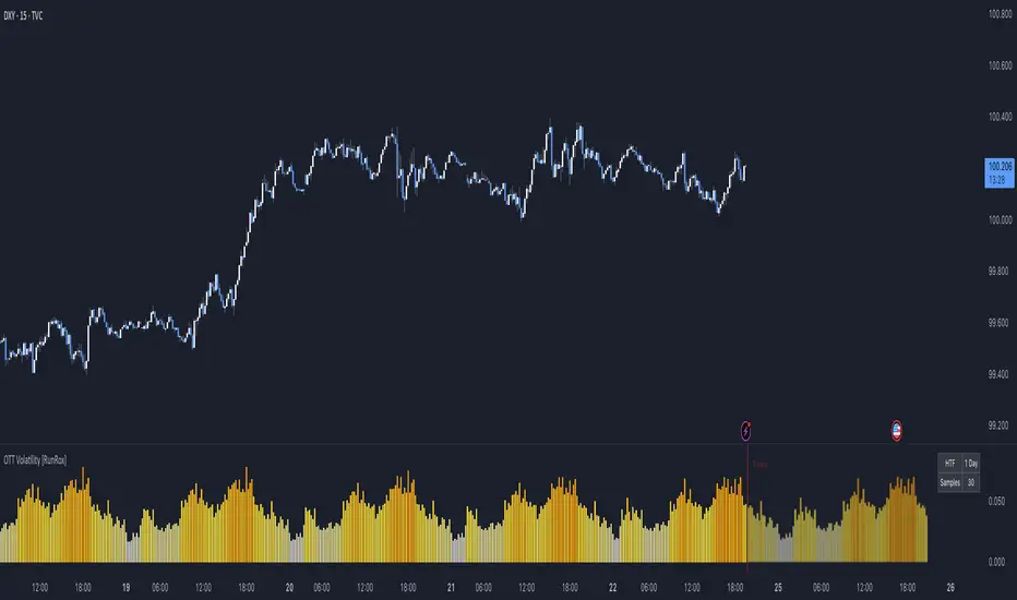
OTT Volatility [RunRox]📊 OTT Volatility is an indicator developed by the RunRox team to pinpoint the most optimal time to trade across different markets.
OTT stands for Optimal Trade Time Volatility and is designed primarily for markets without a fixed trading session, such as cryptocurrencies that trade 24/7. At the same time, it works equally well on any other market.
🔶 The concept is straightforward. The indicator takes a specified number of historical periods (Samples) and statistically evaluates which hours of the day or which days show the highest volatility for the selected asset.
As a result, it highlights time windows with elevated volatility where traders can focus on searching for trade setups and building positions.
🔶 As the core volatility metric, the indicator uses ATR (Average True Range) to measure intraday volatility. Then it calculates the average ATR value over the last N Samples, creating a statistically stable estimate of typical volatility for the selected asset.
🔶 Statistically, during these highlighted periods the market shows higher-than-average volatility.
This means that in these time windows price is more likely to be subject to stronger moves and potential manipulation, making them attractive for active trade execution and position management.
⚠️ However, historical behavior does not guarantee future results.
These periods should be treated only as zones where volatility has a higher probability of being above normal, not as a promise of movement.
As shown in the screenshot above, the indicator also projects potential future volatility based on historical data. This helps you better plan your trading hours and align your activity with periods where volatility is statistically expected to be higher or lower.
🔶 Current Volatility – as shown in the screenshot above, you can also monitor the real-time volatility of the market without any statistical averaging.
On top of that, you can overlay the current volatility on top of the statistical volatility levels, which makes it easy to see whether the market is now trading in a high- or low-volatility regime relative to its usual behavior.
4 display modes – you can choose any visualization style that fits your trading workflow:
Absolute – displays the raw volatility values.
Relative – shows volatility relative to its typical levels.
Average Centered – centers volatility around its average value.
Trim Low Value – filters out low-volatility noise and highlights only more significant moves.
This indicator helps you define the most effective trading hours on any market by relying on historical volatility statistics.
Use it to quickly see when your market tends to be more active and to structure your trading sessions around those periods.
✅ We hope this tool becomes a useful part of your trading toolkit and helps you improve the quality of your decisions and timing.
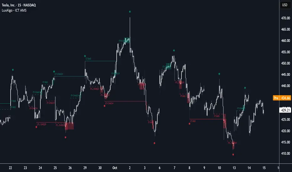
ICT Anchored Market Structures with Validation [LuxAlgo]The ICT Anchored Market Structures with Validation indicator is an advanced iteration of the original Pure-Price-Action-Structures tool, designed for price action traders.
It systematically tracks and validates key price action structures, distinguishing between true structural shifts/breaks and short-term sweeps to enhance trend and reversal analysis. The indicator automatically highlights structural points, confirms breakouts, identifies sweeps, and provides clear visual cues for short-term, intermediate-term, and long-term market structures.
A distinctive feature of this indicator is its exclusive reliance on price patterns. It does not depend on any user-defined input, ensuring that its analysis remains robust, objective, and uninfluenced by user bias, making it an effective tool for understanding market dynamics.
🔶 USAGE
Market structure is a cornerstone of price action analysis. This script automatically detects real-time market structures across short-term, intermediate-term, and long-term levels, simplifying trend analysis for traders. It assists in identifying both trend reversals and continuations with greater clarity.
Market structure shifts and breaks help traders identify changes in trend direction. A shift signals a potential reversal, often occurring when a swing high or low is breached, suggesting a transition in trend. A break, on the other hand, confirms the continuation of an established trend, reinforcing the current direction. Recognizing these shifts and breaks allows traders to anticipate price movement with greater accuracy.
It’s important to note that while a CHoCH may signal a potential trend reversal and a BoS suggests a continuation of the prevailing trend, neither guarantees a complete reversal or continuation. In some cases, CHoCH and BoS levels may act as liquidity zones or areas of consolidation rather than indicating a clear shift or continuation in market direction. The indicator’s validation component helps confirm whether the detected CHoCH and BoS are true breakouts or merely liquidity sweeps.
🔶 DETAILS
🔹 Market Structures
Market structures are derived from price action analysis, focusing on identifying key levels and patterns in the market. Swing point detection, a fundamental concept in ICT trading methodologies and teachings, plays a central role in this approach.
Swing points are automatically identified based exclusively on market movements, without requiring any user-defined input.
🔹 Utilizing Swing Points
Swing points are not identified in real-time as they form. Short-term swing points may appear with a delay of up to one bar, while the identification of intermediate and long-term swing points is entirely dependent on subsequent market movements. Importantly, this detection process is not influenced by any user-defined input, relying solely on pure price action. As a result, swing points are generally not intended for real-time trading scenarios.
Instead, traders often analyze historical swing points to understand market trends and identify potential entry and exit opportunities. By examining swing highs and lows, traders can:
Recognize Trends: Swing highs and lows provide insight into trend direction. Higher swing highs and higher swing lows signify an uptrend, while lower swing highs and lower swing lows indicate a downtrend.
Identify Support and Resistance Levels: Swing highs often act as resistance levels, referred to as Buyside Liquidity Levels in ICT terminology, while swing lows function as support levels, also known as Sellside Liquidity Levels. Traders can leverage these levels to plan their trade entries and exits.
Spot Reversal Patterns: Swing points can form key reversal patterns, such as double tops or bottoms, head and shoulders, and triangles. Recognizing these patterns can indicate potential trend reversals, enabling traders to adjust their strategies effectively.
Set Stop Loss and Take Profit Levels: In ICT teachings, swing levels represent price points with expected clusters of buy or sell orders. Traders can target these liquidity levels/pools for position accumulation or distribution, using swing points to define stop loss and take profit levels in their trades.
Overall, swing points provide valuable information about market dynamics and can assist traders in making more informed trading decisions.
🔹 Logic of Validation
The validation process in this script determines whether a detected market structure shift or break represents a confirmed breakout or a sweep.
The breakout is confirmed when the close price is significantly outside the deviation range of the last detected structural price. This deviation range is defined by the 17-period Average True Range (ATR), which creates a buffer around the detected market structure shift or break.
A sweep occurs when the price breaches the structural level within the deviation range but does not confirm a breakout. In this case, the label is updated to 'SWEEP.'
A visual box is created to represent the price range where the breakout or sweep occurs. If the validation process continues, the box is updated. This box visually highlights the price range involved in a sweep, helping traders identify liquidity events on the chart.
🔶 SETTINGS
The settings for Short-Term, Intermediate-Term, and Long-Term Structures are organized into groups, allowing users to customize swing points, market structures, and visual styles for each.
🔹 Structures
Swings and Size: Enables or disables the display of swing highs and lows, assigns icons to represent the structures, and adjusts the size of the icons.
Market Structures: Toggles the visibility of market structure lines.
Market Structure Validation: Enable or disable validation to distinguish true breakouts from liquidity sweeps.
Market Structure Labels: Displays or hides labels indicating the type of market structure.
Line Style and Width: Allows customization of the style and width of the lines representing market structures.
Swing and Line Colors: Provides options to adjust the colors of swing icons, market structure lines, and labels for better visualization.
🔶 RELATED SCRIPTS
Pure-Price-Action-Structures.
Market-Structures-(Intrabar).
Estimated Manipulation Movement Signal [AlgoPoint]Follow the Footprints of Whale Movements That Drive the Market
Overview
The market is not always driven by natural supply and demand. Large players—often called "whales" or institutions—can create artificial price movements to trigger stop-losses, induce panic or FOMO, and build their large positions at favorable prices. These events are known as "stop hunts" or "liquidity grabs."
The EMMS indicator is a specialized tool designed to detect these specific moments of potential market manipulation. It does not follow trends in a traditional sense; instead, it identifies high-probability reversal points created by the calculated actions of Smart Money trapping other market participants.
How It Works: The 3-Module Logic
The indicator uses a multi-stage confirmation process to identify a potential stop hunt:
1. Anomaly Detection: The engine first scans the chart for "Anomaly Candles." These are candles with unusually high volume and a very long wick relative to their body. This combination signals a sudden, forceful, and potentially unnatural price push.
2. Liquidity Zone Detection: The indicator automatically identifies and tracks recent significant swing highs and lows. These levels are considered "Liquidity Zones" because they are areas where a large number of stop-loss orders are likely clustered. These are the "hunting grounds" for whales.
3. The Stop Hunt Signal: A final signal is generated only when these two events align in a specific sequence:
An Anomaly Candle (high volume, long wick) spikes through a previously identified Liquidity Zone.
The same candle then reverses, closing back inside the previous price range.
This sequence confirms that the move was likely a "trap" designed to engineer liquidity, and a reversal in the opposite direction is now highly probable.
How to Interpret & Use This Indicator
BUY Signal: A BUY signal appears after a sharp price drop that pierces a recent swing low (taking out the stops of long positions) and then aggressively reverses to close higher. This suggests that Smart Money has absorbed the panic selling they just induced. The signal indicates a potential move UP.
SELL Signal: A SELL signal appears after a sharp price spike that pierces a recent swing high (taking out the stops of short positions) and then aggressively reverses to close lower. This suggests that Smart Money has sold into the FOMO buying they just created. The signal indicates a potential move DOWN.
This indicator is best used as a high-probability confirmation tool, ideally in conjunction with your understanding of the overall market trend and structure.

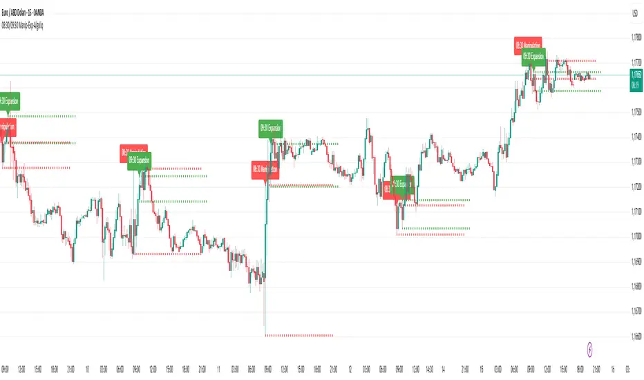
08:30 & 09:30 Manipulation-Expansion - AlgoliqDescription:
The 08:30 & 09:30 Manipulation-Expansion indicator identifies key market levels at two critical times during the trading session: 08:30 (Manipulation) and 09:30 (Expansion). It visually marks the high and low of these bars and provides real-time alerts when price breaks these levels.
Features:
08:30 Manipulation: Highlights high and low with dotted lines and a label. Alerts trigger when levels are broken.
09:30 Expansion: Highlights high and low with dotted lines and a label. Alerts trigger when levels are broken.
Customizable: Set hours, minutes, line colors, widths, and lengths to fit your trading style.
Alert System: Real-time notifications whenever price breaks key levels.
Usage:
Ideal for traders looking to monitor early session price action, detect potential manipulations, and plan breakout trades.
Manipulation Ribbon [FxScripts]Manipulation Ribbon
Designed to detect areas of price manipulation by Market Makers vs areas where it is trading in a natural, price-driven state. By identifying zones of control and imbalance, the ribbon provides a clear visualization of where price is being held or artificially displaced, offering key insights into potential future direction.
Indicator Function
Unlike traditional oscillators, the Manipulation Ribbon plots a continuous line or ribbon, with no defined y-axis. The ribbon dynamically adapts to market conditions, allowing the user to spot potential manipulation and price containment vs natural price movement.
Calculation Methodology
The Manipulation Ribbon is derived exclusively from price action. The underlying algorithm evaluates where price is, where it should be and where it’s being held.
The resulting ribbon reflects these dynamics in real time, providing a visual framework for interpreting price behavior at a granular level.
Operational Use: Divergences
The primary use of the Manipulation Ribbon is to locate divergences between price and the ribbon.
There are two distinct types of divergence to look for:
Price Containment: Where the ribbon moves but price doesn’t. This can help identify zones where price is being held, often preceding sharp movements once control is released.
Price Manipulation: Where price moves but the ribbon doesn’t. This can help identify liquidity sweeps, often preceding swift reversals once the liquidity has been taken.
Analytical Scenarios
High Liquidity Sweep: Price forms a higher high while the ribbon forms a lower high. Indicates a liquidity sweep may be occurring at the highs and a potential bearish reversal may be imminent.
Low Liquidity Sweep: Price forms a lower low while the ribbon forms a higher low. Indicates a liquidity sweep may be occurring at the lows and a potential bullish reversal may be imminent.
Top Edge Hold: Upwards movement of the ribbon without price followthrough. Indicates price may be being held at the highs, suggesting Market Makers are artificially holding price down in order to create a top edge and potential bearish reversal.
Bottom Edge Hold: Downwards movement of the ribbon without price followthrough. Indicates price may be being held at the lows, suggesting Market Makers are artificially holding price up in order to create a bottom edge and potential bearish reversal.
Settings
Guides: Option to have dynamic guides applied to your chart. Customizable style, color and width.
Guide Lookback: Due to the ribbon having a non-standard y-axis scale, it’s not possible to plot standard interval guides. Due to technical limitations this value is not calculable automatically either. The upper and lower bounds of the guides are therefore calculated using a user-inputted lookback function. In order to ensure the guides use the correct y-axis on the chart, simply input the average number of bars in your current viewport using the ruler, the guides will automatically update to match this.
Line 1 / Band 1: Option to turn on/off Line 1 and Band 1 alongside updating color and linewidth. Line 1 and Band 1 use the current chart symbol as their source.
Line 2 / Band 2: Option to add a second line and/or band to the chart. Use this to compare any correlated instrument e.g. BTCUSDT and ETHUSDT (as visualized in the chart above) or other pairs such as XAUUSD/XAUEUR or ES/NQ. Due to differences in y-axis scaling it's advised to add this as an additional indicator on a new pane (as per chart above).
Inverse Line 2 / Band 2: Option to show/hide the inverse of Line 2 and Band 2. This is useful for comparing inversely correlated symbols e.g. EURUSD and USDCHF.
Performance and Optimization
Backtesting Results: The Manipulation Ribbon has undergone extensive backtesting across various instruments, timeframes and market conditions, demonstrating strong performance in identifying where price is out of sync with its natural state. User backtesting is strongly encouraged as it allows traders to gain familiarity with the ribbon using their preferred instruments and timeframes.
Optimization for Diverse Markets: The Manipulation Ribbon can be used on crypto, forex, indices, commodities and stocks. The Manipulation Ribbon's algorithmic foundation ensures consistent performance across a variety of instruments. The lack of complex settings makes it easy for the trader to set up and go.
Educational Resources and Support
Users of the Manipulation Ribbon benefit from comprehensive educational resources and full access to FxScripts Support. This ensures traders can maximize the potential of the Manipulation Ribbon and other tools in the Sigma Indicator Suite by learning best practices and gaining insights from an experienced team of traders.

HTF Power of Three+ Limitless by Supreme
HTF Power of Three+ Limitless by Supreme
This indicator provides a high fidelity lens into the market's fundamental fractal rhythm.
For the professional trader who understands every candle is a story of accumulation manipulation and distribution this tool transcends the limitations of linear time analysis.
It offers an institutional grade panoramic dashboard of the Power of Three archetype operating seamlessly across any timeframe without constraint.
The core limitation of standard chart analysis is the boundary between timeframes.
This tool dissolves these walls presenting a fluid four dimensional view of market dynamics directly on your chart.
It transforms your perception by offering a continuous unbroken context of the higher timeframe narrative that governs all lower timeframe price action.
This is not merely another visualization tool.
It is a complete solution to the problem of temporal dissonance that plagues most traders.
The standard chart presents a flat fragmented reality.
You are forced to switch between timeframes losing your place and breaking your cognitive flow.
This constant friction degrades the quality of analysis and leads to missed opportunities or flawed execution.
The market is a fractal an infinitely repeating pattern across all scales of time.
Lower timeframe price movements are not random events.
They are the direct consequence of the objectives being pursued on higher timeframes.
To trade without this higher timeframe context is to navigate a storm without a compass guided only by the immediate chaotic waves.
This indicator provides that compass.
The Power of Three is the narrative structure embedded within every candle.
This concept posits that smart money engineers price through a deliberate three phase process.
First is the accumulation phase.
This is a period of relative equilibrium typically around the opening price where large institutions quietly build their positions.
It is the balance before the imbalance the coiling of a spring.
Second is the manipulation phase.
This is the critical judas swing or stop hunt designed to engineer liquidity.
Price is intentionally driven against the true intended direction to trip stop loss orders from breakout traders and induce uninformed participants to take the wrong side of the market.
Their selling becomes the liquidity for institutions to buy at better prices and vice versa.
Third is the distribution phase.
This is the true expansion move where price travels rapidly in the direction of institutional intent.
This is the clean efficient price leg that most trend following systems attempt to capture often after the most advantageous entry point has passed.
Understanding this three part structure is the key to aligning your trades with smart money flow.
This tool makes that entire process visible.
The current live higher timeframe candle is projected onto your chart as it forms.
This is not a static snapshot but a living representation of the ongoing campaign.
Every tick on your lower timeframe chart now has context.
You can see precisely if price is in the initial accumulation phase giving you time to prepare.
You can identify the manipulation phase as it happens allowing you to avoid being trapped or to position yourself for the reversal.
You can confirm the beginning of the distribution phase providing the confidence to engage with the true market move.
The indicator also displays the three previously completed higher timeframe candles.
This is not just historical data.
It is the immediate narrative context.
These three candles reveal the established order flow and the key price levels that matter.
The highs and lows of these candles are not arbitrary points.
They are institutional reference points magnets for liquidity and critical levels for targeting or invalidation.
A manipulation move will often seek the high or low of the previous candle before reversing.
The expansion move will often target the liquidity resting beyond a high or low from two candles prior.
This four candle panoramic view allows for sophisticated narrative construction.
You can build a high probability thesis for the trading session based on the interrelationship of these candles.
For example after a series of strong bullish higher timeframe closes a brief manipulative dip below the prior candle's open becomes a very high probability long entry.
Conversely a failure to expand above the previous candle's high after a strong run may signal exhaustion and an impending reversal.
The tool's architecture is built on a state of the art non redrawing framework.
All visual elements are created once and only their parameters are updated.
This eliminates redraw lag entirely ensuring a fluid instantaneous and seamless experience.
Your analytical environment will remain sharp responsive and completely unburdened even during extreme market volatility.
The engine is unbound by time.
Its logic is perfectly fractal.
A scalper on a one minute chart using a fifteen minute context gains the same clarity and follows the same principles as a swing trader on a daily chart using a weekly context.
The pattern is universal.
This tool makes its application universally accessible.
This is for the trader who is no longer satisfied with looking at the market through a keyhole.
It is for the analyst who demands a complete limitless and flawlessly performing view of the price delivery process.
-
By installing this indicator you move from a fragmented view of price to a holistic four dimensional understanding of the market.
You achieve temporal coherence seeing the cause on the higher timeframe and the effect on the lower timeframe as a single unified process.
You begin to operate without the constraints of conventional charting.

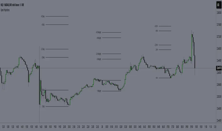
Time-Based Manipulation ProjectionsThis indicator automatically plots custom projection levels based on session and timeframe opening prices, utilizing the AMD/PO3 concept (Accumulation, Manipulation, Distribution / Power of Three). The theory suggests that price typically opens, creates an initial manipulation move to hunt liquidity, then reverses for distribution.
By measuring the distance from the open to the initial high/low manipulation, the indicator projects potential targets and reversal zones at customizable ratios, with the 2-2.5x and 4-4.5x extensions often serving as key areas.
Features:
Session-Based Projections: 4 custom session-based projections with full control over the opening time and the time when the projections stop updating with new manipulation highs/lows (Midnight, Daily, NY Open, etc)
Timeframe-Based Projections: 4 custom timeframe-based projections (H1, H4, Daily, Weekly, etc.)
Dynamic Anchoring: In line with AMD/PO3 logic, the indicator automatically locks to the correct manipulation leg (high or low) based on price position relative to the open
Custom Projections: Define your own projection levels
Custom Labels: Assign your own names to each projection, making it easy to identify and organize levels on the chart
Historical Levels: Option to display past projections
Styling Options: Choose line style, thickness, colors, label size, font, and positioning
Extend Lines: Option to extend projections forward to current price
Delayed Plotting: Set a delay (in minutes) after open before projections appear, useful to avoid false early swings
Note: These projections are most effective when the manipulation leg is clean and well-defined. If the manipulation is shallow, standard projections like 2–2.5x or 4–4.5x may not provide useful levels. In such cases, try experimenting with larger custom projections.
Benford's Law Actual [Tagstrading]Benford’s Law Chart — First Digit Analysis of Percentage Price Drops
This script visualizes the distribution of the leading digit in the percentage change of price drops, and compares it to the theoretical distribution expected by Benford’s Law.
It helps traders, analysts, and quants to detect anomalies, unnatural behavior, or price manipulation in any asset or timeframe.
How to Use
Add to any chart or symbol (stocks, crypto, FX, etc.) and select the timeframe you wish to analyze.
Set the “Number of Bars to Analyze” input (default: 500) to control the length of the historical window.
The chart will display, for the latest window:
A blue line: the actual leading-digit distribution for percentage price changes between bars.
A red line: the expected distribution per Benford’s Law.
Labels below and above: digit markers and the expected (theoretical) percentages.
Summary panel on the right: frequency counts and actual vs. theoretical % for each digit.
Interpretation:
If your actual (blue) curve or digit counts are significantly different from the red Benford’s Law curve, it could indicate unnatural price action, fraud, bot activity, or structural anomalies.
Why is this useful for TradingView?
Financial forensics: Benford’s Law is a classic tool for detecting data manipulation and fraud in accounting. On charts, it can reveal if price movements are statistically “natural.”
Transparency and confidence: Helps communities audit markets, brokers, or exchanges for irregularities.
Adaptable: Works on any market, any timeframe.
What makes this script unique?
Focuses on % price changes, not raw prices.
This provides a fair comparison across assets, symbols, and timeframes.
Measures only the direction and magnitude of drops/rises — more suitable for detecting manipulation in active markets.
Clear and customizable visualization:
The Benford line, actual data, and summary are all visible and readable in one glance.
Optimized for speed and clarity (runs efficiently on all major charts).
How is it different from stg44’s Benford’s Law script?
This script analyzes the leading digit of percentage price changes (i.e., how much the price drops or rises in %),
while the original by stg44 analyzes the leading digit of price itself.
Results are less sensitive to price scale and more comparable across volatile and non-volatile assets.
The summary panel clearly shows ( ) for actual and for Benford theoretical values.
Full code is commented and open for the community.
Credits and Inspiration
This script was inspired by “Benford’s Law” by stg44:
Thanks to the TradingView community for sharing powerful visual ideas.
—
By tags trading

Failed 2s - The StratDescription:
This indicator detects and highlights "Failed 2" candlestick patterns from The Strat methodology — key price action setups signaling potential reversals or continuation points. It automatically identifies Failed 2 Down (Failed 2D) and Failed 2 Up (Failed 2U) signals by analyzing two consecutive bars, with special attention to price interaction at the 50% midpoint of the previous candle.
Visuals:
- Green upward triangles mark Failed 2 Down signals (bullish setups).
- Red downward triangles mark Failed 2 Up signals (bearish setups).
- Special signals that touch the 50% midpoint of the previous candle are emphasized but use the same shapes.
Alerts:
Built-in alert conditions let you receive notifications when these patterns occur, so you never miss a trade opportunity.
How to Use ALERTS in TradingView
- Paste this code into Pine Editor on TradingView.
- Click Add to Chart.
Set alerts:
- Click "Alerts" → "Condition" = your indicator name
- Choose the alert type (e.g. "Failed 2D Bar Alert")
- Set "Once per bar close"
- Customize the notification method (pop-up, app, email, etc.)
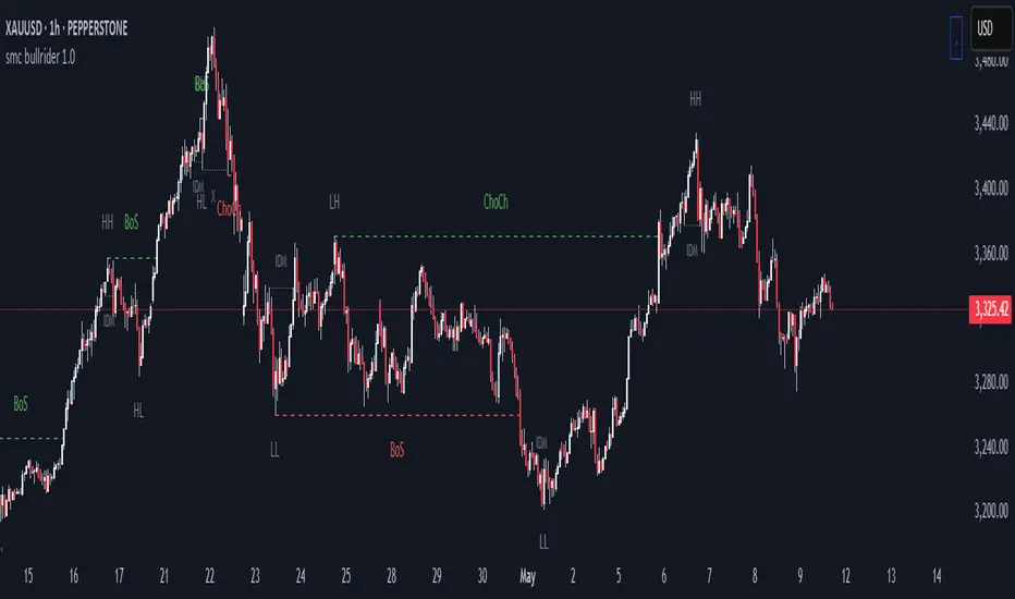
smc bullrider 1.0The smc bullrider 1.0 indicator is specifically crafted for mapping market structures. It excels in clearly recognizing type of Points Of Interest (SCOB) offering traders a straightforward and effective method to analyze market movements. It helps identify strategic entry points with precision.
🟠 Exploring Structure Mapping.
🔹This indicator presents a distinctive method for examining the market structure, emphasizing liquidity through the concept of 'Inducement'. Inducement plays a pivotal role in pinpointing essential structural indicators in the market, including Higher Highs (HH), Higher Lows (HL), Lower Lows (LL), and Lower Highs (LH).
🔹Consider Inducement as a strategically placed trap near supply or demand zones. It lures in eager buyers or sellers before the actual zone is reached, effectively creating liquidity. To validate an inducement, it must signify a legitimate pullback.
🔹A valid scenario arises when the price either sweeps or closes beyond the high or low of the preceding candle. In this context, the candle's color, whether bullish or bearish, holds no significance, and both situations are deemed valid. Inside bars are disregarded unless they meet this specific criterion. The indicator facilitates this process by automatically highlighting valid pullbacks with a distinctive gray round label.
🔹This feature serves not only as a visual guide but also as a vital tool for effortlessly comprehending market movements, offering a clear and visual representation of ongoing market trends
🟣 Understanding POI Functionality
🔹Single Candle Order Block (SCOB): Leveraging single-candle mitigation proves to be a powerful method for incorporating multiple entries into your successful trades.
🔵 How to Utilize the smc bullrider 1.0 Indicator:
🔹The smc bullrider 1.0 Indicator is crafted to elevate your trading strategy by pinpointing crucial order blocks and market signals. Below is a guide on how to make the most of the different components of the smc bullrider 1.0 Indicator:
🔹SCOB (Single Candle Order Block):
Application: SCOB is well-suited for scaling into a position. It is best utilized to increase positions when the market responds to OB or OB-EXT, signaling a potential reversal.
🟢Here's how to use it.
🔹Market Structure Drawing
This diagram depicts significant market indicators, such as instances of ascending prices (Higher Highs - HH) or descending prices (Lower Lows - LL). It serves as a valuable visual tool for comprehending the dynamics of market behavior
PICTURE (DIAGRAM)
Live Chart Example: Our indicator efficiently dissects market structure, showcasing the 'Inducement' concept with precision in real-time trends—highlighting HH, HL, LL, and LH
PICTURE (REAL CHART)
Valid Pullback ( IDM ):
Valid Pullback Example: This image illustrates a common situation where the price extends beyond the high or low of the preceding candle, signifying a valid pullback. Pay attention to the identifiable gray dotted line label marking the inducement point.
PICTURE (DRAW/REAL)
Single Candle Order Block (SCOB)
The provided chart showcases the SCOB in a real trading setting, highlighting its effectiveness in optimizing trades.
🟡 Summary
🔹smc bullrider 1.0 Indicator distinguishes itself in the realm of market analysis, with a distinct focus on structure mapping and high-probability Point of Interest (POI).
Furthermore, it provides a visual representation of three key areas for each market move: discount, premium, and the equilibrium area at 50%. Its innovative approach involves scrutinizing market structure using the 'Inducement' concept, a pivotal strategy for identifying vital structural markers and steering
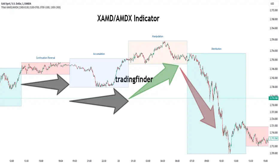
Edufx AMD~Accumulation, Manipulation, DistributionEdufx AMD Indicator
This indicator visualizes the market cycles using distinct phases: Accumulation, Manipulation, Distribution, and Reversal. It is designed to assist traders in identifying potential entry points and understanding price behavior during these phases.
Key Features:
1. Phases and Logic:
-Accumulation Phase: Highlights the price range where market accumulation occurs.
-Manipulation Phase:
- If the price sweeps below the accumulation low, it signals a potential "Buy Zone."
- If the price sweeps above the accumulation high, it signals a potential "Sell Zone."
-Distribution Phase: Highlights where price is expected to expand and establish trends.
-Reversal Phase: Marks areas where the price may either continue or reverse.
2. Weekly and Daily Cycles:
- Toggle the visibility of Weekly Cycles and Daily Cycles independently through the settings.
- These cycles are predefined with precise timings for each phase, based on your selected on UTC-5 timezone.
3. Customizable Appearance:
- Adjust the colors for each phase directly in the settings to suit your preferences.
- The indicator uses semi-transparent boxes to represent the phases, allowing easy visualization without obstructing the chart.
4. Static Boxes:
- Boxes representing the phases are drawn only once for the visible chart range and do not dynamically delete, ensuring important consistent reference points.

XAMD/AMDX ICT 01 [TradingFinder] SMC Quarterly Theory Cycles🔵 Introduction
The XAMD/AMDX strategy, combined with the Quarterly Theory, forms the foundation of a powerful market structure analysis. This indicator builds upon the principles of the Power of 3 strategy introduced by ICT, enhancing its application by incorporating an additional phase.
By extending the logic of Power of 3, the XAMD/AMDX tool provides a more detailed and comprehensive view of daily market behavior, offering traders greater precision in identifying key movements and opportunities
This approach divides the trading day into four distinct phases : Accumulation (19:00 - 01:00 EST), Manipulation (01:00 - 07:00 EST), Distribution (07:00 - 13:00 EST), and Continuation or Reversal (13:00 - 19:00 EST), collectively known as AMDX.
Each phase reflects a specific market behavior, providing a structured lens to interpret price action. Building on the fractal nature of time in financial markets, the Quarterly Theory introduces the Four Quarters Method, where a currency pair’s price range is divided into quarters.
These divisions, known as quarter points, highlight critical levels for analyzing and predicting market dynamics. Together, these principles allow traders to align their strategies with institutional trading patterns, offering deeper insights into market trends
🔵 How to Use
The AMDX framework provides a structured approach to understanding market behavior throughout the trading day. Each phase has its own characteristics and trading opportunities, allowing traders to align their strategies effectively. To get the most out of this tool, understanding the dynamics of each phase is essential.
🟣 Accumulation
During the Accumulation phase (19:00 - 01:00 EST), the market is typically quiet, with price movements confined to a narrow range. This phase is where institutional players accumulate their positions, setting the stage for future price movements.
Traders should use this time to study price patterns and prepare for the next phases. It’s a great opportunity to mark key support and resistance zones and set alerts for potential breakouts, as the low volatility makes immediate trading less attractive.
🟣 Manipulation
The Manipulation phase (01:00 - 07:00 EST) is often marked by sharp and deceptive price movements. Institutions create false breakouts to trigger stop-losses and trap retail traders into the wrong direction. Traders should remain cautious during this phase, focusing on identifying the areas of liquidity where these traps occur.
Watching for price reversals after these false moves can provide excellent entry opportunities, but patience and confirmation are crucial to avoid getting caught in the manipulation.
🟣 Distribution
The Distribution phase (07:00 - 13:00 EST) is where the day’s dominant trend typically emerges. Institutions execute large trades, resulting in significant price movements. This phase is ideal for trading with the trend, as the market provides clearer directional signals.
Traders should focus on identifying breakouts or strong momentum in the direction of the trend established during this period. This phase is also where traders can capitalize on setups identified earlier, aligning their entries with the market’s broader sentiment.
🟣 Continuation or Reversal
Finally, the Continuation or Reversal phase (13:00 - 19:00 EST) offers a critical juncture to assess the market’s direction. This phase can either reinforce the established trend or signal a reversal as institutions adjust their positions.
Traders should observe price behavior closely during this time, looking for patterns that confirm whether the trend is likely to continue or reverse. This phase is particularly useful for adjusting open positions or initiating new trades based on emerging signals.
🔵 Settings
Show or Hide Phases.
Adjust the session times for each phase :
Accumulation: 19:00-01:00 EST
Manipulation: 01:00-07:00 EST
Distribution: 07:00-13:00 EST
Continuation or Reversal: 13:00-19:00 EST
Modify Visualization : Customize how the indicator looks by changing settings like colors and transparency.
🔵 Conclusion
AMDX provides traders with a practical method to analyze daily market behavior by dividing the trading day into four key phases: Accumulation, Manipulation, Distribution, and Continuation or Reversal. Each phase highlights specific market dynamics, offering insights into how institutional activity shapes price movements.
From the quiet buildup in the Accumulation phase to the decisive trends of the Distribution phase, and the critical transitions in Continuation or Reversal, this approach equips traders with the tools to anticipate movements and make informed decisions.
By recognizing the significance of each phase, traders can avoid common traps during Manipulation, capitalize on clear trends during Distribution, and adapt to changes in the final phase of the day.
The structured visualization of market phases simplifies decision-making for traders of all levels. By incorporating these principles into your trading strategy, you can enhance your ability to align with market trends, optimize entry and exit points, and achieve more consistent results in your trading journey.
Power Of 3 ICT 01 [TradingFinder] AMD ICT & SMC Accumulations🔵 Introduction
The ICT Power of 3 (PO3) strategy, developed by Michael J. Huddleston, known as the Inner Circle Trader, is a structured approach to analyzing daily market activity. This strategy divides the trading day into three distinct phases: Accumulation, Manipulation, and Distribution.
Each phase represents a unique market behavior influenced by institutional traders, offering a clear framework for retail traders to align their strategies with market movements.
Accumulation (19:00 - 01:00 EST) takes place during low-volatility hours, as institutional traders accumulate orders. Manipulation (01:00 - 07:00 EST) involves false breakouts and liquidity traps designed to mislead retail traders. Finally, Distribution (07:00 - 13:00 EST) represents the active phase where significant market movements occur as institutions distribute their positions in line with the broader trend.
This indicator is built upon the Power of 3 principles to provide traders with a practical and visual tool for identifying these key phases. By using clear color coding and precise time zones, the indicator highlights critical price levels, such as highs and lows, helping traders to better understand market dynamics and make more informed trading decisions.
Incorporating the ICT AMD setup into daily analysis enables traders to anticipate market behavior, spot high-probability trade setups, and gain deeper insights into institutional trading strategies. With its focus on time-based price action, this indicator simplifies complex market structures, offering an effective tool for traders of all levels.
🔵 How to Use
The ICT Power of 3 (PO3) indicator is designed to help traders analyze daily market movements by visually identifying the three key phases: Accumulation, Manipulation, and Distribution.
Here's how traders can effectively use the indicator :
🟣 Accumulation Phase (19:00 - 01:00 EST)
Purpose : Identify the range-bound activity where institutional players accumulate orders.
Trading Insight : Avoid placing trades during this phase, as price movements are typically limited. Instead, use this time to prepare for the potential direction of the market in the next phases.
🟣 Manipulation Phase (01:00 - 07:00 EST)
Purpose : Spot false breakouts and liquidity traps that mislead retail traders.
Trading Insight : Observe the market for price spikes beyond key support or resistance levels. These moves often reverse quickly, offering high-probability entry points in the opposite direction of the initial breakout.
🟣 Distribution Phase (07:00 - 13:00 EST)
Purpose : Detect the main price movement of the day, driven by institutional distribution.
Trading Insight : Enter trades in the direction of the trend established during this phase. Look for confirmations such as breakouts or strong directional moves that align with broader market sentiment
🔵 Settings
Show or Hide Phases :mDecide whether to display Accumulation, Manipulation, or Distribution.
Adjust the session times for each phase :
Accumulation: 1900-0100 EST
Manipulation: 0100-0700 EST
Distribution: 0700-1300 EST
Modify Visualization : Customize how the indicator looks by changing settings like colors and transparency.
🔵 Conclusion
The ICT Power of 3 (PO3) indicator is a powerful tool for traders seeking to understand and leverage market structure based on time and price dynamics. By visually highlighting the three key phases—Accumulation, Manipulation, and Distribution—this indicator simplifies the complex movements of institutional trading strategies.
With its customizable settings and clear representation of market behavior, the indicator is suitable for traders at all levels, helping them anticipate market trends and make more informed decisions.
Whether you're identifying entry points in the Accumulation phase, navigating false moves during Manipulation, or capitalizing on trends in the Distribution phase, this tool provides valuable insights to enhance your trading performance.
By integrating this indicator into your analysis, you can better align your strategies with institutional movements and improve your overall trading outcomes.
Advanced Pivot Manipulation SuperTrend - Consolidation ZoneHere’s the description translated into English for your TradingView publication:
---
Advanced Pivot Manipulation SuperTrend - Consolidation Zone
Description :
This advanced indicator combines multiple technical tools to provide a comprehensive analysis of trends, key levels, and consolidation zones. Ideal for traders seeking to spot opportunities while avoiding the traps of flat markets, it helps you better understand market dynamics and improve your trading decisions.
Key Features:
1.
Dynamic SuperTrend with Pivot Points:
- An enhanced SuperTrend algorithm based on pivot points for more precise trend tracking.
- Thresholds (Up/Dn) are dynamically adjusted using ATR (Average True Range) for improved volatility adaptation.
2. Consolidation Zones:
- Automatically identifies periods when the market moves within a narrow range (1% by default).
- Consolidation zones are visually highlighted to help avoid risky trades.
3. Dynamic Support and Resistance:
- Automatically calculates support and resistance levels based on a rolling period (configurable).
- These levels serve as key references for potential breakouts or trend reversals.
4. Advanced Detection Tools:
- Includes a volume multiplier and shadow-to-body ratio to signal unusual or potentially manipulated moves (e.g., spoofing).
5. Intuitive Visuals:
- SuperTrend lines are color-coded to indicate bullish (green) or bearish (red) trends.
- Semi-transparent lines mark support and resistance levels, and red backgrounds indicate consolidation zones.
Customizable Parameters:
- Pivot Point Period: Adjust the period for detecting pivot highs and lows.
- ATR Factor and Period: Control the sensitivity of the SuperTrend indicator.
- Lookback Period for S/R: Define the duration for calculating support and resistance levels.
- Volume Multiplier and Shadow/Body Ratio: Configure thresholds for detecting high volumes or anomalies in candlestick patterns.
How to Use:
- Easily identify dominant trends using the SuperTrend.
- Spot consolidation zones to avoid inefficient trades or prepare breakout strategies.
- Use support and resistance levels as reference points for placing orders or adjusting risk management.
Target Audience:
- Intraday and swing traders.
- Anyone looking for a comprehensive and customizable indicator to effectively analyze volatile markets.
---
Notes:
The indicator is fully customizable to suit your needs and strategies. Feel free to experiment with the parameters to maximize its effectiveness according to your trading style.
Keywords: SuperTrend, Support and Resistance, Consolidation, Pivot Points, Trends, ATR, Advanced Trading.
---
This description highlights the indicator’s strengths and is designed to appeal to the TradingView community.

CRT Trades (turtle soup, A-M-D ranges with inside bars)CRT means Candle Range Theory. Every single candle is a range, on every single timeframe. Ranges may be either manipulated - turtle souped or broken - engulfed - closed above/below and retested.
CRT is usually presented as a 3 candle model. However it may consist of more than 3 candles due to inside bars. Inside bar is the candle where high is not higher then previous candle high and low is not lower then previous candle low.
First candle represents accumulation (may consist of more candles - inside bars), second candle represents manipulation (turtle soup) and third candle represents distribution. The abbreviation for that is A-M-D.
In accumulation the range with specific high and low is created. In manipulation (turtle soup) the high or low of the range is manipulated - liquidity taken and price should usually reverse back to the range. In distribution price is reversing back to the opposite side of the range. On higher timeframe it looks like manipulation candle wick is higher/lower than previous range high/low (may consist of 1 or more inside bar candles) but the body must not close above/below previous range high/low. Otherwise it is not manipulation (turtle soup) most likely and price should continue in direction of the candle close. Distribution candle should touch opposite side of range and it is mostly heavy and fast candle.
CRT model can be found on higher timeframe (e.g. 4h) and entries can be found on lower timeframe (e.g. 15m). You always use only lower timeframe on your chart because CRT model on the higher timeframe is shown on the lower one and also you can plan entries on the lower timeframe. You are able to change CRT model higher timeframe in the indicator settings.
There are two types of entries:
simple - wait for manipulation candle to close on higher timeframe (HTF) and then enter on lower timeframe (LTF) above open of the distribution candle on HTF if it is short or on LTF below open of the distribution candle on HTF if it is long. These entries can be done by market order.
advanced - wait for the break of previous range high/low and enter by limit order when price reverses back to the range and retraces to the order block or fair value gap created by the breaker candle.
Stop loss can be placed above/below of the top/bottom created by manipulation candle. First take profit should be placed in 1/2 of the accumulation range and second take profit should be placed at the opposite range of accumulation range.
It is possible to filter only particular accumulation (range) and manipulation (turtle soup) candles depending also on timezone set in the settings. For example on 4h CRT model if you fill input "indices" for section "range" like 1,2 and input "indices" for section "turtle soup" like 3,4 then you are awaiting the range to form during asia session and manipulation during london session if the timezone is somewhere around "UTC+2".
Dotted lines represent turtle soup of previous range and solid lines represent engulfing candle of the breaker candle on lower timeframe. When the engulfing is closed you can look for entries either by market order after closing or by limit order when the price retraces to order block (created by breaker candle) or fair value gap (created by engulfing).
Recommendations for combining lower (entries) and higher (crt model) timeframes:
1D CRT model => 1h entries,
4h CRT model => 15m entries,
1h CRT model => 5m entries,
15m CRT model => 1m entries.
CRT IndicatorCandle Range Trading (CRT) Indicator
The CRT Indicator identifies potential trading opportunities by analyzing specific candlestick patterns. This script is designed to detect both bullish and bearish CRT patterns and provides visual cues directly on your chart.
Features:
Pattern Detection:
Analyzes two consecutive candles to identify the CRT pattern.
Detects both bullish and bearish setups based on the relative positions of the candles.
How It Works:
Bearish CRT Pattern:
The script identifies a bearish CRT when:
The first candle is bullish (closing price is higher than the opening price).
The second candle is bearish (closing price is lower than the opening price).
The second candle’s high exceeds the high of the first candle.
The closing price of the second candle falls within the range of the first candle.
Bullish CRT Pattern:
The script identifies a bullish CRT when:
The first candle is bearish (closing price is lower than the opening price).
The second candle is bullish (closing price is higher than the opening price).
The second candle’s low is below the low of the first candle.
The closing price of the second candle falls within the range of the first candle.
Visual Signals:
A red triangle is plotted above the candles for a bearish CRT pattern.
A green triangle is plotted below the candles for a bullish CRT pattern.
How to Use:
Monitor the chart for the appearance of red and green triangles.
Green triangles suggest potential bullish movements.
Red triangles suggest potential bearish movements.
Use these signals as part of a comprehensive trading strategy and combine with other technical indicators for best results.
Settings:
This indicator operates with default settings for detecting CRT patterns and does not include customizable parameters.
Limitations:
The CRT Indicator is based on two consecutive candles and does not account for broader market trends or other indicators.
Be aware that false signals may occur in volatile or choppy market conditions.
The indicator does not provide entry points, profit targets, or stop loss levels, which should be managed based on individual risk tolerance and strategy.
Note: The CRT Indicator is for informational purposes only and should be used in conjunction with other forms of analysis and proper risk management. Always test any strategy thoroughly before applying it to live trading.

ICT Power Of Three | Flux Charts💎 GENERAL OVERVIEW
Introducing our new ICT Power Of Three Indicator! This indicator is built around the ICT's "Power Of Three" strategy. This strategy makes use of these 3 key smart money concepts : Accumulation, Manipulation and Distribution. Each step is explained in detail within this write-up. For more information about the process, check the "HOW DOES IT WORK" section.
Features of the new ICT Power Of Three Indicator :
Implementation of ICT's Power Of Three Strategy
Different Algorithm Modes
Customizable Execution Settings
Customizable Backtesting Dashboard
Alerts for Buy, Sell, TP & SL Signals
📌 HOW DOES IT WORK ?
The "Power Of Three" comes from these three keywords "Accumulation, Manipulation and Distribution". Here is a brief explanation of each keyword :
Accumulation -> Accumulation phase is when the smart money accumulate their positions in a fixed range. This phase indicates price stability, generally meaning that the price constantly switches between up & down trend between a low and a high pivot point. When the indicator detects an accumulation zone, the Power Of Three strategy begins.
Manipulation -> When the smart money needs to increase their position sizes, they need retail traders' positions for liquidity. So, they manipulate the market into the opposite direction of their intended direction. This will result in retail traders opening positions the way that the smart money intended them to do, creating liquidity. After this step, the real move that the smart money intended begins.
Distribution -> This is when the real intention of the smart money comes into action. With the new liquidity thanks to the manipulation phase, the smart money add their positions towards the opposite direction of the retail mindset. The purpose of this indicator is to detect the accumulation and manipulation phases, and help the trader move towards the same direction as the smart money for their trades.
Detection Methods Of The Indicator :
Accumulation -> The indicator detects accumulation zones as explained step-by-step :
1. Draw two lines from the lowest point and the highest point of the latest X bars.
2. If the (high line - low line) is lower than Average True Range (ATR) * accumulationConstant
3. After the condition is validated, an accumulation zone is detected. The accumulation zone will be invalidated and manipulation phase will begin when the range is broken.
Manipulation -> If the accumulation range is broken, check if the current bar closes / wicks above the (high line + ATR * manipulationConstant) or below the (low line - ATR * manipulationConstant). If the condition is met, the indicator detects a manipulation zone.
Distribution -> The purpose of this indicator is to try to foresee the distribution zone, so instead of a detection, after the manipulation zone is detected the indicator automatically create a "shadow" distribution zone towards the opposite direction of the freshly detected manipulation zone. This shadow distribution zone comes with a take-profit and stop-loss layout, customizable by the trader in the settings.
The X bars, accumulationConstant and manipulationConstant are subject to change with the "Algorithm Mode" setting. Read the "Settings" section for more information.
This indicator follows these steps and inform you step by step by plotting them in your chart.
🚩UNIQUENESS
This indicator is an all-in-one suite for the ICT's Power Of Three concept. It's capable of plotting the strategy, giving signals, a backtesting dashboard and alerts feature. Different and customizable algorithm modes will help the trader fine-tune the indicator for the asset they are currently trading. The backtesting dashboard allows you to see how your settings perform in the current ticker. You can also set up alerts to get informed when the strategy is executable for different tickers.
⚙️SETTINGS
1. General Configuration
Algorithm Mode -> The indicator offers 3 different detection algorithm modes according to your needs. Here is the explanation of each mode.
a) Small Manipulation
This mode has the default bar length for the accumulation detection, but a lower manipulation constant, meaning that slighter imbalances in the price action can be detected as manipulation. This setting can be useful on tickers that have lower liquidity, thus can be manipulated easier.
b) Big Manipulation
This mode has the default bar length for the accumulation detection, but a higher manipulation constant, meaning that heavier imbalances on the price action are required in order to detect manipulation zones. This setting can be useful on tickers that have higher liquidity, thus can be manipulated harder.
c) Short Accumulation
This mode has a ~70% lower bar length requirement for accumulation zone detection, and the default manipulation constant. This setting can be useful on tickers that are highly volatile and do not enter accumulation phases too often.
Breakout Method -> If "Close" is selected, bar close price will be taken into calculation when Accumulation & Manipulation zone invalidation. If "Wick" is selected, a wick will be enough to validate the corresponding zone.
2. TP / SL
TP / SL Method -> If "Fixed" is selected, you can adjust the TP / SL ratios from the settings below. If "Dynamic" is selected, the TP / SL zones will be auto-determined by the algorithm.
Risk -> The risk you're willing to take if "Dynamic" TP / SL Method is selected. Higher risk usually means a better winrate at the cost of losing more if the strategy fails. This setting is has a crucial effect on the performance of the indicator, as different tickers may have different volatility so the indicator may have increased performance when this setting is correctly adjusted.
3. Visuals
Show Zones -> Enables / Disables rendering of Accumulation (yellow) and Manipulation (red) zones.

Edufx's Power of ThreeIndicator Overview
Name: Edufx's Power of Three
Purpose:
To highlight the high and low price ranges of specific hourly candles on a chart.
To visualize these ranges using rectangles.
Features
Visibility Toggle:
Users can enable or disable the visibility of the rectangles highlighting the high and low price ranges of the specified candles.
Customizable Rectangle Length:
Users can adjust the length of the rectangles that extend from the specified candle's high and low prices.
Price Range Tracking:
The high and low prices of the specified candles are tracked and stored.
Rectangle Drawing:
Rectangles are drawn from 5 bars before the end of the specified hour, highlighting the high and low price ranges.
How It Works
Price Range Tracking:
During each specified hour, the high and low prices are updated with the highest and lowest prices observed.
Rectangle Drawing:
At the end of each specified hour, the high and low prices are used to draw rectangles extending 5 bars backward from the end of the hour.
Rectangles are color-coded (red, green, and blue) for easy identification.
Usage
This indicator is useful for traders who want to monitor and react to key price levels at specific times of the day.
The visual rectangles help in identifying potential trading opportunities based on price action relative to these key levels.
Example
If the price moves above the high of the specified candle but fails to close above it, a visual rectangle will highlight this price range.
Similarly, if the price moves below the low of the specified candle but fails to close below it, the rectangle will indicate this range.
This indicator provides visual aids to assist traders in making informed decisions based on the behavior of price at specific key levels.

[TTM] HTF Candle Overlay (Power of 3)🌟 Overview 🌟
Introducing the all-new Higher Timeframe Candle Overlay indicator, crafted from the foundational principles of AMD (Accumulation, Manipulation, and Distribution) and PO3 (Power of 3). Elevate your trading strategy with this innovative tool, designed to provide deeper insights into market dynamics.
Explore ICT's resources for detailed insights on leveraging this in your trading strategy.
🌟 Features 🌟
Display up to 20 historical candles from any timeframe higher than the current chart's timeframe.
Auto Timeframe feature dynamically sets the higher timeframe based on the current chart's timeframe. For instance, on a 15-minute chart, you can display 1-hour candles, and on a 1-hour chart, you can display 4-hour candles, eliminating the need to update the timeframe settings manually.
Load multiple instances of the indicator with different timeframes (e.g., 4H and Daily, as shown in the preview image).
Option to Show/Hide Candle open line.
Option to Show/Hide Candle Timeframe.
Option to Show/Hide each candle's time/day.
🌟 Coming Soon 🌟
Fair value gaps highlighted on HTF overlay candles.
Happy Trading!
TheTickMagnet
Crypto Manipulation [ProjeAdam]OVERVIEW
Indicator that detects manipulation candles on the Binance exchange according to open interest, volume, candlestick analyzes and percent changes.
IMPORTANT NOTE: This indicator works in Crypto Binance Exchange and only in Future Parities.
Example ->> BTCUSDT.P -- ETHUSDT.P -- ADAUSDT.P
> Topics in the writing of the crypto manipulation indicator <
Market makers manipulate the crypto market because most people who trade on the stock exchange act with their emotions and are forced to close the transaction at a loss. In these manipulations, many people are liquidated and the money they earn is used as fuel in the market.
We can reduce the psychological impact that the market is trying to have on us with this indicator.
IF we detect manipulation candles in the market, we can control our fragile psychology and close our transactions in profit by trading with market-making formations in these areas.
ALGORITHM
In this indicator, I use 4 different datasets to detect manipulation candles in crypto market.
1- Extremely variable volume data in Spot and Future markets
2- Wicks formed by candles
3-Percentage change of price movement
4-Distance from the average value of people who open and close transactions in Future parity
When there is excessive volatility in price movement, the algorithm in this indicator notices this price volatility and calculates a manipulation value by dividing it by the volatility value in past price movements.
In my Python backtests, I noticed that when manipulation is done in the crypto market, there is extreme volatility in certain values. This is because there are more robots in the crypto exchange than in the Bist exchange and the total transaction volume is less than in other exchanges. We observe these data that change in a short time, the amount of volume created by people being liquidated, and the open positions that are forcibly closed due to this situation, only in Cryptocurrency exchanges.
How does the indicator work?
The manipulation candle does not give us information about the direction of price movement, it is only used as an auxiliary indicator. With the help of this indicator, we can prevent large losses by better determining our risk situation during and after manipulation.
We show our manipulation values as columns. We draw a channel over the values we show and we understand that there is manipulation in the candle of our values above this channel.
The indicator shows the manipulation value in the form of columns. Our manipulation value that goes outside the channel we have determined is colored red, within the channel it is colored yellow, and below the channel it is colored green. Red columns indicate candles that are manipulations.
As we observed in the example above, we observe excessive volume increase, momentum in open interest and wick candles during manipulation times. As these values increase, our manipulation value also increases.
What are the BIST and Crypto Exchanges and What are the differences between them?
The differences between the general structure of BIST Exchange and the general structure of the cryptocurrency exchange are as follows;
1- While trading takes place under goverment control in BIST Exchange, there are no regulations in the Cryptocurrency market yet.
2- Since BIST Exchange is a much larger market than the cryptocurrency exchange, manipulations can be made by very large money owners and large companies, but there is a monopolized situation in crypto.
3- We see instantaneous large changes in volume in the cryptocurrency market during manipulation times. While this situation is not seen effectively in the BIST exchange, volume changes have a great impact on the crypto exchange.
4- Since there are many open source codes in the cryptocurrency exchange and much easier and faster trading is allowed thanks to the robots produced by software, manipulations in the cryptocurrency exchange occur very quickly and in a short time.
5- We can know who opened and closed transactions in which candle in the cryptocurrency market, but we cannot access this data in Borsa Istanbul.
The majority of Borsa Istanbul users do not trade in crypto, and many users who trade in crypto do not know Borsa Istanbul because only TURKISH citizens can open transactions here.
Using two completely different algorithms and publishing two different indicators will be convenient for many users at this stage. The indicators to be used for these two exchanges, which have many different features that I have explained above, should also be different.
So What are the differences between the two algorithms?
1-Crypto manipulation indicator uses liquidation data, we cannot access this data on the Bist exchange.
2-While manipulations in the crypto exchange occur in very short periods of time, BIST generally moves slower than crypto.
3-By using the crypto manipulation indicator open interest data, we can access in detail on which candle the transaction was opened and closed, but we cannot access it on the Bist exchange.
In our example above, when manipulation candles are formed, you see the volumetric change and the change in open interest. The excessive increase in volume and the momentum of open interest data affects our crypto manipulation value.
The greater the volume increase, the greater the manipulation.
Regardless of the open interest direction, the greater the momentum change in value, the more manipulation has been done.
Our BIST manipulation indicator only focuses on the change of candles in the market structure. In other words, it cares about percentage changes and the change within the average. I tried to show in the example above that volume data is not a consistent variable in the BIST stock market when calculating manipulation.
The user types of the two different indicators vary greatly, and both indicators benefit the community by making calculations according to the metrics of their own exchanges. For the reasons I explained above, I thought it would be better to write two indicators for tradingview users that work with different algorithms on two different exchanges.
Example
In our example above, we see a manipulation candle clearing the stops formed, the market maker clearing the orders at the people's stop levels at the bottom to move the price up.
We can quickly control manipulation candles in 5 different parities at the same time by entering our parities in the settings panel.
In our example above, we observe a beautiful manipulation candle. As you can see, if there is an extreme increase in volume, a momentum movement in the open line and a candle with a wick, we should look for manipulation here.
SETTINGS PANEL
We have only two setting in this indicator.
Our multiplier value determines the width of the band value formed above our manipulation value. In the chart above, our multiplier value is 3.2. If we reduce our multiplier value, our manipulation sensitivity will decrease as there will be much more candles on the band.
If you have any ideas what to add to my work to add more sources or make calculations cooler, suggest in DM .

Bist Manipulation [Projeadam]
OVERVIEW | GENEL BAKIŞ
ENG: Indicator that detects manipulation candles according to changing market conditions.
TR: Değişen piyasa koşullarına göre manipülasyon mumlarını tespit eden gösterge.
ENG: IMPORTANT NOTE: This indicator works in BIST Market and only in Future Parities.
Example ->> PETKM1! --SASA1!
TR: ÖNEMLİ NOT: Bu indikatör BİST Piyasasında ve sadece Future Paritelerde Çalışır.
Örnek- >> PETKM1! -- SASA1!
ENG: Market makers manipulate the market because most people who trade on the stock exchange act with their emotions and are forced to close the transaction at a loss.
TR: Piyasada market yapıcı oluşumlar manipülasyon yaparlar çünkü borsada işlem alan insanların birçoğu duygularıyla hareket eder ve zararla işlem kapatılmaya zorlanır.
ENG: If we detect manipulation candles in the market, we can control our fragile psychology and close our transactions in profit by trading with market-making formations in these areas.
TR: Marketde manipülasyon mumlarını tespit edersek kırılgan psikolojimizi kontrol edebilir ve bu alanlardan market yapıcı oluşumlarla beraber işlem alarak işlemlerimizi karda kapatabiliriz.
ALGORITHM | ALGORİTMA
ENG: With the help of this indicator, you can detect manipulation candles in the BIST exchange with the help of the algorithm I created by using volumetric data and wicks created by the price.
When there is excessive volatility in price movement, the algorithm in this indicator notices this price volatility and calculates a manipulation value by dividing it by the volatility value in past price movements.
TR: Bu indikatör yardımıyla hacimsel veriler ve fiyatın oluşturduğu fitillerden yararlanarak oluşturduğum algoritma yardımıyla siz de BİST borsasında manipülasyon mumlarını tespit edebilirsiniz.
Fiyat hareketinde aşırı derece oynaklık olduğunda bu indikatördeki algoritma bu fiyat oynaklığını fark eder ve geçmiş fiyat hareketlerindeki oylanklık degerine bölerek bize bir manipülasyon degeri hesaplar.
How does the indicator work? | Gösterge nasıl çalışır?
ENG: The manipulation candle does not give us information about the direction of price movement, it is only used as an auxiliary indicator.
TR: Manipülasyon mumu bize fiyat hareketinin yönü hakkında bilgi vermez sadece yardımcı bir gösterge olarak kullanılır.
ENG: We show our manipulation values as columns. We draw a channel over the values we show and we understand that there is manipulation in the candle of our values above this channel.
TR: Manipülasyon degerlerimiz kolonlar şeklinde gösteriyoruz. Gösterdiğimiz değerlerimizin üzerine bir kanal çizdiriyoruz ve bu kanalın üzerinde kalan değerlerimizdeki mumda manipülasyon yapıldığını anlıyoruz.
ENG: The indicator shows the manipulation value in the form of columns. Our manipulation value that goes outside the channel we have determined is colored red, within the channel it is colored yellow, and below the channel it is colored green. Red columns indicate candles that are manipulations.
TR: İndikatör manipülasyon degerini kolonlar şeklinde gösteriyor. Bizim belirlediğimiz kanal dışına çıkan manipülasyon degerimiz kırmızı, kanal içerisinde sarı, kanal altında yeşil olarak renklendiriliyor. Kırmızı kolonlar manipülasyon olan mumları göstermektedir.
Example | Örnek
ENG: In our example above, we see a manipulation candle that clears the price gaps, while the market maker clears the orders in the price gaps at the bottom to move the price up.
TR: Yukarıdaki örneğimizde oluşan fiyat boşluklarını temizleyen bir manipülasyon mumu görmekteyiz, alt kısımdaki fiyat boşluklarındaki emirleri temizleyen market maker fiyatı yukarı taşımak için buradaki emirleri temizliyor.
SETTINGS PANEL | AYARLAR PANELİ
ENG: We have only one setting in this indicator.
TR: Bu indikatörde tek ayarımız vardır.
ENG: Our multiplier value determines the width of the band value formed above our manipulation value. In the chart above, our multiplier value is 3.3. If we reduce our multiplier value, our manipulation sensitivity will decrease as there will be much more candles on the band.
TR: Çarpan değerimiz manipülasyon değerimizin üstünde oluşşan band değerinin genişliğini belirlemektedir.Yukarıdaki grafikte çarpan değerimiz 3.3, Eğer çarpan değerimizi azaltırsak band üstünde çok daha fazla mum olacağı için manipülasyon hassasiyetimiz azalacaktır.
ENG: When we set our multiplier value to 2.3, we have a more sensitive manipulation skin and it gives signals in more candles.
TR: Çarpan değerimizi 2.3 yapınca daha hassas manipülasyon derimiz oluyor ve daha fazla mumda sinyal veriyor.
If you have any ideas what to add to my work to add more sources or make calculations cooler, suggest in DM .
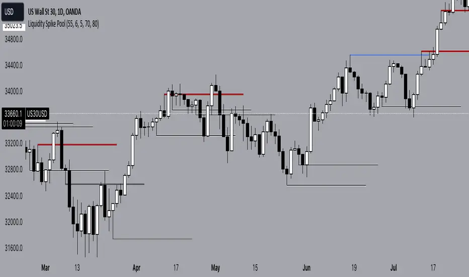
Liquidity Spike PoolThe “Liquidity Pools” indicator is a tool for market analysts that stands out for its ability to clearly project the intricate zones of manipulation present in financial markets. These crucial territories emerge when supply or demand takes over, resulting in long shadows (wicks) on the chart candles. Imagine these regions as "magnets" for prices, as they represent authentic "liquidity pools" where the flow of money into the market is significantly concentrated. But the value of the indicator goes beyond this simple visualization: these zones, when identified and interpreted correctly, can play a crucial role for traders looking for profitable entry points. They can mutate into important bastions of support or resistance, providing traders with key anchor points to make informed decisions within their trading strategies.
A key aspect to consider is the importance of different time frames in analyzing markets. Larger time frames, such as daily or 4h, tend to host larger and more relevant liquidity zones. Therefore, a successful strategy might involve identifying these areas of manipulation over longer time frames through the use of this indicator, and then applying these findings to shorter time frames. This approach allows you to turn manipulation zones into crucial reference points that merit constant surveillance while making trading decisions on shorter time frames.
The indicator uses color to convey information clearly and effectively:
- Dark blue lines highlight candles with significant upper wick, signaling the possible presence of an important manipulation area in the considered area.
- Dark red lines are reserved for sizable candlesticks with significant upper wick, emphasizing situations that are particularly relevant to traders.
- Dark gray lines highlight candles with significant lower wick, providing a valuable indication of manipulation zones where the bid may have prevailed.
- White lines highlight sizable candlesticks with significant lower wick, clearly indicating situations where demand has been predominant and may have helped form a liquidity pool.
This indicator constitutes an important resource for identifying and clearly displaying candles with significant wicks, allowing traders to distinguish between ordinary market conditions and circumstances particularly relevant to their trading strategies. Thanks to the distinctive colors of the lines, the indicator offers intuitive visual guidance, allowing traders to make more informed decisions while carrying out their analyses.