Early Trend Warning Using MTF AnalysisAs an active trader and software professional, I build my own indicators. I built this one today which I want to share with fellow traders.
If you are a trend trader then HTF/MTF analysis is very critical. It is virtually impossible to constantly track multiple tickers all the time. One should not take a buy trade when MTF is bearish and vice versa. This indicator solves this problem.
The EMA Trend Warning indicator helps traders detect potential trend changes early by analyzing price interactions with multi-timeframe Exponential Moving Averages (EMAs) and their momentum. It sends instant alerts when price crosses above or below EMAs with supporting momentum, making it easier to capture bullish or bearish moves.
The EMA Trend Warning indicator detects potential trend changes by monitoring price against 14-period EMAs on multiple timeframes: 15-minute, 30-minute, and 1-hour charts. It sends alerts when the price crosses above or below the EMA with supporting momentum, helping traders identify early bullish or bearish signals.
How It Works:
1. Calculates 14-period EMA on 15m, 30m, and 1H charts.
2. Computes EMA slopes to determine momentum direction.
3. BUY alert triggers when price crosses above the 15m EMA and at least one EMA slope is upward.
4. SELL alert triggers when price crosses below the 15m EMA and at least one EMA slope is downward.
5. Alerts fire once per bar and track previous state to avoid repeated notifications.
Features:
1. Multi-timeframe EMA monitoring.
2. Momentum confirmation with EMA slopes.
3. Instant BUY/SELL alerts.
4. Tracks previous trend state to prevent alert spam.
Benefits:
1. Detects trend changes early for better entry timing.
2. Confirms trend across multiple timeframes.
3. Saves time with automated alerts.
4. Helps traders align trades with market momentum.
Please consider this indicator as EARLY WARNING ONLY. Take trade based on multiple confluences post receiving any warning. I have tested it on BTCUSD since yesterday, multiple warning alerts were 100% perfect.
Multitimeframe

rosh Swift ALGO-X based on ema for xauusd scalping use with original settings, assured 100 pips per day

Account GuardianAccount Guardian: Dynamic Risk/Reward Overlay
Introduction
Account Guardian is an open-source indicator for TradingView designed to help traders evaluate trade setups before entering positions. It automatically calculates Risk-to-Reward ratios based on market structure, displays visual Stop Loss and Take Profit zones, and provides real-time position sizing recommendations.
The indicator addresses a fundamental question every trader should ask before entering a trade: "Does this setup make mathematical sense?" Account Guardian answers this question visually and numerically, helping traders avoid impulsive entries with poor risk profiles.
Core Functionality
Account Guardian performs four primary functions:
Detects swing highs and swing lows to identify logical stop loss placement levels
Calculates Risk-to-Reward ratios for both long and short setups in real-time
Displays visual SL/TP zones on the chart for immediate trade planning
Computes position sizing based on your account size and risk tolerance
The goal is to provide traders with instant feedback on whether a potential trade meets their minimum risk/reward criteria before committing capital.
How It Works
Swing Detection
The indicator uses pivot point detection to identify recent swing highs and swing lows on the chart. These swing points serve as logical areas for stop loss placement:
For Long Trades: The most recent swing low becomes the stop loss level. Price breaking below this level would invalidate the bullish thesis.
For Short Trades: The most recent swing high becomes the stop loss level. Price breaking above this level would invalidate the bearish thesis.
The swing detection lookback period is configurable, allowing you to adjust sensitivity based on your trading timeframe and style.
It automatically adjusts the tp and sl when it is applied to your chart so it is always moving up and down!
Risk/Reward Calculation
Once swing levels are identified, the indicator calculates:
Entry Price: Current close price (where you would enter)
Stop Loss: Recent swing low (for longs) or swing high (for shorts)
Risk: Distance from entry to stop loss
Take Profit: Entry plus (Risk × Target Multiplier)
R:R Ratio: Reward divided by Risk
The R:R ratio is then evaluated against your configured thresholds to determine if the setup is valid, marginal, or poor.
Visual Elements
SL/TP Zones
When enabled, the indicator draws colored boxes on the chart showing:
Red Zone: Stop Loss area - the region between your entry and stop loss
Green/Gold/Red Zone: Take Profit area - colored based on R:R quality
The color coding provides instant visual feedback:
Green: R:R meets or exceeds your "Good R:R" threshold (default 3:1)
Gold: R:R meets minimum threshold but below "Good" (between 2:1 and 3:1)
Red: R:R below minimum threshold - setup should be avoided
Swing Point Markers
Small circles mark detected swing points on the chart:
Green circles: Swing lows (potential support / long SL levels)
Red circles: Swing highs (potential resistance / short SL levels)
Dashboard Panel
The dashboard in the top-right corner displays comprehensive trade planning information:
R:R Row: Current Risk-to-Reward ratio for long and short setups
Status Row: VALID, OK, BAD, or N/A based on R:R thresholds
Stop Loss Row: Exact price level for stop loss placement
Take Profit Row: Exact price level for take profit placement
Pos Size Row: Recommended position size based on your risk parameters
Risk $ Row: Dollar amount at risk per trade
Position Sizing Logic
The indicator calculates position size using the formula:
Position Size = Risk Amount / Risk per Unit
Where:
Risk Amount = Account Size × (Risk Percentage / 100)
Risk per Unit = Entry Price - Stop Loss Price
For example, with a $10,000 account risking 1% per trade ($100), if your entry is at 100 and stop loss at 98 (risk of 2 per unit), your position size would be 50 units.
Input Parameters
Swing Detection:
Swing Lookback: Number of bars to look back for pivot detection (default: 10). Higher values find more significant swing points but may be slower to update.
Target Multiplier: Multiplier applied to risk to calculate take profit distance (default: 2). A value of 2 means TP is 2× the distance of SL from entry.
Risk/Reward Thresholds:
Minimum R:R: Minimum acceptable Risk-to-Reward ratio (default: 2.0). Setups below this show as "BAD" in red.
Good R:R: Threshold for excellent setups (default: 3.0). Setups at or above this show as "VALID" in green.
Account Settings:
Account Size ($): Your trading account size in dollars (default: 10,000). Used for position sizing calculations.
Risk Per Trade (%): Percentage of account to risk per trade (default: 1.0%). Professional traders typically risk 0.5-2% per trade.
Display:
Show SL/TP Zones: Toggle visibility of the colored zone boxes on chart (default: enabled)
Show Dashboard: Toggle visibility of the information panel (default: enabled)
Analyze Direction: Choose to analyze Long only, Short only, or Both directions (default: Both)
How to Use This Indicator
Basic Workflow:
Add the indicator to your chart
Configure your account size and risk percentage in the settings
Set your minimum and good R:R thresholds based on your trading rules
Look at the dashboard to see current R:R for potential long and short entries
Only consider trades where the status shows "VALID" or at minimum "OK"
Use the displayed SL and TP levels for your order placement
Use the position size recommendation to determine lot/contract size
Interpreting the Dashboard:
VALID (Green): Excellent setup - R:R meets your "Good" threshold. This is the ideal scenario for taking a trade.
OK (Gold): Acceptable setup - R:R meets minimum but isn't optimal. Consider taking if other confluence factors align.
BAD (Red): Poor setup - R:R below minimum threshold. Avoid this trade or wait for better entry.
N/A (Gray): Cannot calculate - usually means no valid swing point detected yet.
Best Practices:
Use this indicator as a filter, not a signal generator. It tells you IF a trade makes sense, not WHEN to enter.
Combine with your existing entry strategy - use Account Guardian to validate setups from other analysis.
Adjust the swing lookback based on your timeframe. Lower timeframes may need smaller lookback values.
Be honest with your account size input - accurate position sizing requires accurate inputs.
Consider the target multiplier carefully. Higher multipliers mean larger potential reward but lower probability of hitting TP.
Alerts
The indicator includes four alert conditions:
Good Long Setup: Triggers when long R:R reaches or exceeds your "Good R:R" threshold
Good Short Setup: Triggers when short R:R reaches or exceeds your "Good R:R" threshold
Bad Long Setup: Triggers when long R:R falls below your minimum threshold
Bad Short Setup: Triggers when short R:R falls below your minimum threshold
These alerts can help you monitor multiple charts and get notified when favorable setups appear.
Technical Implementation
The indicator is built using Pine Script v6 and includes:
Pivot-based swing detection using ta.pivothigh() and ta.pivotlow()
Dynamic box drawing for visual SL/TP zones
Table-based dashboard for clean information display
Color-coded visual feedback system
Persistent variable tracking for swing levels
Code Structure:
// Swing Detection
float swingHi = ta.pivothigh(high, swingLen, swingLen)
float swingLo = ta.pivotlow(low, swingLen, swingLen)
// R:R Calculation for Long
float longSL = recentSwingLo
float longRisk = entry - longSL
float longTP = entry + (longRisk * targetMult)
float longRR = (longTP - entry) / longRisk
// Position Sizing
float riskAmount = accountSize * (riskPct / 100)
float posSize = riskAmount / longRisk
Limitations
The indicator uses historical swing points which may not always represent optimal SL placement for your specific strategy
Position sizing assumes you can trade fractional units - adjust accordingly for instruments with minimum lot sizes
R:R calculations assume linear price movement and don't account for gaps or slippage
The indicator doesn't predict price direction - it only evaluates the mathematical viability of a setup
Swing detection has inherent lag due to the lookback period required for pivot confirmation
Recommended Settings by Trading Style
Scalping (1-5 minute charts):
Swing Lookback: 5-8
Target Multiplier: 1-2
Minimum R:R: 1.5
Good R:R: 2.0
Day Trading (15-60 minute charts):
Swing Lookback: 8-12
Target Multiplier: 2
Minimum R:R: 2.0
Good R:R: 3.0
Swing Trading (4H-Daily charts):
Swing Lookback: 10-20
Target Multiplier: 2-3
Minimum R:R: 2.5
Good R:R: 4.0
Why Risk/Reward Matters
Many traders focus solely on win rate, but profitability depends on the combination of win rate AND risk/reward ratio. Consider these scenarios:
50% win rate with 1:1 R:R = Breakeven (before costs)
50% win rate with 2:1 R:R = Profitable
40% win rate with 3:1 R:R = Profitable
60% win rate with 1:2 R:R = Losing money
Account Guardian helps ensure you only take trades where the math works in your favor, even if you're wrong more often than you're right.
Disclaimer
This indicator is provided for educational and informational purposes only. It is not intended as financial, investment, trading, or any other type of advice or recommendation.
Trading involves substantial risk of loss and is not suitable for all investors. The calculations provided by this indicator are based on historical price data and mathematical formulas that may not accurately predict future price movements.
Position sizing recommendations are estimates based on user inputs and should be verified before placing actual trades. Always consider factors such as leverage, margin requirements, and broker-specific rules when determining actual position sizes.
The Risk-to-Reward ratios displayed are theoretical calculations based on swing point detection. Actual trade outcomes will vary based on market conditions, execution quality, and other factors not captured by this indicator.
Past performance does not guarantee future results. Users should thoroughly test any trading approach in a demo environment before risking real capital. The authors and publishers of this indicator are not responsible for any losses or damages arising from its use.
Always consult with a qualified financial advisor before making investment decisions.


Trinity Multi-Timeframe CCITrinity Multi-Timeframe CCI Indicator
This Pine Script indicator is a powerful **multi-timeframe Commodity Channel Index (MTF CCI)** tool that displays three CCI lines on a single pane:
- **Current timeframe** (whatever chart you're viewing, e.g., 1h, 15m, etc.)
- **4-hour timeframe**
- **Daily timeframe**
All three use the same CCI length (default 20, adjustable) and are fully customizable—you can enable/disable each line, change its timeframe, color, and thickness. Horizontal levels at 0 (dashed white by default), +100 (red), and -100 (green) are also included and fully editable.
### Core Functionality & Visual Signals
The standout feature is the **dynamic coloring of the current timeframe CCI line**:
- **Green**: Strong **bullish alignment**. This occurs when **all three CCIs are above the zero line** AND the current timeframe CCI is the **highest** of the three (leading the move upward with higher-timeframe confirmation).
- **Red**: Strong **bearish alignment**. This occurs when **all three CCIs are below the zero line** AND the current timeframe CCI is the **lowest** of the three (leading the move downward with higher-timeframe confirmation).
- **Yellow**: Neutral or no clear alignment (default state when the above conditions aren't met).
An optional light background shading (green or red) highlights when the indicator is in a bullish or bearish state.
Small triangle markers appear on the pane when a new bullish or bearish alignment forms, and built-in alerts notify you of new signals or when a signal ends. These are editable to enable or disable.
### How Traders Can Use It
This indicator helps identify **high-probability trend continuations or reversals** by combining momentum (CCI) across multiple timeframes with alignment confirmation:
- **Trend-following entries**: A green current line (especially with a fresh alert) suggests strong upward momentum backed by higher timeframes—ideal for long entries or adding to positions in an uptrend.
- **Bearish entries/short setups**: A red current line signals strong downward momentum confirmed across timeframes—good for short entries or exiting longs.
- **Confluence filter**: Use it as a filter for other strategies. Only take trades in the direction of the alignment (e.g., only long if current line is green).
- **Early warning of weakness**: When the current line turns yellow after being green/red, it often signals the trend is losing multi-timeframe support—useful for tightening stops or taking partial profits.
In essence, it visually answers the question: “Is the short-term momentum not only strong, but also aligned with and leading the medium- and long-term momentum?” When the answer is yes (green or red), it highlights moments of **multi-timeframe confluence**—some of the most reliable setups in technical trading.
The alerts make it practical for active traders: you get notified the moment a strong aligned signal appears, without needing to watch the chart constantly.
It's clean, highly customizable, and focuses on one clear concept—**multi-timeframe CCI leadership**—making it excellent for trend, swing, and even intraday traders looking for higher-timeframe confirmation.

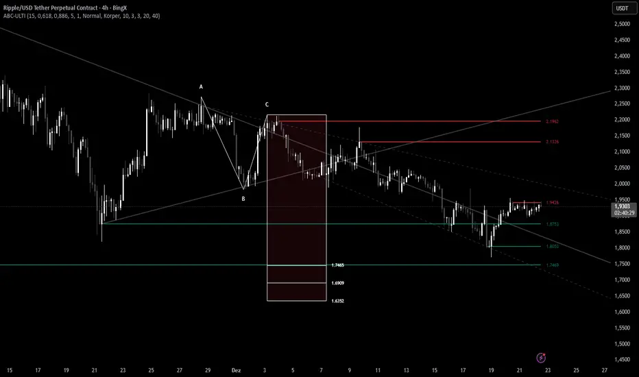
ABC Pro Ultimate S/RABC Pro Ultimate is a high-precision trading tool designed to identify harmonic ABC (Zigzag) patterns and combine them with institutional Support & Resistance levels. Unlike standard indicators that clutter your chart with noise, this script filters for high-relevance pivot points from the distant past to provide truly meaningful trade setups.
CryptoFlux Dynamo [JOAT]CryptoFlux Dynamo: Velocity Scalping Strategy
This Pine Script v6 strategy is designed for cryptocurrency markets operating on 5-minute and faster timeframes. It combines volatility regime detection, multi-path signal confirmation, and adaptive risk management to identify momentum-based trading opportunities in perpetual futures markets.
Core Design Principles
The strategy addresses three challenges specific to cryptocurrency trading:
24/7 market operation without session boundaries requires continuous monitoring and execution logic
Volatility regimes shift rapidly, demanding adaptive stop and target calculations
Tick-level responsiveness is critical for capturing momentum moves before they complete
Strategy Architecture
1. Signal Generation Stack
The strategy uses multiple technical indicators calibrated for cryptocurrency momentum:
MACD with parameters 8/21/5 (fast/slow/signal) optimized for crypto acceleration phases
EMA ribbon using 8/21/34 periods with slope analysis to assess trend structure
Volume impulse detection combining SMA baseline, standard deviation, and z-score filtering
RSI (21 period) and MFI (21 period) for momentum confirmation
Bollinger Bands and Keltner Channels for squeeze detection
2. Volatility Regime Classification
The strategy normalizes ATR as a percentage of price and classifies market conditions into three regimes:
Compression (< 0.8% ATR): Reduced position sizing, tighter stops (1.05x ATR), lower profit targets (1.6x ATR)
Expansion (0.8% - 1.6% ATR): Standard risk parameters, balanced risk-reward (1.55x stop, 2.05x target)
Velocity (> 1.6% ATR): Wider stops (2.1x ATR), amplified targets (2.8x ATR), tighter trailing offsets
ATR is calculated over 21 periods and smoothed with a 13-period EMA to reduce noise from wicks.
3. Multi-Path Entry System
Four independent signal pathways contribute to a composite strength score (0-100):
Trend Break (30 points): Requires EMA ribbon alignment, positive slope, and structure breakout above/below recent highs/lows
Momentum Surge (30 points): MACD histogram exceeds adaptive baseline, MACD line crosses signal, RSI/MFI above/below thresholds, with volume impulse confirmation
Squeeze Release (25 points): Bollinger Bands compress inside Keltner Channels, then release with momentum bias
Micro Pullback (15 points): Shallow retracements within trend structure that reset without breaking support/resistance
Additional scoring modifiers:
Volume impulse: +5 points when present, -5 when absent
Regime bonus: +5 in velocity, -2 in compression
Cycle bias: +5 when aligned, -5 when counter-trend
Trades only execute when the composite score reaches the minimum threshold (default: 55) and all filters agree.
4. Risk Management Framework
Position sizing is calculated from:
RiskCapital = Equity × (riskPerTradePct / 100)
StopDistance = ATR × StopMultiplier(regime)
Quantity = min(RiskCapital / StopDistance, MaxExposure / Price)
The strategy includes:
Risk per trade: 0.65% of equity (configurable)
Maximum exposure: 12% of equity (configurable)
Regime-adaptive stop and target multipliers
Adaptive trailing stops based on ATR and regime
Kill switch that disables new entries after 6.5% drawdown
Momentum fail-safe exits when MACD polarity flips or ribbon structure breaks
5. Additional Filters
Cycle Oscillator : Measures price deviation from 55-period EMA. Requires cycle bias alignment (default: ±0.15%) before entry
BTC Dominance Filter : Optional filter using CRYPTOCAP:BTC.D to reduce long entries during risk-off periods (rising dominance) and short entries during risk-on periods
Session Filter : Optional time-based restriction (disabled by default for 24/7 operation)
Strategy Parameters
All default values used in backtesting:
Core Controls
Enable Short Structure: true
Restrict to Session Window: false
Execution Session: 0000-2359:1234567 (24/7)
Allow Same-Bar Re-Entry: true
Optimization Constants
MACD Fast Length: 8
MACD Slow Length: 21
MACD Signal Length: 5
EMA Fast: 8
EMA Mid: 21
EMA Slow: 34
EMA Slope Lookback: 8
Structure Break Window: 9
Regime Intelligence
ATR Length: 21
Volatility Soothing: 13
Low Vol Regime Threshold: 0.8% ATR
High Vol Regime Threshold: 1.6% ATR
Cycle Bias Length: 55
Cycle Bias Threshold: 0.15%
BTC Dominance Feed: CRYPTOCAP:BTC.D
BTC Dominance Confirmation: true
Signal Pathways
Volume Baseline Length: 34
Volume Impulse Multiplier: 1.15
Volume Z-Score Threshold: 0.5
MACD Histogram Smoothing: 5
MACD Histogram Sensitivity: 1.15
RSI Length: 21
RSI Momentum Trigger: 55
MFI Length: 21
MFI Momentum Trigger: 55
Squeeze Length: 20
Bollinger Multiplier: 1.5
Keltner Multiplier: 1.8
Squeeze Release Momentum Gate: 1.0
Micro Pullback Depth: 7
Minimum Composite Signal Strength: 55
Risk Architecture
Risk Allocation per Trade: 0.65%
Max Exposure: 12% of Equity
Base Risk/Reward Anchor: 1.8
Stop Multiplier • Low Regime: 1.05
Stop Multiplier • Medium Regime: 1.55
Stop Multiplier • High Regime: 2.1
Take Profit Multiplier • Low Regime: 1.6
Take Profit Multiplier • Medium Regime: 2.05
Take Profit Multiplier • High Regime: 2.8
Adaptive Trailing Engine: true
Trailing Offset Multiplier: 0.9
Quantity Granularity: 0.001
Kill Switch Drawdown: 6.5%
Strategy Settings
Initial Capital: $100,000
Commission: 0.04% (0.04 commission_value)
Slippage: 1 tick
Pyramiding: 1 (no position stacking)
calc_on_every_tick: true
calc_on_order_fills: true
Visualization Features
The strategy includes:
EMA ribbon overlay (8/21/34) with customizable colors
Regime-tinted background (compression: indigo, expansion: purple, velocity: magenta)
Dynamic bar coloring based on signal strength divergence
Signal labels for entry points
On-chart dashboard displaying regime, ATR%, signal strength, position status, stops, targets, and risk metrics
Recommended Usage
Timeframes
The strategy is optimized for 5-minute charts. It can operate on 3-minute and 1-minute timeframes for faster scalping, or 15-minute for swing confirmation. When using higher timeframes, consider:
Increasing structure lookback windows
Raising RSI trigger thresholds above 58 to filter noise
Extending volume baseline length
Markets
Designed for high-liquidity cryptocurrency perpetual futures:
BTC/USDT, BTC/USD perpetuals
ETH perpetuals
Major L1 tokens with sufficient volume
For thinner order books, increase volume impulse multiplier and adjust quantity granularity to match exchange minimums.
Limitations and Compromises
Backtesting Considerations
TradingView strategy backtesting does not replicate broker execution. Actual fills, slippage, and commissions may differ
The strategy uses calc_on_every_tick=true and calc_on_order_fills=true to reduce bar-close distortions, but real execution still depends on broker infrastructure
At least 200 historical bars are required to stabilize regime classification, volume baselines, and cycle context
Market Structure Dependencies
BTC dominance feed ( CRYPTOCAP:BTC.D ) may lag during low-liquidity periods or weekends. Consider disabling the filter if data quality degrades
Volume impulse detection assumes consistent order book depth. During extreme volatility or exchange issues, volume signatures may be unreliable
Regime classification based on ATR percentage assumes normal volatility distributions. During black swan events, regime thresholds may not adapt quickly enough
Parameter Sensitivity
Default parameters are tuned for BTC/ETH perpetuals on 5-minute charts. Different assets or timeframes require recalibration
The composite signal strength threshold (55) balances selectivity vs. opportunity. Higher values reduce false signals but may miss valid setups
Risk per trade (0.65%) and max exposure (12%) are conservative defaults. Aggressive scaling increases drawdown risk
Execution Constraints
Same-bar re-entry requires broker support for rapid order placement
Quantity granularity must match exchange contract minimums
Kill switch drawdown (6.5%) may trigger during normal volatility cycles, requiring manual reset
Performance Expectations
This strategy is a framework for momentum-based cryptocurrency trading. Performance depends on:
Market conditions (trending vs. ranging)
Exchange execution quality
Parameter calibration for specific assets
Risk management discipline
Backtest results shown in publications reflect specific market conditions and parameter sets. Past performance does not indicate future results. Always forward test with paper trading or broker simulation before deploying live capital.
Code Structure
The strategy is organized into functional sections:
Configuration groups for parameter organization
Helper functions for position sizing and normalization
Core indicator calculations (MACD, EMA, ATR, RSI, MFI, volume analytics)
Regime classification logic
Multi-path signal generation and composite scoring
Entry/exit orchestration with risk management
Visualization layer with dashboard and chart elements
The source code is open and can be modified to suit your trading requirements. Everyone is encouraged to understand the logic before deploying and to test thoroughly in their target markets.
Modification Guidelines
When adapting this strategy:
Document any parameter changes in your publication
Test modifications across different market regimes
Validate position sizing logic for your exchange's contract specifications
Consider exchange-specific limitations (funding rates, liquidation mechanics, order types)
Conclusion
This strategy provides a structured approach to cryptocurrency momentum trading with regime awareness and adaptive risk controls. It is not a guaranteed profit system, but rather a framework that requires understanding, testing, and ongoing calibration to market conditions.
You should thoroughly understand the logic, test extensively in their target markets, and manage risk appropriately. The strategy's effectiveness depends on proper parameter tuning, reliable execution infrastructure, and disciplined risk management.
Disclaimer
This script and its documentation are for educational and informational purposes only. They do not constitute financial advice, investment recommendations, or trading advice of any kind. Trading cryptocurrencies and derivatives involves substantial risk of loss and is not suitable for all investors. Past performance, whether real or indicated by backtesting, does not guarantee future results.
This strategy is provided "as is" without any warranties or guarantees of profitability
You should not rely solely on this strategy for making trading decisions
Always conduct your own research and analysis before making any financial decisions
Consider consulting with a qualified financial advisor before engaging in trading activities
The authors and contributors are not responsible for any losses incurred from using this strategy
Cryptocurrency trading can result in the loss of your entire investment
Only trade with capital you can afford to lose
Use this strategy at your own risk. The responsibility for any trading decisions and their consequences lies entirely with you.

Price Prediction Forecast ModelPrice Prediction Forecast Model
This indicator projects future price ranges based on recent market volatility.
It does not predict exact prices — instead, it shows where price is statistically likely to move over the next X bars.
How It Works
Price moves up and down by different amounts each bar. This indicator measures how large those moves have been recently (volatility) using the standard deviation of log returns.
That volatility is then:
Projected forward in time
Scaled as time increases (uncertainty grows)
Converted into future price ranges
The further into the future you project, the wider the expected range becomes.
Volatility Bands (Standard Deviation–Based)
The indicator plots up to three projected volatility bands using standard deviation multipliers:
SD1 (1.0×) → Typical expected price movement
SD2 (1.25×) → Elevated volatility range
SD3 (1.5×) → High-volatility / stress range
These bands are based on standard deviation of volatility, not fixed probability guarantees.
Optional Drift
An optional drift term can be enabled to introduce a long-term directional bias (up or down).
This is useful for markets with persistent trends.

Multi-Fractal Trading Plan [Gemini] v22Multi-Fractal Trading Plan
The Multi-Fractal Trading Plan is a quantitative market structure engine designed to filter noise and generate actionable daily strategies. Unlike standard auto-trendline indicators that clutter charts with irrelevant data, this system utilizes Fractal Geometry to categorize market liquidity into three institutional layers: Minor (Intraday), Medium (Swing), and Major (Institutional).
This tool functions as a Strategic Advisor, not just a drawing tool. It calculates the delta between price and structural pivots in real-time, alerting you when price enters high-probability "Hot Zones" and generating a live trading plan on your dashboard.
Core Features
1. Three-Tier Fractal Engine The algorithm tracks 15 distinct fractal lengths simultaneously, aggregating them into a clean hierarchy:
Minor Structure (Thin Lines): Captures high-frequency volatility for scalping.
Medium Structure (Medium Lines): Identifies significant swing points and intermediate targets.
Major Structure (Thick Lines): Maps the "Institutional" defense lines where trend reversals and major breakouts occur.
2. The Strategic Dashboard A dynamic data panel in the bottom-right eliminates analysis paralysis:
Floor & Ceiling Targets: Displays the precise price levels of the nearest Support and Resistance.
AI Logic Output: The script analyzes market conditions to generate a specific command, such as "WATCH FOR BREAKOUT", "Near Lows (Look Long?)", or "WAIT (No Setup)".
3. "Hot Zone" Detection Never miss a critical test of structure.
Dynamic Alerting: When price trades within 1% (adjustable) of a Major Trend Line, the indicator’s labels turn Bright Yellow and flash a warning (e.g., "⚠️ WATCH: MAJOR RES").
Focus: This visual cue highlights the exact moment execution is required, reducing screen fatigue.
4. The Quant Web & Markers
Pivot Validation: Deep blue fractal markers (▲/▼) identify the exact candles responsible for the structure.
Inter-Timeframe Web: Faint dotted lines connect Minor pivots directly to Major pivots, visualizing the "hidden" elasticity between short-term noise and long-term trend anchors.
5. Enterprise Stability Engine Engineered to solve the "Vertical Line" and "1970 Epoch" glitches common in Pine Script trend indicators. This engine is optimized for Futures (NQ/ES), Forex, and Crypto, ensuring stability across all timeframes (including gaps on ETH/RTH charts).
Operational Guide
Consult the Dashboard: Before executing, check the "Strategy" output. If it says "WAIT", the market is in chop. If it says "WATCH FOR BOUNCE", prepare your entry criteria.
Monitor Hot Zones: A Yellow Label indicates price is testing a major liquidity level. This is your signal to watch for a rejection wick or a high-volume breakout.
Utilize the Web: Use the faint web lines to find "confluence" where a short-term pullback aligns with a long-term trend line.
Configuration
Show History: Toggles "Ghost Lines" (Blue) to display historical structure and broken trends.
Fractal Points: Toggles the geometric pivot markers.
Hot Zone %: Adjusts the sensitivity of the Yellow Warning system (Default: 1%).
Max Line Length: A noise filter that removes stale or "spiderweb" lines that are no longer statistically relevant.

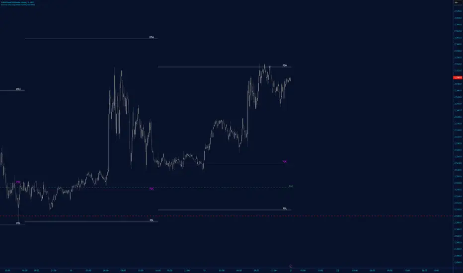
PM/PW/PD/OVN/CD Highs & Lows with prices+ EMAsPM/PW/PD/OVN/CD Highs & Lows with prices
+
3 customizable EMAs (def 12/34/55)

Range EncapsulatorWhen a user selects a start date and the desired duration, the specified date range will be highlighted. High and low data lines corresponding to this range will be drawn. Additionally, quarter-point interval lines from the previous data range will be displayed between the high and low lines of the current range, provided they fall within those boundaries.


Ichimoku MTF Heatmap WITH ALERT meeting D and W conditionsThis is a version of the Ichimoku Cloud Heatmap but adds a can't miss alert when it meets Daily and Weekly conditions. The cloud metric is still being refined and the qualifier is ignoring just the cloud for now. As of 12/21/2025 GLD is meeting the conditions to set this flag.


Session Breakout TrackerThis indicator identifies breakout opportunities when price breaks previous session ranges, tracking 4 distinct breakout chains:
Asia → London (Primary Asia breakout during London session)
London → NY (London breakout during NY session)
NY → Asia (NY breakout during next Asia session)
Asia → NY* (Fallback Asia breakout during NY if Chain 1 had no breakout)
For each breakout, it measures the maximum distance price travels before hitting your defined stop-loss, providing exact pip/point calculations.
Features :
Automatic session detection (Asia: 18:00-03:00, London: 03:00-12:00, NY: 12:00-18:00 NYT)
Complete session range tracking - high/low for each session
Session level plotting with adjustable transparency
User Inputs :
Adjustable pip multiplier (0.0001 for Forex, 0.01 for JPY pairs)
Customizable stop-loss distance in pips
Toggle labels/table/session levels independently
Adjustable session duration for optimizing strategies and back testing

ChoCh Pattern with Trading Levels + Candlestick PatternsBuilt for smart money traders and market structure enthusiasts, the ChoCh Pattern indicator identifies powerful Change of Character reversals with precision. Features intelligent swing point detection, automated risk-reward level plotting, and comprehensive performance tracking to optimize your trading edge in any market condition.
Smart Money Structure Detection - Identifies bullish and bearish Change of Character patterns based market structure analysis and Candlestick patterns Detection,Eliot Waves with T levels
Automated Entry & Exit Levels - Generates entry points with 4 customizable take-profit targets (TP1-TP4) and stop-loss placement based
Real-Time Performance Dashboard - Tracks hit rates for all TP levels, stop-loss statistics, and cumulative P&L across all signals
Visual Trade Management - Clear buy/sell arrows, color-coded level lines, and dynamic price labels for effortless trade execution
Traders seeking systematic risk management with multiple profit targets

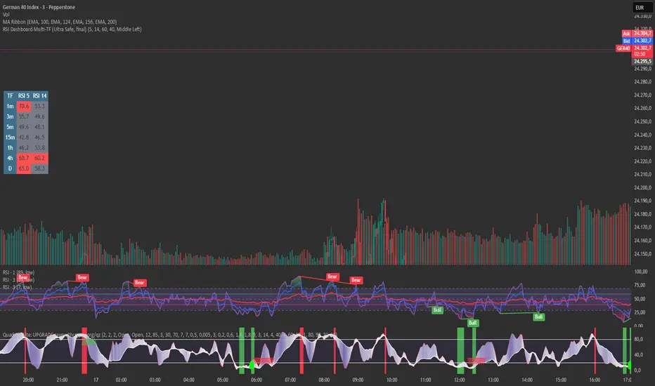
RSI Dashboard Multi-TF This script displays RSI values from multiple timeframes in a compact dashboard directly on the chart.
It is designed for traders who want to quickly identify whether the market is overbought, oversold, or neutral across different timeframes, without constantly switching chart intervals.
The dashboard shows the RSI simultaneously for the following timeframes:
- 1 minute
- 3 minutes
- 5 minutes
- 15 minutes
- 1 hour
- 4 hours
- Daily
Typical use cases:
- Scalping & intraday trading
- Multi-timeframe analysis at a glance
- Entry confirmation (e.g. pullbacks, breakouts)
- Avoiding trades against overbought or oversold market conditions
- Complementing EMA, VWAP, or price action strategies
⚙️ Notes
This dashboard is an analysis tool, not an automated trading system.
No repainting (uses request.security).
Suitable for indices, forex, crypto, and commodities.
This RSI dashboard provides a fast, clear, and visually clean market overview across multiple timeframes, making it an ideal tool for active traders who want to make efficient and well-structured trading decisions.
MATRIX AI Trading SystemMATRIX AI Trading System - Complete Trading Guidelines
Core Trading Strategy
Primary Entry Signals (Must Have)
BUY/SELL Arrow Signals - Your main entry trigger
Wait for the green "BUY" arrow (upward triangle) below the candle
Wait for the red "SELL" arrow (downward triangle) above the candle
These are generated by the MATRIX indicator when momentum shifts
AI Score Confirmation
Check the dashboard on the right side
LONG SCORE should be 55+ (preferably 70+) for buy entries
SHORT SCORE should be 55+ (preferably 70+) for sell entries
Green = Strong signal, Yellow/Orange = Moderate, Red = Weak
3-4 Key Confirmations (Use At Least 3)
Confirmation 1: Bollinger Bands (BB) Smooth Area
Best Entry Zones:
For BUY: Price touches or bounces from the lower BB band (blue line at bottom)
For SELL: Price touches or bounces from the upper BB band (blue line at top)
BB Status on Dashboard: Look for "Squeeze" followed by "Expansion" - this indicates volatility breakout
Avoid trading when: Price is in the middle of BB bands with "Normal" status
What to Look For:
Price rejection wicks at BB bands
Candle closes back inside the bands after touching outer band
BB width increasing (expansion phase)
Confirmation 2: RSI Divergence
Check Dashboard Row 9 (RSI):
Bullish Divergence: Look for "Bull Div" label on chart (green label near lows)
Price makes lower low, but RSI makes higher low
Strong reversal signal for BUY trades
Bearish Divergence: Look for "Bear Div" label on chart (red label near highs)
Price makes higher high, but RSI makes lower high
Strong reversal signal for SELL trades
Dashboard Signals:
RSI value shows in green when bullish (<30 zone)
RSI value shows in red when bearish (>70 zone)
"Bull Div" or "Bear Div" text appears in rightmost column
Confirmation 3: Fibonacci Golden Pocket
The Sweet Spot (0.618 - 0.786 retracement):
Yellow shaded zone between two orange lines
Dashboard Row 15 shows: "Inside" or "Outside"
Trading Rules:
BUY Setup: Price pulls back INTO golden pocket, then BUY arrow appears
SELL Setup: Price rallies INTO golden pocket from below, then SELL arrow appears
Best Entries: When price is "Inside" golden pocket + BUY/SELL arrow appears
Trend Continuation: Golden pocket acts as support in uptrends, resistance in downtrends
Confirmation 4: Support & Resistance
Check Dashboard Rows 16-17:
Support Level: Green horizontal line below price
Resistance Level: Red horizontal line above price
Dashboard shows "Near" or "Away"
Trading Rules:
BUY Priority: When dashboard shows "Near" support + BUY arrow
SELL Priority: When dashboard shows "Near" resistance + SELL arrow
Strongest Signals: Multiple touches of S/R level + rejection candles
Wait for confirmation: Don't trade until price clearly respects the level
Additional Power Confirmations
Confirmation 5: Fair Value Gap (FVG)
Visual Identification:
Green semi-transparent boxes = Bullish FVG (price gap up)
Red semi-transparent boxes = Bearish FVG (price gap down)
Small dotted line in the middle of each FVG zone
"FVG" label marks each gap
Trading Strategy:
BUY Setup: Price returns to fill bullish FVG (green box) + BUY arrow
SELL Setup: Price returns to fill bearish FVG (red box) + SELL arrow
Dashboard Row 14: Shows "FVG Up" or "FVG Dn"
FVG zones act as magnets - price often returns to fill them
Confirmation 6: CHoCH (Change of Character)
Structure Break Signals:
Green "CHoCH" label below candle = Bullish structure change
Red "CHoCH" label above candle = Bearish structure change
What It Means:
Market structure has shifted direction
Previous trend is weakening
Potential reversal or new trend beginning
Trading Application:
CHoCH + BUY arrow = Strong bullish reversal setup
CHoCH + SELL arrow = Strong bearish reversal setup
Look for CHoCH near support/resistance for highest probability
Complete Trade Setup Examples
PERFECT BUY SETUP (Use 3-4 Confirmations)
✅ BUY Arrow appears below candle (primary signal)
✅ LONG SCORE 70+ on dashboard (AI confirmation)
✅ Price at lower BB band or bouncing from it (BB confirmation)
✅ "Bull Div" label appears or RSI bullish (divergence confirmation)
✅ "Inside" golden pocket or near 0.618 Fib (Fibonacci confirmation)
✅ "Near" support on dashboard (S/R confirmation)
✅ Bullish FVG zone below or CHoCH green label (SMC confirmation)
Minimum Required: BUY Arrow + 3 of the above confirmations
PERFECT SELL SETUP (Use 3-4 Confirmations)
✅ SELL Arrow appears above candle (primary signal)
✅ SHORT SCORE 70+ on dashboard (AI confirmation)
✅ Price at upper BB band or rejecting from it (BB confirmation)
✅ "Bear Div" label appears or RSI bearish (divergence confirmation)
✅ "Inside" golden pocket or near 0.786 Fib (Fibonacci confirmation)
✅ "Near" resistance on dashboard (S/R confirmation)
✅ Bearish FVG zone above or CHoCH red label (SMC confirmation)
Minimum Required: SELL Arrow + 3 of the above confirmations
Trade Management
Entry Rules:
Wait for confirmation: Arrow + AI Score + minimum 3 confirmations
Best entries: 4+ confirmations aligned = highest probability
Avoid: Trading with only 1-2 confirmations (low probability)
Stop Loss (Automatic on Chart):
Red horizontal line shows your SL level
Based on recent swing high/low (20 periods)
Dashboard shows risk in pips
Take Profit Levels (Automatic on Chart):
TP1 (1:1 R:R): Green dashed line - First profit target
TP2 (2:1 R:R): Green dashed line - Second profit target
TP3 (4:1 R:R): Green solid line - Final profit target
Labels show exact prices, pips, and percentage gains
Position Sizing Strategy:
Close 50% at TP1 (secure profits)
Close 30% at TP2 (let winners run)
Close 20% at TP3 or trail stop (maximum gains)
Dashboard Quick Reference
Top Priority Rows to Check:
Row 1: LONG SCORE (need 55+, prefer 70+)
Row 2: SHORT SCORE (need 55+, prefer 70+)
Row 3-6: TP Hit Rate statistics
Row 8: Trend direction
Row 9: RSI + Divergence status
Row 12: BB status (Squeeze/Expansion/Normal)
Row 14: SMC status (OB/FVG indicators)
Row 15: Fib golden pocket (Inside/Outside)
Row 16-17: S/R proximity (Near/Away)
Row 20: Active trade status
Trading Psychology & Rules
High Probability Setups (Take These):
BUY/SELL arrow + AI Score 70+ + 4 confirmations = STRONG ENTRY
Multiple confluences at same price level = HIGH PROBABILITY
Trend direction + all indicators aligned = BEST TRADES
Low Probability Setups (Skip These):
Arrow appears but AI Score below 45 = WEAK SIGNAL
Only 1-2 confirmations = LOW PROBABILITY
Conflicting signals (bullish and bearish indicators mixed) = STAY OUT
"Sideways" trend + mixed signals = NO TRADE
Golden Rules:
Never trade without the BUY/SELL arrow
Always check AI Score first (must be 55+)
Wait for minimum 3 confirmations
Respect the automatic TP/SL levels
Check TP Hit Rate on dashboard (Row 3-6)
Trade with the trend (Row 8 on dashboard)
Quick Decision Flowchart
STEP 1: Did BUY/SELL arrow appear? → NO = Don't trade / YES = Continue
STEP 2: Is AI Score 55+? → NO = Skip trade / YES = Continue
STEP 3: Count your confirmations:
BB position (at bands?)
RSI Divergence (Bull/Bear Div label?)
Golden Pocket (Inside/Outside?)
S/R Proximity (Near support/resistance?)
FVG zone (price near gap?)
CHoCH label (structure break?)
STEP 4: Do you have 3+ confirmations? → NO = Wait / YES = ENTER TRADE
STEP 5: Set position size and follow automatic TP/SL levels
Success Tips
✅ Patience is key - Wait for all confirmations to align
✅ Quality over quantity - 2-3 high-probability trades better than 10 weak ones
✅ Trust the system - The AI calculates 11 different indicators
✅ Follow TP/SL strictly - They're calculated for optimal risk:reward
✅ Review dashboard - Check TP Hit Rate to see system performance
✅ Trade sessions - Best results during high volume trading hours
✅ Avoid news events - Major economic releases create unpredictable volatility

[EWT] HTF Candle Panel: Advanced Multi-Timeframe ProjectionOverview
The HTF Candle Panel is a high-performance utility designed for serious technical analysts who require real-time higher timeframe (HTF) context without the need to constantly switch tabs. This indicator renders a customizable panel of HTF candlesticks directly in the right margin of your current chart, allowing you to monitor the developing price action of a Daily, Weekly, or Hourly candle while navigating the lower timeframe (LTF) noise.
Key Features
Real-Time HTF Projection: Unlike standard static overlays, this script uses request.security with lookahead logic to ensure the most recent HTF candle updates tick-by-tick in sync with the live market.
Fully Customizable Interface:
Adjustable Timeframes: Switch between any interval (e.g., watching 1D candles on a 5m chart).
Dynamic Positioning: Use the Extra Right Margin Offset and Spacing inputs to perfectly position the panel in your chart's empty space.
Two Visual Styles: Choose between Standard (Wicks + Bodies) for a classic look or Box style for a cleaner, modern interface.
Smart Background Panel: An optional shaded "container" automatically scales to the High/Low of the projected period, providing a clear visual boundary for your HTF analysis.
Price Action Labels: Toggleable labels for the most recent HTF close prices with configurable positioning and colors.
Strategic Use Cases
1. ICT & CRT Trading (The "Internal vs. External" Perspective)
For traders following Inner Circle Trader (ICT) concepts or Core Range Theory (CRT), understanding where the "HTF Objective" lies is critical.
Identify HTF PD Arrays: Easily visualize HTF Order Blocks or Fair Value Gaps (FVGs) as they form on the Daily or 4H level while you look for entries on the 1m or 5m.
Bias Confirmation: Keep the Daily candle bias in your peripheral vision to ensure your LTF trend alignments are high-probability.
2. Multi-Timeframe (MTF) Analysis
MTF analysis is the backbone of professional trading. This indicator solves the "tunnel vision" problem by providing:
The "Micro-to-Macro" Bridge: See if a 15m bullish breakout is actually just a wick-rejection on a 4H candle.
Candle Close Anticipation: Monitor the "Fullness" of an HTF candle to predict potential reversals or continuations before they happen on the lower timeframe.
How to Set Up
Right Margin: For the best experience, go to your Chart Settings > Canvas > Margin > Right and set it to 100 or higher. This provides the "future space" for the panel to reside.
Configuration: Use the Extra Right Margin Offset input to push the candles further right if they overlap with your current price action.
Developer Best Practices
Built on Pine Script v6, this script follows the KISS (Keep It Simple, Stupid) and DRY (Don't Repeat Yourself) principles. It is optimized for performance by executing drawing logic only on the most recent bar (barstate.islast), ensuring your chart remains lag-free even with multiple candles projected.


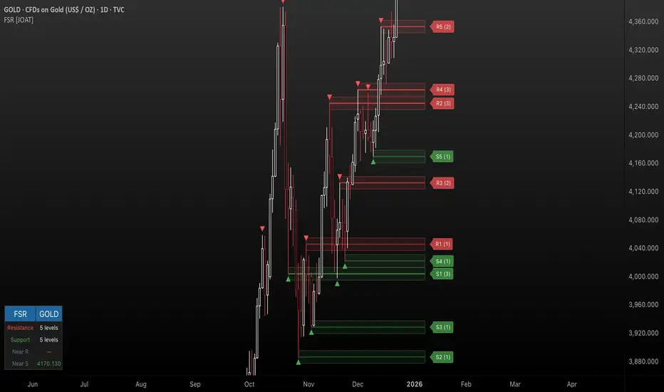
Fractal Support & Resistance [JOAT]
Fractal Support & Resistance — Automatic Level Detection with Volume Weighting
Fractal Support & Resistance automatically identifies key price levels using a proprietary combination of fractal detection, volume analysis, and dynamic touch counting. Levels are intelligently styled based on their strength and how many times they have been tested, giving you instant visual feedback on level importance.
Why This Script is Protected
This script is published as closed-source to protect the proprietary level management algorithm and the unique volume-weighted strength calculation methodology from unauthorized republishing. The specific implementation of touch detection, level merging logic, and dynamic opacity calculations represents original work that differentiates this from standard fractal indicators.
What Makes This Indicator Unique
Unlike basic fractal indicators that simply mark pivot points, this system:
Tracks how many times each level has been tested (touch counting)
Weights level importance by volume at the fractal point
Merges nearby fractals into single levels instead of cluttering the chart
Dynamically adjusts visual opacity based on level strength
Provides zone boxes around levels for realistic price reaction areas
What This Indicator Does
Detects fractal pivot highs and lows to establish support and resistance levels
Tracks how many times each level has been touched or tested
Weights level importance by volume at the fractal point
Draws extending lines and zone boxes for each level
Dynamically adjusts level opacity based on touch count for visual strength indication
Provides a dashboard with nearest levels and counts
Core Methodology
The indicator uses Williams Fractal concepts as a foundation but extends them with proprietary enhancements:
Fractal Detection — Identifies pivot highs and lows where price creates local extremes with confirmation bars on each side. A fractal high requires the highest point with lower highs on both sides; a fractal low requires the lowest point with higher lows on both sides.
Level Clustering — New fractals within a tolerance zone (based on Zone Padding %) update existing levels rather than creating duplicates. This keeps the chart clean and focuses on significant price areas.
Volume Integration — Volume at each fractal point is accumulated to weight level significance. Higher volume fractals are considered more important.
Touch Tracking — The system monitors when price approaches existing levels and increments touch counts. More touches indicate stronger, more significant levels.
Visual Strength System
Level appearance changes dynamically based on market interaction:
Newer or less-tested levels appear more transparent (up to 80% transparency)
Each additional touch reduces transparency by 15%
Heavily tested levels become more prominent and opaque (minimum 20% transparency)
Labels display level number and touch count (e.g., "R1 (3)" = Resistance 1 with 3 touches)
Zone boxes provide visual areas around each level
Color Scheme
Resistance Color — Default: #FF5252 (red) — Used for resistance levels and zones
Support Color — Default: #4CAF50 (green) — Used for support levels and zones
Zone Fill — 90% transparent version of level color
Zone Border — 70% transparent version of level color
Labels — 30% transparent background with white text
Dashboard Information
The on-chart table (bottom-left corner) displays:
Number of active resistance levels meeting minimum touch requirement
Number of active support levels meeting minimum touch requirement
Nearest resistance level above current price
Nearest support level below current price
Inputs Overview
Fractal Settings:
Fractal Period — Bars on each side for fractal confirmation (default: 2, range: 1-10)
Max Levels Per Side — Maximum resistance and support levels to track (default: 5, range: 1-20)
Zone Padding (%) — Level zone width as percentage of price (default: 0.2%, range: 0-2%)
Filtering:
Volume Weight Levels — Toggle volume-weighted level importance (default: on)
Min Touches to Show — Filter out levels with fewer touches (default: 1, range: 1-10)
Lookback Period — Historical bars to analyze for level detection (default: 200, range: 50-500)
Visual Settings:
Resistance/Support Colors — Customizable color scheme
Show Zone Boxes — Toggle filled zone areas around levels
Show Level Labels — Toggle level labels with touch counts
Show Fractal Markers — Toggle small triangles at fractal points
Show Dashboard — Toggle the information table
Line Width — Thickness of level lines (default: 2, range: 1-5)
How to Use It
For Support/Resistance Trading:
Use levels with higher touch counts as stronger support/resistance references
More opaque levels have been tested more times and are more significant
Watch for price reactions at zone boundaries, not just exact level prices
Combine with candlestick patterns at levels for entry signals
For Breakout Trading:
Watch for breakouts when price closes beyond a level
Levels with many touches that finally break often produce strong moves
Use the zone box—a close beyond the zone is more significant than just touching the level
Set alerts for resistance/support breaks
For Target Setting:
Use the nearest resistance as a profit target for long positions
Use the nearest support as a profit target for short positions
Dashboard shows these levels for quick reference
Alerts Available
FSR Resistance Break — Price closes above a resistance level
FSR Support Break — Price closes below a support level
FSR New Fractal High — Fresh fractal high detected
FSR New Fractal Low — Fresh fractal low detected
Best Practices
Increase Fractal Period for fewer but more significant levels
Use Min Touches filter to show only well-tested levels
Volume weighting helps identify institutionally significant levels
Combine with trend indicators—trade with the trend at levels
This indicator is provided for educational purposes. It does not constitute financial advice. Past performance does not guarantee future results. Always conduct your own analysis and use proper risk management before making trading decisions.
— Made with passion by officialjackofalltrades
C2 HTF Detection CRT [MarioLeb]What This Indicator Does:
1. Detects "C2 Sweeps" - Price retesting previous highs/lows then closing back inside the range.
2. Shows HTF Structure - Marks High Timeframe support/resistance zones (C1 ranges).
3. Finds Multi-Timeframe Confluence - When HTF and LTF C2 signals align at same levels.
4. Highlights CRT Cycles - Complete market cycles (C1→C2→C3 pattern).
Visual Output:
Horizontal lines = C2 sweep levels
Colored zones = C1 ranges (key areas)
Yellow line = 50% level of C1 range
Boxes = CRT cycles (if enabled)
CISD lines = Change in supply/demand confirmation
Purpose:
Identify where higher timeframe structure meets lower timeframe precision - shows where big moves often start.
Alert Features:
Automated Alerts trigger when:
HTF C2 Detected - "Bullish/Bearish HTF C2 Detected on "
CRT Cycle Complete - "Bullish/Bearish CRT Cycle Detected on "
CISD Confirmed - "HTF CISD Confirmed on "
LTF C2 Detected - "Bullish/Bearish LTF C2 vs HTF C1 Detected"
Key Alert:
Once C2 candle closes inside C1 range after sweeping high/low → Alert fires immediately.
Each alert includes:
Direction (Bullish/Bearish)
Timeframe
Mode (Strict/Easy)
Pattern type (C2/CRT/CISD)
Alert frequency: Once per bar (no spam).
