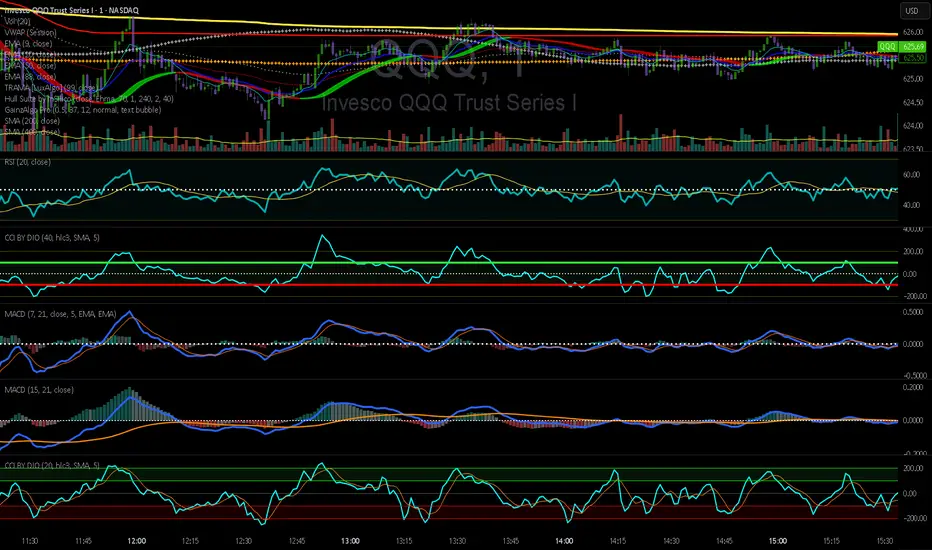
CCI by DioAdded background color to entry points of the channel for easy observation to levels I am looking at.
Penunjuk dan strategi
ICT Quant-Core: Liquidity Intelligence [Dual-Engine]🔥 THE ULTIMATE LIQUIDITY FILTERING ENGINE
Most SMC traders lose money because they "catch falling knives" on every local wick. This algorithm solves this problem by using DUAL-CORE logic and a signal quality scoring system.
This is no ordinary pivot indicator.
⚙️ HOW DOES IT WORK? (DUAL-CORE LOGIC)
The algorithm analyzes the market on two levels simultaneously:
1️⃣ MACRO CORE (Lookback 50 - "WHALE 🐋")
Tracks key levels from recent weeks/months.
This is where institutions build their positions.
Signals from this core have the highest priority (Score 10/10).
2️⃣ LOCAL CORE (Lookback 20 - "ROACH 🐟")
Tracks internal market structure and noise.
Signals are filtered by the Main Trend. If the trend is down, Local Longs are marked as "TRAP."
🧠 SMART FILTERS (QUANT LAYERS)
Instead of entering on every line touch, the script requires confirmation:
✅ RECLAIM LOGIC: Price must close back above/below the liquidity level (Swing Failure Pattern).
✅ RVOL FILTER: Requires relative volume > 1.2x the average (institutional track).
✅ SCORING SYSTEM (0-10): Each signal receives a score.
- 10/10: Macro Grab in line with the trend + high volume.
- 3/10: Local Grab against the trend (risky).
📊 ANALYTICAL DASHBOARD
In the lower right corner, you'll find the "Command Center":
- Trend Status (Distribution/Accumulation)
- Whale's Last Move (Price and Direction)
- Current Tactics (e.g., "Ignore Longs, Search for Shorts")
- Filter Status (RSI, Volume, Reclaim)
🚀 HOW TO USE IT?
1. Set the H4 timeframe.
2. Wait for a signal with a rating > 7/10.
3. Ignore "Fish/Local" signals (small icons) if they contradict the Dashboard color.
4. Entry occurs only after the candle closes (Reclaim).

NoProcess PivotsNoProcess Pivots
Visualize the structural framework of price action with NoProcess Pivots, a precision tool for multi-timeframe confluence trading.
Pivots are mathematically derived levels where price statistically finds support, resistance, or equilibrium. Institutional order flow respects these levels as key decision points where liquidity pools form and inefficiencies seek rebalancing.
NoProcess Pivots displays historical pivot ranges as period-bounded zones across Daily, Weekly, and Quarterly timeframes—allowing you to observe how price has respected or violated these levels over time. By projecting ±33% extensions beyond R1/S1, traders can identify targets, retracement levels, and key reversal points.
Cross-reference pivots across multiple timeframes to find confluence zones where Daily, Weekly, and Quarterly levels stack. These high-conviction areas offer the clearest setups for entries and exits.
Features:
Multi-timeframe pivots: Daily, Weekly, Quarterly
Historical levels with adjustable depth
Period-bounded zones
±33% extensions
Adaptive light/dark mode table
Real-time Δ PP percentage
Pivot cross alerts
Built for traders who respect the math behind the markets.

RiskCraft - Advanced Risk Management SystemRiskCraft – Risk Intelligence Dashboard
Trade like you actually respect risk
"I know the setup looks good… but how much am I actually risking right now?"
RiskCraft is an open-source Pine Script v6 indicator that keeps risk transparent directly on the chart. It is not a signal generator; it is a risk desk that calculates size, frames volatility, and reminds you when your behaviour drifts away from the plan.
Core utilities
Calculates professional-style position sizing in real time.
Reads volatility and market regime before position size is confirmed.
Adjusts risk based on the trader’s emotional state and confidence inputs.
Maps session risk across Asian, London, and New York hours.
Draws exactly one stop line and one target line in the preferred direction.
Provides rotating education tips plus contextual warnings when risk escalates.
It is intentionally conservative and keeps you in the game long enough for any separate entry logic to matter.
---
Chart layout checklist
Use a clean chart on a liquid symbol (e.g., AMEX:SPY or major FX pairs).
Main RiskCraft dashboard placed on the right edge.
Session Risk box on the left with UTC time visible.
Floating risk badge above price.
Stop/target guide lines enabled.
Education panel visible in the bottom-right corner.
---
1. On-chart components
Right-side dashboard : account risk %, position size/value, stop, target, risk/reward, regime, trend strength, emotional state, behavioural score, correlation, and preferred trade direction.
Session Risk box : highlights active session (Asian, London, NY), current UTC time, and risk label (High/Med/Low) per session.
Floating risk badge : keeps actual account risk percent visible with colour-coded wording from Ultra Cautious to Very Aggressive.
Stop/target lines : exactly one dashed stop and one dashed target aligned with the preferred bias.
Education panel : rotates core principles and AI-style warnings tied to volatility, risk %, and behaviour flags.
---
2. Volatility engine – ATR with context 📈
atr = ta.atr(atrLength)
atrPercent = (atr / close) * 100
atrSMA = ta.sma(atr, atrLength)
volatilityRatio = atr / atrSMA
isHighVol = volatilityRatio > volThreshold
ATR vs ATR SMA shows how wild price is relative to recent history.
Volatility ratio above the threshold flips isHighVol , which immediately trims risk.
An ATR percentile rank over the last 100 bars indicates calm versus chaotic regimes.
Daily ATR sampling via request.security() gives higher time-frame context for intraday sessions.
When volatility spikes the script dials position size down automatically instead of cheering for maximum exposure.
---
3. Market regime radar – Danger or Drift 🌊
ema20 = ta.ema(close, 20)
ema50 = ta.ema(close, 50)
ema200 = ta.ema(close, 200)
trendScore = (close > ema20 ? 1 : -1) +
(ema20 > ema50 ? 1 : -1) +
(ema50 > ema200 ? 1 : -1)
= ta.dmi(14, 14)
Regimes covered:
Danger : high volatility with weak trend.
Volatile : volatility elevated but structure still directional.
Choppy : low ADX and noisy action.
Trending : directional flows without extreme volatility.
Mixed : anything between.
Each regime maps to a 1–10 risk score and a multiplier that feeds the final position size. Danger and Choppy clamp size; Trending restores normal risk.
---
4. Behaviour engine – trader inputs matter 🧠
You provide:
Emotional state : Confident, Neutral, FOMO, Revenge, Fearful.
Confidence : slider from 1 to 10.
Toggle for behavioural adjustment on/off.
Behind the scenes:
Each state triggers an emotional multiplier .
Confidence produces a confidence multiplier .
Combined they form behavioralFactor and a 0–100 Behavioural Score .
High-risk emotions or low conviction clamp the final risk. Calm inputs allow normal size. The dashboard prints both fields to keep accountability on-screen.
---
5. Correlation guardrail – avoid stacking identical risk 📊
Optional correlation mode compares the active symbol to a reference (default AMEX:SPY ):
corrClose = request.security(correlationSymbol, timeframe.period, close)
priceReturn = ta.change(close) / close
corrReturn = ta.change(corrClose) / corrClose
correlation = calcCorrelation()
Absolute correlation above the threshold applies a correlation multiplier (< 1) to reduce size.
Dashboard row shows the live correlation and reference ticker.
When disabled, the row simply echoes the current symbol, keeping the table readable.
---
6. Position sizing engine – heart of the script 💰
baseRiskAmount = accountSize * (baseRiskPercent / 100)
adjustedRisk = baseRiskAmount * behavioralFactor *
regimeAdjustment * volAdjustment *
correlationAdjustment
finalRiskAmount = math.min(adjustedRisk,
accountSize * (maxRiskCap / 100))
stopDistance = atr * atrStopMultiplier
takeProfit = atr * atrTargetMultiplier
positionSize = stopDistance > 0 ? finalRiskAmount / stopDistance : 0
positionValue = positionSize * close
Outputs shown on the dashboard:
Position size in units and value in currency.
Actual risk % back on account after adjustments.
Risk/Reward derived from ATR-based stop and target.
---
7. Intelligent trade direction – bias without signals 🎯
Direction score ingredients:
EMA stack alignment.
Price versus EMA20.
RSI momentum relative to 50.
MACD line vs signal.
Directional Movement (DI+/DI–).
The resulting Trade Direction row prints LONG, SHORT, or NEUTRAL. No orders are generated—this is guidance so you only risk capital when the structure supports it.
---
8. Stop/target guide lines – two lines only ✂️
if showStopLines
if preferLong
// long stop below, target above
else if preferShort
// short stop above, target below
Lines refresh each bar to keep clutter low.
When the direction score is neutral, no lines appear.
Use them as visual anchors, not auto-orders.
---
9. Session Risk map – global volatility clock 🌍
Tracks Asian, London, and New York windows via UTC.
Computes average ATR per session versus global ATR SMA.
Labels each session High/Med/Low and colours the cells accordingly.
Top row shows the active session plus current UTC time so you always know the regime you are trading.
One glance tells you whether you are trading quiet drift or the part of the day that hunts stops.
---
10. Floating risk badge – honesty above price 🪪
Text ranges from Ultra Cautious through Very Aggressive.
Colour matches the risk palette inputs (High/Med/Low).
Updates on the last bar only, keeping historical clutter off the chart.
Account risk becomes impossible to ignore while you stare at price.
---
11. Education engine & warnings 📚
Rotates evergreen principles (risk 1–2%, journal trades, respect plan).
Triggers contextual warnings when volatility and risk % conflict.
Flags when emotional state = FOMO or Revenge.
Highlights sub-standard risk/reward setups.
When multiple danger flags stack, an AI-style warning overrides the tip text so you can course-correct before capital is exposed.
---
12. Alerts – hard guard rails 🚨
Excessive Risk Alert : actual risk % crosses custom threshold.
High Volatility Alert : ATR behaviour signals danger regime.
Emotional State Warning : FOMO or Revenge selected.
Poor Risk/Reward Alert : risk/reward drops below your standard.
All alerts reinforce discipline; none suggest entries or exits.
---
13. Multi-market behaviour 🕒
Intraday (1m–1h): session box and badge react quickly; ideal for scalpers needing constant risk context.
Higher time frames (1D–1W): dashboard shifts slowly, supporting swing planning.
Asset classes confirmed in validation: crypto majors, large-cap equities, indices, major FX pairs, and liquid commodities.
Risk logic is price-based, so it adapts across markets without bespoke tuning.
15. Key inputs & recommended defaults
Account Size : 10,000 (modify to match actual account; min 100).
Base Risk % : 1.0 with a Maximum Risk Cap of 2.5%.
ATR Period : 14, Stop Multiplier 2.0, Target Multiplier 3.0.
High Vol Threshold : 1.5 for ATR ratio.
Behavioural Adjustment : enabled by default; disable for fixed risk.
Correlation Check : optional; default symbol AMEX:SPY , threshold 0.7.
Display toggles : main dashboard, risk badge, session map, education panel, and stop lines can be individually disabled to reduce clutter.
16. Usage notes & limits
Indicator mode only; no automated entries or exits.
Trade history panel intentionally disabled (requires strategy context).
Correlation analysis depends on additional data requests and may lag slightly on illiquid symbols.
Session timing uses UTC; adjust expectations if you trade localized instruments.
HTF ATR sampling uses daily data, so bar replay on lower charts may show brief data gaps while HTF loads.
What does everyone think RISK really means?

Swing Data - ADR% / RVol / PVol / Float % / Avg $ Vol (Mod)Modified from this source code:
I have added the current bar DR so i can compare to ADR of the current bar to see if it is worth taking the trade for my bar-by-bar practice.
Quick too instead of having to measure it each time
BörsenampelThe “VIX/VVIX Traffic Light (Panel)” visualizes the current market risk as a simple traffic light (green / yellow / red) in the top‑right corner of the chart, based on the VIX and VVIX indices.
How it works
The script loads the VIX and VVIX indices via request.security and evaluates them using user‑defined threshold levels.
Green: VIX and VVIX are below their “green” thresholds, indicating a calm market environment and more risk‑on conditions.
Red: VIX and VVIX are above their “red” thresholds, signalling stress or panic phases with elevated risk.
Yellow: Transitional zone between the two extremes.
Chart display
A small panel with the title “Traffic Light” is shown in the upper‑right corner of the chart.
The central box displays the current status (“GREEN”, “YELLOW”, “RED”) with a matching background color.
Optionally, the current VIX and VVIX values are shown below the status.
Inputs and usage
Symbols for VIX and VVIX can be freely chosen (default: CBOE:VIX and CBOE:VVIX).
The green/red thresholds can be adjusted to fit personal volatility rules or different markets.

Volatility Risk PremiumTHE INSURANCE PREMIUM OF THE STOCK MARKET
Every day, millions of investors face a fundamental question that has puzzled economists for decades: how much should protection against market crashes cost? The answer lies in a phenomenon called the Volatility Risk Premium, and understanding it may fundamentally change how you interpret market conditions.
Think of the stock market like a neighborhood where homeowners buy insurance against fire. The insurance company charges premiums based on their estimates of fire risk. But here is the interesting part: insurance companies systematically charge more than the actual expected losses. This difference between what people pay and what actually happens is the insurance premium. The same principle operates in financial markets, but instead of fire insurance, investors buy protection against market volatility through options contracts.
The Volatility Risk Premium, or VRP, measures exactly this difference. It represents the gap between what the market expects volatility to be (implied volatility, as reflected in options prices) and what volatility actually turns out to be (realized volatility, calculated from actual price movements). This indicator quantifies that gap and transforms it into actionable intelligence.
THE FOUNDATION
The academic study of volatility risk premiums began gaining serious traction in the early 2000s, though the phenomenon itself had been observed by practitioners for much longer. Three research papers form the backbone of this indicator's methodology.
Peter Carr and Liuren Wu published their seminal work "Variance Risk Premiums" in the Review of Financial Studies in 2009. Their research established that variance risk premiums exist across virtually all asset classes and persist over time. They documented that on average, implied volatility exceeds realized volatility by approximately three to four percentage points annualized. This is not a small number. It means that sellers of volatility insurance have historically collected a substantial premium for bearing this risk.
Tim Bollerslev, George Tauchen, and Hao Zhou extended this research in their 2009 paper "Expected Stock Returns and Variance Risk Premia," also published in the Review of Financial Studies. Their critical contribution was demonstrating that the VRP is a statistically significant predictor of future equity returns. When the VRP is high, meaning investors are paying substantial premiums for protection, future stock returns tend to be positive. When the VRP collapses or turns negative, it often signals that realized volatility has spiked above expectations, typically during market stress periods.
Gurdip Bakshi and Nikunj Kapadia provided additional theoretical grounding in their 2003 paper "Delta-Hedged Gains and the Negative Market Volatility Risk Premium." They demonstrated through careful empirical analysis why volatility sellers are compensated: the risk is not diversifiable and tends to materialize precisely when investors can least afford losses.
HOW THE INDICATOR CALCULATES VOLATILITY
The calculation begins with two separate measurements that must be compared: implied volatility and realized volatility.
For implied volatility, the indicator uses the CBOE Volatility Index, commonly known as the VIX. The VIX represents the market's expectation of 30-day forward volatility on the S&P 500, calculated from a weighted average of out-of-the-money put and call options. It is often called the "fear gauge" because it rises when investors rush to buy protective options.
Realized volatility requires more careful consideration. The indicator offers three distinct calculation methods, each with specific advantages rooted in academic literature.
The Close-to-Close method is the most straightforward approach. It calculates the standard deviation of logarithmic daily returns over a specified lookback period, then annualizes this figure by multiplying by the square root of 252, the approximate number of trading days in a year. This method is intuitive and widely used, but it only captures information from closing prices and ignores intraday price movements.
The Parkinson estimator, developed by Michael Parkinson in 1980, improves efficiency by incorporating high and low prices. The mathematical formula calculates variance as the sum of squared log ratios of daily highs to lows, divided by four times the natural logarithm of two, times the number of observations. This estimator is theoretically about five times more efficient than the close-to-close method because high and low prices contain additional information about the volatility process.
The Garman-Klass estimator, published by Mark Garman and Michael Klass in 1980, goes further by incorporating opening, high, low, and closing prices. The formula combines half the squared log ratio of high to low prices minus a factor involving the log ratio of close to open. This method achieves the minimum variance among estimators using only these four price points, making it particularly valuable for markets where intraday information is meaningful.
THE CORE VRP CALCULATION
Once both volatility measures are obtained, the VRP calculation is straightforward: subtract realized volatility from implied volatility. A positive result means the market is paying a premium for volatility insurance. A negative result means realized volatility has exceeded expectations, typically indicating market stress.
The raw VRP signal receives slight smoothing through an exponential moving average to reduce noise while preserving responsiveness. The default smoothing period of five days balances signal clarity against lag.
INTERPRETING THE REGIMES
The indicator classifies market conditions into five distinct regimes based on VRP levels.
The EXTREME regime occurs when VRP exceeds ten percentage points. This represents an unusual situation where the gap between implied and realized volatility is historically wide. Markets are pricing in significantly more fear than is materializing. Research suggests this often precedes positive equity returns as the premium normalizes.
The HIGH regime, between five and ten percentage points, indicates elevated risk aversion. Investors are paying above-average premiums for protection. This often occurs after market corrections when fear remains elevated but realized volatility has begun subsiding.
The NORMAL regime covers VRP between zero and five percentage points. This represents the long-term average state of markets where implied volatility modestly exceeds realized volatility. The insurance premium is being collected at typical rates.
The LOW regime, between negative two and zero percentage points, suggests either unusual complacency or that realized volatility is catching up to implied volatility. The premium is shrinking, which can precede either calm continuation or increased stress.
The NEGATIVE regime occurs when realized volatility exceeds implied volatility. This is relatively rare and typically indicates active market stress. Options were priced for less volatility than actually occurred, meaning volatility sellers are experiencing losses. Historically, deeply negative VRP readings have often coincided with market bottoms, though timing the reversal remains challenging.
TERM STRUCTURE ANALYSIS
Beyond the basic VRP calculation, sophisticated market participants analyze how volatility behaves across different time horizons. The indicator calculates VRP using both short-term (default ten days) and long-term (default sixty days) realized volatility windows.
Under normal market conditions, short-term realized volatility tends to be lower than long-term realized volatility. This produces what traders call contango in the term structure, analogous to futures markets where later delivery dates trade at premiums. The RV Slope metric quantifies this relationship.
When markets enter stress periods, the term structure often inverts. Short-term realized volatility spikes above long-term realized volatility as markets experience immediate turmoil. This backwardation condition serves as an early warning signal that current volatility is elevated relative to historical norms.
The academic foundation for term structure analysis comes from Scott Mixon's 2007 paper "The Implied Volatility Term Structure" in the Journal of Derivatives, which documented the predictive power of term structure dynamics.
MEAN REVERSION CHARACTERISTICS
One of the most practically useful properties of the VRP is its tendency to mean-revert. Extreme readings, whether high or low, tend to normalize over time. This creates opportunities for systematic trading strategies.
The indicator tracks VRP in statistical terms by calculating its Z-score relative to the trailing one-year distribution. A Z-score above two indicates that current VRP is more than two standard deviations above its mean, a statistically unusual condition. Similarly, a Z-score below negative two indicates VRP is unusually low.
Mean reversion signals trigger when VRP reaches extreme Z-score levels and then shows initial signs of reversal. A buy signal occurs when VRP recovers from oversold conditions (Z-score below negative two and rising), suggesting that the period of elevated realized volatility may be ending. A sell signal occurs when VRP contracts from overbought conditions (Z-score above two and falling), suggesting the fear premium may be excessive and due for normalization.
These signals should not be interpreted as standalone trading recommendations. They indicate probabilistic conditions based on historical patterns. Market context and other factors always matter.
MOMENTUM ANALYSIS
The rate of change in VRP carries its own information content. Rapidly rising VRP suggests fear is building faster than volatility is materializing, often seen in the early stages of corrections before realized volatility catches up. Rapidly falling VRP indicates either calming conditions or rising realized volatility eating into the premium.
The indicator tracks VRP momentum as the difference between current VRP and VRP from a specified number of bars ago. Positive momentum with positive acceleration suggests strengthening risk aversion. Negative momentum with negative acceleration suggests intensifying stress or rapid normalization from elevated levels.
PRACTICAL APPLICATION
For equity investors, the VRP provides context for risk management decisions. High VRP environments historically favor equity exposure because the market is pricing in more pessimism than typically materializes. Low or negative VRP environments suggest either reducing exposure or hedging, as markets may be underpricing risk.
For options traders, understanding VRP is fundamental to strategy selection. Strategies that sell volatility, such as covered calls, cash-secured puts, or iron condors, tend to profit when VRP is elevated and compress toward its mean. Strategies that buy volatility tend to profit when VRP is low and risk materializes.
For systematic traders, VRP provides a regime filter for other strategies. Momentum strategies may benefit from different parameters in high versus low VRP environments. Mean reversion strategies in VRP itself can form the basis of a complete trading system.
LIMITATIONS AND CONSIDERATIONS
No indicator provides perfect foresight, and the VRP is no exception. Several limitations deserve attention.
The VRP measures a relationship between two estimates, each subject to measurement error. The VIX represents expectations that may prove incorrect. Realized volatility calculations depend on the chosen method and lookback period.
Mean reversion tendencies hold over longer time horizons but provide limited guidance for short-term timing. VRP can remain extreme for extended periods, and mean reversion signals can generate losses if the extremity persists or intensifies.
The indicator is calibrated for equity markets, specifically the S&P 500. Application to other asset classes requires recalibration of thresholds and potentially different data sources.
Historical relationships between VRP and subsequent returns, while statistically robust, do not guarantee future performance. Structural changes in markets, options pricing, or investor behavior could alter these dynamics.
STATISTICAL OUTPUTS
The indicator presents comprehensive statistics including current VRP level, implied volatility from VIX, realized volatility from the selected method, current regime classification, number of bars in the current regime, percentile ranking over the lookback period, Z-score relative to recent history, mean VRP over the lookback period, realized volatility term structure slope, VRP momentum, mean reversion signal status, and overall market bias interpretation.
Color coding throughout the indicator provides immediate visual interpretation. Green tones indicate elevated VRP associated with fear and potential opportunity. Red tones indicate compressed or negative VRP associated with complacency or active stress. Neutral tones indicate normal market conditions.
ALERT CONDITIONS
The indicator provides alerts for regime transitions, extreme statistical readings, term structure inversions, mean reversion signals, and momentum shifts. These can be configured through the TradingView alert system for real-time monitoring across multiple timeframes.
REFERENCES
Bakshi, G., and Kapadia, N. (2003). Delta-Hedged Gains and the Negative Market Volatility Risk Premium. Review of Financial Studies, 16(2), 527-566.
Bollerslev, T., Tauchen, G., and Zhou, H. (2009). Expected Stock Returns and Variance Risk Premia. Review of Financial Studies, 22(11), 4463-4492.
Carr, P., and Wu, L. (2009). Variance Risk Premiums. Review of Financial Studies, 22(3), 1311-1341.
Garman, M. B., and Klass, M. J. (1980). On the Estimation of Security Price Volatilities from Historical Data. Journal of Business, 53(1), 67-78.
Mixon, S. (2007). The Implied Volatility Term Structure of Stock Index Options. Journal of Empirical Finance, 14(3), 333-354.
Parkinson, M. (1980). The Extreme Value Method for Estimating the Variance of the Rate of Return. Journal of Business, 53(1), 61-65.

HTF Candles & Levels Visualizer - SRHTF Candles & Levels Visualizer is a clean higher‑timeframe visualization tool designed to complement any trading strategy by giving clear context of larger‑TF structure directly on your current chart. It plots the previous high and low for up to three user‑selectable timeframes, and draws them as extended levels with optional labels, making it easy to see where current price sits relative to key higher‑timeframe zones.
The script also renders compact proxy candles for each selected timeframe to the right of current price, so you can visually track HTF candle development without switching charts. Each HTF slot has independent settings: timeframe, color, number of displayed candles, and visibility toggles, along with global controls for line style, label size, candle spacing, and colors.
This tool does not generate trading signals; it focuses purely on multi‑timeframe context and market structure visualization to support your own entries, exits, and risk management.

AlphaTrend | APEX [Singularity]This is a customized Trend Tracer style system designed to capture high-quality moves while filtering out noise. It combines three core "Engines":
1. Kinetic Trend Engine (The "Ribbon")
Logic: Uses a Dual-ALMA Ribbon (Arnaud Legoux Moving Average).
Fast Line (Leader): Responsive, hugs price.
Slow Line (Laggard): Smooth, validates structure.
Signals: "BUY" and "SELL" labels trigger exactly when the ribbon twists (Crossover/Crossunder).
Filters:
Entropy & Hurst: Measures market chaos. The ribbon turns Gray/Faded during choppy conditions to warn against trading.
2. Flow Engine (Whale Validation)
Whale Volume: Checks for relative volume spikes (> 1.2x average) and Money Flow intensity.
Confirmation: Signals are stronger when accompanied by the Whale Icon (🐋), indicating institutional participation.
3. Liquidity Magnets (Targets)
Logic: Automatically detects recent Swing Highs and Lows.
Visuals: Dashed lines extend forward to act as dynamic Support/Resistance levels or Take Profit targets.
Behavior: Lines disappear when price tests (breaks) them, indicating "Liquidity Taken".
Visuals
Cloud: Dynamic Green/Red fill between the ribbon lines.
HUD: Heads-Up Display showing current Trend, Market State (Clean/Chop), Flow Status, and Active Magnets.
Labels: Clean "Tag" style labels for entry signa

Kurtosis with Skew Crossover Focused OscillatorDescription:
This indicator highlights Skewness/Kurtosis crossovers for short-term trading:
Green upward arrows: Skew crosses above Kurtosis → potential long signal.
Red downward arrows: Skew crosses below Kurtosis → potential short signal.
Yellow upward arrows: Extreme negative skew (skew ≤ -1.7) → potential oversold/reversal opportunity.
Oscillator Pane:
Orange = Skewness (smoothed)
Blue = Kurtosis (adjusted, smoothed)
Zero line = visual reference
Usage:
Primarily for 2–5 minute charts, highlighting statistical anomalies and potential short-term reversals that can be used in conjunction with OBV and/or CVD
Arrows signal potential entries based on skew/kurt dynamics.
Potential ideas???????
---------------------------------------
Add Supporting Market Context
---------------------------------------
Currently, signals are purely based on skew/kurt crossovers. Adding supporting indicators could improve reliability:
Volume / CVD: Identify when crossovers occur with real buying/selling pressure.
Wick Imbalance: Detect forced moves in price structure.
Volatility Regime (Parkinson / ATR): Filter signals during high volatility spikes or compressions.
Experimentation: Try weighting these supporting signals to dynamically confirm or filter skew/kurt crossovers and see if false signals decrease on 2–5 minute charts.
--------------------------------------
Dynamic Thresholds & Scaling
--------------------------------------
Right now, the extreme skew signal is triggered at a fixed level (skew ≤ -1.7). Future improvements could include:
Adaptive thresholds: Scale extreme skew levels based on recent standard deviation or intraday volatility.
Kurtosis thresholds: Introduce a cutoff for kurtosis to identify “fat-tail” events.
Experimentation: Backtest different adaptive thresholds for both skew and kurt, and see how it affects the precision vs. frequency of signals.
--------------------------------------------------
Multi-Timeframe or Combined Oscillator
--------------------------------------------------
Skew/kurt signals could be combined across multiple intraday timeframes (e.g., 1-min, 3-min, 5-min) to improve confirmation.
Create a composite oscillator that blends short-term and slightly longer-term skew/kurt values to reduce noise.
Experimentation: Compare a single timeframe approach vs multi-timeframe composite, and measure signal reliability and lag.
I'm leaving this open so anyone can experiment with it as this project may be on the backburner, but these are my thoughts so far

The Rumer's Box Theory“The Rumer's Box Theory” is a visual trading indicator that allows traders to quickly identify the previous daily candle’s high and low across any timeframe. It displays a purple box spanning the previous day’s high to low, with a blue horizontal line marking the 50% midpoint for quick reference. The settings also provide options to extend the box and midpoint line to the left, giving traders flexibility in how the indicator appears on the chart.

BLACK SWAN SWEEP (DANIELPEREZ)Crt de velas especificas después del sweep buscar la confirmación del order block para tomar una operacio .
Check specific candlesticks after the sweep to find order block confirmation before taking a trade.

Dynamic 15-Ticker Multi-Symbol Table 2025 EditionTitle:
Dynamic 15-Ticker Multi-Symbol Table 2025 Edition
Description:
This script provides a multi-ticker table for TradingView charts. It is fully open-source and free to use. The table displays up to 15 tickers, including SPY as the baseline symbol. The script updates in real-time on any timeframe.
Features:
SPY baseline: The first row always shows SPY for reference.
Custom tickers: Add up to 14 additional tickers via the input settings. Rows without tickers remain hidden.
Price and direction: Each ticker row displays the current price and an indicator of direction based on recent price movement.
RSI (14) indicator: Shows the current relative strength index value with a simple directional marker.
Volume formatting: Displays volume values in thousands, millions, or billions automatically. Volume change is indicated with directional markers.
Stable layout: The table uses alternating row colors for readability and maintains consistent row count without collapsing or disappearing rows.
Real-time updates: All displayed values refresh automatically on any chart timeframe.
How to use:
Add the script to your chart.
Enter your chosen tickers in the input settings. SPY will remain as the first ticker automatically.
Tickers not entered will remain hidden. When a ticker is removed, the row will be removed-dynamically.
Observe live prices, RSI values, and volume changes directly on your chart without switching symbols.
Additional notes:
The script is fully open-source; users are encouraged to modify or improve it.
No external links or references are required to understand its function.
This script does not repaint and does not require additional requests to update values.

The Rumer's Box Theory“The Rumer's Box Theory” is a visual trading indicator designed to help traders quickly identify the previous daily candle’s high and low ranges across all timeframes. The indicator draws a purple box spanning the previous day’s high to low, with a blue horizontal line at the 50% midpoint for easy reference.

DAILY AND WEEKLY MID LINESDAILY AND WEEKLY MID LINES INDICATOR
Description:
This indicator calculates and visualizes the dynamic midpoint (mid) of the current day and week in real-time. It provides traders with key reference levels based on developing price action.
Features:
Daily Mid Line:
Color: Orange
Thickness: 3 pixels
Style: Solid line
Updates: Automatically recalculates with each new candle
Calculation: Average of the day's highest high and lowest low from market open
Weekly Mid Line:
Color: Blue
Thickness: 3 pixels
Style: Dashed line
Updates: Continuously recalculates throughout the week
Calculation: Average of the week's highest high and lowest low from week start
How It Works:
At the start of each new trading day (00:00), the daily mid line resets and begins calculating from the first candle
At the start of each new trading week (typically Monday), the weekly mid line resets and begins fresh calculations
Both lines extend automatically to the right as new candles form
The lines are dynamic - they adjust as new highs/lows are made during the day/week
Trading Applications:
Support/Resistance Levels:
The mid lines act as natural equilibrium points where price may find temporary support or resistance
Daily mid can serve as intraday pivot, weekly mid as broader market balance point
Trend Analysis:
Price consistently above mid lines suggests bullish momentum
Price consistently below mid lines suggests bearish momentum
Relationship between daily and weekly mid lines shows multi-timeframe alignment
Entry/Exit Signals:
Price crossing above daily mid may indicate short-term bullish momentum
Price crossing below daily mid may indicate short-term bearish momentum
Weekly mid breaks can signal more significant trend changes
Market Context:
Distance between price and mid lines indicates market extremity
Steeper mid line slopes suggest stronger directional momentum
Flat mid lines suggest range-bound or consolidating markets
Confluence Trading:
Combine with other indicators (RSI, MACD, moving averages) for confirmation
Use as dynamic levels for stop-loss placement or take-profit targets
Best Practices:
More effective on higher timeframes (1H, 4H, Daily) for clearer signals
Works well in trending markets where mid lines act as moving support/resistance
Monitor for price rejection or acceptance at mid levels for trading decisions
Use in conjunction with volume analysis for confirmation
Psychological Significance:
Mid points often represent fair value areas where buyers and sellers find temporary equilibrium, making them natural decision points for market participants.
This indicator is particularly useful for day traders, swing traders, and position traders looking for dynamic, real-time reference points that adapt to current market conditions rather than relying on static historical levels.

ATR% Multiple from MA (with QQQ Reference)ATR% Multiple from MA (with QQQ Reference)
This indicator measures how extended a stock's price is from its moving average, normalized by volatility (ATR). It's useful for identifying overbought/oversold conditions and timing profit-taking.
How it works:
ATR% = ATR / Current Price (volatility as % of price)
% Gain From MA = How far price is from the moving average
ATR% Multiple From MA = % Gain From MA ÷ ATR%
Features:
Displays ATR% Multiple for the current symbol
Adds QQQ ATR% Multiple as a market benchmark reference
Shows % Gain From MA and ATR % for additional context
Customizable MA type (SMA, EMA, WMA, VWMA) and lengths
Usage:
Values of 7-10+ suggest taking partial profits (price is extended)
Negative values suggest oversold conditions
Compare your stock's extension to QQQ to gauge relative strength
Inspired by jfsrev's original ATR% Multiple from 50-MA concept, with added QQQ market reference:

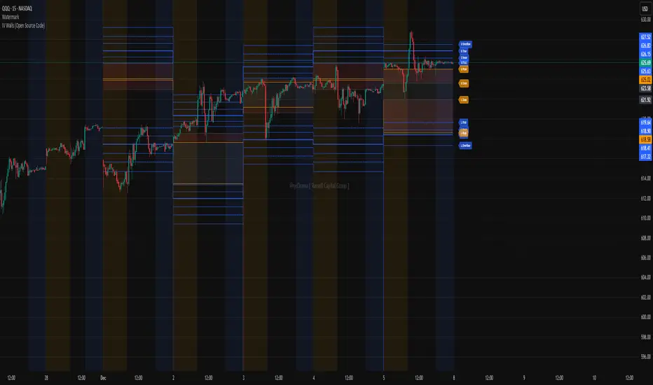
IV Walls (Open Source Code)Russell Capital Group
Code is completely open source. You are encouraged to make a copy as it is necessary for applying the indicator to multiple symbols. Each day's derived data must be plotted by code. Data is derived from the Fractal X software.
Message @ryd3rama on discord for more information or help.
Rating for each momentMoment Score Labels is a Pine v5 overlay indicator that shows momentum “ratings” (0–100) directly on the chart. It prints a vertical score label on every candle (rolling window to avoid label limits) and adds vertical SETUP/ENTRY/EXIT markers for both long and short signals. Signals are based on a weighted mix of trend (MA alignment + slope), momentum (RSI + MACD histogram), breakout (Donchian high/low), and volatility contraction, with an optional Daily regime filter and optional volume/breakout confirmations.

🟡 GOLD 4H HUD v8.9 — Loose ICT OB + Strong/Weak + FVG/HVN/LVNGOLD 4H HUD v8.9 is a clean, structured Smart Money Concepts (SMC)–based analysis tool designed exclusively for XAUUSD on the 4-hour timeframe.
It focuses on the three most important elements for institutional orderflow analysis:
✔ Loose ICT Order Blocks (Demand/Supply)
✔ Fair Value Gaps (FVG)
✔ Volume Profile Zones (HVN/LVN/POC)
The script builds a professional-style HUD that displays the key institutional regions and structural levels that matter most for gold traders.
📌 Key Features
1 — Market Structure Engine (HH/HL & BOS)
The indicator detects:
Minor swing Highs and Lows
Last confirmed HH / HL levels
Break of Structure (BOS) for directional bias
EMA-200 trend filter (UP / DOWN / NEUTRAL)
This gives traders a clean structural read without clutter or noise.
2 — Loose FVG Engine (Tolerance-Based ICT Gaps)
A soft-threshold FVG engine detects “loose” Fair Value Gaps using a 0.1% price tolerance.
This method ensures:
Fewer missed imbalances
Cleaner OB/FVG alignment
Higher accuracy on 4H gold displacement legs
FVGs automatically shift to the right side of the chart for clean visualization.
3 — Order Block Engine (Demand/Supply + Strong/Weak Classification)
A simplified ICT-style OB engine scans the past few candles whenever BOS is detected.
It identifies:
Demand OB during bullish BOS
Supply OB during bearish BOS
Strong OB if fully nested inside an active FVG
Weak OB otherwise
OB boxes include:
Clear color coding (strong vs. weak)
Price range labels inside each box
Automatic right-shift for visual clarity
4 — Volume Profile Engine (POC / HVN / LVN / VAH / VAL)
Based on a rolling window (default 120 bars), the script builds a lightweight volume distribution.
It displays:
POC (Point of Control)
HVN (High Volume Node)
LVN (Low Volume Node)
Value Area High / Low
HVN/LVN zones are shown as right-shifted colored boxes with price labels.
These zones help identify:
Institutional accumulation
Low-liquidity rejection points
Areas where price tends to react strongly
5 — Support / Resistance Mapping
The script automatically generates:
OB-based support/resistance
Swing-high/swing-low levels
HVN/LVN structural levels
These are displayed in the HUD for fast reference.
6 — Professional HUD Panel
A compact, easy-to-read HUD summarizes:
Trend direction
Latest HH/HL
OB ranges (Strong/Weak)
HVN/LVN price zones
POC
Multi-layer support & resistance
This turns the script into a fully functional analysis dashboard.
📌 What This Indicator Is NOT
To avoid misunderstanding:
It does not take entries or generate buy/sell signals
It does not auto-detect CHOCH, MSS, SMT, or sweeps
It is not a trading bot
This tool is designed as an institutional-style map and analysis HUD, not a strategy.
📌 Best Use Case
This indicator is ideal for traders who want to:
Read institutional structure on XAUUSD
Identify clean Demand/Supply zones
Visualize FVG/OB/HVN interactions
Track high-value liquidity levels
Build directional bias on 4H before dropping to execution timeframes
⚠ Important Note
This tool is designed exclusively for the 4H timeframe.
Using it on lower timeframes will display a warning.

Quantum Uncertainty by Kingshuk GhoshLet me explain this indicator in simple, practical terms, including the fascinating physics concept that inspired me.
This indicator helps to understand when the market is predictable (safe to trade) versus unpredictable (risky to trade). It shows the probability zones where price is likely to move and warns you when conditions are too chaotic for reliable trading.
The Physics Behind It: Heisenberg's Uncertainty Principle:-
This indicator is inspired by one of the most profound discoveries in physics: Heisenberg's Uncertainty Principle.
What Is The Uncertainty Principle?
In 1927, physicist Werner Heisenberg discovered something remarkable about the universe: you cannot simultaneously know both the exact position and exact momentum of a particle with perfect precision. The more accurately you know one, the less accurately you can know the other.
Simple Analogy:
Imagine trying to photograph a speeding bullet:
Use fast shutter speed → You see exactly WHERE it is (position), but the image is frozen, so you can't tell HOW FAST it's moving (momentum)
Use slow shutter speed → You see motion blur showing HOW FAST it's moving (momentum), but you can't pinpoint exactly WHERE it is (position)
You can never have both perfect clarity simultaneously - there's always a trade-off.
How This Applies To Trading
The indicator translates this principle to financial markets:
In Physics:
Position Uncertainty × Momentum Uncertainty = Always greater than a minimum value
High uncertainty in one means high uncertainty overall
In Trading:
Price Position Uncertainty = How much the price bounces around (volatility)
Price Momentum Uncertainty = How erratic the directional strength is
Total Market Uncertainty = Price Volatility × Momentum Volatility
The Trading Insight:
Just like in physics, when BOTH price position and momentum are uncertain (highly volatile), the market becomes fundamentally unpredictable. You can't reliably know where price will go next because the system is in high uncertainty state.
Why This Matters For You
Traditional indicators often look at price OR momentum separately. This indicator recognizes that both must be considered together to truly understand market predictability, just as Heisenberg showed that position and momentum must be considered together in physics.
When both uncertainties are high simultaneously:
Price could jump anywhere
Momentum could shift instantly
Predictions become unreliable
Trading becomes gambling
When both uncertainties are low:
Price behavior is more regular
Momentum is more stable
Patterns become clearer
Trading becomes strategic
This is why the indicator's core metric multiplies price volatility by momentum volatility - it's capturing that fundamental uncertainty relationship.
Market Uncertainty
The indicator calculates how unpredictable the market currently is by examining:
How much price is bouncing around (price volatility)
How erratic the momentum is (momentum instability)
When both are high simultaneously, the market becomes highly unpredictable. When both are calm, the market is more reliable for trading.
Think of it like driving:
Low uncertainty = Clear road, good visibility, safe to drive
High uncertainty = Fog, rain, poor visibility, dangerous conditions
Probability Bands
The indicator draws colored bands around a central average price line:
White Center Line (Basis)
The average price over your lookback period
Acts as a equilibrium point where price gravitates
Blue Bands (Inner Zone)
Covers about 68% of normal price behavior
Price spends most of its time here
This is the "normal operating range"
Purple Bands (Outer Zone)
Covers about 95% of all price behavior
Price rarely ventures here
When it does, it's unusual and noteworthy
Highway Lane Analogy:
Most drivers stay in center lanes (blue zone)
Few drivers use extreme outer lanes (purple zone)
When someone drives on the shoulder, it's abnormal and signals something is happening
Wave Function Collapse
Another physics concept applied here: In quantum mechanics, particles exist in multiple states simultaneously (superposition) until they're measured - then the "wave function collapses" to a single state.
In This Indicator:
The probability bands represent all the possible states price could be in. When price moves and settles at a specific level, it's like the wave function collapsing - probability becomes reality.
The indicator helps you see:
Where price is most likely to be (high probability zones - blue bands)
Where price rarely goes (low probability zones - purple bands)
When price is in an "impossible" state (outside bands - tunneling)
Price Position
The indicator tracks where current price sits within these bands:
Upper position = Price in the top half (bullish territory)
Lower position = Price in the bottom half (bearish territory)
Extreme positions = Price in outer 30% on either side (potential reversal zones)
Quantum Tunneling Signals
This is another physics concept: In quantum mechanics, particles can sometimes "tunnel" through barriers that classical physics says they shouldn't be able to cross.
In Trading:
When price breaks through the 95% probability barrier, it's "tunneling" into statistically improbable territory - these are marked by triangles:
Green Triangle Up
Price tunneled through the upper 95% barrier
This is statistically rare (happens only 5% of the time)
Often signals price exhaustion or coming reversal downward
Like a particle that tunneled too far and will snap back
Red Triangle Down
Price tunneled through the lower 95% barrier
Also statistically unusual
Often signals panic selling may be overdone
Like a spring compressed too far, ready to bounce
These "tunneling events" are significant because they represent extreme deviations from normal probability - and markets tend to revert to normal.
Entanglement Score
In quantum physics, "entanglement" means two particles are connected such that measuring one instantly affects the other, no matter the distance.
In Trading:
This measures whether price movements are "entangled" with trading volume - do they move together in a connected way?
High Entanglement (above 0.5)
Price and volume move together
Volume confirms the price action
More reliable, trustworthy moves
Like entangled particles - they're truly connected
Low Entanglement (below 0.3)
Price moves without volume support
Suspicious, unsupported movements
Less reliable, be cautious
Like particles that aren't entangled - the connection is weak
Negative Entanglement
Price and volume move in opposite directions
Often signals divergence or potential reversal
Requires careful interpretation
Information Dashboard:
1. Uncertainty Level
Shows current market unpredictability (the core Heisenberg principle calculation):
✓ Normal (Green) = Market is behaving predictably, safe to trade
⚠ High Risk (Red) = Market is chaotic, avoid trading
This is your first checkpoint - if uncertainty is high, don't proceed further.
2. Probability Score
Shows how normal or extreme the current price is:
Percentage shown = Where price sits in the probability distribution
✓ Safe (Green) = Price in normal range (middle 70%)
⛔ Extreme (Red) = Price at statistical outliers (outer 15%)
High percentage (>85%) = Price near the average, stable situation
Low percentage (<15%) = Price at extremes, unstable situation
3. Position Indicator
Tells you which side of the market you're on:
Upper/Lower = Basic location in the bands
→ Neutral (Gray) = Price in balanced middle zone
⚠ Reversal? (Orange) = Price at extremes, watch for turnaround
This helps you anticipate potential support or resistance levels.
4. Entanglement Confirmation
Shows the correlation number and interpretation:
✓ Confirmed (Green) = Volume strongly supports price (>0.5)
⚠ Weak (Orange) = Poor volume support (<0.5)
Always prefer trading when entanglement is confirmed - it means the move is "real" with participant backing.
5. Trade Status - YOUR MAIN SIGNAL
This is the indicator's final verdict combining all factors:
✓ TRADEABLE (Green)
Uncertainty is normal
Probability is safe
Entanglement is decent
Action: Market conditions favor trading
⛔ AVOID (Red)
One or more conditions are unfavorable
Market is too unpredictable
Action: Stay out, preserve capital.
Scenario A: Perfect Buy Setup
Red triangle appears (quantum tunneling down)
Position shows "Lower" with "⚠ Reversal?" warning
Entanglement shows "✓ Confirmed"
Trade Status: "✓ TRADEABLE"
Interpretation: Price hit extreme low with volume support, likely to bounce back to probability zone
Action: Consider long entry with stop below recent low
Scenario B: Perfect Sell Setup
Green triangle appears (quantum tunneling up)
Position shows "Upper" with "⚠ Reversal?" warning
Entanglement shows "✓ Confirmed"
Trade Status: "✓ TRADEABLE"
Interpretation: Price hit extreme high, exhaustion in high uncertainty zone
Action: Consider short entry or exit longs with stop above recent high
Scenario C: High Uncertainty - Stay Out
Uncertainty shows "⚠ High Risk"
Probability shows "⛔ Extreme"
Trade Status: "⛔ AVOID"
Interpretation: Both price and momentum uncertainties are high - market is fundamentally unpredictable (Heisenberg principle in action)
Action: No trading, wait for uncertainty to decrease
Scenario D: Trending Market
Price consistently stays in upper bands
No tunneling signals
Entanglement remains high
Trade Status stays "✓ TRADEABLE"
Interpretation: Strong trend with low uncertainty
Action: Trade with the trend, don't fight it
Scenario E: Choppy, Range-Bound
Price bounces between inner blue bands
Frequent status changes between TRADEABLE and AVOID
Entanglement fluctuates
Interpretation: Market lacks direction, uncertainty fluctuating
Action: Use bands as support/resistance for scalping, or wait for breakout.
Why The Uncertainty Principle Matters In Trading
Traditional technical analysis often looks at indicators in isolation:
"RSI is oversold, so buy"
"Price is volatile, so wait"
"Volume is high, so trade"
But Heisenberg's principle teaches us that multiple uncertainties interact and compound. This indicator recognizes that truth:
When price volatility is high AND momentum is erratic:
You can't reliably predict where price will go
You can't reliably predict how strong the move will be
The combination creates fundamental unpredictability
This is when the indicator says "AVOID"
When price volatility is low AND momentum is stable:
Price behavior becomes more regular
Directional moves become more reliable
The low combined uncertainty creates tradeable conditions
This is when the indicator says "TRADEABLE"
The Probability Wave Function
In quantum mechanics, until you measure a particle, it exists in all possible states simultaneously (superposition). The probability wave describes where it's most likely to be found.
The bands work the same way:
Blue bands = Where price has 68% probability of being (1 standard deviation)
Purple bands = Where price has 95% probability of being (2 standard deviations)
Outside bands = Less than 5% probability (quantum tunneling territory)
When price is in the blue zone, it's in its "natural" superposition state - normal behavior.
When price tunnels outside, it's in an "improbable" state - like a quantum particle appearing where it shouldn't be. Physics tells us this can't last - the wave function will collapse back to normal probability zones. In trading, this means reversion to the mean.
Entanglement and Market Correlation
Quantum entanglement shows us that connections matter - particles don't act in isolation.
In markets:
Price shouldn't move in isolation from volume
When they're "entangled" (moving together), the move is authentic
When they're not entangled (price moves without volume), the move is suspicious
This is why the indicator checks entanglement - it's verifying that the market components are properly connected and confirming each other.
Golden Rules for the indicator:
Never trade during high uncertainty states - When the indicator shows AVOID, it's telling you that fundamental unpredictability (Heisenberg's principle) has taken over. This is non-negotiable.
Reduce position size when entanglement is weak - Even if uncertainty is low, weak volume entanglement means the move may not be authentic.
Respect the quantum tunneling signals - They mark statistical extremes where price has entered improbable territory. Reversion to normal probability zones is likely.
Don't chase price outside the bands - If you missed the tunneling entry, wait for price to return to normal probability zones.
Use the white center line as equilibrium - Like particles gravitating toward lower energy states, price tends to revert to its average.
Heisenberg's Uncertainty Principle teaches us a profound lesson: some things are fundamentally unknowable. You cannot eliminate uncertainty - you can only measure it and decide whether it's low enough to act.
This indicator embraces that wisdom:
It doesn't claim to predict the future
It doesn't promise guaranteed wins
It simply measures current uncertainty
And tells you when conditions are favorable vs. unfavorable
The market, like quantum particles, is probabilistic, not deterministic. You're trading probabilities, not certainties. The indicator helps you identify when those probabilities are in your favor (low uncertainty) and when they're not (high uncertainty).
This is a more mature, realistic approach to trading than indicators that promise to "predict" moves. Instead, this indicator honestly assesses predictability itself.
Remember: Not trading during high uncertainty is just as important as trading during low uncertainty. Preservation of capital is the foundation of long-term success. As Heisenberg taught us, some moments are simply too uncertain to act - and that's okay.
Chart attached: -NSE Persistent, EoD 05/12/25, Day Time Frame.
DISCLAIMER: This information is provided for educational purposes only and should not be considered financial, investment, or trading advice. Please do boost if you like it. Happy Trading.

🟡 GOLD 4H HUD v12 — Time-Safe Nuclear Edition🟡 GOLD 4H HUD v12 — Time-Safe Nuclear Edition
A full–scale Smart Money Concepts (SMC) analytics engine designed exclusively for XAUUSD on the 4-Hour timeframe.
This script combines market structure, liquidity, displacement, order blocks, imbalance, volume profile, SMT divergence, and institutional behavior modeling into a single unified HUD.
Built with a time-safe architecture, all structural elements (OB/FVG/Sweep) are stored by timestamp to minimize repainting and preserve event integrity.
📌 Core Features (12 Modules + Full HUD)
1 — Market Structure Engine
Automatically detects:
HH / HL / LH / LL
BOS (Break of Structure)
MSS (Market Structure Shift)
CHOCH (Change of Character)
Real swing pivots & trend state
2 — Sweep Engine (Liquidity Grab Detection)
Identifies institutional liquidity grabs:
Break + reclaim of highs/lows
ATR-filtered invalidation
Displacement-backed sweeps
3 — Time-Safe FVG Engine
Detects Bullish/Bearish Fair Value Gaps
ATR-tolerant FVG logic
Automatic right-extension
Auto-delete when filled or invalid
4 — Time-Safe Order Block Engine
Demand & Supply OB detection
Strength classification (Weak vs Strong)
FVG-overlap confirmation
Timestamp-locked (non-repainting)
5 — Volume Profile Engine (HVN / LVN / POC)
Real-time micro-profile:
High Volume Node (HVN)
Low Volume Node (LVN)
Point of Control (POC)
6 — SMT Engine (Gold vs DXY Divergence)
Smart Money Divergence built-in:
Bullish SMT
Bearish SMT
Directional confirmation with zero lag
7 — Displacement Engine
Measures institutional impulse:
Body-based impulse detection
Multi-leg continuation signals
FVG continuation moves
Generates displacement score
8 — Premium / Discount Model
Auto-classifies price into:
Discount (Buy zone)
Premium (Sell zone)
9 — SMC Trend Engine (Score-Based)
Combines 10+ factors:
Structure
FVG
OB power
Displacement
POC positioning
SMT conditions
Outputs:
BULL / BEAR / RANGE
Full scoring system
10 — Institutional Imbalance Model (IMB Engine)
Combines:
PD zones
Sweep direction
Displacement
SMT
OB strength
CHOCH/MSS
A complete institutional bias filter.
11 — Entry Engine (Signal Fusion Model)
Entry conditions fuse:
Sweep
CHOCH
Displacement
OB strength
FVG alignment
SMT confirmation
Also outputs:
Suggested SL/TP
Entry score
12 — Trendline Engine
Auto-draws:
HL → HL bullish trendlines
LH → LH bearish trendlines
+ Full Nuclear HUD
Displays:
Market structure
Trend direction
SMT / CHOCH / MSS
FVG / OB zones
HVN / LVN / POC
Liquidity strength
Entry model
Liquidity Magnet direction
SL/TP map
A complete institutional dashboard in one place.
⚠ Usage Requirement
This script is designed ONLY for the 4H timeframe.
✨ Summary
GOLD 4H HUD v12 — Time-Safe Nuclear Edition
is not just an indicator.
It is a full institutional-grade SMC analysis system, built specifically for Gold.
If you trade XAUUSD on the 4H timeframe —
this is your complete market intelligence HUD

Veil Trend# Veil Trend (VTrend)
**Veil Trend** is a minimalist trend-following and volatility framework built around a triple-EMA structure and adaptive price bands. It is designed to clearly define trend direction, dynamic support and resistance, and momentum expansion—without clutter.
---
## 🔹 Core Components
### Main EMA (Slow)
Acts as the primary trend axis.
- Price **above** the main EMA → bullish bias
- Price **below** the main EMA → bearish bias
### Medium EMA
Tracks intermediate momentum and trend strength, helping visualize pullbacks within the broader trend.
### Fast EMA (Optional)
Provides short-term momentum sensitivity and early trend shifts.
Hidden by default to maintain a clean chart.
---
## 🔹 Adaptive Veil Bands
Veil Trend wraps the main EMA with adaptive volatility bands (“the veil”) to define normal price movement versus expansion.
- **ATR-Based Bands (Default)**
Bands automatically expand and contract with volatility, adapting to changing market conditions.
- **Percentage-Based Bands (Optional)**
Bands are offset by a fixed percentage from the main EMA, useful for consistent scaling across instruments.
The shaded area between bands represents the **healthy trend zone**, where pullbacks and consolidations typically occur.
---
## 🔹 Signals & Interpretation
*(Disabled by default for a clean visual experience)*
### Band Breaks
- **Break above upper band** → strong bullish momentum
- **Break below lower band** → strong bearish momentum
### Band Bounces
- **Bounce from lower band** → potential bullish continuation
- **Rejection at upper band** → potential bearish continuation
Alerts are included for all band events and can be enabled as needed.
---
## 🔹 Visual Design Philosophy
- Clean, layered EMA structure (“noodles”)
- Subtle volatility bands with optional fill
- Optional status table for quick market context
- Minimalist by default, information-rich when enabled
---
## 🔹 Best Use Cases
- Identifying trend direction and bias
- Trading pullbacks within established trends
- Spotting volatility expansion and breakout conditions
- Works on **stocks, crypto, forex, and indices**
- Effective across all timeframes
---
**Veil Trend doesn’t predict — it reveals.**
