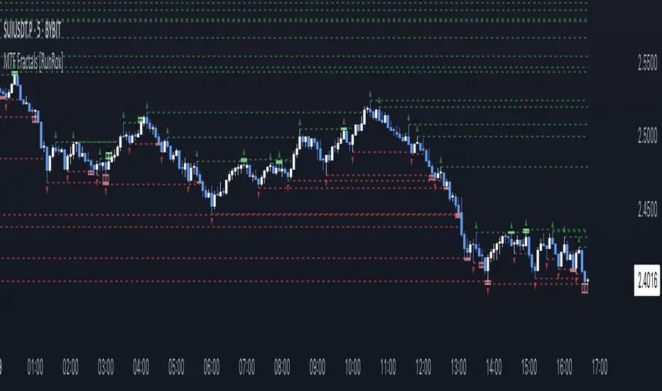
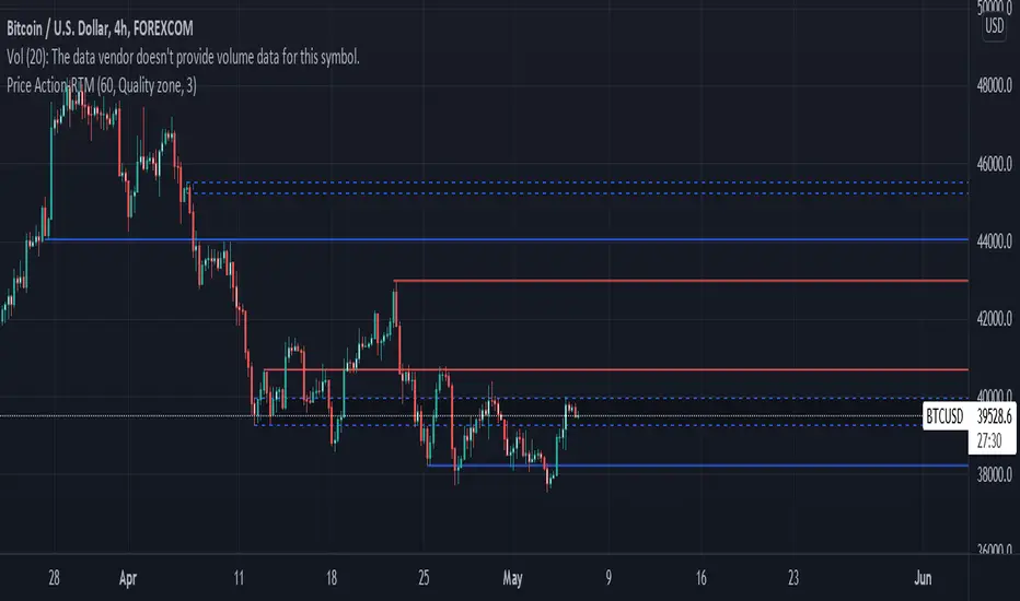
Candlestick Edge Auto-Preset MTF Self-CalibratingCandlestick Edge only fires a candlestick pattern when it is "rightly placed" — confirmed by a higher-timeframe trend AND by where price sits in the developing volume profile. Then it does what most pattern tools don't: it forward-tests every signal and reports the MEASURED edge per pattern, so you read realized performance instead of a marketing claim.
WHY THIS IS ONE TOOL (not a bundle)
The parts answer one question about one candle: "is this pattern in a place that has historically paid, and does it beat a coin-flip here?"
PATTERN detection says WHAT printed (24 classic candlestick patterns).
HTF ALIGNMENT says whether the bigger trend agrees.
VOLUME-PROFILE POSITIONING says WHERE it printed — reversals only at value-area edges, naked POC, HVN support/resistance, or liquidity sweeps; continuations only through low-volume voids or on a value breakout.
The CALIBRATION SPINE forward-resolves each signal with a triple barrier and reports Hit% vs a matched Base% (Edge) with a Wilson confidence interval, so a placed-and-confirmed pattern can be told apart from a small-sample fluke.
One pattern substrate, one location read, one calibration spine.
MEASUREMENT (the differentiator)
Each signal opens at close with target = ±TP·ATR, stop = ∓SL·ATR, over a fixed horizon. The first barrier touched decides win/loss (same-bar tie counts as the stop — conservative). Base% is the unconditional same-barrier win-rate for that direction. Edge = Hit% − Base%; a "*" marks rows whose Wilson 95% lower bound clears the base rate. A leave-one-out row prices each filter's marginal contribution, and a footer lists only the patterns that are green AND have enough samples to trust in the current configuration.
AUTO PRESET (default on)
Candlestick edges are timeframe-specific. Auto Preset reads the chart's timeframe and switches on the pattern subset plus higher-timeframe distance that performed best for that timeframe in the author's study of NSE index futures, and forces the two filters on. Turn it OFF for full manual research mode: all 24 patterns selectable, filters and HTF distance (3x / 5x / 15x / custom) under your control. Nothing is ever removed — the preset only curates which patterns are active by default per timeframe.
HOW TO USE
Leave Auto Preset on and read the labelled signals (teal = bullish, red = bearish, each tagged with the pattern name). Open "Show scoreboard" to see measured Edge per pattern — trust the EDGE column and the "*", never a raw hit-rate. Best behaviour is on intraday timeframes (1H and below).
ORIGINALITY
Standard techniques are credited below. What is original is the combination: a location-gated pattern engine whose every signal is forward-calibrated, a timeframe-adaptive auto-preset, a leave-one-out filter attribution, and an auto-surfaced tradeable set — measured edge, not asserted.
NON-REPAINT
Signals open on confirmed bars; triple-barrier outcomes resolve on bars AFTER the trigger; all higher-timeframe / lower-timeframe / prior-day-POC requests use lookahead_off and confirmed intrabars. Pivots used by sweeps confirm first.
DATA & MARKETS
Runs on any symbol that reports volume; the developing profile needs volume to be meaningful. Defaults are tuned for intraday index futures. On the Enhanced data tier the delta read uses intrabar aggregation (richer on paid plans) and auto-falls-back to an OHLCV proxy when intrabars aren't served — safe to leave on for any plan.
CONCEPT CREDITS (methods operationalized — original Pine re-derivations)
Candlestick patterns — Nison; pattern-performance framing per Bulkowski
Market / auction profile, POC / Value Area — Steidlmayer; Dalton
Bulk Volume Classification — Easley, Lopez de Prado & O'Hara (2012)
Triple-barrier labelling — Lopez de Prado
Wilson score interval — Wilson (1927)
HONESTY / LIMITS
The profile is an ATR-binned developing session profile (not tick POC). Delta is an estimate (proxy or intrabar reconstruction), not true bid/ask. Reported edge is context measured on loaded history — not a prediction or a promise. The preset defaults were tuned on one instrument over a recent window, so treat them as a well-measured hypothesis, not proven alpha.
Educational tool. Not financial advice — you alone are responsible for your trading decisions. Penunjuk

Bedaiwi's Smart PivotsBedaiwi's Smart Pivots is a three-level market-structure indicator that classifies price turning points as Minor, Intermediate, and Major highs and lows.
HOW IT WORKS
Minor Pivots
A Minor High is confirmed when the middle bar of a three-bar formation has a high that is strictly higher than the highs immediately before and after it.
A Minor Low is confirmed when the middle bar has a low that is strictly lower than the lows immediately before and after it.
Equal highs and equal lows are not treated as Minor pivots.
Intermediate Pivots
Intermediate pivots are derived from confirmed sequences of Minor pivots.
An Intermediate High is identified when a higher Minor High is followed by a lower Minor High.
An Intermediate Low is identified when a lower Minor Low is followed by a higher Minor Low.
Major Pivots
Major pivots apply the same hierarchical logic to confirmed Intermediate pivots.
A Major High is identified when a higher Intermediate High is followed by a lower Intermediate High.
A Major Low is identified when a lower Intermediate Low is followed by a higher Intermediate Low.
SYMBOLS AND COLORS
- Red diamond: Intermediate High
- Green diamond: Intermediate Low
- Red exclamation mark: Major High
- Green exclamation mark: Major Low
Optional Minor pivots use the same High and Low color settings.
When the replacement option is enabled, an Intermediate symbol is removed and replaced with an exclamation mark if the same point is later promoted to Major status.
HISTORICAL PLOTTING AND CONFIRMATION DELAY
Pivot identification requires subsequent price information.
A Minor pivot is confirmed only after the following bar closes. Intermediate and Major pivots require additional confirmed pivot sequences, so their confirmation occurs later.
After confirmation, the indicator places the symbol on the historical bar where the relevant high or low occurred. Therefore, a symbol displayed on an earlier bar was not necessarily available in real time on that bar.
Historical placement is used only to show the actual location of the confirmed turning point. It should not be interpreted as a signal that was known on the historical pivot bar.
SETTINGS
Users can:
- Show or hide Minor pivots
- Show or hide Intermediate pivots
- Show or hide Major pivots
- Replace an Intermediate symbol when it becomes a Major pivot
- Customize High and Low pivot colors
PRACTICAL USE
Smart Pivots can help users:
- Study market structure
- Identify significant historical swing highs and lows
- Separate short-term fluctuations from higher-level price structure
- Review possible support and resistance areas
- Add context to discretionary price-action analysis
LIMITATIONS
Smart Pivots is an analytical indicator. It does not place trading orders and does not define entries, exits, stop-loss levels, profit targets, position sizing, or expected returns.
Pivot confirmation is delayed by design because later price action is required. Results may vary between symbols, timeframes, sessions, and data feeds.
The indicator does not identify final market tops or bottoms with certainty. Historical observations do not guarantee future market behavior.
This script is provided for research and educational purposes only. It is not financial or investment advice. Penunjuk

Liquidity Structure Framework [PakunFX]Liquidity Sequence Framework
Liquidity Sequence Framework (LSF) is a market structure analysis indicator designed to visualize the progression of liquidity events, structure shifts, and Fair Value Gaps (FVGs) within a single analytical framework.
Instead of focusing on individual signals, the indicator organizes multiple market events into a sequential process, helping traders observe how price structure develops over time. The script combines swing structure, liquidity sweeps, trend filtering, and Fair Value Gap detection into a unified charting tool.
Features
External and Internal Swing Structure detection
Liquidity Sweep identification (SSL / BSL)
Bullish and Bearish Structure Shift detection
Automatic Fair Value Gap (FVG) detection
EMA-based trend filter
Premium / Discount (Equilibrium) filter
Configurable setup conditions
Visual sequence tracking with alerts
How it Works
The indicator monitors market structure using external and internal swing highs and lows. When liquidity is swept beyond a previous swing level, a new sequence begins. The script then tracks whether price confirms a structure shift and subsequently forms a Fair Value Gap within a configurable sequence window.
Trend filtering can be applied using Fast and Slow EMA conditions, while optional Premium / Discount and Fair Value Gap requirements allow users to customize how potential setups are displayed.
Display Elements
External Swing High / Low
Internal Swing High / Low
Liquidity Sweep markers (SSL / BSL)
Structure Shift markers
Active Fair Value Gap zones
Fast and Slow EMA
Equilibrium level
Setup markers
Alerts
Alerts are available for:
Liquidity Sweep
Bullish Structure Shift
Bearish Structure Shift
Bullish Sequence Setup
Bearish Sequence Setup
These alerts are intended to notify users when predefined analytical conditions are detected.
Notes
Liquidity Sequence Framework is designed as a market analysis tool. It visualizes structural relationships between liquidity events and price development but does not generate trading recommendations or predict future market direction.
Disclaimer
This script is provided for educational and research purposes only.
All calculations are based on historical price data. The displayed structures, Fair Value Gaps, and sequence conditions are intended to support chart analysis and should not be interpreted as guarantees of future market behavior or trading performance.
Penunjuk

Elaris Failed Breakout DetectorFailed Breakout Detector
The **Failed Breakout Detector** is designed to help traders identify situations where price briefly breaks above resistance or below support, but fails to sustain the move and quickly returns back inside the previous trading range.
These events are commonly referred to as **failed breakouts**, **bull traps**, **bear traps**, or **liquidity sweeps**. They can indicate that buying or selling pressure was unable to maintain the breakout, potentially leading to a move in the opposite direction.
Instead of relying on a single candle pattern, this indicator combines multiple confirmation techniques to improve signal quality, including:
• Automatic support and resistance detection using confirmed swing pivots.
• Configurable breakout buffer to reduce sensitivity to minor price movements.
• Detection of failed breakout and failed breakdown events within a user-defined number of bars.
• Optional volume confirmation to require stronger participation during the initial breakout.
• Optional rejection wick analysis to identify stronger rejection candles.
• Optional EMA trend filter for users who prefer trading with the prevailing trend.
• Dynamic support and resistance zones based on ATR.
• Signal confidence score for additional context.
• Optional dashboard displaying current structure and trend information.
• Built-in alert conditions for long, short and combined signals.
How it works
**Failed Breakout (Short Setup)**
1. Price closes above a confirmed resistance level.
2. Within the specified number of candles, price closes back below that resistance.
3. Optional filters such as volume, wick rejection and trend confirmation are evaluated.
4. A bearish failed breakout signal is generated.
**Failed Breakdown (Long Setup)**
1. Price closes below a confirmed support level.
2. Price quickly closes back above that support.
3. Optional confirmation filters are applied.
4. A bullish failed breakdown signal is generated.
Inputs
The indicator allows users to customize:
• Pivot sensitivity
• ATR-based breakout buffer
• Support and resistance zone size
• Maximum number of bars allowed before the breakout is considered valid
• Volume confirmation
• Rejection wick requirements
• EMA trend filtering
• Dashboard visibility
• Signal labels
• Alert conditions
Notes
• Swing levels are created from confirmed pivot highs and lows. Because pivots require confirmation, support and resistance levels are confirmed after the selected right-side pivot bars.
• Signal markers themselves do not repaint after they appear.
• This indicator is intended as a technical analysis tool and should be used alongside sound risk management and additional market context.
• No indicator can guarantee future market direction.
If you find this indicator useful, consider leaving a like and sharing your feedback. Constructive suggestions are always appreciated and help improve future updates.
Penunjuk

Rejection Block Matrix [ZOM]Rejection Block Matrix maps supply and demand rejection blocks from failed swing sweeps and confirmed pivot wick rejection.
What it shows:
- Demand and supply blocks built from wick/body rejection structure
- Failed high/low sweep blocks for tape-reading style reversal context
- Tested and broken block state tracking, with broken context hidden by default to reduce clutter
- Reclaim/rejection marks when price retests a live block
- A compact dashboard showing visible demand/supply blocks, tested count, latest source, bias, and quality
How I use it:
The blocks are structure zones, not automatic entries. I use them to see where price rejected prior liquidity, then watch how later candles behave when they revisit those blocks. It is especially useful on liquid intraday markets such as ES, NQ, crypto, and major FX pairs.
Open-source script. Educational tool only; not financial advice. Penunjuk

Liquidity Vault [Dojo La Nuit]Liquidity Vault maps resting liquidity on your chart as clean horizontal levels and tracks what happens to them — without any buy/sell signals or predictions. It is a pure visualization tool for traders who read price around liquidity.
HOW IT WORKS
The script detects swing pivots and clusters nearby highs (and nearby lows) into single liquidity zones using an ATR-based tolerance, so the levels travel across instruments without re-tuning. Each zone gets a strength score from 0 to 100 built from three factors:
• Touches — how many times price reacted at the level
• Freshness — recent levels score higher and decay over time (configurable half-life)
• Volume — relative volume that accumulated at the level
HOW TO READ IT
• Red lines = sell-side liquidity (resting above price)
• Green lines = buy-side liquidity (resting below price)
• Opacity = strength: the stronger the zone, the more solid the line
• Dimmed, dotted lines = zones that have already been swept (price wicked through the level). They are kept as context, not removed.
SETTINGS
• Zone Detection — adaptive or fixed pivot length, clustering tolerance, lookback, max live zones
• Zone Strength — minimum score to display, freshness half-life, volume weighting on/off
• Visuals — theme (auto/dark/light), strength-based intensity, keep swept zones, line width
• Colors — fully customizable buy-side / sell-side colors
NOTES
Strength is shown through line opacity by design, to keep the chart minimal. Zones are recalculated on confirmed bars. This tool highlights where liquidity rests and when it gets taken — it does not generate entries, targets or signals.
This indicator is for educational and analytical purposes only. It is not financial advice. Always do your own research and manage your own risk.
─────────────────────────
🌙 LIQUIDITY VAULT — Dojo La Nuit
Liquidity Vault mostra la liquidità presente sul grafico come livelli orizzontali puliti e ne traccia l'evoluzione, senza segnali di acquisto/vendita e senza previsioni. È uno strumento puramente visivo per chi opera attorno alla liquidità.
COME FUNZIONA
Lo script individua i pivot di mercato e raggruppa i massimi (e i minimi) vicini in un'unica zona di liquidità tramite una tolleranza basata sull'ATR, così i livelli funzionano su strumenti diversi senza dover ritoccare i parametri. A ogni zona viene assegnato un punteggio di forza da 0 a 100, calcolato su tre fattori:
• Tocchi — quante volte il prezzo ha reagito al livello
• Freschezza — i livelli recenti pesano di più e si attenuano nel tempo (half-life configurabile)
• Volume — il volume relativo accumulato sul livello
COME SI LEGGE
• Linee rosse = liquidità sell-side (sopra il prezzo)
• Linee verdi = liquidità buy-side (sotto il prezzo)
• Opacità = forza: più la zona è forte, più la linea è piena
• Linee attenuate e puntinate = zone già spazzate (il prezzo ha bucato il livello con un'ombra). Restano come contesto, non vengono rimosse.
IMPOSTAZIONI
• Rilevamento zone — pivot adattivo o fisso, tolleranza di clustering, lookback, numero massimo di zone attive
• Forza zone — punteggio minimo da mostrare, half-life della freschezza, peso del volume on/off
• Visual — tema (auto/scuro/chiaro), intensità in base alla forza, mantieni zone spazzate, spessore linea
• Colori — colori buy-side / sell-side completamente personalizzabili
NOTE
La forza è rappresentata tramite l'opacità della linea, per scelta, per mantenere il grafico minimale. Le zone vengono ricalcolate sulle barre confermate. Lo strumento evidenzia dove si trova la liquidità e quando viene presa: non genera entrate, target o segnali.
Questo indicatore è a scopo puramente didattico e di analisi. Non è consulenza finanziaria. Fai sempre le tue valutazioni e gestisci il tuo rischio. Penunjuk

Elaris Absorption Zones ProElaris Absorption Zones Pro
Elaris Absorption Zones Pro is an advanced price-action and volume analysis indicator designed to identify potential absorption events where aggressive market orders are absorbed by opposing passive liquidity.
The indicator focuses on situations where price attempts to break an important level but fails to continue, suggesting that significant limit orders may be absorbing the incoming buying or selling pressure.
Unlike traditional breakout indicators that look for continuation, this tool is designed to highlight failed auctions, rejection events, and potential liquidity absorption zones that may lead to reversals, pullbacks, or reduced directional momentum.
---
What Is Absorption?
Absorption occurs when aggressive participants repeatedly attempt to push price through a level using market orders, but opposing limit orders absorb that pressure and prevent further movement.
Examples include:
• Buyers aggressively pushing above resistance but failing to achieve continuation.
• Sellers aggressively pushing below support but failing to achieve continuation.
• Large rejection wicks appearing after a breakout attempt.
• High volume with limited price progress (Effort vs Result imbalance).
These conditions can indicate the presence of significant liquidity providers defending a price area.
---
How The Indicator Works
The indicator combines multiple confirmation layers:
Market Structure Analysis
The script monitors:
• Confirmed swing highs and swing lows
• Recent trading ranges
• Failed breakout attempts
Price must first attempt to break an important structural level before absorption conditions can be evaluated.
Rejection Analysis
The indicator evaluates:
• Upper wick size
• Lower wick size
• Body-to-range relationship
Large rejection wicks combined with small candle bodies may indicate strong opposing liquidity.
Volume Confirmation
Volume is evaluated using:
• Relative volume
• Volume moving averages
• Optional volume Z-score analysis
This helps identify situations where participation is elevated compared to normal market activity.
Effort vs Result Model
One of the core components of the indicator is Effort vs Result analysis.
High volume combined with poor directional progress can indicate that incoming orders are being absorbed rather than successfully moving the market.
Absorption Scoring
Every detected signal receives a strength score based on:
• Rejection quality
• Relative volume
• Candle efficiency
Higher scores generally indicate stronger absorption characteristics.
---
Features
✔ Bullish absorption detection
✔ Bearish absorption detection
✔ Failed breakout recognition
✔ Confirmed swing structure analysis
✔ Range breakout absorption detection
✔ Relative volume filters
✔ Volume Z-score filtering
✔ Effort vs Result analysis
✔ Absorption strength scoring
✔ Optional absorption zones
✔ Zone retest detection
✔ Dashboard with live metrics
✔ Alert conditions
✔ Non-repainting confirmation mode
---
Bullish Absorption
Bullish absorption may occur when:
1. Price breaks below support.
2. Sellers attempt continuation.
3. Price quickly returns above the level.
4. A strong lower rejection wick forms.
5. Volume confirms elevated participation.
This may suggest that passive buyers absorbed the selling pressure.
---
Bearish Absorption
Bearish absorption may occur when:
1. Price breaks above resistance.
2. Buyers attempt continuation.
3. Price closes back below the level.
4. A strong upper rejection wick forms.
5. Volume confirms elevated participation.
This may suggest that passive sellers absorbed the buying pressure.
---
How To Use
Many traders use absorption signals as:
• Early reversal warnings
• Liquidity sweep confirmations
• Support and resistance confirmation
• Market structure confirmation
• Trade management tools
For best results, consider combining absorption signals with:
• Trend analysis
• Market structure
• Higher timeframe context
• Risk management rules
• Additional confirmation tools
---
Non-Repainting
When "Confirm Only After Candle Close" is enabled, signals are generated only after a candle has fully closed.
Confirmed swing levels are based on completed pivot structures.
This helps reduce signal instability and prevents intrabar repainting behavior.
---
Important Notes
This indicator does not use Level II, order book, footprint, or exchange matching engine data.
Because TradingView Pine Script does not have direct access to actual market order flow, absorption is estimated using a combination of price action, rejection behavior, volume analysis, and structural breakout failure characteristics.
As with all trading tools, signals should be used as part of a complete trading plan and not as standalone buy or sell recommendations.
Penunjuk

Pivot Breakout Retest Signals [algo_aakash]Overview
Pivot Breakout Retest Signals is a price action indicator that helps traders identify potential bullish and bearish retest opportunities around Classic Pivot Point levels.
The indicator calculates pivot levels from a selected higher timeframe (Daily, Weekly, or Monthly) and monitors price for breakout events followed by retests of those levels. When a valid retest is confirmed within the specified window, the script displays a Bullish or Bearish signal on the chart.
Features
• Classic Pivot Point calculation
• Daily, Weekly, or Monthly pivot timeframe selection
• Automatic breakout detection
• Retest confirmation logic
• Bullish and Bearish signal visualization
• Configurable retest window
• Alert support for signal events
How It Works
Bullish Conditions
1. Price breaks above a Pivot, R1, or R2 level.
2. The breakout is recorded.
3. Price retests the broken level within the user-defined retest window.
4. If price closes back above the level after the retest, a Bullish signal is generated.
Bearish Conditions
1. Price breaks below a Pivot, S1, or S2 level.
2. The breakdown is recorded.
3. Price retests the broken level within the user-defined retest window.
4. If price closes back below the level after the retest, a Bearish signal is generated.
Inputs
Pivot Timeframe
Select the timeframe used to calculate pivot levels:
• Daily
• Weekly
• Monthly
Retest Window
Determines how many candles are allowed between the breakout and the retest confirmation.
Alerts
The script includes built-in alert conditions:
• Bullish Alert
• Bearish Alert
Alerts can be used with TradingView's notification system or connected to external workflows.
Notes
• Pivot levels are calculated using completed higher-timeframe data.
• Signals are generated only after both breakout and retest conditions are satisfied.
• The indicator is intended as an analytical tool and may be combined with other forms of technical analysis.
Limitations
• Signals can occur during ranging or volatile market conditions.
• Not every breakout or retest will lead to sustained price movement.
• Additional confirmation methods may be useful depending on the market and trading style. Penunjuk

SXA: Super Xtation Amplitude | MTF FrameworkSXA (Super Xtation Amplitude) is a multi-timeframe market positioning framework designed to provide a complete visual overview of price location within the broader market structure.
Rather than focusing on entry signals, SXA combines trend context, volatility, session activity, anchored VWAPs, prior-day reference levels, Fibonacci projections, and higher-timeframe moving averages into a single environment. The objective is to help traders understand where price is currently trading relative to statistically and structurally significant areas.
The indicator was built around a simple principle:
"Price behaves differently depending on where it is located within the market."
By integrating multiple forms of context into one view, SXA allows traders to quickly identify premium and discount zones, trend alignment, session-driven liquidity areas, and potential reaction levels without switching between multiple indicators.
FEATURES
• Smart Trend Engine
Multi-timeframe moving average framework designed to visualize short, intermediate, and macro directional bias.
• Dynamic Trend Clouds
Visual cloud structures help identify trend alignment and potential transition zones between bullish and bearish conditions.
• Higher Timeframe Context
Daily 50 SMA and 200 SMA provide broader market structure and long-term directional references.
• Prior Day Reference Levels
Automatic plotting of previous day's Open, High, Low, and Close.
• Fibonacci Expansion Grid
Extended Fibonacci projections derived from the previous day's range to identify potential reaction zones and liquidity targets.
• Anchored Session VWAPs
Includes:
* Daily VWAP
* European Session VWAP
* Pre-New York VWAP
* New York Session VWAP
* Post-European Session VWAP
These levels provide institutional-style references for price acceptance and value.
• Weekly Structure Levels
Dynamic weekly Open, High, and Low levels update in real time throughout the trading week.
• Session Mapping
Visual session boxes highlight important market periods, including the Asian session and Pre-New York range.
INTENDED USE
SXA is designed as a contextual decision-support tool rather than a standalone trading system.
The indicator can be used to:
* Assess overall market positioning.
* Identify trend alignment across multiple timeframes.
* Locate potential support and resistance zones.
* Track session-driven liquidity.
* Monitor volatility expansion and contraction.
* Build discretionary trade narratives.
* Enhance existing trading systems.
SXA does not generate buy or sell recommendations. Instead, it seeks to answer a more fundamental question:
"Where is price currently located within the broader market landscape?"
By providing that context at a glance, traders can make more informed decisions while reducing chart clutter and indicator overload.
Created by @Peter_n_n
Penunjuk

Smart Money Sentiment Index [MarkitTick]💡A comprehensive analytical tool designed to bridge the gap between underlying market psychology and structural price action. By synthesizing a multi-dimensional sentiment oscillator with an advanced market structure mapping system, this indicator provides a holistic view of market dynamics. It is engineered to identify periods of psychological exhaustion—where market participants exhibit extreme fear or greed—and cross-reference these anomalies with significant shifts in supply and demand. This confluence allows for a highly disciplined approach to navigating volatile environments, ensuring that structural analysis is always contextualized by prevailing market sentiment.
✨ Originality and Utility
Traditional oscillators typically isolate a single variable, such as momentum or volume, which often leads to diverging signals during complex market phases. Furthermore, structural mapping tools operate strictly on price geometry without considering the behavioral state of the market. This tool is highly original because it resolves this disconnect. It operates as a strategic mashup, justifying the combination of sentiment analysis and structure mapping by positing that structural breaks are significantly more reliable when they align with behavioral extremes. By unifying these two previously disparate analytical frameworks, the indicator filters out structural noise that occurs in neutral psychological zones, delivering a refined perspective on market conditions.
🔬 Methodology and Concepts
The underlying methodology relies on a dual-engine architecture, carefully abstracted to maintain calculation integrity and protect core logic.
• The Sentiment Engine
The sentiment component processes multiple parallel vectors of market data. It continually assesses momentum differentials, volatility compression and expansion, volume participation intensity, and relative positioning. These vectors are mathematically normalized and aggregated into a singular composite score ranging from zero to one hundred. This raw composite is then passed through a dynamic smoothing algorithm to filter out erratic tick-level noise, resulting in a stable primary sentiment value. A secondary signal line is derived from this primary value to calculate momentum convergence and divergence, effectively anticipating shifts in behavioral trends before they fully materialize.
• The Structural Engine
Operating concurrently, the structural engine performs rigorous swing analysis. It continuously scans historical price action to identify confirmed pivot highs and pivot lows based on user-defined parameters. When price action eclipses these pivotal nodes, the engine mathematically categorizes the event as either a continuation of structure or a fundamental shift in character. Upon confirmation of these structural shifts, the engine projects dynamic support and resistance zones, tracking their mitigation status in real-time to visualize areas of untested liquidity.
🎨 Visual Guide
The visual presentation is meticulously designed to present complex data hierarchies without obscuring price action.
• The Oscillator Pane
The primary sentiment line oscillates between 0 and 100, plotted prominently to reflect current market psychology.
A secondary, semi-transparent signal line tracks the primary sentiment, providing a visual cue for momentum crossovers.
Horizontal reference levels establish the baseline neutral zone (50), as well as the thresholds for extreme greed and extreme fear.
The background of the oscillator pane dynamically illuminates with deeply saturated hues when the sentiment breaches the outermost extremes, providing immediate visual notification of exhaustion.
• Chart Elements and Overlays
Price candles feature dynamic color gradients that transition from deep red to vibrant green, providing a bar-by-bar heatmap of the underlying sentiment.
Dashed horizontal lines project across the chart to mark significant structural breaks, accompanied by precise text labels denoting the nature of the break.
Translucent rectangular zones are drawn at the origin points of structural breaks, visually representing active areas of interest.
The color coding of these zones shifts to a muted, darker shade once price successfully retests and mitigates the area, allowing the user to distinguish between fresh and exhausted liquidity.
• The Analytics Dashboard
A highly structured table anchors to the chart, displaying real-time metrics:
FGI Value : The exact numerical sentiment score paired with a visual magnitude bar.
Signal Value : The smoothed momentum score.
Momentum Gap : Calculates the absolute distance between the sentiment and signal lines, indicating whether the psychological momentum is expanding or narrowing.
Bias Regime : Classifies the broader environment as rising or extreme within the context of fear or greed.
Zone Status : Explicitly warns when the market enters extreme threshold boundaries.
Zero Cross Age : A bar-counting mechanism that tracks the duration since the sentiment last crossed the neutral baseline.
Market Structure : Displays the current prevailing structural trend confirmed by the SMC engine.
📖 How to Use
This tool is designed to foster a systematic approach to market analysis, utilizing confluence to filter high-probability environments.
Identify Behavioral Exhaustion : Monitor the sentiment oscillator and the analytics dashboard. When the market enters the extreme greed or extreme fear background zones, recognize that the prevailing trend is highly saturated and susceptible to mean reversion.
Wait for Structural Confirmation : Do not act solely on sentiment extremes. Wait for the structural engine to print a confirmed shift in character on the chart.
Assess the Momentum Gap : Consult the dashboard to ensure the momentum gap is expanding in the direction of the new structural shift, validating that market psychology supports the technical breakout.
Define Invalidation : Utilize the freshly generated, unmitigated order block zones as logical areas to define risk parameters and structural invalidation points.
⚙️ Inputs and Settings
The indicator provides extensive configurability to adapt to various market environments.
• Sentiment Parameters
FGI Period : Dictates the lookback window for the core sentiment vectors. Shorter lengths increase sensitivity, while longer lengths identify macro psychological shifts.
Signal Line Period : Adjusts the smoothing factor for the secondary momentum tracker.
Overbought/Oversold Levels : Allows the user to define the exact numerical thresholds that trigger the extreme background zones and alerts.
• Visual and Dashboard Configurations
Color Price Candles : Toggles the sentiment-based gradient coloring on the main chart candles.
Dashboard Settings : Provides options to customize the background and text colors of the analytics panel for optimal visibility.
• Structural Settings
Swing Length : Determines the number of bars required to confirm a valid structural pivot point.
Enable SMC Overlay : A master toggle for the structural lines and zone boxes.
Track/Hide Mitigation : Configures how the indicator handles zones once they have been retested by price, offering the option to either recolor them or remove them entirely to keep the chart clean.
• Alert Conditions
FGI crosses Zero : Generates a notification when sentiment flips across the neutral 50 baseline.
OB/OS Level Breach : Triggers a warning precisely when the market enters the predefined extreme psychological zones.
🔍 Deconstruction of the Underlying Scientific and Academic Framework
The theoretical foundation of this indicator is deeply rooted in the principles of behavioral finance and auction market theory. Traditional quantitative finance assumes rational actors operating in an efficient market; however, empirical evidence demonstrates that markets are frequently driven by cognitive biases, leading to periods of irrational exuberance (greed) and unwarranted panic (fear).
The sentiment engine models this behavioral distribution by capturing standard deviations in volatility and momentum, mapping the data onto a normalized sigmoid-like curve. This quantifies the exact degree of psychological saturation. When a market reaches the tail ends of this distribution, the probability of mean reversion increases exponentially due to the exhaustion of marginal buyers or sellers.
Simultaneously, the structural engine maps these psychological states onto the physical mechanics of order flow. Breakouts and structural shifts that occur during neutral sentiment phases are often the result of standard liquidity provision and algorithmic execution. However, structural breaks that trigger concurrently with extreme sentiment readings mathematically validate a macro shift in participant behavior. By tracking the origin points of these shifts (order blocks), the indicator highlights the exact price vectors where institutional and large-scale participants initiated the phase transition, offering a rigorous, data-driven framework for anticipating future supply and demand imbalances.
⚠️ Disclaimer
All provided scripts and indicators are strictly for educational exploration and must not be interpreted as financial advice or a recommendation to execute trades. I expressly disclaim all liability for any financial losses or damages that may result, directly or indirectly, from the reliance on or application of these tools. Market participation carries inherent risk where past performance never guarantees future returns, leaving all investment decisions and due diligence solely at your own discretion. Penunjuk

Penunjuk

Elaris FVG Inversion ProElaris FVG Inversion Pro
Advanced Fair Value Gap & Inversion Mapping System
Elaris FVG Inversion Pro is a professional-grade market structure and imbalance visualization tool designed to help traders identify fair value gaps (FVGs), inversion fair value gaps (IFVGs), and potential reaction zones directly on the chart.
The indicator focuses on price inefficiencies created by aggressive directional movement and highlights areas where price may revisit, react, continue, or reverse.
Instead of displaying excessive noise, the system uses smart filtering logic, mitigation tracking, and optional trend confirmation to provide a cleaner and more structured view of market imbalance behavior.
━━━━━━━━━━━━━━━━━━
Core Features
━━━━━━━━━━━━━━━━━━
• Bullish & Bearish Fair Value Gap Detection
Automatically identifies three-candle imbalance structures in real time.
• Inversion Fair Value Gaps (IFVG)
Detects when previously established imbalance zones transition into potential reversal zones after invalidation.
• Non-Repainting Confirmed Detection
Signals and zones can be confirmed only after candle close to maintain stable historical plotting.
• Smart Gap Filtering
Optional ATR, volume, and EMA trend filters help reduce low-quality or insignificant zones.
• Dynamic Zone Management
Zones automatically extend forward and can be configured to expire or hide after mitigation.
• Mitigation Tracking
Supports multiple mitigation models including:
* Proximal
* Midpoint (50%)
* Distal
• Quality Scoring System
Each zone is evaluated using volatility and structure-based conditions to help prioritize stronger imbalances.
• Dark & Light Mode Compatible
Designed for clean visibility across different TradingView chart themes.
• Professional Dashboard
Displays active bullish, bearish, and inversion zones along with trend-state information.
━━━━━━━━━━━━━━━━━━
How It Works
━━━━━━━━━━━━━━━━━━
Bullish FVG:
Forms when price leaves an upside imbalance between candles, potentially creating a future demand area.
Bearish FVG:
Forms when price leaves a downside imbalance, potentially acting as future supply.
IFVG:
Occurs when price invalidates an existing FVG and the zone transitions into a potential reversal area.
The indicator can be used for:
* Trend continuation setups
* Pullback entries
* Liquidity-based reactions
* Market structure analysis
* Confluence with support/resistance or liquidity concepts
━━━━━━━━━━━━━━━━━━
Best Practices
━━━━━━━━━━━━━━━━━━
Higher timeframe FVGs generally produce stronger reactions than lower timeframe gaps.
Using the optional EMA and volume filters may help improve signal quality during volatile or choppy market conditions.
For confirmation-based trading approaches, combine FVG reactions with structure breaks, momentum shifts, or liquidity sweeps.
━━━━━━━━━━━━━━━━━━
Notes
━━━━━━━━━━━━━━━━━━
This indicator is intended for technical analysis and educational purposes.
No indicator guarantees future performance, and traders should always apply proper risk management and independent confirmation before making trading decisions.
Penunjuk

Reaction Quality Heat Zones [AGPro Series]Reaction Quality Heat Zones
🧠 Core Idea
Is price reacting with clean quality, or is the zone only producing weak noise and failure pressure?
📌 Overview / What it does
Reaction Quality Heat Zones is a premium TradingView overlay that evaluates the quality of price reactions around a live reference zone. It studies wick rejection, close location, participation, follow-through, and failed-reaction pressure to determine whether the current reaction area deserves attention.
The script produces a forward-projected heat zone, centered zone label, compact event labels, right-side state tags, and an AGPro-style panel. It is designed to show whether a reaction is clean, weak, absorbing pressure, failing, or producing follow-through.
It does not predict price direction, automate trading, or provide guaranteed entries. It is a visual context tool for reading reaction quality.
🎯 Purpose & Design Philosophy
This script was built because many traders can see a reaction after it happens, but struggle to judge the quality of that reaction in real time.
Reaction Quality Heat Zones helps traders evaluate whether a level, area, or market response is actually meaningful, or whether price is only producing low-quality movement around noise.
The mindset is quality-first: not every bounce, rejection, or reaction deserves the same weight.
⚡ Why This Script Is Different
Most tools mark support, resistance, or candle reactions as isolated events.
This script does NOT treat every wick or bounce as equally important.
Instead, it evaluates reaction quality as a combined structure: wick quality, close behavior, participation, follow-through, and failure pressure are all interpreted together.
⚙️ Methodology
1. Context Detection
The script identifies the dominant reaction side by comparing bullish and bearish reaction quality.
2. Reference Mapping
It builds a heat zone around the most relevant recent reaction boundary.
3. Reaction Evaluation
It scores the zone using wick rejection, close quality, participation, follow-through, and distance from the reaction boundary.
4. Visual Output
It displays a projected heat zone, event labels, state tags, and a structured panel.
🗺️ How to Read the Chart
Zones represent areas where reaction quality is being evaluated.
The centered zone label shows the active reaction heat score.
Labels mark clean reactions, weak reactions, absorption risk, failed reactions, and follow-through events.
Colors represent state context:
• Green = clean or follow-through reaction
• Pink = failed reaction pressure
• Yellow = absorption risk
• Indigo = weak or building reaction
The panel summarizes reaction state, direction, heat score, failure pressure, wick quality, follow-through, and next context.
🚦 Signals & States
• CLEAN REACTION → reaction quality is strong and failure pressure is controlled
• FOLLOW-THROUGH → reaction quality is strong and continuation is visible
• WEAK REACTION → reaction quality is not strong enough yet
• ABSORPTION RISK → quality exists, but failure pressure is also elevated
• FAILED REACTION → failure pressure dominates the reaction area
• REACTION BUILD → no decisive reaction state is confirmed
🔔 Alerts Logic
Alerts trigger when a new clean reaction, follow-through reaction, failed reaction, absorption risk, or weak reaction is detected.
Alerts are attention markers only. They are not trade instructions.
🧩 Confluence Logic
The strongest reaction context appears when wick rejection, close quality, participation, and follow-through align.
The weakest reaction context appears when reaction quality is low and failure pressure increases.
📊 When to Use
• Support and resistance reactions
• Breakout retests
• Range boundary reactions
• Pullback reaction checks
• Intraday and swing market-structure review
⚠️ When NOT to Use
• Very low-liquidity symbols
• Random chop without clear reaction areas
• News-driven spikes
• Charts where spreads or data quality distort candles
🎛️ Key Inputs
• Reaction Lookback → controls the recent window used to build the heat zone
• Follow-Through Length → controls continuation evaluation after reaction
• Heat Threshold → defines how strong a reaction must be to qualify
• Failure Threshold → defines when failure pressure becomes important
• Zone Projection Bars → keeps all zone edges visible for publication screenshots
• Panel and label settings → control readability and layout
🖥️ Interface & Visual Design
The interface is built for fast visual interpretation.
The heat zone carries the main story, while the panel provides structured confirmation. Right-side tags keep the current state readable without burying the candles.
The visual design is intentionally premium, compact, and publication-ready.
🧪 Practical Usage Workflow
1. Read the panel state.
2. Check the active heat zone.
3. Compare heat score with failure pressure.
4. Look for clean reaction or follow-through confirmation.
5. Interpret the result within broader market structure.
🔍 Interpretation Guidelines
High heat with controlled failure pressure suggests a cleaner reaction.
High heat with high failure pressure suggests absorption risk.
Low heat suggests the reaction may not be meaningful yet.
Failed reaction pressure does not guarantee reversal. It shows that the reaction area is losing quality.
🚫 What This Script Is NOT
This script is not a prediction engine.
It is not financial advice.
It is not an automated trading system.
It does not provide guaranteed buy or sell signals.
It does not replace risk management.
⚠️ Limitations & Transparency
Reaction quality can change quickly.
Different timeframes may show different reaction behavior.
Volatility, liquidity, market sessions, and sudden news can affect how zones behave.
Outputs should always be interpreted with broader market context.
🧠 Market Context Notes
A good reaction is not only a wick.
It also needs close quality, participation, and follow-through. This script is designed to make that difference visible.
🧾 Use Case Examples
When price reacts from a zone with strong wick quality, strong close behavior, and follow-through, the heat score can confirm a cleaner reaction.
When price reacts but failure pressure rises, the zone may be vulnerable.
When price stays inside the zone without quality, the script may show weak reaction or reaction build context.
🧱 System Philosophy
AGPro Series scripts are designed to make complex market context easier to read without reducing the market to simplistic signals.
This script follows that philosophy by focusing on reaction quality instead of generic support or resistance marks.
🔐 Non-Promise Statement
No script can guarantee future price movement.
This tool provides structured context, not certainty.
📉 Risk Disclosure
Trading involves risk.
Users remain responsible for their own decisions, position sizing, and risk management.
This script does not provide financial advice or guaranteed trading outcomes.
📚 Educational Note
Use this script to study how price reacts around important areas and to compare clean reactions with weak or failed reactions across different market conditions.
Penunjuk

Exhaustion Fuel Gauge [AGPro Series]Exhaustion Fuel Gauge
🧠 Core Idea
Is the current move still powered by real participation, or is the trend running on exhausted fuel?
📌 Overview / What it does
Exhaustion Fuel Gauge is a premium TradingView overlay that evaluates trend fuel, participation strength, extension pressure, wick reaction, and momentum efficiency to map whether a directional move is still active, fading, or entering exhaustion territory.
The script produces a forward-projected fuel zone, compact state labels, current context tags, and an AGPro-style panel that summarizes the active gauge state. It is designed to help users read whether a move has enough internal fuel to continue or whether the chart is showing signs of weakening participation and exhaustion risk.
It does not predict price direction, automate trades, or provide guaranteed signals. It is a visual decision-support map for market context.
🎯 Purpose & Design Philosophy
This script was built to fill the gap between simple momentum indicators and real chart context. Many tools show whether price is moving fast, but they do not clearly explain whether the move still has fuel or whether the movement is becoming fragile.
Exhaustion Fuel Gauge helps discretionary traders, swing traders, intraday traders, and market-structure readers evaluate the quality of a move before overreacting to a single candle.
The design philosophy is simple: trend continuation should be judged by fuel, participation, efficiency, and reaction quality together.
⚡ Why This Script Is Different
Most tools focus on overbought or oversold readings.
This script does NOT treat exhaustion as a single oscillator value or a generic reversal signal.
Instead, it combines directional persistence, participation strength, range behavior, move efficiency, wick pressure, and extension risk into a clean overlay that explains whether the current move still has usable fuel.
⚙️ Methodology
1. Context Detection
The script identifies the active directional context using recent price movement and trend baseline behavior.
2. Fuel Evaluation
It measures persistence, participation, range expansion, and efficiency to estimate how much usable fuel remains in the move.
3. Exhaustion Risk Mapping
It evaluates extension, fuel fade, wick pressure, and participation fade to estimate whether the move is becoming vulnerable.
4. Visual Output
The script displays a forward-projected fuel zone, event labels, right-side context tags, and a structured AGPro panel.
🗺️ How to Read the Chart
Zones represent the current fuel reference area where the active move should be evaluated.
Labels mark important changes such as fuel activation, fuel fading, exhaustion watch, exhaustion hit, or reset build.
Colors represent state context:
• Green = active fuel
• Pink = exhaustion risk or exhaustion hit
• Yellow = caution / watch state
• Indigo = fading or reset context
The panel summarizes the current gauge state, direction, fuel score, exhaustion risk, participation, extension, and next context.
🚦 Signals & States
• FUEL ACTIVE → directional move still has usable internal fuel
• FUEL FADING → move is still present, but internal support is weakening
• EXHAUSTION WATCH → extension and reaction pressure are elevated
• EXHAUSTION HIT → exhaustion evidence is strong and fuel has weakened
• RESET BUILD → no clean directional fuel is currently confirmed
🔔 Alerts Logic
Alerts trigger when the script detects a new fuel-active state, fuel-fading state, exhaustion-watch state, exhaustion-hit state, or reset-build state.
Alerts are attention markers only. They are not trade instructions and should not be interpreted as guaranteed outcomes.
🧩 Confluence Logic
The strongest exhaustion context appears when extension pressure, participation fade, wick reaction, and weak fuel score align.
The strongest continuation context appears when fuel score remains high while exhaustion risk stays contained.
📊 When to Use
• Trending markets where continuation quality matters
• Extended moves where exhaustion risk needs to be evaluated
• Breakout follow-through analysis
• Swing-trading context review
• Intraday movement quality checks
⚠️ When NOT to Use
• Extremely low-liquidity markets
• Randomly choppy symbols with poor structure
• News spikes where normal participation behavior is distorted
• Very low timeframes with excessive noise
🎛️ Key Inputs
• Trend Length → adjusts the baseline used to define directional context
• Fuel Lookback → controls how many bars are used for fuel evaluation
• Exhaustion Threshold → adjusts how strict exhaustion detection is
• Fuel Fade Threshold → defines when a move is considered fuel-fading
• Zone Projection Bars → keeps the active zone visible for publication screenshots
• Panel and label settings → control visual readability
🖥️ Interface & Visual Design
The interface is built for quick visual interpretation.
The panel provides structured context without dominating the chart. The fuel zone gives the main story visually, while compact labels and right-side tags provide the current state without clutter.
The goal is a premium, publication-ready TradingView chart.
🧪 Practical Usage Workflow
1. Read the panel state.
2. Check whether fuel is active, fading, or exhausted.
3. Observe the active fuel zone and current right-side tags.
4. Compare exhaustion risk with participation and extension.
5. Use broader market structure before making any decision.
🔍 Interpretation Guidelines
High fuel with low exhaustion risk suggests the move still has internal support.
High exhaustion risk with weak fuel suggests the move may be vulnerable to reaction or reset.
Fuel fading does not mean reversal. It means continuation quality is weakening.
Exhaustion hit does not guarantee a top or bottom. It marks a context that deserves caution.
🚫 What This Script Is NOT
This script is not a prediction engine.
It is not financial advice.
It is not an automated trading system.
It does not provide guaranteed buy or sell signals.
It does not replace risk management or independent analysis.
⚠️ Limitations & Transparency
The script is rule-based and depends on market conditions.
Different timeframes may produce different readings.
Volatility, liquidity, gaps, and news-driven moves may affect signal quality.
Outputs should always be interpreted with broader market context.
🧠 Market Context Notes
Exhaustion is not only about price distance.
It also depends on whether participation remains strong, whether candles still close efficiently, and whether wick pressure begins to appear against the current direction.
This script is designed to make those conditions easier to read visually.
🧾 Use Case Examples
When price extends strongly but fuel remains high and exhaustion risk is contained, the move may still have continuation quality.
When price extends while participation fades and wick pressure increases, the chart may be entering exhaustion-watch territory.
When exhaustion risk rises while fuel drops, the context becomes more fragile.
🧱 System Philosophy
AGPro Series tools are designed as professional visual maps, not signal machines.
The goal is to make complex market context easier to interpret without reducing it to a simplistic buy or sell label.
🔐 Non-Promise Statement
No script can guarantee future price movement.
This tool provides structured context, not certainty.
📉 Risk Disclosure
Trading involves risk.
Past behavior does not guarantee future results.
Users are responsible for their own decisions, position sizing, and risk management.
This script does not provide financial advice.
📚 Educational Note
Use this script as a learning and analysis tool to better understand momentum quality, trend fuel, and exhaustion behavior across different market conditions.
Penunjuk

Acceptance Failure Path Map [AGPro Series]Acceptance Failure Path Map
🧠 Core Idea
Did price truly accept beyond a market boundary, or did that acceptance fail and create a new reaction path?
📌 Overview / What it does
Acceptance Failure Path Map is a market-structure visualization tool designed to study acceptance, failed acceptance, reclaim attempts, and continuation behavior around a defined reference range.
The script maps an acceptance band, detects whether price holds above or below that band, and highlights when accepted price fails back through the boundary. It produces compact labels, a centered path zone, right-side state tags, and an AG Pro panel that summarizes the current acceptance context.
It does not predict price direction, automate decisions, or claim that any acceptance event must continue. Its purpose is to make acceptance quality easier to read.
🎯 Purpose & Design Philosophy
This script was built for traders who want to understand whether a move is being accepted by the market or rejected after a temporary push beyond structure.
Many breakout tools mark only the breakout event. This script focuses on what happens after the breakout: acceptance, failure, reclaim pressure, and continuation risk.
The design supports a patient, context-first workflow where the trader reads the path of price around a boundary instead of reacting to a single candle.
⚡ Why This Script Is Different
Most tools focus on breakout signals, support and resistance touches, or simple range breaks.
This script does NOT treat every break as meaningful acceptance.
Instead, it builds a path map around acceptance quality, failure timing, reclaim behavior, and current risk state. The result is a cleaner view of whether price is holding acceptance or losing it.
⚙️ Methodology
1. Context Detection
The script builds a reference range from recent market structure and applies an ATR-based buffer to reduce noise.
2. Reference Mapping
It defines upper and lower acceptance boundaries and tracks whether price closes beyond them for the required number of bars.
3. Reaction Evaluation
After acceptance appears, the script monitors whether price fails back through the boundary, attempts reclaim, or holds continuation.
4. Visual Output
The chart displays an acceptance path zone, event labels, right-side state tags, and a panel summarizing the current condition.
🗺️ How to Read the Chart
Zones show the current acceptance path area around the active boundary.
Labels highlight acceptance above, acceptance below, acceptance failure, reclaim tests, and held acceptance.
Colors separate bullish acceptance, bearish acceptance, neutral failure risk, and reclaim context.
The panel shows the current path state, acceptance side, failure risk, path quality, reference range, active boundary, and next context.
🚦 Signals & States
• ACCEPT ABOVE → Price has accepted above the reference boundary.
• ACCEPT BELOW → Price has accepted below the reference boundary.
• ACCEPT FAIL → Accepted price failed back through the boundary within the failure window.
• RECLAIM TEST → Price is testing reclaim after a failed acceptance event.
• ACCEPT HELD → Acceptance remained valid after the failure window.
🔔 Alerts Logic
Alerts trigger when the script detects acceptance above, acceptance below, acceptance failure, or reclaim testing.
These alerts are attention markers. They are not trade instructions, entry signals, or guaranteed outcomes.
🧩 Confluence Logic
The context becomes stronger when acceptance quality, distance from the reference range, participation, and follow-through direction align.
If acceptance appears without follow-through or quickly returns through the boundary, the failure context becomes more important.
📊 When to Use
• After range breaks
• Around support and resistance transitions
• During breakout retests
• When price is attempting to hold above or below a major boundary
• When evaluating whether market structure is accepted or rejected
⚠️ When NOT to Use
• Extremely illiquid markets
• Very noisy low-timeframe candles
• News-driven spikes with unstable spreads
• Markets with no meaningful reference range
• Situations where a single indicator is being used without broader context
🎛️ Key Inputs
• Reference Range Length → controls how much structure is used to build the acceptance boundary.
• Acceptance Bars → controls how many closes are required before acceptance is recognized.
• Failure Window → controls how quickly accepted price must fail back through the boundary.
• Boundary Buffer ATR → adjusts the buffer around the reference range.
• Label and Panel Font Size → adjust chart readability.
• Visible Band Bars and Band Projection Bars → control how the acceptance zone appears on the chart.
🖥️ Interface & Visual Design
The interface is designed for a premium, clean chart view.
The panel provides the current summary. The acceptance zone carries the main story. Labels are compact and spaced to avoid hiding candles.
The visual hierarchy is intentionally simple: zone first, current state second, event labels third.
🧪 Practical Usage Workflow
1. Read the AG Pro panel to identify the current path state.
2. Check whether price is above, below, or inside the acceptance path zone.
3. Review recent labels to understand whether acceptance held, failed, or reclaimed.
4. Compare the current failure risk and path quality with broader market context.
5. Use alerts only as attention markers for further review.
🔍 Interpretation Guidelines
Acceptance is stronger when price remains outside the boundary with follow-through.
Acceptance failure is more meaningful when price quickly returns through the boundary after appearing accepted.
Reclaim tests should be interpreted as context changes, not automatic reversal signals.
Held acceptance suggests the market is continuing to respect the accepted side, but it still requires confirmation from broader structure.
🚫 What This Script Is NOT
This script is not a prediction engine.
It is not financial advice.
It is not an automated trading system.
It does not provide guaranteed buy or sell signals.
It does not replace risk management, market context, or independent analysis.
⚠️ Limitations & Transparency
Acceptance behavior can look different across timeframes.
High volatility can create temporary false readings.
Low-liquidity markets may produce unstable boundary behavior.
The script is rule-based and depends on the selected settings, symbol behavior, and chart timeframe.
🧠 Market Context Notes
Acceptance and failure are closely related to market structure, liquidity reaction, and participant commitment.
When price breaks a boundary but cannot hold it, the failed side may become the more important context.
When price accepts and holds, the market may be showing stronger directional commitment.
🧾 Use Case Examples
When price accepts above a range and holds beyond the failure window, the chart may show an ACCEPT HELD context.
When price accepts above a boundary but quickly closes back below it, the script may mark ACCEPT FAIL.
When price returns back toward a failed boundary, the script may show a RECLAIM TEST state.
🧱 System Philosophy
AGPro Series tools are built to visualize market context without turning analysis into prediction.
The goal is to make structure, risk, and reaction quality easier to observe in real time.
🔐 Non-Promise Statement
No script can guarantee market direction, timing, or outcome.
This tool provides structured visual context only.
📉 Risk Disclosure
Trading involves risk.
Users are responsible for their own decisions, risk management, and position sizing.
This script does not provide financial advice or guaranteed trading results.
📚 Educational Note
Use this script as a learning and analysis tool for studying acceptance, failed acceptance, reclaim pressure, and continuation behavior around market boundaries.
Penunjuk

Candle Intent Map [AGPro Series]Candle Intent Map
🧠 Core Idea
Does this candle show initiative, absorption, rejection, indecision, or a real shift in intent?
📌 Overview / What it does
Candle Intent Map is a candle behavior and market reaction tool designed to read the internal message of price candles beyond simple bullish or bearish color.
The script evaluates body pressure, wick reaction, close location, volume context, short follow-through, and recent intent changes to classify whether the market is showing initiative, absorption, rejection, indecision, or an intent shift.
It produces compact labels, a visible intent pressure zone, right-side context tags, and a clean AG Pro panel. It does not predict price, automate decisions, or promise that a candle pattern will continue.
🎯 Purpose & Design Philosophy
This script was built because many candlestick tools stop at basic pattern recognition.
A candle is not only a shape. It is a relationship between body commitment, wick reaction, volume participation, close location, and what happens immediately after that candle forms.
Candle Intent Map helps traders who want to read candle quality, initiative pressure, reaction zones, and follow-through context without turning the chart into a crowded pattern scanner.
⚡ Why This Script Is Different
Most candle tools focus on named formations such as engulfing candles, pin bars, doji candles, or simple color changes.
This script does NOT treat every candle pattern as an automatic signal.
Instead, it studies whether the candle has enough internal pressure, reaction quality, volume context, and follow-through to deserve attention.
The goal is not to label more candles. The goal is to label the candles that tell a clearer market story.
⚙️ Methodology
1. Context Detection
The script measures body-to-range ratio, upper wick pressure, lower wick pressure, close location, and relative volume participation.
2. Intent Classification
Candles are classified into initiative, absorption, rejection, indecision, or intent shift conditions based on body pressure, wick behavior, and directional commitment.
3. Reaction Evaluation
The script builds a reaction-quality score using body strength, wick reaction, close placement, volume context, and short follow-through behavior.
4. Visual Output
The strongest current candle intent context is mapped as a visible intent zone, compact event labels, right-side state tags, and a structured AG Pro panel.
🗺️ How to Read the Chart
Zones represent the most recent candle intent pressure area.
Labels show important candle intent events such as bullish intent, bearish intent, absorption, rejection, indecision, or intent shift.
Colors separate constructive pressure, defensive pressure, neutral reaction, and absorption-style behavior.
The panel summarizes current intent, direction, body pressure, wick reaction, follow-through, quality score, and next context.
🚦 Signals & States
• BULL INTENT → bullish body pressure with meaningful close location and participation
• BEAR INTENT → bearish body pressure with meaningful close location and participation
• ABSORPTION → strong reaction behavior with compressed body and meaningful volume
• LOWER REJECT → lower wick reaction suggesting downside rejection
• UPPER REJECT → upper wick reaction suggesting upside rejection
• INDECISION → low body commitment with balanced wick behavior
• INTENT SHIFT → recent candle intent changes direction with enough pressure to matter
🔔 Alerts Logic
Alerts trigger when the script detects bullish candle intent, bearish candle intent, candle absorption, or candle intent shift.
These alerts are attention markers only. They highlight a candle context that may deserve review, not a trade instruction.
🧩 Confluence Logic
The strongest context appears when candle body pressure, wick reaction, close location, volume participation, and follow-through point in the same direction.
When these components align, the candle intent quality score becomes stronger.
📊 When to Use
• During active trend continuation phases
• Around reaction zones and pullback areas
• Near support, resistance, VWAP, or liquidity references
• When evaluating whether a candle has real participation behind it
• When comparing initiative candles against absorption or rejection candles
⚠️ When NOT to Use
• Extremely illiquid markets
• Very noisy low-timeframe environments
• News-driven candles with abnormal spreads
• Symbols with unreliable volume data
• Situations where broader market context is ignored
🎛️ Key Inputs
• Volume Context Length → controls the relative volume comparison window
• Follow-Through Length → controls how short-term continuation is measured
• Initiative Body Ratio → changes how strict the initiative candle filter is
• Reaction Wick Ratio → changes how strict wick-based rejection and absorption filters are
• Visible Zone Bars → controls how much of the recent chart the intent zone covers
• Label and Panel Font Size → controls visual readability
🖥️ Interface & Visual Design
The interface is designed to stay clean, readable, and publication-friendly.
The chart focuses on one main intent zone, compact event labels, right-side context tags, and a structured panel.
The visual hierarchy is intentional: zone first, current state second, historical intent events third.
🧪 Practical Usage Workflow
1. Read the panel to understand the current candle intent state
2. Check the intent zone and its position relative to price
3. Review recent labels to understand whether initiative, absorption, or rejection has dominated
4. Compare the quality score with current follow-through
5. Interpret the output inside broader market context
🔍 Interpretation Guidelines
A strong intent label does not mean price must continue.
A rejection label does not mean reversal is guaranteed.
An absorption label means the candle structure showed reaction and participation, but confirmation still depends on the following market behavior.
The best interpretation comes from combining candle intent with structure, liquidity, volatility, and timeframe context.
🚫 What This Script Is NOT
This script is not a prediction engine.
It is not financial advice.
It is not an auto-trading system.
It does not provide guaranteed buy or sell signals.
It does not replace risk management or independent analysis.
⚠️ Limitations & Transparency
Candlestick interpretation changes across timeframes.
Volume quality may differ between markets and exchanges.
Fast volatility expansion can make recent candle intent less stable.
Low-liquidity conditions may create misleading wick or body readings.
Users should always interpret outputs within broader market context.
🧠 Market Context Notes
Candle intent is most useful when combined with structure, liquidity, trend quality, volatility, and acceptance behavior.
One candle rarely tells the whole story. The value comes from understanding whether candle pressure is supported or rejected by what comes next.
🧾 Use Case Examples
When price reaches a known support area and the script prints a lower rejection label with improving quality, the trader can study whether downside pressure is being rejected.
When a strong body candle prints with high quality and follow-through, the trader can evaluate whether initiative pressure is entering the market.
When absorption appears inside a range, the trader can watch whether trapped pressure develops or fades.
🧱 System Philosophy
Candle Intent Map is part of the AGPro Series approach: clean visual tools that focus on market context, reaction quality, and decision support rather than prediction claims.
The script is designed to make candle behavior easier to read while keeping the trader responsible for interpretation.
🔐 Non-Promise Statement
No script can know the future.
No candle label guarantees continuation or reversal.
This tool provides structured visual context only.
📉 Risk Disclosure
Trading involves risk.
Market conditions can change quickly.
All decisions remain the responsibility of the user.
This script does not provide financial advice or guaranteed trading outcomes.
📚 Educational Note
Use this script as an educational and analytical companion for studying candle behavior, reaction quality, and short-term intent context.
Penunjuk

Failed Continuation Trap Map [AGPro Series]Failed Continuation Trap Map
🧠 Core Idea
Did a continuation attempt fail strongly enough to trap traders and create pressure in the opposite direction?
📌 Overview / What it does
Failed Continuation Trap Map is a rule-based price-action and market-structure visualization tool designed to study failed continuation attempts.
The script identifies trend-aligned continuation attempts, maps the attempted breakout zone, evaluates whether the move fails back through that zone, and highlights when trapped longs or trapped shorts may create opposite pressure.
It does not predict reversals, automate trades, or guarantee that a failed continuation will produce follow-through. It is a structured decision-support map for continuation failure, trap behavior, and opposite-pressure context.
🎯 Purpose & Design Philosophy
Many breakout and continuation tools focus on whether price moved beyond a level.
This script was built to answer a more selective question:
Did the continuation attempt fail in a way that changes the market narrative?
The design goal is to help traders read failed continuation as a trap context instead of treating every rejection as a reversal signal.
⚡ Why This Script Is Different
Most tools focus on breakouts, pullbacks, continuation signals, or reversal labels.
This script does NOT label every failed move as a trap.
Instead, it waits for a trend-aligned continuation attempt, tracks the attempt zone, evaluates failure quality, maps the trap pocket, and checks whether opposite pressure confirms after trapped participants are created.
⚙️ Methodology
1. Continuation Bias Detection
The script uses fast and slow EMAs to define the active continuation bias.
2. Attempt Mapping
When price attempts continuation beyond recent structure, the script records the attempt level and builds an attempt zone.
3. Failure Evaluation
After the attempt, the script watches a defined failure window to detect rejection back through the attempt level.
4. Trap and Pressure Scoring
Trap quality uses rejection wick behavior, relative volume, and failure timing.
5. Visual Output
The chart displays the attempt zone, trap pocket, opposite-pressure rail, centered trap label, event labels, right-side tags, alerts, and a compact AG Pro decision panel.
🗺️ How to Read the Chart
Attempt Zone = the area around the continuation level where breakout or continuation participants may enter.
Trap Pocket = the area where failed continuation can create trapped participants.
Opposite-Pressure Rail = the level used to read whether the failed continuation is turning into stronger pressure against the attempt.
Centered Trap Label = the main visual anchor inside the active trap pocket.
Event Labels = compact labels for attempts, long traps, short traps, and pressure confirmation.
Right-Side Tags = current trap state, attempt level, and pressure quality.
Panel = summarizes trap state, attempt type, trapped side, trap quality, pressure quality, next context, and timeframe.
🚦 Signals & States
• ATTEMPT ACTIVE → price attempted continuation and is still inside the failure evaluation window.
• TRAP ACTIVE → the continuation attempt failed back through the attempt level.
• OPPOSITE PRESSURE → price confirmed pressure away from the failed continuation attempt.
• CONTINUATION HOLD → the attempt is holding beyond the continuation zone.
• ATTEMPT EXPIRED → the attempt did not create a timely failure or pressure signal.
• WAIT ATTEMPT → no valid continuation attempt is active.
🔔 Alerts Logic
Alerts trigger when a major continuation-failure state appears.
• Continuation Attempt → price attempted continuation beyond recent structure.
• Failed Continuation Trap → continuation attempt failed back through the attempt zone with trap quality.
• Opposite Pressure Confirmed → opposite pressure confirmed after a failed continuation attempt.
Alerts are attention markers, not trade instructions.
🧩 Confluence Logic
The context becomes stronger when:
• Continuation bias is clear
• Price attempts continuation beyond recent structure
• The attempt fails back through the zone quickly
• Rejection wick quality is strong
• Relative volume supports participation
• Opposite-pressure rail confirms after the trap
• The panel state agrees with the chart labels
If these elements do not align, the script avoids forcing a trap interpretation.
📊 When to Use
• Breakout failure analysis
• Failed continuation review
• Trend continuation trap studies
• Intraday and swing market-structure analysis
• Crypto, forex, stocks, and index markets
• 1H, 4H, and daily charts
• Markets where continuation attempts are common and readable
⚠️ When NOT to Use
• Very low-liquidity symbols
• Extremely sideways markets with no continuation bias
• News-driven candles that distort rejection quality
• Ultra-low timeframes with excessive noise
• Markets where recent structure is too compressed to define a clean attempt zone
• Situations where a single failed attempt should not be treated as a standalone decision
🎛️ Key Inputs
• Fast EMA Length → defines the faster continuation-bias component.
• Slow EMA Length → confirms the broader continuation direction.
• ATR Length → normalizes attempt zones, trap pockets, labels, and failure levels.
• Continuation Breakout Lookback → defines recent structure used to identify continuation attempts.
• Failure Evaluation Window → controls how long after an attempt the script can classify failure.
• Attempt Zone ATR → controls the thickness of the continuation attempt zone.
• Trap Wick Threshold → defines how much rejection quality is needed before a failure becomes trap context.
• Use Volume Confirmation → adds relative volume to trap-quality scoring.
• Projection Bars → controls how far zones, rails, and right-side tags project.
• Label Font Size → controls chart label and tag text size.
• Panel Font Size → controls panel text size.
🖥️ Interface & Visual Design
The visual hierarchy is built around the failed-continuation story.
The attempt zone shows where continuation was attempted.
The trap pocket shows where trapped participants may become part of the next narrative.
The opposite-pressure rail gives a clean reference for pressure confirmation.
The centered badge keeps the active trap context readable at first glance.
The AG Pro panel summarizes the current trap state without forcing the user to decode every element manually.
🧪 Practical Usage Workflow
1. Let the script identify the active continuation bias.
2. Watch for an attempt beyond recent structure.
3. Check whether the attempt holds or fails back through the zone.
4. If trap context appears, watch the opposite-pressure rail.
5. Use the panel to confirm trap state, trapped side, and quality scores.
6. Interpret the output inside broader trend, liquidity, volatility, and support/resistance context.
🔍 Interpretation Guidelines
A continuation attempt does not guarantee follow-through. It means price attempted to move beyond recent structure in the trend direction.
A trap active state does not guarantee reversal. It means the continuation attempt failed back through the attempt zone with enough quality to deserve attention.
Opposite pressure does not guarantee trend change. It means trapped participants may be adding pressure against the attempted continuation.
The strongest readings occur when trap state, pressure rail, and broader market context align.
🚫 What This Script Is NOT
This script is not a prediction engine.
It is not financial advice.
It is not an auto-trading system.
It does not provide guaranteed entry or exit signals.
It is not a generic breakout indicator.
It is not a simple reversal marker.
⚠️ Limitations & Transparency
EMA bias can lag during fast reversals.
Failure windows may miss slow-developing traps.
Low-liquidity markets can produce misleading wick behavior.
High volatility can make attempt zones wider or less stable.
Timeframe differences can change how continuation attempts appear.
The script is designed for structured interpretation, not certainty.
🧠 Market Context Notes
Failed continuation traps often matter most when traders are leaning heavily in one direction and price fails to reward that pressure.
The same failed attempt can have different meaning in a strong trend, range, liquidity sweep, or volatility shock.
The script should be read together with broader structure, volume, liquidity, and trend context.
🧾 Use Case Examples
• If price attempts upside continuation and then closes back below the attempt level with a strong upper wick, the script may show long-trap context.
• If price attempts downside continuation and then rejects back above the attempt level, the script may show short-trap context.
• If price continues beyond the pressure rail after a trap, the script may show opposite-pressure confirmation.
🧱 System Philosophy
Failed Continuation Trap Map is part of the AGPro Series approach to decision-support tools:
clear structure, premium chart readability, honest interpretation, and no promise of certainty.
The goal is to help traders see when continuation logic breaks, without turning every failure into a forced reversal signal.
🔐 Non-Promise Statement
No script can know the future.
No failed continuation guarantees reversal.
No signal should be interpreted without broader market context.
📉 Risk Disclosure
Trading involves risk.
Markets can move unpredictably.
This script is for educational and analytical purposes only.
It does not provide financial advice or guaranteed trading outcomes.
Users remain responsible for their own decisions.
📚 Educational Note
Use this script to study how continuation attempts fail and how trapped participants can affect the next phase of market behavior.
The value is not only in the trap label. The value is in learning when a continuation narrative is accepted, rejected, or converted into opposite pressure.
Penunjuk

Impulse Correction Balance Map [AGPro Series]Impulse Correction Balance Map
🧠 Core Idea
Is the current correction still healthy compared with the prior impulse, or is the impulse losing structural balance?
📌 Overview / What it does
Impulse Correction Balance Map is a rule-based impulse and correction visualization tool designed to compare the current pullback with the prior directional swing leg.
The script identifies a valid bullish or bearish impulse, measures correction depth, maps the healthy-to-balanced correction pocket, and highlights whether price is still respecting the impulse structure or moving into failure risk.
It does not predict price direction, automate trades, or guarantee continuation after a pullback. It is a structured market-structure and wave-analysis tool for reading impulse strength, correction depth, balance, continuation, and failure context.
🎯 Purpose & Design Philosophy
Many pullback tools mark a retracement or draw generic Fibonacci levels.
This script was built to answer a more practical question:
Is the correction proportionate to the impulse that created it?
The design goal is to help traders evaluate pullbacks as part of a complete impulse-correction relationship instead of treating every retracement as equal.
⚡ Why This Script Is Different
Most tools focus on static retracement levels, generic trend strength, or simple pullback labels.
This script does NOT mark every pullback as a clean opportunity.
Instead, it builds the impulse leg first, measures the correction against that leg, separates healthy correction, balanced pullback, deep correction, continuation, and failure risk, then displays the story through premium chart visuals and a compact AG Pro panel.
⚙️ Methodology
1. Swing Detection
The script uses confirmed swing pivots to identify meaningful bullish or bearish impulse legs.
2. Impulse Validation
An impulse must meet a minimum ATR-normalized size before it becomes the active reference leg.
3. Correction Mapping
After the impulse forms, the script tracks the deepest correction point and calculates retracement depth as a percentage of the impulse.
4. Balance Evaluation
Correction depth is classified into healthy, balanced, deep, continuation, or failure states.
5. Visual Output
The chart displays the impulse box, correction pocket, depth ladder, centered pocket label, right-side tags, event labels, alerts, and a compact AG Pro decision panel.
🗺️ How to Read the Chart
Impulse Box = the prior validated directional swing leg.
Correction Pocket = the projected healthy-to-balanced retracement area.
Depth Ladder = reference rails for shallow, balanced, and deep correction zones.
Centered Pocket Label = the main visual anchor for the active balance pocket and quality score.
Right-Side Tags = current correction depth, balance state, and continuation reference.
Event Labels = key moments such as healthy correction, deep correction, continuation, or correction failure.
Panel = summarizes balance state, impulse direction, correction depth, impulse size, quality score, next context, and timeframe.
🚦 Signals & States
• HEALTHY CORRECTION → correction depth remains shallow relative to the impulse.
• BALANCED PULLBACK → correction is deeper but still inside the normal balance area.
• DEEP CORRECTION → correction is pressing into a riskier retracement zone.
• HIGH FAILURE RISK → correction is beyond the preferred balance area.
• CONTINUATION → price extends beyond the impulse end in the impulse direction.
• CORRECTION FAIL → price invalidates the impulse start area.
• WAIT IMPULSE → no valid impulse reference is active yet.
🔔 Alerts Logic
Alerts trigger when a major impulse-correction state appears.
• Healthy Correction → correction remains inside the healthy retracement area.
• Deep Correction Risk → correction depth moves into the deep-correction risk area.
• Continuation Trigger → price breaks beyond the impulse end in the impulse direction.
• Correction Failure → correction invalidates the impulse start area.
Alerts are attention markers, not trade instructions.
🧩 Confluence Logic
The context becomes stronger when:
• The impulse leg is large enough relative to ATR
• Correction depth remains proportionate
• Price respects the balance pocket
• Continuation appears after a controlled correction
• The panel state agrees with the event label
• Broader trend structure supports the impulse direction
If these elements do not align, the script avoids forcing a continuation interpretation.
📊 When to Use
• Trend continuation analysis
• Pullback evaluation
• Swing structure review
• Crypto, forex, stocks, and index markets
• Wave-style impulse and correction studies
• 1H, 4H, and daily charts
• Markets with clear directional legs and retracement behavior
⚠️ When NOT to Use
• Very low-liquidity symbols
• Extremely choppy markets with no clear swing structure
• News-driven candles where pivots may be distorted
• Ultra-low timeframes with excessive noise
• Markets where every pullback is immediately invalidated by volatility
• Situations where a single retracement should not be treated as a standalone decision
🎛️ Key Inputs
• Swing Pivot Length → controls how swing highs and lows are confirmed.
• Minimum Impulse ATR → defines how large the impulse must be before it becomes active.
• ATR Length → normalizes impulse size, label spacing, and correction context.
• Healthy Correction Max % → defines the upper boundary of the shallow correction zone.
• Balance Correction Max % → defines the upper boundary of the balanced correction zone.
• Deep Correction Max % → defines the deep-correction risk boundary.
• Projection Bars → controls how far correction pockets, rails, and tags project.
• Label Font Size → controls chart label and tag text size.
• Panel Font Size → controls panel text size.
🖥️ Interface & Visual Design
The visual hierarchy is built around the impulse-correction relationship.
The impulse box shows the directional leg.
The correction pocket shows where a controlled retracement can remain balanced.
The depth ladder shows where the correction becomes shallow, balanced, deep, or risky.
The centered badge makes the pocket readable at first glance.
The AG Pro panel summarizes the current state without forcing the user to inspect every level manually.
🧪 Practical Usage Workflow
1. Wait for a valid impulse leg to appear.
2. Check the correction pocket and depth ladder.
3. Read the current balance state in the panel.
4. Watch whether the correction stays healthy, becomes deep, or fails.
5. Look for continuation only after the correction context remains controlled.
6. Interpret the result inside broader trend, liquidity, and volatility context.
🔍 Interpretation Guidelines
A healthy correction does not guarantee continuation. It means the retracement is still proportionate to the prior impulse.
A deep correction does not guarantee reversal. It means the pullback is approaching an area where the original impulse is less structurally clean.
A continuation trigger does not guarantee follow-through. It means price extended beyond the impulse end according to the script's rule set.
A correction failure is a structural warning, not a trading command.
🚫 What This Script Is NOT
This script is not a prediction engine.
It is not financial advice.
It is not an auto-trading system.
It does not provide guaranteed entry or exit signals.
It is not a standard Fibonacci retracement tool.
It is not a full Elliott Wave counter.
⚠️ Limitations & Transparency
Swing detection depends on pivot confirmation, so signals can appear after pivots are confirmed.
Timeframe differences can change impulse and correction structure.
High volatility may cause correction depth to expand quickly.
Low-liquidity markets may produce unreliable swing pivots.
The script is designed for structured interpretation, not certainty.
🧠 Market Context Notes
Impulse-correction behavior is strongest when the market has a clear directional leg, a readable retracement, and enough liquidity for swing structure to matter.
The same correction depth can mean different things in a strong trend, a range, or a volatility shock.
The script should be read together with broader structure, volume, volatility, and market regime.
🧾 Use Case Examples
• If a bullish impulse forms and the correction remains shallow, the map may show healthy correction context.
• If a bearish impulse forms and price retraces deeply against it, the map may show deep correction or failure risk.
• If price breaks beyond the impulse end after a controlled correction, the map may show continuation.
🧱 System Philosophy
Impulse Correction Balance Map is part of the AGPro Series approach to decision-support tools:
clear structure, premium chart readability, honest interpretation, and no promise of certainty.
The goal is to help traders understand the relationship between impulse strength and correction depth without turning analysis into signal spam.
🔐 Non-Promise Statement
No script can know the future.
No correction depth guarantees continuation or reversal.
No signal should be interpreted without broader market context.
📉 Risk Disclosure
Trading involves risk.
Markets can move unpredictably.
This script is for educational and analytical purposes only.
It does not provide financial advice or guaranteed trading outcomes.
Users remain responsible for their own decisions.
📚 Educational Note
Use this script to study how impulses and corrections relate to each other.
The value is not only in the label. The value is in learning whether a pullback is proportionate, stretched, balanced, or structurally weak compared with the impulse that came before it.
Penunjuk

Liquidity Vacuum Recovery Map [AGPro Series]Liquidity Vacuum Recovery Map
🧠 Core Idea
Did price leave a liquidity vacuum, and is the market repairing that vacuum or rejecting the repair attempt?
📌 Overview / What it does
Liquidity Vacuum Recovery Map is a price-action visualization tool built to study displacement, imbalance, liquidity void behavior, and repair progress after a strong directional candle.
The script identifies high-quality displacement candles, builds an active vacuum zone from the body of that move, tracks how deeply price revisits the zone, measures repair progress, highlights rejection risk, and summarizes the full recovery context inside a compact AG Pro panel.
It does not predict future price, automate trades, or claim that every vacuum must be filled. It is a structured map for reading whether a thin participation area is still open, partially repaired, fully repaired, or being rejected.
🎯 Purpose & Design Philosophy
Many traders can see a fast displacement move after it happens.
The harder question is what comes next:
Is the market repairing the move, respecting the void, or rejecting the return into that area?
This script was built to answer that question visually. It helps traders read imbalance recovery, repair quality, rejection pressure, and next-context conditions without turning the chart into a generic signal board.
⚡ Why This Script Is Different
Most liquidity void tools focus on drawing static gaps, imbalance boxes, or historical void areas.
This script does NOT treat a vacuum as a passive rectangle on the chart.
Instead, it tracks the life cycle of the vacuum after displacement: creation, first repair, half repair, full repair, and rejection risk. The focus is not only where the vacuum is. The focus is whether the market is actively repairing it or refusing to repair it.
⚙️ Methodology
1. Displacement Detection
The script reviews candle range expansion, candle body commitment, close drive, and volume participation to identify a meaningful displacement candle.
2. Vacuum Zone Mapping
When the displacement qualifies, the script builds a vacuum zone from the strongest portion of the candle body. Bullish displacement leaves a repair zone below price. Bearish displacement leaves a repair zone above price.
3. Repair Progress Tracking
The script tracks how far price penetrates back into the active vacuum zone and converts that movement into a repair progress percentage.
4. Rejection Evaluation
If price enters the zone but moves away before full repair, the script evaluates whether the repair attempt is being rejected.
5. Quality Scoring
Vacuum quality combines range expansion, body commitment, close drive, and volume participation into a 0-100 score.
6. Visual Output
The chart displays the active vacuum zone, repair progress fill, midpoint reference, right-side repair tags, event labels, alerts, and a compact AG Pro decision panel.
🗺️ How to Read the Chart
Liquidity Vacuum Zone = the thin participation area left behind by a strong displacement candle.
Repair Progress Fill = the portion of the vacuum that price has already revisited.
VAC HIGH / VAC LOW = the active upper and lower boundaries of the vacuum zone.
REPAIR tag = the current repair progress score on the right side of the chart.
VACUUM OPEN = a qualified vacuum exists, but repair has not meaningfully started.
REPAIRING = price has started revisiting the vacuum zone.
REPAIR COMPLETE = price has repaired most or all of the active vacuum.
REJECTION RISK = price entered the vacuum zone but moved away before full repair.
Panel = summarizes vacuum state, quality score, vacuum type, repair progress, rejection risk, target zone, and next context.
🚦 Signals & States
• BULL VACUUM LEFT → bullish displacement created a vacuum below price.
• BEAR VACUUM LEFT → bearish displacement created a vacuum above price.
• REPAIR START → price has started entering the active vacuum zone.
• REPAIR HALF → price has repaired at least half of the active vacuum zone.
• REPAIR COMPLETE → price has repaired most or all of the active vacuum zone.
• REPAIR REJECTION → price entered the vacuum zone but rejected away before full repair.
🔔 Alerts Logic
Alerts can trigger when a qualified vacuum is created, repair starts, half repair is reached, full repair is reached, or repair rejection appears.
These alerts are attention markers only.
They are not trade instructions, entry signals, exit signals, or guaranteed outcomes.
🧩 Confluence Logic
The context becomes stronger when a high-quality displacement candle creates a clear vacuum, price revisits the zone, repair progress reaches a meaningful threshold, and rejection risk remains low.
The context becomes weaker when the vacuum is old, repair progress is incomplete, and price repeatedly rejects away from the zone.
📊 When to Use
• After strong displacement candles
• During imbalance and liquidity void analysis
• Around fast breakout or breakdown moves
• When evaluating whether a move is being repaired
• When studying continuation versus retracement behavior
• On liquid markets where candles and volume are meaningful
⚠️ When NOT to Use
• In extremely low-liquidity markets
• During highly erratic news candles
• On symbols with unreliable volume data
• When price is moving in tiny noisy candles without displacement
• As a standalone buy or sell system
🎛️ Key Inputs
• Minimum Displacement Range → controls how large a candle must be relative to average range.
• Minimum Body / Range → controls how committed the displacement candle body must be.
• Minimum Close Drive → controls how strongly the candle must close toward its direction.
• Vacuum Zone Body Share → controls how deep the vacuum zone is drawn inside the displacement body.
• Repair Start / Half / Complete Percent → controls the repair progress thresholds.
• Rejection Buffer ATR → controls how far price must move away before rejection risk is detected.
• Projection Bars → controls how far the active zone extends to the right.
• Label and Panel Font Size → controls chart readability.
🖥️ Interface & Visual Design
The visual design is built around one active story:
Where is the vacuum, how much of it has been repaired, and what is the current repair state?
The zone creates the main map, the repair fill shows progress, right-side tags keep the structure readable, event labels mark important moments, and the AG Pro panel summarizes the decision context.
🧪 Practical Usage Workflow
1. Read the panel first.
2. Check whether the script shows an active vacuum.
3. Review the vacuum quality score.
4. Look at repair progress.
5. Check whether rejection risk is low, medium, or high.
6. Use the vacuum boundaries as context areas, not automatic trade levels.
7. Confirm the broader market structure independently.
🔍 Interpretation Guidelines
A vacuum left behind by strong displacement can remain open for a long time.
Repair progress means price has revisited part of the zone.
Full repair means the active vacuum has mostly been revisited.
Rejection risk means the market attempted to repair the zone but moved away before completing the repair.
None of these states guarantee what happens next.
🚫 What This Script Is NOT
This script is not a prediction engine.
It is not a financial advice tool.
It is not an automated trading system.
It does not guarantee that price will fill a vacuum.
It does not guarantee continuation after rejection.
It does not replace risk management or independent analysis.
⚠️ Limitations & Transparency
Vacuum detection depends on candle behavior, volatility, volume, and timeframe.
Different timeframes may show different vacuum structures.
Some markets repair quickly, while others leave open void areas for long periods.
Volume-based scoring may be less reliable on symbols with incomplete or synthetic volume.
High volatility can create visually large zones that should be interpreted with extra caution.
🧠 Market Context Notes
Liquidity vacuums are most useful when interpreted as participation gaps rather than guaranteed magnets.
A repaired vacuum can signal that the market revisited a prior thin area.
A rejected vacuum can signal that the market respected the displacement path and refused deeper repair.
The best interpretation comes from combining vacuum context with structure, volatility, liquidity, and higher-timeframe conditions.
🧾 Use Case Examples
When price leaves a strong bullish displacement candle and later returns into the vacuum zone, traders can monitor whether repair progress increases smoothly or gets rejected near the upper part of the zone.
When price leaves a strong bearish displacement candle and later returns into the vacuum zone, traders can monitor whether the market fully repairs the move or rejects back below the zone.
When repair progress reaches half repair but rejection risk rises, the active context may become more fragile.
🧱 System Philosophy
Liquidity Vacuum Recovery Map is part of the AGPro Series approach:
Build visual tools that explain market context clearly, avoid hype, avoid prediction claims, and support structured decision-making.
The goal is not to tell users what to do.
The goal is to help users see what the market is doing more clearly.
🔐 Non-Promise Statement
No script can remove uncertainty from trading.
This tool does not promise accuracy, certainty, profitability, or future performance.
📉 Risk Disclosure
Trading involves risk.
Market conditions can change quickly.
Users are responsible for their own decisions, position sizing, risk management, and interpretation.
This script is for educational and analytical purposes only and does not provide financial advice.
📚 Educational Note
Use this script as a structured way to study displacement, liquidity vacuum behavior, repair progress, and rejection context.
The most valuable output is not a single label.
The value is the full map: vacuum, repair, rejection, quality, and next context.
Penunjuk

Breakout Participation Gate [AGPro Series]Breakout Participation Gate
🧠 Core Idea
Does the breakout have enough participation and structure to deserve attention?
📌 Overview / What it does
Breakout Participation Gate is a breakout validation tool built to separate structured breakouts from weak breaks and fakeout-prone moves.
The script builds upper and lower breakout gate levels from recent structure, evaluates breakout candle quality, checks relative volume, body commitment, close location, trend context, retest behavior, expansion potential, and fakeout risk.
It does not predict price direction, automate trades, or claim that a gate-open event must continue. It is a structured visualization and decision-support tool for breakout participation review.
🎯 Purpose & Design Philosophy
Breakouts are among the most searched and most misunderstood market events.
Many tools mark every move above resistance or below support.
This script was built to ask a stricter question:
Did the breakout pass the participation gate?
The design goal is to help traders avoid treating every structural break as equally meaningful.
⚡ Why This Script Is Different
Most breakout tools focus on the break itself.
This script does NOT mark every breakout as valid.
Instead, it checks whether the breakout had enough relative volume, body commitment, close location, range expansion, trend context, and retest behavior. It also keeps the active gate visible so users can watch whether the breakout holds, expands, or fails back inside the structure.
⚙️ Methodology
1. Context Detection
The script identifies recent upper and lower gate levels using a structure lookback.
2. Breakout Qualification
When price closes beyond a gate, the script scores participation through volume, candle body, close location, range expansion, and trend context.
3. Gate Classification
High-quality breakouts can become GATE OPEN events. Lower-quality breaks can be classified as WEAK BREAK.
4. Retest Evaluation
After a gate opens, the script projects a retest shelf and watches whether price defends the shelf.
5. Fakeout and Expansion Review
The script tracks whether price closes back inside the gate shelf or expands beyond the active gate with acceptable participation.
6. Visual Output
The chart displays breakout gate lines, retest shelf, event labels, right-side tags, alerts, and a compact AG Pro panel.
🗺️ How to Read the Chart
Upper Gate = recent upper structure level that price must break to start an upside gate evaluation.
Lower Gate = recent lower structure level that price must break to start a downside gate evaluation.
Breakout Retest Shelf = the active zone around the gate where retest behavior is evaluated.
GATE OPEN = breakout passed the participation gate.
WEAK BREAK = price broke the gate but participation quality was not strong enough.
RETEST HOLD = price defended the active retest shelf after the breakout.
FAKEOUT RISK = price closed back inside the gate shelf after the breakout.
EXPANSION READY = price expanded beyond the gate while participation remained acceptable.
Panel = summarizes gate status, quality score, direction, relative volume, body commitment, retest health, fakeout risk, and next context.
🚦 Signals & States
• GATE OPEN → breakout passed the participation gate.
• WEAK BREAK → price broke structure but did not show enough participation quality.
• GATE WATCH → active gate is being monitored after a breakout.
• RETEST HOLD → active retest shelf was defended.
• FAKEOUT RISK → price closed back through the gate shelf.
• EXPANSION READY → price expanded beyond the gate with acceptable participation.
• WAIT BREAKOUT → no active gate has been triggered.
🔔 Alerts Logic
Alerts trigger when a major breakout-gate state appears.
• Breakout Gate Open → breakout passed the participation gate.
• Weak Breakout → price broke a gate level without enough participation quality.
• Breakout Retest Hold → active retest shelf was defended.
• Breakout Fakeout Risk → price closed back inside the gate shelf after the breakout.
Alerts are attention markers, not trade instructions.
🧩 Confluence Logic
The context becomes stronger when:
• Price closes beyond a defined structure gate
• Relative volume is above normal
• Candle body commitment is strong
• Close location supports the breakout direction
• Range expands versus ATR
• The breakout direction agrees with trend context
• Retest behavior respects the active gate shelf
When these elements do not align, the script avoids treating the breakout as automatically valid.
📊 When to Use
• Breakout validation
• Failed breakout review
• Retest planning
• Trend continuation review
• Crypto, stocks, futures, forex, and liquid markets
• 15m, 30m, 1H, 4H, and 1D charts
⚠️ When NOT to Use
• Very low-liquidity assets
• Extremely noisy micro timeframes
• Symbols with unreliable volume
• News-driven spikes where structure can be distorted
• Markets where every wick break is being over-interpreted
• Situations where a single breakout label is expected to act as a guaranteed signal
🎛️ Key Inputs
• Gate Structure Lookback → defines the recent structure window used for upper and lower gates.
• Breakout Close Buffer ATR → controls how far beyond the gate price must close.
• Minimum Breakout Relative Volume → defines how much participation is required for strong volume credit.
• Minimum Body Commitment % → controls how much candle body participation is required.
• Gate Quality Threshold → separates gate-open breakouts from weak breaks.
• Retest Evaluation Window → defines how long the active gate shelf remains under review.
• Retest Shelf Width ATR → controls the thickness of the retest shelf around the active gate.
• Expansion Ready Distance ATR → defines when a breakout has expanded far enough to be monitored as continuation-ready.
• Event Label Mode → Premium focuses on higher-quality gate states. Detailed allows more weak-break labels.
🖥️ Interface & Visual Design
The visual hierarchy is built around the gate:
Gate lines define the structure.
The retest shelf shows where the breakout should hold.
Event labels mark gate-open, weak-break, retest-hold, fakeout-risk, and expansion-ready states.
Right-side tags keep the active gate context visible.
The AG Pro panel compresses the current breakout context into a fast, readable summary.
🧪 Practical Usage Workflow
1. Read the panel gate status.
2. Check whether price has broken the upper or lower gate.
3. Compare quality score with the event label.
4. Watch the active retest shelf.
5. Check whether price holds, expands, or fails back inside the gate.
6. Confirm with broader market structure, liquidity, volume, and risk planning.
🔍 Interpretation Guidelines
A gate-open label does not guarantee continuation.
A weak-break label does not guarantee reversal.
A retest-hold label means the active shelf was defended according to the script's rules.
A fakeout-risk label means the breakout structure weakened.
The script is best used as a breakout-quality layer, not as a standalone trading system.
🚫 What This Script Is NOT
This script is not a prediction engine.
It is not financial advice.
It is not an auto-trading system.
It does not provide guaranteed entry or exit signals.
It is not a simple support/resistance breakout marker.
⚠️ Limitations & Transparency
Breakout quality depends on market structure and liquidity.
Volume behavior can differ across crypto, futures, stocks, and forex.
Choppy ranges can create repeated weak-break and fakeout states.
Different timeframes may show different gate behavior.
Highly volatile news events can distort breakout quality.
🧠 Market Context Notes
Breakouts are strongest when structure, candle commitment, participation, and retest behavior align.
The first break is only one part of the story.
The active gate shelf helps users watch whether the market accepts the breakout after the first impulse.
🧾 Use Case Examples
If price closes above the upper gate with strong participation, the script may mark GATE OPEN.
If price breaks a gate but quality is weak, the script may mark WEAK BREAK.
If price returns to the active shelf and defends it, the script may mark RETEST HOLD.
If price closes back through the shelf, the script may mark FAKEOUT RISK.
🧱 System Philosophy
The goal is not to chase every breakout.
The goal is to filter breakout attention.
This script treats breakout quality as a sequence:
structure break → participation gate → retest shelf → expansion or failure.
🔐 Non-Promise Statement
No breakout label guarantees continuation.
No weak-break label guarantees reversal.
No retest label guarantees a successful trend move.
All outputs should be interpreted as analytical context.
📉 Risk Disclosure
Trading involves risk.
This script is for educational and analytical purposes only.
It does not provide financial advice, investment advice, or guaranteed trading outcomes.
Users are fully responsible for their own decisions, risk management, and trade execution.
📚 Educational Note
Use the script to study which breakouts attract real participation and which breaks fail to hold their gate.
The most useful question is not only whether price broke structure.
The better question is whether the breakout deserved attention after the break.
Penunjuk

Trend Maturity Ladder [AGPro Series]Trend Maturity Ladder
🧠 Core Idea
Is the trend still early, healthy, mature, stretched, or vulnerable to exhaustion?
📌 Overview / What it does
Trend Maturity Ladder is a trend lifecycle visualization tool built to classify the stage of an active trend.
The script builds a staged trend ladder, maps a healthy pullback shelf, marks an invalidation shelf, tracks maturity score, evaluates extension, identifies exhaustion risk, and summarizes the current lifecycle state in an AG Pro panel.
It does not predict price direction, automate trades, or claim that a mature trend must reverse. It is a structured decision-support tool for reading trend stage, pullback quality, and late-trend risk.
🎯 Purpose & Design Philosophy
Many trend tools answer only one question:
Is price trending?
This script was built to answer a more useful question:
Where is the trend in its lifecycle?
The design goal is to help traders separate early trend development, healthy continuation, mature structure, stretched extension, and invalidation pressure.
⚡ Why This Script Is Different
Most trend tools focus on moving average direction, ribbon color, or generic trend strength.
This script does NOT act as another trend-strength meter or moving-average ribbon.
Instead, it models the trend as a ladder with stages: early trend, active trend, mature trend, stretched trend, exhaustion watch, and invalidation pressure. It combines trend alignment, slope, ADX, distance from the slow trend reference, trend age, pullback depth, and momentum risk into one visual lifecycle map.
⚙️ Methodology
1. Context Detection
The script checks fast, slow, and anchor trend alignment to determine whether the market has a bullish trend, bearish trend, or mixed structure.
2. Maturity Scoring
It scores trend age, ATR-adjusted extension, slope, ADX, and moving-average alignment to estimate how mature the trend is.
3. Pullback Evaluation
It builds a healthy pullback shelf around the trend references and checks whether price is pulling back without breaking the broader ladder.
4. Exhaustion and Invalidation Review
It identifies late-trend extension risk and invalidation pressure when price closes through the trend shelf.
5. Visual Output
The chart displays maturity ladder zones, pullback shelves, invalidation shelves, trend rails, event labels, right-side tags, alerts, and a compact AG Pro panel.
🗺️ How to Read the Chart
Trend Maturity Ladder = the active lifecycle zone around the current trend.
Healthy Pullback Shelf = the area where pullbacks can remain structurally constructive.
Invalidation Shelf = the area where the trend ladder becomes vulnerable.
Trend Rails = fast, slow, and anchor trend references.
EARLY TREND = trend alignment is fresh.
ACTIVE TREND = trend structure is aligned and still developing.
MATURE TREND = trend has aged and expanded meaningfully.
STRETCHED TREND = the trend is extended relative to its slow reference.
EXHAUSTION WATCH = maturity, extension, and momentum conditions suggest late-trend risk.
INVALIDATION PRESSURE = price has closed through the invalidation shelf.
Panel = summarizes trend stage, maturity score, direction, pullback health, exhaustion risk, age, extension, and next context.
🚦 Signals & States
• EARLY TREND → trend alignment is fresh and still developing.
• ACTIVE TREND → trend is aligned and not yet deeply mature.
• MATURE TREND → trend has aged and expanded.
• STRETCHED TREND → price is extended from the slow trend reference.
• HEALTHY PULLBACK → price has pulled into the trend shelf without invalidating it.
• EXHAUSTION RISK → maturity, extension, and momentum risk are aligned.
• INVALIDATION PRESSURE → price has closed through the invalidation shelf.
• NO CLEAR TREND → fast, slow, and anchor references are not aligned.
🔔 Alerts Logic
Alerts trigger when a major trend lifecycle state appears.
• Trend Maturity Transition → the active trend stage changes.
• Healthy Trend Pullback → price pulls into the healthy trend shelf without invalidating the ladder.
• Trend Exhaustion Risk → maturity, extension, and momentum conditions align.
• Trend Invalidation Pressure → price closes through the invalidation shelf.
Alerts are attention markers, not trade instructions.
🧩 Confluence Logic
The context becomes stronger when:
• Fast, slow, and anchor trend references align
• The slow reference has directional slope
• ADX supports directional structure
• Pullbacks respect the healthy shelf
• Extension is not excessively stretched
• The panel state agrees with the chart label
Late-trend caution increases when maturity, extension, and RSI pressure align.
📊 When to Use
• Trend-following review
• Pullback continuation planning
• Late-trend risk monitoring
• Crypto, stocks, futures, forex, and liquid markets
• 30m, 1H, 4H, 1D, and 1W charts
• Markets where trend structure is visible
⚠️ When NOT to Use
• Very choppy, non-directional markets
• Low-liquidity assets
• Extremely noisy micro timeframes
• Markets with frequent gaps that distort trend references
• Situations where a single trend score should not be over-interpreted
• When the user wants guaranteed entries or exits
🎛️ Key Inputs
• Fast Trend Length → controls short-term trend pressure.
• Slow Trend Length → controls the main maturity reference.
• Anchor Trend Length → filters weak or mixed trend regimes.
• ATR Length → controls ladder spacing, extension scoring, and label offsets.
• Early Trend Max Age → defines how long a fresh trend can remain early.
• Mature Trend Age → defines when age contributes strongly to maturity.
• Stretched Distance ATR → defines when trend extension becomes stretched.
• Healthy Pullback Width ATR → controls the pullback shelf thickness.
• Invalidation Shelf ATR → controls the distance of the invalidation shelf.
• Exhaustion RSI Level → adds momentum pressure to exhaustion-risk logic.
🖥️ Interface & Visual Design
The visual hierarchy is built around the trend lifecycle:
The ladder shows the active maturity zone.
The pullback shelf shows where continuation can be evaluated.
The invalidation shelf shows where the trend becomes vulnerable.
Event labels mark lifecycle transitions and risk states.
Right-side tags keep the current trend stage visible.
The AG Pro panel compresses the current trend lifecycle into a fast, readable summary.
🧪 Practical Usage Workflow
1. Read the panel trend stage.
2. Check whether trend direction is aligned.
3. Locate the healthy pullback shelf.
4. Watch whether price respects or breaks the shelf.
5. Check maturity score and exhaustion risk.
6. Confirm with market structure, liquidity, volume, and risk planning.
🔍 Interpretation Guidelines
An early trend does not guarantee continuation.
A mature trend does not guarantee reversal.
Exhaustion risk does not mean price must immediately turn.
Invalidation pressure means the current ladder structure has weakened.
The script is best used to understand trend lifecycle context, not to replace independent analysis.
🚫 What This Script Is NOT
This script is not a prediction engine.
It is not financial advice.
It is not an auto-trading system.
It does not provide guaranteed entry or exit signals.
It is not a moving-average ribbon or a simple trend-strength meter.
⚠️ Limitations & Transparency
Trend stages depend on timeframe.
Choppy markets can create frequent stage changes.
Strong news moves can stretch trend references quickly.
Low-liquidity markets may create unreliable trend readings.
Different assets may require different trend lengths.
🧠 Market Context Notes
Trends often move through recognizable phases:
alignment → expansion → maturity → extension → pullback or invalidation.
This script visualizes that sequence so the user can avoid treating every trend as equally fresh.
🧾 Use Case Examples
If trend references align shortly after a transition, the script may classify EARLY TREND.
If price pulls into the shelf while the ladder remains intact, the script may mark HEALTHY PULLBACK.
If the trend becomes aged and extended while RSI is stretched, the script may mark EXHAUSTION RISK.
If price closes through the invalidation shelf, the script may mark INVALIDATION PRESSURE.
🧱 System Philosophy
The goal is not to chase trend strength.
The goal is to understand trend timing.
This script treats trend as a lifecycle:
early → active → mature → stretched → vulnerable.
🔐 Non-Promise Statement
No trend stage guarantees future price direction.
No pullback shelf guarantees continuation.
No exhaustion label guarantees reversal.
All outputs should be interpreted as analytical context.
📉 Risk Disclosure
Trading involves risk.
This script is for educational and analytical purposes only.
It does not provide financial advice, investment advice, or guaranteed trading outcomes.
Users are fully responsible for their own decisions, risk management, and trade execution.
📚 Educational Note
Use the script to study where trends tend to age, stretch, reset, or fail.
The most important question is not only whether a market is trending.
The better question is whether the trend is still fresh enough to deserve attention.
Penunjuk

Volume Participation Shock Map [AGPro Series]Volume Participation Shock Map
🧠 Core Idea
Did the volume shock bring real participation, or did the move get absorbed after the first impulse?
📌 Overview / What it does
Volume Participation Shock Map is a volume-flow interpretation tool designed to study what happens after a major participation candle appears.
The script identifies high-quality volume shocks by combining relative volume, candle body participation, ATR-adjusted range expansion, and close location. It then projects the active shock zone, tracks follow-through, detects absorption risk, highlights thin continuation attempts, and summarizes the current participation state in an AG Pro panel.
It does not predict price direction, automate trades, or claim that every high-volume candle will continue. It is a structured visualization tool for reading participation quality after volume events.
🎯 Purpose & Design Philosophy
Many volume tools stop at the first spike.
This script was built to answer the next question:
Did the market continue to participate after the shock, or was the impulse absorbed?
The design goal is to help traders separate meaningful volume expansion from one-bar excitement, thin breakouts, and failed participation.
⚡ Why This Script Is Different
Most tools focus on volume spikes, climax candles, or simple high-volume alerts.
This script does NOT treat high volume as automatically bullish or bearish.
Instead, it checks whether the candle had real body participation, whether price followed through beyond the shock zone, whether the move was absorbed back through the zone, and whether later breakouts happened with weak participation.
⚙️ Methodology
1. Shock Detection
The script compares current volume with recent average volume, checks candle body share, evaluates ATR-adjusted range expansion, and scores close location.
2. Shock Zone Mapping
When a qualified shock appears, the candle range becomes an active participation shock zone.
3. Follow-Through Evaluation
After the shock, the script watches whether price accepts beyond the shock high or low with enough relative volume.
4. Absorption Evaluation
If price closes back through the shock zone after the impulse, the script can mark absorption risk.
5. Visual Output
The chart displays the active shock zone, midpoint participation rail, event labels, right-side context tags, alerts, and a compact AG Pro panel.
🗺️ How to Read the Chart
Participation Shock Zone = the active high-volume candle range being evaluated.
Participation Rail = the midpoint of the shock zone.
BULL VOLUME SHOCK = a bullish shock candle with strong volume, body participation, and range expansion.
BEAR VOLUME SHOCK = a bearish shock candle with strong volume, body participation, and range expansion.
REAL FLOW CONTINUATION = price followed through beyond the shock zone with acceptable participation.
ABSORPTION RISK = price moved back through the shock zone after the initial impulse.
THIN MOVE = price moved beyond the shock edge without enough relative volume. This appears in Detailed label mode.
Panel = summarizes participation state, quality score, shock type, relative volume, body participation, follow-through, absorption risk, and next context.
🚦 Signals & States
• BULL VOLUME SHOCK → bullish high-participation impulse appeared.
• BEAR VOLUME SHOCK → bearish high-participation impulse appeared.
• REAL FLOW UP → bullish shock followed through with acceptable participation.
• REAL FLOW DOWN → bearish shock followed through with acceptable participation.
• BULL SHOCK ABSORBED → bullish shock lost participation back through the zone.
• BEAR SHOCK ABSORBED → bearish shock lost participation back through the zone.
• SHOCK WATCH → an active shock is still being evaluated.
• QUIET FLOW → no active participation shock is currently dominant.
🔔 Alerts Logic
Alerts trigger when a major participation state appears.
• Volume Participation Shock → a high-quality volume shock appears.
• Real-Flow Continuation → price follows through beyond the active shock zone with acceptable participation.
• Absorption Risk → price closes back through the active shock zone after the shock.
• Thin Move → price moves beyond the shock edge without enough relative volume.
Alerts are attention markers, not trade instructions.
🧩 Confluence Logic
The context becomes stronger when:
• Relative volume is clearly above normal
• Candle body participation is strong
• Candle range expands versus ATR
• Price closes near the directional side of the candle
• Follow-through appears before the evaluation window expires
• The panel state agrees with the chart label
If these elements do not align, the script avoids treating volume as automatic conviction.
📊 When to Use
• Breakout participation review
• Trend continuation validation
• Reversal impulse analysis
• High-volume candle interpretation
• Futures, stocks, forex, crypto, and liquid markets
• 15m, 30m, 1H, 4H, and 1D charts where volume data is meaningful
⚠️ When NOT to Use
• Symbols with unreliable or missing volume data
• Very low-liquidity markets
• Extremely noisy micro timeframes
• News spikes where volume behavior may be abnormal
• Markets where candle volume does not represent real participation well
• Situations where a single volume event should not be over-interpreted
🎛️ Key Inputs
• Relative Volume Length → defines the volume baseline.
• Shock Relative Volume → sets how strong volume must be before a shock can qualify.
• Minimum Body Participation % → controls how much candle body commitment is required.
• Minimum Range ATR → filters out small candles with high volume.
• Shock Quality Threshold → controls how selective the main shock labels are.
• Follow-Through Window → defines how long after a shock the script watches for continuation or absorption.
• Minimum Follow Relative Volume → defines whether continuation has enough participation.
• Absorption Midline Threshold % → controls how deeply price must return into the shock zone before absorption risk is marked.
• Event Label Mode → Premium focuses on major shock, continuation, and absorption events. Detailed also allows thin-move labels.
🖥️ Interface & Visual Design
The visual hierarchy is built around the active shock zone.
The zone shows the high-volume impulse range.
The midpoint rail helps judge acceptance versus absorption.
Event labels highlight the most important participation behavior.
Right-side tags keep the current shock context visible.
The AG Pro panel compresses the current state into a fast, readable decision-support summary.
🧪 Practical Usage Workflow
1. Read the panel participation state.
2. Check whether an active shock zone is present.
3. Watch whether price accepts beyond the shock high or low.
4. Evaluate whether follow-through has enough relative volume.
5. Watch for absorption back through the shock zone.
6. Confirm the chart context with structure, trend, liquidity, and risk planning.
🔍 Interpretation Guidelines
A volume shock is not automatically a valid trade signal.
Continuation is stronger when price accepts beyond the shock zone with participation.
Absorption matters when the first impulse cannot hold its zone.
Thin moves can warn that price is extending without enough participation.
The script is best used as a participation-reading layer, not as a standalone decision system.
🚫 What This Script Is NOT
This script is not a prediction engine.
It is not financial advice.
It is not an auto-trading system.
It does not provide guaranteed entry or exit signals.
It is not a simple volume spike alert.
⚠️ Limitations & Transparency
Volume quality depends on the symbol and market.
Crypto, futures, stocks, and forex may represent volume differently.
High volatility can create sudden shock labels that need broader context.
Low-liquidity assets may produce misleading relative volume readings.
Different timeframes may show different participation behavior.
🧠 Market Context Notes
Volume can be useful only when it is read together with price behavior.
A strong candle with high volume may show participation.
But if price cannot follow through, that same candle may become an absorption reference.
This script is designed to make that difference easier to see.
🧾 Use Case Examples
If a strong bullish candle appears with high relative volume, large body participation, and range expansion, the script may mark BULL VOLUME SHOCK.
If price later closes above the shock high with enough participation, the script may mark REAL FLOW CONTINUATION.
If price closes back through the shock zone after the impulse, the script may mark ABSORPTION RISK.
If price breaks beyond the shock edge with weak relative volume, Detailed mode may mark THIN MOVE.
🧱 System Philosophy
The goal is not to make volume louder.
The goal is to make volume behavior more interpretable.
This script treats participation as a sequence:
shock → acceptance → follow-through → absorption or continuation.
🔐 Non-Promise Statement
No script can guarantee market direction.
No volume event guarantees continuation.
No absorption label guarantees reversal.
All outputs should be interpreted as analytical context.
📉 Risk Disclosure
Trading involves risk.
This script is for educational and analytical purposes only.
It does not provide financial advice, investment advice, or guaranteed trading outcomes.
Users are fully responsible for their own decisions, risk management, and trade execution.
📚 Educational Note
Use the script to study how markets behave after high-participation candles.
The most important question is not only whether volume appeared.
The better question is whether price continued to accept that participation afterward.
Penunjuk

Penunjuk