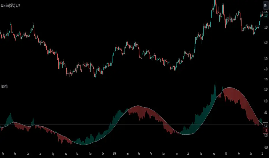
Trend AngleThe "Trend Angle" indicator serves as a tool for traders to decipher market trends through a methodical lens. It quantifies the inclination of price movements within a specified timeframe, making it easy to understand current trend dynamics.
Conceptual Foundation:
Angle Measurement: The essence of the "Trend Angle" indicator is its ability to compute the angle between the price trajectory over a defined period and the horizontal axis. This is achieved through the calculation of the arctangent of the percentage price change, offering a straightforward measure of market directionality.
Smoothing Mechanisms: The indicator incorporates options for "Moving Average" and "Linear Regression" as smoothing mechanisms. This adaptability allows for refined trend analysis, catering to diverse market conditions and individual preferences.
Functional Versatility:
Source Adaptability: The indicator affords the flexibility to select the desired price source, enabling users to tailor the angle calculation to their analytical framework and other indicators.
Detrending Capability: With the detrending feature, the indicator allows for the subtraction of the smoothing line from the calculated angle, highlighting deviations from the main trend. This is particularly useful for identifying potential trend reversals or significant market shifts.
Customizable Period: The 'Length' parameter empowers traders to define the observation window for both the trend angle calculation and its smoothing, accommodating various trading horizons.
Visual Intuition: The optional colorization enhances interpretability, with the indicator's color shifting based on its relation to the smoothing line, thereby providing an immediate visual cue regarding the trend's direction.
Interpretative Results:
Market Flatness: An angle proximate to 0 suggests a flat market condition, indicating a lack of significant directional movement. This insight can be pivotal for traders in assessing market stagnation.
Trending Market: Conversely, a relatively high angle denotes a trending market, signifying strong directional momentum. This distinction is crucial for traders aiming to capitalize on trend-driven opportunities.
Analytical Nuance vs. Simplicity:
While the "Trend Angle" indicator is underpinned by mathematical principles, its utility lies in its simplicity and interpretative clarity. However, it is imperative to acknowledge that this tool should be employed as part of a comprehensive trading strategy , complemented by other analytical instruments for a holistic market analysis.
In essence, the "Trend Angle" indicator exemplifies the harmonization of simplicity and analytical rigor. Its design respects the complexity of market behaviors while offering straightforward, actionable insights, making it a valuable component in the arsenal of both seasoned and novice traders alike.
Regression
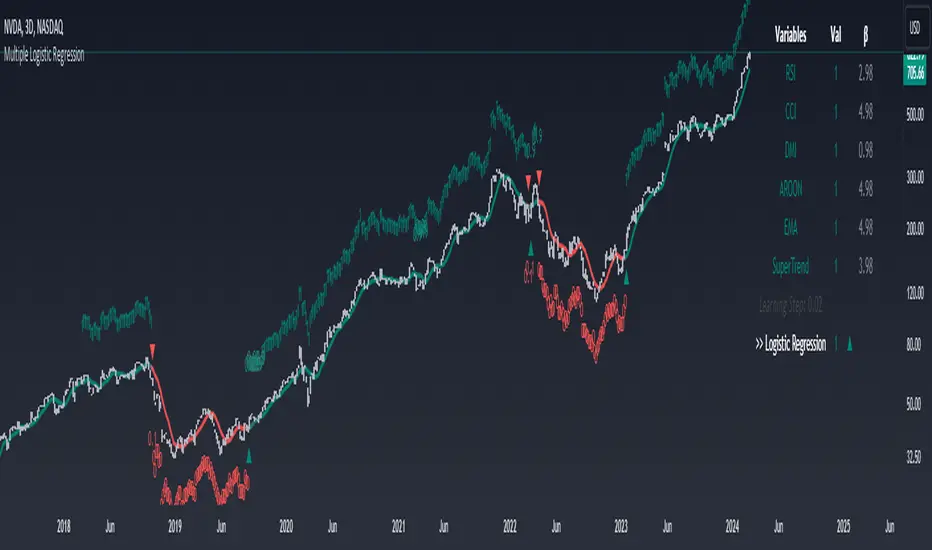
Machine Learning: Multiple Logistic Regression
Multiple Logistic Regression Indicator
The Logistic Regression Indicator for TradingView is a versatile tool that employs multiple logistic regression based on various technical indicators to generate potential buy and sell signals. By utilizing key indicators such as RSI, CCI, DMI, Aroon, EMA, and SuperTrend, the indicator aims to provide a systematic approach to decision-making in financial markets.
How It Works:
Technical Indicators:
The script uses multiple technical indicators such as RSI, CCI, DMI, Aroon, EMA, and SuperTrend as input variables for the logistic regression model.
These indicators are normalized to create categorical variables, providing a consistent scale for the model.
Logistic Regression:
The logistic regression function is applied to the normalized input variables (x1 to x6) with user-defined coefficients (b0 to b6).
The logistic regression model predicts the probability of a binary outcome, with values closer to 1 indicating a bullish signal and values closer to 0 indicating a bearish signal.
Loss Function (Cross-Entropy Loss):
The cross-entropy loss function is calculated to quantify the difference between the predicted probability and the actual outcome.
The goal is to minimize this loss, which essentially measures the model's accuracy.
// Error Function (cross-entropy loss)
loss(y, p) =>
-y * math.log(p) - (1 - y) * math.log(1 - p)
// y - depended variable
// p - multiple logistic regression
Gradient Descent:
Gradient descent is an optimization algorithm used to minimize the loss function by adjusting the weights of the logistic regression model.
The script iteratively updates the weights (b1 to b6) based on the negative gradient of the loss function with respect to each weight.
// Adjusting model weights using gradient descent
b1 -= lr * (p + loss) * x1
b2 -= lr * (p + loss) * x2
b3 -= lr * (p + loss) * x3
b4 -= lr * (p + loss) * x4
b5 -= lr * (p + loss) * x5
b6 -= lr * (p + loss) * x6
// lr - learning rate or step of learning
// p - multiple logistic regression
// x_n - variables
Learning Rate:
The learning rate (lr) determines the step size in the weight adjustment process. It prevents the algorithm from overshooting the minimum of the loss function.
Users can set the learning rate to control the speed and stability of the optimization process.
Visualization:
The script visualizes the output of the logistic regression model by coloring the SMA.
Arrows are plotted at crossover and crossunder points, indicating potential buy and sell signals.
Lables are showing logistic regression values from 1 to 0 above and below bars
Table Display:
A table is displayed on the chart, providing real-time information about the input variables, their values, and the learned coefficients.
This allows traders to monitor the model's interpretation of the technical indicators and observe how the coefficients change over time.
How to Use:
Parameter Adjustment:
Users can adjust the length of technical indicators (rsi_length, cci_length, etc.) and the Z score length based on their preference and market characteristics.
Set the initial values for the regression coefficients (b0 to b6) and the learning rate (lr) according to your trading strategy.
Signal Interpretation:
Buy signals are indicated by an upward arrow (▲), and sell signals are indicated by a downward arrow (▼).
The color-coded SMA provides a visual representation of the logistic regression output by color.
Table Information:
Monitor the table for real-time information on the input variables, their values, and the learned coefficients.
Keep an eye on the learning rate to ensure a balance between model adjustment speed and stability.
Backtesting and Validation:
Before using the script in live trading, conduct thorough backtesting to evaluate its performance under different market conditions.
Validate the model against historical data to ensure its reliability.
Scalper's Volatility Filter [QuantraSystems]Scalpers Volatility Filter
Introduction
The 𝒮𝒸𝒶𝓁𝓅𝑒𝓇'𝓈 𝒱𝑜𝓁𝒶𝓉𝒾𝓁𝒾𝓉𝓎 𝐹𝒾𝓁𝓉𝑒𝓇 (𝒮𝒱𝐹) is a sophisticated technical indicator, designed to increase the profitability of lower timeframe trading.
Due to the inherent decrease in the signal-to-noise ratio when trading on lower timeframes, it is critical to develop analysis methods to inform traders of the optimal market periods to trade - and more importantly, when you shouldn’t trade.
The 𝒮𝒱𝐹 uses a blend of volatility and momentum measurements, to signal the dominant market condition - trending or ranging.
Legend
The 𝒮𝒱𝐹 consists of a signal line that moves above and below a central zero line, serving as the indication of market regime.
When the signal line is positioned above zero, it indicates a period of elevated volatility. These periods are more profitable for trading, as an asset will experience larger price swings, and by design, trend-following indicators will give less false signals.
Conversely, when the signal line moves below zero, a low volatility or mean-reverting market regime dominates.
This distinction is critical for traders in order to align strategies with the prevailing market behaviors - leveraging trends in volatile markets and exercising caution or implementing mean-reversion systems in periods of lower volatility.
Case Study
Here we can see the indicator's unique edge in action.
Out of the four potential long entries seen on the chart - displayed via bar coloring, two would result in losses.
However, with the power of the 𝒮𝒱𝐹 a trader can effectively filter false signals by only entering momentum-trades when the signal line is above zero.
In this small sample of four trades, the 𝒮𝒱𝐹 increased the win rate from 50% to 100%
Methodology
The methodology behind the 𝒮𝒱𝐹 is based upon three components:
By calculating and contrasting two ATR’s, the immediate market momentum relative to the broader, established trend is calculated. The original method for this can be credited to the user @xinolia
A modified and smoothed ADX indicator is calculated to further assess the strength and sustainability of trends.
The ‘Linear Regression Dispersion’ measures price deviations from a fitted regression line, adding further confluence to the signals representation of market conditions.
Together, these components synthesize a robust, balanced view of market conditions, enabling traders to help align strategies with the prevailing market environment, in order to potentially increase expected value and win rates.

ATR TrendTL;DR - An average true range (ATR) based trend
ATR trend uses a (customizable) ATR calculation and highest high & lowest low prices to calculate the actual trend. Basically it determines the trend direction by using highest high & lowest low and calculates (depending on the determined direction) the ATR trend by using a ATR based calculation and comparison method.
The indicator will draw one trendline by default. It is also possible to draw a second trendline which shows a 'negative trend'. This trendline is calculated the same way the primary trendline is calculated but uses a negative (-1 by default) value for the ATR calculation. This trendline can be used to detect early trend changes and/or micro trends.
How to use:
Due to its ATR nature the ATR trend will show trend changes by changing the trendline direction. This means that when the price crosses the trendline it does not automatically mean a trend change. However using the 'negative trend' option ATR trend can show early trend changes and therefore good entry points.
Some notes:
- A (confirmed) trend change is shown by a changing color and/or moving trendline (up/down)
- Unlike other indicators the 'time period' value is not the primary adjustment setting. This value is only used to calculate highest high & lowest low values and has medium impact on trend calculation. The primary adjustment setting is 'ATR weight'
- Every settings has a tooltip with further explanation
- I added additional color coding which uses a different color when the trend attempts to change but the trend change isn't confirmed (yet)
- Default values work fine (at least in my back testing) but the recommendation is to adjust the settings (especially ATR weight) to your trading style
- You can further finetune this indicator by using custom moving average types for the ATR calculation (like linear regression or Hull moving average)
- Both trendlines can be used to determine future support and resistance zones
- ATR trend can be used as a stop loss finder
- Alerts are using buy/sell signals
- You can use fancy color filling ;)
Happy trading!
Daniel
Machine Learning: Radius Neighbors Regressor[Pofatoezil] My native language is Chinese. The following introduction is translated using ChatGPT, and I hope the translation is fluent.
Introduction
This indicator is based on the machine learning model, Radius Neighbors Regressor, which predicts the target based on the similarity of past 500 input data. The provided indicator itself is merely a tool, requiring users to input features for comparison based on their preferences. In this indicator, you can utilize up to seven types of data for regression analysis and predict target values for up to three different time periods. It is essential for users to identify features suitable for their specific commodity on their own.
What is Radius Neighbor
The Radius Neighbors Regressor is a machine learning model used for regression tasks, specifically within the realm of supervised learning. It operates based on the principle of radius-based neighbor searches, where the algorithm predicts a target variable by considering the similarity of data points within a specified radius.
Unlike KNN, which considers a fixed number of nearest neighbors, Radius Neighbors Regressor allows for a flexible definition of neighborhoods by specifying a radius. This can be advantageous when dealing with varying densities in the dataset.
The radius-based approach may offer improved robustness in situations where the distribution of neighbors is not uniform or when dealing with outliers, as it considers all data points within the specified radius.
Parameter Settings and Output
Users need to import data(such as KD,RSI,ATR,CCI,MA,Volume....) from the TradingViewChart into the indicator first, and they can choose up to seven types. Then, they select the forecasting period and the regression target (such as Close, MA....). Afterward, set the maximum search radius, where the maximum value of the radius is the square root of N, where N is the number of features used. I recommend using 10% to 15% of the square root of N as the initial parameters.
Left Table
Neighbors: Indicates how many data points among the past 500 records are sufficiently close to the current data.
Ev: The target value predicted by the model.
WR: The probability of predicting a value greater than 0, noting that this is only meaningful for data values related to prices (Close, MA...).
Right Table
Distribution of predicted values for different periods. For example, 90% represents the predicted values at the 90th percentile among the past 500 data points. RK represents the real-time data ranking among past data, ranging from 0 to 100, where a higher number is more suitable for a long position, and vice versa for a short position.
example
I believe that this indicator has many suitable applications, but relying solely on it as a basis for trading decisions may pose risks. I'll leave it to you to explore.
DayChart
H1Chart
After Open Position
First, I observed on the DayChart that the indicator showed a neutral stance in the short, medium, and long term. Additionally, on the H1Chart, I noticed stronger bullish signals in the short, medium, and long-term data. Consequently, I decided to go long for an intraday position.

Linear Regression Channel 200█ OVERVIEW
This a simplified version of linear regression channel which use length 200 instead of traditional length 100.
█ FEATURES
Color change depends light / dark mode.
█ LIMITATIONS
Limited to source of closing price and max bars back is 1500.
█ SIMILAR
Regression Channel Alternative MTF
Regression Channel Alternative MTF V2
AI Momentum [YinYang]Overview:
AI Momentum is a kernel function based momentum Indicator. It uses Rational Quadratics to help smooth out the Moving Averages, this may give them a more accurate result. This Indicator has 2 main uses, first it displays ‘Zones’ that help you visualize the potential movement areas and when the price is out of bounds (Overvalued or Undervalued). Secondly it creates signals that display the momentum of the current trend.
The Zones are composed of the Highest Highs and Lowest lows turned into a Rational Quadratic over varying lengths. These create our Rational High and Low zones. There is however a second zone. The second zone is composed of the avg of the Inner High and Inner Low zones (yellow line) and the Rational Quadratic of the current Close. This helps to create a second zone that is within the High and Low bounds that may represent momentum changes within these zones. When the Rationalized Close crosses above the High and Low Zone Average it may signify a bullish momentum change and vice versa when it crosses below.
There are 3 different signals created to display momentum:
Bullish and Bearish Momentum. These signals display when there is current bullish or bearish momentum happening within the trend. When the momentum changes there will likely be a lull where there are neither Bullish or Bearish momentum signals. These signals may be useful to help visualize when the momentum has started and stopped for both the bulls and the bears. Bullish Momentum is calculated by checking if the Rational Quadratic Close > Rational Quadratic of the Highest OHLC4 smoothed over a VWMA. The Bearish Momentum is calculated by checking the opposite.
Overly Bullish and Bearish Momentum. These signals occur when the bar has Bullish or Bearish Momentum and also has an Rationalized RSI greater or less than a certain level. Bullish is >= 57 and Bearish is <= 43. There is also the option to ‘Factor Volume’ into these signals. This means, the Overly Bullish and Bearish Signals will only occur when the Rationalized Volume > VWMA Rationalized Volume as well as the previously mentioned factors above. This can be useful for removing ‘clutter’ as volume may dictate when these momentum changes will occur, but it can also remove some of the useful signals and you may miss the swing too if the volume just was low. Overly Bullish and Bearish Momentum may dictate when a momentum change will occur. Remember, they are OVERLY Bullish and Bearish, meaning there is a chance a correction may occur around these signals.
Bull and Bear Crosses. These signals occur when the Rationalized Close crosses the Gaussian Close that is 2 bars back. These signals may show when there is a strong change in momentum, but be careful as more often than not they’re predicting that the momentum may change in the opposite direction.
Tutorial:
As we can see in the example above, generally what happens is we get the regular Bullish or Bearish momentum, followed by the Rationalized Close crossing the Zone average and finally the Overly Bullish or Bearish signals. This is normally the order of operations but isn’t always how it happens as sometimes momentum changes don’t make it that far; also the Rationalized Close and Zone Average don’t follow any of the same math as the Signals which can result in differing appearances. The Bull and Bear Crosses are also quite sporadic in appearance and don’t generally follow any sort of order of operations. However, they may occur as a Predictor between Bullish and Bearish momentum, signifying the beginning of the momentum change.
The Bull and Bear crosses may be a Predictor of momentum change. They generally happen when there is no Bullish or Bearish momentum happening; and this helps to add strength to their prediction. When they occur during momentum (orange circle) there is a less likely chance that it will happen, and may instead signify the exact opposite; it may help predict a large spike in momentum in the direction of the Bullish or Bearish momentum. In the case of the orange circle, there is currently Bearish Momentum and therefore the Bull Cross may help predict a large momentum movement is about to occur in favor of the Bears.
We have disabled signals here to properly display and talk about the zones. As you can see, Rationalizing the Highest Highs and Lowest Lows over 2 different lengths creates inner and outer bounds that help to predict where parabolic movement and momentum may move to. Our Inner and Outer zones are great for seeing potential Support and Resistance locations.
The secondary zone, which can cross over and change from Green to Red is also a very important zone. Let's zoom in and talk about it specifically.
The Middle Zone Crosses may help deduce where parabolic movement and strong momentum changes may occur. Generally what may happen is when the cross occurs, you will see parabolic movement to the High / Low zones. This may be the Inner zone but can sometimes be the outer zone too. The hard part is sometimes it can be a Fakeout, like displayed with the Blue Circle. The Cross doesn’t mean it may move to the opposing side, sometimes it may just be predicting Parabolic movement in a general sense.
When we turn the Momentum Signals back on, we can see where the Fakeout occurred that it not only almost hit the Inner Low Zone but it also exhibited 2 Overly Bearish Signals. Remember, Overly bearish signals mean a momentum change in favor of the Bulls may occur soon and overly Bullish signals mean a momentum change in favor of the Bears may occur soon.
You may be wondering, well what does “may occur soon” mean and how do we tell?
The purpose of the momentum signals is not only to let you know when Momentum has occurred and when it is still prevalent. It also matters A LOT when it has STOPPED!
In this example above, we look at when the Overly Bullish and Bearish Momentum has STOPPED. As you can see, when the Overly Bullish or Bearish Momentum stopped may be a strong predictor of potential momentum change in the opposing direction.
We will conclude our Tutorial here, hopefully this Indicator has been helpful for showing you where momentum is occurring and help predict how far it may move. We have been dabbling with and are planning on releasing a Strategy based on this Indicator shortly.
Settings:
1. Momentum:
Show Signals: Sometimes it can be difficult to visualize the zones with signals enabled.
Factor Volume: Factor Volume only applies to Overly Bullish and Bearish Signals. It's when the Volume is > VWMA Volume over the Smoothing Length.
Zone Inside Length: The Zone Inside is the Inner zone of the High and Low. This is the length used to create it.
Zone Outside Length: The Zone Outside is the Outer zone of the High and Low. This is the length used to create it.
Smoothing length: Smoothing length is the length used to smooth out our Bullish and Bearish signals, along with our Overly Bullish and Overly Bearish Signals.
2. Kernel Settings:
Lookback Window: The number of bars used for the estimation. This is a sliding value that represents the most recent historical bars. Recommended range: 3-50.
Relative Weighting: Relative weighting of time frames. As this value approaches zero, the longer time frames will exert more influence on the estimation. As this value approaches infinity, the behavior of the Rational Quadratic Kernel will become identical to the Gaussian kernel. Recommended range: 0.25-25.
Start Regression at Bar: Bar index on which to start regression. The first bars of a chart are often highly volatile, and omission of these initial bars often leads to a better overall fit. Recommended range: 5-25.
If you have any questions, comments, ideas or concerns please don't hesitate to contact us.
HAPPY TRADING!

Relational Quadratic Kernel Channel [Vin]The Relational Quadratic Kernel Channel (RQK-Channel-V) is designed to provide more valuable potential price extremes or continuation points in the price trend.
Example:
Usage:
Lookback Window: Adjust the "Lookback Window" parameter to control the number of previous bars considered when calculating the Rational Quadratic Estimate. Longer windows capture longer-term trends, while shorter windows respond more quickly to price changes.
Relative Weight: The "Relative Weight" parameter allows you to control the importance of each data point in the calculation. Higher values emphasize recent data, while lower values give more weight to historical data.
Source: Choose the data source (e.g., close price) that you want to use for the kernel estimate.
ATR Length: Set the length of the Average True Range (ATR) used for channel width calculation. A longer ATR length results in wider channels, while a shorter length leads to narrower channels.
Channel Multipliers: Adjust the "Channel Multiplier" parameters to control the width of the channels. Higher multipliers result in wider channels, while lower multipliers produce narrower channels. The indicator provides three sets of channels, each with its own multiplier for flexibility.
Details:
Rational Quadratic Kernel Function:
The Rational Quadratic Kernel Function is a type of smoothing function used to estimate a continuous curve or line from discrete data points. It is often used in time series analysis to reduce noise and emphasize trends or patterns in the data.
The formula for the Rational Quadratic Kernel Function is generally defined as:
K(x) = (1 + (x^2) / (2 * α * β))^(-α)
Where:
x represents the distance or difference between data points.
α and β are parameters that control the shape of the kernel. These parameters can be adjusted to control the smoothness or flexibility of the kernel function.
In the context of this indicator, the Rational Quadratic Kernel Function is applied to a specified source (e.g., close prices) over a defined lookback window. It calculates a smoothed estimate of the source data, which is then used to determine the central value of the channels. The kernel function allows the indicator to adapt to different market conditions and reduce noise in the data.
The specific parameters (length and relativeWeight) in your indicator allows to fine-tune how the Rational Quadratic Kernel Function is applied, providing flexibility in capturing both short-term and long-term trends in the data.
To know more about unsupervised ML implementations, I highly recommend to follow the users, @jdehorty and @LuxAlgo
Optimizing the parameters:
Lookback Window (length): The lookback window determines how many previous bars are considered when calculating the kernel estimate.
For shorter-term trading strategies, you may want to use a shorter lookback window (e.g., 5-10).
For longer-term trading or investing, consider a longer lookback window (e.g., 20-50).
Relative Weight (relativeWeight): This parameter controls the importance of each data point in the calculation.
A higher relative weight (e.g., 2 or 3) emphasizes recent data, which can be suitable for trend-following strategies.
A lower relative weight (e.g., 1) gives more equal importance to historical and recent data, which may be useful for strategies that aim to capture both short-term and long-term trends.
ATR Length (atrLength): The length of the Average True Range (ATR) affects the width of the channels.
Longer ATR lengths result in wider channels, which may be suitable for capturing broader price movements.
Shorter ATR lengths result in narrower channels, which can be helpful for identifying smaller price swings.
Channel Multipliers (channelMultiplier1, channelMultiplier2, channelMultiplier3): These parameters determine the width of the channels relative to the ATR.
Adjust these multipliers based on your risk tolerance and desired channel width.
Higher multipliers result in wider channels, which may lead to fewer signals but potentially larger price movements.
Lower multipliers create narrower channels, which can result in more frequent signals but potentially smaller price movements.

Linear RegressionThis indicator can be used to determine the direction of the current trend.
The indicator plots two different histograms based on the linear regression formula:
- The colored ones represent the direction of the short-term trend
- The gray one represents the direction of the long-term trend
In the settings, you can change the length of the short-term value, which also influences the long-term as a basis that will be multiplied

Linear Regression IndicatorThis tool can be used to determine the direction of the current trend.
The indicator changes the color of the candles based on the direction of the linear regression formula. This is made settings the length of the short-term linear regression in the settings, the longer one is also based on that parameter but significantly larger.
The indicator also plots the average between the two linear regression lines used in the candle coloring formula, and can be used both for support and resistance or as a trend line used to analyze breakouts.
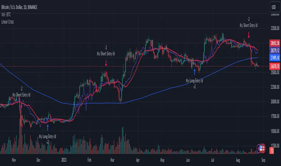
Linear Cross Trading StrategyLinear Cross Trading Strategy
The Linear Cross trading strategy is a technical analysis strategy that uses linear regression to predict the future price of a stock. The strategy is based on the following principles:
The price of a stock tends to follow a linear trend over time.
The slope of the linear trend can be used to predict the future price of the stock.
The strategy enters a long position when the predicted price crosses above the current price, and exits the position when the predicted price crosses below the current price.
The Linear Cross trading strategy is implemented in the TradingView Pine script below. The script first calculates the linear regression of the stock price over a specified period of time. The script then plots the predicted price and the current price on the chart. The script also defines two signals:
Long signal: The long signal is triggered when the predicted price crosses above the current price.
Short signal: The short signal is triggered when the predicted price crosses below the current price.
The script enters a long position when the long signal is triggered and exits the position when the short signal is triggered.
Here is a more detailed explanation of the steps involved in the Linear Cross trading strategy:
Calculate the linear regression of the stock price over a specified period of time.
Plot the predicted price and the current price on the chart.
Define two signals: the long signal and the short signal.
Enter a long position when the long signal is triggered.
Exit the long position when the short signal is triggered.
The Linear Cross trading strategy is a simple and effective way to trade stocks. However, it is important to note that no trading strategy is guaranteed to be profitable. It is always important to do your own research and backtest the strategy before using it to trade real money.
Here are some additional things to keep in mind when using the Linear Cross trading strategy:
The length of the linear regression period is a key parameter that affects the performance of the strategy. A longer period will smooth out the noise in the price data, but it will also make the strategy less responsive to changes in the price.
The strategy is more likely to generate profitable trades when the stock price is trending. However, the strategy can also generate profitable trades in ranging markets.
The strategy is not immune to losses. It is important to use risk management techniques to protect your capital when using the strategy.
I hope this blog post helps you understand the Linear Cross trading strategy better. Booost and share with your friend, if you like.
Advanced Weighted Residual Arbitrage AnalyzerThe Advanced Weighted Residual Arbitrage Analyzer is a sophisticated tool designed for traders aiming to exploit price deviations between various asset pairs. By examining the differences in normalized price relations and their weighted residuals, this indicator provides insights into potential arbitrage opportunities in the market.
Key Features:
Multiple Relation Analysis: Analyze up to five different asset relations simultaneously, offering a comprehensive view of potential arbitrage setups.
Normalization Functions: Choose from a variety of normalization techniques like SMA, EMA, WMA, and HMA to ensure accurate comparisons between different price series.
Dynamic Weighting: Residuals are weighted based on their correlation, ensuring that stronger correlations have a more pronounced impact on the analysis. Weighting can be adjusted using several functions including square, sigmoid, and logistic.
Regression Flexibility: Incorporate linear, polynomial, or robust regression to calculate residuals, tailoring the analysis to different market conditions.
Customizable Display: Decide which plots to display for clarity and focus, including normalized relations, weighted residuals, and the difference between the screen relation and the average weighted residual.
Usage Guidelines:
Configure the asset pairs you wish to analyze using the Symbol Relations group in the settings.
Adjust the normalization, volatility, regression, and weighting functions based on your preference and the specific characteristics of the asset pairs.
Monitor the weighted residuals for deviations from the mean. Larger deviations suggest stronger arbitrage opportunities.
Use the difference plot (between the screen relation and average weighted residual) as a quick visual cue for potential trade setups. When this plot deviates significantly from zero, it indicates a possible arbitrage opportunity.
Regularly update and adjust the parameters to account for changing market conditions and ensure the most accurate analysis.
In the Advanced Weighted Residual Arbitrage Analyzer , the value set in Alert Threshold plays a crucial role in delineating a normalized band. This band serves as a guide to identify significant deviations and potential trading opportunities.
When we observe the plots of the green line and the purple line, the Alert Threshold provides a boundary for these plots. The following points explain the significance:
Breach of the Band: When either the green or purple line crosses above or below the Alert Threshold , it indicates a significant deviation from the mean. This breach can be interpreted as a potential trading signal, suggesting a possible arbitrage opportunity.
Convergence to the Mean: If the green line converges with the purple line , it denotes that the price relation has reverted to its mean. This convergence typically suggests that the arbitrage opportunity has been exhausted, and the market dynamics are returning to equilibrium.
Trade Execution: A trader can consider entering a trade when the lines breach the Alert Threshold . The return of the green line to align closely with the purple line can be seen as a signal to exit the trade, capitalizing on the reversion to the mean.
By monitoring these plots in conjunction with the Alert Threshold , traders can gain insights into market imbalances and exploit potential arbitrage opportunities. The convergence and divergence of these lines, relative to the normalized band, serve as valuable visual cues for trade initiation and termination.
When you're analyzing relations between two symbols (for instance, BINANCE:SANDUSDT/BINANCE:NEARUSDT ), you're essentially looking at the price relationship between the two underlying assets. This relationship provides insights into potential imbalances between the assets, which arbitrage traders can exploit.
Breach of the Lower Band: If the purple line touches or crosses below the lower Alert Threshold , it indicates that the first symbol (in our example, SANDUSDT ) is undervalued relative to the second symbol ( NEARUSDT ). In practical terms:
Action: You would consider buying the first symbol ( SANDUSDT ) and selling the second symbol ( NEARUSDT ).
Rationale: The expectation is that the price of the first symbol will rise, or the price of the second symbol will fall, or both, thereby converging back to their historical mean relationship.
Breach of the Upper Band: Conversely, if the difference plot touches or crosses above the upper Alert Threshold , it suggests that the first symbol is overvalued compared to the second. This implies:
Action: You'd consider selling the first symbol ( SANDUSDT ) and buying the second symbol ( NEARUSDT ).
Rationale: The anticipation here is that the price of the first symbol will decrease, or the price of the second will increase, or both, bringing the relationship back to its historical average.
Convergence to the Mean: As mentioned earlier, when the green line aligns closely with the purple line, it's an indication that the assets have returned to their typical price relationship. This serves as a signal for traders to consider closing out their positions, locking in the gains from the arbitrage opportunity.
It's important to note that when you're trading based on symbol relations, you're essentially betting on the relative performance of the two assets. This strategy, often referred to as "pairs trading," seeks to capitalize on price imbalances between related financial instruments. By taking opposing positions in the two symbols, traders aim to profit from the eventual reversion of the price difference to the mean.

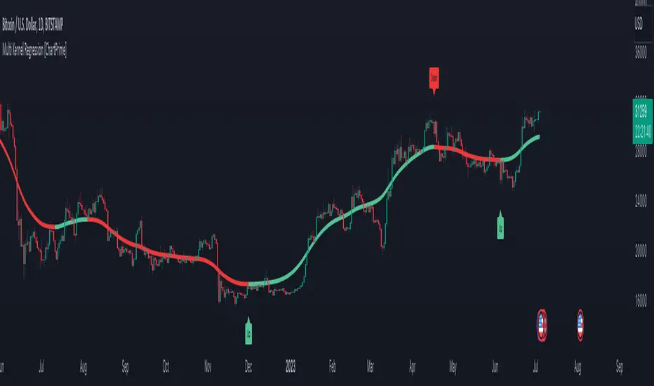
Machine Learning Regression Trend [LuxAlgo]The Machine Learning Regression Trend tool uses random sample consensus (RANSAC) to fit and extrapolate a linear model by discarding potential outliers, resulting in a more robust fit.
🔶 USAGE
The proposed tool can be used like a regular linear regression, providing support/resistance as well as forecasting an estimated underlying trend.
Using RANSAC allows filtering out outliers from the input data of our final fit, by outliers we are referring to values deviating from the underlying trend whose influence on a fitted model is undesired. For financial prices and under the assumptions of segmented linear trends, these outliers can be caused by volatile moves and/or periodic variations within an underlying trend.
Adjusting the "Allowed Error" numerical setting will determine how sensitive the model is to outliers, with higher values returning a more sensitive model. The blue margin displayed shows the allowed error area.
The number of outliers in the calculation window (represented by red dots) can also be indicative of the amount of noise added to an underlying linear trend in the price, with more outliers suggesting more noise.
Compared to a regular linear regression which does not discriminate against any point in the calculation window, we see that the model using RANSAC is more conservative, giving more importance to detecting a higher number of inliners.
🔶 DETAILS
RANSAC is a general approach to fitting more robust models in the presence of outliers in a dataset and as such does not limit itself to a linear regression model.
This iterative approach can be summarized as follow for the case of our script:
Step 1: Obtain a subset of our dataset by randomly selecting 2 unique samples
Step 2: Fit a linear regression to our subset
Step 3: Get the error between the value within our dataset and the fitted model at time t , if the absolute error is lower than our tolerance threshold then that value is an inlier
Step 4: If the amount of detected inliers is greater than a user-set amount save the model
Repeat steps 1 to 4 until the set number of iterations is reached and use the model that maximizes the number of inliers
🔶 SETTINGS
Length: Calculation window of the linear regression.
Width: Linear regression channel width.
Source: Input data for the linear regression calculation.
🔹 RANSAC
Minimum Inliers: Minimum number of inliers required to return an appropriate model.
Allowed Error: Determine the tolerance threshold used to detect potential inliers. "Auto" will automatically determine the tolerance threshold and will allow the user to multiply it through the numerical input setting at the side. "Fixed" will use the user-set value as the tolerance threshold.
Maximum Iterations Steps: Maximum number of allowed iterations.

AI Moving Average (Expo)█ Overview
The AI Moving Average indicator is a trading tool that uses an AI-based K-nearest neighbors (KNN) algorithm to analyze and interpret patterns in price data. It combines the logic of a traditional moving average with artificial intelligence, creating an adaptive and robust indicator that can identify strong trends and key market levels.
█ How It Works
The algorithm collects data points and applies a KNN-weighted approach to classify price movement as either bullish or bearish. For each data point, the algorithm checks if the price is above or below the calculated moving average. If the price is above the moving average, it's labeled as bullish (1), and if it's below, it's labeled as bearish (0). The K-Nearest Neighbors (KNN) is an instance-based learning algorithm used in classification and regression tasks. It works on a principle of voting, where a new data point is classified based on the majority label of its 'k' nearest neighbors.
The algorithm's use of a KNN-weighted approach adds a layer of intelligence to the traditional moving average analysis. By considering not just the price relative to a moving average but also taking into account the relationships and similarities between different data points, it offers a nuanced and robust classification of price movements.
This combination of data collection, labeling, and KNN-weighted classification turns the AI Moving Average (Expo) Indicator into a dynamic tool that can adapt to changing market conditions, making it suitable for various trading strategies and market environments.
█ How to Use
Dynamic Trend Recognition
The color-coded moving average line helps traders quickly identify market trends. Green represents bullish, red for bearish, and blue for neutrality.
Trend Strength
By adjusting certain settings within the AI Moving Average (Expo) Indicator, such as using a higher 'k' value and increasing the number of data points, traders can gain real-time insights into strong trends. A higher 'k' value makes the prediction model more resilient to noise, emphasizing pronounced trends, while more data points provide a comprehensive view of the market direction. Together, these adjustments enable the indicator to display only robust trends on the chart, allowing traders to focus exclusively on significant market movements and strong trends.
Key SR Levels
Traders can utilize the indicator to identify key support and resistance levels that are derived from the prevailing trend movement. The derived support and resistance levels are not just based on historical data but are dynamically adjusted with the current trend, making them highly responsive to market changes.
█ Settings
k (Neighbors): Number of neighbors in the KNN algorithm. Increasing 'k' makes predictions more resilient to noise but may decrease sensitivity to local variations.
n (DataPoints): Number of data points considered in AI analysis. This affects how the AI interprets patterns in the price data.
maType (Select MA): Type of moving average applied. Options allow for different smoothing techniques to emphasize or dampen aspects of price movement.
length: Length of the moving average. A greater length creates a smoother curve but might lag recent price changes.
dataToClassify: Source data for classifying price as bullish or bearish. It can be adjusted to consider different aspects of price information
dataForMovingAverage: Source data for calculating the moving average. Different selections may emphasize different aspects of price movement.
-----------------
Disclaimer
The information contained in my Scripts/Indicators/Ideas/Algos/Systems does not constitute financial advice or a solicitation to buy or sell any securities of any type. I will not accept liability for any loss or damage, including without limitation any loss of profit, which may arise directly or indirectly from the use of or reliance on such information.
All investments involve risk, and the past performance of a security, industry, sector, market, financial product, trading strategy, backtest, or individual's trading does not guarantee future results or returns. Investors are fully responsible for any investment decisions they make. Such decisions should be based solely on an evaluation of their financial circumstances, investment objectives, risk tolerance, and liquidity needs.
My Scripts/Indicators/Ideas/Algos/Systems are only for educational purposes!

Stablecoin Market Cap RiskThe Stablecoins Market Cap Risk indicator serves as a valuable risk oscillator for Bitcoin on a macro scale . This metric is derived by aggregating the market capitalization of CRYPTOCAP:USDT (Tether) and CRYPTOCAP:USDC (USD Coin), subsequently dividing this combined value by CRYPTOCAP:TOTAL (total market capitalization). The resulting figure is further normalized through linear regression.
The regression in question:
drive.google.com
However, it is essential to acknowledge that this model's reliability may diminish over time, as it is based solely on data from the most recent 4.5 years of cryptocurrency market trends. Consequently, adaptations and enhancements to the model are anticipated in the future to ensure its continued relevance and accuracy.

Extrapolated Previous Trend [LuxAlgo]The Extrapolated Previous Trend indicator extrapolates the estimated linear trend of the prices within a previous interval to the current interval. Intervals can be user-defined.
🔶 USAGE
Returned lines can be used to provide a forecast of trends, assuming trends are persistent in sign and slope.
Using them as support/resistance can also be an effecting usage in case the trend in a new interval does not follow the characteristic of the trend in the previous interval.
The indicator includes a dashboard showing the degree of persistence between segmented trends for uptrends and downtrends. A higher value is indicative of more persistent trend signs.
A lower value could hint at an anti-persistent behavior, with uptrends over an interval often being followed by a down-trend and vice versa. We can invert candle colors to determine future trend direction in this case.
🔶 DETAILS
This indicator can be thought of as a segmented linear model ( a(n)t + b(n) ), where n is the specific interval index. Unlike a regular segmented linear regression model, this indicator is not subject to lookahead bias, coefficients of the model are obtained on previous intervals.
The quality of the fit of the model is dependent on the variability of its coefficients a(n) and b(n) . Coefficients being less subject to change over time are more indicative of trend persistence.
🔶 SETTINGS
Timeframe: Determine the frequency at which new trends are estimated.

Multi Kernel Regression [ChartPrime]The "Multi Kernel Regression" is a versatile trading indicator that provides graphical interpretations of market trends by using different kernel regression methods. It's beneficial because it smoothes out price data, creating a clearer picture of price movements, and can be tailored according to the user's preference with various options.
What makes this indicator uniquely versatile is the 'Kernel Select' feature, which allows you to choose from a variety of regression kernel types, such as Gaussian, Logistic, Cosine, and many more. In fact, you have 17 options in total, making this an adaptable tool for diverse market contexts.
The bandwidth input parameter directly affects the smoothness of the regression line. While a lower value will make the line more sensitive to price changes by sticking closely to the actual prices, a higher value will smooth out the line even further by placing more emphasis on distant prices.
It's worth noting that the indicator's 'Repaint' function, which re-estimates work according to the most recent data, is not a deficiency or a flaw. Instead, it’s a crucial part of its functionality, updating the regression line with the most recent data, ensuring the indicator measurements remain as accurate as possible. We have however included a non-repaint feature that provides fixed calculations, creating a steady line that does not change once it has been plotted, for a different perspective on market trends.
This indicator also allows you to customize the line color, style, and width, allowing you to seamlessly integrate it into your existing chart setup. With labels indicating potential market turn points, you can stay on top of significant price movements.
Repaint : Enabling this allows the estimator to repaint to maintain accuracy as new data comes in.
Kernel Select : This option allows you to select from an array of kernel types such as Triangular, Gaussian, Logistic, etc. Each kernel has a unique weight function which influences how the regression line is calculated.
Bandwidth : This input, a scalar value, controls the regression line's sensitivity towards the price changes. A lower value makes the regression line more sensitive (closer to price) and higher value makes it smoother.
Source : Here you denote which price the indicator should consider for calculation. Traditionally, this is set as the close price.
Deviation : Adjust this to change the distance of the channel from the regression line. Higher values widen the channel, lower values make it smaller.
Line Style : This provides options to adjust the visual style of the regression lines. Options include Solid, Dotted, and Dashed.
Labels : Enabling this introduces markers at points where the market direction switches. Adjust the label size to suit your preference.
Colors : Customize color schemes for bullish and bearish trends along with the text color to match your chart setup.
Kernel regression, the technique behind the Multi Kernel Regression Indicator, has a rich history rooted in the world of statistical analysis and machine learning.
The origins of kernel regression are linked to the work of Emanuel Parzen in the 1960s. He was a pioneer in the development of nonparametric statistics, a domain where kernel regression plays a critical role. Although originally developed for the field of probability, these methods quickly found application in various other scientific disciplines, notably in econometrics and finance.
Kernel regression became really popular in the 1980s and 1990s along with the rise of other nonparametric techniques, like local regression and spline smoothing. It was during this time that kernel regression methods were extensively studied and widely applied in the fields of machine learning and data science.
What makes the kernel regression ideal for various statistical tasks, including financial market analysis, is its flexibility. Unlike linear regression, which assumes a specific functional form for the relationship between the independent and dependent variables, kernel regression makes no such assumptions. It creates a smooth curve fit to the data, which makes it extremely useful in capturing complex relationships in data.
In the context of stock market analysis, kernel regression techniques came into use in the late 20th century as computational power improved and these techniques could be more easily applied. Since then, they have played a fundamental role in financial market modeling, market prediction, and the development of trading indicators, like the Multi Kernel Regression Indicator.
Today, the use of kernel regression has solidified its place in the world of trading and market analysis, being widely recognized as one of the most effective methods for capturing and visualizing market trends.
The Multi Kernel Regression Indicator is built upon kernel regression, a versatile statistical method pioneered by Emanuel Parzen in the 1960s and subsequently refined for financial market analysis. It provides a robust and flexible approach to capturing complex market data relationships.
This indicator is more than just a charting tool; it reflects the power of computational trading methods, combining statistical robustness with visual versatility. It's an invaluable asset for traders, capturing and interpreting complex market trends while integrating seamlessly into diverse trading scenarios.
In summary, the Multi Kernel Regression Indicator stands as a testament to kernel regression's historic legacy, modern computational power, and contemporary trading insight.
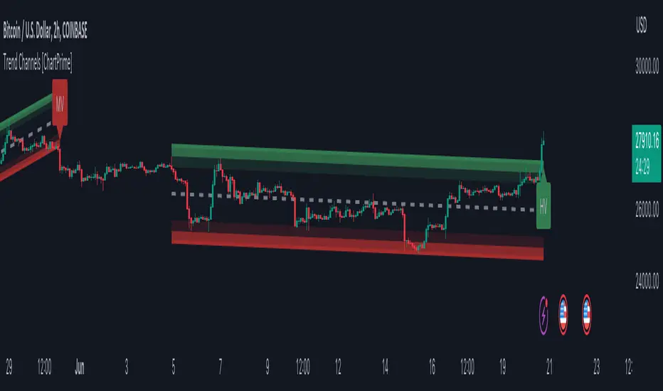
Trend Channels With Liquidity Breaks [ChartPrime]Trend Channels
This simple trading indicator is designed to quickly identify and visualize support and resistance channels in any market. The primary purpose of the Trend Channels with Liquidity Breaks indicator is to recognize and visualize the dominant trend in a more intuitive and user-friendly manner.
Main Features
Automatically identifies and plots channels based on pivot highs and lows
Option to extend the channel lines
Display breaks of the channels where liquidity is deemed high
Inclusion of volume data within the channel bands (optional)
Market-friendly and customizable colors and settings for easy visual identification
Settings
Length: Adjust the length and lookback of the channels
Show Last Channel: Only shows the last channel
Volume BG: Shade the zones according to the volume detected
How to Interpret
Trend Channels with Liquidity Breaks indicator uses a combination of pivot highs and pivot lows to create support and resistance zones, helping traders to identify potential breakouts, reversals or continuations of a trend.
These support and resistance zones are visualized as upper and lower channel lines, with a dashed center line representing the midpoint of the channel. The indicator also allows you to see the volume data within the channel bands if you choose to enable this functionality. High volume zones can potentially signal strong buying or selling pressure, which may lead to potential breakouts or trend confirmations.
To make the channels more market-friendly and visually appealing, Trend Channels indicator also offers customizable colors for upper and lower lines, as well as the possibility to extend the line lengths for further analysis.
The indicator displays breaks of key levels in the market with higher volume.
Machine Learning : Torben's Moving Median KNN BandsWhat is Median Filtering ?
Median filtering is a non-linear digital filtering technique, often used to remove noise from an image or signal. Such noise reduction is a typical pre-processing step to improve the results of later processing (for example, edge detection on an image). Median filtering is very widely used in digital image processing because, under certain conditions, it preserves edges while removing noise (but see the discussion below), also having applications in signal processing.
The main idea of the median filter is to run through the signal entry by entry, replacing each entry with the median of neighboring entries. The pattern of neighbors is called the "window", which slides, entry by entry, over the entire signal. For one-dimensional signals, the most obvious window is just the first few preceding and following entries, whereas for two-dimensional (or higher-dimensional) data the window must include all entries within a given radius or ellipsoidal region (i.e. the median filter is not a separable filter).
The median filter works by taking the median of all the pixels in a neighborhood around the current pixel. The median is the middle value in a sorted list of numbers. This means that the median filter is not sensitive to the order of the pixels in the neighborhood, and it is not affected by outliers (very high or very low values).
The median filter is a very effective way to remove noise from images. It can remove both salt and pepper noise (random white and black pixels) and Gaussian noise (randomly distributed pixels with a Gaussian distribution). The median filter is also very good at preserving edges, which is why it is often used as a pre-processing step for edge detection.
However, the median filter can also blur images. This is because the median filter replaces each pixel with the value of the median of its neighbors. This can cause the edges of objects in the image to be smoothed out. The amount of blurring depends on the size of the window used by the median filter. A larger window will blur more than a smaller window.
The median filter is a very versatile tool that can be used for a variety of tasks in image processing. It is a good choice for removing noise and preserving edges, but it can also blur images. The best way to use the median filter is to experiment with different window sizes to find the setting that produces the desired results.
What is this Indicator ?
K-nearest neighbors (KNN) is a simple, non-parametric machine learning algorithm that can be used for both classification and regression tasks. The basic idea behind KNN is to find the K most similar data points to a new data point and then use the labels of those K data points to predict the label of the new data point.
Torben's moving median is a variation of the median filter that is used to remove noise from images. The median filter works by replacing each pixel in an image with the median of its neighbors. Torben's moving median works in a similar way, but it also averages the values of the neighbors. This helps to reduce the amount of blurring that can occur with the median filter.
KNN over Torben's moving median is a hybrid algorithm that combines the strengths of both KNN and Torben's moving median. KNN is able to learn the underlying distribution of the data, while Torben's moving median is able to remove noise from the data. This combination can lead to better performance than either algorithm on its own.
To implement KNN over Torben's moving median, we first need to choose a value for K. The value of K controls how many neighbors are used to predict the label of a new data point. A larger value of K will make the algorithm more robust to noise, but it will also make the algorithm less sensitive to local variations in the data.
Once we have chosen a value for K, we need to train the algorithm on a dataset of labeled data points. The training dataset will be used to learn the underlying distribution of the data.
Once the algorithm is trained, we can use it to predict the labels of new data points. To do this, we first need to find the K most similar data points to the new data point. We can then use the labels of those K data points to predict the label of the new data point.
KNN over Torben's moving median is a simple, yet powerful algorithm that can be used for a variety of tasks. It is particularly well-suited for tasks where the data is noisy or where the underlying distribution of the data is unknown.
Here are some of the advantages of using KNN over Torben's moving median:
KNN is able to learn the underlying distribution of the data.
KNN is robust to noise.
KNN is not sensitive to local variations in the data.
Here are some of the disadvantages of using KNN over Torben's moving median:
KNN can be computationally expensive for large datasets.
KNN can be sensitive to the choice of K.
KNN can be slow to train.

Kernel Regression ToolkitThis toolkit provides filters and extra functionality for non-repainting Nadaraya-Watson estimator implementations made by @jdehorty. For the sake of ease I have nicknamed it "kreg". Filters include a smoothing formula and zero lag formula. The purpose of this script is to help traders test, experiment and develop different regression lines. Regression lines are best used as trend lines and can be an invaluable asset for quickly locating first pullbacks and breaks of trends.
Other features include two J lines and a blend line. J lines are featured in tools like Stochastic KDJ. The formula uses the distance between K and D lines to make the J line. The blend line adds the ability to blend two lines together. This can be useful for several tasks including finding a center/median line between two lines or for blending in the characteristics of a different line. Default is set to 50 which is a 50% blend of the two lines. This can be increased and decreased to taste. This tool can be overlaid on the chart or on top of another indicator if you set the source. It can even be moved into its own window to create a unique oscillator based on whatever sources you feed it.
Below are the standard settings for the kernel estimation as documented by @jdehorty:
Lookback Window: The number of bars used for the estimation. This is a sliding value that represents the most recent historical bars. Recommended range: 3-50
Weighting: Relative weighting of time frames. As this value approaches zero, the longer time frames will exert more influence on the estimation. As this value approaches infinity, the behavior of the Rational Quadratic Kernel will become identical to the Gaussian kernel. Recommended range: 0.25-25
Level: Bar index on which to start regression. Controls how tightly fit the kernel estimate is to the data. Smaller values are a tighter fit. Larger values are a looser fit. Recommended range: 2-25
Lag: Lag for crossover detection. Lower values result in earlier crossovers. Recommended range: 1-2
For more information on this technique refer to to the original open source indicator by @jdehorty located here:

KernelFunctionsFiltersLibrary "KernelFunctionsFilters"
This library provides filters for non-repainting kernel functions for Nadaraya-Watson estimator implementations made by @jdehorty. Filters include a smoothing formula and zero lag formula. You can find examples in the code. For more information check out the original library KernelFunctions.
rationalQuadratic(_src, _lookback, _relativeWeight, startAtBar, _filter)
Parameters:
_src (float)
_lookback (simple int)
_relativeWeight (simple float)
startAtBar (simple int)
_filter (simple string)
gaussian(_src, _lookback, startAtBar, _filter)
Parameters:
_src (float)
_lookback (simple int)
startAtBar (simple int)
_filter (simple string)
periodic(_src, _lookback, _period, startAtBar, _filter)
Parameters:
_src (float)
_lookback (simple int)
_period (simple int)
startAtBar (simple int)
_filter (simple string)
locallyPeriodic(_src, _lookback, _period, startAtBar, _filter)
Parameters:
_src (float)
_lookback (simple int)
_period (simple int)
startAtBar (simple int)
_filter (simple string)
j(line1, line2)
Parameters:
line1 (float)
line2 (float)
Ultimate Trend ChannelThe "Ultimate Trend Channel" indicator is a comprehensive trend analysis tool that calculates and displays a series of upper and lower bands based on user-defined input lengths. It uses linear regression and standard deviation to determine these bands for each of the 21 different group lengths. The indicator then computes the averages of these upper and lower bands, as well as the average of all the bands combined.
The visualization on the chart includes the plotting of the average upper and lower bands, with the space between these bands shaded for easy visualization of the overall trend. Additionally, the average of all the bands, referred to as the "Ultimate Trend Line," is also plotted on the chart.
This indicator provides a robust way of assessing market trends and volatility over varying periods, which can be extremely useful for both short-term and long-term trading strategies.

Linear Regression Channel (Log)The Linear Regression Channel (Log) indicator is a modified version of the Linear Regression channel available on TradingView. It is designed to be used on a logarithmic scale, providing a different perspective on price movements.
The indicator utilizes the concept of linear regression to visualize the overall price trend in a specific section of the chart. The central line represents the linear regression calculation, while the upper and lower lines indicate a certain number of standard deviations away from the central line. These bands serve as support and resistance levels, and when prices remain outside the channel for an extended period, a potential reversal may be anticipated.
I have replaced the Pearson values with trend strength levels to enhance understanding for individuals unfamiliar with Pearson correlation.
