Gann Pyramid Time Cycles [PyraTime]Gann Pyramid Time Cycle by PyraTime is a specialized technical analysis tool based on the harmonic theories of W.D. Gann. Unlike standard indicators that smooth price with averages (like EMAs or RSIs), PyraTime focuses on Time-Price Geometry, operating on the principle that specific time intervals dictate market structure.
This script allows traders to anchor a starting point (a major high or low) and project "Pyramid" time cycles forward. It uses esoteric counts (such as the 27-minute Lunar cycle and the Square of 144) to identify potential pivot points and structural breakout zones.
Key Features
Custom Time Anchoring: Set a specific historical date and time as your "Zero Point." All analysis projects mathematically from this single anchor.
Harmonic Intervals: Includes specific Gann intervals (Lunar 27m, Solar 33m, Master 22m) alongside standard timeframes.
Cycle Confluence Detector: Automatically highlights the chart background when multiple independent time cycles align, indicating a high-probability volatility window.
Structural Breakout Signals: Identifies "Time-Price Boxes" by capturing the High/Low range at the start of a major harmonic cycle. Signals are generated only when price breaks this defined structure.
Smart Dashboard: A monitor panel that tracks active cycles and counts down to the next major time pivot.
Comprehensive Tutorial
1. The Concept: Squaring Time and Price
The core utility of this script is to visualize the "Rhythm" of the market. It does not use moving averages. Instead, it waits for a "Time Beat" to complete and then marks the price range of that moment as a critical zone for the future.
2. Setting Your Anchor (Crucial Step)
The accuracy of this tool depends entirely on your Origin Pivot.
Identify a significant Major High or Major Low.
Open Settings and set the "Origin Pivot (Anchor)" to that exact Date and Time.
The script will immediately recalculate all geometry from that point.
3. Selecting Your Cycles
The script offers two cycle categories:
Standard Intervals: 4H, Daily (Good for macro trends).
Gann Intervals:
27m (Lunar): (Default ON) Effective for high-volatility assets like Crypto/Indices.
33m (Solar): Often tracks institutional algorithmic flows.
144m: The "Square of 12" master cycle.
4. How to Trade the Signals
The Vertical Lines (Time Pivots) These represent purely Time. When price hits a line, expect a shift in behavior (reversal or acceleration).
Confluence: If the background turns Gold, 3+ cycles are peaking simultaneously. This is a major alert.
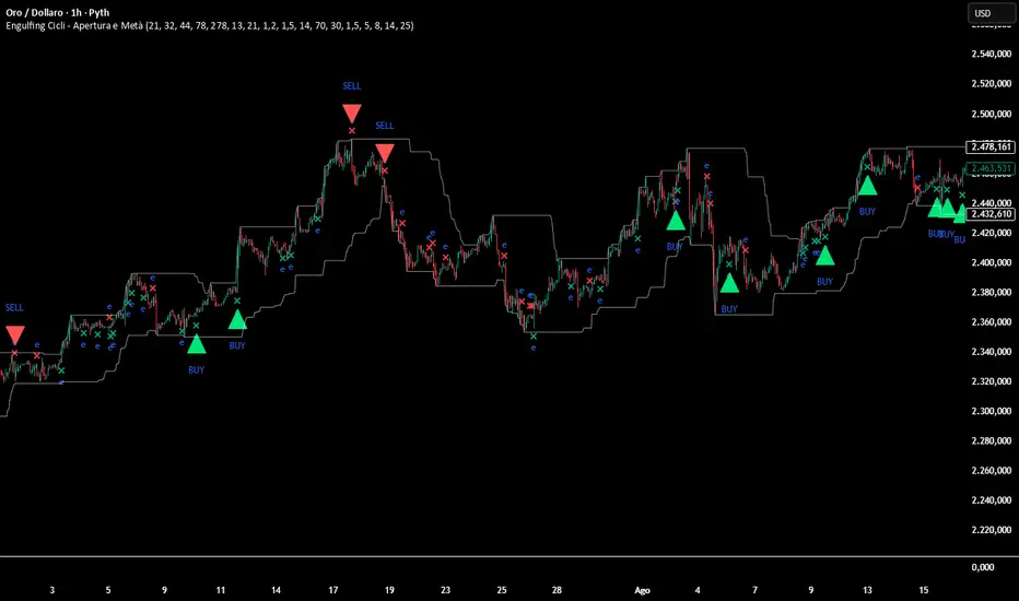
The Price Boxes (Breakout Logic) At a "Harmonic" count (e.g., 180, 360), the script draws a box based on that specific candle's High and Low.
Red Line: The High of the Time-Pivot candle.
Green Line: The Low of the Time-Pivot candle.
Buy Signal: Generated when a candle closes above the Red Line.
Sell Signal: Generated when a candle closes below the Green Line.
This filters out noise by ensuring you only trade when price breaks the structure defined by the Time Cycle.
Settings Guide
Show Dashboard: Toggles the countdown panel.
Show Cycle S/R Levels: Toggles the horizontal support/resistance lines.
Show Breakout Signals: Toggles "BUY" and "SELL" labels (Default: OFF).
Show Labels on Lines: Toggles text on vertical lines (Default: OFF for cleaner charts).
Risk Disclaimer
Trading financial markets involves high risk. This script is a technical analysis tool for projecting time cycles and historical price structures. It does not guarantee future performance or profits. Past cycle alignment does not ensure future market movement. Always manage your risk.
Penunjuk Pine Script®