Trade Manager + DivergenceTrade Manager + Divergence — Smart Entry & Automated Risk Control
Trade Manager + Divergence is a versatile trading strategy that combines automated RSI divergence detection, manual level entries, and a multi‑layered safety‑order system with advanced risk management.
It is designed for traders who want precise technical entries supported by fully automated position handling.
🔍 Key Features
1. RSI Divergence Entry Module
The strategy automatically detects:
Bullish divergence (Higher Low on RSI + Lower Low on price)
Bearish divergence (Lower High on RSI + Higher High on price)
Additional options include:
Divergence strength filtering
MA200 trend filter
Visual divergence markers on the chart
2. Manual Entry Levels
You can define:
A manual LONG entry price
A manual SHORT entry price
Automatic removal of the level after entry
Perfect for traders who prefer to work from key zones they identify themselves.
3. Multi‑Level Safety Order System
The strategy supports:
Initial base order
Up to 8 safety orders
Volume scaling
Step scaling
All parameters are fully customizable:
Order size
Distance between orders
Scaling coefficients
Maximum number of safety orders
4. Automated Take Profit
Take profit is calculated from the average position price:
Separate TP settings for LONG and SHORT
TP levels displayed directly on the chart
5. Breakeven Mechanism
After a specified number of safety orders, the strategy can:
Automatically close the position at breakeven
Include exchange fees in the calculation
6. Mini Status Panel
A compact table in the top‑right corner shows:
Position size
Position value
Number of open trades
Current PnL
Equity
This makes monitoring your position simple and intuitive.
⚙️ Clean and Organized Settings
All inputs are grouped into clear sections:
General
Entry Mode
Divergence Settings
Manual Levels
Risk Management
Each parameter includes a tooltip explaining its purpose.
📌 Disclaimer
This script does not guarantee profits and is not financial advice.
Always test strategies on historical data and use proper risk management.
Cari dalam skrip untuk "Divergence"

MACD 12-26-9 with Slope, Convergence & Divergence1. Core Indicator: MACD (12-26-9)
The script uses the standard MACD:
Fast EMA: 12
Slow EMA: 26
Signal EMA: 9
It plots:
MACD Line → short-term vs long-term momentum
Signal Line → smoothed MACD
Histogram → distance between MACD and Signal
2. Histogram Slope (Momentum Acceleration)
What it is
The slope measures how fast the MACD histogram is changing.
histSlope = hist - hist
What it tells you
Positive slope → momentum accelerating
Negative slope → momentum slowing
Slope flip → early momentum shift (often before MACD cross)
Why it matters
MACD crosses are lagging.
Histogram slope gives early warning of momentum changes.
3. Convergence & Divergence (MACD vs Signal)
How it’s calculated
The script measures the distance between the MACD and Signal lines:
distance = abs(macdLine - signalLine)
Convergence → distance is shrinking
Divergence → distance is expanding
Interpretation
Convergence = compression / energy building
Divergence = expansion / trend strength or exhaustion
This is not price divergence, but internal momentum structure.
4. MACD Perimeter Threshold (Momentum Filter)
What it is
Horizontal bands above and below zero that define a “noise zone”.
Inside perimeter → weak / choppy momentum
Outside perimeter → strong momentum
Why it’s useful
Filters low-quality MACD crosses
Identifies compression → expansion
Helps spot trend exhaustion when momentum fades outside the band
5. Visual Encoding (What you see)
Histogram colors
Bright green / red → strong acceleration
Dull green / maroon → weakening momentum
Gray → indecision
MACD line color
Yellow → converging (compression)
Orange → diverging (expansion)
Blue → neutral
Markers
Up triangle → bullish convergence
Down triangle → bearish divergence
6. How traders use this indicator
Trend continuation
MACD above zero
Histogram positive
Slope rising
Divergence expanding
➡ Strong trend continuation
Pullback entries
Trend intact
Histogram pulls back toward zero
Slope turns up again
➡ High-probability re-entry
Breakout anticipation
Long convergence
Histogram flattening
Sudden slope expansion
➡ Breakout likely
Exhaustion warning
Large divergence
Histogram slope weakens
Momentum fails to expand
➡ Trend may stall or reverse
7. Best use cases
Works best as a momentum confirmation tool
Combine with:
Market structure
Support / resistance
Moving averages
Volume or Force Index

Gold Projection DivergenceGOLD PROJECTION DIVERGENCE
Oscillator Companion for the Gold Macro Projection Model
OVERVIEW
The Gold Projection Divergence oscillator quantifies how far gold is trading from its projected fair value. While the main indicator shows where gold should be, this oscillator shows how extreme the mispricing is—providing precise timing signals for entries and exits.
HOW IT WORKS
The oscillator calculates the difference between actual gold price and the projected value, then normalizes it as a Z-score . This statistical measure shows how many standard deviations gold is trading away from its projected fair value.
Z > +2 — Gold is 2+ standard deviations above fair value (extremely overvalued)
Z > +1 — Gold is moderately overvalued
Z = 0 — Gold is trading at projected fair value
Z < -1 — Gold is moderately undervalued
Z < -2 — Gold is 2+ standard deviations below fair value (extremely undervalued)
VISUAL ELEMENTS
Histogram — Color-coded divergence magnitude
Yellow Line — Smoothed Z-score
Dashed Lines — +2 and -2 standard deviation levels
Dotted Lines — +1 and -1 standard deviation levels
Triangle Markers — Extreme crossover signals
Circle Markers — Zero-line crossings
HISTOGRAM COLORS
Dark Red — Z > +2 (extreme overvaluation)
Orange — Z between +1 and +2
Light Orange — Z between 0 and +1
Light Green — Z between -1 and 0
Green — Z between -2 and -1
Lime — Z < -2 (extreme undervaluation)
COMPONENT TABLE
The breakdown table shows divergence from each individual factor:
Silver — Is gold over/undervalued relative to silver?
M2 — Is gold over/undervalued relative to money supply?
DXY — Is gold over/undervalued relative to dollar strength?
Equity — Is gold over/undervalued relative to stocks?
TIPS — Is gold over/undervalued relative to real rates?
TRADING APPLICATIONS
Mean Reversion Strategy
Enter LONG when Z < -2 and begins rising
Enter SHORT when Z > +2 and begins falling
Use zero-line crossings for trend confirmation
Trend Following Filter
Only take long trades when Z < 0 (undervalued)
Only take short trades when Z > 0 (overvalued)
Divergence Confirmation
Bearish: Price makes new highs while Z-score makes lower highs
Bullish: Price makes new lows while Z-score makes higher lows
ALERTS
Extreme Undervaluation — Z crosses below -2
Extreme Overvaluation — Z crosses above +2
Moderate Undervaluation — Z crosses below -1
Moderate Overvaluation — Z crosses above +1
Divergence Turned Positive — Crossed above zero
Divergence Turned Negative — Crossed below zero
COMBINED USAGE
For best results, use both indicators together :
Main Indicator — Visual context of actual vs. projected on price chart
Divergence Oscillator — Precise measurement for timing decisions
The main indicator shows where gold should be; the oscillator shows how extreme the mispricing is and when to act.
Disclaimer: This indicator is for educational purposes only. Past correlations do not guarantee future relationships. Market conditions can alter historical relationships. Always use proper risk management.

Jurik Angle Flow [Kodexius]Jurik Angle Flow is a Jurik based momentum and trend strength oscillator that converts Jurik Moving Average behavior into an intuitive angle based flow gauge. Instead of showing a simple moving average line, this tool measures the angular slope of a smoothed Jurik curve, normalizes it and presents it as a bounded oscillator between plus ninety and minus ninety degrees.
The script uses two Jurik engines with different responsiveness, then blends their information into a single power score that drives both the oscillator display and the on chart gauge. This makes it suitable for identifying trend direction, trend strength, exhaustion conditions and early shifts in market structure. Built in divergence detection between price and the Jurik angle slope helps highlight potential reversal zones while bar coloring and a configurable no trade zone assist with visual filtering of choppy conditions.
🔹 Features
🔸 Dual Jurik slope engine
The indicator internally runs two Jurik Moving Average calculations on the selected source price. A slower Jurik stream models the primary trend while a faster Jurik stream reacts more quickly to recent changes. Their slopes are measured as angles in degrees, scaled by Average True Range so that the slope is comparable across different instruments and timeframes.
🔸 Angle based oscillator output
Both Jurik streams are converted into angle values by comparing the current value to a lookback value and normalizing by ATR. The result is passed through the arctangent function and expressed in degrees. This creates a smooth oscillator that directly represents steepness and direction of the Jurik curve instead of raw price distance.
🔸 Normalized power score
The angle values are transformed into a normalized score between zero and one hundred based on their absolute magnitude, then the sign of the angle is reapplied. This yields a symmetric score where extreme positive values represent strong bullish pressure and extreme negative values represent strong bearish pressure. The final power score is a weighted blend of the slow and fast Jurik scores.
🔸 Adaptive color gradients
The main oscillator area and the fast slope line use gradient colors that react to the angle strength and direction. Rising green tones reflect bullish angular momentum while red tones reflect bearish pressure. Neutral or shallow slopes remain visually softer to indicate indecision or consolidation.
🔸 Trend flip markers
Whenever the primary Jurik slope crosses through zero from negative to positive, an up marker is printed at the bottom of the oscillator panel. Whenever it crosses from positive to negative, a down marker is drawn at the top. These flips act as clean visual signals of potential trend initiation or termination.
🔸 Divergence detection on Jurik slope
The script optionally scans the fast Jurik slope for pivot highs and lows. It then compares those oscillator pivots against corresponding price pivots.
Regular bullish divergence is detected when the oscillator prints a higher low while price prints a lower low.
Regular bearish divergence is detected when the oscillator prints a lower high while price prints a higher high.
When detected, the tool draws matching divergence lines both on the oscillator and on the chart itself, making divergence zones easy to notice at a glance.
🔸 Bar coloring and no trade filter
Bars can be colored according to the primary Jurik slope gradient so that price bars reflect the same directional information as the oscillator. Additionally a configurable no trade threshold can visually mute bars when the absolute angle is small. This highlights trending sequences and visually suppresses noisy sideways stretches.
🔸 On chart power gauge
A creative on chart gauge displays the composite power score beside the current price action. It shows a vertical range from plus ninety to minus ninety with a filled block that grows proportionally to the normalized score. Color and label updates occur in real time and provide a quick visual summary of current Jurik flow strength without needing to read exact oscillator levels.
🔹 Calculations
Below are the main calculation blocks that drive the core logic of Jurik Angle Flow.
Jurik core update
method update(JMA self, float _src) =>
self.src := _src
float phaseRatio = self.phase < -100 ? 0.5 : self.phase > 100 ? 2.5 : self.phase / 100.0 + 1.5
float beta = 0.45 * (self.length - 1) / (0.45 * (self.length - 1) + 2)
float alpha = math.pow(beta, self.power)
if na(self.e0)
self.e0 := _src
self.e1 := 0.0
self.e2 := 0.0
self.jma := 0.0
self.e0 := (1 - alpha) * _src + alpha * self.e0
self.e1 := (_src - self.e0) * (1 - beta) + beta * self.e1
float prevJma = self.jma
self.e2 := (self.e0 + phaseRatio * self.e1 - prevJma) * math.pow(1 - alpha, 2) + math.pow(alpha, 2) * self.e2
self.jma := self.e2 + prevJma
self.jma
This method implements the Jurik Moving Average engine with internal state and phase control, producing a smooth adaptive value stored in self.jma.
Angle calculation in degrees
method getAngle(float src, int lookback=1) =>
float rad2degree = 180 / math.pi
float slope = (src - src ) / ta.atr(14)
float ang = rad2degree * math.atan(slope)
ang
The slope between the current value and a lookback value is divided by ATR, then converted from radians to degrees through the arctangent. This creates a volatility normalized angle oscillator.
Normalized score from angle
method normScore(float ang) =>
float s = math.abs(ang)
float p = s / 60.0 * 100.0
if p > 100
p := 100
p
The absolute angle is scaled so that sixty degrees corresponds to a score of one hundred. Values above that are capped, which keeps the final score within a fixed range. The sign is later reapplied to restore direction.
Slow and fast Jurik streams and power score
var JMA jmaSlow = JMA.new(jmaLen, jmaPhase, jmaPower, na, na, na, na, na)
var JMA jmaFast = JMA.new(jmaLen, jmaPhase, 2.0, na, na, na, na, na)
float jmaValue = jmaSlow.update(src)
float jmaFastValue = jmaFast.update(src)
float jmaSlope = jmaValue.getAngle()
float jmaFastSlope = jmaFastValue.getAngle()
float scoreJma = normScore(jmaSlope) * math.sign(jmaSlope)
float scoreJmaFast = normScore(jmaFastSlope) * math.sign(jmaFastSlope)
float totalScore = (scoreJma * 0.6 + scoreJmaFast * 0.4)
A slower Jurik and a faster Jurik are updated on each bar, each converted to an angle and then to a signed normalized score. The final composite power score is a weighted blend of the slow and fast scores, where the slow score has slightly more influence. This composite drives the on chart gauge and summarizes the overall Jurik flow.

VCAI RSI Divergence +VCAI RSI Divergence+ is an RSI that shows trend, momentum, and divergence using V-CoresAI colour logic instead of a single white line.
What it shows:
Yellow RSI line → bullish momentum (RSI above its MA; buy-side pressure in control)
Purple RSI line → bearish momentum (RSI below its MA; sell-side pressure in control)
Thin blue line → fast RSI moving average that drives the colour flips
Dashed 70/30 lines → classic OB/OS zones
Background bands → soft purple in OB, soft yellow in OS to mark exhaustion areas
How to read it:
Yellow & rising → momentum shifting bullish; pullbacks into yellow OS band can be accumulation zones
Purple & falling → momentum shifting bearish; pushes into purple OB band can be distribution/sell zones
Hard colour flips (yellow ↔ purple) mark trend regime changes, not minor RSI noise
Divergence mode (on/off)
The divergence engine scans RSI and price pivot structure:
Bullish divergence (yellow) → price lower low + RSI higher low
Bearish divergence (purple) → price higher high + RSI lower high
Lines and tags appear only where a meaningful disagreement between price and RSI exists, giving early context for potential reversals or fade setups.
Together, the momentum colours + optional divergence mapping give a far clearer market read than a standard RSI, with zero clutter and no guesswork.

Momentum Divergence Oscillator by JJMomentum Divergence Oscillator by JJ
A powerful, all-in-one momentum tool designed to streamline trade confluence, combining multi-timeframe trend analysis with automatic divergence spotting and classic MACD signals.
How to Use This Indicator
This oscillator is designed to be used in the lower pane of your chart, beneath your primary price chart. It provides three main types of signals:
1. Multi-Timeframe (MTF) Trend Confirmation
The background shading is your primary trend filter. It looks at the MACD trend on two higher timeframes (30m and 60m by default) to confirm the market's overarching direction.
Green Shading: Indicates that both higher timeframes are in a bullish trend (MACD above signal line). Focus on looking for BUY signals during this time.
Red Shading: Indicates that both higher timeframes are in a bearish trend. Focus on looking for SELL signals during this time.
Grey/No Shading: The higher timeframes are not in agreement or are consolidating. Exercise caution or stick to standard price action rules.
2. Automatic Divergence Signals
Divergence is a powerful early warning system where the indicator moves in the opposite direction of the price. The indicator automatically flags these occurrences:
"Bull RSI Div" (Green Label-Up): Bullish divergence identified using the RSI oscillator. This suggests a potential reversal to the upside after a downtrend.
"Bear RSI Div" (Red Label-Down): Bearish divergence identified using the RSI oscillator. This suggests a potential reversal to the downside after an uptrend.
Tip: These signals are often most reliable when they occur within the corresponding MTF background colour (e.g., a "Bull RSI Div" during a Green MTF background).
3. Momentum Shifts and Crossovers
The standard plots provide immediate insight into market momentum:
Blue/Orange Lines: The traditional MACD line (Blue) and Signal line (Orange).
Histogram (Green/Red Bars): Represents the momentum difference between the MACD and Signal lines.
Zero-Line Crosses (Triangles): Tiny triangles appear when the MACD line crosses the zero line, indicating a shift in long-term momentum.
Peaks & Troughs (X-Crosses): The 'X' markers identify local peaks and troughs in the histogram, sometimes indicating short-term exhaustion of the current move.
Disclaimer: Trading involves significant risk and is not suitable for every investor. This indicator is for educational purposes only and should not be considered financial advice. Always use appropriate risk management.

Bollinger Band ToolkitBollinger Band Toolkit
An advanced, adaptive Bollinger Band system for traders who want more context, precision, and edge.
This indicator expands on the classic Bollinger Bands by combining statistical and volatility-based methods with modern divergence and squeeze detection tools. It helps identify volatility regimes, potential breakouts, and early momentum shifts — all within one clean overlay.
🔹 Core Features
1. Adaptive Bollinger Bands (σ + ATR)
Classic 20-period bands enhanced with an ATR-based volatility adjustment, making them more responsive to true market movement rather than just price variance.
Reduces “overreacting” during chop and avoids bands collapsing too tightly during trends.
2. %B & RSI Divergence Detection
🟢 Green dots: Positive %B divergence — price makes a lower low, but %B doesn’t confirm (bullish).
🔴 Red dots: Negative %B divergence — price makes a higher high, but %B doesn’t confirm (bearish).
✚ Red/green crosses: RSI divergence confirmation — momentum fails to confirm the price’s new extreme.
These signals highlight potential reversal or slowdown zones that are often invisible to the naked eye.
3. Bollinger Band Squeeze (with Volume Filter)
Yellow squares (■) show periods when Bollinger Bands are at their narrowest relative to recent history.
Volume confirmation ensures the squeeze only triggers when both volatility and participation contract.
Often marks the “calm before the storm” — breakout potential zones.
4. Multi-Timeframe Breakout Markers
Optionally displays breakouts from higher or lower timeframes using different colors/symbols.
Lets you see when a higher timeframe band break aligns with your current chart — a strong trend continuation signal.
5. Dual- and Triple-Band Visualization (±1σ, ±2σ, ±3σ)
Optional inner (±1σ) and outer (±3σ) bands provide a layered volatility map:
Price holding between ±1σ → stable range / mean-reverting behavior
Price riding near ±2σ → trending phase, sustained momentum
Price touching or exceeding ±3σ → volatility expansion or exhaustion zone
This triple-band layout visually distinguishes normal movement from statistical extremes, helping you read when the market is balanced, expanding, or approaching its limits.
⚙️ Inputs & Customization
Choose band type (SMA/EMA/SMMA/WMA/VWMA)
Adjust deviation multiplier (σ) and ATR multiplier
Toggle individual features (divergence dots, squeeze markers, inner bands, etc.)
Multi-timeframe and colour controls for advanced users
🧠 How to Use
Watch for squeeze markers followed by a breakout bar beyond ±2σ → volatility expansion signal.
Combine divergence dots with RSI or price structure to anticipate slowdowns or reversals.
Confirm direction using multi-timeframe breakouts and volume expansion.
💬 Why It Works
This toolkit transforms qualitative chart reading (tight bands, hidden divergence) into quantitative, testable conditions — giving you objective insights that can be backtested, coded, or simply trusted in live setups.

cd_indiCATor_CxGeneral:
This indicator is the redesigned, simplified, and feature-enhanced version of the previously shared indicators:
cd_cisd_market_Cx, cd_HTF_Bias_Cx, cd_sweep&cisd_Cx, cd_SMT_Sweep_CISD_Cx, and cd_RSI_divergence_Cx.
Within the holistic setup, the indicator tracks:
• HTF bias
• Market structure (trend) in the current timeframe
• Divergence between selected pairs (SMT)
• Divergence between price and RSI values
• Whether the price is in an important area (FVG, iFVG, and Volume Imbalance)
• Whether the price is at a key level
• Whether the price is within a user-defined special timeframe
The main condition and trigger of the setup is an HTF sweep with CISD confirmation on the aligned timeframe.
When the main condition occurs, the indicator provides the user with a real-time market status summary, enriched with other data.
________________________________________
What’s new?
-In the SMT module:
• Triad SMT analysis (e.g.: NQ1!, ES1!, and YM1!)
• Dyad SMT analysis (e.g.: EURUSD, GBPUSD)
• Alternative pair definition and divergence analysis for non-correlated assets
o For crypto assets (xxxUSDT <--> xxxUSDT.P) (e.g.: SOLUSDT.P, SOLUSDT)
o For stocks, divergence analysis by comparing the asset with its value in another currency
(BIST:xxx <--> BIST:xxx / EURTRY), (BAT:xxx <--> BAT:xxx / EURUSD)
-Special timeframe definition
-Configurable multi-option alarm center
-Alternative summary presentation (check list / status table / stickers)
________________________________________
Details and usage:
The user needs to configure four main sections:
• Pair and correlated pairs
• Timeframes (Auto / Manual)
• Alarm center
• Visual arrangement and selections
Pair Selections:
The user should adjust trading pairs according to their trade preferences.
Examples:
• Triad: NQ1!-ES1!-YM1!, BTC-ETH-Total3
• Dyad: NAS100-US500, XAUUSD-XAGUSD, XRPUSDT-XLMUSDT
Single pairs:
-Crypto Assets:
If crypto assets are not in the triad or dyad list, they are automatically matched as:
Perpetual <--> Spot (e.g.: DOGEUSDT.P <--> DOGEUSDT)
If the asset is already defined in a dyad list (e.g., DOGE – SHIB), the dyad definition takes priority.
________________________________________
-Stocks:
If stocks are defined in the dyad list (e.g.: BIST:THYAO <--> BIST:PGSUS), the dyad definition takes priority.
If not defined, the stock is compared with its value in the selected currency.
For example, in the Turkish Stock Exchange:
BIST:FENER stock, if EUR is chosen from the menu, is compared as BIST:FENER / OANDA:EURTRY.
Here, “OANDA” and the stock market currency (TRY) are automatically applied for the exchange rate.
For NYSE:XOM, its pair will be NYSE:XOM / EURUSD.
________________________________________
Timeframes:
By default, the menu is set to “Auto.” In this mode, aligned timeframes are automatically selected.
Aligned timeframes (LTF-HTF):
1m-15m, 3m-30m, 5m-1h, 15m-4h, 1h-D, 4h-W, D-M
Example: if monitoring the chart on 5m:
• 1h sweep + 5m CISD confirmation
• D sweep + 1h CISD confirmation (bias)
• 5m market structure
• 1h SMT and 1h RSI divergence analysis
For manual selections, the user must define the timeframes for Sweep and HTF bias.
FVG, iFVG, and Volume Imbalance timeframes must be manually set in both modes.
________________________________________
Alarm Center:
The user can choose according to preferred criteria.
Each row has options.
“Yes” → included in alarm condition.
“No” → not included in alarm condition.
If special timeframe criteria are added to the alarm, the hour range must also be entered in the same row, and the “Special Zone” tab (default: -4) should be checked.
Key level timeframes and plot options must be set manually.
Example alarm setup:
Alongside the main Sweep + CISD condition, if we also want HTF bias + Trend alignment + key level (W, D) and special timeframe (09:00–11:00), we should set up the menu as follows:
________________________________________
Visual Arrangement and Selections:
Users can control visibility with checkboxes according to their preferences.
In the Table & Sticker tab, table options and labels can be controlled.
• Summary Table has two options: Check list and Status Table
• From the HTF bias section, real-time bias and HTF sweep zone (optional) are displayed
• The RSI divergence section only shows divergence analysis results
• The SMT 2 sub-section only functions when triad is selected
Labels are shown on the bar where the sweep + CISD condition occurs, displaying the current situation.
With the Check box option, all criteria’s real-time status is shown (True/False).
Status Table provides a real-time summary table.
Although the menu may look crowded, most settings only need to be adjusted once during initial use.
________________________________________
What’s next?
• Suggestions from users
• Standard deviation projection
• Mitigation/order blocks (cd special mtg)
• PSP /TPD
________________________________________
Final note:
Every additional criterion in the alarm settings will affect alarm frequency.
Multiple conditions occurring at the same time is not, by itself, sufficient to enter a trade—you should always apply your own judgment.
Looking forward to your feedback and suggestions.
Happy trading! 🎉

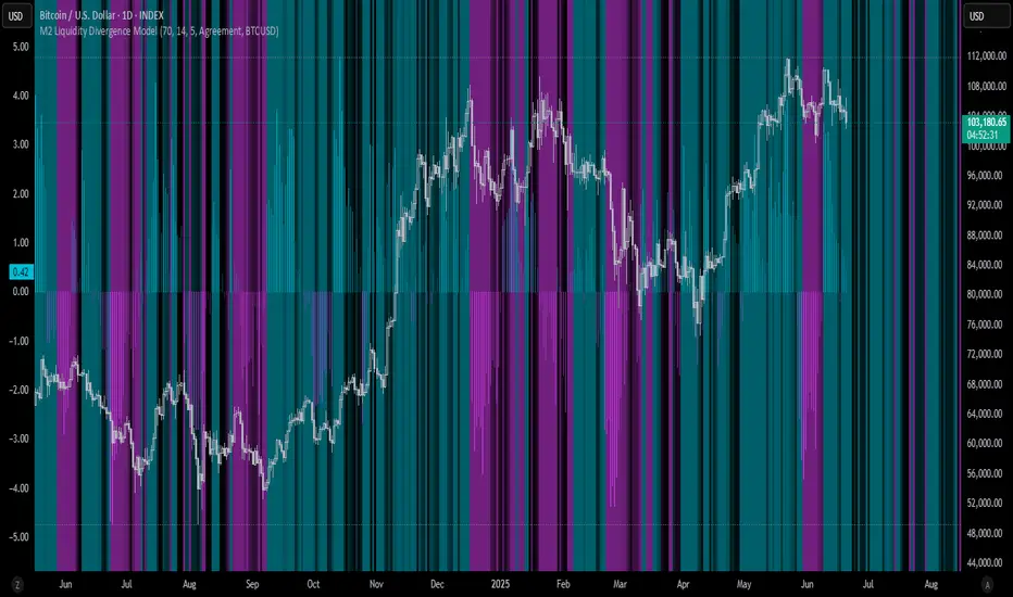
M2 Liquidity Divergence ModelM2 Liquidity Divergence Model
The M2 Liquidity Divergence Model is a macro-aware visualization tool designed to compare shifts in global liquidity (M2) against the performance of a benchmark asset (default: Bitcoin). This script captures liquidity flows across major global economies and highlights whether price action is aligned ("Agreement") or diverging ("Divergence") from macro trends.
🔍 Core Features
M2 Global Liquidity Index (GLI):
Aggregates M2 money supply from major global economies, FX-adjusted, including extended contributors like India, Brazil, and South Africa. The slope of this composite is used to infer macro liquidity trends.
Lag Offset Control:
Allows the M2 signal to lead benchmark asset price by a configurable number of days (Lag Offset), useful for modeling the forward-looking nature of macro flows.
Gradient Macro Context (Background):
Displays a color-gradient background—aqua for expansionary liquidity, fuchsia for contraction—based on the slope and volatility of M2. This contextual backdrop helps users visually anchor price action within macro shifts.
Divergence Histogram (Optional):
Plots a histogram showing dynamic correlation or divergence between the liquidity index and the selected benchmark.
Agreement Mode: M2 and asset are moving together.
Divergence Mode: Highlights break in expected macro-asset alignment.
Adaptive Transparency Scaling:
Histogram and background gradients scale their visual intensity based on statistical deviation to emphasize stronger signals.
Toggle Options:
Show/hide the M2 Liquidity Index line.
Show/hide divergence histogram.
Enable/disable visual offset of M2 to benchmark.
🧠 Suggested Usage
Macro Positioning: Use the background context to align directional trades with macro liquidity flows.
Disagreement as Signal: Use divergence plots to identify when price moves against macro expectations—potential reversal or exhaustion zones.
Time-Based Alignment: Adjust Lag Offset to synchronize M2 signals with asset price behavior across different market conditions.
⚠️ Disclaimer
This indicator is designed for educational and analytical purposes only. It does not constitute financial advice or an investment recommendation. Always conduct your own research and consult a licensed financial advisor before making trading decisions.
Combined ATPC & MACD DivergenceTrend Optimizer + Divergence Finder in One Unified Tool
🔍 Overview:
This powerful dual-system indicator merges two proven analytical engines:
✅ The Algorganic Typical Price Channel (ATPC) — a custom trend oscillator that highlights mean-reversion and directional bias.
✅ A refined MACD system with divergence detection, enhanced with an adjusted Donchian midline for real-time trend strength filtering.
Together, they provide a high-confidence, multi-signal system ideal for swing trading, scalping, or confirming reversals with context.
⚙️ Core Components & Logic
🧠 1. ATPC Engine (Trend Commodity Index)
A momentum and volatility-normalized oscillator based on the typical price (H+L+C)/3:
TrendCI Line (Blue) – Main trend signal based on smoothed CCI logic.
TrendLine2 (Orange) – A slower smoothing of TrendCI for crossovers.
Key Zones (customizable):
🔴 Ultra Overbought: +73
🟣 Overbought: +58
🟣 Oversold: -58
🔴 Ultra Oversold: -73
Trade Logic:
✅ Buy Signal: TrendCI crosses above TrendLine2 while in oversold zone
❌ Sell Signal: TrendCI crosses below TrendLine2 while in overbought zone
Additional visual feedback:
Histogram Bars show strength and direction of momentum shift
Green/Red Circles highlight potential long/short setups
📉 2. MACD System + Divergence Finder
Classic MACD enhanced with a Donchian Midline overlay to filter trend bias.
🔷 MACD Line and 🟠 Signal Line show crossover momentum
🟩/🟥 Histogram shows distance from the signal line
🟪 Adjusted Donchian Midline dynamically adapts to range-bound vs trending environments
Background Color provides real-time trend state:
✅ Green = Bullish Trend
❌ Red = Bearish Trend
No color = Neutral / Choppy
MACD Boundaries (user-defined):
Overbought: +1.0
Oversold: -1.0
🔀 3. Divergence Detection
Spot hidden power shifts before price reacts:
🔼 Positive Divergence – Price makes lower lows, but MACD histogram rises
🔽 Negative Divergence – Price makes higher highs, but MACD histogram weakens
These are visually marked with:
Green “+Div” label (bullish reversal cue)
Red “–Div” label (bearish exhaustion signal)
🎯 How to Use It
For Trend Traders:
Stay in sync with macro trend using MACD histogram + background
Use ATPC crossovers for precision entries
Avoid signals during neutral background (chop filter)
For Reversal Traders:
Look for bullish +Div with ATPC buy signal in oversold zone
Look for bearish –Div with ATPC sell signal in overbought zone
Mid-Donchian line can act as confluence or breakout trigger
For Scalpers & Intraday Traders:
Combine with VWAP, liquidity zones, or order flow levels
ATPC crossovers + MACD histogram zero-line flip = potential scalp entry
Use histogram slope and divergence to avoid false momentum traps
🧩 Customizable Inputs
🎛️ ATPC: Channel & Smoothing lengths, overbought/oversold thresholds
🎛️ MACD: Fast/slow EMAs, signal smoothing, Donchian period, bounds
🎨 Fully theme-compatible with adjustable colors and line styles
🔔 Alerts (Add Your Own)
While this version doesn’t contain built-in alerts, you can easily add alerts based on:
buySignal or sellSignal from ATPC logic
Histogram cross zero or trend flip
MACD Divergence event
📜 “This indicator doesn't just show signals—it tells a story about who’s in control of the market, and when that control might be slipping.”
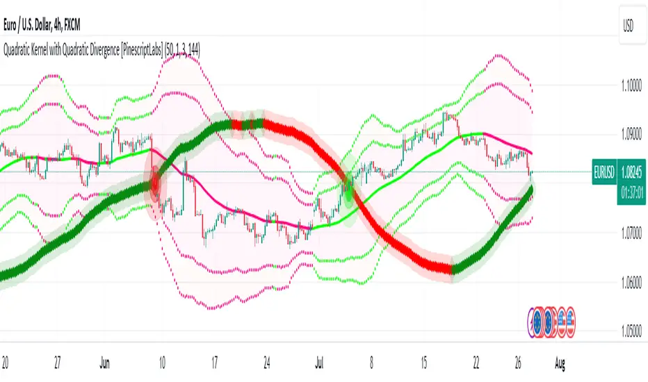
Quadratic Kernel with Quadratic Divergence [PinescriptLabs]This indicator combines a quadratic kernel regression with adaptive deviation bands to provide a unique view of market trends.
Key Features:
**Customizable Parameters:**
- Regression Period: Adjusts the sensitivity of the central line (default 50).
- Time Deformation: Modifies the weight of recent vs. older data (default 1.0). Increasing the "Time Deformation" makes more recent data more relevant, while decreasing it gives more weight to older data in the regression calculation.
- Confidence Band Width: Controls the width of the bands (default 3.0). Determines how many standard deviations are added to or subtracted from the central line to form the confidence bands. The standard deviations are calculated as the difference between the central line and the closing prices. A higher confidence value will result in wider bands, indicating a broader range of expected price variation, while a lower confidence value will result in narrower bands, indicating a narrower range of expected price variation.
**How to Use the Indicator Based on Price Crossings with the Kernel Divergence Line?**
Short: We need a candle to cross and close below the Kernel Divergence Line (bullish), and at the same time, the quadratic channels must be in a Bearish state for confirmation. Once the entry is executed, our exit will be when the Divergence Line changes its color by at least two confirmation points, or the price crosses above, which nullifies the entry.
Long: We need a candle to cross and close above the Kernel Divergence Line (bearish), and at the same time, the quadratic channels must be in a Bullish state for confirmation. Once the entry is executed, our exit will be when the Divergence Line changes its color by at least two confirmation points, or the price crosses below, which nullifies the entry.
**How to Use the Indicator Based Solely on Kernel Divergence??**
We observe the Kernel Divergence line, which indicates bullish momentum while the price is declining, and we are looking for the Reversal point.
**Confirmation of the Reversal Point:** When the Kernel Divergence changes from bullish (green color) to bearish (red color), we look for the price at its lowest point to be below the first lower Quadratic channel or even outside the Quadratic channel. This signals a potential strong reversal.
How to Use the Indicator Based Solely on Quadratic Channels?
Use only confirmations of changes from Bullish to Bearish or vice versa. It is recommended to have at least three confirmation points in the same direction.
Quadratic Kernel Regression: Provides a smoothed trend line that adapts to market movements.
Adaptive Deviation Bands: Dynamically calculated to show market volatility.
Buy/Sell Signals: Based on the price crossing the central line and the direction of the trend.
Quadratic Kernel Regression calculates a smoothed central line based on recent prices.
The deviation bands automatically adjust according to market volatility.
The trend is determined by comparing the current position of the central line with its previous position.
Buy signals are generated when the price crosses above the central line in an uptrend.
Sell signals are generated when the price crosses below the central line in a downtrend.
Español:
Este indicador combina una regresión de kernel cuadrático con bandas de desviación adaptativas para proporcionar una visión única de la tendencia del mercado.
Características principales:
**Parámetros personalizables:**
- Período de regresión: Ajusta la sensibilidad de la línea central (por defecto 50).
- Deformación del tiempo: Modifica el peso de los datos recientes vs. antiguos (por defecto 1.0). Aumentar la "Deformación del tiempo" hace que los datos más recientes sean más relevantes, mientras que disminuirla da más peso a los datos antiguos en el cálculo de la regresión.
- Ancho de bandas de confianza: Controla la amplitud de las bandas (por defecto 3.0). Determina cuántas desviaciones estándar se añaden o restan a la línea central para formar las bandas de confianza. Las desviaciones estándar se calculan como la diferencia entre la línea central y los precios de cierre. Un valor mayor de confianza resultará en bandas más anchas, indicando un rango más amplio de variación esperada en los precios, mientras que un valor menor de confianza resultará en bandas más estrechas, indicando un rango más estrecho de variación esperada.
* *Cómo usar el Indicador Basados en los Cruces de Precio con la Línea de Divergencia del Kernel?**
Short: Necesitamos que una vela cruce y cierre por debajo de la línea de Divergencia del Kernel (bullish) y al mismo tiempo los Canales cuadráticos deben estar en un momento Bearish para confirmación. Una vez ejecutada la entrada, nuestra salida será cuando la Línea de Divergencia haga su cambio de color al menos dos puntos de confirmación o el precio haga un cruce por arriba, lo que anula la entrada.
Long: Necesitamos que una vela cruce y cierre por Encima de la linea de Divergencia del Kernel( Bearish) y al mismo tiempo los Canales cuadráticos deben estar en un momento Bullish para confirmación, una vez ejecutada la entrada nuestra salida será cuando la Linea de Divergencia haga su cambio de color al menos dos puntos de confirmación o el precio haga un cruce por Debajo lo que anula la entrada:
Como usar el indicador Basado en solo en Divergencia del Kernel? : Observamos la linea de Divergencia del Kernel la cual nos indica un momentum bullish mientras que precio va a la baja y lo que buscamos es el punto de Reversion.
Confirmación de punto de reversion: cuando la Divergencia de Kernel pasa de bullish ( color verde) a bearish ( color rojo) buscamos que el precio en su punto mas bajo este por debajo del primer canal inferior Quadratico o fuera incluso del canal Quadratico lo que nos indica una posible reversion con fuerza.
Como usar el indicador basado solo en Canales Quadraticos?
Utilizar únicamente las confirmaciones de Cambio de Bullish a Bearish o visceversa, se recomienda al menos tres puntos de confirmación en la misma dirección.
Regresión de kernel cuadrático: Ofrece una línea de tendencia suavizada que se adapta a los movimientos del mercado.
Bandas de desviación adaptativas: Calculadas dinámicamente para mostrar la volatilidad del mercado.
Señales de compra/venta: Basadas en el cruce del precio con la línea central y la dirección de la tendencia.
La regresión de kernel cuadrático calcula una línea central suavizada basada en los precios recientes.
Las bandas de desviación se ajustan automáticamente según la volatilidad del mercado.
La tendencia se determina comparando la posición actual de la línea central con su posición anterior.
Las señales de compra se generan cuando el precio cruza por encima de la línea central en una tendencia alcista.
Las señales de venta se generan cuando el precio cruza por debajo de la línea central en una tendencia bajista.
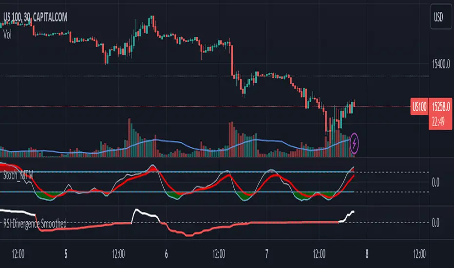
RSI Divergence SmoothedRSI Divergence Smoothed
This indicator is based on the RSI Divergence indicator by @InvestitoreComune.
The "RSI Divergence Smoothed" is a custom technical indicator designed to highlight divergence between two RSI (Relative Strength Index) lines: a fast RSI and a slow RSI. The divergence is then visualized on the chart, assisting traders in recognizing potential market reversals and trend continuation.
Here's a breakdown of its smoothing options added:
1. **WMA Difference**: The indicator first computes a weighted moving average (WMA) difference, which takes the difference between the WMA of half the input length and the WMA of the full length.
2. **Hull Moving Average (HMA)**: The indicator can use the HMA as a filter. HMA combines the benefits of a simple moving average and a linear weighted moving average, aiming to be faster in response to price changes.
3. **Sine Weighted Moving Average (SWMA)**: Another filter option, SWMA, weighs the data points by the sine of their position in the data set, giving more weight to the central data points.
4. **Kaufman's Adaptive Moving Average (KAMA)**: KAMA adapts to price volatility and can also be used as a filter. It's especially useful in choppy markets, adjusting the smoothing constant based on the relative volatility of the price series.
5. **Gaussian Moving Average (GMA)**: This filter uses a Gaussian kernel to weigh the data points, emphasizing the more recent data while giving lesser importance to older data. It helps smooth out the price data, potentially eliminating some of the noise.
I've personally found the KAMA smoothing to be most helpful but keen to hear of anyone's personal experiences and recommendations.
RSI divergence computations are based on the filtered price (or raw price if no filter is chosen) - the indicator calculates two RSIs:
- Fast RSI: With a default length of 5 periods.
- Slow RSI: With a default length of 14 periods.
The core functionality of this indicator is to compute the divergence between the Fast and Slow RSI. The divergence is plotted on the chart, with the color indicating its direction: white for positive divergence and red for negative.
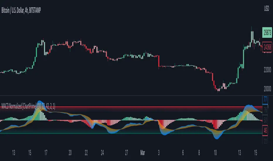
MACD Normalized [ChartPrime]Overview of MACD Normalized Indicator
The MACD Normalized indicator, serves as an asset for traders seeking to harness the power of the moving average convergence divergence (MACD) combined with the advantages of the stochastic oscillator. This novel indicator introduces a normalized MACD, offering a potentially enhanced flexibility and adaptability to numerous market conditions and trading techniques.
This indicator stands out by normalizing the MACD to its average high and average low, also factoring in the deviation of the high-low position from the mean. This approach incorporates the high and low in the calculations, providing the benefits of stochastic without its common drawbacks, such as clipping problems. As a result, the indicator becomes exceptionally versatile and suitable for various trading strategies, including both faster and slower settings.
The MACD Normalized Indicator boasts a variety of options and settings. The features include:
Enable Ribbon: Toggle the display of the ribbon accompanying the MACD Normalized, as desired.
Fast Length: Determine the movement speed of the fast line to receive advance notice of potential market opportunities.
Slow Length: Control the movement pace of the slow line for smoother signals and a comprehensive outlook on market trends.
Average Length: Specify the length used to calculate the high and low averages, providing greater control over the indicator's granularity.
Upper Deviation: Establish the extent to which the high and low values deviate from the mean, ensuring adaptability to diverse market situations.
Inner Band (Middle Deviation): Adjust the balance between the high and low deviations to create an inner band signal, giving traders a secondary level of market analysis and decision-making support.
Enable Candle Color: Enable the coloring of candles based on the MACD Normalized value for effortless visualization of trading potential.
Use Cases for the MACD Normalized Indicator
In addition to analyzing market trends and identifying potential trading opportunities, ChartPrime's MACD Normalized Indicator offers a range of applications for traders. These use cases encompass distinct trading scenarios and strategies:
Overbought and Oversold Regions
One of the key applications of the MACD Normalized Indicator is identifying overbought and oversold regions. Overbought refers to a situation where an asset's price has risen significantly and is expected to face a downturn, while oversold indicates a price drop that may subsequently lead to a reversal.
By adjusting the indicator's parameters, such as the upper and inner deviation levels, traders can set precise boundaries to determine overbought and oversold areas. When the MACD moves into the upper region, it may signal that the asset is overbought and due for a price correction. Conversely, if the MACD enters the lower region, it possibly indicates an oversold condition with the potential for a price rebound.
Signal Line Crossovers
The MACD Normalized Indicator displays two lines: the fast line and the slow line (inner band). A common trading strategy involves observing the intersection of these two lines, known as a crossover. When the fast line crosses above the slow line, it may signify a bullish trend or a potential buying opportunity. Conversely, a crossover with the fast line moving below the slow line typically indicates a bearish trend or a selling opportunity.
Divergence and Convergence
Divergence occurs when the price movement of an asset does not align with the corresponding MACD values. If the price establishes a new high while the MACD fails to do the same, a bearish divergence emerges, suggesting a potential downtrend. Similarly, a bullish divergence takes place when the price forms a new low but the MACD does not follow suit, hinting at an upcoming uptrend.
Convergence, on the other hand, is represented by the MACD lines moving closer together. This movement signifies a potential change in the trend, providing traders with a timely opportunity to enter or exit the market.
Volume Crop ━ Hidden Volume Divergence [whvntr] Volume Divergence
• Formula originated from: "Hidden Price Divergence" (circles) by TheLark. I did two things to harness its
effectiveness:
• Firstly, I developed a unique way to filter out the divergence signals that were appearing on both sides of the
midline. This filter will be known as the "Midline Tool" . It filters out a lot of the false signals commonly
associated with oscillators.
• Then, I modified the default format from Price to Volume.
• The midline formula "Midline Tool" was developed by me . It adjusts in the thousands since it's volume.
Let me know in the comments if you would rater have a smaller step value than 10,000. How does it work?
Crossover then Crossunder, the arrows only appear during the first sign of hidden volume divergence once
crossing the midline. Normally, these signs appear on both side of the midline both bearish and bullish no
matter if it's on an oversold or overbought side of the spectrum... Also, let
me know in the comments if you would like for me to release an oscillator version of this
indicator for co-witnessing.
Features:
• Volume divergence
• Midline Tool©
• Disclaimer: This indicator does not constitute investment advice. Trade at your own risk with the investments
you can afford to lose because all financial investments have risks and this is not a
guarantee that the volume divergence will be 100% all the time.
Next Pivot Projection [Trendoscope]Still experimental. Extending further on the divergence backtest results - in this script we try to project next 2 pivots (including one unconfirmed pivot)
🎲 Previous experiments
1. Divergence-Backtester
2. Divergence-Backtester-V2
🎲 Additions
Apart from collecting the stats on number of occurrences of HH, HL, LH, LL - this script also keeps track of average ratio for each levels and average bars.
Based on these data, we try to calculate the next pivot projections including possible bar and price.
Cloud covering the candles indicate historical levels of average HH, HL, LH, LL projections.
Hover on projection labels to find more details in tooltips.
🎲 Overall method in a nutshell
🎲 Going bit deeper
🎯 Unconfirmed Pivot and its projection - Last pivot of the zigzag is always unconfirmed. Meaning, it can potentially repaint based on further price movements. But, projection of the unconfirmed pivot will not change as it will be based on previous two pivots - both of which are confirmed.
🎯 Next Pivot Projection - Next pivot is projected based on last two pivots - which include last unconfirmed pivot. Hence, these projections can potentially repaint based on the last pivot repaint.
🎯 Historical projections displayed as cloud - Historical projection values are displayed as cloud around pivots.
A cloud above represents area from average lower high range to average higher high range. Cloud color is green if average ratio of pivot high is more than 1. Red Otherwise.
A cloud below represents area from average higher low range to average lower low range. Cloud color is red if average ratio of pivot high is more than 1. Green otherwise

Stoch RSI, Div, Zone S3 by Gammaprod>> How to use this indicator :
1. Set your teadingview theme to dark theme.
2. My indicator is valid for forex, stock and but more valid for crypto.
3. Use three timeframe for more validation (choose between those, that fit to your trading style) :
- Timeframe 1m, 5m, and 15m for Scalping
- Timeframe 30m, 1h and 4h for Intraday
- Timeframe 4h, 1D and 1W for Swing Trading
4 . Always use THREE INDICATORS FROM GAMMAPROD, those three indicators is back to back each other, by the way, I only made those three indicators only (for now) :
- Trendlines Boll Ichi Crypto by Gammaprod
- Stoch RSI Divs Zone Crypto by Gammaprod
- MACD Volume Crypto by Gammaprod
>> How to setting :
1. Trendlines Boll Ichi Crypto by Gammaprod
A. Support and Resistence
- Well if you familiar with this indicator you can add it, but recommended for Timeframe 30m or more
B. Trendlines Primary or Trendlines Secondary
- Timeframe 1m you DON'T NEED Trendlines Primary or Trendlines Secondary
- Timeframe 5m you DON'T NEED Trendlines Secondary, but you CAN ADD Trendlines Primary if you fell it helpful (for me, it is helpful to find where the candles start or the end trend or a consolidation or where the candles will surpass a resistance or a support).
- Timeframe 15m you DON'T NEED Trendlines Secondary, DEFENITELY add Trendlines Primary it will help to find where the candles stop or a consolidation or where the candles will surpass a resistance or a support).
- Timeframe 30m or more, DEFENITELY NEED BOTH Trendlines Primary and Secondary Trendlines, it will help to find where the candle stop or consolidation or where the candle will surpass a resistance or support).
C. Bolinger, Ichimoku Cloud and Lagging Span
- Please DON'T CHANGE IT at all, it's really helpful to know when and where to make an entry decesion or a trend or a consolidation, if you don't understand how to read it, you better to learn it first (on "how to read" section and "How to OPEN position" the section below)
2. Stoch RSI Divs Zone Crypto by Gammaprod (DON'T CHANGE IT)
3. MACD Volume Crypto by Gammaprod (DON'T CHANGE IT)
>> How to read :
1. Sell or Buy Priority :
A. Buy Priority
- Color background on macd and stoch rsi is pink or purple sell is the priority, (if you're not sure to buy, just wait until the best moment to sell)
B. Buy Priority
- Color background on macd and stoch rsi Teal or light green buy is the priority, (if you're not sure to sell, just wait until the best moment to buy)
C. Indecision / Golden Moment
- Color background on stoch rsi yellow is indecision / golden moment of reversal pattern (wait until it formed background only on Stoch RSI), please becareful at this moment.
2. Trend / Consolidation :
A. BULLISH trend
- When Stoch RSI and MACD have teal or light green background that's means BULLISH trend, better to confirm by the candle is above green cloud and lagging span (red line) is also above the candle.
B. BEARISH trend
- When Stoch RSI and MACD have the Pink or purple background that's means BEARISH trend, better to confirm by the candle is above purple cloud and lagging span (red line) is also below the candle.
C. CONSOLIDATION
- When Stoch RSI have the mix background that's means CONSOLIDATION, better to confirm by the candle is in or near to green / purple cloud and lagging span (red line) is also on the candle.
3. Special Mark
A. Ideal Bullish :
- Near line 20 and green / teal background = When Stoch RSI have the char R / H on lime color label, that's means divergence or hidden divergence for buy position, if you not see this label that's means just a standard confirmation for buy
B. Not an Ideal Bullish :
- Near line 80 and green / teal background = if this happens make sure you know what happen, it could be a false signal or bullish continual pattern
C. Ideal Bearish :
- Near line 80 and pink / purple background = When Stoch RSI have the char R / H on lime color label, that's means divergence or hidden divergence for buy position, if you not see this label that's means just a standard confirmation for sell position.
D. Not an Ideal Bearish:
- Near line 20 and pink / purple background = if this happens make sure you know what happen, it could be a false signal or bearish continual pattern
E. The Beginning of Reversal (from BEARISH to BULLISH) :
- When Stoch RSI line shaping GREEN position is near 20.
- MACD lines still PINK, position lines is UNDER the HISTOGRAM, but the HISTOGRAM start to SHAPE FALL PINK (light pink) and the BACKGROUND still PINK / PURPLE.
- Position CANDLES NEAR BLUE line, NEAR PURPLE CLOUD, and lagging span (red line) STILL ON the area candle. (it used to be confirmed with the golden moment).
F. The Beginning of Reversal (from BULLISH to BEARISH) :
- When Stoch RSI line shaping PINK position is near 80.
- MACD lines still GREEN, position lines is ABOVE the HISTOGRAM, but the HISTOGRAM start to SHAPE FALL GREEN (light green) and the BACKGROUND still TEAL / GREEN.
- Position CANDLES NEAR WHITE line, NEAR TEAL CLOUD, and lagging span (red line) STILL ON the area candle. (it used to be confirmed with the golden moment).
G. False Signals, or It could be a Golden Moment (better to see it on TF 15 or bigger):
- Near line 20 or 80 and yellow background = When Stoch RSI have the char R / H on color label, that's means divergence or hidden divergence for buy / sell position, if you not see this label that's means just a standard confirmation for buy / sell depends on where the Stoch RSI line if near 20 that's means buy, near 80 means sell
>> How to OPEN position:
A. Bullish
1. Trendlines Boll Ichi Crypto by Gammaprod
- The candles above the green cloud.
- Lagging span (red line) above the candles.
- then open buy near yellow line (the first option) / blue line (the second option) (always confirm the position with two other indicators below).
2. Stoch RSI Divs Zone Crypto by Gammaprod
- Teal or Green background.
- The lines is shaping green.
- Better if on the bottom (at a range 20).
3. MACD Volume Crypto by Gammaprod
- Teal or Green background.
- The lines is shaped or shaping green.
- Better if at the green histogram.
B. Bearish
1. Trendlines Boll Ichi Crypto by Gammaprod
- The candles below the purple cloud.
- Lagging span (red line) below the candles.
- then open buy near yellow line (the first option) / white line (the second option) (always confirm the position with two other indicators below).
2. Stoch RSI Divs Zone Crypto by Gammaprod
- Pink or purple background.
- The lines are shaping pink.
- Better if the line on the top (at a range 80).
3. MACD Volume Crypto by Gammaprod
- Pink or purple background.
- The lines are shaped or shaping green.
- Better if at the pink histogram.
C. Consolidation
1. Trendlines Boll Ichi Crypto by Gammaprod
- The candles on the cloud (green or purple).
- Lagging span (red line) on the candles.
- then open buy near the white or blue line (always confirm the position with two other indicators below).
2. Stoch RSI Divs Zone Crypto by Gammaprod
- Mix background specially on a timeframe 15m or more.
- The line move fast up and down.
- Better if on the bottom or the top of the lines (at a range 20 or 80).
3. MACD Volume Crypto by Gammaprod
- Changing the background.
- The line is near the middle line.
- Have small Histogram.
>> The secret ingridient is comparing the timeframe :
The example scalping (Timeframe 1m, 5m and 15m)
- TF 1m is for making an open position.
- TF 5m is for making a judgement of the trend market.
- TF 15m is to confirm that judgement from TF 5m, be careful if it not similar then it used to be a consolidation or the beginning of the reversal.
There's a lot a way to open the position than above information that i gave it to you, but consider there are a limit char on this column, I hope it will help your trading and make a more profit on it.

TMA-LegacyThis is a script based on the original TMA- RSI Divergence indicator by PhoenixBinary.
The Phoenix Binary community and the TMA community built this version to be public code for the community for further use and revision after the reported passing of Phoenix Binary (The community extends our condolences to Phoenix's family.
The intended uses are the same as the original but some calculations are different and may not act or signal the same as the original.
Description of the indicator from original posting.
This indicator was inspired by Arty and Christy .
█ COMPONENTS
Here is a brief overview of the indicator from the original posting:
1 — RSI Divergence
Arty uses the RSI divergence as a tool to find entry points and possible reversals. He doesn't use the traditional overbought/oversold. He uses a 50 line. This indicator includes a 50 line and a floating 50 line.
The floating 50 line is a multi-timeframe smoothed moving average . Price is not linear, therefore, your 50 line shouldn't be either.
The RSI line is using a dynamic color algo that shows current control of the market as well as possible turning points in the market.
2 — Smoothed RSI Divergence
The Smoothed RSI Divergence is a slower RSI with different calculations to smooth out the RSI line. This gives a different perspective of price action and more of a long term perspective of the trend. When crosses of the floating 50 line up with the traditional RSI crossing floating 50.
3 — Momentum Divergence
This one will take a little bit of time to master. But, once you master this, and combined with the other two, damn these entries get downright lethal!

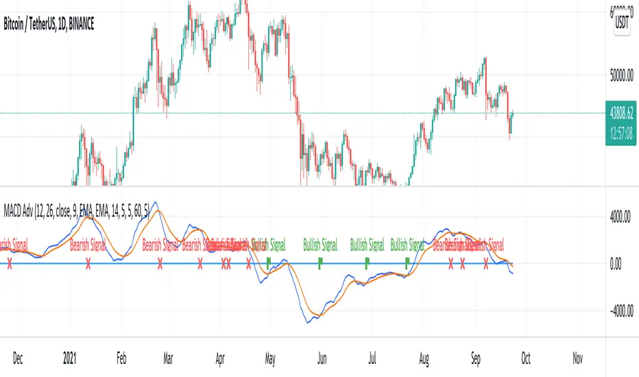
MACD AdvancedHello traders!
As you know, MACD is one of the oldest and the most popular indicators for trading. It seems to be a «Hello world indicator» of most technical analysis beginners. It’s easy to interpret and rather useful for many styles of trading. There are many arguments about its accuracy but in my opinion, this indicator can show very good results. However, you should squeeze every drop of its opportunities and we'll help you with it. We invented this script to make the lives of both professionals and freshmen easier.
Our new indicator uses all the opportunities that MACD gives. It takes into consideration divergencies, crossovers, the MACD, and signal line location. It seems to be rather difficult to take into consideration all MACD signals when you don’t use algorithmic trading, but it’ll be trivial using our script. We have integrated some innovations that’ll make traders’ staff easier. As you know, the crossover is considered to be a false signal in conjunction with hidden divergence which predicts another movement. Thus, we catch all types of divergencies and if it’s hidden of another «value» we skip it. However, if there's a crossover with bullish divergence or cross under with bearish, the signal seems to be strong and accurate. In this case, divergence is playing for us and makes the point of entrance more trustable. Our script takes into consideration this case and the innovative divergence chaser doesn’t give any mistakes. Moreover, if crossover takes place above zero line and crosses under bellow it, these signals are considered to be false too. It’s a trivial task comparing with the previous, thus it’s extremely simple for our script. We called it MACD Advanced cause it uses all the power of MACD with the power of invasive divergence chasers. The usage of it is trivial. Just add it to the chart, tune the parameters like MACD and tune the divergence chaser and get very accurate signals. We decided not to draw the bars to make signals more visible. It seems to be very nice!
I hope guys you'll enjoy it and it'll become a part of your trading staff.
Kifier's MFI/STOCH Hidden Divergence/Trend BeaterMFI/STOCH Hidden Divergence/Trend Beater
General Idea:
My premise around this strategy was to make a general strategy for crypto that would help out with finding entry positions for when you’re bullish on a crypto and want to hold on for a while, and at the same time avoiding massive drops. Essentially a way to mix long term/ swing trading; I somewhat achieved my goal however it still requires a lot of logic tuning of the trend averages.
I’m a huge proponent of volume indicators and coupled with average closing price, I think this gives a really good idea of what is happening with the market. It gives an idea on the market and retail investor sentiment. This generally gives you logical entry positions (Although I don’t know how amazing that will work with all cryptos, there’s a fine line between a good strategy and one that just rides bubble market conditions, some would argue that’s still a success and others not)
How it works:
There are many components to the strategy that try to do different things:
First of all there are two types of entries, a MFI hidden divergence with a STOCH check, essentially it will only fire when a divergence is detected while STOCH is above 50%, however this might be changed in the future as due to the volatile nature of cryptos, the STOCH is not too effective. The second entry is a simple MFI/STOCH trend, if STOCH is above 50% and the trend is detected to be in a trending long, once a MFI crossover over the 50% line is detected an entry is placed, this is designed to get out profit where the divergence would otherwise be less accurate during strongly trending conditions.
-MFI is a great indicator, as a volume weighted momentum indicator I find it the most accurate of all, the STOCH however is a great indicator to get a general picture of simple market conditions and can filter out the emotional noise of retail investors.
-VWMA and an SMA (The bottom oscillator) gives an idea of the trend tacking into account of the volume, this serves as a more short term filter of the trend for filters.
-OBV checks are done between the OBV and an EMA of the OBV, to get the idea of a volume weighted long trend, which is important for crypto as there are massive rallies to go up due to retail greed, it’s great to jump onto it at the beginning, and get off before the stack of cards fall apart.
-ATR is used to detect when the market is relatively just ranging or moving sideways, which is where the hidden divergence entries are done, during predictable and profitable market conditions.
- Stop loss is based on the closest support of the entry, this is a nice medium of room to breath but also an actual stop loss.
Future plans and improvements:
Currently there’s a lot I want to improve, mostly the divergence detection and the overall sharpe ratio could be much better, but the current value of 0.5 gives me hope that the strategy is onto something. I also want to change TP from a percentage stop to something more dynamic but that might be too optimistic. The current plan is to paper trade test this either by manual or by a python bot, to see how it performs with some user input as well.

[blackcat] L2 Bull Bear Convergence Divergence (BBCD)Level: 2
Background
A bull market is gaining ground and is economically sound, while a bear market is declining and most stocks are depreciating. The actual origins of these terms are unclear, but one reason could be that bulls attack by pulling their horns up while bears attack by brushing their paws down.
Function
L2 Bull Bear Convergence Divergence (BBCD) disclose the convergence divergence of the bull bear as a market opinion indicator. It tells you the opinion of those who are directly involved with the markets. As a trader, understanding how the convergence divergence of the bull bear works can be of great help. I inherited the traditional MACD expression method, and added golden cross (yellow cross) and dead cross (fuchsia cross) prompts, as well as bottom divergence (lime cross) and top divergence (red cross) prompts.
Key Signal
bbd --> bull bear fast line
bbdsupport --> bull bear slow line and support level
bbdgx --> bull bear gold cross in yellow
bbddx --> bull bear dead cross in fuchsia
bbotdiverg --> bull bear bottom divergence alert in lime cross
btopdiverg --> bull bear top divergence alert in red cross
Pros and Cons
Pros:
1. it can help to see the strength change of a trend in time
2. visual bottom and top divergence alerts are provided
Cons:
1. it disclose the strength change better than price change
Remarks
Bull Bear Convergence Divergence (BBCD) is new.
Readme
In real life, I am a prolific inventor. I have successfully applied for more than 60 international and regional patents in the past 12 years. But in the past two years or so, I have tried to transfer my creativity to the development of trading strategies. Tradingview is the ideal platform for me. I am selecting and contributing some of the hundreds of scripts to publish in Tradingview community. Welcome everyone to interact with me to discuss these interesting pine scripts.
The scripts posted are categorized into 5 levels according to my efforts or manhours put into these works.
Level 1 : interesting script snippets or distinctive improvement from classic indicators or strategy. Level 1 scripts can usually appear in more complex indicators as a function module or element.
Level 2 : composite indicator/strategy. By selecting or combining several independent or dependent functions or sub indicators in proper way, the composite script exhibits a resonance phenomenon which can filter out noise or fake trading signal to enhance trading confidence level.
Level 3 : comprehensive indicator/strategy. They are simple trading systems based on my strategies. They are commonly containing several or all of entry signal, close signal, stop loss, take profit, re-entry, risk management, and position sizing techniques. Even some interesting fundamental and mass psychological aspects are incorporated.
Level 4 : script snippets or functions that do not disclose source code. Interesting element that can reveal market laws and work as raw material for indicators and strategies. If you find Level 1~2 scripts are helpful, Level 4 is a private version that took me far more efforts to develop.
Level 5 : indicator/strategy that do not disclose source code. private version of Level 3 script with my accumulated script processing skills or a large number of custom functions. I had a private function library built in past two years. Level 5 scripts use many of them to achieve private trading strategy.

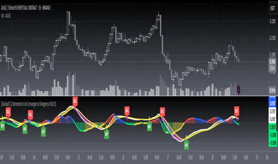
[blackcat] L2 Momentum Line Convergence Divergence (MLCD)Level: 2
Background
Momentum indicators are technical analysis tools that can be used to determine the strength or weakness of the stock price. Momentum measures the speed at which stock prices rise or fall. Common momentum indicators are the relative strength index (RSI) and the moving average of convergence divergence (MACD).
Function
L2 Momentum Line Convergence Divergence (MLCD) is one of my innovative indicator which is to differeniate with average of convergence divergence (MACD). So, I named it as Momentum Line Convergence Divergence (MLCD). In order for everyone to be more familiar with its useage, I inherited the traditional MACD expression method, and added golden cross (yellow cross) and dead cross (fuchsia cross) prompts, as well as bottom divergence (lime cross) and top divergence (red cross) prompts.
Key Signal
mtm --> momentum fast line
mtmaux --> momentum slow line
mtmgx --> momentum gold cross in yellow
mtmdx --> momentum dead cross in fuchsia
mtmbotdiverg --> momentum bottom divergence alert in lime cross
mtmtopdiverg --> momentum top divergence alert in red cross
Pros and Cons
Pros:
1. very stable for market price change and trend following
2. visual bottom and top divergence alerts are provided
Cons:
To be found yet
Remarks
Blackcat1402 brand MLCD indicator
Readme
In real life, I am a prolific inventor. I have successfully applied for more than 60 international and regional patents in the past 12 years. But in the past two years or so, I have tried to transfer my creativity to the development of trading strategies. Tradingview is the ideal platform for me. I am selecting and contributing some of the hundreds of scripts to publish in Tradingview community. Welcome everyone to interact with me to discuss these interesting pine scripts.
The scripts posted are categorized into 5 levels according to my efforts or manhours put into these works.
Level 1 : interesting script snippets or distinctive improvement from classic indicators or strategy. Level 1 scripts can usually appear in more complex indicators as a function module or element.
Level 2 : composite indicator/strategy. By selecting or combining several independent or dependent functions or sub indicators in proper way, the composite script exhibits a resonance phenomenon which can filter out noise or fake trading signal to enhance trading confidence level.
Level 3 : comprehensive indicator/strategy. They are simple trading systems based on my strategies. They are commonly containing several or all of entry signal, close signal, stop loss, take profit, re-entry, risk management, and position sizing techniques. Even some interesting fundamental and mass psychological aspects are incorporated.
Level 4 : script snippets or functions that do not disclose source code. Interesting element that can reveal market laws and work as raw material for indicators and strategies. If you find Level 1~2 scripts are helpful, Level 4 is a private version that took me far more efforts to develop.
Level 5 : indicator/strategy that do not disclose source code. private version of Level 3 script with my accumulated script processing skills or a large number of custom functions. I had a private function library built in past two years. Level 5 scripts use many of them to achieve private trading strategy.
CryptoNL R.E.D (rsi+ema and divergence)I used the build-in divergence indicator and fine-tuned the divergence provision.
Alerts have also been added and ema12 for extra trend determination.
The background color indicates the bearish and bullish zones.
Bullish divergence are indicated with a green line and dot
Bearish divergence are indicated with a red line and dot
Hidden divergence are indicated with an orange line and stripe marking.
All settings can be adjusted as desired. In the example, the bearish lines are off and bullish on to show the difference.

[Coingrats]RSI Divergence + StochRSIThis indicator shows the RSI and StochRSI. RSI divergence will also be marked.
- Bullish divergence - green triangle,
- Hidden bullish divergence - gray triangle
- Bearish divergence = red triangle
- Hidden bearish divergence - gray triangle
Credits to BabyWhale83 for the code to spotting divergence
WANNA TIP ME? BUY ME SOME BEERS!
BTC: 3BMEXX5JrX94ziUSoQMLEmi51WcYwphAg3
ETH: 0x541e504bb461aa141de6ddce09dc89eb16f58f9c
LTC: LPBJXzUZJksCuCK27AY2qAVYGGGiUfejok
DON'T FORGET TO LOOK AT OUR SITE MYCRYPTODARAR.COM