Gold Seasonal Long-Term StrategyBased on the rigid cycle of physical gold demand.
It capitalizes on the strong buying momentum driven by India's Diwali in November, the Western holiday season in December, and the Chinese New Year in January/February to execute a long-term hold.
Cari dalam skrip untuk "GOLD"

🟡 GOLD 4H HUD v8.9 — Loose ICT OB + Strong/Weak + FVG/HVN/LVNGOLD 4H HUD v8.9 is a clean, structured Smart Money Concepts (SMC)–based analysis tool designed exclusively for XAUUSD on the 4-hour timeframe.
It focuses on the three most important elements for institutional orderflow analysis:
✔ Loose ICT Order Blocks (Demand/Supply)
✔ Fair Value Gaps (FVG)
✔ Volume Profile Zones (HVN/LVN/POC)
The script builds a professional-style HUD that displays the key institutional regions and structural levels that matter most for gold traders.
📌 Key Features
1 — Market Structure Engine (HH/HL & BOS)
The indicator detects:
Minor swing Highs and Lows
Last confirmed HH / HL levels
Break of Structure (BOS) for directional bias
EMA-200 trend filter (UP / DOWN / NEUTRAL)
This gives traders a clean structural read without clutter or noise.
2 — Loose FVG Engine (Tolerance-Based ICT Gaps)
A soft-threshold FVG engine detects “loose” Fair Value Gaps using a 0.1% price tolerance.
This method ensures:
Fewer missed imbalances
Cleaner OB/FVG alignment
Higher accuracy on 4H gold displacement legs
FVGs automatically shift to the right side of the chart for clean visualization.
3 — Order Block Engine (Demand/Supply + Strong/Weak Classification)
A simplified ICT-style OB engine scans the past few candles whenever BOS is detected.
It identifies:
Demand OB during bullish BOS
Supply OB during bearish BOS
Strong OB if fully nested inside an active FVG
Weak OB otherwise
OB boxes include:
Clear color coding (strong vs. weak)
Price range labels inside each box
Automatic right-shift for visual clarity
4 — Volume Profile Engine (POC / HVN / LVN / VAH / VAL)
Based on a rolling window (default 120 bars), the script builds a lightweight volume distribution.
It displays:
POC (Point of Control)
HVN (High Volume Node)
LVN (Low Volume Node)
Value Area High / Low
HVN/LVN zones are shown as right-shifted colored boxes with price labels.
These zones help identify:
Institutional accumulation
Low-liquidity rejection points
Areas where price tends to react strongly
5 — Support / Resistance Mapping
The script automatically generates:
OB-based support/resistance
Swing-high/swing-low levels
HVN/LVN structural levels
These are displayed in the HUD for fast reference.
6 — Professional HUD Panel
A compact, easy-to-read HUD summarizes:
Trend direction
Latest HH/HL
OB ranges (Strong/Weak)
HVN/LVN price zones
POC
Multi-layer support & resistance
This turns the script into a fully functional analysis dashboard.
📌 What This Indicator Is NOT
To avoid misunderstanding:
It does not take entries or generate buy/sell signals
It does not auto-detect CHOCH, MSS, SMT, or sweeps
It is not a trading bot
This tool is designed as an institutional-style map and analysis HUD, not a strategy.
📌 Best Use Case
This indicator is ideal for traders who want to:
Read institutional structure on XAUUSD
Identify clean Demand/Supply zones
Visualize FVG/OB/HVN interactions
Track high-value liquidity levels
Build directional bias on 4H before dropping to execution timeframes
⚠ Important Note
This tool is designed exclusively for the 4H timeframe.
Using it on lower timeframes will display a warning.

Gold AI RSI Monitor [Stacked + KNN]Here is a comprehensive description and user guide for the Gold AI RSI Monitor. You can copy and paste this into the "Description" field if you publish the script on TradingView, or save it for your own reference.
Gold AI RSI Monitor
🚀 Overview
The Gold AI RSI Monitor is a next-generation dashboard designed specifically for trading volatile assets like Gold (XAUUSD). It completely reimagines the traditional RSI by "stacking" 10 different timeframes (from 1-minute to Monthly) into a single, vertical view.
Integrated into this dashboard is a K-Nearest Neighbors (KNN) Machine Learning algorithm. This AI analyzes historical price action to find patterns similar to the current market and predicts the next likely move with a confidence score.
📊 Visual Guide: How to Read the Chart
1. The "Stacked" Lanes Instead of switching timeframes constantly, this indicator displays them all at once using vertical offsets.
Bottom Lane (0-100): 1-Minute RSI
Middle Lanes: 5m, 15m, 30m, 1H, 2H, 4H, Daily
Top Lane (900-1000): Monthly RSI
2. Gradient Color System The RSI lines change color based on momentum strength:
🔴 Red: Oversold / Bearish (Approaching 30 or lower)
🟡 Yellow: Neutral (Around 50)
🟢 Green: Overbought / Bullish (Approaching 70 or higher)
3. Tracker Lines Each timeframe has a dotted horizontal line extending to the right. This allows you to instantly see the exact RSI value for every timeframe without squinting.
🤖 The AI Engine (KNN)
The "AI" component uses a K-Nearest Neighbors algorithm.
Learning: It scans the last 1,000 bars of history.
Matching: It finds the 5 historical moments that look mathematically identical to the current market conditions (based on RSI and Volatility).
Predicting: It checks if price went UP or DOWN after those historical matches.
The Signals:
Buying Signal: If the majority of historical matches resulted in a price increase, the AI triggers a BUY.
Selling Signal: If the majority resulted in a drop, the AI triggers a SELL.
🎯 How to Trade with This Indicator
1. The "Crosshair" Signal
When the AI detects a high-probability setup, a massive Crosshair appears on your chart:
Green Crosshair: Strong BUY signal.
Red Crosshair: Strong SELL signal.
Note: The crosshair consists of a thick vertical line and a dashed horizontal line intersecting at the signal candle.
2. Timeframe Alignment (Confluence)
Do not rely on the AI alone. Look at the stacked RSIs:
Strong Long: The AI shows a Green Crosshair AND the lower timeframes (1m, 5m, 15m) are all turning Green/upward.
Strong Short: The AI shows a Red Crosshair AND the lower timeframes are turning Red/downward.
3. Support & Resistance Zones
Bottom Dotted Line (30): Support. If RSI hits this and turns up, it's a buying opportunity.
Top Dotted Line (70): Resistance. If RSI hits this and turns down, it's a selling opportunity.
⚙️ Settings Guide
RSI Length: Default is 14. Lower (e.g., 7) makes it faster/choppier; higher (e.g., 21) makes it smoother.
Enable AI Signals: Toggles the KNN calculation on/off.
Neighbors (K): How many historical matches to check. Default is 5.
Increase to 9-10 for fewer, more conservative signals.
Decrease to 3 for faster, more aggressive signals.
AI Timeframe: CRITICAL SETTING.
If left empty, the AI calculates based on your current chart.
Recommendation: For Gold scalping, set this to 15m or 1h. This ensures the AI looks at the bigger trend even if you are zooming in on the 1-minute chart.
⚠️ Disclaimer
This tool is for educational and analytical purposes. The "AI" is a statistical probability algorithm based on past performance, which is not indicative of future results. Always manage your risk.
Gold Key Level LinesOverview
Gold Horizontal Lines is a visual grid tool that draws automatic horizontal levels around the current price. It’s designed for symbols like Gold (XAUUSD), but works on any market and timeframe.
What It Does
Draws main, mid, and quarter price levels based on user-defined intervals (e.g. 100 / 50 / 25).
Centers the grid around the current close, above and below by a chosen number of levels.
Adds optional price labels to each line on the right side of the chart.
Deletes and redraws lines only on the last bar to keep the chart clean and efficient.
Inputs
Main Line Interval – distance between key levels (e.g. 100).
Mid / Quarter Intervals – optional extra levels between main lines (set to 0 to disable).
Colors, Styles, Widths – separate settings for main, mid, and quarter lines.
Show Price Labels – toggle labels on/off.
Number of Lines Above/Below Price – controls how far the grid extends.

GOLD PRICES1. Introduction – The Indicator's Purpose
"This indicator is designed to help traders accurately identify entry and exit points, avoiding random trading decisions. It also aims to reduce uncalculated risk and improve trade quality by providing a clear reading of trends and potential reversal points."
2. Simplified Explanation of the Indicator's Operation
-"The indicator's operation relies on a set of technical elements that contribute to providing an accurate reading of market movement. First, it displays strong areas such as support and resistance levels, as these are points where the price frequently reacts and often experiences clear reversals.
-The indicator also works to determine the overall market trend, whether upward or downward, to help the trader enter with the correct trend and avoid counter-trading.
-In addition, the indicator calculates trading volumes and measures momentum to determine the strength of the current movement and its potential for continuation or weakening. When a set of technical conditions are met, the indicator provides precise entry alerts that help the trader seize suitable opportunities at the right time with the highest possible success rate."
3. Indicator Features
For example:
-Lightweight and fast on the chart.
-Identifies optimal buy/sell zones.
-Supports all timeframes.
-Provides reliable signals without noise.
-Includes clear visual tools for both beginners and professionals.
--------------------------------------------------------------------------
--------------------------------------------------------------------------
--------------------------------------------------------------------------
--------------------------------------------------------------------------
00 - Core (Primary choice: timeframe & implied mode
⭐ A Simple and Clear Explanation of the (D-W-M) Timeframe System
This option allows you to specify the type of drawing levels the indicator uses.
The indicator itself is the same… the same conditions… the same method… but only the range of movement changes according to the timeframe.
⭐ What are timeframes?
Timeframes = the candlestick timeframe.
Daily candle = D
Weekly candle = W
Monthly candle = M
The larger the timeframe, the greater the distance between the levels.
⭐ Explanation of D-W-M
🔹 1. D = Daily
Plots levels based on daily price movement.
The levels are close and small.
Suitable for scalping and short-term trading.
Gives more signals and faster price movement.
🔹 2. W = Weekly
Plots levels derived from a full week's price movement.
The levels are farther away and stronger than the daily level.
Suitable for medium-term trading (3–7 days). Fewer signals but higher accuracy.
🔹 3. M = Monthly
Based on a full month's movement.
Depicts significant and distant levels.
Suitable for long-term swing trading and in-depth analysis.
Signs are few but very strong.
⭐ Main Idea (Summary)
-The indicator is the same, -The rules are the same, -The calculation mechanism is the same…
But the difference between D/W/M is:
✔ Movement range
✔ Level strength
✔ Distance between entry points
✔ Signal duration
01 - Localization
⭐ What is this system?
This system completely changes the indicator's language.
It means that the words displayed on the chart are translated into the language you choose in the settings.
It's not just translation… It's a multilingual interface within the indicator.
⭐ What are its benefits?
Its benefits include:
✔ Making the indicator suitable for people from all over the world
✔ Displaying your chart in your preferred language
✔ Making the indicator more professional
✔ Making the indicator's wires and alerts speak your language
For example, if you have an Arabic-speaking user, they will see "Buy."
And if you have a foreign-speaking user, they will see "Buy."
Everyone can see it in their own language without you changing anything within the indicator.
⭐ What exactly does it do?
This system controls three main points:
1️⃣ Chart text interface
Types such as:
Buy / Sell
Target
Stop
Information
Translate to your chosen language.
2️⃣ Supports multiple languages
The system allows you to choose from:
Arabic
English
Turkish
Russian
Chinese
Japanese
Korean
Or Auto (automatically detects TradingView's language)
02 - Display & Colors
⭐ What is the function of this section?
This section is responsible for the Price Levels System using the indicator:
It determines whether to display historical levels or only the current ones.
It gives you complete control over the colors of the zones for each type (A, B, C, D).
In short, this entire section deals with the appearance of the levels on the chart.
⭐ Explanation of each line in a simple and understandable way:
🔵 1. group_levels
This is simply the name of the settings group.
All the settings appear within a section called:
"03 ▸ Price Levels" Organized and grouped in one place.
🔵 2. show_prev_levels
This is the most important option.
Function:
✔ Do you want to show levels for previous periods or not?
In other words:
If you set it ON → it shows current levels + levels from previous days/weeks/months
If you set it OFF → it only shows current period levels (meaning it hides any older lines or zones)
Its purpose:
If you want a clean and uncluttered chart — turn it off.
If you want a deeper analysis and to see the history of the levels — turn it on.
🔵 3. fillColorA
This is the color of the "Main Zone A".
This is usually the most important area of the indicator… and is considered the strongest area.
Your choice should be based on:
Strong support/resistance
Recurring demand/supply zone
🔵 4. fillColorB
This is the color of Zone B.
It is usually:
Localities less strong than A
Or support zones
Or a secondary level within the same period
If you don't specify a different color, the indicator uses the same color as A.
🔵 5. fillColorC
This is the color of Zone C. Typically used for:
Strong reversal zones
Danger zones
Or price divergence zones (Warning Zone)
Often shown in red as a warning.
🔵 6. fillColorD
This is the color of the "D" zone.
Usually used for:
Mild support/resistance zones
Or target levels
Or price slippage zones
Its color is green, indicating a positive zone (buy/support).
⭐ System Summary (Very simple and organized)
✔ Show Previous Levels
Turns the display of previous levels on/off.
✔ Fill Color A
Color of primary and strong zones.
✔ Fill Color B
Color of secondary zones.
✔ Fill Color C
Color of warning zones (often strong resistance/danger).
✔ Fill Color D
Color of support/buy/positive zones.
03 - Price Levels
⭐ What is the Price Levels system?
This system is responsible for plotting price levels within the indicator:
Current levels
Previous levels
Colors of the zones
Strength of each level according to its type (A – B – C – D)
This section is essentially the "visual representation" of the zones plotted by the indicator.
⭐ What does this system include?
🔹 1. Show Previous Levels
This option allows you to:
On: Displays levels from previous periods (previous day, previous week, previous month, etc., depending on the indicator's setting).
Off: Displays only the current period's levels, hiding the previous ones for a clean chart.
This is useful for people who:
Like a clean chart → Turn off
Like in-depth analysis and historical levels → Turn on
🔹 2. Colors of Levels A – B – C – D
The system divides the zones into 4 types:
A – Primary color
Strongest zone
Most important level
Most reliable
B – Supportive color
Secondary zone
Less powerful than A
Often within the same period
C – Warning color
Dangerous level or reversal point
Often red because it's a sensitive zone
D – Support/Buy color
Positive level
Often green
System objective:
Each zone type is distinguished by a different color so the reader can immediately identify the zone's strength from the color.
🔹 3. Use Unified Fill (One color for all zones)
This is a new and important option:
✔ If you enable it → all zones (A–B–C–D) will change to the same color
This means the indicator uses only one color for all zones.
Its benefits:
The chart becomes cleaner
The appearance is unified
For users who don't like too many colors
✔ If you turn it off → each level retains its own color
A color
B color
C color
D color
⭐ What is the purpose of this entire system?
The goal is for the indicator to provide:
✔ Clear and organized levels
✔ Complete control over appearance and display
✔ Professional colors that highlight the strength of each area
✔ The ability to merge all levels with a single color if you prefer a simpler look
✔ An option to show/hide previous levels
04 - Trade Settings (Entries / TP / SL)
✅ Trade Settings Explained — A Simple and Clear Guide
This section controls everything related to entry signals, profit targets, stop-loss levels, and filters within the indicator.
The main idea:
🎯 You define what you want to appear on the chart and what you want to hide… and the indicator operates according to your choices.
1️⃣ Show Buy and Sell Signals
Show Buy Signals
If enabled → Buy signals will appear on the chart (arrow, entry line, sticker).
Show Sell Signals
If enabled → Sell signals will appear.
🔸 If disabled → The indicator operates normally, but without entry signals.
2️⃣ Show Profit Targets (TP) and Stop Loss (SL)
Show TP on Chart
If enabled → The indicator draws the target line and displays the TP along with the level.
Show SL on Chart
If enabled → It draws the stop-loss line.
🔹 This means you can leave the signals without TP/SL if you just want to monitor entry without managing the trade.
3️⃣ Stop Appeared Visual Signal
Show "Stop Appeared" Visual
This is a smart option:
Even if you have disabled SL…
it still displays a small indicator that tells you:
"A stop loss appeared on this candle."
🔸 This is useful if you like to keep your chart clean but want to know exactly when the stop loss appears.
4️⃣ Strong Saturation Filter
Enable Saturation Filter
This is an additional filter to prevent weak signals.
If you enable it:
The indicator will only give a signal if the candle is strong, oversaturated, and has high momentum.
This reduces false signals and makes entry more accurate.
🔥 This option is especially important for those trading on lower timeframes.
05 - Alert Settings
✅ Alert Settings Explained
This section covers everything related to the alerts the indicator sends when an entry signal appears.
Its concept is very simple:
🎯 The indicator only alerts you when an entry signal appears… and you choose the type of alert you want to receive.
✔ Enable Simple Entry Alerts
This option is the main toggle.
If you enable it → the indicator sends an alert whenever a buy or sell signal appears.
If you disable it → the indicator operates normally, but without any alerts.
🔸 This option only controls the alert sending; it does not change the indicator's signals themselves.
2️⃣ Alert Type You Want to Receive
✔ Alert Type
Here you choose the type of signals you want the indicator to alert you to:
Buy only → Buy alerts only
Sell only → Sell alerts only
Both → Buy + Sell alerts (default option)
🔸 If you are scalping or focusing on a specific trend, you can limit the alert to only one type to reduce distractions.
In summary, simply and clearly:
The Alerts section allows you to control:
Turn alerts on/off
Choose the type of signals you want to receive: Buy, Sell, or both
This way, you can customize the indicator to alert you in the way that best suits your trading style.
Now that we've covered the basic settings and details of the indicator, I'll explain clearly and simply how stop-loss orders appear, the best timeframes, the best assets to trade, and the best trading times.
1. What is the best timeframe for trading?
According to the D system, the best fixed timeframe for trading is the 15-minute timeframe.
This timeframe provides clear, fast movement, suitable for the nature of the indicator's levels.
2. How does the stop-loss order appear?
The stop-loss order in this system is not fixed, but dynamic.
If a buy signal appears,
and then a candle closes completely below the level,
without the candle returning to touch the level from above,
then the stop-loss order appears immediately.
This is the exit mechanism for the trade in the indicator.
3. What is the best currency or asset to trade?
Based on the D system and the 15-minute timeframe, the best asset to trade is gold,
especially on ONAE, as it provides clear and consistent movement with the indicator.
4. Is it preferable to trade during news releases? I don't recommend trading during news releases, as the market often experiences slippage, which can lead to unexpected losses.
Therefore, pay close attention to high-impact news releases.
5. Can this indicator be used as support and resistance levels for other currencies, stocks, metals, and cryptocurrencies?
Yes, it can be used normally.
However, you must choose the appropriate settings:
Short-term trading → Use the daily setting (D)
Medium-term trading → Use the weekly setting (W)
Long-term trading → Use the monthly setting (M)
Disclaimer
All information mentioned here is based on personal experience and practical observations and does not constitute financial advice or a call to buy or sell. Trading in the financial markets involves high risk and may result in the loss of capital.
Please ensure you fully understand the risks before making any decisions, and use the indicator at your own risk.
Conclusion
This concludes the explanation.
If I have missed any part or have any questions, please write them in the comments, and I will add and clarify all the information completely and accurately.

Gold Buy Sell Signal V2.1🚀 **XAUUSD Traders — Ready to Level Up**
After 6 months of back testing + live trading and over 1,000 trials, my Gold trading script is consistently hitting **65%+ accuracy**.
If you're serious about Gold and want a high-probability trading system, send an email to prabhdeephere@gmail.com — let’s grow together! 💹
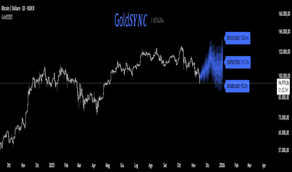
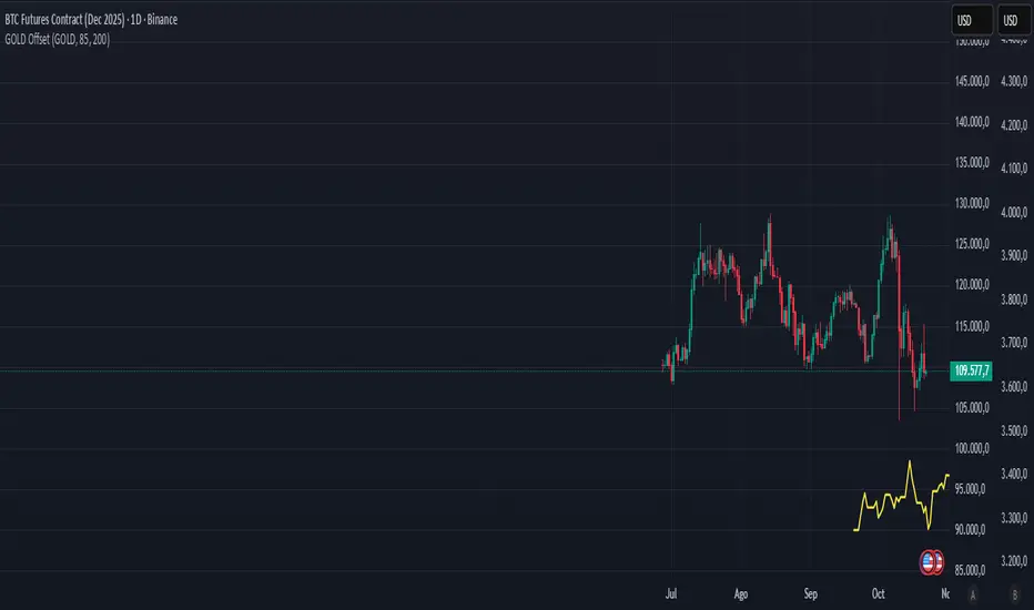
Gold𝑺𝒀𝑵𝑪🟡 Gold𝑺𝒀𝑵𝑪 - BTC follows GOLD
Gold𝑺𝒀𝑵𝑪 is a quantitative projection tool that visualizes how Bitcoin (BTC/USD) would perform if it mirrored the recent price behavior of Gold (XAU/USD).
It extends Gold’s last n days of normalized performance forward on the BTC chart and builds a volatility-adjusted projection corridor.
⚙️ Core Mechanics
Projection Engine:
Calculates Gold’s relative performance over the selected lookback window and applies it to BTC’s last closing price.
Volatility Scaling:
Computes the rolling standard deviation of Gold’s logarithmic returns to estimate the potential deviation range.
Dynamic Gradient Bands:
Three upper and lower standard deviation layers (1σ, 2σ, 3σ) are drawn using fading gradient fills to visualize increasing uncertainty.
Scenario Labels:
Displays key levels for:
𝑩𝑼𝑳𝑳𝑪𝑨𝑺𝑬 — +2σ projection
𝑬𝑿𝑷𝑬𝑪𝑻𝑬𝑫 — mean projection
𝑩𝑬𝑨𝑹𝑪𝑨𝑺𝑬 — −2σ projection
📈 Usage
Designed for 1D charts (daily timeframe).
Provides a comparative “sync” between Gold and Bitcoin to study cross-asset momentum, volatility symmetry, and directional bias.
Useful in macro correlation analysis or when modeling BTC’s potential movement under Gold-like conditions.
🧠 Interpretation
Gold𝑺𝒀𝑵𝑪 doesn’t predict - it synchronizes.
It offers a contextual view of BTC’s potential path if it followed Gold’s rhythm, enhanced by statistically derived volatility zones.
Created by: @SP_Quant
Credits: BitAura
Gold vs. Dollar Sentiment Map [SB1]🟡 Gold vs Dollar Sentiment Map
The Gold vs Dollar Sentiment Map reveals the direct inverse relationship between Gold Futures (GC) and the U.S. Dollar Index (DXY) — one of the most reliable global risk-sentiment gauges.
It helps traders instantly identify whether capital is flowing into safety (Gold) or into the Dollar (risk assets) during any session or timeframe.
🔍 Core Logic
Risk-Off (Bearish background = Red): DXY ↓ and Gold ↑ → investors seeking safety, rising fear or falling yields.
Risk-On (Bullish background = Green): DXY ↑ and Gold ↓ → investors rotating into risk assets, stronger USD demand.
Neutral (Gray): Mixed signals – no dominant macro driver.
📊 Dashboard
A compact on-chart table displays real-time trend bias for:
Gold (GC) – Bullish / Bearish / Neutral
U.S. Dollar Index (DXY) – Bullish / Bearish / Neutral
Color shading reflects each asset’s intrabar momentum.
⚙️ Visual Features
Adaptive background colors to show sentiment shifts.
Strong candle markers highlighting momentum bars near range extremes.
Alerts for clear Risk-On / Risk-Off alignment.
🧭 How to Use
Red background (Risk-Off): Gold strength + Dollar weakness → favorable environment for long gold setups.
Green background (Risk-On): Dollar strength + Gold weakness → bias toward short gold or avoid long exposure.
Gray background: Stay patient; look for confirmation or wait for alignment.
💡 Ideal For
Gold and Forex traders monitoring macro rotation.
Sentiment confirmation alongside order-flow, VWAP, or volume-delta tools.
Overlaying on intraday or higher-timeframe charts to frame trade bias.

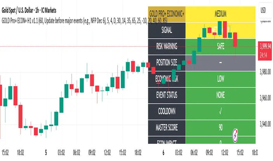
Gold Master Pro Plus ECONOMIC ENHANCED (H1 London v1.1)Overview
This indicator provides gold trading signals with integrated economic calendar awareness, specifically optimized for H1 timeframe and London session trading.
Methodology
The script analyzes multiple technical factors while monitoring economic event risks:
Technical Analysis Components:
RSI for momentum detection with configurable overbought/oversold levels
EMA crossovers (9, 21, 50 periods) for trend direction
MACD for momentum confirmation
ADX for trend strength measurement
Volume analysis for confirmation of price movements
Support/resistance detection using pivot points
Economic Calendar Integration:
Time-based detection of major economic releases (NFP, CPI, FOMC meetings)
Volatility assessment during event periods
USD stability monitoring through currency pair correlations
Automatic cooldown periods after high-impact events
Risk Management Features:
Multi-timeframe confirmation using daily trends
Session-aware scoring (London/NY overlap focus)
Quality-tiered signal classification
Position size recommendations based on signal strength and risk conditions
How to Use
Initial Setup:
Apply to XAUUSD on H1 timeframe
Configure economic settings in the inputs:
Enable economic event filter
Set ET offset (typically 5 hours for winter, 4 for summer)
Select relevant economic events to monitor
Signal Interpretation:
PLATINUM: All conditions aligned (active session, strong volume, low economic risk, trend confirmation)
HIGH: Most factors aligned with moderate risk
MEDIUM: Some factors aligned with acceptable risk
BLOCKED: High economic risk, cooldown period, or manual block active
Dashboard Metrics:
Economic risk level indicates current market safety
Event status shows timing of economic releases
Position size recommends appropriate trade sizing
Master score combines all technical and economic factors
Configuration Options
Economic Settings:
Economic impact threshold (30-80)
ET offset adjustment for timezone accuracy
Cooldown period configuration (2-24 bars)
Technical Settings:
RSI parameters (length, overbought/oversold levels)
Signal thresholds for different quality tiers
Session timing bonuses/penalties
Risk Management:
Multi-timeframe confirmation enable/disable
Higher timeframe selection (D, W, 4H, 12H)
MTF weight percentage (10-50%)
Important Notes
Economic event timing is approximate and should be verified with official economic calendars
Past performance does not guarantee future results
Trading involves substantial risk of loss
This tool is for educational purposes and should not be considered financial advice
The indicator is designed to assist in identifying potential trading opportunities while managing economic event risks through automated protection mechanisms.
Gold THB per Baht (XAU -> Thai baht gold)What it does
This indicator converts international gold prices (XAU) into Thai retail “baht gold” price (THB per 1 baht gold weight) in real time. It multiplies the XAU price (per troy ounce) by USD/THB and converts ounces to Thai baht-weight using the exact gram ratios.
Formula
THB per baht gold = XAU (USD/oz) × USDTHB × (15.244 / 31.1035) × (1 + Adjustment%) + FlatFeeTHB
1 troy ounce = 31.1035 g
1 Thai baht gold = 15.244 g
Conversion factor ≈ 0.490103

Gold 15m: Trend + S/R + Liquidity Sweep (RR 1:2)This strategy is designed for short-term trading on XAUUSD (Gold) using the 15-minute timeframe. It combines trend direction, support/resistance pivots, liquidity sweep detection, and momentum confirmation to identify high-probability reversal setups in line with the dominant market trend.
⚙️ Core Logic:
Trend Filter (EMA 200):
The strategy only takes long positions when price is above the 200 EMA and short positions when price is below it.
Support/Resistance via Pivots:
Dynamic swing highs and lows are identified using pivot points. These act as local supply and demand levels where liquidity is likely to accumulate.
Liquidity Sweep Detection:
A bullish liquidity sweep occurs when price briefly breaks below the last pivot low (grabbing liquidity) and then closes back above it.
A bearish sweep occurs when price breaks above the last pivot high and then closes back below.
Momentum & Candle Strength:
The strategy filters signals based on candle range and body size to ensure entries occur during strong price reactions, not weak retracements.
Risk Management (1:2 RR):
Stop-loss is placed slightly beyond the last pivot level using ATR-based buffers, and take-profit is set at 2× the risk distance, maintaining a reward-to-risk ratio of 1:2.
💼 Trade Logic Summary:
Long Entry:
After a bullish liquidity sweep & reclaim, momentum confirmation, and trend alignment (above EMA 200).
Short Entry:
After a bearish sweep & reclaim, momentum confirmation, and trend alignment (below EMA 200).
Exit:
Automated via ATR-based Stop Loss and Take Profit targets.
📊 Customization Options:
Adjustable EMA length, pivot settings, ATR multipliers, and RR ratio.
Option to enable/disable trend filter.
Toggle display of S/R zones on chart.
🧠 Best Use:
Works best during London and New York sessions when Gold shows strong momentum.
Can be adapted for forex pairs and indices by tuning ATR and pivot parameters.

Golden Ladder – Louay Joha (Wave & Gann Hi/Lo + ATR R-Levels)Overview
Golden Ladder is a momentum-and-structure tool that detects three-bar ladder waves and filters them with a Gann Hi/Lo regime guide (SMA-based). When a valid wave aligns with the current Hi/Lo bias and passes optional market filters (ADX, RSI, and proximity to recent extremes), the script prints BUY/SELL n labels (n = wave index) and draws a complete Entry / SL / TP1–TP4 ladder using ATR-based risk units (R) or fixed caps—configured for clarity and consistency. The script also keeps the chart clean: the last trade remains fully drawn while historical groups are trimmed to compact “ENTRY-only” stubs.
Why these components together (originality)
Three-bar ladder captures short-term momentum structure (progressively higher highs/lows for buys; the reverse for sells).
Gann Hi/Lo (SMA of highs/lows with a directional state) acts as a regime filter, reducing counter-trend ladders.
ATR-based R ladder turns signals into an actionable plan: a volatility-aware SL and TP1–TP4 that scale across instruments/timeframes.
Smart Entry filters (ADX strength, RSI extremes, and distance from recent top/bottom using ATR buffers) seek to avoid low-quality, stretched entries.
Slim history keeps only a short ENTRY stub for prior groups, so the signal you just got is always the most readable.
This is not a mere mashup; each layer constrains the others to produce fewer, clearer setups.
How it works (high-level logic)
Regime (Gann Hi/Lo):
Compute SMA(high, HPeriod) and SMA(low, LPeriod).
Direction state HLv flips when the close crosses above/below its track; one unified Hi/Lo guide is plotted.
Ladder signal (structure + confirmation):
BUY ladder: three consecutive green bars with rising highs and rising lows and HLv == +1.
SELL ladder: mirror conditions with HLv == -1.
Signals evaluate intrabar and are controlled by Smart Entry filters (ADX/RSI/extreme checks).
Risk ladder (R-based or capped):
Default: risk = ATR(atr_len) × SL_multiple and TPs in R.
Optional fixed caps by timeframe (e.g., M1/M5) using USD per point.
Longs: SL = entry – risk; TPi = entry + (Ri × risk).
Shorts: SL = entry + risk; TPi = entry – (Ri × risk).
All levels auto-reflow to the right as bars print.
Chart hygiene:
The latest trade shows ENTRY/SL/TP1–TP4 fully.
Older trades are automatically trimmed (only a short ENTRY line remains, with optional label).
Alerts:
BUY – Smart Entry (Tick) & SELL – Smart Entry (Tick) fire on live-qualified signals.
You can connect alerts to your automation, respecting your broker’s risk controls.
Inputs (English summary of UI)
Label settings: label size; ATR-based vs fixed-tick offsets; leader line width/transparency; horizontal label shift.
Gann Hi/Lo: HIGH Period (HPeriod), LOW Period (LPeriod).
Market filters: ADX (length, smoothing, minimum), RSI (length + caps), recent extremes (lookback + ATR buffer).
Entry/SL/TP Levels: TP1–TP4 (R), label right-shift, show last-trade prices on labels.
Fixed SL Caps: per-timeframe caps (M1/M5) via USD per point.
How to use
Apply on your instrument/timeframe; tune H/L periods and filters to your market (e.g., XAUUSD on M1/M5).
Favor signals aligned with the Hi/Lo regime; tighten filters (higher ADX, stricter RSI caps) to reduce noise.
Choose ATR-Risk or fixed caps depending on your preferences.
The drawing policy ensures the most recent trade remains front-and-center.
Notes & limitations
Signals can evaluate intrabar; MA-based context is inherently lagging.
ATR-based ladders adapt to volatility; extreme spikes can widen risk.
This is a technical analysis tool, not financial advice.
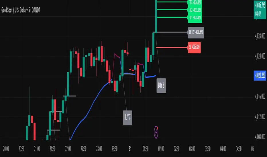
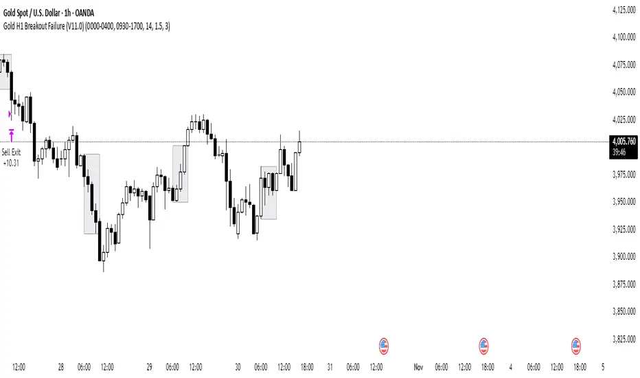
Gold H1 Breakout Failure (V11.0)This strategy is designed for trading XAU/USD (Gold) on the 1-hour timeframe. It identifies and trades fake breakouts of the Asian session range.
The logic is simple yet effective:
The script first marks the Asian session high and low.
Once price breaks out of this range and closes outside, it waits for confirmation by watching for price to close back inside the range.
When this re-entry occurs, the strategy takes a position in the opposite direction of the initial breakout, anticipating a false breakout or liquidity trap setup.
By focusing on these fakeouts, the strategy aims to capture reversal momentum after liquidity sweeps, making it especially effective during sessions when volatility transitions from Asia to London or New York.
Gold Spread + DXY Confluence Strategy v2### 🟡 **Gold Spread + DXY Confluence Strategy Indicator**
This custom-built indicator helps you confirm the **real direction of gold (XAU)** by combining:
✅ A **Gold Spread Index** — built from the average of gold priced in six currencies (XAUUSD, XAUAUD, XAUCHF, XAUEUR, XAUGBP, XAU/Silver)
✅ A **normalized DXY overlay** — to compare gold vs USD strength in real time
✅ Visual background zones that show:
- 🟢 Buy confluence (Gold ↑ / DXY ↓)
- 🔴 Sell confluence (Gold ↓ / DXY ↑)
- ⚠️ Divergence (both move same direction — avoid)
---
### 📈 Use this tool to:
- Confirm if gold strength is global, not just USD noise
- Avoid trading during low-volume or choppy market conditions
- Get clean, high-probability entries using your own price action or structure strategy
---
### 🛠 Features:
- Auto-adjusts to your chart’s timeframe
- Real-time background color zones
- Alerts for buy/sell confluence and divergence
- Clean, minimal overlay for easy decision-making
---
**Ideal for intraday traders, swing traders, or anyone trading XAUUSD.**
--
🟡 黃金強弱 + 美元指數共振策略指標
這個自製指標可以幫助你確認黃金(XAU)的真實方向,透過結合以下兩個關鍵數據:
✅ 一個黃金強弱指數(Gold Spread Index)
以六種貨幣的黃金報價為平均(XAUUSD、XAUAUD、XAUCHF、XAUEUR、XAUGBP、黃金/白銀)
✅ 一個標準化的美元指數(DXY)疊加線
可以即時對比黃金與美元的相對強弱
✅ 視覺背景區塊:
🟢 買進共振:黃金上漲 / 美元下跌
🔴 賣出共振:黃金下跌 / 美元上漲
⚠️ 偏離狀態:黃金與美元同方向波動(建議避開)
📈 功能與用途:
幫你辨別黃金是否真正強勢,而不只是受美元影響
避開假突破、震盪盤、低成交量時段
搭配你自己的 SNR 策略或結構型進場方式,提高勝率與交易質量
🛠 功能特色:
自動套用你當前圖表的時間週期
背景顏色即時顯示市場狀態
支援警示功能(買進、賣出共振與偏離提醒)
極簡設計,資訊清楚明確
非常適合做 XAUUSD 的日內交易者或波段交易者使用。

Gold–Bitcoin Correlation (Offset Model) by KManus88This indicator analyzes the correlation between Gold (XAU/USD) and Bitcoin (BTC/USD) using a time-offset model adjustable by the user.
The goal is to detect cyclical leads or lags between both assets, highlighting how capital flows into Gold may precede or follow movements in the crypto market.
Key Features:
Dynamic correlation calculation between Gold and Bitcoin.
Adjustable offset in days (default: 107) to fine-tune the temporal shift.
Automatic labels and on-chart visualization.
Compatible with multiple timeframes and logarithmic scales.
Interpretation:
Positive correlation suggests synchronized trends between both assets.
Negative correlation signals divergence or rotation of liquidity.
The time-offset parameter helps estimate when a shift in Gold could later reflect in Bitcoin.
Recommended use:
For macro-financial and global liquidity cycle analysis.
As a complementary tool in cross-asset momentum strategies.
© 2025 – Developed by KManus88 | Inspired by monetary correlation studies and global liquidity cycles.
This script is for educational purposes only and does not constitute financial advice.
Gold Market Cap vs BTC Market Cap Ratio
What the script calculates
Gold market cap: XAUUSD spot price × total above-ground stock (converted to troy ounces) in trillions USD.
BTC market cap: Live data from TradingView's CRYPTOCAP:BTC symbol, which provides Bitcoin's circulating market cap (already in USD, converted to trillions here).
Ratio: Gold market cap ÷ BTC market cap (e.g., 1.0 means gold market cap equals BTC; 2.0 means gold is twice BTC's market cap)

UOT Gold Pressure IndexGold Pressure Index combines the momentum of the US Dollar Index (DXY) and US 10-Year Treasury Yields into a single, easy-to-read oscillator that helps traders identify high-probability setups in gold markets.
What Does This Indicator Do?
This indicator measures the combined directional pressure from the two primary fundamental drivers of gold prices:
DXY (US Dollar Index) - Gold's primary inverse correlation
US 10-Year Treasury Yields - Alternative to gold for safe-haven flows
When both are rising together, gold typically faces strong selling pressure. When both are falling together, gold typically finds support. The GPI simplifies this analysis into one visual metric.

Gold RCI Signalトレンド転換点をRCI×CCI×ボラティリティで検出するロング専用インジケーター。ゴールド(XAUUSD)対応。
A long-only indicator that detects trend reversal points using a combination of RCI, CCI, and volatility. Optimized for Gold (XAUUSD).
#RCI #CCI #volatility #trendreversal #gold #XAUUSD #indicator

Gold Lagging (N days)This indicator overlays the price of gold (XAUUSD) on any chart with a customizable lag in days. You can choose the price source (open, high, low, close, hlc3, ohlc4), shift the series by a set number of daily bars, and optionally normalize the values so that the first visible bar equals 100. The original gold line can also be displayed alongside the lagged series for direct comparison.
It is especially useful for analyzing delayed correlations between gold and other assets, observing shifts in safe-haven demand, or testing hypotheses about lagging market reactions. Since the lag is calculated on daily data, it remains consistent even if applied on intraday charts, while the indicator itself can be plotted on a separate price scale for clarity.
이 지표는 금(XAUUSD) 가격을 원하는 차트 위에 N일 지연된 형태로 표시합니다. 가격 소스(시가, 고가, 저가, 종가, hlc3, ohlc4)를 선택할 수 있으며, 지정한 일 수만큼 시리즈를 뒤로 이동시킬 수 있습니다. 또한 첫 값 기준으로 100에 맞춰 정규화하거나, 원래 금 가격선을 함께 표시해 비교할 수도 있습니다.
금과 다른 자산 간의 지연 상관관계를 분석하거나 안전자산 수요 변화를 관찰할 때 유용하며, 시장 반응의 시차 효과를 검증하는 데에도 활용할 수 있습니다. 지연은 일봉 데이터 기준으로 계산되므로 단기 차트에 적용해도 일 단위 기준이 유지되며, 별도의 가격 스케일에 표시되어 가독성을 높일 수 있습니다.
Gold H4 First Hour Scalping IndicatorUpdated V4
This Indicator shows how much on an average gold moved in first 4 hour. Then The possible direction in the next h4

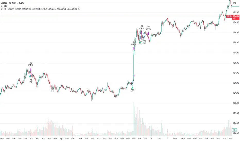
Gold 5m — MACD 694 Strategy (with ADX/Bias + ATR Trailing)This is my sustain gold trade for trading gold 5m TF