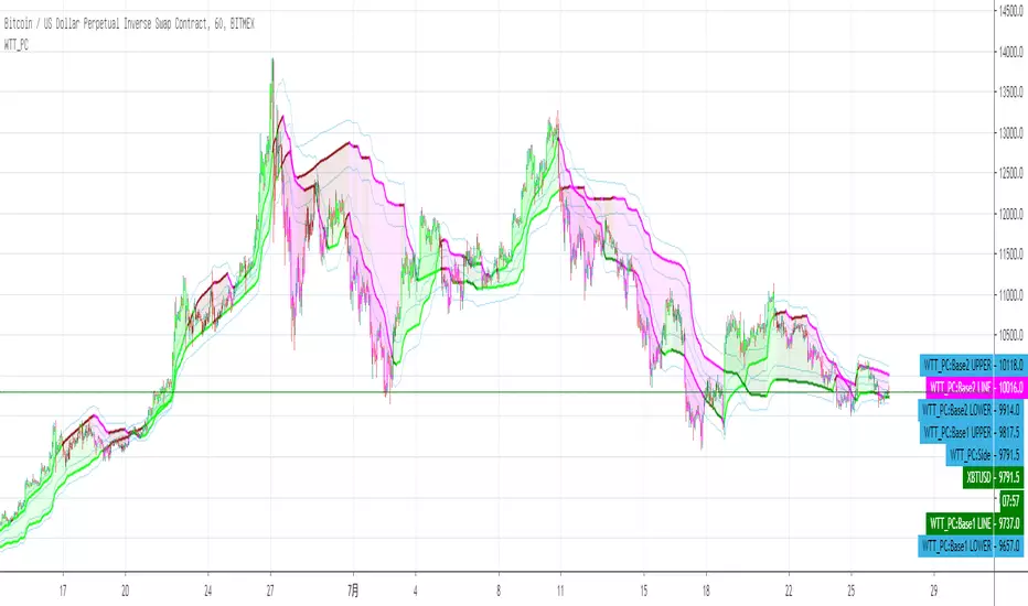
Wyckoff Trend Tracking Buffett's SecretWyckoff Trend Tracking Buffett's Secret 该指标拟合数十种策略综合计算趋势整体水平。红色或黄色区域代表趋势到达顶部,暗绿色或亮绿色代表趋势到达底部,助力交易员逃顶抓底一网打尽。该指标可等用于贪婪恐惧指数使用。如巴菲特名言:“当别人贪婪的时候你要恐惧,当别人恐惧的时候你要贪婪”。故取名为:“巴菲特的秘密”。
Cari dalam skrip untuk "Wyckoff"

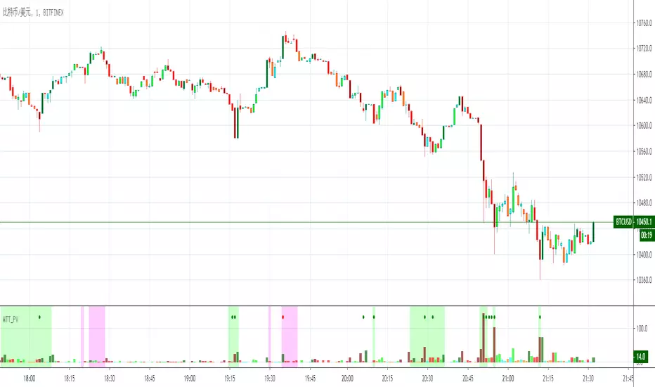
Wyckoff Trend Tracking Key VolumeWyckoff Trend Tracking Key Volume 该指标为您在纷繁复杂的众多交易量中一眼就能识别出关键量,过滤掉其它交易量杂波。

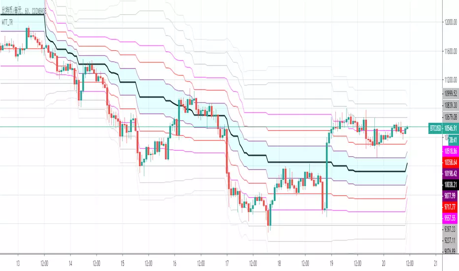
Wyckoff Trend Tracking Price CyclesWyckoff Trend Tracking Price Cycles 该指标为您揭示市场动态运行的区间及价格运行的方位,让市场变化了然于胸。
Wyckoff Trend Tracking Volatility StopWyckoff Trend Tracking Volatility Stop该指标为您提示小时、日与周的周期波动幅度,在无序的震荡中提示未来可能的波动幅度。

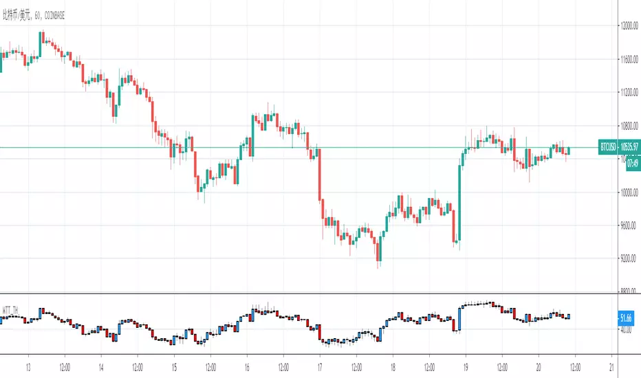
Wyckoff Trend Tracking Trend OscillatorWyckoff Trend Tracking Trend Oscillator该指标在纷繁复杂的市场震荡中为您清晰的提示趋势的强弱。

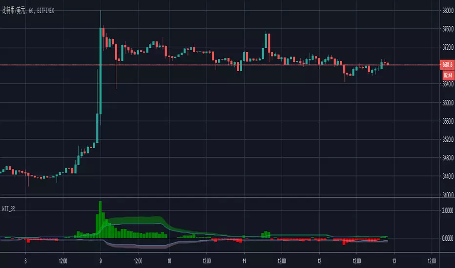
Wyckoff Trend Tracking Breakout ReversalWyckoff Trend Tracking Breakout Reversal该指标为您提示市场多空双方的突破与反转。
Wyckoff Trend Tracking Trend & Stop X4Wyckoff Trend Tracking Trend & Stop X4该指标为您提供多方位的趋势分析,让您在变化万千的市场中辨清方向。

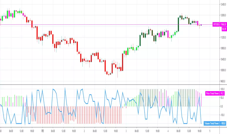
Wyckoff Trend Tracking Momentum IndicatorWyckoff Trend Tracking Momentum Indicator该指标结合量价,让您感受到来自市场的冷热。

Wyckoff Trend Tracking Channel OscillatorWyckoff Trend Tracking Channel Oscillator该指标让您感受到市场传递来的心跳声,随时随地把握市场脉搏。

Wyckoff Trend Tracking Volume TransferWyckoff Trend Tracking Volume Transfer该指标通过对交易量的分析,时刻呈现给您市场的情绪,让您随时感知市场的温度。


Bollinger Bands (Bad Ass B-Bands) - Wyckoff ModeHi Everyone! It's time to make this indicator public reduce the load off of me for others requesting access... This particular version of Bad Ass B-Bands has a minor change in the default settings to reduce the thickness of the B-Bands to number 1 thickness instead of a default to number 2 thickness. Feel free to adjust the colors to your personal preference to work well with the background color of your choosing.
DEFAULT INPUTS:
The Standard Deviation for White Upper B-Band = Positive 1.0
The Standard Deviation for White Lower B-Band = Negative 1.0
The Standard Deviation for Aqua Upper B-Band = Positive 1.618
The Standard Deviation for Aqua Upper B-Band = Negative 1.618
The Standard Deviation for Orange Upper B-Band = Positive 2.618
The Standard Deviation for Orange Upper B-Band = Negative 2.618
The Standard Deviation for Red Upper B-Band = Positive 3.618
The Standard Deviation for Red Upper B-Band = Negative 3.618
The Yellow B-Band BASIS is setup for 20-Moving Average
It's EXTREMELY IMPORTANT to use this indicator with my Phoenix Ascending 2.201 indicator to get a better indication of where the price action can run up to or down to in most any time frame.
BASIC RULES BELOW: Be advised these rules are ONLY BASIC... More detailed rules will be made available in the future.
If the Red RSI inside Phoenix Ascending indicator goes above level 50, there's a chance for price action to run up to the Aqua/Orange UPPER B-Bands.
If the Blue LSMA inside the Phoenix Ascending indicator goes above level 50, there's a chance for the B-Bands to expand and the body of each candle to remain inside the Aqua/Orange UPPER B-Bands until the B-Bands begin to flatten and/or contract.
If the Red RSI inside the Phoenix Ascending indicator goes below level 50, there's a CHANCE for the price action to fall down to the Aqua/Orange LOWER B-Bands.
If the Blue LSMA inside the phoenix Ascending indicator goes below level 50, there's a CHANCE for the B-Bands to expand and the body of each candle to remain inside the Aqua/Orange LOWER B-Bands until the B-Bands begin to flatten and/or contract.
If the Green Line falls down to level 50 inside the Phoenix Ascending Indicator, there's a CHANCE for the price action to fall to the Yellow B-Band Basis.
If the Green Line runs up to level 50 inside the Phoenix Ascending Indicator, there's a CHANCE for the price action to run up to the Yellow B-Band Basis.
REMINDER: The rules above are ONLY "BASIC" RULES. Additional rules will be available in the future.
Happy Trading and Stay Awesome!
David
SETUP VIDEO FOR PHOENIX ASCENDING 2.201 and BOLLINGER BANDS:

Time Frame Color ClassifierTime Frame Colour Classifier
A professional Pine Script indicator that provides instant visual identification of trading sessions through intelligent colour-coded backgrounds.
Key Features
📅 Daily Session Colours
- Monday: Green | Tuesday: Blue | Wednesday: Yellow | Thursday: Red | Friday: Purple
📊 Weekly Classification
- Week 1-5 : Colour-coded by week of the month using the same colour scheme
## How It Works
Intraday Charts (1min-4H) : Shows daily colours - every candle on Monday displays green background, Tuesday shows blue, etc.
Daily/Weekly Charts : Switches to weekly colours - all days in Week 1 show green, Week 2 shows blue, etc.
Professional Applications
✅ Multi-Timeframe Analysis : Seamlessly switch between timeframes whilst maintaining visual context
✅ Session Recognition : Instantly identify which trading day you're analysing
✅ Pattern Analysis : Spot recurring patterns on specific days of the week
✅ Strategy Development : Incorporate temporal factors into trading strategies
✅ Performance Attribution : Correlate results with specific trading sessions
Customisation Options
- Toggle daily/weekly colours on/off
- Fully customisable colour schemes
- Adjustable background transparency
- Optional day labels
Technical Details
- Pine Script v5for optimal performance
- Automatic timeframe detection - no manual configuration required
- Minimal resource usage - won't slow down your charts
- Works on all chart types and timeframes
Perfect For
- Day traders switching between multiple timeframes
- Swing traders analysing weekly patterns
- Algorithmic strategy development
- Multi-timeframe market analysis
- Trading education and research
---
Developed by @wyckoffnawaf
Transform your chart analysis with visual timeframe clarity
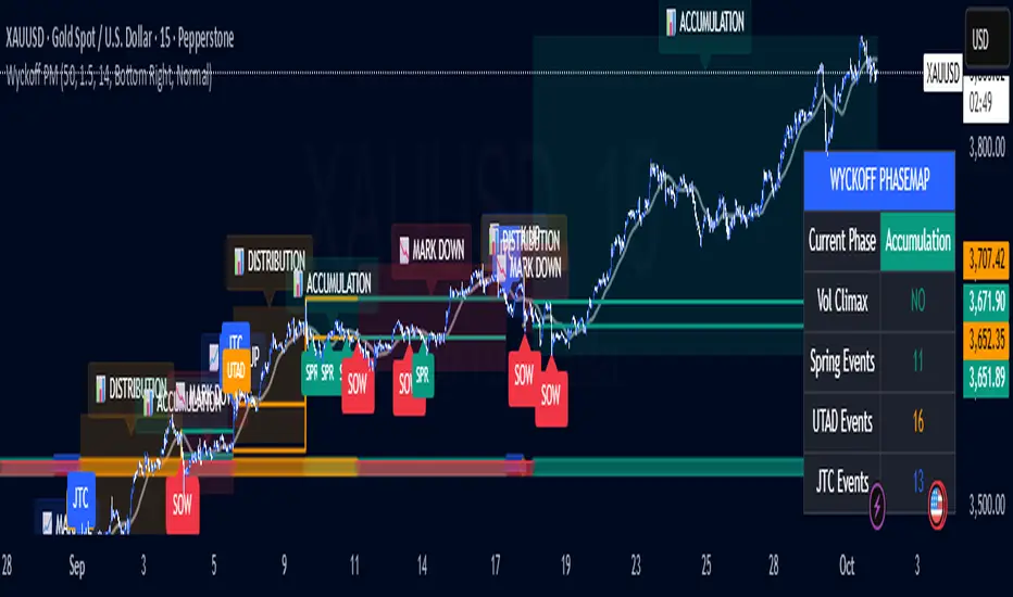
Wyckoff PhaseMap Overlay [FxalgoxPro]📊 Wyckoff PhaseMap Overlay
Professional Wyckoff Market Cycle Indicator for TradingView
━━━━━━━━━━━━━━━━━━━━━━━━━━━━━━━━━━━━━━━━
🎯 OVERVIEW
The Wyckoff PhaseMap Overlay is a sophisticated indicator that automatically identifies and visualizes the four phases of the Wyckoff Market Cycle on your price chart, combining price action analysis with volume confirmation to detect:
Phase 1: Accumulation (Cause)
Phase 2: Mark Up (Effect)
Phase 3: Distribution (Cause)
Phase 4: Mark Down (Effect)
━━━━━━━━━━━━━━━━━━━━━━━━━━━━━━━━━━━━━━━━
🔑 KEY FEATURES
📈 Phase Detection
Accumulation : Identifies selling climax (SC), automatic rally (AR), secondary tests (ST), and springs
Mark Up : Detects sustained uptrend with higher highs/higher lows structure
Distribution : Recognizes buying climax (BC), UTAD (upthrust after distribution), and range formation
Mark Down : Confirms breakdown with volume and downtrend structure
🎨 Visual Elements
Phase Background Colors : Optional color-coded backgrounds for each phase
Range Lines : Dynamic support/resistance levels during accumulation and distribution
Event Markers : Clear labels for Spring, UTAD, JTC (Jump the Creek), and breakdowns
Trend MA Overlay : Moving average for trend confirmation
Phase Labels : Large, descriptive labels when phases change
📊 Dashboard
Real-time phase status
Volume climax indicator
Event counters (Spring, UTAD, JTC)
Customizable position and size
🔔 Alerts
Phase change notifications
Spring detection
UTAD detection
Jump the Creek confirmation
Breakdown signals
━━━━━━━━━━━━━━━━━━━━━━━━━━━━━━━━━━━━━━━━
⚙️ CONFIGURATION
Wyckoff Phases (Main Settings)
Parameter | Default | Description
---------------------------- | ------- | -------------
Trend MA Length | 50 | Moving average for trend detection
Volume Climax Threshold | 1.5 | Multiplier for average volume to detect climax events
Range Detection Length | 14 | Lookback period for range identification
Phase 1: Accumulation
Toggle accumulation phase display
Show/hide Spring events
Show/hide AR (Automatic Rally) and ST (Secondary Test)
Customize phase and spring colors
Phase 2: Mark Up
Toggle mark up phase display
Show/hide Jump The Creek (JTC) events
Customize phase and JTC colors
Phase 3: Distribution
Toggle distribution phase display
Show/hide UTAD events
Show/hide BC (Buying Climax)
Customize phase and UTAD colors
Phase 4: Mark Down
Toggle mark down phase display
Customize phase and breakdown colors
Visual Settings
Show Phase Labels : Display large phase transition labels
Show Event Markers : Display Spring, UTAD, JTC markers
Show Phase Background : Color-code background by current phase
Dashboard
Show Dashboard : Toggle statistics panel
Position : Top Right / Bottom Right / Bottom Left
Size : Tiny / Small / Normal
━━━━━━━━━━━━━━━━━━━━━━━━━━━━━━━━━━━━━━━━
🧠 HOW IT WORKS
Phase Detection Logic
1️⃣ Accumulation (Cause)
Triggers:
- Selling climax detected (high volume + down move)
- Price enters range-bound consolidation
- Low volume compression
- Spring: False breakdown below support with low volume
2️⃣ Mark Up (Effect)
Triggers:
- Jump The Creek (JTC): Breakout from accumulation range
- Volume confirms breakout (>1.3x average)
- Higher highs and higher lows structure
- Price above trend MA
3️⃣ Distribution (Cause)
Triggers:
- Buying climax detected (high volume + up move)
- Price enters range-bound consolidation after uptrend
- UTAD: False breakout above resistance with volume
- Range compression
4️⃣ Mark Down (Effect)
Triggers:
- Breakdown from distribution range
- Volume confirms breakdown (>1.3x average)
- Lower lows and lower highs structure
- Price below trend MA
━━━━━━━━━━━━━━━━━━━━━━━━━━━━━━━━━━━━━━━━
📝 EVENT DEFINITIONS
Event | Phase | Description | Visual
-------- | ------------- | ------------------------------------------------ | -------------------------
SC | Accumulation | Selling Climax - panic selling with high volume | Volume spike + price drop
AR | Accumulation | Automatic Rally - bounce from oversold | Recovery move
ST | Accumulation | Secondary Test - retest of lows | Low volume test
Spring | Accumulation | False breakdown below support | 🟢 Label below
JTC | Mark Up | Jump The Creek - confirmed breakout | 🔵 Label (transition)
BC | Distribution | Buying Climax - euphoric buying with high volume | Volume spike + price rise
UTAD | Distribution | Upthrust After Distribution - false breakout | 🟠 Label above
SOW | Mark Down | Sign of Weakness - confirmed breakdown | 🔴 Label (transition)
━━━━━━━━━━━━━━━━━━━━━━━━━━━━━━━━━━━━━━━━
🎯 USE CASES
For Traders
Identify accumulation zones for potential long entries
Recognize distribution zones for potential short entries or exits
Confirm trend changes with phase transitions
Avoid false breakouts (Springs and UTADs)
Time entries using Jump The Creek signals
For Analysts
Market structure analysis across multiple timeframes
Volume-price divergence identification
Institutional behavior tracking (accumulation/distribution)
Cycle completion analysis
━━━━━━━━━━━━━━━━━━━━━━━━━━━━━━━━━━━━━━━━
🎨 RECOMMENDED SETTINGS
For Swing Trading (Daily/4H)
Trend MA Length: 50
Volume Climax Threshold: 1.5
Range Detection Length: 14
For Intraday Trading (1H/15m)
Trend MA Length: 20
Volume Climax Threshold: 2.0
Range Detection Length: 10
For Long-term Investors (Weekly)
Trend MA Length: 100
Volume Climax Threshold: 1.3
Range Detection Length: 20
━━━━━━━━━━━━━━━━━━━━━━━━━━━━━━━━━━━━━━━━
📚 WYCKOFF METHOD RESOURCES
The indicator is based on Richard Wyckoff's market cycle theory:
Accumulation → Smart money accumulates while retail panics
Mark Up → Price rises as smart money distributes to late buyers
Distribution → Smart money exits while retail buys
Mark Down → Price falls as retail holds losing positions
Learn More:
Wyckoff Analytics
Market cycle analysis
Volume Spread Analysis (VSA)
━━━━━━━━━━━━━━━━━━━━━━━━━━━━━━━━━━━━━━━━
⚠️ IMPORTANT NOTES
Volume Required : Indicator requires volume data (won't work on some Forex brokers without volume)
Timeframe : Best results on 1H, 4H, Daily, Weekly
Confirmation : Always combine with other analysis methods
Context : Phase detection improves with clean, trending markets
━━━━━━━━━━━━━━━━━━━━━━━━━━━━━━━━━━━━━━━━
🐛 TROUBLESHOOTING
Q: Why aren't any phases showing?
Ensure volume data is available for your symbol
Try adjusting Volume Climax Threshold (lower = more sensitive)
Check if Show Phase Background is enabled
Q: Too many false signals?
Increase Volume Climax Threshold for stricter detection
Increase Range Detection Length for better range identification
Use higher timeframes (4H/Daily)
Q: Dashboard not showing?
Check Show Dashboard is enabled in settings
Ensure panel isn't off-screen (try different position)
━━━━━━━━━━━━━━━━━━━━━━━━━━━━━━━━━━━━━━━━
👨💻 CREDITS
Developer : Fxalgox
Method : Richard Wyckoff Market Cycle Theory
━━━━━━━━━━━━━━━━━━━━━━━━━━━━━━━━━━━━━━━━
💡 TIPS FOR BEST RESULTS
Combine with Market Context : Use alongside market structure analysis
Multi-timeframe Confirmation : Check higher timeframe phase alignment
Volume is Key : Pay attention to volume climax indicators in dashboard
Be Patient : Wait for phase confirmations before taking action
Use Alerts : Set up alerts for phase changes and key events
━━━━━━━━━━━━━━━━━━━━━━━━━━━━━━━━━━━━━━━━
Happy Trading! 📈
Remember: This indicator is a tool for analysis, not financial advice. Always manage risk appropriately.
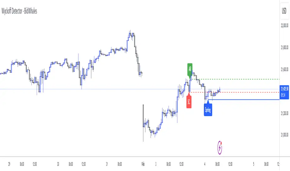
Wyckoff Detector - BidWhalesWyckoff Detector - BidWhales
Description:
I was searching for a powerful Wyckoff indicator on TradingView but couldn’t find one that met my standards. So, I built the Wyckoff Detector - BidWhales, a tool designed to detect live Wyckoff phases and provide visual cues for traders.
---
What is it?
The Wyckoff Detector identifies and visualizes Wyckoff Accumulation and Distribution phases, helping traders spot key turning points in the market. This indicator assists with recognizing essential Wyckoff components like:
- Accumulation (Bullish):
- Selling Climax (SC)
- Automatic Rally (AR)
- Spring
- Sign of Strength (SOS)
- Distribution (Bearish):
- Buying Climax (BC)
- Automatic Reaction (AR)
- Upthrust (UT)
- Sign of Weakness (SOW)
The script is programmed to display these key phases on your chart with labels, dashed lines, and confirmations based on price action and volume.
---
Features:
1. Customizable Inputs:
- Swing Length: Determines the range for detecting climaxes and turning points.
- Volume Climax Multiplier: Adjusts the sensitivity of volume spikes for phase confirmation.
- Error Threshold (%): Controls the margin for phase detection accuracy.
- Minimum Delay Bars: Ensures phases occur with sufficient spacing for reliability.
- Wick Rejection Ratio: Confirms validity of springs and upthrusts with wick-to-body analysis.
2. Automated Phase Detection:
- Dynamically identifies Wyckoff components like SC, AR, Spring, SOS, BC, AR, UT, and SOW.
- Provides labels and horizontal lines to track phases visually.
3. Failure Logic:
- Phases invalidate upon predefined conditions:
- Close below Spring wick for bullish failure.
- Close above Upthrust wick for bearish failure.
- Time-based expiration (Max Bars Back) for stale patterns.
4. Volume Confirmation:
- Volume spikes (climax) are analyzed relative to a moving average, ensuring more accurate phase detection.
5. Clean Visuals:
- Labels and lines are plotted clearly on the chart, helping traders recognize patterns without clutter.
---
How to Use:
1. Add the indicator to your chart.
2. Adjust parameters like Swing Length and Volume Multiplier to suit your timeframe and trading style.
3. Look for Accumulation phases for potential bullish signals and Distribution phases for bearish signals.
4. Use the displayed labels and lines (SC, AR, Spring, etc.) to confirm Wyckoff patterns.
---
Disclaimer:
This indicator is a tool for educational purposes only. It is not financial advice. Always conduct your own analysis before making trading decisions.
---
Script License:
This Pine Script™ code is subject to the terms of the Mozilla Public License 2.0 at (mozilla.org).
© ProfitSync
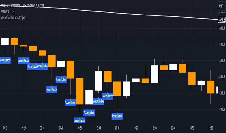
Wyckoff Method IndicatorThe Wyckoff Method Market Cycle Indicator is a powerful tool designed to help traders identify the current market phase based on the principles of the Wyckoff Method. This indicator analyzes price action and volume patterns to determine whether the market is in an accumulation, markup, distribution, or markdown phase.
The Wyckoff Method, developed by Richard D. Wyckoff, is a time-tested approach to understanding market dynamics and identifying potential trading opportunities. By studying the interaction between price and volume, the Wyckoff Method aims to provide insight into the actions of market participants and the potential direction of the market.
This indicator automatically detects the key market phases as defined by the Wyckoff Method:
Accumulation: This phase occurs when large institutional investors are quietly accumulating positions, often leading to a period of consolidation with low volatility and decreasing volume.
Markup: Following the accumulation phase, the markup phase is characterized by a breakout above the accumulation range, accompanied by increasing volume. This indicates a potential bullish trend.
Distribution: After a significant price advance, the distribution phase emerges. It is marked by high volatility and increasing volume as large investors begin to distribute their holdings to the public.
Markdown: The markdown phase follows the distribution phase and is characterized by a breakdown below the distribution range, accompanied by increasing volume. This suggests a potential bearish trend.
The indicator plots the detected market phases on the chart using the following signals:
Green triangle pointing upwards: Accumulation phase
Blue triangle pointing downwards: Markup phase
Red triangle pointing downwards: Distribution phase
Orange triangle pointing upwards: Markdown phase
By utilizing this indicator, traders can gain valuable insights into the underlying market structure and make more informed trading decisions. However, it is important to note that the Wyckoff Method Market Cycle Indicator should be used in conjunction with other technical analysis tools and risk management strategies.
The indicator provides two input parameters:
Lookback Period: The number of bars used to calculate the volatility and determine the market phases. The default value is 50.
Volume Condition Multiple: The multiple used to compare the current volume with the volume of the lookback period. The default value is 2.
Traders can adjust these parameters to suit their specific trading style and the characteristics of the asset being analyzed.
Please note that this indicator is intended for educational and informational purposes only. It does not constitute financial advice. Always conduct your own analysis and exercise proper risk management when trading.
Happy trading!
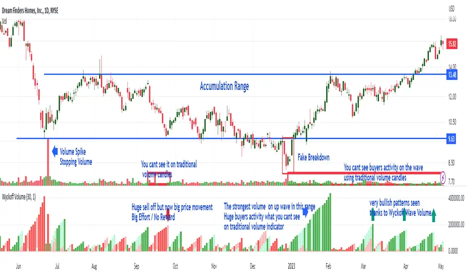
Wyckoff Wave Volume
What Is Wyckoff Wave Volume and How Does It Work?
It is the cumulative sum of exchanged (sold/bought) shares or contracts on a given wave (downward or upward) in a given time plotted below the chart as volume histogram. It shows how much trade is taking place on a given wave. Values are displayed below the chart as opposed to the Wyckoff Wave Chart indicator which displays these values as numbers plotted on the chart.
As you can see in the attached chart, volume candles usually only show a single buyer and seller exposure on the chart. On a normal volume, "Volume Spike" are clearly visible, which play an important role in the analysis. However, the cumulative volume on a wave gives us much more information and shows exactly on which waves the biggest purchases or the biggest sales take place. As in the attached chart, we can see how buyers aggressively carried out the final accumulation action just before the range breakout. In the analysis of the Wyckoff method, cumulative volume is a key indicator to assess the strength or weakness of the market.
It works very similarly the other way around (distribution). Before the market changes direction after large increases, downward waves are characterized by very high volume, which is drawn on the histogram as ultra-high bars. This is information about the distribution carried out by the players - taking profits after increases or opening shorts.
Wyckoff Wave Volume for TradingView
Wyckoff Wave Volume is the best tool to identify turning points in all markets. Money plays in the market, not set ups. Therefore, in order to earn money, you must play in the same direction as the professionals! It is thanks to the observation of the volume that you can know which side the professionals (Smart Money) are on and trade in accordance with their direction. You can also "look" inside the chart and see on the numbers or graphical histogram who controls the market at a given moment - Buyer or the Seller.
Let's Start From The Beginning!
Wyckoff Wave Volume created by Richard Wyckoff in early 1930' were a breakthrough in technical analysis. In his famous technical analysis course, he told his students to "think like waves". Volume analysis was an integral part of his way of investing. During the period when Wyckoff was active in the financial markets wave volume was calculated manually, we now have a fully automated version for TradingView. Using Wyckoff Cumulative Volume you will be surprised how well it identifies turning points in all markets and on any time frame. This tool is very helpful in predicting trend changes in all markets like forex, crypto, futures and stocks.
In order for the indicator to work well on all charts, it is necessary to set the appropriate step in its settings.
"Step" is the wave setting to be taken into account when counting the volume on a given swing. The standard setting for each round is 30. This is the measure of pips on which the next upward or downward wave is to be counted. However, for individual assets, these settings can be adjusted individually.
Wyckoff Wave Chart
What Is Wyckoff Wave Chart and How Does It Work?
It is the cumulative sum of exchanged (sold/bought) shares or contracts on a given wave (downward or upward) in a given time plotted on the chart.
Wyckoff Wave Chart for TradingView
Wyckoff Wave Chart is the best tool to identify turning points in all markets. Money plays in the market, not set ups. Therefore, in order to earn money, you must play in the same direction as the professionals! It is thanks to the observation of the volume that you can know which side the professionals (Smart Money) are on and trade in accordance with their direction. You can also "look" inside the chart and see on the numbers or graphical histogram who controls the market at a given moment - Buyer or the Seller.
Let's Start From The Beginning!
Wyckoff Wave Chart created by Richard Wyckoff in early 1930' were a breakthrough in technical analysis. In his famous technical analysis course, he told his students to "think like waves". Volume analysis was an integral part of his way of investing. During the period when Wyckoff was active in the financial markets wave volume was calculated manually, we now have a fully automated version for TradingView. Using Wyckoff Cumulative Volume you will be surprised how well it identifies turning points in all markets and on any time frame. This tool is very helpful in predicting trend changes in all markets like forex, crypto, futures and stocks.
In order for the indicator to work well on all charts, it is necessary to set the appropriate step in its settings.
"Step" is the wave setting to be taken into account when counting the volume on a given swing. The standard setting for each round is 30. This is the measure of pips on which the next upward or downward wave is to be counted. However, for individual assets, these settings can be adjusted individually.
Another important setting is the "Volume Divider" - the cumulative volume numbers on a given swing displayed on the chart will be different for different assets. In the case of penny stocks, it can be even millions of listed assets. In order for the chart not to display too long numbers, you can divide it by 1000 / 10000 / 100000. In the case of small intervals such as 1 or 5 minute charts, "O" may appear at the ends of swings. You should then reduce the "Volume Divider" to 1 or 10.
Accumulation example:
