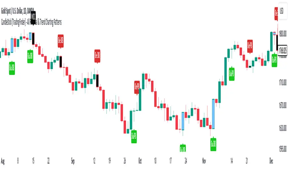
CandleStick [TradingFinder] - All Reversal & Trend Patterns🔵 Introduction
"Candlesticks" patterns are used to predict price movements. We have included 5 of the best candlestick patterns that are common and very useful in "technical analysis" in this script to identify them automatically. The most important advantage of this indicator for users is saving time and high precision in identifying patterns.
These patterns are "Pin Bar," "Dark Cloud," "Piercing Line," "3 Inside Bar," and "Engulfing." By using these patterns, you can predict price movements more accurately and therefore make better decisions in your trades.
🔵 How to Use
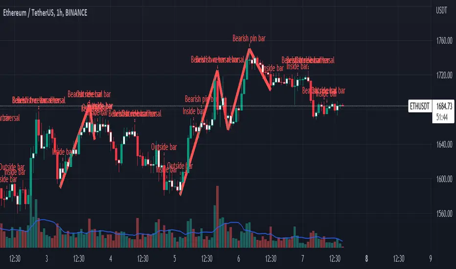
Pin Bar : This pattern consists of a Candle where "Open Price," "Close Price," "High Price," and "Low Price" form the "Candle Body," and it also has "Long Shadow" and "Short Shadow." In the visual appearance of the Pin Bar pattern, we have a candle body and a pin bar shadow, where the candle body is smaller relative to the shadow.
Just as the candle body plays an important role in analysis, the pin bar shadow can also be influential. The larger the pin bar shadow, the stronger the expectation of a trend reversal.
When a "bearish pin bar" occurs at resistance or the chart ceiling, it can be predicted that the price trend will be downward. Similarly, at support points and the chart floor, a "bullish pin bar" can indicate an upward price movement.
Additionally, patterns like "Hammer," "Shooting Star," "Hanging Man," and "Inverted Hammer" are types of pin bars. Pin bars are formed in two ways: bullish pin bars have a long lower shadow, and bearish pin bars have a long upper shadow. Important: Displaying "Bullish Pin Bar" is labeled "BuPB," and "Bearish Pin Bar" is labeled "BePB."
Dark Cloud : The Dark Cloud pattern is one type of two-candle patterns that occurs at the end of an uptrend. The 2-candle pattern indicates the shape of this pattern, which actually consists of 2 candles, one bullish and one bearish. This pattern indicates a trend reversal and is quite powerful.
The Dark Cloud pattern is seen when, after a bullish candle at the end of an uptrend, a bearish candle opens at a higher level (weakly, equal, or higher) than the closing point of the bullish candle and finally closes at a point approximately in the middle of the previous candle. In this indicator, the Dark Cloud pattern is identified as "Wick" and "Strong" .
The difference between these two lies in the strictness of their conditions. Important: Strong Dark Cloud is labeled "SDC," and Weak Dark Cloud is labeled "WDC."
Piercing Line : The Piercing candlestick pattern consists of 2 candles, the first being bearish and consistent with the previous trend, and the second being bullish. The conditions of the pattern are such that the first candle is bearish and a price gap is created between the two candles upon the opening of the next candle because its opening price is below (weakly equal to or less than) the closing price of the previous candle.
Additionally, its closing price must be at least 50% above the red candle.
This means that the second candle must penetrate at least 50% into the first candle. Important: Strong Piercing Line is labeled "SPL," and Weak Piercing Line is labeled "WPL."
3 Inside Bar (3 Bar Reversal) : The 3 Inside Bar pattern is a reversal pattern. This pattern consists of 3 consecutive candles and can be either bullish or bearish. In the bullish pattern (Inside Up) formed at the end of a downtrend, the last candle must be bullish, and the third candle from the end must be bearish.
Additionally, the close price must be more than 50% of the third candle from the end. In the bearish pattern (Inside Down) formed at the end of an uptrend, the last candle must be bearish, and the third candle from the end must be bullish. Additionally, the close price must be less than 50% of the third candle from the end. Important: Bullish 3 Inside Bar is labeled "Bu3IB," and Bearish 3 Inside Bar is labeled "Be3IB."
Engulfing : The Engulfing candlestick pattern is a reversal pattern and consists of at least two candles, where one of them completely engulfs the body of the previous or following candle due to high volatility.
For this reason, the term "engulfing" is used for this pattern. This pattern occurs when the price body of a candle encompasses one or more candles before it. Engulfing candles can be bullish or bearish. Bullish Engulfing forms as a reversal candle at the end of a downtrend.
Bullish Engulfing indicates strong buying power and signals the beginning of an uptrend. This pattern is a bullish candle with a long upward body that completely covers the downward body before it. Bearish Engulfing, as a reversal pattern, is a long bearish candle that engulfs the upward candle before it.
Bearish Engulfing forms at the end of an uptrend and indicates the pressure of new sellers and their strong power. Additionally, forming this pattern at resistance levels and the absence of a lower shadow increases its credibility. Important: Bullish Engulfing is labeled "BuE," and Bearish Engulfing is labeled "BeE."
🔵 Settings
This section, you can use the buttons "Show Pin Bar," "Show Dark Cloud," "Show Piercing Line," "Show 3 Inside Bar," and "Show Engulfing" to enable or disable the display of each of these candlestick patterns.
Cari dalam skrip untuk "bar"
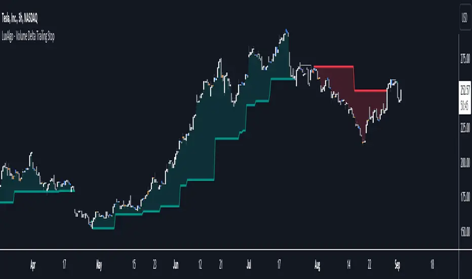
Volume Delta Trailing Stop [LuxAlgo]The ' Volume Delta Trailing Stop ' indicator uses Lower Time Frame (LTF) volume delta data which can provide potential entries together with a Volume-Delta based Trailing Stop-line .
🔶 USAGE
Our 'Volume Delta Trailing Stop' script can show potential entries/Stop Loss lines
A trigger line needs to be broken before a position is taken, after which a Volume Delta-controlled Trailing Stop-line is created:
🔶 DETAILS
🔹 Volume rises when bought or sold
🔹 When the opening price appears on the chart, a buy/sell order has been executed.
If that order is less than the available supply of that particular price, volume will rise, without moving the price.
🔹 When the opening price is the same as the closing price, the volume of that bar can be seen as "neutral volume" (nV); nor "up", nor "down" volume.
Example
A buy order doesn't fill the first available supply in the order book. This price will be the opening price with a certain volume.
When at closing time, price still hasn't moved (the first available supply in the order book isn't filled, or no movement downwards),
the closing price will be equal to the opening price, but with volume. This can be seen as "neutral volume (nV)".
🔹 Delta Volume (ΔV): this is "up volume" minus "down volume"
🔹 Standard volume is colored red when closing price is lower than opening price ( = "down volume").
🔹 Standard volume is colored green when closing price is higher OR equal (nV) than opening price ( = "up volume").
🔹 Neutral Volume
The "Neutral-Volume" is considered "Up-Volume" - setting will dictate whether nV is considered as green 'buy' volume or not.
🔶 EXAMPLE
29 July 10:00 -> 10:05, chart timeframe 5 minutes, open 29311.28, close 29313.89
close > open, so the volume (39.55) is colored green ("up volume").
(The Volume script used in the following examples is the open-source publication Volume Columns w. Alerts (V) from LucF )
Let's zoom to the 1-minute TF:
The same period is now divided into more bars, volume direction (color) is dependable on the difference between open and close.
Counting up and down volume gives a more detailed result, it remains in an upward direction though):
(ΔV = +15.51)
Let's further zoom in to the 1-second TF:
The same period is now divided into even more bars (more possibility for changing direction on each bar)
Here we see several bars that haven't moved in price, but they have volume ("neutral" volume).
(neutral volume is coloured light green here, while up volume is coloured darker green)
When we count all green and red volume bars, the result is quite different:
(ΔV = -0.35)
In total more volume is found when price went downwards, yet price went up in these 5 minutes.
-> This is the heart of our publication, when this divergence occurs, you can see a barcolor changement:
• orange: when price went up, but LTF Volume was mainly in a downward direction.
• blue: when price went down, but LTF Volume was mainly in an upwards direction.
When we split the green "up volume" into "up" and "neutral", the difference is even higher
(here "neutral volume" is colored grey):
(ΔV = -12.76; "up" - "down")
🔶 CONCEPTS
bullishBear = current bar is red but LTF volume is in upward direction -> blue bar
bearishBull = current bar is green but LTF volume is in downward direction -> orange bar
🔹 Potential positioning - forming of Trigger-line
When not in position, the script will wait for a divergence between price and volume direction. When found, a Trigger-line will appear:
• at high when a blue bar appears ( bullishBear ).
• at low when an orange bar appears ( bearishBull ).
Next step is when the Trigger-line is broken by close or high/low (settings: Trigger )
Here, the closing price went under the grey Trigger-line -> bearish position:
🔹 Trailing Stop-line
When the Trigger-line is broken, the Trailing Stop-line (TS-line) will start:
• low when bullish position
• high when bearish position
You can choose (settings -> Trigger -> Close or H/L ) whether close price or high/low should break the Trigger-line
When alerts are enabled ("Any alert() function call"), you'll get the following message:
• ' signal up ' when bullish position
• ' signal down' when bearish position
After that, the TS-line will be adjusted when:
• a blue bullishBear bar appears when in bullish position -> lowest of {low , previous blue bar's high or orange bar's low}
• an orange bearishBull bar appears when in bearish position -> highest of {high, previous blue bar's high or orange bar's low}
When alerts are enabled ("Any alert() function call"), and the TS-line is broken, you'll get the following message:
• ' TS-line broken down ' when out bullish position
• ' TS-line broken up ' when out bearish position
🔹 Reference Point
Default the direction of price will be evaluated by comparing closing price with opening price.
When open and close are the same, you'll get "neutral volume".
You can use "previous close" instead (as in built-in volume indicator) to include gaps.
If close equals open , but close is lower than previous close , it will be regarded as " down volume ",
similar, when close is higher than previous close , it will be regarded as " up volume "
Note, the setting applies for the current timeframe AND Lower timeframe:
Based on: " open " (close - open)
Based on: " previous close " (close - previous close)
🔹 Adjustment
When the TS-line changes, this can be adjusted with a percentage of price , or a multiple of " True Range "
Default (Δ line -> Adjustment - 0)
Δ line -> Adjustment 0.03% (of price)
Δ line -> Mult of TR (10)
🔶 SETTINGS
🔹 LTF: choose your Lower TimeFrame: 1S (seconds), 5S, 10S, 15S, 30S, 1 minute)
🔹 Trigger: Choose the trigger for breaking the Trigger-line ; close or H/L (high when bullish position, low when bearish position)
🔹 Δ line ( Trailing Stop-line ): add/subtract an adjustment when the TS-line changes ( default: Adjustment ):
• Adjustment ( default: 0 ): add/subtract an extra % of price
• Mult of TR : add/subtract a multiple of True Range
🔹 Based on: compare closing price against:
• open
• previous close
🔹 "Neutral-Volume" is considered "Up-Volume" : this setting will dictate whether nV is considered as green 'buy' volume or not.
🔶 CONSIDERATIONS
🔹 The lowest LTF (1S) will give you more detail and will get data close to tick data.
However, a maximum of 100,000 intrabars can be used in calculations .
This means on the daily chart you won't see anything since 1 day ~ 86400 seconds. (just over 1 bar)
-> choose a lower chart timeframe, or choose a higher LTF (5S, 10S, ... 1 minute)
🔹 Always choose a LTF lower than the current chart timeframe.
🔹 Pine Script™ code using this request.security_lower_tf() may calculate differently on historical and real-time bars, leading to repainting .
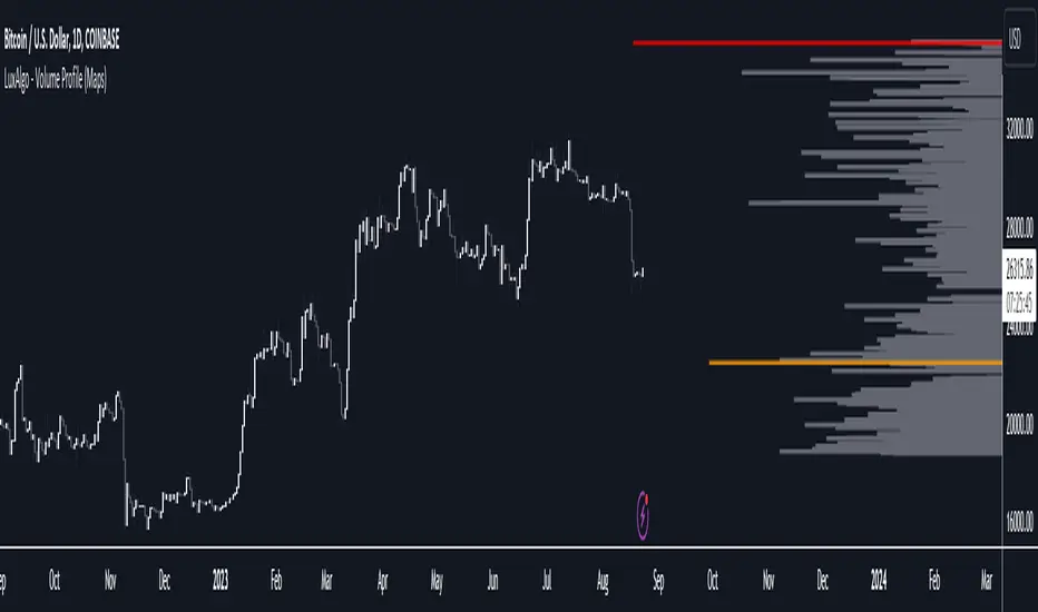
Volume Profile (Maps) [LuxAlgo]The Pine Script® developers have unleashed "maps"!
Volume Profile (Maps) displays volume, associated with price, above and below the latest price, by using maps
The largest and second-largest volume is highlighted.
🔶 USAGE
The proposed script can highlight more frequent closing prices/prices with the highest volume, potentially highlighting more liquid areas. The prices with the highest associated volume (in red and orange in the indicator) can eventually be used as support/resistance levels.
Voids within the volume profile can highlight large price displacements (volatile variations).
🔶 CONCEPTS
🔹 Maps
A map object is a collection that consists of key - value pairs
Each key is unique and can only appear once. When adding a new value with a key that the map already contains, that value replaces the old value associated with the key .
You can change the value of a particular key though, for example adding volume (value) at the same price (key), the latter technique is used in this script.
Volume is added to the map, associated with a particular price (default close, can be set at high, low, open,...)
When the map already contains the same price (key), the value (volume) is added to the existing volume at the associated price.
A map can contain maximum 50K values, which is more than enough to hold 20K bars (Basic 5K - Premium plan 20K), so the whole history can be put into a map.
🔹 Visible line/box limit
We can only display maximum 500 line.new() though.
The code locates the current (last) close, and displays volume values around this price, using lines, for example 250 lines above and 250 lines below current price.
If one side contains fewer values, the other side can show more lines, taking the maximum out of the 500 visible line limitation.
Example (max. 500 lines visible)
• 100 values below close
• 2000 values above close
-> 100 values will be displayed below close
-> 400 remaining -> 400 values will be displayed above close
Pushing the limits even further, when ' Amount of bars ' is set higher than 500, boxes - box.new() - will be used as well.
These have a limit of 500 as well, bringing the total limit to 1000.
Note that there are visual differences when boxes overlap against lines.
If this is confusing, please keep ' Amount of bars ' at max. 500 (then only lines will be used).
🔹 Rounding function
This publication contains 2 round functions, which can be used to widen the Volume Profile
Round
• "Round" set at zero -> nothing changes to the source number
• "Round" set below zero -> x digit(s) after the decimal point, starting from the right side, and rounded.
• "Round" set above zero -> x digit(s) before the decimal point, starting from the right side, and rounded.
Example: 123456.789
0->123456.789
1->123456.79
2->123456.8
3->123457
-1->123460
-2->123500
Step
Another option is custom steps.
After setting "Round" to "Step", choose the desired steps in price,
Examples
• 2 -> 1234.00, 1236.00, 1238.00, 1240.00
• 5 -> 1230.00, 1235.00, 1240.00, 1245.00
• 100 -> 1200.00, 1300.00, 1400.00, 1500.00
• 0.05 -> 1234.00, 1234.05, 1234.10, 1234.15
•••
🔶 FEATURES
🔹 Adjust position & width
🔹 Table
The table shows the details:
• Size originalMap : amount of elements in original map
• # higher: amount of elements, higher than last "close" (source)
• index "close" : index of last "close" (source), or # element, lower than source
• Size newMap : amount of elements in new map (used for display lines)
• # higher : amount of elements in newMap, higher than last "close" (source)
• # lower : amount of elements in newMap, lower than last "close" (source)
🔹 Volume * currency
Let's take as example BTCUSD, relative to USD, 10 volume at a price of 100 BTCUSD will be very different than 10 volume at a price of 30000 (1K vs. 300K)
If you want volume to be associated with USD, enable Volume * currency . Volume will then be multiplied by the price:
• 10 volume, 1 BTC = 100 -> 1000
• 10 volume, 1 BTC = 30K -> 300K
Disabled
Enabled
🔶 DETAILS
🔹 Put
When the map doesn't contain a price, it will be added, using map.put(id, key, value)
In our code:
map.put(originalMap, price, volume)
or
originalMap.put(price, volume)
A key (price) is now associated with a value (volume) -> key : value
Since all keys are unique, we don't have to know its position to extract the value, we just need to know the key -> map.get(id, key)
We use map.get() when a certain key already exists in the map, and we want to add volume with that value.
if originalMap.contains(price)
originalMap.put(price, originalMap.get(price) + volume)
-> At the last bar, all prices (source) are now associated with volume.
🔹 Copy & sort
Next, every key of the map is copied and sorted (array of keys), after which the index (idx) is retrieved of last (current) price.
copyK = originalMap.keys().copy()
copyK.sort()
idx = copyK.binary_search_leftmost(src)
Then left and right side of idx is investigated to show a maximum amount of lines at both sides of last price.
🔹 New map & display
The keys (from sorted array of copied keys) that will be displayed are put in a new map, with the associated volume values from the original map.
newMap = map.new()
🔹 Re-cap
• put in original amp (price key, volume value)
• copy & sort
• find index of last price
• fetch relevant keys left/right from that index
• put keys in new map and fetch volume associated with these keys (from original map)
Simple example (only show 5 lines)
bar 0, price = 2, volume = 23
bar 1, price = 4, volume = 3
bar 2, price = 8, volume = 21
bar 3, price = 6, volume = 7
bar 4, price = 9, volume = 13
bar 5, price = 5, volume = 85
bar 6, price = 3, volume = 13
bar 7, price = 1, volume = 4
bar 8, price = 7, volume = 9
Original map:
Copied keys array:
Sorted:
-> 5 keys around last price (7) are fetched (5, 6, 7, 8, 9)
-> keys are placed into new map + volume values from original map
Lastly, these values are displayed.
🔶 SETTINGS
Source : Set source of choice; default close , can be set as high , low , open , ...
Volume & currency : Enable to multiply volume with price (see Features )
Amount of bars : Set amount of bars which you want to include in the Volume Profile
Max lines : maximum 1000 (if you want to use only lines, and no boxes -> max. 500, see Concepts )
🔹 Round -> ' Round/Step '
Round -> see Concepts
Step -> see Concepts
🔹 Display Volume Profile
Offset: shifts the Volume Profile (max. 500 bars to the right of last bar, see Features )
Max width Volume Profile: largest volume will be x bars wide, the rest is displayed as a ratio against largest volume (see Features )
Show table : Show details (see Features )
🔶 LIMITATIONS
• Lines won't go further than first bar (coded).
• The Volume Profile can be placed maximum 500 bar to the right of last price.
• Maximum 500 lines/boxes can be displayed
Developing Market Profile / TPO [Honestcowboy]The Developing Market Profile Indicator aims to broaden the horizon of Market Profile / TPO research and trading. While standard Market Profiles aim is to show where PRICE is in relation to TIME on a previous session (usually a day). Developing Market Profile will change bar by bar and display PRICE in relation to TIME for a user specified number of past bars.
What is a market profile?
"Market Profile is an intra-day charting technique (price vertical, time/activity horizontal) devised by J. Peter Steidlmayer. Steidlmayer was seeking a way to determine and to evaluate market value as it developed in the day time frame. The concept was to display price on a vertical axis against time on the horizontal, and the ensuing graphic generally is a bell shape--fatter at the middle prices, with activity trailing off and volume diminished at the extreme higher and lower prices."
For education on market profiles I recommend you search the net and study some profitable traders who use it.
Key Differences
Does not have a value area but distinguishes each column in relation to the biggest column in percentage terms.
Updates bar by bar
Does not take sessions into account
Shows historical values for each bar
While there is an entire education system build around Market Profiles they usually focus on a daily profile and in some cases how the value area develops during the day (there are indicators showing the developing value area).
The idea of trading based on a developing value area is what inspired me to build the Developing Market Profile.
🟦 CALCULATION
Think of this Developing Market Profile the same way as you would think of a moving average. On each bar it will lookback 200 bars (or as user specified) and calculate a Market Profile from those bars (range).
🔹Market Profile gets calculated using these steps:
Get the highest high and lowest low of the price range.
Separate that range into user specified amount of price zones (all spaced evenly)
Loop through the ranges bars and on each bar check in which price zones price was, then add +1 to the zones price was in (we do this using the OccurenceArray)
After it looped through all bars in the range it will draw columns for each price zone (using boxes) and make them as wide as the OccurenceArray dictates in number of bars
🔹Coloring each column:
The script will find the biggest column in the Profile and use that as a reference for all other columns. It will then decide for each column individually how big it is in % compared to the biggest column. It will use that percentage to decide which color to give it, top 20% will be red, top 40% purple, top 60% blue, top 80% green and all the rest yellow. The user is able to adjust these numbers for further customisation.
The historical display of the profiles uses plotchar() and will not only use the color of the column at that time but the % rating will also decide transparancy for further detail when analysing how the profiles developed over time. Each of those historical profiles is calculated using its own 200 past bars. This makes the script very heavy and that is why it includes optimisation settings, more info below.
🟦 USAGE
My general idea of the markets is that they are ever changing and that in studying that changing behaviour a good trader is able to distinguish new behaviour from old behaviour and adapt his approach before losing traders "weak hands" do.
A Market Profile can visually show a trader what kind of market environment we currently are in. In training this visual feedback helps traders remember past market environments and how the market behaved during these times.
Use the history shown using plotchars in colors to get an idea of how the Market Profile looked at each bar of the chart.
This history will help in studying how price moves at different stages of the Market Profile development.
I'm in no way an expert in trading Market Profiles so take this information with a grain of salt. Below an idea of how I would trade using this indicator:
🟦 SETTINGS
🔹MARKET PROFILING
Lookback: The amount of bars the Market Profile will look in the past to calculate where price has been the most in that range
Resolution: This is the amount of columns the Market Profile will have. These columns are calculated using the highest and lowest point price has been for the lookback period
Resolution is limited to a maximum of 32 because of pinescript plotting limits (64). Each plotchar() because of using variable colors takes up 2 of these slots
🔹VISUAL SETTINGS
Profile Distance From Chart: The amount of bars the market profile will be offset from the current bar
Border width (MP): The line thickness of the Market Profile column borders
Character: This is the character the history will use to show past profiles, default is a square.
Color theme: You can pick 5 colors from biggest column of the Profile to smallest column of the profile.
Numbers: these are for % to decide column color. So on default top 20% will be red, top 40% purple... Always use these in descending order
Show Market Profile: This setting will enable/disable the current Market Profile (columns on right side of current bar)
Show Profile History: This setting will enable/disable the Profile History which are the colored characters you see on each bar
🔹OPTIMISATION AND DEBUGGING
Calculate from here: The Market Profile will only start to calculate bar by bar from this point. Setting is needed to optimise loading time and quite frankly without it the script would probably exceed tradingview loading time limits.
Min Size: This setting is there to avoid visual bugs in the script. Scaling the chart there can be issues where the Market Profile extends all the way to 0. To avoid this use a minimum size bigger than the bugged bottom box
LNL Scalper ArrowsLNL Scalper Arrows
The indicator consist of various different types of candlestick patterns that are truly time tested by multiple veteran traders. These arrows are a combination of short-term scalping strategies taught by Linda Raschke & a trader that goes by name Quant Trade Edge. These strategies/patterns occur regularly within the markets. They offer high probability quick moves during the trending days. These four patterns are based on pure price action, no oscillators, no trend, no momentum indicators involved. Trend (ema) is there just as a simple trend gauge.
LNL Scalper Arrows were designed specifically for intra-day trading. Mostly useful for the futures but also stocks as well. These arrows can work anywhere between the fast-moving 512 or 1600 tick charts to a 1min, 2min and up to 5min or 10min charts.
Trend Gauge (Exponential Moving Average)
Nothing fancy just a classic EMA that can guide the direction of the short-term trend. I have added a custom coloring of the EMA that is based on a simple RSI filter. That should help to visualize the non-directional moments within the trend. Although the length is adjustable, for scalping it is better to focus on smaller periods such as 9, 13 or 20 or 34 but anything above 50 loses its purpose as a short-term trend gauge. Again, this is a scalping tool not a trend tool, you are not going to get rid of the fakeouts by increasing the period of the trend.
Tail Arrows (Eat the Tail Pattern)
Tail is a candlestick that is either a price rejection spike, or a flag continuation pattern on a lower time frame. A failed action. It is basically a candle with much bigger wick (shadow) of the candle than the actual body. Such candles are usually telling us about strong participation from the other side of the market. Eat the tail pattern occurs whenever the low of the Tail candle is immediately broken on a following candle "the tail is eaten alive". Such a breaks occurs in a most aggressive types of markets with a strong momentum. DO NOT try to trade this in a low volume or a ranging market. Tail Arrows are the most aggressive arrows & should be only used on the highest volume or a parabolic momentum markets.
Scalp Arrows (Scallop Pattern)
Known as Scallops or minor lows or highs, these patterns are the most common within the all scalper arrows. They occur regularly on 1min & 5min charts - basically everyday. Scallops provide the best possible risk to reward entry within the trend without the need of any indicators or oscillators. The Scallop Up 3 bar pattern consist of a high that is lower that the previous high but also low that is lower than the previous low. Scallop Up or a minor low triggers when the last high is broken, creating a three bar mountain or a peak within the 5 bar span.
Hoagie Arrows (Hoagie Pattern)
Hoagies occur way less often than any other scalping patterns. Hoagies represent two (or more) inside candles within the shadow of a first candle. Such a formation is creating a small compression or a range that sooner or later breaks out. The hoagie is triggered whenever the high or low of the shadow (first) candle is broken. The great thing about the hoagies is that they can work either way despite the trend direction. Although this indicator is coded for the 2 bar hoagies, there are no limitations on how much inside bars can hoagie include.
Umbrella Arrows (Umbrella Pattern)
Another really awesome 3 bar pattern that is really fun to trade. Umbrella occurs when the candle before the previous candle is a pin bar or a tail bar and the body of the previous candle is within the shadow or a wick of the candle before. The umbrella is triggered once the high or low of the previous bar is broken. Umbrellas are more frequent than Hoagies but occur much less than the Scallops.
Outside Bar Wedges (Outside Bar Pattern)
Pretty much self-explanatory candlestick pattern. Outside Bar is basically any bar that peaks outside of the both ends of the previous candle. So the range of the candle is higher & it looked beyond the high and beyond the low of the previous candle. These candles are signalizing the potenial momentum change. Ouside Bars usually occur at the tops or bottoms of the moves. I decided to add them because they can serve as a great addition to these scalping patterns.
Signal vs. SignalBreak Mode
The trigger can be viewed in two different ways:
1. Signal: Plots the trigger before the trigger bar, basically right when the pattern is formed but NOT YET triggered. The signal is triggered once the next candle break the high or low of the current candle.
2. SignalBrake: Plots the trigger after the break of the high or low of the actual pattern. It is basically a candle after the signal candle. (Signal is better for trading because it gives you time to prepare for the actual break of the high or low = the actual signal. SignalBrake is great for looking back in history only for the patterns that actually traded).
Pin Bar BTW Ratio
Pin Bar (Body-To-Wick) Ratio represents the size of the body of a pin bar candle for Eat the Tail and Umbrella patterns. Pin Bar BTW Ratio measures the ratio between the wick & the body of the candle. Ref. interval is 2.0 - 5.0 (ideal pin bar is 2.0 - 3.0 = the wick or a shadow is 2x - 3x bigger than the body of the candle)
ATR Stop & Target Labels
I also created three simple labels (tables) that can show you the ideal target & stop as well as the current ATR. Since LNL Scalper Arrows consist of high probability scalping patterns, a good rule of thumb to follow is to use a half of the current ATR as a target and a current ATR as a stop (or two times the target). So if the current 7 period ATR is 30 the target would be 15 pts. and a stop around 30 pts. With such a risk management you should aim for a win rate 70% or higher. Obviously you can adjust the risk management in the settings to your personal preference.
Low Range vs. High Range Markets
There are two major downsides with the Scalper Arrows:
1. You need volume and a volatility. These patterns really do struggle in ranging "boring" sideways action. It is absolutely crucial to recognize the current market environment and really stay cautions and (or completely out) in case the chop continues. Adding something like DMI can help you recognize the potential flat markets.
2. Not only do you need volume & momentum, you also need a decent range. This indicator works better on a rangy market such as NQ futures or YM. But are much tougher to trade on lower range markets such as some stocks or ZB futures or basically any other lower range market.
Hope it helps.

libhs.log.DEMO◼ Overview
This is a demonstration of dual logging library I have ported from my personal use for public use. Please start bar replay from Bar#4, and progress automatically slowly or manually.You would need to go through 450+ bars to see the full capability.
Logger=A dual logging library for developers. Tradingview lacks logging capability. This library provided logging while developing your scripts and is to be used by developers when developing and debugging their scripts.
Using this library would potentially slow down you scripts. Hence, use this for debugging only. Once your code is as you would like it to be, remove the logging code.
◼︎ Usage (Console):
Console = A sleek single cell logging with a limit of 4096 characters. When you dont need a large logging capability.
//@version=5
indicator("demo.Console", overlay=true)
plot(na)
import GETpacman/log/2 as logger
var console = logger.log.new()
console.init() // init() should be called as first line after variable declaration
console.FrameColor:=color.green
console.log('\n')
console.log('\n')
console.log('Hello World')
console.log('\n')
console.log('\n')
console.ShowStatusBar:=true
console.StatusBarAtBottom:=true
console.FrameColor:=color.blue //settings can be changed anytime before show method is called. Even twice. The last call will set the final value
console.ShowHeader:=false //this wont throw error but is not used for console
console.show(position=position.bottom_right) //this should be the last line of your code, after all methods and settings have been dealt with.
◼︎ Usage (Logx):
Logx = Multiple columns logging with a limit of 4096 characters each message. When you need to log large number of messages.
//@version=5
indicator("demo.Logx", overlay=true)
plot(na)
import GETpacman/log/2 as logger
var logx = logger.log.new()
logx.init() // init() should be called as first line after variable declaration
logx.FrameColor:=color.green
logx.log('\n')
logx.log('\n')
logx.log('Hello World')
logx.log('\n')
logx.log('\n')
logx.ShowStatusBar:=true
logx.StatusBarAtBottom:=true
logx.ShowQ3:=false
logx.ShowQ4:=false
logx.ShowQ5:=false
logx.ShowQ6:=false
logx.FrameColor:=color.olive //settings can be changed anytime before show method is called. Even twice. The last call will set the final value
logx.show(position=position.top_right) //this should be the last line of your code, after all methods and settings have been dealt with.
◼︎ Fields (with default settings)
▶︎ IsConsole = True Log will act as Console if true, otherwise it will act as Logx
▶︎ ShowHeader = True (Log only) Will show a header at top or bottom of logx.
▶︎ HeaderAtTop = True (Log only) Will show the header at the top, or bottom if false, if ShowHeader is true.
▶︎ ShowStatusBar = True Will show a status bar at the bottom
▶︎ StatusBarAtBottom = True Will show the status bar at the bottom, or top if false, if ShowHeader is true.
▶︎ ShowMetaStatus = True Will show the meta info within status bar (Current Bar, characters left in console, Paging On Every Bar, Console dumped data etc)
▶︎ ShowBarIndex = True Logx will show column for Bar Index when the message was logged. Console will add Bar index at the front of logged messages
▶︎ ShowDateTime = True Logx will show column for Date/Time passed with the logged message logged. Console will add Date/Time at the front of logged messages
▶︎ ShowLogLevels = True Logx will show column for Log levels corresponding to error codes. Console will log levels in the status bar
▶︎ ReplaceWithErrorCodes = True (Log only) Logx will show error codes instead of log levels, if ShowLogLevels is switched on
▶︎ RestrictLevelsToKey7 = True Log levels will be restricted to Ley 7 codes - TRACE, DEBUG, INFO, WARNING, ERROR, CRITICAL, FATAL
▶︎ ShowQ1 = True (Log only) Show the column for Q1
▶︎ ShowQ2 = True (Log only) Show the column for Q2
▶︎ ShowQ3 = True (Log only) Show the column for Q3
▶︎ ShowQ4 = True (Log only) Show the column for Q4
▶︎ ShowQ5 = True (Log only) Show the column for Q5
▶︎ ShowQ6 = True (Log only) Show the column for Q6
▶︎ ColorText = True Log/Console will color text as per error codes
▶︎ HighlightText = True Log/Console will highlight text (like denoting) as per error codes
▶︎ AutoMerge = True (Log only) Merge the queues towards the right if there is no data in those queues.
▶︎ PageOnEveryBar = True Clear data from previous bars on each new bar, in conjuction with PageHistory setting.
▶︎ MoveLogUp = True Move log in up direction. Setting to false will push logs down.
▶︎ MarkNewBar = True On each change of bar, add a marker to show the bar has changed
▶︎ PrefixLogLevel = True (Console only) Prefix all messages with the log level corresponding to error code.
▶︎ MinWidth = 40 Set the minimum width needed to be seen. Prevents logx/console shrinking below these number of characters.
▶︎ TabSizeQ1 = 0 If set to more than one, the messages on Q1 or Console messages will indent by this size based on error code (Max 4 used)
▶︎ TabSizeQ2 = 0 If set to more than one, the messages on Q2 will indent by this size based on error code (Max 4 used)
▶︎ TabSizeQ3 = 0 If set to more than one, the messages on Q2 will indent by this size based on error code (Max 4 used)
▶︎ TabSizeQ4 = 0 If set to more than one, the messages on Q2 will indent by this size based on error code (Max 4 used)
▶︎ TabSizeQ5 = 0 If set to more than one, the messages on Q2 will indent by this size based on error code (Max 4 used)
▶︎ TabSizeQ6 = 0 If set to more than one, the messages on Q2 will indent by this size based on error code (Max 4 used)
▶︎ PageHistory = 0 Used with PageOnEveryBar. Determines how many historial pages to keep.
▶︎ HeaderQbarIndex = 'Bar#' (Logx only) The header to show for Bar Index
▶︎ HeaderQdateTime = 'Date' (Logx only) The header to show for Date/Time
▶︎ HeaderQerrorCode = 'eCode' (Logx only) The header to show for Error Codes
▶︎ HeaderQlogLevel = 'State' (Logx only) The header to show for Log Level
▶︎ HeaderQ1 = 'h.Q1' (Logx only) The header to show for Q1
▶︎ HeaderQ2 = 'h.Q2' (Logx only) The header to show for Q2
▶︎ HeaderQ3 = 'h.Q3' (Logx only) The header to show for Q3
▶︎ HeaderQ4 = 'h.Q4' (Logx only) The header to show for Q4
▶︎ HeaderQ5 = 'h.Q5' (Logx only) The header to show for Q5
▶︎ HeaderQ6 = 'h.Q6' (Logx only) The header to show for Q6
▶︎ Status = '' Set the status to this text.
▶︎ HeaderColor Set the color for the header
▶︎ HeaderColorBG Set the background color for the header
▶︎ StatusColor Set the color for the status bar
▶︎ StatusColorBG Set the background color for the status bar
▶︎ TextColor Set the color for the text used without error code or code 0.
▶︎ TextColorBG Set the background color for the text used without error code or code 0.
▶︎ FrameColor Set the color for the frame around Logx/Console
▶︎ FrameSize = 1 Set the size of the frame around Logx/Console
▶︎ CellBorderSize = 0 Set the size of the border around cells.
▶︎ CellBorderColor Set the color for the border around cells within Logx/Console
▶︎ SeparatorColor = gray Set the color of separate in between Console/Logx Attachment
◼︎ Methods (summary)
● init ▶︎ Initialise the log
● log ▶︎ Log the messages. Use method show to display the messages
● page ▶︎ Clear messages from previous bar while logging messages on this bar.
● show ▶︎ Shows a table displaying the logged messages
● clear ▶︎ Clears the log of all messages
● resize ▶︎ Resizes the log. If size is for reduction then oldest messages are lost first.
● turnPage ▶︎ When called, all messages marked with previous page, or from start are cleared
● dateTimeFormat ▶︎ Sets the date time format to be used when displaying date/time info.
● resetTextColor ▶︎ Reset Text Color to library default
● resetTextBGcolor ▶︎ Reset Text BG Color to library default
● resetHeaderColor ▶︎ Reset Header Color to library default
● resetHeaderBGcolor ▶︎ Reset Header BG Color to library default
● resetStatusColor ▶︎ Reset Status Color to library default
● resetStatusBGcolor ▶︎ Reset Status BG Color to library default
● setColors ▶︎ Sets the colors to be used for corresponding error codes
● setColorsBG ▶︎ Sets the background colors to be used for corresponding error codes. If not match of error code, then text color used.
● setColorsHC ▶︎ Sets the highlight colors to be used for corresponding error codes.If not match of error code, then text bg color used.
● resetColors ▶︎ Reset the colors to library default (Total 36, not including error code 0)
● resetColorsBG ▶︎ Reset the background colors to library default
● resetColorsHC ▶︎ Reset the highlight colors to library default
● setLevelNames ▶︎ Set the log level names to be used for corresponding error codes. If not match of error code, then empty string used.
● resetLevelNames ▶︎ Reset the log level names to library default. (Total 36) 1=TRACE, 2=DEBUG, 3=INFO, 4=WARNING, 5=ERROR, 6=CRITICAL, 7=FATAL
● attach ▶︎ Attaches a console to an existing Logx, allowing to have dual logging system independent of each other
● detach ▶︎ Detaches an already attached console from Logx

Orion:SagittaSagitta
Sagitta is an indicator the works to assist in the validation of potential long entries and to place stop-loss orders. Sagitta is not a "golden indicator" but more of a confirmation indicator of what prices might be suggesting.
The concept is that while stocks can turn in one bar, it usually takes two bars or more to signal a turn. So, using a measurement of two bars help determine the potential turning of prices.
Behind the scenes, Sagitta is nothing more than a 2 period stochastic which has had its values divided into five specific zones.
Dividing the range of the two bars in five sections, the High is equal to 100 and the Low is equal to 0.
The zones are:
20 = bearish (red) – This is when the close is the lower 20% of the two bars
40 = bearish (orange) – This is when the close is between the lower 20% and 40% of the two bars.
60 = neutral (yellow) – This is when the close is between the middle 40% - 60% of the two bars.
80 = bullish (blue) – This is when the close is between the upper 60% - 80% of the two bars.
100 = bullish (green) – This is when the close is above the upper 80% of the bar.
The general confirmation concept works as such:
When the following bar is of a higher value than the previous bar, there is potential for further upward price movement. Conversely when the following bar is lower than the previous bar, there is potential for further downward movement.
Going from a red bar to orange bar Might be an indication of a positive turn in direction of prices.
Going from a green bar to an orange bar would also be considered a negative directional turn of prices.
When the follow on bar decreases (ie, green to blue, blue to yellow, etc) placing a stop-loss would be prudent.
Maroon lines in the middle of a bar is an indication that prices are currently caught in consolidation.
Silver/Gray bars indicate that a high potential exists for a strong upward turn in prices exists.
Consolidation is calculated by determining if the close of one bar is between the high and low of another bar. This then establishes the range high and low. As long as closes continue with this range, the high and low of the range can expand. When the close is outside of the range, the consolidation is reset.
Signals in areas of consolidation (maroon center bar) should be looked upon as if the prices are going to challenge the high of the consolidation range and not necessarily break through.
The entry technique used is:
The greater of the following two calculations:
High of signal bar * 1.002 or High of signal bar + .03
The stop-loss technique used is:
The lesser of the following two calculations:
Low of signal bar * .998 or Low of signal bar - .03
IF an entry signal is generated and the price doesn’t reach the entry calculation. It is considered a failed entry and is not considered a negative or that you missed out on something. This has saved you from losing money since the prices are not ready to commit to the direction.
When placing a stop-loss, it is never suggested that you lower the value of a stop-loss. Always move your stop-losses higher in order to lock in profit in case of a negative turn.
Strat Dashboard [TFO]The Strat Dashboard tracks up to 10 signals while highlighting common strat reversal patterns, the SSS 50% rule, timeframe continuity, and some additional criteria with VWAP and moving averages.
With the strat, all price action bars/candles are simplified into 3 total possibilities: 1 (inside bar), 2 (a bar that takes the previous bar's high OR low), and 3 (outside bar). The first table column for Last X Candles shows the most recent candles according to this notation, for example, 1 - 2D - 2U. This would mean we had an inside bar, followed by a bar that took the previous bar's low, followed then by a bar that took the previous bar's high. Note that the colors in this column are set according to whether the current bar's close exceeds the previous bar's high/low. By default, these colors are green if above the previous bar's highs, or red if below the previous bar's lows. If the current close is in between the previous candle's high and low (even after already taking the prior high or low), no color will be applied.
The SSS 50% column shows a yes or no value for whether the current bar aligns with the SSS 50% rule, where a bar has taken either the previous high or low, and has since reversed to at least the midway point of the previous bar's height - essentially anticipating a 2 that may become a 3 (outside bar).
Timeframe continuity (TFC) shows a yes or no value for when the current candle on multiple timeframes are all green or red (above the open price or below the open price, respectively). For example, if you were looking at the current 15m, 1h, and 1D bars, and they were all above the open price, you could say there's TFC between all three timeframes. As of the initial release, you can select up to 3 different timeframes. The table values will only be true when all selected timeframes are in alignment. When setting alerts, first deselect the timeframes if you don't want TFC logic to impact alerts.
The "Last" column shows the last strat reversal pattern that was confirmed (after the last bar closes). Waiting for a candle close is the safer option since a 2 can turn into a 3; however for higher timeframes, it may be beneficial to make an update to this indicator in which you can have live alerts as well (not waiting for a candle close). You can select which strat reversals you want to be shown from the settings. Various strat reversals may be selected for alerts of type "Any"; for example, if setting up an alert for "Any" strat reversal on Symbol 1, then this alert will go off when any of the *selected* strat reversals occur for that specific symbol. Deselect any strat reversals that you don't want to be included in these alerts.
Lastly, the EMA and VWAP columns simply show whether price is above or below said value. This tracks the current candle close, and may repaint/change several times if the current bar is oscillating above and below these values.
Swing Levels and Liquidity - By LeviathanThis script will plot pivot points (swing highs and lows) in the form of lines, boxes or labels to help you identify market structure, “liquidity” areas, swing failure patterns, etc. You are also able to see the volume traded at each pivot point, which will help you compare their significance.
Bars Left-Right
A pivot high (swing high) is a bar in a series of bars that has a higher value than the bars around it and a pivot low (swing low) is a bar in a series of bars that has a lower value than the bars surrounding it. The Bars Left and Bars Right parameters are used to define the number of bars on the left and right sides of a pivot point that the function should consider when identifying pivot highs and lows in a time series. For example, if Bars Left is set to 5 and Bars Right is set to 6, the function will look for a pivot point by comparing the value of the current bar with the values of the 5 bars to its left and the 6 bars to its right. If the value of the current bar is higher than all of these bars, it is considered a pivot high point. These parameter can be used to adjust the sensitivity of the script (lowering the Bars Left and Bars Right parameters will give you more swing points and increasing the Bars Left and Bars Right parameters will give you fewer swing points).
”Show Boxes” - This will draw a box above the swing high and a box below the swing low to help you visualise a large area of interest around swing points. Additional box types and the width of the box can be adjusted in Appearance settings below.
”Show Lines” - This will draw a horizontal line at the level of each swing high and swing low.
”Show Labels” - This will plot a circle at the high point of each swing high and at the low point of each swing low.
”Show Volume” - This will display the amount of volume traded in a given swing point candle. It can help you identify the significance of a given swing point by comparing it to the volumes of other swing points.
”Extend Until Filled” - This will extend the swing point levels until they are mitigated by the price. Turning it off will continue plotting the levels just a few more bars after a swing point occurs.
”Appearance” - You can show/hide swing points, choose the colors of labels, lines and boxes, choose the size and positioning of the text, choose line and box appearance (adjust the Box Width when switching between timeframes!) and more.
More updates coming soon (MTF, more data…)

Simple STRAT Tool by nnamWhat this Indicator Does
This indicator is a very simple tool created specifically for experienced Straters. It was created for those Straters who fully understand the 1-2-3 Strat Scenarios, are in need of an easy to use tool, and do not want or need a lot of messy markings on their chart.
The indicator simply allows the user to color code the Strat 1, 2 ,3 (Inside /Outside /Up / Down) Bars as desired and by default extends lines to the right of the chart from the Highs and Lows of the previous 2 Bars giving the user a simple reference for Strat scenario structure breaks.
As shown above, the bars are color coded, but the original bar color is maintained via the border and wick.
If a bar is an Outside Bar or an Inside Bar, it is still easy to identify whether or not the bar was a Bullish or Bearish 1 or 3.
The same goes for 2UP and 2Down Bars - It is easy to identify Bullish or Bearish UP or DOWN Bars.
Optionally, as show in the screenshot below, the user can extend the lines in both directions to get an "at a glance" better understanding of where price is currently vs previous support and resistance areas.
For Straters that prefer to trade only INSIDE BAR BREAKOUTS there is an optional input setting labeled "Trade Inside Bars ONLY".
This setting turns OFF the lines that extend from the 2nd previous bar back and only displays and extend lines from the previous bar IF and ONLY IF the current bar is an INSIDE (one) bar. .
The User Input settings allow for the following customizations:
1. Custom Outside Bar Color
2. Custom Inside Bar Color
3. Custom 2 Up Bar Color
4. Custom 2 Down Bar Color
5. Turn ON or OFF color coded bars
6. Trade only INSIDE Bar Breakouts
7. Extend Lines Both Directions
8. Hide all Lines
The customizable settings above allow the user to hide all lines and turn OFF color coding without having to fully remove the indicator from the chart. This is convenient when the user has another indicator that uses color coded bars or the lines conflict with another indicator and they need to be temporarily disabled.
If you have any questions regarding this indicator please let me know. If you have any suggestions for minor tweaks to the indicator do not hesitate to ask for them.
I hope you enjoy this indicator and get some usefulness from it... HAPPY TRADING!!
Signs of the Times [LucF]█ OVERVIEW
This oscillator calculates the directional strength of bars using a primitive weighing mechanism based on a small number of what I consider to be fundamental properties of a bar. It does not consider the amplitude of price movements, so can be used as a complement to momentum-based oscillators. It thus belongs to the same family of indicators as my Bar Balance , Volume Ticks , Efficient work , Volume Buoyancy or my Delta Volume indicators.
█ CONCEPTS
The calculations underlying Signs of the Times (SOTT) use a simple, oft-explored concept: measure bar attributes, assign a weight to them, and aggregate results to provide an evaluation of a bar's directional strength. Bull and bear weights are added independently, then subtracted and divided by the maximum possible weight, so the final calculation looks like this:
(up - dn) / weightRange
SOTT has a zero centerline and oscillates between +1 and -1. Ten elementary properties are evaluated. Most carry a weight of one, a few are doubly weighted. All properties are evaluated using only the current bar's values or by comparing its values to those of the preceding bar. The bull conditions follow; their inverse applies to bear conditions:
Weight of 1
• Bar's close is greater than the bar's open (bar is considered to be of "up" polarity)
• Rising open
• Rising high
• Rising low
• Rising close
• Bar is up and its body size is greater than that of the previous bar
• Bar is up and its body size is greater than the combined size of wicks
Weight of 2
• Gap to the upside
• Efficient Work when it is positive
• Bar is up and volume is greater than that of the previous bar (this only kicks in if volume is actually available on the chart's data feed)
Except for the Efficient Work weight, which is a +1 to -1 float value multiplied by 2, all weights are discrete; either zero or the full weight of 1 or 2 is generated. This will cause any gap, for example, to generate a weight of +2 or -2, regardless of the gap's size. That is the reason why the oscillator is oblivious to the amplitude of price movements.
You can see the code used to calculate SOTT in my ta library 's `sott()` function.
█ HOW TO USE THE INDICATOR
No videos explain this indicator and none are planned; reading this description or the script's code is the only way to understand what Signs of the Times does.
Load the indicator on an active chart (see here if you don't know how).
The default configuration displays:
• An Arnaud-Legoux moving average of length 20 of the instant SOTT value. This is the signal line.
• A fill between the MA and the centerline.
• Levels at arbitrary values of +0.3 and -0.3.
• A channel between the signal line and its MA (a simple MA of length 20), which can be one of four colors:
• Bull (green): The signal line is above its MA.
• Strong bull (lime): The bull condition is fulfilled and the signal line is above the centerline.
• Bear (red): The signal line is below its MA.
• Strong bear (pink): The bear condition is fulfilled and the signal line is below the centerline.
The script's "Inputs" tab allows you to:
• Choose a higher timeframe to calculate the indicator's values. This can be useful to get a wider perspective of the indicator's values.
If you elect to use a higher timeframe, make sure that your chart's timeframe is always lower than the higher timeframe you specified,
as calculating on a timeframe lower than the chart's does not make much sense because the indicator is then displaying only the value of the last intrabar in the chart bar.
• Specify the type of MA used to produce the signal line. Use a length of 1 or the Data Window to see the instant value of SOTT. It is quite noisy, thus the need to average it.
• Specify the type of MA applied to the signal line. The idea here is to provide context to the signal.
• Control the display and colors of the lines and fills.
The first pane of this publication's chart shows the default setup. The second one shows only a monochrome signal line.
Using the "Style" tab of the indicator's settings, you can change the type and width of the lines, and the level values.
█ INTERPRETATION
Remember that Signs of the Times evaluates directional bar strength — not price movement. Its highs and lows do not reflect price, but the strength of chart bars. The fact that SOTT knows nothing of how far price moves or of trends is easy to forget. As such, I think SOTT is best used as a confirmation tool. Chart movements may appear to be easy to read when looking at historical bars, but when you have to make go-no-go decisions on the last bar, the landscape often becomes murkier. By providing a quantitative evaluation of the strength of the last few bars, which is not always easily discernible by simply looking at them, SOTT aims to help you decide if the short-term past favors the bets you are considering. Can SOTT predict the future? Of course not.
While SOTT uses completely different calculations than classical momentum oscillators, its profile shares many of their characteristics. This could lead one to infer that directional bar strength correlates with price movement, which could in turn lead one to conclude that indicators such as this one are useless, or that they can be useful tools to confirm momentum oscillators or other models of price movement. The call is, of course, up to you. You can try, for example, to compare a Wilder MA of SOTT to an RSI of the same length.
One key difference with momentum oscillators is that SOTT is much less sensitive to large price movements. The default Arnaud-Legoux MA used for the signal line makes it quite active; you can use a more quiet SMA or EMA if you prefer to tone it down.
In systems where it can be useful to only enter or exit on short-term strength, an average of SOTT values over the last 3 to 5 bars can be used as a more quiet filter than a momentum oscillator would.
█ NOTES
My publications often go through a long gestation period where I use them on my charts or in systems before deciding if they are worth a publication. With an incubation period of more than three years, Signs of the Times holds the record. The properties SOTT currently evaluates result from the systematic elimination of contaminants over that lengthy period of time. It was long because of my usual, slow gear, but also because I had to try countless combinations of conditions before realizing that, contrary to my intuition, best results were achieved by:
• Keeping the number of evaluated properties to the absolute minimum.
• Limiting the evaluation's scope to the current and preceding bar.
• Choosing properties that, in my view, were unmistakably indicative of bullish/bearish conditions.
Repainting
As most oscillators, the indicator provides live realtime values that will recalculate with chart updates. It will thus repaint in real time, but not on historical values. To learn more about repainting, see the Pine Script™ User Manual's page on the subject .
Impactful pattern and candles pattern AlertThe Alertion indicator!
impactful pattern:
pattern that happen near the zone or in the zone at lower timeframe and give us entry and stop limit price.
It is helpful for price action traders and those who want to decrease their risk.
There are 3 IP patterns:
Quasimodo
Head and shoulder
whipsaw engulfing
These patterns may occur near the zone or may not occur but by them, you can decrease your trading risk for example you can
trade with half lot before IP pattern and enter with other half after pattern.
how to use?
for example:
you find zone at 1h timeframe for short position
when price enter to your zone
you run this indicator and choose your lower timeframe, for example 15m and click on short position.
Then make the alert by right-click on your chart and choose the add alert and at condition box choose the impactful pattern and then click on create
now wait for message :)
Candles pattern:
like reversal bar, key reversal bar, exhaustion bar, pin bar, two-bar reversal, tree-bar reversal, inside bar, outside bar
these occur when the trend turn, so it is usable when the price enter to your zone or near your zone.
This pattern can decrease your risk.
Inside bar and outside bar:
if this pattern engulf up, it is bullish pattern and if engulf down, it is bearish pattern.
what does this indicator do?
this indicator is for making alert
it helps you to decrease your risk and failure.
You optimize it to alert you when IP pattern happen or candle pattern happen or inside bar or outside bar engulfing or all of them.
For IP pattern, it will message you entry and stop limit price.
It works at 2 different timeframes, so you can make alert for example in 1h TF for candles pattern and 15m TF for IP pattern.
Indicator will alert you for candles pattern at your chart timeframe and for IP pattern at timeframe you've chosen when you run the indicator, and it is changeable
in setting.
setting options
TIMEFRAME
IP: select the timeframe for IP patterns it means when IP pattern happen at that timeframe the indicator will alert you
example = your TF is 1h, you found the supply zone and want to trade, note that IP pattern happen in lower TF, so you select 15m TF or TF lower than 1h.
Short position: select it if you want to make short position.
BUFFERING
indicator send you entry and stop limit price
you can change it by amount of percent
it is your strategy to change your entry and stop loss or not
example= in head and shoulder pattern at short position, the stop limit is high price of head in pattern
so the indicator will message you the exact price but if you want to put
your stop limit 5 percent upper than exact price you can enter 5 in front of stop loss
or you want to enter 5 percent lower than exact high price of shoulder, you can optimize it.
ALERTION
you choose what alert you want
IP alert or candle alert or inside and outside bar alert
type your text for alert
you can write additional text for your message
ADVANCE
IP alert frequency option:
1. Once per bar : indicator will alert you for IP pattern once at your chat timeframe bar, and you should wait til next bar for next alert.
2. Once per bar close : alert you when your chart timeframe bar closed and next alert will happen when next bar is closed.
3. All: alert you all the times IP pattern happen
pivot left and right bars: lower will find smaller pattern
at the END:
this indicator is not strategy
it is part of your strategy that help you to increase your winning rate.
It is helpful for scalping and candle patterns finding.
After you make an alert, you can delete the indicator or change your timeframe or make another alert, your previous alert won’t change.
Thank you all.
Poly Cycle [Loxx]This is an example of what can be done by combining Legendre polynomials and analytic signals. I get a way of determining a smooth period and relative adaptive strength indicator without adding time lag.
This indicator displays the following:
The Least Squares fit of a polynomial to a DC subtracted time series - a best fit to a cycle.
The normalized analytic signal of the cycle (signal and quadrature).
The Phase shift of the analytic signal per bar.
The Period and HalfPeriod lengths, in bars of the current cycle.
A relative strength indicator of the time series over the cycle length. That is, adaptive relative strength over the cycle length.
The Relative Strength Indicator, is adaptive to the time series, and it can be smoothed by increasing the length of decreasing the number of degrees of freedom.
Other adaptive indicators based upon the period and can be similarly constructed.
There is some new math here, so I have broken the story up into 5 Parts:
Part 1:
Any time series can be decomposed into a orthogonal set of polynomials .
This is just math and here are some good references:
Legendre polynomials - Wikipedia, the free encyclopedia
Peter Seffen, "On Digital Smoothing Filters: A Brief Review of Closed Form Solutions and Two New Filter Approaches", Circuits Systems Signal Process, Vol. 5, No 2, 1986
I gave some thought to what should be done with this and came to the conclusion that they can be used for basic smoothing of time series. For the analysis below, I decompose a time series into a low number of degrees of freedom and discard the zero mode to introduce smoothing.
That is:
time series => c_1 t + c_2 t^2 ... c_Max t^Max
This is the cycle. By construction, the cycle does not have a zero mode and more physically, I am defining the "Trend" to be the zero mode.
The data for the cycle and the fit of the cycle can be viewed by setting
ShowDataAndFit = TRUE;
There, you will see the fit of the last bar as well as the time series of the leading edge of the fits. If you don't know what I mean by the "leading edge", please see some of the postings in . The leading edges are in grayscale, and the fit of the last bar is in color.
I have chosen Length = 17 and Degree = 4 as the default. I am simply making sure by eye that the fit is reasonably good and degree 4 is the lowest polynomial that can represent a sine-like wave, and 17 is the smallest length that lets me calculate the Phase Shift (Part 3 below) using the Hilbert Transform of width=7 (Part 2 below).
Depending upon the fit you make, you will capture different cycles in the data. A fit that is too "smooth" will not see the smaller cycles, and a fit that is too "choppy" will not see the longer ones. The idea is to use the fit to try to suppress the smaller noise cycles while keeping larger signal cycles.
Part 2:
Every time series has an Analytic Signal, defined by applying the Hilbert Transform to it. You can think of the original time series as amplitude * cosine(theta) and the transformed series, called the quadrature, can be thought of as amplitude * sine(theta). By taking the ratio, you can get the angle theta, and this is exactly what was done by John Ehlers in . It lets you get a frequency out of the time series under consideration.
Amazon.com: Rocket Science for Traders: Digital Signal Processing Applications (9780471405672): John F. Ehlers: Books
It helps to have more references to understand this. There is a nice article on Wikipedia on it.
Read the part about the discrete Hilbert Transform:
en.wikipedia.org
If you really want to understand how to go from continuous to discrete, look up this article written by Richard Lyons:
www.dspguru.com
In the indicator below, I am calculating the normalized analytic signal, which can be written as:
s + i h where i is the imagery number, and s^2 + h^2 = 1;
s= signal = cosine(theta)
h = Hilbert transformed signal = quadrature = sine(theta)
The angle is therefore given by theta = arctan(h/s);
The analytic signal leading edge and the fit of the last bar of the cycle can be viewed by setting
ShowAnalyticSignal = TRUE;
The leading edges are in grayscale fit to the last bar is in color. Light (yellow) is the s term, and Dark (orange) is the quadrature (hilbert transform). Note that for every bar, s^2 + h^2 = 1 , by construction.
I am using a width = 7 Hilbert transform, just like Ehlers. (But you can adjust it if you want.) This transform has a 7 bar lag. I have put the lag into the plot statements, so the cycle info should be quite good at displaying minima and maxima (extrema).
Part 3:
The Phase shift is the amount of phase change from bar to bar.
It is a discrete unitary transformation that takes s + i h to s + i h
explicitly, T = (s+ih)*(s -ih ) , since s *s + h *h = 1.
writing it out, we find that T = T1 + iT2
where T1 = s*s + h*h and T2 = s*h -h*s
and the phase shift is given by PhaseShift = arctan(T2/T1);
Alas, I have no reference for this, all I doing is finding the rotation what takes the analytic signal at bar to the analytic signal at bar . T is the transfer matrix.
Of interest is the PhaseShift from the closest two bars to the present, given by the bar and bar since I am using a width=7 Hilbert transform, bar is the earliest bar with an analytic signal.
I store the phase shift from bar to bar as a time series called PhaseShift. It basically gives you the (7-bar delayed) leading edge the amount of phase angle change in the series.
You can see it by setting
ShowPhaseShift=TRUE
The green points are positive phase shifts and red points are negative phase shifts.
On most charts, I have looked at, the indicator is mostly green, but occasionally, the stock "retrogrades" and red appears. This happens when the cycle is "broken" and the cycle length starts to expand as a trend occurs.
Part 4:
The Period:
The Period is the number of bars required to generate a sum of PhaseShifts equal to 360 degrees.
The Half-period is the number of bars required to generate a sum of phase shifts equal to 180 degrees. It is usually not equal to 1/2 of the period.
You can see the Period and Half-period by setting
ShowPeriod=TRUE
The code is very simple here:
Value1=0;
Value2=0;
while Value1 < bar_index and math.abs(Value2) < 360 begin
Value2 = Value2 + PhaseShift ;
Value1 = Value1 + 1;
end;
Period = Value1;
The period is sensitive to the input length and degree values but not overly so. Any insight on this would be appreciated.
Part 5:
The Relative Strength indicator:
The Relative Strength is just the current value of the series minus the minimum over the last cycle divided by the maximum - minimum over the last cycle, normalized between +1 and -1.
RelativeStrength = -1 + 2*(Series-Min)/(Max-Min);
It therefore tells you where the current bar is relative to the cycle. If you want to smooth the indicator, then extend the period and/or reduce the polynomial degree.
In code:
NewLength = floor(Period + HilbertWidth+1);
Max = highest(Series,NewLength);
Min = lowest(Series,NewLength);
if Max>Min then
Note that the variable NewLength includes the lag that comes from the Hilbert transform, (HilbertWidth=7 by default).
Conclusion:
This is an example of what can be done by combining Legendre polynomials and analytic signals to determine a smooth period without adding time lag.
________________________________
Changes in this one : instead of using true/false options for every single way to display, use Type parameter as following :
1. The Least Squares fit of a polynomial to a DC subtracted time series - a best fit to a cycle.
2. The normalized analytic signal of the cycle (signal and quadrature).
3. The Phase shift of the analytic signal per bar.
4. The Period and HalfPeriod lengths, in bars of the current cycle.
5. A relative strength indicator of the time series over the cycle length. That is, adaptive relative strength over the cycle length.

statisticsLibrary "statistics"
General statistics library.
erf(x) The "error function" encountered in integrating the normal
distribution (which is a normalized form of the Gaussian function).
Parameters:
x : The input series.
Returns: The Error Function evaluated for each element of x.
erfc(x)
Parameters:
x : The input series
Returns: The Complementary Error Function evaluated for each alement of x.
sumOfReciprocals(src, len) Calculates the sum of the reciprocals of the series.
For each element 'elem' in the series:
sum += 1/elem
Should the element be 0, the reciprocal value of 0 is used instead
of NA.
Parameters:
src : The input series.
len : The length for the sum.
Returns: The sum of the resciprocals of 'src' for 'len' bars back.
mean(src, len) The mean of the series.
(wrapper around ta.sma).
Parameters:
src : The input series.
len : The length for the mean.
Returns: The mean of 'src' for 'len' bars back.
average(src, len) The mean of the series.
(wrapper around ta.sma).
Parameters:
src : The input series.
len : The length for the average.
Returns: The average of 'src' for 'len' bars back.
geometricMean(src, len) The Geometric Mean of the series.
The geometric mean is most important when using data representing
percentages, ratios, or rates of change. It cannot be used for
negative numbers
Since the pure mathematical implementation generates a very large
intermediate result, we performed the calculation in log space.
Parameters:
src : The input series.
len : The length for the geometricMean.
Returns: The geometric mean of 'src' for 'len' bars back.
harmonicMean(src, len) The Harmonic Mean of the series.
The harmonic mean is most applicable to time changes and, along
with the geometric mean, has been used in economics for price
analysis. It is more difficult to calculate; therefore, it is less
popular than eiter of the other averages.
0 values are ignored in the calculation.
Parameters:
src : The input series.
len : The length for the harmonicMean.
Returns: The harmonic mean of 'src' for 'len' bars back.
median(src, len) The median of the series.
(a wrapper around ta.median)
Parameters:
src : The input series.
len : The length for the median.
Returns: The median of 'src' for 'len' bars back.
variance(src, len, biased) The variance of the series.
Parameters:
src : The input series.
len : The length for the variance.
biased : Wether to use the biased calculation (for a population), or the
unbiased calculation (for a sample set). .
Returns: The variance of 'src' for 'len' bars back.
stdev(src, len, biased) The standard deviation of the series.
Parameters:
src : The input series.
len : The length for the stdev.
biased : Wether to use the biased calculation (for a population), or the
unbiased calculation (for a sample set). .
Returns: The standard deviation of 'src' for 'len' bars back.
skewness(src, len) The skew of the series.
Skewness measures the amount of distortion from a symmetric
distribution, making the curve appear to be short on the left
(lower prices) and extended to the right (higher prices). The
extended side, either left or right is called the tail, and a
longer tail to the right is called positive skewness. Negative
skewness has the tail extending towards the left.
Parameters:
src : The input series.
len : The length for the skewness.
Returns: The skewness of 'src' for 'len' bars back.
kurtosis(src, len) The kurtosis of the series.
Kurtosis describes the peakedness or flatness of a distribution.
This can be used as an unbiased assessment of whether prices are
trending or moving sideways. Trending prices will ocver a wider
range and thus a flatter distribution (kurtosis < 3; negative
kurtosis). If prices are range-bound, there will be a clustering
around the mean and we have positive kurtosis (kurtosis > 3)
Parameters:
src : The input series.
len : The length for the kurtosis.
Returns: The kurtosis of 'src' for 'len' bars back.
excessKurtosis(src, len) The normalized kurtosis of the series.
kurtosis > 0 --> positive kurtosis --> trending
kurtosis < 0 --> negative krutosis --> range-bound
Parameters:
src : The input series.
len : The length for the excessKurtosis.
Returns: The excessKurtosis of 'src' for 'len' bars back.
normDist(src, len, value) Calculates the probability mass for the value according to the
src and length. It calculates the probability for value to be
present in the normal distribution calculated for src and length.
Parameters:
src : The input series.
len : The length for the normDist.
value : The series of values to calculate the normal distance for
Returns: The normal distance of 'value' to 'src' for 'len' bars back.
normDistCumulative(src, len, value) Calculates the cumulative probability mass for the value according
to the src and length. It calculates the cumulative probability for
value to be present in the normal distribution calculated for src
and length.
Parameters:
src : The input series.
len : The length for the normDistCumulative.
value : The series of values to calculate the cumulative normal distance
for
Returns: The cumulative normal distance of 'value' to 'src' for 'len' bars
back.
zScore(src, len, value) Returns then z-score of objective to the series src.
It returns the number of stdev's the objective is away from the
mean(src, len)
Parameters:
src : The input series.
len : The length for the zScore.
value : The series of values to calculate the cumulative normal distance
for
Returns: The z-score of objectiv with respect to src and len.
er(src, len) Calculates the efficiency ratio of the series.
It measures the noise of the series. The lower the number, the
higher the noise.
Parameters:
src : The input series.
len : The length for the efficiency ratio.
Returns: The efficiency ratio of 'src' for 'len' bars back.
efficiencyRatio(src, len) Calculates the efficiency ratio of the series.
It measures the noise of the series. The lower the number, the
higher the noise.
Parameters:
src : The input series.
len : The length for the efficiency ratio.
Returns: The efficiency ratio of 'src' for 'len' bars back.
fractalEfficiency(src, len) Calculates the efficiency ratio of the series.
It measures the noise of the series. The lower the number, the
higher the noise.
Parameters:
src : The input series.
len : The length for the efficiency ratio.
Returns: The efficiency ratio of 'src' for 'len' bars back.
mse(src, len) Calculates the Mean Squared Error of the series.
Parameters:
src : The input series.
len : The length for the mean squared error.
Returns: The mean squared error of 'src' for 'len' bars back.
meanSquaredError(src, len) Calculates the Mean Squared Error of the series.
Parameters:
src : The input series.
len : The length for the mean squared error.
Returns: The mean squared error of 'src' for 'len' bars back.
rmse(src, len) Calculates the Root Mean Squared Error of the series.
Parameters:
src : The input series.
len : The length for the root mean squared error.
Returns: The root mean squared error of 'src' for 'len' bars back.
rootMeanSquaredError(src, len) Calculates the Root Mean Squared Error of the series.
Parameters:
src : The input series.
len : The length for the root mean squared error.
Returns: The root mean squared error of 'src' for 'len' bars back.
mae(src, len) Calculates the Mean Absolute Error of the series.
Parameters:
src : The input series.
len : The length for the mean absolute error.
Returns: The mean absolute error of 'src' for 'len' bars back.
meanAbsoluteError(src, len) Calculates the Mean Absolute Error of the series.
Parameters:
src : The input series.
len : The length for the mean absolute error.
Returns: The mean absolute error of 'src' for 'len' bars back.

BE_CustomFx_LibraryLibrary "BE_CustomFx_Library"
A handful collection of regular functions, Custom Tools & Utility Functions could be used in regular Scripts. hope these functions can be understood by a non programmer like me too.
G_TextValOfNumber(ValueToConvert, RequiredDecimalPlaces, BeginingChar, EndChar) Function to return the String Value of Number with decimal precision with the prefix and suffix characters provided
Parameters:
ValueToConvert : = Number to Convert
RequiredDecimalPlaces : = No of Decimal values Required. supports to a max of 5 decimals else defaults to 2
BeginingChar : = Prefix character which is needed.
EndChar : = Suffix character which is needed.
Returns: Returns Out put with formated value of Given Number for the specified deicimal values with Prefix and suffix string
G_TradableValue(ValueToConvert, NeedCustomization, RequiredDecimalPlaces) Function to return the Tradable Value of Number
Parameters:
ValueToConvert : = Number to Convert
NeedCustomization : = set to 1 if you want to customize the decimal percision values. default is No customization needed, which provides output equalent to round_to_mintick
RequiredDecimalPlaces : = if NeedCustomization is set to 1 mention the decimal percision value required. max supported decimal is 5 else defaults to 2
Returns: Returns Out put with formated value of Given Number
G_TxtSizeForLables(SizeValue) Function to Get size Value for text values used in Lables
Parameters:
SizeValue : = auto, tiny, small, normal, large, huge. specify either of these values or default value Normal will be displayed as output
Returns: Returns Respective Text size
G_Reg_LineType(LineType) Function to Get Line Style Value for text values used in Lines
Parameters:
LineType : = 'solid (─)', 'dotted (┈)', 'dashed (╌)', 'arrow left (←)', 'arrow right (→)', 'arrows both (↔)' or default line style 'dotted (┈)' will be the output
Returns: Returns Respective Line style
G_ShapeTypeForLables(ShapeType) Function to Get Shape Style Value for text values used in plot shapes
Parameters:
ShapeType : = 'XCross', 'Cross', 'Triangle Up', 'Triangle Down', 'Flag', 'Circle','Arrow Up', 'Arrow Down','Lable Up', 'Lable Down' or default shpae style Triangle Up will be the output
Returns: Returns Respective Shape style
G_Indicator_Val(string, float, int, int) Gets Output of the technical analyis indicator which has length Parameter. RSI, ATR, EMA, SMA, HMA, WMA, VWMA, 'CMO', 'MOM', 'ROC','VWAP'
Parameters:
string : IndicatorName to be specified
float : SrcVal for the TA indicator default is close
int : Length for the TA indicator
int : DecimalValue optional to specify if required formatted output with decimal percision
Returns: Value with the given parameters
G_CandleInfo(string, bool, float, bool) function to get Candle Informarion such as both wicksize, top wick size , bottom wick size, full candle size and body size in default points
Parameters:
string : WhatCandleInfo, string input with either of these options "Wick" , "TWick" , "BWick" , "Candle", "Body" , "BearfbVal", "BullfbVal" , "CandleOpen" ,"CandleClose", "CandleHigh" , "CandleLow", "BodyPct"
bool : RepaintingVersion, set to true if required data on the realtime bar else default is set to false
float : FibValueOfCandle, set the fibo value to extract fibvalue of the candle else default is set to 38.2%
bool : AccountforGaps, set to true if required data on considering the gap between previous and current bar else default is set to false
Returns: Returns Respective values for the candles
G_BullBearBarCount(int, int) Counts how many green & red bars have printed recently (ie. pullback count)
Parameters:
int : HowManyCandlesToCheck The lookback period to look back over
int : BullBear The color of the bar to count (1 = Bull, -1 = Bear), Open = close candles are ignored
Returns: The bar count of how many candles have retraced over the given lookback with specific candles
BarToStartYourCalculation(Int) function to get candle co-ordinate in order to use it further for calculating your analysis work . "Heart full Thanks to 3 Pine motivators (LonesomeTheBlue, Myank & Sriki) who helped me cracking this logic"
Parameters:
Int : SelectedCandleNumber (default=450) How many candles you would need to anlysie in your script from the right.
Returns: A boolean - output is returned to say the starting point and continue to diplay true for the future candles
isHammer(float, bool, bool) Checks if the current bar is a hammer candle based on the given parameters
Parameters:
float : fib (default=0.382) The fib to base candle body on
bool : colorMatch (default=false) Does the candle need to be green? (true/false)
bool : NeedRepainting (default=false) Specify True if you need them to calculate on the realtime bars
Returns: A boolean - true if the current bar matches the requirements of a hammer candle
isStar(float, bool, bool) Checks if the current bar is a shooting star candle based on the given parameters
Parameters:
float : fib (default=0.382) The fib to base candle body on
bool : colorMatch (default=false) Does the candle need to be red? (true/false)
bool : NeedRepainting (default=false) Specify True if you need them to calculate on the realtime bars
Returns: A boolean - true if the current bar matches the requirements of a shooting star candle
isDoji(float, float, bool) Checks if the current bar is a doji candle based on the given parameters
Parameters:
float : _wickSize (default=1.5 times) The maximum allowed times can be top wick size compared to the bottom (and vice versa)
float : _bodySize (default= 5 percent to be mentioned as 0.05) The maximum body size as a percentage compared to the entire candle size
bool : NeedRepainting (default=false) Specify true if you need them to calculate on the realtime bars
Returns: A boolean - true if the current bar matches the requirements of a doji candle
isBullishEC(float, float, bool, bool) Checks if the current bar is a bullish engulfing candle
Parameters:
float : _allowance (default=0) How many POINTS to allow the open to be off by (useful for markets with micro gaps)
float : _rejectionWickSize (default=disabled) The maximum rejection wick size compared to the body as a percentage
bool : _engulfWick (default=false) Does the engulfing candle require the wick to be engulfed as well?
bool : NeedRepainting (default=false) Specify True if you need them to calculate on the realtime bars
Returns: A boolean - true if the current bar matches the requirements of a bullish engulfing candle
isBearishEC(float, float, bool, bool) Checks if the current bar is a bearish engulfing candle
Parameters:
float : _allowance (default=0) How many POINTS to allow the open to be off by (useful for markets with micro gaps)
float : _rejectionWickSize (default=disabled) The maximum rejection wick size compared to the body as a percentage
bool : _engulfWick (default=false) Does the engulfing candle require the wick to be engulfed as well?
bool : NeedRepainting (default=false) Specify True if you need them to calculate on the realtime bars
Returns: A boolean - true if the current bar matches the requirements of a bearish engulfing candle
Plot_TrendLineAtDegree(float, float, int, string, bool) helps you to plot the Trendlines based on the specified angle at the defined price to bar ratio
Parameters:
float : Degree (default=14) angle at which Trendline to be plot
float : price2bar_ratio (default=1e-10) The maximum rejection wick size compared to the body as a percentage
int : Bars2Plot (default=6) Does the engulfing candle require the wick to be engulfed as well?
string : LineStyle = 'solid (─)', 'dotted (┈)', 'dashed (╌)', 'arrow left (←)', 'arrow right (→)', 'arrows both (↔)' or default line style 'dotted (┈)' will be the output
bool : PlotOnOpen_Close (default=false) Specify True if you need them to calculate on the Open\Close Values
Returns: plot the Trendlines based on the specified angle at the defined price to bar ratio
How to avoid repainting when NOT using security()Even when your code does not use security() calls, repainting dynamics still come into play in the realtime bar. Script coders and users must understand them and, if they choose to avoid repainting, need to know how to do so. This script demonstrates three methods to avoid repainting when NOT using the security() function.
Note that repainting dynamics when not using security() usually only come into play in the realtime bar, as historical data is fixed and thus cannot cause repainting, except in situations related to stock splits or dividend adjustments.
For those who don’t want to read
Configure your alerts to trigger “Once Per Bar Close” and you’re done.
For those who want to understand
Put this indicator on a 1 minute or seconds chart with a live symbol. As price changes you will see four of this script’s MAs (all except the two orange ones) move in the realtime bar. You are seeing repainting in action. When the current realtime bar closes and becomes a historical bar, the lines on the historical bars will no longer move, as the bar’s OHLC values are fixed. Note that you may need to refresh your chart to see the correct historical OHLC values, as exchange feeds sometimes produce very slight variations between the end values of the realtime bar and those of the same bar once it becomes a historical bar.
Some traders do not use signals generated by a script but simply want to avoid seeing the lines plotted by their scripts move during the realtime bar. They are concerned with repainting of the lines .
Other traders use their scripts to evaluate conditions, which they use to either plot markers on the chart, trigger alerts, or both. They may not care about the script’s plotted lines repainting, but do not want their markers to appear/disappear on the chart, nor their alerts to trigger for a condition that becomes true during the realtime bar but is no longer true once it closes. Those traders are more concerned with repainting of signals .
For each of the three methods shown in this script’s code, comments explain if its lines, markers and alerts will repaint or not. Through the Settings/Inputs you will be able to control plotting of lines and markers corresponding to each method, as well as experiment with the option, for method 2, of disabling only the lines plotting in the realtime bar while still allowing the markers and alerts to be generated.
An unavoidable fact is that non-repainting lines, markers or alerts are always late compared to repainting ones. The good news is that how late they are will in many cases be insignificant, so that the added reliability of the information they provide will largely offset the disadvantages of waiting.
Method 1 illustrates the usual way of going about things in a script. Its gray lines and markers will always repaint but repainting of the alerts the marker conditions generate can be avoided by configuring alerts to trigger “Once Per Bar Close”. Because this gray marker repaints, you will occasionally see it appear/disappear during the realtime bar when the gray MAs cross/un-cross.
Method 2 plots the same MAs as method 1, but in green. The difference is that it delays its marker condition by one bar to ensure it does not repaint. Its lines will normally repaint but its markers will not, as they pop up after the condition has been confirmed on the bar preceding the realtime bar. Its markers appear at the beginning of the realtime bar and will never disappear. When using this method alerts can be configured to trigger “Once Per Bar” so they fire the moment the marker appears on the chart at the beginning of the realtime bar. Note that the delay incurred between methods 1 and 2 is merely the instant between the close of a realtime bar and the beginning of the next one—a delay measured in milliseconds. Method 2 also allows its lines to be hidden in the realtime bar with the corresponding option in the script’s Settings/Inputs . This will be useful to those wishing to eliminate unreliable lines from the realtime bar. Commented lines in method 2 provide for a 2b option, which is to delay the calculation of the MAs rather than the cross condition. It has the obvious inconvenient of plotting delayed MAs, but may come in handy in some situations.
Method 3 is not the best solution when using MAs because it uses the open of bars rather than their close to calculate the MAs. While this provides a way of avoiding repainting, it is not ideal in the case of MA calcs but may come in handy in other cases. The orange lines and markers of method 3 will not repaint because the value of open cannot change in the realtime bar. Because its markers do not repaint, alerts may be configured using “Once Per Bar”.
Spend some time playing with the different options and looking at how this indicator’s lines plot and behave when you refresh you chart. We hope everything you need to understand and prevent repainting when not using security() is there.
Look first. Then leap.
Delta Volume Columns [LucF]Displays delta volume columns using intrabar volume information. Each volume column is divided into three sections: buying, selling and neutral volume. Volume for each section is determined from the volume and price movement of each intrabar at a user-selected lower resolution.
Features include:
- Choice of color themes for either dark or light chart backgrounds
- Delta volume columns
- Volume Balance displayed as the difference between the MAs of buying and selling volume
- Display of divergences between a bar’s volume balance and the bar’s price movement (example: buying volume > selling volume but close < open). Divergences can be shown in 2 different color schemes (including green/red showing a tentative direction), on volume columns and/or on chart bars
- Display of bar by bar volume balance with highlighting of above average volume
- Display of the usual total volume MA
- Choice of the lower resolution used to retrieve intrabar information
- Alerts configurable on any combination of the markers, with control over long/short direction
- Choice of 3 different markers:
1. Double bumps: two consecutive bars where buying or selling volume is in the same direction and where volume > volume MA
2. Divergence confirmations: direction of the price bar following a price/volume balance divergence
3. Volume balance shifts: zero level crossings of the volume balance MA delta
The chart shows the two main modes of display:
- Top pane : shows the stacked volume columns with divergences in orange and the flattened volume balance MAs delta at the bottom of the volume columns. This volume balance is the same shown in the bottom pane. The top pane also shows the instant volume balance strip above the volume columns. The strip’s colors show which of the buying or selling volume was greater, and colors are brighter if the total volume was above the total volume MA.
- Bottom pane : shows the volume balance MAs delta with markers 1 and 2. Given that this graphic has no price momentum component, I find quite eerie how it often looks like a momentum-based signal.
The default 5 minute intrabar resolution is used in combination with the weekly chart, which is excessive.
This script uses a special characteristic of the security() function’s behavior when it is sent to a resolution lower than the chart’s resolution. Details are given in the script’s comments. This method has the advantage of working under more circumstances than some of the other loop-based methods, but it also has its limits.
IMPORTANT
This is what you need to know:
- The method used does not work on the realtime bar—only on historical bars. Consequently, the volume column shown on the realtime bar is a normal volume column plotted in green or red, following price movement. The column will only show delta volume information after it closes and becomes a historical bar.
- The indicator only works on some chart resolutions: 5, 10, 15 and 30 minutes, 1, 2, 4, 6, and 12 hours, 1 day, 1 week and 1 month. The script’s code can be modified to run on other resolutions, but chart resolutions must be divisible by the lower resolution used for intrabars.
- Intrabar resolutions can be selected from 1, 5, 15, 30, 45 minutes, 1, 2, 3, 4 hours, 1 day, 1 week and 1 month. The intrabar resolution must of course be smaller than the chart’s resolution.
- Contrary to my other indicators where alerts must be configured to trigger “Once Per Bar Close” in order to avoid false triggers (or repainting), all this indicator’s alerts are designed to trigger using previous bar information since the indicator’s calculations in the realtime bar are not exact. Markers are not plotted with a negative offset; they appear at the beginning of the realtime bar following confirmation of the marker’s condition on the previous bar. Alerts for this indicator should thus be configured to trigger “Once Per Bar” so they trigger at the beginning of the realtime bar. Note that the penalty is not that great, as it is simply the instant between the close of the previous realtime bar and the opening of the next. The advantage of using this technique is that the indicator does not repaint; a marker that appears at the beginning of the realtime bar will never disappear.
- The script only plots information that is reliable in the realtime bar, i.e., total volume and markers. All other plots are set to n/a to prevent misleading traders.
- When the difference between the chart’s resolution and the lower resolution is too important, volume columns will not calculate for all bars in the dataset.
On Delta Volume
Buying or selling volume are misnomers, as every unit of volume transacted is both bought and sold by 2 different traders. There is no such thing as “buy only” or “sell only” volume, but trader lingo is riddled with original fabulations.
Without access to order book information, traders work with the assumption that when price moves up during a bar, there was more buying pressure than selling pressure. The built-in volume indicator available on TradingView uses this logic to color the volume columns green or red. While this script’s numbers are more precise because it analyses a number of intrabars to calculate its information, it uses the exact same imperfect logic to calculate its buying/selling/neutral sections.
Until Pine scripts can have access to how much volume was transacted at the bid/ask prices, our so-called buying/selling volume information will always be a mere proxy.
Divergences
You may wonder how there can be divergences between buying/selling volume information and price movement. This will sometimes be due to the methodology’s shortcomings we have just discussed, but divergences may also occur in instances where because of order book structure, it takes less volume to increase the price of an asset than it takes to decrease it.
As usual, divergences are points of interest because they reveal imbalances, which may or may not become turning points. I do not share the overwhelming enthusiasm traders have for divergences. To your pattern-hungry brain, the orange bars this indicator shows on chart will—as divergences on other indicators do–appear to often indicate turnarounds. My opinion is that reality is generally quite sobering, as many who have tried building automated rules based on divergences will tell you. I do not have hard numbers on the lack of performance of divergences—only many failed attempts to make them perform, which a few experienced strategy modelers I know share with me. Please don’t try to read too much into them. While they look great on past data, I find they are often difficult to use in realtime to make bets with good odds.
Thanks to:
- A guy called Kuan who commented on a Backtest Rookies presentation of an intrabar delta volume indicator using a for loop. The heart of “my” indicator is code borrowed from Kuan; I just built a hopefully useful wrapper around it.
- @theheirophant, my partner in the exploration of the sometimes weird abysses of security() ’s behavior at lower resolutions.

How to avoid repainting when using security() - PineCoders FAQNOTE
The non-repainting technique in this publication that relies on bar states is now deprecated, as we have identified inconsistencies that undermine its credibility as a universal solution. The outputs that use the technique are still available for reference in this publication. However, we do not endorse its usage. See this publication for more information about the current best practices for requesting HTF data and why they work.
This indicator shows how to avoid repainting when using the security() function to retrieve information from higher timeframes.
What do we mean by repainting?
Repainting is used to describe three different things, in what we’ve seen in TV members comments on indicators:
1. An indicator showing results that change during the realtime bar, whether the script is using the security() function or not, e.g., a Buy signal that goes on and then off, or a plot that changes values.
2. An indicator that uses future data not yet available on historical bars.
3. An indicator that uses a negative offset= parameter when plotting in order to plot information on past bars.
The repainting types we will be discussing here are the first two types, as the third one is intentional—sometimes even intentionally misleading when unscrupulous script writers want their strategy to look better than it is.
Let’s be clear about one thing: repainting is not caused by a bug ; it is caused by the different context between historical bars and the realtime bar, and script coders or users not taking the necessary precautions to prevent it.
Why should repainting be avoided?
Repainting matters because it affects the behavior of Pine scripts in the realtime bar, where the action happens and counts, because that is when traders (or our systems) take decisions where odds must be in our favor.
Repainting also matters because if you test a strategy on historical bars using only OHLC values, and then run that same code on the realtime bar with more than OHLC information, scripts not properly written or misconfigured alerts will alter the strategy’s behavior. At that point, you will not be running the same strategy you tested, and this invalidates your test results , which were run while not having the additional price information that is available in the realtime bar.
The realtime bar on your charts is only one bar, but it is a very important bar. Coding proper strategies and indicators on TV requires that you understand the variations in script behavior and how information available to the script varies between when the script is running on historical and realtime bars.
How does repainting occur?
Repainting happens because of something all traders instinctively crave: more information. Contrary to trader lure, more information is not always better. In the realtime bar, all TV indicators (a.k.a. studies ) execute every time price changes (i.e. every tick ). TV strategies will also behave the same way if they use the calc_on_every_tick = true parameter in their strategy() declaration statement (the parameter’s default value is false ). Pine coders must decide if they want their code to use the realtime price information as it comes in, or wait for the realtime bar to close before using the same OHLC values for that bar that would be used on historical bars.
Strategy modelers often assume that using realtime price information as it comes in the realtime bar will always improve their results. This is incorrect. More information does not necessarily improve performance because it almost always entails more noise. The extra information may or may not improve results; one cannot know until the code is run in realtime for enough time to provide data that can be analyzed and from which somewhat reliable conclusions can be derived. In any case, as was stated before, it is critical to understand that if your strategy is taking decisions on realtime tick data, you are NOT running the same strategy you tested on historical bars with OHLC values only.
How do we avoid repainting?
It comes down to using reliable information and properly configuring alerts, if you use them. Here are the main considerations:
1. If your code is using security() calls, use the syntax we propose to obtain reliable data from higher timeframes.
2. If your script is a strategy, do not use the calc_on_every_tick = true parameter unless your strategy uses previous bar information to calculate.
3. If your script is a study and is using current timeframe information that is compared to values obtained from a higher timeframe, even if you can rely on reliable higher timeframe information because you are correctly using the security() function, you still need to ensure the realtime bar’s information you use (a cross of current close over a higher timeframe MA, for example) is consistent with your backtest methodology, i.e. that your script calculates on the close of the realtime bar. If your system is using alerts, the simplest solution is to configure alerts to trigger Once Per Bar Close . If you are not using alerts, the best solution is to use information from the preceding bar. When using previous bar information, alerts can be configured to trigger Once Per Bar safely.
What does this indicator do?
It shows results for 9 different ways of using the security() function and illustrates the simplest and most effective way to avoid repainting, i.e. using security() as in the example above. To show the indicator’s lines the most clearly, price on the chart is shown with a black line rather than candlesticks. This indicator also shows how misusing security() produces repainting. All combinations of using a 0 or 1 offset to reference the series used in the security() , as well as all combinations of values for the gaps= and lookahead= parameters are shown.
The close in the call labeled “BEST” means that once security has reached the upper timeframe (1 day in our case), it will fetch the previous day’s value.
The gaps= parameter is not specified as it is off by default and that is what we need. This ensures that the value returned by security() will not contain na values on any of our chart’s bars.
The lookahead security() to use the last available value for the higher timeframe bar we are using (the previous day, in our case). This ensures that security() will return the value at the end of the higher timeframe, even if it has not occurred yet. In our case, this has no negative impact since we are requesting the previous day’s value, with has already closed.
The indicator’s Settings/Inputs allow you to set:
- The higher timeframe security() calls will use
- The source security() calls will use
- If you want identifying labels printed on the lines that have no gaps (the lines containing gaps are plotted using very thick lines that appear as horizontal blocks of one bar in length)
For the lines to be plotted, you need to be on a smaller timeframe than the one used for the security() calls.
Comments in the code explain what’s going on.
Look first. Then leap.
AI Academy: Volume k-NN [PhenLabs]📊 AI Academy: Volume k-NN
Version: PineScript™ v6
━━━━━━━━━━━━━━━━━━━━━━━━━━━━━━━━━━
━━━━━━━━━━━━━━━━━━━━━━━━━━━━━━━━━━
📌 Description
AI Academy: Volume k-NN (Theory Edition) is an educational indicator designed to demystify how artificial intelligence pattern recognition works directly on your TradingView charts. Rather than being a black-box signal generator, this tool visualizes the entire k-Nearest Neighbors algorithm process in real-time, showing you exactly how AI identifies similar historical patterns and generates predictions.
The indicator scans up to 2,000 historical bars to find patterns that match your current price action, then uses an ensemble of the closest matches to project potential future movement. What sets this apart is the integrated “AI Grimoire”—an interactive educational book overlay that teaches core machine learning concepts through four illuminating chapters.
Whether you’re a trader curious about AI methodology or a developer learning algorithmic concepts, this indicator transforms abstract machine learning theory into tangible, visual understanding.
━━━━━━━━━━━━━━━━━━━━━━━━━━━━━━━━━━
━━━━━━━━━━━━━━━━━━━━━━━━━━━━━━━━━━
🚀 Points of Innovation
• First TradingView indicator to visualize k-NN algorithm execution in real-time with full transparency
• Interactive “AI Grimoire” educational overlay teaches machine learning concepts while you trade
• Dual-mode pattern matching combines price action with optional volume confirmation
• Confidence-based opacity system visually communicates prediction reliability
• Historical match visualization shows exactly which past patterns informed the prediction
• Ghost bar projections display averaged ensemble predictions with adjustable forecast horizons
━━━━━━━━━━━━━━━━━━━━━━━━━━━━━━━━━━
🔧 Core Components
• Pattern Capture Engine: Converts recent price action into logarithmic returns for normalized comparison across different price levels
• k-NN Search Algorithm: Calculates Euclidean distance between current pattern and historical patterns to find closest matches
• Volume Weighting System: Optional feature that incorporates volume patterns into distance calculations with adjustable influence
• Ensemble Predictor: Averages future returns from k-nearest historical matches to generate consensus forecast
• Confidence Calculator: Measures average distance of top matches to determine prediction reliability on 0-100% scale
• AI Grimoire Display: Table-based educational overlay rendering book-style content with chapter navigation
━━━━━━━━━━━━━━━━━━━━━━━━━━━━━━━━━━
🔥 Key Features
• Adjustable Pattern Length: Define how many bars constitute the current pattern for matching (5-100 bars)
• Configurable Search Depth: Control how far back the algorithm searches for historical matches (500-4,900 bars)
• Flexible k-Neighbors: Select how many closest matches inform the prediction (1-20 neighbors)
• Volume Toggle: Enable or disable volume pattern matching for different market conditions
• Volume Influence Slider: Fine-tune the weight given to volume vs. price patterns (0-100%)
• Ghost Bar Count: Adjust how many future bars the indicator projects (3-15 bars)
• Minimum Confidence Filter: Set threshold to hide low-confidence predictions
• Historical Match Display: Toggle visibility of colored boxes marking source patterns
━━━━━━━━━━━━━━━━━━━━━━━━━━━━━━━━━━
🎨 Visualization
• Blue Scanner Box: Highlights current pattern being analyzed labeled “AI INPUT (The Prompt)”
• Green Historical Boxes: Mark past patterns where price subsequently moved bullish
• Red Historical Boxes: Mark past patterns where price subsequently moved bearish
• Ghost Bars: Semi-transparent candles projecting into the future showing predicted price path
• Confidence Label: Displays prediction confidence percentage and number of matches used
• AI Grimoire Book: Leather-bound book overlay in top-right corner with navigable chapters
━━━━━━━━━━━━━━━━━━━━━━━━━━━━━━━━━━
📖 Usage Guidelines
Algorithm Settings
• Pattern Length — Default: 20 | Range: 5-100 | Controls how many recent bars define the pattern. Shorter values find more matches but less specific. Longer values find fewer but more precise matches.
• Search Depth — Default: 2000 | Range: 500-4900 | Determines how many historical bars to scan. Higher values find more potential matches but increase computation time.
• k-Neighbors — Default: 5 | Range: 1-20 | Number of closest matches to use for prediction. Higher values smooth predictions but may dilute strong signals.
• Ghost Bar Count — Default: 5 | Range: 3-15 | How many future bars to project. Shorter horizons are typically more reliable.
• Use Volume Matching — Default: Off | When enabled, patterns must match on both price AND volume characteristics.
• Volume Influence — Default: 30% | Range: 0-100% | Weight given to volume pattern when volume matching is enabled.
Visualization Settings
• Bullish/Bearish Match Colors — Customize colors for historical match boxes based on outcome direction.
• Min Confidence % — Default: 60 | Predictions below this threshold will not display.
• Show Historical Matches — Default: On | Toggle visibility of source pattern boxes on chart.
Education Settings
• Select Chapter — Navigate through AI Grimoire chapters or keep book closed for clean chart view.
━━━━━━━━━━━━━━━━━━━━━━━━━━━━━━━━━━
✅ Best Use Cases
• Learning how k-Nearest Neighbors algorithm functions in a trading context
• Understanding the relationship between historical patterns and forward predictions
• Identifying when current market conditions resemble past scenarios
• Supplementing discretionary analysis with pattern-based confluence
• Teaching others machine learning concepts through visual demonstration
• Validating whether volume confirms price pattern formations
• Building intuition for what AI “sees” when analyzing charts
━━━━━━━━━━━━━━━━━━━━━━━━━━━━━━━━━━
⚠️ Limitations
• Past pattern similarity does not guarantee future outcome similarity
• Requires sufficient historical data (minimum 500+ bars) to function properly
• Computation-intensive on lower timeframes with maximum search depth
• Cannot predict truly novel “black swan” events not represented in historical data
• Volume matching less effective on assets with inconsistent volume reporting
• Predictions become less reliable as forecast horizon extends further out
• Educational overlay may obstruct chart view on smaller screens
━━━━━━━━━━━━━━━━━━━━━━━━━━━━━━━━━━
💡 What Makes This Unique
• Full Transparency: Unlike black-box AI tools, every step of the algorithm is visualized on your chart
• Integrated Education: The AI Grimoire teaches machine learning concepts without leaving TradingView
• Theory Meets Practice: See exactly which historical patterns inform each prediction
• Honest Uncertainty: Confidence scoring and opacity fading acknowledge when the AI “doesn’t know”
• Dual-Mode Analysis: Optional volume weighting adds institutional-quality analysis dimension
━━━━━━━━━━━━━━━━━━━━━━━━━━━━━━━━━━
🔬 How It Works
1. Pattern Capture: On each bar, the indicator captures the most recent price changes as logarithmic returns, creating a normalized “fingerprint” of current market behavior. If volume matching is enabled, volume changes are captured similarly.
2. Historical Search: The algorithm iterates through up to 2,000 historical bars, calculating the Euclidean distance between the current pattern fingerprint and each historical pattern. Distance combines price similarity and optional volume similarity based on weight settings.
3. Neighbor Selection: All historical patterns are ranked by similarity (lowest distance = most similar). The k-closest matches are selected as the “ensemble council” that will inform the prediction.
4. Confidence Calculation: Average distance of top-k matches determines confidence. Tighter clustering of similar patterns yields higher confidence scores, while scattered or distant matches produce lower confidence.
5. Prediction Generation: Future returns from each historical match (what happened AFTER those patterns) are averaged together. This ensemble average is applied to current price to generate ghost bar projections.
6. Visualization: Historical match locations are marked with colored boxes (green for bullish outcomes, red for bearish). Ghost bars render with opacity tied to confidence level—higher confidence means more solid bars.
━━━━━━━━━━━━━━━━━━━━━━━━━━━━━━━━━━
💡 Note:
This indicator is designed primarily for educational purposes —to help traders understand how AI pattern recognition algorithms function. While the predictions can supplement your analysis, they should never be used as the sole basis for trading decisions. The AI Grimoire chapters explain key concepts including why AI “hallucinates” during unprecedented market events. Always combine with proper risk management and additional confirmation.
━━━━━━━━━━━━━━━━━━━━━━━━━━━━━━━━━━

PineStats█ OVERVIEW
PineStats is a comprehensive statistical analysis library for Pine Script v6, providing 104 functions across 6 modules. Built for quantitative traders, researchers, and indicator developers who need professional-grade statistics without reinventing the wheel.
For building mean-reversion strategies, analyzing return distributions, measuring correlations, or testing for market regimes.
█ MODULES
CORE STATISTICS (20 functions)
• Central tendency: mean, median, WMA, EMA
• Dispersion: variance, stdev, MAD, range
• Standardization: z-score, robust z-score, normalize, percentile
• Distribution shape: skewness, kurtosis
PROBABILITY DISTRIBUTIONS (17 functions)
• Normal: PDF, CDF, inverse CDF (quantile function)
• Power-law: Hill estimator, MLE alpha, survival function
• Exponential: PDF, CDF, rate estimation
• Normality testing: Jarque-Bera test
ENTROPY (9 functions)
• Shannon entropy (information theory)
• Tsallis entropy (non-extensive, fat-tail sensitive)
• Permutation entropy (ordinal patterns)
• Approximate entropy (regularity measure)
• Entropy-based regime detection
PROBABILITY (21 functions)
• Win rates and expected value
• First passage time estimation
• TP/SL probability analysis
• Conditional probability and Bayes updates
• Streak and drawdown probabilities
REGRESSION (19 functions)
• Linear regression: slope, intercept, forecast
• Goodness of fit: R², adjusted R², standard error
• Statistical tests: t-statistic, p-value, significance
• Trend analysis: strength, angle, acceleration
• Quadratic regression
CORRELATION (18 functions)
• Pearson, Spearman, Kendall correlation
• Covariance, beta, alpha (Jensen's)
• Rolling correlation analysis
• Autocorrelation and cross-correlation
• Information ratio, tracking error
█ QUICK START
import HenriqueCentieiro/PineStats/1 as stats
// Z-score for mean reversion
z = stats.zscore(close, 20)
// Test if returns are normally distributed
returns = (close - close ) / close
isGaussian = stats.is_normal(returns, 100, 0.05)
// Regression channel
= stats.linreg_channel(close, 50, 2.0)
// Correlation with benchmark
spyReturns = request.security("SPY", timeframe.period, close/close - 1)
beta = stats.beta(returns, spyReturns, 60)
█ USE CASES
✓ Mean Reversion — z-scores, percentiles, Bollinger-style analysis
✓ Regime Detection — entropy measures, correlation regimes
✓ Risk Analysis — drawdown probability, VaR via quantiles
✓ Strategy Evaluation — expected value, win rates, R:R analysis
✓ Distribution Analysis — normality tests, fat-tail detection
✓ Multi-Asset — beta, alpha, correlation, relative strength
█ NOTES
• All functions return `na` on invalid inputs
• Designed for Pine Script v6
• Fully documented in the library header
• Part of the Pine ecosystem: PineStats, PineQuant, PineCriticality, PineWavelet
█ REFERENCES
• Abramowitz & Stegun — Normal CDF approximation
• Acklam's algorithm — Inverse normal CDF
• Hill estimator — Power-law tail estimation
• Tsallis statistics — Non-extensive entropy
Full documentation in the library header.
mean(src, length)
Calculates the arithmetic mean (simple moving average) over a lookback period
Parameters:
src (float) : Source series
length (simple int) : Lookback period (must be >= 1)
Returns: Arithmetic mean of the last `length` values, or `na` if inputs invalid
wma_custom(src, length)
Calculates weighted moving average with linearly decreasing weights
Parameters:
src (float) : Source series
length (simple int) : Lookback period (must be >= 1)
Returns: Weighted moving average, or `na` if inputs invalid
ema_custom(src, length)
Calculates exponential moving average
Parameters:
src (float) : Source series
length (simple int) : Lookback period (must be >= 1)
Returns: Exponential moving average, or `na` if inputs invalid
median(src, length)
Calculates the median value over a lookback period
Parameters:
src (float) : Source series
length (simple int) : Lookback period (must be >= 1)
Returns: Median value, or `na` if inputs invalid
variance(src, length)
Calculates population variance over a lookback period
Parameters:
src (float) : Source series
length (simple int) : Lookback period (must be >= 1)
Returns: Population variance, or `na` if inputs invalid
stdev(src, length)
Calculates population standard deviation over a lookback period
Parameters:
src (float) : Source series
length (simple int) : Lookback period (must be >= 1)
Returns: Population standard deviation, or `na` if inputs invalid
mad(src, length)
Calculates Median Absolute Deviation (MAD) - robust dispersion measure
Parameters:
src (float) : Source series
length (simple int) : Lookback period (must be >= 1)
Returns: MAD value, or `na` if inputs invalid
data_range(src, length)
Calculates the range (highest - lowest) over a lookback period
Parameters:
src (float) : Source series
length (simple int) : Lookback period (must be >= 1)
Returns: Range value, or `na` if inputs invalid
zscore(src, length)
Calculates z-score (number of standard deviations from mean)
Parameters:
src (float) : Source series
length (simple int) : Lookback period for mean and stdev calculation (must be >= 2)
Returns: Z-score, or `na` if inputs invalid or stdev is zero
zscore_robust(src, length)
Calculates robust z-score using median and MAD (resistant to outliers)
Parameters:
src (float) : Source series
length (simple int) : Lookback period (must be >= 2)
Returns: Robust z-score, or `na` if inputs invalid or MAD is zero
normalize(src, length)
Normalizes value to range using min-max scaling
Parameters:
src (float) : Source series
length (simple int) : Lookback period (must be >= 1)
Returns: Normalized value in , or `na` if inputs invalid or range is zero
percentile(src, length)
Calculates percentile rank of current value within lookback window
Parameters:
src (float) : Source series
length (simple int) : Lookback period (must be >= 1)
Returns: Percentile rank (0 to 100), or `na` if inputs invalid
winsorize(src, length, lower_pct, upper_pct)
Winsorizes values by clamping to percentile bounds (reduces outlier impact)
Parameters:
src (float) : Source series
length (simple int) : Lookback period (must be >= 1)
lower_pct (simple float) : Lower percentile bound (0-100, e.g., 5 for 5th percentile)
upper_pct (simple float) : Upper percentile bound (0-100, e.g., 95 for 95th percentile)
Returns: Winsorized value clamped to bounds
skewness(src, length)
Calculates sample skewness (measure of distribution asymmetry)
Parameters:
src (float) : Source series
length (simple int) : Lookback period (must be >= 3)
Returns: Skewness value (negative = left tail, positive = right tail), or `na` if invalid
kurtosis(src, length)
Calculates excess kurtosis (measure of distribution tail heaviness)
Parameters:
src (float) : Source series
length (simple int) : Lookback period (must be >= 4)
Returns: Excess kurtosis (>0 = heavy tails, <0 = light tails), or `na` if invalid
count_valid(src, length)
Counts non-na values in lookback window (useful for data quality checks)
Parameters:
src (float) : Source series
length (simple int) : Lookback period (must be >= 1)
Returns: Count of valid (non-na) values
sum(src, length)
Calculates sum over lookback period
Parameters:
src (float) : Source series
length (simple int) : Lookback period (must be >= 1)
Returns: Sum of values, or `na` if inputs invalid
cumsum(src)
Calculates cumulative sum (running total from first bar)
Parameters:
src (float) : Source series
Returns: Cumulative sum
change(src, length)
Returns the change (difference) from n bars ago
Parameters:
src (float) : Source series
length (simple int) : Number of bars to look back (must be >= 1)
Returns: Current value minus value from `length` bars ago
roc(src, length)
Calculates Rate of Change (percentage change from n bars ago)
Parameters:
src (float) : Source series
length (simple int) : Number of bars to look back (must be >= 1)
Returns: Percentage change as decimal (0.05 = 5%), or `na` if invalid
normal_pdf_standard(x)
Calculates the standard normal probability density function (PDF)
Parameters:
x (float) : The value to evaluate
Returns: PDF value at x for standard normal N(0,1)
normal_pdf(x, mu, sigma)
Calculates the normal probability density function (PDF)
Parameters:
x (float) : The value to evaluate
mu (float) : Mean of the distribution (default: 0)
sigma (float) : Standard deviation (default: 1, must be > 0)
Returns: PDF value at x for normal N(mu, sigma²)
normal_cdf_standard(x)
Calculates the standard normal cumulative distribution function (CDF)
Parameters:
x (float) : The value to evaluate
Returns: Probability P(X <= x) for standard normal N(0,1)
@description Uses Abramowitz & Stegun approximation (formula 7.1.26), accurate to ~1.5e-7
normal_cdf(x, mu, sigma)
Calculates the normal cumulative distribution function (CDF)
Parameters:
x (float) : The value to evaluate
mu (float) : Mean of the distribution (default: 0)
sigma (float) : Standard deviation (default: 1, must be > 0)
Returns: Probability P(X <= x) for normal N(mu, sigma²)
normal_inv_standard(p)
Calculates the inverse standard normal CDF (quantile function)
Parameters:
p (float) : Probability value (must be in (0, 1))
Returns: x such that P(X <= x) = p for standard normal N(0,1)
@description Uses Acklam's algorithm, accurate to ~1.15e-9
normal_inv(p, mu, sigma)
Calculates the inverse normal CDF (quantile function)
Parameters:
p (float) : Probability value (must be in (0, 1))
mu (float) : Mean of the distribution
sigma (float) : Standard deviation (must be > 0)
Returns: x such that P(X <= x) = p for normal N(mu, sigma²)
power_law_alpha(src, length, tail_pct)
Estimates power-law exponent (alpha) using Hill estimator
Parameters:
src (float) : Source series (typically absolute returns or drawdowns)
length (simple int) : Lookback period (must be >= 10 for reliable estimates)
tail_pct (simple float) : Percentage of data to use for tail estimation (default: 0.1 = top 10%)
Returns: Estimated alpha (tail index), typically 2-4 for financial data
@description Alpha < 2 indicates infinite variance (very heavy tails)
@description Alpha < 3 indicates infinite kurtosis
@description Alpha > 4 suggests near-Gaussian behavior
power_law_alpha_mle(src, length, x_min)
Estimates power-law alpha using maximum likelihood (Clauset method)
Parameters:
src (float) : Source series (positive values expected)
length (simple int) : Lookback period (must be >= 20)
x_min (float) : Minimum threshold for power-law behavior
Returns: Estimated alpha using MLE
power_law_pdf(x, alpha, x_min)
Calculates power-law probability density (Pareto Type I)
Parameters:
x (float) : Value to evaluate (must be >= x_min)
alpha (float) : Power-law exponent (must be > 1)
x_min (float) : Minimum value / scale parameter (must be > 0)
Returns: PDF value
power_law_survival(x, alpha, x_min)
Calculates power-law survival function P(X > x)
Parameters:
x (float) : Value to evaluate (must be >= x_min)
alpha (float) : Power-law exponent (must be > 1)
x_min (float) : Minimum value / scale parameter (must be > 0)
Returns: Probability of exceeding x
power_law_ks(src, length, alpha, x_min)
Tests if data follows power-law using simplified Kolmogorov-Smirnov
Parameters:
src (float) : Source series
length (simple int) : Lookback period
alpha (float) : Estimated alpha from power_law_alpha()
x_min (float) : Threshold value
Returns: KS statistic (lower = better fit, typically < 0.1 for good fit)
is_power_law(src, length, tail_pct, ks_threshold)
Simple test if distribution appears to follow power-law
Parameters:
src (float) : Source series
length (simple int) : Lookback period
tail_pct (simple float) : Tail percentage for alpha estimation
ks_threshold (simple float) : Maximum KS statistic for acceptance (default: 0.1)
Returns: true if KS test suggests power-law fit
exp_pdf(x, lambda)
Calculates exponential probability density function
Parameters:
x (float) : Value to evaluate (must be >= 0)
lambda (float) : Rate parameter (must be > 0)
Returns: PDF value
exp_cdf(x, lambda)
Calculates exponential cumulative distribution function
Parameters:
x (float) : Value to evaluate (must be >= 0)
lambda (float) : Rate parameter (must be > 0)
Returns: Probability P(X <= x)
exp_lambda(src, length)
Estimates exponential rate parameter (lambda) using MLE
Parameters:
src (float) : Source series (positive values)
length (simple int) : Lookback period
Returns: Estimated lambda (1/mean)
jarque_bera(src, length)
Calculates Jarque-Bera test statistic for normality
Parameters:
src (float) : Source series
length (simple int) : Lookback period (must be >= 10)
Returns: JB statistic (higher = more deviation from normality)
@description Under normality, JB ~ chi-squared(2). JB > 6 suggests non-normality at 5% level
is_normal(src, length, significance)
Tests if distribution is approximately normal
Parameters:
src (float) : Source series
length (simple int) : Lookback period
significance (simple float) : Significance level (default: 0.05)
Returns: true if Jarque-Bera test does not reject normality
shannon_entropy(src, length, n_bins)
Calculates Shannon entropy from a probability distribution
Parameters:
src (float) : Source series
length (simple int) : Lookback period (must be >= 10)
n_bins (simple int) : Number of histogram bins for discretization (default: 10)
Returns: Shannon entropy in bits (log base 2)
@description Higher entropy = more randomness/uncertainty, lower = more predictability
shannon_entropy_norm(src, length, n_bins)
Calculates normalized Shannon entropy
Parameters:
src (float) : Source series
length (simple int) : Lookback period
n_bins (simple int) : Number of histogram bins
Returns: Normalized entropy where 0 = perfectly predictable, 1 = maximum randomness
tsallis_entropy(src, length, q, n_bins)
Calculates Tsallis entropy with q-parameter
Parameters:
src (float) : Source series
length (simple int) : Lookback period (must be >= 10)
q (float) : Entropic index (q=1 recovers Shannon entropy)
n_bins (simple int) : Number of histogram bins
Returns: Tsallis entropy value
@description q < 1: emphasizes rare events (fat tails)
@description q = 1: equivalent to Shannon entropy
@description q > 1: emphasizes common events
optimal_q(src, length)
Estimates optimal q parameter from kurtosis
Parameters:
src (float) : Source series
length (simple int) : Lookback period
Returns: Estimated q value that best captures the distribution's tail behavior
@description Uses relationship: q ≈ (5 + kurtosis) / (3 + kurtosis) for kurtosis > 0
tsallis_q_gaussian(x, q, beta)
Calculates Tsallis q-Gaussian probability density
Parameters:
x (float) : Value to evaluate
q (float) : Tsallis q parameter (must be < 3)
beta (float) : Width parameter (inverse temperature, must be > 0)
Returns: q-Gaussian PDF value
@description q=1 recovers standard Gaussian
permutation_entropy(src, length, order)
Calculates permutation entropy (ordinal pattern complexity)
Parameters:
src (float) : Source series
length (simple int) : Lookback period (must be >= 20)
order (simple int) : Embedding dimension / pattern length (2-5, default: 3)
Returns: Normalized permutation entropy
@description Measures complexity of temporal ordering patterns
@description 0 = perfectly predictable sequence, 1 = random
approx_entropy(src, length, m, r)
Calculates Approximate Entropy (ApEn) - regularity measure
Parameters:
src (float) : Source series
length (simple int) : Lookback period (must be >= 50)
m (simple int) : Embedding dimension (default: 2)
r (simple float) : Tolerance as fraction of stdev (default: 0.2)
Returns: Approximate entropy value (higher = more irregular/complex)
@description Lower ApEn indicates more self-similarity and predictability
entropy_regime(src, length, q, n_bins)
Detects market regime based on entropy level
Parameters:
src (float) : Source series (typically returns)
length (simple int) : Lookback period
q (float) : Tsallis q parameter (use optimal_q() or default 1.5)
n_bins (simple int) : Number of histogram bins
Returns: Regime indicator: -1 = trending (low entropy), 0 = transition, 1 = ranging (high entropy)
entropy_risk(src, length)
Calculates entropy-based risk indicator
Parameters:
src (float) : Source series (typically returns)
length (simple int) : Lookback period
Returns: Risk score where 1 = maximum divergence from Gaussian 1
hit_rate(src, length)
Calculates hit rate (probability of positive outcome) over lookback
Parameters:
src (float) : Source series (positive values count as hits)
length (simple int) : Lookback period
Returns: Hit rate as decimal
hit_rate_cond(condition, length)
Calculates hit rate for custom condition over lookback
Parameters:
condition (bool) : Boolean series (true = hit)
length (simple int) : Lookback period
Returns: Hit rate as decimal
expected_value(src, length)
Calculates expected value of a series
Parameters:
src (float) : Source series
length (simple int) : Lookback period
Returns: Expected value (mean)
expected_value_trade(win_prob, take_profit, stop_loss)
Calculates expected value for a trade with TP and SL levels
Parameters:
win_prob (float) : Probability of hitting TP (0-1)
take_profit (float) : Take profit in price units or %
stop_loss (float) : Stop loss in price units or % (positive value)
Returns: Expected value per trade
@description EV = (win_prob * TP) - ((1 - win_prob) * SL)
breakeven_winrate(take_profit, stop_loss)
Calculates breakeven win rate for given TP/SL ratio
Parameters:
take_profit (float) : Take profit distance
stop_loss (float) : Stop loss distance
Returns: Required win rate for breakeven (EV = 0)
reward_risk_ratio(take_profit, stop_loss)
Calculates the reward-to-risk ratio
Parameters:
take_profit (float) : Take profit distance
stop_loss (float) : Stop loss distance
Returns: R:R ratio
fpt_probability(src, length, target, max_bars)
Estimates probability of price reaching target within N bars
Parameters:
src (float) : Source series (typically returns)
length (simple int) : Lookback for volatility estimation
target (float) : Target move (in same units as src, e.g., % return)
max_bars (simple int) : Maximum bars to consider
Returns: Probability of reaching target within max_bars
@description Based on random walk with drift approximation
fpt_mean(src, length, target)
Estimates mean first passage time to target level
Parameters:
src (float) : Source series (typically returns)
length (simple int) : Lookback for volatility estimation
target (float) : Target move
Returns: Expected number of bars to reach target (can be infinite)
fpt_historical(src, length, target)
Counts historical bars to reach target from each point
Parameters:
src (float) : Source series (typically price or returns)
length (simple int) : Lookback period
target (float) : Target move from each starting point
Returns: Array of first passage times (na if target not reached within lookback)
tp_probability(src, length, tp_distance, sl_distance)
Estimates probability of hitting TP before SL
Parameters:
src (float) : Source series (typically returns)
length (simple int) : Lookback for estimation
tp_distance (float) : Take profit distance (positive)
sl_distance (float) : Stop loss distance (positive)
Returns: Probability of TP being hit first
trade_probability(src, length, tp_pct, sl_pct)
Calculates complete trade probability and EV analysis
Parameters:
src (float) : Source series (typically returns)
length (simple int) : Lookback period
tp_pct (float) : Take profit percentage
sl_pct (float) : Stop loss percentage
Returns: Tuple:
cond_prob(condition_a, condition_b, length)
Calculates conditional probability P(B|A) from historical data
Parameters:
condition_a (bool) : Condition A (the given condition)
condition_b (bool) : Condition B (the outcome)
length (simple int) : Lookback period
Returns: P(B|A) = P(A and B) / P(A)
bayes_update(prior, likelihood, false_positive)
Updates probability using Bayes' theorem
Parameters:
prior (float) : Prior probability P(H)
likelihood (float) : P(E|H) - probability of evidence given hypothesis
false_positive (float) : P(E|~H) - probability of evidence given hypothesis is false
Returns: Posterior probability P(H|E)
streak_prob(win_rate, streak_length)
Calculates probability of N consecutive wins given win rate
Parameters:
win_rate (float) : Single-trade win probability
streak_length (simple int) : Number of consecutive wins
Returns: Probability of streak
losing_streak_prob(win_rate, streak_length)
Calculates probability of experiencing N consecutive losses
Parameters:
win_rate (float) : Single-trade win probability
streak_length (simple int) : Number of consecutive losses
Returns: Probability of losing streak
drawdown_prob(src, length, dd_threshold)
Estimates probability of drawdown exceeding threshold
Parameters:
src (float) : Source series (returns)
length (simple int) : Lookback period
dd_threshold (float) : Drawdown threshold (as positive decimal, e.g., 0.10 = 10%)
Returns: Historical probability of exceeding drawdown threshold
prob_to_odds(prob)
Calculates odds from probability
Parameters:
prob (float) : Probability (0-1)
Returns: Odds (prob / (1 - prob))
odds_to_prob(odds)
Calculates probability from odds
Parameters:
odds (float) : Odds ratio
Returns: Probability (0-1)
implied_prob(decimal_odds)
Calculates implied probability from decimal odds (betting)
Parameters:
decimal_odds (float) : Decimal odds (e.g., 2.5 means $2.50 return per $1 bet)
Returns: Implied probability
logit(prob)
Calculates log-odds (logit) from probability
Parameters:
prob (float) : Probability (must be in (0, 1))
Returns: Log-odds
inv_logit(log_odds)
Calculates probability from log-odds (inverse logit / sigmoid)
Parameters:
log_odds (float) : Log-odds value
Returns: Probability (0-1)
linreg_slope(src, length)
Calculates linear regression slope
Parameters:
src (float) : Source series
length (simple int) : Lookback period (must be >= 2)
Returns: Slope coefficient (change per bar)
linreg_intercept(src, length)
Calculates linear regression intercept
Parameters:
src (float) : Source series
length (simple int) : Lookback period (must be >= 2)
Returns: Intercept (predicted value at oldest bar in window)
linreg_value(src, length)
Calculates predicted value at current bar using linear regression
Parameters:
src (float) : Source series
length (simple int) : Lookback period
Returns: Predicted value at current bar (end of regression line)
linreg_forecast(src, length, offset)
Forecasts value N bars ahead using linear regression
Parameters:
src (float) : Source series
length (simple int) : Lookback period for regression
offset (simple int) : Bars ahead to forecast (positive = future)
Returns: Forecasted value
linreg_channel(src, length, mult)
Calculates linear regression channel with bands
Parameters:
src (float) : Source series
length (simple int) : Lookback period
mult (simple float) : Standard deviation multiplier for bands
Returns: Tuple:
r_squared(src, length)
Calculates R-squared (coefficient of determination)
Parameters:
src (float) : Source series
length (simple int) : Lookback period
Returns: R² value where 1 = perfect linear fit
adj_r_squared(src, length)
Calculates adjusted R-squared (accounts for sample size)
Parameters:
src (float) : Source series
length (simple int) : Lookback period
Returns: Adjusted R² value
std_error(src, length)
Calculates standard error of estimate (residual standard deviation)
Parameters:
src (float) : Source series
length (simple int) : Lookback period
Returns: Standard error
residual(src, length)
Calculates residual at current bar
Parameters:
src (float) : Source series
length (simple int) : Lookback period
Returns: Residual (actual - predicted)
residuals(src, length)
Returns array of all residuals in lookback window
Parameters:
src (float) : Source series
length (simple int) : Lookback period
Returns: Array of residuals
t_statistic(src, length)
Calculates t-statistic for slope coefficient
Parameters:
src (float) : Source series
length (simple int) : Lookback period
Returns: T-statistic (slope / standard error of slope)
slope_pvalue(src, length)
Approximates p-value for slope t-test (two-tailed)
Parameters:
src (float) : Source series
length (simple int) : Lookback period
Returns: Approximate p-value
is_significant(src, length, alpha)
Tests if regression slope is statistically significant
Parameters:
src (float) : Source series
length (simple int) : Lookback period
alpha (simple float) : Significance level (default: 0.05)
Returns: true if slope is significant at alpha level
trend_strength(src, length)
Calculates normalized trend strength based on R² and slope
Parameters:
src (float) : Source series
length (simple int) : Lookback period
Returns: Trend strength where sign indicates direction
trend_angle(src, length)
Calculates trend angle in degrees
Parameters:
src (float) : Source series
length (simple int) : Lookback period
Returns: Angle in degrees (positive = uptrend, negative = downtrend)
linreg_acceleration(src, length)
Calculates trend acceleration (second derivative)
Parameters:
src (float) : Source series
length (simple int) : Lookback period for each regression
Returns: Acceleration (change in slope)
linreg_deviation(src, length)
Calculates deviation from regression line in standard error units
Parameters:
src (float) : Source series
length (simple int) : Lookback period
Returns: Deviation in standard error units (like z-score)
quadreg_coefficients(src, length)
Fits quadratic regression and returns coefficients
Parameters:
src (float) : Source series
length (simple int) : Lookback period (must be >= 4)
Returns: Tuple: for y = a*x² + b*x + c
quadreg_value(src, length)
Calculates quadratic regression value at current bar
Parameters:
src (float) : Source series
length (simple int) : Lookback period
Returns: Predicted value from quadratic fit
correlation(x, y, length)
Calculates Pearson correlation coefficient between two series
Parameters:
x (float) : First series
y (float) : Second series
length (simple int) : Lookback period (must be >= 3)
Returns: Correlation coefficient
covariance(x, y, length)
Calculates sample covariance between two series
Parameters:
x (float) : First series
y (float) : Second series
length (simple int) : Lookback period (must be >= 2)
Returns: Covariance value
beta(asset, benchmark, length)
Calculates beta coefficient (slope of regression of y on x)
Parameters:
asset (float) : Asset returns series
benchmark (float) : Benchmark returns series
length (simple int) : Lookback period
Returns: Beta coefficient
@description Beta = Cov(asset, benchmark) / Var(benchmark)
alpha(asset, benchmark, length, risk_free)
Calculates alpha (Jensen's alpha / intercept)
Parameters:
asset (float) : Asset returns series
benchmark (float) : Benchmark returns series
length (simple int) : Lookback period
risk_free (float) : Risk-free rate (default: 0)
Returns: Alpha value (excess return not explained by beta)
spearman(x, y, length)
Calculates Spearman rank correlation coefficient
Parameters:
x (float) : First series
y (float) : Second series
length (simple int) : Lookback period (must be >= 3)
Returns: Spearman correlation
@description More robust to outliers than Pearson correlation
kendall_tau(x, y, length)
Calculates Kendall's tau rank correlation (simplified)
Parameters:
x (float) : First series
y (float) : Second series
length (simple int) : Lookback period (must be >= 3)
Returns: Kendall's tau
correlation_change(x, y, length, change_period)
Calculates change in correlation over time
Parameters:
x (float) : First series
y (float) : Second series
length (simple int) : Lookback period for correlation
change_period (simple int) : Period over which to measure change
Returns: Change in correlation
correlation_regime(x, y, length, ma_length)
Detects correlation regime based on level and stability
Parameters:
x (float) : First series
y (float) : Second series
length (simple int) : Lookback period for correlation
ma_length (simple int) : Moving average length for smoothing
Returns: Regime: -1 = negative, 0 = uncorrelated, 1 = positive
correlation_stability(x, y, length, stability_length)
Calculates correlation stability (inverse of volatility)
Parameters:
x (float) : First series
y (float) : Second series
length (simple int) : Lookback for correlation
stability_length (simple int) : Lookback for stability calculation
Returns: Stability score where 1 = perfectly stable
relative_strength(asset, benchmark, length)
Calculates relative strength of asset vs benchmark
Parameters:
asset (float) : Asset price series
benchmark (float) : Benchmark price series
length (simple int) : Smoothing period
Returns: Relative strength ratio (normalized)
tracking_error(asset, benchmark, length)
Calculates tracking error (standard deviation of excess returns)
Parameters:
asset (float) : Asset returns
benchmark (float) : Benchmark returns
length (simple int) : Lookback period
Returns: Tracking error (annualize by multiplying by sqrt(252) for daily data)
information_ratio(asset, benchmark, length)
Calculates information ratio (risk-adjusted excess return)
Parameters:
asset (float) : Asset returns
benchmark (float) : Benchmark returns
length (simple int) : Lookback period
Returns: Information ratio
capture_ratio(asset, benchmark, length, up_capture)
Calculates up/down capture ratio
Parameters:
asset (float) : Asset returns
benchmark (float) : Benchmark returns
length (simple int) : Lookback period
up_capture (simple bool) : If true, calculate up capture; if false, down capture
Returns: Capture ratio
autocorrelation(src, length, lag)
Calculates autocorrelation at specified lag
Parameters:
src (float) : Source series
length (simple int) : Lookback period
lag (simple int) : Lag for autocorrelation (default: 1)
Returns: Autocorrelation at specified lag
partial_autocorr(src, length)
Calculates partial autocorrelation at lag 1
Parameters:
src (float) : Source series
length (simple int) : Lookback period
Returns: PACF at lag 1 (equals ACF at lag 1)
autocorr_test(src, length, max_lag)
Tests for significant autocorrelation (Ljung-Box inspired)
Parameters:
src (float) : Source series
length (simple int) : Lookback period
max_lag (simple int) : Maximum lag to test
Returns: Sum of squared autocorrelations (higher = more autocorrelation)
cross_correlation(x, y, length, lag)
Calculates cross-correlation at specified lag
Parameters:
x (float) : First series
y (float) : Second series (lagged)
length (simple int) : Lookback period
lag (simple int) : Lag to apply to y (positive = y leads x)
Returns: Cross-correlation at specified lag
cross_correlation_peak(x, y, length, max_lag)
Finds lag with maximum cross-correlation
Parameters:
x (float) : First series
y (float) : Second series
length (simple int) : Lookback period
max_lag (simple int) : Maximum lag to search (both directions)
Returns: Tuple:

Pivot Points - Market Structure with percent changeRULES:
1) Inputs that control pivots
• leftBars: how many bars to the left of the pivot must be lower (for a high pivot) or higher (for a low pivot).
• rightBars: how many bars to the right of the pivot must be lower (for a high pivot) or higher (for a low pivot).
These two values define the “strictness” of a swing.
2) Pivot High logic (ta.pivothigh)
A pivot high is confirmed at bar t when:
• The high at t is the maximum within the window:
○ from t - leftBars through t + rightBars
• In practical terms:
○ the prior leftBars bars have highs below that high
○ the next rightBars bars have highs below that high
In code:
• ph = ta.pivothigh(high, leftBars, rightBars)
Behavior:
• ph returns the pivot high price, but only after rightBars future bars have printed.
• Until then it returns na.
Where it is plotted:
• When ph is confirmed on the current bar, the actual pivot occurred rightBars bars ago, so we place the label at:
○ pivotBar = bar_index - rightBars
○ price = ph
3) Pivot Low logic (ta.pivotlow)
A pivot low is confirmed at bar t when:
• The low at t is the minimum within the window:
○ from t - leftBars through t + rightBars
• In practical terms:
○ the prior leftBars bars have lows above that low
○ the next rightBars bars have lows above that low
In code:
• pl = ta.pivotlow(low, leftBars, rightBars)
Same confirmation behavior:
• pl only becomes non-na after rightBars bars have passed.
• The label is plotted at bar_index - rightBars.
4) Confirmation delay (important)
Because pivots need “future” bars to confirm, every pivot is lagged by rightBars bars. This is expected and correct: it prevents repainting of the pivot point once confirmed.
5) The alternation rule (your added constraint)
On top of the raw pivot detection above, the script enforces:
• You cannot accept another pivot high until a pivot low has been accepted.
• You cannot accept another pivot low until a pivot high has been accepted.
Implementation:
• Track lastAccepted = "high" or "low".
• Only process pivotHigh when lastAccepted != "high".
• Only process pivotLow when lastAccepted != "low".
This is what prevents consecutive HHs (or LHs) printing without an intervening HL/LL pivot, and vice versa.
REALTIME BARS THAT ARE NOT REPAINTED BUT HAVE A 3 BAR DELAY ON THE CHART TIMEFRAME:
The confirmation delay is exactly rightBars bars.
• A pivot is only confirmed after rightBars future bars have printed.
• So the signal arrives rightBars × your chart timeframe after the actual turning point.
Examples:
• If rightBars = 3:
○ On a Daily chart: ~3 trading days after the pivot bar.
○ On a 65-minute chart: 3 × 65 = 195 minutes (about 3h 15m) after the pivot bar.
○ On a 10-minute chart: 30 minutes after the pivot bar.
Note: the pivot label is plotted back on the pivot bar (bar_index - rightBars), but you only learn it rightBars bars later.

Cumulative Buy/Sell Volume[MIT]Cumulative Buy/Sell Volume - Stacked/Separate Mode
Description:
This indicator calculates and displays the cumulative buy and sell volume over the past N bars (lookback period). It splits volume based on price movement:
Up bars (close > open) → All volume assigned to Buy
Down bars (close < open) → All volume assigned to Sell
Flat bars (close == open) → Configurable handling (split 50/50, ignore, all to buy, or all to sell)
Key Features:
Two display modes:
Separate Display: Buy bars upward (green), Sell bars downward (red) — classic side-by-side comparison
Stacked Display: Both bars upward — visually stacked to show total volume and buy/sell dominance
Fully customizable colors for Buy and Sell bars (with high transparency for better stacking visibility)
Rolling window calculation (default 20 bars)
Optional debug label on the last bar showing exact Buy/Sell cumulative values
Inputs:
Lookback Period n: Number of bars to look back for cumulative volume (default: 20)
Flat Bar Volume Handling: How to handle doji/flat bars (Split 50/50, Ignore, All to Buy, All to Sell)
Display Mode: Separate Display or Stacked Display
Show Buy Volume / Show Sell Volume: Toggle visibility
Buy Bar Color / Sell Bar Color: Custom color picker
Usage Tips:
Use "Stacked Display" to quickly see which side (buy or sell) dominates the recent volume.
Use "Separate Display" for clear absolute strength comparison.
Higher transparency ensures overlapping bars in stacked mode remain distinguishable.
Best used on active stocks with sufficient volume.
Note: This is a non-overlay indicator (shows in a separate pane). Combine with price chart for better context.
指标名称: 累计买/卖成交量 - 叠加/分开模式
短标题: Cum BuySell Vol Custom
指标描述:
本指标计算并显示过去 N 根 K 线的累计买入量和卖出量。根据价格走势对成交量进行拆分:
阳线(收盘 > 开盘)→ 全部成交量计入买入
阴线(收盘 < 开盘)→ 全部成交量计入卖出
平盘(收盘 = 开盘)→ 可配置处理方式(50/50 平分、忽略、全部计买入、全部计卖出)
主要功能:
两种显示模式:
分开展示(Separate Display):买入柱向上(绿色),卖出柱向下(红色)——经典对比模式
叠加展示(Stacked Display):买入和卖出柱都向上绘制——视觉上堆叠,快速看出买/卖谁占主导
支持自定义买入柱和卖出柱颜色(内置高透明度,确保叠加时两种颜色都能看清)
滚动窗口计算(默认 20 根 K 线)
可选在最后一根 K 线上显示调试标签(显示精确的累计买入/卖出数值)
参数说明:
回看周期 n:累计计算的 K 线根数(默认 20)
平盘处理方式:如何处理收盘=开盘的 K 线(50/50 平分、忽略、全部计买入、全部计卖出)
显示模式:分开展示 或 叠加展示
显示买入量 / 显示卖出量:开关控制是否显示对应柱子
Buy Bar Color / Sell Bar Color:自定义柱子颜色(支持透明度调整)
使用建议:
叠加模式适合快速判断近期成交量中买方或卖方更强势(柱子谁高谁占优)。
分开模式适合清晰对比买/卖绝对力量差异。
高透明度设置确保叠加时两种颜色都能透出,不会完全覆盖。
建议用在成交活跃的个股上,效果更明显。

Institutional Flow DetectorOverview
InstFlow 1S Delta identifies institutional order flow by analyzing volume anomalies and directional bias using 1-second sub-bar data. The indicator detects when large players are likely entering or exiting positions, providing actionable trade recommendations with confidence scoring.
Unlike traditional volume indicators that only show total volume, InstFlow breaks down each bar into 1-second micro-bars, classifies buying vs selling pressure, and identifies statistically significant volume events that likely represent institutional activity.
How It Works
1-Second Delta Analysis
The indicator fetches all 1-second bars within each candle and classifies each micro-bar as buying (close ≥ open) or selling (close < open). This achieves ~85-90% directional accuracy compared to ~55-65% from traditional bar-based methods.
Delta = Buy Volume - Sell Volume
Delta Ratio = |Delta| / Total Volume
Volume Anomaly Detection (Z-Score)
Volume is compared to a rolling 20-bar average using statistical z-scores:
- T1: Z-Score ≥ 1.5 (top ~7% of volume bars)
- T2: Z-Score ≥ 2.0 (top ~2% of volume bars)
- T3: Z-Score ≥ 3.0 (top ~0.1% of volume bars)
Signal Types
- Big Trades (T1/T2/T3) : Unusual volume with clear directional bias
- Absorption (ABS) : High volume + small price move + delta imbalance = hidden liquidity absorbing orders
- Exhaustion (EXH) : Capitulation pattern - big flush followed by immediate reversal with opposing delta
- Divergence (DIV) : Price and cumulative delta disagreeing over 5 bars
ACTION Recommendation System
Synthesizes all signals into a single trade direction (LONG/SHORT/WAIT) with confidence scoring (1-10):
- Exhaustion signals: +5 points (strongest reversal)
- Counter-trend absorption: +4 points
- Volume tier: +1 to +3 points
- Divergence confirmation: +2 points
- Strong trend (ADX>30): +1 point
- High delta imbalance (>50%): +1 point
Features
Real-time 1-second delta classification for accurate buy/sell detection
Statistical volume anomaly detection adapts to each instrument
Absorption detection finds hidden liquidity/iceberg orders
Exhaustion patterns catch capitulation reversals
Delta divergence warns of weakening moves
ACTION + Confidence system provides clear trade recommendations
Price-locked markers stay fixed at detection level (don't float)
Info table displays all metrics in real-time
RTH session filtering
Comprehensive alert conditions
Settings Guide
Detection Settings
Volume Lookback (20): Bars for calculating average volume and standard deviation
T1/T2/T3 Thresholds : Z-score thresholds for volume tiers. Lower = more signals.
1-Second Delta
Delta Resolution (1S): Use 1S for ES/NQ. Try 5S if 1S unavailable.
Min Delta Imbalance (10%): Minimum ratio to classify direction.
Absorption Detection
Min Volume Multiple (1.2x): Volume must exceed average by this multiple
Max Price Move Multiple (0.5x): Price move must be less than this × average range
Delta Imbalance Threshold (20%): Minimum delta ratio for absorption
Exhaustion Detection
Minimum Tier for Flush (T1): Required volume tier for the flush bar
New High/Low Lookback (10): Bars to check for price extremes
Min Reversal Size (0.3x ATR): Required body size for reversal bar
Divergence Detection
Divergence Lookback (5): Bars to compare price vs cumulative delta
Delta Trend Threshold (0.4): Sensitivity for divergence detection
How to Use
Add to ES, NQ, MES, or MNQ chart (1-5 minute timeframe)
Check 1S Data quality in table (green = 30+ bars = reliable)
Monitor ACTION field for trade direction
Use Confidence score for position sizing: HIGH (7+) = full size, GOOD (5-6) = standard, MED (3-4) = reduced
EXH signals are highest priority reversals
ABS + DIV combination is strong reversal confirmation
T2/T3 with trend are continuation signals
Avoid counter-trend T1/T2 without EXH/ABS/DIV confirmation
Visual Guide
Green circles below bar = Buy pressure (T1 small, T2 medium, T3 large)
Red circles above bar = Sell pressure (T1 small, T2 medium, T3 large)
Purple diamond + "ABS" = Absorption detected
Cyan label + "EXH" = Exhaustion pattern
Orange triangle + "DIV" = Delta divergence
Yellow background = Counter-trend warning
Best Practices
Trade during RTH (9:30am - 4:00pm ET) for most reliable signals
Wait for HIGH or GOOD confidence before full position
Use EXH as primary reversal trigger
Check cumulative delta supports trade direction
Combine with price action and support/resistance levels
Limitations
Requires 1-second data availability (ES, NQ, MES, MNQ have this)
ETH signals less reliable due to lower volume
EMA-based trend lags on sharp reversals
Not suitable for stocks without adjusting parameters significantly
Absorption/Exhaustion patterns may not occur every session
Disclaimer
This indicator is for educational and informational purposes only. It does not constitute financial advice.
Past performance does not guarantee future results
The indicator shows where institutional activity is LIKELY - it does not predict the future
Always conduct your own research and analysis
Never risk more than you can afford to lose
Paper trade any new strategy before using real capital
