TTM Squeeze Range Lines (with Forward Extension) By Gautam KumarThis TTM Squeeze Range Lines script helps visualize breakout levels by marking the recent squeeze’s high and low, making it easier to identify potential trade setups. Each signal line is extended for visibility, showing possible entry levels after a squeeze.
Interpreting the LinesLight blue background marks periods when the TTM squeeze is active (tight volatility).
Green line is drawn at the highest price during the squeeze, extended forward—this is commonly used as the breakout level for long entries.
Red line shows the lowest price during the squeeze, indicating the bottom of the range—potential stop loss positioning or an invalidation level.
When the squeeze background disappears, the horizontal lines will have just appeared and extended forward for several bars after the squeeze ends.
If the price breaks above the green line (the squeeze high), it signals a possible momentum breakout, which traders often use as a long entry.
The red line can be used for placing stop losses or monitoring failed breakouts if price falls below this level.
Best Practices
Combine these levels with volume and momentum confirmation for strong entries.
Adjust the extension length (number of bars forward) from the settings menu to fit your preference.
For systematic trading, use these breakout signals alongside chart pattern or histogram confirmation.
This makes it easy to visualize strong entry zones based on the end of squeeze compression, supporting both discretionary and automated swing trading approaches
Cari dalam skrip untuk "bollingerband"

BBKC Combined Channels OverlayBBKC Combined Channels Overlay (Volatility & Mean Reversion)This indicator provides a clean, single-view envelope combining the Bollinger Bands (BB) and Keltner Channels (KC) directly onto your price chart. It is an essential tool for traders operating with Volatility Compression (The Squeeze) and Mean Reversion strategies in fast-moving markets like Futures, High BTC Beta Equities, and Crypto. The goal of this tool is twofold: to visually frame the market's current volatility state and to identify high-probability entry points based on expansion or extreme contraction. How to Use the BBKC Overlay: Spotting the Squeeze (Accumulation Phase):The Squeeze is identified when the Bollinger Bands (BB) contract and fit inside the Keltner Channels (KC).The area is clearly marked with a subtle Orange Background Highlight on the main chart. This is the Accumulation phase, signaling low volatility before a potential large directional move. Trading Mean Reversion: When price pushes aggressively outside the outermost bands (the BB Upper/Lower), it signals an extreme volatility expansion and over-extension. This is a strong setup for mean reversion—a high-probability trade targeting a snap-back towards the central Basis Line (SMA).Customizing for Extreme Compression: For traders looking only for the tightest, highest-probability Squeezes, adjust the following setting: KC Multiplier (ATR): Lower this value from the default of 1.5 down to 1.25 or 1.0. This narrows the KC, forcing the Bollinger Bands to contract even further to trigger the Squeeze signal, thus filtering for only the most minimal volatility. Recommended Synergy: For a complete volatility system, pair this BBKC Combined Channels Overlay (your visualization tool) with the BBKC Squeeze Indicator (the sub-pane momentum histogram).Overlay (Main Chart): Shows where the Squeeze is occurring and identifies mean reversion targets. Squeeze Indicator (Lower Pane): Shows if the Squeeze is active and the directional momentum building up, helping you time the breakout entry for the Manipulation/Distribution phase.

Bollinger Keltner Squeeze Indicator (BBKC)Bollinger Keltner Squeeze Indicator (BBKC)This single-pane indicator combines the power of Bollinger Bands (BB) and Keltner Channels (KC) to accurately identify periods of low volatility compression—the famous Squeeze—which often precedes large, directional moves.Designed for traders utilizing Accumulation, Manipulation, Distribution (AMD) strategies, this tool makes spotting the 'Accumulation' phase simple and visually clear, perfect for high BTC Beta equities or futures markets like MES and MNQ.Key Features:Clear Squeeze Visualization:The background of the main chart is shaded Orange when the Squeeze is active (BB is inside KC). This immediately highlights periods of extreme compression.A simple Red/Green Dot below the chart confirms the Squeeze state (Red = Squeeze ON, Green = Squeeze OFF).Momentum Histogram:A built-in momentum oscillator smooths price action and guides the anticipated direction of the breakout.Teal/Orange Bars: Indicate momentum direction while the Squeeze is active (building pressure).Bright Green/Red Bars: Indicate momentum direction after the Squeeze has broken (expansion/breakout).How to Find Maximum Volatility Compression (The "Tightest" Squeeze)To align this indicator with a strategy focused on catching only the most extreme volatility compression—the key to those explosive moves—traders should adjust the Keltner Channel Multiplier setting.Setting Name: KC Multiplier (ATR)Default Value: 1.5Recommended Adjustment: To filter for only the absolute tightest squeezes (where price is least volatile), decrease this multiplier value, typically down to 1.25 or even 1.0.By lowering the KC Multiplier (ATR), you narrow the Keltner Channel boundaries. This requires the Bollinger Bands to compress even further to fit inside, ensuring the indicator only signals the Squeeze state during moments of truly minimal volatility, setting you up for maximum opportunity.
10MAs + BB10 MAs riboon + Bollinger Bands
I used two basic Multiple MA ribbons. so I just merge them to one indicaotor

BB Crosses Optimized - [JTCAPITAL]BB Crosses Optimized - is a modified way to use Bollinger Bands combined with volatility filtering (ATR) and flexible smoothing methods for Trend-Following.
The indicator works by calculating in the following steps:
Source Selection & Smoothing
The script begins by letting the user select a preferred price source (default is Close, but options include Open, High, Low, HL2, etc.). This raw input is then passed through a smoothing process.
Multiple smoothing techniques can be chosen: SMA, EMA, HMA, DEMA, TEMA, RMA, and FRAMA. Each method reduces short-term noise differently, ensuring flexibility for traders who prefer faster or slower reaction speeds in trend detection.
Bollinger Band Construction
Once the smoothed source is prepared, Bollinger Bands are calculated. The middle band is a moving average of the smoothed data over the defined BB Period . The upper and lower bands are then generated by adding and subtracting the Standard Deviation × Deviation multiplier . These dynamic bands capture volatility and help define breakout zones.
ATR Volatility Measurement
Parallel to the band calculation, the Average True Range (ATR) is computed over the chosen ATR Period . This measures market volatility. The ATR can optionally act as a filter, refining buy and sell levels so signals adapt to current market conditions rather than being fixed to price alone.
Bollinger Band Signals
-If the smoothed price closes above the upper band, a potential bullish event is marked.
-If the smoothed price closes below the lower band, a potential bearish event is marked.
Trend Line Construction
When a bullish event occurs, the script anchors a trend-following line beneath price. If ATR filtering is enabled, the line is set at Low – ATR , otherwise at the simple Low. Conversely, when a bearish event occurs, the line is anchored above price at High + ATR (or just High without the filter). The line is designed to only move in the direction of the trend—if price action does not exceed the prior value, the previous level is held. This prevents unnecessary whipsaws and keeps the indicator aligned with dominant momentum.
Final Trend Detection
The slope of the trend line defines the trend itself:
-Rising line → bullish trend.
-Falling line → bearish trend.
Visual Output
The indicator plots the trend line with dynamic coloring: Blue for bullish phases, Purple for bearish phases. A subtle filled background area emphasizes the active trend zone for clearer chart interpretation.
Buy and Sell Conditions:
- Buy Signal : Triggered when smoothed price closes above the upper Bollinger Band. Trend line then anchors below price (with or without ATR offset depending on settings).
- Sell Signal : Triggered when smoothed price closes below the lower Bollinger Band. Trend line then anchors above price (with or without ATR offset).
Additional filtering is possible via:
- ATR Toggle : Switch ATR on or off to adapt the strategy to either volatile or steady markets.
- Smoothing Method : Adjust smoothing to speed up or slow down responsiveness.
- Deviation Multiplier : Tight or wide bands adjust the sensitivity of signals.
Features and Parameters:
- Source : Choose between Close, Open, High, Low, HL2, etc.
- Average Type : Options include SMA, EMA, HMA, DEMA, TEMA, RMA, FRAMA.
- ATR Period : Defines how ATR volatility is measured.
- BB Period : Lookback length for Bollinger Band construction.
- Deviation : Multiplier for the standard deviation in Bollinger Bands.
- Smoothing Period : Controls how much the source data is smoothed.
- ATR Filter On/Off : Enables or disables ATR integration in signal calculation.
Specifications:
Smoothing (MA Types)
Smoothing is essential to reduce chart noise. By offering multiple MA choices, traders can balance between lag (SMA, RMA) and responsiveness (EMA, HMA, FRAMA). This flexibility allows the indicator to adapt across asset classes and trading styles.
Bollinger Bands
Bollinger Bands measure price deviation around a moving average. They help identify volatility expansion and contraction. In this script, the bands serve as breakout triggers—price crossing outside suggests momentum strong enough to sustain a trend.
Standard Deviation
Standard Deviation is a statistical measure that quantifies the dispersion of price data around the mean. With a multiplier applied, it creates bands that contain a probabilistic portion of price action. Crossing beyond these suggests a higher likelihood of trend continuation.
ATR (Average True Range)
ATR measures the degree of volatility. Instead of simply reacting to price crossing the bands, ATR ensures the trend line placement adapts to current conditions. In volatile markets, wider buffers prevent premature signals; in calmer markets, tighter placement keeps signals responsive.
Trend Line Logic
The trend line only adjusts in the direction of the trend. If new values do not exceed the prior, the line remains unchanged. This prevents false reversals and makes the line a reliable visual confirmation of trend direction.
Signal Detection
The indicator does not repaint: signals are based on confirmed closes relative to the Bollinger Bands. This makes it more reliable for both live trading and backtesting scenarios.
Visual Enhancements
The use of dual plots and fill shading creates a clearer separation of bullish vs. bearish phases. This helps traders visually align entries and exits without second-guessing.
Enjoy!

FlowSpike ES — BB • RSI • VWAP + AVWAP + News MuteThis indicator is purpose-built for E-mini S&P 500 (ES) futures traders, combining volatility bands, momentum filters, and session-anchored levels into a streamlined tool for intraday execution.
Key Features:
• ES-Tuned Presets
Automatically optimized settings for scalping (1–2m), daytrading (5m), and swing trading (15–60m) timeframes.
• Bollinger Band & RSI Signals
Entry signals trigger only at statistically significant extremes, with RSI filters to reduce false moves.
• VWAP & Anchored VWAPs
Session VWAP plus anchored VWAPs (RTH open, weekly, monthly, and custom) provide high-confidence reference levels used by professional order-flow traders.
• Volatility Filter (ATR in ticks)
Ensures signals are only shown when the ES is moving enough to offer tradable edges.
• News-Time Mute
Suppresses signals around scheduled economic releases (customizable windows in ET), helping traders avoid whipsaw conditions.
• Clean Alerts
Long/short alerts are generated only when all conditions align, with optional bar-close confirmation.
Why It’s Tailored for ES Futures:
• Designed around ES tick size (0.25) and volatility structure.
• Session settings respect RTH hours (09:30–16:00 ET), the period where most liquidity and institutional flows concentrate.
• ATR thresholds and RSI bands are pre-tuned for ES market behavior, reducing the need for manual optimization.
⸻
This is not a generic indicator—it’s a futures-focused tool created to align with the way ES trades day after day. Whether you scalp the open, manage intraday swings, or align to weekly/monthly anchored flows, FlowSpike ES gives you a clear, rules-based signal framework.

Daniel.Yer BB EntryMy BB entry strategy.
need to improve a little the code, but for start, its look very good.
also need to check the statistic in 3 and 5 min range.
Great Job :)

RSI/Stochastic with overlays a moving average + Bollinger BandsCompact oscillator panel that lets you switch the base between RSI and Stochastic %K, then overlays a moving average + Bollinger Bands on the oscillator values (not on price) to read momentum strength and squeeze/expansion.
What’s added
Selectable base: RSI ↔ Stochastic %K (plots %D when Stoch is chosen).
MA + BB on oscillator to gauge momentum trend (MA) and volatility (bands).
Adjustable bands 70/50/30 with optional fill, plus optional regular divergence and alerts.
How to read
Bull bias: %K above osc-MA and pushing/closing near Upper BB; confirm with %K > %D.
Bear bias: %K below osc-MA and near Lower BB; confirm with %K < %D.
Squeeze: BB on oscillator tightens → expect momentum breakout.
Overextension: repeated touches of Upper/Lower BB in 70/30 zones → strong trend; watch for %K–%D recross.
Quick settings (start here)
Stoch: 14 / 3 / 3; Bands: 70/50/30.
Osc-MA: EMA 14.
BB on oscillator: StdDev 2.0 (tune 1.5–2.5).
Note
Analysis tool, not financial advice. Backtest across timeframes and use risk management.
Advanced Grid Trading System - [WOLONG X DBG]Overview
This sophisticated grid trading system combines Bollinger Bands breakout analysis with RSI filtering to create a comprehensive automated trading approach. The system implements advanced grid management with dynamic lot sizing, intelligent ATR-based spacing, and comprehensive risk management features including drawdown protection, time-based trading controls, and multi-level position management.
Methodology
The indicator employs a multi-layered analytical approach based on established technical analysis principles:
Core Signal Generation
Bollinger Bands Breakout Engine: Utilizes customizable period Bollinger Bands (default 35) with highest/lowest price detection over the calculation period to identify potential reversal points when price breaks below recent lows or above recent highs
RSI Confirmation Filter: Implements RSI-based signal filtering with customizable maximum RSI values to avoid entries during overbought/oversold conditions, requiring RSI below (50 - max_rsi_value) for buy signals and above (50 + max_rsi_value) for sell signals
Grid Management System: Advanced progressive grid system with configurable pip-based spacing, intelligent ATR-based distance calculation, and cumulative lot sizing with customizable multipliers
Advanced Features
Dynamic Lot Sizing: Eight calculation methods including Fixed Lot, Dynamic by Balance/Equity, and risk-based percentage approaches (Low Risk 20%, Medium Risk 40%, High Risk 80%, Extreme Risk 120%, Margin Loading)
Comprehensive Risk Management: Multi-layered drawdown protection with percentage and absolute value limits, automatic position closure options, and trading suspension features with time-based recovery
Time-Based Controls: Configurable GMT-based trading hours with start/stop times for session-specific trading and market condition adaptation
Key Components
Signal Types
Primary Entry Signals: Buy signals when price breaks below recent lowest values within Bollinger period with RSI confirmation; Sell signals when price breaks above recent highest values with RSI confirmation
Grid Expansion Logic: Automatic additional entries based on configurable pip distances from base price, triggered when price moves against initial position by specified intervals
Take Profit Systems: Dual-mode TP calculation using either weighted average across all positions or individual level TP with customizable pip values
Stop Loss Protection: Grid-wide SL with customizable pip distances or default 1000-pip protection
Visual Elements
Bollinger Bands Display: Three-line Bollinger Bands system with upper, middle (SMA), and lower bands for trend and volatility analysis
Grid Base Line: Yellow dashed line showing initial grid entry level with right extension for reference
Comprehensive TP/SL Lines: Dual-line system showing both first order reference levels (dotted, light colors) and official Martingale weighted average levels (solid, bold colors)
Entry Point Labels: Detailed entry markers showing BUY/SELL direction, grid level, and lot size information
Dual Dashboard System: Main control panel (top-right) and dark theme entry log (bottom-right) with real-time status updates
Usage Instructions
Basic Configuration
Capital Management: Select lot calculation method from dropdown (recommended: "Low Risk 20%" for conservative approach)
Grid Parameters: Configure trading distance (default 35 pips) and enable smart distance for ATR-based dynamic adjustments
Strategy Settings: Set Bollinger period (35), RSI period (20), and maximum RSI value (15) for signal filtering
Risk Controls: Configure maximum drawdown percentage and action when limits are exceeded
Signal Interpretation
Buy Entry Conditions: Generated when current close price breaks below the lowest price in the Bollinger calculation period, with RSI below (50 - max_rsi_value)
Sell Entry Conditions: Generated when current close price breaks above the highest price in the Bollinger calculation period, with RSI above (50 + max_rsi_value)
Grid Expansion: Automatic additional entries when price moves against position by configured pip distances, with progressive lot sizing using multipliers
Exit Conditions: Weighted average TP achievement, breakeven after specified grid levels, or manual cycle completion
Dashboard Analysis
Main Control Panel: Displays current grid level, trading direction, open orders count, total volume, next lot size, grid P&L, current balance, floating drawdown, RSI status, trading hours, and system locks
Dark Theme Entry Log: Shows recent entry history with timestamps, entry types (BUY/SELL), prices, lot sizes, and grid levels for trade tracking
Risk Monitoring: Real-time drawdown tracking with color-coded warnings and automatic protection activation
Risk Management Features
Automatic Protections
Drawdown Limits: Configurable percentage (default 100%) and absolute USD drawdown limits with four response options: Close Orders and Stop 24h/Until Restart, or Prevent New Grid/Until Restart
Position Sizing: Eight dynamic lot calculation methods based on account equity, balance, or risk tolerance with maximum lot size limits
Grid Limitations: Maximum number of grid levels (default 9) to prevent excessive exposure accumulation
Time Controls: GMT-based trading hour restrictions to avoid high-volatility periods or specific market sessions
Confirmation Requirements
Multi-Indicator Alignment: Requires both Bollinger Bands breakout and RSI confirmation before signal generation
Intelligent Spacing: ATR-based grid spacing adjustment using short-term (96-period) vs long-term (672-period) ATR ratio for market volatility adaptation
Progressive Sizing: Configurable lot multipliers for different grid levels (Order 2: 1.0x, Orders 3-5: 2.0x, Orders 6+: 1.5x default)
Optimal Settings
Timeframe Recommendations
Scalping: 1M-5M charts with reduced grid spacing (20-25 pips) and tighter RSI filters
Day Trading: 15M-1H charts with standard settings (35 pips) and default RSI parameters
Swing Trading: 4H-Daily charts with increased spacing (50+ pips) and relaxed RSI filters
Market Conditions
Trending Markets: Reduce RSI maximum value to 10-12, increase grid spacing to 40-50 pips, enable breakeven functionality
Ranging Markets: Standard settings with weighted TP enabled and moderate grid spacing
High Volatility: Enable smart distance, reduce maximum grid levels to 6-7, increase drawdown limits
Advanced Features
Customization Options
Lot Calculation Methods: Eight different approaches from fixed lot (0.01) to risk-based percentage calculations with margin loading options
Grid Multipliers: Separate multiplier settings for different grid levels (2nd order, 3rd-5th orders, 6th+ orders) with decimal precision
TP/SL Configuration: Individual or weighted average TP calculation with positive/negative pip values, breakeven after specified levels
Visual Controls: Toggle options for dashboard display, entry labels, TP/SL lines, lot information, and dark theme components
Technical Specifications
Grid Management: Up to 50 configurable grid levels with progressive lot sizing and cumulative position tracking
Risk Controls: Dual drawdown limits (percentage and absolute) with four different response actions and time-based recovery
Time Management: GMT-based trading hours with flexible start/end times supporting overnight sessions
Alert System: Five comprehensive alert conditions for new signals, drawdown warnings, maximum levels, and cycle completion
Important Limitations
Lagging Nature: Signals may appear after optimal entry points due to confirmation requirements and breakout validation
Grid Risk: Progressive lot sizing can lead to significant exposure accumulation during extended adverse price movements
Market Dependency: Performance varies significantly between trending and ranging market conditions, requiring parameter adjustments
Computational Load: Complex multi-array calculations and real-time dashboard updates may impact performance on slower devices
No Guarantee: All signals are suggestions based on technical analysis calculations and may be incorrect
Educational Disclaimers
This indicator is designed for educational and analytical purposes only. It represents a technical analysis tool based on mathematical calculations of historical price data and should not be considered as financial advice or trading recommendations.
Risk Warning: Grid trading involves substantial risk of loss and is not suitable for all investors. The progressive lot sizing methodology can lead to significant exposure accumulation during adverse market movements. Past performance of any trading system or methodology is not necessarily indicative of future results.
Important Notes:
Always conduct your own analysis before making trading decisions
Use appropriate position sizing and risk management strategies
Never risk more than you can afford to lose
Consider your investment objectives, experience level, and risk tolerance
Seek advice from qualified financial professionals when needed
Grid trading can result in multiple simultaneous positions with compounding risk exposure
Performance Disclaimer: Backtesting results do not guarantee future performance. Market conditions change constantly, and what worked in the past may not work in the future. The indicator's mathematical calculations are based on historical data patterns that may not repeat. Always paper trade new strategies before risking real capital.
System Limitations: The indicator relies on technical analysis principles and may produce false signals during unusual market conditions, news events, or periods of extreme volatility. Users should implement additional confirmation methods and maintain strict risk management protocols.

Outside the Bollinger Bands Alerting Indicator Overview
The Outside the Bollinger Bands Alerting Indicator is a comprehensive technical analysis tool that combines multiple proven
indicators into a single, powerful system designed to identify high-probability reversal patterns at Bollinger Band extremes. This
indicator goes beyond simple band touches to detect sophisticated pattern formations that often signal strong directional moves.
Key Features & Capabilities
🎯 Advanced Pattern Recognition
Bollinger Band Breakout Patterns
- Detects "pierce-and-reject" formations where price breaks through a Bollinger Band but immediately reverses back inside
- Identifies failed breakouts that often lead to strong moves in the opposite direction
- Combines multiple confirmation signals: engulfing candle patterns, MACD momentum, and ATR volatility filters
- Visual alerts with symbols positioned below (bullish) or above (bearish) candles
Tweezer Top & Bottom Patterns
- Identifies consecutive candles with nearly identical highs (tweezer tops) or lows (tweezer bottoms)
- Requires at least one candle to breach the respective Bollinger Band
- Confirms reversal with directional close requirements
- Customizable tolerance settings for pattern sensitivity
- Visual alerts with ❙❙ symbols for easy identification
📊 Multi-Indicator Integration
Bollinger Bands Indicator
- Dual-band configuration with outer (2.0 std dev) and inner (1.5 std dev) bands that can be adjusted to suit your own parameters
- Configurable MA types: SMA, EMA, SMMA (RMA), WMA, VWMA
- Customizable length, source, and offset parameters
- Color-coded band fills for visual clarity
Moving Average Suite
- EMA 9, 21, 50, and 200 (individually toggleable)
- Special "SMA 3 High" for help visualizing and detecting Bollinger Band break-outs
- Dynamic color coding based on price relationship
Optional Ichimoku Cloud overlay
- Complete Ichimoku implementation with customizable periods
- Dynamic cloud coloring based on trend direction
- Toggleable overlay that doesn't interfere with other indicators
🚨 Comprehensive Alert System
Real-Time JSON Alerts
- Sends structured data on every confirmed bar close
- Includes all indicator values: BB levels, EMAs, MACD, RSI
- Contains signal states and crossover conditions
- Perfect for automated trading systems and webhooks
{"timestamp":1753118700000,"symbol":"ETHUSD","timeframe":"5","price":3773.3,"bollinger_bands":{"upper":3826.95,"basis":3788.32,"lower":3749.68},"emas":{"ema_9":3780.45,"ema_21":3788.92,"ema_50":3800.79,"ema_200":3787.74,"sma_3_high":3789.45},"macd":{"macd":-10.1932,"signal":-11.3266,"histogram":1.1334},"rsi":{"rsi":40.5,"rsi_ma":39.32,"level":"neutral"}}
Specific Alert Conditions
- MACD histogram state changes (rising to falling, falling to rising)
- RSI overbought/oversold crossovers
- All pattern detections (BB Bounce, Tweezer patterns)
- Bollinger Band breakout alerts
🎨 Visual Elements
Pattern Identification
- ♻ symbols for Bollinger Band breakout patterns (green for bullish, red for bearish)
- ❙❙ symbols for tweezer patterns (green below for bottoms, red above for tops)
- Color-coded band fills for trend visualization
Chart Overlay Options
- All moving averages with distinct colors
- Bollinger Bands with inner and outer boundaries
- Optional Ichimoku cloud with trend-based coloring
Trading Applications
Reversal Trading
- Identify high-probability reversal points at extreme price levels
- Use failed breakout patterns for entry signals
- Combine multiple timeframes for enhanced accuracy
Trend Analysis
- Monitor moving average relationships for trend direction
- Use Ichimoku cloud for trend strength assessment
- Track momentum with MACD and RSI integration
Risk Management
- ATR-based volatility filtering reduces false signals
- Multiple confirmation requirements improve signal quality
- Real-time alerts enable prompt decision making
Suggested Use
- Use on multiple timeframes for confluence
- Combine with support/resistance levels for enhanced accuracy
- Set up alerts for hands-free monitoring
- Customize settings based on market volatility and trading style
- Consider volume confirmation for stronger signals
VIX CCI Oscillator [Compression + EMA Trigger + Bounce Glow]VIX CCI OSCILLATOR
ADJ CHART FOR YOUR LIKING
NOT AS SMOOTH AS PREVIOUS VERSION (STOCH)
SHOWS TIGER SIGNAL ON EMA
SAMEOUTPUT
HUD Box: emoji-coded tactical feedback
bounce 100 "💥 Expansion" :
bounce 0.8 "🔴 Overbought" :
bounce 0.618 "📉 Distribution" :
bounce 0.5 "🧠 Midline" :
bounce 0.382 "📈 Accumulation" :
bounce 0.2 "🟢 Oversold" :
bounce0.0 "💣 Expansion" : "⚪ Neutral"
Tiger EMA/STOCH
This logic checks if the oscillator is trending above or below its 48-period EMA,
If above, it paints the line GREEN🟢 (bullish),
If below, it paints it RED🔴 (bearish),
If compression is active, it overrides both with purple🟣 to highlight tactical squeeze conditions,
⚠️WARNING⚠️
ALWAYS REMEMBER THIS CHART IS VIX/USD
IN MOST CASES SPY MOVES VICE VERSA
I AM NOT RESPOSIBLE FOR YOUR OWN ACTIONS/TRADE IDEAS

BB TrendSyncBB TrendSync - Advanced Dual-Band Momentum Deviation System
Core Innovation and Originality
This indicator transforms traditional Bollinger Band analysis through three key innovations that distinguish it from standard implementations:
1. Dual-Band Percentage Oscillator Architecture: Unlike conventional Bollinger Bands that display price levels, this system converts dual Bollinger Band calculations into percentage-based oscillators. The first system uses extended lookback periods (40-period base with 65-period standard deviation) for macro trend detection, while the second employs rapid response parameters (8-period base with 66-period standard deviation) for micro momentum capture. Each system independently calculates where price sits within its band range as a percentage from 0-100.
2. Momentum Deviation Enhancement: The breakthrough innovation applies standard deviation analysis to the percentage oscillator readings themselves. Rather than analyzing price volatility, this technique measures the volatility of the oscillator's position within its range over a specified period (typically 25 periods with 0.8 multiplier). This creates dynamic "bands around the bands" that adapt to changing market momentum characteristics.
3. Multi-Modal Signal Synthesis: The system provides five distinct methods for combining dual-band signals, from simple arithmetic averaging to consensus requirements where both systems must agree. The "Average" mode specifically utilizes momentum deviation crossovers rather than basic threshold crossovers, creating refined entry timing.
Mathematical Framework
Percentage Conversion Formula:
The core calculation transforms standard Bollinger Band readings into normalized percentages using the formula:
BB_Percent = 100 * (Source - Lower_Band) / (Upper_Band - Lower_Band)
Momentum Deviation Calculation:
The system then calculates the standard deviation of these percentage readings:
MD_StdDev = StandardDeviation(BB_Percent, MD_Length)
Upper_MD_Band = BB_Percent + (MD_Multiplier * MD_StdDev)
Lower_MD_Band = BB_Percent - (MD_Multiplier * MD_StdDev)
Signal Generation Logic:
Primary signals occur when momentum deviation bands cross predetermined thresholds, providing earlier and more reliable entry points than standard Bollinger Band touches. The system tracks band states dynamically, changing visual indicators when momentum shifts are detected.
Value Proposition for Closed-Source Distribution
This indicator justifies TOP ELITE access through several proprietary elements:
Algorithmic Sophistication: The momentum deviation methodology represents original research into oscillator volatility analysis. While Bollinger Bands are public domain, applying volatility analysis to the percentage oscillator itself is a novel approach that required extensive backtesting and optimization.
Advanced Signal Processing: The five-mode signal combination system with momentum deviation integration provides significantly more nuanced analysis than standard Bollinger Band implementations. The state tracking and visual feedback systems offer professional-grade market analysis tools.
Comprehensive Analytics Engine: The integrated performance measurement system calculates advanced metrics including Sortino ratio, Calmar ratio, and Kelly Criterion position sizing guidance in real-time, providing institutional-quality analytics typically found in expensive trading platforms.
Professional Visualization Framework: The dynamic color-coding system, gradient oscillator bars, and state-aware visual elements provide immediate market sentiment feedback that goes far beyond basic indicator plotting.
Technical Implementation Details
Dual-System Parameters:
System 1 (Macro): 40-period SMA base, 65-period standard deviation calculation, 1.0 multiplier
System 2 (Micro): 8-period SMA base, 66-period standard deviation calculation, 1.9 multiplier
Momentum Deviation Settings:
Standard deviation length: 25 periods (optimized for detecting momentum shifts)
Multiplier: 0.8 (calibrated to reduce false signals while maintaining sensitivity)
Threshold Configuration:
Long threshold: 62% (upper momentum zone entry)
Short threshold: 60% (lower momentum zone entry)
Close thresholds create tight range for precision timing
Signal Modes Explained:
BB1 Only: Uses macro system exclusively for trend-following signals
BB2 Only: Uses micro system exclusively for momentum scalping
Average: Employs momentum deviation crossovers of averaged systems
Both Required: Demands agreement from both systems before signaling
Either One: Triggers when any system generates signals
Performance Metrics Explained
Core Performance Metrics:
Net Profit: Total percentage return from strategy implementation, showing bottom-line effectiveness of the signal generation system.
Win Rate: Percentage of profitable trades, indicating signal accuracy. Combined with profit factor analysis to ensure statistical reliability.
Total Trades: Number of completed round-trip trades for statistical significance assessment.
Current P&L: Real-time profit/loss percentage of active positions with continuous updates.
Risk Assessment Metrics:
Max Drawdown: Largest peak-to-trough equity decline, crucial for risk management and position sizing decisions.
Calmar Ratio: Annualized return divided by maximum drawdown, providing risk-adjusted performance measurement.
Advanced Risk Metrics:
Sharpe Ratio: Excess return per unit of total volatility, industry standard for risk-adjusted performance comparison.
Sortino Ratio: Similar to Sharpe but focuses on downside deviation only, providing more realistic risk assessment.
Kelly Criterion (Half): Optimal position sizing calculation based on win probability and average win/loss ratios, using conservative half-Kelly approach.
Real-Time Status:
Position: Current market exposure (Long/Short/Cash)
MD State: Momentum deviation status (Bullish/Bearish/Neutral)
Practical Application
Setup Recommendations:
Use "Average" mode for balanced signal generation combining both timeframe perspectives
Monitor momentum deviation band colors for trend confirmation
Observe gradient oscillator position for market sentiment assessment
Utilize performance metrics for strategy optimization and risk management
Adjust thresholds based on market volatility characteristics
Market Applicability:
The system functions across all timeframes and instruments, with particular effectiveness in trending markets where momentum persistence provides statistical edge. The dual-band approach captures both short-term momentum shifts and longer-term trend developments.
Competitive Advantages
Unlike standard Bollinger Band indicators that simply plot price bands, this system provides:
Quantified momentum analysis through volatility-of-volatility calculations
Multi-modal signal processing for diverse market conditions
Professional-grade performance analytics with institutional metrics
Dynamic visual feedback systems for immediate market assessment
Optimized parameter sets developed through extensive backtesting
12H SUI
1H BTC Since 2023
Risk Disclaimer
This indicator is designed for educational and analytical purposes. It does not constitute financial advice or trading recommendations. Past performance does not guarantee future results. Trading involves substantial risk of loss, and you should carefully consider your financial situation before making trading decisions. The indicator's signals should be part of comprehensive analysis and never the sole basis for trading decisions. Always conduct independent research.
Technical Requirements
Compatible with all TradingView chart types and timeframes. Optimized for real-time analysis with efficient computational algorithms suitable for live trading environments.

EMA Envelope + SMA + Purple DotThis indicator combines three tools into one:
📈 EMA Envelope with wedge and range contraction signals to highlight volatility squeezes.
🔵 SMA with optional smoothing (SMA/EMA/WMA/SMMA/VWMA) and optional Bollinger Bands.
🟣 Purple Dot “PowerBars” that mark strong momentum bars when price ROC (%) and volume exceed user-defined thresholds.
It also includes:
Background highlighting of contraction zones (bullish/bearish/neutral colors).
A summary table showing PowerBar count and return (%) over custom lookback periods.
Flexible display settings (table position, dark/light theme, highlight toggle).
Designed for traders who want to track momentum bursts, volatility contraction, and trend strength all in one tool.

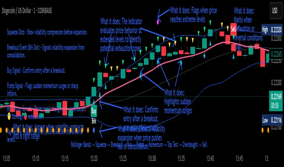
Crypto Breakout Buy/Sell Sequence
⚙️ Components & Sequence Multiple Timeframe (What It Does)
1. Bollinger Bands – Form the foundation by measuring volatility and creating the dynamic range where squeezes and breakouts occur.
2. Squeeze Dots – Show when price compresses inside the bands, signaling reduced volatility before expansion.
3. Breakout Event (Brk Dot) – Fires when price expands beyond the squeeze zone, confirming volatility expansion. (This paints Intra, before candle close)
4. Buy Signal – Confirms entry after a breakout is validated. (This paints at candle close)
5. Pump Signal – Flags sudden surges that extend sharply from the bands, often linked to strong inflows.
6. Momentum Stream – Tracks the strength of movement following the breakout, from continuation (🟢) to slowing (🟡) to exhaustion (🔴). (Resets at Pump Signal)
7. Overbought Indicator – Confirms when momentum has reached overheated conditions, often aligning with band extremes.
8. Sell Signal – Prints when exhaustion/reversal conditions are met, closing the trade cycle.
The Crypto Breakout Buy/Sell Sequence is a no-repaint event indicator that maps a full trade cycle using Bollinger-band-based volatility states: Bollinger Bands → Squeeze → Breakout → Buy → Pump → Momentum → Top Test → Overbought → Sell. Each stage is rule-based and designed to be read on standard candlesticks.
How It Works (System Logic)
Volatility framework: Bollinger Bands define dynamic range and compression/expansion.
Initiation: Squeeze → Breakout confirms expansion; Buy validates participation after expansion begins.
Management: Pump highlights unusual acceleration; Momentum stream tracks continuation → slowing → exhaustion.
Exhaustion/Exit: Top Testing + Overbought build the exhaustion case; Sell marks the sequence end.
How To Use (Quick Guide)
Wait for Squeeze → Breakout → Buy to establish a structured start.
Manage with Momentum:
🟢 continuation, 🟡 slowing, 🔴 exhaustion pressure.
Monitor extremes: Top Testing and/or Overbought = tighten risk.
Exit on Sell or on your risk rules when exhaustion builds.
Limitations & Good Practice
Signals reflect price/volatility behavior, not certainty.
Strong trends can remain extended; Overbought/Top Test ≠ instant reversal.
Always confirm with your own risk rules, position sizing, and market context.
Initial public release: integrated Squeeze/Breakout/Buy → Momentum → Exhaustion → Sell cycle; improved label clarity; cleaned defaults.
Disclaimer
For educational purposes only. Not financial advice. Past performance does not guarantee future results. Test before live use.
Thank You
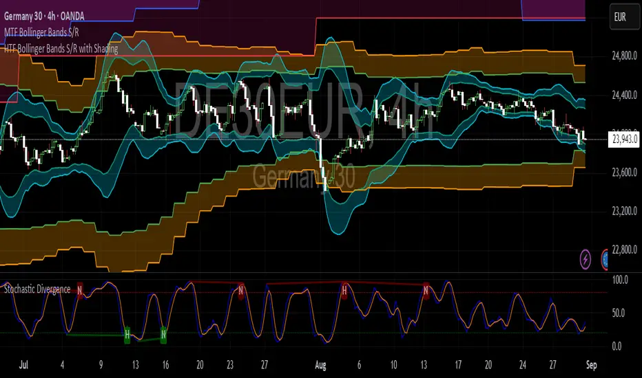
HTF Bollinger Bands S/R with ShadingBollinger Band works as good support and resistance levels. This indicator shows the BB 2SD and 3SD on daily, weekly and monthly on lower timeframes.
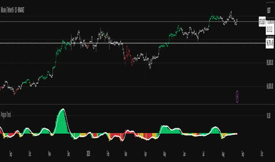
Penguin TrendMeasures the volatility regime by comparing the upper Bollinger Band to the upper Keltner Channel and colors bars with a lightweight trend state. Supports SMA/EMA/WMA/RMA/HMA/VWMA/VWAP and a selectable calculation timeframe. Default settings preserve the original look and behavior.
Penguin Trend visualizes expansion vs. compression in price action by comparing two classic volatility envelopes. It computes:
Diff% = (UpperBB − UpperKC) / UpperKC × 100
* Diff > 0: Bollinger Bands are wider than Keltner Channels -> expansion / momentum regime.
* Diff < 0: BB narrower than KC -> compression / squeeze regime.
A white “Average Difference” line smooths Diff% (default: SMA(5)) to help spot regime shifts.
Trend coloring (kept from original):
Bars are colored only when Diff > 0 to emphasize expansion phases. A lightweight trend engine defines four states using a fast/slow MA bias and a short “thrust” MA applied to ohlc4:
* Green: Bullish bias and thrust > fast MA (healthy upside thrust).
* Red: Bearish bias and thrust < fast MA (healthy downside thrust).
* Yellow: Bullish bias but thrust ≤ fast MA (pullback/weakness).
* Blue: Bearish bias but thrust ≥ fast MA (bear rally/short squeeze).
Note: By default, Blue renders as Yellow to preserve the original visual style. Enable “Use true BLUE color” if you prefer Aqua for Blue.
How it works (under the hood):
* Bollinger Bands (BB): Basis = selected MA of src (default SMA(20)). Width = StdDev × Mult (default 2.0).
* Keltner Channels (KC): Basis = selected MA of src (default SMA(20)). Width = ATR(kcATR) × Mult (defaults 20 and 2.0).
* Diff%: Safe division guards against division-by-zero.
* MA engine: You can choose SMA / EMA / WMA / RMA / HMA / VWMA / VWAP for BB/KC bases, Diff smoothing, and the trend components (VWAP is session-anchored).
* Calculation timeframe: Set “Calculation timeframe” to compute all internals on a chosen TF via request.security() while viewing any chart TF.
Inputs (key ones):
* Calculation timeframe: Empty = use chart TF; if set (e.g., 60), all internals compute on that TF.
* BB: Length, StdDev Mult, MA Type.
* KC: Basis Length, ATR Length, Multiplier, MA Type.
* Smoothing: Average Length & MA Type for the “Average Difference” line.
* Trend Engine: Fast/Slow lengths & MA type; Signal (kept for completeness); Thrust length & MA type (defaults replicate original behavior).
* Display: Paint bars only when Diff > 0; optional Zero line; optional true Blue color.
How to use:
1. Regime changes: Watch Diff% or Average Diff crossing 0. Above zero favors momentum/continuation setups; below zero suggests compression and potential breakout conditions.
2. State confirmation: Use bar colors to qualify expansion: Green/Red indicate expansion aligned with trend thrust; Yellow/Blue flag weaker/contrarian thrust during expansion.
3. Multi-timeframe analysis: Run calculations on a higher TF (e.g., H1/H4) while trading a lower TF chart to smooth noise.
Alerts:
* Diff crosses above/below 0.
* Average Diff crosses above/below 0.
* State changes: GREEN / RED / YELLOW / BLUE.
Notes & limitations:
* VWAP is session-anchored and best on intraday data. If not applicable on the selected calculation TF, the script automatically falls back to EMA.
* Default parameters (SMA(20) for BB/KC, multipliers 2.0, SMA(5) smoothing, trend logic and bar painting) preserve the original appearance.
Release notes:
v6.0 — Rewritten in Pine v6 with structured inputs and guards. Multi-MA support (SMA/EMA/WMA/RMA/HMA/VWMA/VWAP). Calculation timeframe via request.security() for multi-TF workflows. Safe division; optional zero line; optional true Blue color. Original visuals and behavior preserved by default.
License / disclaimer:
© waranyu.trkm — MIT License. Educational use only; not financial advice.
ORB Dashboard for the TFLX Strategy# ORB Range/ATR Dashboard - Technical Indicator Description
## Main Function
This indicator analyzes Opening Range Breakout (ORB) patterns by calculating a defined time period and its relation to historical volatility. The indicator combines multiple technical analysis methods and presents results in a configurable dashboard format.
**Purpose:** This indicator automates the manual calculation steps of the TFLX analysis methodology, providing real-time computation of volatility ratios, trend filters, and risk management parameters that would otherwise require manual calculation and monitoring.
## Requirements and Limitations
**Additional Indicator Required:** This dashboard indicator works in conjunction with a separate ORB range visualization indicator that displays the actual high/low range levels on the chart. The dashboard provides analysis and calculations, while the range indicator provides visual reference points.
**Important Notice:** This indicator serves as an analytical tool and calculation assistant for the TFLX methodology. It does not execute trades automatically but provides data analysis to support manual decision-making processes.
## TFLX Analysis Methodology Framework
### Core Analysis Rules (Discretionary Implementation)
**Primary Conditions:**
- Market position relative to neutral zones (BB analysis)
- Volatility range between 15-60% of ATR(3)
- News event screening (high-impact economic releases)
- Market session timing constraints (before calculated session end)
- US Bank Holiday considerations
**Exception Conditions:**
- High-impact news with rebreak patterns
- Reversal patterns during neutral market conditions
### Technical Specifications of the Methodology
**Range Definition:**
- Time Period: First 15 minutes after market open
- Measurement: High-Low range calculation
- Breakout Trigger: 5-minute close outside established range
**Volatility Analysis:**
- Formula: (Range Points / ATR(3) Previous Day) × 100
- Threshold Ranges:
- <15%: Below minimum threshold
- 15-20%: Low volatility range
- 25-30%: Moderate volatility range
- 30-40%: Good volatility range
- 40-50%: High volatility range
- 50-60%: Very high volatility range
- >60%: Above maximum threshold
**News Event Categories:**
- Major Events: NFP, CPI, PPI, FOMC releases
- Minor Events: All significant economic releases during market hours
- Impact Assessment: Market reaction analysis framework
**Trend Analysis Framework (1H Bollinger Bands):**
- Base Calculation: EMA(200) with standard deviation bands
- Reference Points: Market Open, ORB Close, Trigger Bar
- Decision Logic: 2 out of 3 reference points determine bias
- Zone Classifications:
- Within 0.5 multiplier: Neutral zone
- Within 1.5 multiplier: Directional bias zone
- Outside 1.5 multiplier: Strong directional zone
**Timing Constraints:**
- Session Window: Market open to calculated session end (typically 4.5 hours)
- Retracement Analysis: Maximum adverse movement before breakeven or stop loss
**Manual Calculation Process (Automated by Indicator):**
1. Measure range in points using chart measurement tools
2. Switch to daily timeframe
3. Set ATR period to 3
4. Extract previous day's ATR value
5. Calculate: (Range Points ÷ ATR Value) × 100
6. Apply percentage thresholds for analysis
## Core Components and Calculation Methods
### 1. Opening Range Calculation
**Data Source:** High/Low/Close prices of current timeframe
**Calculation:**
- Defines a configurable time period (default: 15 minutes)
- Collects during this period: `range_high = max(high)` and `range_low = min(low)`
- Calculates Range Size: `range_size = range_high - range_low`
- Stores the last close price of the period: `final_orb_close`
### 2. ATR (Average True Range) Integration
**Data Source:** Daily True Range values
**Calculation:**
```
daily_atr = ta.atr(length) // Default 3 periods
atr_yesterday = daily_atr // Previous trading day
```
**Available Methods:** RMA (default), SMA, EMA, WMA
### 3. Volatility Ratio Calculation
**Formula:**
```
ratio = (range_size / atr_yesterday) * 100
```
**Purpose:** Normalization of current range against historical volatility
**Configurable Parameters:** Min/Max thresholds (default: 15-60%)
### 4. Bollinger Bands Integration (1H Timeframe)
**Data Source:** 1-hour chart data via `request.security()`
**Calculation:**
```
bb_ema = ta.ema(close, 200) // 1H timeframe
bb_std = ta.stdev(close, 200) // 1H timeframe
bb_upper = bb_ema + (bb_std * multiplier)
bb_lower = bb_ema - (bb_std * multiplier)
```
**Configurable Multipliers:**
- Neutral Zone: 0.5x standard deviation
- Strong Zone: 1.5x standard deviation
### 5. Trend Filter System (2/3 Method)
**Components:**
1. **NY Open Signal:** Compares 1H open price with BB levels
2. **ORB Close Signal:** Compares final ORB close with BB levels
3. **Trigger Signal:** Compares breakout price with BB levels
**Logic:**
```
if (bullish_signals >= 2) → "BULLISH"
if (bearish_signals >= 2) → "BEARISH"
else → "MIXED" or "NO TREND"
```
## Component Interaction
### Trade Signal Generation
**Algorithm:**
```
trade_allowed = (orb_ratio >= min_threshold AND orb_ratio <= max_threshold)
AND (bb_signal != "NEUTRAL")
AND (trend_filter_result contains "BULLISH" OR "BEARISH")
```
### Risk Management Calculation
**Entry Points:**
- Long Entry: `range_high`
- Short Entry: `range_low`
**Stop Loss Calculation:**
```
sl_level = range_low + (range_size * sl_position_percent / 100)
```
**Take Profit Calculation:**
```
tp_distance = range_size * tp_factor_percent / 100
long_tp = long_entry + tp_distance
short_tp = short_entry - tp_distance
```
**Position Sizing (CFD-optimized):**
```
risk_per_contract = avg_risk_points * contract_value * lot_size
max_contracts = max_risk_amount / risk_per_contract
```
**Margin Calculation (CFDs):**
```
position_value = total_units * entry_price
margin_required = position_value / leverage
```
## Dashboard Elements
### 1. Volatility Filter Section
- **ORB Range:** Current range in points
- **ATR Previous:** Yesterday's ATR values
- **ORB Ratio:** Calculated ratio with color coding
### 2. Trend Filter Section
- **NY Open vs BB:** Position of 1H open relative to BB
- **ORB Close vs BB:** Position of ORB close relative to BB
- **Trigger Bar vs BB:** Position of breakout price relative to BB
- **Trend Result:** Summary of 2/3 filter
### 3. Risk Management Section (optional)
- **R/R Ratio:** Calculated from TP/SL distances
- **Risk per Lot:** Based on instrument type
- **Max Lot Packages:** Automatic position sizing calculation
- **Margin Required:** For CFD instruments
### 4. Journal Section (optional)
- **Breakout Timing:** Categorization by bars (1-3, 4-6, 7-9, 10-12, 13+)
- **Direction Tracking:** Bullish/Bearish breakout direction
- **Position Analysis:** Distance of breakout to ORB range
## Automatic Instrument Detection
**CFD/Index Treatment:**
```
if (syminfo.type == "cfd" OR syminfo.type == "index")
contract_value = 1.0 * cfd_lot_size
```
**Forex Treatment:**
```
if (syminfo.type == "forex")
contract_value = syminfo.pointvalue * cfd_lot_size
```
**Futures/Stocks:**
```
contract_value = syminfo.pointvalue
```
## Timezone Handling
- All time calculations based on configurable timezone
- Session End Time: ORB Start + 4.5 hours
- Automatic overflow handling for 24h format
## Alert System
**ORB Formation Alert:**
- Triggered upon completion of ORB period
- Includes: Range size, high/low values
**Breakout Alert:**
- Triggered on close price outside ORB range
- Includes: Direction, trade status based on filters
## Configuration Options
- **ORB Period:** Start/end time in hours/minutes
- **ATR Parameters:** Period and calculation method
- **Volatility Thresholds:** Min/max percentage limits
- **BB Parameters:** Period and multipliers
- **Risk Management:** Risk amount, SL/TP positions
- **Dashboard Layout:** Position, size, colors, visibility
## Data Integrity
- State variables with `var` declaration for persistence
- Daily reset of all relevant variables
- Lookahead bias prevention through `barmerge.lookahead_off`
- Multi-timeframe safety through `request.security()` functions
This technical implementation provides a comprehensive analysis framework for Opening Range Breakout patterns with integrated volatility, trend, and risk management components.

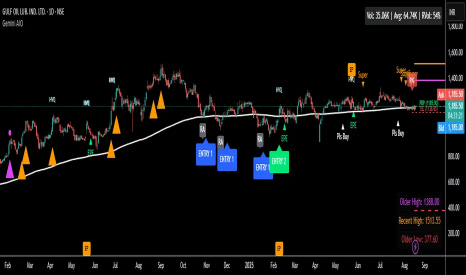
Gemini All-in-OneDescription
The Gemini AIO (All-in-One) is a comprehensive overlay indicator designed for swing and position traders. It merges three distinct and powerful trading strategies into a single, cohesive tool to identify high-probability setups in stocks that are in confirmed uptrends.
What the Indicator Does:
Combines Three Strategies: Integrates a multi-scanner breakout system, a mean-reversion model, and a multi-year breakout tool into one indicator.
Main Modules
Signals Module:
1. Features six unique scanner signals (CS1-CS6) to identify a variety of bullish consolidation patterns.
2. Includes a full trade management framework with RVC (Red Volume Candle), PBP (Post Breakout Pivot Entry), and ISL (Initial Stop Loss) levels.
3. Identifies powerful Episodic Pivot (EP) and EP Entry (EPE) signals for stocks showing exceptional strength.
Reversal Module:
1. A mean-reversion strategy that primarily uses Bollinger Bands to find oversold conditions.
2. Provides a three-stage signal process: RA (Reversal Setup), Entry 1, and Entry 2 to time entries from a potential bottom.
Multi-Year Breakout (MYBO) Module:
1. Automatically identifies and plots historical, multi-year resistance and support levels.
2. Generates a clear signal when the price breaks out above these significant long-term levels.
Advanced Alerts: Features a highly customizable alert system that can be timed to trigger either on the bar's close or at a specific time of day (e.g., 2:30 PM IST), allowing for end-of-day style notifications.
How to Best Use It:
This indicator is most powerful when used with a systematic, rules-based approach. The core principle is to use long-term moving averages to define the trend and then use the indicator's signals to time entries within that trend.
The Foundation (Trend Filter): The most important rule is to only consider long setups on stocks where the 150-day SMA is above the 200-day EMA, and the 150-day SMA is sloping upwards. This keeps you aligned with the primary uptrend.
Strategy 1: The Momentum Breakout (PBP Entry)
1. Confirm the stock meets the primary trend filter rules.
2. Wait for an AIO setup signal (Super, Pls Buy, etc.) to draw a PBP line.
3. Enter when the price crosses above the PBP line or wait for a pull back after the price has crossed the PBP line.
Strategy 2: The Mean Reversion (RA Entry)
1. Confirm the stock meets the primary trend filter rules.
2. Wait for an "RA" (Reversal Setup) signal to appear on the chart.
3. Enter on the "ENTRY 1" (Risky Entry) or "ENTRY 2" signal (Safer Entry) or wait for a pull back after "ENTRY 1" or "ENTRY 2" signal.
Strategy 3: Multi-Year Breakout (MYBO) :
1. A breakout triangle (orange or fuchsia) appears below the candle, signaling a close above the "Recent High" (Orange) or "Older High" (Fuchsia).
2. Recent High refers to the highest price the stock has reached in last 12 months. Breaking above the "Recent High" is a sign of strong current demand.
3. Older High refers to the highest price the stock reached in a more distant, historical period - the period between 5 years ago and 1 year ago. Breaking above the "Older High" is a sign of VERY strong demand as it has broken a historic high.
4. Wait for a breakout triangle to appear on the chart.
5. Enter on the high of the candle marked with a breakout triangle or wait for a pull back after that signal.
Customize Your View: Use the "Inputs" tab to enable/disable the modules you want to focus on and configure the alerts you want to receive. Use the "Style" tab to hide any visual elements you don't need to keep your chart clean.
All-in-One EMA & BBThis script combines Bollinger Bands and multiple EMAs into one powerful tool. It includes:
1) Bollinger Bands with customizable MA type and colors.
2) EMA 21 on Daily and Weekly timeframes.
3) EMA 21, 50, 100, 200 on current chart timeframe.
4) Toggle options for each indicator for a clean, flexible view.
Ideal for traders seeking multi-timeframe trend analysis and volatility insights.

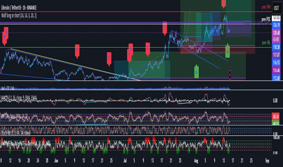
Wolf long or short this indicator is based on RSI, Stoch, BB , this indicator is giving a better understanding of short or long combined with 3 indicator
Tony O's Euler BandsTony O’s Euler Bands is a volatility-based overlay that uses the mathematical constant e (~2.71828) to scale price bands in a non-linear way. Unlike traditional Bollinger Bands or Keltner Channels, these bands are spaced by exponential functions of volatility (σ), creating zones that expand and contract more dynamically across different market regimes.
How it works:
A configurable moving average (EMA/SMA/RMA/WMA) is used as the basis.
Volatility (σ) is calculated as the standard deviation of returns over a user-defined lookback.
Four band levels are plotted above and below the basis at distances equal to:
basis × 𝑒^(𝑚⋅𝜎⋅𝑘)
where m is a user multiplier and k = {2, 4, 6, 8} for each successive band.
This produces inner bands that highlight mild deviations and outer bands that signal extreme moves.
What makes it unique:
Uses e as the base for band expansion instead of linear multiples or Fibonacci ratios.
Bands scale multiplicatively, making them more consistent across assets and price scales.
Multiple symmetric bands per side, color-coded from green (mild) to purple (extreme) for intuitive visual cues.
Optional transparent fill to show volatility envelopes without obscuring price action.
How to use:
Trend monitoring: Sustained closes beyond an inner band can indicate momentum; closes beyond outer bands can signal overextension.
Reversion spotting: Touches on extreme bands (level 4) can highlight potential exhaustion points.
Works on any asset/timeframe; adjust basis length, volatility lookback, and multiplier to suit your market.

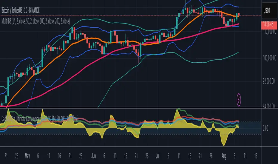
Multi-Length Quad Bollinger BandsHere is a Pine Script code for TradingView that plots four separate Bollinger Bands on your chart. The lengths are preset to 14, 50, 100, and 200, but every aspect—including lengths, standard deviations, colors, and the source price—is fully customizable through the script's settings menu.
The 14 and 50-period bands are enabled by default, while the 100 and 200-period bands are disabled to keep the chart clean initially. You can easily toggle any of them on or off.