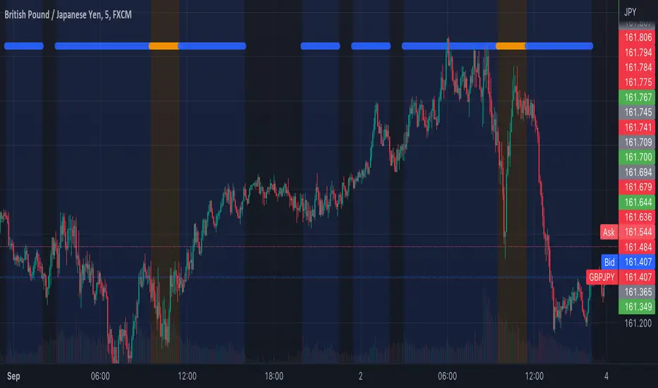
Tosch Market Sessions (US/GB/JP)Library "Tosch Market Sessions"
Returns if the NYSE, London SE, Tokyo SE are open
@function Returns if the NYSE (US), London SE (GB), Tokyo SE (JP) are open
@returns
bus, bgb, bjp - bool: true if the corresponding exchange is open
count - int: count of how many exchanges are open at the moment
ccolor - color: color that indicates the number of open exchanges
0 => color.black
1 => color.blue
2 => color.orange
3 => color.white
Cari dalam skrip untuk "session"
Time Sessions - S/RThis scripts shows you some time sessions such as NY open, NY mid, London Open and Daily Close for UTC - 0
It also plots resistance and support based on the last 15 candles but you can change it in settings.

Market Sessions(4sessions)Special for CLUB SM))) Special for CLUB SM))) Special for CLUB SM))) Special for CLUB SM))) Special for CLUB SM))) Special for CLUB SM))) Special for CLUB SM))) Special for CLUB SM))) Special for CLUB SM))) Special for CLUB SM))) Special for CLUB SM))) Special for CLUB SM))) Special for CLUB SM))) Special for CLUB SM))) Special for CLUB SM))) Special for CLUB SM))) Special for CLUB SM))) Special for CLUB SM))) Special for CLUB SM))) Special for CLUB SM))) Special for CLUB SM))) Special for CLUB SM))) Special for CLUB SM))) Special for CLUB SM))) Special for CLUB SM))) Special for CLUB SM))) Special for CLUB SM))) Special for CLUB SM))) Special for CLUB SM))) Special for CLUB SM))) Special for CLUB SM))) Special for CLUB SM))) Special for CLUB SM))) Special for CLUB SM))) Special for CLUB SM))) Special for CLUB SM))) Special for CLUB SM))) Special for CLUB SM))) Special for CLUB SM))) Special for CLUB SM))) Special for CLUB SM))) Special for CLUB SM))) Special for CLUB SM))) Special for CLUB SM))) Special for CLUB SM))) Special for CLUB SM))) Special for CLUB SM))) Special for CLUB SM))) Special for CLUB SM))) Special for CLUB SM))) Special for CLUB SM))) Special for CLUB SM))) Special for CLUB SM))) Special for CLUB SM))) Special for CLUB SM))) Special for CLUB SM))) Special for CLUB SM))) Special for CLUB SM))) Special for CLUB SM))) Special for CLUB SM))) Special for CLUB SM))) Special for CLUB SM))) Special for CLUB SM))) Special for CLUB SM))) Special for CLUB SM))) Special for CLUB SM))) Special for CLUB SM))) Special for CLUB SM))) Special for CLUB SM))) Special for CLUB SM))) Special for CLUB SM))) Special for CLUB SM))) Special for CLUB SM))) Special for CLUB SM))) Special for CLUB SM))) Special for CLUB SM))) Special for CLUB SM))) Special for CLUB SM))) Special for CLUB SM))) Special for CLUB SM))) Special for CLUB SM))) Special for CLUB SM))) Special for CLUB SM))) Special for CLUB SM))) Special for CLUB SM))) Special for CLUB SM))) Special for CLUB SM))) Special for CLUB SM))) Special for CLUB SM))) Special for CLUB SM))) Special for CLUB SM))) Special for CLUB SM))) Special for CLUB SM))) Special for CLUB SM))) Special for CLUB SM))) Special for CLUB SM))) Special for CLUB SM))) Special for CLUB SM))) Special for CLUB SM))) Special for CLUB SM))) Special for CLUB SM))) Special for CLUB SM))) Special for CLUB SM))) Special for CLUB SM))) Special for CLUB SM))) Special for CLUB SM))) Special for CLUB SM))) Special for CLUB SM))) Special for CLUB SM))) Special for CLUB SM))) Special for CLUB SM))) Special for CLUB SM))) Special for CLUB SM))) Special for CLUB SM))) Special for CLUB SM))) Special for CLUB SM))) Special for CLUB SM))) Special for CLUB SM))) Special for CLUB SM))) Special for CLUB SM))) Special for CLUB SM))) Special for CLUB SM))) Special for CLUB SM))) Special for CLUB SM))) Special for CLUB SM))) Special for CLUB SM))) Special for CLUB SM))) Special for CLUB SM))) Special for CLUB SM))) Special for CLUB SM))) Special for CLUB SM))) Special for CLUB SM))) Special for CLUB SM))) Special for CLUB SM))) Special for CLUB SM))) Special for CLUB SM))) Special for CLUB SM))) Special for CLUB SM))) Special for CLUB SM))) Special for CLUB SM))) Special for CLUB SM))) Special for CLUB SM))) Special for CLUB SM))) Special for CLUB SM))) Special for CLUB SM))) Special for CLUB SM))) Special for CLUB SM))) Special for CLUB SM))) Special for CLUB SM))) Special for CLUB SM))) Special for CLUB SM))) Special for CLUB SM))) Special for CLUB SM))) Special for CLUB SM))) Special for CLUB SM))) Special for CLUB SM))) Special for CLUB SM))) Special for CLUB SM))) Special for CLUB SM))) Special for CLUB SM))) Special for CLUB SM))) Special for CLUB SM))) Special for CLUB SM))) Special for CLUB SM))) Special for CLUB SM))) Special for CLUB SM))) Special for CLUB SM))) Special for CLUB SM))) Special for CLUB SM))) Special for CLUB SM))) Special for CLUB SM))) Special for CLUB SM))) Special for CLUB SM))) Special for CLUB SM))) Special for CLUB SM))) Special for CLUB SM))) Special for CLUB SM))) Special for CLUB SM))) Special for CLUB SM))) Special for CLUB SM))) Special for CLUB SM))) Special for CLUB SM))) Special for CLUB SM))) Special for CLUB SM))) Special for CLUB SM))) Special for CLUB SM))) Special for CLUB SM))) Special for CLUB SM))) Special for CLUB SM))) Special for CLUB SM))) Special for CLUB SM))) Special for CLUB SM))) Special for CLUB SM))) Special for CLUB SM))) Special for CLUB SM))) Special for CLUB SM))) Special for CLUB SM))) Special for CLUB SM))) Special for CLUB SM))) Special for CLUB SM))) Special for CLUB SM))) Special for CLUB SM))) Special for CLUB SM))) Special for CLUB SM))) Special for CLUB SM))) Special for CLUB SM))) Special for CLUB SM))) Special for CLUB SM))) Special for CLUB SM))) Special for CLUB SM))) Special for CLUB SM))) Special for CLUB SM))) Special for CLUB SM))) Special for CLUB SM))) Special for CLUB SM))) Special for CLUB SM))) Special for CLUB SM))) Special for CLUB SM))) Special for CLUB SM))) Special for CLUB SM))) Special for CLUB SM))) Special for CLUB SM))) Special for CLUB SM))) Special for CLUB SM))) Special for CLUB SM))) Special for CLUB SM))) Special for CLUB SM))) Special for CLUB SM))) Special for CLUB SM))) Special for CLUB SM))) Special for CLUB SM))) Special for CLUB SM))) Special for CLUB SM))) Special for CLUB SM))) Special for CLUB SM))) Special for CLUB SM))) Special for CLUB SM))) Special for CLUB SM))) Special for CLUB SM))) Special for CLUB SM))) Special for CLUB SM))) Special for CLUB SM))) Special for CLUB SM))) Special for CLUB SM))) Special for CLUB SM))) Special for CLUB SM))) Special for CLUB SM))) Special for CLUB SM))) Special for CLUB SM))) Special for CLUB SM))) Special for CLUB SM))) Special for CLUB SM))) Special for CLUB SM))) Special for CLUB SM)))

Market Maker Session TimesThis indicator is design to mark out the session times for the Market Maker Method. All times are on NY time however you do not need to change your personal timezone.
The colours are also changeable, here's what the standard version are:
Asia Session - Green
UK Session - Yellow
US Session - Red
Dead Zone - Grey
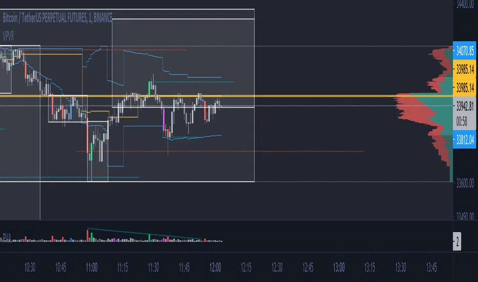
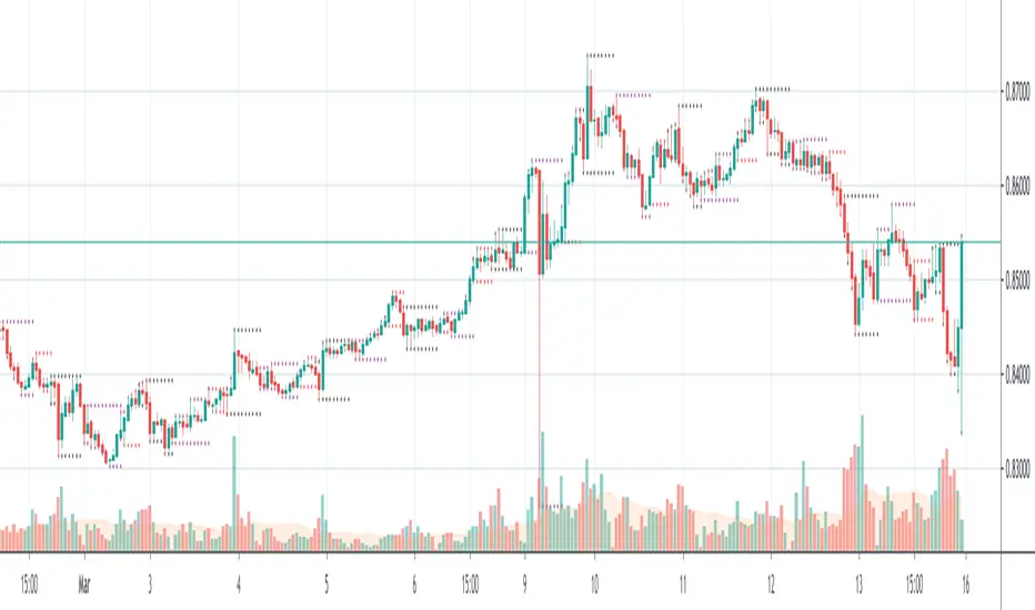
Single Prints - Session Initial BalancesDisclaimer: Expose yourself to the knowledge of different trading methods. If you are unaware of what a Single Print is then do some research and broaden your knowledge.
This indicator has only been tested on BTCUSDT Binance pair. This indicator is meant to be used on the 30 minute timeframe to highlight Single Prints.
The calculations are base on 0000 UTC and what Single Prints are created during that day.
Single Prints
Single Prints are where prices moves to fast through an area (on a 30 minute timeframe), in the case of this indicator in $50 intervals, where the price has not yet cross back past, represented as orange lines. If you were viewing this on a Time Price Opportunity Chart (TPO) each $50 would be represented as a square with a letter in it. If price has only been through that area once, within that 24 hour period, then it is called a Single Print. If however the Single Print is on the lower wick of the candle it is called a Buying Tail and on the Upper Wick a Selling Tail.
Single Prints leave low volume nodes with liquidity gaps, these inefficient moves tend to get filled, and we can seek trading opportunities once they get filled, or we can also enter before they get filled and use these single prints as targets.
Single Prints are a sign of emotional buying or selling as very little time was spent at those levels and thus there is no value there.
The endpoints of single print sections are considered to be potential support or resistance points and or get filled (like a CME gap).
The above is only a very short summary, to understand Single Prints, Buying Tails and Selling Tails more please do your own research (DYOR).
References:
Trading Riot Volume Profile - Website
TOROS TPO Charts Explained - Youtube
Session Boxes
Session Boxes are the high and low of that markets session before the new market session opens. I used the data from the website Trading Hours for the time input.
White box – Start of day UTC 0000 to Market Close UTC 2000
Purple box – Asia Start UTC 0130 to London Start UTC 0700
Yellow box – London Start UTC 0700 to New York Start UTC 1330
Blue box – New York Start UTC 1330 to Market Close UTC 2000
Red box – Market Close UTC 2000 to End of day UTC 2359
References:
Trading Hours - Website
Initial Balance
The Initial Balance is the market range between the high and low of the first hour of trading for the market. In the case of crypto when is the Initial Balance if it is 24/7.
Context of Initial Balance:
The Initial Balance is traditionally the range of prices transacted in the first hour of trade. Many regard the Initial Balance as a significant range because, especially for the index futures which are tied to the underlying stocks, orders entered overnight or before the open are typically executed prior to the end of the first hour of trade. Some use it to understand how the rest of the day may develop, while others use it as a span of time to avoid trading altogether because of its potential volatility.
For this indicator I have coded the Initial Balance time as below:
White Box - To appear for the first hour of the day 0000 to 0100 UTC .
Purple Box - To appear for the first hour of the day 0130 to 0230 UTC .
Yellow Box - To appear for the first hour of the day 0700 to 0800 UTC .
Blue Box - To appear for the first hour of the day 1330 to 1430 UTC .
Red Box - To appear for the first hour of the day 2000 to 2100 UTC .
The diagram above shows some examples:
How price (white arrows) retraces the single prints.
How price (red arrows) uses the single prints as S/R.
References:
Not Hard Trading – Website
My Pivots Initial Balance - Website
Thanks go to:
StackOverFlow Bjorn Mistiaen
Trading View user mvs1231
Please message me if you have any feedback/questions.
I am looking at developing this indicator further in the future.

ICT Market SessionsThis indicator highlights sessions, kill-zones and significant time elements on the chart based on ITC's method.
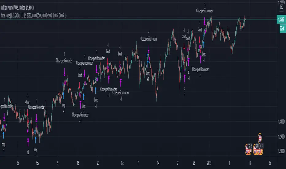
London Breakout/Session GBP/USD Forex DaytradeThis is a forex strategy suited for day traders, specialized in the london breakout session
The key elements for this strategy are the specific london time session, together with an exit time(before asian trade/at the end of new york session).
At the same time, as logic elements we only use price action inside like :
For long we have 3 ascending candles, and for short we have 3 descending candles.
For exit we have both TP/SL based on price percentage movement, or we exit if we reach the end of the day.
If you have any questions message me in private !

Trading Sessions by Aflaq for UF TradersThis indicator is meant for traders under the UF Program who needs a quick way to show multiple sessions high and low
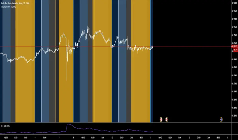
Mountain Time SessionsEdited sessions time zones for people in the Mountain Time Zone. thanks to original creator ChrisMoody.

Market Profile for Futures with Session and After Hours SplitAdapted existing Market Profile scripts to be move suitable for Futures Markets with Session and After Hours split
Script Provides split Market Profiles for Session and After Hours
Users can customize the Session and AH hours inputs to suit any ticker and their interpretation of prime and non-prime hours

Fx Sessions For CryptoFx Sessions for crypto traders. High Volatility occurs at weekends, and NY-Assia overlap in week days.


Fx SessionsThis script displays a lower strip to be aware of Fx Sessions (London, NY and Tokyo). Please pay attention to the pre London "Kill Zone" which comprehends the Gap between the Tokyo close (End of Yellow Strip) and the London open (Beginning of Aqua Strip).
Courtesy from Kevin Prudhom from Octopus Fx Academy.

BO_EXPIRY_VDUB_v1Set Background to custom Trading sessions & set custom Binary Options expiry times.

Tom's Session Lows & HighsJust a simple indicator showing previous day, Asian Session & London Session lows and highs.

NQ ICT NY Session ChecklistNQ ICT NY Session Checklist
A manual, on-chart checklist indicator designed to enforce ICT execution rules during the New York session on Nasdaq (NQ). The script displays a step-by-step confirmation panel for higher-timeframe bias, liquidity identification, liquidity sweep, market structure shift, fair value gap entry, and risk/reward validation. It helps prevent early entries, FOMO, and overtrading by clearly indicating when all conditions are met and the trader is ready to execute.

HTB NY Session VWAP with Prev CloseVisual Distinction: The current VWAP is a bold pink line that moves with price, while the previous VWAP appears as a static, thin gray line, providing a clear "anchor" from yesterday's value.
Many institutional traders look for "Value Area" relationships. If today's price opens above the Previous Session VWAP, the market is considered "internally bullish." If it fails to hold that level and crosses below it, it often signals a "mean reversion" or a trend reversal.
Would you like me to add an alert that triggers specifically when the current price touches the Previous Session VWAP line?
