Fractal Pullback Market StructureFractal Pullback Market Structure
Author: The_Forex_Steward
License: Mozilla Public License 2.0
The Fractal Pullback Market Structure indicator is a sophisticated price action tool designed to visualize internal structure shifts and break-of-structure (BoS) events with high accuracy. It leverages fractal pullback logic to identify market swing points and confirm whether a directional change has occurred.
This indicator detects swing highs and lows based on fractal behavior, drawing zigzag lines to connect these key pivot points. It classifies and labels each structural point as either a Higher High (HH), Higher Low (HL), Lower High (LH), or Lower Low (LL). Internal shifts are marked using triangle symbols on the chart, distinguishing bullish from bearish developments.
Break of Structure events are confirmed when price closes beyond the most recent swing high or low, and a horizontal line is drawn at the breakout level. This helps traders validate when a structural trend change is underway.
Users can configure the lookback period that defines the sensitivity of the pullback detection, as well as a timeframe multiplier to align the logic with higher timeframes such as 4H or Daily. There are visual customization settings for the zigzag lines and BoS markers, including color, width, and style (solid, dotted, or dashed).
Alerts are available for each key structural label—HH, HL, LH, LL—as well as for BoS events. These alerts are filtered through a selectable alert mode that separates signals by timeframe category: Low Timeframe (LTF), Medium Timeframe (MTF), and High Timeframe (HTF). Each mode allows the user to receive alerts only when relevant to their strategy.
This indicator excels in trend confirmation and reversal detection. Traders can use it to identify developing structure, validate internal shifts, and anticipate breakout continuation or rejection. It is particularly useful for Smart Money Concept (SMC) traders, swing traders, and those looking to refine entries and exits based on price structure rather than lagging indicators.
Visual clarity, adaptable timeframe logic, and precise structural event detection make this tool a valuable addition to any price action trader’s toolkit.
Sentiment

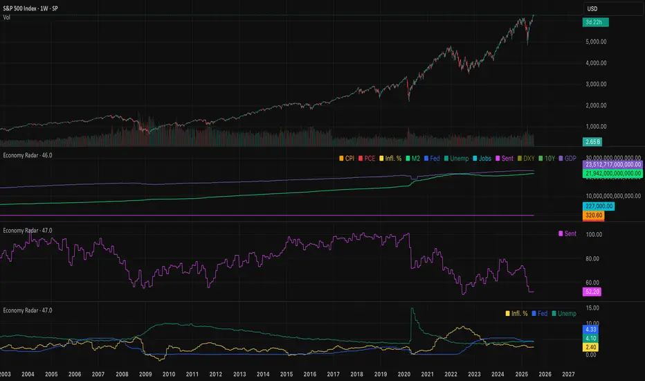
Economy RadarEconomy Radar — Key US Macro Indicators Visualized
A handy tool for traders and investors to monitor major US economic data in one chart.
Includes:
Inflation: CPI, PCE, yearly %, expectations
Monetary policy: Fed funds rate, M2 money supply
Labor market: Unemployment, jobless claims, consumer sentiment
Economy & markets: GDP, 10Y yield, US Dollar Index (DXY)
Options:
Toggle indicators on/off
Customizable colors
Tooltips explain each metric (in Russian & English)
Perfect for spotting economic cycles and supporting trading decisions.
Add to your chart and get a clear macro picture instantly!
Open Interest Screener
Open Interest Screener
Traders often wonder: how do you enter a trend before it takes off — not at the very peak? Most classic technical indicators lag behind price. So what could you add to your system to catch a move earlier?
🔍 Enter the Open Interest Screener!
I've personally relied on this metric for years while trading crypto. It helps detect abnormal spikes in open interest — sudden increases in the number of outstanding derivative contracts — which often signal that something big is about to happen. These moments can mark the very start of a major trend.
🧠 How to use it:
Go long if price is rising and there's a spike in open interest on the way up.
Go short if price is falling and open interest rises during the decline.
Exit positions when open interest sharply drops — this may indicate the move is losing momentum.
⚙️ Settings & Customization:
Bars to look back — defines how far back the script looks to detect % changes in open interest.
OI % Change Threshold — adjust this to control sensitivity; higher = fewer, stronger signals.
Exchange source toggles — choose between BitMEX (USD/USDT) and Kraken data feeds.
Show Spike Zones — enable or disable visual highlights for detected spikes.
📌 Tips:
Configure the indicator for your preferred cryptocurrency pair and timeframe.
Visually validate that the OI spikes look meaningful and are not cluttering the chart.
Optimal settings vary by asset — take time to test and tune them for each coin.
With this tool, you're no longer guessing where the trend might begin — you're tracking the intent of market participants as it unfolds. Use it as part of a broader system and stay ahead of the herd.
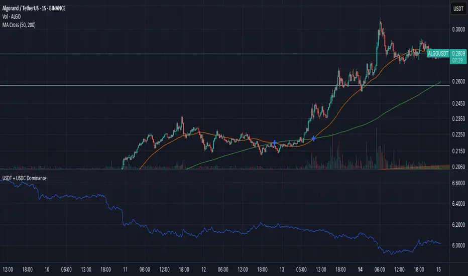
USDT + USDC Dominance USDT + USDC Dominance: This refers to the combined market capitalization of Tether (USDT) and USD Coin (USDC) as a percentage of the total cryptocurrency market capitalization. It measures the proportion of the crypto market held by these stablecoins, which are pegged to the US dollar. High dominance indicates a "risk-off" sentiment, where investors hold stablecoins for safety during market uncertainty. A drop in dominance suggests capital is flowing into riskier assets like altcoins, often signaling a bullish market or the start of an "alt season.


USDT + USDC DominanceUSDT and USDC Dominance: This refers to the combined market capitalization of Tether (USDT) and USD Coin (USDC) as a percentage of the total cryptocurrency market capitalization. It measures the proportion of the crypto market held by these stablecoins, which are pegged to the US dollar. High dominance indicates a "risk-off" sentiment, where investors hold stablecoins for safety during market uncertainty. A drop in dominance suggests capital is flowing into riskier assets like altcoins, often signaling a bullish market or the start of an "alt season."
RSI(14) Custom by ChadRSI 14 : this indicator works in low time frame like 1h and 4h, for entry long position and short position. when the line touch 70 mean the price is overbought, when the line touch 50 it"s neutral, and when the line touch 30 mean price is oversold.

Ultimate Poker Bluff Strategy🎲 Ultimate Poker Bluff Strategy (Intraday Trading)
This strategy integrates multiple sophisticated concepts into a dynamic intraday trading system designed to identify and capitalize on short-term market inefficiencies (fake pumps and fakeouts).
The fake pump indicator can be found here:
📌 Core Concepts & Logic
This TradingView (Pine Script) strategy combines:
Poker principles:
Pot Odds: Ensures a positive risk-reward ratio (at least 2:1).
Bluff Detection: Identifies fake pumps or unnatural price movements using arbitrage detection methods relative to a benchmark (e.g., DXY).
Blackjack "Forbidden Strategy" principles:
Dynamically adjusts the position size based on the profitability of recent trades, scaling up slightly after wins and scaling down after losses.
Devil’s Game (Risk Management):
Implements strict capital protection rules by capping the maximum allowed position size, safeguarding your capital against rare and extreme market events.
⚙️ Detailed Explanation of Parameters
🎛 Strategy Inputs
Basis Risk % per Trade (baseRiskPercent): The baseline percentage of capital risked per trade (default is 1%).
TP ATR Multiplier (atrTPMultiplier = 3.0): Defines the profit target as a multiple of the ATR (Average True Range).
SL ATR Multiplier (atrSLMultiplier = 0.5): Defines the stop-loss level as a multiple of ATR. A tight SL ensures high Reward/Risk.
ATR Length (atrLength = 10): Period for ATR calculation to measure volatility.
Max Position per Trade ($) (maxAbsolutePosition): Maximum allowed position size in USD to protect from catastrophic losses (default is $100,000).
Fake Pump Scale (k) (k = 0.25): Sensitivity setting for detecting unusual price discrepancies (fake pumps).
Benchmark Asset (benchmarkTicker = "DXY"): The asset used as a reference benchmark for arbitrage detection.
📈 Indicators & Calculations
Volatility Measurement (ATR)
Uses the ATR indicator to set dynamic take-profit and stop-loss levels:
Take Profit = current price + (ATR × 3)
Stop Loss = current price − (ATR × 0.5)
Fake Pump Detection (Arbitrage Indicator)
Measures deviations from expected asset price based on a constant relation with a benchmark (e.g., DXY).
Generates EMAs (arb_ema_fast and arb_ema_slow) to detect abnormal short-term movements.
Defines upper and lower thresholds (arb_threshold) to identify potential fake pumps or unsustainable price spikes.
Gamma Stability Check
Ensures stable market conditions by confirming that the difference between fast and slow EMAs (arb_ema_fast and arb_ema_slow) remains small. Trades are entered only during stable conditions to avoid high volatility periods.
🔄 Dynamic Blackjack Position Sizing
Adjusts position sizing dynamically based on previous trade results:
Profitable last trade → Increase risk slightly (up to a cap of 3%).
Losing last trade → Reduce risk to 75% of base risk, enhancing capital protection.
🚨 Entry & Exit Logic
Long Entry Conditions:
Fast EMA crosses above Slow EMA (bullish crossover).
Market is stable (gamma_stable condition true).
Previous candle indicated a downward fake pump (isFakePumpDown ).
Short Entry Conditions:
Fast EMA crosses below Slow EMA (bearish crossover).
Market is stable (gamma_stable condition true).
Previous candle indicated an upward fake pump (isFakePumpUp ).
Risk-Reward Validation: Only enters trades when the risk-reward ratio is at least 2:1.
🛡️ Capital Protection (Devil’s Game Principle)
Ensures no single trade exceeds the absolute maximum allowable position size, providing protection against rare, catastrophic events.
🖥️ Visual Plots for Analysis
Triangles: Visual indications of detected fake pumps:
🔻 Red down arrow: Potential fake upward spike.
🔺 Green up arrow: Potential fake downward spike.
🎯 Strategy Goals & Benefits
Identifies high-probability intraday trades using a rigorous probabilistic framework inspired by professional gambling strategies.
Limits exposure effectively, scaling position size strategically to capitalize on profitable sequences and minimize the impact of losing streaks.
Ensures long-term capital growth with disciplined risk and reward management.
This is just an experiment on how to identify fake moves in the market which works especially in lower timeframe. This is not financial advice.

[Enhanced] L1 Banker Move🧠 L1 Banker Move
This is a multi-layered momentum signal tool designed to reveal institutional activity before major price moves. It combines deep liquidity detection, price pressure dynamics, and short-term investor alignment to deliver actionable signals with clarity and precision.
Key Features:
🔴 Institutional Signal
Detects potential Level 1 banker moves based on deep price compression and long-term sweep logic (Lowest Low 90 + smoothed momentum spikes).
🔵 Institutional Build Phase
Shows stealth accumulation/distribution zones using low volatility buildup and compression-based ratios over the past 30 bars.
🟢 Short-Term Investor Signal
Confirms price shifts with VWAP cross, SMA structure, and fast/slow EMA delta acceleration. Useful for timing precision entries after institutional setups.
💜 Combined Strength Histogram
A composite momentum bar that blends all three layers to visually rank the power of each setup.
🎯 Smart Highlighting & Alerts
Background turns red when an institutional signal appears without retail confirmation—flagging early entry traps or front-running zones. Includes alert conditions to notify you of optimal entry moments.
Customization:
Adjust the EMA delta sensitivity
Choose your preferred institutional timeframe (default: Daily)

[Enhanced] L1 Banker MoveThis is a multi-layered momentum signal tool designed to reveal institutional activity before major price moves. It combines deep liquidity detection, price pressure dynamics, and short-term investor alignment to deliver actionable signals with clarity and precision.
Key Features:
🔴 Institutional Signal
Detects potential Level 1 banker moves based on deep price compression and long-term sweep logic (Lowest Low 90 + smoothed momentum spikes).
🔵 Institutional Build Phase
Shows stealth accumulation/distribution zones using low volatility buildup and compression-based ratios over the past 30 bars.
🟢 Short-Term Investor Signal
Confirms price shifts with VWAP cross, SMA structure, and fast/slow EMA delta acceleration. Useful for timing precision entries after institutional setups.
💜 Combined Strength Histogram
A composite momentum bar that blends all three layers to visually rank the power of each setup.
🎯 Smart Highlighting & Alerts
Background turns red when an institutional signal appears without retail confirmation—flagging early entry traps or front-running zones. Includes alert conditions to notify you of optimal entry moments.
Customization:
Adjust the EMA delta sensitivity
Choose your preferred institutional timeframe (default: Daily)

Inverted USDT.DSignal Logic at a Glance
Exits happen automatically if price crosses EMA200 in the opposite direction, or whenever any SAR cross occurs (strict stop on your “risky” trades).
The indicator’s core logic uses a 200-period EMA crossover on USDT.D (and optionally VIX) to define the primary trend—price crossing above the EMA closes shorts and opens longs, while crossing below does the opposite—and then layers on “risky” entries whenever the Parabolic SAR flips within that trend (SAR dot appearing below price in an uptrend for add-on longs, above price in a downtrend for add-on shorts). All positions—main and risky—are closed automatically if price crosses the EMA against your trade or any SAR cross occurs. An invert toggle flips every entry/exit rule, letting you trade the opposite signals, and identical logic runs in parallel on VIX to offer complementary or hedged signals.
Step-by-Step Usage Example
1. Set your timeframe (e.g., Daily or 4H).
2. Watch for the Main Long label (green arrow up).
3. When it appears, the strategy will close any short and open a new long.
4. Optionally, use a Sar Long label as a signal to add to your position.
5. Stay in the trade while price remains above EMA200.
6. Exit on either a Main Short or when SAR flips against you.
Tips for Real-World Trading
• Turn on alerts for each label type so you never miss a signal.
• Use the built-in Strategy Tester to optimize your SAR parameters and position sizing.
• Combine with a fixed stop-loss or take-profit discipline off-chart.
• Experiment with the Invert Signal toggle in different market regimes.

Dynamic Spot vs Perps Premium (Area Plot)This is a script to give you an easy overall view on the spot perp premium which could indicate the momentum is drove by spot or perps

Highs and Lows By ScalprHighs & Lows (HL) – Multi-Time-Frame Levels
What It Does
Highs & Lows plots the most important reference levels for up to four different time-frames at once. It displays divider lines that mark the start of each new period, opening lines showing the first price of the period, highs lines tracking the highest price reached, and lows lines tracking the lowest price reached in each period. Use it to read market structure at a glance, trade opening-range returns, gap fills, sweeps and other level-based setups.
Key Features
Multi-Time-Frame Engine
Choose from 4 Hour, 1 Hour, 30 minutes, 15 minutes, 10 minutes, 5 minutes, Daily, Weekly or Monthly for each of the four slots. Turn individual slots on/off from one global panel for easy management.
Per-Time-Frame Display Controls
For every active slot you can independently toggle divider lines, opening lines, highs lines, lows lines, and hide current opening to keep only completed periods visible.
Smart "Show Last X" Filters
Keep charts clean by limiting history. Control how many recent periods to show for lines and how many recent text labels to display. For example, show only the last 2 hours on a 1-hour chart.
Hide Swept Highs/Lows
Automatically hide any highs or lows that price has traded through, keeping your chart clean and focused only on unswept levels that remain relevant.
Text Labels
Add optional custom text for highs and lows like "H1" and "L1". Labels automatically position above highs and below lows with horizontal alignment options of left, center, or right. Adjust color, size and font weight to match your preferences.
Styling Freedom
Independent color, line style including solid, dashed, or dotted options, and width settings for each level type. Transparency is applied automatically when hiding current period information.
How to Use
Start by enabling the time-frame slots you need in Global Settings. In Multi-Time-Frame Settings, pick the interval for each slot and toggle which lines you want displayed. Fine-tune visibility using "Show Last X" in Time-Frame Lines to limit historical lines, and "Show Last X" in Text to limit labels. Adjust colors and widths in the Time-Frame Lines sections to match your chart theme.
Notes
The script is lightweight and deletes old objects in real time to maintain TradingView's limits. It works on any symbol and chart resolution with levels updating live. Text labels are purely textual with no background boxes to maximize clarity and reduce chart clutter.
Happy trading and stay level-headed!

TTT Sentiment IndicatorThis indicator plots the NYSE uptick vs. downtick volume ratios and can be used as a short-term sentiment indicator of buying pressure (FOMO) when UVOL/DVOL is high and selling pressure (panic selling) when DVOL/UVOL is high. These ratios are used informally by Chris Vermeulen of The Technical Traders as a contrarian indicator on a 30 minute chart.
This script isn't created, approved, or supported by The Technical Traders, but was created by a TTT subscriber to support the request of other subscribers. I'm not planning to upgrade or support this indicator or answer questions on how to use it. It's open source, so users can make their own copy and edit as they see fit.

GalihRidha ZoneX — Adaptive MTF S&R + Smart Money AreasWelcome to ZoneX: The new frontier of Support & Resistance for modern traders!
ZoneX is more than just S&R — it’s a hybrid price map that fuses classic pivots with institutional logic, visualizing the zones that really matter.
What Makes ZoneX Different?
Multi-Timeframe S&R:
Instantly spot the true key levels from higher timeframes, not just what everyone else sees on the current chart.
Smart Money Order Blocks:
Automatically highlights supply and demand zones where institutions accumulate or distribute — find the real “trap” areas and avoid getting faked out.
VWAP Bands:
See where the liquidity is thickest — these bands act as magnets for price, great for both reversals and breakouts.
Midline Channel:
Identify the market’s equilibrium — know when you’re in value and when you’re at the edge.
Previous High/Low:
Mark institutional magnets and classic stop-hunt zones, updated in real-time.
Ultra Customizable:
One-click to enable/disable any feature. Clean for minimalists, packed for pros.
How to Use ZoneX
Breakout?
Wait for price to clear a ZoneX band or order block with momentum — enter on the retest.
Reversal?
Fade wicks and exhaustion right in the highlighted zone — confirm with price action or volume.
Range/Balance?
Trade the ping-pong between ZoneX midline and outer bands — great for scalping and mean reversion.
Who’s It For?
Active traders who want an edge beyond standard S&R.
Institutional-mindset scalpers and swing traders.
Anyone who loves a clean chart but craves real market context.
Level up your chart, see what the big players see —
and never trade blind again. This is ZoneX.

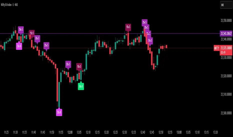
Delta Spike Detector [GSK-VIZAG-AP-INDIA]📌 Delta Spike Detector – Volume Imbalance Ratio
By GSK-VIZAG-AP-INDIA
📘 Overview
This indicator highlights aggressive buying or selling activity by analyzing the imbalance between estimated Buy and Sell volume per candle. It flags moments when one side dominates the other significantly — defined by user-selectable volume ratio thresholds (10x, 15x, 20x, 25x).
📊 How It Works
Buy/Sell Volume Estimation
Approximates buyer and seller participation using candle structure:
Buy Volume = Proximity of close to low
Sell Volume = Proximity of close to high
Delta & Delta Ratio
Delta = Buy Volume − Sell Volume
Delta Ratio = Ratio of dominant volume side to the weaker side
When this ratio exceeds a threshold, it’s classified as a spike.
Spike Labels
Labels are plotted on the chart:
10x B, 15x B, 20x B, 25x B → Buy Spike Labels (below candles)
10x S, 15x S, 20x S, 25x S → Sell Spike Labels (above candles)
The color of each label reflects the spike strength.
⚙️ User Inputs
Enable/Disable Buy or Sell Spikes
Set custom delta ratio thresholds (default: 10x, 15x, 20x, 25x)
🎯 Use Cases
Spotting sudden aggressive activity (e.g. smart money moves, traps, breakouts)
Identifying short-term market exhaustion or momentum bursts
Complementing other trend or volume-based tools
⚠️ Important Notes
The script uses approximated Buy/Sell Volume based on price position, not actual order flow.
This is not a buy/sell signal generator. It should be used in context with other confirmation indicators or market structure.
✍️ Credits
Developed by GSK-VIZAG-AP-INDIA
For educational and research use only.
EdgeXplorer - Liquidity ScopeLiquidity Scope by EdgeXplorer
Liquidity Scope is a real-time liquidity detection system developed for traders who want to track where the market is hunting stops, absorbing orders, and setting up traps — often before the average eye catches on. Built to identify the telltale behavior of liquidity sweeps and false breakouts, this tool highlights areas on the chart where price interacts with key swing points, including wicks, breaks, and retests.
⸻
🔍 What Does Liquidity Scope Do?
Liquidity Scope scans price action for swing highs and lows, tracks how price behaves around them, and visually plots zones where liquidity is likely being targeted. It tells you:
• When price wicks into a previous swing without breaking it (a liquidity probe),
• When price breaks past that level and returns (a potential retest),
• And when a sweep is complete or mitigated.
The result? A visual map of where liquidity was grabbed, where it hasn’t been yet, and where price might revisit — all drawn directly on your chart, in real time.
⸻
⚙️ How It Works – Technical Breakdown
Here’s the logic behind the engine:
1. Swing Detection
The script uses ta.pivothigh() and ta.pivotlow() to mark structural swing points, using your selected “Swings” length to define sensitivity.
2. Sweep Conditions
For each swing high or low:
• If price wicks into the level but fails to close beyond it → potential liquidity test.
• If price closes beyond the swing → it’s marked as broken.
• If price later retests the broken level from the other side → it’s tagged as a retest zone.
3. Visual Memory
Each swing level stores its own “memory state” (whether it was wicked, broken, retested, or mitigated), allowing the tool to update visuals live and avoid clutter.
4. Dynamic Zones
• When a sweep is detected, the tool draws a colored zone (box) at the sweep location, along with a supporting line.
• These zones extend forward until price clearly invalidates or mitigates them.
⸻
📈 Visual Components – What You See on the Chart
Element Meaning
Green Zones / Lines Bullish sweep: liquidity hunted below a swing low
Red Zones / Lines Bearish sweep: liquidity hunted above a swing high
Dotted Lines Wicks — price tested the level without breaking
Dashed Lines Retests — price returned to retest a broken level
Solid Lines Confirmed sweep levels with clean structure
Shaded Boxes Sweep zones extended into the future for monitoring
Faded Transparency Indicates mitigation or that the zone is cooling off
Every visual is tied to a logic branch in the code — nothing is decorative. Each shape or line has meaning tied to price behavior.
⸻
📊 Inputs & Settings Explained
Setting Description
Swings (len) Sets the pivot lookback range. Higher = fewer, stronger swing levels.
Options (opt) Controls what sweep types you want to see:
• Only Wicks → Focus on traps and fakeouts
• Only Outbreaks & Retest → Focus on confirmed moves
• Wicks + Outbreaks & Retest → See it all |
| Bull/Bear Colors | Customize how bullish vs. bearish sweeps are drawn |
| Extend Zones (extend) | When on, boxes stretch forward in time until price touches or invalidates them |
| Max Bars (maxB) | Sets how long (in bars) sweep zones will stay active before expiring |
⸻
🧠 How to Read It in Live Markets
Liquidity Scope doesn’t tell you what to do — it tells you what the market just did in relation to liquidity and structure.
Here’s how to use it:
• Green Zones (Bullish Sweeps):
Price just grabbed liquidity under a low. Watch for:
• A bounce → potential reversal
• A retest → possible long entry confirmation
• Red Zones (Bearish Sweeps):
Price swept above a high. Watch for:
• Immediate rejection → potential short zone
• Pullback and retest → trend continuation trap or fake breakout
• Wick Sweeps Only:
Often seen in range-bound markets or when market makers are testing stops.
• Retest Sweeps:
Often seen in trending markets, validating breakouts or signaling exhaustion.
⸻
🧪 Optional Use Cases & Strategy Tips
Here’s how traders on the EdgeXplorer platform use Liquidity Scope:
• 🔄 Smart Money Concepts: Use sweep zones alongside order blocks, FVGs, and breakers to confirm institutional movement.
• ⚠️ Trap Zones: Spot liquidity fakeouts where retail might be chasing early breakouts.
• 🎯 Entry/Exit Filtering: Use zones to validate entries only when price reacts cleanly around them — or exits when mitigation completes.
• 🧠 Confluence Layer: Combine with trend indicators or volume to add strength to directional bias.
⸻
🔒 Final Note on Use & Compliance
Liquidity Scope is a market behavior visualizer, not a signal generator. It helps you understand where the market might be trapping liquidity, but you are the strategy. Always pair with proper confirmation, risk management, and your own discretion.
All logic, structure, and assets in this script are © protected under ETAPX Inc. and the EdgeXplorer platform. Unauthorized sharing or monetization of this code is prohibited under company and platform policy.

WMA(10) Momentum Indicatorshows wma momentum. work in progress. Attempts to capture mementum changes and confirm current trend direction. i will be expanding on this.

🔒 Skrita Znanost - Povprečje🔒 Skrita Znanost – Povprečje
Ta indikator prikazuje dinamično povprečno ceno skozi celotno zgodovino trgovalnega para ter meri trenutno odstotno odstopanje cene od tega povprečja.
Namesto tradicionalnih drsečih povprečij, ki temeljijo na določenem številu svečnikov, ta indikator uporablja kumulativno povprečje od začetka grafikona. S tem omogoča edinstven pogled na to, kako se cena trenutno nahaja v primerjavi z dolgoročnim povprečjem.
🔸 Vizualni elementi:
Oranžna črta prikazuje povprečno ceno skozi celoten časovni obseg.
Na grafu se pojavi dinamična oznaka, ki prikazuje:
Natančno vrednost povprečne cene,
Trenutno odstopanje cene v odstotkih,
Besedno razlago: pozitivno odstopanje ↑, negativno odstopanje ↓ ali brez odstopanja.
📈 Uporaba:
Indikator je uporaben za prepoznavanje potencialnih skrajnosti – ko je cena izrazito nad ali pod dolgoročnim povprečjem, lahko to nakazuje na možen odboj, korekcijo ali nadaljevanje trenda.
This indicator displays a dynamic average price across the full historical range of the selected trading pair and calculates the current percentage deviation from that long-term average.
Unlike traditional moving averages based on a fixed number of candles, this tool uses a cumulative average from the beginning of the chart. This provides a unique perspective on where the price currently stands in relation to its entire historical performance.
🔸 Visual elements:
The orange line represents the cumulative historical average price.
A dynamic label on the chart displays:
The precise value of the average price,
The current deviation in percentage,
A textual note: positive deviation ↑, negative deviation ↓, or no deviation.
📈 Usage:
This indicator is particularly useful for identifying potential extremes – when the price is significantly above or below the historical average, it may signal a possible bounce, correction, or trend continuation.

Confluence checklistConfluences by Scalpr
Custom Confluences Checklist - Trading Setup Confirmation Tool
A clean and customizable confluence tracking indicator designed to help traders confirm high-probability setups by monitoring multiple technical factors simultaneously.
Key Features:
10 Fully Customizable Confluences - Name each confluence to match your trading strategy (Premium/Discount zones, Liquidity sweeps, Market structure, etc.)
Dynamic Dashboard - Only appears when confluences are active, keeping your chart clean
Visual Confirmation - Green checkmarks (✅) for each confirmed confluence with custom color coding
Flexible Display Options - Choose dashboard position (4 corners) and size (Small/Normal/Large)
Real-time Counter - Shows active confluence count in header
Professional Layout - Confluence names on left, checkmarks on right for easy scanning
How to Use:
Setup Phase - Enable and rename confluences in settings to match your analysis criteria
Analysis Phase - Check/uncheck confluences as market conditions align with your setup
Confirmation Phase - Use the dashboard as a visual checklist to confirm trade entries
Perfect For:
ICT traders tracking premium/discount, liquidity sweeps, and market structure
Multi-timeframe analysis confirmation
Setup validation before trade execution
Educational purposes for learning confluence-based trading

Multi SMA AnalyzerMulti SMA Analyzer with Custom SMA Table & Advanced Session Logic
A feature-rich SMA analysis suite for traders, offering up to 7 configurable SMAs, in-depth trend detection, real-time table, and true session-aware calculations.
Ideal for those who want to combine intraday, swing, and higher-timeframe trend analysis with maximum chart flexibility.
Key Features
📊 Multi-SMA Overlay
- 7 SMAs (default: 5, 20, 50, 100, 200, 21, 34)—individually configurable (period, source, color, line style)
- Show/hide each SMA, custom line style (solid, stepline, circles), and color logic
- Dynamic color: full opacity above SMA, reduced when below
⏰ Session-Aware SMAs
- Each SMA can be calculated using only user-defined session hours/days/timezone
- “Ignore extended hours” option for accurate intraday trend
📋 Smart Data Table
- Live SMA values, % distance from price, and directional arrows (↑/↓/→)
- Bull/Bear/Sideways trend classification
- Custom table position, size, colors, transparency
- Table can run on chart or custom (higher) timeframe for multi-TF analysis
🎯 Golden/Death Cross Detection
- Flexible crossover engine: select any two from (5, 10, 20, 50, 100, 200) for fast/slow SMA cross signals
- Plots icons (★ Golden, 💀 Death), optional crossover labels with custom size/colors
🏷️ SMA Labels
- Optional on-chart SMA period labels
- Custom placement (above/below/on line), size, color, offset
🚨 Signal & Trend Engine
- Bull/Bear/Sideways logic: price vs. multiple SMAs (not just one pair)
- Volume spike detection (2x 20-period SMA)
- Bullish engulfing candlestick detection
- All signals can use chart or custom table timeframe
🎨 Visual Customization
- Dynamic background color (Bull: green, Bear: red, Neutral: gray)
- Every visual aspect is customizable: label/table colors, transparency, size, position
🔔 Built-in Alerts
- Crossovers (SMA20/50, Golden/Death)
- Bull trend, volume spikes, engulfing pattern—all alert-ready
How It Works
- Session Filtering:
- SMAs can be set to count only bars from your chosen market session, for true intraday/trading-hour signals
Dynamic Table & Signals:
- Table and all signal logic run on your selected chart or custom timeframe
Flexible Crossover:
- Choose any pair (5, 10, 20, 50, 100, 200) for cross detection—SMA 10 is available for crossover even if not shown as an SMA line
Everything is modular:
- Toggle features, set visuals, and alerts to your workflow
🚨 How to Use Alerts
- All key signals (crossovers, trend shifts, volume spikes, engulfing patterns) are available as alert conditions.
To enable:
- Click the “Alerts” (clock) icon at the top of TradingView.
- Select your desired signal (e.g., “Golden Cross”) from the condition dropdown.
- Set your alert preferences and create the alert.
- Now, you’ll get notified automatically whenever a signal occurs!
Perfect For
- Multi-timeframe and swing traders seeking higher timeframe SMA confirmation
- Intraday traders who want to ignore pre/post-market data
- Anyone wanting a modern, powerful, fully customizable multi-SMA overlay
// P.S: Experiment with Golden Cross where Fast SMA is 5 and Slow SMA is 20.
// Set custom timeframe for 4 hr while monitoring your chart on 15 min time frame.
// Enable Background Color and Use Table Timeframe for Background.
// Uncheck Pine labels in Style tab.
Clean, open-source, and loaded with pro features—enjoy!
Like, share, and let me know if you'd like any new features added.

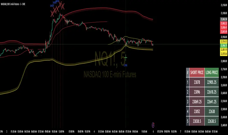
Floor and Roof Indicator with SignalsFloor and Roof Indicator with Trading Signals
A comprehensive support and resistance indicator that identifies premium and discount zones with automated signal generation.
Key Features:
Dynamic Support/Resistance Zones: Calculates floor (support) and roof (resistance) levels using price action and volatility
Premium/Discount Zone Identification: Highlights areas where price may find resistance or support
Customizable Signal Frequency: Control how often signals are displayed (every Nth occurrence)
Visual Signal Table: Optional table showing the last 5 long and short signal prices
Multiple Timeframe Compatibility: Works across all timeframes
Technical Details:
Uses ATR-based calculations for dynamic zone width adjustment
Combines Bollinger Bands with highest/lowest price analysis
Smoothing options for cleaner signal generation
Fully customizable colors and display options
How to Use:
Floor Zones (Blue): Potential support areas where long positions may be considered
Roof Zones (Pink): Potential resistance areas where short positions may be considered
Signal Crosses: Visual markers when price interacts with key levels
Signal Table: Track recent signal prices for analysis
Settings:
Length: Period for calculations (default: 200)
Smooth: Smoothing factor for cleaner signals
Zone Width: Adjust the thickness of support/resistance zones
Signal Frequency: Control signal display frequency
Visual Options: Customize colors and table position
Alerts Available:
Long signal alerts when price touches discount zones
Short signal alerts when price reaches premium zones
Educational Purpose: This indicator is designed to help traders identify potential support and resistance areas. Always combine with proper risk management and additional analysis.
This description focuses on the technical aspects and educational value while avoiding any language that could be interpreted as financial advice or guaranteed profits.