Price Action Analyst [OmegaTools]Price Action Analyst (PAA) is an advanced trading tool designed to assist traders in identifying key price action structures such as order blocks, market structure shifts, liquidity grabs, and imbalances. With its fully customizable settings, the script offers both novice and experienced traders insights into potential market movements by visually highlighting premium/discount zones, breakout signals, and significant price levels.
This script utilizes complex logic to determine significant price action patterns and provides dynamic tools to spot strong market trends, liquidity pools, and imbalances across different timeframes. It also integrates an internal backtesting function to evaluate win rates based on price interactions with supply and demand zones.
The script combines multiple analysis techniques, including market structure shifts, order block detection, fair value gaps (FVG), and ICT bias detection, to provide a comprehensive and holistic market view.
Key Features:
Order Block Detection: Automatically detects order blocks based on price action and strength analysis, highlighting potential support/resistance zones.
Market Structure Analysis: Tracks internal and external market structure changes with gradient color-coded visuals.
Liquidity Grabs & Breakouts: Detects potential liquidity grab and breakout areas with volume confirmation.
Fair Value Gaps (FVG): Identifies bullish and bearish FVGs based on historical price action and threshold calculations.
ICT Bias: Integrates ICT bias analysis, dynamically adjusting based on higher-timeframe analysis.
Supply and Demand Zones: Highlights supply and demand zones using customizable colors and thresholds, adjusting dynamically based on market conditions.
Trend Lines: Automatically draws trend lines based on significant price pivots, extending them dynamically over time.
Backtesting: Internal backtesting engine to calculate the win rate of signals generated within supply and demand zones.
Percentile-Based Pricing: Plots key percentile price levels to visualize premium, fair, and discount pricing zones.
High Customizability: Offers extensive user input options for adjusting zone detection, color schemes, and structure analysis.
User Guide:
Order Blocks: Order blocks are significant support or resistance zones where strong buyers or sellers previously entered the market. These zones are detected based on pivot points and engulfing price action. The strength of each block is determined by momentum, volume, and liquidity confirmations.
Demand Zones: Displayed in shades of blue based on their strength. The darker the color, the stronger the zone.
Supply Zones: Displayed in shades of red based on their strength. These zones highlight potential resistance areas.
The zones will dynamically extend as long as they remain valid. Users can set a maximum number of order blocks to be displayed.
Market Structure: Market structure is classified into internal and external shifts. A bullish or bearish market structure break (MSB) occurs when the price moves past a previous high or low. This script tracks these breaks and plots them using a gradient color scheme:
Internal Structure: Short-term market structure, highlighting smaller movements.
External Structure: Long-term market shifts, typically more significant.
Users can choose how they want the structure to be visualized through the "Market Structure" setting, choosing from different visual methods.
Liquidity Grabs: The script identifies liquidity grabs (false breakouts designed to trap traders) by monitoring price action around highs and lows of previous bars. These are represented by diamond shapes:
Liquidity Buy: Displayed below bars when a liquidity grab occurs near a low.
Liquidity Sell: Displayed above bars when a liquidity grab occurs near a high.
Breakouts: Breakouts are detected based on strong price momentum beyond key levels:
Breakout Buy: Triggered when the price closes above the highest point of the past 20 bars with confirmation from volume and range expansion.
Breakout Sell: Triggered when the price closes below the lowest point of the past 20 bars, again with volume and range confirmation.
Fair Value Gaps (FVG): Fair value gaps (FVGs) are periods where the price moves too quickly, leaving an unbalanced market condition. The script identifies these gaps:
Bullish FVG: When there is a gap between the low of two previous bars and the high of a recent bar.
Bearish FVG: When a gap occurs between the high of two previous bars and the low of the recent bar.
FVGs are color-coded and can be filtered by their size to focus on more significant gaps.
ICT Bias: The script integrates the ICT methodology by offering an auto-calculated higher-timeframe bias:
Long Bias: Suggests the market is in an uptrend based on higher timeframe analysis.
Short Bias: Indicates a downtrend.
Neutral Bias: Suggests no clear directional bias.
Trend Lines: Automatic trend lines are drawn based on significant pivot highs and lows. These lines will dynamically adjust based on price movement. Users can control the number of trend lines displayed and extend them over time to track developing trends.
Percentile Pricing: The script also plots the 25th percentile (discount zone), 75th percentile (premium zone), and a fair value price. This helps identify whether the current price is overbought (premium) or oversold (discount).
Customization:
Zone Strength Filter: Users can set a minimum strength threshold for order blocks to be displayed.
Color Customization: Users can choose colors for demand and supply zones, market structure, breakouts, and FVGs.
Dynamic Zone Management: The script allows zones to be deleted after a certain number of bars or dynamically adjusts zones based on recent price action.
Max Zone Count: Limits the number of supply and demand zones shown on the chart to maintain clarity.
Backtesting & Win Rate: The script includes a backtesting engine to calculate the percentage of respect on the interaction between price and demand/supply zones. Results are displayed in a table at the bottom of the chart, showing the percentage rating for both long and short zones. Please note that this is not a win rate of a simulated strategy, it simply is a measure to understand if the current assets tends to respect more supply or demand zones.
How to Use:
Load the script onto your chart. The default settings are optimized for identifying key price action zones and structure on intraday charts of liquid assets.
Customize the settings according to your strategy. For example, adjust the "Max Orderblocks" and "Strength Filter" to focus on more significant price action areas.
Monitor the liquidity grabs, breakouts, and FVGs for potential trade opportunities.
Use the bias and market structure analysis to align your trades with the prevailing market trend.
Refer to the backtesting win rates to evaluate the effectiveness of the zones in your trading.
Terms & Conditions:
By using this script, you agree to the following terms:
Educational Purposes Only: This script is provided for informational and educational purposes and does not constitute financial advice. Use at your own risk.
No Warranty: The script is provided "as-is" without any guarantees or warranties regarding its accuracy or completeness. The creator is not responsible for any losses incurred from the use of this tool.
Open-Source License: This script is open-source and may be modified or redistributed in accordance with the TradingView open-source license. Proper credit to the original creator, OmegaTools, must be maintained in any derivative works.
Supplyandemandzones

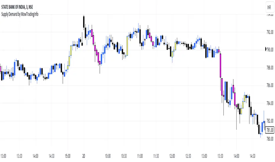
Supply Demand by WowTradingInfoThis indicator identifies supply and demand zones based on price action, which is a crucial concept for technical analysis. Supply zones represent areas where the price has historically shown selling pressure, while demand zones show areas with strong buying interest.
Explanation:
Rally-Base-Rally (RBR):
A rally is defined as a price movement where the percentage increase between the current high and the previous low.
A base is defined as a period of consolidation where price stays within a narrow range, with low volatility.
A RBR pattern is detected when a rally occurs, followed by a base, and then another rally.
Drop-Base-Drop (DBD):
A drop is identified when the price decrease between the current low and the previous high.
A DBD pattern is detected when a drop occurs, followed by a base, and then another drop.
Zone Marking:
RBR Zones are drawn with repaint the candles color as yellow (where buyers are likely to step in).
DBD Zones are drawn with repaint the candles color as pink (where sellers are likely to step in).
Example Use Case:
Rally-Base-Rally: When you see a yellow zone, it suggests that price rallied, consolidated, and is likely to rally again. It can be used as a potential demand zone.
Drop-Base-Drop: pink zones indicate that price dropped, consolidated, and may drop again. It can be used as a potential supply zone.
This script will help you automatically detect and visualize RBR and DBD patterns on your TradingView chart. These zones can provide valuable insights into areas where price may react due to past buying or selling pressure.
Supply and Demand Zones
Script Introduction:
I have spent a long time searching for the perfect supply and demand zone indicator, but most of the ones I found were based on lines instead of proper zones, which didn’t quite meet my needs. After much trial and error, I decided to build my own indicator that generates clear and reliable supply and demand zones based on price swings and volatility. This indicator dynamically adjusts to market conditions, creating zones that are more responsive to price movements. Whether you're day trading or swing trading, this indicator will help you identify key price levels where buying and selling pressures exist.
Overview:
This indicator identifies supply and demand zones based on swing highs and lows, combined with market volatility. These zones represent areas where price is likely to experience reversals due to buying or selling pressures. The zones are displayed as rectangles (boxes) rather than lines, making it easier to visualize the areas of interest on the chart.
How the Indicator Works:
1. Supply Zones (Red Box):
- A supply zone is identified when the price forms a swing high (a local high point) and there is sufficient volatility (using ATR). The zone represents an area where sellers are likely to step in and push the price down.
2. Demand Zones (Green Box):
- A demand zone is identified when the price forms a swing low (a local low point) and volatility is sufficient. The zone represents an area where buyers are likely to step in and push the price up.
3. Extension Direction:
- You can control whether the zones extend to the left, to the right, or both directions. This lets you choose how far back or forward you want the zones to appear on the chart.
4. Volatility Filter (ATR Multiplier):
- The indicator uses the Average True Range (ATR) to filter out minor price movements. The ATR multiplier is hardcoded to 0.25, meaning that the indicator is more responsive to smaller price swings. This setting helps the zones adjust dynamically to changing market conditions.
How to Use the Indicator:
1. Adding to Chart:
- After publishing, you or invited users can apply the script to any chart. The indicator will automatically generate supply (red) and demand (green) zones.
2. Settings:
- Swing Length (Look-back Period): This controls how many bars back the script looks for significant swing highs and lows. Increasing this value will create zones based on larger swings.
- Extend Zone Horizontally (Bars): This controls how far the zones extend horizontally (left or right). You can adjust this to make the zones extend more or less on the chart.
- Extension Direction: Choose whether the zones extend to the left, right, or both directions. This gives flexibility on how you want the zones to display on the chart.
- Supply Zone Color: You can customize the color and opacity of the supply zone (default is red).
- Demand Zone Color: You can customize the color and opacity of the demand zone (default is green).
Best Practices for Trading:
- Combine with Other Indicators: While supply and demand zones are powerful on their own, combining this indicator with other tools like moving averages, volume analysis, or momentum indicators can provide further confirmation of potential price reversals.
- Watch for Price Action in Zones: When price approaches a supply or demand zone, watch for price action signals such as candlestick patterns (e.g., pin bars, engulfing candles) that can give you an idea of whether the zone will hold or break.
- Adjust for Different Timeframes: The indicator works well across different timeframes. Use a higher look-back period for larger timeframes (e.g., 4-hour, daily) and a lower look-back period for shorter timeframes (e.g., 5-minute, 15-minute charts).
Final Notes:
This script is intended to help traders identify key supply and demand zones and make better trading decisions. Since it dynamically adjusts to market volatility, it is well-suited for both day traders and swing traders who want to capture price reversals at significant levels.

Range supply and demandHi all!
This is a very simple indicator. It plots the high timeframe (configurable via the "Timeframe" setting) high/low current timeframe bars (that has the same high/low as the higher timeframe) as supply/demand. The higher timeframe bar that's chosen is the one that's next last. As of now one high and one low zone is plotted.
The defaults are based on useful zones when on daily candles.
You can choose to display the higher timeframe within the zone via the "Show" option.
Hope this is clear enough, let me know otherwise.
Best of luck trading!
Momentum Candles by @PipsandProfitFXThe High Momentum Candles indicator highlights price bars with exceptional price movement and strong volume. It identifies candles with significantly long bodies relative to their shadows, indicating rapid price changes. Additionally, the indicator filters for candles with above-average volume to confirm the strength of the price movement.
Dark red: bearish momentum
Orange: bullish momentum
(You can easily change the momentum candles to whatever color you want in the indicator settings.)
By visually emphasizing these high momentum candles, traders can potentially identify potential trend reversals or continuations, as well as potential entry and exit points.
Key Features:
Identifies candles with large bodies relative to their shadows
Filters candles based on volume to confirm strength
Highlights high momentum candles with a distinct color
Let me know if you'd like to see any updates on this indicator.
Note: This indicator is a visual tool and should be used in conjunction with other technical analysis techniques for making informed trading decisions.
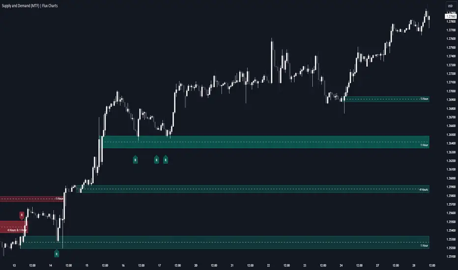
Supply & Demand (MTF) | Flux Charts💎 GENERAL OVERVIEW
Introducing our new Supply and Demand (MTF) Indicator! This new indicator renders Supply and Demand zones based on momentum candles. It can detect Supply and Demand zones across up to 3 diferent timeframes. It's capable of combining zones, retest & break labels and it's customizable with invalidation and style settings.
Features of the new Supply and Demand (MTF) Indicator:
Renders Supply and Demand Zones Across 3 Timeframes
Combination Of Overlapping Zones
Retest & Break Labels
Retest & Break Alerts
Enable / Disable Historic Zones
Visual Customizability
📌 HOW DOES IT WORK ?
Supply and Demand is a key concept in trading. It helps traders see the zones that market-makers buy & sell the asset in large amounts. It's detected by finding momentum candles (candles that have large bodies) in a row.
Momentum candles are defined to have a larger body than the average candle in the chart, and at least 4 of them in a row is required to draw a supply or demand zone. The zone is drawn from the high wick to low wick of two candles before the first momentum candle in the row.
Check this example :
These zones are usually where market makers trade the asset in larger amounts. Thus, they act as support & resistance zones by their nature. A retest of these zones can make the price bounce to the opposite direction, while a breakout usually means strong price action momentum is incoming in that direction. Supply zones indicate bearish momentum while demand zones indicate bullish momentum.
Check this example :
Here a Supply Zone (Bearish) forms. Then price comes back up to test the zone, and it fails to break. After the failed attemp, a stong bearish momentum takes the price back to a lower level. Then another test of the zone occurs and successfully breaks the zone this time. This breakout starts a bullish momentum that takes the price to a higher level.
🚩UNIQUENESS
This indicator provides Supply and Demand zones in your chart with pure simplicity. It supports up to 3 different timeframes as we believe supporting your trades with higher timeframes can improve your trading experience. It also gets rid of complexity by combining overlapping zones into a single zone, even if they are from different timeframes! You can also set-up alerts to get notified when a supply or demand zone is being retested, or is broken. Overall, this indicator is the ultimate kit for supply and demand zones.
⚙️SETTINGS
1. General Configuration
Max Distance To Last Bar -> The maximum distance that the indicator will render supply and demand zones from. Higher settings mean rendering older supply and demand zones.
Zone Invalidation -> Select between Wick & Close price for Supply and Demand Zone Invalidation.
Retests & Breaks -> Enable retest & break labels in your chart.
Show Historic Zones -> This will show historic supply & demand zones which are invalidated if enabled. You can disable this to only see active supply and demand zones for a simpler chart.
2. Timeframes
You can set up to 3 different timeframes and enable / disable them using the checkboxes in this section.
Indecisive CandlesAn Indecisive Candle, often referred to as a Base Candle, is a pivotal element in technical analysis, particularly for identifying institutional supply and demand zones. These candles are characterized by their small bodies and long wicks, reflecting a balance between buyers and sellers, indicating a potential pause or consolidation in the market.
To calculate whether a candle qualifies as an indecisive candle based on the criterion that its body (the absolute difference between its open and close prices) is less than or equal to 50% of the total range of the candle (the difference between its high and low prices).
Key Features:
Small Real Body: Signifies minimal movement from open to close, indicating market indecision.
Long Upper and Lower Wicks: Show that both bulls and bears attempted to control the price, but neither succeeded, leading to a standoff.
Formation Context: Typically found at the end of a strong trend or within a consolidation phase, hinting at a potential reversal or continuation pattern.
Usage in Identifying Institutional Supply and Demand:
Supply Zones: When an Indecisive Candle forms after a rally, it can mark the onset of an institutional supply zone, suggesting that large entities are starting to sell, leading to potential downward pressure.
Demand Zones: Conversely, when this candle appears after a downtrend, it often signals the emergence of a demand zone, where institutions begin to accumulate, anticipating a price increase.
Trading Strategies:
Zone Identification: Use Indecisive Candles to pinpoint key supply and demand zones on your chart, enhancing the accuracy of your support and resistance levels.
Confirmation: Look for confirmation from subsequent price action or volume spikes to validate the presence of institutional activity before making trading decisions.
Risk Management: Place stop-loss orders beyond the wicks of these candles to protect against false breakouts or continued indecision.
Conclusion:
Indecisive Candles are essential tools for traders looking to understand market sentiment and institutional behavior. By mastering their identification and interpretation, you can enhance your ability to spot high-probability trading opportunities and manage risks effectively.

MTF OB Supply Demand ZonesHello everyone,
This exceptional indicator provides you with visual representations of bullish and bearish order blocks or supply and demand zones across multiple timeframes. In simple terms, bullish order blocks are represented by a small red candle followed by a large red candle, while bearish order blocks are depicted as a small green candle followed by a large red candle. Supply and demand zones are drawn by using order blocks.
Features:
Display order blocks from up to three different timeframes.
Customize the maximum number of boxes shown and the colors of the zones.
Choose from three different modes: OB (Order Block), Extended OB, and Supply/Demand.
Mode Descriptions:
OB: Includes the body of the candle.
Extended OB: Encompasses the body and wick of the candle.
Supply/Demand: Covers the body, wick, and half the body of the large candle.
Usage:
Ensure that charts 2 and 3 are set to a higher timeframe. For modes 2 and 3, it’s recommended to reduce the maximum number of boxes shown. The zones or boxes are transparent, allowing for overlap. This feature aids in identifying reversal zones or confirmed zones. The more intense the color, the stronger the confirmation. If a green zone overlaps a red zone (or vice versa), it signifies a reversal zone.
Thank you for checking out this indicator!
---
Additional Information:
Order blocks refer to specific price areas where large market participants, such as institutional traders, have previously placed significant buy or sell orders. These clusters of orders can impact price movement, liquidity, and market sentiment.
Order blocks are a strategic approach to identifying key levels of support and resistance based on the behavior of institutional traders. These key levels are then utilized as entry or exit points for trades.
An order block is an area where there has been a large concentration of limit orders awaiting execution. These blocks are identified on a chart by observing previous price action and pinpointing areas where the price experienced significant movement or abrupt changes in direction.
Order blocks are used in the following popular trading philosophies:
Smart Money Concepts (SMC)
Inner Circle Trading (ICT)
Price Action
---
Credits to: @AGFXTRADING
Supply & Demand Zones (Order Block) Pro [BacktestBot]Supply & Demand Zones (Order Block) Pro with DBD/RBR/RBD/DBR/FVG
This indicator helps to identify large price moves driven by banks and institutions. It can be used for any asset type (FOREX, crypto, commodities, indices) and any timeframe.
How to use this indicator
Message me to gain access. I try to reply within 24 hours.
Consider this as more of a visual aid to add to your confluences.
Use a side by side chart layout with different timeframes to see more zones.
(See example of use at the bottom)
Pullback trades are popular with zones.
⭑⭑⭑ Zones ⭑⭑⭑
How are zones created?
Supply zones are created when the price drops quickly, so are found above the price action.
Demand zones are created when the price rallies quickly, so are found below the price action.
The script uses a combination of quick price movements and user defined minimum price % changes. All user defined settings have default settings which vary depending on asset type and timeframe.
What is a strong zone?
The zones boxes have either a dashed border or a solid border. A solid border represents a strong zone which is when
the price has moved very quickly from it, or
the price has bounced off the zone multiple times.
What is a deactivated zone?
When the price has gone through the zone by a certain %, the zone is deactivated and displayed in a more transparant colour.
How are deactivated zones used for switch zones?
When a new zone is created, it is checked to see if it overlaps a recently deactivated zone.
e.g. If a new demand zone overlaps a recently deactivated supply zone, then the zone has switched from supply to demand. This might mean the new zone could be a strong one and the number of hits on the previous zone (also a potential indicator of strength) is displayed in the zone label tooltip.
Zone information
Basic zone information can be found in the zone label.
Users can choose what information is displayed in the label including the number of hits and prices.
More detailed information can be found in the zone label tooltip.
Hovering over the label will display more information including the zone start time and height %.
DBD/RBR/RBD/DBR/FVG
Zones are defined as drop base drop, rally base rally, rally base drop, drop base rally, and fair value gap.
Zone height
Users have the option of choosing
Wick to wick, or
Wick to body
The indicator does its best to meet the user preference but sometimes it is not possible. The information in the label tooltip will show if the preference was matched.
Minimum and maximum height default settings help to prevent zone boxes which might fill the whole chart.
⭑⭑⭑ Lines of Interest ⭑⭑⭑
Lines of interest are displayed as an added bonus.
Long wick
Long wicks might show areas of support or resistance. Very long and long wicks are defined by the % change in the wicks.
Very long wick lines are always displayed, and long wicks are displayed if they are not near a zone.
Possible Support / Resistance
After a big rally or drop, lines are displayed to show where the price might pullback to. These lines can act as possible support or resistance, and
are taken from recently deactivated zones. A solid line respresents a strong deactivated zone.
⭑⭑⭑ Alerts ⭑⭑⭑
Limit the number of alerts to the recommended ones. Consider this as more of a visual aid to add to your confluences.
Alert types
Early alerts happen immediately.
Bar end alerts happen when the bar closes.
Alert display
Alerts can be displayed on the chart with symbols. The most recent symbols have a tooltip which allow alert information to be displayed when hovering over them.
It is recommended to turn the alert display off, as it can clutter up the chart. The alerts will continue to work with the display off.
⭑⭑⭑ Example of use ⭑⭑⭑
Side by side chart with different timeframes
⭑⭑⭑ Disclaimer ⭑⭑⭑
Trading is very high risk. All content, tools and scripts provided by BacktestBot are for informational & educational purposes only. Past performance does not guarantee future results.
NITS - NIFTY INTRADAY TRADING SYSTEMNSE:NIFTY
Hello Traders..!
This is another indicator / system to make use for NIFTY & BANK NIFTY Intra day trading.
This is my Gift to the traders for this New Year 2024. Use this to your Edge and make some profits. All explained below.
NIFTY INTRA-DAY TRADING SYSTEM
Explanation of Arrays:
-------------------------------
## FIRST 15 MIN SESSION BOX ##
From 09:15 to 09:30 where the initial orders will get collected and Auction takes place.
DO NOT engage into any trade in this session. Let the Box develop.
## INITIAL HIGH / LOW FORMATION SESSION ##
This session is from 09:15 to 10:30.
We can observe the Initial High or Low being formed for the day, that is VALID TILL 11:30.
## NO-TRADE ZONE / ACC. AREA / DAY’S H OR L CONFIRMATION SESSION ##
From 11:30 to 12:30
90% of time this is the session where the whole Day’s High or Low will get confirmed. Sometimes the market may violate this Session!
DO NOT engage into any fresh trade in this area.
Once the box is developed, you can see the Mid price line will be formed which is valid for the afternoon Trading session till 15:30.
## SIGNAL LINE, MIDDLE PRICE LINE, SESSION HIGH LOW LINES ##
Middle Price Line – the dotted line (Red colour) is Mid Price Line for the Initial session box. This acts as an important price level for the whole day.
Signal Line – the Solid line that will form after 10:30. Consider this price line as very important price line to which the price reacts with a good momentum, either break through or rejection and valid for the whole trading day.
Session High Low price line – high and low prices of the Initial session box which acts as a good Support / Resistance / Target / Stop loss. Even previous session’s price lines can also be used for the current day too.
## TREND BOX ##
Multi-Time frame trend box will show the real-time trend on different time frames. This box will be very helpful in trade decision. Please note that at least THREE HIGHER TIME FRAME TRENDS must be in the same direction to support your trade criteria for the better confirmation.
## VOLUME IMBALANCE ##
These orange coloured boxes are very tiny imbalances between prices that were formed during price movements. Algorithm will try to fill these imbalances on its way of filling orders. These price imbalances can be used for our edge while taking trades.
SOME TIPS:
---------------------------
1) Avoid Break out trades
2) Always trade the pull backs
3) Keep your Stops above / below the KEY LEVELS
4) Always follow the Higher Time frame trend while taking a trade.
If you trade in 1m TF consider 5m trend
If you trade in 5m TF consider 1H or 15m trend
5) Consider the higher TF closure of prices only, to validate the break out.
6) Trade what you see, market can do anything it wants.
7) Do not worry about losses. It happens and that is the business.
8) End your trading week in green no matter how big or small the profit is. Consistency is the key this business.
9) Keep in mind that the Market does two things only, either it will FILL THE GAP or GRAB THE LIQUIDITY. Just plan your trades accordingly. Liquidity levels like Previous Session / Day / Week / highs and lows.
10) The Market is a continuous business. It does not end for the specific day. It will not end its Buy or Sell model unless it completes its cycle, hence TRADE WHAT YOU SEE and not WHAT YOU THINK!
11) Unless the key swing high / low is broken and closed, DO NOT consider that move as a reversal. Consider that as a Liquidity grab. And it will continue in its previous trend.
HOW TO TAKE TRADE USING NITS: (one of the Techniques)
--------------------------------------------------------------------------------
As explained above, Do not engage in trade for the first 15 minutes.
Once the 15m box forms then look for divergence between NIFTY and BANK NIFTY.
Both Indices are supposed to trade in the same direction but at key levels and times, these instruments will make DIVERGENCE with its Highs and Lows.
Ex: one Index will make LOW AND LOWER LOW and at the same time other will make LOW AND HIGHER LOW. This deflection can be used for taking Buy Trades.
Ex:
If the Divergence forms at the Bottom then the market will move upwards.
If the Divergence forms at the Top then the market makes down move.
To confirm this divergence, the price will move away from that deflected Lows or Highs.
-----------------------------------
POINTS TO OBSERVE
------------------------------------
Mostly the first 15 min range that forms will either be very large candles or normal candles with rejection wicks or Shaved bar (open and H/L same)
Whenever you observe a very large wide range bars within the 15min range, consider the Day’s high and Low is already formed. And the market will be hovering inside that range only. Very useful for taking 50 points scalping here and there by using the signal line and middle line or Acc box mid line. In this scenario you have three important info of the day, OPEN HIGH & LOW established already, The market will only look for its close.
Ex:
If the market trades with normal candles, then consider your trades in two parts.
From 09:30 to 11:30 and from 12:30 to 15:30 as 11:30 to 12:30 will confirm the current day’s High / Low hence do not take a fresh position within that time.
1) Initial session trade – If the price does not break and close the 15 min range high/low, consider it is going to reverse and continue its trend till 10:30
Ex:
2) Mid session Trade – mostly the market accumulates positions and collects orders between 11:30 to 12:30 for the afternoon session. Once the session box is developed, the middle price line will form. Wait for the market breakout and close off this session’s high or low in Higher TF. The market will continue in the direction of breakout from this session and continue till 15:30. Hence wait for pull back till its mid price / high or low price lines of this Acc box and take trade in the initial breakout direction keeping stop above or below the session’s high or low.
Ex:
## Fixed Range Volume Profile as a Tool ##
-----------------
Note:
-----------------
Kindly do not ask for any codes or script details. The one technique what I explained (Divergence method) is more than enough for making a consistent earnings. Please study and back test / forward test for yourself for atleast 2 weeks time. Every traders aspect and mindset is different in seeing the market movements. Please design your own methodology and CONSIDER this as a BUSINESS..!
JUST.....
Believe the System
Be patient
Be Disciplined &
Be a Successful Earner..!!
LET YOUR ENDS MEET
(Hope I explained well)
Supply and Demand Anchored [LuxAlgo]The Supply and Demand Anchored indicator is an anchored version of the popular Supply and Demand Visible Range indicator. Once adding the indicator to the chart, users need to manually select the starting and ending points for the indicator's calculation. The estimated supply/demand zones are then extended.
🔶 USAGE
The proposed indicator makes use of the same method highlighted in previous posts (see related scripts section below) to estimate supply and demand zones.
When adding the indicator to the chart, users will be prompted to select a starting and ending point for the calculation of the supply and demand zones, click on your chart to select those points.
Once calculated, each zone/level will be extended to the right of the chart. These can be used as support/resistance zones. Clicking on one of the graphical elements of the indicator or the indicator title will highlight the starting and ending calculation points, these can be dragged to be set at different locations.
🔶 SETTINGS
Threshold %: Percentage of the total visible range volume used as a threshold to set supply/demand areas. Higher values return wider areas.
Resolution: Determines the number of bins used to find each area. Higher values will return more precise results.
Intra-bar TF: Timeframe used to obtain intra-bar data.
🔶 RELATED SCRIPTS
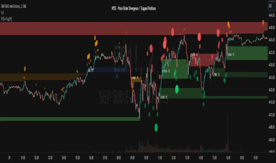
Market Price Order Divergence + Trapped Positions [Pt]█ Introduction
Specifically designed for trading on NYSE, NASDAQ, Dow Jones, and AMEX related instruments like SPY, QQQ, ES, NQ...etc., this innovative tool provides traders with advanced market insights to help them comprehend the market intricacies and make well-informed decisions. Comprising three primary features: Price Order Divergence (POD) Bubbles, Market Order Bubbles, and Trapped Positions/Zones, this tool assists traders in deciphering the nuances of market order flow and trends.
An important point to note is that TradingView doesn't currently provide direct access to market order data, such as buy and sell order flow. Therefore, this tool cleverly leverages TICK index data to estimate the overall market buy and sell strength.
█ Price Order Divergence (POD)
POD serves to detect disparities between the prices of US indices and estimated market orders during regular trading hours (9:30 to 16:00 EST). Bullish divergence indicates that the estimated market order flow is biased towards buy orders, despite bearish price action. In contrast, bearish divergence indicates that the market order flow is biased towards sell orders while the price exhibits bullish action. By default, PODs are visually represented as green bubbles under the candle for bullish divergence and red ones above the candle for bearish divergence. The bubble's size symbolizes the estimated market order strength.
█ Market Order Bubbles (MOB)
During extended or Globex hours, instead of POD, the tool uses Market Order Bubbles (MOB) to estimate market orders using volume data. Sophisticated algorithm is used to distinguish between bullish vs bearish volume. A strong bullish volume represents significant buy orders, whereas a strong bearish volume represents substantial sell orders. By default, MOBs during these hours are shown in blue for bullish and yellow for bearish divergence. Again, the bubble's size symbolizes the estimated market order strength.
█ Trapped Positions/Zones
Trapped positions materialize when PODs or MOBs emerge in trending markets. For example, a bearish divergence during an uptrend suggests significant selling (including shorting), and if the price continues ascending without offering short positions any profit, these positions become 'trapped shorts' and is shown as 'TS' in the zone. The opposite is true for 'trapped longs' or 'TL'.
A price range zone can be delineated from the trapped position candles. If prices revisit these zones, and the prevailing market trend stays bullish, the trapped shorts will probably liquidate near the break-even point to mitigate losses. The same rationale applies to bullish divergence in a downtrend. Therefore, these zone often times represents support / resistance zones.
█ Potential Use Cases
► Trend Confirmation: POD or MOB can confirm the strength of an ongoing trend. For example, during a bullish trend, a plethora of green bubbles or blue MOBs can affirm the trend's solidity.
► Spotting Reversals: Large, isolated POD or MOB bubbles could indicate potential market reversals. For instance, a prominent red bubble or yellow MOB during an uptrend might hint at an impending trend reversal.
► Risk Management: The Trapped Positions/Zones feature could assist in risk management. When prices approach these zones, traders can anticipate potential large market orders impacting price movements.
► Profit Optimization: This tool can aid traders in optimizing profits by identifying when trapped positions are likely to liquidate, thus predicting potential sharp price movements.
Remember, as with any tool, this should be used alongside other market analyses and not as a standalone indicator. Happy trading!
================================================================================================================
█ Settings Overview
◊ Market - available options: NYSE, NASDAQ, Dow Jones, AMEX. This will be displayed
◊ Lookback period- # of bars to lookback for detecting price vs market order divergences
▼ Regular Hour - Price Order Divergence Bubbles
◊ Show Price Order Divergence (POD) Bubbles - toggle on/off for POD bubbles
◊ └ Use Market Order Sentiment only - Shows divergences between price movement and market order sentiment (amount of buying vs selling)
◊ └ Use Market Order Trend Bias - On top of market order sentiment, the indicator also looks at overall market short term trends to determine divergences
◊ └ Use Threshold Min. Threshold - For filtering order size, the lower the threshold, the more sensitive
◊ └ Use Volume Strength - Take volume into consideration as well, only shows divergence when there is strength in volume
▼ Extended Hour - Market Order Bubbles
◊ Show Market Order Bubbles - toggle on/off for MOB. Using volume data to estimate significant market order activities. Bubbles indicate possible large liquidation activities
◊ └ Volume Analysis period - lookback period for volume analysis
◊ └ Volume Strength period - lookback period for volume strength
▼ Trapped Position Zones
◊ Show Potential Traps - toggle on/off for un-activated trapped zones. They are shown as lightly shaded areas of potential traps. These areas will be activated once price hit the activation %
◊ Show Trapped positions (Regular Hours) - toggle on/off for POD trapped zones. By default, trapped shorts are shown in green, trapped tongs are shown in red.
◊ Show Trapped positions (Extended Hours) - toggle on/off for MOB bubbles. By default, trapped shorts are shown in blue, trapped tongs are shown in orange.
◊ └ Activation % - Trapped zones are activated if price goes x% of the potential trapped range in the undesirable direction. Default is 100%
◊ Liquidate display options - options: On first touch, Per touch, Fully liquidated
Trapped zones liquidate display options:
▼ Display
◊ General color settings for bubbles, trapped zones, and label size
◊ Use Emoji for bubbles - fun setting that displays bulls and bears by default. This helps really visualize where the bulls and bears are! 🤣🤣 These emoji can be changed in the style setting.
▼ Trapped Zone Channel
The trapped zone channel represents a continuous channel of the closest activated trapped zone area. This allows for creating alerts for trapped zones, and the plot outputs allows for custom Pinescript integration.
◊ Trapped Zone Channel Buffer % - Adds upper and lower buffer for trapped zone channel
◊ Show Trapped Channel - toggle on/off on trapped zone channels
◊ └ Remove channel changing lines - toggle on/off the transition plot lines when switching to the closest trapped zones
◊ Show Trapped Channel Fill - toogl
▼ Extra
◊ Display settings for chosen market and indicator title
▼ Trend Follower
◊ Show Trend Following Bar Color - toggle trend follower algorithm. This is an experimental trend following algorithm that attempts to detect bullish, neutral and bearish trends.
▼ Outputs
◊ Output Bubbles
Outputs for Bubbles for external interface. These can be used as inputs to your own indicator or strategy Pinescript. For more info, take a look at this TradingView blog:
www.tradingview.com
Bubble type can be chosen within the settings:
Both - Default, output will include both Market Price Order Divergence Bubbles (during Regular Hours) and Market Order Bubbles (during Extended Hours)
POD Only (RTH) - Output will include only Market Price Order Divergence Bubbles; otherwise, output = 0 during Extended Hours
MOB Only (ETH) - Output will include only Market Order Bubbles; otherwise, output = 0 during Regular Hours
Market Order Bubbles output values:
3 = Large size Bullish Bubble
2 = Medium size Bullish Bubble
1 = Small size Bullish Bubble
0 = No Bubble
-1 = Small size Bearish Bubble
-2 = Medium size Bearish Bubble
-3 = Large size Bearish Bubble
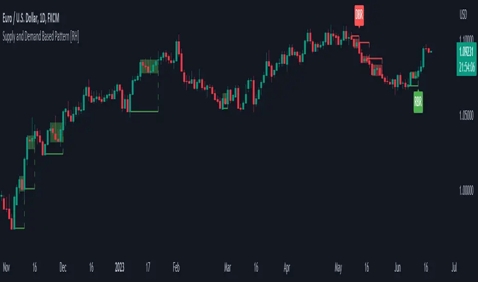
Supply and Demand Based Pattern [RH]This indicator focuses on detecting RBR and DBD patterns, which signify periods of increased momentum and potential continuation or reversal of the prevailing trend.
The RBR pattern consists of a rally (upward movement), followed by a base (consolidation or retracement), and then another rally. It suggests that the upward momentum may persist and provide trading opportunities.
On the other hand, the DBD pattern comprises a drop (downward movement), followed by a base, and then another drop. It indicates that the downward momentum might continue, offering potential shorting opportunities.
Bullish(RBR) example:
Bearish(DBD) example:
1. The bullish (RBR) and bearish (DBD) patterns share the same underlying logic, only differing in their directionality.
2. For both RBR and DBD patterns, the first rise/drop can consist of one or multiple candles. However, in the case of multiple candles, all candles must exhibit a bullish nature for RBR and a bearish nature for DBD.
Example:
3. It is a prerequisite for the first rise/drop to include at least one candle with a defined percentage of health, as determined by the user.
4. The base, following the first rise/drop, may comprise one or multiple candles.
Example:
5. To maintain consistency, the base is not allowed to retrace beyond 80%, although this value can be adjusted by the user.
6. Similar to the first rise/drop, the second rise/drop in both RBR and DBD patterns can consist of one or multiple candles. However, all candles within this phase must demonstrate a bullish nature for RBR and a bearish nature for DBD.
7. Confirmation of the bullish (RBR) pattern occurs when a candle closes above the high of the first rise. Conversely, the bearish (DBD) pattern is confirmed when a candle closes below the low of the first drop.
Example:
Alerts can be set for all bullish and bearish pattern or for the first pattern in the range of similar pattern.
Volume-based Support & Resistance Zones-V1 By Trade Mastership™ The all-new Support & Resistance Zones indicator, which has been upgraded to offer traders more powerful features and functionality. This innovative indicator identifies high-volume fractal lows or highs to create zones based on the size of the wick for that timeframe's candle. This makes it easy for traders to visualize which price levels are the most significant for either a trend continuation or a reversal when zones are broken and retested.
The original script for this indicator was created by Trade Mastership, with additional modifications by L N Behera. Credit goes to both of them for the majority of the logic behind this script. Since then, the script has been improved with several changes, including:
Changing the default S/R lines from plots to lines, and giving users the option to change between solid, dashed, or dotted lines for both S/R lines
Adding additional timeframes and more options for TF1, beyond the current TF. Now, users have four timeframes to plot S/R zones from
Giving users the option to easily change the line thickness for all S/R lines
Making it easier to change the colors of S/R lines and zones by consolidating the options under settings (rather than under style)
Adding extensions to active SR Zones to extend all the way right
Adding the option to extend or not extend the previous S/R zones up to the next S/R zone
Adding optional timeframe labels to active S/R zones, with left and right options, as well as the option to adjust how far to the right the label is set
Fixing an issue where the higher timeframe S/R zone was not properly starting from the high/low of fractal. Now, any higher timeframe S/R will begin exactly at the High/Low points. Note that this may not work perfectly on stocks, and if a fractal high/low is too many bars in the past, it will revert to a default max bars back to avoid script errors.
Adding a function to prevent S/R zones from lower timeframes displaying while on a higher timeframe. This helps clean up the chart quite a bit.
Creating arrays for each timeframe's boxes and lines so that the number of S/R zones can be controlled for each timeframe and limit memory consumption.
Adding new alert options and customized alert messages
Here's how this indicator works: it looks for fractal highs or fractal lows with volume that pierces above the volume's Moving Average. This moving average value can be modified in the settings for each timeframe. The fractal highs will be confirmed with three successive higher highs followed by two successive lower highs and vice versa for the fractal lows. The zone is created from the fractal high/low and the close of the candle for whatever timeframe you selected. The bigger the zone, the more significant that zone is.
Traders can disable any zone, change the zones to show lines only, and modify all the colors, transparencies, and thickness of lines for all the zones. To create alerts, traders can enable the types of alerts they want for each timeframe in the indicator's settings. After applying changes, right-click on one of the zones on the chart, and click "Add Alert on Vol S/R Zones." You do not need to add a title, as the correct alert messages are already built-in.
The latest update has migrated the script to Pine Script Version 5 and added a higher number of total boxes/lines to show on the chart. It has also increased the max bars count to the maximum Pine Script allows, enabling traders to utilize as many bars as possible when drawing the left side of SR zones that are very far back on the chart. Additionally, the update fixed issues where the indicator would not load on 1 minute and 3-minute charts unless higher timeframe SR zones

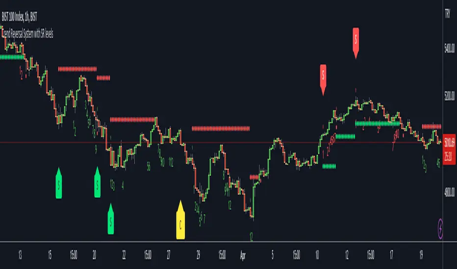
Trend Reversal System with SR levelsHello All,
This is the Trend Reversal System with Support/Resistance levels script. long time ago I published it as closed source but now I upgraded it and and published as open-source with a different name. I hope it would be useful for you all while trading/analyzing.
The script has some parts in it: Setup, Count, SR levels, Risk levels & Targets . Now lets check them:
Setup Part: it has two part, Buy or Sell Setup. one of them can be active only. Buy setup: if current close checks if current is lower/equal than the close of the 5. bar. if yes then the script increases number of buy setup. and if it reaches 9 then the script checks if current low is lower/equal than the lows of last 3. and 4. bars, or if the low of the last bar is lower/equal than the lows of last 3. and 4. bars. if yes then the script increases the buy setup by 1. if these conditions met then it puts the label 'S' , same for Sell setup. S labels on both setup are potential reversals.
Count Part: If buy or sell setup reaches the 9 then Count part starts from 1. lets see buy count: If current close is lower/equal than the low of the 3. bar and buy count is lower than 12 or low of the bar 13 is less than or equal to the close of bar 8 then buy count increase or it's completed. if it's completed then the script puts C label, and it's potential reversal. of course there are some conditions that can cancel the count buy/sell or recycle/restart.
By using Setup and Count levels the script can show Support/Resistance Levels, Risk levels & Targets. SR levels are potential reversal levels.
Lets see some example screenshots:
Support/Resistance levels:
Potential Reversal levels and how setup/counts are shown:
Count part can recycle and the script shows it as 'R' , ( you can see the conditions for Recycle in the script ):
Count can be cancelled and and it's shown as 'x'
If the scripts find 9 on Setup or 13 on Count then it checks if it's a good level to buy/sell and if it decides it's good level then it shows TRSSetup Buy/Sell or TRSCount Buy/Sell and also shows the target. in following example the script checks and decide it's a good level to take long position. it can be aggressive or conservative, Conservative is recommended.
Enjoy!
Supply and Demand w/ Higher Timeframe and Hidden Zones█ OVERVIEW
This indicator draws Supply and Demand zones using the common methodology of a basing candle followed by a drop/rally candle. The indicator user inputs allow you to configure the parameters for zone identification in two ways. First, by increasing the intensity of the drop/rally candle. Second, by increasing the number of candles that should be grouped to form a base and it's following drop/rally. This allows you to chart zones from higher timeframes and zones that may not be identifiable on the higher timeframes (aka Hidden Zones).
For example, when viewing a chart on the 5min timeframe the "Number of Candles" user input can be set according to the higher timeframe that you want to use to draw zones.
Setting "Number of Candles" to 3 draws zones from the 15min timeframe. (5min * 3 candles = 15min)
Setting "Number of Candles" to 6 draws zones from the 30min timeframe. (5min * 6 candles = 30min)
This functionality also allows for the identification of hidden zones because the first candle in a set on the lower timeframe does not have to align with the candles on the higher timeframe.
█ CONCEPTS
Intensity
For demand zones, the distance between the close of a rally candle and the high of the basing candle is what this indicator refers to as "Intensity".
For supply zones, it is the distance between the close of the drop candle and the low of the basing candle.
Higher Timeframe Zones
This indicator finds higher timeframe zones through the use of the "Number of Candles" user input.
The higher timeframe used will be the product of the chart's current timeframe and the value set for "Number of Candles".
Hidden Zones
A hidden zone is a zone from a higher timeframe that can not be seen when charting with that timeframe.
It can only be found on lower timeframes by grouping candles together to emulate higher timeframe candles.
█ USER INPUTS
Lookback
The Number of Bars back used to find zones.
Zone Configuration
• Drop/Rally Intensity - Increase this to require the drop/rally candle to make a greater move from the basing candle to qualify as a zone.
• Number of Candles - Increase this to draw zones from higher timeframes. The timeframe used will be the product of the chart's current timeframe and the value selected.
Zone Drawing Options
• Include Broken Zones - When unchecked zones that have been broken through will not be drawn.
• Demand Fill/Border - Allows customization of the color and transparency of demand zones.
• Supply Fill/Border - Allows customization of the color and transparency of supply zones.
█ TIPS
1 — Use the indicator multiple times on the chart with the "Number of Candles" input set to different values to have zones from multiple higher timeframes on the chart.
2 — Drop/Rally Intensity set to 0 is not recommended. It will lead to very weak zones being drawn.

VWAP Supply and Demand ZonesThis is my 1st indicator enjoy.
Description of the VWAP Supply and Demand Zones indicator:
This indicator uses the Volume Weighted Average Price (VWAP) to identify potential supply and demand zones in the market. The VWAP is a popular indicator that shows the average price of a security weighted by volume over a specified period of time. It can be used as a benchmark to measure the efficiency of trading and to identify trends and price levels.
The indicator plots the VWAP as a blue line on the chart, and also plots two other lines above and below it, which represent the upper and lower bounds of the supply and demand zones. The width of these zones can be adjusted by changing the “Zone Width” input parameter.
The indicator also plots shapes on the chart to mark when a supply or demand zone is formed. A supply zone is formed when the price crosses above the VWAP and then falls back below it, indicating that there is more selling pressure than buying pressure at that level. A red triangle is plotted above the bar where this happens, and a red zone is drawn between the previous close and previous VWAP values.
A demand zone is formed when the price crosses below the VWAP and then rises back above it, indicating that there is more buying pressure than selling pressure at that level. A green triangle is plotted below the bar where this happens, and a green zone is drawn between the previous close and previous VWAP values.
The supply and demand zones can be used as potential areas of support and resistance, where traders can look for reversal or continuation signals. For example, if the price enters a supply zone from below, it may indicate that sellers are willing to sell at higher prices, which could lead to a bearish reversal. Conversely, if the price enters a demand zone from above, it may indicate that buyers are willing to buy at lower prices, which could lead to a bullish reversal.
The indicator can be applied to any timeframe or market, but it may work better on higher timeframes where volume data is more reliable. It can also be combined with other indicators or tools to confirm or filter signals.

Support and Resistancewhat is "Support and Resistance"?
it is a support and resistance indicator.
what it does?
it draw support and resistance zones on the chart.
how it does it?
It determines the zones where the price leaves with a big candle after going horizontal for a while as support or resistance zones according to the price movement direction. while doing this, it compares the size of the candles and the elapsed time.
how to use it?
Red zones represent resistance and green zones represent support. You can buy in the support zone or sell in the resistance zone. my advice is to make your own interpretation by taking into account the price movement with different indicators. they are considered useful if there is a closure beyond the zones. otherwise, they continue to be shifted to the right.
notice: As new zones are created, old ones may disappear. so it might be wise to draw boxes using drawing tools where the old zones are.
Support and resistance are very important concepts for technical analysis. so I am thinking of updating and improving this indicator many times in the long run. but I couldn't wait long to post it.
examples:

Professional Zones - Institutional Demand and Supply Imbalances
Intro to Supply and Demand Zone Technical Analysis
Supply and demand is an increasingly common strategy among day and swing traders in equity, forex, and the futures markets. The goal of analyzing supply and demand zones is to pre-determine where price action may pivot before that pivot happens, thus giving us an edge over the market. There are many unique charting/trading strategies that fit under the supply and demand umbrella, however we are going to focus primarily on Institutional Zones of Demand and Supply Imbalances, as this is what our TradingView indicator actively displays.
What are Institutional Zones of Demand and Supply Imbalances?
First, let’s break down the phrase above. The first word is ‘institutional’, which is a key aspect in our trading. As a retail trader, you must understand that retail traders (individual traders like you and I) have very little control and very little effect on price action in the major markets. The price action that we see everyday is caused by large institutions and hedge funds buying and selling equities in massive quantities.
This chart displays the price action for ES, which is the S&P500 E-mini futures .
At the time this guide was created, that chart for ES displays the low of this year (2022). You can see major highs and major lows, as well as steep drops and momentous runs.
Price action like this appears random to the naked eye, however it is all controlled by major institutions. These institutions place large buy and sell orders for markets such as the S&P 500 Index which causes these moves.
Our Institutional Demand and Supply Analysis attempts to discover the price zones where institutions have placed their buy/sell orders. Their buy orders create “demand zones”. And their sell orders create “supply zones”. Knowing where these zones exist allows us to anticipate price trend reversals so we can profitably participate in them alongside the major institutions when these key moves take place.
We are looking for areas in the chart where institutions have created major imbalances (more buy orders than sell orders or vice versa) which creates demand and supply zones that impact price action and trend reversals in predictable ways.
What Causes These Supply and Demand Zones?
Understanding that institutions control the price of the markets is crucial for understanding how these zones of supply and demand imbalances are formed, and it can be derived from historical price action.
There are two types of price action, balanced and imbalanced. Balanced price action is flat, consolidatory price action where the overall direction is sideways. Imbalanced price action is an exaggerated move in price either up or down. Now here is the key: institutional supply and demand imbalances are formed when price action goes from balanced to imbalanced. Below is an example of balanced price action .
There are clearly areas of institutional buy and sell orders that are causing price action to oscillate between the areas of demand and supply. The longer price action consolidates and moves sideways, the larger the volume profile will be in this range. In other words, more institutional orders will build up as price remains relatively the same for a longer period of time.
Here is how a demand zone is formed :
Due to bullish CPI news, price action went from balanced to imbalanced by exploding to the upside. This bullish price action filled all of the sell orders and broke past the previous area of supply. Because price moved up so fast, the buy orders did not get a chance to fill, essentially leaving an area with a high concentration of buy orders remaining. Hence, a new demand zone is formed which is shown here .
Our state-of-the-art indicator automatically scans for these historical shifts in price action (balanced to imbalanced) via our supply and demand zone detection formula, and displays them on your chart instantly. Remember the first image sent of blank price action? Here it is below:
The image below shows the exact same chart of ES, however, our advanced Professional Zones - Institutional Demand and Supply Imbalances indicator has been applied to the chart.
Just like that, price action has been transformed from unexplainable chaos to an orderly sequence of demand bounces and supply rejections.
Yes, all of these zones may be charted manually if one were to acquire the knowledge required to chart them by hand, and spend numerous hours going back in time to find all these zones. Additionally, these charts would then have to be constantly monitored and updated, which would require hours of work each day. This powerful indicator automates all of that work to give you more precious time to analyze and trade these zone-driven pivots in the markets.
How To Measure the Strength of Supply and Demand Zones?
The longer the consolidation takes place, the larger the demand/ supply zone will be. This strength is measured by the time frame of the origin of the zone.
Each zone may be formed on a different time frame, the biggest being the 1 Month time frame, and the smallest being the 30 Minute. Each supply and demand zone is automatically labeled based on the time frame from which the zone originated.
The weakest zones are derived from the 30 minute time frame. This means the zone only took two 30 minute candles to form, which is not a lot of time for institutions to place large orders. This means that the bounces and rejections off of these zones will usually be smaller, and usually won’t last more than a few days.
Larger zones such as 1 Day, 1 Week, and 1 Month often cause large swings in the market lasting weeks, months and even years. So pay attention not just to where the demand and supply zones currently appear, but also to the strength of that zone. You can see below that the demand zone that the market bottomed in and reversed out of in 2022 was in fact, a very strong weekly zone.
What is the Significance of Supply and Demand Zone Breaks?
These zones are order-based. This means that a supply zone level doesn’t turn into demand when price action breaks above it, and demand doesn’t turn into supply when price action breaks below it. It is unlike standard trend-based support and resistance levels. If price action breaks below demand by even $0. 01 , all of the buy orders have been filled and the demand must be deleted from the chart (and vice versa for a supply zone ).
While it is possible to play these zone breaks as continuation plays off of current momentous price action, it is unpredictable how far price will go up or down after breaking supply or demand during that leg.
However, in my years of supply and demand experience, I have noticed that if demand breaks, the market will eventually come down to the next viable demand zone . This is because without a pivot caused by an institutional-created demand or supply imbalance, there is often not enough participation to cause a sustainable trend reversal for a long period of time. Below is an example of this:
Above is the 4 Hour chart of TSLA bouncing up off of a demand zone . We call this a bounce in “no man's land”, as there is no major demand bounce to support this reversal to the upside. So in theory, price action should return lower to the next major historical zone of demand before it has a chance of pulling off a solid reversal. Here is what happened:
As you can see above, TSLA did indeed end up heading back down into the next major demand zone before getting a sustainable reversal to the upside. So you may play these supply and demand zone breaks as continuation trades, either long or short, with a price target at the next major zone. Just make sure to use proper risk management and position sizing, as timing the trigger of a price target can be difficult.
How Might I Place a Trade Using the Indicator?
Now that the basics of institutional supply and demand zones have been discussed, there will come a time that this strategy must be actively applied to personal trading with a goal of becoming profitable. Here is a step-by-step process to place a trade using supply and demand paired with an example of a day trade from the 1 minute time frame.
Step 1: Find a highly institutionally traded stock that is currently in supply or demand as shown by our indicator. For example, AAPL:
Step 2: Look for an above-average (exaggerated) volume spike. Because we are in one of the green zones at the bottom of the chart, we know that we are in demand where large institutional buy orders reside. We need to wait for some of these orders to actually fill before we take our trade. This is known as volume confirmation. The color of the volume usually does not matter in this situation.
Step 3: Now that we have a volume spike which is confirmation of large orders being filled, we need more confirmation that the institutional orders are not only a buy, but large enough to actually reverse the current trend.
This is ultimately a judgment call. A few green candles may be good enough to dictate a reversal, or a trend break. It comes down to personal preference and how aggressive you would like to be. Keep in mind, the longer you wait, the more confirmation your trade has, but also, the longer you wait, the greater the risk of missing the new trend. In this example, we will use a trend line to confirm our trend reversal.
Step 4: Enter the trade. Now that you have proper demand confirmation, you may place your trade. Be sure to determine your stop loss, price target, position size, and all other risk management factors along the way.
In this example, AAPL ran all the way up to supply before rejecting; making for a perfect demand to supply call trade. Also, more short trade entries could have been taken based off of the multiple supply rejections AAPL had.
The Bottom Line
There are many ways one may go about trading the stock market. However in my years of trading and teaching, there has never been a strategy that has not only changed my career, but improved the trading careers of my students, more dramatically than Institutional Zones of Demand and Supply Imbalances.
Though charting new zones and deleting broken ones everyday was time consuming and repetitive, the results of trading these zones made it well-worth the hours of charting. However, after months of development and fine-tuning, the painful charting process has been automated by this powerful indicator, completely replacing the tedious charting work for myself and my students.
While numerous other indicators include the name “Supply and Demand Zones”, we believe that no supply and demand indicator remotely this advanced and accurate available on TradingView. I am very blessed to finally bring this revolutionary tool to the market.
Introduction to the Aurora Demand and Supply Indicator for TradingView and its Functionality
This page is dedicated to providing a thorough walk-through of our Professional Zones - Institutional Demand and Supply Imbalances indicator. The settings functionality, customizability, and purpose will be discussed to give you an in-depth understanding of the indicator. Understanding the purpose of the different functions and settings is crucial to utilizing this powerful tool at its full potential.
First Look Upon Indicator Addition
After purchasing the indicator, your chart may initially appear cluttered, zoomed out, and hard to read. But do not worry, it just means the indicator settings must be fine-tuned to optimize your experience. Tt may appear overwhelming. However this page will discuss each major customizable setting and the functionality behind it to streamline your TradingView set up.
Filter Options Settings Category
This is the first customizable feature that appears when accessing the settings of the indicator. What Filter Zone Ranges does is allow you to filter the range at which zones appear both above and below the current asset price. With this setting unchecked, every single demand and supply zone within the 5k candle limit (or 20k limit if you have a premium TradingView account) will appear on your chart. This causes chart clutter which limits the visibility of price action.
If you have this setting activated, you can choose exactly the range of zones visible to you. This range is percent based and is measured both above and below the current market price. For example, if you activate Filter Zone Ranges and set the Filter Percentage at 7%, only zones within the range of 7% above, and 7% below the current asset price will be shown.
Demand/ Supply Zone Options Settings Category
The next two categories contain the majority of the customizability for supply and demand zones. The first option in both the Demand/ Supply Zone Options is Create Demand/Supply Zones. This toggle is very straight forward, you may choose whether or not to display all demand zones, or all supply zones.
The next two options are Demand/ Supply Zone Border and Demand/ Supply Zone Fill. Again, these are straight forward. The border setting allows you to edit both the color and opacity of the zones’ border lines. The fill setting allows you to edit the color and opacity of the interior of the supply/demand boxes.
Following the first pair of visual settings, you will see Demand/ Supply Zone Box Offset. This allows you to toggle how much the indicator offsets each zone from its origin point. In other words, move it to the left or right from the point in time at which the zone was created. The 0 offset is the base setting which is actually a slight offset to the right of the origin point to ensure that the candlesticks remain unobstructed visually.
After the offset options, you will find Demand/ Supply Zone ERC Multiple. This is a key setting which inputs the value our formula utilizes to scan the areas of institutional supply and demand imbalances. Unless you are extremely experienced with supply and demand analysis or you are running backtesting, it is highly recommended this value is left at ‘2’ for both the demand and supply options.
The next two options you will see in your indicator settings are Extend Demand/ Supply Zone and Demand/ Supply Zone Size. This feature allows you to customize exactly how far your zones will extend from the point of origin into the future.
The three options on the drop down menu are Extend, Fixed, and Dynamic. Each of these options extend your zones in a different fashion. It is important to note that the value inputted in the size option is the amount of units the zones will extend to the right for both Fixed and Dynamic options. The larger this input is, the further out the zones will extend into the future, and vice versa.
The final setting in the Demand/ Supply Zone Options category is Broken Zones to Keep and Broken Demand/ Supply Zone Fill. The Broken Zones to Keep input allows you to see recent supply or demand zones that have been broken and deleted from your chart. This may be useful for a trader in a few different ways. The Broken Demand/ Supply Zone Fill setting allows you to customize the number of broken zones displayed as well as their color and opacity. The most prominent example of this option’s utility is for traders that do not observe price action during the entirety of the market open.
If an individual left their charts for a few hours and missed a demand break, it may give the illusion that there was never a demand there and price action has been in “no-man's land” all day. However if that individual inputted ‘1’ in the Broken Zones to Keep setting, they would be able to see that a demand has broken. This may be useful as the trader may have an altered sentiment after knowing that a zone did in fact break.
Note: the value inputted is the amount of previously broken zones that will appear on your chart. For example, if the value ‘3’ is inputted, the three most recently broken zones will appear on your chart.
Time Frame Options Settings Category
Time Frame Options Settings allows you to toggle which supply and demand zones appear on your chart by time frame. For example, if you are analyzing a chart on a larger time frame such as the daily or weekly, the small 30 minute and 45 minute zones will often clutter your chart. By deselecting the weaker and smaller time frame zones, it will clean your chart up, allowing you to only see the zones that assist your analysis.
However the first two options in the category are unique.The first is Show Forming Zones. This option is extremely useful if you are watching price action play out live, when seeing the possibility of a supply or demand zone forming may be of benefit during your day trading. By toggling this setting ON, you will see all possible supply and demand zones forming in real time. However, this could cause clutter if multiple zones are forming at once in which case, toggling it off may be more beneficial.
The second option in the Timeframe Options category is the Show Zones Inside toggle, which controls the table at the top right of your screen (you may get rid of this table by deselecting tables in display settings).
This setting simply is a “yes” or “no” as to whether or not the table located at the top right of your screen will display the number of zones price action is currently sitting in. This setting is useful as zones may sometimes pile up on top of one another, making it hard to know exactly how many zones price action is currently sitting in.
Gap Options Settings Category
Just below the Timeframe Options category, is the Gap Options category. Gaps appear when two daily candles highs and lows do not overlap. These are often created when a catalyst is released into the market overnight causing a large move, resulting in a “gap” up or down the next morning.
A Gap often forms due to a strong move to the upside, and the indicator highlights this gap with a gray box. Gaps are important to many traders as there is often a large lack of liquidity inside the gap area, which often acts as a magnet that attracts future price action to fill it. If toggled on, the indicator displays the gap among the supply and demand zones seamlessly. The rest of the settings for this category are options to customize the color, opacity, size, and offset. These have the same effect as the options in the Demand/ Supply Zone Options category.
Text Options Settings Category
The final category in the indicator input settings is Text Options. This category allows you to toggle zone labeling on or off, and to specify how you would like the zone labels to appear. It’s strongly recommended that zone labeling is left ON because knowing the time frame a supply or demand zone originated from is a massive indicator of its strength. Top right alignment causes labeling such as “3H” to appear at the top right of each zone.
Indicator Data Limitations
There are a few limitations of TradingView which impact the Professional Zones - Institutional Supply and Demand Imbalances indicator. The first is the data TradingView provides to its users. With a basic TradingView account, a user only has access to 5,000 candles of data. So if a user is on the 1 minute time frame, that user can only see 5,000 candles before that current point. This is important because our advanced indicator scans historical price action that has formed supply and demand zones and displays it on your chart. This means that if a user is on a 1 minute time frame chart, they will only be able to see zones formed within the last 5,000 candles. Older supply and demand zones can not be displayed. However if a user has the Premium TradingView subscription, they can access up to 20,000 candles, which greatly increases the potential zones the user may see on the smaller time frames.
To counter this, we strongly recommend checking the larger time frames before starting your trading day, as there could be an old zone lurking behind the scenes. Once you spot it on the 30 minute time frame, for example, you may easily take note of the demand zone and its location.
The Bottom Line
This indicator has been intricately and powerfully designed to not only display institutional supply and demand imbalances more accurately and efficiently than any other TradingView indicator, but it has also been designed to give the user full control. Full control means the user has the ability to customize the appearance and inputs, as well as toggle specific objects visible to the trader.
We have meticulously designed the Professional Zones - Institutional Supply and Demand Imbalances indicator to be extremely valuable as a stand-alone strategy, as well as versatile enough to incorporate multiple other trading strategies on top of supply and demand .
However, in order for this indicator to be utilized by you at its full potential, it is important that you understand all of its features, capabilities and configuration options before you dive into trading.
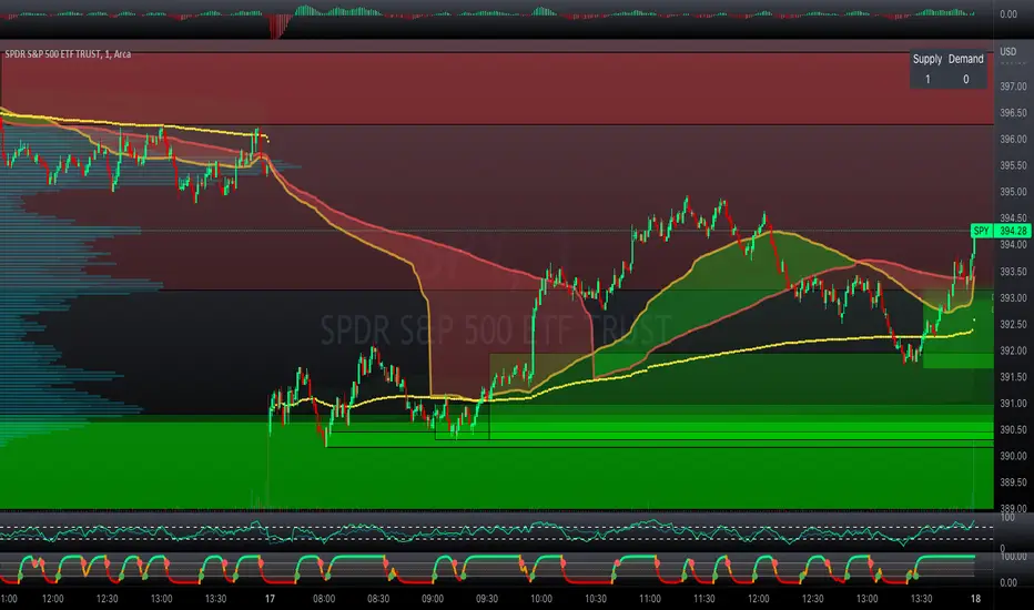
Donchian Channels with Limits and Shadows | by Octopu$ 🌊 Donchian Channels with Middle Line, Limits and Shadows | by Octopu$
Donchian Channels are three lines generated by Moving Average calculations.
These lines formed by upper and lower bands around a midrange or median band.
The Upper Band marks the Highest price of a security over X periods of time.
While the Lower Band marks the Lowest price over the same period.
Now, the Limit bands are the High and Low prices over a Y period of time (different than X)
The difference about using Limits with the Bands on Donchian Channels is the time length:
By using different time comparisons (X and Y) you are able to identify previous Highs and Lows.
This is very useful for Support and Resistance levels regarding the Price Action
As well as Pivot Points, considering the possibility off Breakouts or Bounces.
Usually - as a General Rule - the Price tends to navigate in-between these channels
That's where DC Channels + Limits w/ Shadows come into play!
Highs and Lows serve as Supply and Demand Zones as well.
The Middle Line can be used as a spot for Reversal/Continuation.
All of this also makes the Donchian Channels a great tool for Trend Identification.
The combination of your understanding and analysis as well as other Indicators and Factors as Confluence, you can improve your Charting Analysis.
www.tradingview.com
AMEX:SPY
ANY Ticker. ANY Timeframe.
( SPY 5m as an example only.)
Features:
• Upper Channel
• Lower Channel
• Limit High
• Limit Low
• Middle Line
• Shadow
Options:
• Color Picker
• Line Styling
• Toggle On/Off
• Length Customization
• Background Transparency
Notes:
v1.0
Indicator release.
Changes and updates can come in the future for additional functionalities or per requests. Follow and Stay Tuned!
Did you like it? Please Support and Shoot me a message! I'd appreciate if you dropped by to say thanks! Thank you.
- Octopu$
🐙
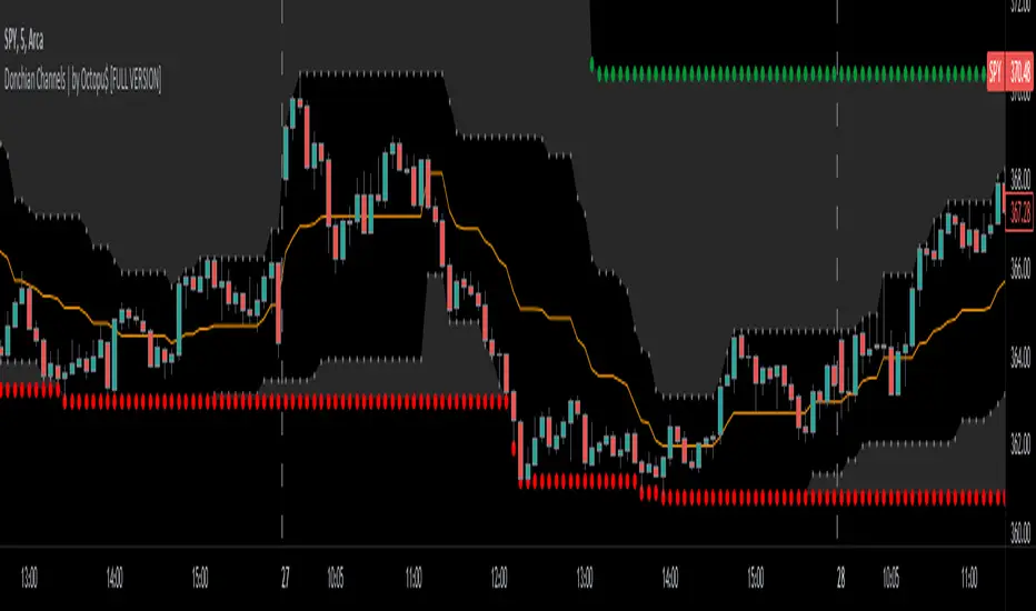
Support Resistance Channels/Zones Multi Time FrameHello All,
For long time I have been getting a lot of requests for Support/Resistance Multi Time Frame script. Here ' Support Resistance Channels/Zones Multi Time Frame ' is in your service.
This script works if the Higher Time Frame you set is higher than the chart time frame. so the time frame in the options should be higher than the chart time frame.
The script checks total bars and highest/lowest in visible part of the chart and shows all S/R zones that fits according the highest/lowest in visible part. you can see screenshots below if it didn't make sense or if you didn't understand
Let see the options:
Higher Time Frame : the time frame that will be used to get Support/Resistance zones, should be higher than chart time frame
Pivot Period : is the number to find the Pivot Points on Higher time frame, these pivot points are used while calculating the S/R zones
Loopback Period : is the number of total bars on higher time frame which is used while finding pivot points
Maximum Channel Width % : is the percent for maximum width for each channel
Minimum Strength : each zone should contain at least a 1 or more pivot points, you set it here. (Open/High/Low/Close also are considered while calculating the strength)
Maximum Number of S/R : the number of maximum Support/Resistance zones. there can be less S/Rs than this number if it can not find enough S/Rs
Show S/R that fits the Chart : because of we use higher time frame, you should enable this option then the script shows only S/Rs that fits the current chart. if you disable this option, all S/R zones are shown and it may shrink the chart. also you may not see any S/R zone if you don't choose the higher time frame wisely ;)
Show S/R channels in a table : if you enable this option (by default it's enabled) then lower/upper bands of all S/R zones shown in a table ( even if it doesn't fit the chart ). you can change its location. zones are sorted according to their strengths. first one is the strongest.
and the other options is about colors and transparency.
Screenshots before and after zoom-out:
after zoom-out number of visible bars and highest/lowest change and it shows more S/R zones that fits the current chart!
if you see Support Resistance zone like below then you should decrease ' Maximum Channel Width ' or you should set higher time frame better:
You can change colors and transparency:
You can change Table location:
Alerts added :)
P.S. I haven't tested it so much, if you see any issue please drop a comment or send me message
Enjoy!
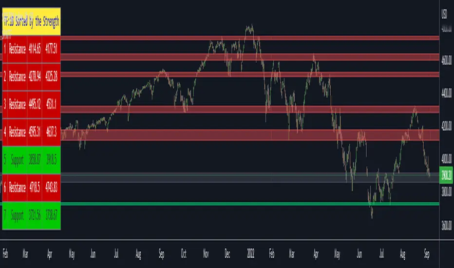
Sonarlab - SMC Multi Timeframe add-onThe SMC HTF Indicator is an add-on for the original SMC Indicator . This add-on will show you multi timeframe Internal structure points, swing structure points and POI's. This will make it easier for you to do your multi timeframe analyses to speed up the process and save you chart work.
Main features:
- POI's
- Structure points (Swing and Internal)
- Trading panel (based on structure breaks)
Setting overview
Higher timeframe structure
Select timeframe {turn on/ off} / {amount to show}
Internal structure {turn on/ off} / {amount to show}
Swing structure {turn on/ off} / {amount to show}
POI {turn on/ off} / {amount to show}
OB Mitigation {wick/ close}
Alerts
Bullish/ bearish POI
Bullish/ bearish BOS
Bullish/ bearish CHoCH
Swing Bullish/ bearish BOS
Swing Bullish/ bearish CHoCH
Second higher timeframe structure
Select timeframe {turn on/ off} / {amount to show}
Internal structure {turn on/ off} / {amount to show}
Swing structure {turn on/ off} / {amount to show}
POI {turn on/ off} / {amount to show}
OB Mitigation {wick/ close}
Alerts
Bullish/ bearish POI
Bullish/ bearish BOS
Bullish/ bearish CHoCH
Swing Bullish/ bearish BOS
Swing Bullish/ bearish CHoCH
Trading panel
Styling options

Support & Resistance/Supply & Demand/Liquidity/Trendlines (Expo)Real-Time Support & Resistance/Supply & Demand/Liquidity Zones /Trendlines / Key Levels
This trading tool automatically identifies real-time Support/Resistance, Supply and Demand, Liquidity Zones, Key levels, and Trendlines.
FEATURES
This indicator includes all necessary features for traditional technical analysis, such as Trendlines, Support/Resistance, Supply/Demand, and Liquidity Zones. In addition to that, we have added key market levels.
Support/Resistance: Identifies areas in real-time where the price finds support and resistance.
Supply/Demand: The indicator analyzes the market structure in real-time and maps out key supply and demand zones. The user gets an instant understanding of the current market structure.
Liquidity Zones: Liquidity zones are displayed where there is a significant level of trading activity and when there is both high supply and demand for an asset, security, or contract.
TrendLines: Trendlines help traders determine the current direction of market prices. A trendline is displayed when a price action trend is detected.
Key Levels: Key levels are psychological levels that are under the attention of many traders. There is a lot of buying or selling pressure at these levels. At these key levels, price decides its direction, either to go bearish or bullish.
HOW TO USE
Use the indicator to identify several important and commonly used levels and zones. All zones work as a future reference where the price has a higher likelihood to react at, bounce off from, or reverse.
-----------------
Disclaimer
Copyright by Zeiierman.
The information contained in my Scripts/Indicators/Ideas/Algos/Systems does not constitute financial advice or a solicitation to buy or sell any securities of any type. I will not accept liability for any loss or damage, including without limitation any loss of profit, which may arise directly or indirectly from the use of or reliance on such information.
All investments involve risk, and the past performance of a security, industry, sector, market, financial product, trading strategy, backtest, or individual’s trading does not guarantee future results or returns. Investors are fully responsible for any investment decisions they make. Such decisions should be based solely on an evaluation of their financial circumstances, investment objectives, risk tolerance, and liquidity needs.
My Scripts/Indicators/Ideas/Algos/Systems are only for educational purposes!
Skrip berbayar
