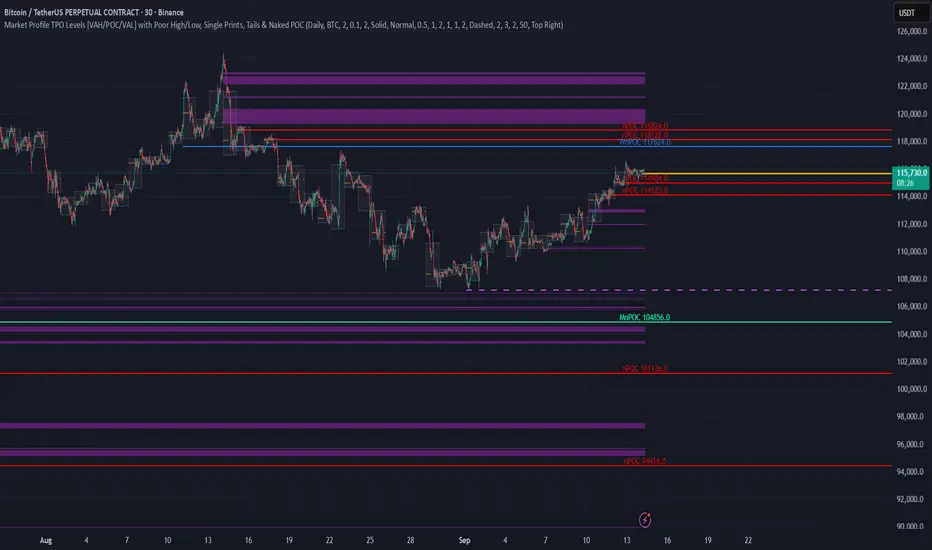
TPO Levels [VAH/POC/VAL] with Poor H/L, Single Prints & NPOCs### 🎯 Advanced Market Profile & Key Level Analysis
This script is a unique and comprehensive technical analysis tool designed to help traders understand market structure, value, and key liquidity levels using the principles of **Auction Market Theory** and **Market Profile**.
This script is unique (and shouldn't be censored) because :
It allows large history of levels to be displayed
Accurate as possible tick size
Doesn't draw a profile but only the actual levels
Supports multi-timeframe levels even on the daily mode giving macro context
There is no indicator out there that does it
While these concepts are universal, this indicator was built primarily for the dynamic, 24/7 nature of the **cryptocurrency market**. It helps you move beyond simple price action to understand *why* the market is moving, which is especially crucial in the volatile crypto space.
### ## 📊 The Concepts Behind the Calculations
To use this script effectively, it's important to understand the core concepts it is built upon. The entire script is self-contained and does not require other indicators.
* **What is Market Profile?**
Market Profile is a unique charting technique that organizes price and time data to reveal market structure. It's built from **Time Price Opportunities (TPOs)**, which are 30-minute periods of market activity. By stacking these TPOs, the script builds a distribution, showing which price levels were most accepted (heavily traded) and which were rejected (lightly traded) during a session.
* **What is the Value Area (VA)?**
The Value Area is the heart of the profile. It represents the price range where **70%** of the session's trading volume occurred. This is considered the "fair value" zone where both buyers and sellers were in general agreement.
* **Point of Control (POC):** The single price level with the most TPOs. This was the most accepted or "fairest" price of the session and acts as a gravitational line for price.
* **Value Area High (VAH):** The upper boundary of the 70% value zone.
* **Value Area Low (VAL):** The lower boundary of the 70% value zone.
VAH and VAL are dynamic support and resistance levels. Trading outside the previous session's value area can signal the start of a new trend.
***
### ## 📈 Key Features Explained
This script automatically calculates and displays the following critical market-generated information:
* **Multi-Timeframe Market Profile**
Automatically draws Daily, Weekly, and Monthly profiles, allowing you to analyze market structure across different time horizons. The script preserves up to 20 historical sessions to provide deep market context.
* **Naked Point of Control (nPOC)**
A "Naked" POC is a Point of Control from a previous session that has **not** been revisited by price. These levels often act as powerful magnets for price, representing areas of unfinished business that the market may seek to retest. The script tracks and displays Daily, Weekly, and Monthly nPOCs until they are touched.
* **Single Prints (Imbalance Zones)**
A Single Print is a price level where only one TPO traded during the session's development. This signifies a rapid, aggressive price move and an imbalanced market. These areas, like gaps in a traditional chart, are frequently revisited as the market seeks to "fill in" these thin parts of the profile.
* **Poor Structure (Unfinished Auctions)**
A **Poor High** or **Poor Low** occurs when the top or bottom of a profile is flat, with two or more TPOs at the extreme price. This suggests that the auction in that direction was weak and inconclusive. These weak structures often signal a high probability that price will eventually break that high or low.
***
### ## 💡 How to Use This Indicator
This tool is not a signal generator but an analytical framework to improve your trading decisions.
1. **Determine Market Context:** Start by asking: Is the current price trading *inside* or *outside* the previous session's Value Area?
* **Inside VA:** The market is in a state of balance or range-bound. Look for trades between the VAH and VAL.
* **Outside VA:** The market is in a state of imbalance and may be starting a trend. Look for continuation or acceptance of prices outside the prior value.
2. **Identify Key Levels:**
* Use historical **nPOCs** as potential profit targets or areas to watch for a price reaction.
* Treat historical **VAH** and **VAL** levels as significant support and resistance zones.
* Note where **Single Prints** are. These are often price magnets that may get "filled" in the future.
3. **Spot Weakness:**
* A **Poor High** suggests weak resistance that may be easily broken.
* A **Poor Low** suggests weak support, signaling a potential for a continued move lower if broken.
***
### ## ⚙️ Customization & Crypto Presets
The indicator is highly customizable, allowing you to change colors, transparency, the number of historical sessions, and more.
To help traders get started quickly, the indicator includes **built-in layout presets** specifically calibrated for major cryptocurrencies: ** BINANCE:BTCUSDT.P , BINANCE:ETHUSDT.P , and BINANCE:SOLUSDT.P **. These presets automatically adjust key visual parameters to better suit the unique price characteristics and volatility of each asset, providing an optimized view right out of the box.
***
### ## ⚠️ Disclaimer
This indicator is a tool for market analysis and should not be interpreted as direct buy or sell signals. It provides information based on historical price action, which does not guarantee future results. Trading involves significant risk, and you should always use proper risk management. This script is designed for use on standard chart types (e.g., Candlesticks, Bar) and may produce misleading information on non-standard charts.
TPO
Simple TPODisplays price distribution over time using Time Price Opportunities (TPO). Shows Point of Control (POC), Value Area High/Low (VAH/VAL) levels to identify key support/resistance zones and fair value areas. Includes customizable timeframes and price breakout alerts.

Pristine Value Areas & MGIThe Pristine Value Areas indicator enables users to perform comprehensive technical analysis through the lens of the market profile in a fraction of the time! 🏆
A Market Profile is a charting technique devised by J. Peter Steidlmayer, a trader at the Chicago Board of Trade (CBOT), in the 1980's. He created it to gain a deeper understanding of market behavior and to analyze the auction process in financial markets. A market profile is used to analyze an auction using price, volume, and time to create a distribution-based view of trading activity. It organizes market data into a bell-curve-like structure, which reveals areas of value, balance, and imbalance.
💠 How is a Value Area Calculated?
A value area is a distribution of 68%-70% of the trading volume over a specific time interval, which represents one standard deviation above and below the point of control, which is the most highly traded level over that period.
The key reference points are as follows:
Value area low (VAL) - The lower boundary of a value area
Value area high (VAH) - The upper boundary of a value area
Point of Control (POC) - The price level at which the highest amount of a trading period's volume occurred
If we take the probability distribution of trading activity and flip it 90 degrees, the result is our Pristine Value Area!
Market Profile is our preferred method of technical analysis at Pristine Capital because it provides an objective and repeatable assessment of whether an asset is being accumulated or distributed by institutional investors. Market Profile levels work remarkably well for identifying areas of interest, because so many institutional trading algorithms have been programmed to use these levels since the 1980's!
The benefits of using Market Profile include better trade location, improved risk management, and enhanced market context. It helps traders differentiate between trending and consolidating markets, identify high-probability trade setups, and adjust their strategies based on whether the market is in balance (consolidation) or imbalance (trending). Unlike traditional indicators that rely on past price movements, Market Profile provides real-time insights into trader behavior, giving an edge to those who can interpret its nuances effectively.
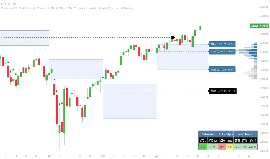
Virgin Point of Control (VPOC) - A point of control from a previous time period that has not yet been revisited in subsequent periods. VPOCs are great for identifying prior supply or demand zones.
Below is a great example of price reversing lower after taking out an upside VPOC
💠 Are all POCs Created Equal?
If POCs are used to gauge supply & demand zones at key levels, then a POC with higher volume should be viewed as more significant than a POC that traded lower volume, right? We created Golden POCs as a tool to identify high volume POCs on all timeframes.
Golden POC (GPOC) - A POC that traded the highest volume compared to prior POCs (proprietary to Pristine Capital)
We calculate value areas for the following time intervals based on the user selected timeframe:
5 Minute and 15 Minute Timeframes -> Daily Value Area
The daily value area paints the distribution of the PRIOR session's trading activity. The "d" in the label references for VAHd, POCd and VALd is a visual cue that value area shown is daily.
1 Hour Timeframe -> Weekly Value Area
The weekly value area paints the distribution of the PRIOR week's trading activity. The "w" in the label references for VAHw, POCw and VALw is a visual cue that value area shown is weekly.
1 Day Timeframe -> Monthly Value Area
The monthly value area paints the distribution of the PRIOR month's trading activity. The "m" in the label references for VAHm, POCm and VALm is a visual cue that value area shown is monthly.
1 Week Timeframe -> Yearly Value Area
The yearly value area paints the distribution of the PRIOR year's trading activity. The "y" in the label references for VAHy, POCy and VALy is a visual cue that value area shown is yearly.
💠 What is a developing value area?
The developing value area provides insight into the upcoming value area while it is still forming! It appears when 80% of the way through the current value area. As the end of a trading period approaches, it can make sense to start trading off the developing value area. When the time period flips, the developing value area becomes the active value area!
💠 Value Areas Trading Setups
Two popular market profile concepts are the bullish and bearish 80% rules. The concept is that there is an 80% probability that the market will traverse the entire relevant value area.
Bullish 80% Rule - If a security opens a period below the value area low , and subsequently closes above it, the bullish 80% rule triggers, turning the value area green. One can trade for a move to the top of the value area, using a close below the value area low as a potential stop!
In the below example, HOOD triggered the bullish 80% rule after it reclaimed the monthly value area!
HOOD proceeded to rally through the monthly value area and beyond in subsequent trading sessions. Finding the first stocks to trigger the bullish 80% rule after a market correction is key for spotting the next market leaders!
Bearish 80% Rule - If a security opens a period above the value area high , and subsequently closes below it, the bearish 80% rule triggers, turning the value area red. One can trade for a move to the bottom of the value area, using a close above the value area high as a potential stop!
ES proceeded to follow through and test the value area low before trending below the weekly value area
Value Area Breakouts - When a security is inside of value, the auction is in balance. When it breaks out from a value area, it could be entering a period of price discovery. One can trade these breaks out of value with tight risk control by setting a stop inside the value area! These breakouts can be traded on all chart timeframes depending on the timeframe of the individual trader. Combining multiple timeframes can result in even more effective trading setups.
RBLX broke out from the monthly value area on 4/22/25👇
RBLX proceeded to rally +62.78% in 39 trading sessions following the monthly VAH breakout!
💠 Market Generated Information to Improve Your Situational Awareness!
In addition to the value areas, we've also included stat tables with useful market generated information. The stats displayed vary based on the timeframe the user has up on their screen. This incentivizes traders to check the chart on multiple timeframes before taking a trade!
Metrics Grouped By Use Case
Performance
▪ YTD α - YTD Alpha (α) measures the risk-adjusted, excess return of a security over its user defined benchmark, on a year-to-date basis.
▪ MTD α - MTD Alpha (α) measures the risk-adjusted, excess return of a security over its user defined benchmark, on a month-to-date basis.
▪ WTD α - WTD Alpha (α) measures the risk-adjusted, excess return of a security over its user defined benchmark, on a week-to-date basis.
▪ YTD %Δ - Year-to-date percent change in price
▪ MTD %Δ - Month-to-date percent change in price
▪ WTD %Δ - Week-to-date percent change in price
Volatility
▪ ATR % - The Average True Range (ATR) expressed as a percentage of an asset's price.
▪ Beta - Measures the price volatility of a security compared to the S&P 500 over the prior 5 years (since inception if 5 years of data is not available)
Risk Analysis
▪ LODx - Low-of-day extension - ATR % multiple from the low of day (measures how extended a stock is from its low of day)
▪ MAx - Moving average extension - ATR % multiple from the user-defined moving average (measures how extended a security is from its moving average). Default moving average = 50D SMA
Why does MAx matter?
MAx measures the number of ATR % multiples a security is trading away from a key moving average. The default moving average length is 50 days.
MAx can be used to identify mean reversion trades . When a security trends strongly in one direction and moves significantly above or below its moving average, the price often tends to revert back toward the average.
Example, if the ATR % of the security is 5%, and the stock is trading 50% higher than the 50D SMA, the MAx would be 50%/5% = 10. A user might opt to take a countertrend trade when the MAx exceeds a predetermined level.
The MAx can also be useful when trading breakouts above or below the key moving average of your choosing. The lower the MAx, the tighter stop loss one can take if trading against that level.
Identifying an extreme price extension using MAx 👇
Price mean reverted immediately following the high MAx 👇
💠 Trend Analysis
The Trend Analysis section consists of short-term and long-term stage analysis data as well as the value area timeframe and price in relation to the value area.
Stage Analysis
▪ ST ⇅ - Short-term stage analysis indicator
▪ LT ⇅ - Long-term stage analysis indicator
Short-term and long-term stage analysis data is provided in the two rightmost columns of each table. The columns are labeled ST ⇅ and LT ⇅.
Why is Stage Analysis important? Popularized by Stan Weinstein, stage analysis is a trend following system that classifies assets into four stages based on price-trend analysis.
The problem? The interpretation of stage analysis is highly subjective. Based on the methodology provided in Stan Weinstein’s books, five different traders could look at the same chart, and come to different conclusions as to which stage the security is in!
We solved for this by creating our own methodology for classifying stocks into stages using moving averages. This indicator automates that analysis, and produces short-term and long-term trend signals based on user-defined key moving averages. You won’t find this in any textbook or course, because it’s completely unique to the Pristine trading methodology.
Our indicator calculates a short-term trend signal using two moving averages; a fast moving average, and a slow moving average. We default to the 10D EMA as the fast moving average & the 20D SMA as the slow moving average. A trend signal is generated based on where price is currently trading with respect to the fast moving average and the slow moving average. We use the signal to guide shorter-term swing trades.
In general, we want to take long trades in stocks with strengthening trends, and short trades in stocks with weakening trends. The user is free to change the moving averages based on their own short-term timeframe. Every trader is unique!
The same process is applied to calculate the long-term trend signal. We default to the 50D SMA as our fast moving average, and the 200D SMA as the slow moving average for the LT ⇅ signal calculation, but users can change these to fit their own unique trading style.
What is Stage 1?
Stage 1 identifies stocks that transitioned from downtrends, into bottoming bases.
Stage 1A - Bottom Signal: Marks the first day a security shows initial signs of recovery after a downtrend, with early indications of strength emerging.👇
Stage 1B - Bottoming Process: Identifies the ongoing phase where the security continues to stabilize and strengthen, confirming the base-building process after the initial signal.👇
Stage 1R - Failed Uptrend: Detects when a security that had entered an early uptrend loses momentum and slips back into a bottoming phase, signaling a failed breakout.👇
What is Stage 2?
Stage 2 identifies stocks that transitioned from bottoming bases to uptrends.
Stage 2A - Breakout: Marks the first day a security decisively breaks out, signaling the start of a new uptrend.👇
Stage 2B - Uptrend: Identifies when the security continues to trade in an established uptrend following the initial breakout, with momentum building but not yet showing full strength.👇
Stage 2C - Strong Uptrend: Detects when the uptrend strengthens further, with the security displaying clear signs of accelerating strength and buying pressure.👇
Stage 2R - Failed Breakdown: Detects when a security that had recently entered a corrective phase reverses course and reclaims its upward trajectory, moving back into an uptrend.👇
What is Stage 3?
Stage 3 identifies stocks that transitioned from uptrends to topping bases.
Stage 3A - Top Signal: Marks the first day a security shows initial signs of weakness after an uptrend, indicating the start of a potential topping phase.👇
Stage 3B - Topping Process: Identifies the period following the initial signal when the security continues to show signs of distribution and potential trend exhaustion.👇
Stage 3R - Failed Breakdown: Detects when a security that had entered a deeper corrective phase reverses upward, recovering enough strength to re-enter the topping phase.👇
What is Stage 4?
Stage 4 identifies stocks that transitioned from topping bases to downtrends.
Stage 4A - Breakdown: Marks the first day a security decisively breaks below key support levels, signaling the start of a new downward trend.👇
Stage 4B - Downtrend: Identifies when the security continues to trend lower following the initial breakdown, with sustained bearish momentum, though not yet fully entrenched.👇
Stage 4C - Strong Downtrend: Detects when the downtrend intensifies, with the security displaying clear signs of accelerating weakness and selling pressure.👇
Stage 4R - Failed Bottom: Detects when a security that had begun to show early signs of bottoming reverses course and resumes its decline, falling back into a downtrend.👇
Stage N/A - Recent IPO: Applies to stocks that recently IPO’ed and don’t have enough data to calculate all necessary moving averages.
Value Area
In Trend Analysis, the value area information is helpful to gauge price in relation to the value area.
▪ VA(y) - Categorizes the security based on the relation of price to the yearly value area
▪ VA(m) - Categorizes the security based on the relation of price to the monthly value area
▪ VA(w) - Categorizes the security based on the relation of price to the weekly value area
Value area states:
▪ ABOVE = Price above the value area high
▪ BELOW = Price below the value area low
▪ INSIDE = Price inside the value area
▪ Bull 80% = Bullish 80% rule in effect
▪ Bear 80% rule = Bearish 80% rule in effect
For example, in the chart above, VA(m) - ABOVE indicates a monthly value area and price is above the VAH.
💠 What Makes This Indicator Unique
There are many value area indicators, however...
Value Area
▪ Golden POC (GPOC) - This is a proprietary concept.
▪ Unique Label Customization
Pristine value areas often comprehensive and unique label customizations. Styles include options to display any combination of the following on your labels:
• Price levels associated with market profile levels
• % distance of market profile levels from security price
• ATR% extension of market profile levels from security price
Multi-Timeframe Analysis
Based on the chart timeframe, unique market generated information is shown to facilitate multi-timeframe analysis.
▪ Weekly Timeframe
On the weekly timeframe the focus is the bigger picture and the metrics reflect this perspective. Performance data includes YTD Alpha and YTD percent change in price. Volatility is measured using ATR % and the industry standard beta. Trend analysis for this higher timeframe include the 52-week range, which measures where a security is trading in relation to its 52wk high and 52wk low. Also included is the where price is in relation to yearly value area.
▪ Daily Timeframe
As one drills down to the daily timeframe, the performance metrics include MTD alpha and MTD percent change in price.
Risk analysis includes the low-of-day extension (LODx), which is the ATR % multiple from the low of the day, to measures how extended a stock is from its low of day. In addition, the moving average extension (MAx) is the ATR % multiple from the user-defined moving average, measures how extended a security is from its
moving average. The default moving average is the 50D SMA, however this can be customized in Settings.
Trend Analysis on the daily timeframe includes the Pristine Capital methodology for classifying stocks into stages using moving averages. Both short-term and long-term stage analysis data is included. Finally, price in relation to monthly value area is shown.
▪ Hourly Timeframe
An the hourly timeframe, performance metrics include WTD alpha and WTD percent change in price. Trend analysis includes the daily closing range (DCR) and price in relation to weekly value area.
💠 Settings and Preferences
💠 Acknowledgements
We'd like to thank @dgtrd, a TradingView Pine Wizard, for his insight on the finer details when working with volume profiles.
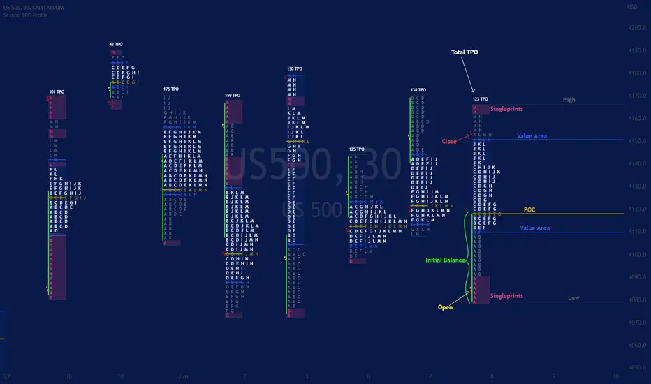
TPO IQ [TradingIQ]Hello Traders!
Introducing "TPO IQ"!
TPO IQ offers a Time Price Opportunity profile with several customization options that packs several related features to help traders navigate the generated profiles!
Features
TPO Profiles
Single Print identification
Initial Balance Identification
Can be anchored to timeframe change
Can be anchored to fixed time interval
Last profile detailed visuals
Customizable value area percentage
POC identification
Mid-point identification
TPO Profiles
A TPO profile is a market profile visualization that details how much time was spent at each price level throughout the time interval.
The image above further explains what a TPO Profile is!
Each letter corresponds to a candlestick. With this information, traders are able to visualize how much time was spent at each price area.
With customizable gradient colors, specifically in this example, blocks colored red are the earliest times in the profile, blocks colored green are in the beginning half of the time midpoint of the profile. Blue blocks represent the first half of the end of the time period, and purple blocks correspond to the end of the time period.
Please note that this form of TPO profile generation will only occur when the most recent profile uses less than 500 alphabet characters! If more than 500 characters are preset, TPO IQ will revert to using labels!
Initial Balance
TPO IQ also identifies the initial balance range and all alphabet characters that form within it!
The image above exemplifies this feature. The initial balance range is denoted by a a neon-blue line, with a blue circle showing the opening price. All characters within the initial balance range are highlighted blue, which is a feature that can be disabled with customizable colors.
POC
TPO IQ also identifies the point of control (POC) of the TPO Profile.
The point of control for the profile is labeled yellow by default, and shows where price spent the most time throughout the time period.
The image above shows the POC for the time period being identified by TPO IQ.
Value Area
TPO IQ also identifies the value area of the profile. A customizable percentage that is 70% by default, the value area of a TPO profile shows where price traded the majority of the time.
The image above further explains this feature. For this example, with the value area percentage being set to 70%, the value area high and value area low show the price zone that prices traded at 70% of the time throughout the profile.
TPO Midpoint
In addition to the POC, the TPO profile midpoint is also identified by TPO IQ.
The TPO midpoint simply corresponds to the middle price between the session's high and low!
Fixed Interval Mode
By default, TPO IQ recalculates every day, but this can also be changed to a customizable session time, such as 4 hours. If 4 hours is selected, then a new TPO profile will be generated every 4 hours.
However, in Fixed Interval mode, a TPO profile will be generated through a user-defined time range, such as 1300-1700.
In the image above, Fixed Interval mode is applied with a time range of 1300-1700 and, consequently, TPO IQ generates a new profile throughout every 1300-1700 time range!
This feature allows traders to specify time ranges of interest to generate TPO profiles for!
TPO Overview Label
The TPO overview label shows key statistics for the TPO profile generated throughout the trading session!
The "TPO Count" statistic shows how many alphabetical letters were generated for the profile, which is an adequate method to determine the session's volatility and price range.
The "Tick Levels" statistic shows how many tick levels were used to create the profile - another method to determine the volatility and price range of the session.
The "Top Letter" statistic shows which letter appears most throughout the profile. In this example, the top letter was "f", which means throughout creation of the profile, the letter "f" appeared the most!
And that's all for now!
If you have any feedback or new feature ideas for TPO IQ please feel free to share them with us!
Thank you traders!

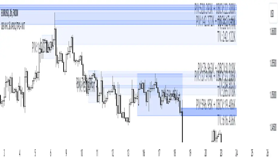
Order Blocks with Volume Heatmap & Clusters - VK TradingOrder Blocks with Volume Heatmap & Clusters - VK Trading
This script is designed to identify and highlight Order Blocks, a key concept in institutional trading, and combines it with powerful tools like volume heatmaps and accumulation clusters for enhanced market analysis. Suitable for traders of all experience levels, this script provides a clear and customizable visualization to help identify significant market zones effectively.
What Does This Script Do?
Order Block Identification: Highlights bullish and bearish order blocks directly on the chart, making it easier to spot key supply and demand zones.
Volume Heatmap: A dynamic heatmap adjusts colors based on relative volume, allowing you to quickly identify areas of heightened activity.
Institutional Accumulation Clusters: Zones of potential institutional accumulation are calculated using a combination of ATR (Average True Range), standardized volume, and RSI (Relative Strength Index).
Automatic Clearing: Invalidated order blocks are automatically removed, ensuring your charts remain clean and focused.
Key Features
Customizable Sensitivity: Adjust the script’s sensitivity to tailor order block detection to different market conditions and strategies.
Advanced Volume Display Options: Toggle volume visibility on or off. Customize the position, size, and color of volume labels for better integration with your chart's design.
Dynamic Heatmap Intensity: Fine-tune the heatmap’s intensity and color to highlight areas of interest based on trading volume.
Dual Order Block Detection: Uses two independent detection settings to analyze the market from multiple perspectives.
Visual Alerts: Automatically draws key level lines based on detected order blocks for better clarity.
User Benefits:
Clear Market Analysis: Helps pinpoint institutional activity and key levels with minimal effort.
Increased Efficiency: Automates plotting and analysis, allowing you to focus on decision-making.
Versatile Compatibility: Complements strategies like Smart Money Concepts, Wyckoff, and Price Action approaches.
Disclaimer
This script is intended as an analytical and educational tool. It does not guarantee specific outcomes or eliminate trading risks. Use this tool at your own discretion and always practice proper risk management.
OVN H/L OVN H/L (Overnight High/Low)
Description:
The "OVN H/L" indicator is designed to plot the highest and lowest price levels within a specified time interval on your chart. This tool is especially useful for traders who focus on key support and resistance levels established during specific trading sessions, such as overnight or pre-market hours.
Features:
Custom Time Interval: Input your desired start and end times in HH
format (UTC+0). Handles intervals that span midnight seamlessly. Session Count Control: Choose the number of past sessions to display on the chart. Helps keep your chart organized by limiting the number of lines. Line Extension Options: Option to extend lines indefinitely to the right. If disabled, lines can be set to end or be interrupted upon price crossing. Upper and Lower Line Customization: Color Selection: Customize the color of the upper (high) and lower (low) lines separately. Line Width: Adjust the thickness of the lines from 1 to 5. Line Style: Choose between solid, dashed, or dotted lines for both upper and lower lines. Dynamic Line Management: Automatically updates high and low levels during the specified interval. Draws lines after the interval ends, reflecting the captured high and low. Price Interaction Detection: If line extension is disabled, lines will adjust if the price crosses them, providing visual cues.
Usage:
Overnight Trading: Identify key high and low levels from overnight sessions that may influence the upcoming trading day. Intraday Analysis: Customize the time interval to focus on specific market sessions (e.g., London or New York sessions). Support and Resistance Levels: Use the plotted lines as potential support and resistance zones for trading strategies.
How to Use:
Apply the Indicator: Add the "OVN H/L" indicator to your chart from the TradingView indicator library. Configure Time Settings: In the indicator settings, set the start and end times for the interval you're interested in. Adjust Appearance: Customize the colors, widths, and styles of the upper and lower lines to your preference. Set Session Display: Determine how many previous sessions' lines you wish to display. Line Extension Preference: Decide whether you want the lines to extend indefinitely or to end/interact based on price movement. Analyze Price Action: Use the high and low lines to identify key levels for potential entries, exits, or stop-loss placements.
Notes:
Time Zones: The script uses UTC+0 for time calculations. Ensure you adjust the input times accordingly if your chart is in a different timezone. Compatibility: Best used on intraday timeframes where sessions and intervals are relevant. Limitations: The indicator may not display correctly on historical data beyond the number of sessions specified.
Conclusion:
The "OVN H/L" indicator is a versatile tool that enhances your chart analysis by highlighting significant price levels within custom time intervals. By visualizing these critical zones, traders can make more informed decisions and refine their trading strategies.

Liquidity composition / quantifytools- Overview
Liquidity composition divides each candle into sections that are used to display transaction activity at price. In simple terms, an X-ray through candle is formed, revealing the orderflow that built the candle in greater detail. Liquidity composition consists of two main components, lots and columns. Lots and columns can be used to visualize user specified volume types, currently supporting net volume and volume delta. Lots and columns can be used to visualize same or different volume types, allowing a combination of volume footprint, volume delta footprint and volume profile in one single view. Liquidity composition principally works on any chart, whether that is equities, currencies, cryptocurrencies or commodities, even charts with no volume data (in which case volatility is used to approximate transaction activity). The script also works on any timeframe, from minute charts to monthly charts. Orderflow can be observed in real-time as it develops and none of the indications are repainted.
Example: Displaying same volume types on lots and columns
Example: Displaying different volume types on lots and columns
Liquidity composition supports user specified derivative data, such as point of control(s) and net activity coloring. Derivative data can be calculated based on either net volume or volume delta, resulting in different highlights.
With net volume, volume delta and derivative data in one view, key orderflow events such as delta imbalances, high volume nodes, low volume nodes and point of controls can be used to quickly identify accumulation/distribution, imbalances, unfinished/finished auctions and trapped traders.
Accessing script 🔑
See "Author's instructions" section, found at bottom of the script page.
Key takeaways
- Liquidity composition breaks down transaction activity at price, measured in net volume or volume delta
- Developing activity can be observed real-time, none of the indications are repainted
- Transaction activity is calculated using volumes accrued in lower timeframe price movements
- Lots and columns can be used to display same or different volume types (e.g. volume delta lots and net volume columns) in single view
- Users can specify derivative data such as volume delta POCs, net volume POC and net activity coloring
- For practical guide with practical examples, see last section
Disclaimer
Orderflow data is estimated using lower timeframe price movement. While accurate and useful, it's important to note the calculations are estimations and are not based on orderbook data. Estimates are calculated by allotting volume developing on lower timeframe chart to its respective section based on closing price. Volume delta (difference between buyers/sellers) is calculated by subtracting down move volumes (sell volume) from up move volumes (buy volume). Accuracy of the orderflow estimations largely depends on quality of lower timeframe chart used for calculations, which is why this tool cannot be expected to work accurately on illiquid charts with broken data.
Liquidity composition does not provide a standalone trading strategy or financial advice. It also does not substitute knowing how to trade. Example charts and ideas shown for use cases are textbook examples under ideal conditions, not guaranteed to repeat as they are presented. Liquidity composition should be viewed as one tool providing one kind of evidence, to be used in conjunction with other means of analysis.
- Example charts
Chart #1: BTCUSDT
Chart #2: EURUSD
Chart #3: ES futures
- Calculations
By default, size of sections and lower timeframe accuracy are automatically determined for all charts and timeframes. Number of lower timeframe price moves used for calculating orderflow is kept at fixed value, by default set to 350. Accuracy value dictates how many lower timeframe candles are included in the calculation of volume at price. At 350, the script will always use 350 lower timeframe price movements in calculations (when possible). When calculated dynamic timeframe is less than 1 minute, the script switches to available seconds based timeframes. Minimum dynamic timeframe can be capped to 1 minute (as seconds based timeframes are not available for all plans) or dynamic timeframe can be overridden using an user specified timeframe.
Example: Calculating dynamic lower timeframe
Main chart: 4H / 240 minutes
Accuracy value: 100
Formula: 240 minutes / 100 = 2.4 minutes
Timeframe used for calculations = 2 minutes
Section size is automatically determined based on typical historical candle range, the bigger it is, the bigger the section size as well. Like dynamic timeframe, automatic section size can be manually overridden by user specified size expressed in ticks (minimum price unit). Users can also adjust sensitivity of automatic sizing by setting it higher (smaller sections, more detail and more noise) or lower (less sections, less detail and less noise). Section size and dynamic timeframe can be monitored via metric table.
Volume at price is calculated by allotting volume associated with a lower timeframe price movement to its respective section based on closing price (volume is stored to the section that covers closing price). When used on a chart with no volume data, volatility is used instead to determine likely magnitude of participation. Volume delta (difference between buyers/sellers) is calculated by subtracting down move volumes (sell volume) from up move volumes (buy volume). Volumes accrued in sections are monitored over a longer period of time to determine a "normal" amount of activity, which is then used to normalize accrued volumes by benchmarking them against historical values.
Volume values displayed on the left side represent how close or far volume traded at given section is to an extreme, represented by value of 10 . The more value exceeds 10, the more extreme transaction activity is historically. The lesser the value, the less extreme (and therefore more typical) transaction activity is. Users can adjust sensitivity of volume extreme threshold, either by increasing it (more transaction activity is needed to constitute an extreme) or decreasing it (less transaction activity is needed to constitute an extreme).
Example: Interpreting volume scale
0 = Very little to no transaction activity compared to historical values
5 = Transaction activity equal to average historical values
10 = Transaction activity equal to an extreme in historical values
10+ = The more transaction activity exceeds value of 10, the more extreme it is historically
Accuracy of orderflow data largely depends on quality of lower timeframe data used in calculations. Sometimes quality of underlying lower timeframe data is insufficient due to suboptimal accuracy or broken lower timeframe data, usually caused by illiquid charts with gaps and inconsistent values. Therefore, one should always ensure the usage of most liquid chart available with no gaps in lower timeframe data. To combat poor orderflow data, a simple data quality check is conducted by calculating percentage of sections with volume data out of all available sections. Idea behind the test is to capture instances where unusual amount of sections are completely empty, most likely due to data gaps in LTF chart. E.g. 90% of sections hold some volume data, 10% are completely empty = 90% data quality score.
Data quality score should be viewed as a metric alerting when detail of underlying data is insufficient to consider accurate. When data quality score is slightly below threshold, lower timeframe chart used for calculations is likely fine, but accuracy value is too low. In this case, one should increase accuracy value or manually override used timeframe with a smaller one. When data quality score is well below threshold, lower timeframe chart used for calculations is likely broken and cannot be fixed. In this case, one should look for alternative charts with more reliable data (e.g. ES1! -> SPY, BITSTAMP:BTCUSD -> BINANCE:BTCUSDT).
Example : When insufficient data quality scores can/cannot be fixed
- Derivative data
Point of control
Point of control, referring to point in price where transaction activity is highest, can be calculated based on the volume type of lots or columns (based on net volume or volume delta). Depending on the calculation basis, displayed point of controls will vary. POC calculated based on net volume is no different from traditional POC, it is simply the section with highest amount of transaction activity, marked with an X. When calculating POC based on volume delta, the script will highlight two point of controls, named leading and losing point of control . Leading POC refers to lot with highest amount of volume delta, marked with an X. If leading POC was net buy volume, losing POC is marked on section with highest net sell volume, marked with S respectfully. Same logic applies in vice versa, if leading POC is net sell volume, losing POC is marked on highest buy volume section, using the letter B.
Net activity
Similarly to point of control calculation, net activity can be calculated based on either volume types, lots or columns. When calculating net activity based on net volume, candles will be colorized according to magnitude of total volume traded. When calculating net activity based on volume delta, candles will be colorized according to side with most volume traded (buyers or sellers). Net activity color can be applied on borders or body of a candle.
- Visuals
Lots, columns, candles and POCs can be colorized using a fixed color or a volume based dynamic color, with separate color options for buy side volume, sell side volume and net volume.
Metric table can be offsetted horizontally or vertically from any four corners of the chart, allowing space for tables from other scripts.
Table sizes, label sizes and offsets for visuals are fully customizable using settings menu.
- Practical guide
OHLC data (candles) is a simple condensed visualization of an auction market process. Candles show where price was in the beginning of an auction period (timeframe), the highest/lowest point and where price was at the end of an auction. The core utility of Liquidity composition is being able to view the same auction market process in much greater detail, revealing likely intention, effort and magnitude driving the process. All basic orderflow concepts, such as ones presented by auction market theory can be applied to Liquidity composition as well.
The most obvious and easy to spot use case for orderflow tools is identifying trapped traders/absorption, seen in high transaction activity at the very highs/lows of a candle or even better, at wicks. High participation at wicks can be used to identify forced orders absorbed into limit orders, idea behind being that when high transaction activity is placed at a wick, price went one direction with a lot of participation (high effort) and came right back up (low impact) within the same time period.
Absorption can show itself in many ways:
- Extreme buy volume sections at wick highs or buy side POC at wick highs
- Multiple, clustered high buy volume sections (but not extreme) at wick highs
- Positive net volume delta into a reversal down
- Extreme sell volume sections at wick lows or sell side POC at wick lows
- Multiple, clustered high sell volume sections (but not extreme) at wick lows
- Negative net volume delta into a reversal up
- Extreme net volume sections at or net volume POC at wick highs/lows
- Extreme net volume into a reversal up/down
For accurate analysis, orderflow based events should be viewed in the context of price action. To identify absorption, it's best to look for opportunities where an opposing trend is clearly in place, e.g. absorption into highs on an uptrend, absorption into lows on a downtrend. When price is ranging without a clear trend or there's no opposing trend, extreme activity at an extreme end of a candle might be aggressive participants attempting to initiate a new trend, rather than getting absorbed in the same sense. With enough effort put into pushing price to the opposite direction at overextended price, a shift in trend direction might be near.
Price action based levels are a great way to get context around orderflow events. Simple range highs/lows as a single data point serve as a high probability regimes for reversals, making them a great point of confluence for identifying trapped traders.
Low to zero volume sections can be used to identify points in price with little to no trading, leaving a volume null/void behind. Typically sections like these represent gaps on a lower timeframe chart, which can be used as reference levels for targets and support/resistance.
Net volume can be used for same purposes as above, but for determining general intention of market participants it's a much more suitable tool than volume delta. According to auction market theory, low/no participation is considered to reject prices and high participation is considered to accept prices. With this concept in mind, unfinished auctions occur when participation is high at highs or high at lows, idea behind being that participants are showing willingness and interest to trade at higher or lower prices. Auction is considered finished when the opposite is true, i.e. when participants are not showing willingness to trade at higher/lower prices. In general, direction of unfinished auctions can be expected to continue shortly and direction of unfinished auctions can be expected to hold.
While shape of volume delta and net volume are usually similar, they're not the same thing and do not represent the same event under the hood. Volume delta at 0 does not necessarily mean participation is 0, but can also mean high participation with equal amount of buying and selling. With this distinction in mind, using volume delta and net volume in tandem has the benefit of being able to identify points in price with a lot of up and down price movement packed into a small area, i.e. consolidation. Points in price where price hangs around for an extended period of time can be used to identify levels of interest for re-tests and breakout opportunities.

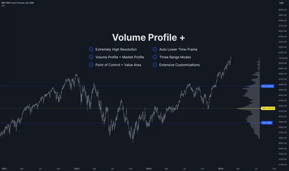
Volume Profile PlusThis indicator provides a high-resolution and high-precision implementation of Volume Profile with flexible range settings. Its key features include:
1. Support for a high resolution of up to 2,500 rows.
2. Capability to examine lower timeframe bars (default 5,000 intra-bars) for enhanced precision.
3. Three range modes — "Visible Range", "Anchored Range", and "All Range".
4. Highlighting of Point of Control and Value Area.
5. Extensive customization options allowing users to configure dimensions, on-chart placements, and color schemes.
🔵 Settings
The settings screen, along with the explanations for each setting, is provided below:
🔵 High Resolution using Polyline
Inspired by @fikira, this indicator utilizes the newly introduced `polyline` type in PineScript to plot the volume profile. It employs a single polyline instance to represent the entire histogram. With each polyline instance supporting up to 10,000 points and each histogram row requiring 4 points, this indicator can accommodate 2500 rows, resulting in a significantly higher resolution compared to conventional volume profile indicators that use `line`s or `box`es to draw the histogram.
🔵 High Precision Data-binning using Lower Timeframe Data
Conventional volume profile indicators often face one or both of the following limitations:
1. They only consider volume within the chart's current timeframe.
2. They assign each bar's total volume to a single price bucket based on the bar's average price, rather than distributing volume across multiple price buckets.
As a result, when the number of bars in the chart is low, those indicators may provide imprecise results, making it difficult to accurately identify significant volume nodes and the point of control.
To address these limitations and enhance accuracy, this indicator examines data from lower timeframes and distributes the volume to fine-grained price buckets. It intelligently selects an appropriate lower timeframe to ensure precise output while complying with a maximum specified number of bars to maintain good performance.
🔵 Three Range Modes
This indicator offers users the flexibility to choose from three range modes:
1. Visible Range (Default Mode): In this mode, the volume profile calculation begins at the time of the left-most bar displayed in the current viewport. As the user scrolls through the viewport, the volume profile updates automatically.
2. Anchored Range: This mode allows the user to set the start time either by using the datetime input boxes or by dragging the anchor line on the chart.
3. All Range: In this mode, the volume profile calculation is based on all the historical bars available in the chart.
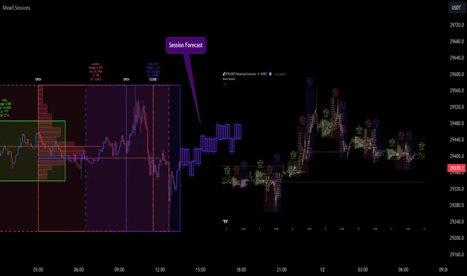
Market Sessions and TPO (+Forecast)This indicator "Market Sessions and TPO (+Forecast)" shows various market sessions alongside a TPO profile (presented as the traditional lettering system or as bars) and price forecast for the duration of the session.
Additionally, numerous statistics for the session are shown.
Features
Session open and close times presented in boxes
Session pre market and post market shown
TPO profile generated for each session (normal market hours only)
A forecast for the remained of the session is projected forward
Forecast can be augmented by ATR
Naked POCs remain on the chart until violated
Volume delta for the session shown
OI Change for the session shown (Binance sourced)
Total volume for the session shown
Price range for the session shown
The image above shows processes of the indicator.
Volume delta, OI change, total volume and session range are calculated and presented for each session.
Additionally, a TPO profile for the most recent session is shown, and a forecast for the remainder of the active session is shown.
The image above shows an alternative display method for the session forecast and TPO profile!
Additionally, the pre-market and post-market times are denoted by dashed boxes.
The image above exemplifies additional capabilities.
That's all for now; further updates to come and thank you for checking this out!
And a special thank you to @TradingView of course, for making all of this possible!
ADR/AWR/AMR Average Daily+Weekly+Monthly Range[Traders Reality]Advanced ADR/AWR/AMR indicator created for Traders Reality community, as well as the greater trading community.
Thanks to the TR community discord guys: infernix, peshocore and xtech5192
Everything is modular and can be turned on/off, including a customisable table showing daily/weekly/monthly average pips/dollars.
If you just want the average daily range lines for example, you can just disable everything else. You can choose how many days to look back; as well as for weeks or months.
Check out Traders Reality on YouTube if you want to see this implemented as part of Tino's strategy that utilizes market manipulation, imbalances, times of day etc.
Price regularly reverses from ADR, making it one of the few highly valuable indicators in price action/smart money trading.

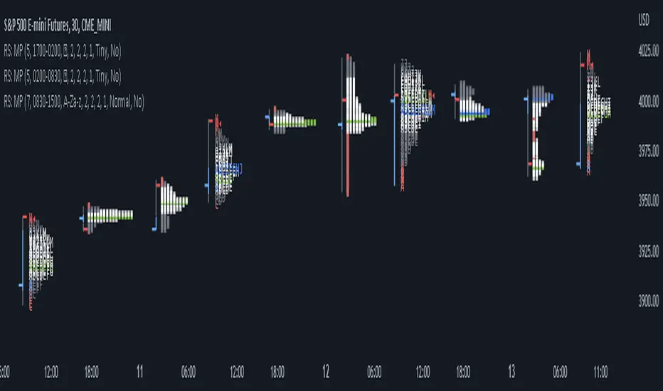
RS: Market ProfileA Market Profile (time price opportunity) implementation with an option to mark a point of control (POC) based on volume.
Config: Hide default candles. Select a session time using exchange timezone. Experiment with tick multiplier value to achieve desired level of detail. Choose the symbols of your choice, e.g. squares or A-Z chars. For multiple sessions you will have to add additional instances of this script with a different time configuration.
Limitations: TradingView has a hard limit for the number of characters (500), if it's reached, label rendering stops. Try increasing tick multiplier value to reduce the number of labels rendered or reduce the window size.
Features:
Use symbols or A-Z chars for TPOs
Mark POC
Calculate Value Area (volume or time based)
Highlight single prints (SP)
Highlight VWAP
Show daily bar
Highlight Open and Close
Highlight current price row (during live market)
Highlight initial balance (IB)
[Pt] Daily Market Profile / TPOA great mentor of mine once told me, trading is like driving. When you are driving, there are directions and road signs to follow. The key areas and levels from TPO market profile are the road signs in trading, you shouldn't trade without them much like you shouldn't drive without road signs, as you will get lost.
From Wikipedia: "A Market Profile is an intra-day charting technique (price vertical, time/activity horizontal) devised by J. Peter Steidlmayer, a trader at the Chicago Board of Trade (CBOT), ca 1959-1985. Steidlmayer was seeking a way to determine and to evaluate market value as it developed in the day time frame. The concept was to display price on a vertical axis against time on the horizontal, and the ensuing graphic generally is a bell shape--fatter at the middle prices, with activity trailing off and volume diminished at the extreme higher and lower prices." If you are unfamiliar with the concept, search for Market Auction Theory, Market Profile, and TPO on the web.
What's cool about this script?
As a professional trading, you should be drafting a trading plan and drawing all your key areas and levels before entering a trade. If you are trading with market profile, with this script, you no longer have to spend the time it takes to manually draw those key areas and levels. All are automatically generated with this script to give you the visual cues in your trades~!!
**IMPORTANT** Please note that due to the limitation on TradingView, there can only be limited number of boxes and lines that can be generated per indicator. Hence, this script only aims to provide you with as many key areas and levels as possible. This may be mitigated by having multiple instances of this indicator. Please use at your risk and discretion.
This script provides a comprehensive set of indicators / elements of daily TPO market profile, which includes the following:
- Market Profile based on TPO
- Point of Control (POC)
- Value Area (VA)
- Single Prints (SP)
- Excess (EX)
- Naked vs Visited (Touched) POC and VA
This script also includes the following key features that hopes to provide value in your trading:
- Automatically generated key areas and levels, including all the elements above
- Those key areas and levels will fade away as they become less significant, based on number of crosses and touches
- Customizable display settings
- Customizable session for generating the MP
- Two positions for MP placement
Setting descriptions:

TPO Market Profile [Kioseff Trading]REPOST; SCRIPT WORKS!!
Due to technical error, this script was republished! Thank you for your support (:
Hello!
This indicator comprises a real time TPO Market Profile!
The script works on any timeframe 1 second or greater - the script calculates relative to the timeframe selected for your chart.
The image above shows the 1-minute BTCUSD chart; 650 +/- tick levels are set.
To see the script in full functionality - try using bar replay on a cryptocurrency 1-minute chart (start at the beginning of a regular hours session). Be sure to adjust the tick spread if necessary (:
So far, the script's held up in real time - I've not had any array loop errors or timeouts. The TPO profile updates accordingly with changes in time / high and low prices. Letters are appended to the profile in real time.
The image above shows configurations for the indicator. I plan to update the indicator quite a bit over the coming days - more to come.
You can select the timeframe change the indicator accounts for. For instance, you can have set the indicator to reset every day, every 30 minutes, every 5 minutes, every week, month, etc.
In the image above, I configured the indicator to recalculate every 3 months. Consequently, the indicator will record a TPO profile for three consecutive, reset, then record a TPO profile for the next 3 months. This setting makes the indicator compatible with any timeframe greater than 1 minute.
You can also use a drag & drop time-start bar to modify the starting point for the market profile TPO calculation.
The indicator hosts an option to auto calculate the tick spread between levels. However, as you switch timeframes and assets, sometimes, you'll have to manually set the tick range (:
Thanks for checking it out; more to come!
Sep 4
Release Notes: UPDATE: The indicator can work on seconds-based charts.
The image above shows the indicator working on the 1-second chart.
(Screenshot is old; characters are now numbered instead of strange unicode)
Release Notes: Added value area + vah + val. Font update. Changed characters to numbered once the alphabet is exhausted. POC, VAH, and VAL label located left of the first bar of the interval. Initial balance range can be toggled. Spaced the characters (more legible). Quite a bit of aesthetic changes so check it out!
Soon, I'll release a version of the script that shows VAH, POC, VAL, and TPO letters from previous sessions. I coded this feature into this indicator; however, it was removed due to load time complications. This feature will be its own script (:
If the script has trouble loading please let me know (:

TPO Letters [Kioseff Trading]Hello!
"TPO Letters" functions similarly to the script "Realtime TPO Profile"; however, TPO characters are appended to a developing bar. Simply, TPO characters display on the bar that formed them.
All colors are configurable.
The image above emphasizes functionality; TPO letters are colored on a gradient . Additionally, the value area range is shaded; characters that form within the range are gradient colored. Gray-colored characters extend beyond the value area.
The columned data displayed right of the TPO letters shows tick levels. Tick levels are shaded various colors, each color indicative of some occurrence.
Tick Levels
Red: Single Print
Yellow: POC
Lime Green: VAH or VAL
Lighter Green: Value Area Inclusive Level
Left of the TPO horizontal-axis, the aqua-colored line (blue-line inclusive) reflects the high-low range of the session; the blue-colored line reflects the initial-balance range (IBR).
You can select to color TPO letters within the IBR blue (any color).
Additionally, you can select to shade the IBR.
The image above shows auxiliary features.
Unfortunately, I'm unable to orient TPO letters at their intended tick levels using one label per bar, a contrasting feature of the "Realtime TPO Profile" script.
This means only 1000 TPO letters can be displayed simultaneously. If the number of TPO letters exceeds 1000, early-session and middle-session characters will begin to disappear. This isn't an issue for the "Realtime TPO Profile" script, as each tick level comprised one label, to which additional TPO characters were appended to the label as necessary and extended horizontally. Using this same method proved fallible for this indicator - vertical scaling is an issue. While I could append all letters formed for a bar to one label, the letters wouldn't superimpose atop their corresponding tick level (using " " didn't suffice).
Consequently, you'll have to, at times, rely on the label & box count oriented in the bottom-right table to see whether the number of labels & boxes transcends the upper threshold. You can hide this table at anytime (:
The image above exemplifies the "Fixed Range" portion of the indicator. A useful inclusion for the "Realtime TPO Profile" script however, while still useful for "TPO Letters", can only display 1000 TPO letters concurrently.
You can also reset the TPO profile at user-defined time intervals.
The indicator hosts an auto-calculate tick levels option; however, there will be times you'll need to manually adjust the tick levels to achieve digestible results (:
That's all! If the script would benefit from an excluded feature, or you notice an error, please let me know! Thank you (:
Shoutout to @kaigouthro for creating an exceptional library for gradient colors!! It was used in this script (:

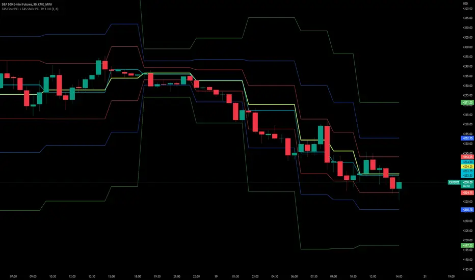
TAS Float PCL + TAS Static PCL [TASMarketProfile]TAS PRICE COMPRESSION LEVELS (PCLs) includes 2 distinct indicators that use volume at price analysis, volume aggregation and multi-timeframe confluence to calculate and display significant levels of commercial interest above and below the market. These levels reveal reliable trading levels which can be leveraged for enhanced trade entries, trailing stops and targets.
THERE ARE TWO TYPES OF TAS PCLs:
TAS Float PCLs - These levels take into account new data flow throughout the trading session and expands or contracts the levels dynamically in accordance with changing market conditions. These are often referred to by traders as “Floaters” or “Dynamic PCLs.”
TAS Static PCLs - These levels are set upon the start of the trading session and remain intact throughout the duration of the session. Many traders These are often referred to by traders as “Statics.”
Both TAS Floaters and TAS Statics have up to 10 horizontal lines available to display. The four center lines are referred to as Points of Control (POC). Three of these lines are colored cyan and one is yellow. The yellow line is more prominent and referred to as the Master Point of Control (MPOC) of the Price Compression Levels on display. The first area of commercial suppor t and resistance are plotted with red lines on both sides of the POC lines and commonly referred to as S1 and R1 levels. The next level of support and resistance areas are designated by blue lines (S2 and R2 levels) and then lastly the farthest from the POC lines are the green lines (S3 and R3 levels). By default, typically the green lines are not displayed but can be activated on an “as needed” basis within the indicator Style settings.
EXAMPLE OF TAS FLOAT PCLs:
ABOUT TAS FLOAT PCLs:
The TAS Dynamic PCLs (Floaters) reveal the price areas that attract commercial interest based on the current market conditions.
How the PCLs are plotted can be adjusted with two inputs controlled by the user.
----------1) MinSignal_123: This setting controls the sensitivity of the calculations. The default is set to 1 and this represents the most sensitive input that makes it easiest for market conditions to trigger new PCL levels. A setting of 2 is considered “medium” sensitivity and lastly a setting of 3 would require the most substantial change in conditions to trigger an adjustment of PCLs on the chart.
----------2) Length: This input setting determines the number of bars of data included in the calculation for new TAS Float PCLs to be adjusted on the chart. The default is set to 8.
MORE ON INPUT SETTINGS:
Using higher values in both inputs will display more significant areas of commercial interest for higher probability support and resistance levels around PCLs. These are referred to as “slow” Floaters.
Using lower value inputs will create Floaters that are more responsive to market conditions. These are referred to as “fast” Floaters.
When fast Floaters are contracted (cover a narrow range of prices) the market is tightly balanced and can easily enter into breakout conditions, if price closes outside of the TAS Float PCLs.
Expanded Floaters that are wider apart provide for greater rotational range trading conditions.
BELOW ARE THE RECOMMENDED INPUT SETTINGS COMBINATIONS THAT WILL DICTATE HOW RESPONSIVE THE PCLs WILL REACT TO CONDITIONS:
FAST (default): 1 - 8
MEDIUM: 2 - 14
SLOW: 3 - 34
The user will typically choose to have either Statics or Float PCLs active on the chart at a time, but not both as you'll have up to 20 levels on your chart (too many). You can, however, put them on different panes. Visit the INPUT settings of the indicator to select which one you want active.
The user can change the coloring, line type and thickness in the STYLE settings.
ABOUT TAS STATIC PCLs:
Many traders opt for TAS Static PCLs because they prefer to know the significant commercial interest price areas before they trade.
Unlike Floaters, TAS Static levels will not change throughout the trading session and are only affected if the user changes the opening and closing time parameters for the trading session displayed. By default, Static levels will recalculate and display new levels upon the reopen of the next session.
Tightly compacted POC lines designate an area of particularly strong commercial interest that provides higher probability, lower risk entries for extended directional moves. These areas are often referred to as “walls.”
If the POC lines are spread out over a wider range, a trader should be on the lookout for a more rotational trading session.
Periodically, one of the POC lines may be plotted outside of a red line (S1 or R1). In this case, the market may be biased in the same direction that the POC line is in relation to the red line.
TAS PRICE COMPRESSION LEVELS can be used as a stand-alone trading guidance system or in conjunction with other popular TASMarketProfile indicators.
Trade Well My Friends!
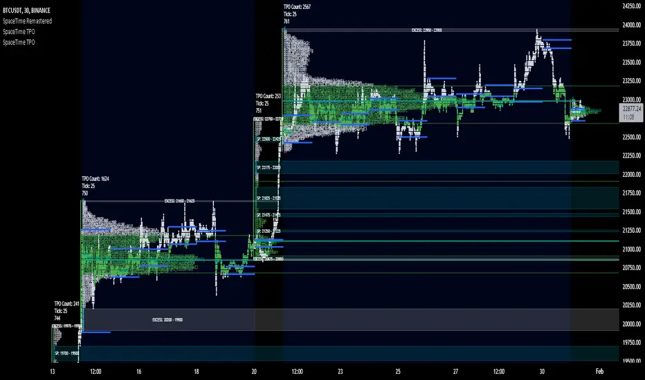
SpaceTime TPOSpaceTime TPO Part of the SpaceTime Complete Suite
SpaceTime TPO Provides an modified codebased to remastered to display the TPO Calculations in a separate indicator with multiple new features, a separate release was necessary in order to maximise the usage of the draw history that can be provided.
Significantly improved from its predecessor Spacetime advanced, the display options used here are less resource heavy and therefore can display multiple profiles in comparison to the previous "high res lettering"
Full suite view:
The main additional advantage of this separate indicator comes in the form of Split TPO profiles ! This utilizes the tradingview display engine creating a whole new way to display data comparative to the candlestick method, doing so will help visualise the profile as it develops.
The Split profiles comes with a pro and con
Pro:
Split profile makes it easier to detect real price movement adjusted to tick
Also tracks the VA travel by history so it is easier to visualise value expansion!
Con:
Due to some limitation some data may occasionally be missed on very volatile candles
Fix:
Increase ticksize/Leave on wicks for candles to see these fluctuations
Update fix inbound: Will display the overflow in a dynamic way so no wicks are needed for all candles if this persists to be a problem
SpaceTime TPO also comes with the same advantages of multi session profile TPOs
Additionally comes with the ability to have a session line
Session Line tracking can continue with "Total" For full length of profile
And
"VA" for Value Area tracking
(or off)
Close tracking in the form of a square is available
Pending updates:
Split profile improvement
Close tracking improvement
Naked Intrabar POCThis indicator with an unfortunate and very non PC sounding name approximates (!) the intrabar point of control (POC) either from time or volume at price.
Due to pine limitations, bin size and the sample lower time frame selection will have at least some effect on the accuracy of the approximation. The trade off is between accuracy and historical availability, however bar replay can be used to view prior historical states beyond what is visible from the current real time bar.
In order for all intrabar POC circles to be visible, you will need to manually set the visual order of the indicator by bringing it to the front.
Since the POC represents a price point around which the highest market participation occurred, the exposed global variable intrabar_poc may (or may not) be interesting as an alternative to ohlc based source input.

Session TPO Market ProfileIntroduction
Wikipedia: A Market Profile is an intra-day charting technique (price vertical, time/activity horizontal) devised by J. Peter Steidlmayer, a trader at the Chicago Board of Trade (CBOT), ca 1959-1985. Steidlmayer was seeking a way to determine and to evaluate market value as it developed in the day time frame. The concept was to display price on a vertical axis against time on the horizontal, and the ensuing graphic generally is a bell shape--fatter at the middle prices, with activity trailing off and volume diminished at the extreme higher and lower prices. In this structure he recognized the 'normal', Gaussian distribution he had been introduced to in college statistics.
Important : The market profile tool is designed to be used on the 30min timeframe, however, you can modify its parameters and use it on lower timeframes (15/10/5min)
This indicators displays the following information
Session open
TPO
Value area calculation zone
POC
Highlight of Single prints
Session High/Low
The current price (TPO Profile is often used isolated without any candlesticks on it)
Parameters
Session beginning configuration (not coded with a session input yet)
Number of candles to use for calculation (default 13 for a single session)
Extend yesterday's levels (VAH/VAL/POC)
Show/Hide Market profile calculation area (background color)
Bars number (number of rows that will be used to draw the profile)
Show/Hide TPO's
TPO Colors customization (For in/out of VA, VAL/VAH/POC/High/Low levels and single prints)
Show/Hide High/Low levels
Show/Hide VAL/VAH/POC Levels as lines
Enable/Disable Single prints highlighting
Value area size (as percent)
Show/Hide current price (corresponding to a line scaled on the "close" price)
Additional Notes
Each session is drawn when the day is over
To use as much space as possible, TPO's are not directly drawn on the area of their calculation (which can be confusing if you use candlesticks directly over it)
This script will probably be updated in the future (especially concerning its implementation which is a bit spaghetti coded for now) .
If you have interesting suggestions about new features that are usual within market profile tools and missing from this script , don't hesitate to suggest it.
Market Profile Visible RangeSup TV, 2 important points .
1) surprisingly, it's the first MP Visible Range script on TV;
2) This one doesn't use any bagging/binning*, instead each row represents the time spent on the actual minimal price steps (aka ticks).
The script will be further extended with usual market profile related functionally in future updates. At this point we have:
- Profile itself (each row represents how many bars touch the given price);
- Mode of the profile (called POC)**;
* Still it will be introduced in future when I will find / design the proper aggregating technique. It is vital for processing very wide price ranges (for example, 500 days on ES futures).
** The script correctly calculates POC by finding all the modes in the data & choosing the closest one to data's midrange.
For this kind of technical instrument finally it was more convenient to use Pine Script 5 (btw it's my first Pine 5).
Basically this script is a side-effect of another R&D I'm doing, the stuff is useful tho so let's go.
By choosing length we both specify the amount of data to be processed & the profile's location screen-wise. It's pretty cool and & useful, on my screen it's always almost touching the left side and still always visible.
The code is heavily commented in order to be understood fast, nothing fantastic, just a lil patience required this time.
Rationale
Market & volume profiles are well known concepts, lotta info available, the most important point of all that is that MP is just another way of visualizing data that lets you notice things you don't usually notice on sequential charts. From my side I can only add that it's better to use your own brain for thinking and reconsidering using volume profile in all the cases, especially on decentralized markets (unless you're aggregating ALL the volume data from everywhere, including options, OTC etc).
Here is it, for you

SpaceTime RemasteredSpaceTime Remastered
SpaceTime Remastered provides a new code base for TPO Calculations. Significantly enhanced and some differences justifying leaving both choices for users to choose between. Using the PineV5 library, providing the ability to create a profile of price and time.
The main advantage is now being able to run multiple sessions simultaneously whilst also being more efficient. This has allowed for synchronous data generation for multi profile uses and still executing at a faster speed. Additionally this has given the rise to London, New York and Asia sessions as options with this new knowledge in mind. However, the sessions can be utilised beyond this in the form of D,W,M at the same time as an example with a multitude of possible combinations up to the users interest.
Tick for the multiple sessions to determine the segmented data generation of the TPO, can be split between the sessions and work independently of one another. This tick is vital alongside time and price. The generation of this tool can be used to highlight trending and ranging conditions and opportunities to spot both can be used to take trades, e.g. using value migration in use of trend development.
The release of the AutoTick improvements is significant as well providing more consistency and less affected reaction to the volatility in its calculation leading to a more accurate profile tool. AutoTick is a global controller and will handle tick generation for any enabled session.
The words and their abbreviation plus key.
POC: Point Of Control
VA: Value Area
SP: Single Print
EXS: Excess *sell or buy tail
PHL: Poor High/Low
TPO: Time Price Opportunity
N = Naked e.g. NPOC Naked Point of Control
D = Developing e.g. DVA Developing Value Area
VAStyles and POCStyles exist to better customise the representation of datak,
Show Text Data is toggleable to give the text representation of key inflection points and data. TPO Count, TickSize used, Excess location boundaries, Single Print Location Boundaries.
Display modes exist for All data, VA + Levels and Levels up to the users choosing.
Session timings are adjustable.
ToDo:
Add Initial balance if requested.
Add User Settings for select members of the community.
Add TPO lettering, delayed as mostly unused in predecessor.
Add Rotation Factor

SpaceTime Profile CompositesSpaceTime Profile Composites
SpaceTime Profiel Composites provides an alternative composite builder to the existing solution in the SpaceTime Profile Advanced.
Using the new pinev5 I utilize the ability for user confirmed data to give them the choice in time in a more interactable and user friendly way.
The main advantage of this is the ability to create multiple composites without multiple uses of SpaceTime Profile Advanced, additionally the user can select the indicator and edit the composite start time using the chart as opposed to the date picker in pine.
The indicator is fully fleshed out with all the features:
PoC
NPoC
Single Prints
Naked Single Prints
Value Area
Value Area Levels
Naked Value Area Levels
Excess
Poor highs and lows
Initial Balance
Auto TickSize
Auto TickSize
This has been heavily adjusted to allow greater detail, and less reliant on volatility, should this work well consistently SpaceTime Profile Advanced may also recieve this change to auto ticksize.
How To Use
Composites are best utilized when multiple value areas are overlapping with their POCS in range of the previous VA's, using a composite
the user is able to generate the greater picture for how this area will provide useful levels of interest, instead of multiple smaller profiles, the user can utilize one larger profile to give more accurate levels of reaction.

Market Profile with TPOThis is is Market Profile with TPO (the letters) on the current session. Due to pinescript limitations, we are limited to 500 TPOs, since this script uses 1 label per TPO. It is NOT volume profile, this is Time Profile (Time spent at a price).

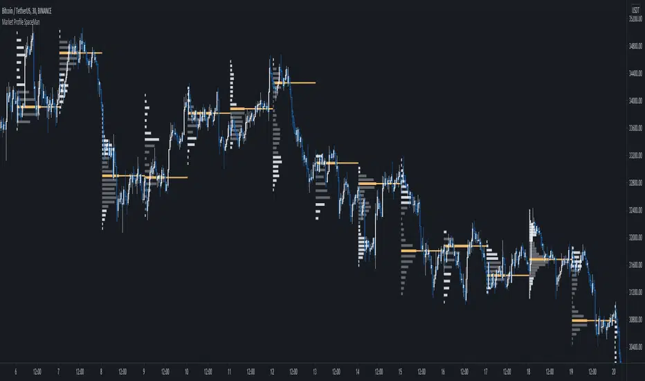
SpaceTime Profile Regular SpaceManBTCSpaceTime Profile Regular SpaceManBTC
Is a profiling tool for a market session.
Using time and price it calculates the TPO mapping the POC on your chart as well as the general profile.
The tool is useful as it can give you a general idea of how a day traded/is trading based off of its shape.
As well as provides the current developing POC as a reference for potentially a dynamic level of interest.
Value area shading is also including in the release using 68% as my reference of personal choice to represent where
bulk of the market activity occured on a given time frame.
To generate the data the indicator aims to look at the price variations over time of the given session (you can choose this in settings), this will then stack
and overlay on the chart to generate the TPO calculations by mapping 1 to 1 with the price you see on the chart.
This will give you areas of importance such as the POC which can be retested when naked providing a point of interest.
Works similar to volume profile but with no volume calculations only with price and time in mind.
Very useful tool for trend / market analysis by providing this graphical representation of a trading session between buyers and sellers!